Transcripts
1. Introduction: Hi, my name is Selene, the digital fantasy
artist based in Denmark. During this class, you'll
be learning how to utilize layers in Procreate while
painting a landscape. Layers, or one of
the major advantages in the digital medium
and can really help take away some of the fear
failure when attempting an intricate motive
like nature scenes. In this class, you'll be
completing a blending exercise to prepare for the process of painting a landscape
in Procreate, which I'll demonstrate in
smaller detestable sections. Through this project, will cover how to adjust
layers according to each other and how
to add texture and detail with the brushes
procreate has to offer. This class is meant
for all levels. But if you're new
to digital painting or painting in general, you can benefit from also taking my class on color
mixing in Procreate. Here I go over the most
basic color theory and how to mix and
pick colors digitally. But without further ado,
let's get on with it. So grab your iPad, viral procreate, and
let's get started.
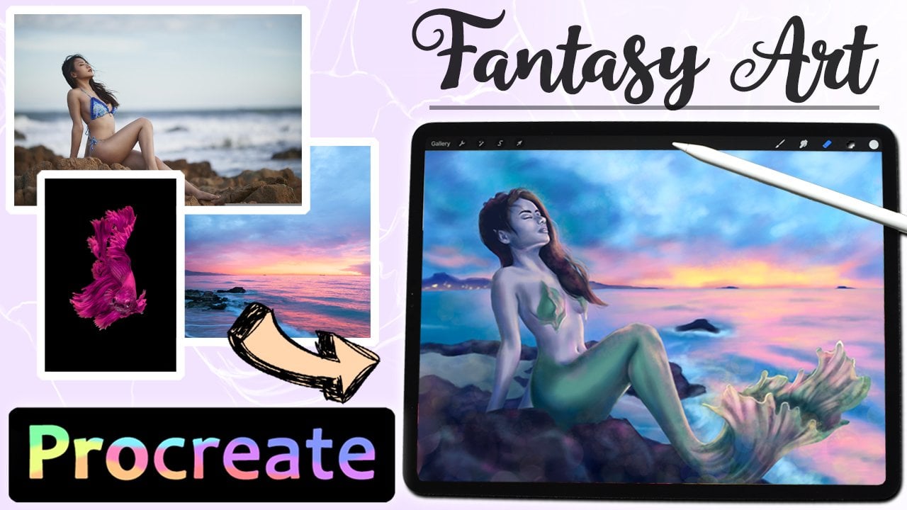
2. Reference and Utilizing layers: Reference is always
good for learning, even if you don't plan
on following it to a T, that's the thing. You can follow a reference
to whatever degree want. I like having one,
if not multiple to help me with direction
and how to shade things. Yet my result is never meant to look exactly
like either of them. In essence, don't be scared
to use reference and think you have to
be able to produce something that
looks just like it. Today we will be using this one, featuring a landscape
with a stone path as a focal point and flowers
in the foreground. Figuring out how to approach
a landscape and where to even start can make
it a little daunting. But that's when utilizing layers can make it all the
more accessible. For instance, in
traditional art, we have to be mindful or
what is the furthest in the background and what will overlap with what when
we start to paint. Otherwise, you might struggle getting things to stand out in the foreground unless you're working in a completely
opaque medium. But digitally, we can work on the foreground,
middle ground, and background interchangeably,
since we can keep it on different layers and
anything can be undone. If you're new to digital art. Layers would like transparent
film on top of each other, where you can paint on one layer and only affect that layer. This also means that
you can delete or alter one layer without
affecting the rest, which is a major advantage,
are working digitally. You can also move layers
around if you want to change the order and change which
layer overlaps, what? Layers can also be
merged together and become one if you want
to simplify things. But keep in mind, once merged, you can't separate them again. Layers also has some
useful settings like Aflac and clipping mask. By alpha locking your layer, you'd look in the
pixels already in that layer and now cannot
paint outside of those. This means that you
don't have to worry about painting
outside the lines, which takeaways on
with the pressure and allows you to spend
that energy elsewhere. Clipping mask layers
that stick to the layer underneath
and function the same as alpha lock in the
sense that you cannot paint outside of the
pixels of the base layer. Clipping masks have
an advantage over the simple epilogue because
you can go back into the base layer and edit
the color or shape of that layer while still keeping what you've done
in the clipping masks. You can add as many clipping
masks to a layer as you want and change up
the order them as you go. As a whole, they
are a great tool to split up the work into
smaller sections. So you can work on
bits of a painting at a time without fear of
messing up anything. Now that you have some
basic knowledge of how layers work and how I
propose you use them, we can move on to
the next few points before we dive into the
landscape painting.
3. Textured Brushes in Procreate: Procreate comes with a lot of different textured
brushes by default, for us, a lot of options for
you to play around with. I do find that I prefer to use a blended base of color before
you shouldn't textures, since it can get a little busy. If I go in with textures
right from the start. This project, I use a
variety of brushes, all standard, and I encourage you to play around
with all the options. And finally, once that gives you the look that sushi style, for instance, I use
a brush pens for drawing hair to do
strands of grass. So there's a lot of potential
just waiting to be found. The base layer, I'll be using
my custom blending brush, which will be in the resources
if you want to use it.
4. Blending Exercise: Before we get started
on the landscape, I'm going to go over
the most basic ways of blending that I will be using in my painting
process for this class. In the resource section, you'll find these
exercise template that I made for
you to play with. Import the PNG file
into a blank canvas in Procreate and alpha
lock the template layer. This way we won't have to worry about painting
outside of the lines. The three types of blending
we'll be practicing here. Blurring, smudging
and pen pressure. Starting from the
left foot blurring. Pick a color and then use the selection tool to mark
the circle and color Durbin. Then select part of the circle
and drop another color. Now a circle has two pillars
with a defined edge, which we're going to blur. Stolen the template layer, go to adjustments and
press Gaussian blur. Now you can adjust
how much you want to blur by dragging the
pen from left to right. Going overboard will make
both colors flow together, but somewhere in the middle
would give a smooth blend. Downside to this type
of blending is loss of detail. Now onto smudging. Filled-in circle with two
corners of your choice before going to the Smudge tool
set to a large, precise. You can easily smudge the lines between the colors and
blend the transition. You can also drag lines back and forth for
different look, but smudging following
the direction of the edge will give you
a very nice even blend. This method is better
if you only wanted to an area and not entire layer. Finally, we're going to
blend with pen pressure. For this, you'll
need a brush with pen pressure
sensitivity enabled, like my blending brush. Fill the circle with one color, picking another to gradually
blend in from on-site. You can do circular
or diagonal strokes, but start with
light pressure and gradually apply more
to get capacity. Go back and forth between
the colors and blend them together with a light hand until you hadn't
with the transition. I will use these three
types of bending interchangeably
throughout the project. So go ahead and download the template and complete
the exercise for yourself.
5. Sketching: The good thing about
painting something organic is that you don't have to follow the
exact lines of the reference photo
to look natural. So start lightly
sketching out where I want each component
of the landscape, in this case the mountains, fields, path and flowers to go. First, try to get the placement down so you can get the
proportions you're looking for. Then you make a new
layer on top and lower the opacity of the button one and make them more
confidence sketch. But still it's just inch. And when drawing nature, I find myself making losers sketches that
when I draw people, don't feel any pressure to make it very strict detailed sketch. The most detail I put
into my sketch was the rocks on the path
in the foreground, a social and I have
to have to find. I wouldn't suggest you
spend anytime sketching out every single
flower or grasp patch, since that would just
chloride the sketch and also make the undertaking
so much greater. Art should be fun after all. When you no longer need
the initial sketch layer, you can turn it off and in order to avoid clutter I just deleted. Now we're ready to
start adding color.
6. Blocking in the Base Layers: Normally, I don't bother
naming any of my layers, but I did for the
sake of this class. So you can see my starting port labeled the mountains
as the middle ground, which is technically not right. But that doesn't really matter. The important thing is
that we have layers for each of the big
components of the landscape. So we can start
blocking in the colors. You can color drop mark
with the selection tool or simply painting colors according to this, It's like I did. The reason you should
laid out all of these base colors
is that it's much easier to see them in context when they're not just sitting
against a white background. You don't have to be
precise at this point, as long as you get the
colors in the right areas. Once you have each layer
filled with the chosen color, you can make adjustments
like moving them slightly, which we couldn't do
if everything was in the same layer or even
working traditionally. Now, we can move on and focus
on the layers individually.
7. Sky and Clouds: Since this guy is the
background layer, we can make this
sketch invisible and jump right into shading. I use light pen
pressure to lay down darker blues and ROC curve for the clouds before using the smudge tool to lightly
blend it together. This guy just around the edge of the mountains is
a little lighter, which makes the
mountain stand out. So I made sure to leave
that area lighter. Make sure you blend in
the right direction. Even when using
this much torque, I said helps keep
the right flow. Don't go overboard
on the blending since we still want the
class to stand out a bit. This guy's portion of
this picture is so small, That's not too much to paint. And we can now move
on to the mountains.
8. Mountains: Firstly, we need to
define the tops of the mountains so they clearly
stand out from the sky. Select the appropriate layer and color, pick the base color. Now you can make the sketch
visible again if you want. But I chose to look
at my reference and just draw the
very tops from that. I alternate between
the brush and the eraser to make
the shapes stand out. Because thing about drawing nature and organic
shapes is that you don't have to follow
the reference strictly in order to get
a convincing result. Just paint peaks that
looks good to you. Then we can move on to shading. But before we do, I'm going to adjust the color of the
base mountain layer by going into adjustments and press hue, saturation
and brightness. This function does exactly
what you'd assume. Here. We can trick the
hue saturation and value. Again, if these terms
are unfamiliar to you, have a look at my previous
class though, to help you out. You can continue to work in
this layer and put it into alpha lock to stay within
the already present pixels. Or you can work in
layers on top of that, that you said two
clipping masks? I worked in multiple
clipping mask layers so I can go back and forth
adjusting as I go. Now I tend to sketch back on in order to have a few
guidelines are what the different sections of rock overlap each other
and create shadows. Since the mountains are
mostly covered in snow, I go in with a medium
great to roughly lay down the shaded areas and a very light gray for the
highlighted snow. At this point, we're
still just getting down the right color and values. So don't worry about
blending just yet. Juices mana area of
rock to focus on, to like getting
overwhelmed and start laying down shadows
in a dark brown. At this point, I made a new clipping mask on top
of the mountain layer. Adjustments can still be made to the snow we put down before. Look at your reference to see appropriate places
for the shadows to go to help give shape. Along the way, you can always
turn the sketch on and off, which I tend to do as soon as a half the basic structure down. Then pick a color
that is lighter than the base and start adding a bit of highlights
to the mountains still in the same clipping mask. You can also make a new
mask that's up to you. That's the glory of
it. You can have as many or as few
layers as you want. I went back to the
snow mosque, too dark, gray on the shadow side of the peak to have
a sense of shade. Returning to the top mask, I continue shading
is also kept very rough only with a
natural blend I get from the pen pressure
of my blending brush. The objective of the very first shadow past is just to get the basic sense of
shape down because we can always return
and refine things. I decided to blend the
edges of the snow mask. You shouldn't blur to
make it a little softer. So select the snow layer
and go into adjustments. Then hit Gaussian Blur and swipe from left to right it
until you have a soft lint. You're happy with magenta the shading mask, and finish up shedding the rest of the mountains bit by bit. The downside of using blue to blend is the
loss of definition. Once the mountains were
all basically shaded, I go back into the snow
mosque and use a slightly darker gray to help bring back definition to the shadow side. Some edges need to be lift
Harsha in order to give shape. So look at your reference
and see you online should be softly blended versus when
they should be harsher. Help make it look more 3D. I used a light
gray, nearly white to help highlight the snow
where the light hits it. Be careful about adding highlights that a
straight-up bite though, since we haven't shaded
the rest of the landscape. And you might want the option to brighten this area of later. Zooming out to get a
look at the illustration as a whole is a good
tool along the way, is it allows us to see how well everything
registers from U4. Finally, he is in three layers. We have for this section, month for the very base
shape for the mountains, one for the snow, and 1
third the rock shading. Now we will move on
to the next section so we can get a basic
shuttle pass down all over before returning
to a texture and finer details to the
mountains later.
9. Fields and Path: Go into what is technically
the middle ground. We got to make a
new layer on top of the field and set it
to clipping mask. Then we can start working in shades of yellow,
orange, and green. You shouldn't curved
horizontal strokes to give the feel of
hills in the landscape. Sketch helps give a sense of where the small
hilltop should be. So we can add the
night as Carlos there. Use a smudge tool to blend
the stokes together. We can add another clipping mask to the final landscape further. Now we have a sense
of the hilltops. We can add a darker shade to the lower points
to emphasize it. When you have the
basic fields down, we can move on to
the stone path. Make a new layer on top of
the previous field layers, but they'll make it
a clipping mask. This layer will be the
base layer of the path. So we can start by filling in the shape with the sun at color. Make a clipping mask on
top of the path and start filling in the shadow between each stone with a dark brown. The sketch is very
helpful here to get the initial placements
of the stone style. Further in the distance, I stopped focusing on each
one and just let everything merged together in order to keep the focus on
the foreground. Keep in mind that
shadows will look flat if they are a single color. So adding a slightly
lighter tone for variation can really
lift the image. To look on the surface
of the stones. Make a clipping mask
under the first, directly over the base layer, which will allow us to paint underneath the shadows,
would just put down. Adding darker and
lighter tones to the flat tops will make the Rock rules more
natural and textured. Adding the variety in colors help bring
life to the Stones. Since rocks in real life can
have many different hues, I added both a yellow
and a colder blue tone. Making another
clipping mask on top. I will start now. I can go in with an even darker brown to really carve
out each stone. This will sharpen things up and bring another level
of dimension, referred to as the reference
and see whether should be sharp lines and where darker
shadow should fade out. Making things look real
is sometimes getting the rag inch between
blending and not blending. Using a brush with pen pressure means that you can use
the same dark color too. I cracks often varying value to the Stones by adjusting
how much pressure you use. The cracks will help break
up the large surface of the stones and bring more
interest to the eye. How much detail you add at
this point it's up to you, but you can always return
and add more later. When you're happy with
the state of the path, you can move on to the flowers and the grass of the foreground.
10. Flowers and Grass: The further to the front
of the image we get, the further to the top
of our pile of layers. You want to work for the flowers and grass
off the foreground. The layer needs to be on top of the path layer since we want the foliage to overlap the path. Previously, I used to
sketch as a guide to lay down a base color before
turning it off again. Bringing the grass color slightly over the
edge of the path in-between the rocks
to make the path look more integrated
into the landscape. For the sections that
are covered in flowers, I use a dark reddish
brown as a base. Since this is foreground and meant to overlap
what is behind it. I didn't lay down a basic
shape with a clipping mask. Instead, I lay down the
colors in the base layer, since I know I'll be putting multiple different
layers on top of later. When ready to add
the flower color, I make a new layer on top, still just a regular layer, so it can still overlap
what is beneath and make the edges look
random and natural. Painting every single flower bud would have been daunting. So instead focus
on getting corner down in the areas
of dense flowers. To start with. Returning to the previous layer, I can add the stem color of the flowers in any areas
that was forgotten, like in-between the
rocks of the path. In a fresh layer authored
in this section, we go in and define the
clusters of flowers. I do this with the same blending
brush, set of variance, smaller sizes, and gently dabbing and stroking
in the right areas. This is meant to look
rough drill and I just want to add a bit
of definition and I'll make a layer in-between
the two flower layers and use a darker color to help
define the flower clusters. Select the top flower layer
and set it to alpha lock. This is a neat trick, as we can now call in
and change the colors of the flowers without affecting
the layers underneath. I work in different tones, pinks and corals to make
the flowers look lively. I believe the flowers
like this for now and return to add
some texture later. In a new layer on the very top, we can start editing
some grass strands. I'm still using the
same brand new brush at a very small size and instructs in the right direction
according to the reference. It's nice that we can focus on some details in the foreground before actually having
finished the rest of the picture for
a few reasons. It's nice to get some details in where we wanted
them to be for sure because then it's
easier to figure out how much detail is needed
as everywhere else. Also, I just find it uplifting that I can
jump between sections. Should I just want to work on
something else for awhile? You want these
strands to overlap everything else and stand out. Focus on the one in the
foreground for now, since we'll be adding more
texture and details shortly.
11. Adjusting Values: The trick for checking how
the values of an image work together is to go into
actions and hit Copy Canvas, which takes a snapshot
of every visible layer. Then paste it on top of
all of our layers and go into adjustments and
remove the saturation. We're then left with
a grayscale image of a current artwork and can better see how different
components work together. I also desaturate the
reference image to compare the two and get an idea of where
can focus on more attention. Let's make some adjustments. Mainly darkening some layers that have too light of a value. I do with this in two ways. The first one is
to go and manually in the different
layers and choose a similar but darker color and work those in with
my blending brush. The second way is to select a layer and go into adjustments and play with the brightness and hue to get closer to
the look you want. This way you can tweak
the entire layer at once if that's what we need. This is yet another advantage
of having elements in different layers centered leaves so much room for
editing along the way. Now we can move on to Edison visual interests
through textures.
12. Adding Textures: To add some texture, I'm going to use some
of the default brushes that Procreate
comes with starting with concrete block under industrial torque on
the mountains and make a new clipping mask on the
top of the others and use a dark brown to add some
texture to the dark areas. The brush does most of the work. You use a light hand and
varying brush sizes. It's not a huge difference, but it interest on otherwise
smooth looking mountain. Next, let's work on the path using the brush grunge textures. Make a new clipping mask to the section and move it
under the two top ones. So we only affect a tub of the rocks and not the
shading in-between. Brush on both, a
lighter shade for the highlighted areas and the darker one for the shaded ones. If you ever lose track
or which layer is what? If you forget to name them? Like me, you can always flip him on and off and see
what they contain. Make a new layer under
the alpha locked flower layer and find the
brush called fine hair. On the push-ups. I found that this brush
is good for making grass patches without having to paint every single strand. So a go-around using
various shades of green and chanting the
brush size to break up the flat base layer mixture to have grass hanging over the path to make
it look overgrown. To add some texture
to the flowers, make a new layer under
the logged flower layer and find the brush
aurora on the autistic. This makes a splash, it dotted texture that helps fill out the illusions
of the fields. Having tons of
individual flowers mixture to change
up the colors a little so everything
doesn't blend together. You don't have to
use the textures of the brushes as they are. You can also use
the smudge tool to skin the texture of
a different look. Return to the top mountain
Clipping Mask and use an almost white great
That's on pottery snow, using the crunch and textures. When you've worked
your way around the whole image and
the textures you felt like we can move on to the final details to
bring it altogether.
13. Finishing Details: This part is about going
back and forth between the different layers and add the last few details that you feel will elevate the piece. This can be both
in layers or masks underneath each other or on
the very top of the layer. I add some variation in color and value to
the kras to help the texture we added
previously stand out more before going on to
Item individual strokes. When doing individual
strokes for grass or whatever it might be to use a color that
stands out a little because otherwise the
effect won't be much. This is the time where you
determine where you're painting could benefit from a little more
detail to have the, I wonder the direction
you want it to. The right side of the foreground has a lot of grass going on. But I find that as long as you have the right
colors in your base, you can get away with only
occasional single-strand to sell the effect. The left foreground has some single-strand
of golden wheat or grasp that really helps bring out that final
bit of detail. The single strokes
are just done with my blending brush,
so nothing special. The great thing about keeping so many layers separate
is that we still have access to everything
and can jump back and forth to
a hawks content. If you feel you have
too many layers and it gets a little confusing, you can always
merge some of them. I added a new layer to the flowers and use
the same texture brushes before to add highlights with a lighter color and
a smaller brush size. Like a lot of people, I really enjoy adding
highlights, GAS. It's just one of the
most satisfying boards. In a new layer on
top of the path. I used the same brush to add some green foliage between
the stepping stones. The reference photo
has a bit of mist at the bottom of the
mountains on the fields. So made a new layer on
top of everything and use the cloud brush on the elements to suck
the paint that in. Whenever you're happy with the amount of detail
in your painting. And we can call it a
day and admire artwork.
14. Final Thoughts and Class Project: Now we've been over
the use of layers and a demonstration of using them
to paint a whole landscape. So now it's your turn. The class project for
today is to complete the blending exercise and
play around with layers. Even making an Italian
landscape if you offer it. The reference and
exercise template, along with my branding is available in the resource
section for you. Thank you so much for
taking this class. I still recommend my color glass as a supplement to this one. But I also have other classes on Procreate you might
like on my page. If you want to see more
of my personal ad, you can find me on Instagram
at saline that data out. I'll have a look
in my Etsy shop. Have fun creating
and bye for now.
 Celine D., Digital Fantasy Artist