Transcripts
1. Introduction: Hi, my name is Celine. Welcome to this class on
color mixing. In Procreate. This class, we'll be going over some basic color theory to help you understanding
of color for your art. You'll also be completing four exercises to help better
your understanding of Hue, Saturation and values, along with Connor context
and how to find a mixed. The college you
want. This class is made with beginners in
mind, but can be enjoyed, but all liberals get out your iPad via Procreate,
and it gets started.
2. Color Theory: But why is color theory
relevant in digital art? You might ask, well, just like in traditional art, and understanding of how colors are mixed and
work in relation to each other is very helpful
for achieving good artwork. Allowed an art can be
played by ear, so to speak. But a basic understanding can
enable you to tweet things if you feel like
your color choices aren't giving you
the ripe you want. Let's start with some of the
most basic color theory. Most of you have probably
heard of the color wheel. But in the most basic form, it consists of three
primary colors, being yellow, red, and blue. Lisa primary as they cannot
be mixed from other colors, making them the base of
all hues and color mixing. Side-note, black
and white are not considered colors and therefore are not presented in the wheel. When we go to the
secondary colors, will look at the ones who
can mix from a primary. Red and yellow mix orange, red and blue mix purple and
yellow and blue mixed green. Again, this sounds very simple, but it's good to have in
the back of your head when you're choosing
colors digitally to. For instance, let's say
we are painting a leaf. We know it's green. And since we know green is mixed
by yellow and blue, we know where to look for it. And we can choose if you
want agreeing to have more of a yellow or a blue hue. Lastly, I will brush
up on color harmony, which is what it sounds like. Choosing colors that are harmonious and
pleasing to look at. I won't say it's a given
that all art should be harmonious as it may not
be. Look, you're going for. But if it is a simple
ways to get harmony is to look for corners that are mixed next to each
other on the wheel. Going back to the green leaf, if you choose three
colors going from green, yellow to yellow, your show, they'll go calmly together. If you want something
in your painting to pop an emphasis, you can choose a
complimentary color, meaning an opposite
colon, the wheel. Red and green look great together if they're
complimentary, Carlos, and it gives
a great contrast. This will bring life and
balance to an artwork.
3. Hue, Value and Saturation: Building on the
previous color theory, we need to have a look at
hue, value and saturation. If you're looking at color
selection like this, we have the hue on this slider, the saturation on this one. And the value here. To break it down.
Hue is the color which we determined is mixed
from our primary colors. Value is how light
or dark color is, how much black or
white it contains. Saturation is how
vibrant the color is. If you had wide
open a two-color, traditionally, you lighten
or darken the color, but you also desaturated, which also applies
to digital colors. The more black or white you add, will gradually take it to gray, desaturating your
color completely. Using these three aspects of color can have a great
effect on your artwork as value determines
how much contrast and thereby depth you
have in your painting. Using more saturated
colors can brighten up a painting and adjusting the hue can change
the field completely. To emphasize this, we're going
to do a little exercise.
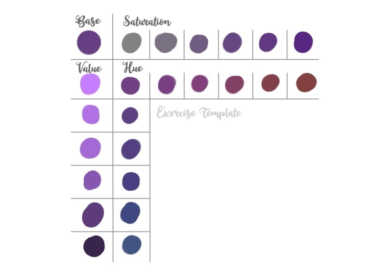
4. Exercise; Hue, Value, and Saturation: To get a sense of how hue, value and saturation work
in relation to each other. I've made us more template. You can get in the
resource section and open and procreate. This is reminiscent
of color mixing exercises that you'll do
with traditional mediums. In the top-left
corner labeled base, you're going to paint a color. I chose the purple being
a secondary color. Pick from the middle
of the selection like this, to get a mid tone. To the right, we can
play the saturation, the saturation slider
all the way to the left to desaturate
the color completely, leaving us with the
gray and swatch. This. Then move the slider a bit to the right
and swatch again. Repeat in small steps, switching every time and
watch how he gradually get back to the base purple and even further to
more saturated one. Now returned to the
base color and direct your attention to the values
on the side of the template. Move the slider all the way to the right to get that
light as possible. Color swatch. Move the slider a bit to
the left and swatch again. Repeat until you're
gradually get back to the base color and beyond
it to an even darker one. Unlike when we
removed saturation, the value section will
remain bright and saturated, though reaching both
lighter and darker tones. Finally, we're going
to play with US, pick a base color again
and move the hue, slider it to the
right and swatch. Repeat, and watch how the
color gradually becomes red. Then return to the base
tone and repeat the steps, go into the left this time
until the caller tuned. Now you can clearly see
how little change in you all just the colors and gives
a different expression. But since we only
change the hue and not the value or saturation, all these Hughes
had the same value, meaning if we take this
layer into grayscale by the moving saturation in adjustments are hue selection
will all be the same gray. This is important knowledge
as it shows how changing the hue will not change the
amount of depth in your art. You need to look at the two
other aspects for that. You can complete
this exercise with how ever many colors you want before moving onto
the next section.
5. Color Picking from Reference: In traditional art, you often have to mix the collision
need for painting. So you need to know
which colors to use to get the wonder result. You can, of course,
by a set of paints or pencil with more choices. But more often than not, you need to make some shades. In digital art, we have the opposite
problem, so to speak. We have every shade
available to us. Even though it's hard to mix traditionally already at
the touch of our pens. Why would this be a problem? Well, when given
endless possibilities, you're going to be left
a little lost as well, the specific color you need. Technique, for instance,
when I started digital art, I was struggling to find the
skin tones I wanted to use. And whatever I chose
just looked to orange to yellow or red because I was
hoping about aimlessly, hoping to stumble upon the
right color for my BCE. This also led back to my lack of understanding of value and
saturation at the time. But how did I learn
to find the Carlos I wanted I call it
picked from reference. Specifically, I pick the color
I liked off the reference. And then I studied where it was in correlation to
everything else. Both the hue, the
saturation, and the value, to see what base color actually ended up
being what I needed. Next, I picked a
different color on the same reference to see what could be used
to shade the first. Once again, studying it
and often finding that the shading color would not be just a darker
version of the base, but a different hue,
sometimes subtly, which is part of what really
brings an image life. So be curious and study what hues and values makes up
whenever you want to paint. Picking from reference
is a tablet shorter. I highly recommend it for studying and practicing
for your choice of color. But I also don't recommend
that you allow yourself to be completely depending
on it. In the long run. When I first started
using Procreate, I didn't know what the
reference function that you could use other
apps like rich, rough, like a US now, so I will
import my reference into a layer on top of my art so I could have it
visible whenever needed. This gave me the option of color picking
directly from them. It's great for
learning purposes. But after awhile, I stopped studying the colors
and just pick whatever I wanted from the
reference because it was easy and faster than
finding them on my own. I can't tell you
not to always call a pig from reference
for your art, as there are no rules in art, is all about having fun. But I will strongly suggest that you only do it
initially to help you understand if color and then pick your own
colors after that, having the reference
in Procreate might be too much
of a temptation. So once you're
ready, you can have your reference either in
the reference function, in a separate app, and I do. Now let's do another exercise
so you can see what I mean.
6. Exercise; Picking Color from Reference: Important next exercise from the resources and make a new layer on top
for your swatches. The reference I used here
is from Pixabay that I used for my previous class
on drawing hair, color pick. What do you think
is a base color of the skin and swatch it. Now go to the color
section so we can study how this
color is composed. Looking at the
queue when orange, almost in the middle
between red and yellow, which at first glance
might seem odd since the color we picked don't really look much like orange at all. But when we look
at the saturation, we see that it's
close to the left, thereby more on the
desaturated side. In a sense, each orange that's been mixed
with a bit of gray. The value of slide
is to the right. He made in a fairly light color. This information is what
will enable you to mix, quote unquote this corner again without reference,
should you want to? Now we're going to repeat this process with a shadow tone. Pick one and swatch it
onto the base color. Looking at our slides,
there's more we can learn. The shadow is still
in the orange hue, but closer to the red this time, making it a subtle hue
change from the first. The biggest difference comes
in saturation. In value. The saturation slider is
closer to the middle, making this current more
saturated than the first. This helps keep the
shadow vibrant and not to the value slider
is in the middle, making it a bit darker. This really helps bring
out contrasts in shape. Next, we're going to
mix these two shapes, all cells without picking them. Start with the clonal
selection at a random color before going back to the OSU
where we know we're going. Then move around the
saturation slider, remembering that the base color was on the T saturated side. Try the value slider, keeping the right
for lighter value. I didn't the exact shade may
take some fiddling around, but keep at it until you find it or something
that's very close. When you're thinking
of getting close, mega swatch to come
here to the first, then it's easier
to see where you might still need
some adjustments. When you read something
you happy with. Move on to the shadow color. Keep in mind that the world walk come crumbling down on you. If you don't get the exact
shades of your reference. Art is a journey. And it's about having
fun along the way. When you have mixed
both of the corners, you can switch between
the pink color and the mixed to further
learn the difference between them if
there is any copied this exercise with
however many shapes you want before moving on, you can also use
your own reference for different color palette.
7. Colors in Context: Another aspect of color theory that makes choosing
the right colors difficult is that colors appear differently depending on
what they're compared to. This means that
the background of a piece greatly changes the
way that the colors look. This doesn't mean you
can't have an all white background because
you certainly can. Knowing what you want from
the background hover. It will make it easier to
choose your palate accordingly. Let's look at one of my
personal RPCs for reference. This is a piece called melody featuring MAN made on the water. The whole painting is kept in blue and green hues to convey
the under ocean field. And looking at the
character itself, she has a blue tail
and light skin. But what exactly is her skin
compared to everything else? Has skin looks like a
pale flesh tone assaults. But if you pick the base color, she's actually blew
a very pale shade, but it isn't a proof. But it's lighter and
less blue than the rest, giving the illusion
that it is skin. If you want to use the
same color to paint skin, a white background, it wouldn't look right and you will
end up with an alien. Therefore, context is very important when
choosing your palate, which also leads back to
complimentary colors. Red on top of green
will look completely different than red
on top of blue. Let's explore this
with an exercise.
8. Exercise; Colors in Context: Open a template in Procreate and start by focusing on
the first example. The point is to color match the small square
within is where. So open the color
selection and start moving the hue slider to
get something similar. Then move around
the saturation and value until you have something
that looks right to you. Then swatch this color
onto the sign mix. Now we can fact check
ourselves to see how we perceive this color due to it being on a
colored background. Color pick the inner square
and swatch it on the picture. Hopefully, you can now see
what I meant when I previously talked about parents looking different without
any background. Moving on to the next example, repeat the process again, finding the color on your own first before color
picking it to compare, complete all four and then look at the
results as a whole. Did you notice that
the color from the first third example is the exact same and that the second fourth
is the same red. While looking at the overall, It's not immediately clear since the background is
different colors, that brings out something
else when we look at them. Example 14, add a background that go in the same hue
as the middle color, making them go
together harmoniously. But 23 have backgrounds
of complimentary colors. Hues that are opposite
to the middle color, which makes them stand out
and pop rather than blend in. Complete the exercise
to see how you yourself perceived
color and contexts.
9. Mixing Colors on The Canvas: In some approaches
to traditional art, you made sure Carlos
directly in the Canvas, which is something I've
incorporated into my process. If I have a character
that NO wanted to shade with more of a purple
tone to the lighting. But I'm not really
sure what specific color to the news. I do this. I choose a purple and make a single night stroke
over the base color. And then I can color
pick the new tone that I've mixed on my canvas. Then undo the stroke
and you now have a mix of the base and the
purple to shade with. The same can be
done for brushing. Exciting. This has become my preferred method
of figuring out color mixes and find
in-between blend tones. Let's play with this one
in a final exercise.
10. Exercise; Mixing Colors on Your Canvas: This template has a
circle in the middle, which you start by filling
in in a new layer on top. You can choose any
color as your base, but I'll be going
with a flesh tone. Now you can find a econo you would like to use for your mix. If you want to shade something, then choose economy with a
darker value and the base. If you wanted to be vibrant
and racist saturation. When you've chosen your color, swatch in the circle
marked with him. Now use the same corner and
gently stroke over the base. Use a brush with
pressure sensitivity. I'm using my favorite
blending brush, which you can also find in the resources which will
make the stroke transparent, showing us the mix
of the two colors. Select this new mixed
color and onto the stroke. Now, swatch this new corner
in the mixed circle. This way we can
see the difference between the first color, which else, and the
new mix we got. You can use this new color to shape the base
circle if you want. Putting the layer
in alpha lock will help you stay within the lines. This mixing technique
works with any colors. So let's do one for
highlights to list. I'll go for light
value in a yellow hue. Swatch the initial
color like previously, if I'm mixing it in with a base, select the new color
and I'll do the stroke. Now we have a highlight. I find this way of mixing
useful as it feels very traditional and can be used to learn where to look for
the shapes you need. Complete the exercise with
however many corners you want.
11. Final Thoughts and Class Project: Now we come to the
end of this class. If you haven't
completed the exercises already. Now's the time. The class project for
today is to complete the four exercises
to help better your understanding
of color and how to mix and pick the right
ones for your art. I'll be leading the
exercise templates in the resource section along with my favorite blending brush, should you want to use them? Thank you so much for
taking this class. If you want to see more, I have all the Procreate classes
you might like on my page. If you want to see more
of my personal art, you can find me on Instagram
at Celine dot-dot-dot. I'll have a look
at my Etsy shop. Have fun creating
and bye for now.
 Celine D., Digital Fantasy Artist