Transcripts
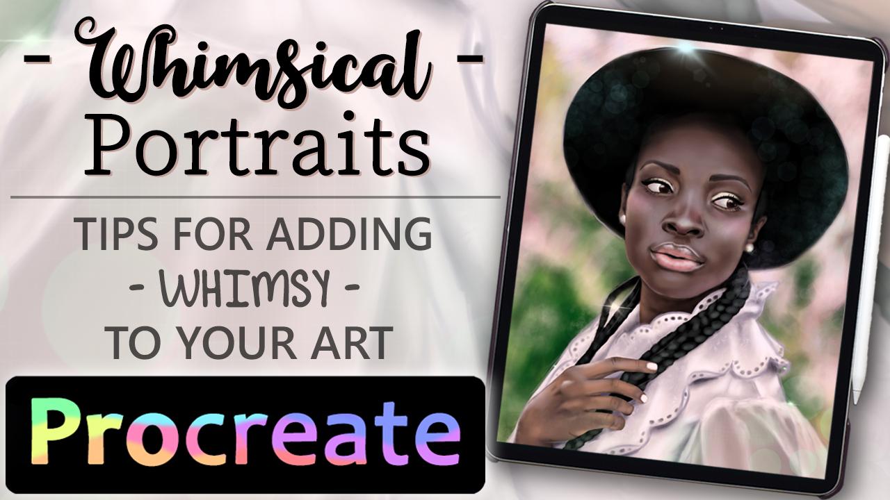
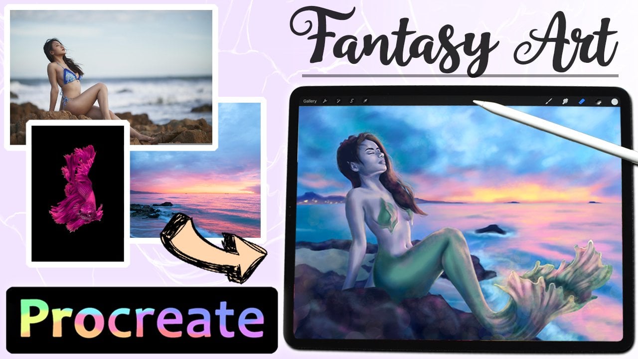
1. Introduction: Hi, my name is Celine, and I'm a digital fantasy
art is from Denmark. In this class, we'll be making a whimsical portrait
in procreate. Going over different
ways of adding whimsy to your art will be going over the whole process from
sketch to finish. Paying most attention to
the whimsical aspects and details like amplifying
what's already there. Keeping visible sketch lines,
textures, and lighting. If you're new to Procreate
or digital art in general. I have a grayscale budget class along classes on sketching, painting skin, and
drawing hair that can all help form a base
for your portrait skills. To make it a little easier for you guys to approach this class. You can find my sketch
and reference for this project in the resources, so you can follow
along from there. So when you're ready, get out your iPad, file, procreate, and
let's get started.
2. Sketching : Here's the reference
will be using iteratively so you can
find it in the resources. I chose this one because
I like the post and the combination of hat
and romantic shirt. It also has nice comprehensive lighting and focused
on the face. Since I go for realistic
proportions in my art, a good reference can
make or break a piece. The points I'm going over in this class can be transferred to any other reference or in
whatever style you like. Before I go on to add whimsy, I sketch out what I want to
keep from the reference. For this project. I kept very faithfully to the reference. So we can focus specifically on a whimsical aspects on their own central working digitally, we can zoom in on one
eye and you start there because we can move and resize
everything along the way. I wanted to catch the models
likeness to some extent, but it has no impact on
the whimsy part of it. You can start with any character of your
choosing for this. The photo already has some
romantic aspects to it, like the lace collar
on the shirt. But once we have the
first basic sketch down, we can go in an amplifier, what are the aspects
are already there? And what can add for
even more Wednesday. If you lower the
opacity of the sketch, you can play around
in a new layer with ideas for the
finished piece. I pay around the
color of the shirt, making it a bit more
prominent and trying to make some more scalloped
edges flipped over, insinuating when all movement, movement flare and
dynamics are things I find help the whimsical
fill in my pieces. Like the person is moving unexpectedly or if there's
wind blowing around them. Texture is another
thing that can add interest and a
glimpse into your art. So to make the
white shirt less of a big blob in the overall image. I plan to have this leave
transparent in the color face. Since whimsy sort of encompasses the unexpected and
almost erratic, you don't have to stay strictly within the realm of reality. I mostly work in fantasy. So the whimsical is
right up my alley. Whimsy can also come into play in your personal art style, meaning how you choose
to illustrate things. I tend to illustrate faces in a realistic manner and
add the whimsy elsewhere. Also, since the model is a
person of color with braids, I only shift the braids a little to show a peak
of the background, but otherwise follow
the reference. Having hair wish around in
the wind is very whimsical. But braids have a bit
more structure to them, which I wanted to keep as a contrast to other
software whimsy parts. But all of this comes down
to personal preference. In the end, once you have a
sketch you're happy with. We can move on to
color and rendering, which is where the whimsy
will start coming to life.
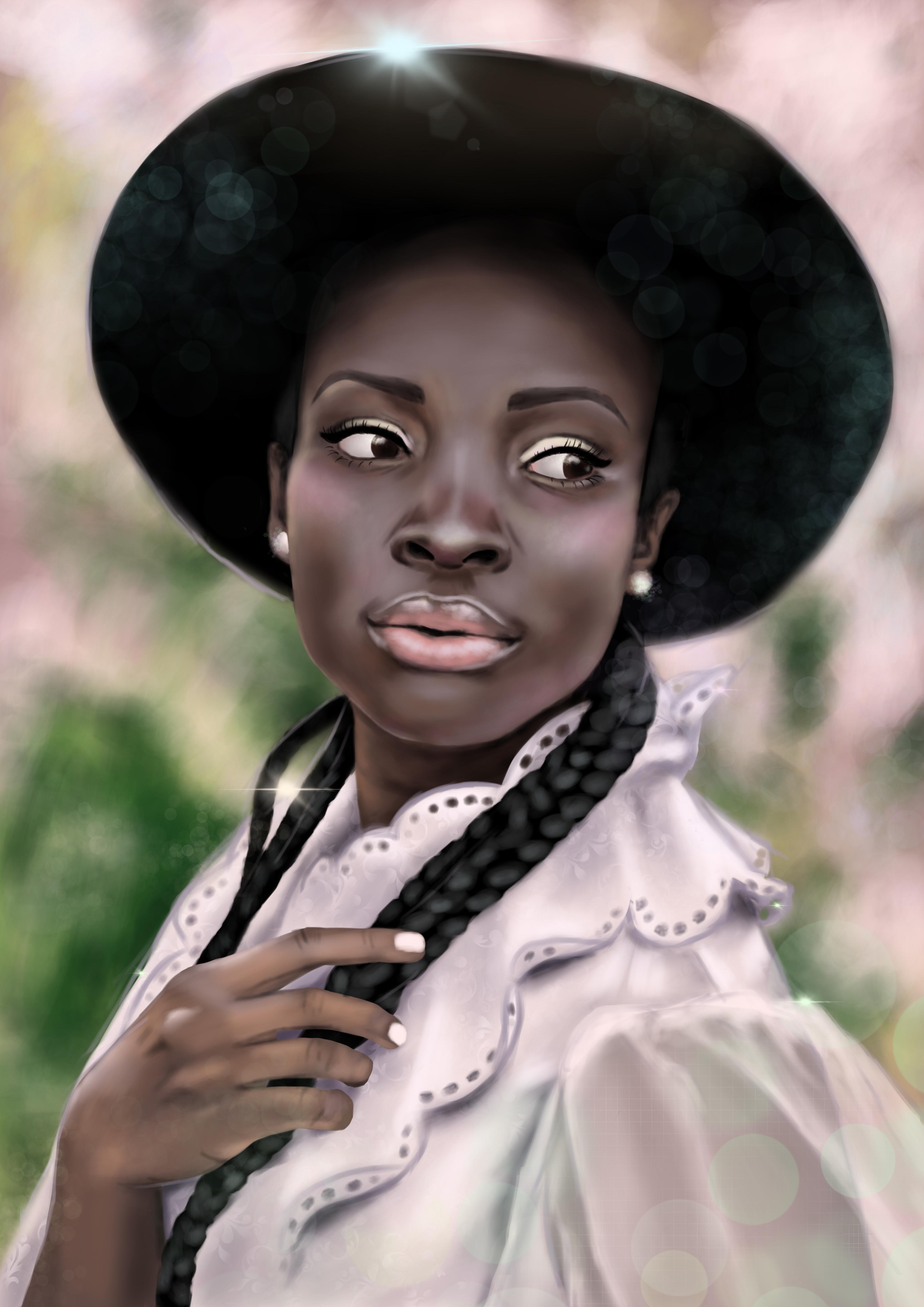
3. Color and Rendering: Let's start with the
background to get something to ground A-values in. It's already a little whimsical
in the reference being out-of-focus and starring
green, pinks and yellows. I plot these down, but go for slightly
more saturated colors to make it more lively,
adding to the whimsy. Next, I placed out all
the base colors in each their own layer to make adjustments easier when
going onto the rendering. Now, use the reference
to whatever level you want in rendering the different
aspects of the painting. I start fairly close
to the reference when shading and
rendering the skin, since I wanted that
to look realistic. Having line art or
keeping the sketch visible and add another sense of whimsy and style
to your portrait. I tend to erase or
change the color of the sketch on the face to
help the realistic look. But you can keep
them if it suits your style. Bonus tip. If you want to render
faces realistically, pay close attention to your reference and the
subtle color variations. Meaning, don't just lay
down the color you expect, but look at the varying tones of the different
features of the face. In this case, most
highlighted areas has a cool view with some of their in-between tones of a warm hue. This helps bring
life to the skin. I wind up the hand to a
lesser degree than the face, since I wanted the
face to be the focus, It's generally a
good idea to have the most detailed rendering wherever you want
the eyes to linger. Whimsy can also come through in the way you choose
to illustrate. For me, I find it whimsical to keep things a little
more painterly. We can see individual strokes looking more like
traditional art, comes into effect with
the braids in this case, where I kept to single
individual strokes to indicate the highlights on each strand of the braid, but
kept it at that. The result is
understandably braids, but not too overpowering. I also take an illustrative
approach to the shirt. I use reference to
see how to shade, but keep it all a little rough and keep the
sketch visible. Even if I recolor it. Opposite to the reference, I shaded the shirt with
more of a pink hue than the original blue to account for shifting the tone of the
painting in general. When I get to this leaf, I bring in another
reference to see how to shade a
see-through fabric. Never be shy of bringing in more references to get a
grasp of something new. Sometimes even whimsical
elements need references, especially if it's
something new to you. Finishing up the shirt. I made dots in
bearing colors around the scallop edges to illustrate it being
some sort of lace. Again, keeping it paint
elite and not to defined. Then we're ready to move on to the final details and touches.
4. Whimsical Details : Now we're getting into the final whimsical details and touches. Firstly, we're going
to play around with patterns and textures. I started playing
around with drawing some lazy parents on the shirt, but didn't like look unrested. The good thing about working digitally is that
we can just make new layers and try things
out without being permanent. Instead, I played around the texture brushes that
comes with Procreate and use the one called victorian to edit vintage looking
pattern to the shirt. He bid like an uneven, so it wouldn't be
too overpowering. Returning to the
texture brushes, I use the one
called grid to make squares almost to like
look to the trench. Parents leave. Again,
keep it light and only on some parts of the
sleeve, adding to the whimsy. Dripping off the
sketch in the back, I draw some sketchy lines in a light color on the
edges of the hat. And this helps bring the style of the shirt into
the rest of the painting. It's also a good
way to highlight an admiral focus
to certain areas. The reference has a
small lens flare on the top edge of the
head, which I lean into. Procreate comes with
a lens flare brush, which I use both on the
spot in the reference, but also in smaller sizes and different hues around the
outline of the shirt. This makes it look like light is sparkling
from behind her. How little or how
much you add of any of these details are up
to you and your style. Back to the luminous brushes. My favorite one is
called broken lights, and I use it in all my pieces. It adds varying hues
of light round shapes, giving a foggy,
kinda magical look. Using this eye-brain
contrasting tone from the background
into the character, mainly on the outer edges. Using this brush on some of the background helps
tie the texture of the whole piece together while adding to the magical OMC. The same brush on a
small setting can also add shimmery
highlighted the skin. As a final touch. I add some
pink to the cheeks and nose, which wasn't in the
reference since it works so well with the
rest of the color scheme. And then our whimsical
portrait is done.
5. Final Thoughts and Class Project: Here we have our finished
whimsical portrait. In my style, whimsy
meet surrealism. But you can use these
whimsical touches and apply them to any art style. To summarize, amplify the
reference and add movement. Heap visible sketch lines. Render in a painterly manner, incorporate patterns
and textures, playing with lighting
and sparkles. Now you see me Illustrator
this portrait. So now it's your turn. The class project
for today is to illustrate your own
whimsical portrait. You can find your own
reference if you want, or you can use the one I
provided along with my sketch. If you complete the
project to share on here, I would love to see it. Thank you so much
for taking my class. I hope it was helpful to you. Should want to see more from me. You can check out the
other classes on my page. F on grading and bye for now.
 Celine D., Digital Fantasy Artist