Transcripts
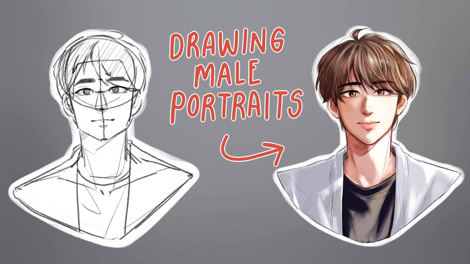
1. Intro 1: In the painting beautiful
girls with procreate class, immerse yourself in the
world of digital artistry. As you can learn essential
techniques for creating stunning portraits
of beautiful girls using the procreate app, Whether you are a beginner
or an intermediate artist, this class provides a
comprehensive guide to elevating your digital painting skills and bringing your artistic
visions to life. In this class, you'll learn the fundamentals of
digital painting. Fundamentals of facial features, essential features of procreate. This class is perfect for
inspiring digital artists, illustrators, and anyone with a passion for creating
cabuating portraits. Join us on this
artistic journey and unlock the potential within
your digital caneras.
2. Introduction 2: Hello and welcome to Painting Beautiful Girls
with Procreate Course. My name is A K N Pi, your guide and instructor
to this course. I'm thrilled to have you
join this artistic journey where we'll explore
the captivating world of digital painting together. Make sure you have
your procreate app installed on your ipad, your Apple pencil ready. And don't forget to check the class material sections
for additional resources. All right, let's get started.
3. Procreate basics: Hello everyone. Welcome to Creating Beautiful Girl
with Procreate Course. To begin, let's get
to know the ipad. The one that I have here
is an ipad pro 2021. But don't worry, the Pro
version is not required. A regular ipad will work. Two, my previous ipad in the ipad 106 from 2018
that I use for studies. Here you can see some of my
art that I created with it. The key point is that any
ipad can be used for drawing, as long as it supports a stylus. If your ipad supports a
stylus, you're good to go. However, the number
of layers you can create may vary depending on your devices specifications
to go to Nat information. Here, this canvas size is approximately
eight fold size. On this ipad Gen six, you can create up to 26 layers
for this type of canvas. The ipad Pro, on the other hand, has high as allowing more layers and better
performance overall. If you frequently find
yourself needing more layers, you may want to consider
the upgrade to an ipad. Here we'll discuss about
screen protectors. The one that I'm using here is the paper like
screen protector. It reduces glare and
make drawing with the stylus feel like
it's on real paper. As you can see, without
a screen protector, you experience more glare, which can be harsh on the eyes. While it is not requirement, I do recommend having a screen protector to
reduce eye strain. Now let's download
the brokered app. You can find it
in the app store, and it looks like this. After the installation
is complete, you'll be presented
with this gallery. To create a new canvas, simply click on the plus icon. Here you'll find a variety of canvas sizes to choose from. I usually like to work
on a standard size, but if you want to create a
completely custom canvas, you can click on
the small plus icon right here and input
your own dimensions. For example, 1024
by 1024 pixels. This section provides
information about the canvas including
DPI for printing. And the amount of supported
layers in this case is 996, which is quite a lot. Then there is a color profile
which set things like RGB for digital drawing and
CMYK for printed works. We won't delve into this, so it's fine to leave it. S the Time lab video option allows you to export your
work as a time lap video. Then there is a
canvas properties where you can change
the background color or hide it by clicking here. Now let's talk about the stack wish functions
like a folder. You can easily drag and drop similar file into the stack
to keep them organized. To do this, simply use your finger tap and
hold on a file, then drag it into the stack. Wait for the stack to open, then release your
finger. That's it. If you create a new canvas, you'll see a window like this. Here's the color view, which you can customize
according to your preferences. But I prefer mine this way. Next is the layer section. These are quite straightforward. The bottom layer is
in the background, while the top layer
is in the foreground. It looks a little
something like this. If you want to paint within the boundary of a lower layer, you can create a
new layer on top. And select clipping
mask like this. Now let's talk about the N, which is short for normal. This represents the layers
current blending mode. You can choose between a variety of different
blending modes. I often use multiply to create shadow and overlay to make
colors pop like this. It's often interesting to experiment with these
settings. Give it a try next. The opacity refers to
the level of transparency. 100 means the layer is fully opaque while sliding to zero, make it fully transparent. The Erasio tool works
as you would expect, is for erasing like a brush. However, you can also adjust a variety of
Erasio settings. Next is a blur tool, which is for softening colors. I consider this
one of brokerage, most standard features, as it is extremely helpful
and easy to use. Expect to see it used
frequently in this course. We can also select
different brushes, however, I prefer to keep
it on medium hot air badge. For now, let's move on
to the Brad settings. As a student in this course, you'll receive a custom
Brad Set that I create. Make sure to download it
from the provided link. Once the file is downloaded, you'll find the brushes
right here to install them. Simply click on them and they will be imported
automatically. You now have this
brush set available. Feel free to experiment
with them to see which one you like or find
the most suitable for you. If you want to create
your own brush, here's how to do it. Click on this plus
icon and you'll have a default brush
to start with. The spacing setting represents the gap between brush stock. This is useful for creating
effect like pearls or him. Next is the
stabilization setting, which stabilizes your strokes
so they aren't as ably. Here you can adjust the level of stabilization as you draw, you'll notice that the line is, this is great for creating smooth lines or for calligraphy. After that is the taper
setting which adjusts how the brush tapers at the beginning and
the end of each stroke, giving this kind of effect. Shape allows you to modify the brush alpha for
squeezing it here, see how the shape changes. You can even rotate it or make more drastic alterations to change the shape entirely. Go to it, import
the source library, and you are presented with a wild selection to choose from. Let's pick this one
and click Done. You can also adjust the scale
to your liking as well. Scatter adds an element of
randomness to the brush, scattering the stroke in
different directions. Grain refers to texture. You can adjust the scale and change the texture
by going to eat it. Import then sauce library. This will provide you with
a variety of options. Let's say you want to
change it to this one. Simply select it and click. This is just a rough overview of how to create a custom brush. I encourage you to
experiment with it. After you're happy with
your newly created brush, you can go ahead and write your name to claim it
as your own creation. There are other aspects
such as rendering, which we won't go
into too much detail about because the information can get a little overwhelming. This course is about focusing on drawing female faces
using the app. We'll mainly cover
the functionality we need most frequently
during this course. All right, so let's explore some more
commonly used features. Insert Photo allows
you to select images from your phone or ipads gallery and add
them to your canvas. Now the drawing guide is a feature that you
use quite a lot. It comes in various forms, such as two de grid, which is handy for creating straight lines or
guiding your drawing. Then there's a perspective for drawing scenes and symmetry, which is useful for your
guest symmdical works. You can choose between vertical, horizontal quadrant,
radio symmetry. By the way, the last
one is excellent for creating intricate patterns
with a single stroke. Go ahead and
experiment with these when you enable
the drawing guide, it will appear here as assisted. If you decide you
don't want to use it, you can simply turn it
off by clicking here. You can also tackle the
grid on and off like this. Next is adjustment, which
includes options like hue, where you can change colors. Saturation for rividness, and
brightness for lightness. Another one used quite
often is the curve fissure, which works similar to hue but without affecting the color. Let's have a look
at blurring tools. You can see like cousin blur and an adjustable bar appears. Then simply use your pen
to control the blurriness. Another helpful tool is liquefy. I am a big fan of this
feature and use it frequently because
sometimes your drawing may not look quite the
way you want it to. You can make
adjustments like this. Here we have push, reconstruct, pine, expand, blah, blah, blah. So go ahead and experiment with them to see how they work. Next up is the selection tool, which you'll find quite
helpful as you work, as there are a variety of options for selecting
parts of your artwork. For instance, to select a specific area without
affecting the whole layer. Clicking here and then
click Copy Paste. It will be moved to a new layer. This way you can work on it without affecting
the layer below. Free hand is another handy tool. Select free hand and
Color fill chose a color picker point to fill with this
color and click at. Is that easy to remove it? Just use the removed tool. The inward feasure
inverts the color while feeder control the softnes of the edges.
Something like this. The arrow icon represents
the selection tool as well. You have options like free form, to freely adjust the
selected area size without thinking about
the proportions, while uniform maintains
the proportions. Finally, the Warp
tool is crucial for things like creating
patterns on clothing. When you slick warp, you can
slowly rotate and adjust, allowing you to fit patterns to the control of the character's
body, realistically. Now, a couple of handy
gestures that you should know. The first is to undo. All you're going to do is tap on the screen
with two fingers. If you want to just clear
the screen completely, all you're going
to do is to take three fingers and
move it to the side. Something that I want you to remember is the flip
horizontal feature. It's very important
for shaking your work. When we stare at the
same thing for too long, our brains often
ignore mistakes. Flipping horizontal is
like refreshing your eyes and help you to see air that
you might have overlooked. This is a quick explanation of the most essential
stuff that you need to know in order to
use the program. So that you can start
creating stuff right away without having to watch hours and
hours of tutorials. I definitely encourage you to explore and
experiment with all of these features to get a better understanding
of them. Happy drawing.
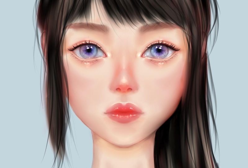
4. Face proportions: First we'll discuss the
proportions of the face. We'll start with a
brief explanation, not going into too much detail. As many know, the head
is typically round. An important line is the vertical Cymmertical
line of the face. This will be the eyebrow line
followed by the hair line, then the nose, and
finally the chin. These three sections
will be of equal size. Additionally, the position
of the ears will be approximately from
the eyebrow line to the tip of the nose. The position of the eyes will be slightly below
the eyebrow line. The eyes and the
size of the eyes, as well as the distance between the eyes will be equal
to the size of one eye. The nose will be equal
to this space as well. Then comes the mouth, the width of which will be similar to the width
of the pupils. These are the rough
proportions of the human face. But for a semi realistic style, there might be
adjustments such as reducing or increasing the
size in certain areas. For instance, the eyes might be position lower
and made larger. The nose might be narrowed and the mouth
and face size reduced. For those worried
about drawing lines inaccurately or seeking
additional guidance, we can opt for tools like a two degree adjusting
the size as needed. We will find the vertical
symmertical line, then the eyebrow line, the nose and the chin, and the hair line the
eye line follows. The drafting method varies
from person to person. Some might be similarly drawing
a T shape for the pace, while others prefer
using circle. After learning Basic, you can choose any drafting
method you prefer. Some might sketch free hand, as it can save
time for phases at certain angles since they
are not too complex. However, if you are still not confident
with the proportions, it is recommended to
use the Loomis method. Start by drawing a circle, then draw the symmergical line. Mark the positions
of the eyebrow line, airline, nose and chin,
ensuring eco distances. Then draw the
outline of the face, curving slightly at the
shin below the nose. Mark the position of the ears, even though the cause may
focus on semi realistic work, is essential to learn the
correct proportions first. Next is the skull, which does not
start from the ear, but from behind the ear
ending at the back like this. And the neck will
be cylindrical, and then any excess part to reveal the rough proportions
of the human face. Next, we'll cover the
side view of the face. We will start with a
circle. As before, assuming the face is
turned in this direction, the vertical exits line
will be on this side. Then we'll have the eyebrow, nose and hair line. The ear will be
located about here. After that, draw a line from the eyebrow
down to the shin. And also from the end
of the ear to the next. Draw the eye line and the mouth. With this, we will have a
45 degrees side of the face for a full 90
degrees side wheel. Start with a circle again. The vertical line
will be completely on the side with the eyebrow
lined in the middle. Followed by the nose line, the chin, and the hair line. Draw another line in the middle
of the circle as a cross. The position behind
the cross will be where the ear is located. If you are still a beginner, it's recommended to
start with a method of using circle and
symmetrical line first. It may seem complicated, but it greatly adds in drafting phases from
challenging angles. Next, we'll demonstrate drawing using a photograph as a guide. You can download the image
from the provided link. Once downloaded, insert
the photo to your canvas, then reduce the opacity so we can clearly see
our drawing layer. We start with a circle. As usual, the face in this
picture is slightly tilted. The central line of the face will be slightly
slanted like this. The eyebrow line will have a slight curve following
the plan of the circle. Then comes the nose shin, the hairline followed by
the position of the ear, eyes and the rest of the face. The face is the same. Draw down past the nose a bit and then curve
into the shin. Next will be the
cylindrical neck, and the skull will be
start from behind the ear. Let's look at another example, but this time we
won't be tracing. We will place it
next to our drawing, Like this, practice a lot using this method
so you can improve and become faster
with fewer mistakes. You can try practicing
with this image file. Try to place the nose
hair line and neck. Just play around
with it. And we'll meet again in the next video.
5. Adjusting proportion: In this video, I'll be demonstrating the
process of transforming the proportions of a sketch from a realistic style to
a semi realistic one. The semi realistic approach is relatively popular in the
digital art community, especially for creating illustrations
suitable for gaming. Generally in the semi
realistic style, features such as
larger eye size, a greater distance from
the eye to eyebrows, a relatively small
and short nose, small lips, and a pettaial
structure are common. Additionally, the head tends
to be slightly larger. Now time to explore the
step to transition from the typical proportions to the same realistic proportions. Let's take a look at
these three images. They all appear similar and we're going to
make some adjustments. For instance, in this one we'll selectively
refine certain areas. We will lower the eye area, slightly elevate the nose
and then raise the mouth. Following that, we will control the phase to
make it appear smaller. In simple terms, we are
tuning the facial feature akin to popular influences
on social media. This next image will
follow a similar process, but with a heightened
level of exaggeration. Now we will continue
by sketching in more detail using
these facial features. The method of sketching may vary depending on individual
preferences and skills. For those who are
not very precise, it's advised to focus on marking the eye socket and then
moved onto the nose. It often has a droplet shape followed by a horizontally
oriented mouth. Now let's add more detail by roughly sketching
the upper eyelid. The upper eyelid tends
to have a distant curve, while the lower eyelid
is usually less curve. Next outline the
eyebrow structure, followed by the nose and mouth. Moving on to the side view. Starting from the left nost. Everyone can try replicating what we've learned and start
sketching in more detail. Next we'll depict
a sight profile, turning the face at
a 90 degree angles. The same method
applies to adjust the facial structure involving
the position of the mouth, nose, eyes as desired to draw the side view. Let's begin with the forehead, then the area between
the eyebrows and down to the eyes curve inward. The nose bridge is where the nose curving in again
just before the upper lip. Generally the lower lip inward
more than the upper lip. Below the lower lip
curve in slightly again. The shin protrudes once more before reaching
the jaw line. The area around the eye socket
is situated in this part. The nose area tends
to ptude the nose. The part below the nose forms a structure resembling stairs. Feel free to practice and
add your own details. If you have any questions, don't hesitate to ask.
6. Detailed sketching: In this video, we will proceed with sketching
in more detail, building upon the mark
position for the eyes, ears, nose, and mouth. We will begin with a
circle like before, followed by a vertical line to determine the direction
of the face is turning. Then we'll add lines for
the eyes and eyebrows, the nose line, the jaw line, and finally the hair line. Next we'll sketch the position
of the facial features. Next step is to reduce the opacity of this layer and
create a new layer on top. We then start drawing the eye socket followed by a rough outline
of the eyebrows. After that, we will
outline the nose, followed by the rises, moving onto the mouth
area, outline the lip, and then proceed to
the other areas like the facial structure and neck. Finally, we will add a
rough sketch of the hair. Once you have this rough sketch, you can close the
lower sketch layer. If you feel unsatisfied, you can use the liquefied tool, choose the push mode, and gradually adjust the
areas you find satisfactory. Now the details sketch
for this image looks better for this image, try sketching it yourself
using the techniques. If you have any questions, feel free to comment and ask.
7. Eyes structure and sketching: Hello, In this video, we'll explore the
structure of the eye. First we have the white part, which is the eyeball,
Then we have tear. Next there is a upper eyelid and below it is
the lower eyelid. Then we have the iris. The dog park in the
center is the pupil. It's very important
to remember that the eyeball is not in the
exact center of the eye, but its position
slightly higher. When you open our eyes, the upper eyelid comes down to cover about 1 ft of the iris. The inner corner of the eye is usually lower than
the outer corner. Let's move on to sketching. We'll start by
drawing a circle for the eyeball and a smaller
circle for the Eris. We will roughly
outline the eyebrows, then determine the
length of the eye and mark the positions of the upper and the lower eyelids. Normally, the inner corner of the eye is slightly lower
than the outer corner. Next, we'll draw both
upper and lower eyelids parallel to the circular
shape of the eyeball. Since they consist of skin, we need to add some
thickness to them to make our drawing
more three dimensional. The thickness of the lower
eyelid is quite visible, while the thickness of the upper eyelid is
usually less apparent. You can, however,
notice the thickness of the upper eyelid from the
shadow it cats on the eyeball. After that, we'll get some people in the
center of the iris. Next, let's cover the
elges in more detail. When you look at the image, you'll notice that the eyellages extend outward
along these lines. This is why observing real
life references is so important because we can directly apply what
we see in our work. Using references is crucial when it comes to the overall
creative process. With this knowledge in mind, let's get the eye laches roughly according to
the reference material. Moving on to the eyebrows. We will first learn about how the eyebrow alignments work. At the beginning of the eyebrow, the lines will be vertical. As we move along, we'll angle them toward
the end of the eyebrow. In the middle of the eyebrow, there will be hairs
that grow from the top aligned downwards
towards the end. Let's continue sketching. Based on this information, we should have something
that looks like this, after which we can
erase any excess. This sketch will be
similar to the first one. Try to focus on understanding these principles as you
sketch and practice. Let's have a look at the
eyes from the side view. Let's assume this is
a side facing face. The position of the eye
will be approximately here. Drawing the eye from this angle will result in this
triangular shape. Then we'll add the eyelid, the eyelashes, and
finally the eyebrows. The upper eyelids
eyelashes will point upwards and may have a
slight downward angle, while the lower eyelids
eyelashes will point downwards. With these ads, we should
have a side facing eye. A tip for drawing
allergies is to start with one line and then add more
lines to create a cluster. It should look
something like this, with multiple clusters
of two or three lines. Try not to make them to, even as this will
make it look unusual. When starting any work, make sure to create a new layer. As for sketching the eye, we will begin by roughly sketching a circular
shape for the eyeball. Then we will proceed
to the part of the iris defining its approximate length. Next door lined, following
the curve of the eyeball. In this part, we'll define
the upper and lower eyelids. Since these steps are part
of the sketching process, you don't have to worry too
much about the details. Finally, let's draw the eyelashes
and complete this part. In this photo, the
head of the model is turned at roughly
a 45 degree angle. The face is tilted
slightly to the left. The models gaze will be
directed toward the camera. We need to draw the iris
to face it as well. Continuing as
before, we will draw the upper and lower eyelids along the curvature
of the eyeball. As mentioned
earlier, the eyelids represent the skin
which has thickness. So we'll add some to make the drawing look more
complete and realistic. If you look closely,
you'll notice that the left eye appears more
narrow than the right one. This is due to the
curvature of the face. The more the face turns away
from the point of view, the less of it we see. Furthermore, when the
face turned to the side, the lower eyelid is deeper and closer to the eye compared
to the upper eyelid. Studying human anatomy
shows the position of the eyeball is not in the
center of the eye is higher. This is why the
lower eyelid appears deeper or more inward
than the upper eyelid. For the eyebrows in this photo, they are relatively
thick and you can slightly see the
individual hairs. Based on what we have already learned about how the
eyebrows are lined, you'll be able to figure
out how to draw them. Moving on to the eyelashes, they follow the curvature
of the eyeball. In the next image, our model is facing straight, but her gaze is to the side. In this photo, you can see that the upper eyelid area where it meets the iris is
the widest part. This is because the shape of the iris is not flat against. The eyeball is protruded
and like a contact lens, depending on where the
iris is positioned, it pushes the eyelid to
making it appear wider. As for the last image, is a large forward facing eye looking
directly at the camera. The trick in drawing an
eye looking straight ahead is to move the irises
slightly toward each other. This make the eye
seems like they are looking directly
at the camera. Sometimes it might look
like the eyes are crossing. But you can adjust this
letter when adding detail. For now, the main
goal is to make the eye appear to be looking
directly at the viewer that's set for this video. If you have any questions, feel free to ask in a comment. In the next video, we'll be
adding color to the eyes and make the eyebrows in a semi realistic
style. See you there.
8. Eyes coloring: In this video, I'll explain the process of applying
color to the eyes. We'll start by separating the line layers using
the selection tool. After that, copy and
paste the selected part, and you'll see that it has
become another separate layer. Move the line layer to
the top and then we'll create a new layer under need
it for the best skin color. Use the selection tool to select the area that
we are going to paint, Choose the color, and drag it to the best skin area
for the skin color, I recommend using a
slightly desaturated color. If the color is too bright, you can always reduce the brightness by
using the curve tool. First, select the color for
the eyes, for the white part. Some people might immediately
go for pure white, but I recommend a soft, pale, bluish gray color instead. This makes for a
more natural look compared to pure white. As for the black
part of the ice, you can choose any
color you like as long as it's melted
non bright color. Next, we will create a new
layer above the skin layer and change the blending mode to multiply before darkening
the desired area. To select the skin color, simply hold your finger, which will sample the color. Then apply it. For those who are unsure about
how to apply shadow, I recommend just following
my step for now. Next, we'll use the blur
tool to smooth the color. If you're curious
about the brush I've been using
up to this point, it's simply this one. Once you are satisfied, go to the line layer and
gently use the blur. Don't worry too much
about the lines because you'll need to
add details again later. Now, create a new layer at the very top and change the
blending mode to multiply, select the color from
the shadow area. And use it to draw the O and the eye lashes to
give it a defined look. Here we color the under
eye area, then the iris. And finally, we'll
draw the eyelashes. Once you have this result, click on the layer and
you'll see these options. Select Merge, so the eyes are combined into
a single layer. Use the blur tool to gently
smooth it out once more. After that, we will create a new layer and change the
blending mode to overlay, select a red tone and
apply it to the eye area. The reason for using red tone is because it's the
color of blood. Applying this tone will make the drawing
appear more lifelike. Once you are satisfied, merge the layers again and
retain some more details. You may wonder why I create so many layers and then
merge them over and over. It's because I prefer working few layers and merging them. Often it makes for a more
straightforward workflow. When I want to add
something new, I create a new layer
and draw on it. If I don't like the result, I can simply delete it. If I do like it, I merge the layer like
this and continue. Yes, the middle of the eye will have a soft color and is a point
where it protrudes. This will make it catch more
light and appear lighter. Then choose a variety
of bright colors and apply them to the irises to make them look
more interesting. Let's work a bit on the details You can draw the eyes
however you like, just remain observant
and practice drawing regularly to
continue improving. Once satisfy, merge
the layers again above the rises, they should have a shimmering
quality like glass. Observing this feature from
a picture of a glass bead, so you can apply
its to your work. Now let's move on
to the highlight. Choose a very light
color, almost white, and apply to the upper eyelid, lower eyelid, the
eye area and irises. This will give you a
beautiful eye that looks striking and have
dimension to them. Next. It's more of a personal technique
that I like to use. Whether you follow it
or not, it's up to you. I use the curve tool
to reduce the contrast of the image to make
it appears vivid. This is purely a
personal preference. If it's not your thing, feel free to live
things as they are. That's roughly how you
can color the eyes. If you have any questions, feel free to ask me. I encourage you to practice regularly and
showcase your work. If you desire feedback
on your work, always feel free to ask, see you in the next one.
9. Nose sketching and coloring: This video will
focus on the nose. The nose is positioned at
the center of both eyes. Here we can see the
breach of the nose. Here is the tip. Those
two are the nose straws. There won't be any detail around the nose
because we follow a semi realistic style which doesn't emphasize
details too much. What we'll focus on is adding shading here to
create the breach of the nose over here to make the nose stand
out from the face. Then we'll add some highlights in this area to
create dimension, we will start by sketching
and coloring the nose, which begins in the
center between the eyes. I personally like to
shape it like this, similar to a drop of water. I use this shape
because it aligns well with the curve in
the horizontal section of the nose and resembles the tip of the nose as seen
in the referent image. This area represents the bridge of the nose with
the tip below that. Then you have the nostrils, as I mentioned earlier, when it comes to the nose, it's in the semi
realistic style. It doesn't require an
excessive amount of detail. However, shading can still be used to create the bridge of the nose and to make the nose appear as a prominent
feature of the face. Adding highlights in the right
places can add the mention for a specific example. Let's look at the nose that
is slightly turned upward. You can start with
a similar approach, beginning with a shape
like a water droplet. You'll notice that the curve in the horizontal
section of the nose follows the shape of the tip of the nose as seen in the
reference material. Next, let's consider
a profile wheel, where the face is
turned to the left. In this case, the central line of the face will also
turn to the left. Start with the same sketch using the drop shape for
the tip of the nose. The horizontal
section of the nose will be similar to the
previous examples. However, this time
the vertical line will represent the
breach of the nose. Erase the axis. Then you'll have the nose that appear
turned to the side. Let's continue with
the coloring process. Start with the
drop shape sketch. You can proceed to color the
nose and add depth to it. First, separate the line
layer from the others. After that, create a new layer and place it underneath
the line layer. Use the selection tool to choose the area to
apply the best color, and then drag the
color into that area. If needed, you can
always adjust the color. Take advantage of the
flexibility of digital art. Once we have the best
color as desired, we will proceed to select a reddish orange color and apply it to the breach
and the tip of the nose. As I explained, using a reddish orange color help make the artwork look
natural and lifelike, since it resembles
the color of blood. After achieving the desired
effect with the best color, we will blend it and
create a new layer, set it to multiply. We then apply the color to the shaded areas to
add more dimension. And adjust the intensity of the nose tip to ensure it
look more three dimensional. The sides of the nose are made slightly darker to make
it appear more prominent. After achieving the
desired effect, we will blend the
colors once again. Subsequently, create a
new layer and choose a dark red color to add
depth to the nostrils. This will enhance the overall three
dimensionality of the nose. Finally, add the
highlights to the nose, particularly in the
area of the bridge, as shown in the image. I realized that the nose may
appear a bit too realistic, so I decided to use the liquefy tool to
slightly reduce the size. Next, let's learn
how to tackle a nose that is turned at
a 45 degree angle. We will create a new
layer underneath the line layer and
apply the beds color. Then use an orange or red color to add a touch of
blood circulation. Proceed to add color in
the areas with shading, like the bridge and the
underneath the nose. After achieving
the desired look, blend the colors using the blue tool and
refine the details. To finish up, you can
apply highlights by selecting a light color and add a high light
effect to the nose. These steps should
help you create a nose with dimensions and
depth in your artwork. If you have any more
questions or if there's anything else
I can assist you with. Always feel free to ask.
10. Lips sketching and coloring: Next we will proceed
to draw the lips. The upper lip is composed
of three fatty lamps, while the lower lip
consists of two. The darkest part of the
lip will be on this area. With this, we have a rough
outline of the lip structure. Let's have a closer look at
this particular set of lips. In this image, it appears as if you can't see the central, but is there just less visible? This is the first
and this is the second and the third
fats for the upper lip. Time to move on to the process
of sketching the lips, you can download the file
from the provided link. First we'll draw a
horizontal curve like this. Then a straight line which forms the separate point between
the upper and lower lip, and then the lower lip
that you're all set for. Sketching the lips with this next image, we will use the same
approach as before. It's done nice and
straightforward, isn't it? What's crucial here is that you practice regularly as practice, who makes you improve
your drawing skills? Next, let's move on to coloring. First, we'll separate
the sketch layer, then just like before, create a new layer and place
it below the sketch layer. Use the selection tool to select the area where you
wanted to apply color. Now, choose the
color for the lips. It can be red, pink, or any color you prefer. Fill in the selected area
with your shoes and color. Then select a light gray color and apply it to the
area of the teeth. After that, we will
use a blur tool to blend the colors together
to make them harmonize. With that done, choose a
slightly darker right and apply it to the inner and the outer parts of the
lip to create dimension. Use the blending tool to
adjust it to your liking. Create a new layer and change the blending
mode to multiply, then apply to the
inner part of the lip. My coloring process
involves adding dark colors and blending
them gradually satisfy. Now let's blow the lines and when you are satisfied,
merge the layer. Create a new layer set to multiply and pant in
the darkest areas. Now let's address the issue of the lip not
looking very vibrant. We'll create a new layer, set it to overlay and paint
it with the bright color. This will make the
lip look more lively. Next, we'll enhance
the lip details by selecting a color tone, and painting along
the lip edges. The following step is one
I particularly enjoy. I will choose a very light
color for the highlighting slowly along the convex area to achieve the nice glossy lips. I still prefer less
vibrant colors, so I'll merge all
the layer again and adjust the curve setting
for a more subtle look. Now let's take a look
at one more example. As before, create a best color
beneath the sketch layer. She like the lip color blended? Chose a darker color
for the inner lip. And then carefully
blend the lines, refine the details
on the dark areas, and then at the highlights P Don't forget to practice a lot. And if you have any
questions or need feedback, feel free to let me know. See you in the next video. Bye.
11. Ears sketching and coloring: For the ears, their position
is on the sides of the head. About as long as the nose. The ear has a complex
structure with concave and convex form and
some overlapping parts. However, we won't delve into
the anatomical details. We'll focus on the
overall shape. Let's assume this is the face. We'll start by
sketching the elope, which is attached to the face. Then we'll outline the part of the ear that curve
parallel to the lope. Pay attention to how different
parts of the ear might protute or receive to make your drawing look
more realistic. The coloring process for the ear is similar to
the previous steps. Begin with the best color
beneath the sketch layer and then a reddish orange
color for the shadows. Blend the line and refine the details in the area
where light and shadow meet. Drawing the ear doesn't
have to be complicated since this course focus on
a semi realistic style. But if you have any questions, always feel free to ask.
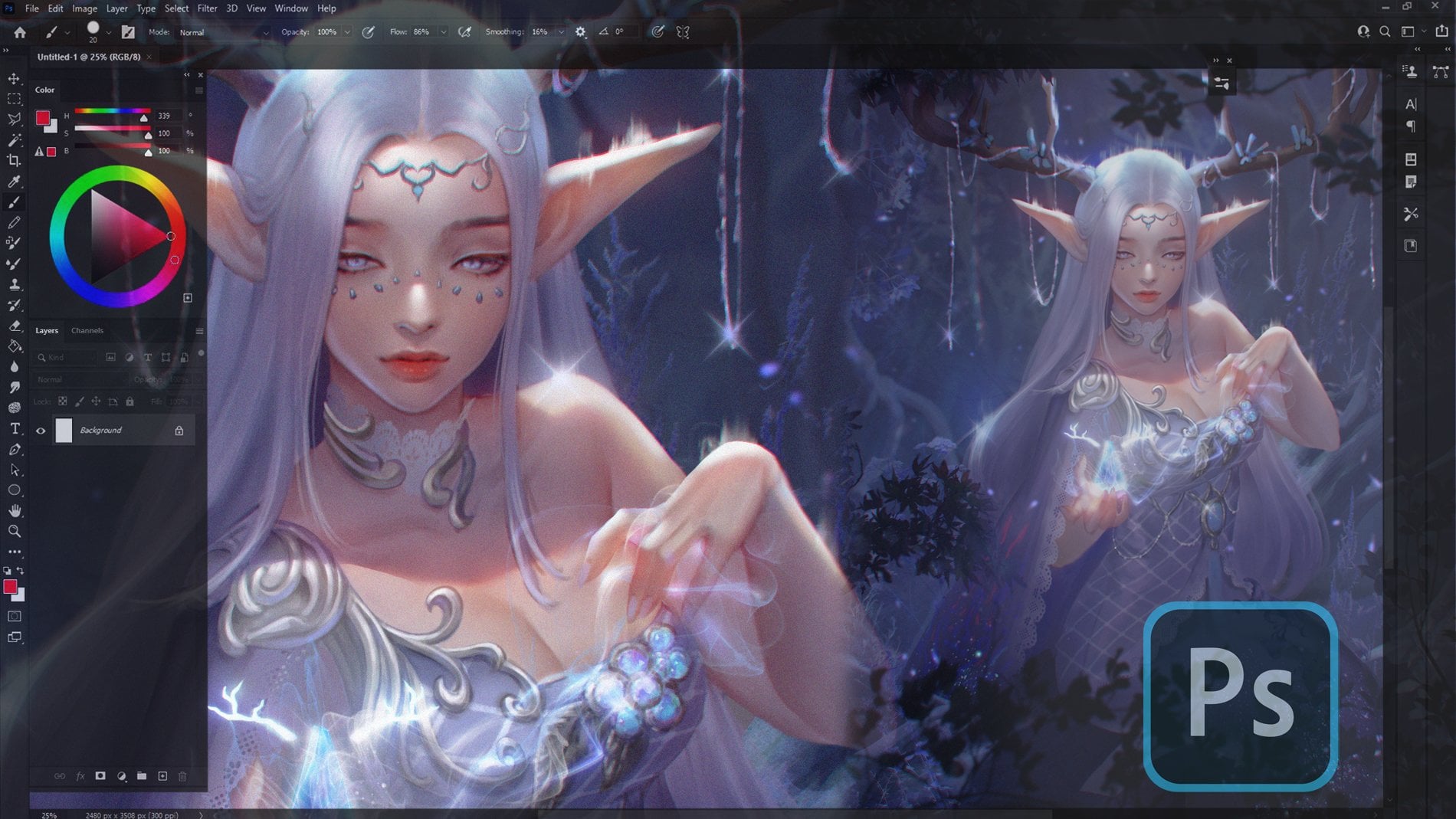
12. Face plane: In this video, we will proceed to add color
to the facial plants. Since this image
depicts a frontal face, we will utilize the
symmetry feature as usual. Set the color layer
beneath the line layer. Then we'll block off the edges
and drop the skin color. I will make a slight adjustment as the colors seems
to be too vibrant. Next, you'll see like a
darker color To add shadows, focusing on areas
like the eye socket, eyebrows, nose bridge,
and the tip of the nose. For those unsure about
where to apply shadows, you can follow along with me after shading will
smartly applied shadows. Once satisfied, merge the
layer and create any one. Adjust the blending
mode to overlay and use an orange color to apply high lights to the
area like the eyelids, nose, cheeks, and lips, as well as the ears,
creating another layer. And the blending
mode is optional. If you want to increase
the brightness, you can use overlay. Or if you wish to add shadows, you can use multiply. Once you have achieftd, this create a new
layer and choose a bright color to apply
highlights to the bright areas. This includes the upper
and lower eyelid sections, the breach and the
tip of the nose. The inner side of the eyes and the cull also highlight the bottom corner of
the mold and the, this is a rough approximation of the facial plant in a
semi realistic style. Feel free to practice
and experiment with it. If you have any questions, don't hesitate to ask and
see you in the next video.
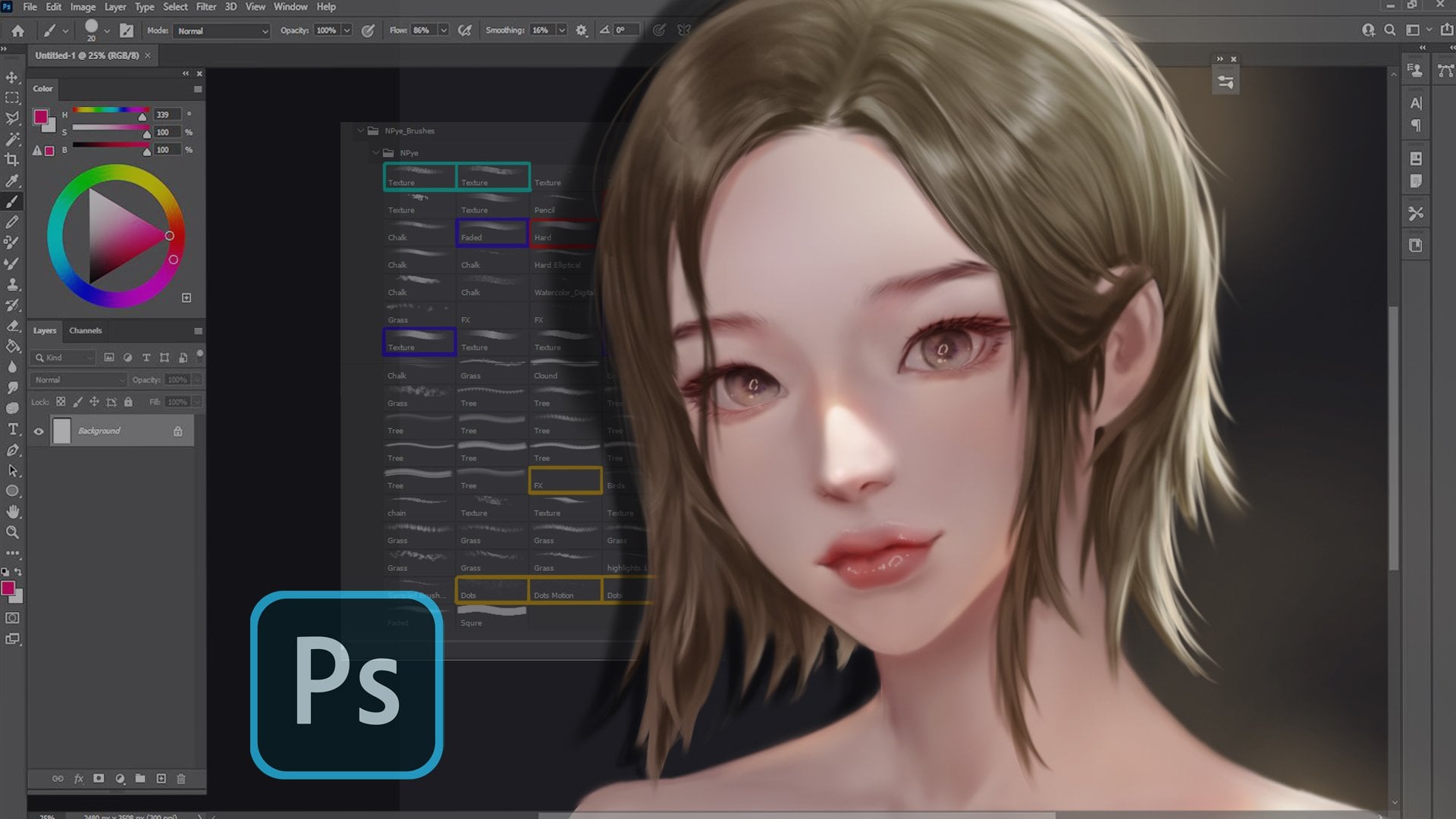
13. Hair structure: In this video, we'll
discuss how to draw hair. First, we'll divide the
hair into three parts. The front, the middle, and the back sections. The front part of the
hair is the part that covers the forehead or
falls in front of the ears. The middle section
extends from the ear, while back section includes
the rest of the hair. Let's try sketching it. Start with the front
part of the hair, outline it roughly,
then move on to the middle part and follow
it up with the back part. Here we have another example. Start with the front
part of the hair, sketch it roughly, and continue
with the middle section. Since you can't see the
back part in this image, we'll just focus on
these two parts. Next let's look at
how to sketch here. I recommend starting from the outer structure and
working your way in. Then add more detail
to refine it. Enhance the detail
of the front part of the hair and add more
intecracies to the inner part. In this way, you will have a rough representation
of the hair. Next, I'll show you how to sketch more flowing
and beautiful hair. If the hair is long
and look flowing, I recommend not drawing
it too rigidly. Instead, try to follow a more natural flow is
being blown by the wind. This will give it a more
dynamic, lifelike appearance. Let's take a look
at two examples. The first one is
drawing the hair in a stand out way
with normal details. The second is more
detailed and gives the hair a beautiful
and intricate flow. It may have some
layers and adding some strains or
wisp will make it look even more natural.
Give it a try. It might be challenging at first as making hair look
beautiful can be difficult. But as you practice, you'll get better and more
comfortable. Give it up.
14. Hair sketching: This is my Pinterest, where I serve images
as examples including a variety of hairstyle
and facial expressions. Feel free to shake it out
using the provided link. Once you have
chosen a hairstyle, let's start by
sketching the face. Because you are an
excellent student, you remember the
basic principles of facial sketching we've
seen so far, right? Okay, now that we have the face, let's import the
selected hairstyle. Go to this and choose Reference. Then click Import. Then we can begin
sketching the hair. Starting with the banks. Remember to divide the
hair into three parts, front, middle, and back. Start with a rough outline
before adding details. Once you have a rough sketch, you can refine it by
adding more details. Now we'll work on the bread. We shall have a left or
right overlapping pattern. Next we'll start working
on the line art. We'll reduce the
opacity of this layer, creating a new layer on top. And resize the brush
to make it smaller. Then start drawing the
line based on the sketch in areas where the
hair overlaps. I would recommend drawing darker lines for a
more aesthetic look. You can visit my pins for more hairstyle inspiration
using the provided link. Here we have sketched
the line of the hair. In the next video, we'll move on to coloring. See you there.
15. Hair coloring: In this video, we'll
discuss how to color hair. To begin, we'll
start with creating a new layer underneath the
line layer for the best color. Next, we'll outline
the edges of the hair, then applies the best color. If you feel that the
color looks too vibrant, you can always adjust it using the hue saturation
settings or curve tool. Now let's create a new layer
above the base hair layer. And change the blending
mot to multiply, select a color and apply
it in the shadow areas. This color will define
the edges of the hair. To keep this color within the boundaries of
the base hair layer, you can use sleeping mask. Next, we will create
another layer on top and change
the blending mode. To screen, we will use this
layer to add highlights. You can follow the natural
curve of the hair and give it a slight curve based
on the shape of the head. You can also change the high
light color as desired. Now let's create a
new layer on top of the line layer and
apply a clipping mask. Adjust the color slightly and merge the line layer
with the new layer. Then adjust the blur
tool to blend the lines. This will give the hair
a more natural look. Merge the hair layers
to combine them. Create another new layer on top se a light pinkish orange color. And apply it to the area
adjacent to the skin. Then add some final details to the darkest part of the hair, including the tiny hair strands. This will add depth to the hair. Finally, select the hair color and start drawing fine lines around the edges of the hair, making it appear more
natural and less rigid. This will give the hair a more
flowing and dynamic look. This is a relatively
complex process. If you have any questions, feel free to ask. See
you in the next one.
16. Start the project 1: In this video, we are going
to start the project. But first I'm going
to make a new canvas. I will choose a square. Okay, now I'll import
the reference by going to reference here and
choose image import. I will use this one
as a reference. Because if we choose the
difficult angle right now, it will be difficult to focus on the workflow that we learned. For the brush, I
use pi and medium. Hot air brush size 3% and opacity 30% Pick
any color you like. Go to Drawing Guide 80. Drawing guide and symmetry. Okay, we'll start by
drawing a circle for the skull, something like this. And then the vertical line, something like this. And then the eyebrow line. Yeah. And then the nose,
the hair line. And then the chin is still remember the
proportions, right? And then the face, the position of the ear,
something like this. And Bill removes the axis, the nick, this is the rough outline. And then we'll go in more detail lowering the opacity and then create a
new layer on top. Dings, maybe you can
change the color. I, I suck it and not mouth. Now a little bit more
detail, further proportions. It's going to look
super ugly of course, but we can fix later structure of the eyebrow and knows and then and the contour. So this is what we
got. Looks super ugly. But don't worry, we adjust
the proportion like using. So I'll make the eyes bigger
and the nose smaller, and the lips a little bit
big, but not too big. And the small face for woman, a small neck is better
because if it's too big neck, it's going to look like a man. Okay, after this I will
start outlining the hair. Maybe we should t, of the drawings Ss, I feel like the
ears are too big, so I'm going to reduce the size. And then I'm going
to change the size. Make sure that the middle
line is in the center. Something like this. And now we are going
to reduce the opacity. And then new layer for
the details sketch. Still remember the
basic anatomy, right? The inner corner of the eye, usually lower than
the outer corner, not, not the lips keeps the nose might be a
little bit too big, so I'm going to use liquefy. Okay, then the face in this pick, I noticed
that the end of the ear, it's a lot higher than
the end of the nose. It happens because the face
is not completely straight, but it's down a little bit. So that's why the position of the ear is higher than usual. We're going to do
the same thing. This is the normal position, the usual position of the ear. And if the face tilted down, the position of the
ear will be higher. Also, if the face tilt up, the position of the
ear will be lower. Okay, now I'm going to talk off the rowing *** and start
working on the hair. It's going to be
challenging because we will do many things at
the same time like hair, eyes, lips, not
separate anymore. All right, now that we got this, I will close the lower layers and you can group it like
this for the back up. This is the sketch layer. The line art layer. What? I'm going to create a new layer and and they
need the line layer. We'll start using the best color you can use, any color you like. Okay? Okay. I'm going to
apply the color to the features of the
face, such as lips. Blue eyes and the eyeball we can do the nose and then
we're going to use the blue to same
medium heart airbrush. And the hair is black but I don't want to
use fully black yet, so I'm going to use Create
is something like that. You can see that the hair is outside of the
boundary of the skin. First I'm going to
talk of drawings, then I'm going to
use clipping mask. Now it's inside the area. All right, now that we got
to sketch the best layer, in the next video we will in more details.
So see you there.
17. Start the project 2: In this video we are going to continue the
coloring process. We can merge this down
and then I'm going to create a new
layer clipping mask. And then going to
pick the color, change the blending to multiply. Then don't forget to
use the drawing assist. Okay, now we are going to work on the
shadow areas here, here and then use the bull
tool to smooth them out. Okay, after this
we'll merch the layer again and then go
to the line layer. Drawing assist and
blur the line. Be patient merged layer again. And I'm going to create
a new layer again and change the bending mode
to multiply, drawing assist. And I will do the shedding
again one more time. I want to do the shedding
one more time because I feel like it's a
little bit too light now. I'm going to apply shadow
in the hair area as well. I'm going to change the
background color too. Okay. And then I'm going
to march the layer again. Will the excess these
lines because you, you don't want it to
appear in your artwork. I'm gonna use the enjoying as, okay? And now I'm going to
create a new layer, change it to multiply again, and then choose the color
like dark but not too dark. I don't forget to
use drawing assist.
18. Start the project 3: I think the nose is a
little bit too short. So I'm going to fix
the proportions a bit. Assist key and then going to create a
new layer again. And then change it
to over lay during creping mask and then shows the color that are going to
be What was his call again? Rush on. Rush on, yeah. And I okay, then blur out again. Key. Now I'm going to work on the S. What
I'm going to do is to create a layer and go to the drawing guide
and then edit Drawing Guide. In the option going
to show a radio, put it in the middle of the S, like this drawing assist
and start working. Okay, next I'm going to slide veer to the
left and then duplicate. Use the selection tool and
then move to the side. Okay, now we're going
to remove the axis. This is another way to draw
the irises March down again. I want to add more
shadow here again. So I'll change the planning. Moto multiply again
and then apply here. Next step I will
make the eyelashes. We're going to the
drawing guy again. And then edit drawing guy
because it was like this, but we want the vertical click, choose the black color
for the eyelashes. And very small brush drawing as and then lighter color
for the lower eyelashes. And then we'll use
the blood tool again, smoothed out the sharp areas. Now it is high light
time, merged the layer, create a new layer
and drawing as, change the blending to at. And then this ya, no and a cupito and highlight for the hair, that curve along the skull merged out again. And then we'll work on the
overall detail again. Okay, The last step I will create another layer
and change the brush. Okay, I will work with the tree, it's done. If you
have any questions, feel free to let me know. And don't forget
to practice a lot. What I wanted to tell you
is that don't give up. Just give yourself some
time and keep practicing. Start with this easy
angle like this, and then when you're
comfortable with the workflow, you can start working on more difficult or more
complicated angles. So yeah, that's it
for this course. Thank you very much for joining
me again and see you in the next course
maybe. Okay, bye bye.
 Ariya Abeen, NPye