Transcripts
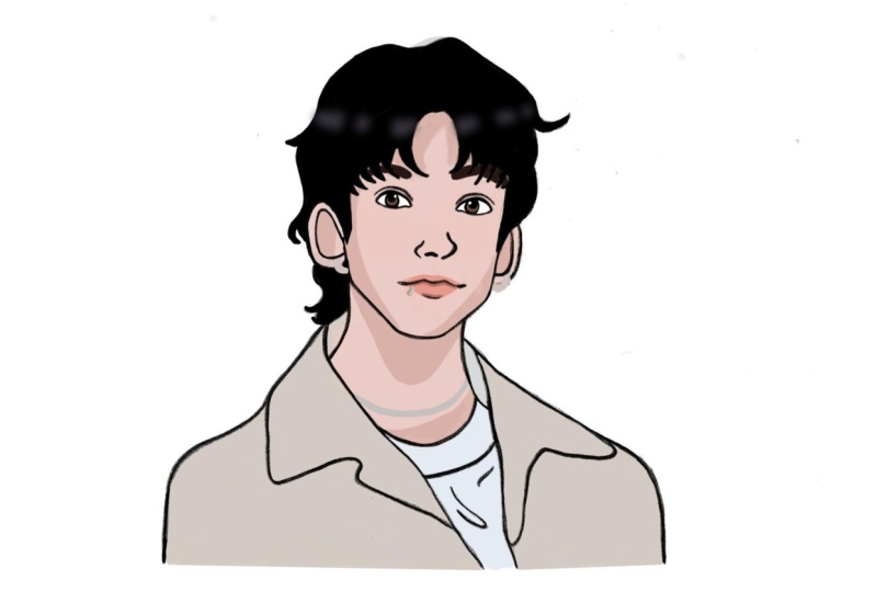
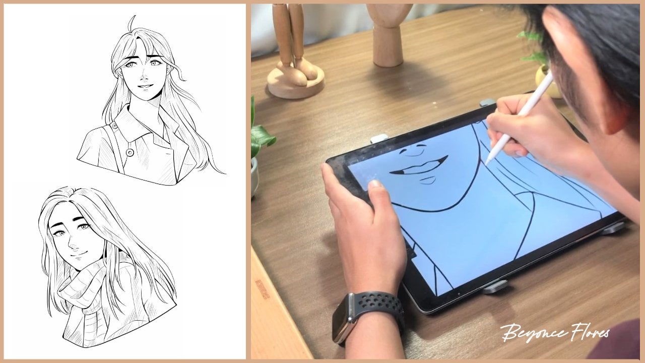
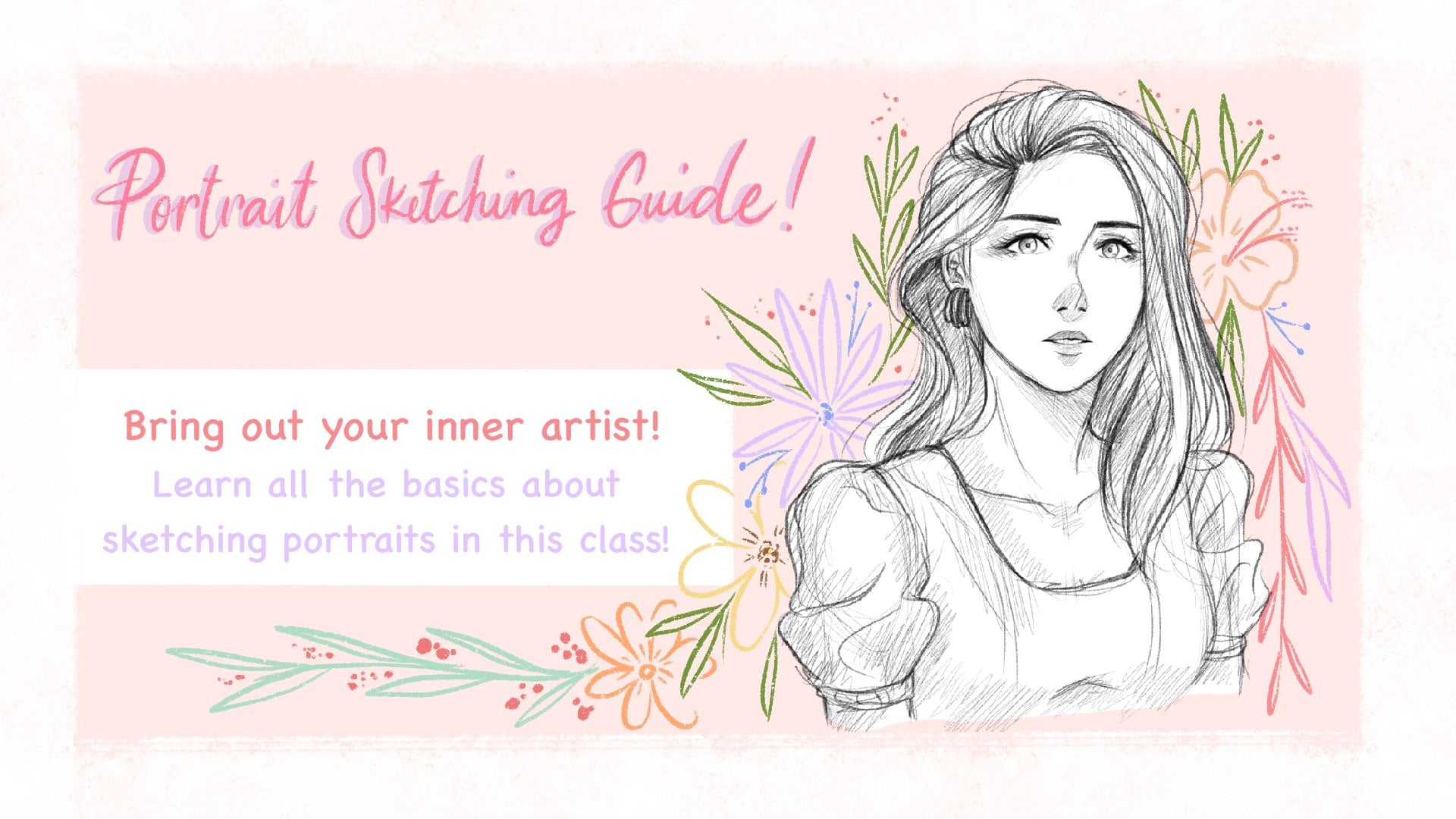
1. Introduction : Drawing male characters can definitely be challenging
when starting out. So let's dive deeper into that. Hi, I'm Beyonce Flores,
a digital artist, and in this class, let's talk about creating male characters. When I first started out, I found it quite a challenge
to draw a male portrait. It was difficult for me to
capture the masculine look when I was only really used to drawing soft, feminine features. But with the right tips
and a lot of practice, my male characters soon became eye catching
and attractive. If you find yourself having trouble with drawing
male characters as well, this class is perfect for you. So let's do a quick overview. We'll study about references and how we can take
inspiration from them. Then after breaking
down the reference, we'll start sketching coloring. And by the end, you'll have made your own stylized portrait. Enough of the weight,
and let's get started.
2. Getting Started: Firstly, we're going to
need drawing equipment. I'll be using the ipad Pro and Apple Pencil with an
app called Procreate. Throughout this
class, we'll be using various brushes for sketching,
coloring, et cetera. I've listed down
some of the brushes I used and I recommend
for each lesson. Now you can use any canvas size, but the canvas size that
I'll be using is 3,000 by 3,000 This ensures a nice overall quality
for the artwork. Now once everything
is set and ready, let's head over to
the next lesson.
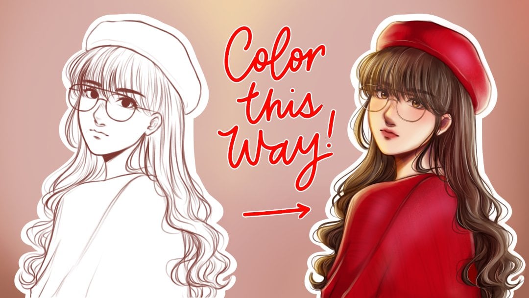
3. Studying the Reference: A good artwork almost always
has a reference behind it. A good use of
reference equals to a good foundation
for each artwork. When we say taking
inspiration on a reference, it doesn't mean to draw
every single detail, but to get the
essence and simplify. This is what makes
our drawing unique. Take the reference we have here and how I took
inspiration from it. It's not exactly the
same and you can see how my style has been
incorporated to the portrait. You'd first want to
simplify the shapes first, then add the details later. We have here this nice
reference starting off with the basic shapes around circle
with the main guidelines. Then at the bottom of
the main guideline, I'm marking out the
chin placement. And then extending
the cheeks and jaw just between the
eye and the upper lip. I'm putting down the
placements for the ears. I'm then shaping
out the eyes and the eyebrows before extending
the neck downwards. I'm adding details
to the collar bone, then extending to the
shoulders, then cutting it off. I'm then outlining a basic shape for the nose and the lips. Afterwards, I'll be defining the eyes shape as
well as the eyebrows. Then I'll be outlining
with the blue shade, the coat and the
shirt for the hair. I lowered down the
opacity of our reference and I outlined the line
for our character. Then I draw the basic shape
and outline for the hair. After learning about
the references and drawing out
the basic shapes, let's move to the next lesson.
4. Sketching: Now after completing the rough sketch of
the basic shapes, let's now start with
the main outline. I start off with the facial
features like the eyes, eyebrows, the nose,
and the mouth, and then I move
towards to the face. I draw the neck, then
I draw the ears. Then I start outlining the hair. I draw all of the strands
of the hair going down, just like the direction the
guide arrow is pointing. I continue to draw those strands until I'm
satisfied with the look. I draw the sideburns, then I add the small
details like straight hair. I now move on to
outlining the coat and adding the
wrinkles in details. Then I draw his shirt. I'm now drawing the irises
and now adding details to it. Right here, I'm just
adding a little bit of finishing touches and I flip my canvas to check
for any mistakes. I noticed an off
proportioning on one eye, so I focused on fixing that, the canvas, and here's a look
of the before and after. Once you've finished
the main sketch, let's move to the next lesson to learn all about the coloring.
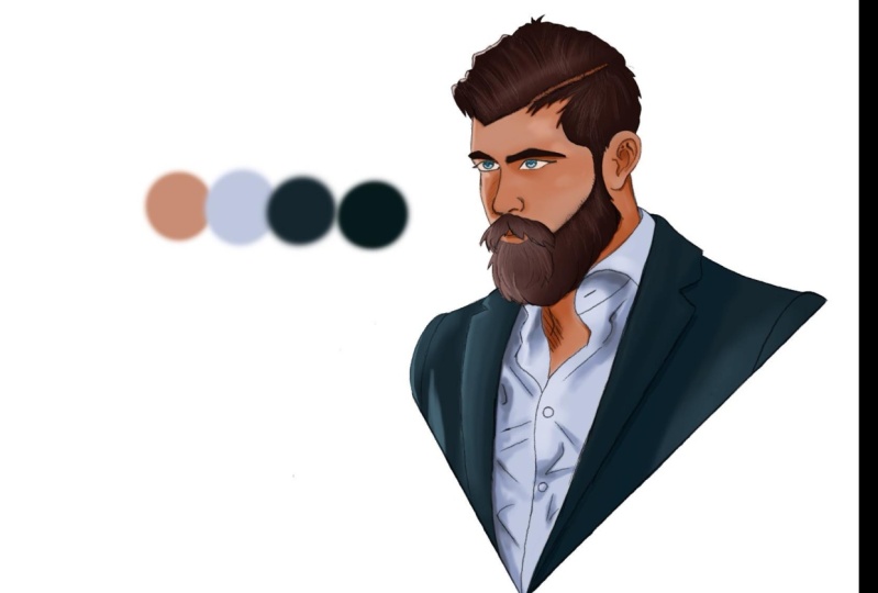
5. Adding the Colors: So now let's add a layer
beneath the sketch. And let's take the lasso
tool to outline our drawing. Once we've finished the outline, let's take a gray color
and color drop it. Now we have a base to
start coloring from. Right here is the color
palette that I'll be using. But feel free to use any of
the colors that you like. Note that these are only the
base colors and the colors will expand once we get to
the shadows and highlights. Next step is to
add a layer above the gray base and set
it to clipping mask. This way, whatever we
draw on that layer, it will not go past
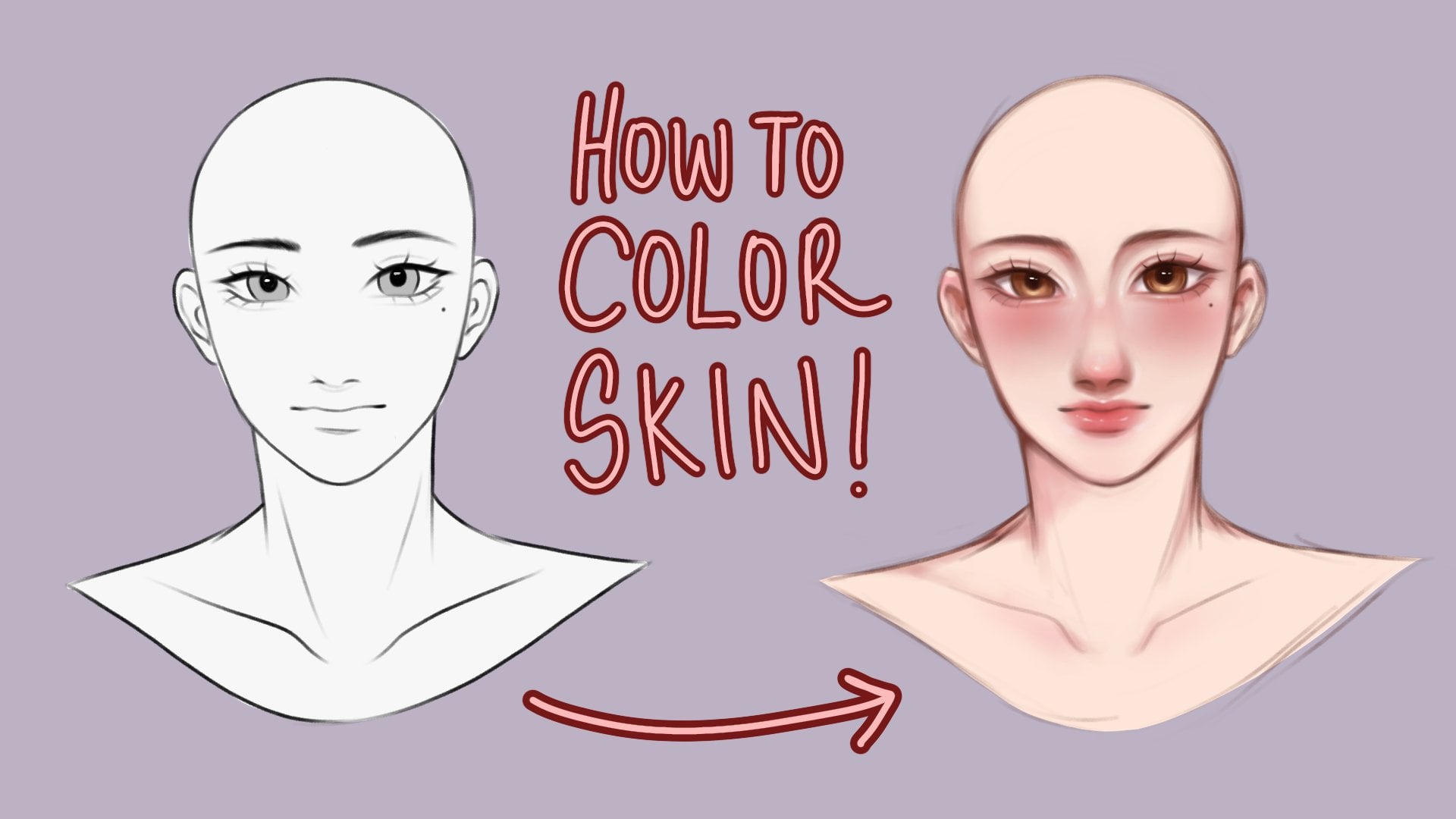
the base beneath it. Now I'm going to color
in the parts for the skin and it's okay to
go over the lines for now. Once I'm done, I'm setting
that layer to alpha lock, meaning I'll only be able to color within the color
that I filled in earlier. Then I'm taking a warm
and bright orange tone and a soft airbrush. And will air brush it
towards the cheek, the nose, and to the lips. Then I'm taking a darker
red orangish tone. And with the medium
hard airbrush, I'll be placing
the basic shadows based on our reference earlier. The main light source
comes from the right side, so our shadows will be placed on the left side
of our character's face. After placing the basic shadows, I'm taking a darker tone of the same color and
I'll be placing more detailed and
defined shadows for the lips. I'm taking the same blush color we used earlier and
turn it a little bit darker and take an airbrush and airbrush
it all over the lips. You can also see
me cleaning up and shaping the lips with
the original base color. Then I'm taking a
slightly darker shade to make the lips pop out more. I'm also taking a light yellow
shade and will color areas such as the inner eye corner to give our character a
little bit more dimension. Now I'm taking a really light
shade of red and orange, but not completely white
to fill in the eyes. I then took a brownish shade
and filled in the irises. I then shaded it with
a darker brown and added a little high light
with a lighter yellow color with the skin halfway done. Let's move to some other
parts of our drawing. I'm adding a new layer and setting it to
clipping mask as well. And we'll fill in the clothing. Keep in mind that each color is separated to
different layers. And all are ship into clipping mask right here. I've updated the color
palette and added new colors. And I'm also opening up our reference photo and
place it on the side. This way we have a guide to how we're going to
shade our clothing. Starting with the inner clothing I dropped from my
palette earlier, the similar color
from our reference, and start shading it right here. I'm constantly looking at my reference to give me the guide of how I'm
supposed to shade. After drawing the hard shadows, I start to soften
it up by color, dropping a slightly darker tone. Shading an art piece is really
a trust the process thing, so don't be afraid and
just keep on going. Now, basing off
from the reference, I'm coloring a large part on the right side
of our character, like the neck and the
right side of his face. I'm now taking a
darker brown red tone and adding a layer
and setting it the clipping mask
as well as multiply and will shade over the
left side of our character. Again, I keep looking at the
reference as I'm shading. After that, I open up the layers and set
the layer opacity to around 40 to 50% and that gives a nice natural
shadow look. Moving on to the jacket, I'm color dropping the darker
gray from our palette, and I'm shading it
as I'm looking into the reference for the
shadow placement. Now I'm color dropping
the lighter tone and adding it to the right side
of our characters jacket. Now for the hair, similar
to how I shaded the skin, I'm placing the basic shadows
first before placing. Later on the more
detailed shadows, I'm drawing more shadows on the left side of our
characters hair. As the light is coming
from the right side. I'm now taking a darker
brown and adding the fine and more
detailed shadows. Now I color drop the lighter shade and shade the right side of
our character's hair. I'm adding a little bit of
details here and there. And here's the final look. Right now, it still feels
like something's missing. We'll add some finishing
touches and the highlights.
6. Highlights & Finishing Touches : Now we're going to add
some finishing touches, as well as some
highlights so that our character won't look flat. I'll start by taking the sketch layer and setting
that layer to multiply, as well as alpha lock. I'm then taking a
middle shade of red and we'll airbrush it around the skin this way it lessens the strength of the
black from our sketch layer. I'm also shading some
parts of the hair. Next, we're going to
add a layer above the sketch and set
it to overlay. Now we're going to
take a vibrant orange, yellow tone and airbrush it at the right side
of our character. After that, I'm lowering
the opacity and now we have a soft
light effect look. Now I'm adding another
layer on top of that overlay layer and taking
a bright whitish color, I'll be adding some
highlight on the eyes, the lips, as well as
some strands of hair. I'm also color dropping
the brown from the hair. Then I'll be adding
more loose strands of hair to give it
a natural look. Now, open up your layers and
with the pinching motion, pinch all of the base
colors that we've made. This merges all of the
layers into one layer. Now go to the Want tool and open the hue saturation and
brightness section. Here I'm adjusting a bit
of the saturation as well as the brightness
to finish the piece off. Now that I'm happy
with the colors, I can call this a
finished portrait. Now it's your turn. Let's move to the
next lesson and talk all about our
class project.
7. Class Project: We've reached the
end of this class. I'm hoping you've learned a lot and we'll
continue to practice. For this class project, I'd like you to submit a
stylized male portrait. You can create your own
from scratch or you can use the sketch provided
in the resource section. I would also love
to hear from you, so if you could leave a
review about this class, I'd appreciate that a lot. Thank you for tuning in
with me in this class. I'll see you on the next one.
 Beyoncé Flores, Bring out your passion for art ✨