Transcripts
1. Introduction: If you look at an
artwork without color, it looks incomplete. Color gives life and
personality to an Art piece. It's also a way to express
yourself as an artist. Coloring may definitely
seem overwhelming at first, but once you understand the basics and
continue to practice, coloring may just become one of your favorite parts in drawing. Hi, I'm Beyonce Flores,
a digital artist. And here in this class,
I'll be teaching you how to color life
into your characters. So what are we going to
learn in this class anyway, questions such as,
Where do I start or Am I even doing this right,
are totally natural. That's why in this
class, I've broken down everything you need to
know into three parts, base Colors, Shading,
and Highlights. Understanding these three
points will help you have an easier time in
coloring your artworks. My goal in this class is to help you express
yourself through colors and inspire you to develop your own
style in coloring. Honestly, I can't wait to start. So enough talk and let's go
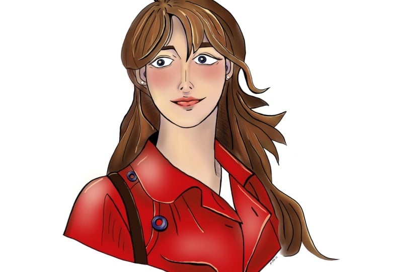
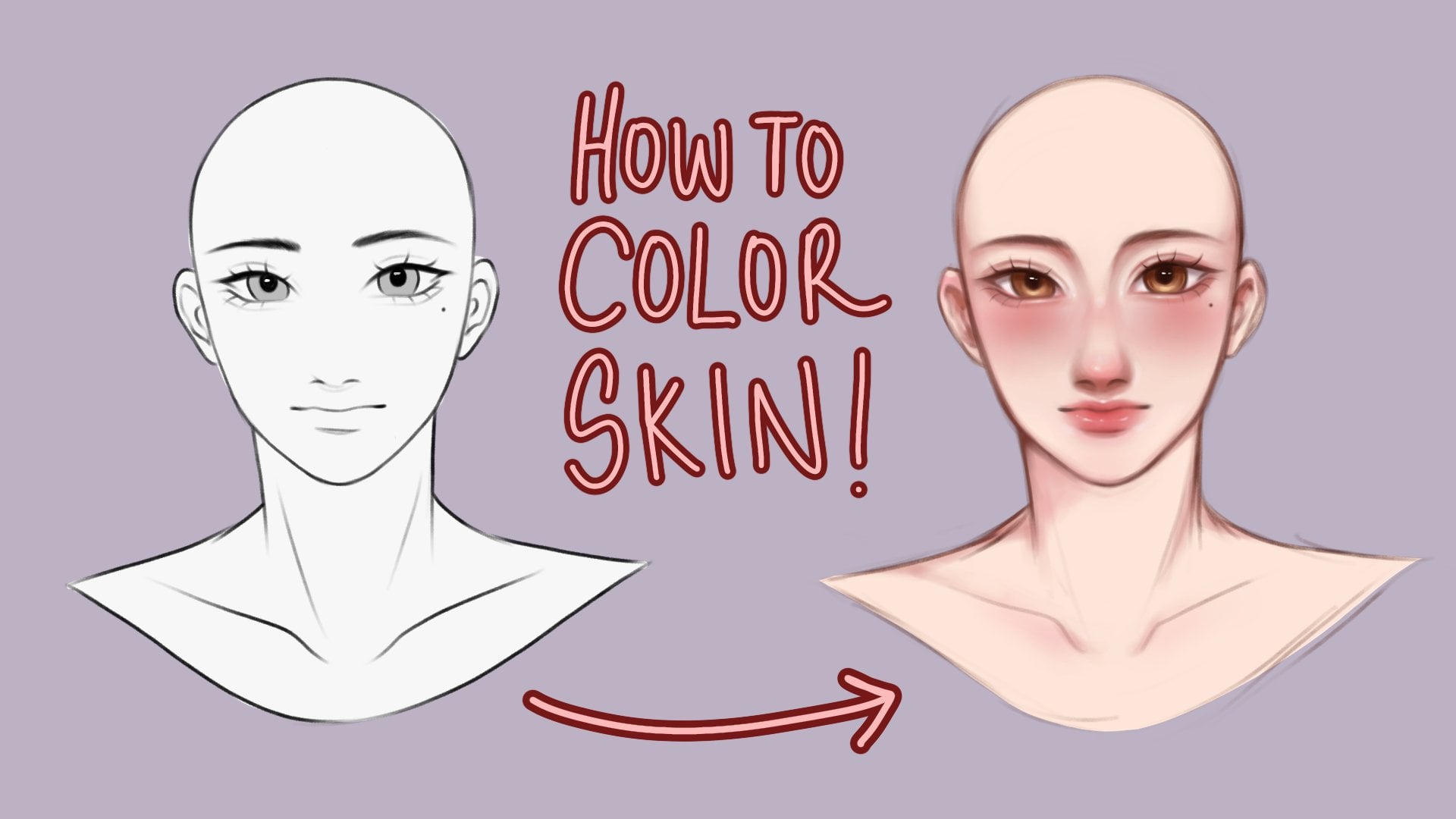
2. Importance of References: So right here is a
sketch that I drew beforehand with this
photo as a reference. So why are References important? You might ask,
References are always good when you want to
learn more about poses, anatomy, proportions,
even color palettes. They serve as a guide for both beginner and
intermediate artists. Now, if we look at the reference
we have for this class, let me show you how we're
going to break this down. Firstly, let's determine
the light source, and that'll be our
guide to where the shadows will be
at the reference, there's a yellow light
source coming from the left, which mainly hits the left
side of our character. There's also a whitish light
coming from the right side, and it's slightly brightens up the right side of our character, such as the hair and her cheek. With those light
sources in mind, the shadows will
be at the center, such as the folding their hat. Beneath the hat, the neck area, and the creases in her clothing. Now that we have a
guide for our coloring, in the next video, we'll be learning how
to add base Colors
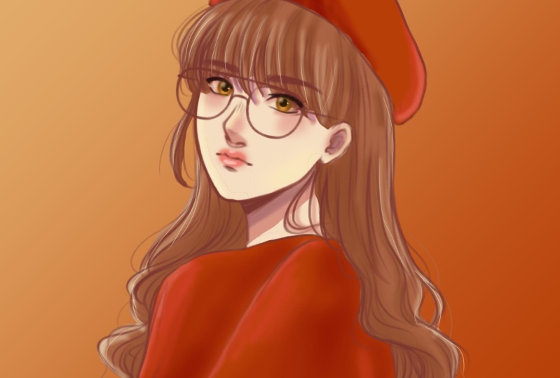
3. Base Colors: So what are base Colors? Let's take the classic
sphere as an example. If we remove the
shadows and highlights, we're left with this
flat gray base color. You can think of it as a
foundation in coloring. A good foundation can lead
you to a good output. If you open your color
wheel, or in my case, a square, you'll see
three sliders here. The first one is the hue, or you change the colors. Second slider is the saturation. It changes your color
too vibrant or dull. Lastly, the value is the intensity of how light
and dark your color is. The same thing applies to
color wheels like this. Hue, saturation, and value. You can also look
up color palettes that could help you with
mixing and matching colors. To start, make sure to add
a layer beneath the sketch. And that's where will we
drawing our base color? Let's add the base color for the skin first, which is a red, orange hue, and right around the upper left of
the color wheel. Once you're happy with
the shade that you got to go fill in the lines. After that, I'll add a new layer and put the
base color for the hair. Looking at the reference, I'm choosing a slightly
red brown shade and just fill the hair in. This time. My strokes are more precise, especially at the bands and
the loose strands of hair. Now, another method
you could also try is taking the strength tool
and on another layer, just follow along the lines. Just until you close it up. Afterwards, you can simply just drag and drop the
color into the hat. Clean up the edges
here in there. And voila, right here, I'll be doing the
same for the clouds. Once you've finished
placing your base Colors. Let's move on to the next
video, discussing about Shading
4. Shadows: So going back to our sphere, it's got its base color. So now we're going to add Shading. How are we
going to do that? Firstly, we're going to need to determine the light source. If our light is
coming from overhear, the drop shadow
would be over here. Core shadow would be overhear. You might be asking, why isn't the darkest
shadow over here? Because light bounces
from surfaces, which gives that hint
of light, that spot. Now, to apply this to our portrait as we broken
down the reference earlier, the main light source is at the upper left and another diffused light
source on the right. So our shadows will sit around the middle
of our character. Now that we've
discussed the basics, let's start Shading
our character. Let's start by
adding a layer above the skin and setting
it to clipping mask. This way, any strokes you make won't go over
the base layer. So let's start by
taking a light red, orange shade and airbrushing all over her cheeks,
nose, and lips. This will give a nice blush
and tint to the character. Now I'm taking a darker
shade by sliding the value down in the saturation a little
bit to the right. This way, the shadows
complement the base Colors. This is a personal preference, but I like Shading a
bit of the under eye. This is different from
ibex doing this makes the characters eyes look
bigger and prominent. Now I'm gradually
Shading smaller, more detailed areas with a darker and slightly
more saturated color. You can also experiment
by changing hues, like purple, for example. This adds personality
and depth to the Shading. For the lips. You want to take a soft airbrush again and choose a
light red shade, gently airbrush around
the area of the lips. Then define the inner part of the lips with a
darker red shade. I also took a light
pink and highlighted the cupid's bow and gently airbrush the center of the
lips with the same color. I then airbrushed
a light yellow and white on the cheeks for
a soft light effect. For the hair. I took a darker, a little bit more saturated
shade of brown and on a separate layer which is also clipped on the hairs
base color layer. I start Shading the banks in
defining the hairs shape. After I take a darker brown and I shade the parts where
I'd like to highlight depth. Lastly, with the same tint of yellow and white
from the skin earlier, lightly shade the left
and right sides of the hair just to give that
soft light effect again. Another method of shading is
using the Multiply layer. This is a simple and more
beginner friendly method. Start by taking a dark
red or purple shade and draw the shadows. Afterwards, set that layer to multiply and it will automatically compliment
your base color. You can then adjust the
opacity to your liking. So now we've finished
the Shading. Once you're ready, let's
go to the next video. We'll discuss all
about Highlights
5. Adding Highlights: We're back to our sphere. And what's left is Highlights. Highlights is where a
light hits the object. This gives the sphere dimension and it also makes the
drawing look better. Start little by little, because too much can
overpower the painting. To apply this to our work. Add another layer, then take a lighter
shade of yellow and draw fine lines highlighting the strands of hair
on the left side. Then highlight areas
where light will hit, such as the tip of the nose, cheeks, cupid's bow, and
the center of the lips. Highlights can really either
make or break an artwork. So just do it slowly than soon. You'll get the hang of it. Then airbrush the
same yellow shade at the left part of
the hat and sweater. Then take a white shade
for the right side, just gently airbrush the
highlight on the top of her hat, on her sweater, and
on the right cheek. And that's the Highlights done. Once you're done,
you can move to the next video and we'll finally move to our
finishing touches.
6. Finishing Touches: This part is really just
based on your personal style. What I did here is I added small details that really
enhance the artwork, like adding loose
strands of hair. So you want to do is
take the same color of the hair and draw S3 and
loose strands like this. This will give the Portrait
a more realistic feel. Now I'm taking a mid tone from the red orange and just draw small strands in
the hair like this. This gives a little
more shine to the hair. Now I'm taking a black
and on a separate layer, align the eyes so
it pops out more. For the eyes. I shaded it similarly to our sphere example. And adding Highlights
in more details. Finishing Touches is
really all about adding your own personal
touch to your drawing. And that helps develop
your own style. Just keep on practicing and
let the creativity flow. And soon you'll
find yourself with your own personal
style in drawing. And now we finished coloring
our character portrait. I want you to go to the next
video so we can discuss our class project and
some final words.
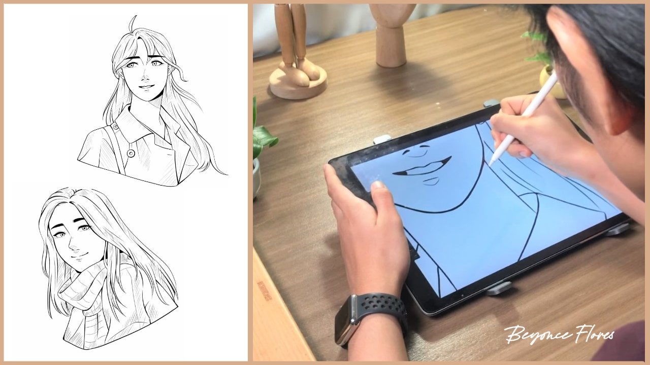
7. Class Project: Congratulations for reaching
the end of this class, for the class project, I'd like you to submit at least one colored artwork with the techniques
you've learned today, I've prepared three
different sketches which can be found in the
resource section below. And I'd be glad if you could
submit one as a project. Always remember to keep
practicing and experiment with rendering because that's where you can really develop
your own style. I'm looking forward
to your work. Thank you for joining my class. I hope to see you
on the next one.
 Beyoncé Flores, Bring out your passion for art ✨