Transcripts
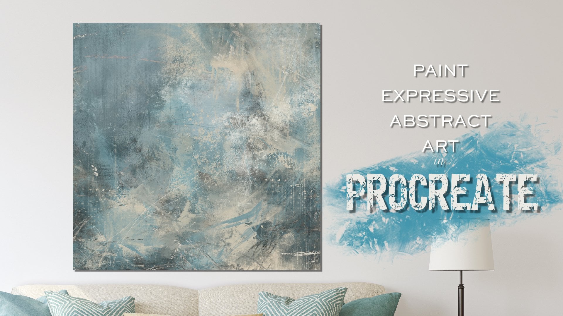
1. Welcome!: Welcome to painting abstract
landscapes and procreate. After taking this class, you will be able to paint your own abstract
landscape design to match your personal space. In this class,
you'll learn how to develop a color
palette from Arun, how to paint the background, and how to paint the horizon using my custom stamp brushes. You'll learn how
to add clouds to give interests and
drama to your sky. And you'll learn
how to blend it all together for a cohesive look. You'll also learn
how to finish out your painting with
a cool texture. You'll learn about placing
your horizon line, working from light to dark and dark to light and
the differences. You'll learn about
choosing various colors. Mark making with the brushes, reshaping the stamp brushes to get the look you
want for your pain. But most of all, you'll experience letting
go and having fun. You'll also learn how
to paint a landscape on the fly using a few of
your favorite colors. You'll learn about layering
and moving your layers around about using layer modes and opacity to get the
look you want. And about blending your marks in weld and make everything
work together. You'll also enjoy a fun
bonus lesson where I create a quick impressionistic
paintings and matching room using
only one brush. In order to complete this class, you'll need an iPad with
procreate installed. You'll also need
an Apple pencil. You will already need to
have a basic understanding of using Procreate and
installing your brushes. And you will need to
understand how to transfer photos onto your iPad
before starting this class. Provided with the class is my abstract landscape
painting brush set, and a thick paint canvas
texture to use as an overlay. Are you ready to
paint an original abstract landscape
design for your space? If so, then please join me. Your class project is to
take a photo of your room, develop a color palette you'd
like for the space and to create an expressive
abstract landscape design. I'm Jay Johnson,
your instructor, and I look forward to seeing your abstract
landscape paintings.
2. Brush Tour: Hello everyone. In this video, I am going
to go over the brushes and my abstract landscape set that I've included for
you for this class. The first brush is the
rough pencil brush, and I'm going to zoom in on this page here
so you can see it. It is exactly what it says. It is a rough pencil
and they can go a little bit bigger or
really, really thin. If you would like. Great for mark making, great for sketching
something in. If you have an idea that you
would like to sketch in. That is all I use this
brush for really, I don't necessarily
paint with it. It's just specifically
for making rough marks in a
pencil like fashion. Then there's the smooth
paint and blend. Now the ones that are in
the set that will blend. I've tried to include the word blend there in the
name of the brush. So you'll know that it
can also be used as blending brush or
a painting brush. So let's try this. This is the smooth paint one. This is one of my favorite ones. I've included it in
a lot of my sets. It's got a really
nice feathery look. Now, if I press real light, he does that and you
press really hard, it goes quite a bit darker. Then we put down
another color here. Sort of an orange color. Brighter orange. It's just got
a real nice feathery look. And then using it as a blender. It does a very good job for, for blending two
colors together. See that nice. Blend them getting there. And this is a great brush. It's not just, I use this all the time
and everything I do, but some of my lessons where
I do animals and birds, this is a great brush for
doing fur and feathers because of the feathery tail
end of the brush. You can hold down on it and scrub to do a nice solid blend. Get some interesting
effects there. Or you can just swipe back-and-forth to get
a different look. And it brings whatever
color you're pulling from. It brings that over top. So that's a really nice, versatile brush that I
include with everything. Then there's the canvas
paint and blend. It. It has a nice canvas
texture along with the still got the feathery end. But as a nice canvas texture. You see that nice
canvas texture. And then when you blend with it, it also has a nice
canvas texture, but stays with the blend. And you can scrub this one
to blend the two colors. Or you can just pull down from one direction to the other. Once again, whatever color
you're pulling from, pushing from, that's the color it's going
to start with on the blend. So that's another very
versatile brush that I include in a lot of my classes. I use it quite a bit. This is a rough edge
paint and blend brush. And when you paint
with this one has got a nice rough edge and just a general
roughness to it. Overall. Lots of speckles in there. You can go light,
very light touch, or you can press really hard
and get a more solid look. Let's put another
color on there. And this one blends
out real well too. This is what I often
use to mess up edges to give things
a more abstract, fun, unpredictable,
painterly look. It's a smooth brush, except for it does have the, the roughness to it. It's a smooth painting
brush though. It doesn't have a
Canvas texture as well, I'm trying to say. So let's go to my super
thick paint and blend. Let me get a fun get
a green color here. Super thick paint and blend
is I had it set real big. It's got a nice thick
go a little darker. A nice thick texture to it
with some speckles in it. And it looks like you're
painting on top of concrete. You can see how it leaves some of the other colors showing through when you paint a
new color on top of it. And let's blend with it now. And I'm just doing short strokes back-and-forth to blend
these or you can scrub. It should make a grayish tone, the green and the purple,
slightly grayish tone. You could pull from the white. This is great for trimming
up some little edges too, if you're erasing
with this brush. All of these can be used
as erasing brushes. But let's say you wanted to, you had to straight
of an agile or something and you wanted to
rough it up a little bit. You can use this brush to do so because it gives a real nice
rough look to the edges. And the next one is my rough
scatter paint and blend. And once again, too big. This has a Canvas texture. And it's kind of a funky brush. Makes lots of splatter
and some solid. You press real hard,
you get the more solid, look like that. You press real light, you get like more. I tend would this one. Let me back up a little here. With this one, I tend to
do more short strokes like this rather than
scrubbing like that. To me it just if I'm
wanting to look like this, I tend to just do them
more unpredictable. You can tap harder and it will appear darker than
if you tap lighter. And it can blend as well. Let's put a little color
down there to blend. Now let's blend. That. Scatter around. Short strokes or
scrubbing motion. Either one just play
with it and get it where it feels right. And this is another good one
to come around and rough up the edges and pull on
it and push on it. To create some
really fun texture and unpredictable. Look. Let me get to a
different color here. Back to my orange.
I like my orange. The impressionist
painting blend. And we'll get to this
later on in the class. We're going to do a short
little bonus lesson with this brush. But just to show you real quick, let me zoom out a little
bit how this one works. It leaves, you can
go different sizes, a variation of color from
whatever color you're on, see the lighter ones. And then you want to
throw some blue in there. It's a very fun brush to create an
impressionist style book. And you can also blend with it. Blend them once you've
already got down together. And it will take those
colors and still blend them in a impressionist fashion. It's just a really
fun loose brush for creating an
impressionistic look. Like. So, oops. I meant I hit the layer clear. Then there's my fan brush. I haven't given this out yet. Anybody. I'm tired of playing
with it myself, which is what I do when
I make a new brush. This has got a rough
texture as well because it picked up the paper from where
I made the brush. And it's in the shape
of a fan brush, which is kinda neat for doing sort of a grassy
look or a rough look. The real big with it. Just a very abstract
painting look, you can go across like this
or up and down like this. Let's put some orange on there. See how when you lay it down
on top of the other color, it shows the color beneath. Now if you press harder
and enough times, it'll cover that. But I'm a light touch person and a short taps
and short drags, that's what I tend to do. And you can also blend with
the fan brush as well. Just slowly doing that there. And he can hold down real, real hard to get a
really nice blend, but it still has some of that nice rough texture from the original paper
showing up in there. So that's kind of a neat
brush to play with. Also, it's a one you can
work around the edges of things that are too sharp or you want to mess up the edges
and soften them up. But not lose all of the color like you
would with any eraser. Just blend blend the
white into there. I know this looks
like a big mess. And then there's my mop brush, which is one of my
favorites for blending. If you want a really soft
look, seeing paint with it, it makes it really nice,
soft, cloudy look. It's pretty strong. You can reduce the
opacity to do lighter. But I usually with
the mop brush, I'm doing more blending
than anything else. I don't paint with
it a whole lot, but it is a good
way if you want to paint some quick clouds
or something like that, It's a good thing
to use for that. So you can just
blend very softly. You can go pretty
big with it and kinda bring your edges out and make them
real nice and soft. So that's a fun brush. And now we're gonna
move into some of the stamp brushes I've included
because a lot of what I do with my painting when I'm painting backgrounds
and abstracts and abstract landscapes even is I've made a wide
variety of brushes so that I can work fairly
quickly to create a look. I want to create. I use stamp brushes quite a bit to set everything in
place, get me going. So this is my splash stamp. Just makes a big
splash and splatter, it's real fun to add later. I add these kind of things
here later on in the painting. Now being that these
are stamped brushes, you cannot blend with these, you can erase with them. However. Some on the
Splash stamp right now, my eraser so I can tap loops and tap too
much, too many times. I see that took part
of that backoff. So they're fun to erase
with if you want to create a little negative space
and they're fun to paint with like that. And, but you cannot blend
with these stamp brushes. I've got a variety of
stamp brushes included. And let me get over
here on the blue again. And the first group
is the clouds. Now, the first few
clouds in here are soft clouds and then I've got
a couple of heavy clouds, then a couple of more
detailed clouds, and then one more
heavy one that I just finished making
this morning. So I thought I would go
ahead and include that. But the clouds are
really nice for building the clouds
in your landscapes. And I don't, usually, I'm just stamping with them
now with the same color. I'm just going
down in the group. Like so. I don't like that one there. But that little lower. I do not usually
leave these as is. I usually end up coming
back with a blender. Usually the smooth or
the paint and blend sometimes the mop brush to soften up some of
these little edges here. Like let's just try blending
with the pain blend. On this little spot right here. It's sort of blends
out that hard edge, keeps the color there, but you also brings little
canvas texture in there. I'll just kinda go around
the Cloud and do that. And then if you wanted
to use the mop brush, you could also use
that to soften everything up just by
tapping and dragging. And you can do that around these edges here where
it's a little bit hard. Brush, a little smaller, and just gently tap. The mop brush is good for it to just like it's good
for painting clouds. But that brings some of the harsh edges down and gives
a more painterly effect. And you can also use these clouds stamps as a way
to get your cloud going. And then if you wanted to
add color from a paintbrush, such as the super thick, Let's try one to add a
little white in here. Like say we wanted
to add a little bit more white right here. You could just add
a little bit right there. Wherever you wanted. It. Just kinda going in
circles very gently. You can go a little bigger here to bring a little
texture into your Cloud. And then you can then blend that with the mop brush to tone it down if it's a little too much. And kind of work your clouds. Like with this mop brush or with the paint and blend to
bring the canvas texture in. I do like that one for working in some canvas
texture throughout as well. There we go. I just kinda worked on that
upper right corner of that cloud a little bit. So those are the
software clouds. And then let's go
back down here. Here's the, here's one
of the heavy ones. I'm going to show you the
difference in the stamp. That one that's the last one has a much more heavy
painterly effect. If you want a more, excuse me, heavy painterly looking cloud, the heavy ones would be
what you want to use. And you can of course,
re-size your clouds, make them different sizes. You can also reduce opacity. To lighten up the opacity. You can change color. That's the eye stamp
that inside that. But let's say I
wanted to blend that. Now I could get on the canvas paint and
blend in and work it in. Or even the super thick can use that to work
it in and maintain some good heavy texture or the mop brush to work
it in with other cloud. And soften things
up and go a little bigger and really bring
that color out in wood. That other one, not at Cloud has a totally
different look than it did. Of course, that's
not necessarily good luck because
you wouldn't have this bright spot of white
in the middle of the cloud. Usually you'd have that
at the top of the cloud. So, you know, kinda look at clouds when you're
working with them. Go, you know, if you're
not sure about the cloud, look on the Internet
cloud pictures or go out, go outside and see
whatever clouds you can see and take a look at the
way the colors are layered. They're layered differently in the Cloud in the morning
versus at night versus midday. So it's just there. There are a lot of fun. And you can get as heavy
painterly look just by stamping or you
could soften that up like I've done
there on those. Okay, let me clear this layer because
I'm getting a little crazy here. Would color. Alright, let's go to
stamp eight is another, it's not a heavy stamp, but it's a more detailed Cloud. It's got more action
going on inside this cloud and then
stamp nine, same way. Really bubbly, stormy looking action,
which is kinda cool. And you can take
another color stamp right up on in there. And you can just keep on tapping and stamp
and clouds until you get a look that you really like. So there are a lot
of fun to play with. And then there's the
final heavy stamp one that I've finished
this morning, which is also very painterly. Get up close here
where you can see it. Say all that good
painterly detail in there. But let's say I wanted to make this bottom edge
a little bit rougher. I could use that
super thick paint and blend the scatter
won the fan brush. Let's try the scatter one. Just on their kinda
blend that up and scatter May 1 be a
little bit too scattered, maybe a little bit
too busy for clouds. So let's try the fan brush. Just kinda sweep on
that bottom edge, pulling upward with the
brush and it brings some of that roughness to the bottom
edge and the super thick. Let's see what that does. Yeah, just bring some of that nice thick texture in there and you can
even work the Cloud back out if you don't
like the shape in my cloud from my stamp brush, feel free to change it. Feel free to add whatever
color you want in there. I stamped at color on there. Got to make sure
you're not on a stamp brush if you want to paint. All right, so that
covers the clouds. And then very quickly I'm
gonna go over the ground. Stamps. There are 12 of them. And these clouds
are meant to be on the top of your
abstract landscape and the ground stamps are meant to be on the bottom or
wherever your horizon is. Sometimes you might want your
horizon close to the top. Now, these brushes are 5
thousand by 5 thousand. That's the size of the brush. A Canvas I'm working on to
6 thousand by 6 thousand. So when I stamp this, it's
smaller, the ground level. So what I will do is after I stamp the
ground level, I want, click on the transform tool, pull it out to the
edges where I want it, and move it to exactly where
I want the horizon line. It may be down really low. It may be up really high. In some cases it may be
just below the middle. But when you stamp them, they're going to
own a 6 thousand by 6 thousand Canvas
because they're 5 thousand by 5
thousand brushes, they're going to be smaller
than your canvas size. If you can't, if
your canvas size is 5 thousand by 5
thousand or less, less than 5 thousand
in any direction. It will cover the whole thing from edge to edge
when you stamp. And you can always resize. Your Ground stamp to fit more
accurately on your campus. But I use the transform tool a lot with these ground once. And the clouds, they fit
in the middle of the sky, so they're not that big a deal. But the ground ones you
usually won't go into the edges. So that's one. Brighten up that
green a little bit. Here's the ground stamp to, and these are called ground, but a lot of these
are just simple mark, so I'm just going to stamp
them right here in the middle. I lost my green. There we go. I'm
just going to stamp them right here in the middle. So there's two. Once again, if I didn't like that there
I could transform it. I could leave it right there
on my abstract piece or I could bring it all the way
across by transforming. Just depends on whatever the
look you're going for is. But you can mix
these ground stamps with each other as
well. There's three. Here's four. You can mix them, you can put them on
different layers and then maneuver those
layers around, change your layer modes. This one here is a
five, I believe. Yep. 56 are watercolor, splashy, drippy kind of stamps. Let's clear that and go to
seven is a grassy stamp. If you want grass on your grand. Nine is just a mark, a good strong paint mark to make a good abstract horizon line. Ten, another mark 11, and another mark like that. Other one where you could doesn't have to extend
all the way across. 12. Another, another mark. And you just kinda gotta tat and figure out what were
you going to put it now, I often, I put the these
are all on one layer here. But when I go to lay
the groundwork in, as you will see, I will
have that on a new layer. I will have the clouds. On a new layer. I will have the background
on its own layer, and eventually I will
merge those layers together and then continue
on working the painting. But you can stack
these ground levels on top of each other
if you would like, and in different colors. And of course they only
stamping the color I have. They do not blend. They can't erase though. And just like the clouds, you can also take these and blend out parts that
you want blended out, blend it in with
your background. It's just as a starting
point to give you a cool mark that will work for your abstract
that you want to build. That covers all the
brushes in the set. And when we come back, we're gonna get started
painting the canvas. We're going to use the canvas
paint and blend brush, and then we will
start our painting. So we'll be back shortly.
3. Canvas & Colors Setup: Alright, before we get into
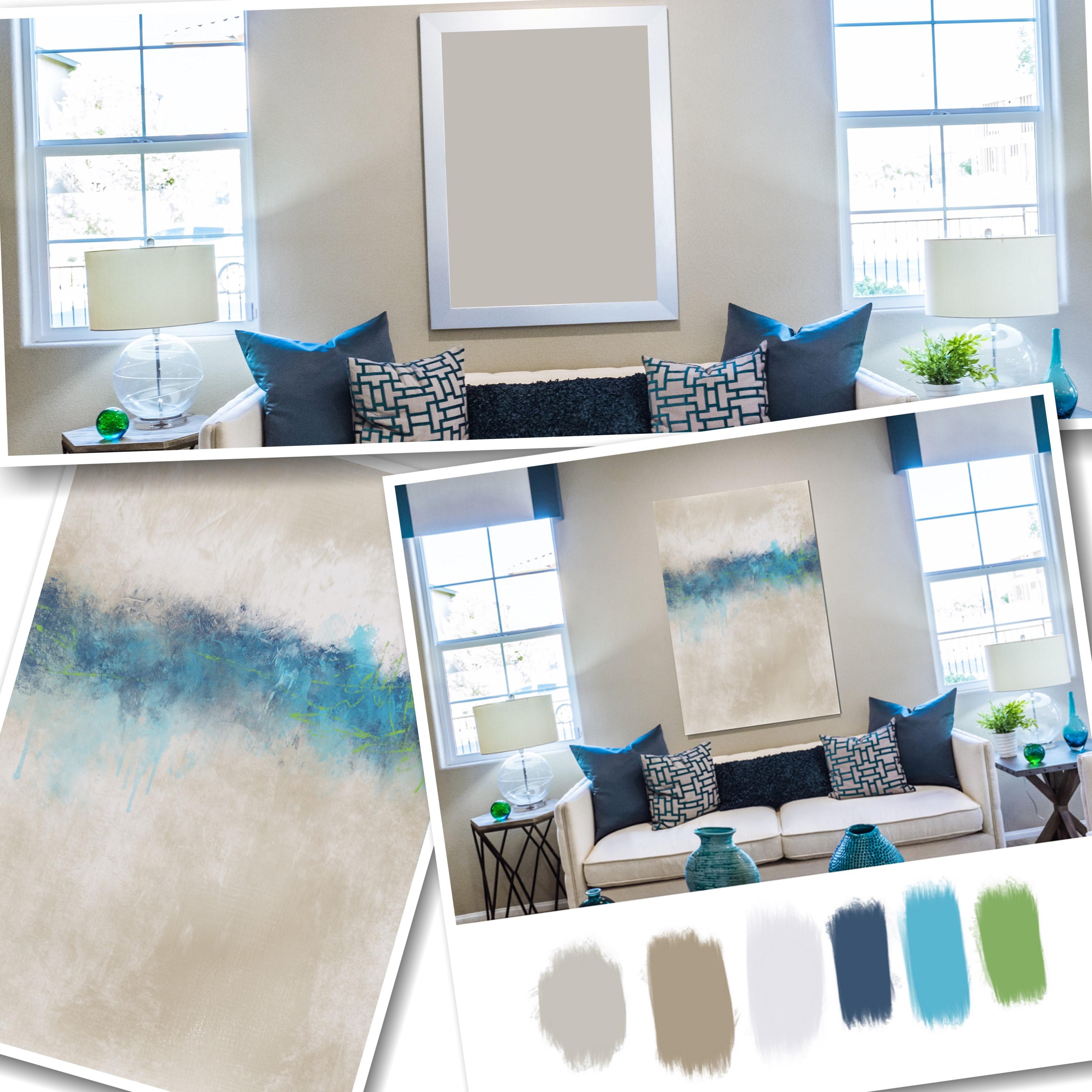
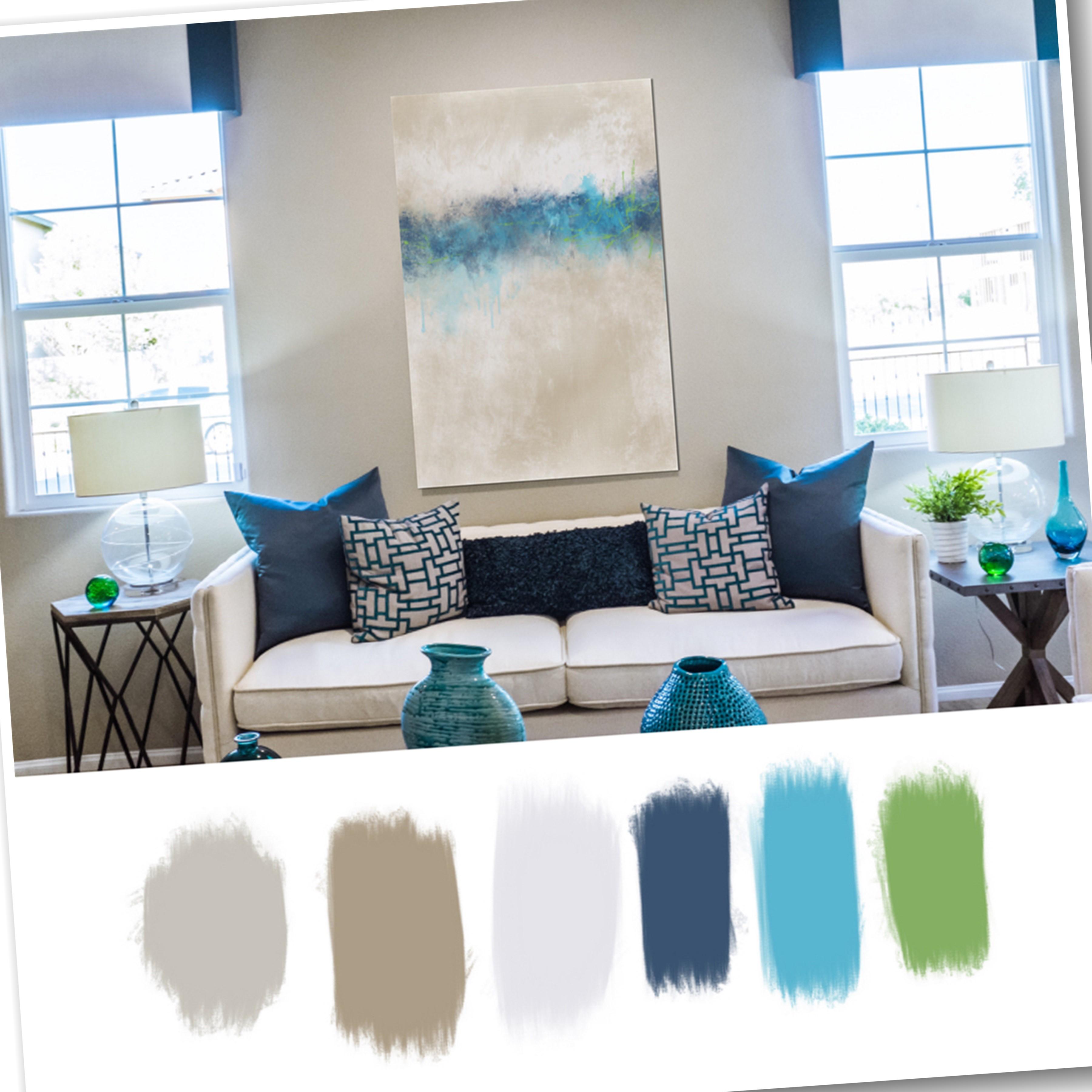
setting up the Canvas, I want to talk about whatever you're using for
your inspiration room. This is a picture of my husband's favorite
chair in our Dan. And I shot the picture
with the phone. And just so I could get
an idea of the look, the shape, the
colors, et cetera. And this chair has blues, greens like a soft green brown and obviously
the creamy white. My artwork that's
hanging on the wall isn't older painting
of a horse I did, which is in really rich
red and really rich gold. And it looks good on the wall. The time with the chair
we had there at the time. We have since changed out to this chair until I
scary to do this class. I never really, it never
really dawned on me that this artwork totally
does not go with this chair. I need to create
a new work of art that I can hang here on
this wall in place of this, which will go better
with the decor. There's two couches in the room that are
also light-colored. So this artwork just
does not go in the room. It's not a piece of art that I want to get rid of or cell. So I'm going to keep it. But it just doesn't need
to be in this room. And I thought it would be fun to design an abstract piece that could fit in this location. And normally I work in square format just because
that's what I prefer. But in this case, I think I'm going to work
in a long skinny format. We're, the piece can hang vertically here over this chair. In that instead of this piece. And that the colors will be similar to what's in the chair. So everything will look like it's a little bit more cohesive. I'm not the world's
greatest decorator. I can do pieces of art
till my hair falls out, but decorating
room, not my thing. And I also took a close up photo of the chair so that
could grab the colors. So I'm gonna go set
up a Canvas now. Let's click out of this
and go back to Procreate. And now here I was
in the 6 thousand by 6 thousand when I was
showing you the brushes. So I'm thinking that's the
size I normally work in, 6 thousand by 6 thousand. I'm thinking the
vertical skinny piece. And I also work in 6
thousand by 4 thousand, but I don't think
that's skinny enough. So I'm thinking 6
thousand by 3 thousand, which would print
through my printer. As big as 60 by 30. I'm not going to have
something that big printed. That would just be too huge, but at least I could have it printed that size
if I wanted to. So I'm gonna go to hit the
plus button up here and set up a new canvas
and click the dark plus next to New Canvas, I always work at 300 DPI. And I'm going to type in
my width to be 3 thousand. And I'm going to leave
my height is 6 thousand. That gives me a maximum of
25 layers on my system. You don't have to work this
big if you don't want to. But I like my work to be
able to be printed big. So therefore, I worked on the largest size canvas
that I can get away with, that I feel comfortable with. So this is the size
I'm going to work on. You could do 1500 by 3
thousand or whatever, but I want you to
look at your room. Okay, I'm creating the PCF, nice and long and skinny. And at this point on
this first layer, I'm actually going to go grab
those two room photos here, this one and this one. So I've got both
photos in there. That one got in there twice. Let's delete that. They're on their own layer. My painting layer will
be underneath these. I like to put it under, make a new layer and then
drag it underneath so I can turn the color
layers on and off. So I'm going to grab my
little close-up here. I'm going to pull that down
like so just out of the way. And then I'm gonna go on
the layer for the room. And I'm going to
pull that up and resize that down
just a little bit. And actually I'm going
to merge all of these onto these two photos
under one layer. Like so. So they're both on
the same layer. Now. I'm going to make
a color palette. Now off here to the
side on the white area. I'm going to pick
colors and I'm not going to pick colors
from my horse photo. I'm going to pick colors from the chair that are
pleasing to me, obviously for the background, I would want this lighter color. So I'm just going
to move, hold down my finger on here and move it around until I get to
a really light color. So that's gonna be
the light color. And I'm going to use the smooth paint and blend just to make a color swatch right there. So it's a light cream. I really liked that. And of course I
always use black and white as well in
any paintings I do, so don't need to put white down. I do want that light cream. And I really liked this
green on this leaf. So I'm going to move
my finger around, holding it down, move it
around until I get to. I don't want the
real dark shade of the green or the real light. That's a good one right there. And when you let go,
it sets the color. Here on the top right corner. You can see it. It sets the color. So I'm going to make
a swatch for that. That is still kind of on
the dark side though. Let me go back. Zooming in a little closer
and move this around. That's a little lighter there. Let me put that light
lighter one down. It's almost a greenish gray. And if I wanted to adjust that, if I didn't want it that
much to the gray side, I can click on the color and make sure I'm on
the color wheel and I can pull that over to the
right just a little bit. Like so. So there's a little bit
more of the green shade. It's still when you
zoom out, it's, it doesn't match what's
in the picture though. So that might just be slight little accent
color if I use it at all. Now, let's look at the blue. I'm going to hold my
finger down there and get a nice medium blue and
put that down there. I liked that. And then there's a
light brown in here. I'm going to move in because
this is a weaved pillow. It's got little areas than there that
it'll appear darker. So that's why I'm
moving it around. That's more toward the cream. How about that? That looks good. So there's a medium
medium brown. Not sure I liked
the medium brown. Let me go back and get a
little darker on here. Well, that didn't do it. It helps if you zoom in
a little closer and when you let go and set
that color there, there's a little darker brown. So I've got both in there. And then there's this really
this is actually a blue. If you hold, hold, hold down
on there, that's a blue. So I'm going to
put that in there. I can't even get darker, which is more like
a almost a black, but that's actually
in this blue family. It's not quite solid black. So there's a good range
of colors that I can now use to create this landscape. And I'm going to make, I've already made the
new layer underneath. So the very first thing
I'm going to do is decide what color do I
want my base canvas to be. And in this case,
because I'm trying to go lighter in this room, I'm not creating a dark
and moody work of art. I'm creating a lighter, moody work of art. I'm going to hold down on my color swatch for the
light creamy color. And it makes sure I'm
on Layer three there, which is actually
going to be my canvas. And I'm gonna go to the
paint and blend brush. And if you go real big, you're gonna get really
big canvas marks. I don't want them that big. So I'm just going to kind of go with a medium size brush and just paint with that
brush all over very fast. Just to get some color down. So we know where to get started
with my new work of art. That'll go into my room. I've got a nice
cream color down, and I'm gonna go to the blending tool and click
that same paint blend brush, the medium size brush. I'm just gonna softly put
it down and go in circles and up and down and I'm holding it down.
I'm not letting up. Every so often I'll let up, but I'm just softly
blending that in and it's really light so I know it's hard for you to see, but it's just creating
a base to start with. Let me zoom in and see
if he could see any of that texture and he could
see a little bit of it. It's just so light. Now you don't have to. You can turn this back on and
he can look like let's say, I want to bring in some of this lighter brown into
the actual canvas color. So I'm going to turn
my room photo op. Make sure I'm on the
right layer and I'm going to put some of that light brown down here
on the bottom part. I haven't really decided
where I want my horizon, but I'm thinking
like right in here. Now I'm going to use
the blending brush and blend that in. So my canvas has a sort of a graduated color
now, to work with. Just blending this in with
that same canvas brush. And you can go a little bigger on the blending brush and kind of pull it up a little
more side-to-side, just until you get a nice blend of color to start
with on the base. So we have a nice
graduated canvas color there to start the landscape on. And these are the colors
I'm predominantly going to use in the landscape. Now have to decide, do I want maybe a coastal look? Do I want to stick with more? I don't have to use all of
these colors that I've chosen. So do I want to stick more
with the blues and the brown or the greens and the brown with the
blues and the sky. Don't really know
what I wanna do yet. So I'm going to take
a few minutes break. And when I come back, I'm going to decide what I
want to do next with color.
4. Coastal Landscape Ground: Okay, I think I've
decided on what colors. I want to stick more with. The blues. In my piece. Like the dark blue down here, the purplish blue, this blue. And I may use the light color
green on the left here, or the dark color green
on the top right? Somewhere in there,
I don't know. And the brown I'm
thinking coastal mainly because this is my husband's favorite chair
and he likes coastal things. So I'm thinking coastal. So I'm going to add a new
layer above my canvas layer. And I need to either decide to start with the
clouds on the horizon. I think I'm going to
start with Horizon. And I think I will start. Let's start with this
darker purplish color. Right there. Turn off the top layer, which is the room photo
from my inspiration. And I think what I wanna do is have a very large sky
and a low horizon. I'm thinking I'm on
the pencil brush. The rough pencil. Don't
know if that's too thick. Lower that size down a
little and you can turn your butt two fingers on a turn your paper to make
it where you can do it. Now if you wanted to draw
at exact straight line, you can draw across the
page and then hold it and it will snap in place
to be totally straight. I don't need to
have an exact line, but just to get
the horizons set, I've put that there. And you can do some
little scribbles here with your pencil to kinda decide what
you're gonna do. I'm thinking coastal,
so I'm thinking water. This may be the the water area and that the bottom
area might be sand. So I'm thinking maybe water. At least part of it
may be saying so I'm just kinda scribbling out. Where am I want the
water versus the sand. He can just use your imagination
here on this and think of how water flows
up on sand, like so. All right, so that's
the pencil marks. And now I'm going to go get an actual ground
level mark here. Let's try this ground
to, like I said, I put these on a new layer, each one so I can
move them around. That's undoing. I'm just tapping. And hey, I got that in place
where I wanted it. But if not, you can
always click on your transform tool
to move it around. And this will all be
blended so you won't even probably see the pencil
marks by the time I'm done. Let's put another layer on top and add something
interesting there. Um, what about splashy
one number five loops? Now if it's too big, you can lower the size down
and get it where you want. And then Transform and pull it in place and stretch it out
exactly where you want it. It looks kinda interesting. It could be a little darker. And one way to do that
would be to duplicate this layer right there and it becomes a
little bit darker. And you can also take the duplicate layer and
shifted around if you wish to change up
the look of it. However I liked
it, where it was. I'm going to leave it there. So I've got the two dark layers over my little pencil guideline. Now, the part on the
left will be the water, and the part on
the right will be the sand area. So let me go. Sandisk kinda rough. So let's go with the super
thick paint and blend. Turn on that top layer here
so I can grab this brown. The darker brown first. Then turn off the top layer and make a new
layer for the sand. Actually, I'm quite pleased with layers three through
five with the drawing. We'll sketch in the horizon
line and a splash marks. So I'm going to go
ahead at this point, squeeze these altogether. I don't like a big
mess with my layers. I like to condense
them as I can. When I start blending
of, I'll blend, I'll squeeze them all together to merge them all with
that canvas layer. But right now, I'm
still working on top. I've got the super thick paint
and blend in this brown. I'm just going to gently fill this in and
it's not supposed to look exact because it is
supposed to be an abstract. So I'm not worried about
it looking perfect. Just trying to get some
color down right now. So there's the little sandy area and it's got some
variation of color. To add more variation of color. Let's turn the top
layer back on and let's get this lighter
brown in there. Turn the top layer back off. Once I get to color
and turn it off. And it's got a little
light variation, but I'm going to make the
brush a little bigger and gently tap in here. In a few spots. Break some of that
texture in there. Okay, now, let's go grab, let's grab the same
purplish blue tone for the watercolor. No, change my mind. Artists prerogative, Let's grab this blue, the software blue. Put a new layer then
for the water and decide what brush
to use for that. Water is going to be smoother. I may try the smooth
one right now. Turn off my room photo
and then get down in here with the
Smooth paintbrush. I'm just kinda guide that in there where I
had those lines strong. You don't have to
even keep the lines. You can, if you did a sketch, you can get rid of them. Lower the opacity of them. I'm going right over
the splashy area too. And I go in the direction
that the water is flowing. Water right over into the sand, covering up those lines. Just good to get a
general impression of where the water might be. Now, I like that blue color. I might like a little
bit of that blue color behind this dark, purplish blue. Splashy. But I'm not sure. I might go with the darker
blue behind this purplish. I'm gonna get on the
bottom layer is make a new layer because I want to
go underneath all of this. And I'm going to turn my top layer and get
this really dark. Make sure my color
wheel picked it up. Turn off the top layer. And I'm going to
go pick a stamp. Should go behind
that other stamp. Wonder what the drip
on would look like. That might look
pretty cool as to be lower that size down
now it's too small. Make it a little bigger. Right? I'll have to re-size it as much because it's on its own layer. Transform it now watch, it's gonna go down
behind everything. I painted already. Don't want it down this low or, uh, I kinda like it
up about right there. But the top edge of that dark, dark layer is a little
harsh right there. On that layer. I'm going to blend that. And I'm going to use, let's do the scatter one. Let's see if I can
blend it with that one. Get a small brush and just kinda work on this
corner right here. Just alone that real hard edge. Maybe go a little bigger. Maybe not. Sure, it's getting rid of
that hard edge enough. I might have to press
a little harder. There I go. Press a
little harder on that. And it's kind of blending
in that harsh edge. I'm working underneath
what's already there, so I'm not messing
up what's on top. Just don't want that mind
showing from that stamp. So you can manipulate
the stamps. Anyway. You want there. That's a little better.
It's starting to look like a fun piece. I really liked the drips. Okay, I'm happy with all of
these at this 0.5736 layers. I still want to leave
the canvas layer on its own layer and paint
these things on top. So I'm going to squeeze
these layers together. So there I have the base. If I wanted to really strengthen the
color a little bit more, I could duplicate it. You can even play
with layer modes and really enrich that color
a little bit right there. But I think I'm going
to leave it alone. Delete that, just keep
working with it as a habit. I don't want it to
be super strong. I do want a little bit more
dark on that horizon line. So let's put another layer on top and grab one of
these other stamps. Which one do I want? What's this one? Number three, Let's take a
look at what that looks like. Oof, that's pretty strong. But it's got some
really cool texture. Let me grab that. Stretch it out or it'll
fit kinda pull it down. Like so. That gives some really
dark contrasts there, which is very interesting. Now if it's too dark, you can lower the opacity, which is a little dark, so I'm going to lower
it down to about 63. And on that layer I may even blend some of the
edges a little bit. So once again, let's go back to that scatter brush and
kind of press real hard. Let's see here I didn't quite go off the edge of the paper
when I resize that. So I'm just going to
blend that off the edge. See what happens if I go
with a bigger scatter brush. And you can even go
the opposite way and pull down against it, which will reveal the
colors behind it. Can even paint with
the scatter brush. Let's do a little of that. Let's grab that light blue
and go to the scatter brush. Scatter. Let's just try a
couple of marks with that. In, in through there. Kinda dress it up a little. Make it look like
the waters a little bit rougher in there. Also trimmed down
that darkness there. Just tapping it just the
size a little bit and even bring it up a little there. Oh, that's starting to look. Starting to look a
little bit interesting. I'm thinking I want to bring some of that lighter
color down into the sand with some
marks there too. So let me make a
new layer and go to my inspiration photo loops. Rabbit, and hold down
on this lightest color, which is that creamy color. Then turn that layer off and decide if I want to put
some marks on the sand. Now these horizon marks, you don't need to just
use them for a horizon if they have a unique
mark or texture. You can bring it in and
use it like number ten. Let's just see. That's
kind of interesting, but it's a little big. You can bring it in
and kind of blend out the edges a little bit. So that it looks kinda stupid
with that block there. But when we go to blend it, and let's blend with the
super thick on this one. Let's blend that out. Blend it right out. When you push against it, it'll blend it right out to
reveal what's underneath. And blend it right
over this edge. If you don't want
it right there, come down a little bit
from the top downward with that super thick. So that's that one. That little areas
blended in pretty good. Zoom out too, when you're doing this blending to look at
your picture as a whole. So you can see what it's
going to look like. Now this one here is
much too straight. So we want to mess that
edge up a little bit. Pull it inward. Alright, I think we still
need a little bit more of the light in here. Whoops. I have my paper turned
skewed up just a little bit. I didn't do this on
a separate layer, so I'm just keep
executing my pencil up there. That's
a little better. Now blend right over
into that water. And then blend up and
down with this one too. So we've got some dimension now that's created in the sand. Now the sand back here
toward the back would tend to be a little
bit darker because that's a little more
in the distance. It wouldn't be as
bright as this. So we can get, get this brown, which is the same brown
I use for the sand. But you don't have to
stick with those colors. You can pull down that color on the color
wheel to a darker shade. Turn off that layer. I'm gonna put a little
bit of darkness in here. And I'm going to use that
same super thick on, but a lower size just to
see what that looks like. And this is all undoable. Stroke that darker
color in there. And i'm, I'm going to
blend what I've done here. I've put a little bit of
that darker color right in there where the water meets. Now let's blend that same brush. Alright. I think we've got
a little bit too much of the light blue here. So I'm going to go grab
that dark color again. Let me look to see
if I've got a stamp that could stamp in there nicely about this
one, number 11. And I'm going to put
that on a new layer so I can resize it and put
it right in position. So that's a little big. Let's lower the size. There we go. Bring it down. Stretch it out a little. Now let's see if I can
blend that a little. So this is all just
personal choice at this point, what do you want? What look do you want? And I noticed that I'm trying
to not be so realistic, but yet here I am almost really realistically
forcing this shore. I'm getting a neat look there. I think I need to add
some clouds that. So I'm going to come back
and work on the clouds next. Then after that,
we'll move on to the final touches and see what's going to make this all
tied together nicely.
5. Coastal Landscape Ground & Sky: Alright, as I'm looking at this, I'm thinking about something
because of the way I have done the sand
and the water, there would be shoreline would
continue on right in here. One of the marks, I'm going to get this
super dark color. One of the stamp
marks. This one. Number one has a, whoops, let's get on. A new layer here. Has ground level stuff like So. I don't want it over
here on the left, but I would like some
of that on the right. So it doesn't need to be on
top of the splash either. But I have no
choice because I've already merged those layers. Let's see. I can bring this down. No, I can bring it down
under it right there. So now it's under it. So when I moved this down, it will appear under it. But I don't need
what's on the left. So you can mask that out or you could just
simply erase it. I'm just going to I'm on the splashy stamp
brushes and eraser. I'm just going to
tap right on there, on that side and
erase that side. On that layer. You still have a little
bit right in there. And I'm working on that
very, very bottom layer. There we go. Now. He could stand to
be a little darker. So I'm going to duplicate it. Okay, there we go. Now it looks like there's
maybe some trees or something there on the shoreline
in that little section. And now I'm pretty
happy with the ground, but I've lost all
my pencil lines. I'm going to squeeze
all the ground layers I've just done together. So they are now on
top of the canvas. But I want to scribble in
with the same dark color, some pencil lines
that I've lost. Just a little bit. I'm going to lower the size
of it pretty small. And right about in here. Maybe even go a little darker
down here toward black, a little bit bigger. Right about in here. I'm going to scribble
in some of these lines. Maybe even go a little darker
right now that's too high. So you, when you zoom out,
you can see these things. Where does it need to be? Somewhere right in there. And I just want to
scribble in some of these like so. And then I'll blend them. Let's use the paint blend, which is a nice
soft Canvas look. I want to blend some of
that down a little bit. I'm going to zoom in close. Test this out. With what size. Just to soften that. Soften that up a little. Maybe too big. This is all just play. Just leave a little hint. Those pencil lines so
that they're still there. Not totally gone. I don't know why I did
the shoreline like this. Just what came to mind. I had another idea. May actually do two
lessons for this room. And then have two
paintings to choose from. Depends on how well
this one comes out. That's a little dark. I did them on that layer. So I have no choice now
but to leave him there and blend them in a little more than because they're
a little bit dark. See, this is why you're
supposed to do new layer for all this stuff so you
don't make these mistakes. Let me get my super thick
and blend some of that. Just to give a little
more texture in there. So it helped darken
things up a little bit around where that
water is entering, where the sand is just
fussing with it now. But I should have done
that on a new layer. And this is a little
bit dark right here. So with that super thick, I'm just going to blend that in. Now, let's do another new layer. Let's do the pencil lines again. Just kinda scribble. Scribble in there where I
had them to begin with. Very gently. That's a little too dark. Bring the opacity down 30%, maybe even 20%. That just gives a little
bit of line work in there, which I feel is
kinda interesting. I still feel like I
need some little, a little bit more darkness
with my trees there. Let me do a new layer and go to the splash stamp. That's big, dark. That is, it's got a lot of variation
in color in there. I was thinking about using
that on its own layer. Moving it somehow
in here if you're trying to adjust it and you
want to stretch it out and it's not going make sure
to click free form. And you can maneuver it
just the way you want. For the look you're after. I liked some of that but
I don't like all of them. Let's just go to the erase and I think I was already
on that stamp. Let's go to the rough
scatter and see how it does as an eraser on
this left side of that mark. I want to try to remove some of that which softens that
up so you can turn it off and on and see
what you want gone. I kinda liked that look. Maybe a little bit
more removed there. Even a little bit of that
bottom part removed there. That's looking a little better. What else do I want to do? All right, Let's squeeze
all these together. So I wasn't gonna
do clouds, right? So let's turn on
our photo again. And let's go. I really liked the soft blue
and the dark blue. I think the dark blue would be a little bit too much
contrast up there. At some point you've
got to decide where you want the eye to go. I really want the eye to
go to the horizon line and everything else to be accents. So I've chosen the soft blue. And I do want to use the
really soft clouds on this. I believe the heavier clouds, I'm not so sure about this. May 1 be interesting. Ten. You could put that
in there as we want. Low clouds are high clouds. That looks interesting
as a low cloud needs to be a little
bigger in there. If you don't like, Hey, we're doing
something wrong here. We need to get on our new layer. There we go. Okay, If you don't like your cloud where it's at, click on the transform so
you can move it around, resize it because
it's on free form. I can stretch it any which way I want to change the
actual shape of the cloud. I really do like that. Now let's put a little
dark on top of that. Um, let's go get the dark color. How about this dark, light,
dark, purplish, blue. Let's pick one of these. Let's pick number eight. Turn off the room photo. Let's just stamp
number eight on here. Well, that's kinda interesting. I can move it around. And if you want to flip it, you can flip horizontal, which I want to do. Let's kinda interesting. Numlist K with a little
bit lighter shade of the blue right there. Grab the blue, excuse it
up to be a little lighter. Let's go find one of
these other clouds. How about this one?
A little big. B. It's not dark enough. With this. A little more color and a little bit too intense
back to the gray side. And play with size. You do a lot of stamping
undo, stamping undo. And of course I didn't
put it on its own layer. There we go. Then you
can move it around. I'm not really sure
I like that on top. But because it's on its own
layer, how about we do this? Let's bring it under the dark. I'm putting in a
group by accident. Bring it down under that one. Maybe even under this one. So just peeks out of the top. There we go just a little bit. And then I can skewed it
around right where I want it to look in a
little stormy there. I want to work on
blending these clouds, but I'm going to merge them. First. Merge all those clouds together. And now I can move the
whole thing around. I wanted to backup
topic, put it on top. I think I had it
just a little close. Put it right there. Go
with the blending brush. And let's do, let's do a little bit of
the super thick and maybe a little bit
of the mop brush. So we'll get in here and
do the super thick and some of these areas where it's just a little bit too much. Cloud pictures division. Make it a little more painterly. Yes. Make cloud photos are
made from real I mean, cloud brushes made from
real cloud photos. You gotta get away
from the photo look. So we're actually painting
that out a little bit. Just blending that softly. Now it's just the mop brush. And you can take it away a
little too much detail there. Soften those, some of those
edges a little bit more. Even in the center there, a little bit underneath there. Just to you think it looks good with the bigger
mop brush and sweep around the
edges and it'll bring the background in a
little bit better. That's kinda
interesting looking, I think the background is
a little bit too bright. I mean, I know it
needs to be light. I'm thinking about darkening it, so let's get on it
and duplicate it. And let's change the layer mode. Multiply. Think that's what
we're going to have to use too dark in it. That changed to a
dark stormy seen. I don't want a dark stormy seen. But I do want a little
bit darker background. Multiply, but maybe at about 40%, has a little bit more
color to it there. And then I can put some more
clouds on on top of these. And let's just pick the
lightest color we can find their fill even
a little bit lighter. Let's pick some of
these other clouds to play with. The light. That's not gonna work. Alright, let's go with the
blue, but a little lighter. You can put a little bit more
cloud up there in the sky. I'm just kinda stack these
on top of each other. Maybe even one of these. Off to the side. Oh, that's kinda
interesting looking. Now it's gone. I did
all that on one layer. So let's blend
that a little bit. And let's use the mop brush on that to get that super soft. Because I want the focus down
more on the lower cloud, but I'm adding this cloud
to get some color. Like so. I'm just going to
really soften that up. Let's just add some
color in there. And because it's
on its own layer, you can stretch it out, make it a little bigger. We can also move the whole thing around my wanted underneath
that cloud layer. Like so. So the other cloud
is over top of it, but that just gives a
little bit a neat color to the sky. A little bit more. Let's see. Go under that layer,
make a new layer. Grab this super dark color here. Let me pop into a
really dark cloud and see what that looks like. Oh, that's that's interesting. You can tap off with a stamp. You can tap off the edge just
to give a little bit of it, or you can just move
it off the edge. There it is right in the middle. So let me just move
it around and I'm under the other one. That's kinda neat looking in it. It's kinda stormy
looking beneath looking. I'm going to keep that as he lives under the
other two cloud layers. Now I'm going to blend
this a little bit. This one, I'm going
to use super thick. Again, get some real painterly
texture marks in there. Since this is the Cloud, I want to be pretty much in focus and just kinda go around the edges that are kind of harsh and get some of those
paint strokes in there. That texture on it gets him the white, the
darker shades. It is so much fun playing
with these clouds. I just really like them. Really loved to work
with the clouds. Let's go with a
little bigger brush. Let's see if I can do some gentle swoops really
quickly with the color or something darker layer
going upward toward it. Now my cloud looks a
little bit too funky. I'm going to undo some
of what I just did. Just double-tap and keep double tapping to get back
to something you like. I'm double-tap and real fast. I think I've lost. Well, let me go back and re
blend this corner right here. I think I need a little something over here
in this shade. So once again, I'm gonna go under it and make a new layer. And I'm going to use
that same Cloud, but I'm going to tap
in a different spot. And I'm going to
re-size this by using the free form method to
get that under there. And then say I got a little edge right
here, I don't want, so I'm going to blend this out
with some of these stamps. You gotta be careful
of your edges and make sure you don't
have a harsh edge. But there's so much fun. Still think. On this particular layer, we need to get more division between the clouds
and the trees, or at least a little
more color harmony. So I'm going to blend,
work on blending that little corner by the trees. And then I'm gonna
get this blue. Once again, I'm gonna
get under all of those papillae are in there. And different cloud. How about this little
bitty one right here? I'm going to tap that. Somewhere right around in there. But because it's on
its own layer and move it exactly where I want it. If it's not dark enough, duplicate it and
it'll darken it. You can even duplicate it again. And you can duplicate
any of these. Swipe to the left.
Hit Duplicate. Now I didn't want to
duplicate that one. Let's go to this one. Now. How about this one? I like to have it. It's a little too dark, so I'm going to lower the
opacity down to about 50%. I got some blue in my sky. Now. I kinda like that. I'm going to merge all
the sky layers together. When they tap on the top one, grab it, hold down
on it in the bottom. Wait. Hold on it. And the bottom one? No,
it's moving in on me. Probably because I've got
my pencil in my hand. Hit both of them
with two fingers at the same time in
squeeze, there it is. Now my clouds are all on
their own layer and I can make adjustments to
the whole thing. If I wanted to really
lighten it up, I could, if I wanted
to duplicate that. And then change layer modes, play with different layer modes. I could soft lights
always pretty good. It's one of my favorites. Gives a little bit
more intensity. Maybe a little too
intense though. So let's lower the opacity. Let's kinda neat.
Zoom way out so you can look at it from a
distance. Yeah, I like that. That's soft light duplicate layer at thirty-seven percent. I like that, so I'm
going to squeeze those two layers together. Now I'm going to blend
a little bit with that same super thick brush
on this top Cloud right here. Right over the edge of it. It's just a little bit to photo like get a little texture
in this clouds more. I just go in little
circles very gently. When I'm doing this,
I don't do any, I don't push down hard, I don't do anything
really harsh. See it's got that
nice texture in there in those clouds. Now. Not too sure about
this one little bit here hanging down toward
the horizon line. So I'll just get underneath
it and blend upward. Like so. I'll zoom out. They didn't go a little
bit bigger on that brush. Zoom out. So I can make sure I don't
take too much of it away. There. We've got a nice little Bt
horizon with clouds now. So when I come, I'm
going to blend. I'm actually going to merge
all of this together now. So there's my picture
at this point. When I come back,
I'm gonna look at some final touches here
on this particular one.
6. Coastal Landscape Finishing Up: Well, I think it's a pretty
cool landscape at this point. It just needs a little texture. I'm going to add
a new layer top. And I'm going to go
to Insert a photo. And you will have
this texture in your resources. And there it is. It's a really thick painterly
texture now it's square. So it's going to have
to be transformed. So click on the
transform button, get on free form. You can drag it out if you
want to keep it uniform. Stay on uniform and you can
drag it out and be super big, but I don't need it
to be super big. This will stretch
out pretty good as a high-quality texture. Like all of my textures
are that I make. They are very
high-quality scans, okay, now that's on top, and I'm going to put
that in multiply mode. Now you can see,
if I turn it off, you can see how much
it's darkened it. That's a little too much. I'm going to bring
the opacity down. Usually between 30, 60%. I want to keep
that lightness my, my panel wall and that Dan is just dark and so I don't want
anything like super dark, but that's a little too bright. Let's go about
merry-go-round, 5049. Let's zoom in. Now it's got that real
fun, thick paint texture, which as much as you try
with the procreate brushes, you just can't get
super thick paint. I've tried. I mean, you can get some
that are very close. So that's why I
still continue to use textures in my work to really get a Super cool thick
paint look when I want it, and that's what I
want for this piece. So if you turn it off and on, you can see how that looks. And you can even paint
more on top of this, which will give the look
of paint sitting on top. So let's do that. Let's add another layer. And let's check our
colors again here. And of course I have everything
underneath turned on. I didn't put that bright
green in there anywhere. There. The chair has a
little bit of the greens. It's got the more softer green, not the bright green. And it's pretty, but I
was really trying to get away from green in
this room because we used to have a lot
of green in the room. So I really don't want
to add any more green, but what I do want
to add some white. I'll get him this really
bright color from the palette. Turn that off. And since I'm on a new layer, Let's go get a cloud and let's
get a heavy, heavy cloud. Just to see what
this will look like. Let's just stamp it there. Of course that's not full size, but full-size is too much. It's gonna go off the
edge and you want to maintain the shape, but you can transform it, stretch it out
however you want it, move it, tilt it. And that's a little
a little bright. But let's do a little
blending on it. You see this on top of
the thick paint texture. So we're still on
that super thick, which I really
liked from London, the edges of the clouds. I'm just gonna go
around the edges here where it's a
little bit strong. And blend that in with the background that
I've already painted. Just tones. You can even go with
a real big brush and kind of sweep over it. And it will bring some of
that painted texture in it. But it'll have some
of the cloud there. Just to add a little bit
of white and zoom out. And you can kinda work it around a little bit more now pretty much lost the
shape of that cloud. That's okay. I'm going to
put another cloud on there. So let's go to this one. Let's do a new layer
just to be safe. Let's just wait to be, turn that down.
That's too small. So a stamps you got to adjust
the size a little bit more. Now let's go back to
the blending brush and blend the edges
just a little bit. This time I'm not going
to blend it as much. I'm going to actually
tap and blend in the middle a little bit. Actually, I'm going to
go to the race and the super sick and tap and
blend in the middle to give it a little bit
more dimension in the Cloud and bring some of that color and texture from
underneath through it. You could match
this or erase it. It's up to you. I don't like the shape of that because
it's on its own layer. I can fiddle with it and
transform it and move it around. I may even put it up over top, that other one that I
sort of blended all the way out and click off
of it and zoom out. Let's kinda neat. I think I
still need a little bit more white up here at the top,
another white cloud. This time. I'm going to go with one
of these strong ones here, like maybe this one. And I'm just going to tap
around, I get it where I want. That looks pretty cool. I don't even think I need
to blend much of that. One. Can adjust the
opacity. If you want to. Like a pretty strong, I may blend it a little bit. It's hard to see
because it's so white. There's a couple
of spots that are standing out, so
I'll blend those. It's rough, subtle. It's just real subtle, but it gives a little
bit more dimension. Up there. I'd actually like
to grab this grayish blue, maybe even that one there, it's sort of a greenish gray. And let me add yet
another cloud. Can you tell I had
fun with the clouds? Add just a little
bitty one here. And let's put that, um, get it on its own
layer and stretch it and move it just over top of that other white
one a little bit. I know this is real subtle. May not have been able
to see it as good. If I want to darken
it, duplicate it. There, gives a little bit
more dimension in there. So I'm just working that sky. I think it would be nice to have a little bit of
brightness down in here. Oops, oh, that was
a happy accident. Actually, I kind of liked that. I just accidentally touched my finger there with that cloud. So let me go ahead
and blend that in. Just soften those
edges a little bit. Like so. Oh yeah, I like that. I'm thinking right here
above the horizon line, there needs to be a
little bit of brightness. So let's go back to our color. Before I do that, I'm going to squeeze everything together
I've done so far. So it's all on one layer. Alright, now we're
back to the colors. And you know, I could pick
the same white again. Or I could go here and see
if there's another shade. That might be more interesting to pull that's
really super bright, but needs to be brighter. That's what I had before. Okay, I'll try working
with that new layer, whoops, new layer above
the base painting. And I need to get
some brightness in here just a little bit. So we'll paint brush
do I have in here that's going to accomplish
what I want the best. I don't really need
a lot of texture in there because there's already texture from the
splatter rough edge. That'd be a little
bit too much texture. How about just the
canvas paint blend and just gently add
some white in there. And this is all happening on top of that textured background. I added. That's a little too much. It looks pretty good,
but let me blend that now with the
same pain blend. Just to soften it a little bit, it's a little strong. When did in on the
edges a little bit. I'm nitpicking now. You know, if you've watched my other classes,
I nitpick things. But nitpicking is
what makes good work. Hey, that's, that's actually looking better than I thought
this was going to look, let me merge that down. Merge down. Now I want to actually look at the painting on top of the rim. If I put this layer on top, there's going to be
some bleed through. So at this point I will
save the image and import it as a new photo on top. So let me turn this
one off, turn this on, import or insert
the actual picture. And now I'm going to re-size
this here and move it. See how that might look. If it was hanging
above my chair, it actually might look
pretty darn good. Move it over a little bit more. I wouldn't want it that big. I'm trying to cover
up the horse art just to not distract. But that actually
looks pretty good. It goes with the chair. Because of the light color
on top of that painting, it will brighten up the room. It's abstract. The only color I didn't
really add in is the green. These two green or three grains. Because I decided to go
water instead of grass. I'm thinking there needs
to be in the water. Some little streaks
or something. Let me turn that off that off and turn the
painting back on. And I've already saved it as is. So if I screw something
up, that's okay. We'll still use the
same light color. Let me go find a stamp brush. Well, we could do, and I do this a lot because they usually don't have this with the ocean because
the ocean moving. But we don't know if
this is a notion. This could be a
lake or whatever. I mean, it's abstract. It's kinda leaves it
up to the imagination. What it is, it's what it is
to the person viewing it. But I'm in a lake or something still
were there Stillwater, those these clouds would be reflecting in this
water underneath. So how about on this new layer? We add a cloud. How about number three? Number four. Number four. Okay, we're going to
stamp it on here. Now that's obviously too big. Now if you wanted to
create a nice foggy look, you could actually do
that, blend that in and it would look
all nice and foggy. I'm this right there. Now if it's reflecting, it's not gonna be
in this position, is going to be upside down. That's only if the same
cloud is in the sky. I'm just using this Cloud to add a little
lightness down here. So I'm gonna go free form. Scooted around, make it quite a bit
smaller just to add a little bit of
lightness in there. And play with opacity
a little bit. There we go. Yeah, see that's added a little
bit of brightness there, but I want to blend that in. So we're gonna go with
that super thick again, which works really
well on these. I'm just kinda blend around
those edges so we don't see any photographic
cloud-like materials. And you can turn the
layer off and on. You see where you are. You can adjust the opacity. Even more. 41% gives a little
lightness there. You can zoom out and
blend a little bit more. That's kinda fun.
What else can I do? Makes a difference
in the picture. Just that little bit of
white right there gives it that dimension that I'm after. So it doesn't look so flat. But this new layer on
and let's go to pencil. Even make that
pencil really small. Just do some pencil lines in here that can
also be blended. And we'll go with the
paint and blend Canvas. Press that kinda hard. Kinda go over those
and soften them up. This is just fun. I like making marks
on my final pieces. Pencil type marks. I don't know why.
I just like it. A little bigger brush, Sarah, as we get toward the front, smooth this out a little more. Just leave a little bit
of those marks showing. And then once again, adjust opacity down and we're
just barely showing off on, gives a little dimension there. I could sit here and fuss
with this all day long. But I, I like this. Blend those together. Let me look at the
difference between the two. Yeah, I like the
second version better. I'm going to save it as a JPEG. And let me pull in, Add, insert a photo, insert the second version
with the brighter. And let's resize it to fit in
our room. Where I want it. Scoot it over just a little bit. So there's version too. There's version one that a little bit of
brightness in that water. To me is what it needed. It's adding that little
bit of dimension in there. So now I'm happier with it. I think that would
look really good. Hanging above that chair, not quite that big. I will have it printed smaller than this and take
the place of that other, our work behind it. But I think it'd be a nice little accent
piece right there. I have something else
hanging off on the, hanging over here on the left so I can't go long ways
and go really wide. So this long skinny
picture is a good choice. But I think I'm gonna do one more picture based
on these colors, one more image to go with
this chair in this spot. And something a little
bit simpler than this. A little bit faster, a little bit simpler. And then we're going
to compare and see which one we would choose. And then I'll ask my husband
who this is his chair. Which one he likes the best. Because as you know, his chair, he's the one there
most of the time. So, um, the next
part of this class, we're going to do
another image and the same size to go
above the same chair. We've got the same
colors already picked. So we won't have to
pick the colors again. But we're going to do
something a little bit simpler than a scene like this. This is an abstract
landscape scene. But you can do an abstract
landscape without it looking quite as realistic as this does. So we're going to
attempt that next.
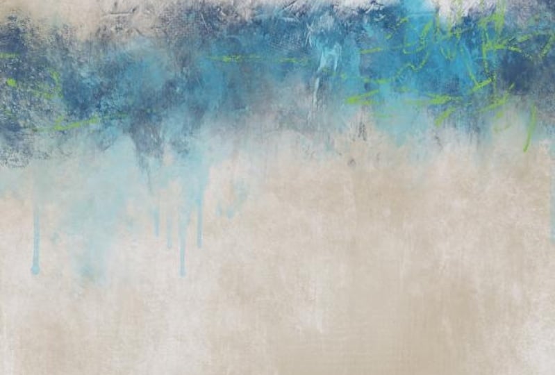
7. Painting 2 Background & Ground: Okay, We have finished this first painting that
goes with this room. As you could tell him
that picture there. And now we're going to work on a second painting that isn't quite as realistic is this, or just has a little
bit different look, a little bit more
abstract mark making. So we're going to use
the same canvas size. I'm going to leave
these two up there. This is a room with our
color palette here. So I'm going to get under the room because I like to turn the room one on and off to
grab the colors real quick. It's a lot easier when
that layer is on top. I'm going to put
a new layer here. And this time we're going to
work a little differently. We're going to work from a little bit darker color
to a lighter color. So I'm going to start with this blue right
here, bluish green. That's what I'm going to paint
the canvas width to start. And let's go with
let's go with the, Let's see what the
super thick would do. Let's try that. Just paint the whole canvas has got
some good texture in there. Just go over it. Many times as you want to get the shade he would
like for the background. Make the brush a little bigger. Of course, each, each
time you go over it, it gets a little bit darker. I'm going to work from
dark to light on this one. The last one we worked
from light to dark or dark to light to me as much. I don't know, it's
a little easier, a little more satisfying. Alright, let's see
what we got here. That's a pretty good texture. So let's go back to our colors. And let's get the super dark. Yeah, Let's try that one and draw a little line
as to where we want. The Verizon. Once again, I think I want it down
fairly on the low side, not right in the
middle. Like that. Brushing my own. Wanted to be on that pencil. Not right in the middle, but down here on the bottom. Third, just kinda scribble
in a horizon there. Now let's give a little bit
of something to the horizon. Let's go with some fun
ground marks here. Start with ground three. And we're going put
this on a new layer. And it put it kinda low. So I'm going to move it up
and I'm going to extend it, stretch it out a bit. There we go. Let's
add another new layer and give a little
bit of dimension. That color that I'm on. I'm going to pull the
color up a little bit. I'm gonna go over
a little bit to get a little bit
of a lighter shade more to the gray side. See what that looks like. And let's go with number nine. Make sure I'm on a new layer. Made that mistake the last
time. There we go. That's it. Cool mark, but it
needs to be smaller. There. Let's bring that in. Stretch it out, move it down, some like that. Now let's go. Let me go back to
the dark shade. Put another new layer. Let me turn off the rim. Make sure I'm on the new layer. And let's go with number ten. Stamp that in there,
dragging it out. So that's kinda fun. Let's blend these a little bit. I'm actually going to merge
those three together. And I'm going to use, what am
I going to use super thick. Let's do rough edge. I've got this set opacity
at the, around the middle. So it's not so strong. There's a harsh line right
here from that mark. I'm just going to blend that in. Really need to be
down where I can blend that pencil line too. So let me just merge that
layer with the canvas layer. There we go. That's
better than I can blend. Pencil line out as
well a little bit. This is a nice fun brush for adding texture when
you're blending. Move it up just a little bit. Just got some fun texture
that pops in there. Can even blend this
edge out a little bit. It looks a little
bit too structured. See much the same
size as this side. I'm wanting the left side to
be a little bit skinnier. Make that brush a little
bigger and pull up from the bottom to kinda trim that
sudden down a little bit. And then even do that at
the top to that brush, get some really neat
marks in there. Zoom out to take a look
and do a little bit more. Blending upward, go a
little bigger on the brush. Make that one side a
little bit trimmer. Okay, That's kinda fun. Now I'm going to take the same dark brush down here
underneath on the right. I'm going to try to put some marks to make
like a reflection. Actually want to
bring a little bit lighter shade into there. Let me pull this color
and see where I'm at. This would be more
of a turquoise, which I really like, but it's a little
bit on the gray side to match the chair, but you don't have
to match exactly. So I'm going to pull it
over to the right just a little to get some
fun turquoise color. And I'm going to make, I'm just going to add some of that color down
here on the bottom right with a brush
rather than a stamp. So let's go with that
same rough edge one. And it's not super bright. And just kinda, There we go. Now, I'm going back to the dark. I'm going to do
new layer on top. And I'm going to shut
that off and I'm going to pick another mark to go
down here on the bottom, on top of what I just did. So let's see what would
be fun to go there. What about number
12? A little big. Let's make it smaller
and pull it down. Trying to get some of
that mark in there. Now let's see what happens
if we rotate that Mark. Don't have to leave
it the way I have it. Okay, That's kinda cool. Now back to that rough edge
paint and blend brush. And I'm thinking, I want to blend out this middle
part right here. And blend in a little
bit of this part. I don't want it to look. I don't want it to
look so structured. Maybe even make it
a little smaller, come from both
sides, blend inward. Like that, shows a little bit of a almost a reflective thing. But I'm going to add another
new layer using that same. Well, I'm going to move with
the dark color up a little, get a little bit lighter
and toward the gray side. See what this does. I'm gonna get this stamp
here on the new layer stamp. Okay, I love the drips. I don't want to turn, turn it round, transform, flip horizontal, and move
it around where I want it. And it's a little bit dark. So I'm going to lower the
opacity of that. Like so. And I'm going to blend this left edge where it's got a hard edge using
that same brush. Even blend over some of that. Okay, Now, I want something
this lighter blue in there, which is this color. I want something right in here when that lighter
blue to tie this together. So another new layer. Let me look at my marks again. What about the rough
scatter brush? Let's see if that would do
like a little mark in there. Make it a little bigger. I'm just kinda, this
is not a stamp brush. You can actually
paint with this. Lay some of that
lighter blue color in there, tie that together. Maybe even bring it up here a little bit
over that darkest part. Let's look in kinda interesting. Now I want to bring some of
the other colors in here. I'm going to blend
these layers together. I mean, where it says together and make a
new layer on top. Turn on this. And let's bring some of this tan color in there
with a paintbrush. And let's this time ago
with the paint and blend. We're gonna do this. A fairly large size
across the sky. Bring some color into that sky. Leaving some of
the blue showing. Then let's bring some of
it down here as well. Maybe even a little
bit right there. All right. See if we can
brighten this little bit. On the tan. Let's go move. I'm going to move the color
wheel more toward the golden in kinda come
over to a goal. And using that same brush, I'm going to add some of
that color in as well. Who I liked that mark. Some of that down here. Just a little bit here and there. Right now. Making decisions
as I'm going here. Let's go back to this color. Let's get some of this
dark brown new layer. And with the super thing, Let's come in with
some of the dark brown and a couple of spots. Maybe over here on
this right side. I need a bigger brush than that. And over here on the left, here on the top right. I might have to go bigger on that brush down
here a little bit. So there we've got a little
more color in there. Okay. There was a color I didn't use. The other painting. I'm going to put a
new layer on top, turn this color back on. And it's these greens. And now I'm sitting here looking at the
bright green and I'm thinking that might be a fun one to incorporate
Somewhere in here. With a really cool Mark. Let me see. Let me go. Have a
huge number ten. Let's click number ten. Alright, that is an
interesting mark. I'm going to click on free form. And I'm going to reshape
this mark and bring it. I'm thinking I want
this splash of fun color noun here
at the bottom. A little bit like that. But I'm going to blend it. And let's do the rough
edge painted to blend this green mark in a little
bit and that's too big. That top edge where it's
a little harsh edge. And over here on the side too, just kinda one,
some of that out. That incorporates a little
bit of that green there. And you can play
with layer modes to, to see if a mark might create a more unique look on a different layer mode. And you can also
duplicate the layer, which will make it a
little bit stronger. And you can also
click on adjustments. Alright, let me
unduplicated that. Go back to the original layer
and click on adjustments. Let's play with this hue saturation brightness
click Layer. Let's pull the saturation
of that green up more. That's kinda fun. At about 80%. It gives that nice little
splashing green in there, which is kinda fun. Like to bring a little
bit of green mark up here into this
horizon as well. So let me do another
layer and see. Let's go with I
think the fan brush, maybe a little too
much, but we'll try. I'm trying to decide
where I want it. I'm going to get the brush
size right like that. And then once again,
Hue Saturation, Brightness layer, bring the saturation of
that one up around 80%. Now that's kind of interesting. But I think it's covering up
the dark a little too much. I want some dark marks in there. I've got two choices. I can either pick the dark
colors and add the marks, or I can mask away some of this with a couple of fun marks. And that's fun to
do with the pencil. Somebody get onto pencil. Make sure I'm on that
layer where I just added that top tap the
layer click Mask. Now, as I paint
with this pencil, it will erase basically
some of that, but I can bring it
back if I want to just put a couple of
marks in through there. So it's not so structured. And even do a couple of
these scribble marks. That's kinda fun. A couple of more marks. I like the scribble marks there. That's kinda fun. If I do that on the other
layer, layer seven, mask do the same thing, but not as many marks, maybe just a few. Just to get some broken this there's
some interest in there. Let's see. I don't
like that one Mark, I just did so on a mask, I'm on black, which
takes it away. You can go to white on your color wheel and go back
over that and bring it back. Tone that marked down there. It's kinda fun. Alright, so I've got
the green and this one. The next step would be to start bringing in
some lighter color. I do want to add some clouds, some type of cloud in the sky. And I want to add a little
bit of light down here on this bottom with
some marks as well. So in the next segment, we will go on to the second
part of this painting.
8. Painting 2 More Color and Sky: All right, Now it's time to
bring a little lightness into this because I am
going for a lighter piece. I've lost some of my
blue in the sky though. Here's all my layers so far. And to avoid clutter, I'm going to squeeze
all of those together and add a new layer. So I'm gonna go back
to grab that blue. Actually might pull
it a little bit toward the center to get a
little more rich color there. And turn that off. Let's bring some blue in. Let's try the super thick. And it's not a
whole lot brighter, but it's enough or there's
some blue in there. Just quickly making some
fun March through there. And I'm not worried
about it being messy. Even down here. Well, that's a little too much. Let's back that off. Just a little bit right there. And let's go with
the rough edge and add a bit of that blue
somewhere over here. Hello right there. That's
a little strong mark. So I'm going to blend
that with the same brush. Blend that out a little
bit to tone that down. So there's a little
bit in there. Okay, let's make a new layer
to go with a lighter shade. The lighter shade
I've chosen this, this one. Turn that off. Let's put some clouds in first. And I already know. I'm gonna do a couple
of these heavy clouds. I go a little bigger than that. I'm just going to stamp one there and go to the other one. Let's see. We're not want that. Trying to decide where I want the cloud. You tapped undo a lot. Lower that size a little. Alright, that's good. Let me bring in this one. And this is a totally
different looking cloud. I just want to add
some fluff in here. Here's another heavy stamp. Let's see what this
one looks like. These are all going
to be blended. That's kinda interesting. Alright, let's
blend these clouds. Let's begin with this. Oops. When the super thick, we'll start with the top one. And just kind of go around
those edges to blend that in. This brush has some
really cool texture. I really like it and
come right on down over the painterly one. A little bit bigger brush. Blend that in. Leaving some of the heavy painterly
marks of this one. Go back up here, soften that up a
little bit more. Pull this one out a little more. Down here to this bottom one. Just going all around the edges, softly blending with
the super thick brush. Pulling it down toward the
horizon a little more, pull that white down. Spread that out a little more. Bring this part up a little. So those clouds
are pretty bright. Let me pull the opacity down. 70%. Let me add a new layer, and let's put a cloud down here in this bottom left corner. Go with Cloud one and just put it in there and
then transform it, move it around, Let's
flip it upside down. We can actually reshape
this particular one. And then using that
same blending brush. When this one in a little bit, just going to add some
dimension to this area. Brightness. Alright, now, I
don't really like the dark around the
clouds on the top. So underneath the clouds on
top of that blue layer I did. I'm going to add a new layer, and I'm just going to paint with one of these paint brushes. Let's see the paint and blend. Whoops, that's a little big. And just bring some of that lighter color and
all around the clouds. And this color is
appearing underneath them to help brighten
this upper part. And you can do your
brush strokes in any way that you want. And even down here. And a little bit of that white. Even down here at the very
bottom where the green is. Let's add a little touch of it. So it's getting a
little lighter now it needs a little blending
on that layer. So let's blend with
the super thick. Since I've been having
good luck with that. Go with a larger
brush and just kinda gently soften all that
up just a little. Leaving some of
the marks showing not doing every little bit. Like those Canvas marks. I really liked the Canvas marks
over the dark blue there. I'm going to, I'm
not really going to blend that over the green. That's a little harsh song. I am going to blend that. Hey, we're getting somewhere. Yeah, I'm actually liking that. I think I need a little
more white though, just to make sure I'm gonna
do that on its own layer. I'm actually going to go make
sure it's on solid white. If you double tap on
your color wheel there, on the edge where it's white, it should go to straight white. Male. Remember how I used the ground marks but
I turned them around. I think I'm gonna do that
with a couple of these. So let's try Number nine. Stamp it. Transform, right? Or not flip, rotate. There we go. Let's
pull this markup and let's make it like super big. Whoo. That's kind of interesting. Not really want that
under the clouds. So let me pull that layer
down underneath everything. And you can adjust opacity. But I really liked
the bright white. I wonder if I should
bring the opacity of the clouds backup. Know. What I need to do on the bright white layer
is do a little blending. But first I really liked the way that made it cool mark
on that right edge. So I'm going to duplicate that. And I'm going to transform
that and flip it horizontal and pull it over to the left side
and pull it down. I think I'm going to pull it
down over the whole thing. Like so. I didn't pull it
down enough there. Okay, so we got some
cool marks there. And I'm going to squeeze
those two layers together so that it made a really fun
texture layer on top. And it's on top of all these, but it's a little strong. Now, you can reduce the
opacity and drop it down. But I liked some of the
bright white being there. So instead, I think I'm going
to do a mask on here. Mask. Now. On the mask, make
sure you're on black. Double-tap near the black and it should go to straight black. And let's put let's put ground two on there
and just stamp it. Okay. You can barely see it. Let me stamp a
little bit bigger. It put it right
here in the middle. But what I'm gonna do, um, do the same thing. I'm going to transform. Oh, no, I'm not. Okay, that's not working
the way I intended. Alright, forget that. Let's bring in a color. Sometimes if something
doesn't work, I just go about it another way. Let's pick the light color off, but let's go more. Now let's pick them. I'm sorry. I'm thinking as I go, Let's pick the blue color
on a new layer there. Turn the top layer off. Alright, now we're
going to stamp mark with the blue to
tone down the white, but we're on top of the white. So let's do that. First of all to
try bringing layer five up, overlay or none. Okay, that worked a
little bit to tone it down because it brought the blue painted layer
up over top of that. Alright, now let's add some
more blue with a mark. Back to that same mark. Alright, there's that mark. Then we're going to rotate it. We're going to pull pull it down and just let's pull it
all the way across to add some cool texture. In there. It's a little strong. Let's reduce it. Play with opacity. What happens if we
change layer mode? Ask yourself, when you're
doing these lots of what-ifs, what if I do this?
What if I do that? And that's some pretty
cool texture there. It's a little dark. Let's go to one of these
other layer modes. Overlay, soft,
light, hard light, multiplies a little dark. Let's mess with it. Go to your adjustments, hue saturation and
brightness on that layer. And let's raise the
brightness of the layer up. That's a little better.
I've got some fun texture in there because we're
still on that layer. We can still re-size it, stretch it out even more. Can even rotate it
around. Even more. It's just getting some
cool fun texture in there. But we have a harsh
line at the bottom, so we need to get rid of that. So back to the super thick. And let's just blend that. Well, I thought I
was blending it out. Maybe I'm not
something right here. This layer, this white layer where it's making that harsh line that
needs to be blended out. So I had to get on
the right layer. Now I can blend this out. There we go. Bring some of that. There we go. Got rid
of the harsh line. Okay, back to the top layer, the blue one. This one. We just toning things down. We can adjust opacity, which I think I'll do,
make it about 50%. There's McLeod's. Let me raise my opacity
of my clouds back up. Make them more white. Closer to white. So about 90, 91%. I think I want a little more
cloud or something in there. Alright, I'm going
to to declutter, squeeze everything together,
and make a new layer. And I'm going to go
to the light color, turn that off, and go
back to the clouds. Let's go back to number seven, which is a heavy one
and stamp it in there. That's kinda neat. Might need to resize it or
reshape it a little bit. I don't want to
lose all that blue. I just wanted to bring
weld dimension in there. Let's go to the other
cloud, the other heavy one. Stamp it somewhere in
there. There we go. I see now that thick paint
Luke is on there and I actually like that and I don't want to blend that too much. But this bottom part of this
one I am going to blend. But I think I'm going to blend
with this canvas paint and blend brush and
just pull down on that bottom part of that one a little bit all the
way across the bottom. Pretty cool, pretty cool. I want a little bright white, just like are in that
same color of the clouds. Down here on this
bottom portion. Let's make a new layer. Pick a brush. I'm thinking. I don't know if I want
to use a stamp brush or if I want to use the paintbrush, let's try the rough
pencil and a larger size. And just kinda scrape a little little marks in here. I'm just kinda making
marks wherever. All right, Now that
I've made those marks, let's blend them and
I'm going to use that rough edge
one to blend this. Let me get it down small enough. I don't want to blend
it out too hard. I want some of that bright
little marks to show. I'm going in the
same direction with the blending that I
did with the painting. Zoom out to see, see
a little better. Maybe make it a little bigger
down here because these are a little bigger strokes. Maybe a little bigger. I'm not sure I like that part, so I'm going to blend
that noun and blend, come down over top of it. To soften those
up just a little. Do the same up here, come over top by this edge. Zoom out to see
what you're doing. It's kinda fun. Just sitting here
thinking now, studying. You know, there's no
rule that says you can't go super bright with
a color in here. And I'm sitting here
thinking, dang, I'd like a little bright
turquoise in there somewhere as a mark just to bring
some interest into it. So let's go turn this on. Get this blue, make a new layer. Take that blue, drag it over
and up to the brighter side. Now this may not work, but that's why you do new
layers and you can always delete them or change them. And I'm thinking down here on the bottom in the area
where I put the green, I'd like to damp some
turquoise right there. And maybe even up here
in this blue area. So let's go with a stamp brush and I'll reshape it
like I did before. Let's pick one. Number three has some pretty good texture. Let me stamp that down. Trying to get it lined up so
it doesn't go off the edge. Make it a little smaller. There we go. Now, we're going to reshape it. I'm going to turn it around. It's on free form, which will allow me to
reshape it anywhere I want. It's kinda fun. Make
it a little smaller. That's some fun color. I think I want it even
a little brighter. So on that layer,
go to saturation. Let me brighten it a
little human saturated, a little, brighten it a little. I'm just wanting that little
pop of color in there. Okay. Now, you see how the
bottom edge is too harsh. I need to blend that out. So blending brush, stick with that
rough edge and I'm just going to get on
that bottom edge. And I'm going to pull that down, scrub that around to get
rid of that hard edge. And here at the top, there's
a little bit of a hard edge, but I don't mind at all. I just want to pull down in the middle of it to
break it up a little. Now how fun is that? How that bright color in there. But I think it needs to be there needs to be
a little bit more of that color up here
near the horizon line. And maybe even out
here to the edge, but not quite as strong as that. So let's make a new layer. And I love the idea of the
splatter and the drips. Let me try number five. Stamp. This has got some nice splatter. Okay, I've stamped
it, transform, rotate, and bring it over here. I'm going to have to zoom out to see where I am. There we go. I'm going to re-size it is
on free form so I can squish and pull and just
kinda move it around. I don't want to put it
right at the horizon line. That's pretty cool. It's over
top of the bright marks. So I have to decide whether
I want it over under. I'm just going to
pull it down under and see what it looks like. I like it under, but
I do need to blend that mark out and there's a hard edge here at the horizon. So make sure you're
on that layer. Rough edge still. And just get on that
top line where it's real harsh and scrub
that out to blend it in. Make sure I don't
have any harsh line down here at the bottom. I do a little bit. There we go. Check your edges. That's starting to
look kinda fun. Thinking about a little
more white lines maybe in that makeshift treeline there. Let me just try to do a
little scribble. Get on top. New layer, turn this on and
get back to that white color. Or off-white. Go to the what if
we use this stamp? Stamp it and a small
size and then rotate it. No, it's too light. Clear that layer. Try again. Let's skip the stamp and just go straight for
the pencil brush. The pencil is great for just adding in little scribbling marks where you might want them. I'm thinking right in here, right in here, right in here, just to add a little interest. And I'm thinking even maybe add some more
scribble right there. I like this some kind
of line coming from the left to the right
here on the bottom. Bringing so that's
a little strong. Bring a sweep mark over there. Okay, That's fun. Now I got to blend them. So once again, the rough
edge and I need to be on a pretty small one just to kinda break those up so
they're not so strong. Same with this one did. Then this one here
at the bottom. And go a little bigger
brush to blend that. Just to break it up a little. But yet let us still be there. That star, that's fun. That is fun. I really liked this one. I'm looking at it to decide
if I need anything else. I'm wondering if I need a little bit at
tiny gold on that. How that tree line somewhere, maybe right there where
there's some little brown. Add another layer. Turn on this and grab the brown. See where that takes me. Let's bring that over here. More towards the orange
and change it to go. Just to add a little pop
of color right there. So turn that back off
and pick a paintbrush. Haven't used the smooth one
at all. Let's try that. Fun, but a little strong. The rough edge to blend it. Just pulled down. I just want a hint of that
little golden color in there. Zoom out to see if
it's too strong. It's just a hint, see,
just a little hint. Pulled down a little more
just to leave a hint of it. And maybe even add
that into the bottom. Maybe over here with this green is just make a little
mark right there. Still on the rough edge. Swiping sideways to make
that blend in spring, a little hint of color in there
that wasn't there before. Thinking, here, I
need something. Alright, I'm happy with
all of this so far. So I'm going to squeeze
those layers together, make a new layer. And I'm thinking this blue here, maybe even a darker
blue right there. I'm just going to get on it
and grab it right from there. Thinking a few paint
strokes there. I don't know which one. How about pain blend? Go back to my old favorite. I'm thinking here I need to have a little little bit of something
coming out right there. Then even going down over
that is not bright enough. Grabbed the cream color
now or the off-white and kinda dot that and
bring some of that, tone it down a little. I'm nitpicking now, my
favorite thing to do. Let's pick the rough edge
and just make a mark and see what happens here. Big, strong, gently tap. Just add a little bit
more white right there. How about if we even grab
some of that turquoise? Just make a slight little
mark right through there. The marks too strong
now, losing my voice. Well, there we go. That's kinda interesting. And if that layer too strong, lower the opacity and you turn it all the
way down and see what you had to scoot over here. All the way up. Come on now. All the way down. All the way up. I do like it all the way up, so I'm going to leave it there. I've lost a little bit of my green down here where
I put the blue, which I knew I would do. So I'm gonna go back and grab the green,
that bright greens. Turn that off. I'm going to bring in a little
bit of that with a stamp of some sort. How about the splash? Making it different size?
Oh, that's too much. Different sizes. Sure. I like it. Pull the green out and make it a
little more saturated. Well, no. Grab a green from up here. Maybe this is not going to work. It's not coming out right
on top of that color. So let's not use that brush. Let me go grab the green again. Make sure I'm on
the right shade. Let's pick a different brush. That one's just a little
bit too strong and I can adjust opacity and
all that business. What about the
impressionist brush? Just a few little flex in there. If you press really lightly, it does it real soft. Spreads this brush
out quite a bit. So still not pleased
with that color. For some reason it's
not coming out. Probably because it's
on top of the blue. How about if we pick the
yellow? Let's kinda fun. Might be a little strong. Pull down that opacity. Just kinda breaks up the
blue just a little bit. And if a mark there
isn't what you want, you can just click mask and go in there with
the paintbrush. Like the paint blend. And just softly paint with the black on the mask layer and
it'll blend some of that out. Just adds a little. Look at those neat marks. How well or how
well that's gone. I'm saying here, looking
at it, thinking, do I need anything else? So I'm going to take a
quick break and come back and finish this on up.
9. Painting 2 Final Touches: Okay, I'm ready to
finish this one up. I'm gonna do the same thing to this one that I did
to the other 1. First we're going to
merge the layers. I'm going to add a
new layer on top, and I'm going to go grab that canvas texture
that I've given you. This zoom out so I can
transform this to fit. Well, it's on uniform. I wanted on free
form. There we go. Whoops. I can stretch it exactly
where I want it. There we go. Now I'm going to
set it to multiply. And of course it darkened,
did quite a bit. You can play with
opacity, 40%, 39 percent. And you can now see that
texture in the clouds. How fun is that? You don't
have to leave this layer. As is, you can flip it
horizontal or vertical, and you just flip it
around until it gets the look that you like.
I kind of like that. I'm going to duplicate
that layer and put it on overlay soft light to brighten it up just
a little bit more. Maybe a little much. So we'll play with
opacity on that layer. About 20%. Turn it off on, just brightens it
just a little bit. Go back to the multiply,
play with opacity. Just play with this until
it gets like you want. But it really gives that a dimension to those clouds when you add this texture layer. And it shows that
real Paint Texture. Alright, I like that.
Squeeze those together. How fun. Now I haven't signed
these pieces yet. But normally I would
add a new layer here and pick a color that
I want to sign with. Let's just go with
the creamy white. And I would go with the pencil and make sure I
have a new layer. Make the pencil pretty small. Down here on the
bottom, like that. And then you can re-size
your signature to fit. You can move it around. Yeah. Let's cleaves that together. Now, sign that one. Now I'm going to save this as a j pain to get
a solid image. When you paint these, if you put the room
photo underneath, you'll see the room photo
through it. It's not solid. I can't describe it. It's not really solid
until you save it. So i'm, I'm going to import the saved photo
just so I can show you, you, you don't have to do this. But so there's the saved
photo and turn that one off. And I have this one. That's the other one,
that's this one. See the difference? It's funny because
on this version, we started with a light
background and worked our way to dark colors. On this version, I started
with a dark background and worked my way to lighter colors and this one actually
turned out brighter. And that's how I usually do
my paintings in my studio. I do start with a dark background and then keep adding the lighter colors. So depending on
the look you want, you got two choices here. Let's see what it
looks like on the rim. So this is just for me showing
you what it looks like. Zoomed in here where
I can mess with it. So we can see. This wants to be difficult and actually reverse
me out of there. Alright. So there's that one
over the chair. Let's pull the other
one up to the top. There's the other one. So which one looks
best in the room? Don't know. It's my husband's chair. It's his favorite spot. So I'll probably ask him which one he likes better before
I ordered the print. I like this one
better just because I like that pop a turquoise
color in there. But he may like the more
muted, softer, darker tones. That's two ways to make a
landscape abstract landscape. Both of them are kinda abstract. This one's a little bit
more on the realistic side. And then on this
one I tried to get looser with the marks
and more abstract. So it's just personal preference for you and your
room that you're working on and
which one you like. And we're going to
do another room in the next video and
see how that one goes. So I hope you guys have
enjoyed these two. And then we're going
to have fun with another room in the next video.
10. Painting 3 Planning It Out: In this third lesson, we're going to design
the landscape to go inside this
frame, in this room. And I want to talk
about some tips that I've kind of already gone over here and there
throughout the other lessons. But I just wanted to
do a little recap. When designing a
landscape for the room. Look at your space that
you're designing for and pick which orientation would
go get best in that space. In this space, I
square woodwork. But there's already a
rectangle frame here, which was a piece of
art in that I removed. And the vertical
orientation works very well in this room between these two long vertical windows. So I'm going to keep
the orientation vertical for this piece, but measure your space. See how big you need
to go that will determine the file size them. If you're going to go
real big on a wall, you would need a larger file
size than if you're doing a small piece for say, just a small accent
piece for say, a bathroom or
something like that. Where you don't have
a lot of space, then you could use this
smaller file size. So keep that in mind
when you're designing. I'm also, let me get
on a brush here. There we go. Determine in your landscape, where do you want
your horizon line? I rarely put a horizon line
in the center like this, but it can be done. That is, that is a
spot to put it if you want to divide
it in the center. But it's a little more
interesting if you put your horizon line on the lower third or on the upper third. And I think we've done a couple on the
lower third already. So in this lesson, I think I'm going to
do on the upper third. Um, another tip I have are a thing I want to go
over is you can paint. If you don't like
the stamp brushes, you can paint whatever you want to with the
brushes that are there. So if something is or you
can add to the stamp brush. So let's say a horizon line
isn't working and you want to add to it using one
of the paint brushes and add some marks to it. Marks is what makes
us stamp brushes. The stamp brushes make
it super easy and super fast to do a landscape. I am obsessed with
stamp brushes. I use them all the
time for mark-making, for not only for landscapes, but for integrating
interesting marks and texture into my paintings. I designed my own stamp brushes, and I collect stamp brushes, I buy them all. I have a whole host of brushes
here in my files that I have purchased and
stamp brushes, you just can't go
wrong with them. There is always a use
for stamp brushes. You can make your
own stamp brushes. So for instance, here's a, here's a cloud stamp I made
from a black and white image. In order to make your own, you would need a black
and white image. I often make mine from paint, such as this one was
made from paint. I painted the Cloud in black
on a white piece of paper. And a there took a
photo or scan it. And then all you have
to do is duplicate a current stamp brush that
works the way you wish. And then when you go into the duplicate
brush, click on Shape, click on Edit above the shape, and it'll ask you to
insert the new photo. And so you insert
the new photo and click Done and then you will have a new stamp brush with a new shape and
you can give it a name. So don't be afraid to try
making your own stamp brushes. Don't be afraid to
alter a stamp brush. For instance. Let's put the stamp down here. Like I've shown in
several videos. Of course, this is
on the wrong layer. I need it. You need it on its own layer
to be able to alter it. I'm gonna get those strokes
off of there for that room. Okay. So make a new layer, put your stamp down. Just tap somewhere
and it'll appear and use the transform tool. Don't be afraid to alter these. Don't be afraid to. Once you lay it down, add some paint marks to it. But you can alter it
by stretching it out. If you have it on uniform, it will stretch out uniformly. Trying to get that undone. There we go. If you want to really alter it, you can distort War. I use free form. And that way I can
pull the sides. Make it look like I want. I can even make it a square
mark by altering the size. So it's a totally different mark than what we just laid down. So don't be afraid to do that. And like I said, don't be afraid to add
paint to that brush if there's something
you don't like about it or you want it
to be more interesting. Just take one of
the other brushes and add some paint to it. And that way you have a different look than
the actual stamp. Don't be afraid to change
the look of the stamp. Make a stamp work for
your piece of art. Alright, when it comes to color, I like to pick just a few colors from
the room I'm working on. And don't be afraid to use a bold color like we did in the last lesson with
the turquoise color. Don't be afraid to put that little pop of color
in there is that accident. It really brings
a piece to life. You don't have to do that, but don't be afraid to do that. Experiment with it. Just see what feels
good to you and then save your image
and then put it in your room like we've done
in the other lessons, like I'll do in this one. Put it in your room and actually look at it and see if you
need to make adjustments. If you do go back to
the main image and continue on and then save it
again and look at it again. And then when it gets
to the point where you really like it to save it again. And then you can
have it printed. And then you've created
your own work of art for your space. So let's see what else was
I going to talk about here? Don't be afraid to go. I wanted to mention
something else about the stamp brushes. Don't be afraid to go
big with a stamp brush. These are high-quality
stamp brushes. So you can, I mean, they go
a certain size, like so. And I'm just putting this
over top of this image. I turn that off, but
don't be afraid to get on the brush and really
stretch it out. Like so the quality
will still be good. You can also, Let's say let's
put another one on there. As a new layer.
Remember, New Layer, New Layer, New Layer. If you want to alter
that brush mark you just made and not alter the
ones underneath it. New layer. That's something I tend to forget and I have
to correct myself. But don't be afraid
to mix layer modes. So here I've put
two brushes damage, you can get a whole new look
for your piece just from playing with the
layer modes, like so. And just go through
them all and see what, what looks cool to
you, what you like. And don't be afraid
to add more layers, like duplicate a layer and add additives
another layer mode. So we've got a totally
different look there than we had there. Remember, on your colors,
on your color wheel. If you want to change the color, if you want to neutralize it, pull it more to the left. On the color wheel. Brighten up, darken down. If you go over here,
you're going to get really bright, really saturated color. So let's say I wanted
to add more neutral, lighter color to this. With another mark. I put that on a new layer. There we haven't another mark. You can flip the layers. Vertical, horizontal. You can rotate them. You don't have to use a stamp in the same way it is presented. So experiment with that to get the look
that you're after. You can also adjust the layers
here and your adjustments, you can adjust hue
saturation and brightness. Let's say I want
to know a little bit brighter. Like that. You can adjust color, bowel, color balance,
curves, et cetera. You can even blur that
particular layer. And notice up top it says
Gaussian blur slide to adjust, just pull to the left
and it will soften that. Like so. So that's kind of
a fun thing to do. Let's talk about the clouds. Just because of cloud. Is presented as a Cloud. Doesn't mean you have to
use a cloud as a Cloud. So there I've stamped to Cloud. But let's say I want to
smooth that out a little. I can use the mop brush loops. I'm on the paintbrush, go to blending brush
and use the mop brush. You can smooth that out. Like so. To create
a different look, you don't have to stick
with the same look. And of course that's kinda light so you can't see it real well. Let me duplicate it. Every time you duplicate a
layer, it'll get darker. Like that. Um, but clouds don't have
to be used as clouds. They can be used to add light somewhere
where you want to, and if you blend it out, you can change layer modes. You can maneuver that cloud into a shape that you
want to add a streak of light or stretch it out real big just to
add some interests. These clouds also make good fog. So just because you're using a Cloud as a cloud
when you stamp, it, doesn't mean it
has to stay that way. It can make a good
foggy look to it. If you wanted to add
fog over a horizon. Now the first lesson, I stayed pretty realistic. The second lesson, I got
a little more abstract. So in this lesson
for this piece, I'm going to get even more
abstract and very simple. And this is gonna be
a very fast pace. So there probably won't be multiple videos for
this particular lesson. I want to go ahead
and pick my colors now that I wish to use, I'm going to start by picking the neutral color from the wall. And I'm going to go into my Smooth paintbrush
and I'm going to add and that color right there. And then I'm going to pick
a little darker shade of that neutral
color and add that. And then I'm going
to pick a real light shade from the couch. Well, that's two gray C. I
don't really want the gray. So let me see if I can move this around and get a
little warmer tone. Well, it's okay.
That's a light gray. That'll work. Won't keep it. Okay. Now I need to get some blue. And I'm thinking,
I don't know how bright I want to go
and I'm thinking I'll get maybe this blue
from the pillow. And I love this turquoise
blue from there. And then for a really
interesting addition and pop of color just a
tiny bit in this image, I'm thinking I would like to get one of these
shades of green, so I'm just sliding it around to determine
there's a good one. I think that might
be a little too. It's not saturated enough. Let me pull up
makes sure I'm on. There we go. I think that's
a little better shade. That's right. So I want to add a little bit of pop of that green
color in this other, in with these other
colors, but it'll be very, very small as an accent. So these are the
colors I'm going to work with for this room photo. And we will continue on with
that in the next video.
11. Painting 3 Start To Finish: Okay, I have saved the
room photo along with my swatches up here in the
top left, right there. But I need a vertical image. So I'm going to
add a new canvas. And I'm going to use my traditional size that
I have used for years, which is 4 thousand
by 6 thousand. Because I think that will
fit in there in that frame. It might be a
little bit lengthy. For that frame. I'm going to input the
photo, insert the photo. So I can have that
as my reference point on its own layer. And then I'm going to add a new layer to
start painting on. I'm going to put
that underneath. So I like to keep my
room photo layer on top. And I'm going to start
with a background color. And I think I'm going to start
with the darker shade of this tan here for color. So I've chosen that. I'm going to turn
off the room photo and I'm going to
paint this canvas. Let me look back
at Durham photo. I want to mention one other
thing that there's a lot of texture in here with
the n table texture, the base textures,
the pillow textures. So I'm thinking the only
place I want a lot of texture showing is probably
where I put the horizon line. So I'm going to not do a ton of visible
texture in the background. It's gonna be very light. So let's paint some texture. Um, let's just start with
the paint and blend brush. And fairly decent sized brush to get a canvas
texture in there. No work on this one very fast. And then I'm going to blend that with the paint and
blend as well, because that'll
give it a smoother little bit smoother texture. I'm not blending
every little bit. I want some of the little
canvas bits to show through. I'm going to add another
new layer on top of that. Pull up the moon photo. I'm gonna go with
a lighter shade. And I'm going to add more on top of this with a
different brush. Let's try the super thick. And it's, it's very light. Let's go a little
bigger. It's very light. I'm just doing it
here and there. Just add some color variation. Now let's go with the
gray that's even lighter. And another new layer for that. And on this one, turn off the room photo. I'm actually going to use a stamp brush to stamp a
little bit of texture on here. So let me pick a cool stamp. Well, how about that one
we tried minute ago, the ground stamp say that's
got some good texture, but obviously that shape is not going to cover
this whole Canvas. So this is where the
tip I gave about don't be afraid to
alter your Canvas or your stamp brushes comes
in because I'm going to pull this out. Super big, super big. To add some fun
texture in there. A little smaller than that. Benefits a little too bright, which I think it is. I'm going to pull
down the opacity. But now we've got some fun
texture in that background. Might add a little more. So let me do another new
layer and pick another stamp. Let's try this one. Have to go a little
bigger than that. Trying to stamp it
right in the middle. I'm going to rotate this one. Like so. Whoops. I grabbed it wrong. Good grief. Let me unselect it
and re-select it. There we go, trying to
move it around a little. So I'm putting it
on one side there, which is kinda fun. But, um, I liked
that on that side, but I want some on
the other side, so I'm gonna do it again. Make another mark. And this one I'm
going to rotate and flip and pull around. Like so. Just trying to get
it looking like I want. And on both of these layers
they're a little bright, so I'm going to lower the
opacity on those as well. Now on that last one, I have a hard edge right there. I don't want that. I'm gonna get on that layer
with the blending brush and just get the rough edge
brush and blend that out. So now I don't have a
hard edge there anymore. Look around and make sure I
don't have any anywhere else. So that's just done. That background is just done
by altering some textures. I do think I want to add one
more little bit of texture, so I'm going to grab
this color from there, add one more layer, and pick another stamp. I'm not sure which one. Let's try number nine. Let's not got enough. It's got too much solid color. What about if we just
use the fan brush there? Just to add a little bit
of that color right there. In there. I want it a little
darker at the bottom, the horizon on this, I'm going to blend, merge
all these together. The horizon is going to be grab a pencil so I can show you right
up here on this one. That's what I've decided
would look cool in this room. So back to the room photo. On my horizon, I'm going to
start with the darker blue. Turn off the room photo. I'm going to grab that
number three stamp. I really got some fun texture. And I'll put that right there, but it's not where I want it, so I'm gonna move it
up where I want it. And I'm going to maneuver
it by using free form, pulling it out where I want it. All right, I'm going to add
a new layer on top of that. And I'm going to pick
this turquoise blue. And I'm going to add
another stamp on top with the turquoise blue. Let's try number five, which is a splash. Put that let me put it down here so I
can see it and then I'll move it trying to get
it stamped just right. I'm not being very
successful and grab it, move it, reshape it
the way I want it. That's kinda fun. I'm going to add
another new layer. And I'm going to get this drip
stamp with the fun drips. Me undo that. That's kinda fun. Now do I want that under these layers are
over these layers? That's the question. If I pull it over, It's a little too solid. So how about if I move this
layer down under the dark blue and then move it around. There we go. That's
kind of interesting. How fun is that? Do I want the opacity that dark? No, I don't. So let's adjust it. Do I want a little more
dark blue in there? Maybe? Say a lot of this is
what IF and what do you want? Or do I want to bring some of
that darker brown in there? Let's try that. Turn off the room photo. Now, how do I want to
bring the dark brown in? Is the next question. Do I want to use a stamp
brush or do I want to use it? I mean, I could use a
cloud brush and create a little fog or it could use. How about the scatter brush? Let's just see how that does. Tried to paint with it
here off on this side. Well, that's kinda neat. And I'm painting
real light just to bring some of that
brown color in there. And then just go
around and add some of that with this brush and
the rest of the painting. Now how about getting
this lighter color in there too, in some way. What if we do a splash with
that on another new layer? See what that comes out
to be. That's too big. Let's move it around. Let me rotate it. Kinda interesting with
this taking away. Once I have on the left side. So I got a couple of choices. I can put it under these other
layers or I can just using brush to mask off
the left side here. Let's do that. Mask. Your color changes to black. You need a paintbrush now to
be able to mask that off. So how about we try the
scatter one? In this area. I'm just gently pressing
on this and doing circular motions to get it
off that horizon line area. I mean, you can press really hard to get it off
a little bit more. You can even use the super thick brush to
get it off even more. And you can see the
layer right there. So that got some of it off. But I still feel it's
a little strong. You can adjust the opacity of
the whole thing right here, even with the layer
mask on there. So let's do about 50% on that. It's just very subtle. I still think I
need a little more dark blue on that left edge. Let's add another layer. And let's get the
dark blue color back from the room photo. And let's add something there. What about the rough edge? Just paint it in. Just paint. Now that's a little too strong. How about the fan brush? There? Just a little touch
of the fan brush. Maybe even bring
a little touching that fan brush over here. That's a little too tall. Keep it down lower. There we go. Maybe even over this
a little bit there. Alright, now remember
I said I was going to bring that
green and let me go ahead and merge all these
together and find that green. Now I want to bring a pop
of green in on a new layer. Turn off the room photo. Now how do I want to do that? I want it to just be
a tiny little bit. To do tiny little bits. I like to use the pencil
and just make some marks. As far as what kind of marks? Have no idea. Let's just do some pencil needs to
be a little thicker. I'm just making some marks here. Whatever mark you want
to make let's do. He can do something like this. Squiggles circle. I like to zoom out
so I can see where the green is going to be. Just move things around. Let's kinda interesting,
it's definitely abstract. Um, now that I've put
the mark in there, I don't want all of
the marks showing. So I'm going to add a mask. And I'm going to go on
with the rough edge. Let's see how that works. I'm just going to tap
on certain areas of the green to tone it down. Just a little bit. It's showing if you take
away too much, just undo. So there's a little green
in there. Very subtle. I like that. Let's merge that altogether. Nate can adjust once you've merged everything, duplicate it. You can if you duplicate it, it's automatically going
to get darker already. If you turn off the bottom layer to go back the way it was. But you can play
with layer modes. If you really
wanted to change up the look and get a more rich
color, a brighter look. Soft light is one
of my favorites. So I can turn off, on, off, on. I kinda like soft light. It may be a little strong. So I'm going to slide
my opacity around until it starts looking
like I like it. Maybe close to 70%. Now I really like that. So at this point, I'm
going to save this image. The reason I do this is because the image is going to show
through what's underneath it. So I've saved it. So now I can turn my
room photo back on, again on my room photo layer. And let's blow this up
so we can see it Good. Well, then you can't
see the green. So I'm, I'll leave it like this. I'm going to input the new layer and insert what I just saved. And obviously it's full size, so I'm going to resize
it down to fit in. Let me zoom out. Now. I gotta get that unselected
before I can zoom out. There we go. I'm trying
to resize this where it'll fit in the frame. In the frame just to see
how this piece would look. Having trouble selecting, only de-select and
re-select again. Sometimes you gotta
get in a little close. Oh good Lord. I've accidentally hit the Undo. All right. I'm just trying to
get it selected. Good, where it'll
go in the frame. That's the general idea. So there we have a fun piece that kinda looks like a
landscape from a distance. But when you zoom in, it's got more of
an abstract look. I know it's not
fitting in the frame, but you get the general idea
just to see how it looks. I'm only using the room photo to see how it looks in the room. Obviously won't be
printed that way. But I really liked the way
these colors turned out. I think that looks really
cool in that room. I like them bright burst
of the turquoise color. If I wanted a little
bit more dark color in the image, I could grab. If I could quit painting, I could grab the dark blue and add some more
of that in there, but I really liked
that turquoise pop. And I liked the addition of
the green that I've added in there. So there we go. That is a fun
abstract landscape. We squeeze those together. That goes in that room now. And it picks up on
that a little bit of green, which is fun. Um, I also want to
mention some other tips, or one other tip. You don't have to
use a rim photo. If you have a certain
colors you'd like, you can just swatch out
to your colors like this of the colors that
are your favorites. If you have a regular photo of something else that you like, that inspired you color wise, like you saw something like a pillow or a blanket or
something and he said, Oh, I just loved
the colors in that. You can take a picture of
that and swatch out colors from that to go in
your room as well. You don't have to
use a room photo to make a piece of art. I'm started this project on
thinking of room photos. So that's why I did room photos. But I hope you have enjoyed this and be sure to watch the
bonus lesson to that. In that lesson, I create
a really fun piece. So we'll see you in
the next lesson.
12. Bonus 1 Abstract Landscape: In this bonus lesson, I am just going to quickly paint and abstract landscape
using this brush set. I'm going to try to
do it very fast. And I'm not using a room for inspiration this time or
any colors for inspiration. I'm just picking some of my favorite colors and they're in the blues
and the Brown's family. So the first thing
I'm gonna do is cover this canvas with some color. And I'm thinking a light, sort of light blue. So I'm just picking it
from the color wheel. And I'm going to pick a brush. I think I'm going to use
my super thick paint and blend and that's not light, that's not dark enough. So I'm going to pull
it down a little bit. This makes, this
brush and a big size makes some great texture. Let's pull it down
a little more. You can do various shades just to get some color on this
canvas just very quickly. This bus brush
kind of tapers out and picks up other
colors and blends. It's really fun to lay down some base color and go up and get some
different shade in here. Because I don't want
everything to look flat and then some dimension. And now let me switch to the paint and
blend brush and get a little bit of a Canvas
texture in here in some places. And all of this
will be covered up. I'm just very quickly
working to get some color noun and was shift
that color a little more. And then go back to the super thick and go over that again. Sort of tone some of that canvas down, it's a little strong. Alright, there's a
good base color. I don't want to go ahead
and put my horizon line in. I want my horizon line
to be close to black. I'm going to add a new layer. And I'm going to still stay in the blue family though and pull it down close to the black, but not totally black. And I wanted to pick
this one, ground one. And I'm just going to put
it on this lower third. Well, that's down too far
wherever you touch it, it may just appear somewhere. But that's why you have
the transform tool. And I'm gonna go to free
form and pull it up. And then I'm going to
move it up where I want. It shall be about right there. Alright, now I'm going to add some more stamp on top of this. I'm gonna go to
the Brown family. I'm going to click over
here and the oranges. And there's a really rich
terracotta color that I like. So I'm going to try to
add some of that in here. And actually let me put
that on its own layer. And I'm going to put it
underneath this layer. And I think I'm
going to paint this in this particular color
with the fan brush. And I'm just going to say I'm
under the darker layer now. You try to get
some of that color in there just underneath. And now I'm going to go to, let's see, How about
the scatter brush. And I'm gonna go to a goal, more of the gold color. And sort of go over top
of that terracotta. Maybe a little bit
bigger on the brush. And bring some of that
down here as well. And over here. And right there. Now I'm going to do
something fun with my black layer that I did. I'm going to duplicate that, which is going to make
it a little darker. And then I'm gonna
duplicate it again. And this time on the third one, I'm going to flip it
vertically and pull it down and kinda line it up there. So it looks like a reflection. I'm going to squeeze
these layers together and that all
becomes one layer now. And I can adjust
the opacity if I wanted or do whatever
I want it to it. I'm going to work on top
with another new layer. I'm gonna get some
clouds in here. And for the clouds, want to go pretty light. Still stay some in this creamy family more
toward the gray a little bit. Somewhere in there. And
let's grab heavy stamp. This one. Let's make
it as big as I can. And let's grab the
other heavy stamp one. Let's do low amount up here. And I'm just going to stamp
this in multiple places. And I'm also going to stamp one down here
towards the bottom, but smaller just to get some
of that color in there. I'm gonna go back to let me get this heavy
stamp number ten. Let me stick that in there
too. Let me stick that. It's not as heavy as the others, but it gets it in there. Now I'm going to do a
little blending on this. So I'm gonna go to
the blending brush and I'm going to blend with, um, let me try the
super thick first in a big size and just go around
the edges of these clouds. If you pull outward
towards the clouds, you're going to blend in
that white into the blue. And if you pull, I mean, if you pull from the blue, you're going to
blend the blue in there into the white cloud. It gives us sky some dimension. And then I'm gonna
do the same thing down here and blend this out. Well, I blend, blended
that too far out. So let's go with a little
smaller brush down here. There we go. So we have
a little light there. Now let me get new layer going. I'm gonna go a little
bit more toward this golden side here. See what that looks like. On the new layer. I'm going to use some
of the splash stamp. And I'm just going to
put some marks in here. Maybe a little strong. So let me go a little
lighter with that. Maybe a little more
of the golden side. That's kinda fun. I'm just going to put a couple of splotches of this in here. And then I'm going
to blend that out. I think I'm gonna do it
using the scatter this time. Just kinda blend that
color down in there. And now I'm going to adjust
the opacity of that. Maybe around 70%. Supposed to see what a different
layer mode looks like. Overlay, soft, light, Multiply, multiplies, kinda fun. Linear burn is kind
of interesting. Maybe a little strong. I kinda like the linear
burn will leave it at 62%. Let me duplicate this. And let me try
another layer mode. Hard Light has some nice really bright
yellow color in there. I don't want it that much. Soft light. Soft lights pretty good. Brightens it up a little bit. Now in the horizon line, I want to get some more, the brown and I'll put another
new layer on this time. I'm going to pull down
here in this medium brown. Let me see what other
stamps I could stamp on there. That would be fun. This is one of my
favorites right here. Oops, I've done it twice. Let me stamp it up here
so you can see it. And let me alter the stamp. And I pull it actually, I want it flipped. I want the bigger side of
the stamp on this side. I'm going to pull this out
and just rearrange it. The way I like. That's kinda fun. Now I think I want some rich
blue in this blue family, but a little bit more
saturated and darker in there. And I think I'm gonna go
with that same stamp. And wait a minute, I
did it on its own. I got to put on new
layer. New layer. Alright, same stamp and
flip it horizontal. Again. This time I'm going to change the shape of it a little bit. Position it a little
bit differently. So it doesn't look the
same as the other one. And now on that layer, I'm going to take the
super thick and sort of blend some of
these edges. Like so. I got that blue color in there. That's kind of interesting. I think I'd need a little
bit more of the brown. I'm gonna go back to the
brown shade but go a little darker, maybe like that. And get a brown stamp
going in there. And I like this one a lot because it's
got a lot of texture. So let me, when did I do it
on new layer? New layer. Now let me stamp it
once, stamp at once. And let me rearrange this one to how I want
it and where I want it. Now it's a little
strong over the blue. But because it's on
a different layer, we can move it under the blue. And we can even move it
under this other splash. There we go. And we can even move it all the way down under everything, but then you won't
see any of it. Oops, I didn't mean to do that. Let me move it back up to
under the other brown. We've got some pretty
color going on in there. The yellow is a
little bit saturated. That'll be that layer. And that layer. So those layers, I'm going to go to hue
saturation and brightness. Click on Layer and
then pull down that saturation on
each of those layers. So it's not quite so bright. Orange layers, a
little bit bright too, but We're gonna come back over that with
some of this blue. At this point, I'm going
to merge all of these, make another new layer. And I've already got
the blue selected. And I'm going to use, let's see. Let me use a super
thick and sort of gently see it's a very light blue is just tamping that tone down a little bit. And I got a little too much
down there on the bottom. So I'm gonna go a little bit
more gentle on the bottom. Undo if you don't like it. And then I'm gonna go a
little bit lighter all the way up there and go to the scatter and let me do
some scatter brush in there. Just toning down that
color a little bit. And this is on its own layer. So if it's too strong, tones it down too much, you just reduce the opacity. Let's kinda interesting. I think I want another layer and input some of
the rich orangey brown onto this
horizon lines more. So how about we go with
a stamp like this? And then once again, reshape it. How I want it and
where I want it. A little strong. I actually think I want that
under the horizon. Let's kinda interesting,
it's over it, but under the other one, That's not what I intended. I wanted to bring it
all the way down and then it's kinda disappeared, but let me stretch
it out a little bit. There we go. Now let me add
another new layer on top. Let me go a little bit lighter
on that shade and add. Say here. Can actually just use clouds to add interesting texture.
It doesn't have to be. For clouds. So I'm going to stamp one of these clouds in
here to get some of that orange texture
in there. Stamp it. I'm trying to move it down low. Stamp on up high. Well, that's not going to work. Alright, let me resize this. And you can turn this too. If you want to turn it. There we go. Let me duplicate it. I want it up here at the top. Two hoops. Select it and move it
up here at the top. And I'm going to flip
it, maybe rotate it. And then I'm going to
blend some of this out. Or I could put it
under the horizon, but I want it on top. I'm going to blend it out. I'm going to use
the super thick and softly blend down some of this. And as I push against it, it will reveal the horizon underneath and go with
a real big brush. Lower it down like this. I gotta get on this layer. If I want to blend
this one, there we go. Just leave some of
that splash in there, but tone it down a little
bit with the blending. Now lost some of my
really dark right there. And that's from the top one. This one on top. So maybe I'll move that one under the horizon. And maybe I'll skewed it
around a little bit more. Or maybe I'll add to that. Let me put another
stamp on there. There we go. And on this other
side I want to do a little bit of golden color. And I kinda wanna
do the same thing. So another new layer. And let's put a cloud
stamp in there. That might be a little
too gold, too saturated. So if you want it less
saturated and move it over, That's not saturated
enough. Move it back. There we go. And then
I'm going to put some down here as well. And I know this
is a cloud stamp, but you can blend that this time I'm going
to use the scatter. Smaller size. I'm actually painting
with the scatter. We go to the blending
tool and use the scatter. And just sort of softly when that around it just I'm just getting
that color in there. Like a little more strong white. I'm going to go ahead
and merge all of these. Then. This little spot right here where it's dark, that
little splatter. I want to tone that down some, so I'm going to use the
super thick and just gently go around
the edges of that to tell him that splash
down a little bit. And this one too. Well, we got rid of it too much. And the backoff, you
say did I undo my yeah. Okay. I'm using the super thick. Let me do a little smaller. I don't want to lose
the whole splash. Nitpicking here. Just wanted to tone it down. So there we go. I'm a little more
happy with that. Now let's add a new layer on top and need to get
some more white in. And I'm gonna go
with pure white. I'm going to pick a pure white. And I'm going to pick
that heavy stamp. Wow Sam, I'm going to put it in there and then I'm going to reshape it and maybe flip it. And instead of blending on this, I'm going to do
another new layer on top and I'm going
to use the retry, the scatter brush and just paint some around
here over the edges, which in turn helps
to blend them in. But I'm not totally
losing the texture. Now. I've lost a little bit. It's too white in the middle. I need some, something
showing there. I'm going to merge
those two together. And I'm going to put
a mask on there, which will paint in black. And Let me try a stamp on a mask
That's a little strong. Lower the opacity of
that low opacity. I'm just kinda stamping
in there on that, so the white is
not totally gone. Now want to add another new
layer and I'm going to, I'm still on the white,
still on the white. But I'm going to
put another Cloud and other heavy stamp cloud
on top here like that. And this one, I'm going to blend it with the scatter just along
the edges a little bit, which tones down
that strength of it. Zoom out so you can see what it looks like from a distance. I feel like there needs in
this upper left corner, there needs to be something. So I'm going to get
on new layer and using the paintbrush scatter. I'm gonna see if I can just gently tap and
scatter some white. Often that section maybe even come down this direction toward the tree so
it's a little strong. Something looks too
strong, undo it. And then over on this side, do a little scatter as well that brings
some good texture and dimension into there. And then even on the bottom, that's a little big. Back it up. Undo, tap gently just to get
some texture in there. I think I like this
bright blue right here. It's not bright,
quite bright enough, so I'm going to scoot it
over and make it a little brighter at another new layer. Let's find a stamp mark that I might like right there
in that general area. This one's fun. Number ten. So it gives us some
interesting look to the watery part of the scene. So I'm going to re-size
and reshape this. I'm just trying to get
some texture in here into the water area and
lower the opacity. And then obviously I don't want that hard edge there
at the top of that. So I'm gonna go to
the blending brush and you super thick. And just alone this hard edge and you get a
decent sized brush. Sort of blend that edge down. Maybe even blended away from the outer edge where I really
wanted it is in the water. So blending that down here at the top a little bit, blend some of that back down. So now it's in the water. Say it's over this
area a little bit, some blending that down a
little more toward the water. You can turn it off and on
and see what you think. And the opacity is at 63. I'm going to lower that
opacity a little more. I just want a little hint of
that shown in that water. And now I need a
little brightness somewhere here in this
water to match this cloud. So once again,
another new layer. And what might make something fun about the fan brush? Oh yeah, that's kinda neat. Make a little white
streak right there. Maybe even add to
that a little bit. Kinda looks like a
reflection of the Cloud. I think I would like a little lighter marking up here
at the orange area. Maybe. Just gonna pick a little
bit lighter color, this greenish color
I'm ended up with. And this time I wanna
do stamp just to get some funds, something in there. Let me try this stamp. That's kinda fun. What do I wanna do with it? Reshape it? I just want a little
bit of that appearing. Just dragging it around. That may be a little strong. I'm looking at specifically
over the orange area. Well, that might work. I'm just kinda moving. You can move it all around, say, whew, that's fun. But I need to mask
off some of that. So we're gonna put
a mask on there. And I'm gonna go in
with, I'm on black. I'm going to go in with since we've been using
the scatter brush a lot, Let's try that. And just kinda tap on the upper edge
where the horizon is. In certain places, just leave the greenish color
that I'm tapping, tapping over top
of it to tone it down and reveal
what's underneath. Going all across that upper edge because I really
don't want that. I like the bottom
part of that stamp. Most of it. It adds some fun texture in there and you turn
it off and on. Let's zoom out. Often on. And let's lower the opacity of it just to get a little
bit of it in there. Now I feel that the
upper Cloud is to white. Now that I'm zoomed out. So I want to input a little bit of a greyer shade in there. So let me merge all of these. Well, if I can do it right, merge all these together. There. I'm going to
add another new layer. And I've got, I did
have the gray selected. There's a gray. I'm going to add in some gray
over that cloud. And let me try to do that
with the super thick. See what that'll look like. Just tone that. Oops, that's too strong. Tone that and just
gently tapping it. Tell him that brightness
down a little bit. Maybe even bring a
little blue in there as well in some certain areas. So it's not such a bright white and maybe bring a little
of this brown in there. Tone down a little bit better. Looks like a really fun
landscape right now. And these are some of
my favorite colors is blue and this terracotta. There are some of
my favorite colors. I really liked that. I'm going to go ahead
and squeeze all of that together and add a
new layer on top. And I'm going to bring in
that texture that I've had in the other lessons soon
as I find it right here. And I'm going to set
that on Multiply. And I'm going to decide
if I want the texture that way or if I want to
flip it or rotate it, I'm just going to
keep rotating until I think it looks the way I want. I liked that way. Then we're going to
duplicate it and put it on soft light. And I'm going to lower
that opacity down. If I needed the soft
light, take it back off. Let's just look at the multiply and lower the opacity on that. About 40%. That's fun. Now, if I want to enrich this horizon color makes them a little
bit darker in there. I can add a new layer on
top of the canvas layer, grab the darkest shade
I can find in there. And let me just use
this fan brush. And let me just paint where I want to darken things
a little bit in there. Maybe even go a little darker
like that to the black. Gives it some good contrast. Now that's a little, little much there with that
fan brush there. So let me switch over to the
paint and blend and just add some little
dashes of that coming downward from that horizon. In certain spots. Been canvas texture in there. Even upward a little
here on this side. I kinda like to add a
little darkness with some cloud texture
to just for fun. Let me try a new layer and stamp this stamp a cloud in here. I don't know why I
felt like doing this, but I can move it around. Free form, reshape
it, resize, it. And then blend it
with the super thick. Just kinda blended
in where there's just a little hint of
something interesting. There might be a
little too much. I don't know. I'm backing out of it now. Double tapping. It gives a little bit
of interesting texture there on that side. And I'm still not
done with this blue. I don't think I went a
little bit of that in there, but I want to go a
little more dark and saturated. New layer. Let's see. How about just some blue
cloud mark in there. Let's use this other
small cloud and stamp it there and then blend that
with the super thick. Sad, some difference
in shading and it's very subtle. Very subtle. Little too much of the blue. I'm going to turn it
off and on and keep blending until I I'm
happy with how it looks. I just wanted a little
touch of it in there. This is a minor things. Now I'm going to
decide if I want my Canvas and actually
a little bit darker. So I'm gonna go back
to the canvas layer and play with the opacity. Bring it up. Oh my
house, draw on it. That's pretty strong. Maybe about 58%. I'm pretty happy with that. That's exactly what
I had in mind. The oranges, the
blues, the browns. I could sit here and
keep playing with this, but I know you're probably
getting bored by now, so I don't want to do that, but I just wanted to show you
how you can just play with the brushes and come up with something without an
inspiration room, even without a color palette. Just by picking colors
you like on here. And just keep doing multiple layers until you get
to something that you like. And then when you're
satisfied with what you have, go ahead and merge those
layers and then add new layers on top
and just keep going. I mean, it's very meditative
to sit here and do this, and I tend to do
this every morning. I spend time with
my art like this and don't have any clue of
what I'm want to paint. I just sit down
and start playing. And that's how a lot
of my best ideas come. Because I'm relaxed
and I'm having fun and I'm not trying to
do a certain thing. I just had in mind
today what kind of colors I wanted to
do in this piece. So that helped me
along a little bit. But I hope you've enjoyed
this bonus lesson. And have fun creating your
own abstract landscapes. As always, thanks for watching. You guys have a great day.
13. Bonus 2 A Simple Fun Painting: Okay, in this video, we are going to design a fun impressionist,
abstract piece. Not necessarily a landscape, but I've included this. There's an impressionist
style brush. And I wanted to do this
as a bonus video to show you what you could do. This is the room that
I'm working with here. And I'm going to pull
some colors from this room for a piece
of art to go right over that love
seat. Right there. So it'll go right over there and I'm going to
pull colors from the room to get to blend
with that love seat. So let's get out of this
and go to Procreate. Now this will be a square image, so I'm going to set
up my Canvas to be 6 thousand by 6 thousand, which is the size I like
to work on for big prints. Because to go on that wall, it's going to have
to be a big print. I'm gonna go ahead and
bring in the photos here. At least a one to
one or two of them. Let's bring in this one. And let's insert the
second one as well. Well, let's just
bring in all three. That way I can grab
colors from all of them. So I'm just going to
move them around here. Make them a little bigger. They're each on their own layer. Make that one pretty
big because that's got some of the color
I want to grab. Now obviously you don't
have to do this part. You can do this with your
own inspiration room. I'm going to go back to that
first one and make that one a little bit smaller. So I can make this
one a little bigger. So I can zoom in and
say, But this one, this bottom one has the colors really good
that I want to grab. So I want that one in there. And I'll just merge all
those together so that can be my room photos. So now I'm going to
make a new layer. I'm going to put the
room layer on top. And on the room layer, I'm going to grab some colors
to make a color swatch. And I'm going to do that often the right side where
it's white right here. I'm just going to go to my
smooth paint and blend. And I'm going to start
picking some colors. I love the dark red. So that's going in there. I like this brighter red. These people have a
lot of running gold. There's a creamy color or a tan, and then kind of a lighter. It's not light enough. We find the really
lightest point. There is sort of a, it's almost a pinkish, but I know it's not that way. It's more of an ivory. I'm going to select this color. And I'm gonna go more on the color wheel to
up and to the left, a little more to the white side. Like that. It's more of a creamy colors. There's a yellow
cast on the picture. And I do want to get some
of the golden yellow. So I'm going to
see which picture has the best use of that. And that's, let's see. I'm just kinda go
through here and find something that looks
golden yellow. Maybe that but more
toward the goal. So you can pick your own colors by manipulating your
color wheel around. There we go. And I do think
I need a little bit of dark. So I'm going to
grab the dark brown from the back of the sofa. It's almost a black, but that'll give me some good contrast. So there is my color palette, which has the colors
that this room contains to make a piece of art to go on this wall right
there over that loves seat. So now we're gonna
go to the Layer two, underneath that layer and
we're going to start painting. And I'm already on
the dark color, so I'll start with
the dark color. I'm gonna go to the
impressionist painting blend. And this is going to show
you how you can make a really quick
abstract painting, not necessarily a landscape, but it could be a beginning
background for a landscape. And it can also be
a background for your other photo art
projects where you blend backgrounds with
your photos like I do. I'm gonna get. A larger brush. I'm just going to hold it down and move it
around the canvas. And as you can tell, it gives me different shades
as I hold it down. But unless I lifted up, the dark won't reappear. So I lifted up periodically as I am putting these down
and I'll vary the size. And I'm tapping and
putting it down more often to get more of
the dark in there. You can probably hear my
tapping the more you tap, it's going to have this brush is going to have the darker tones, right when it first hits
the iPad with the pencil. And then as you hold
down and gets lighter, I'm just going to
cover this whole canvas with this color. Or would these colors? Alright, now I'm going
to add a new layer. I'm going to turn on my photo and I'm going to
grab the dark red. I'm going to work
from dark to light. So I've got the dark red and that's going
on the new layer. So I'm going to turn off the inspiration
and start painting with this color and make the brush a little bigger to
get some strokes down first. And now we'll make it a little smaller to work in some
different strokes. I'm not covering
everything with this, but I'm adding quite
a bit of this red. All right, Now I'm gonna
go with another layer. Turn on the inspiration
room and let's get the brighter red
for the next layer. Turn off the inspiration room. A little bigger brush. Get in there with some
of this brighter red. And each time I'm
adding the new layer, I'm doing less brushwork. And I'm aiming for
these areas where the white is showing through. Because I'm done, I don't really want the white showing through, but this will all be blended. Okay, there's the brighter red. Another new layer. Turn
on the inspiration room. And let's go with this
color right here. Turn off the rim. Input some of this color. Right in the center,
working toward the center or the
center is going to be the brightest spot. Lower the size, bring
in some smaller marks. Oh, how fun is this? Okay, new layer. Turn on the inspiration room. Now let's go with this gold. Turn off the room and get
some of this gold in there. More, more in the middle with the big strokes and then
the smaller strokes. Alright, new layer. This is super fun way
to do a painting. And this little bit
of why the off white, white, off-white color
on this last layer. And just a little bit, well that's a little
too strong. A little. Make that brush a
little smaller, just a little bit
of that in there. Alright, now I'm
going to merge all of these layers by
squeezing them together. Makes sure I don't mess it up. I'm going to duplicate it. Which made it a little
bit darker, interesting. But I'm going to turn
off that bottom layer, um, because it does
make it darker, which I may like later. So I'm going to
leave that, but on this particular duplicate layer, I'm going to blend with that
same impressionist brush. And I'm just going to
get the size right here. I don't want it super big. I'm just holding that
down and blending around. Every once in a
while, I'll lift up, which will start blending
with a new color. This has a lot of texture in it because of
this brush marks. So if you're working on a wallpapered wall
with a lot of texture, this type of painting probably
would not go so well. Alright, it's blended. I'm going to turn that
bottom layer back on. Woo, look at that. That looks interesting. I'm gonna go to the
bottom layer and do a little blending on
that later as well. How fun now, I'm going to add
another new layer on top. And I'm going to go
back and grab that. Dark red. Again. Turn the room photo off and I'm going to,
on the new layer, bring in some more of that dark red spots
around the edges, trying to keep the light
area toward the middle. Just to draw the
eye to the middle. Now where is that
super dark color? I'm lost my super dark color. I know I had it somewhere here. Must have hit something. Okay. Reselect in the
super dark color. And I'm gonna do this
on the same layer. There we go. So now there's the dark color and
I'm going to adopt that in more so around the bottom. And then I'm gonna go
back and I'm gonna get that pretty gold color again. Oops, I didn't mean
to start a new layer. Turn off the room
photo and bringing that pretty gold,
some more of that. And then just a tad bit
of that light color. Turn off the room photo
just right there. Now I'm going to
blend this layer. Might go a little
smaller brush to blend this work around. Blend some of that in what a fun impressionist
style abstract painting. Now if I duplicate this, that gives it even
more intensity. So on that duplicate, blend, a little more on that. I think I want a little bit
more of the golden there. So I'm gonna go back and
pull the gold color. Really liking that gold color. And turn off the room
photo and dot in. A little more flexible
that gold throughout. And I'm going to blend that
gold on its own layer. Gives it such a randomness. Fun, energetic. Now I'm going to move
all of these layers together and blend actually on that layer that I've
just put together. Just to soften up
a little bit more. I haven't tried this. But let's try the super
thick blending brush and see if I can soften things
just a little bit more, especially around the edges. Just blend with that
brush tone, some of that, any of these little white flecks down that I don't
want by the edges. Because why it
will draw the eye. Let's go with a
really big brush and just kinda touch in
there very gently, just kinda soften
some of it back down. Now I think I want
a little more red. You could just keep
on going with this. That bright red. I think I want a little
more of that few spots. And let's go back and blend
that with the impressionist. Just to kinda work that in. Let's blend it again with
a super thick as well. That brush may be too big. And I want to blend it all out. I just want some of
that red in there. How fun. Alright, let's squeeze
all of these together. Now let's look at a
save it. Save it. Turn the room on, turn that off, make a new layer at the
top to bring in what I just saved as a final image. And let's see what it
might look like on the wall of the room. That looks neat. Can bring it over here. I'm trying to make
the size smaller. I mean, I know this room angle
is not at the right angle. But it gives you an idea. What that may look
like on the wall. Goes with the color
tones of the room, gives a nice, bright, nice abstract, bright
burst of color. You could continue
on with the painting and create a landscape with it, or use it for a background
for something else. Like it would be fun to get a photo of these flowers and bring that in
on top of that, masking the background
away. That would be fun. Or you could just
leave it as is. It just depends on the look
you want for the room, but it looks pretty cool. Let me duplicate it. Bring it down here
to look at it. Right here. I know I'm
covering up the lamp. I just like to look at
the stuff on the wall. I know it's cricket. I don't know what I'm
done with it now. Resized it too much. Let's try not to
have it cricket. So it kinda gives a look what it would look like in that room. Just a fun simple, It's a simple piece. But yet it's a, it's got a lot of energy. It's got a lot of
abstract energy to it. So it just adds that
color to the room to match the colors
that are already there. And it's just a
lot of fun to do. And that's a really
cool background for other uses as well. So since I've saved it, it will probably become a
background that I can use. So that looks pretty good. Anyway. I hope you guys have fun
playing around with that brush. It definitely is
something you can add some great texture
and a lot of energy to your pieces with just
because of the brush itself. But then when you add
these vibrant colors with it, I mean, you could create your own multiple masterpieces
with multiple colors, but this kind of painting. So I hope you've
enjoyed the lessons in this class on painting the abstract landscapes
into different styles. And I hope you enjoy this little bonus lesson on painting with this fun brush and that you will have fun
creating your own art. I look forward to
seeing your projects. So pick your
inspiration photo for your room that you want to make a piece of art to go with. And then work those layers and work with those stamp
brushes in this set two, to really create your own
numb interesting landscape based on what I've shown
you in this class. And I look forward to seeing
everything you create. So be sure to upload your projects to the
class project page. As always, thanks for watching. You guys have a great day.
 Jai Johnson, Painting My Favorite Subjects