Transcripts
1. Welcome: Hi everyone. I'm Jay Johnson and I teach
people how to paint photos. In procreate. Painting your
photos is a fun and unique way to create
art. In procreate. I've taught the basics
of how to paint your photos using the
Procreate app on the iPad. In several of my other classes. If you find your work looking
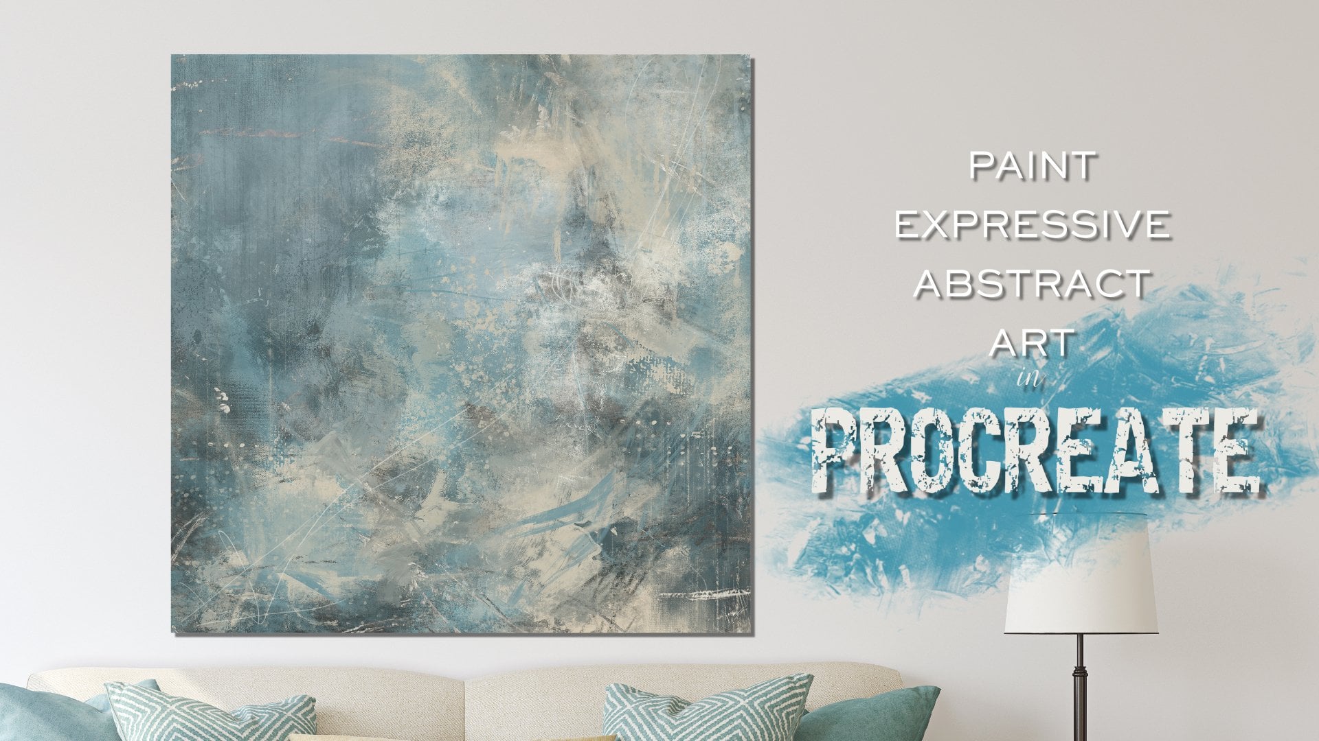
too rigid and too tight, you can choose to get expressive for a more abstract look. In this class, I'm teaching you my personal expressive
techniques I use to create looser paintings with
excitement and interests. Throughout this class,
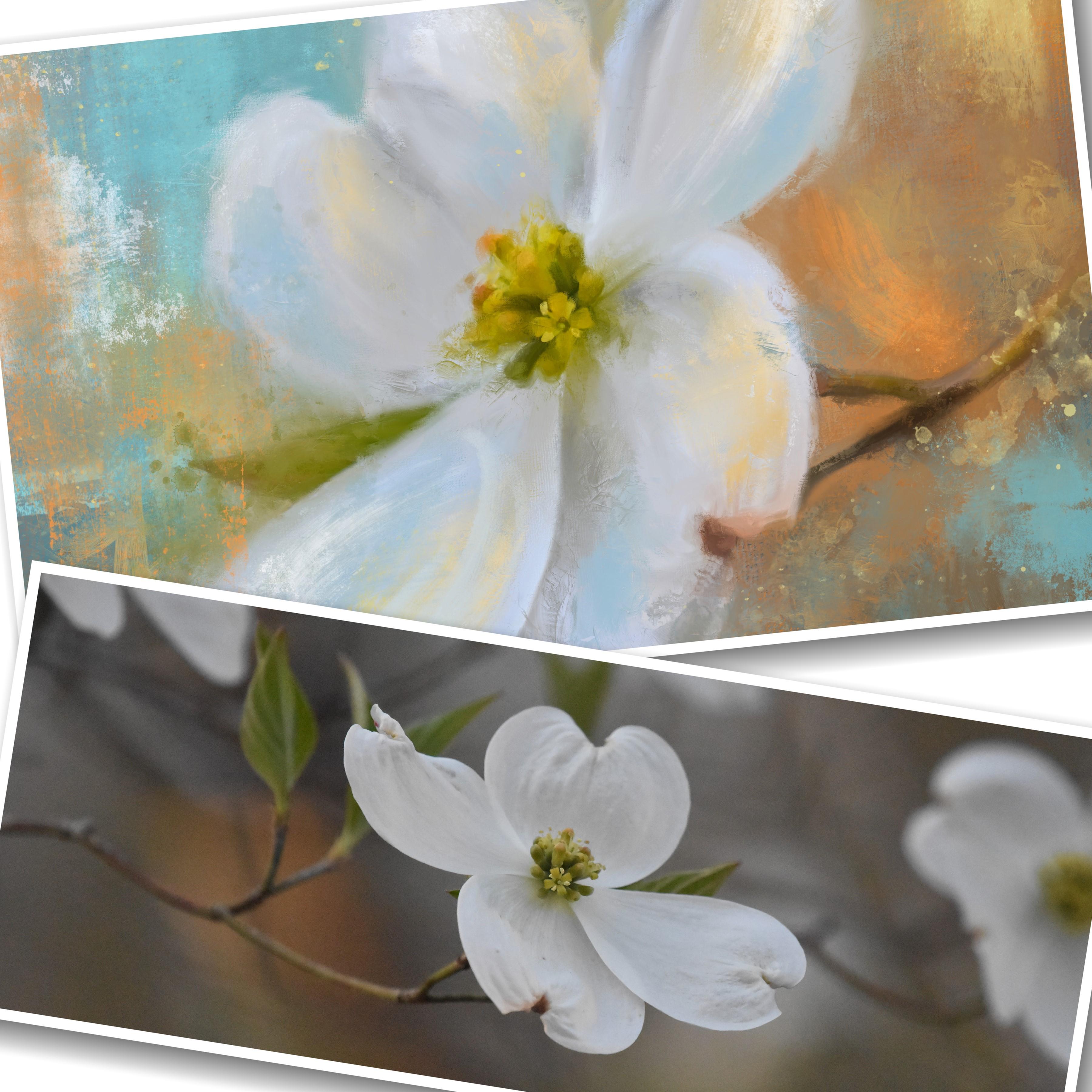
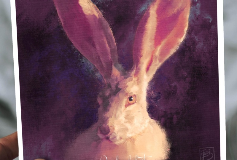
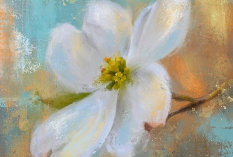
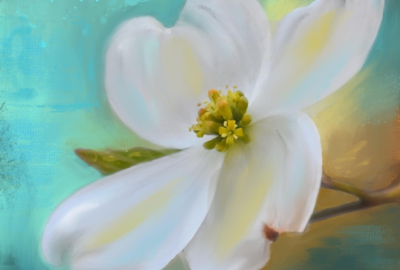
you'll learn how to paint this dog would flower photo into an
expressive work of art. You'll see me step away
from the realism of the photo while still
maintaining accuracy. You will learn how to
set up your canvas about the huge brush set and
how I use these brushes. How to edit your photo
before painting. How to paint your background. How to paint the flower in
concert with the background. How to take your painting
from realism to expressive. How to use stamp brushes
for unique mark-making. How to loosen things up. How to add interest
and excitement by using expressive brushwork. In order to complete this class, you'll need an iPad with
procreate installed. You will also need
an Apple pencil. And you already need to have a basic understanding of using Procreate and
installing brushes. You will need to understand
how to transfer photos onto your iPad before
starting the class. Provided with this class is my original dog with photo and my expressive painting brush
set with over 80 brushes. So are you ready to paint your
photos more expressively? If then? If so, then please
join me in this class. I look forward to seeing your renditions of the dog
would flower as well as your own expressive
flower paintings featuring flowers you
photographed and painted.
2. Canvas Set Up & Brush Tour: Okay, We're ready
to start for our expressive painting of
a dog would flower. I'm assuming that you already have downloaded and installed the brush set and the dog would flower photo I've
provided you with. If you haven't, you might want
to go ahead and get those onto your iPad before you begin. The very first thing
we need to do is set up a canvas for
the dog would flower. Now the dog would flower
is a horizontal photo. And I like to paint square. It's just my preference. If you want to set up
a horizontal Canvas, then go for it. But for me, the type
of work I like to do, I liked I just liked the square. It's just my thing. So I'm going to set
up a square canvas by hitting the plus button. And I'm going to choose, I've already got
one set up here, but I'm going to choose this dark plus sign by
the word new canvas. And this is where you
would set that up. If, if it's on something else, these blue is highlighted
something else. Make sure you get on dimensions. This is only thing I mess with. I don't touch anything else. Just dimensions. It depending on
the iPad you have, how much memory you have
and things like that will depend on the size image you can work on how many
layers you can get. You've got a width,
a height, a DPI, and a maximum layers here, I always work at 300 DPI. So if that doesn't say 300, click inside that
box and change that. The maximum layers we'll adjust as you adjust the
width and the height. Height based on what
your iPad can handle. Now I do 6 thousand by 6
thousand because I print really, really big prints on Canvas. And that to me is the size I need to do to get the
really big prints made. If you wanna do two thousand, two thousand or 3 thousand
by 3 thousand, that's fine. But I'm going to do 6
thousand by 6 thousand. So you type it in. And it's already there
in the second row, but you could type it there. And then after you've done that, it'll tell you how many
layers you can get. The amount of layers doesn't matter if you run out of layers. You can always merge
what you've done together and continue
adding new layers, which you'll see me do. Just click Create. And it will appear. And it will also open up. And it will be saved in your list of canvas
sizes for the next time. If you've already got one setup, that's a square, go for it. You'll need to import
your photo on here. Insert your photo, which we'll
go over in the next video. I'll show you how to
do that and how to resize it specifically
to fit the square. But I wanted to go into a
little bit on the brushes. So let me grab a blue
or pretty blue color. And I just wanted to quickly go over the brushes that are
included in my expressive set. These are ones that
I use most often. They are not all that I use. If you noticed in my
brush library list, I have J marks 87654, etc. Those are all marks that I
have made with real paint. And I also have purchased pretty much every
stamp brush set out there that I could
find that I liked. There is no limit
to the amount of stamp brushes you can have when it comes to
expressive painting. They are an integral part of the expressive painting
process for me. Because they blend
a real brush mark in with your painting, which we'll go into later. So in the set, I have a lot of stamp
brushes for you included. I have three pencil
brushes to mainly because I signed with
a brush like this. Or if you wanted to add some unique line
work in your art, marks, you want to make just scribbling marks or
even do a sketch. Like an outline of
your subject as you're going along
on a layer on top. And I don't know what the
heck That's supposed to be. We're starting to look
like maybe it could be a dog of some sort. Yeah. But I mean, you could
sketch with these. You can add line work, et cetera, with the
pencil brushes. And then the main
brushes to paint the photo or the smooth brush. That's the one I start with. The smooth brush. You can paint with it,
but also blend with it. And that's where I
start, is blending. And when you blend
with the smooth brush, it creates a very
nice smooth blend. I also have the painting, one brush which kind of
blends as it paints. And it has a slight
canvas texture to it. See if you can see that. It's really nice. And when you go
to blend with it, it'll blend would
that canvas texture. Then I have the mess it
up one and mess it up to the mess it up one has
a really rough edge. Great for adding some
expressive marks throughout. And when it comes to
blending with it, I do a lot of this to
mess up the edges. Because in the process
of expressive painting, you're going to paint
the photo realistically first and then you're
going to mess it up. Because messing it up is what helps make it become expressive. So that is an integral
brush to this process. And the textural one is
a heavy texture brush. I don't press very hard on this. Drag it lightly and you can
see it creates texture. If you press it harder, it'll create a little
darker texture, but if you press it too hard, it will just become solid. Say this one's kinda finicky. So you have to be a little
bit careful with it. And when blending, you do get a little
bit of the texture. If you grab a color and
drag it another direction, you'll get some of the
color and texture. But you can also actually soften up by holding it
down and blending. So if you make a textural
mark this real strong, then you want us to soften that. You can use it as a, as a blender and kind of
soften that down like that. It has some really
heavy texture. And this is one more for accents toward the
end of things, which you'll see as we go along. The stamp brushes are
pretty self-explanatory. If you're familiar
with stamp brushes, you basically just stamp. You cannot. Like I'm holding down right now. You cannot paint with it. It just does one stamp. And you can resize these
and make them smaller. And you can layer them
on top of each other. It's really fun. And you can also reduce
the opacity of them to a lighter opacity
if you just want a hint of a brush mark. But we'll get into
all of that later. But there's a wide
range of them in here because you never know what kind of
mark you might need. And the whole concept of the
expressive painting is using expressive marks
and then blending those expressive marks
in with the painting. So this is my secret here on expressive painting
is the stamp brushes. And the blending
of those brushes. After you make the mark, blending of the mark in
with what's already down. And you can alter the look of the stamp brush to buy blending. So therefore, person is not going to look at one of
your paintings and say, oh, they did the same mark in this painting that they
did in the last painting. So the blending of them
is very important to really make it look
unique and different. And I also want to mention when it comes to
the stamp brushes, you'll see me just guessing
and picking and choosing one. There is no set way
to use a stamp brush. There's no set method to doing things with
the stamp brushes. It's a matter of what
Mark do you want where what Mark would
fit in a good spot, and then toning it down using some blending and changing up the look of it by
using some blending. And it's all a matter
of what you like. You put a mark down
and sit and you say, Oh, I like it, except
I don't like this. One little part here at the top. That's at the point
where you can choose to blend that out. And you can also erase
with the stamp brushes. So if you touch on top of an area that you just want to add a
little bit of interest to. You can tap and erase part
of that with a stamp brush. Or like let's say
you want to put some white dots in here, get on the one with the
dots and just tap it. And it's just basically
erased what's there. And which is I'm trying to pull down the size.
It's not wanting to pull. There we go. So you could do and you can
tap them together in one spot to create a really
unique pattern or look. There is just no
limit to what you can do with stamp brushes to create something unique
and different and interesting to your painting. And that's, that's just a
quick rundown on the brushes. And I've included a wide variety here for all different
kinds of situations. And I use these and every
expressive painting I do, and I don't just use
these I have purchased, I've made several others and
I've purchased others from other people and installed them and I will use them
in the same manner. But stamp brushes,
I collect them. I just, that's my thing. Stamp brushes are what
makes the paintings unique and different and
interesting in the end. So there was a, there was a quote I heard
one time that said, when people see something that's painted
real expressively, they think it was
painted real loosely. And that's not the case. Expressive things. Some of them are painted real
loosely and very quickly. And certain paint mediums can work very expressively just
because they're loose. But when it comes to this on Procreate and other
paintings methods, I have found that
to really paint expressively and make
it all tied together. It's a lot of careful thought
and placement of Marx and blending those marks in with what you've
already got down there. That's what makes the
biggest difference. In a variety of
expressive paintings. It's not just slapped
something down and just, you know, paint. Just get real loose with it. Although getting loose with your painting and
just sweeping brushes and doing things like this can create some interesting effects. Definitely. But, um, it's, it's, it's a wide variety of choices and picking the right
marks for the right places. And pretty soon here as
I keep tapping on these, you'll see that I'm going
to end up having sort of an abstract painting
without even intending to. And this is all done very
quickly and very loosely. And it's very fun. But when it comes to painting
your subject expressively, have to be a little bit
thoughtful and careful with the placement
and the size of your marks and the
colors of them as well. So let's just something
I wanted to go over a little bit in talking
about these stamp brushes. And there's all kinds of
abstract marks in here I've created that can really add to your, your overall painting. And you can even use
marks to fit into a certain section of your
painting, which you'll see. As we go along and paint. You'll see where I place a
mark within the subject. And a lot of times right now I'm working on
just one layer. But most of the time when we're actually
doing the painting, the subject will be on its own layer and the marks will be made on a layer on top. That way, if you want to adjust the opacity of the marks layer, if you want to turn
to mark around, resize the mark, you'll have the ability to do that and
we'll get into all of that. But just kinda wanted to
go over that real quick like before we get started
and now we're ready to go and get moving on. This dog would flower painting. And I encourage you to paint the one I've given the
flower I've given you. But if you have your own flower, you want to try to
paint. Feel free. I love to see people
explore and do different things than just
trying to do what I do, because that's what makes you, your creativity come
to life for yourself, is to pick your own
photo to work from, and to paint and pick
your own colors to. These happened to be some
of my favorite colors, which is why you see me do these demos a lot in using
these two colors, the orange and blue, and the black and the white. And that's just
favorites of mine. You may have your favorites. Don't be scared to
mess things up. Don't be scared
to change colors. Don't be scared to choose
different marks for your painting and
don't be scared to use other stamp brushes
made by other people. There. They're definitely
when you're doing expressive painting
in the way I do it with the photos are even with an abstract piece
like something like this. They're definitely something
that needs to be in your arsenal of supplies
with Procreate. But let's get started on
the dog would painting so you can see how this goes
and how I create it. And then you'll have your opportunity to create
it yourself as well. We'll see you in
the next section.
3. Paint Background & Mask Flower: Okay, I'm ready to get
started on the first lesson, which will be on the
dog would flower. I've got my canvas setup at
6 thousand by 6 thousand, the layers already there. I'm going to insert a photo and go to that album
where I've stored the photos I want to paint
and I'm going to pick the dog would now the dog
woods rectangular. The canvas is square. So I want to resize this flower
to fit my Canvas better. So I click this arrow up here, and this gives me the
options Freeform, Uniform Distort and warp. I use uniform when
resizing this layer. If you use free
form and you go to drag from the corners out if you want to
re-size it accurately, it's going to possibly
distort your image, so I keep it on uniform. You can use your
pencil and grab one of the corners and pull like that. But you can also put two fingers on image and just squeeze out. And you can even turn your image and put it however orientation
you want on your canvas. Now I want this to be
tilted a little bit, and I want it to
be big enough to cover the whole canvas so
it's outside the corners. And that looks pretty good to me because I want the flower
to fill the painting. The very first thing I'm gonna
do with this is I'm going to flip this image because I like to paint with my subject is facing the left. You don't have to flip it. But I'm going to show
you how to do that. You click that arrow
up there again. And there's a button down here
that says Flip Horizontal. And you can do that. And then the
orientation you want, then just tap on the layers. And that will set that in place. To get started. I'm going to
duplicate this twice. Now. I'm going to duplicate
it once first. Okay? So when working on
the duplicate layer, when it comes to photo painting, as you start painting this
with the blending brush, you're going to be painting the exact colors
that are on here. And if you want to add
color later, that's fine. If you'd like the colors that
are here now, that's fine. I tend to like my images a little bit more
bolder and color, a little bit more saturated. So I'm going to click this Adjustments button
up here at the top. And I'm going to click hue, saturation and brightness,
and click the layer. And I'm going to
pull the saturation up to about 90% range. I'm also going to pull up on the brightness
just a little bit. Just a little bit. Not too much. You Brian, The too
much it'll get baited. If you wanted to
change the color hue. You could do that to get some
really interesting effects. Um, I like it the way it is, so I'm going to leave
it at the 50 per cent, but then tap on the
layers and you can see the difference when you turn that one off and that went on. I think we're gonna
get a much more colorful painting
with this look. Now, I'm going to
duplicate that layer. And I believe the
bottom one alone. You can rename your
layers if you want. If you want to keep
track of where you are, but I don't usually
do enough layers to have to worry
about renaming them. So the very first
thing we're going to do with this layer of
the flower image is this is going to become
the background because we're going to use the blending
brush, the smooth one. At a fairly large size,
fairly large size. I've got it about
31. And try that. And I'm just going to start blending this color
out just short marks. And I'm going right
over the flower because this is becoming
part of the background. And I'm pressing pretty
hard as a stroke. And I don't know why that is showing that
flower underneath. Okay. Sometimes with this
blending brush or any of the blending brushes. Let me try the paint
blend ones that for some reason it's
blending what's there, but it's showing
what's underneath. And I don't know
why it does that. Um, so I'm gonna shut the two underneath layers off so I can really see
what I'm doing here. There we go. Now you can see the
solid blend. Like so. I'm just going to blend it all out with the colors
that are there. Every bit of it. Just
very short strokes going different directions
with the strokes. So that gives me a nice blend to start with for
the background. Now I'm going to go to the
paint and blend brush. And I'm going to blend with
that one in certain spots. Play with size a little bit. If you do different sized
brush marks throughout, that gives some
interests to your work. But this this pain blend one, I'm going mostly on the
edges where there's like sharp little edges
and blending those in from that smooth brush. Just here and there
throughout, not everywhere. I don't need the canvas showing everywhere from
that brush just to soften it up a
little bit. Like so. All right, that's a good
start for the background. Now, this point, I already know, I'm going to turn the bottom
one back on so you can see. I already know
around this flower, I would like to him
bring in some blue. It's not a real
greenie turquoise, but a kind of a
really pretty ocean, rich blue, not dark blue. But I haven't painting here at home that somebody
else did that's hanging on my wall and it's a white dog would would this really pretty
blue background? And I thought that
this would be pretty, but I also like this orange tone that's here off to the side. So I'm also going
to bring in some of that orange tone
into the background. So let's grab the orange
first, the orange color. And let's turn the
background back on and turn the
flower layer off. And let's just using
my brush in my own, using the paint and blend
directly on this layer. Let's paint in some strokes of that orange in this area where we know it's
at in the photo. And let's even bring some
of it down here underneath. Like so just hearing they're not anything really
extraordinary. And then you can play
with the orange tones and go to maybe a little
lighter shade, dot some of that in there
to get some variation. So that's pretty good
for the orange areas. Add a little bit more there. Now let's get some of that
turquoise ocean he blue and I just went there
on the color wheel to a spot that I felt looked
good and I'm pulling it. I don't want it super saturated, so I'm pulling it more
toward the middle. And let's go down a little bit, kind of a medium tone like that, back to that paint and
blend brush to paint with. Maybe make it a little bigger. And let's bring in some of that blue all around where
we know the flower is. And even underneath here. And even over here, right on top of the orange area. Bring in some of that blue. Because I want this
background to be a nice mix of colors. So now that I've
done a medium blue, Let's move it up to lighter blue area straight up
from that medium color. And let's do some of that in
here with the same brush. Let's make the brush
a little smaller. Because the lighter
areas is going to be here at the top of the flower. You can even bring some right over where the flower
is going to be. This just gives some variation. Then down here at the
bottom right corner, let's pull down past the
medium blue to a darker blue. And dot some of the
darker blue here in this lower area where
we know it's in shadow. And that's going to
be a bit darker. Now I feel like I've lost a
little too much in my orange. So I'm going to hold down, grab that same orange and put a few little marks
of that back in there. And then maybe even go
straight down to more of the brown area and
put some of that down here on this
very lowest corner. Maybe even over here
on this side a little, and even maybe come up a little bit more in a few
lighter shades. This is just putting some of the background colors
that you might want in your picture into the background
that you're making. Now, you can just choose any colors you
want for the background, if you would rather
have purple and pink behind your flower, or yellow and green or whatever
you might want to choose. You don't have to
use these colors. These are just the colors that inspired me when I was
looking at this flower. So now this needs to be
blended a little bit. So I'm going to go with, Let's try the mess
it up one brush. And I have this opacity
set around 60% on it. Because if he used
at full strength, that makes it just a little
bit too strong on this brush. So I'm just going
to tap in here. You can see on some
of these areas, just to blend in. Some of that gives
a little texture to it That's different
than the canvas. And I'm not gonna do it
all over here in there. And it pulls some of
that color around. Just to give us a
good starting point. And make, basically
we're making a mess. But that's the whole
point of this, because this is about being expressive and being
expressive does not mean being very diligent
to every little detail. And I know this is
the background, so you don't usually
have a lot of details in the background. But still there, you know, you can paint a very
realistic painting keeping everything detailed. But that's not what
I'm after here. That's a good start
to the background. So now it's time to
bring in the flower. So I'm going to move this
layer with the flower up and turn it on. And now we're going to tap that layer to make
sure we're on it. And what do we wanna
do is we want to mask out the flower to lay on
top of this background. So I'm gonna do that using
the Smooth paintbrush, which is great for masking. And you want to pick
black on color wheel. So if you'll just double-tap
near where the black is on, the color wheel should
go to straight black. And then you want to
add a mask layer. If you tap on the
layer and click Mask, There's your layer mask. That's what you want to
paint on with the black. When you paint the black, even though it
doesn't look black, what it's doing is
it's erasing what I'm painting on and revealing
what's underneath. So see, that's the
background that's underneath that we're revealing. So make sure you're on the layer mask when
you're doing that. And you've got to
also decide what part of this do you want to keep and what do you
want to get rid of? These leaves in the
back behind this petal? I want to get rid of this
little pokey leaf right here. I don't need that. I'm not interested in that much detail. This leaf over here, I would like to keep, and obviously the stem
I would like to keep. So I'm using a fairly
big brush right now and just getting rid of
the bigger areas. It looks like it's erasing, but with masking,
It's not erasing. It's just simply hiding it. And if I need to bring it back, I can do so with white. If I need to bring
something back. Like let's accidentally go
over that leaf right there. Oops, I've lost my leaf. To bring that back. I would get on the color wheel, double-tap near the white. And it will go to white. And then I can bring that Leaf Back by
painting with white. And then if you
go back to black, double-tap near the black. You can also choose the color from down
here in your history. Black and white are right there. So now I can continue painting with the black and
try not to go over the edge of the leaf and get as close in around the petals
as I can without going over. So let's go with a little
bit bigger brush to get these larger areas that
are away from the petals. Oops, I went over that a little, I could fix that later. I'm holding down on
this brush and pushing pretty strong as I'm doing this masking to just mask away all of that background
from behind the flower. Like so. I'm getting a
little close to the stem. Close as I can. I think
it's time to make the brush a little
smaller and go around some of these areas here. So let's start with this petal
right here and get close. I'm holding down,
pressing pretty hard. So I'll use this size brush
in the areas where I can. And then I'll reduce the size
two more and getting those little actually the smaller
areas that I need to get. I'm just kinda carefully going along without trying not
to go over the petal. The background we've created is a mix of the colors that
were already present in the background plus the new colors that I added in and sort
of blended around. That's just a really quick way to start with the background. Go around this, getting as
close as I can. All right. We need to keep
this stem accurate. So I'm gonna get close to
it without going over. Now I have to get a
smaller brush to get in-between the two
pieces of the stamp. Some people forget that there'll be doing
legs of animals and they won't mask
between them and it becomes very obvious later. So we will have to come back with a little smaller
brush and fix that up. But right now with
this size brush, I've got it set at, I figured I would do
everything that this size can handle at the moment. There. Now, time to make that
brush a little smaller and get in these areas
where I needed to have a little more control. I'm not worried about
the petals staying exact because this is going to
be an expressive painting. So they're not
going to be exact. But for right now, just to see how everything I
want to try to stick, keep them exact and not really
go over the petals yet. And anywhere where there's a
little dark along the edge, trim that up and
get in this corner. If I go over the edge
of the petals a little, it's not that big a deal. But I'm really trying to
keep them fairly accurate. So when it comes time
to painting the flower, I can see good as
to what's where. Because even though it's
gonna be expressive and a little bit on
the abstract side, I like to be able to tell
what it is when it's done. I don't want to be able
to tell it's a dog would. Now I'm getting
this area in here. Kind of looking around at
little areas I've missed. I'm around here with
this leaf is getting their head around
this edge of it. That's pretty good. So now look at what
we've got is quite a bit different from
the original photo. Is if you turn this off and this softened turn the
original back on, That's what we started with. And that's what we have now. But when, for some
reason it's not even when painting the
layer as a blending tool, it's revealing some of
the original photo there. And I don't want that revealed, so I'm shutting off the original photo just
to be sure on that. Because whatever is turned
on when you go to save it, it will save that in
there and I don't want that original photo
in there at all. So now we have a good starting
point for the flower. At this point you could squeeze the Layer Mask
and the flower together. And that flower is now mass, the backgrounds masked away. So when you will, almost except for a little
part I missed up there. So when you turn off your
background completely, if you see this checkerboard, you could save this as a PNG
file transparent image to be able to put it on top of
another background if you wanted to at a later time. My mask wasn't quite
entirely accurate. I missed a few little spots, but it doesn't need
to be when you've got this background involved
that you've already made. So now we can add some
details to the background. And we can also
paint the flower. And I like to add a few stamp brushes to
the background first, before I paint the
flower and I will paint, you can paint the flower
on its own layer. You can definitely do that. I tend to merge them together
and work on it as a whole. But in the next section
we're going to just bring in some stamp brushes into this background to dress
it up a little more. And then we'll work on
painting the flower.
4. Enhance The Background: Alright, let's work on adding some more interests to this background using some
of the stamp brushes. So make sure your
background layer selected. And just to be on the
safe side in case you don't like what you do
just to add a new layer, hit the plus button, add a new layer right
there under the flower. Leave the flower
turned on though. Make sure you're
on the new layer. And let's pick a color. Let's pick this blue color
that's already there. And let's alter
it just a little. Let's go just a tad
lighter from that color. Pull it up, straight up and pick your stamp brush to paint with. So this is one of
my favorites for adding to the
background because it adds some neat interests. And I'm going to tap that
right above the flower. And of course that's too small. So let's bring up the size o. When I accidentally hit it again at the larger
size right there. And I kinda like that. So I think I'm going
to leave that. But I don't like the little hole in the middle of
that stamp there. So what I do with the stamps, as I get on the mess it up, brush as a blender
and as I stamp, I will then switch over
to blend the areas. I don't like that little that
little hole right there. I don't really like that. And like where
there's a hard edge, maybe just pull
out a little bit. And down here I like this hard, I like this edging
of the stamp here, but I'm the part
where the leaf is. I'm just going to
pull down behind that and maybe even pull out on the side
toward the flower. So that gives it a little bit of interests that may be a
little strong right there. So I'm going to pull down
some more on that and then pull up a little
from under it. It kinda breaks it up. Oh, that adds some
good interests there. Let's pick a
different stamp with that same color. Let's see. And you just go through
the marks here. It is helpful to look at the
area where you might want to stamp something like right
here above these petals. I might like to
stamp mark there. I'm looking through here for a mark that might
be interesting. If a mark, if you put a
mark and you don't like it, you could just double
tap to undo that mark. Or because it's on a new layer, you could just erase that mark. Let's pick number 12. Let's see what that looks like. I'm just going to tap right
above these two petals. And that looks like it's
just kind of floating there. So it's double tapping, undo it, make it bigger and try to
stamp closer to the top. Maybe a little bit more
over the top edge. That adds a little
interests there. Maybe break that up a little
with the mess it up brush. And on this side
just pull out just a little over to the left. Blended in a little bit. That's pretty neat. I feel like this
little gray area in between the petals might, could use a little color. So what if we grab a
color from the flower? Because I like to pull colors from the flower into
the background. And I like to pull colors from the background and put them into the flower with
the stamp brushes. As I go along, Let's
try this golden color. Maybe a little strong. So let's go more
to the gray side. And maybe up a little
lighter, something like that. Let's pick another
stamp that might look interesting right there. You just scroll
down until you find something you would like. How about this 37? There may be a little abstract. And I'm going to tap right
there where that gray area is. O double-tap there. That's kinda interesting. I'm just tapping it and undoing and tapping it in
different places. Okay. I kinda like that the
way it looks by the petals. I don't like the way it
looks up here at the top. So back to the blending brush. And let's just pull some of that blue towards it to
tone that down. I'm not really pulling the blue. I'm pulling against the golden, which is showing the
blue from underneath. Whoops, that's too strong. Pull some of the
golden color out. But that tones it down. But there's a little
interests there and I'd like to bring that color
in somewhere else. So maybe around the
leaf area right here. So let's pick another
stamp. About 36. What about that one
behind the leaf? It looks like I'm
tapping on the flower, but I'm tapping behind it. Well, that's kind
of interesting. Just try some different places, but I kinda liked that. I really like this
one right here, the way it made that mark. Let's go to the blending
brush and let's pull some of the blue down in there. Kinda mess it up. That's why this brush is called mess it up. But I'm leaving that little
mark right there because I think that's interesting. But at least it brought some
of that color in there. Very nice. Now let's go to
the orange, grab that color. And this go just a
little bit brighter, a little bit up and
brighter on that shade. And let's pick your
stamp to go there. What about this watery
one, number 44. Let's tap up here at the top
and see how that would look. A little too bright. Pull it more toward
the gray side. That's interesting. I liked some of that, but I think it needs to be
blended some and tone down. So I'm going to use that
same blending brush. And well in some of
that end just to soften that. Very nice. Now here in-between
these puddles where there's a
little bit of gray. How about we bring some of the actual oranges
closest to that in there. So let me pick there and let's
pick a stamp to go there. Um, how much? 62. Let's see what
that looks like there. Oh, that's a little big. Doubled double-tap. There's still a little big, It's actually that's a
very big stamp brush going behind the whole flower. I might want that brush to go
in a different orientation. So one way to do that is
to add another layer. Add that stamp brush mark on another layer which
is on its own layer. Now. Now touch the arrow appear. Once you're on
there, you can take that with your two fingers. Held down on it. Squeeze it, turn it, place it exactly where
you might want it. Just try to position that there. All right, I'm going to tap on that layer, set
that in place. See it turned it around for me, said that in place. And once I tap the layers tab, while this needs
some blending now, so back to the, mess it up. This harsh edge right here. I'm going to blend that out
a little bit to soften it. Mess it up. And this edge right here, just little short taps. I'm not really
pushing hard at all. And that lets me
pull some of the blue or pull against it. Was her worldview reveal
what's underneath. You'll get the feel of this
as you do it more often. Now that's pretty good there. I liked the way
the edging is now, but I feel like it may be a little bit of strong
orange right there. So I'd like to bring in a
little of the blue tone. So let me find a blue. Just hold down and
move it around. That's a good blue. So let me find
another stamp brush that I could put right there. Thinking of something soft, Let's try number 80. That's a very soft one. And you can always lower the
opacity of the stamp brush. I'm just going to stamp right
in there and bring some of that blue over in there. I must have done there. I did a blue stamp by accident. I knew something
didn't look right. Double-tap is your friend. Make sure I'm still
on Layer five, which I am now tab. And there just to add
some of that blue, just tapping in a couple
of different spots. I'm going to double-tap
again and undo some of that and do a
bigger, bigger mark. I think that blue's
a little dark. So let me grab a lighter
gray blue stain. There we go. That tone that down
just a little bit. This is all just personal
preference here at this point. All right, I think we've added some good interests to
the background for now. So I'm going to squeeze the background and these
two stamp layers together. So now they're all one. And then it's time
to paint the flower. So that's what we're
going to do next. And like I said, I like to merge the flower and the background layer
and paint them that way. That's just my
personal preference. You can paint the flower on
its own layer if you wish. But I like to merge the two, so I'm gonna do that now
in squeeze those two. Well, what I just did
double-tap to undo that. There we go. I'm going to squeeze
those two together. So now the flower, that's how it was, that's how it is. Turn off the original
photo layer. And that's a true representation of what we're working with. So now it's time to
paint the flower. And because I'm merge them
as I paint this flower, some of those
strokes are going to come over into the background. But that's okay. Because when you're
doing a real painting, you are painting a lot of
times on different layers, but they're not stacked
on top of each other. It's still all on one piece of paper or one piece of canvas. So I like to try to
replicate that same feel. And that's why I like to merge
those two layers together. And when I paint the flower, it will actually bring some
brush marks from painting the flower right in and mix with the background
brush marks. So that's next
painting, the flower.
5. Painting The Flower: Okay, Now before
painting this layer, I'm going to duplicate it. This is a safety feature. As you can tell,
when I duplicated it dark in that
upper right corner. For some reason
that right corner was being disagreeable when initially masking away or
painting the background. So, um, I don't need the
layer underneath on. I just need to save
the layer underneath. In case I screw this
up, I'll have a backup. I can go to just
a safety feature. So I'm actually going to
start painting the flower now with the blending brush. And I'm going to
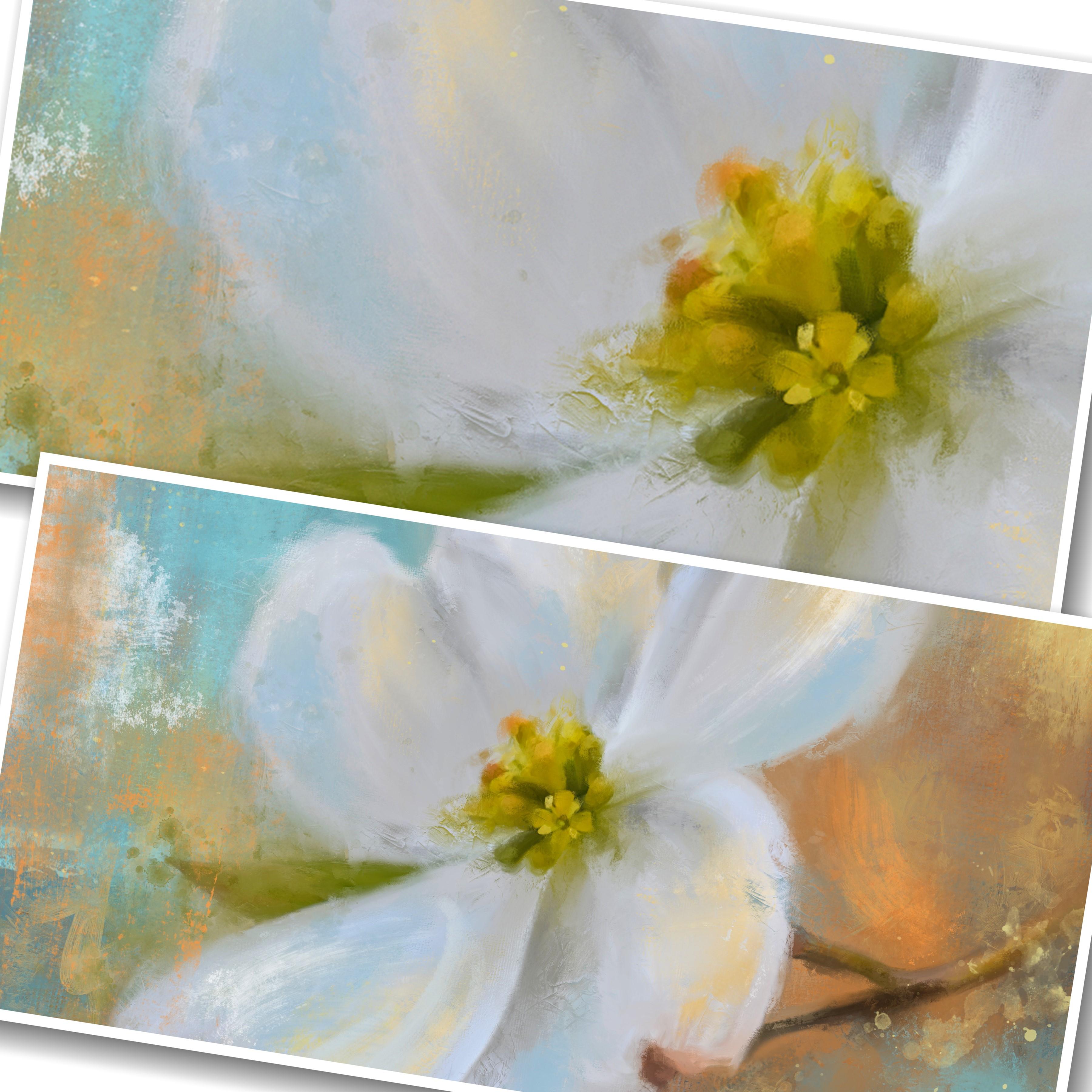
use the smooth one. And I'm going to start with this little petal up here that's too
big of a brush. Lower the size. And I'm going to try to
paint it fairly accurately. Blended. You notice I'm
going outside the lines. That's alright. I'm doing short
little choppy strokes in different directions
that creates interest. Now this petal, where it's really lower
that a little more, where it's really bright white. I want to maintain
that brightness. So I'm just gonna
go carefully along that edge and follow the
direction of the flower. Along this edge, a
little short strokes. And then here this dark area, I want to maintain this. So that same size brush, I'm going to paint that. And this white edge right here, bring this up in here and go along the
edge of that pedal. And this little dark
area here, pull that up. So anything detailed that
you want to maintain, you use a smaller brush for. Now, let's continue on down this petal toward the middle of the flower, where it's lighter. So I want to maintain
that lighter area. So anything you want to keep, you might want to use
the smaller brush. And then as you get
away from that, you can then move your
brush size is larger. Let's go back up
here to the top and do strokes with
the larger brush, pulling in the
direction of the petal. At this point. On this petal, I'm just
sweeping up and down. I'm going outside the edge, which will sweep that
color into the background. Let's get this petal right here where I
did the darker areas. And let's mess with
that a little bit. Go over that. And then you can
also get down here close to the center of the flower and sweep
upwards on this petal. Then we have this
really large section in the middle that
I haven't done. So we're gonna go with a
bigger brush and sweep that upwards and then back downwards in the
direction of the petal. And get him, get a little
free on those edges and just sweep right over those edges where it meets the background. So that pedal is done. Then let's go do this pedal
that's kinda heart-shaped. Once again to keep, maintain the lighter areas, I'm gonna go with a
little smaller brush and go around the edge right down to where
it meets the middle. And this little dark
strip in the middle. I want to maintain that. So I'm going to paint that with that small brush straight down. Any of these little areas coming off the top of the petal. Maintain those. So I'm going to go in the direction that
those areas are going. Maneuver that brush around. All right. Now let's make it a little larger to get the middle areas, like I said before,
go right over those edges and bring them
right into the background. Don't be afraid. Don't
be afraid to mess it up. We're getting expressive. I'm staying away from that middle part of
the flower though. At this point. I'm
getting close to it. I'm going one direction
downward and I'm sweeping back, afford to pull these
colors in with each other. And then at the top, I'll just go over that just a little and pull
that into the background. And even that dark area there. Okay. Now I've stayed away
from the middle at this point because I'm
working on these petals right now. So let's go. Let's go to this pedal and you can grab with your
two fingers and turnaround to work in the
direction you want to work in. Now this little dark orange area here on the tip of this pedal. I want to maintain that
some painting that with a small brush and kind of going around that edge near it
with the smaller brush. And we're the edge
meets the stem. I want to maintain that. So I'm going along that edge in the direction of the edge. And then this dark area of this petal meets
the other petal. I want to maintain that. I don't want the two
petals to blend together. I want them to be separated, so I need to maintain that and even these dark areas
appear like to maintain. So using that small
brush and even do some little short
choppy strokes in there around that orange area. And then obviously were
these two petals meet, I don't want to maintain that. And I'll go toward the green
and then pull the green out. And then toward it, pull it out. And then we have this
little circular area right there painted in the
direction of the circle. Kind of work into that. Pull it out and then
pull back towards it. Now we can go with the
larger brush and I see there's a little
imperfection right there. Little purple and perfection. I don't need the imperfections. We're not painting a
realistic painting. We're just trying to get the
general overall shape and look in there with
a bigger brush. In short strokes, mostly in
the direction of the petal. Because these petals are smooth, but they're not going
to look smooth. And I get done. Right now. I'm trying to keep
them kind of smooth. You can go along
the outside edge. A little. Mess that up. Alright, there's that pedal. Now we have this
pedal and there's a little yellow spot
right at the tip. Small brush. And then a dark gray
right above that. Try to keep that. And along the edge
of that pedal, this dark area here, these little dark areas and light right in-between them I'm trying to keep so I
use a small brush. And then down here along this edge of where the
center of the flower, nice short little
strokes following the direction of those sections of the center of the flower. And where it meets the pedal. Be kind of careful around that. And kind of go around
the outside edge. And there's where
the leaf comes into. We need to be careful with that. So I'm gonna go down that
edge with the smaller brush. Alright, let's get
a larger brush now. And this puddle,
starting at the top, sweep downwards a few times
and even outside the edge. And then sweep upwards
back toward what I just did from the lower
area and then downwards, then upwards, back-and-forth,
upwards and downwards. Come out over the edge of that. This top looks a little choppy, so I'm just going to use in that bigger brush sweep
over that a little. Alright, that pedals down. All the petals are done. Now let's do the leaf. Smaller brush, get
this tip area. Follow the edge of the leaf. This leaf isn't very big. So I can keep the colors in the leaf by using
the small brush and just doing each section
of color separately. You'll get a feel for
this the more you do it. Or it meets that pedal. Bring that pedal down
over that leaf a little. Alright, there's the leaf. Now we still have this
center area left to do. And this little yellow flower in the middle section of it
requires a pretty small brush. Little short strokes. Any of these areas
that are super bright. Be a little cautious with those because you don't
want to lose them. And the super dark areas
you don't want to lose. The small brush works great, but you can do this
small brush on this whole section
of the flower. Just treat each
little portion and each little puddle of that area separate and
go in-between them. Anywhere that's real spectrally from the noise and the photo. You need to paint. If you see specular areas, you haven't painted
it yet and other spectrally can add texture. So it's not a bad idea to
have some of that in there. And I'm working my
way around that now. Just little short strokes in the direction
everything is going. It's good to work on one
little section at a time. I know you can hear
my pen hitting that. So we've got part of it done. Just pick a section and start working on
that one section. Trying to keep your lights and your darker areas from
blending together too much. This is the smallest part
of the flower and it's the longest part to paint because I'm using
such a small brush. But I really don't
want to lose any of this detail right now. I'm doing this
very fast and very loose with the brush marks
in different directions. Crisscross and over top of
each other, up and down. Just a little bit
left to do here. And I also get
in-between it where I see speckle on the pedal, still in those areas as well. But leaving a little
speckle is not so bad because it does add texture. And we're going to mess this
up a little more anyway. Because the whole point
of this is painting it realistically and
then messing it up. That's what makes it expressive. Painting realistic.
And then mess it up. Working very quickly. Little short strokes all the way around that
middle section. Now I still see
some speckled areas in the petals that
I may have missed. So I'm going to
just zoom in close and because this is so light, you might not be able to see those areas going
right near the flower. And at this point, if I mess up a little portion,
that's fine. Adds to the expressiveness. The more you mess it up, the more expressive it looks. Might even want to get
in here and just tap in a few spots inside the center portion
of the flower. Just here and there. I know you can hear that caffeine
was shorter and harder you tap the more messier it looks. All right. So let me turn on
the original flower layer. That's the original that's
the painted. Let's see. Original. Painted. So you can see the
difference there. Now we solve the
stem to work with. So once again, small brush to maintain some of
the detail in the stem. And then try to paint
the same way we did the petals one direction and then pull back and
come the other way. That blends the colors
together without losing them. Because we're using
a very small brush right through the stem. We're not losing the stem
and not losing the colors. I mean. And then this part of the stem where it
goes off the edge. Same thing, one direction
than other direction. Anywhere that it's spectrally
is not been painted. Right now the stem
has been done. So the entire flower has been painted with a smooth brush
realistically at this point. Now it's time to mess it up
and get more expressive, which is what we're
going to do next.
6. Getting Expressive Part 1: All right. It's time to mess up this one. The very first
thing I want to do, make sure I'm on the
correct layer is I want to bring I'm a little bit of the
paint and blend in there. So using the blending brush
with this particular brush. I'm going to test this out on a few areas around the edges. Sweeping just little
short strokes in different directions. Maybe go a little bigger. The bigger the brush you go, the more you see those
little white lines, the more it actually
adds that texture. You can sweep from the
background over onto the flower, or from the flower out
into the background. Either direction. And even in the middle of
the petals do a few strokes, like from the dark
area toward the white or the white
area toward the dark. Just working on the area of
the petals right now to add a little bit of texture
here and there. By sweeping gently just around the edges and down
the middle of the petals and a few spots sweeping darker against lighter and lighter against darker
with this brush. Who that was nice. And I'm doing a fairly
large sized brush working on the just the
larger areas right now. Here in there. Let's
make the brush a little smaller and do some of
these little dark areas. Sweeping one-color
against another. To add that texture to it was to work on the center and do a couple
little touches in there. If it messes up and drags
it out. That's fine. The whole point of this
is being expressive and this is the beginning
of the mess it up stage. Just tapping and dragging
in certain spots. And then let's go to
the leaf area, turn. Just dragging in a few
areas with this brush. And let's go to the stem. Field, little taps
and drags on that. I mean, that's very subtle. But it has made a little
bit of a difference. So now let's go to the
mess it up one, brush. Pick a size to do
a test mark with. And you want to undo
it, just double-tap. Just do it in a few spots. Short little quick marks. Just kind of working
around that center area. You can go with a
smaller brush and touch it on a couple of
these center area spots. Little short touches,
taps and drag. Not even worried right now about keeping everything
super realistic. It's more about
messing things up. At this point. Let's go to this area here. Bunch of little short taps. They're sort of carve-out around the areas you
want to mess with. How about this leaf? Making go a little
bigger on the brush. Just add some really nice, messy texture to it. Messier it looks the better, more expressive it looks. If you don't like a
mark, just double-tap. I didn't like that mark. I'm going to turn it around
and gonna go this way there. This little piece up here and messed up a little too much. If I wanted to bring that back, I could always go
to the layer below and mask this out,
this little spot. But I don t think I even
need that in there. Honestly. That's what you'll
find is you mess things up. There may be some elements
that you don't really need. This is one of them I don
t feel I really need. So I'm going to make
the mess it up, brush a little bigger and
I'm just going to pull from the background right
over top of that, which then basically
eliminates it. At this point, you can
also bring the mess it up, brush a little more into the background itself and
make a few little marks. See, it doesn't even bother
me that that's gone. Alright. It's mess up this stem
a little bit more. Loosen that up, especially
at the edge. I liked that. I tapped right there
and it brought some of that orange into that stem. That's kind of a
big brush though. Now, what did I do
with my there we go. I'm accidentally lost my stuff. My brush sizes. Tapping on the edges around that stem will loosen that up. If you pull too much
color to the background, just pull some from the
background towards it. So we're starting to look
pretty painterly now. And if we, there's
what we started with, there's what we've
ended up with. So now it's time to add a little bit more
darkening and brightening. And bring some colors from the background
into the flower. And bring some colors from the flower into the background. So we're going to do
that on a new layer. And I will paint these
with To start with. Let's do, let's just paint it
with the mess it up, brush. See what happens.
Let's paint some. Now. Change my mind. Let's use the pain
but blend brush. I'm were these grays
are these grays area? I'm gonna get on the gray color, but I want it to be a little darker at sort of a blue-gray. So I'm just going to play
with brush size a little bit and weren't doing
this on a new layer. So if I get a little too dark, I can reduce the opacity. Just going to add some darker
marks where I want them trying to look at, you know, where they were before. All right, now let's there's sort of a
creamy tone right here. It's not really quite creamy. It's a blue-gray. When you hold down and
may get grab a color. It's interesting what comes up. I'd like to bring some of
this yellow tone in there. So let's see. Let's go with a bigger brush. Bring some of that
into that petal. This petal, this petal, a little right there. I'd also like to bring some of this turquoise into the
flower in a few spots. So let's put a little dab, their little dab there. This is all just
guesswork at this point. And let's bring
some of this yellow and maybe even go a little brighter and a
little lighter with that. Let's bring some of that. Oops, a little too big. My stomach just to ground. I don't know if you
can hear that or not. Alright. Let's
bring some of that. Yellow I got from the flower. Grab some more of that. And let's bring a
few little marks of that into the background. In a few spots, mainly at the top. This white right here. Probably going to be
on the blue side. I want to go a little
brighter with it. Let's do a few little taps where the light
would be hitting. In certain areas. Going back to the yellow
from the flower and bring a little tiny bit of
that into this leaf. And then get some
of this orange. Bring it in there to
just add a little color. Just trying to tie
everything together. Now, that's all on a new layer. Say that's before
and that's after. So now we need to
blend this a little bit. What we just did. So I'm going to use
the mess it up brush and fairly decent size. And over those areas
where I've added that, I'm just going to tap
and blend some of that. Of course that one's too big. Go a little smaller. Just very short. Loose taps. It was too strong. You can pull from around
it to tone it down. That's too strong, so I'll
pull back towards it. But all of this with these
different brushes on top, add some texture to this while still bringing
in those colors. Then when you zoom out, you can see where it's too
strong and you might need to work on those areas. Don't forget where you
added in the background to actually blend a little
bit of that out to zooming way out and kinda
see where you're at. I think I need a little more of a lighter tone brought in. I'm going to actually
use the mess it up brush and make a
few little marks. Still needs to be
lighter and not so big. So strong, just a little
dab here in there. That's too strong. They are just a
very light touch. Now blend that some more. And you have to play
with brush size and see how much of this you really
want to be in there. And like I said, because
it's on a new layer. If you don't like something, you can mask it off, he erased it off. You can also reduce the
opacity of the layer. If you find a too strong, and I do this a lot, I'll reduce the opacity down
to about between 80, 90%. When I kinda liked
the way that looks, I still feel the flower looks
a little bit structured. So I'm gonna go ahead and blend or squeezed these
two layers together. There we go. So that's
before and that's after. All right, keep that
original flower layer turned off so I can get a true picture
of what I'm looking at. So I do feel we need to mess up the edges of the
flower a little bit more. Let's play with the
textural brush. And let's see what we can
accomplish with that. And I'm gonna go
along the edge and pull some of that toward the background and pull some of the
background toward it. Just to kind of loosen up
those edges a little bit. Even working in the
middle of the flower. Just tap and drag very lightly. This adds a little bit of
texture and it'll pull a little bit of color Around. Let's work on the left. As you pull. I lost a little bit of edge
to the leaf there. Let's reduce the size. Stroking different ways. With this will create a
different effect just very, you have to be careful
with this brush. It's very finicky,
but it's very fun. Alright, let's go
a little bigger on the brush again around some of these flower edges. Pull from the background
toward the edge. That's kinda interesting. You'll get a lot
of happy accidents with this brush when using it. But it's a lot of fun. And I'm just, like I said, doing very light marks, very light strokes and
blending with this brush. Let's actually try to add a little color with
that same brush. Let's get this little tan color right here and see if I can. But some of that noun. So you think it needs
to be a little smaller, a little more to the yellow side and maybe even a
little brighter. Oh, yeah. Little lighter. On top of that. That's too dark. Now let's blend that
in a little bit. Soften it up a
little too strong. Grabbed some of the blue dots, a few little marks with that. Around in some different spots. Whoops. Too strong, undo it. I'm just putting the
marks wherever I want. And how about some
of this dark gray? Let's enhance that a little bit. Maybe even a little smaller. One mark is a little strong. Let's blend it. Blending it will really
help tone some of that texture and mark down
if it's a little strong. I like some of it. I don't want it to be like
super overly textured.
7. Getting Expressive Part 2: Let's bring some of
this textural marks into the background as well. Just grab a color that's there and go with a really
big brush and do a mark or two here and there. And then grab some of
that orangey color. Touch and drag some of this
yellow color down here. That's too strong. I don't want to
lose my mark there, but I want something
kind of close to it. As too strong. Very light. Maybe even that
was kind of interesting. How about some of the slider? Blue-gray down there? You don't like what,
how it comes out. And I'm getting a real loose and messy now and just picking different colors with
that textural brush and doing marks. How about this blue? Bring some of that blue down in
there and then blend it. Fairly good size brush, which will help soften that up. Lost part of my stem there. Don't really wanna do that. Don't want to soften too much. I'd rather grab a darker color and go from nearby
and go over it. Not too strong though, lighter. I'm telling you this
brush is finicky, go from a different direction, zoom in very light, drag just a little touch of it. And they're not getting
the right consistency. Sometimes changing
the brush size will help that one's too strong. A lot of undoing like to get this bright
orange in there. How about some of
this yellow gold? I don't like that. Bigger brush. Later, drag. There we go. Got a nice little light
stroke and texture in there. You just have to play with it and go right over that stem. We're starting to
get some more now. Where else do I
want to add that? Over there? Down here. Oh, yeah, I kinda
like it down there. Maybe even under the flower a little bit with that same color. All right. I feel like I'm
getting somewhere. This is all just play. At this point. Don't like it double
tapping, undo it. I want to bring some of the
white of the flower in, but I think I want to
do some stamp brushes. So I'm going to add a new layer. I'm going to grab the white
on the edge of the flower and I'm going to go
get a stamp brush. Let's try number three, make sure you're
on the new layer. Oh yeah, that's good. But it's a little bit
too on the blue side. So let me scoot it up
a little more white. Just tap very gently and
I'm tapping off the edge. This is the actual stamp. But I'm tapping off the edge just a little bit to get just a little
bit of it on there. That's pretty neat. Now what if I wanted to
do that same stamp and a blue but down here
in this bottom corner, the problem is the stamp
brushes going that direction. So let's add a new layer. Let's go ahead and
stamp the brush. Turn it with our fingers, and position it where
we might want it here. How about that? So it's
the same stamp brush. It's just turned
a different way. But in order to make
it look different, I'm going to use the mess it up, brush on the edges, and just kind of gently tap
some of that out and around. Alright, now let's go to the white one and gently do this. Got to get on the white layer. There we go, tap
some of that out, would that mess it up, brush. All right, Hey, that's looking
pretty expressive there. Let's do some more brushes. Let me squeeze those
layers together. Start a new layer. Oops, I got two new layers. Let's do, let's grab this, this color right here I've been kinda liking. Or better yet. Let's go to some of
this yellow from the flowers is sort
of a yellow-green. Get a real bright one. And maybe bring it a little bit more toward the
middle to tone it down. And let's pick a stamp. Let's look at stamp 80. You can actually put
that in the flower, but it's still a little bright and bring it more
toward the gray. What happens is that stamp is going in the direction
of the petal. So what happens if we put
that in a pedal right there? And then using the
mess it up brush. When some of that down. Here's a little interesting
effect to that pedal. But I still want to go ahead and stamp some of that
in the background. Stamp ten is one
of my favorites. I'm just kind of tap around and see where I might want it to go. Tapping undo. I kinda like it right there. But I wanted to try to do
this on its own layer. So I can then turn it and
position it the way I want. That's kinda cool. Using the mess it up, brushing the blender again, Let's tone it down a little bit. By blending out
some of that stamp. There we go. That's kinda neat. I think I want that
color over here on the left though as well. So let's squeeze those together through
another new layer. And you notice I'm
doing this a lot. How about how about this one has a
pretty strong stamp. That's probably too strong. How about let's do some dots. Stamp number 24. Put a few little dots in
there in different locations. And using the mess it up
brush just kind of gently. Loops. Generally tap around that to try to turn
some of that down. Now have some lines in here too. So I'll make a new layer. Worse the lines
Here's some minds, but they're going
in one direction. But by being on a new layer, we can turn those lines and
put some in here like that, and then use the
mess it up brush. I want to pull the white over and the blue over
into the yellow. Just to tone down the
lines a little bit. Okay, That's kinda cool. What else can we add? Let's merge those together, start a new layer. So you notice I'll do
a couple of layers, a couple of marks, merge them, and then start a new one. How about some splatter? Here's a good 128
in that same color. Raise the size up so I
can see what I'm doing. Oh, that looks pretty fun. That looks good. Excuse the mess it up. Brush to kind of wondered off
of the edge of the petal. Let's find another
splatter here. 29 is another good one. Let's see where I
might want that to go. Off the bottom. Oh, I
like that. I like it. Just like it is. I'm
going to leave that one. Let's see this bright green
sort of olivine grain. Let's choose that color. Let's see what else
we've got here. We've got I'm looking for some mark that
will look kinda cool and the bright green. This one's a very big splatter. It's a lot of splatter, but you can re-size it down. That's too much splatter worth that other
one I just used. Salmon looked like
Oh, I like that one. Kinda messed up
around the leaf but it got over the one Mark I really like. There we go. But let's blend that
off of the flower. Using the mess it up, brush. When that off of that petal. Just leaving a little bit of it around the
leaf right there. I feel that the white on the left is little
too bright now. So let's grab a little
blue that's nearby it. Actually, let's go down
here underneath it and get this color something nearby and find a soft stamp
mark like number 56. And just stamp that well, stamp that sum right there. Yeah, that tone that
down a little bit, just stamping that their lead my eyes wander around
the whole painting. Before I decide where
I want to put a mark. And you use the stamp
brushes and blending brushes to make those marks
and enhance them. And I start looking.
When I zoom out, I started looking for anything that's really bothering me. And I feel like
this yellow color putting here's a
little too strong. I think it needs to be lighter, so I'm going to take
a white new layer. I'm gonna see if I can find a stamp mark that
might work there. What about 50? That's a pretty good mark, but this is on a new layer. I'm let me resize
that marked down, squeeze it down and position
it where I might want it. Which that's pretty good. Right in there to
tone down the yellow. Playing with it. There we go. But I want to blend off or it covered this
a little dark area. I want to blend that away. Bring that back. Now let's get this blue
from this other Shine. Do another mark. Mark might go good there. This Mark 13. That's too big. Pull that down. This
is real subtle. I'm just kinda tapping
it over that blue. I mean that yellow. Still think I need a little
more of the white in there. Let's tap some of
that over there. I know you probably
didn't see that. I didn't hardly see it myself. To go more to the
white. There we go. Let's put that on a new layer
so I can bill with that. Turn it. Turn it. I'm just grabbing this
in my two fingers. Turning it and resizing it, putting it in position
where I might want it. Um, let me click on
the layer, so show up. Well that gives a
little bit more interests to that petal. Wonder, what about putting that same mark on another petal? You can go ahead and
make the mark again, or you can just
duplicate this layer and you can grab it and move it. What about up here
on this petal? Let's turn it around there. That's better. All right. I've got
too many layers going. August, start getting confused, some merge all those together
and start a new layer. This orange right here. I feel like there needs
to be a little bit of brighter orange mark in there. So I've selected the color. And I'm gonna go through quite a bit brighter.
There we go. Let's see if we can make
a stamp mark in there. How about this one? It's on its own layer
so I can re-size it. Turn it turn it around where I might want it. How about that? Needs to
be blended a little bit. So using that mess it up, brushes, tap around it a little. There we go. It gives a little bit of
bright orange there. I'd like some more of
that bright orange and a few other spots. So let's just do a new layer. Let's pick a paint marker. What Mark do I want? Stamp 27. That's a
little too strong. It can reduce the opacity of it. No, no like that either. Not the right stamp. Sometimes what I like to do is grab these and because
it's on a new layer, I can just stamp it, turn it, re-size it, resize it. I'm trying to do this with
the pencil in my hand. It doesn't like that. All right, let's
take that and blend. Using some of this. I actually don't
mind a little bit of it coming on the petals. All right, let's do
another layer of that. Let's pick a different one. I want that Mark to go. Move it. Let's turn it. See if I like it anywhere. Once again, try and do this with the pencil in my hand
so it's not liking me. Try that and blend. Short little taps sometimes will blend just enough to bring
some of that color in there. Which getting nit-picky. Now, I really think we've got quite
inexpensive flower here. Let me squeeze all
those together. And let me turn on the
original flower there. And this is where we are now. But better yet, let me turn
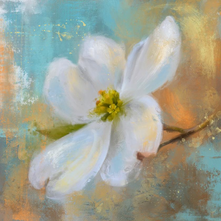
on the original photo. That's where we started. And this is where we are. And I'm actually liking that
pretty well the way that is. And I think I might want
to go ahead and sign this. Um, then pick a color and you
pick a brush to sign with. Like the number three
is one of my favorites. I'm going to pick a color
that I want to sign with. Maybe this kind of neutral
color right there. Let me try to just sign down. There. Might be a little big bring
the size down a little. There might be a little small. Of course I signed it on. I always like to
sign on a new layer. There we go. And now, once you've signed
on a new layer, you can grab it and move it around where
you might want to put it. I like to always put it
down here in this corner. And you don't want it
to be too obtrusive. I do tend to resize it
down quite a little bit, but my signatures on that now. So squeeze those together. So that's a pretty good
expressive flower. I'm especially when compared
to our original photo. There we go. It's
definitely brighter, definitely more fun,
definitely more expressive. And if you want
to at this point, you could duplicate this and you can edit using the adjustments. You can edit and brighten it up, adjust your colors a little bit, sharpen it, all
that kind of thing. If you want to write
right from here, I like to go ahead and
save this image and send it to my computer, pick it up on my computer
and edit from there using my computer monitor because I have found things look different on the computer
than they do on the iPad. And when I print, I've edited on the
computer monitor. My prints look exactly like they look on the
computer monitor. But yet when I print from, directly from the iPad, they might tend to be a little bit different looking and I like to not be surprised
when I get the print. So I tend to edit
on the computer, but you can edit here
using the adjustments tab. In Procreate. You can edit for a lot of things in here and print right from here. Either way you want to do it. Anyway, that's the
dog would flower. And I think that turned
out really, really cool. And after a little bit of editing for contrast
and sharpness, which is basically all
I do at this point. I think this will
be a great print, especially when
printed large size. So I hope you guys have enjoyed
this and kinda get a feel for how I work with
the stamp brushes. And I can't wait to see what you do with the dog would flower be sure to download the
original photo from me and play with it and
create your own look for it. Or if you want to, you can use one of
your own flower photos that you might have. And I hope you guys have
enjoyed watching this. Thanks again for being here. And I look forward
to seeing you in the next class.
Have a great day.
8. Final Thoughts: I want to give you all a
few final thoughts here. After we've done this painting. In the beginning, most learning my photo painting
methods tend to gravitate more towards realism. It's only natural to be
worried about getting everything is
accurate as possible, which is what we did in the
beginning of this class. But that result can be just a re-creation of the
actual photo your painting. And that's fine
in the beginning. Staying accurate
can help you get a good feel of the subject
and how the painting works. Um, but after completing
the accurate renditions, It's more exciting to get more
painterly, at least to me. Because if I want an exact
rendition of my photo, I could just put the
photo out there. And I got started in this
way of painting because I wanted my photos to look different and
I do edit my photos a lot using textures and backgrounds and other things
to make them look different. But then I wanted to
take it a step further. And that's how I ended up painting expressively
in procreate. And it's hard to step away from what your subject actually looks like when
painting a photo. And I'm sure you've struggled with that as we've gone along. But I hope that this class
has helped you to feel a little bit freer
about loosening up and getting more expressive. And I wanted to mention a
couple of things to remember. I'm a major key in becoming more expressive and loose is how the edges of your
subjects are treated. Let me, let me just make
some marks on here. So I can mention a few things. Let's go back to the go
grab a pencil there. But look, look right there. Before I mess up this, let me put this on a new layer. Okay? Look right there at those edges. You see how they're treated. Messing up the edges in
these key areas like this will loosen up your subject and it gives your
painting and more interesting and energetic feel. Another major step
in becoming more loose and expressive as the mark-making that we did
with the stamp brushes. We did a lot of mark-making in the background using
the stamp brushes. But we also did some mark-making
actually on the petals. Actually on the subject itself
with the different marks. Like little splatters and
little things like this. Don't be afraid to do that. Using the brushes to apply unpredictable marks on a new
layer and then blending them in with the realism that's on the layer below adds more
interest to the final painting. And the fun part is
about the marks as you can not only stamp the stamp brush on
there and make a mark, but then if you decide, I don't like that mark and it's entirely entirety,
you can blend it, but you can also use the eraser with a different stamp
brush and erase part of it, which creates even more
uniqueness and interest. The background is very important because it defines the center of interests, which is this. The background and
the subject needs to be tied together, in my opinion. And I did this in this painting with color
choices and with brush marks. The color choices repeating
in the background, like this blue and this blue, repeating in the background and the subject tie it together. Brush marks that repeat
in the background. And the subject that
tie it together to like this really textural
brush here and here. It ties the two things
together by repeating those. So that's something to remember. Repeat some of your
background color actually in the subject. And repeat some of your subject color in the
background like that. Bringing the white from the flower out into
the background. The, the, I think the most important thing when painting like this is
to ask yourself what if What if I use this color? What if I use this
particular stamp brush? What if I loosen a certain edge? What would that look like? What if I use a larger brush or a smaller brush and just make a sweeping mark or a real
tight scribble mark, like something like that. I didn't really do a lot
of that in this painting, but it certainly can be done. Um, all of those questions help you to achieve a
fresh and loose style. So what do you want to avoid when doing a
painting like this? You want to become detached from the photo
in the beginning. You won't, you'll be
painting it realistically, so it's really hard to do that. But then later on when it's
time to get expressive, don't be attached to that photo. And that's why I turned
that photo layer off and I don't really
turn it back on. There's numerous ways to treat your subject and play with your subject and don't
be afraid to try those. Don't fear fragmenting
the form of your subject. Don't fear breaking up a line where the petal edges
supposed to be sharp list. Let's just do that here. Let's just grab the
mess it up brush, which is one of my favorites. And let's just pull
down right there. Don't be afraid to do that. What if you were to
put a stamp on that, you know, across the
edge of the flower. Let's pick one here. What if you were to paint a
drip, something like this? And well, there it is. Obviously that's too big, but don't be afraid to
try stuff like this and then use the mess it up brush to take out what you
don't want like that. See it left that little
bitty mark right there. Don't be afraid
to do that stuff. And don't care
about the outcome. Because you'll be surprised when you get done
and you zoom out. And you look at things, at how good it really
looks when you're done. So what's going to happen
after you do all this? Through experimentation
like this, your personal style will come. You may decide you like to
stay super realistic with your paintings that you don't
like this and that's okay. You may decide you
prefer warm colors, are cooler colors in your work. That comes from playing
with the different colors, putting different colors
in the background and bringing those
into your subject. And you'll say, Do I like
that, do not like that. You'll learn that
as you go along, you may decide you like a
really obscured subject and making this even more
abstract than I've done here. You may decide you prefer dark
over light or vice versa. This is a real light image. I've made it quite a bit lighter than it was in
the original photo. And you can see the
original photo here. And layer one is really dark. And I've made it
quite a bit lighter, but you may decide to go darker with your work, and that's fine. You may decide you want to incorporate a
favorite color too. And every painting
like I did here with my oranges and my, my blues, I like
those two colors. I incorporate those two
colors a lot in my work. I feel like that
makes my work me. And you may decide you like really heavy texture
or you may decide you like a softer texture or
very little texture at all. Um, as you continue
to experiment, what you love to create in a
painting will come to light. And I hope I have guided you into feeling free to
experiment with this class. And I hope you'll try
this image and you'll try some of your own
flower images and see what you can come up with
and kinda get a feel for what you love to
do in a painting. Thanks again for joining
me and I look forward to seeing your class projects
and what you create. Have a great day.
 Jai Johnson, Painting My Favorite Subjects