Transcripts
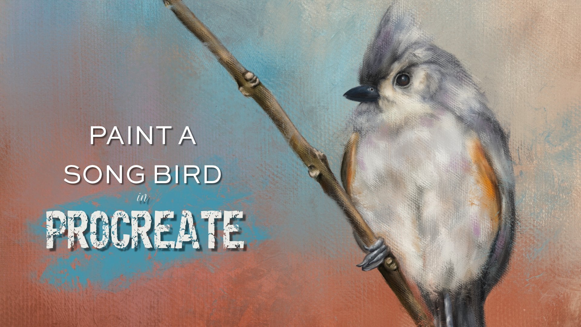
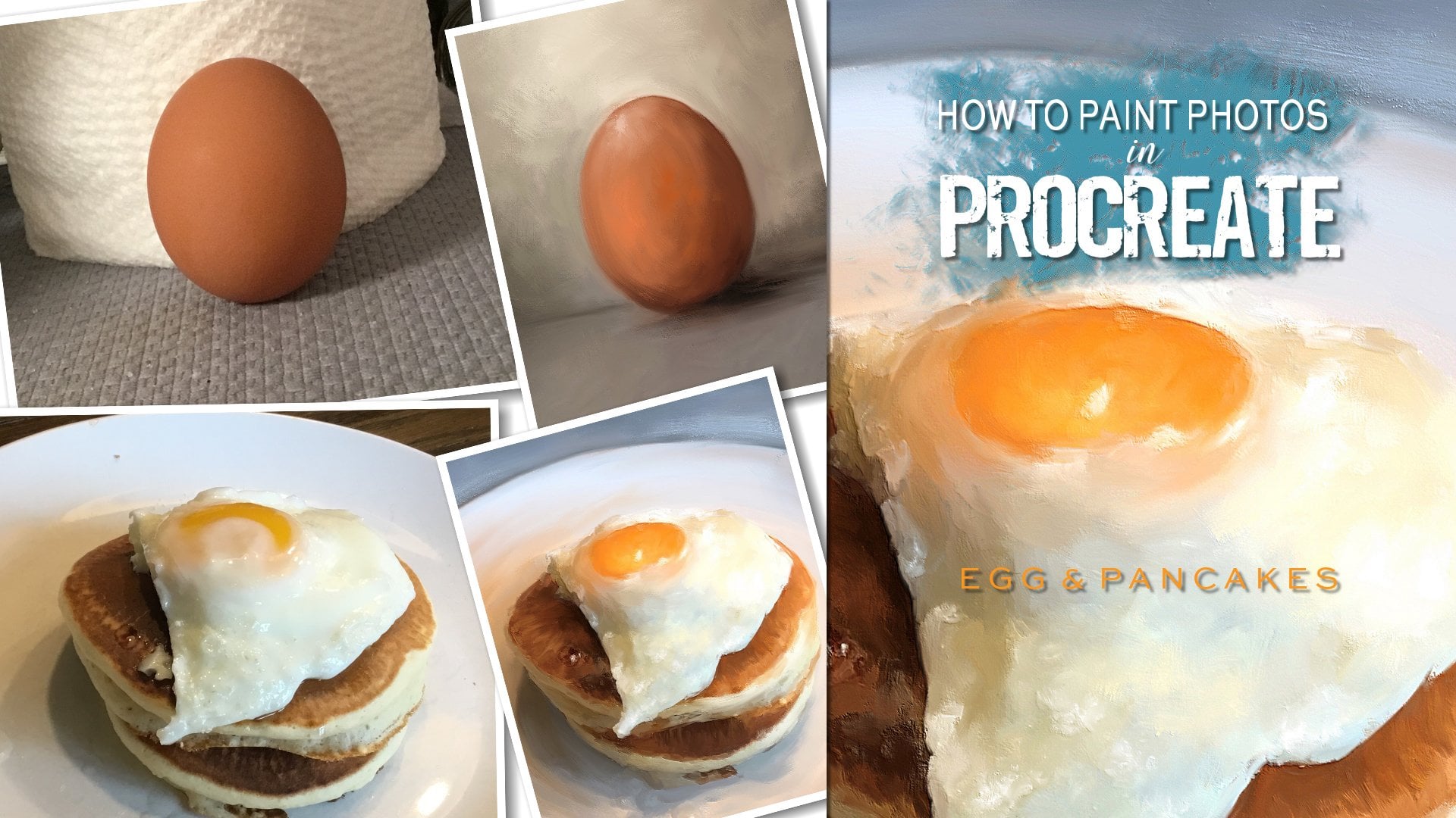
1. Welcome: Hi everyone, welcome to
how to paint photos in Procreate a sweet gold finch. I'm Jay Johnson
and I teach people how to paint photos in
Procreate on the iPad. I started this several
years ago when I started helping photographers make
their photos more artistic. And I somehow stumbled
upon procreate, and got an iPad. And I've been painting
my photos ever since. I love to paint
birds and wildlife, sometimes floral,
sometimes other objects. In this class, we're going
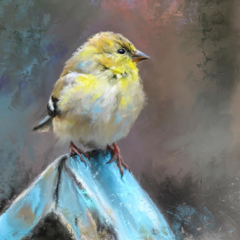
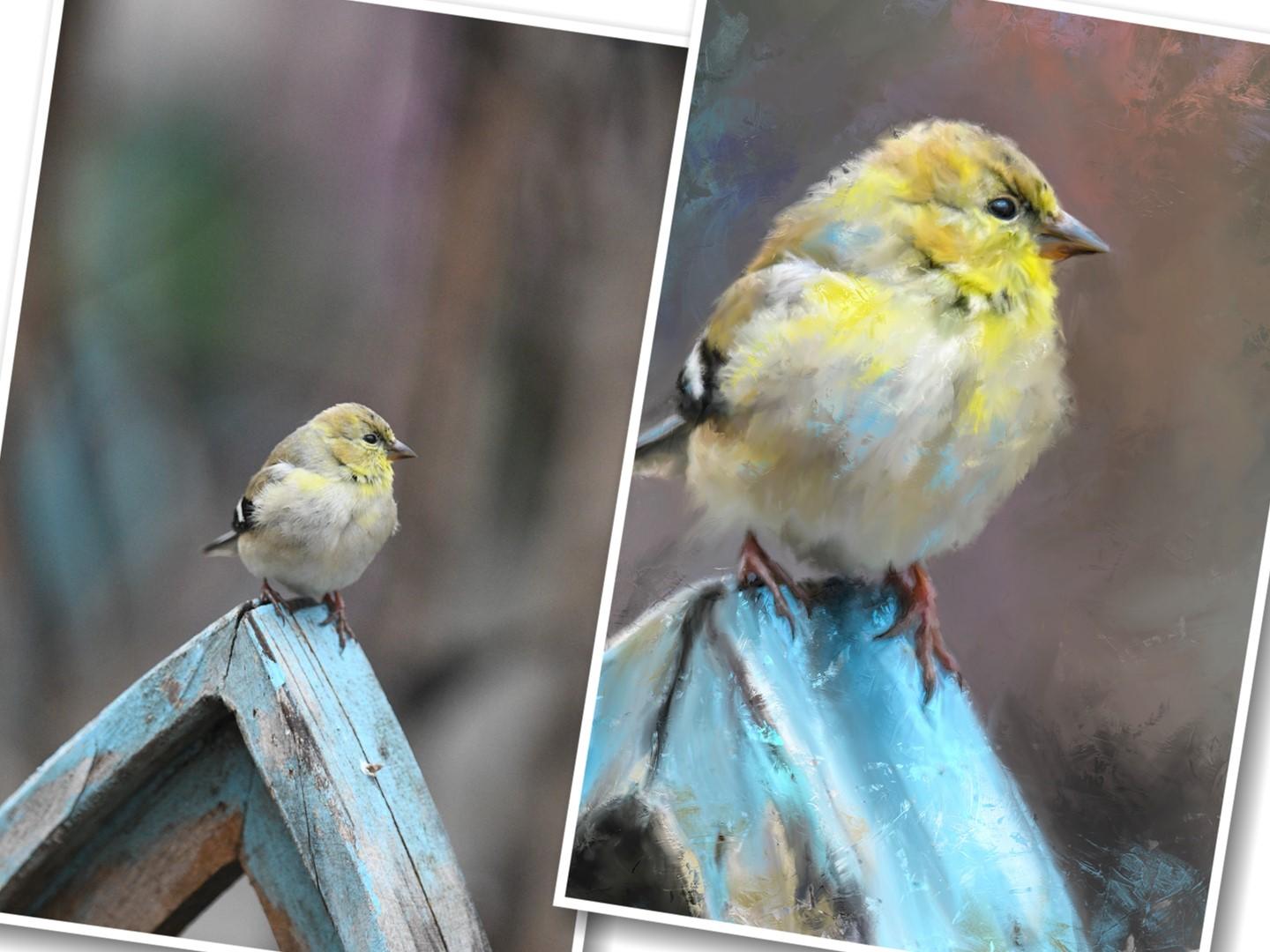
to paint gold finch photo. The original photo
is shown here. And there's the
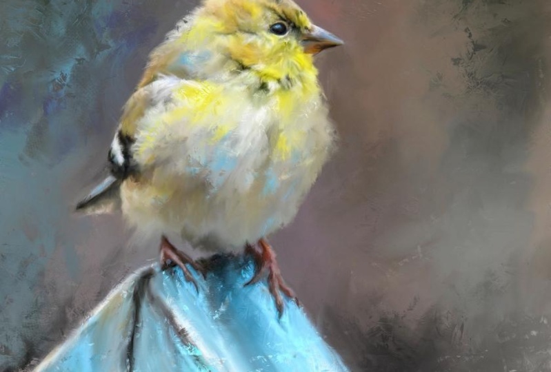
finished painting. I teach you in this
class how to set up your canvas and test your brush. How to paint the detail areas, how to paint the whole
body of the bird. The woods pace that
he's sitting on. I teach you how to work the background to make
it more painterly. I teach you how to do expressive
brushwork and add color. I teach you how to enhance
your dark and light areas of your finished piece and how to do some interesting
finishing touches. And it's all done in this
course with just one brush. In order to complete the class, you'll need an iPad with
procreate installed. You'll also need an Apple
pencil and you'll have to have a basic understanding of using Procreate and
installing brushes. And you will need to
understand how to get a photo onto your iPad. Because everybody
does at different. So if I tell you one way, it might not be the
way you want to do it. So it's best if you already have an understanding of those
things to begin with. Provided with the class is the original gold finch photo that I took for you to paint. There's one brush provided, which is all I use to complete this painting
is the one brush. There's one canvas
texture overlay, which is optional, which I
go into in the final video. Let's get started in painting this sweet little songbird in a unique and expressive way.
2. Canvas Set Up & Brush Test: Alright, so you have the
photos that I've given you, the canvas and the bird downloaded and you
have downloaded the brush and
hopefully installed it into Procreate and we're
ready to get started. You can check your photos
to make sure they're here. There is the gold finch on the very bottom and right next
to it this square canvas. Then let's open Procreate. Now in Procreate you may, you would hit this plus button
to bring up your canvas. As you may already have
a square canvas setup. Delete that one. And you
have other sizes here. We're working for
square on this project, which I do a lot of
my paintings square. I just liked the format. I already have a square, 6 thousand by 6
thousand setup in here. But if you don't, I'm going
to show you how to do that. Click the plus button. Again. I mean this plus button by
new canvas, the black one. And it will bring up this and you want to
be on dimensions. And I do, my canvas
is at 300 DPI. I already have six thousand, six thousand in here. If you click with, you could change that to say
3 thousand by 3 thousand. And notice it says
maximum layers have changed now this maximum
layers that you'll get for our canvas size
depends on your iPad. I'm working on a iPad Pro. The iPad Pro with quite a bit of memory
and things like that, you can get a lot more layers. If you're working on
a different iPad. And you might not have the ability to
have this many layers. We don't need near
that many layers. But my favorite size is 6
thousand by 6 thousand. But if you want to do 3
thousand, that's fine. But you just type in what
you want and it'll show you how many layers ten
is more than enough. For what I do. Then
you would just, you could title your
canvas if you wanted to type in 6 thousand, let's just call it
6 thousand Canvas. I can't spell. Then you would just
click on Create. And then it will
appear in your list. And it will also create
the Canvas and open it. If you go back. There it is untitled artwork
6 thousand by 6 thousand. If you hit the Plus,
you'll see at the very bottom it's added the
canvas that I've started. So you need to create your
canvas first and then OK, make sure it's open. Now, before we import the photo, I want to do a brush test. I do this with every
painting, with every brush. We're using the rich Canvas thick five brush
which I've given you. It's imported here, it shows at the top after
you've imported, if you have not done this step and it gotten your
brush into Procreate, you can hit the Plus button, you can hit Import, and then you can go
pick the brush from wherever ended up on your iPad. And in my case, I come from a desktop with my
brushes and with my photos. So I put them on my
son does I expand drive which I plug into my iPad and I get
thanks from there. It saves it in a
file for that drive. There on the far right is
the rich canvas brush. And you would click that and it would import it into Procreate. It may, depending on if you download directly
onto your iPad, it may appear in your downloads. I've noticed with
everybody's iPad and everything ends up differently. Where things go. The brushes imported, and now it's time
to play with it. And we're going to be using the blender tool in this course, but there's nothing here on
this canvas to blend yet. So let's use the paint tool
with this brush first. And let's see what it does. And I have the size
turned up all the way. So you can see it good. Let's just do a
little short mark. There we go. Just a
little short Mark leaves a little texture, leaves a little canvas. And that's just little
short gentle strokes. The lighter you go, see when you go really light, it leaves just a heavy paint. Lifted texture. If you hold down on it, push real hard, it leaves
a very dark texture. You can do short
heavy strokes or really light strokes just by holding it very
gently, stroking it. Now let's change color. Let's go over here
and get some orange. Put down some orange. I'm just going very
lightly across the top. You can see how it
is leaving that textural marks right on
top of from the orange, right on top of the turquoise. And then if you
want to go strong, you hold down very heavy. You can lower the brush size
and do much smaller marks. And see how it leaves that
nice canvas texture on top. Now let's switch
over to blending. Same brush, it's raised
sizes all the way up. Let's just kind of pulled
down and move it around, blending the turquoise
with the orange. Now let's just gently
pull, lift up. Very short strokes. Very gentle. It blends, but it
leaves some texture while it's blending when
you do it very lightly, stroking right or left. As to the left,
Let's Get up here. Let's stroke this little
orange part off to the right, see how it leaves that texture. And if you hold down and pull, it gets much darker. So with this brush, it's all in the amount of pressure you're using and how long you're holding it down. Or if you're doing a
short little drag, short little sweep, where
you're just tapping and sweeping and then
lifting really quickly. But this gives you, by doing this before you
start a painting, it gives you an opportunity to feel how this brush is
going to work for you. And then you can go back
to painting and add more, which we will do this project. But that kind of
gives you an idea. And you can, you
can scrub it to, you can hold down and scrub
those colors together. I don't normally do that. I do short lift. I lived it very quickly
and do short strokes. In most of what I'm
going to show you, just very short tapping
stroke at the same time. I'll go real fast too. To really get the look I want. And of course play with size. You go to a smaller size, you're going to get smaller. Blending. Smaller marks. The lighter you hold
it when you pull. To blend, the more texture
you're going to get in it. That gives you a
little bit of idea about the brush
and how it works. Now we can clear this layer. After testing the brush. Just click on it
and click Clear. Now we're ready to import the photo that we're working
from so we can get started. We will do that in
the next video.
3. Painting Detail Areas: All right, We are ready
to start with our photo. We have the blank layer here, so we're going to import
the photo by clicking the wrench icon on the top
left and click insert a photo. This will then open your
photos and then you click the gold finch picture
I've given you and it will appear there. There it is. Now, my photo isn't as
big as this Canvas. Also. I think about what part
of this I want to paint. Right now we have a very
small bird on this blue wood, which I really liked
the blue would. But we have a lot of background. I want more bird
than background. Very first thing I'm going
to do is resize this up. I'm going to click this
transform era of there. And it's already on uniform, which means when I pull out
from one corner or another, it's gonna keep everything uniform and not
distort my picture. I'm going to pull down from
the left corner quite a bit. And then you can hold
down with your pencil on it and move it around
where you want it. I'm going to decide how
big I want this bird. And I want him pretty big because I want my
focus to be the bird. So I just keep pulling and moving and deciding
where I want him. I want some of the blue would I don't need him
right in the center. I'm going to put him up toward
the top a little bit more. I'm actually going
to pull a little more and really bring him in. And I'm gonna put him off too, since he's facing to the right, I'm going to move him
just off-center a little bit right in there. Laying out the
picture like this. Let's make them just
a little bigger. I'm running out of room here. But laying them out like this on the Canvas will leave this space here on
the right of him. Later. If I wanted to import words
in with my image and say make a greeting card or something like that
I could do so. I just want him
off-center a little bit. So click the Layers tab
again and he's in position. If you decide you still
want to make him bigger, you can make this a little
smaller by squishing it, as I call it, with
your two fingers and you can do it again. The same thing we just did. I kind of like him right there.
And then click it again. Now I do like this layout. I'm going to duplicate the
photo layer at this point. I don't usually
rename my layers. You can click on the layer and click Rename
if you would like. I'll just go ahead and do
it and just call it bird. Now, you have to
remember when we're using the blending
tool to paint a photo, you're going to paint the colors that are actually
already in here. If you don't like these
colors the way they are, you need to fix that
before you paint. One thing I do on most
of my paintings is I will bring up the
saturation because I shoot a lot of photos
on cloudy days. That tones everything down. The blue is pretty saturated, but the bird could use a
little more brightness. I'm going to do that. I'm going to click the
Adjustments button, click hue, saturation and
brightness and click Layer. And I'm just going to pull
that saturation up and watch that yellow
get more vibrant. I don't want his feet
looking to read maybe about 70% and that just really enhance the color on everything that's before photo. This is the after
with that adjustment. I do like those
colors much better. You could also on
the adjustments. If you wanted to play with
some of these other things on your photos such as
color balance, curves. If you wanted to sharpen
it or any of that, There's no reason to
really do any of that. At this point, but you could do some of those
other adjustments, but whatever you want to, whatever you're going to do. Color wise, you're gonna
be painting what's here, because you're working
actually on a photo. So you want the photo to look generally like you
want it to look later. I do like these more
saturated colors. I just think that's much
neater for what I like to do. We have that ready. We're going to start painting the bird by choosing
the blending tool. I'm going to start. Always start with the eye area. I zoom in really close
and usually you can see enlarging this photo
really pixelated it. But that's not a problem. A lot of times when I
start the blending, I like to go with a
pretty good size brush and just kinda get over here on the background area and see
what that's gonna look like. And I'm doing short strokes
with a very large brush. Just to get a feel for how it's gonna look
and you can zoom out. Most likely I won't keep this background color and
we will change that later. But to get in around the
detail area, smaller brush. And I'm just doing very
quick short strokes with that tap and
lift technique, which I showed in the
previous brush test video. That gives me a feel
of how it's working. And you can always
turn your layer off and on to see
what you're getting. I start with the eye. I'm blowing this up really
big here, zooming in. I'm gonna get my brush
relatively small. You see how blurry and
pixelated the eye looks. I'm going to get on the blue highlighted area on the
eye with very small brush, I think is about two or 3%. I'm do short
criss-cross strokes, blending one color
into the next. This area, in this
little blue area. Then around his when he starts
to get a little bigger, the areas I'm working on
getting a little larger, I will raise the brush size. Now I'm in the black line area
across the top of the eye. And I'll go back and forth if I pull one way and
I don't like it, I'll pull back the
other direction with the brush and
stroke the other way. To me that's just
creates interest anyway, to go back and forth and I
do a lot of crisscrossing, bringing colors over
each other with very short taps and
very short strokes. Now we're getting into the
main area of the eye here. I'll just kinda follow
the contour of the eye. Just like when you're
doing the feather areas, you'll follow the feather. You want to make
sure to get it all painted the best you can. I'm just going all around the eye and now the
underside of the eye. Stroking left to right
and then right to left. And then pulling out
from the eye a little bit right here where
this white area is going around this
top part in the corner. Then the very top and fought
still following the contour, going right and left
with short strokes. And you can go, you
can get really messy with this and go as
fast as you want. Do not try to be realistic. It's hard to not want to paint every little feather and
every little detail, but you don't have to do that. The point of these paintings
is to be expressive. This brush generates a lot
of expressive marking. And just by going crisscross and left and right
and very short strokes, you can really get some interesting
texture to your piece. And painterly look, which
is what we're after. I just keep going
around the eye. As you get further
away from the eye, you can raise the brush size up, but I'd like to scoot out, zoom out, turn the layer off. You can see their original
now turn it back on. Zoom in a little more. I do this a lot. This enables me to see if
things are looking good. Because I'm working
with a very tiny brush, it's better to be zoomed in. Now I can raise the brush
size now. If I want to. Or I could do these
other fine detail areas like this line right here
in the middle of the beak. The word the top of the
beak meets the bottom. I do like to keep
that detail in there. So any while working
with a smaller brush, I'll just keep working
on the detail areas. And here's the little nose
area right above that. Here's where the dark area from. The AI comes down
toward the nose. That's a little detail
area I want to keep. And then there's this underside or the beat comes to the point. I'll go back and forth. Try to keep that
intact with detail. And maybe around the edge of where the beak
meets the feathers. Just a little bit. They're bringing some of that dark detail from the
underside of the beak up. Because if we use too big of a brush where these
little detail areas are, you going to blend them all out and you won't see any detail. There we go. Off on. We're making progress
now another area of detail is the feet. And we have this little area of tail feather here as well, which could require a
larger brush for that. So I'm just going to stick with this smaller brush and do
the feet area right now. I do want to keep the
detail of the toes. So I'll do that. And just paint most
of the foot with this detailed brush,
especially the toenails. And in his little toes. It looks kinda blurry
because we're so zoomed in, go around the edges of
his little legs and in-between the
little toes as well. Now I'm not getting every
pixel painted here right now. My main goal is just to
get the toe detail in. So now I'm on the other toe. The other foot I mean, we have the foot coming
down from the body, so we're going to
get that in place. We got this little
white highlight on top. We're going to keep that. So detailed brush
is very good for these very small areas. And if it doesn't
even look like he has much of a toenail here, you can kind of drag
it out and make his toenail just a little
longer if you want to. Just paint all
these little toes. Areas. Very short
little strokes. Now the feet are mostly painted. Then you can see when I turn it off and on
the difference there. And we'll work on
those some more later. So now I've got a few little spots here in the neck area where
some black is showing. I don't want to lose that black, which I will if you go
with a bigger brush. I'm going to paint
these couple of little spots right now
with the detail brush. Just to try to hang on to them. It doesn't matter
if we lose them. We can always add paint later. But just those little
spots right there. I want to make sure
to keep now we're ready to start going
a little bigger on the brush size and
painting the rest of him.
4. Painting The Bird: All right, Now we're
going to start going along with a
little bit bigger brush. And remember I said, you don't really need to have every little feather,
every little mark. But we are going to play with some brush size and
I'm going to be sizing the brush a little
bit differently as we go. At this point, I I usually work out from the detail areas with a little bit larger brush. And I'm going to work
on this beak area around the little nose here. And I'm still using a
fairly small brush. As an ally, you can turn your Canvas to stroke in
the direction you're, you feel comfortable with. And I'm going along
that first line. I did down the middle
of the beak to try to keep that beak
looking like a beak. I'm just kind of working
outward from that line with a little bit larger brush. As I get further away from
that center line of the beak, I will gradually raise the brush size going
along the edges. This little black edge on the underside and
pull it out too much. You can pull some of the
background right up into it. All right, now let's raise
the brush size a little more. Go with some really big strokes. Short taps, trying not to go out of the edge of the beak
into the background. Because if we go out like this, That's not going to look right. I'm still going
around the edges. The tip a little bit on the
Background portion of it. I mean, a full
little bit of paint goes out from the
brush. That's great. But you don't want it to look
like you've made a mistake. You want it to look like
it's an artistic choice. I'm doing the underside of
the beak, back and forth, crisscrossing this little
orangey area right here. Little white feather
area right there. Now let's turn it up
and look upright. I liked this little
peachy area right here. I'm gonna try to gently
pull some of that out which shows a little
texture when I do that. And this white area
pulling to the right. Very short strokes. Going up around the
edge of the head. Still around the nose but
working outwards so I don't lose the detail of the nose. Now I'm zoomed in super far. As you zoom out. It helps to not only
see your picture, you're working from better, but it also helps to see
where you might want to add some more interests with your strokes by going
a different direction, by doing lighter
stroke and bring it a little texture like
right there I just did working out from the eye. I did that one stroke over
the eye little strong. So I'm going to
double-tap or tap with two fingers and try to get in here and work on this without losing that
ring around the eye. I think this is looking
fairly good so far. Like I said before, turn it off and on. You can see where you are. Now it's tempting
to want to keep all this little feather
detail right here. You can work with a small
brush and do that if you want. I don't usually like to do that. I like to go a
little bit bigger on the brush and just crisscross. Actually lose the
detail of the feather. I'm really just doing a lot of short taps around the bottom
of the feathers on his head. Now, you could pull out some here on the edge
into the background. Still working, going
back to the eye area, I will jump around and
go to different areas. Now I'm a top over the eye. Little short strokes. I still, I'm also doing part of the background around as I go around the edge of the head. Little short strokes crisscross. And as I'm moving back
from the eye to the left, I don't do a whole lot of undoing when I'm working because I can always add
in more marks later, which is later in the class. I will show you how
to do that to add in some more interests marks
right now it's just the main goal is to get
the general photo painted. Then, then we can
get more expressive. When you do these
little crisscross marks here at the top of the head, you can actually bring some of those feathers out
into the background. I'm painting the
background some. And then I moved to the feathers around the edge of the head. And that makes the head
look nice and fluffy, which this is a
little fluffy guy. We want him to look
nice and fluffy. And alternate again, this little black line right
here is kind of interesting. I'm pulling on that. And if it leaves a mark
or two, that's fine. I'm still going around
that edge of the head and the background with little short taps, tap and pull. I guess that could be a technique
tap and pull. Tap pool. There's that little black area
I didn't want to lose from earlier under his neck because
that gives him dimension. And as I get further out
off of this head area, that will go with an
even bigger brush. If you find it's not moving
the pixels is good enough. You could push harder. Let's pull some white down there that looks
kind of interesting. I really love the texture of this brush and it's when
you're blending with it. It doesn't show as much texture as when you're painting with it, which we'll do later to add
additional brush marks. So we'll get an even
better texture in later. But right now this
is just getting the general shape of the
bird all painted in. Real nice. All right, Let's turn
it off, off, on. Zoom way out. Even though we lost some detail by going to a bigger brush
when you turn it off and on. You could still see
that detail is there. I'm gonna go right
around the top of this wing with the
same brush size. But then I'm going to switch to a bigger brush here
in just a minute. Since this little top
of the wing area. These white feathers
right there. Alright, let's go
to a bigger brush. Got this area right here. Along the head, that
top of the head, that's where it meets the
wing where it's not painted. So we're just going to do
some crisscross short taps, taps in summer tap and
drag right through there. Even around the edge. Make him look a little fluffier. Pull that out into
the background. Now, let's do this wing. These feathers that come
over onto his belly. Just go across right to
left or left to right, whatever direction
you feel like going. But I try to keep in line with the feathers of the
feathers are moving to the left. I'll stroke the feathers
in that direction right to left if they're moving
downward, stroke downward. But I'm not keeping the
feathers as they are, but I'm keeping the
colors as they are. And then they're transforming
via the use of this brush. We've got this black area here. For this area, I'm
gonna go a little bit smaller because I do want to keep that black
in there and not lose it. This little streak of white. Pull it out, make it bigger. Then this tail right here
where it's sticking out a little stroke and the
direction of the tail, the gray, grayish white, the black, and then the
body curves right here. So I'm gonna stroke
in the direction of the curve right there. And then finish out this tail by stroking and
the direction it's going around the edge of
the body right here. But once you get the hang of this and how the brush
is working for you, you can really go
quite a bit faster. I'm going quite a bit slower
than I normally would. We've got this one spot here
that looks a little funny. So I'm gonna pull this dark little smaller
brush and pull some of that dark and doesn't
want to pull. So that may just be a happy action they'll fix later by adding
brush marks over it. Get these white feathers little bit more choppy
on their edges. Excuse me. Okay, now, let's take a look at
what we've got here. Off on a zoom way out. When you zoom way out, you can see how it's going
to look like when you have this printed and look
at it across the room. That looks pretty good. Now we're going to work
on the rest of the body and we're gonna go
with a bigger brush. And just kinda quickly go
across the body and finish out this belly area and going go also on the
background around the belly. Short tap and pull. You don't lose your colors. Getting down close to these. The bottom of the belly. Were these feet are might have
to go with not lose any of that have to go with a
little smaller brush here in-between the
foot and the body, crisscross and not lose this
bottom edge of the belly. I can see some pixels spots when I zoom in that are unfinished. So I can kind of go over those. I'm not worried about getting every little pixel because we are going to add
more brush marks. We're gonna go with
a smaller brush and get here in this foot area. Because this foot goes back
under the belly right there. We don't want to lose that. We start the blue would there
to go around this foot, actually go over that foot a little more because there are several parts that are
not painted in the foot. I did the detail of the foot, but not everything else. Start on that wood. And then in-between the toes
where the blue wood is, I'll stick with
that smaller brush. I don't want to lose my tote. Be awful When it
to lose your toes. We don't want to do that. Now let's go over here
to this other foot on the right and go around it in
the blue area of the wood. And in-between the toes
actually do the foot some more because there's some spots
on top that I've missed. Some kind of working
around that foot area. So I don't lose those toes. Working on top of the foot. Don't want to lose the toes. All right. I see
some spots right in here that are unpainted because of the pressure
variation on this brush. Sometimes when you put it down, it may do paint them, sometimes it may not. When it's blending in the
blending portion of this. Because brushes work differently when they're used as a blender. Not every paintbrush
makes a good blunder. Some brushes won't blend at all. How will we look in now? Pull some of these
feathers on the right out. Give them a little more fluff. Off, on, off, on. Oh, we're looking pretty good. You can definitely still
tell us a gold finch, even though we have lost. If you look at this belly area, especially we have lost a lot of those little fine feathers,
but you don't need them. These are expressive
paintings to leave an impression about
what you're seeing, but not necessarily
an actual rendition. Accurate rendition. This isn't I'm not trying
to be photorealistic. I want people to be able to
tell what my painting is, but I want it to be
expressive and this is just the beginning on
the expressiveness. Now let's work on
the wood piece. This little fine line
of black right there. I do want to stay, so I'm going to stick with the
small brush right there in this top edge and then
this gray line right here. Some of that to stay in place. I'm not going to leave
every little line in place. There's no need for that. Main thing is don't
wipe out the toes. Got this black area of the
wood right up under his belly. That's the shadow areas
I want that kept intact. Alright. Let's go with a bigger
brush for the wood. Let's see how big
we can get away with working under
the feet area now. Still going in the
direction of the wood. The wood kind of has its
own unique texture already, which is helpful
if you don't get every little part
of it is helpful. I'm going all the way along the edges of the wood right now. Try not to lose the
highlight where it's at. I like this little brown
spot here on the left. Then there's the dark
area underneath. This same size brush. I'm gonna work in that area
crisscrossing and bring some gray in there because it's
not like solid black. Bigger brush sweeping on that would over
the larger areas, trying not to obliterate the fees little detail
areas I've left in. Would this be an
old piece of wood? Little happy accidents left in there to use a Bob Ross term. Kind of neat. If you make it move the brush in a certain way
and it makes a certain mark. It's kind of neat. I'm just going in the
direction of the wood. Short strokes up and down. That black line there. Sometimes you'll
decide a certain line. It's just not important. You just wipe it out. You can always add another
line later if you want to. Make the brush a little smaller. And work on this little area by the black lines and
the gray lines. And kind of pull on them
a little bit, expand out. Then go around the
background of the edge that then this shadow area, thunder his belly, I
think I'm gonna pull down on some of that pool and
Chris criss-cross it. Light touches to bring
some texture in there. The wood is very textured. Having a lot of texture in
the wood is not a bad thing. But the goal here
is to have the, the head, this area looking
the closest to realistic. And then as you get
further away from that, you can get a lot looser
and more expressive even on the wood unless you desire
it to be super detailed. But that's still even though I really messed that
would up a lot, it looks pretty good. You can still tell that something interesting
that the bird is sitting on. I believe next we're
going to go onto the background and decide
what we want to do there. So that will be in the next
portion of this class.
5. Working The Background: Alright, now we're going to
wipe out this background. I don't mean remove it. Now we're still working
on the bird layer, which is a copy of
the photo layer. This is how I do I work
on one layer until this time to add accents and
other things I might want. We're going to work on
the background portion. And we're going to go with
a big brush size at a 100%. Now, I believe I'm, like I said, I'm working on 6 thousand
by 6 thousand Canvas. If you work with
a smaller canvas, the brush may appear
really big to you. To me, It's not super big
right now. I'm going to start. I'm I'm gonna stay zoomed out and I'm starting with
the top-left corner. And I'm just going to do
that same tap and lift and criss-cross through
the whole background. Being careful. When I get down close to the
bird's head and feathers. Not really go over. I mean, if I make
a little mess up, like they're told a little
feather detail out. You know, if you bring
the background down in, I don't like that. So I'll tap with two fingers. I think if it works
there it goes. I'm just going to crisscross
with this big brush. I don't want to drag like this because that just
looks not good to me. I'm going to tap
with two fingers and take that out and
just crisscross short strokes all the way
around the entire background. I pulled a little section of
his beak out right there. I could lower the brush
size and just kind of work around that
and blend that. Now raised the brush size back. That's why I tried to
go around the edges first with the small brush so I don't really get
too close to the bird. But sometimes I'll
have to still go back. Right now. I'm focused on the
main background here and just get
it all blended out. I'm doing hard
short, tap and lift, crisscross, back and forth, Sumner down, some are
sideways, some are up. I'm using the brush here
at full opacity to, during all of this. If your brush doesn't
show at full opacity. If you're not seeing
the blend you like, make sure your opacities turned up all the way,
which it should be. Moving down around
this sidebar the tail, trying not to
obliterate the tail. So I better stay away from the edge of him
with the big brush and go back in those areas
with a smaller brush. After I get the main
portion of this done. Now we'll move to the
other side of him. Go all over in the wood
in this bottom corner. I don't like this light area
here at the bottom corner. That's something
to keep in mind. But also when blending, if you don't like, you can blend out the darkness from this
section down in here. Little more. The key is
to go back and forth, crisscross different ways to keep your strokes a
little bit more random. So it looks very expressive. Rather than just a
straight stroke. I got most of the
background done. Off, on, off, on. But I do need to go
around the edges of the bird with a
little smaller brush. I'm gonna reduce that to
about half the size it was. And get around this
tail area where I see a lot of pixels
that are unpainted. Now, when you take a
photo like this on a cloudy day and you got your noise level is
high and it's grainy. You're gonna blow it up, especially like we did. You're gonna see some
graininess or pixelization. Some of that can add some
interesting texture, but some of it can
look unfinished. You want to try to really
zoom in and find those spots, like right here by this foot. There's a lot of that showing around the
edge pretty good. Here's some I don't know
if those are marched from the brush. The background. There are some right ear
on the edge of his body. Some of these are from some of these markings
are from the brush. And the harder you
press, the more it will get rid of a market
if you don't like it. So keep that in mind. You can bring that feathers out. You can push them back in. Let's look around his head area. Yeah, there's some
areas right here that didn't get blended good. And just around the
edge of his body. We're gonna go around this
head area that appear on top, over the top of his head. They will slowly disappear. And I find this very meditative
to sit here and do this. I tried to go around and find, like here's some spots right here that are
kind of missed. I've tried to get in there and you watch those spots
kind of disappear. The goal with this
layer is to really, Here's a spot right
here, this terrible. The goal is to really just
spend some time with it. Get expressive with your
marks back and forth. And to get rid of
the original pixels. The best you can. Here is area right here, this little, not so good. You'll learn all
kinds of terms from listening to me a
little not so good. That even make sense. Got my brush cursor turned on, which I don't normally do. But that way you can kinda see when I'm tapping where I am. Some spot right there. If you stroke one way and it doesn't do what you want to do trash stroke
and the other way. That's why I do a lot
of crisscrossing cover all my bases right off the bat, plus add that interesting
texture from the brush. In there. There we go. All right, let's take a
look at what we've got. Zoom out pretty good. Turn it off. So there's the original picture. There is our painted version. We're looking pretty good. Now I just have to decide what I wanted to do with the
rest of this background. The problem is, for
me is it still looks to photo in the background and I want it to
look more painterly. You can go with the big brush and drags more of
that color around. Or if you find a color you like, push that color like this bluish purple here
in this upper corner. Pushing that toward that green. I don't really care
for the green, but I really liked the blue. Remember the lighter the stroke. The more texture you'll
get from the brush. Pull some of this
blue down here, and you're getting into
artistic choice now. You've got this
little peachy area right here where it
meets the green. That's the area where the
light's coming to hit the bird. I don't really want
to make that darker, but I might want
this peachy area to actually bring some
peachy texture marks over here into the green. If you just very
lightly touch and drag, see how it's bringing some
texture into the green. And then if it gets too strong, you can pull one of the
darker colors over it. I really liked
that textural look by pulling some of
that peachy areas over peachy, that even a color. And I'll pull some of that down. And then this purple down
here is really interesting. I'm going to pull some of
that out, just real light. Touch and drag, pull some of that purple texture
over here to the right. And even down over
this black area. Then I want to pull some
more of the black area down. I don't like this
light area down here. The more black I can gently pull that way with
light big strokes. Then I can pull some
of the the gray down and then some more of
the purplish area. I'm just using. I'm using the same
brush, same size. I'm just using it in a
different manner here. Instead of doing the
short, choppy strokes, I'm doing a gentle grab and pull, pulling
different directions. Like what I did
right there, there. Pull some of this over. You can turn the canvas too. Very gentle. I'm not pushing hard at all. Pull some of this
black up and over. Still pulling some more
of this peach tone from the top over
here to the green, dark green in the corner. I really liked the
way that makes some neat texture
over that dark green. You can get some more of this pinkish color from up there. Now let's zoom out off on. We're still got this
little stripe here from the background and that's where this dark green is
coming from here. That may have to be tagging
care of in the next stage, where we're really going
to dress this painting up with a little bit more
expressive brushwork.
6. Adding Expressive Brushwork: All right, it's time to get some additional
brushstrokes in now with paint instead of
the blending tool. So we're going to add
a new layer for this. We're gonna put our brush
shows on a new layer. That way if you don't like them, you can erase them
and you will not mess up what you've
already done here. Generally, I like to start
once again with the eye. You see this beautiful
blue down here. Then he's got this little
bit of blue in the eye. I want to bring some of that up. What I'm gonna do
is I'm gonna put my finger on a color
blue that I like, which then changes the color
up here to that color. I just held down on
it with my finger. Now my paintbrush is that color, but obviously the brushes to be. So we're gonna bring
it down pretty small. Zoom in here to the eye, make sure you're
on the new layer. I'll just rename this paint. There we go. I'm gonna try to make, oops, see, I've picked, I've held my finger
down there on the head and my
color has changed. We're gonna go back
down here and find that blue I liked again. We're going to hold down on it. Now it's back to the blue. I like. Let's see if I can
avoid doing that. I was trying to zoom in. Make sure we're on
the paintbrush. Just make one little mark. Now that's kind of a small mark. Raise it up a little. Just tap in there and that gives a nice little interesting
blue highlight. I'm also going to bring
that blue highlight, that blue color into the beak, right at the top of the beak, I'm gonna make a couple of
little strokes in there. And now we're going
to blend this. Don't worry if the strokes
look too strong and too blue, they're going to be blended. Where else would I like
to bring this blue? I love this blue. Let's see. Make the brush a little bigger. The colors that are
in shadow of the bird would have some blues
and some grays. How about right here? Let's put a little, go a
little bigger with the brush. Undo that. Right in here. Bring a little
blue that's too strong. We needed to have a lighter
touch with the brush. Very light. Stroking a different direction. Maybe even down here. And then this greenish area
down here by the foot. This is my artistic choice. That is an accent color I like. It is one of my favorite colors. I'm even going to make a
smaller brush and bring some of that little bit
of blue right into this tail area and into this white bottom section
of these white feathers. Now, this looks kind
of stupid right now. But it's going to
be blended sum. Now I want to bring
that same blue, I believe into the background. It may be a little bright, I may have to tone it down, but I'm just going to make
a couple of marks here. That might be a little bright. Let's tone that same
color, blue down. So get on the color wheel. Let's pull the left
and down a little. Go with a little different
shade, That's better. I'm just showing
real light strokes to bring in some texture. But you can do a heavier stroke. I'm just making some
marks around in here where I want to bring
some of that blue color in. Like I said, it will be blended. And I may even bring some
down here in the black area. Right along side. No. Gentle or touch. Thereby the base of the wood? Maybe? No, not over there. I don't like it over there. We've got some blue in there. Let's go back to the blender and let's start with the
background where I've added that blue marks and just kind of touch and blend
very gently some of it. I do not want to wipe out all
of the textural marks here. But I do want to. Kind of blended in a little. I'm trying to decide
what I like here. Like I said, this is
all artistic choice. By blending some of this away. I'm Tony it down, but yet it's still there. Then if I decided,
well, it's too strong, I could erase with it. Let's go to the eraser. Make sure we're on
the right brush. Unless just tone some of
this down using the eraser. Sometimes you can
just tap and get an interesting want to
bring some more blue back. So I'm going back
to the paintbrush. Appear in this top corner. Bringing some more N kinda helps offset some of
that green I don't like. Now there's a gray tone
in here right next to it. I hold my finger down on
that to pick up that town. Now I can bring some of that
tone over into it as well. So we have a more difference. And then here's some
pretty purple here. Let's grab that purple. But let's bring it
over to the right just a little on
the color wheel and see if we can add a little
more fun color in there. Now let's go back to the blender and cap and blend some of that. Then get the gray color next to the purple and
bringing some of that in. This is why you're adding some more color
variation in there. Starting to look
kind of interesting. Let's blend some of this blue out on the bird that
I'm not happy with. We put the blue mark in the eye and I really
do like that. I'm going to go with
a real small brush and just blend the
edges of a little bit. Let's get on the beak. We made this mark and go
a little bigger brush and sort of blend
that in a little bit. See that's still a little
strong looking when you zoom in and zoom out,
it'll look different. Let's do a little
erase right there. Right down the middle
of that blue to help it down and
blend it in a little. Now let's zoom out. Oh, that's much better. Back to the blender. Let's get this area right
here. Bigger brush. Some of this I may end up
just blending out a lot of like those little
highlights of blue. Now that we've blended
that a little, let's do color next
to him, grab it. Let's go a little brighter. And let's make a mark. Now let's blend that. I will go back and
forth with colors, making marks and blending
on this upper layer. That looks kind of interesting. Let's get the blending done on this blue and his belly area. Go with a bigger brush. Tap, very short tap stroke. I don't want to
obliterate it completely, so I'm doing very short taps. So I did obliterate that
one. I didn't want to. Rather than blend this one, Let's just grab a color nearby. Let's lighten and brighten that color by going to
the right just a little. And put some of that
color on top of it, and then blend some of that. Then we can get this
color over here. Kinda pull it around, lay some of that down. Blend that. Now whether you use
the surrounding color as is like I just did, or whether you lighten
and brighten like here and go to the right
on the color wheel. You could even go up a
little if you wanted to, and add a little brighter
colors in there. Very lightly. Let's even bring some
of that up here. Appear over. Oh, that's too big
of a brush mark. Gently touched some of that. In there. I'll go back
and forth between color and blend and
changing brush size. In this stage, if there's a division
that looks too harsh, I will blend blended out. I do like that
little bit of blue showing this blue under the
belly is a little strong. I'm gonna take the
colors right around it. Go with the big brush and a
very gentle pull down mark, which will add a mark switch. I add texture in those
areas right there. Let's take this color as is. Whoops. And go Up and over
just a little. Let's take this color
as is and come down. A little UCI was building up. Let's take this color as is. And come note. Let's do this color
up a little bit and brighten it and bring
it right down over it. Let's take this one. Let's go a little brighter. That one. Add some textural
marks in there. Now let's blend some
of that bigger brush. We're starting to
look interesting. You can turn it off and on. If, let's say you liked that, but it's a little strong. You can always click on the N, which will bring you up
this layer mode screen. And you can adjust the opacity if you didn't want
it this strong. But say you bring the
opacity down to about 70. And like it there. You can keep it
there. Right now. I'm gonna keep it strong
until I make more marks. So we're just going to go
through this background, adding and blending
some of these colors. This color here at the top. I just chose it. That's in this reddish color, but I do think I want
this bright area above the head to have a little
bit more brighter color. So I'm gonna pull to
the right and pull up a little brighter pink and go with the big brush and just make a few marks in here.
They're real subtle. That one's not that one is not. I went a little too
rough, undo that one. Now I undo, undo dt and
did too many of them. Very light pull to
add more texture. Coming really close
to his head too. If some comes into
there, that's fine. Then I could even
go a little bit brighter as I come
off this direction, giving it more interest. And I want to blend
this. So let's do that. Big brush. Just gently blend, tap it. If you tap it, it's a gent
real gentle softening around the edges
are if you pull it, it'll blend it out. Remember you're working on a new layer so you go
right over the bird and they won't hurt him because
you're on that new layer. Let's take this purple, pink, but let's go a little, add a little bit
of that in there. Let's get this purple
from over here. Hold down. Bluish purple, little brighter. Bring some of that over. That's too strong. Let's bring it back more towards the gray side. That's
a little better. I had little interest in
color like that last mark, but let's take that off. You don't necessarily
want to have too much texture around the
bird to compete with them. I will blend out some of
this I just put down, but I'll leave some of it to
have those marks in there. Just close to him. I'm
blending some out. That shows now a little bit more light coming across the top, which is where the
light was coming from. Now let us decide
what I want to do. I grab this black, dark gray, still on a big brush, makes sure I'm
still on the right layer and I'm going to try to paint some of that
in right down here. I'm going in with a
little heavier stroke. Let's try to blend
that a little bit. Just to darken this
corner a little bit right there by
the wood and make it stand out a little more subtle. I'll go back and
paint with it some more and a little
texture in there. Then this blue brings grabbed some of the blue and bring
that right down over it. Like I said, that this point, this is all artistic
choice, blending. Just to soften it now a little. Put some more back
in with texture. Let's get this really
dark black here. When that a little better. Get this purplish
pink right here and actually bring in some
of that over top of that. And then get the blue here
and bring in some of that. Just kinda helps offset that piece of wood
a little better because the bottom part of this needs to be a little
darker than the top part. Now, also, I like to bring the colors from the objects and the background
into the bird. But also like to bring some
colors from the bird into the background and the
objects that might be around. I liked this little golden
color here on the wing. I'm gonna grab that. And down here on the wood, I'm going to actually stroke
in few marks with some of that right there
and right there. Right over here on
this bottom portion. And then I will blend
it a little bit. Because this little strong. Then this purple down
here on the bottom. Actually it's a blue. Pull that a little darker. And bring a little Canvas
is a little strong there. Bring that out. Let's go
with a smaller brush. Bring some of those
marks in there. Crisscrossing little
overboard there. Blender, blend it out. What I did, I went
a little overboard. Just add some different
interests there. Maybe this part right
here, this little edge. Let's brighten that a little. Coming with a small
brush. Bigger brush. Add that little
highlight in there and then blend the edges
of it. Just a tad. Work it in. Put some
more of it down. Right here. That's a neat mark right there. I
kind of like that. And then over here
on this underside, back here, see I'm actually
is still in the yellow tones, yellow golden tones like I
picked up from the bird. I'm actually bringing
some of the towns from the bird into the wood. Maybe lowest, not
the bright yellow. It ties in with some
of his yellows. Speaking of the bright yellow, I would like to kind of
enhance that a little bit. The head and belly area. So let us take this real
bright yellow here. And let's make a couple of
large March like that mark, like a mark, usually
two fingers and pull it out trying to bring some more of this yellow
in without overdoing it. Just like I said, this
is artistic choice. Now let's just bring, rather than blend that
as I do like the March. So let's bring some of
that color from around those marks and just go right over the
edge with the color. Oops, I went a little
marks too big. I'm trying to get this a
little area right here. You'll have to choose the color every time we go
around the edge. If you're doing this, then I got a little bit too
heavy with it right in there. I may actually blend
a little bit of that. Then let's say let's
get this color and come over this edge
just a little. Let's get this color and
come over this edge, this color and come
down over the top. Let's go over here to this one, this color and come over
this edge a little. This color and come over
this edge a little. How about this delightful
purple here and come over right up through the middle of that
and maybe around it. Then this darker. You
can just keep picking color and making marks. Here. Let's get this one.
Go over this blue. Still a little bit
more tapping it. Whoops, that's too dark.
Let me too bright. Let's get some of this color and pull out a mark right there. Let's go a little brighter on that and add some
dimension in there. Let's kind of in shadow and
that's a little too bright. We got a little too bright
and go back down a little. I think I got too dark. This is often own playing,
very light touch. Let's blend this right here. That Mark I just made. Those, all those marks. We have a lot of blending. What's kind of interesting. There's where we started, there's where we painted
the whole photo. And here's where
we started adding some different colors
and marks into the background and
into the bird. I'm actually liking the way
this is looking pretty good. I think on the next video we're going to go straight into, well, wait a minute, I see something I didn't blend. Little brush right here is the little blue is a little
strong right there. This blue is okay right
here. Really lose that. I just want to tone
down this part. The underside. There we go. I'm nitpicking now. In the next video
we're going to go onto the darks and the
lights a little bit. We're gonna check
our darks and check our lights and see where we
need to add some of those in. I have to also, I'm gonna leave this
at full opacity until after I do check my
darks and my lights and see if I need to make
any new marks with them. Then we'll decide on the
opacity of this layer as well.
7. Enhancing Darks & Lights: We have our paint layer. Now we're going to add
another new layer to actually paint in
some blacks and whites when you're
painting a photo. Well, let's just talk
about what a photo does. Black is never just black. Traditional painting
with acrylics and OLS and whatnot. You will see. Artists talk about this that I come from a traditional
painting backgrounds. That's where I
picked up on this. But to paint black, you don't have to
use straight black. You use a lot of other
colors in there, mixed to make your black. But here, these because I've got so many colors
in there already. What I don't have is
enough straight black or straight white. On this layer. We're going to call this shadow. We can't spell shadow
and highlights. Shadow and highlights. Whereas I N symbol. There we go, no shadow
and highlights. You don't have to
name your layers if you can keep up with them. We don't have that many. I'm just doing that for
the purpose of the video. Once again, we're
gonna go up here, close in with the eye. We're going to go
to our color wheel. And I was a little trick is whatever color you're
on on the color wheel. If you double-tap with your
pencil at the very bottom, real quick, like it'll
go to straight black. Let's go with a small
brush here at the eye. Let's make just a few marks
around the edge of the eye. Loops, keeping in
contour with the eye. And if you see, if I zoom in, you'll see now these
are really black. Any areas where it looks black, you want to add
some more darkness. Just add straight black. We're going to blend
this little bit, tone it down just a little
by doing a little blending. Pull some of that black on over. Blending. Pull some of the edges
of it away and down. So it doesn't look so harsh. Just kind of move
it around just like we did in painting the photo. If you get a little
too much black, you can always erase it. Back off. Now let's turn that off. We got a little more
dimension going on with AI. Now, Let's go with a little bit bigger brush and get this area down
here on the bottom. Let's do too big. Right here. Adds
a little texture in there and then you can, using the blending brush, soften that texture down. If you don't want that
much texture in your, I zoom out and take a
look at how that looks. It just adds is
hard to see here, but it just adds that
extra bit of dimension. Let's go back to the
paintbrush in any areas that it could stand
a little darkening. Just tap in there with
a little bit of black. Don't overdo it with the black. Just make a few little taps. You can kind of see
where I'm going here. With the black,
even that line on the beak and underside
of the beak here. And then go to the blender tool. Blend it in a little bit. Try not to blend it all out. Tapping. If you just want
to blend a little, just tap on it real fast, a bunch of little taps. And then you can go
with a little bit bigger brush down here in these sections
under the feathers. You can do the same
thing with this. If you want to come back over with the color next
to it, you can do that. Beak area blended a little bit. Let's say, let's go a
little bigger up here. Gentle strokes, we'll add just a touch of little
black textural marks there. If you get too much. Blender tool, tone it down. Got a little too
much right there. When you zoom out,
you can really see if you've got too
much and you see you can blend a little
more and turning it off and on will be helpful. Just short taps to try to
blend it in a little better. Just adds a little bit of dimension there that
you kind of lose. When painting. This tail feather here
up underneath this back TO when you're typing of photo. Wide-open. And your bird is sharp
and your exterior parts, you birds, sometimes you get soft and sometimes will blur. And when they blur, they make a little bit
lighter color tones. So we're going to add some black in here to
compensate for that. Just some quick marks. Then we'll blend that. Tap, tap, tap and drag just
to soften it a little. Give your tail a little
bit more dimension. And if you zoom out
and it's too much, you can always just keep blending on that to tone it
down just a little bit more. This black right
here by the wing. On the wing looks pretty black. But up under here
on the the wood, I'd like to a little
bit more black texture right there, just real. I went over the toe, lower the brush size
and get in there. Remember we don't want
to lose those toes. And then right here, this makes the wood
makes the turn. Even right here. Under that foot. Right there. We got maybe to darken this
a little right here. Sometimes it helps to zoom
out and see where we are. And then other times, because I do want the
width to take the shape, other times it helps to zoom in. Now this side right
here is too dark gray, not enough black, so we're gonna bring some black in there. Then this side also bring a little bit
more right up here. Now I'll go back to
the blender tool. Tap, soften that black down. Just a little. Thunder here where we added
quite a bit of black. Soften that down just a little. But now it's got more black
in it than it did say. You can also pull that
black even further. Now let's work on this
section right here. We got a little
too much blending. We're toning those down
just a little up here. Little too much on. Zoom out. Now it may be a little strong. Once again, just
blend some more. Because a lot of times when
you lie that black down, it does get very strong, but it will leave an
interesting mark or two. You just can't live without. All right. Let's turn that off on, on this area right up under him. Like to try to win that
black down. Just a little. Soften that. Zoom out. Blend it a little more. Let's see what
happens if we go with a big brush and pull
that section down. Apparently I got a little
too heavy with it there, which happens that I've blended it out now so it
looks more like a shadow. Instead of a straight black. I'm gonna touch that
up with something else because I'm not
satisfied with that. Actually, before I
get away from that, I'm going to put a little
more black in there. And blend that just a
little bit more in. And then I'm gonna do something else after a while on that. I will first with a
certain area like this forever if I let myself, okay, let's do some whites. Same thing, whatever
color you're on. Go to the top of the
color will be white. Double-tap. Supposed
to find the white. There you go. Get close to the white
and double-tap and say now it's changed to
white, that's white. Now we're going to
add in some whites. Going to go with a small brush. I'm gonna go turn
him around a little. Once again, we're back at this I this little rim right here. We're going to enhance that. I rim just a little bit. Put a little dot of white right there that catch
light in the eye. We're going to put might
have to go bigger. Little white right
there a little bit all the way down the beak because it would be
catching some light. Go a little bit bigger. Just kinda tap right there. It might be too bright,
but we'll blend it. Top of his head feathers would
be kind of bright because the light's coming from
up here at the top. But those marks are a little
strong than I just did. So I'm gonna back out and try to move my
brush a different way and get in some just
am going around the head, just a few light
little touches and if I get too big of one
like that, back it off. And maybe move the
brush a different way. Maybe lightened my touch. There we go. Lightening the touch. Very light strokes. Now where else is there? White here on top of this wing. Bring a little white in there. There we go. Bring some right here on this outer edge
that made a neat mark. Bringing some right there. This little white feather apart. Maybe bring a little
on that title. Just one little stroke. Maybe even put a
little down here, which I'll blend in. Now he's got some little
white areas on the head. I'm just going to tap in here. Were the white
feathers are and just were not really white because they're coming
from the photo, so it's not ever solid. I'm just going to add in some
marks and if I get a mark, I don't like we back it off. I'll stroke it a
little differently. Then here. Then here, you don't want to do too
much light on the underside. Because your light on the
subject is coming from the top. You can see I've added
a little bit of white there, which will blend. Now I'm gonna come back down
here to this would wear this edges next to where
I put the black. I'm going to put some white
in this outer edge too. There's a little
white right there. And maybe even go real big. And right down here
on this lower part of the wood, add a little white. All right, now let's
go to the blender tool and we're going
to blend some of that wood area back
down because it got a little strong
on the left side. We're going to blend some
of the right side of that would area too
just by tapping, just tones it down just a
little by just tapping. Now let's work on his body where I added all these whites. We're going to
blend some of that little too strong
of a brush there. Notice I have not touched
opacity on this brush. You can. But I don't usually do that. Every so often I might. All these little areas
I put on the face, I'm now just kinda
tapping around some of them to soften the edges. A little bit of those marks was something like
this expressive work. It's all about the marks. The marks is what
gives the interest. I like to look at little
marks individually. I will pick on a mark. Lot of times. Soften that, soften that. Down here at this tail, the bottom of the tail
where I added a little bit, I'm really going to soften that. I just wanted a
little touch of it in their soften that
round this wing. Really liking the way that
looks. Let's shut it off. I mean, this is minor, but it does make a
difference in your painting. It does give it that
added interest. Now I said I was going to work
on this bottom part here, right up under here
where I wasn't happy. I think I'm going
to add a new layer. And I'm going to grab this
dark blue right there. And I've got a big brush and
I'm going to try to just tap very gently right there and tone that down a little bit. If it's a little too much, I'll bring the opacity down, play with opacity on that. Zoom, zoom in. See that's straight by. Now, brought the blue in. But if I bring it in too much, it's too much blue. Maybe about 60% now zoom
out and look at it again, turn it off and on. I liked that, but I also think I want to grab a little
bit of the brighter blue. Oops, that's too big of a brush. And just kinda know,
back that off. Little brush. I just want to bring a little
lighter blue in there. But the mark is not
going like I want. So I was going left to right. Let me go right to left. Let me go down. I'm looking for
textural marks now. Let's see what I think of that. That just toned it down a
little bit. I do like that. Going back to the shadows
and highlights layer, going back to the toes, we're gonna go back to
the straight black, all the way down, double-tap
till it gets to black. And we're going to the bottom of the toe would always be
darker than the top. And you don't want to do too
strong of Mark. Go smaller. And the bottom of the foot
completely would have. And this is at the
point to where if you wanted to add a like
a sketchy layer, you could go with a real strong, strong or real small black brush and just get some
little sketchy lines. You can do this on a,
do that on a new layer. Of course, you could
change the opacity of it. But that makes these black. I'll make these toes stand
out just a little bit more, but I am going to
blend it. All right. Go to the blender brush,
small blender brush. These areas that I'm
just brought in, I'm just going to tap on them and move them
around a little bit. I don't want him to
be super-strong. Want them to have
some of it in there. I'm just blending it
with a very small brush. The wonderful thing about
this method of painting is nobody is going to move their
brush the same way you do. Everybody who does this class, we'll come up with
some different results based on how much time
they want to spend on it. And how they move their brush as opposed from right to left, top to bottom, as opposed to how you
might move your brush. So everybody's work. This method, no, nobody's
will look exactly the same. Everybody's will have slightly different expressions
from each other. Let's zoom out and let's turn that shadows and
highlights back on. I'm looking lost a little
black here by this one toe. Bring that back in. Let's blend that a little bit more softly than we did before. I'm nitpicking now. But nitpicking
makes for good art. Because you're going to nitpick home something
different than somebody else's going to
nitpick home. There we go. Now I've got my shadow and highlights said
at full opacity, but let's play around with moving the opacity
back and forth. I'm just looking at different
areas as I do this. Sometimes full opacity
is a little much. I'll zoom back out
and move that around. I'm thinking around 80%. That's just what
my eyeballs said. Looks good. On the top layer where I added that little bit of
blue on the wood, that opacities at 61. The shadow and highlights layer. I've got it at 79. The paint layer,
I have it at max. A full opacity. Do I
want to change that? That's before I add in my extra paint strokes
and blended them. When I bring it up. It really adds some cool dimension
and some extra colors. I think that I'm going to
leave that at full opacity. I do want to add
a few more marks, I think on that layer. I'm going to grab
a color here from his belly area because I
see a spot right here. I want to try to come down over that
purple just a little bit. And right here, maybe
come out just a little. You can always blend. If a market is too strong. Just nitpicking again. I really think he
looks a lot more expressive than he
did originally. And one way I like to do that is just merge all of that together. I just did. Turn that off. There's the photo There's
the painting. Photo. Painting. You could totally change the color
of the background completely if you wanted to. By going with a new layer
like we did over top, where I added the colors. You could totally add a whole different color behind there. But just remember where
the light's coming from. The light's coming from up here. So you would want
that area to be lighter than say down here. I've got some really
great texture in there from this brush. And I've got some really
interesting colors in there. I think that makes a
really neat painting from this photo. So there's only one
thing left to do. And that would be
to add a signature. Add a new layer, pick the color you want
for your signature. Like sort of that
blue right there. Go with a really small brush. Get down here in
the bottom corner. Hold down on it strong
and sign your name and that sometimes you have
to resign your name. Then because the signatures on a new layer, if you say, Oh, I did it too big, which you may feel
comfortable doing it bigger. You can get on the
transform tool. Pull the signature
down lower or larger. I kinda liked that
the size I had it. You could also, if you don't like your
signature where it's at on the transform
tool and move it. But because I did it so small, I would have to be
here, hold down on it. Come on. Now you're gonna move. You could move it everywhere, anywhere you exactly want it. I tend to like mine down here, but sometimes I put them
right up next to the subject. Then you can merge your
signature when you're painting by squeezing the two
layers together. However many layers
you want to merge, you grab your put your finger on the top one that you want to merge and your finger
on the bottom one, and you squeeze them together
and the other merged. So that's before. And that's after. And even though we did not
paint in every little feather here in his body like that, we still have a very
feathery looking painting because of the way
the brush marks were done and with layers
of different colors added in to give it that
interest and dimension. We still have a very
fluffy looking bird without painting every feather. And he's a little
bit more expressive. I'm gonna come back with
one more video showing you how to add the
canvas texture on top if you would like it. It's included with the class. And talk about what other
kind of things you could do to enhance this image even more if you
wanted to on your own.
8. Finishing Touches: Alright, we have gone
from this photo, this painting or
whatever you've created, which by the way, I want to see. So be sure to share that with me because I'd love
to see what you've done. Now we're going to talk about
ways to finish this out. Now this has plenty of texture
from the brush itself. You don't have to add any
more texture at this point. Sometimes I publish my
work with textures, a Canvas texture on top
and sometimes I don't. Well, I've included
a Canvas texture for you and I'm going to show you what kind of a different look you can get when you add
that to the piece. So we're gonna
create a new layer. And on this layer, you're going to go
to Insert a photo. You're going to grab that
square canvas texture that I gave you
and put it on top. Now we have a very nice
rich canvas texture. First thing we're
gonna do on this is changed the layer
mode to multiply. As you can see, a darkened it considerably an added all
whole lot of texture. Let's duplicate the
texture layer now. Going to get even darker. Unless put that on soft light. And as you can see now, it's really washed it out. Going back to the
multiply layer. Turn off the soft light, going back to the multiply, Let's bring that down
to around 30%. Range. Turn on the soft
light layer and bring that down to around
the 30% range. Now, you can turn
them off and on. It's a little too light
with a soft light layer. So we can fix that
a couple of ways. We can bring them
multiply layer back up. We can bring the soft
light layer down. Sometimes you don't need you don't even need the soft light layer if you
don't want it. That's how it looks
like without it at all. Would just multiply. And you can see
how that is added, the canvas texture in there. But the soft light, if you want it a
little brighter, you can bring that, add that soft light layer and
play with your opacity. You could also try if you
didn't like soft light. You could try overlay. Hard light is going
to be too bright. Soft light is very soft overlays
a little bit more bold. I tend to like soft light. And that adds though, a Canvas texture through
the whole piece. So if you zoom in, you can see that
rich canvas texture in there and you can
turn off the layers. Let's say that look at the background area
here under the beak. You see how it looks
kinda flat when you bring in that
canvas texture. It gives it that dimension. That as if it was
painted on real canvas. And if it's too strong. When you zoom out, like I said, you can always reduce
the opacity even more. Sometimes I do a
very low opacity and I'll just play with them until I get it to look, right. That's what I'm doing now. Then multiply one
I've got on 22, the soft light one. I have on about nine. And turning them off that
didn't alter my colors too much by keeping
those opacities low. But now I do have that
texture in the background. That is kind of interesting. You could also at this
point, if you decide, well, I don't like the texture. In a certain spot, you could always get
on whichever layer is causing an issue
that you don't like and you could erase
off of that layer. I don't do a whole lot of that. But you definitely
could do that. Another thing you could
do to finish it out, and this is all just your
personal choice on whether you want to do these things is you could add another new
layer at the top. You could paint a few
extra brushstrokes on top, over top of the canvas layers. So let's say I've got
this yellow right here. The canvas just
showing the list. Say I want to add a brush
mark or two on top of that, the yellow is not a
very good example. Let's say, let's try
the brighter yellow. Let's say I wanted to add
some more than on top. You could see you sweep
that over the top. And it's actually on
top of the canvas. Before, after. And you can do the
same thing with, if you've got too much
of it, blending it in. That's actually on
top of the canvas. And like the bright blue, I really liked the bright blues. Let's try to make
a mark or two with that very light
touch right there. That's a little too much. Let's go with, sometimes
if you go with a bigger brush and you
do it real gentle, you'll get those
nice textural marks. They're like I just got, It's like it's picking up
the texture of the canvas. Let's go down here a little bit and bring some
of that over here. I'm just doing it real light actually is a little
bit rough right there, so it will blend that out. Back to paint. Just real light marks. Then blend a little Were you
don't like it or erase it. Just added a couple of little
marks on top for interests. And you could do this in the
background area to, whoops. Let's get on paint. If you wanted to add some more brushwork
in the background, that's a little bright. You could pick one of the
colors that's nearby and add a little bit more
marks in the background. Wherever you might
want to add them. Let's say I wanted to
tone down this blue right here and come over
it with a darker I picked a darker color
and drag like that. You don't like
what you just did. You can, oops. Erase that, erase some
of that back off. I really did like
the blue down there, so I didn't really
want to go over it. I don't like that black there. This extra layer of adding
a few more brushstrokes on top just adds another
dimension to the painting. If you want to do that. You could have added the Canvas layers early
on after we painted the whole bird and kept the Canvas layers under the actual additional
marks we did. In the beginning. You could
have done that if you wanted, but I don't always, in fact, I rarely add
the textures at the end. Simply because my work is being printed on a lot of different product types and
it's being printed on Canvas. The CAM when you
print on Canvas, that's the way that's
my preferred area. A way to print is on Canvas. You're already going to
have canvas texture. You can certainly
print this the way it looks on Canvas and
it will be fine. But I just don't want to have too much Canvas interacting
when I go to print. So a lot of times because
I print on Canvas so much, I will not add these Canvas layers and I
will just leave it like this. So when it's printed than this, these areas will pick
up this canvas texture. But it just depends on what you want to do if you're going
to print it on paper. Add the cameras layers, and that gives it that extra
little painterly look. It's all up to you. Another thing you
can do is I've used this one brush through
this whole class. And as you can see, you can do a full painting with one brush. That's not a problem,
especially this brush. But Let's say that you wanted to use some
additional brushes. You could also add
another layer and pick some other brush with some
different kind of brush marks. Like I have some
splatter brushes I made. And if you wanted to add stuff like that in with other
brushes that you have, you could definitely do that and even add more
interests to your piece. Once again, you could have the Canvas layers off
if you want to do that, or you could turn them on. A lot of times I will put
the Canvas layers on. Then I will save. The painting both ways. Let's talk about
saving the painting. I'm gonna take I'm gonna leave those
extra marks I made in. I've shut off this little
splatter layer I did is just to show you what else you could do with other brushes. But let me turn to
Canvas layers off. At this point, I liked
this painting as is. And I'm gonna save it. I would go up here to
this wrench, click on it. I would click Share. And you can save it in a procreate image file where you would have
all of your layers. But I've already
merged my layers and I saved mostly mine in JPEG. I click JPEG export
and save image. Then I picked this up from iCloud from my desktop and
download it on my desktop. The only thing I really do after I downloaded
on the desktop, if it needs a little sharpening, I might apply a little sharpening
and my editing program. Or if I want to
boost the color a little bit more
when I'm finished, I might play with the
saturation a little bit. But mostly this is
what it's going to look like when
it's completely done. Now if I wanted to save
it with the canvas, I can also save that
one the same way. Jpeg, Save Image. Now I have both versions saved. So when I go back to my desktop, I can pick them up
from the iCloud. I could also transform right
from here onto my SanDisk. I expand drive. But I usually just pick
them up from my desktop if iCloud is working,
if it's not. There we go. There is the two files right
here that I've saved. One with the canvas and
one without the canvas. But I don't usually
transform back to the Drive unless and get them that way unless iCloud
is not working. Anyway. I hope that gives you some ideas about
what you can do. I want to see what you do
with this photo and how expressive you can get and color choices and things like
that that you might make. Because you can
choose any colors you want to make your marks. And you can also use
this same technique with any photo of your
choosing that you may have. You can, you don't have to
have professional photos. To paint a photo. You can paint photos from your cell phone. If you want to. You can make them in
any blow them up to any size you want because
you're going to paint it all. It's the main thing to think of when you go
into paint a photo. The photo blurry. Because if it's blurry, you're not gonna get the detail that you may
want in your painting. But if your photo
is sharp and clear, you're going to
come out of it with detail just like we did here. I have say both of these, I'm gonna take all these
layers back off at the moment. So you'd go from that to something like that with just a cell phone
photo if you want to, you can do this technique
with this brush on any photo and you can use the Canvas if
you would like it. Thank you for watching. I hope that you've
enjoyed the class and learned a few things. And I can't wait to
see what you create.
 Jai Johnson, Painting My Favorite Subjects