Transcripts
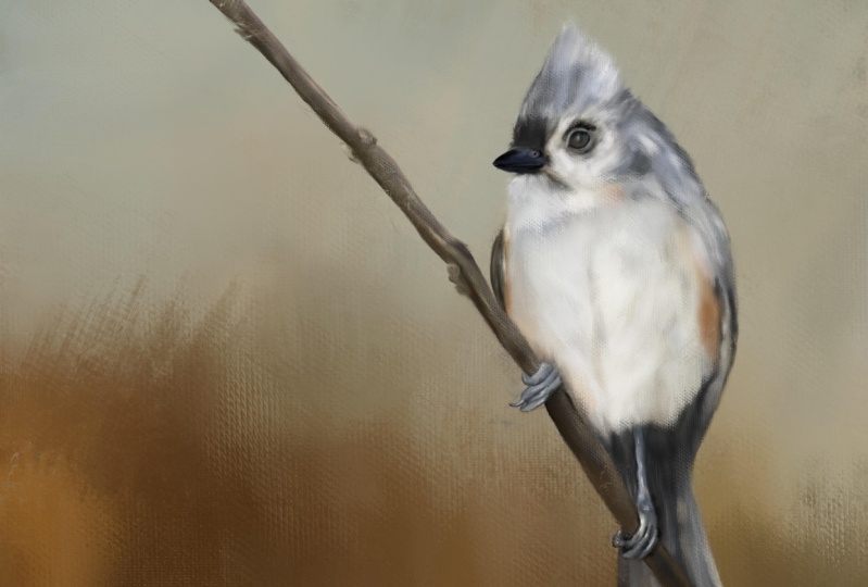
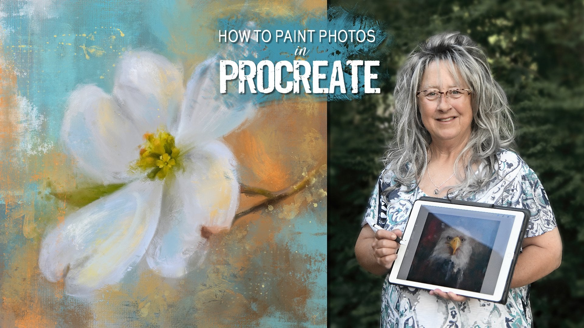
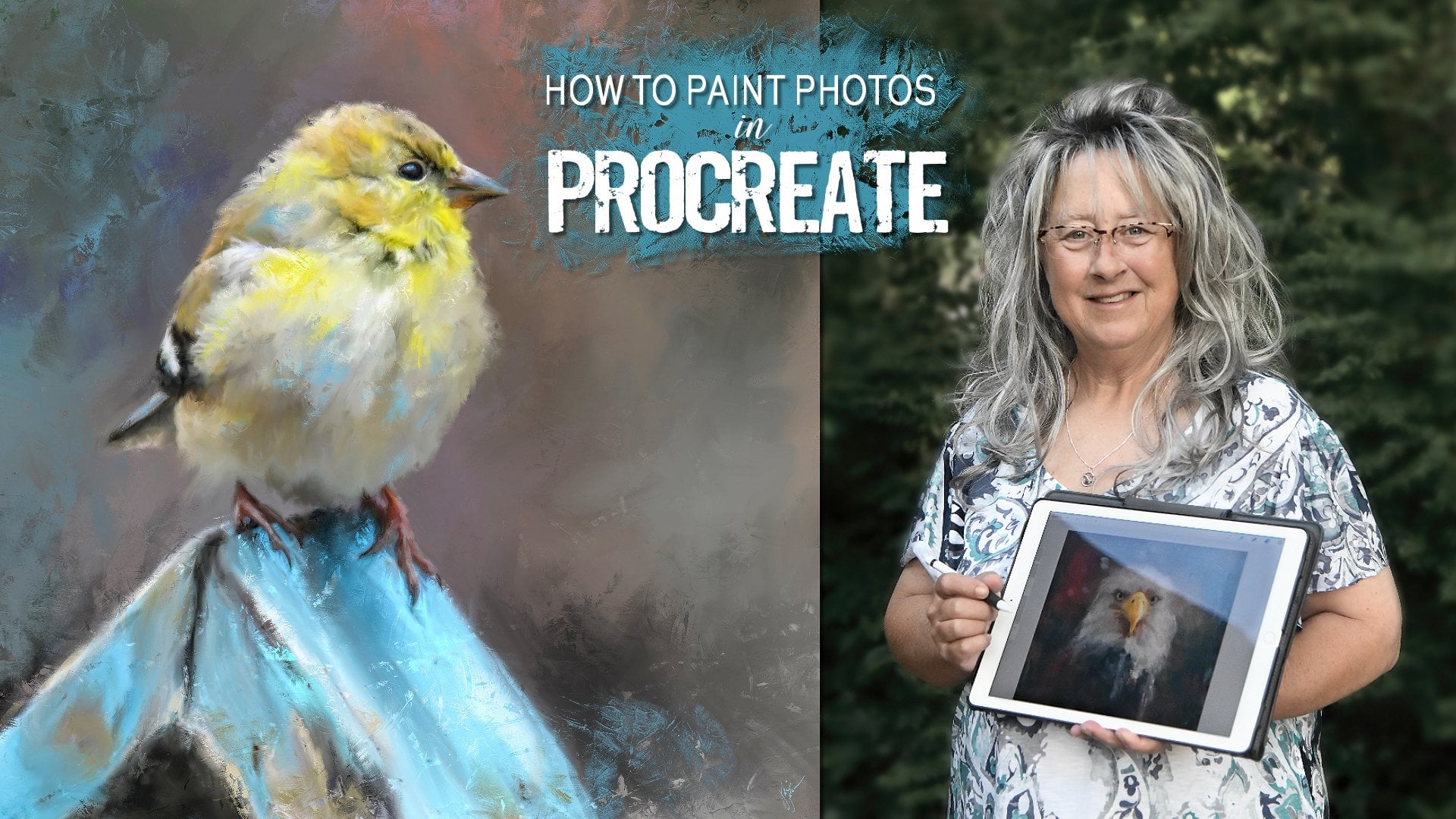
1. Welcome: Hello, I'm Jay Johnson, a multimedia artist
from Tennessee. In this class you're going
to learn how to paint this delightful songbird
in Procreate on the iPad. After a quick brush overview, yes, the brushes are provided. You will watch me
set up the Canvas, do a light sketch based
on my reference photo, which is also provided
and tone the background. We move from there right into painting this
delightful bird, starting with the eye
and then the beak, and working our way through
the body in the wings. And finally down to the
feet and the branch. Towards the end, we refine and add more
color to the background. We'll add some deep texture using my favorite brush
to finish things off. And then I show you how easy it is to change the
background under your subject to create a brand new look
for your final art. In order to complete this class, you'll need an iPad with
procreate installed. You will also need
an Apple pencil. You will need to have a
basic understanding of using Procreate and installing
brushes on your iPad. And you will need to
understand how to transfer photos onto your iPad
before starting this class. I provide you with my simple oil brush set and
the bird reference photo. So you can follow along and try to paint this same bird
if you would like. So are you ready to watch
this bird come to life before your eyes and
learn about shading, simple mark-making,
and blending to build this bird a sketch into
this beautiful painting. If so, then please join me in painting this realistic
style of birth. And remember, you can always pay your own photos and the same
method taught in this class. So if you have birds or animals or even people that
you would like to paint, you can use the same method I teach in this class of work, the same method of working. And I look forward to seeing your finished final paintings. So be sure to share them on the projects page
when you get through.
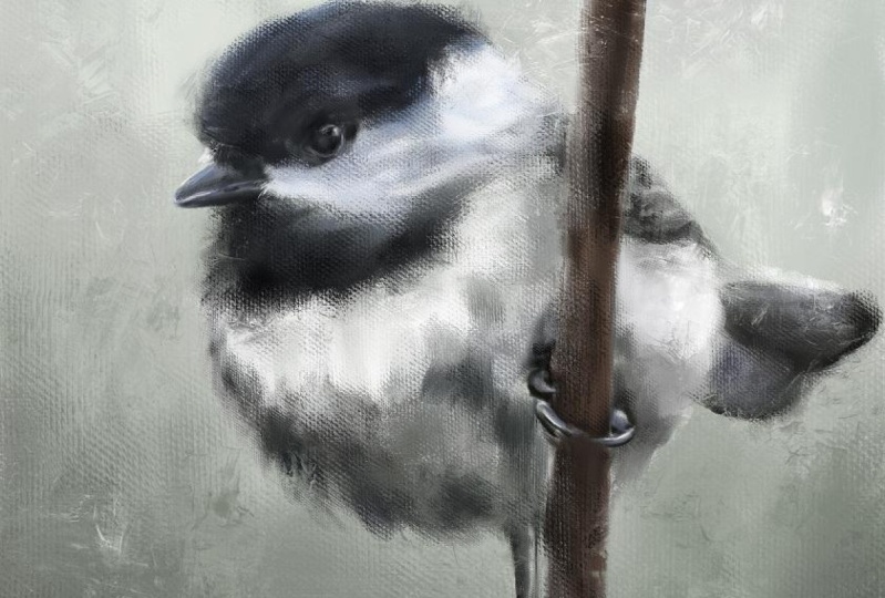
2. Brush Overview: Okay, Before we get
started in this class, I want to talk about the
brushes I have included here. These are all for doing a
certain kind of oil painting. In a certain way. I'm just going to bring
in a photo here of finished one to show
you a finished one. So these brushes
give you plenty of great texture into your piece. So that is what a finished
piece looks like. But I wanted to take you on
a little tour and just show you what we've got
going on here. Trying to get this turquoise
color that I want. Maybe a little bit darker. Okay, I've got myself
situated here. The first one is the
streaky oil sketch. And that makes just a really
slick streaky sketch. And you can go a little
bit larger with it. If you want to do
some bold brushwork. But I usually use this
one a little bit. On the smaller side. It's very loose and I'm just
making very short marks. And you can hold it down
and continue to make marks. But when I go to do the sketch, I want just a small outline if you press really hard and
get it a little bit darker. So that is that
particular brush. And the next one
is a big oil mix. Now this is a, this
is a fun brush. This is useful for making big, bold, square shaped marks that has a little bit
of canvas texture. And you can overlap them with different shades
and different colors. And kind of create some fun
art, some fun backgrounds. They are quick way
to cover the canvas. If you want to go
really super big, you can do that. So that is a fun brush. It's a little bit smooth. It's got a Canvas texture. And as you paint really light, you can see it more, but when you hold it down, it gets a little
more solid and you can see the squareness of it because the way
I've got it set up, but that's the way I wanted it. I wanted that square. Look on this one, sort of a, just a
geometric feel. But it's a great way to block in the beginnings
of the painting. Okay. Then we're gonna go to
the thick canvas brush. This one is similar
to the other one. It's, it's a little bit
more tapered on the end. It has a good rich, thick canvas texture
and the ego lighter. And it's very light. You, you can scrub with it and get a more
solid feeling with it. Or just press really
hard like that. So light, hard. As a scrubbing motion, if you do it too
too much like this, it'll get a little blocky. So it's just the
way I paint as I do short strokes like this. I'm picking up the pen, Apple Pencil, and it's picking
up a little bit of color. You notice it's blending, picking up some of that white. Let's switch colors
here and go over top. And it blends with the other colors underneath
it just a little bit. Okay, now let's go to
the thicker canvas, which is basically just
a thicker version, very, very thick. You want it to show some
very heavy canvas texture. This is the one you want to use. Go with a lighter color over it. If you press really hard, get very thick and
it almost gets some oily look in lines
in there with that, which is really
fun with that one. So let's clear that one. This isn't a very big brush set because you don't
need a whole lot. This is the juicy Canvas blend. And this one blends more. This is the same brush
as the previous one, but it's blending more. So I'm painting the same color. But notice it's a
little bit lighter. That's because it's
blending with the white that's underneath it. So let's say you want to bring
a different color in here. And you see it's
picking up that blue. It's really blending
the colors nicely. So if you wanna get some
good blending going on, this is the one to
use and you can also use this one as a blender. You can use any of
them as a blender. But I do it at it a
little bit lower opacity. And it will pull that canvas texture from
whatever color you start with. It'll pull it over top of the other and it does
a real nice job of it. And because it's a, it's set
to blend a little bit more. So it really works on
blending those colors. So we can just sit here
and blend and you'll get a nice mix of all
of these colors, which is sort of a grayish blue. So that's that one. Then there's also the mop brush, which you can paint
with like this. If you want a really
smooth foggy background or area over your
subject, you can do that. But I also like to blend
with the mop brush a lot. If you've got an area that's got a little too much texture, and you just want to soften it up and tone down that
texture a little bit, but still keep those colors. You can use this
mop brush, which, you know is good on skin if
you're doing a person or, you know, any area that
you just might want to soften up like in
the background. See, I'm nice and soft. That's making that using
that as a blender. The mop brush is very versatile. And then there's
the textural brush. And I've included this and
a few of my other sets. And this one is kind
of a finicky brush. It's very particular. I'm just going to put it
down and press really hard. And it does that, make it a little smaller? And if you just drag
it real lightly, it just leaves some
nice texture over top. I'm just very lightly dragging it and kind of
letting it do its thing. And the fact that it's very unpredictable is what makes
it so neat, because it'll, it'll put marks
in your painting, in your background wherever
you want to use it that are somewhat unplanned. That's what you want,
but look how nice and thick that paint texture
is from that brush. So this is one I use it the end. After I've painted the subject. I'll use this to add some
texture here and there. It also works wonderful
as a blender. So if you wanted to get on one color and pull that
into the other color, whatever color you touch on to start with is the one
that's going to pull from. And I'm just once again, I'm doing this very lightly, dragging this very
light pressure. If you go really hard, you're gonna get a
really solid stroke from whatever color you
touched to start with. That's the one that's
going to pull from. But it's useful in blending different parts of your subject that you
want texture too, but you don't want
to add any coloring. If you use it as a blender, it'll pull what's already there, like so and it will pull it
together with some nice, really juicy thick texture, which adds that real painted
look to your painting. So that's just a little
rundown on these. So it's 1234567, lucky seven, lucky seven brushes
in this brush set. So these are the ones I'm
gonna be using when I'm painting the birds that
I'm doing in this class. And we will see what we can accomplish
with these brushes. So we'll see you
in the next video.
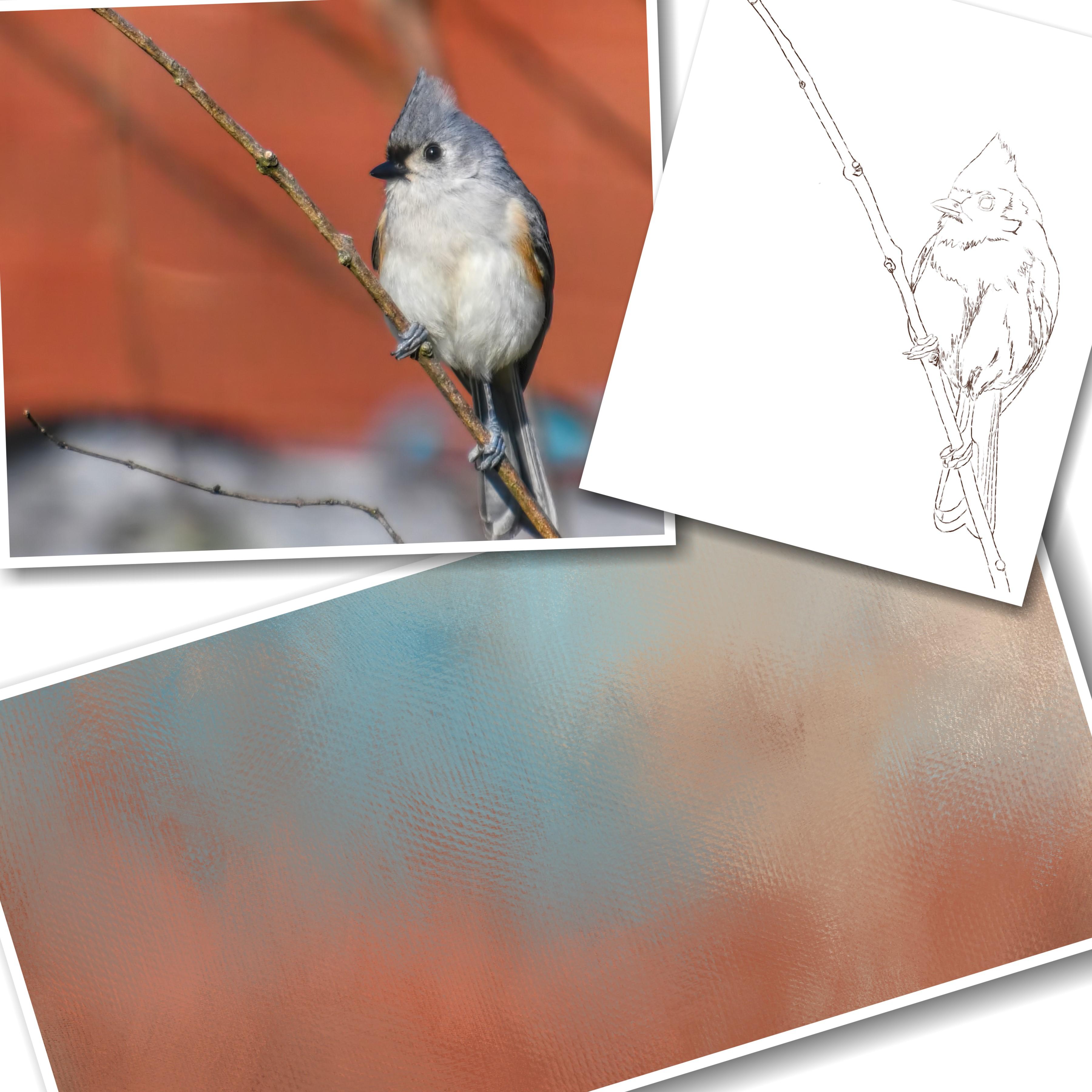
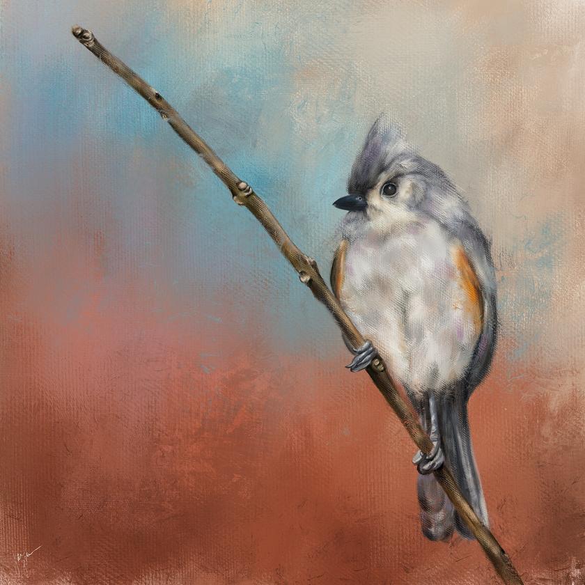
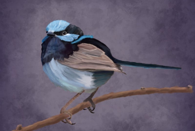
3. Canvas Setup, Sketch & Tone: Okay. Now that bird I showed you in the brush video, this one here. This is the style of
painting I'm going to be doing in this class. And this is not painting a photo like some of
my other classes are. We're going to use the
photo as a reference. So we're gonna get
right into that. First thing we need to
do is set up our canvas. You hit the plus button up here, and you click the
New Canvas button. Unless you already have a square canvas setup,
I'm working on square. You don't have to do square. You can do whatever
size you want. I do 6 thousand by 6 thousand. So I would type 6
thousand in here and 6 thousand in here
and leave it at 300 DPI. It gives me a maximum
of ten layers, which you don't need very
many layers for this, so that's fine with me. I don't mess with anything else. On here. Color profile. I'll leave as it was
set when I've started using the iPad,
time-lapse settings. Um, oh gee. We've got a good video
time-lapse settings here. I didn't even realize that, but I usually do ten ADP in Canvas properties
are set that way. So I pretty much leave
everything else alone. Just change the canvas
to the size I want, which is 6 thousand
by 6 thousand. You can give it a
name right here. And you could put whatever
you want to right there. And then after you've done that, you hit Create and it will
show up on your list. So let me go back because it automatically opens
it after you do that. So there you see, I, I did Square 6 thousand by 6 thousand, which I already have above that. So now I have two of
them, but that's fine. I just wanted to show
you how to do it in case you didn't
know how to do it. So when it opens up, you're ready to start. The first thing you need to do is bring in the reference photo. Now I've given you
these reference photos. I'm going to start with
this little guy right here. Or maybe it's a little girl. This is a tough did ***
mouse from my garden. And I'm going to, I click this top arrow here to
expand the size out. It's on uniform. It's a square picture
to start with. So it's going to keep those
dimensions proportional. If I wanted to do free
form, I could do that. But I usually like to just keep it in
proportion for these. And you can also use two
fingers and squeeze, push outward and it
will make it bigger. I think I want to do make the bird a little
bigger in here. And I liked it. Instead of putting the
bird right in the center, I like to put him
off center a little bit about right there. Maybe even a little bigger. Then I'll lose his tail. Alright? You got to pay attention
to what you want to keep and what
you want to lose. So I've resized it quite a bit, which is fine to
re-size the photo because we're only using it as a reference and positioning. And then I click my Layers
panel and it sets it in place. Now, I like to paint my birds
facing from right to left. So he's facing from
left to right. So I'm going to click this
arrow right here again. And I'm going to flip horizontal and put the bird over
there on that side. That to me is just more natural. So now that I have my
photo in position, I'm ready to do a sketch and the colors when we paint
what I pull from the photo. So I just hold down
a finger and move it around to get the color I want. And I think I'm
going to outline, sketch out the outline
of the bird in this darker orange color. Because I liked that
background color. I don't like the background, but I liked that
background color with this bird's feathers, the tone of his feathers. And I choose colors from this. But then as I go along, I will also touch the color wheel and
move the color around. So let's say I want
to go a little darker with my sketch lines. I could do a skewed it down and get a
little darker brown. And then it's time to create a new layer to do the sketch on. So tap the Plus and get
a new layer above it. I'm going to click on the N on layer one and pull
down the opacity. So when I do the sketch, I can see where it's
actually going. Pretty good. So that's pretty good. So make sure the layer
your sketch on is at 100%. And then the layer
below it is at 60. Wow, I've said it for 61, you can set it for whatever
you're comfortable with. And then I'm gonna go to that
streaky oil sketch brush. And this is what I'm
going to use to sketch out the outline of my bird. And I usually start
with the eye, and I just make short quick
marks around the eye. I'm not sitting here
drawing one solid line. I'm doing short strokes. And then I go on this outer rim. Kinda get that in there
and I'm not real, I'm kinda messy with
this and just kinda scribbling a lot of this because
this is just guidelines. This will be painted over. And I don't need to get every feather or
every thing else. And you can turn off
your original layer at anytime to see how it's going. So I do the I. And then I get to the beak area and you can turn your Canvas with two fingers. To get worried you're
comfortable with. And just doing short
little marks here. And anywhere that I feel
is distinguishable, I will do the marks around. And then here's this
little nostril here. He's kinda dark in the middle and lighter around the edge. And so now I'm ready
to start going around this portion,
the dark areas. I'll just kind of scribble around and I will
draw the line between the dark and light
areas and kinda get some of these lines in
here just as guidelines. Then I start going
around the head. I'm not trying to be perfect. I'm just doing short
strokes and scribbling. The general shape in
here from the photo. And then here's a
little dark area that I think needs to be maintained and stay dark
for shading purposes. So I put that in there and an hour from side to
side under the beak, little feathery area,
kind of scribble that in. Then we have a wing here. And then this area of his
body where it meets the wing. So I'm basically
just tracing over the bird to get the shapes
and the size and proportion. All correct. I don't draw from scratch on
animals and birds because I want their proportions
to be good. You know, I don't want
them to be messed up. And I'll get the branch
to eventually they want to bring that wing down
a little bit right there to tuck
behind that branch. Now he's got a few
little feathers right there that are
kind of standing out. A little darker area
under the beak. So I'll scribble some of that in a little white area
here around the eye. I scribble that in, just kind of outlining
my color divisions. And then we have
this area here where the body changes color. So I want that in there. And then start the wing as it extends down and
you can't really see it, but there is a couple
of feathers in there. And then down the tail. Get that tail in there. And I'm not too worried about
drawing these lines in here because I'm gonna be paying more attention to
the color variation, but i'll, I'll put
them in there anyway. And see this shadow
that's occurring under his tail area here where it's really dark
and really white. I may not put that shadow in there because the photo was taken when he
was in sunlight, so there was a shadow present. But I don't want my painting
to look like a photo. I want it to look
like a painting. Now somehow I have lost my well, there we go. I lost my top bar. All right, we've
got a branch here. Get that in there, and
then we've got these feet. And he got a little
toenail here. And the little toes. And just go around the edges
of those the best I can. I'm not going to be like
super accurate with the feet. Because to me the the feet are not the most important part. I mean, he's got to
have them because he's sitting there on the branch with the feet and get around this
area of the branch. That area of his body. Draw this other
section of the branch. We got this leg. And the chickadee painting
that I showed you earlier, get along the bottom
edge of that body to where that white meats, that darker feathers
from the tail. But on the chickadee painting, I I actually forgot one of the legs and had
to go back and add it in. Alright, so we've got
on the feet here. We've got this foot would this toenail come in
under the other one? So this is the second one is coming up from
behind the branch. And you may have to turn
the opacity of the layer up a little bit so you can see a little bit better
where some of this is going. And then this toenail here. This is why I don't particularly
care for doing feet. This is why I usually do
a lot of head portraits. So you don't have
to do the feet. And I don't know if that
foot looks right or not. It's close enough. It's gonna be kinda hidden by the tail, but I do have some tail
feather right there. And all right, let me go
a little lighter again. I'm adjusting that opacity. Get this branch in. Oops, I meant an extra mark. Now, this branch has another piece extending
off the bottom. I'm taking my artistic license and saying that's not there. I don't want it there. And these little naughty areas, I just do a little
circle around there to show that that's
where anodic area is. So I can work on that later. Here's another one up here. This one's really kind
of nodded up real good. That'll let me know
to pay attention to my shading there in this areas. And you can scribble
in where you know that there needs to be
a little darker coloring. Like I said, this
is all going to be covered up. All right. Let's get the rest
of the branch. It turn it all the way
around and go this way. Get the rest of this
branch outlined. Another little naughty area. I'm holding down
pretty firm on this. Instead of doing
the short strokes. Just because I know
that's gonna be pretty solid and it's going
to be covered up anyway. Another little naughty
area right there. And then finally the tip of it, which is kind of a
pointed shape at the tip. And some little
circular shading here. Were that not is. Alright. Now I will turn off the photo layer
and look at the sketch. That's not half bad of
a sketch to start with. Um, I'm thinking there should be a division line and the beak
there that I've missed. And it's probably hard to see, but I do see it now that
I'm paying attention. It's right in here
where you can see that color change from the
bottom of the beak to the top. All right, Now let's look at it. Turn off the sketch.
There we go. That looks a little better. Also at the center of his body, there is a coloration
difference in here. And I want to make sure to guide myself into
that when I'm painting. So I'm gonna go ahead and
kind of scribbling some of these color variation areas where I can see
there's darker areas. I'm not going to get everyone. I'm not going to
paint every feather. I just want to make sure
when it comes time to applying the paint that I
have this shading, correct. So I'm just scribbling this in. And I usually end up making
too many scribbling marks. But it'll be covered up. Shows a little bit more
fluffiness to the belly now, which I want to make
sure to maintain. So I think the sketch looks
pretty good at this point. And it's ready to
start painting. I'm going to duplicate
the sketch layer. And the reason I'm
doing this is I save these files
that are layered. And just in case I ever want to do
something, repaint this, or put a different background behind it or save the
sketch for whatever reason, I won't paint on
this sketch layer, I'll have it saved. So I'm going to duplicate it. And then I'm going to
turn off the first one. So what's turned off now as the original photo and
the original sketch? This is gonna be the layer we paint on, the duplicate layer. I'm going to rename that and
call it paint right there. So I know don't paint on the
one that says Layer two. And you can rename that
and call it a sketch. Like this sketch. And then photo, of
course that's obvious. What I do need under the sketch. I like to do a background
under the sketch first. So when I paint
the upper layers, they will blend in
with that background is sort of like
toning the canvas. I want to get something
down for the background. So under the paint layer, I'm going to hit plus. Now, let me undo that. If you're on the paint
layer and you hit plus, it'll stick that layer on top. No problem. You can just
drag it down underneath. But you want the bilayer you're going to
paint on, on top. This is gonna be the
background layer. Let's rename that background. Okay, so we've got to paint
layer of background layer, the original sketch and
the original photo. But now what we need
to do before we get started is we
need to bring in the photo as a reference photo so we don't have
to keep clicking here and turn this on and off and then put that
back to full opacity now. But we don't want
that on at all. And it's just in the way. But in case I need
to refer back to it bigger in this size than I
do want to keep it there. So I'm going to turn that off. And I'm gonna go to the wrench. And I'm going to click on Canvas and see where
it says reference. And it's got a little slider, click that, and it'll
turn the reference on. And it usually pulls, you can grab this top bar
here and pull it around. I do it like this. It usually pulls
the reference as what's on your canvas
says canvas is selected. So that could be your reference, but I don't know why you would want the
canvas to be the reference. I want the original photo
to be the reference. So I click on Image, import image, and I will
click on his photo. And yes, his photo
is not reversed. So if you want it to be
facing the same way as this, you can handle that another way, or you can leave it alone and just pick the colors from this. I want it to be
facing the same way. So I'm gonna go back here and
turn off the paint layer, turn on the original
photo layer, and now see how he's
facing this way. I'm going to save this out, share JPEG, save image. Now I'm going to turn the
sketch layer back on, turn the photo layer
back out and go tap on the reference layer. You might have to tap it
a few times or squeeze it or something to
get it to come up. I want to import a
different image. This one is the one I want to import where he's
facing the right way. And you can grab the corner
of this and drag it down. And I think you can
drag this side's out. Yeah. If you grab the corner
and drag the sides out a little bit and move it around. And like I said,
you can squish with your fingers to blow
it up really big, which is what I do because I
pick colors from the photo. But right now I
just want to tone that background so I want to
get some kind of color down. And I'm thinking that same dark brown that I grabbed
and you can push, put your finger and hold it
down on the reference photo. And it will grab that color. And then I'm just
going to make it actually Let me that's
more of a brown there. That's a good brown. Make it a little I
don't want it too dark. I want it a little lighter. Maybe move it around,
kinda in the middle. So it's a medium brown. Just to get something
on the Canvas. And I'm on the background layer. I made sure my
paintbrush is selected. Now let me tell you a little something
here when you have, I don't know if everybody's
iPad does this, but when you have the
reference photo open, at least for me, I'll be
on the blending brush sometimes and I'll go to pick a color like a different color. Notice it did not switch
back to paintbrush. It's something to do with having this reference
photo open. Because when I don't
have a reference photo open and hold down
and select a photo. It does switch automatically. So it's something to do with the reference
photo being open. So I got to grab my
brown again, hold down, grab that color,
move it a little more, a little bit lighter. It sort of in the middle. Now when I've done that
and select it from here, it did go back to paintbrush, but that's just something
to pay attention with. If you select a color over
here on this reference photo, and then you go start
trying to paint over here and you don't
see anything coming out. Check to make sure
you're not still on blending because I
go back-and-forth, back-and-forth
between painting and blending all the time. And I liked the fact
that it does it for me. When I select a color, it knows I want to paint something or I wouldn't
have picked the color. But when this reference
photos open, for some reason, it doesn't automatically
jump back to the paintbrush, so you have to make
sure it's on there. Okay. Now that
we've covered that, I can get some color
down in the background. I am on the background layer. And I'm going to do
the big oil mix brush. I'm going to do it
pretty big size here and just kinda
scribble it in. It doesn't have to be exact, it doesn't have to be blended. I might should have
done a lighter brown, but I can do that. Let me go a little bigger
on that brush and kind of get this in here
a little quicker. Alright, let me go to
a little bit lighter. Maybe even a gray, maybe even move that
color wheel more towards the orange and get
some variation in here. There we go. Some of
this color variation. This is all happening
under the sketch layer. Now I can blend it using
that same big oil mix brush. And I've got the opacity set. Let's say, Well, I can't see it with the
reference photo there. Maybe about 50%. And got the brush
size pretty big. And let's go bigger. And I'm just going to softly tap and blend certain areas of this on this background. And I go different directions
with this, with this brush. I don't do it in the same direction or
straight up and down. I'm just kinda move it
around different ways. You could also use the mop
brush if you wanted to. I like the square
shape of this brush. So that's pretty
good right there. Alright. I'm going to leave
that background alone. That's just a base
to start with. The background will change
color as we go along. But now it's time to
start the painting. So if you turn this off, you got yourself a
background and you can save that out if you'd
like the way it looks, or you can just keep going. So the sketch layer, the paint layer is now on. I've clicked on it. So now I'm ready to
paint on the paint layer and I've clicked back
onto my paintbrush. I'm ready to start choosing colors for the bird and to
start the actual painting. And I always start with the eye. In the next video, we're going to start
the actual painting. And yes, I'm painting
on that sketch layer. I have the original
sketch layer saved. But I'm, I'm not worried about these outlines showing it's not going to look like a coloring book where
it's colored in. Because when you
paint on top of this, it's going to blend
with those lines. You'll see what
I'm talking about. So in the next video, we'll get started on painting this little guy's eye and beak, which is the first part
I do with these birds.
4. Painting The Eye: Okay, we're ready
to paint the eye. We'll start with
the eye, because the eye is the life of this. Now you might think
that's just a black guy. You're going to use black. Not necessarily. Watch this. I hold down on that color. Now, do you think
that solid black? Nope. See how that's off to the left. If you double-tap right here at the bottom
of this color wheel, it will go to straight black. So say it's not solid black. You can drag it around
in here and see the different shades
that are in the eye. And of course you can
always lighten it up. I'm going to start
with that shade, which is right about there. Now you can use the
big wall mix here, which will create a very smooth, a more smooth look. Or let me double-tap
and get out of that. I like to use the
thick canvas on these. I'm getting into this with
these thick canvas brushes. I'm lowering it down to a pretty small size
and I'll check it. I'll put a mark down. I've got this blown up. Huge because I want to make
sure I'm doing it right. I'm just doing short strokes. Notice I'm going right
over the sketch. That's fine. I don't want
that sketch to show anyway. And this area above the eyes somewhat dark, that same shade. So we're going to fill
that in and come on down. Now I will use straight black in a minute and then
this is a little dark, so we'll get that in there. Okay, Now, there are some
different colors in this eye. I'm going to get
this lovely shade of blue that's in kind of close to the highlight
is sort of a blue-green. And staying on the same brush and we'll lower
the size a little. And I'm just, I didn't draw
the highlight in here, but I can see where it is. I'm going to put a couple of
marks so that blue there. And then there's a green, little bit lighter green. And I kinda like that, so I'm going to bring some of that in their
gifts, the blue. And then of course there's the highlight which
is right there. I'm just going to dock
dead in there like that. Now, I know that it looks like this bird has
all got this black, I think going on. But it's not really black. I'm going to hold down
on the original color. And I'm going to move
my outer color wheel around to the
brownish orange shade because I liked the eye to show some of the
background colors. And I know that they're in there because I've photographed these birds up-close
and personal a lot. I'm just playing with
my size of the brush. And I'm going to sweep a
little bit right there. And then around the edge of
the eye is this light gray. So I'm gonna go ahead
and put that in there. And that kind of extends
outward Around here. In-between these two dark
areas. I already did. Look at that nice
juicy canvas texture. And then I'm going to
pick, there's a little darker greenish gray right here. I'm going to grab
that color and get that going down here at
the corner of the eye. And it actually kind of has that same color
along that top rim. So I'm going to bring
some of that in around that top edge and
around the bottom. Okay, that's looking
pretty good. At this point. I'm going to blend some of this
and I'm going to use that thicker
canvas, juicy blend. And I've got that opacity set. Probably about 70%. I don't really want to
move the reference photo, but you got to play with
opacity on the blender. I'm going really small. I don't want it to be too big, so I'm going pretty small. Blend around the highlight area first and blend those colors that are there in
with each other. A little bit. Get this brown area. Just sweeping it kind of gently. And it gives us that real
nice rich canvas texture. And go all the way around
in these gray areas. I did. Just doing short strokes,
gentle blending. I'm not pressing hard at all. Then you can zoom out and take a look at what
you've got going on. I think the oranges
a little strong. So I'm going to blend from the darker area down
into the orange a little bit more on both sides. And even bring that blue
down there a little bit. And sort of tone
down that orange. Zooming out helps you
see from a distance. And that highlight
in the eye just gives him a very
good expression. So now to make the
eye really pop, I'm going to pick
the darker color. Now watch I'm on the blender and it went to the paintbrush. But if you pick it from
the reference photo, it doesn't always go
to the paintbrush. On the paintbrush, I'm
still on the thick canvas, so I'm gonna get
pretty small because I'm going to trim out
this eye in dark black, but I got to get too dark black. So I'm pull it down or double-tap
to get to solid black. And I'm gonna get this
dark area around the eye, around the edge of
it. Pretty good. And that darker area
will extend down under this top edge into those colors I've
put in as I'm gonna go ahead and scribble
some of that in there. Good paint terms, you know,
nothing technical here. Nothing from art school. I never went to art school. And then over top of this
gray line above the eye, I'm also going to
bring in some of that dark black because there's some right there
over the ridge of that that needs to come in. There's also a little spot right here that looks pretty dark. And then this looks
a little dark. Just looking at the tones
here where it's super dark. In fact, this whole area should be quite a
bit darker up here. So I'm going to make the brush a little bigger
and bringing some of that black in there
a little bit more. And I'm even going to
put little smaller, put a little dash
of it down here. Now we'll go back to
the blending brush. Makes sure on thick
canvas juicy blend. And I'm going to start moving
that color around in there. Bringing that black from
under the upper ridge of the eye down a little because that's where
his eye would be shadowed. And by having this color
variation in here, it gives the eye it's shaped. I'm going all around the
edge where that black is gently blending that. You can come up into
that light gray area a little bit more too. Now let's get this bottom ridge and might need to go
a little smaller. Strokes looked a little
being that looks real choppy now because
we're super zoomed in. I'm just scrubbing that in their blending these
areas out a little bit. And then this one down here, this little spot here. And then the bigger area
and go a little bit bigger. Blue that's too big.
See a little bit of adjustment in this brush
really changes the size. And if you don't like when you stroke it from one direction, you don't like the way
it's blended stress stroking it from the
other direction. And I don't do a whole
lot of blending on these, but in the area of
the eye and the beak, I will blend quite a
bit because those are smoother feathered areas or
choppier, looser, feathery. And some of this
light gray area, the black extends down over it. Right up here at
the top of the eye. I'm going to pull down that black when blending that right there and darken that
top edge of that area. Now what we also
need is a little bit of highlight in the gray area. It's this lighter gray
tone right there. But I think it needs to
be a little lighter, so I'm going to raise it up. Make sure to get on the
paintbrush and go to the thick canvas brush and just paint a little dash
of highlight there. And there's, there's gonna be
a little bit and one here, two very small on that
bottom edge of the eye. This is what gives
the eye shape. Now we'll go back to
the blending brush. Pretty small and blend
that highlighted area in. And I know this looks
real digital right now because I've got
it super zoomed in. Alright, ready to zoom out
and see what we've done? He's coming to life. He is coming to life. Obviously the black at the top of his eyes a
little bit too much. You can blend that
back down right now by getting off of it and pulling down towards
it like this. And bring some of
that another color in there and then blend it out. So it's not quite so bad. As far as darkness. I do need a little dark
gray at the corner. I'm going to grab
some of that and did did not switch
to paint brush, so I'm clicking on it
to make it go there. There's a little
point right here at the corner that I haven't
got an order yet. I'm going to put that in there. And then there's a
little bit right there. And then there's also
this comes out to more of a point right here. So I'm paying attention
to the shape of it. And let's see if we
can get some of this lighter gray once you're
on the paintbrush, you can paint with it. Well, that's a pretty
shade right there. Yeah, That's really pretty. Maybe even put some
of that in here. And you can add in color
wherever you see fit. That's a real pretty shade I
just grabbed out of there. And you can blend this or
you could leave that alone. I'm gonna grab that darker gray like right there and a
little bit of that in there. And then even a
little bit darker and just choose that on the
color wheel because there's a little bit of a of a darker shadow line coming
out on that side of the eye. And back to the blending brush. And she's kind of
scrub some of that in. I might need to go smaller. There we go. Get this corner, figured out, bring some of
that black down in there. So it doesn't look
all one color. Mix it around. Now we'll zoom out and see. Alright, we have an I. And I'm obviously I don't want this to look
like a photograph, but I do want certain things
to be very realistic. Which is the eye, the beak. And if the bird has a certain marking that is
integral to the piece, I would include that. Like for instance, there's
a bird out there called a rose breasted gross
speak, Grosse speak. I say gross be
people say Crosby. It has a red V on its chest
of read section of v. And that red is
important in that bird. The tint mouse, that orange that you see on the
wings is important. In those areas, I'll pay a
little bit more attention. But otherwise we're gonna get quite a bit looser with this. As we go along. In the next video, we
will move on to the beak. And then once we
get the beak done, we'll start filling out the rest of the colors
to shape the head. So stay tuned for
the next video.
5. Painting The Beak: Okay, we are ready to start
on this little fellows beak. And I'm going to blow the
reference photo up really big. And I don't know
if you can tell. But there are some blue tones in that upper part of the beak, and then gray and
black at the bottom. And there's some lighter
gray in there too. I'm going to start I'm going
to actually grab a tone from his head feathers to
start painting in the beak with that tone. And I'm still using relatively small brush just
to get this color in here. And I'm gonna put the
color over the whole beak. And then I'm going to
grab, go on the beak. And you can see
it's a dark blue. Say it's a dark blue shade. I'm I'm gonna go just
a little bit lighter than that for the moment. Just to get some good
color variation in there. And I'm staying away from his little nostril
area at the moment. I just want to make sure that
I have not covered that up. A little bit of that blue right there in that bottom,
along that bottom. And now I'll go back down to the darker shade and start
getting some of this in here. Keeping it really dark, where it looks really
dark in the picture, which is along this
bottom edge right here. And then underneath,
it's very dark. Okay, now I'm going to get
this lighter gray surround the nostril and get that
color going in there. In the very center
of the nostril. It's a very dark gray. Get that in there. And then there's a lighter, almost a purplish hue in there. And that color seems to be in the center of the
beak just a little bit. And maybe on this
top edge right here to be a nice highlight color. Now let me go to blend that. There's playing with the
brush size a little bit. Get that nostrils. Sort of blended out. These colors nice and blended a little bit
bigger on the brush. Okay, that's a good look and
beak we've got going on. Now it's time to bring in
some of this dark black tone. And it did not switch back when I highlighted that
to the paintbrush. So I have to do that myself. And let's get this
dark tone under this. Onto the bottom beak. Get some of that in there. On top of that blue. And there's a little bit
of it right here to tip. Along the edge there. And then there's some up
here, this darker tone. As you come down
toward the nostril. And les dot the little darker in the center of the nostril and come around like that. Now let's blend some of that. Get some of those darker tones
mixed in with that blue. A little gray area. I've
gotten it a little bit big, so I'm going to
blend some of that down and make that
little smaller. And blend the bottom beak, bottom part of the beak. Oops. If you lose the
shape of your beak, you can come from
the outside edge and sort of blend that
in and trim it up. That's looking pretty good. I think we need a little bit
of white highlight in there. So I'm just going to grab a
white click the paintbrush. Make sure brushes really tiny. Because we need a
little highlight right here and right here on either side of that
nostril to make it look, give it that depth. And then he's got a little
tiny highlight on the tip of his beak there and a little bit more
highlight right there. So I'm gonna go back
to the blending brush, but really small. And soften that up by blending that just a little
bit with a really tiny brush. And around the nostril, I think he needs a
little more of the light gray on the outer
side of the nostril. So I'm going to try to find that light gray color right there and I'm gonna
go just a tad lighter, had sort of a light blue and
get some of that in there. And then back to
the blending brush. Whoops, I went a little too big. And blend some of that in. Gives it some variation
around that nostril. And that light gray kind of extends were the beak meets
the mouth right there. So I'm gonna go ahead and
paint a little bit of that in this section. And then just a couple of strokes and then blend
it in a little bit. Okay, I'm pretty pleased
with the way that looks. Might need a little more dab of actual black with a tiny brush. Right inside the nostril
edges right there. And where the beak
meets the bottom. And then I'll blend
that in a little bit. Taking my time with that. Yeah. I think the back
highlight is a little strong or that center
of the beak is, I'm going to blend over that
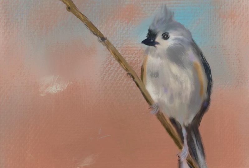
from the top and the bottom. Soften that up. By zooming out. You can see those things. Now that looks pretty good. So now I'm ready to start working around the
head and neck area. And we have more detail
area in the feet. But I don't need to be
quite as accurate with that as I did with this because this is where
I want the eye to go. So as I work away from the head, things will get
looser and messier. And not quite so precise. But in zooming out
and looking at this, this looks like a
pretty good start. So now we're, now we're ready
to start getting a little looser as we work
on this head area. So when we come back, we're going to start
around the beak and work towards the eye and then
upward and outward.
6. Paint The Face & Head: All right, We're ready to start working
outward from the beak. And as you can see, there's
a real dark color there, almost black, not quite modest down there
on that spectrum. Make sure you're on paintbrush. This is where I'll start
loosening up a little bit because it's really easy to get hung up in realism
with the painting. Animals and birds, at
least for me it is. And I'm just going
to just start making marks along the top
edge of the beak. Would that color and crisscrossing and
going back and forth, filling in that area. And then he's got
a little bit of darkness under the beak
coming outward up under here. So I'll make a smaller brush and get some of this in here. And there's a little
dark line right here. So we want to get
some color in there. Maybe even around the
edge of this beak. Work some of that
color in there. Now, looking at under the beak, he's got a really
dark blue-gray. So I'm going to add some of that coming out from what
I just painted with the darker color right on
top of it, bringing it out. Then as it comes out
a little further, he gets more of a medium gray. So come out from that going in the direction
of the feathers. And also starting to
work around upward. I'm in this area
around the beak there. And this dark line here
is really not super dark. So I'm going to tap a
little gray in there. And then around the top, there's a little bit of this
dark gray coming into play. So I'm gonna go ahead and
dab some of that in there. And even around the edge of it, go a little bit bigger
brush come outward. It's that nice blue gray
tones that he has going on. And maybe even go, It's actually in the
red spectrum here, but maybe even go with
a little bit lighter. You can pick your own colors according to what your eye sees. Now I'm going to work
upward on the top of the head and I'm going
to pick a middle of the road color
that is in here. Sort of a medium blue. And go with a bigger brush and make those marks all
the way across this, getting a little
messy back-and-forth, different directions
and get to the top. I don't want to lose his
little head feathers, so a little bit
smaller on the brush. And that color extends all the way around
the back of his head. So we're going to
keep going here. And I'm painting right
over the sketch lines. And it actually starts to go
coming outward from here, starts to go down the back. This direction. I'm going to go ahead and
add that color in there too. That is a pretty color. It's even got a little
dash of it up under here in this area. And we can use that
color in through here. We're in the white or the
whites gonna be as well. Alright, now we need
to get a little bit of this darker shade
that's in here. Some pull that color. And that's not as prevalent. It's not need, don't need to
go as bigger brush strokes. So it's kind of a
streaking up their dash, some of that in looking at
the picture frequently to see where the darker shades are. Upward from the
eye to the right. In here, there's some
of that dark shading. Once again, I'm going in the
direction of the feathers. And then where it
meets the white, There's a little bit of
darker shading in there. And even on up above the
eye, down the backside. Get a little bit more of
it down the backside. So I'll make the
brush a little bigger and just sort of dash
some of that in there. And going back to
under the beak, get some of that
color in there too. Now he's got some lighter
shades in here as well. So I'm going to grab that and bring some of that in where the light is hitting
on the top of his head. And that color actually comes out from the eye a little bit. So I'm going to put some
of that in here and, um, get a little
bit under that i2, just shaping the face in the middle there. So we're starting to
see him take shape. Haven't blended any of this. And you don't have to blend it. But I am going to
blend it a little bit. I mean, if you'd like
a real broken look, you could keep going like this. There's a little bit
of a golden tone, golden brown present
around here. And at the top of this
black area right here. So I'm going to dab a little
bit of that in there. And then put some of that right there
two along this beak. And it kind of extends
up above the eye. And also right in here. As you can tell, I zoom out frequently to take a look
at things as a whole. I'm gonna do a
little blending now. On this head. Back-and-forth,
very short strokes. I don't want it to
be super smooth. Remember if you want to
trim them up a little bit, pull from the outer
edge toward the bird. Just trying to get
these color variations to be a little bit smoother, but not super smooth. And even work on this area above the beak with a
little smaller brush. Once again, going in the direction of the way those
feathers would be going. Very short strokes, not
pressing super hard. Working on blending all of
this in just a little bit. Let's do a little bigger. Brush up in here. Come down. If you make a happy
little mistake like that, you know, sometimes
it's livable. So I think I'm just
going to leave that. You don't have to fix
everything. Perfect. This is when I'm starting
to get looser and get away from perfection. And just basically get some
shadowing and shading in. Let's go down the side
of his wing body. Get some of that darker, blend it in with a
lighter and pull it out. Word, looks like
fluffy feathers then. Okay, he's looking pretty cute. I need a little white
highlighting though in that head and start adding some
white around the face. So I'm going to grab a
white that's in the bird. Go back to the paintbrush and get some white
going in here. Just looking at the areas
where I see it the most. And even making
up areas as I go. Because I'm not
striving to make it look identical to the photo. I'm not, I don't want to be
super photorealistic here. It a little bigger brush. Get in here around this
face and carefully place down some marks around that. I even bring a little bit of that white this direction. Because he does have some
going that direction. He's got a lot of the white. Now let me do a little blending and I'll do this through
the whole thing. I'll make some marks. Blend, makes them more marks. Blend, makes more march blend, add color blend. That's the process. And get a little messy with the blender as long as
I don't get over that, I can work that in around there. Because I want to
leave the eye and the beak. Like they are. Just work these blocks of
color in that I've put down, once again pull from outward and gives him that
little fluffy look. Even pull this out a little bit. Get up under this area here
and blend some of that. Starting to take a little shape. Now, the work on this eye area, a little bit more blended a
little too much right there. I'm gonna get, there's this
golden tone right here, which I want to
integrate in here. So I'm going to
use a small brush. Let me undo that and
just dab some of that in here around the eye. And in this area right here. And along this backside. Just trying to create
some good division there. And then this dark blue, it's actually need to pull
that down a little bit more. So I got some of that on the brush and bring
some of that end. There's also a dark blue
line coming out there. And integrate some
of that in there. I'm gonna go back
that golden color. I'm gonna get a little bit lighter and brighter with that. Drop in a few little
marks with that. And then let's do
a little blending. You really got to
watch the brush size. And I do a little
scrubbing and blending and scrubbing and blending. But you want to watch
that brush size. You don't want it to be too big. That's bringing some of
that color variation with the golden tones in there. And I'll add a
little more gray too because he needs
that and kinda go around and shape the
face a little bit. I mean, it's just a
matter of working with it until it gets to looking like
you want it to look like. Okay, he's taken shape. Like a little bit more
of the blue tone. Little bit brighter in there and I go back to the paintbrush. I was on the blender
and didn't switch back. So you can even go
a lower opacity. If you want a tone in area a little bit and drop
some color in there, I still think it needs to be brighter because I'm doing a little bit lower opacity. It's putting that as
color tones in there. Without being quite so strong. Just going over top of
what I've already done. You need some more
variation in the head area. Now that I've done that, I'm gonna get this dark gray. Let's get some of that
in. Oh, that's too big. It's a purplish gray. Undo that. Let's get some of the
I'm trying to squint. It helps me see where
these shades of color are. And once again, just go in the
direction of the feathers. And now let's go a
little bit darker on that color wheel right
there. A little bit smaller. Brush. Put a few little
marks to get this line back. Get some of those
colors in there. Because when I added
that color on top to tone it at toned it down too much to where it lost
some of the detail and I still want some
of the detail in there. It's always going to be
darker under the beak, so make sure to add some there. Alright, let's blend that. And small brush,
not that small kind of work that in back-and-forth,
back-and-forth. As I zoom in close to look at it and do a little blending
and then I'll zoom out. This is getting all
those shades in there. Working all around.
Blending that. You see this process
takes awhile. And I mean, I enjoy it, but if you are in a
hurry, sometimes I am. I just had the idea, Oh, I want to paint this burger
that versa in those cases, I paint the actual photo
instead of doing it this way. Either way, you're going to come out with a
good piece of art. This process definitely
does take much longer. It's not for the faint of heart. But some people feel like
if you paint the photo, it's not real or, you know, which is the bowl. But, um, this is more for
somebody who wants to say, Hey, I did it all by
scratch from scratch. That's what we're doing here. Okay, Now I need to bring a little bit more white
flicking back in the head area to give that a
little bit more pop, I guess you'd say I'm
doing a real tiny brush. And just in a few spots staying zoomed out
and just looking at different areas where
I see dashes of white. And I'm, you know,
I'm missing some. I'm sure I'm not trying
to be perfect here. I'm trying to just
create a nice painting. Using this guy as a reference of where
the colors should be. You can get a little
bit of that in there. I mean, these are very, very small marks now I'm gonna go a little
bit bigger in this area. Around the eye again. Because he does have
a bright brightness. A couple of places there. That's a nice-looking stroke. Maybe a little strong though. Alright, let's
blend some of this. So it doesn't look like just lines dashed in
there, like it is. Blend it in to get
the light from them. Some of the marks I will leave showing us they are but usually not these
little skinny ones. I tried to work those in. All right. Still think we need
a little bit more on the head. Little bit brighter. That's actually the green shade. There's touching very
lightly in a few spots. And we're gonna get, start
working this area down here. Sort of a creamy look. Alright, I'm going to blend
that just a little bit. Not too much. These are marks. I'm going
to leave more like they are just touching
here and there. Awesome. That blew up through there. Oh, he's looking pretty good. And when you zoom out,
you can really see how it's going to
look from a distance and even work on your
blending a little more. So the head area is
looking pretty good. Now, does it look just like him? Wow. It's pretty close, but you
can see I've added more of that golden yellow color around the eyes then was present here. And I might like another
little dash of that. Let me get another
shade of it here. See what that looked like it. Make sure you're
on the paintbrush. No, I think I want a
little brighter than that. Maybe a little big. I'm getting fussy now. Trying to just get some
fun color variation in there around that. I know he's got a little
dark gray area coming down from the eye is sort of a dark blue gray or greenish
gray, this color. So let me try to dash a
little bit of that in there. And it comes down to just a
little point right there. Then just tap on that and
blend some of those colors in. Not blended totally in. Well, yeah, I think he's
looking super cute. I've got the color
down the backside of that wing in there. Pretty good. I think
I'm ready to work on these orangey areas that are on him to get those in place. And then I can start working
on the chest area and I'm just glancing at
his upper chest here. It is a, um, the upper chest area right in there is sort of a
medium to light gray. And then as it comes
down as sort of a yellowish green as
it goes through the middle because he's got this little line down
the middle of his belly. And then the parts that on
the lower belly that come out are really light
gray to white. But that's what gives
him that shading that shows him being
round and fluffy. So we want to work on that. But I'd like to get those
orange bits that are on his wings in there first. And I think in the, in the next video
we will work on those wing areas and
get those little bits. And before we move to the lower chest and or
upper chest and belly. So we'll do that
and the next one.
7. Paint The Body: Okay, we're ready to
add this little bit of orange tones to the wing area. It looks orange but
it's really a brown. So I'm just going to get a
medium brown to start with. Click on the paintbrush and zoom out so I can see where I am. And I'll start with
this little bit. Right here, this little
section right here. There's some of that
tone right there. And then as it comes
down through here, all the way down to here. Let's go to the other side and get some of
that tone in here. A little bit smaller brush
in here to squeeze that in. That outer edge of that
wing is a darker gray. Alright, now, let's see if I can get the golden
tone in there. Put some of that there. I'm just dabbing it right
over top of what I just did in a few spots. Now need a little bit lighter, but I want to go brighter. So I'm just gonna move
up on the color wheel. A little bit smaller brush. Just glancing at the picture to see where the
brightest areas are. Alright, I'm going to blend
that in just a little bit. I don't know how big my
brush is going to end up. There we go. Blend those up, just a little. Mix those colors together. And of course I'm
going to have to keep going and refine this. I'm going to get this dark
tone now right there. Switch back to paintbrush and
get some of that in here. Down that edge. There's a little bit
of it right there. And over here on this side, there's a little
bit right there. So let me blend that a little. Alright. Now it's looking very golden and I would like it to
be more orange. So I'm in the orange
coloration here, but I'm gonna go even more to the orange and get a
really rich orange. And add just a
little bit of that. Looking at a distance here to see where that
orange tone is. Alright, blend that
in a little bit. Just getting that
base color down. And there's a little bit of this creamy yellow tone and I don't think I
grabbed that right. Almost a white back
to the paintbrush, but it's on this edge of
the dark wing right there, right here where it meets. So I'm going to dash a
little bit of that in there. And it's also appear
over top of that. A little bit down into the orange and even a
little bit down here. Now let me look at
the other side. And it's at the top and comes down through the
middle like that. Let's blend that a little bit. About a nice color
variation going on. Now I'm blending it all. I'm just blending bits of it. Just very light touch
here when the blending. And it even gets a
little wider, but I'm, I think I'm going
to have to work in the edges of the wings and the upper chest and belly to really get
those tones in there. Good. Now if you look down the
middle of his belly, that cream tone is sitting
there in those feathers. So I'm gonna go ahead and
mark some of that end. There's a little bit
of it down here. Just looking at a distance. Where am I seeing
the creamy towns? Maybe even a little bit up here. Alright. Now he's got, I'm looking
back at the lower belly. This is almost a green. So zoom out. And I'm going to try
to bring in that tone. Wherever I see it. A little bit here at the top. Maybe even a little
bit right here. And of course there's a lot
of the blue-gray is in there. Let's get this one down here. I think it's blue now
it's on the green side. So I get some of that. Might've even do a little smaller there because
I covered up all the green getting a little
bit of that in there. A little bit of
that right there. Then up this area right here. This part of the body
meets that orange area. And then, um, right there, maybe under the green just
a little bit right there. Getting in some of those tones, There's a little bit of his body right here that's visible. I'll put that in there. Now
let's get some of the lighter gray and get some of that appear in
this chest area. It starts under the darker
section I've already done. Maybe we can even go with
a little bigger brush. The bigger area you have, the bigger brush you can use. And we're going to
go right over that. There's a little bit
of it right here. Then there's some right here. Then as we go up here, this area has got some gray, especially as you get
close to the orange. And even in this wing
there's a little bit. All right, Now let's
get some of this white and hold down on it there. Get dash. I'm just short little
choppy strokes and they're not covering up
everything I just did, just integrating the
white in there with it. He's starting to
get a little fluffy looking nasty when you add that white in there. I'm leaving some of the
original background showing through as well. He's starting to look
nice and fluffy. Think I want to blend
that just a little bit. I don't want to blend
it all together, but I want to blend it enough where it isn't such a strong
variation between colors. So you just kinda
mix it up a little, but it has all those
colors still showing. Like I said, as you
get further away from the face and get a
little more messy, Get a little fun
blending going on there. I think I need a little darkness in the center of his belly. So I'm gonna grab there's a really dark looking
grayish green right there. Get back to the paintbrush. And I'm going to maybe go
a little darker with that. That's not dark enough. Didn't want to make
these feathers look like they're divided
down the middle. Just dotting that all the way down where I see it ending up. Now let's blend
that a little in, a little smaller
brush to blend that. Don't want to lose
that dark line, but just want to kid it
blended in there a little bit. Okay, Now that looks too choppy. Think I'm gonna go
back to a white. I'm going to go
into a little bit. Get old paintbrush,
little bit lower opacity, a little bit bigger brush. And maybe even bigger. Oops, that's too big. A little lower opacity. Sweep that white in
there over top of that other those other colors. Sort of like we did on the head. I feel like I've lost some of
my darkness in the center. So I'm going to grab
that darker color again, full opacity and bring it back. Actually, I didn't
get it dark enough. I'm not really paying
too much attention to my brush size at this point. I just lost some
of my dark color, so I wanted to bring
that shading back in. When that a little more getting really fast
and loose and messy. Now with this area. Now I think he needs a
little more white switch back to paintbrush. Sweeping those
brushstrokes toward that center section to
come up, come over it. Because that dark line
down the center is kind of just under those. And even just some
big brush marks. If you do a mark you don't like just hit Undo and
take it back off. And I want to get
a little more of this light gray
in there up here. Well, they're just putting strokes on top of
each other now. Let's go a little darker
with that. It's too dark. Now I'm making color decisions. These are just being
placed on top of the other colors and not
really being blended. Now around this foot is a
little darker down there. Let's do big gets darker
as it comes down here. There's a little bit of that
golden town in there too, so I can see it now that I'm zoomed in
over top of that foot, maybe even bring some
of that in here. Blend that a little bit. Whoops. I blend,
blended it too much. Looking really cute. Now under the tail and these wings coming down
back behind the tail, that's really super dark. That is super dark because
there's a shadow there. So it doesn't need to be
made that dark unless you're trying to paint
it exactly as the photo. So I think what I'm
going to try to do is use some of the
gray from the tail. On the bottom part of the tail, those grays and bring them up to the wing area and
where it meets the tail. And bring in some of
these blues from the head into the tail as well and then get a little bit of
darkness in there. And I also need to finish out these wings around
the orange area. And I'm zooming way out to sea. And this bottom dark area right there is a
little too dark. So I'm gonna get a white
color again, creamy white. And I'm just going to make
a fairly decent size. Few brush strokes right there. Just lay them right
on top of the other, not even going to blend those. Because when you don't blend, this gives it the
more painterly look. And I'm touching up here on his back of his
hand a little bit to some of that and the top of his head
bring some of that in. Because when you look
at it from a distance, you can really see the colors better than when
you're right up on top of it. That's why I like to do this. And I mean, he realized he still looks pretty perfect right now, but I'll miss him up a little bit more as I get
toward the end. I prefer a more abstract
blocked in look. But I know a lot
of people like to paint and more realistic side. So I tend to, when I tend to do those abstract
blocked and looks, they're not that
way to start with. If you've watched any of
my photo painting videos, you see that I painted very realistically first
and then mess it up. And that's what I'll do here. If I want to, when
it comes to the end, I will end up messing
this up a little bit, at least around the edges. So I think we're coming
along pretty good here. So the next step
will be the tail, the bottom part of
those wings and finish out these wings along the, the orange area. And then, then we'll
tackle the feet. Um, I'm not a big fan
of painting feet. And then of course we'll
tackle the branch two. And then we'll work
everything all over again, basically because once
you get everything down, that's when you need to
make it all work together. And if you're focused on one area in your painting
is separate than later, you might think, well,
it looks more like a coloring book or
something like that. You have to make everything
work together and bring colors from one
area into another. And we'll go into all of that. Um, but I'm I'm
trying to loosen up, but it's pretty,
pretty tough to do. I do notice up under his beak there needs to
be a little more white. So while I'm sitting
here running my mouth, I'll just dash a few more
white brushstrokes over that. And very short, light choppy. I'm not even going
to blend those, but now he looks a little bit fluffier up under that beak, who I like that much better. And I've lost part of the dark
area coming off the beak. So while I'm doing this, I'll just add a little bit, a few little marks in there. And I may blend
that just a little. Whoo, that's too big. You get too big of a brush. It won't do right? Just to soften that up a little, it needs a little bit
more white in that area. Now I'm nitpicking. But at least I got that dark area back in there and they're fluffed him up a little bit and he needs more white up here. Usually I'll come back
at the end and add. And that's not
even a true white. I'll come back at the end and add more white
where it's needed. But if I see it as
I'm going along, I do like to put a
few of those marks in there and loosen things
up a little bit. I kinda jump all around
and don't work on any one specific area
like I do for the video, you know, I'm trying to
show you a specific area. But when I'm actually doing
one of these for myself, I'm a jump around
a little bit more. That may be a little too much. Very light touch right
here just to get some of that white over that color. Well, that was an
interesting mark. There we go. A little bit smaller. If it's too strong,
just double-tap to undo it and try it again. But adding these
little white marks here and there as
you're going along will help give it that dimension
that we're looking for. Now I need a little blue
over what I just did. And I like to put marks
over top of each other. Once I get to a certain stage rather than blending them all, just lay a markdown. Okay. I'm gonna stop right there
and then we'll get started on the tail and the rest of his
wings in the next segment.
8. Background, Tail & Wings: Okay, I know I said I was
going to work on those wings, but, um, I think we need to get a little background
deal going on here. Now, I want to show
you here what we have. If you turn off the
background I've painted, there is the bird layer
and I will save this as a PNG file after I get done painting the bird layer
because then as a PNG file, it can be put on
various products. And I do put my work on
various products like coffee mugs and
things like that, where you don't really
need a background. You just want the subject with the transparent background
on say, the coffee mug. So I keep these separated. But I am going to spruce up the background a little
bit before we continue on. I'm gonna get some of this rich, vibrant orange in there. And you see that little bit of turquoise down here
at the bottom. I really liked that too. So I'd like to get some
of those marks in there. It's unbelievable that
this picture has my, my two favorite colors in it, the orange and the turquoise. I'm not quite sure where I'm going to
place the turquoise, but I'm going to grab turquoise. Make sure I'm on the
background layer. And I'm gonna go with
a little bigger brush, maybe even bigger than
that and just work some of that end with this brush. Now before I did the background
with the big oil mix, which doesn't really have
a whole lot of texture. So I'm getting some
texture in here now. Just, just for fun. And now I'm gonna get some of
the orange tones in there. And I'm going underneath him. Um, those tones will show up in the tail area as the
under layer color. Tailing wings. I'm just going to dab
some of that in here. And looking at where the
light is hitting him, it looks like it's hitting
him from the right side, just straight onto the front of his face and body pretty good. That's why it's creating
that shadow on his tail. But I liked, I don't know that I'll paint
the shadow on the tail. I'm thinking I want. So I'm not going to have that
strong of a light source. I don't think in this one, but I am going to paint some of this deeper orange with
a big brush in here. And then even go a little darker down in here
across the bottom. Let me see what happens. If I go to the blending brush and grab that textural brush. And I like to do this
about partway through the painting to kind of get an idea of all the
colors I'm working with. So I'm using this textural
brush and you drag it very slowly and it will drag
those colors around. And I don't know if I'm
ready to use that brush yet. So I think I'll go
to the juicy Canvas, blend and blend them that way. I don t know that I want to add a lot of texture right now. And I don t know that I want to do too much blending either. Just a little bit
to spread this out, some of these colors. The gives me an
idea of the tones. When I go ahead and do
this that are gonna be in the background. And I do like that,
that turquoise blue, but I think I want to get a little bit of a
lighter tone of it. Maybe a really light blue. Make sure I'm on paintbrush. Put some of that and I'm going over his face but I'm
actually underneath him. This remember that
working around him, blocking in some of those
colors and then just doing a slight little bit
of blending on them. Move them around, some starting to look
kinda interesting. Let me go back and
put some more of that light blue in that. I might need a little
lighter shade of the orange. So I'll put some of
that in there too. I don't know that I need it. I just want it. Soft blending just to
get the tones in there. So I can see a more accurate picture of
what I'm looking at. And I'm going to leave
this lighter color in the upper corner. Um, maybe put a few more dashes of that end with this brush. Blend it a little bit. Just gives us some interests
to the background. Really short. Single
strokes with a big brush. Kind of a blocky look, but yet it's got
the canvas texture, which is really nice. It gets some of those
colors in there that are from his original background, which I actually happen to like. If you hate your
original background, you could always pull in
a texture background. And I do that all the time. I mean, I don't like the way this original background looks, but I do like the colors in it, which is why I'm
painting with them. So you can paint with
whatever colors you want, but you could also
bring in a background. And I wanted to mention too, once you get your background
looking like you want, turn off your paint layer. And then you can see it a
little bit more accurately and make sure it's blended the way you
want and look it there. I've got a nice background right there that I can save and
use with something else. So I'm going to do that, save that out as a JPEG file and into my photo library
and then that will be there when I want to use
it with something else. But let's say you don't like the colors in
the original background. You don't know what
color you want to paint, but you want to, you want
a different background. All you have to do is add a
new layer underneath him. Go to Insert a file
or insert a photo. I'm going to insert
a file because I have this fall melody. Texture said I just finished. So let's say I wanted to pick a background from one of these
to put in there like that. I can import a
texture background behind him and look it there. Now, that actually
looks pretty darn good. So I have the choice of that background or
the one I just painted. Just depends on the
look that I want. This is a more
subdued, rich look. If I use that background. This other one is a brighter,
more colorful look. But you can certainly do that
with any background that you have that you've
already painted, or textures and backgrounds
that you've purchased. You can just bring any
one of them in there. You don't like that one,
bring a different one end. But you can see how it
changes the whole look of your piece just by having a different
background in there. And I mean, I have mine
saved in files here, some of my collections. And I can just, I've saved by the name of
what they are and I can just go pick one at
anytime to change up the look. Now that's a really nice, cool, dramatic look right there. That might be interesting, but a lot of times I'll wait
to the end before I do this because I'll paint
the background like I feel like I want it
painted at the time, but then I'll also bring in other backgrounds just in case I might like
something better. But it's very
important to turn off your sketch layer
after you've painted your background and go
ahead and save that. Because that could
be a background for another subject on another time. Or it could be a
background that you could use to start another, like an abstract painting or whatever else you
might want to paint. So definitely shut off
your paint and sketch layer and save your background once you get it
looking like you want. And then if you want to, later on you can bring
in other backgrounds and see how they look compared
to what you just painted. Or you can even merge
them together and create. A whole different look
for your subjects. So just something I
wanted to mention there. I'm going to stick with
the background I'm painting because I like these colors and I want to
work these colors into him. So by having those colors
down on there now I have the ability to work with
them a little better. So now we can start painting. The wings. Get back on our subject area. I'm layer and I'm
going to start with this medium greenish gray
over here on this far wing. And go with a well among
the blending brush, go with a pretty small
paintbrush to fit that in there. It's actually a
almost a brown gray. When you get that darker
shade from the outer edge and get that in there. And of course I extend it out a little further than I wanted. So I can go to the
blending brush and blend from the outer edge
of that towards it. And it will trim it back up. There we go. That's got a little lighter gray in there
to make sure you're on Paintbrush For you
start painting that I can get a little lighter shade there isn't even really a gray. It's a I don't know what it is. It looks great in the picture. But when you pull it, there's a lot of colors
floating around in here. Because photos have
a lot more colors. Go more toward a lighter
gray right here. And also on the
edge just a little, there's a little
highlight of it. And blend that in. Trying not to lose my
orange and yellow just gives a hint to that
wing right there. Probably go a little bit
too much orange in there. Let's go with this darker
shade and go black. And get because there's a
really dark black line there. And another one right there, which comes down right in here. So let's darken that a little
and then blend that in. I'm just kind of scrubbing
it to blend it in. Tone down that orange
on that side and a little like a little carried away with my
orange over there. That's okay. I do need
a little more white. On top of that wing. I'm gonna go all the
way up to white. I keep hitting that
for some reason. Just thought a little
bit of that in there. And then when that on then
to brighten it a little. And then maybe just a little
swift brush mark there, which create that
little highlight. And then there's another
one right there. That one I may want
to blend a little. It looks a little strong. So blended a little. There we go. Now, that same dark gray
is present under here, but remember I
said on the tail I was not going to
go quite so dark. So I'm gonna get outside
the shadow area and pick a gray to paint with in the
it's sort of a bluish gray. It's going to have to be
darker than the feet though. Otherwise you won't
see the fetus good. Be sure to get in-between
those toes around those toes. Good. A little bigger brush, sweep some of that
color in there. I'm trying not to totally cover my tail lines and wing lines and just getting
a base color in there. Now I do want the
darker shade that's right there. Right there. So only work that in. And you know, these
wing feathers have dark and then they have light. Dark right up. Near the foot, There's
a little bit more dark. And then on this side is darker. The darkness will help
provide the contrast, but I don't want to go
as dark as the photo is. It's really, it's kinda
difficult when you have a shadow because you got to imagine it
without the shadow. I do know up where
it meets the body, it will be darker. And then there's a little
outer line that'll be darker. Okay, now I need some of
this lighter tone in there. And I need to get not
they're not too big. I mean, I need to get in here. And the little light, It's
almost like a light blue. Then of course the foot is
has got this lighter blue, so I'm gonna go ahead and put that color and for
the upper leg. So I'm not painting
the foot yet, but I am painting the foot just trying to get
that color in there. And then over here they're
probably a little bit of it, not too much over there
because that'd be underneath. And then some of it here. Some of it here. And I were the foot
meets the body, there needs to be a
little bit darker. Right up in here. Little smaller brush. Anywhere where there's tail me, somebody, it needs to
be a little bit darker. Alright, let's do
a little blending on that to work that out. Lending on top of the foot, along the bottom
edge of the body. Given that fluffy,
feathery look. Trying to stay away from
blending the foot right now. And let's get this
upper wing area. That winning is going to
be a little darker because it's in shadow under his body. So I'm going to pull that darker color down
when blending on that. I'll darken it some more to how long it's
looking pretty good. All right, let's work on the
bottom part of the tail. Don't press real hard. It'll blend too strongly. Doesn't matter if
it goes over into the branch because we're
going to do the branch later. A little fine white
lines and that tail. Make sure you own paintbrush. And let's add a little
fine line there. We've got some coming down here. I can't draw a straight
line for anything. I mean, it doesn't
need to be perfect. I'm going to blend it. Somehow. I've lost part of
this tail here. Comes up there. Comes down here. Alright, let me
blend some of that. Well, let's click
on the blender. Oops, that's too big. Undo. Just soften that up a little. Where I drew this
then down here. Just trying to give myself a
little guideline as to where the tail is. I'll
have to go back in. There were some darks. Okay, in-between these feathers, there's gonna be a
sort of a medium gray. I think that might be to
bring it down as a blue-gray. And at the bottom
of these feathers, darker on the one side. Need to go even
darker. There we go. Yeah, We need to get a little
more darkness in there. Show a little bit more division. And then we need
a little bit more white on this outer edge, especially down
here at the bottom. I mean, it's hard to imagine
not seeing the shadow. I don't like to paint it with the shadow in
there unless I, the shadows and integral
part of the piece. In this case it was just
an accidental son shadow. I didn't set it up this way. Just trying to loosely blend
these tail feathers in. It doesn't matter
if it goes over the branch because we're
going to paint the branch. And then around his foot. I really need some
of that darkness. That's super darkness to
make his foot stand out. So there's a little bit right there at the
top of the foot and then along the edge. And even under that
foot right there. Alright, let's blend
this to soften it up. And shadow that leg
just a little bit. Still probably going
to have to put some darkness back in there to really make it stand
out. Maybe not. If I do the foot right, I might not need to do that. Pull that darkness
out and away from it. Because the foot
is pretty bright. But when you add the darkness, some dark marks in there, it does give you that
dimension of where the leg is. This feather is
going to be darker because it's underneath
pretty good. So if I darken that feather, even though I'm not putting
the shadow and I'm darkening it under his toes is going to be a little
bit darker there. So I'll put a few
dark marks in there. When those down. Okay. His tail is looking pretty good. Need a little bit more
work around this wing. Since I'm already
on that dark color. Let's work on that. Tapping in some of that
dark where I see darkness, have even got a section
of it up through the middle of that wing. Maybe even bring the
wing out a little more. Blend it to soften it up. There we go. I need a little
white highlighting. Grab a white. Hear from him. I don't need it very big. I've got a little bit well, that's not very white. Well, I'm on the blender. See, I didn't go back to I chose the paint color but didn't
go back to the paintbrush. Alright, let's try that. That's what I'm talking about. It doesn't switch when you
have the reference photo, I'm just glancing at where
I see some brightness. And I'll go ahead
and blend that in. So it's not so strong. I'll redo it and add an add another stroke
or two in there. What brushing mile. I'm on the right brush. I guess it's just not big
enough or not white enough. Just want a few little
dash marks in there, but I don't want it
to be too strong. I am going to blend
it out a little bit. It's still a little strong. Need to blend it some more. You can really tell when you step back from
it or zoom out. If it's too strong, it
will stand out like a sore thumb and that
kinda did to me. There we go. Something is bugging me about the top
of this orange area. And I think I need to bring in some more orange color in there, a little bit richer. And then go more to, I'm just picking colors now. Get a little golden there. Go more toward the white and then blend it
just a little bit. Now that looks a
little better to me. I'm I'm just nitpicking now. But he has a tail. It doesn't have the
dark sun shadow. I'm pretty much all the
tail as it comes down from the body is going
to be quite a bit darker than what's
further down the tail. In fact, I could add a
little more darkness, darkness right under
the edge of the body. So I'm gonna go with a straight
black and a small brush. Just add some of that in there. Like under the bottom
of those feathers, just scribbling it in. Now let's do a little
blending of it to work it in. Hit upwards into
this feathers and work at downwards into the tail. This is what creates
that shadowing. That makes him look, makes him look super
super realistic. There. Now it looks like he's got a little bit more
fluff to his feathers. I could even go with a little
bigger brush, I think, and make some dark
downward marks right here. And then blend that
just a little bit. Whoops. Blend too much out. So undo it and go
back the other way. Lost a little bit of his
feather fluff there. So I'm going to pull the
white down over the dark. Just a little, dabbing it. I want them to be fluffy. Zoom out and zoom in. All that. He looks a little
fluffier down there now. Okay. So and then, um, well, I forgot this wing, this little piece of
his body right here, this little piece right
here is not shaded, right? So we're going to
put a little dark on their blend that
in a little bit. Now he's got a toast
it can over that area. If you can see right
there that little toe is poking over that area
and I've kinda lost it. So I'll have to paint that
back in, but that's okay. I can do that. But now he's got a little
shading there because it was, if you don't do the shading, you get a very flat
looking image. And you don't want a flat
looking piece of art, you want something
that looks formed. This is what gives the shading, gives the the subject its 3D
shape and brings it to life. So he's looking like
super cute at this point. And now it's time to
work on those feet, which I've been dreading. But I'm going to have to do it. We can't have a flightless
birds sitting on a branch and then of course
we have to do the branch to. So when we come back, we're going to tackle the feet. And we may end up tackling some of the branch around the feet. Um, maybe I should
do the branch first. There's no set order in
way that I do things. I just kinda work around and see what feels
best at the time. I'll probably start
doing the feet. And if the feet don't seem
like they're working, I'll stop the feet.
Do the branch. I mean, it's up to you. You're the artist. You can
whatever feels right to you. And I tell people
that all the time. That'll say what
colors do you want? What colors do you need to use? It's up to you. What shade of blue doing
it? It's up to you. I mean, it's all in what year I envisions that you want
to see in your painting. You know how, how, how saturated you
wanna go to color, how desaturated you want to go, how dark or light? It's all up to you. The main thing is the
shadowing and the shading, because that's what
brings the subject, gives it form and
brings it to life. And I don't really
follow any rules. I just kinda go along
and I glance at the picture and then I
glance back at the painting, usually from a
distance like this, because that helps me
see it better as if I were looking at it from across the room and then
just looking at it now, the orange wing on
the right side, it needs some darker
orange in there. I can see it in the
picture right there. But I do not see that it's
dark enough in my painting. But if I add that
little bit in there, it will definitely help things. So let's just do that right now. But we're gonna go dark. And we're gonna make sure
we got a decent size brush, but it needs to be right here. And it nice even be
darker than that. Right there as it
comes down here. As it comes into this area. And now needs to be
blended just a little bit. And pull the orange up, pull the dark color down. Kind of scrub it in there. And it, it when you're zoomed in like this that you
might be going, Oh, that looks
doesn't look right. But you really can't tell
until you're zoomed out. And then you can also blend
from a zoomed out point. When you can see it much better. At a different perspective. I'm just blending right now
from the zoomed out point back-and-forth
over from bringing the dark into the light and
the light back into the dark. But it's giving it
that shadowing. Let's even go a little darker with a mark or two in there. Just some little touches and
blend some of that down. Now that wing has a little
bit more dimension. They're a little too much, maybe someone to
cover it up some, but it's definitely
darker when you pull that lighter color in with it is darker
than it was before. And so it has a little
bit of variation. We can even go with the orange
and go out and get a more, more rich orange in
there and then go to the yellow and a little
rich yellow in there. Then we gets to be too much. Just undo it or covered up. That gave a little variation
in there and brighten that side up because that side is brighter than the other side. Okay. I think that looks
a tad better now. And when we come back, we're going to tackle the feet. So we'll be back shortly.
9. Painting The Feet: Okay. Are you guys ready
to paint bird feet? I am not beat or not my
favorite thing to do. But I'm going to try anyway. And I'm not as careful with these because I don't want to
draw the attention to them, but they have to be shown. So I've picked a
light blue color. And remember I said I kind of eliminated that one
toe nail right there. I've just painted it back in. And I'm using the light
blue color that's prevalent in the feet to
get the base shape in. So we've got one foot
there and now there's a darker line dividing
in between the feet. So I'm going to swap a little
bit between colors here. Because if I paint all the feet, all one color in the beginning, I'm not going to be able
to see what I've done. So that darker line is there and around the
edge of that toenail. And I know it's right there too. On this outer edge of
it. A little darker. Make that brush a
little smaller. There we go. Alright, now let's go back to the
lighter blue, a bit larger. This one painted. Now, the birds feet aren't really blue, they're more gray. But when you're working from
a photograph as a reference, photographs often
have an emphasis on the blue and green
tones. Just part of it. Sometimes the photographs
have warmer tones. You know, it depends
on the camera. I've had some cameras early on that produce very warm tones. It depends on the lenses too. I have some lenses that are produced very warm
tone photos and others that produce
darker tones. I get the edges on this one. It's got a little tip
there on that toe nail. And I know there's a
little rim right there. This edge is not quite as
thick as the other one because I'm painting with
a smaller brush. And there is a little area right here where it's
a little bit darker. So I'll go ahead and
input that in there. Gives that roundness to that. Now I'm zoomed in too much
where I can't see, so okay. Now I see what's going on. This this one right here, this next one that
I'm working on, that is the foot coming
under the branch. And then this is the toenail of the foot
coming from under the branch. So this book is circling
under the branch. But there's another one
right here, circling on top. So it's kinda hard to see this. T you look at it, you know, quite a bit closer. One toenail is curved under the branch and wrapping around from the
underside because that's how they grip
and they hang on. Okay, so that gets the
basic colors down, but now I need a little darker. I need a black
because I really need to get some of the
black in there. In the areas where
it's the darkest. To show the division of
these toes and I'll blend, this is a little dark
area right there. Then you should come up here. This is pretty dark right here. And I'll blend that in
a little bit better. And then this toenail, there's a little black right
here to shape out this one. I'm probably not getting
it shaped exactly right, but it's close. There's a shadow on
that one from the sun. This toenail looks super big. Just the way it's wrapped around the
bottom of that branch. I'm going to do a
little black alone, the outside of this
one to this one. Now I need some shading
variation there. I need a darker blue. To help form this out. So it's on this
side of the toes. Then under here. And right here on this one. And then I need
some of this white. Oops. Get some of that in there. A little bit right there. Little bit right here. That actually comes down
a little bit right there. There's a little
reflection right there and a little
reflection right there. And a tiny little
bit right there. So I'm gonna go ahead and blend what I've got down
on this one so far. Not what that bigger brush
lower that brush size. It that dark blended in there. And then the light, the light
is more of a highlight. So I'll probably go back
and touch that backup. The dark I can drag
from the dark area into the lighter blue area and drag from the body downward over the foot a little because
that's where the feathers are. And then this one is
pretty dark under here where it scoops
under the branch. This is just getting the
initial blending in. And then our fight refine
things a little bit. Blend that out a little bit
more toward that other one. So when you zoom out
and now you can tell, it looks like toes,
we're getting somewhere. Now I want to go back to the white and the black
a little bit more. So let me grab the black tone, which is really along the
lines of a dark purple. Let me zoom out this
time a little bit more. So I can do this
from a distance. Well, I guess I need to
be on the right brush. Like I said, paintbrush. Go back to the paintbrush. That's too thick. Redo that foot. That TO little
darkness right there. Down through here. There's a little
bit darkness right here to differentiate
it from the body. And then this toe has little
knot on the end of it. Then there's a little
triangular area right there. It's pretty dark l
up through here. Then this toe is kind
of an awkward shaped. But I think it's just
the way it's laying. There's a pretty dark
area right there. And then there's a dark
rim around this one. Let's go to the white. Let's just pick a white
from the purple shade. If you double-tap
near the white, it will come out and there's
some little lines here, will highlight their
little highlight down the middle of that toe. A little highlight here. Little highlighting. Lines here. A little bit right here. Then some right here, just kind of
scribbling this end. And then the one that's
on the underside, There's actually a little speck, white right there, right
here, and right here. And you can see the gray tone on the one that's
on the underside. So I'm going to grab that, the one that's coming
from the underside and bring some of that
tone in there. That one, and this one, they're a little more exposed to a different color
from that side. Let's go a little darker
on that and go across the top of these toes. Zoom out. And I need a little
darkness here. I mean, you're going to have some darkness in there because this is where the branch is. So I might as well
draw some of that in. And then the beat is creating. The foot is creating some
shadow right up under here. So I'll just prepare myself for that and go ahead and
put that in there. Now I can blend a little bit
more, little bit bigger. Where I've placed the white blended in a little better
and where I've placed that black line again, pull that toward the
blue a little better. Just blending these little marks and so it doesn't
look so structured. And I'm really being loose
and messy with this. At least I feel like I am. Get that little white highlight
blended in this dark rim. I'm probably going to have
to bring back the highlight. Again. London's some shadow,
outer edge of that branch. This right here,
and above the toes. Now let's zoom out. Okay, I've lost my highlight on the next to the bottom
one is too strong. Let's fix that by
blending in some of that blue right over that bluish
gray to tone that down. This highlight is a
little, little long. This one, this highlight seems like it may come
out a little more because it's the top
TO blend that in. Now in that bottom one, there's this delightful
shade of blue right? Right in here somewhere. If I find it exactly, trying to hold my finger
down, there we go. So I'm gonna go back
and it's right here. That's a little big undo that
just dots some of that in there over that shadow
area right there. And then I need to
pick up a little white again because I blended
it out too much. On this one because
the toenails are hard and they're shiny. So I'm going to try
to blend it again, but not blend it totally out where it's a little bit
more visible than it was. And this toe right here, I'm going to reshape
that little pull from background towards it. I don't know if I've just
screwed that one up. Probably. Yeah.
Let me undo that. Reshaped from the end a
little bit. Now let's look. Well, he's got a pretty
looking a little foot now. I'm going to stop right there on that foot before I screwed up and go to the next one, which we've got some brighter
colors of blue in this one. I'm going to start with one of these brighter shades and
see where I'm at here. There we go. Get that in there. That's his leg right
there at already painted a little bit of a lighter
blue color in there. We've got the same
thing with one curling around from the bottom. We got a lot more
color variation here. I'm going to get some
of this lighter blue going in there, or medium blue. Now I want to get
there's a darker blue, bluish gray at the top. So I'm going to scribble
some of that in. It's a little darker
on this one side, all the way down, but kind of in pieces. If that makes any sense. Kinda some little
lines right there. And then a little darker
blue next to that. And this toe nail right here
is actually a dark blue. This toenail coming down this way is actually more of a black, but I'm going to
use the dark blue and put some of the
dark blue there. There's actually some dark
blue in-between there. And then up against this, that toenails got a
tip of dark blue. Alright, now I'm going
to grab the white, the widest I can find. How about right there? We're going to color this section would that
that's pretty bright. And then this one has a
pretty bright spot right there with a tiny
little bit on the toe. And then this one, there's two toenails wrapped
together under here. I just now saw. Why did I
ever decided to do the feet? I don't know. I should have known better. I'm just going to
have to wing some of this some of this white in there because
there's some white. So we've got to
toenails criss crossing over and this gray right here. There's one and the other one is sticking out underneath
it from over here. So we need to try
to include that. Now need to get
some black in here. So I'm just gonna go pull some black and try to form
this out a little better. So we can see where
they actually are. This is pretty dark, this little area right here. Let me zoom out. About to toenails, Chris
Chris cross over each other. I'm just needed to
draw that in wood, that black, that's just the
easiest way for me to see it. Little black in here. Because this is the
bottom of another one. Oh, that's the tail, I think in their
darker color there. Sometimes you don't really
know what's what until you've blown it up and
looked at it a while. We have a shadow happening
right under here. Go ahead and get that in. And there's a shadow up here. There's a little bit of a shadow right here alongside that foot. Alright, now I need
to blend this leg. Let me zoom out a little so I
can see it from a distance. And just softly blend this, picking my pencil up in blending the different parts
to try to get that variation of color
that's happening in that leg. I'm telling you beat
or not my thing. I don't like doing them. But you can't have a bird on a branch sit just sitting there. So let's blend TO
areas a little bit. You can have them sitting
there with no feet. So he's got to have some feet. I'm just kind of scrubbing
all this together, but trying to be
very careful not to move those colors too
much from where I had them and hoping
that this will maybe make sense.
When I get done. We'll see it's starting
to look like little toes. I need to get There's
the part of the blue. This is behind the
toes right here. This is a lighter shade. And that is right here. Actually needs to be lighter. It's almost a purple right there and we'll add some of
that color into that feather. And maybe this feather, maybe this feather and
this feather just to disperse whatever color
I've added around a little bit better so that it doesn't look like
there's just some random lavender, purple color. It's now become an
integral part of the painting by me adding
it into some other spots. Let's work on that
shadow area and pull that down a little
bit, move that around. And this shadow area above. I think I need some
more color variation in that white area. I need some more
gray right in there. So it's not quite so bright. But I still need to bring
some more white back in. I think. I mean, in reality, nobody is going to look at your feet on the bird
that closely except you. The goal is to get
an impression of those feet there
as best you can. Alright, let's zoom
out and look at it. That half bad could use a little more white
on the leg area. I'm going to double-tap. To a white. Pull down that brush size. Make a few little, not very
strong highlight marks, just a few little
dashes in here. Looking at it from a distance. Those marks are upside down. There's these little marks were that go across the
top right here. They go like this. I
had them the other way. I'm going to blend those in. Okay, Now I'm gonna
go back to the white. There's a little bit
of white right here. And right here. Needs to be
a little white right there. There should be a little
white on this toenail. But not not too
strong of a white. I'm going to have to work
on that a little bit more. I don't want it
to be too strong, so I'm going to blend
some of the black over it to try to fix that up. Blend this a little
bit of white in. On the upper part of that toe. Pull some of that
color over into that white lined up on the
leg a little bit more. I got a bit of black right here. It's pretty strong. So that can stay that way. And then this one is just a little bitty part
of that toenail showing. Okay. It looks pretty
good for a foot. I'm trying to figure out
if there's something off. Do you notice right
here between the tail, the side of the body
and the branch, there's the orange showing, but in mine, it's not showing. And it should be. So I actually need to import
some orange into there. At least a little bit. I don t know what I guess I brought too much
color in there. Let's go a little
richer on that. Tie in with the
background a little more. I got a little off
track there somehow. And you'll notice these
things as you go along. But now that orange is showing, like it is, they're
pretty close. It's a little bit too dark and blend it
down a little more. Once I paint the branch shuttle, straighten that up a little bit. But hey, the feet are done. I did like that purple that I added into the tail and
that foot just a little bit. So It's important, I think if you introduce
a new color from a certain area to introduce
that color into another area. So I'm going to grab that
purple and go a little bit lighter on it because that's underneath the
body where that is. And I'm actually going to add a little bit
of that purple tone. Maybe in the head. Just a few little dashes of it. Maybe even the wing there, maybe the chest
area a little bit. Just a few little
dashes here and there. Just introduces some
more color variation. And I could blend
that if I wanted to, just to tone it down. But now that purple hue is introduced into
the bird and some other areas as well
as in that tail. So now it looks like it's
done that way on purpose, could even bring a little bit of that purple hue into
the background. Let me try that. Go with a bigger brush for
the background. And just I don't know if I
locked it in the background. Maybe it's a little strong. Go more toward the gray side. Maybe if I bring it down here
on the orange is to gray. There we go. A little bit up here. Now this is changing the look of my background, which I've saved. So if I mess up my background, I can always just repaint over that or I can
just double-tap and undo. I don't like it. Which I think I just doubled
tapped it all. I wouldn't mind the purple
being in the background. If it looked right. Make
sure I'm on the background. Now. Just maybe a
big sweep with a, with one stroke or two of it in their fellows. Kinda nice. A little variation. I think it's a little too much. I'm going to double-tap
couple of times. It takes some of that back off. Well, I took all of it off. Let me go back to the
background again. That's too much. Apparently, when you're doing
some of these brushstrokes, you have to wait a second before you double-tap or
it will disappear on you. I got a little bit of
it into the background. And then I can that
in a little bit. It's just very subtle. This is what makes your
stuff interesting. When you take the time to
think about a color you're adding in one spot and then add that
color to another spot. So I'm back to my
paint layer with the small blending brush and small paintbrush
because it's now it's time to do the branch. I just realized I was holding my hand in front of the mic, so I hope you could hear
all that, but let's look. Zoomed out. The two. I think once the
branch gets painted in, this will become this one. It will make this
picture come together. But we're, we're awful,
awful close here. So when I come back
in the next segment, we're going to paint the branch.
10. Paint The Branch: All right. We're ready
to paint the branch. I don't spend a
whole lot of time on branches because you can
get really messy with it. I'm just trying to
pick a medium color. That brown looks pretty good. Just to get some start
getting some color in it. And of course you
have to re-size your brush to fit in the branch. And I'm going to try to leave the knot areas alone
and do them separately. And just kind of work my way
down with this medium color. I didn't intend on this painting looking as realistic as it does. I usually like my subjects quite a bit more
abstract than this. But if I don't abstract
this, mess it up, maybe I'll have another class or maybe I missed this one up. But probably not
without duplicating it. That's always a good tip. If you're going to, if
you've got something good, you can always save it as it is. Duplicate your file, and continue on and add
what you want to add. Right now we need some
of this dark color, this really dark
brown in there to get some of these not areas. We want to go top
to bottom. Why not? All right. Now to go with a smaller brush,
the outside edge. Little smaller. Me undo that. Little too much. Scribble some in there. Scribble, technical
term, shape out the, the not with the dark edges. And then work your way in
with the lighter stuff. And we've got a little
shadow under here. Work that in. While I'm on this color. Let's go down this edge. This side is gonna
be the underside, so I'm just going to be darker. Find our way to
this little knot. It gets a little bit
darker right there. And then under it darker. And I got some
little darker area up here with the branch. You can pretty much do whatever you want to do about
putting darker areas in it. Let's go to this big
naught down here. We've got a little
dark area here. Right there. Sort of
a rounded dark area. Dark they're dark. They're dark hair
and dark under this. Not dark right here. I'm pretty much drawn my lines already when I did the sketch to get the
dark areas in there. We got a little bit more
darkness on this side, which will build that up. Let's get down to
the next night. Dark area here and
dark area here. And then kinda comes
out right here. I mean, that doesn't
look exactly like that, not but it doesn't
have two knots are not any specific way down. I know it's going to be dark
all the way down there. Then we have the shadow that
we've already got in here. You can add a little
more to that. And we have the dark under this, not this little dark area here. Let me get a little bigger brush here to go down
here because this is a little darker on this side, down through there and
there's a little too big, a little darkness in
here in a few spots. And then under the foot. And then it shifts
and it gets darker on this side because the tail is shading is still
dark over here. But up on top where the branch is not
shaded on that side, like it is down here. I'm starting to
look like a branch. Let's zoom out on a branch. Looks at it from
a distance here. Because I think I need there's some grayish color
in this branch. I think I want to get
some of that in there. Some of that is at the very tip, top on top here. There's not. Like I said, these
don't have to be exact. Once we add the highlighting, you'll see that's a little too big and go a little smaller. And this gray hue kinda
comes down this side. All the way down
that side really guts where the sun
is hitting it. So it's a little
lighter. On that side. Fill in some of this. There's also some green
greenish tone in that branch. We've got the gray going on. This not has a lot of gray. Then under that not-we
need some gray. I think we need a
little darker darker gray up under that,
not right there. Just kinda speckle some of that. This knots pretty
gray right here. Speckle some of this in
here, dab it in there. It's not as some gray. Worse that green. There's some green right here. Like to get that in there. But I got to see what
not that at actually, I'm just going to dot that
in a couple of spots. Give some variation. I'm over here. I kinda lost that not
I'll have to redo that. I see there where I've got
a mark out on the canvas. This is that greenish
color that's in there. Let's go to a black,
pretty black. We got to refine these
knots a little bit. The dark areas haven't
even blended it yet. This one I really messed up. And this one I really messed up. We're trying to form a
circle with the not. Get a few little textural
marks in there too. We need to get to this one under the foot that I
really messed up. Just looking at where
the dark areas are. That shadow area
needs to be darker. Right there. I got one more not here. All right, It's time
to get some highlight in those knots. So we're gonna go back. Here's a good highlight color
right here on this one. Pick that got a little bit, It's a tip top, a
little bit right there. And we've got some
wrapped in here. Seemed like we got a
little piece right there. Then we have this knot, which I totally missed
with the green. It's pretty white. And grab that green and
put it in there as well. And you can click
your color wheel and go back to the
color you're at if it was there, but it's not. So it's sort of a
peachy peachy white. Let me get this top
one a little brighter. Okay. Now where am I at? Right here. This is the
area that's really, really brightly highlighted. There's a couple of
little highlights here. A little highlight right here. Right here, right here. There's some little highlights just on down through
this branch. I'm just going to scribble a
little bit of that in there. And a few spots. This has a pretty good
highlight on this side. And then this as a highlight there has got some highlighted in the
middle of that green. And it's got some highlighting
down through here. And then we have this one
under the foot that also has a pretty bright spot. I'm not sure if that's
going to end up looking like a knot or not. The good thing about your Nazis, you don't have to have in there if you don't
want them there. So if one gives you a fit
and doesn't look real great, you can always get rid of it. Blend it out. All
right, Let's zoom out. What do we need in the branch? A little golden color. We need a little
golden color in there. Just a little bit
here and there. I'm just adding color now. Trying to get a good
blend of colors, which is going to help
form this branch. Alright? This little mistake I made
right here is bugging me. So I'm gonna go to
the eraser brush and just wipe that out. Okay. I think it's time to do
a little blending on the branch to see where we are. I don't need a very big brush
or you'll blend it out. And if you need to trim it up, come from the background
side and blend toward it. I'm just going to
soften all of these up. And I draw little circles, turn little circles with the brush in the
middle of the knots. I can tell right now the
branch is going to need some more browns in it. I'm going to blend the
areas and then go with a bigger blending brush for
the rest of the branch. Right now I want to focus on the areas and right around them. So I'm using the
same sized brushes. I scoot down the canvas. I'm not even looking
at the picture now. I'm just straight looking at the blending of the
knowledge areas. Just trying to get
them formed out. And so they look
a little rounded. That's all I'm trying to do right now is get them to look, have a little bit of shape, and look a little rounded. Especially where
those highlights, our highlights are
pretty bright. Okay. From a distance, they they pretty
well look like nots. Let's bring the size
of that brush up and start brushing a little bigger
strokes with the blending. You can go back and forth
side to side, up and down. This is a odd area right there. Come from the outside edge and blend towards it to trim it up. Highlighting in they're still moving a little faster
now because I'm getting closer to the end. I can feel it closer to the
end of this part anyway. Branches are good
thing to practice on. You want to practice even
just a small section of the branch. Wow. Kinda looks like a branch. I might want to bring a dark
shade of orange color in my pick the orange
and go down to a really dark shade of that. And keeping in mind, my light is coming
from this side. So this side will be darker. So with the orange, the darker shade of orange, I want that to be on this side. And I'm just going to gently
sweep some of this color in. I think I can go a
little bigger with that. It doesn't matter if it
goes over the whole thing. Oops. Maybe a little smaller. I might be a little
too big. Backup. It doesn't matter
if it goes over the yellow area
because I'm doing it so gently that the yellow, golden yellow area
is shining through. Just trying to darken up that. What I know is the darker edge. Some of that in there too. So this is a totally
different color. Very gently. Say that whole bottom section
is kind of in shadow. I see I need to do
a little blending there of the tail area. There's that medium orange from the background is
peeking through there, so I need to fix that. Okay, So I've got that lighter
or darker orange color. Now I want to get
some of this creamy, creamy color in here. There. Let's try that. Give this branch a little
few highlight marks and I'm going to kind
of gentle on them. I don't want to overdo it. On the highlight marks the most the highlight Marsha can be seen here at the top. As you get down underneath. You're not going to
see as much of them. You see a little bit. That doesn't look half bad for a branch by just a bunch of little marks and could have a little bit more
distress in the branch, a little bit more flex. Before I do that, I want to fix this area right here where the the tail see that peachy orange color
that needs to be blended. Close up against the
branch, those colors. So I'm just going to pull down to get right up
against that branch. I don't mind a little bit of
that color peeking through. But I don't want a lot of it. So I'm pulling down
on the tail colors to hit right up
against the branch. And then from down
underneath it I'll pull up to hit the underside
of the branch. All right, that's better. That was bugging me. But we can add a little
texture to the branch. Let's try the thicker
canvas brush. And it's pretty much time to add some texture
over all anyway. And let me grab
some of this dark, dark blue from the beak area. Say it's not a black, it's a dark, dark blue. And let me see if
I can make a few. Well that's a little strong. A few marks as too strong might need to reduce the opacity
of that a little bit, just in a few little
areas of that to give a little extra grittiness
to the branch. A few areas. Like the way that works, I'm going to blend, blend out, blend from the
background towards it. I took a lost some of my shape. Okay. Just gives a few
little heavy texture. Gritty marks. I mean, it's very subtle, but it is a nice,
heavy texture there. I'd say we've done
pretty good so far. And one thing I'm going to do right now before
I miss anything else up. And I recommend you do this if you ever want
to put this on a transparent or on a product with a transparent background. Turn off the background, make sure your background
color is not on. Turn it off. The only letter that's
honest, the paint layer. And I believe you
have to save this as a file for it to save correctly with the
transparent background. I'm going to try it. I'm going to save it as a PNG. And I want to save it to Files because when you save
it to the photo library, it automatically gives
it a white background. So I'm just going to put it I don't really
know where to put it. I don't really have
a category for it. Let me just put it in. Well, let's see. I can
give a new folder. Get on their new folder. Birds there. Okay. I hit the New Folder, plus gave us started a
new folder called birds. And I've got that highlighted so I could save it there as a PNG. So let me show you when you go save it as a
PNG to your photo library. It'll stick just by
hitting Save Image. It'll stick a
transparent background, I mean a white
background behind it. So if I were to import a
new layer from the photo, you'll notice, well, it
did save it as a PNG. Last time I tried this, it saved it as a J pay for our saved it with
a white background. So it's, it's showing
it as a PNG here. In the photo library. You can also get it
from your files though. If that makes any sense. Alright, so I've
saved everything. I will save the original
procreate photo as well, the sketch in case I ever
wanted to repaint this, which I probably don't. Usually when I do
something, once I'm done, let me turn on that
background color and see if it probably needs to be on
when I go save it as a JPEG. At this point, we have a
very realistic painting that looks really, really good. And it could be signed
and done with this point, but I'm never done. I always have to mess things up or do a little
something extra. I am going to go ahead and
add a signature on here. And usually I sign in
the bottom right corner, but since the birds
positioned in the right, I'm going to probably sign
it over here on the left. I usually use my streaky oil and that's on its own
layer, the signature. So I can resize that and move it over
exactly where I want it. You can even put it up
under the bird if I wanted, I can move it to the other side. I'm just going to leave
it there for right now on its own layer. And I'm going to turn it
off because I'm gonna do something somehow with all all of this to tie things
together a little bit more. So when we come back, we're going to take a few
extra steps and see what else we can do to make this
painting a little bit more exciting.
11. Final Touches: Alright, let's see if
we can get this done before my iPad
runs out of juice. Back to what I did
while ago was saving the PNG to the photo library and then to first to the file
sent to the photo library. It did open it as a PNG from
the photo library here. But when I pull open my photo
library on my computer, That's when at least
on my computer, it has a white background solid. When I download it from there, by putting it in files, I can pop my little
sun disk drive in the plug-in part here on
the iPad on the side. Where, where are you
plugging into charge it. Those little sand
disk drives are wonderful because you can easily copy files to and from the
iPad files, photos, et cetera. That's what I use to
get things out of my files when I save
some data files. Or that's how I used to
put a large amount of photos on here rather than
uploading from the computer. That little sun disk drive
is amazing and it's perfect. And it's super easy. So if you don't
have one of those, it's really good if you're transferring from your
iPad to your desktop. If you're not, if you're only working on the iPad,
it doesn't matter. But if you're transferring them like I do, then it matters. Alright. Let's see what we can
do to finish him out. Now, my signature
is on Layer five, and I've got it turned off. I am going to duplicate the paint layer and
duplicate the background. And I'm going to
pull the background up under the duplicate
paint layer. I did this because I'm
going to squeeze these two together to merge
them into one image. Now, I'm going to turn
off the original layers, saving them this way separately. But now I can work on
the painting as a whole. Because when you do a real
painting in the studio, you don't have your
background separate from your painting,
from your subject. It's all painted on one. So by working on it on one, now, we can get a little bit
more interests to this. I do not need the
reference photo anymore. So I'm going to tap
on that and make it come up where I
can X out of that. And it's gone. Because we've already
finished with that. The signature layer
is still turned off, but I'm now working on the merged painted bird
and background together. And I'm going to go to that textural brush as a blender because I'd
love to add some texture. Now we got these
brushes generate a nice oil on canvas
texture, as you can tell. So you don't need to do
anything else beyond this. If you don't want to. If you're trying to paint
a really nice oil portrait of bird or an animal
or pet or something. And you'd like this look, Then you could stop right there. But I like to add some
marks with this brush. And remember I said this
brushes a little finicky. You touch very lightly and drag. And as you do, it will pull, it will put some
texture in there. See, I like when it does that, and I'll drag from
different directions. Sometimes it doesn't look
like it's doing anything. If you don't like what it did, just tap out of it. I'll drag different
directions and see if I can get some
interesting texture. And you can press a
little harder and get a little thicker texture
out of it if you want. But I like to add some of this
texture in here and it's, it's kinda hard to see. Sometimes you don't
want to go over the same area too
much because it'll, it'll disappear on you. Now you can also
paint with this. I mean, this is
very subtle what's happening right now because
I'm doing it very light. You drag a darker area
over lighter area, you'll see it a lot better. You can drag one color
into another and so forth. I'm just doing a few spots like this to add a little interest. So you could see it on
when I did the light. You can see it pulling
that texture into there. And that's pretty cool. I'll come down right
over the branch in some spots because it adds
texture to the branch. Just a little bit. Very
slight little marks. You can reduce the brush. And actually get on the bird. Well, obviously that's
too big on the bird. And you can actually add a
little texture onto the bird. And I'm just pressing
very light there. It put a little bit
right above the eye. Let me stay zoomed in so you can see it's putting just some of that heavy paint texture
and I don't really want to blend the colors too much. That's why I'm doing it
so light and very slowly. And if I don't like something, I undo it, that, that made a nice mark. This is basically
mark-making here. You want to add some
interesting marks. I accidentally drug
off the edge there. Now this is what I like to do. I like to drag off the edges to sort of
mess up my subject. Sometimes I like to bring
colors into other areas. And the lighter you go, the more interesting little fine detail of texture you get. If you press super hard, you're gonna get
something like that. So just very lightly touch
and drag, touch and drag. And you'll just have
to play with pressure. If you want to play with this
brush to see what you like. And I don't want to wipe out anything that I that I liked. So I'm usually doing
one stroke at a time. Oh, that made it
brought that orange out and made a little
interesting Mark. I'm usually doing one
stroke at a time. And the harder you press, the bigger the brush
will get as you move it. But it just add some interesting
little bits of texture. And then I like to go
round the edges in a few spots and pull it out to make it look
a little messier. Sometimes I'll pull
towards it from the background and introduce
a little something. And if you don't like it, take it off, double-tap and
bring down from another area. They added some nice
texture right there. And obviously you can
make the brush size smaller to fit in
a smaller area. This is just hit or miss. What this brush is gonna do. I like to use it kinda
big because it gives you some more unpredictable
marks as you drag. I'm leaving those feet alone. Even get on the branch and
pull it if you want to. But I'm more focused on the bird area and I tried to hit all areas with
a little bit of it. Whatever I do in a painting, like if I introduce a new color, I introduce a new brush. Like this. I try to hit various areas
with that same color or brush. Oh, I like what that just did
off the bottom of the tail. That was interesting
to see when you zoom out, it's very mild. But if somebody's
looking up close and personal than it looks, it just adds interest to it. So this is great, a great one for
messing up the edges. And you get too much. You can just back up. Pull from the background toward the subject or from the
subject toward the background. I didn't like that.
That's a little too much. And if you get a
little too much like right here where it's
a little strong. Go back to the canvas. Juicy blend brush and just gently sweep down
over some of that. So it's not quite so much. You can go, you can drag with
this one too and drag out. But that textural one I
just really liked for adding some little
bit of interest. I'm just dragging
stuff over the branch. I don't want too much
covering the branch, but I do like introduction of a little texture
into the branch. Oh, and I just brought
the orange over the tail. I actually liked that. So I'm going to
leave that alone. Um, I got a little too much
texture there on the branch. I'm going to go back to
that juicy Canvas one and soften some of that up. Break it up a little bit. This is just
personal preference. You can also paint with
the textural brush. So let's say I want
this turquoise color. And I want to put a mark, a few little marks. I want to bring some
of it over here. Can, and you can go right
over your subject if you want. You can go bigger. And then sometimes
it'll make a mark and other times you'll be
like worse the mark. So you go the other direction. Put some little marks in there. And then how about get
this darker orange? See if I can get some
of that in there. Oh, that's kinda interesting. You can even go to a
slightly darker shade. You wanted to add some. Down here at the bottom. It was too much back
it up and do it. Do it again, drag from
different directions. That's too much over the tail. I don't like that.
I'm just going to darken this bottom a
little bit with some of this. And if you feel what you
did here is too strong, you can turn on the
previous layers and adjust the opacity of the
layer you just worked on. So you can have a
little bit of it, but not all of it. That's just if you feel
it's a little too much. Or you can just simply go
back to this thick Canvas. Do you see blend and blend
some of it down to tone, tone it down a little bit. And it's basically
bringing a little more of that canvas texture right over top of the rough texture. And get that blue. Let's just added a
little bit of interests. And another thing
I like to do at the very end is go with
the thicker canvas. Brush. Pick a light color
and go lighter. In that general area. Play with your brush marks. Just dot where you might want some of
that brighter color, dot some of that end. And it's not even
at full opacity. Notice that because sometimes at full opacity It's a
little bit too strong. It just gives a little
bit more thicker canvas touch to it. I got a little carried away with the blue over the
wing right there. So when you go to the
Canvas juicy brush again and blend some of
that down and out. Just so it's not quite
so strong right there. But I like to do the white with that thick canvas
brush and just kind of place it in a few spots where I want to add a little
thicker interests. And then I'll also do
that with the black. Let's go to black. Double-tap near black. You can also add
some with the black. If you areas try not to
go to too much with it. So you don't overdo it. But it's, it's kinda interesting to dot that thick canvas
texture in there. In a few spots. I try not to put
the thick Canvas too much on the beak or the eye, just on the areas where
the feathers might be. And once again,
if it's too much, you can soften it up with
that blending brush. I think his eyebrow looks
a little bit too strong, so I'm going to blend
that a little bit more. Just soften some of that up. Oh, he's looking really nice. Really, really nice. I'm very happy with him. And the way he's turned out, I really like the texture of
that is I've just added in, I really liked that. I can't think of anything else I might want
to do to change him up at this point because he's
just turned out so well. And you know, it's one of
those things where you just don't want to mess it up. So at this point I'll turn
my signature back on. And I will go ahead and
save this as a JPEG, which will send it
to my photo library. And I can pick it up on my
computer and look at it there. Now on the computer I may do
some deeper editing on it. Enhance the sharpness
a little bit, enhance the saturation a
little bit play with that. But I wanted to go back just real quick light to
before we did the merged. Layer and turn that off and
turn these two back on. And remember what I said about bringing a different
background in. If I did not like
this background, I can bring one in by
putting a new layer, adding and inserting a
different backgrounds. So let's say I wanted
to do this one. I just want to see
what it looks like. Well, that looks that
looks pretty good too. So I have that as well. Just by pulling in a totally
different background. So that's what I did. And this is why I did two
totally different looks. That's why I like to save
these would their layers separately so that
you can do this. So say that you put
this out to the world. Nobody's interested in it. Say you're trying to
sell. This says print. Nobody's interested in
it and you're thinking, what can I do with this
to make it better? You don't have to
repaint the whole thing. If you've saved
your file and saved your layers like this, you can always bring
in another background and represent the image as a totally different
piece of work. And that's, that's pretty
nice to gosh, I'm not sure. I like both and that's
the thing. I like both. I I like so many
different things. That's why I make so many
different kinds of backgrounds. I like just different looks. This is a more moody look. This is a more fun, fresh look. There's just so much
you can do with these with adding
different backgrounds in as long as you
save your layers. Now a lot of times I make the mistake of
merging everything. And if you do that, you're not going to have
the ability to do this without masking out their
original background. But by having this separated, you can pull in any background underneath subject and try a totally different
look like that. So anyway, I'm going to stop right here before I mess anything up
because I'm really, really happy with the
way he turned out. And I also really
like the way this looks with this
particular background and I just pulled this out. And as an example, this wasn't a plan. But I actually liked
the way that looks. So I'm gonna go ahead and
save that one out too. And every time you
save it as a JPEG to your photo library
will automatically merge everything for you. So I've got two
versions now saved, this one and this one and
then I could keep going. I could put another
background behind here. You can blend these backgrounds
that you put behind here. If you didn't want that one at full opacity, you can blend it. You can change the layer mode and get even more
different looks. The possibilities with
this are endless aisle. That's, that's
pretty nice-looking, makes it a little richer. Who I really liked that
one to say, I better stop. You guys are going to end up hating me for rambling
on and on and on. Anyway. I hope you guys have
fun trying to paint this little bird
and take it slow. Um, take your time. Take your time with laying down the marks and the blending and look at look at the pieces
very close and individually, but then zoom out. Just like that branch,
I bet you never thought when I was really
zoomed in on that branch, it was going to end
up looking like this. And I think it
turned out really, really good or the feet. But when you're zoomed
in, it's really hard to get a perspective on it. As NC, this is just marks. That's all this is. Is little marks placed down
together near each other, over each other and
blended slightly. But when you zoom out, That's a not on a branch. So practice on the bird I've
given you the original photo of mine to work
with and practice on him and see what
you can do with him. Practice on the branch. You can always take a photo of your own birds in your own yard or your own branches
or whatever. You can put flowers
with your bird. And that's another thing
I wanted to mention by having these layers
separated like that. Let's say I wanted to add
some flowers in with him. I could lay her flower that
I painted behind him as long as you paint them with the
same brushes are very similar. Look, you can do this. So like if I wanted
to paint a couple of flowers and have some
flowers behind him, or some greenery or something, or I wanted to put a
flower in front of him. You could do that by going
on top of that layer. Possibilities are endless
with what you can create by painting on the iPad. And I hope you guys
have enjoyed it. I've named this
little guy Teddy. And I think I'm
going to add him to my collections where I sell my work because he's just
like totally super cute. And I hope you'd like to class and we'll
find some of what I've rambled on about useful
in your painting journey. Thanks as always for being
with me and for watching. Have a great day.
 Jai Johnson, Painting My Favorite Subjects