Transcripts
1. Welcome: Welcome to paint expressive
abstract art in procreate. In this class, you will forget all the rules and allow
yourself to be totally free. You will learn not to think
as much and just to paint. You will learn that
lines, shapes, color, and texture will
make your painting more interesting
and full of depth. Expressing your true self, your inner feelings and
desires through your art, shares who you are. Without you having
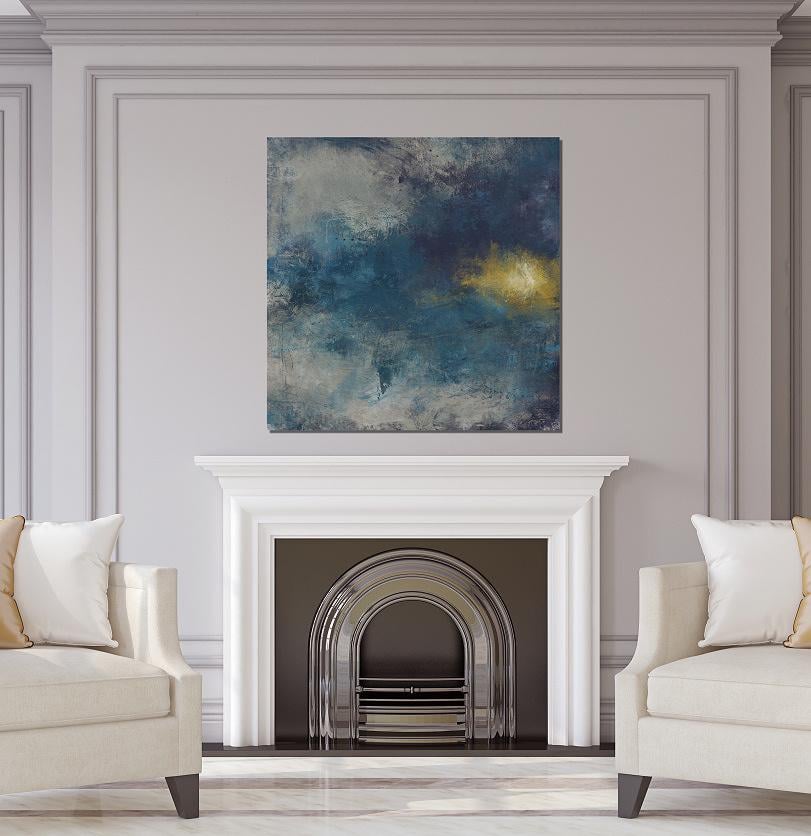
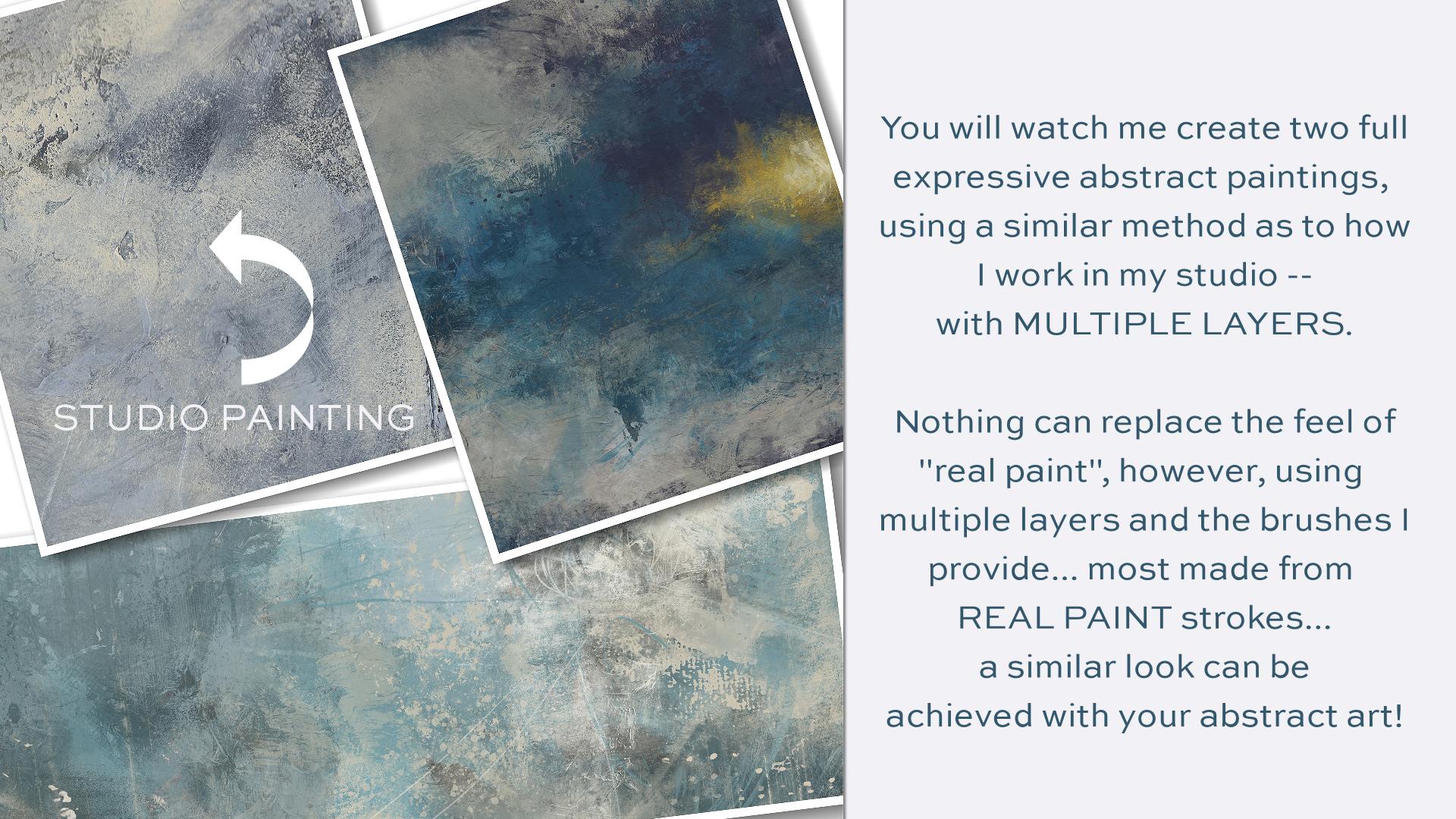
to say a word. You will watch me create two full expressive
abstract paintings using a similar method
as to how I work in my studio with
multiple layers. Nothing can replace
the feel of real pain. However, using multiple layers
and the brushes I provide, most made from real
paint strokes. A similar look can be achieved
with your abstract art. You will come along with me as I create peace among the chaos, from building the
initial Canvas, too expressive mark-making to painting layers and
layers of color. Along with more layers of marks, you will watch this
painting come to life. You will also join
me as I create distant illumination
in the same methods. This demonstrates a darker,
more moody painting, as opposed to the first pain, which is created
in lighter tones. The class begins
with a discussion on building a base canvas
layer and mark-making. You will learn how you
can achieve a variety of different marks using the
brushes I've provided you with. The class journey
continues with both of these paintings as you watch me create them from
start to finish. In the final video, I give you a tour of my layers for my painting,
emerging energy. And you'll see me finish out this painting with
a new stamp brush. I show you just how easy it is to make a stamp brush
from a paint mark. So you can make your own marks, which you can turn into
stamp brushes unique to you. In order to complete the class, you'll need an iPad with
procreate installed. You will also need
an Apple pencil. You will already need to
have a basic understanding of using Procreate and
installing brushes. And you will need to
understand how to transfer photos onto your iPad
before starting the class. Provided with the class is my new abstract
painting brush set and a thick paint canvas texture to use as an overlay,
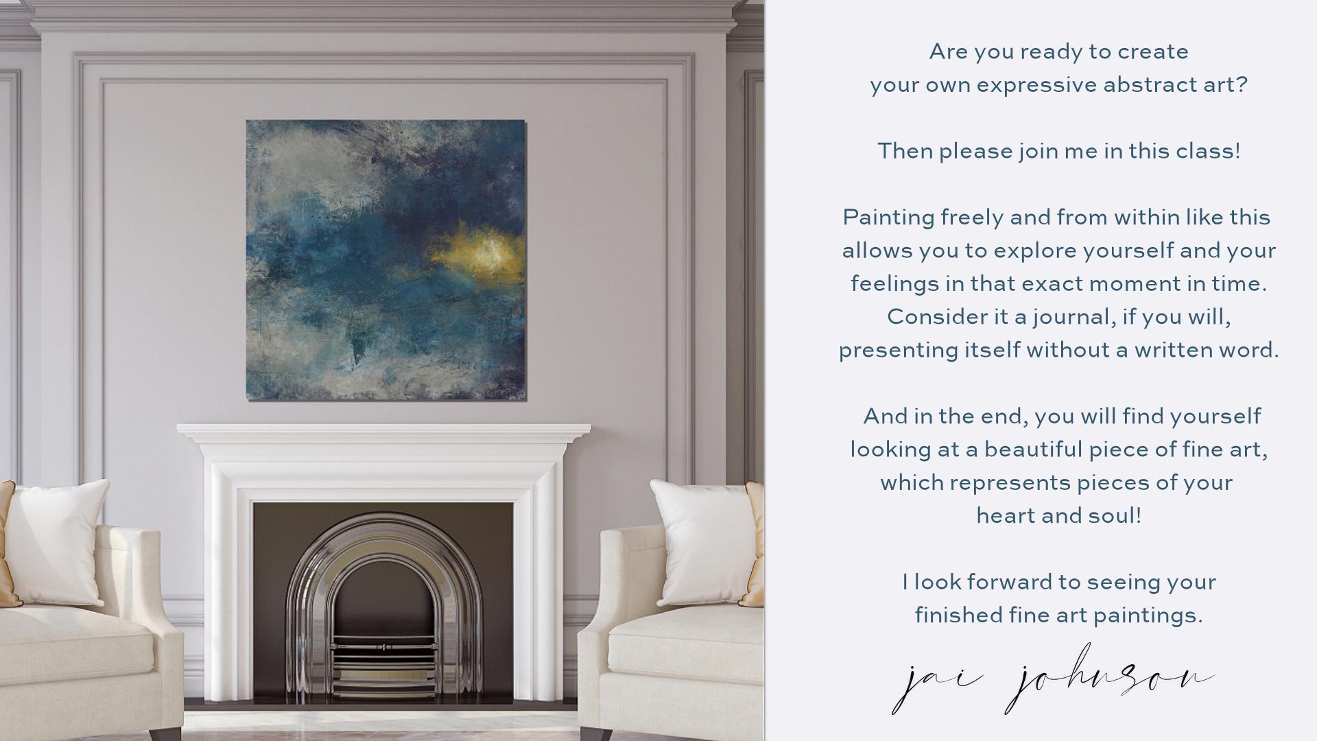
which is optional. Are you ready to create your
own expressive abstract art? Then please join
me in this class. Painting freely and from within, like this allows you
to explore yourself and your feelings in that
exact moment in time. Consider it a journal, if you will, presenting itself
without a written word. And in the end you will find yourself looking at
a beautiful piece of fine art which represents
pieces of your heart and soul. I look forward to seeing your finished fine
art paintings.
2. Mark Making: Hello, hello. Okay, before we get really
started in this class, I just wanted to show you the brushes and talk a little
bit about mark-making. Mark making is how I begin. All of my expressive
abstract art in procreate, in my studio. That's just a good way to
get started on the canvas. Now normally. And we'll get to
this a little later. I paint this canvas here and
get some color down first. Because I just don't
like to start with a bear white canvas. But in this case, just to go over
these brushes and talk about mark-making
a little bit. I just thought I'd start
with the white canvas. The brushes in this set
are divided into sections. I have dry media brushes
to build the canvas, which we'll get
to after a while. The oil paint brushes and
some other painting brushes. Some texture brushes
to add good texture. And then some finishing
stamps to add some little finishing
things to your work. At the end. The square ones down
here at the bottom. Stamp 891011. Those are from Mano
prints that I made. And they are a square stamp
that would go on top. And we'll get to that later. But they add, basically add texture to your overall
finished work and give you, I can give you some neat looks. But I just wanted to talk a
little bit about mark making. And I'll just pick this
rough pencil here. Now when I start mark-making, I usually just start
scribbling something. And I've learned that it's, it's hard to turn off the
brain when you go to paint, at least for me it is. And so I have a quote here. I'm going to try to write
this with this brush. Don't think. Just paint. So C, those are
marks right there. Words can be marks. If you have a favorite quote
or a name or something, you're thinking about a place
or a inspirational word. You can make your mark
with something like that. And you know, as
well as scribbles. You can make shapes. If you'd like, shapes,
certain shapes, you can make certain
shapes for your work. Like squares, circles. And I do them loosely. Don't try to do the things Procreate
has available that will let you do a perfect circle. A perfect, this perfect, that at least not in my class. This is not about perfection. This is about forgetting
all the rules and allowing yourself
to be totally free. And I don't really have a
lot of rules when I paint. I just paint and I just keep going until it
feels like it's done. And there's no set
way to do anything. In regards to these abstracts. If you'd like geometric shapes, you may want to put some
marks like this down. The thing is, the
marks you put down first are going to
be covered up later. And I always do add
more marks at the end. Just for some little
touches here and there. And sometimes I will back
some of the layers out via masking and reveal some of the marks underneath
or parts of them. I will also blend marks, which you can do with
the blending tool. I don't always leave
marks as they are. I just mess things up to
create a starting point. Just get something
on the Canvas. So if you're having
trouble loosening, I'm painting, I'm right handed, so I'm painting with my
dominant hand right now. And, you know, I'm
pretty structured. And the way that I work, when I'm doing things
with my right hand, I tried to get things perfect. It's not it's just natural
to want to try to do that. So there's a couple of different
ways you can loosen up. One of them is just to close your eyes and think about
what you're feeling and just start
making some marks on the page and believe it or
not, what you're feeling. Will come out in your marks. Like if you're feeling angry or whatever you
might my grill dark, big heavy marks and any of these brushes can be
used to make a mark. Any of them. If you're feeling happy, you might make really loose and flowing fun marks like this. There's, like I said, there's no set way. It's just try to try to go with what you're
feeling at the time. If you're feeling
loose like this, Then do, you know, do some loops and
circular marks. If you're feeling kind
of tight, you know, you might want to just
do some straight lines and kinda just get
the pen moving. You can also use your finger. Instead of the pen. You can also switch over
to your non-dominant hand. So like this, this right here I'm doing
with my right hand. Now, when I switch to
the pen to my left hand, It's a lot harder to make
that same kind of mark, but it looks a little
bit more abstract and looser than this
one on the right does, because I did it with
my non-dominant hand. Another way, you can do Marx's to hold your
pencil back toward the end. Like here's your pencil. And I know this doesn't look
at all like this pencil. I'm just drawing.
Just pretend is this the pencil on my pencil, I have a little rubber
grip that I've put on it right here from a pen. I got the rubber grip off of another pen and put it
on the Apple pencil. On the Apple pencil has around. And so I really
need to fix that. See there's that
perfection coming back in. But when I do my
marks and paint, I usually have my fingers right here around this rubber grip. But if you hold it back here, at the back end of it, it will help you loosen up. So let's just do an
example of that. Okay. On the left I'm holding
it on the rubber grip. Just trying to make some lines. Now, I'm holding
it further back. Notice the touches lighter. I'm really pressing
about the same. It's just because I'm
holding it further back. The touches lighter
so that can alter your marks to make them different and unique
even for, you know, you could do some rubber grip and then you could
hold it back and do some with it further back and you notice they're just lighter and a little
bit different. So that's another
thing you can do. Another thing you could do is what I call
blind mark-making. Put your pencil
somewhere on the page. And I've put it on the
top-left, right here. And then close your eyes
and just move it around. And just see if he go
off the page just fine. Just move it around and
just feel the movement. And look at their you know, I never would have
tried to draw that or tried to make
marks like that. That's just because that's
the way my hand moved. So that's another good
way to really get into your feelings and loosen up. And let's see what else did I want to cover
about mark making? And I did talk about
how you can blend them. You can blend with
any of the brushes and mess up your marks, which I do like to do. I'm like so I just take different ones and mess them up because they're going to be
covered up a lot anyway, but it just gets
something started on the canvas and that's the
whole point of mark-making. And you can also use stamps that are in
here to make a mark. That's a mark. And that's another mark. And that's another mark. So there's some marks
that are made with paint. If you want to do
those, the stamps. And then you can also
use the oil brushes. And you can make
marks with them. So don't be, don't
think you'll have to be confined to the pencil. You can also change the
color of your marks as if you're using colored pencils or crayons or something like that. And just use a variety
of things just to make marks and get
things on the page. But like I said, these
will be covered up. And if you lose your marks, you can always reduce them and add some different
marks back in. Like. Hello, what it is
with me in this long tall, it's kinda scribble. I can tell you right now that I'm feeling real scatterbrained lightly just because of stuff that's going
on with the family. So I tend to do a lot
of scattered March. And I mean, this right now. And I'm very frustrated right now with some
of these things. So this just looks like
frustration to me. And then you can blend it with any of the brushes that
you want to blend with. Change up the sizes of the brushes when you're
doing things like this, mark making and blending. Let's just get
something started. It's just a way to loosen up and get something on the canvas. So that's kinda what I wanted
to cover about mark-making. It's really not hard. There's no secret to it. Um, it's just a matter of doing it and trying to be loose about it
instead of structured, don't try to look at something across
the room and draw it. I'm, of course, if
you want to put a certain something in
your painting, can, if you wanted to draw a
certain thing or if you wanted to write a certain
word, you could. Like, let's say I
wanted to write the word love
underneath everything. And then maybe we'll
learn some of that end. And, you know, you all
know what you've done. And that's I guess my advice is go with what you're feeling at the time or what you want
to feel at the time. If you want peace in your life, you may want to write
the word peace. Can't really see that, but, you know, and then mess
it up a little bit. Kind of blended in and we
got a whole loved peace, frustration thing going on here. It's a mess. And your paintings
will look like a mess. They will, they will look ugly at some point
during the painting. But if you keep going
and keep layering, they will eventually
become something. And you'll go, wow, I did that and it all
started with marks. So just be loose and
free and just have some fun getting something down on the canvas
to start with. So that about covers. All I need to say about Marx. Because like I said,
it's not that difficult. It's just something
to get you going. And then later on we'll add some marks to
the end of the painting. So we'll be back in
the next video to talk more or a little
bit about color. That'll be in the next video.
3. All About Color: Alright, in this video, I want to talk a
little bit about color or talk a lot
about color. Maybe. When I'm doing the
painting, I try. After I get past the
mark-making stage of starting my canvas, I think along what
colors I want to paint. And I usually think of how I feel versus
how I want to feel. Because these are
expressive paintings that I'm coming at this
when I do a painting from a place of I want to
feel something, feelings. And I'm not trying to get mushy or anything here
by feelings or anything. But I wrote a book years ago, a business book, and I had
a whole section on color. And I really studied
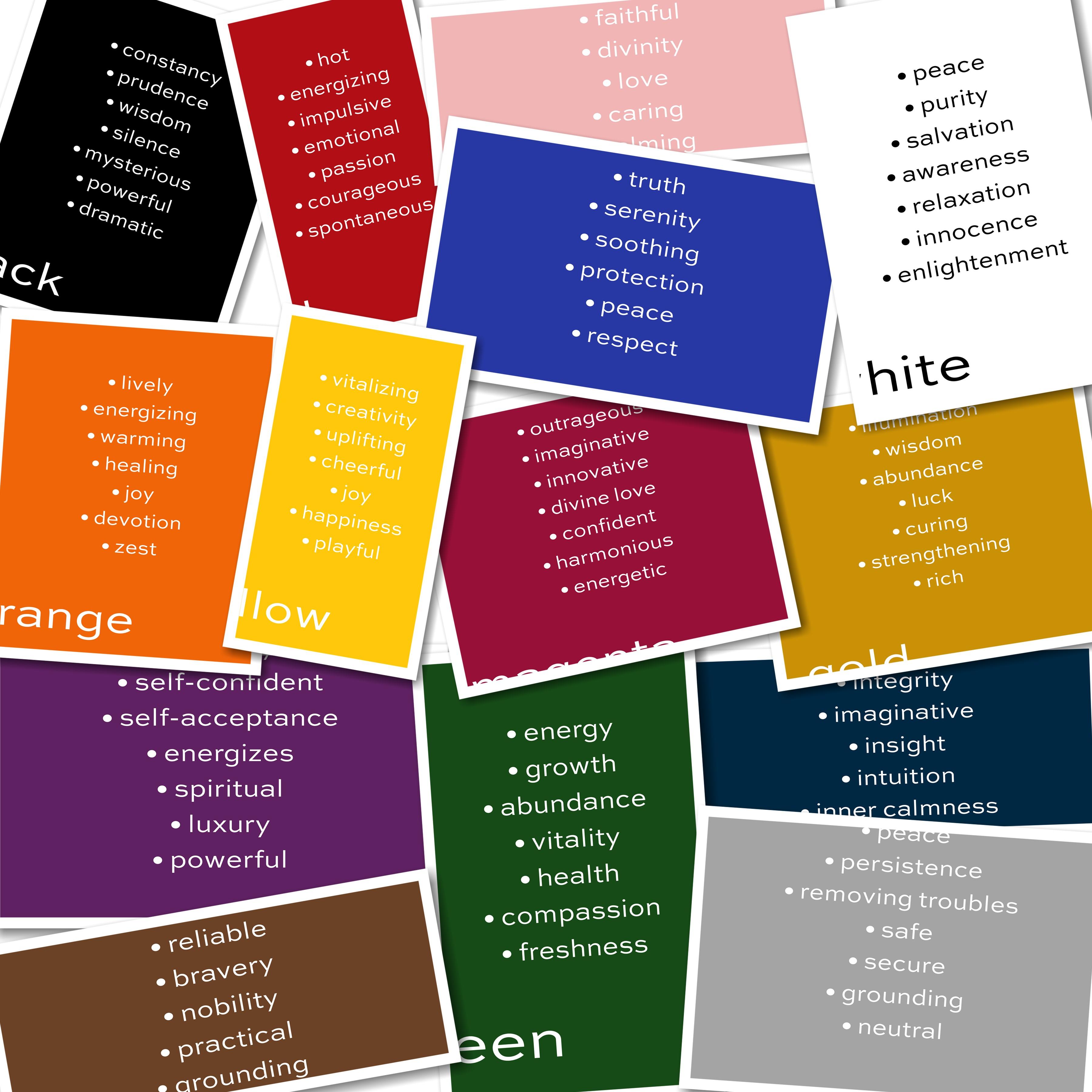
color quite a lot. And the colors,
various colors have various traits or
personalities, if you will. And on these little
slides here that are made are putting this document
to talk about the colors. I've listed the the good things. All everything has good and bad. If we didn't have good and bad, there would be no
balance in this world. But when I'm using the color, when I'm choosing my colors, I'm after a certain feeling, you will often see me paint
or use this color orange. And then not necessarily
this color blue, but more of a
turquoise blue because you can use any
shade of a color. But the reason I do that is
because I'm after some of these traits that are
in these two colors. I want those in my life. I need to bring
those into my life. So That's why I
wanted to talk about the different colors and the different traits
that they have, the good traits
because obviously, I don't want to do
a painting that reminds me when I
look at it later on, if you know that if I was
depressed at that time, like for instance, black can't, I don't have that in here. But black can signify
depression, so can gray. But they also have good traits. And, but I don't want
to do a painting necessarily in those
colors unless I'm ready to really just kind of
zone out and calm down or simplify
things in my life. I usually am going for the bold colors because I'm trying to get those
things in my life. So let's talk about purple. Purple is a royal color. It signifies self. Someone who's self-confident,
who has self-acceptance. It's an energizing colors, so it's a high-energy color. Also a spiritual color. It's a color of luxury,
and it's powerful. Purple is a very,
very powerful color. Now, sometimes I'll do
a whole painting with purples and sometimes they'll
just use it as an accent. If I want to bring
just a little bit of a trait into a painting. Let's go on to green. Green can balance
out with purple. Green signifies energy, and it signifies
growth and abundance, and vitality and health, also compassion and freshness. So if you want to freshen
up and painting and give it a fresh look or a
refreshing feel. You might want to choose green. If you're in a financial bind at the moment and you want
to increase your income. You might want to
focus on abundance. And so you might want
to add some green to signify growth in your
life and abundance. Then there's orange, which
is one of my favorites. Orange is lively and energizing
and warming and healing. Healing is a big thing
for me right now. And my family. Joy, devotion and zest, like think orange juice, how it tastes. Zesty. Orange popsicles, orange. I'm always drawn to orange. If I have a choice of a popsicle or a piece
of candy that's fruity, or any kind of fruit. I'm gonna go toward the one
that's closest to orange. Just that's because
oranges something I've been attracted to my whole life and I've maybe I've been
seeking joy my whole life. I don't know. Maybe I'm
needing healing right now. That is important in my family. Oranges, something I incorporate
into a lot of my work. Then there's yellow. Yellow is happy, playful color, joyful, tearful, uplifting. Creativity. It signifies creativity. It's very creative and
it's a vitalized in color. I'm kinda like the
orange, you know, it just kind of reminds me
of fruit that's vital icing. And then there's blue. Blues. I used to introduce some
calmness in a lot of my work. Blue is restful. It's also truthful, and it indicates serenity. It's soothing. It's indicates protection. Think of the the policemen
with the blue uniforms and, um, you know, back the
blue, that kind of thing. It's a peaceful color and
it's a culture of respect. I'm once again
thinking of policeman, you know, you usually wanna
respect to policeman. Then there's magenta. Now magenta is the wild color. It's outrageous,
imaginative, innovative. It also signifies divine love. That's beyond regular love. It's divine. It's a competent color, harmonious and energetic color. So if you want to add any of these traits into your painting, if you want these traits in
your life and you want to feel these things and have
these things come to pass. Maybe think about painting
with some magenta color. Then there's red, red hot. It's energizing,
it's impulsive and emotional, and
indicates passion. It's a courageous and
spontaneous color. Red's really bold. I like red. I like bringing read into a painting because I think
it shows my passion. And I do have a passion
for all the work I do, and creative and otherwise. And so red is another
color I'm drawn to. And then there's indigo, which is a dark, dark blue. It kinda has a warmer tone
than, than regular blues. It indicates knowledge
and power and integrity. It's an imaginative
color, indicates insight. It has intuition and inner
calmness associated with it. And so if I'm wanting to kinda get back
into my intuition, if I've, you know, how, when you intuitively know, you know, you should make
a certain choice or do a certain thing and
then you ignore it and things go all
haywire and you go, Oh, I should have gone
with my instinct, what my intuition told me. If you want to get
back to that where you can feel closer to that, you might want to choose
this color if you, if you just need to
calm down inside, if you're feeling
really stressed out and you want to calm down, it would be a good
color for that. There's pink. Pink is the color of love. Of course. It's also a divine color. It's a friendly
colored, compassionate, and then it indicates
faithfulness, caring and calming. It's a very caring
and calming color. So if you want
something like that, to bring something
like that into your life for your environment, you might want to paint
with pink in your painting. And then there's white, whites, color of peace, purity, salvation, awareness, relaxation, innocence
and enlightenment. All of those things
I would like, I tend to bring white in
quite a bit into some of my newer work because I want all of these things
to come to pass. And it makes me feel
good when I finish a painting that I've
used the colors that are attuned
to how I want to feel at that moment
versus how I do feel, where my marks tend to
indicate more how I do feel, my colors are more
how I want to feel. Why is introduced a
lot into my work? Then there's black. I love black to. Black indicates constancy,
prudence, wisdom. It's a silent color. So if I want a quiet, I will use a lot of black
gets a mysterious color. And if you want to
indicate mystery or something powerful
or dramatic, black will bring that
to your painting. Then there's gold, golden
illumination color, a color of wisdom. Another abundance color
along with green. It's a lucky color. If you want some
luck in your life, maybe throw some goals. And the paintings. And whether painting
with this color gold or using like gold leaf overlays
and things like that. I've done that quite a bit. Gold is a curing color and
strengthening and rich color. And I don't overdo it on the gold because it can
be a little too much. But I do use a lot
of goals in my work. I love the illumination
factor that gold has. So I do use a lot of gold
tones and colors in my work. And then there's
silver and gray. Silvery gray indicates
peace, persistence. It's a color of that
removes troubles. I've been using a lot more gray lately because I've had a
lot more troubles lately. I'm with health issues
and things like that, so yeah, gray is going
in some of my work. And when you mix
colors together, a lot of times they
will turn gray. It's a safe color in a secure color and
a grounding color, and a neutral color. So introducing those neutrals in is always something
that can be kinda good, especially if the painting
skinning to wild, too vibrant, bring a little gray
into ground it and neutralize
things a little bit. It's always a good choice. And then there's brown, which is another favorite color. Actually all of these
are favorite colors. I just love color. Brown indicates stability. It's an earthy color. So, you know, if I need to be
brought down to earth or I feel like I need to get
grounded with earth. Brown is a good one. It's a reliable color. Indicates bravery and nobility. It's a practical color. And once again, grounding. Um, so if I want to ground, you know, feel more grounded, I might choose to
use this color. So that's just a quick
little rundown on the colors and maybe give you
a little insight into what colors you
might want to think of using when you get
ready to start your painting because you
don t have to do what I do. I'm not giving you a specific color palette
or anything like that. I'm going to paint
with in this class. I'm with how I want to, what I'm feeling and
how I want to feel. I'm going to go that direction. Would the painting
as I go along. And so I'll pick colors that go with what I'm after
at the moment. And I hope this gives
you a little insight into each one of them
and what they mean. And that you will enjoy
the rest of this class.
4. Underpainting & Mark Making: Okay, I'm ready to
start painting. But first I have to
set up my Canvas. So I've opened Procreate. And I'm going to pick my canvas size square 6
thousand by 6 thousand. You can pick any canvas
size you want to start an abstract painting. It's just up to you if you
want square, rectangle, horizontal, skinny, wide,
whatever you want to do. If you don't have the
specific Canvas size set up, all you have to do
is hit the dark plus button by new canvas. Make sure it's on 300 DPI so
you get the best quality. Click on your width and
your height in here. And put your numbers in. Let me get my well, select all 6 thousand and
I already have 6 thousand, thereby type it in again. And that would give me
ten maximum layers, which I do use a lot of layers. And these, if you
do a smaller size, like 4 thousand by 4 thousand, look at I get 29 layers. So the amount of layers you
get depends on your memory, on your iPad and the
size of your painting. So I am not going to
set up a new canvas, but you would just hit
Create and it would appear and be already
open for you to work on. I'm just going to hit
Cancel and go back. And once you've
set up one and it saves them all here
as untitled canvas. So then you can pick
the size you want. I have the square, 6 thousand by 6 thousand setup already. So I'm going to use that. And the main thing
to start with is to get some color down, some color. And we're on layer one. And thinking back to my colors, I'm thinking I want
the brown a brown. So I'm going to move the
color wheel over here to find a good brown color. And I think I'll do a darker maybe not a dark brown
maybe toward the gray side. Somewhere right in there. Maybe a medium to light brown. And I'm going to go down to the build Canvas section and I'm going to take the canvas brush. And I'm just going to stroke
this canvas brush on here. Now if that's too big, you can lower the size. Like so. And I just
go up and down. Most of this can be covered up. This just gives me a starting
point to start with, to do my mark making on. And then I'll go across sometimes to make it look
like a woven Canvas. Some of this may peak through. But a lot of this is
going to be covered up. Just getting some color down. And if it's too strong, you can always blend this, which I might do a
little blending on it. So let's go to the
blending brush and pick. The mop brushes are
great soft blender. Pick a size and you just
kinda go over it to soften it up as if it's
got a watery feel, but a little Canvas is
still peeking through. I'm just doing
this very lightly. I'm not pressing very hard. The harder I press, the
more it will blend. And I just want to
very light blend just to get started with. That gives, just gives
me a starting point. And you could still see some of that Canvas through there. And now I want to put some of these acrylic random stamps
on this page and I will, on this image, and I will build this canvas by just
hitting this stamps, different stamps in different
areas, in different sizes. And then I'll pick
another stamp. I'll do the same thing, hit it in different
areas, different sizes. And then I'll pick another one, tap it in there. And another one. I usually go through all of these when I'm starting just to get some starting marks down. And color, just going through every one of them. Just to get some
variation in there. So I've got a good
bit of brown down. Now, this is what I
would do in my studio. I would add texture to
my canvas or paper. And then I would
use a light wash. And usually I usually use
a brown or cream or gray. You can do, you could use black, you can use a darker
color or any other color. Those are just usually what
I start with to get moving. And then I might blend
some of this a little bit. And let's see. You can blend with
any of these brushes. I think. Let's try this
procreate damp brush. This brush is kinda cool. Just takes away some
of those hard edges. Going in different spots and
softening certain areas up. I've lost some of my canvas feel to this and I did not do this on a
new layer, the stamps. So what I might do here is pick that lighter
color, brown. It actually ended
up being a gray. After I blended it, let me find something
that's close. How about we just stick with
that gray and go back to the canvas brush and
bring a little bit of that canvas texture back
in there in some areas. Just to get a good
starting point. So that looks pretty good. Yeah. I could sit here and fiddle
with this all night, but I'm just trying to
get to a starting points, so that looks pretty good. And we're all that's
on the same layer. So now the next step that I would do would be
to begin mark-making. And I usually do my
mark-making in black or white. Sometimes I do it in gray. I'm going to pick black
on the color wheel. If it doesn't go
directly to black, if you just double-tap
near where the black is or where the white is, it will hop over there. I'm gonna go with
black for right now. I'm going to take
that rough pencil. And I'm going to hold my pencil way toward the
back and my dominant hand. And I'm just going
to start moving it around and making
some kind of marks. And I feel like I'm
thinking about it. So I'm going to keep them
with the same pencil. I'm going to switch to
my non-dominant hand. And I'm just going to
move it around with my left hand. You can tell. After what I went over
in the first video, I'm feeling kinda scattered like there's a lot of
things going on right now. A lot of threads going
through my life that I just I don't know they
need to be settled down. Maybe take another brush. Let's go down and pick one of
these add texture brushes. A couple of different ones here. Let's just see what
any of these will do. And I'm back to my
right hand again. And there's a dark
dark mark there. And I usually don't undo
a mark on this stage, I just make some marks. Now what if I
switched over to that gray to make some marks with a different brush about
the fan brush and just scrape it like that. That just kinda
ended up that way. I didn't intend it. Now let me go back to the black. If you hold down on the color, it'll go right to it. But let me pick me, pick one of the oil brushes, but a small one. And I'm gonna go back
to my non-dominant hand and just make some marks here and there. Make that brush a
little smaller. Is it more of an inky? Look when you get a
little smaller with it. I want to bring back
some of the gray marks. And this time I'm
gonna go back up to my little thin pencil. And this time I'm just
going to close my eyes. But my pencil, I'm holding
my pencil way toward the back and my dominant hand. And I'm going to
close my eyes and just tap it on the canvas
upper left corner. So I usually start and I'm just going to start
moving it around with my eyes closed and just feel the the painting and
feel how I'm feeling. And just I have no
idea what I'm doing. You're seeing it before me
because my eyes are closed. I'll just do this until I
feel like I've had enough. And basically until
I feel relaxed when I sit down to paint
my abstracts, I'm looking for relaxation. Didn't make very
strong marks at all. So Let me go back to the rough pencil and do the same thing with my eyes closed and I'm going to
press a little harder. This one. That looks
like a mess, doesn't it? All right. How about a blend, some of that, what you can do with your marks, It's no different
than painting with a watercolor crown and
adding some water to it. Let's do the scatter
paint and blend and just kinda get a real
big brush and put it on there and just kinda swoop it around in a few spots
to mess this up. I'm trying not to think. I'm just trying to blend
it around some hug. I need a little white marks in there. So I'm gonna go to white. And let's see what some
pastel marks might look like. I'm just tapping it
wherever my hand lands and making some marks. I'm not thinking
about composition or where this is going. I'm just scribbling a little and then make
it a little wider. Make it a little small, real small little
flow going here. Most of this you won't
see by the time I'm done. I go back to the
blending brushes. Or any brush can blend. How about we do an oil flat square as a blender and
let's see what happens. Oh, that's it. Testing. It's really oily. Look. I'm just kind of lightly
dragging this over. ****** were made the white. Just kinda all around. So I got some good marks. And I'm wondering if I need
to put C here I go thinking. I need to stop thinking
and just paint. But I just feel like I need
some skinnier marks involved. So I'm gonna go back
to the small pencil, but this time instead of
keeping my eyes closed, I'm going to just keep
my eyes open sank. See what I'm doing. A lot of
marks on top of this canvas. And what do you know? I did that all on the initial layer instead
of on a new layer. But that's okay.
There's no rules about this that you have
to do it on a new layer. I kinda made a
intersection right here. Now I will say when it
comes to composition, if you're going to think at all. During this, you might think right here when it
comes to composition. If you divide your
painting right down the middle, when is the square? You can do that like this. Put something
inside the squares, not directly in the center. A lot of times I do stuff
directly in the center. But to make it more interesting, if you put it off center, whatever your focal
points is going to be, then it'll make it
more interesting. And I don't want the
orange in there like that, so I'm taking that off. But I do like my little
intersection here with the white. I do like that. Let's see if I can see. I'm trying to I'm
thinking too much now. I'm trying to get a
sometimes if you go along your other marks with a
new a different brush, it will add some interest. And I do like that little
intersection I ended up with. I don't usually undo
marks, but I just did. So there's my starting point. It looks pretty bad, doesn't it? And it's going to
until I do more to it. Which in the next video, we will get to that part
about doing more to it. Which will be two. I turn my page here and make
sure I've got this right. I'm going to add some color,
some different color. The color I want. The color I want. That goes
with the traits that I want to feel at the time. And I'm really thinking, look at how crazy this looks. This is my brain right now. This is why this
came out like this. If you're feeling pretty column, you probably won't make
this many marks at all. But when you're
feeling like I've been feeling lately little haywire. That's kind of what
this looks like, that I could end
this now and give it a name, call it haywire. And it'd be good to go, except it's ugly as all
get out, in my opinion. So I can't stop there. I have to keep going. So in the next video, we're going to add some color. And then we're going
to blend that color and we're gonna do
it on a new layer. Because right now I'm putting
on the new layer right now. Because I may want to scrape
back down to this layer, which is exactly what I do in the studio. I'll do a layer. I'll let it dry. After it's dry, I'll do another layer, let it dry at some point I will scrape something down to
reveal what's underneath. That. That's kinda cool. So we're gonna do that
here with these layers. So I've got my new
layer in place. When I come back, we're going
to start adding some color.
5. Building Painting 1: Okay, I'm ready on the new layer to start
adding some color. Of course the question is, what colors do I want to add? Well, I can tell you right
now and the little piece. So I'm gonna go with
some kind of blue first. And I do like the
turquoise shades of blue. And I'm thinking about
dragging it more to the gray side of that
because gray neutralizes. And I really just need some neutral piece.
Is that a thing? And I'm just going
to start painting with the oil flat square. No reason. Just that. I haven't
liked having to like it. I'm just going to start
scooting the brush around in different sizes and just
painting over some of this, just some different places. Let's try to get that
color in the Canvas. And another color I
might like is white. But I also like yellow because
I need some happiness. So if you mix white and
yellow, you get a cream. And here's a cream color. I might get a little
this creamy color in there and pick
a different brush. Maybe let's go with a brush
with a little texture, but not a huge brush. And if you want to, you can lower the opacity of the brush to get
some color in there, but not as strong. Just going to move it around. I'm not trying to plan
anything specific. Just kinda trying to
introduce some new colors. Now I might also
like in these colors to bring in once again, some of these acrylic
stamps, because they're fun. And just stamp a few, stamp a few of them around. Here in there. Off the sides. Normally get the blue again. Stamp a couple with the blue. Let me stamp on
kinda right there. And you can sap the same
stamp in several places. You can go off the edge and
just around different places. So now I've got a little
color going on there. I'd like to blend it a little. And one of my favorite
brushes to blend with is this rough
edge paint and blend. Because it just kinda
helps things blend in without getting too
solid of a blend. It's got that rough edge. And I'll just alter the
size and move around. And I'm on its own layer. So if I decide I don't
like any of this, I can scrape it back off. This brush has some
nice edge texture. If you start the brush on
the color and pull outward, you'll blend that color outward. And if you start it
away from the color and pulled downward or inward, you'll remove the color. Basically. It softens it up. I don't like this little
section right over the circle and blend
that out a little bit. Looks too structured. Now what about a different
shade of this blue? Let's pull it down and get a darker shade
of the same blue. Let's see what the
Procreate damp brush does. This isn't real strong. I mean, it's very, very subtle marks
here and there. I'm just, I'm doing it lightly. This is a it's
just a cool brush. I just kinda found it recently. And it's in your program
when you get it. But I'm not really
used to how it works. You kinda have to press
hard and it grabs in blends some of those
colors that are there. All right, let's switch
over to a darker. I made a different brush. How about the textural
one brush and let's see how that works
now the textural one. I can tell you
from experience on these textural brushes
you want to drag lightly. You drank too much
and you're going to cover up stuff you
don't want to cover up. Because it gets really,
if you press really hard, it gets real solid. So if you drag lightly, it will introduce a little
bit of fine texture in there. Um, of course, right now this whole painting
looks very busy. And I do know that
if it's too busy and you don't have a place
for the eye to rest. It will not create
what I want to create, which is peace and
serenity and calmness. This area in the upper right. I think I'm going to try
to leave that area pretty smooth and not a lot
of marks in there. I'm just drag this over it to not make that upper
right side so busy. I want to keep
that area to rest. And I really think
this area where the circle is that I've drawn, that area could be fun to
make that a little busier. Right now, I still want to move this one around a little bit. I love this brush. And I can blend
that as well with the paint blend and
blend some of that end. But it's got some really
good real paint texture in there with that brush. And that's what I'm after. I need to decide what to do with my little area down here, where the circle is, I may bring some white in there. So let's go back to the cream, but go more toward
the white like that. And let's pick the fan brush
and kinda squishy little. Just do a little sweep there. Oh, that's kinda neat. And I don't want to overdo that. I want the I to kinda go there. So that's why I chose
the lighter color. I'm gonna go back to the blue. And I've already gone
to a darker shade. I'm going to go to an
even darker shade now and see what else I can do. How about the oil wet soft. Let's play with that. Appear at the top. You got to press kinda hard
for that particular brush. Darken this upper
area a little bit. I'm just kinda scrubbing
it and pressing hard. And that might have
been a little too much, but rather than erase it, Let's go back to the blue color. And let's get a little
scatter in their big brush. Same, bring some of that
color in there like that. Let's kind of interesting. I'm lacking some cream and it's more of
the cream in there. So I'm gonna go back to that. And i'm, I'm gonna decide
now whether I want a new layer or whether I want to keep going
on this layer. I kinda liked this
layer as it is. So I think I'm gonna
go with a new layer. And let me go back to some
of these stamp brushes. Oh, that's kinda cool. I like that brush. Pick another one. Let me get some of this cream
down here on the bottom. When you tap this brush, it'll turn different ways. So if you don't like
the way it's turned, you can always turn it again. I mean, tap it again. Like to get some of that
in down here as well. There we go. Get one, a little cream over
near this other one. Now I'm going to blend these, um, let me try the rough
edge to blend some of this. Pull some of this one
down and out and up. So it doesn't look
quite so random. I don't want them to look
like they were stamped on. I want them to look
like they were. Painted on and then blended
rather than stamped on. I like parts of the
marks being in there. But I don't need the whole
mark being in there. Just working around it. Starting to take a
little shape now. Alright, I'm gonna go
with another new layer. And let's go back
to this light blue, soft blue, which is
such a peaceful color. And see what the
streaky oil does. It's on its own layer. So if I screw it up,
that's kinda neat. Put a few little
sweeping streaky marks in there and then
blend them as well. Blend some of them out. So there's no rhyme
or reason to this. It's just happening. Well, if we go even
lighter with the blue, maybe even a little more to the gray to get things grounded a little bit more. Does this one do? I forget when my own brushes do? I make them? I love them. I use them one time and I'm making marks
and taking them off. I think I'm taking them off. Ah, thought it was I think I've taken off more
than I wanted to. Oh, I don't know what I've done. Let's just blend it in. Back to that. Let's go with a mop brush. I need that softer up there. This is the area of rest. The mop brush will create
a very soft blend. Get some of the tone in there, but it's not real strong. Mark. I think I unblinded some of my streaks when I hit the Undo. So I'm gonna go back
to the rough edge and the streaky areas and work
on them a little bit more. There we go. So we've got a little movement with
the streaky brush, bringing the eye down here
where I drew that circle, which is still kinda showing. And let me go with
another new layer, that same light blue. But what happens if I take what am I looking for? What happens if I take
one of these stamps? This one and put it right there? I can undo it and a recap. If I don't like the angle that
tap debt, I could tap to. Well, of course now
it's not wanted to do a different angle. Oh, no, I like it
in that position. And this is a lot of tap
undo, tap, Undo blend. I need to grab some of
my turquoise back again. And at this point,
I think I want to add a pencil mark or to let
me do that on a new layer. I'm just going to focus
on this area right here. Add a few little marks in
there and then blend them. But if I blend them
with the scatter, Let's see what that does. Just kinda go over. I'm a little bit where
they're kinda there, but they're not there. Looking a little interesting. Now I'm going to squeeze all of these layers together
at this point. So now I have one layer
on top of this layer. And I think I want to scrape
back some of this layer two. So I'm going to
create a mask on it. Tap mask, it changes to black. And I'm going to, let's
go with a rough pencil. And let's see what
happens if I just kinda move it
around. It reveals. Some of what's underneath. That's a little too
much down there, so I'll just do a little
lighter here in this corner. And if you don't like
what you've done, you can turn off
your layer mask. But if you want to
bring someone back, sorry, I took away too much. Just tap on it and go to white. Make sure you're on white by double tapping near the white. And then you can go back
over it with the white. And you can use a different
brush if you want to, like the charcoal brush here. Go back over some of that, some of those marks. Basically what it's
doing is it's putting it back because that's what
a mask enables you to do. It's putting back that
original paint on, I mean, the paint on that layer. Just kinda going over
this in a few spots. I like had revealed some of it. I think it revealed
a little too much. I got a little wild with it. But I do like some of
those marks. Okay. So I'm going to squeeze
these two together. Now I'm going to
make a new layer. And it's a lot of making a
layer squeezing them together, making another layer
squeezing them together. You see we're building
a painting here. I still have my little
focal point down here, but I don't feel that there's
enough contrast there. I think I'm going to grab
some black from the painting. Is that black or is
that dark green? Well, black and turquoise
and mixed together and sort of made a dark
green that's more black. And let me try this
pastel texture down here. See if I can scribble
in some marks. Just to create a little
bit of contrast down here on this bottom corner. Just do some little marks. This is on a new layer, so I'm gonna go over
here to the left side. Bring your feet a
little marks in there and then even
appear at the top. And now I can blend those marks. I'm gonna go back to the
rough edge because it really has a good edge to spread some of this color out and
blend it in real nice. Where it's not such a
strong charcoal line. Just messing with it now, messing around with it. But we're getting a
pretty cool abstract look that's on its own layer so
you can take it off and on. And you can also reduce
the opacity. Like so. Kinda like it at the 75%, it was a little bit strong. But around the seventy-five
percent range, it was pretty good. So when I decided okay, I'm satisfied with this part. I could merge these together, but I'm not sure yet, so I'm going to keep going
with another new layer. I've got my nice area of
rest up here in the right. Busy-ness over the left, which is to me that's drawing
the eye more than what I originally intended
my focal point to be. But that might be okay. A lot of times what
I will do if I'm not sure if I like things is I will grab the painting
with two fingers and turn it around and see if I like it
in a different orientation. I actually like this
orientation a little better. Now the area of rest is on
the upper left, upper right. But you know what the upper left needs is a little
bit of texture. I'm going to grab
the light blue. I don't want to overdo
it with the texture, but I'm gonna go to
one of the texture brushes that light blue. And on the upper left
I'm just going to drag some of that texture, brush down in there. So it's on its own layer. So I can then soften that
because it's a little strong. So I softened with the mop brush a lot and
just kind of go in there and soften some of that down because I don't
want it to be too busy, but I wanted a little bit
of some marks in there. Might be fun to get a
little cream up there. I've selected the cream. And, uh, what about the
mop brush with the cream? Now, I need texture or oil. Oil flat wet or flat round. That's going to create
too much busy-ness. How about this? How about just some with the oil
flat wet right there. Then let's see,
maybe bring some of that same oil flat wet
brush down here in this bottom corner and float
over to the right side. Now let's blend it. See, I'm, I'm
really getting into the feeling of the painting
now with these colors, I'm starting to
feel more peaceful. Even though I'm talking. I'm just kinda blending over
those same marks I just did. And even just do a
general sweeping blend. Okay. I feel like this color which has
come out of blending, might be good to bring
in on its own layer. Let's see. I'm getting close to where I'm liking
things pretty good here. So I'm thinking
about going down to the finishing stamps and and bringing in a few
of these right now. And seeing what happens. I think I would like a drip somewhere up here
towards the top. It's a stamp brush. I'm just going to
tap it in there. I think the drips too dark. Let's go with the
cream. There we go. That's kinda fun. And then I can blend it
with the rough edge, blending brush,
blend some of that. Now let's say I want,
Let's do that again on another new layer
with the other drip. And let's tap up off
the top. Like so. Now that might be
a little strong, but it's on its own layer. So you can play with opacity. And you can also, because it's on its own layer, resize and move it around. I actually like it right there. And it's on the opacity of 52. So it's not full opacity, but now I have a few
little drips in there. Sticking with the cream color. I'm going to get my dots. Stand for, I love my dots. I'm going to stamp them
in a couple of places. Down near the lower left. And another one I really
like is my streaks. Number three. And I'm just going to
stamp them in there. On the left and on the right. Just done a couple of places. And I zoom out to see how
it looks from a distance. I feel I might have a
little too much Russ going on in that upper left. So let me grab the dark blue and tap some of those
streaks in there. Let's tap a bunch of them
in there and you can resize them and making them different. They're on their own layer while they're on a mixed layer. But then you can blend them. Let me go with the
scatter for this one. And just sort of blend those
streaks in a little bit. So some of them are there. They're not like super strong. Zoom out trying to picture
how would look on a wall. I don t think I'm there yet. It still looks kind of messy. So this is the
point where I step away for a little bit and I
come back and look at it. And I sometimes will stand across the room and look at it. And it will just jump out
at me what I need to do. And other times I'll
be sitting there going what the heck
do I need to do? What is standing out to me
that doesn't look right. And what can I do
to change that? So when I come back,
maybe I have an idea of what to do next on this. In the meantime, I do
like all of these layers, so I'm going to squeeze them together and they're still
on top of that base layer. So if I wanted to lower
the opacity down, I could if I wanted to
reveal all the craziness. But I don't I want to
start what I'm after. I'm, I'm after bringing peace
and crazy to my craziness. So I'm getting there,
just not there yet. So when I come back,
we will continue on and we will make more marks, add more color, blend things. Maybe add a little more texture, and just keep going
until it feels done. Right now, it's not
there, but it will be. So join me in the next video.
6. Finishing Painting 1: Okay. Now that I've took a little break and came
back and looked at it. I'm actually kinda liking it. I do feel that area of rest up here needs
a little texture, but it doesn't need
to be very strong. So I'm going to pick one
of the blues, it's there. I'm going to do this
on a new layer. And I'm going to go back
to the canvas brush. I'm going to try this. I'm going to try and they
might not be dark enough. I don't think it's dark
enough to go a little darker. I'm going to try to bring in just some slight canvas texture up there to darken that
down a little bit. Just very slight, gives a little bit of
interesting color. And I may bring some
of that down here. Down here on the cream area. And then let's see where
else I might want that. One thing that's
bugging me is this. I've got two of
the darker colors here with this lighter color, I think the lighter
color needs to be spread out a little bit
more over those darker colors. They're kind of standing
out like two blotches. And don't really like that. I don't want it to be too busy. Um, let's just try bringing the canvas texture in there a little bit into those colors. What about the textural brush? My favorite one,
which is number one. What if I grab that and drag it slightly
over those areas? That looks a little
better than I have this one here that oh, that's a nice little mark
there, textural mark. And maybe over here, which kinda dragging it around slightly and maybe blend it in. Where I did that
just a little bit. I try to zoom out
and look at it. I feel like there needs to be some energy coming from my little focal point
there down this direction. So how can I do that? Maybe with some of this cream. And let's go to the
finishing stamps. I have a couple of splatter brushes that may
be able to help with that. Well, that's interesting.
Maybe a little big. So undo it and she tapped
some of it in there. Let's go to the second one and
tap some of that in there. These on their new
layer. Not really. So let's do that. Set up a new layer. Because he, I liked that, that mark that this is making but I don't like
the direction is going. So by it's, it's
on its own layer. I can turn it and direct it. And I can also resize it. The direction I want to go. See how that looks. That's kinda cool. Let's do another little
layer and go to, um, let's go to, what about these texture brushes and
drag one of those over in. They're bringing a little
texture on top of that. Give it some variation. In some different spots. I feel like the area
of rest up here's two restful but might be
able to fix that. I'm happy with this. I'm squeezing those together. I'm going to add a new layer. And I'm gonna go a
little lighter with the cream, almost a white. I'm going to go down to the
finishing stamps and pick. One of them was
the big number 11. Now these will stamp
in a square like that. And it's smaller
than my canvas size. It's on its own layer though. I can rotate it 45 degrees
and I can re-size it. Then. If you click free form, you can resize it exactly
the size of the painting. Now that's kinda
interesting those marks, but it's, it's too light. So let's try some layer
mode play here on that. Which is what I do
with these a lot is I'll play with the layer modes. Oh, look what lightened did. I liked that it put those nice streaky
marks across there. Of course they're
a little strong, but back to a blending brush. And let me go with
the scatter paint and just kind of
go over it Some. So it's not quite so strong. In certain spots where I
feel it's a little strong. Why do like what the
lightened mode did? Zoom out. Okay, that might, that might actually work. Let me put another
new layer on top. And let's go grab
the blue color. Let's check another one
of these stamps here. How about this one stamp eight. Stamp that on there, of
course that's way too dark. It's still selected on free
form or I can drag it out. It's way too dark
and way too much. Let's play with layer modes. Multiply, darken
the whole thing. I'm just going to drag
through the layers, the different modes, and see if anything
looks interesting. Overlay soft light. I always love soft light. It's one of my favorites. Soft light. Let's take a look at that
and I'll turn it off and on. It gives a nice blue tone
to the whole painting. So let's zoom out off on. I kinda liked that
it's a little strong. So if I reduce the opacity and just kind of
slide it around, let me zoom in so you
could see it better. See this is with
no layer on top. And then as I pull it you can
see I get bluer and bluer. But I don't want it to
go too far to blue. So maybe around 3835%
percent off on. I like the hue that
has given that. I'm not really getting
the marks out of it. But let's do another one. Let's go with the dark. And I don't even
know what that's a mixed color right there. Let's just see what it does. And of course, this is probably
going to be way too dark. And once again, grab it
and move it and resize it. And then play with opacity, play with layer modes. That's kind of an
interesting look nitpick. Now let me tell you if you
ever get to something that looks interesting that
you might want to save, right then go ahead and
click Share and save it. So you'll have that image later. That looks very
interesting to me. That right there. Okay, Let's go through the
layers and look at it. Now, what is lightened
do with that? Didn't really do anything. That's what I thought. Screen color dodge
really brightens things. And a lighter color. Overlay is too strong. Soft light is it's
still too dark. It's making it darker
than I want it to be. But boy, that's giving me
some interesting looks. I do like the one I saved. Difference. Just really darkens it. See what I'm talking about. This saw play and just working
from your expressive side. Like the way it changed
that color hue. All right. I did like the one I saved, but I don t think it's
going to work for this painting I'm doing so I'm going to take that back off. And that is why
we do new layers. So let's see here. Let me go ahead and blend
these because I like those that blend to light. Oh, I I ended it and I'm trying to
squeeze these together. It's changed it. Say as soon as I squeaked, watch this painting when I
squeeze those layers together. And this, you know,
because they're on different layer modes. And it changes the
look of it. Watch. It actually brought in some white streaky marked
down here at the bottom. Which is kinda interesting. And I like it, so
I'm gonna keep it. But that's something
to be aware of when you squeeze those
layers together, make sure it doesn't
change the look of your whole painting to a
look that you don't want. What if I blend with the streaky oil in it mainly added this
white line right here. And just blend some
of this around. Mess it up a little bit. Now let's add, just
get the cream color. Add a new layer and I
want to add some more of my dots right in here. I really liked the dots and then I think
I'll add some over here to the right as well. Worst my streaks. I like them to go smaller. And as some of those here, this is turning into quite the interesting painting is still, has my scattered,
as I described it. Look, but I'm
getting more toward the peaceful feeling from it. It's turning into a very
interesting abstract. Alright, let's see. Let me go get my light
blue out of that. And let's see about
adding a drip more. Do I have a drip? I have
a drips on the right. What if I add some
on the left now? That's going to make
that side too busy. What if I add some right
over top on the right? I kinda like that and
it's on its own layer. So I can stretch them out, extend them out, move them
around, move it over. She could see lower the opacity. We're just brings
a little bit of mixture of color in there. That's interesting. Let's
add another new layer. And we look at these textural brushes
again to see if I want to bring some of this texture. That's two huge of a brush back off and do that
again with those smaller. Brings a little
texture in there. What if I'm bringing
a little texture in with some white me? Don t know that I liked
that blue layer I did. Instead of taking it off, I'm just going to
clear the blue layer. Let's, let's try bringing
some in with the white. I don't like that
brush for this. Let's try number one. Number one textural one
has the heaviest texture. Of course, if you
press too hard, it's gonna do it too much. I just want a little
hint like that. To give that race to paint. Look. Let me make that
a little smaller. Try to come out from this
area right here with some of that heavy paint. Look. There we go. I like that. Let's add
another new layer. And what I wanna do now, what if, what if, what do I want to do? How about the thin pencil? And make some, I want the eye
to flow from here to here. So how about if we make some
interesting little marks? They're bringing some
marks down here. I'm just scribbling. And then I can always
lower the opacity of that. Which I kinda like. It's, it's brought a
little flow in there. I like to zoom out
so I could see it. See it when it's up too high
on capacity, it's too much. So I'm thinking maybe around 66. Kinda liking the way
this is looking. Let's add another new layer. Let's see if any pastel marks
will look right in here. When we go to big size that now we'll notice in most of
this painting I have been zoomed out
when I'm doing it. Instead of zoomed in
real super close. Because I'm not
painting detail work. I'm painting from my feelings, from how I want to feel. I'm trying to just
be expressive. And I don't know if I like that. I'm just trying to
move things around, brushes around and
be expressive. No, I don't want to cover up my dots saying if
this pastel mark will work somewhere
else, maybe the cream. Bring some of the cream
over here. There we go. Maybe over here too. Let's look in pretty fun. I, and at this point I always start thinking
about a title. I'm thinking peace among the chaos or
something like that. I mean, that probably
sounds real corny. Alright, I'm like all of these, I'm blending all of those. Now I still have the
bottom layer available. If I would like to. Oops. I don't obviously don't
want to lower the opacity, but if I'd like to scrape
something back off or even stamped something
back off, I could do. I'm going to
duplicate this layer. And notice it just made
everything stronger. When I did that off on the duplicate layer on
made everything stronger. What if I duplicate it again? What if? What if I
duplicate it again? Lots of what if something, it's dark, as dark
as it's gonna go. That's too many duplicates. But notice it did
make things stronger. I only did that because I
wanted to do a little masking on here to see if I wanted to reveal anything from underneath. And I want to do it on
this duplicate layer here. I'm going to click it and
click Mask and get a brush. What happens if I
just do a stamp, random stamp in here? Is it revealing, oh, I'm on white, I
gotta be on black. Gotta be on black to
do a mask, folks. White brings it
back. There we go. That would reveal some of the stuff underneath
if I wanted it to. It's a little strong though. So not real tickled with that. One. If I just did
a little scatter in their smaller scatter
to reveal some of it. So then you can turn
the mask off and on. No, I don't think I want
to reveal that there. I'm going to clear the mask. All right. Do I want to reveal
anything anywhere else? So the best way to figure
this out is to look at what's under here and see if there's
anything I want to reveal. The only thing that I
might want to reveal, it would be this little
section right there. Were there's that texture. And I don't know if
that'll even work. It's in here somewhere. Right there. No, don't like that. I like my blues over
top of the browns. The browns or grounding
it underneath it. I do like the duplicate. I'm going to delete the mask. I do like the duplicate
layer effect though, how it really pumped things
up when I had both layers on. I'm going to zoom out, turn
the duplicate off and on. Now. I'm keeping it the original way. Let's add another
new layer though, because I might want to
add something on top. And let's do among
the cream color, go a little bit lighter. Let's check these stamps
down at the bottom. Know if I've used
number ten yet. I like to play with them all. See what I can get. Like I said, if you get
something you like, save it. All right, There's multiply. The darker layer modes are. Making things too dark. I gave a creamy texture
to the whole thing. Soft lights to light, and it's the color
that's probably wrong. And if the color is wrong, you all you have to do is go up here to the
Adjustments button and click on saturation and layer. Reduce the saturation
of the layer. And then you can play
with layer modes without the color
you're stamped it with. Overlay is kinda interesting. I don't know if it's
interesting enough to save. Let me look at it. Off on, zoom out. Now. Don't like it. I do like what I've
created here though. Yes, I do like that. There's only one thing I might
want to try doing and that is bringing an overall
texture into the piece. So I'm giving you this texture. I'm going to insert the
photo as soon as I find it. There's that one I saved. By the way. I've got
to find the texture. There it is. Right there. That's got some really
good heavy paint texture. I'm going to scan through
here and I'd like to do multiply At about 30 or
40% range, duplicate it. And then do soft light. And then zoom in and see if the multiplier may
need to be darker to make. Here it is showing
up right here. You see that paint texture. Okay, multiply 100%. Yeah, that paint texture
showing up good. Now, is that real
thick paint texture? I liked that. But is it changing my color too much for him off and back on? I think it's changing
my color too much. This darkening it too much. And I do have enough texture
in the piece already. So I'm not even
going to use that, but you have it in the resources in case you
want to use it on your piece. If you have more, not as busy, not as much busy-ness and texture involved in the
painting is as I've done here, you might want to add
that on top in multiply and soft light to
see how that goes. This looks really
cool At this point. I'm I'm really liking this. And I think that I think
I want to sign it. And when I sign it, always, usually do that in the
bottom corner and I zoom in real big so things
might not look right. And I'll either use the
pencil or the rough pencil. I guess I had the pencil
setup really big. I just pick a color that's in the painting and
sign it with that. It's on its own layer. So if my signature is too big, all I have to do is grab it, resize it down, move it
around where I want it. I also like to blend my
signature a little bit. Wonder if I could blend
it with the streaky oil. Just to mess it up a little so it doesn't
look so structured. Now. I don't like what
the streaky oil did. So I'm going to undo that. That backward goes. What I might do is just paint a little line with that
streaky oil brush, sort of underneath there. And maybe even right
along the edge of it. So now I'm painting
my signature. See I'm dressing it up. There. I like it. I'm calling it
done. So what do you think? Squeeze those two
layers together. I can squeeze all
of it together now. Now it's time to save it. So I've saved it. So let's go to my photos
here. Take a look. There's that other one I saved, which turned out
kinda interesting. I can do something with
that at some point. And there's the new painting. They look totally different because I say this in process. Yeah, I'm happy with it. I think that's gonna do
it for this painting. So I encourage you guys to
have fun with all of this. And just just do like I didn't
sit there and just paint. Pick your colors,
paint your marks. Make a mess. Make a huge mess. Pick your colors and just
start layering layer after layer after layer until you get to
something that you like. I'm sure you will, because it, it'd be coming from within you. And that's the most
important part with expressive abstract painting is that it comes from
within you and it's, it's not about pleasing somebody else because
the public is fickle. I mean, they can say, oh, I want painting in
these colors and you do them in the exact
colors, in the exact way. And they say, I don't like it. It works much better when
you paint for yourself. And you paint what you feel and what feels good
to you at the time, what you want to paint, what
colors you want to use. It will always work better if
you're paying for yourself. And you'll feel you'll
feel more satisfied. I'm not saying it
won't work if you're painting for a
client, but it will. But you'll feel more
satisfied because it's a true expression of who
you are and that's what expressive abstract
painting is all about. And procreate gives us a wonderful avenue to
do that digitally. And what you can. If you have a real paint Studio, like I do a lot of times I will do something in Procreate, not sure of the colors, how they're going to
work together of if I can get a certain
look that I want. But I'll do it in here and
then I'll try to redo it with my paint in my studio and see
what comes about from that. And a lot of times too, I just don't feel like
getting down in the studio. I don't feel like getting
my hands dirty that day. I have too many
other obligations. I have to be on the road. I have to be sitting in a waiting room
somewhere or something. I can take my iPad with
me and do art anywhere. So procreate has opened up that opportunity
for us to do so. And you can create
fine art in Procreate. It doesn't have to be
digital looking by using brushes like this that have texture from actual
painted pieces. It really helps to
get that fine art look to your finished
Procreate abstract paintings. So I hope you guys have enjoyed this and maybe
learned a little bit. Um, I didn't really
know how it's gonna go about this class because
it's hard to teach. It's hard for me to teach
you how to paint what you feel and what,
what you know. You can't just say put a
mark here, put a mark there. It doesn't work that way. With these paintings. They're just a full
expression of yourself. So just let loose
with these brushes. Don't be confined to
these brushes either. Use any brushes you
got that you like uses other stamp brushes,
use other paintbrushes. I will do that often if
I'm unsatisfied and I'm drifting along and I'm not quite sure what I wanna do next. I'll just go to my
brush list and start scanning to other
brushes I've made or other brushes I've bought
from other people and integrate marks
from other brushes into the painting and
sometimes that will do it. That will be what just
that little thing that it needed was a switch. So don't feel tied
to this brush set. I just thought you needed a good overall set
to start with, and you can definitely
do that with these. So I hope you've enjoyed
the class and watching me create this abstract piece and maybe picked up on
a couple of things. And that you will have fun making your own
abstract paintings. I can't wait to see
what you create. Thanks for watching. And you have a great day.
7. Begin Painting 2: Okay, I'm ready to
start another painting. And this is early
in the morning. I'm still sleepy, but I have some things on
my mind and I just feel like painting would be
a great way to start the day and helped
me get grounded. So I'm going to start with already got my six thousand six
thousand Canvas open. I'm going to start with picking. I'm really wanting to
go more toward that. Indigo. They're really
super dark blue. I just need to get something on the Canvas before I
start making some marks. So I'm just going to take my
canvas brush and this color and get something on here with some beginning
Canvas marks, blending. Just to get some color
going. On the base. I'm drawn toward indigo this morning because I really
need some inner calmness. I need some power to deal with some situations that are
really out of my control, but I need some knowledge and power to help
deal with them. Alright, there's
some canvas marks and then I'm gonna do
a new layer this time, unlike the last time or I
accidentally forgotten, I'm going to start building
the canvas with some of the stamp marks and just tap them around
different places. These are gonna be blended, so I'm not really concerned
about using the same mark. Let's get this big
one right here. I like this one a lot. So my favorite ones
in this group. Then this one too,
because it's got some really good heavy canvas. Alright, that's enough of that. Now I'm ready to blend a little. Normally I'd use
my blending brush, but I want to see what
happens if I use this one. Maybe a little too much. I don't know. I kind of
liked that real watery. Look. There's some good marks that just appeared right there. I'll just start this
and just keep building. Until like blend in
with this brush. It's kind of a cool
brush to blend with. Let me put some more
stamps on there. Like I said, it doesn't
matter if I'm using the same one because
they're gonna be blended, I'm going for the really,
really dark background. And this one, the other one
I worked from excuse me, from light to dark. This one I feel like
working in different way. Let's try this one.
See what happens. Blending with its got some really nice
texture in that brush. Get some color down. Dark, rich, indigo. Alright, now I'm ready
to make some marks. I like my base canvas, so I'm going to squeeze
these two layers together. Keep that in place. Now remember what I said. If you like something, you can save it. And I really liked
the way this looks. I might want to use this as a beginning for
another painting. So I'm gonna go ahead and save
this image out right now. Well, I have it. Alright. Now I'm ready to add a new
layer and make some marks. And I want to go with
them lighter color. I'm thinking about just going with one of
these oil brushes to do some mark-making. What about sort of a gray? See what that looks like? I'm just laying my pen. Flow. Alright, let's do the streaky oil like this on to add some
interests on the go, big as I can with
that. That's a cool. Brush. Maybe you didn't go a little bit lighter. Any course you can mark
make with any of these. I'm thinking I liked my
little streaky lines there. I'll put some of them
in here. Like so. Just to break things up
and then I'll blend, whoops, that's too big.
Blend some of that. Give it a more watery look. I think I like to bring some of the indigo mark back in
with one of these trips. He can't really see it there. But I'll leave it. There we go. There's no reason
you can't bring drips in in the beginning
if that's what you want or splatters like that. And then I'll lend some of that. Just gives depth to it. Worse. Scatter paint and blend. Let's see what see if I
can soften up some of this was blending with that kind of have a focal point going on with
these marks I've made. Some may try to stick with that. I think I'm ready now to
move passed the marks. And let me go ahead and squeeze those two
together. Add a new layer. And I'm really
drawn to the blues, like I said in the
previous painting, I'm looking for some
serenity and peace. And I'm thinking I like to bring some blue marks and on this more toward
the turquoise side. How bright I want to go. But, um, about if I use one of these
stamps early on, of course, that changes
the whole look. I don't know about
layer mode on that. Maybe a little too
much early on. I liked that vivid light color, but I don't like it
over the the white. I'm going to choose
that color though if I can, while I'm in here, is going to roll it around
until I find there. Let's select it. I'm not sure if it's selected it there it goes.
How about that one? Okay. I'm going to
clear that layer back out and put it back on normal is I don't want
to use that that early, but I do want some get
some blue in here. And I think I might
go right back to the stamps and add a
stamp or two in here. And then blend some of this. Let us go with the blending
brush since I find it. Well. How can I lose
my own brushes? Third is Among rough edge. It a little bigger
blending brush and get some of these edges, blend it out in with
the rest of it. I like that color. How about let's get a
little lighter shade of it and go with the
oil flat square. Let's see if I can
work some of this in. And then blend. Lot of putting paint down and blending and I really like that color. What about the Old West soft oil brushes are so cool. Thinking I'd like on
this bottom left corner. And the top right and the left. Bring it a little cream, which is along the
lines of white piece and purity and relaxation and awareness and more towards the yellow
side where I get a little happiness going on. Let's try. Let's try that
bold texture one again, just see That's a little strong. Actually, I need to do
this on a new layer. So I don't mess up what
I've already done. Kind of scribble down here, get a little bit of it up here. Maybe a little too bright, but that's where the blending
or come in, blend it out. And because it's
on its own layer, It's not really
messing up my blue. And all of that is
still a little bright. Tone it down a little bit. Mainly need it a
little smoother. Let's bring it more down
toward the gray and get a little smoother
paint in there. Maybe even some of
this pastel texture. Still a little too bright. Tone it now, There we
go. Now it's too light. Backup, altering
colors quite a bit. If the layer is too bright, which I feel it is you can
pull down the opacity. And just it, I'm
thinking around 80%. I'm going to add
another new layer at this point and keep going. What if I go toward the more turquoise side of that blue and put
some marks in here. Blend those in, just get a different
shade going in there. How about a stamp
or to blend those? One of my blending with that. I liked that. I liked that color. Go a little darker with it. Getting back more
toward the Indigo and do a few more stamps that's a little too green and
bring it back toward the blue. There we go. A couple of stamps. Let's kinda interesting that little drip. It
looks like a drip. So instead of a rough edge, if I go with the oil
wet soft as a blender, there's sort of softly
blend some of that end. I really liked to blend
some of the edges of the stamp brushes because they kind of look to structured. I want them to look accidental. It's blending it in
some, but I'm still not. Happy with it. The streaky all as
a blender to small. Oh yeah, I like that
and get some of that more oily look
in there with it. Dragging it around. You can drag some
of it out this way. Kinda interesting. Let me go back to the cream. Actually it picked a
medium cream and put a little bit of a stamp
in here around this area. Feel that needs to be
tied in a little better. I don't know if that's
streaky brush is the best choice
for that blender, I want a little softer load. So how about if I blend
with the canvas brush? Right there has got a
Canvas texture anyway. Blend some of that out and put some of this color back in but with a different mark. What about the fan brush? And then get the turquoise
color and do some of that too with
that same brush. I'm just working
from the heart here. And get some of that
color up in here too. Just feeling what
I want to feel. Dancing around this painting. I think I want to bring
some indigo back. And maybe darken this section
a little bit and find it. Grab the color. There we go. And do this real quick
with some stamps. Right in this area. Now I want to blend that. And where is what happens with the oil
flat round as a blender? I'm not sure about that
one isn't blender. Right there anyway. What about
with some of this texture? As a blender? There we go. That's suiting me better. Kind of spread that
color out a little bit. Let's put a couple more of
those dark stamps there. That's kinda nice like it is. Let me go with the rough
edge one for this one. Oops. A little bit smaller. I'm just I'm not pressing very hard and very gently
kinda mess up those edges some I don't know, I took away my little drip. They're kind of like
the little drip. I don't wanna get
some of this blue. And bring in the stamp mark. Get little, little texture
in there like that. Me too much. Come back this way. Now I can blend some of that in. So those strips
aren't too obvious. I really liked the
way this is going. Okay, I'm going to take a break
for a minute and then I'm going to take a look
at it from a distance. So I come back in the room and
see what I think it needs. I'll be back shortly.
8. Building Painting 2: Okay, in taking
another look at this, I think the lighter areas
are just too bright. Even though I've turned
down the opacity. If I turned down the opacity
much lower on that layer, it will definitely tone it down, but I liked some of it in there. I think what I'm
gonna do is grab this little darker color
right there on a new layer. And I'm going to somehow work some marks into these
brighter areas. What about a stamp? Let's kinda interesting
about this one. That's interesting. If I just take the scatter
brush and try to blend out some of that stamp a
little bit, tone it down. This bottom one
looks pretty good. I don't want to
blend that too much. So if you turn that off, you see that definitely
tones it down. I think I need some more marks
with those colors though. Let's just go with
another new layer. Um, how about some textural
one marks in here? Get a little texture in there. Over here at the
top of this stamp, Morgan kinda went over my darker blue
streak that I liked, but I can blend that. If you blend toward it, it will blend it back
out a little bit. I think my dark mark has
gotten a little bit too soft, so I'm going to put
another one in there. I'll just do it
right on this layer. Make the size smaller. And then blend that with the rough edge and darken that back a little
bit for some reason that particular mark is kind of
important to me at the moment. I might want to bring
some of this blue next to it in with another mark. As too big. If the mark
goes to the wrong way, I just keep tapping and undoing until I get it to
look right now, you could do this
on a new layer. Let's do that. That way
I can turn it the way I want because I know
which way I want it. And then flip it there. Then I can blend that in there. For some reason. That
little dark drip as appealing to me. I do feel I've toned
down the lighter areas. Except for this
bottom down here. Might need to put a
little bit right there. And I've got a lot
of layers going on. I'm going to add another one. And what if I just paint with the streaky oil right
there in this area, just over top of that. Varying the size,
basically making some marks and then
blend some of that end. There we go. I'll think I'm ready to put some
Indigo marks back in here. I'm going to go
that really dark. Indigo. And I'm, I'm
liking all of this. I'm going to squeeze
all these together. So I one solid layer and make a new layer
for these marks. And let me go to my rough pencil and just kinda scribble around
here and there. It's real loosely holding
my pencil toward the back. So it's not quite so strong. And then blend nice. And I'm still on the
rough edge paint blend. I use that mostly for
most of my blending. You can just tap over the marks
and it will work them in. I'm not sure about that one. I need to go with a little
finer line on some marks. So I'll just go with
the other pencil and do my non-dominant
hand on this one. It's kinda like a
few marks on there. Those marks look pretty fun. And I got with the
rough edge paint and blend smaller just to kinda gently move
over those two. Work them in. I don't
want to obliterate them, but I want them to look,
worked in a little better. And then maybe do some
more of those marks. I'm sweeping, marched in blend. Like in that liking that a lot. Fine line marks are really cool. I could even grab a
different color nearby and add in some marks for
that color around that color. Just kinda move in the pan
around and blend some of it. What about the pastel texture? Can I work this in somewhere? And then blend that? I'll know if I like the
pastel texture right there. Maybe I'll put it
somewhere else. How about up here at the top? Tone down that lighter
area a little bit. Maybe bring it a
little bit down there. No rhyme or reason here. I'm just blending and putting March down and blending and putting marched
down and blending. Now I feel like my area with my blue mark here and the
light mark on top of it. I think it needs
some of this blue brought over that light mark to tie it in a little better. So I'm going to go to just go with the canvas
brush with that color. That's too big. And just paint some
canvas texture in there over top of that. Kind of work it around. And then blend. Just tone
it down a little bit. Maybe with that same
color extend out into the lighter blue area
with some kind of mark. About the bold texture. I lower the opacity
on that. There we go. Work some of that in there. Then the indigo grab some of that and work some
of that in there, the same brush and work it down. And get my blender
brush a little bigger. Just tapping it in there to introduce some
texture right there. I still feel like over
the blue mark down here, I need some more blue. So I'm thinking a
splatter new layer. And go down to one of these
stamps and do a splatter, but not that big. Not that being either like that. And then blend it. Maybe even do another splatter. Blend it. It'll just work some of
that color in there. I think I'm ready to
introduce a new color. I think I'm going to
try to get the gold. That's what I'm feel. Right now. I need some illumination,
wisdom, curing. We need curing here. Some luck. Need a
little bit of luck. I'm going to merge these
layers all together, add another new layer and I'm
going to go find some gold. Gold. You would think, might think gold is way
over here to the right, and that's a very bright gold. And I'm thinking more
of a tone down version. If I don't like it, I'll try it. Try something else. Just trying to pick
the best I can. I just needed a good
strong mark right there. And it's on a new layer. So I'm just going to stamp this and its largest
size and it, because it's on its own layer. Now I can remove this, turn it, reshape it, turn
it to free form. So let's say I want it skinnier
and I want to turn it. And I want to flip it and
move it. Move it over. It's a little gold in there. And then I'm going to
blend it. Of course. I'm just going to
try to blend it. I'm going to try
to pull the blue torn to golden blended in. It's kind of interesting,
but I want another Goldmark, I think so I'm gonna
do another layer. And the stamp. I really like, I like that. I just accidentally
touched that there and went off the edge.
That's kinda cool. I don't even think I
want to blend that. I do think I need a
little bit lighter shade of it in the middle of that. I'm going to scoot the color up a little and pick, pick a brush about this
bulb texture brush. Just paint over some of that
with a little lighter shade. I might even go lighter. There. We got to get a little
illumination going on there. And just play with
that color gold. That particular brush. Working over into the
middle a little bit. And then blend it. Let me merge these two together. Now when I blend the edges, I'm getting all of it blended. Even blend some of that up
a little bit right there. Now see gold is pretty
strong, as you can see, that's a pretty
strong mark there. I might want to turn
this back down, bring a little
indigo in, back in. Let's do a new layer. And let's see what about the
textural brush right here. It's a little strong. Go more toward the gray side. No, two purple. Try this, grab a color. Still pretty strong,
but I'm on a new layer. So I can reduce the opacity. Flip it, flip board
I just painted. Rotate it. Rotate that mark, stretch it out. Bring it around. Like so. When you
move it around, you can see it makes a
whole different look. I kinda like it right there. I need to bring some of this
blue back over in here too, I think so. New layer. What about that bold
texture one again, some of that down. And then dark indigo again. And this time I want
to go with drip stamp. I don't want to do
it on a new layer. And if you've used the stamp before and you don't want
it to look the same. This is when you
adjust, adjusted, flip it around, squish
it down, stretch it out. Let's do that's too big. And then of course, one did London in working in around the edges. I think I want to bring
back some more of the gold that I covered up. Now, I have the gold down here. I could simply
duplicate this layer, which makes it stronger and
pull that layer up on top. And just opacity a little
bit. Play with that. Or because it's
on its own layer. I can re-size it, work it in, move it
around with my fingers. Make it really big
or really small. I kinda like that.
But it's going to have a hard edge right
there on the edge. So I'm going to it need
a blender that big, softly blend some of that out. Let around the edges of it. That works some of it in. Be fun, I think to make
some little gold marks. See if I can get a pastel. Small pastel. There. It's on a new layer. Some work, some of that in. I worked most of it away. Maybe I didn't like
that size brush. Let's try the rough pencil. And then let's try
the fine line. Then blend some of that. Okay, I like that. Just adds a little special
touch to it there. Almost kinda looks
like a landscape. I didn't intend that. I think I want to get
another new layer, go in and get the dark
indigo again and go to my where is it? Streaky all. Pretty large size. And up here at this top, I'm going to just
put my pen there and Dre make some streaky marks. Then blend some of that end. I like those streaky marks. What about getting this blue? And doing the same
repeating the same thing, same kind of movement
down here on the bottom. And blending it. Maybe with a bigger brush. London, some of that in. I think I kinda lost
some of it brings some back in there. Glenn. Like this top one might be a little too
strong right there. So I'm going to blend
it a little bit. I might need a little
shading variation in this blue. Another new layer. And let me paint with all
flat wet in there and just, well, maybe go lighter while I was after
shading variation. And where else isn't
even right there. Now I'm going to blend this in. Let's do M's if we bombed and the
streaky oil right there. A little too strong of a blend. But then if we go with
the oil wet soft, which is really good for
softly blending in things. It's got a nice little
canvas texture. Work it in. I think
I want some of this color and
blend that as well. Alright, let me get back
to the lighter color and go with my pastel texture. That's pretty cool.
Bring some of that texture in there
in this brush as you press on it, it gets bigger. We got too much
shading variations. So I'm gonna go back with a darker color and go
over some of that. And maybe even this darker blue and mark over some of that. Because I brightened
it too much. Now, I'm really liking this now. I still fill in and pull some of that darker blue cross though where I just
made that lighter. And I, I love the streaky all for doing this because it's
nice, cool, streaky lines. I'm just going to
put it in here and gently drag some of it. And then I'm still using the
flat west soft to blend, but I blend it a little too
much with a big brush Selma. Tone that down and get some different shades
of blue in that one area. Now, need a little
texture though. Go with that blue and
my textural brush. And just pull. We put that on a new layer. Probably at my maximum layers. Pull some of that over there. Maybe reduce the opacity. Pull some of that over there. Pull it over here too. In this area. Let me get it a little darker blue
and pull some of that. A little bigger.
Might be too much. Let's kinda cool. Wholesome down here on this bottom corner to then get this
lighter brown, cream. Same brush and
pull some of that. I'm just gently putting this on the canvas and pulling
with this brush. Whoops, see that was too
strong. And do that. You gotta be gentle
with this brush and you may have to
do it several times, but look at that really
cool texture. It brings in. Now somehow I've ended up with
this blue across the gold. I'm going to see if I can
find where I've done that add or maybe from the gold layer. Yeah. The goal
layers under okay. Let me I don't know if
I can duplicate this. I maybe out a letter.
Yeah, I'm out of layers. So I'm going to squeeze the
bottom five layers together. Then I can duplicate this gold
and bring it back on top. Maybe turn down the opacity, or just leave it there. As he has, let's say,
I want to zoom out. Okay, I kind of like it as
is, is definitely stronger. Maybe about 80%. Now I think what I
wanna do is I want to put a little bright white light in the middle of that gold, some kind of bright mark that matches this brighter
green color. I don't know how
bright I need to go. I'm just going to pull
color from painting. So it ties in, well, it's on its own layer. I'm going to make
some kind of mark, probably some kind
of stamp mark. Let's try this one. I don't
think that's bright enough. We're gonna have to go brighter and more towards
the yellow side. Okay, that's on its own layer. So I do like the mark, I'm going to stretch it out, turn it the way I want it, and move it where I want it. And then blend it in. Go back to the blending
brush and rough edge. Make sure it's small enough. Softly blend in those
edges right there. When you blend it, it
changes the look of the mark and makes it look like a totally different
more than it was. I liked that, but
it's a little strong. So let me scoot it overseeing see tone down the opacity of it. I think I want to underneath it at a couple of
little pencil marks. I'm going to put a new layer underneath it with
that same color. Go to the really
fine line pencil and just scribble a
little bit in there. Let's do the scatter paint
and blend right here. I don't know why I had
just thought it would be fun to use a
different blender. It makes alteration in things. A little more pence off here. I liked that, but I think the lighter color nice to come out more to the left
under that one. So I'm gonna get under
the pencil layer, add another new layer and
do a different stamp. Or maybe do some rough
pencil right there. Let's try that. Blend it in. Really big blending brush. I still think I need a
little stronger mark, but I think I could go a
little bit darker on town. Charcoals just too strong. Me get this stamp.
I like this one. Too big, but it's
underneath the other. I think. Yeah. The size down. Got it too dark. There we go. Two stamps, one little
darker and a little lighter. Let's go back to the rough
edge. Paint and blend. Whoops, too big. Soften those edges a little
bit to blend that in. I like that. I
think I still need a little pencil marking
in there some more. So which layer did I
do that pencil line? Well, this 19. Go back to layer nine. Pencil. Sketch a rough pencil, but make it a little smaller. Loosely. Scribble in a
little bit of March there. And same blending brush. Blend that in a little. And maybe then take
a little bit of the gold color like that. Wait, I don't think I
got the right color. I wanted like that. And I'm going to squeeze
all of these together. Well, I don't know what I did. I squeezed part of
them but not all. Squeezed them all.
Now, add a new layer. And I'm going to bring in a stamp brush from down here, right over top of the lighter area because
it's on its own layer. I can turn it around, resize it, put it where I want to put it
there. I like that. And then blend out some of those little marks
right in the middle. Oh yeah, I like that. Alright.
I'm going to take a break. And once again, I'm going
to come back and look at what else I want to
do to this painting.
9. Finishing Painting 2: Okay. I'm back and
I'm looking at this and this dark blue marked
down here that I really like. I still feel like it's
kinda just sitting out there in the middle
of everything. And I think it needs to
be tied in a little bit. So I'm going to choose
this textural one brush. And I'm just going to
get on top of that and slowly pull out, holding it down, but not
pressing real hard to bring some of that texture over. And I'm doing this
on a new layer and bring some of that
over onto this other side. It gives it some
fun texture too. And maybe even connected to this part on
top a little bit. While I liked that, I had made this other little
blue mark here. I think I'm going to
take that and just kinda work those edges in that area. Pull some of that down, some of the cream up. Now I feel it's tied
in a little better. So that's before
and that's after. And if it's too much, you can click on it, click mask, it turns the paint to black. That's what you need to be on. Using another brush
or the same brush. You can paint on there and
pulse some of that color back. So if you turn the mask
off, yeah, I like that. Then I think I'm going to
add another new layer. And with the same
dark blue color and the same my
own the fan brush. Yeah. Just come in here
and do a little. I know it doesn't look
like it's doing anything, but it is still a fan
brush marking in there. Where else can I
bring this fan brush? And maybe here at
the top left corner. Maybe here at the bottom. Like to bring the brush
marks into other areas. I've used the fan brush
here in the center. I like to bring him in
somewhere else as well. A few other places just to have some consistency
through the piece. Now I'm thinking, do I want to bring a lighter color
like that and gray? Or let's do a cream. But go lighter. Go more cream. Don't want to bring any
kind of big bold marks in as a texture. Brush. Just kinda
dragging that around. I'm just playing now to
see if I kinda like that. Bring it down this way. Alright, let me get the
balloon and bring some of that on up. In this area with this
same textural brush, just very lightly touching. And of course this is on its
own layer so I can zoom out. I like what it did and so I
think I'm going to leave it, but I do think this top piece right here needs a
little blending. So we'll just go right there and blend that back down a
little bit too strong. Remember there needs to
be a couple of areas of some area of rest that I focal point is right here
where the gold is. Then I want this upper
corner to be sort of arresting corner as you
get away from the gold. I really loved the
colors in this piece. I have not worked with
indigo in a long time. I think. I'll just keep going
like this until I'm done. I'm going to pick
that darker indigo. I think I'm going to bring some splatter marks
right in through here with one of these stamps. Sure, which stamp? Or maybe even some
of my dots. I love. Oh, that's cool. I like my dots. And then maybe make a
smaller version of the dots. Them. A couple of other places. There are put some down in
the bottom right corner. And then I can blend
some of that in. These over here on the
left. Blend those in. Yeah, I really liked my dots. Gosh, I didn't think this
would turn out this good, but this is the way I think
it's good. You may hate it. This is what I feel right now. And I kinda like the way it's
turned out as I built it. Let me squeeze all
these together. Let's try to put a texture on top and just see
what it looks like. So I'm going to go to that
texture I've given you. I didn't use it in
the last painting. Just see if it'll do anything in this painting that
will benefit things. Play with a different
layer modes. Usually like multiply. And soft light is multiply, making it super dark. But if I duplicate that, I really liked that dark look. Then put it on
overlay. About 50%. So the multiply layers, a 100% overlay is 50. If you turn them
off, turn them on. Overlay, maybe need to
tone down a little. I'm getting away from
my original color, but you can see when I did that, I really got some
good real paint. Thick texture in there. Not just zoom out
and click them off. Look at it and click them on. Still feel overlays to
bright. Tone it down. Alright, click them off on. Am I like that? Maybe bring that overlay
down just a little bit more. Off on like that. And it's got some of that
good thick paint texture in there that I really like. Okay, I am going to
use this overlay in this one because I liked
the thick paint effect, it's showing up there. So sometimes that works
to put that on top. Sometimes it doesn't it didn't
for me in the last one. It is for me in this one. So squeeze all those together. And I think I'm ready
to sign this one. This turned out really neat. I'm going to grab a
lighter color here. Just kinda move this around until it gets only color I want. I still don't think
it's light enough. Let me try this color, the cream color, and
it may be too bright. How about if I just grab
a color from down here? Because this is where
I normally sign it. How about that one? And
it'll blend in real while. So put a new layer on top. And I usually signed
with a thin pencil. I can you can sign
with the rough pencil. It's a little bit rougher. I'm not sure I'm liking it. It's not really
that one doesn't. When you first start the stroke, it doesn't go down as
strong as this one does. So I'm gonna go back to
thin pencil, sign it. Then. I could actually go
to the rough pencil loops, use it as a blender. I have it as a blender, yeah. Sort of blend along
this bottom edge. The signature to rough
it up a little bit. I tried that in the last
painting and I didn't like it. I did a little too much. What about the pastel
texture as a blender? When you don't have to
blend the signature, It's just like to
work it in if I can. It's so small. All right. I'm gonna quit
messing with that. I'm just going to
make the signature smaller or go down in that bottom corner like that. And you see when you zoom out, you hardly see it, but
when it's printed big, somebody will say it. I think. I think I might be
done with this. Maybe let's put
another new layer on. Just try something here. Let me get this blue. Get that rough pencil. And just kinda make a few marks down there
and up here at the top. And then go to my
regular blending brush, the rough edge paint and blend. And kinda just go
over that there. And then down here. I mean, this is just a
little bitty extra things. You get a few more
marks in there. I don't want to really mess with that upper corner too much. So these are very, very subtle. Just to add a little
more interests with some marks in there. If you turn it off and just
see what is done there. And you can lower opacity,
which I might do. Just to give a little hint, maybe about halfway 50%. I mean, that's not a necessity. None of this is a necessity. It's just I'm doing what I feel. And I just know when it's done. And right now I think it's done. So I'm going to save
this one out. Save. And then remember, we had we had that from the first
painting that I saved out. That's a nice texture
that can be used. You could bring that
into a future painting. Let's kinda created
some night nice marks, they're lighter color. Let me scoot out and
turn it off and on. Did not intend on doing this. Now it's taken away
my blue too much. But you can flip these. Flip them, stretch them out. Like so re-form. Stretch it out. If you'd like a mark, you
can kind of move it around. So that's another texture
used on top, right there. And just opacity a little bit. That's why I save out
something that looks good. Because it can be useful
in another painting. And you could even
start a painting with one of these
that I saved out, like the dark indigo color that I originally started with. In fact, I, you
see now how far he strayed from that color
toward the lighter blues. So I think I'm going to stop right there with
this painting and call this one done. And as always, I thank
you for hanging out with me and I hope you found something useful out of this. I'm going to blend
these together. And I'm gonna save this out. Because I can't remember
if I saved it out already. There we go. And I'm going to stop right
there with this painting. As always, thanks for watching. You guys have a great day.
10. Make Stamp Brushes Easily: Okay. I'm back yet again
because I thought it was something else I wanted
to show you guys. I've started working
on another painting. And here's my layers. And I'm just going to
turn everything off. So I'm kinda go over what
I did on the base layer. I painted with the
Procreate damp brush because I don't really
know that brush very well. It's kinda cool. And I thought I
need to experiment with it and that's a good
way to learn your brushes is to paint a base layer with a brush that you've
never used before. Just don't have a lot of
experience with and just see how it works as a
painter and a blender. So that's what I did.
And then I just started adding some of my paint stamps on top and some of my mark-making and came
up with this mess. And then I did another layer on top with some stamp
brushes and work them in by blending the edges
to get this dark blue area. And then I did another
layer on top of that where I added
some more light to the left side with some
stamp brushes again and blending them in and also
the textural one brush. I was using that quite a bit. And then I use
another brush here, the painting well shoot
the scatter pain blend. I did a big did it in full size here and just stamped it down a
couple of times. And it made those wonderful
little marks right in there. And then I used one of the
full stamps on the bottom. I think it's number nine
that I used and I stamped it in black and I put the layer mode on
soft light at 56%. And that just darken
things down a little. And you can see it added some streaking marks
in the dark blue area. And I really liked that, so I decided I
wanted to keep that. And then I did
another layer where I put some of the drip stamps, two of them side-by-side
down here at the bottom of that
dark blue area. And now I'm on an
another layer and I'm, I really don't want
to do too much in overwork this piece, but I just have an idea for
a splash of red in here. Stamp brushes that I have here. The acrylic stamps.
I don t know. I just I wanted
something different. So I found another paint
mark and I wanted to show you guys how you can make a stamp brush based off of
one of my stamp brushes. So what I'm gonna do is turn off all of these
so they won't be distracting. And I have black selected. Not that that matters
at the moment. What I need to do is bring
in my picture of mark, which is this mark right here. And that's a pretty
cool thick paint mark. And it's already
in black and white because after the
photo was taken, a shot I mean, I I can I desaturated it, converted it to black and white, but it doesn't
matter in Procreate, it will convert it. What I do want to do is make
this a really good size. So I'm going to just
squeeze this out. And I also want to
turn it because I envision this mark
going in my painting. But I need to have
the brush mark there so I can paint it in red. So I've got it sized pretty
big and I'm going to save that on this big 6 thousand
by 6 thousand Canvas. I'm going to share
JPEG and save image. Now it's saved. So now I can clear this layer. So now I'm gonna go to
the first acrylic stamp, which is this one, this random stamp
right there that makes that mark right there. Say, before I do anything this, I'm going to duplicate this. So just duplicate that and it gives it a number
one after the name. You can always change
the name later. But now that it's duplicated, I click on the duplicate
and there's the mark. I want to go get my new
mark that I just did. So I'm going to click
on shape editor, import, import a photo, and click on the photo
that I just saved, the image I just
saved and hit Done. And it's there, but
it's got a black box, which means when you paint it, it's going to have a black box. It's backwards. So just click, Edit and
tap two fingers one time. And it changes it, it inverts it, save that. Now I have a paint marker. And of course it's painting very small though
there, but that's okay. So now I have a new paint mark. And there it is. So I can
turn all my layers back on. And since I have this new brush, I'm going, I want red.
I want red in here. I'm envisioning a
deep red right there. And I'm going to make sure
I'm on the new brush, on the new layer. I'm just going to stamp it. And there it is. And it's It's not the
direction I want to go. These'll stamp
randomly, like so. Undo that. So just stamp it in whatever
direction it stamps. If it's on a new layer, you can click that arrow
and you can rotate it around and move it exactly
where you want it. And squeeze it down
to the size you want. I might even want it going
off the edge a little bit or close to it. And then just click on the layers panel
and there will be. So there I have this little
splash of red there. Of course it looks like
it's just floating there. So we need to blend
that in a little bit. So I will go back
to how about we try the textural one and just
see how this will blend. And I'm just going to get
on the edge and press down and kind of gently
move this around. If you press too hard, It's going to drag
is going to have too much color on these brushes. I don't press that heart
and I'm just going to work, work in a little bit and mess up those edges with
this textural brush. And I'm coming from the blue
area into the red, like so. And then come back down from the top and did a
little too hard. But that breaks even
more texture in there. And I can even stretch this little out by positioning on
the red and gently pulling. And then if I get too much, I can go back towards
it instead of from it. That's what I'm after, more, something like that. And then even the end I
can grab some of that. Kinda just work at. I'm just doing this very
gently and very slowly. And it's creating some
nice texture in there. But I want a little bit more
control than that offers. So I'm going to go with the
rough edge paint and blend. I don't wanna do it too big. I just want to mess up
these edges a little bit to trim it up. More of the way I see it. In my mind, the way I'm
feeling it and seeing it. I really liked this red. Then I may go back to the
textural one and get on the dark blue area a little bigger and just sweep along
that bottom side of that. That worked at paint
mark right on in there. And I do think I want to do a little blue with
the drip stamping in. So I'm gonna go to that stamp. Or let's say where is it? All the way at the bottom?
Let's do this one. It's on its own layer. Need to make it a
little smaller. I'm just tapping over
the bottom edge of that. May need to go a
little lighter on that color. Let's try this. No, that's too light. Okay. I kinda like that. Can even drop from the top and then I can blend in
that edge of the drip. Mark. And I don't even
know what brush I'm using. Their paint, rough
edge paint and blend and blend in some of that. Okay, That's looking
really interesting. Might want to make
a little red marks. So I'm going to grab the red. And what about the
stamp with the lines? That might be interesting,
that's a little big. Let's put it right
in here and do multiple lines and even alter
the size of it a little. Well, that's kinda neat. Now, can I blend that and
break that up a little? Let's try the textural two and see if it will break
some of that up. And it's on its own layer or so. If I blended away, it's just going to reveal
the part underneath that, that, that's kinda interesting. I'm just softly pulling
this over those lines, but those lines are
really neat in there. But I do think I want some red pencil marks
in here somewhere. And I've still got
it selected on red. So I'm gonna go to
my rough pencil, but I want the pencil marks
under the initial red streak. So I've pulled that layer down. So when I make those marks, they'll appear under here. A little freehand marks in there to give it
a little excitement. Now let's blend
with a rough edge and sort of blend that out
a little on the tail end. And wherever it's too strong, mess up the marks, make the marks
that mess them up. And maybe even, Let's try it. Let's do a pastel texture
mark underneath here. Oh yeah, I like that. And it's under the
initial red paint mark, so I don't like that. Undo that. And so it's appearing underneath
it. That's pretty good. But now I think I've need to bring a little
bit of blue over that. So I've got too many layers over here because
I'm only allowed ten with my size and
the iPad I have. So I'm going to squeeze
all of these together. And then I'm going
to make a new layer. And I've got the blue, the dark blue selected. And I'm going to find a brush. I could do another
mark with this, but I don't want to use
that market right now. I want to do maybe this mark. That's a little big. That's a little small. Course. I can always
move it around. It's on its own layer. Move it with my two fingers and reshape it where I want it. I actually like how
that has flowed down onto the bottom portion. It took a covered up a little
bit too much of the red. So I can lower the
opacity or I can mask on that and using, make sure it's on black. And let me try using the bold texture brush at about a medium opacity on
this brush is very strong. And let's just sweep
over this blue area. Maybe just make it
a little smaller. Sweep over some of that. Me try a different brush and try the textural one is the masking brush and
see what it does. It should bring me
undo some of that. Attend to know the
look I'm looking for and I think I like that
one a little better. I might even go back
to the red and on another new layer using
the textural one brush. Just kinda sweep it. I thought I went back to red. There we go. That's too strong. Kind of dusted over there. Sweep and sweep it out to
the sides a little bit. It gives a little
bit of flex there. Now this top part
here or it did that, I want to blend that in. The rough edge, should
take care of that. Just real gently
sweep across there. But I really liked those textural marks it
put right there. Not sure if the reds too much. So maybe I will bring that new stamp back
in there with a blue. Let's try new layer and go
to that new stamp I made, which is this one. Put the blue there, turn it, squish, resize, turn. Let's turn it a
totally different way. Use move it all around. Now. Okay, now let me go back to the textural one and use
it as a blender. Blending brush and work. Some of that new
stamp mark down, bring some texture in through their work in the edges of it. And he's taken away
a lot of that stamp, but I can actually pull
that color down and up. Maybe even get on this color
and go to that textural. How about the fan brush? Let's just pull down with
the fan brush right there. Okay, That kinda put that
red back in there as if it's in the distance.
Who I like that. And just use the fan brush
and a couple other spots here and then blend those a little bit in. Okay, I may like that. I really loved the
splash around. So, but basically in this video, I wanted to show you
how to make that. How you can make
your stamp brush from one of my other
stamp brushes. So we use that to start with. Then we brought the new mark in. And you can do that with
any paint mark you make. Just make it you know, it's better to make
sure it's really black. And I mean, if you look at
the original image here, you can see that the paint is really dark black and the background is
really super white. If you have any little gray
flex and things like that in your background that could convert over into your brush and you might not want those. So I tried to make
sure the paint is super black and the
background is super white. But you just make a paint mark
and this is really thick. Paint is wet so it
has a shine to it. But you just make a
paint mark and take a picture of it and do what I just showed you
how to do here as far as, you know, putting it on a
big file, saving it out, positioning like you want
and duplicating my brush and then inserting
in under the Shape, your own brush mark that you've made and you can also make
brush marks with the program. So let's say that. Let's just pick
this random stamp. Let me squeeze all these layers together and turn them off. So I've got the
random stamp here, Pixel a sash stamp this, a bunch of times like this. And of course I'm
not, it's not black. It really needs to be. If
you have color variation, that color variation
will show up. But let's say like that pattern, you can actually save that out. And in fact, let's just, let's just do a
little more to this and make a whole whole
bunch of stuff here. Just tap a whole bunch
of stuff you can use any brush you want. So let's use a canvas one. So there's a, there's a
mark, it's a big mark. But you can save this out. Share JPEG, which will save it. Now this one does have some
color variation in it, but it will change it
to black and white. Let's turn that off.
Make a new layer. Duplicate the
random staff again. Click on it, Shape, Edit, Import, import, photo, and there's the new mark. There it is. Click Done. And say once again, it's
the wrong direction, it needs to be inverted. So edit, tap with two
fingers one time, one. There it is. Done. Now I
have another new brush mark. And there it is. Now it's
going to be a little smaller than your initial one. But notice the initial
one has the blue in it. The new one does not. That blue has turned gray, but you do see that color
variation in there. But there's another new marks. So let's say I wanted to
make that mark in red. And it's randomly
turning it as well, so it gives a different
interesting mark. And the harder you press, let me back up and
get that off there, the harder you press, the bigger the mark
will be on this brush. If you press smaller, it gets a little smaller. Say it's just random. But you can make a whole, just tap on this and make a whole cool canvas out
of that, change colors. You can use the same brush
and do a little blending. So let's, we've tapped three colors down there
and go to that texture, a one rush, which
is a great one. Make it real big and just kinda grab on there
in different spots, put it down and drag very
gently down and drag, straying the colors around
off of those stamps. And we have a new canvas
work in here already. And then you can go back and say you want to get some
turquoise in there. You can stamp some of that
in there and blend that in. Stamping, blend,
stamp and blend. You do this long enough. You'll you'll get a whole, a whole new canvas background. And when you do this and you have these
Canvas backgrounds, remember what I said
about saving them? Because that's another
tip I wanted to give you. Let me delete these,
add a new layer. There was one I saved. Back here. It was a couple
I say, but here's one, this purple one, the indigo. Remember I saved
that background. I thought that
looked pretty cool. That can be the beginning
of another painting. And if you don't like the
purple or the color hue of it, you can change it by clicking
this and move this around. And you can change to a totally different, totally
different view. And you can also
do color balance to change things up
with the background. Of course, that's not really
the colors on wanna do, but you just undo it
if you don't like it. There's the original
again and gradient map. I haven't tried that. I mean, there's all kinds of
things you can do in here. But you can use your, your saved out
beginning backgrounds for the beginning of the next
painting if you want to. And I do that quite a bit. It just saves a
little bit of time. If I'm ready to get
right into the painting, it saves a little bit of time. But in the meantime, I'm
going to sign this one with light if I can
get it on there. Well, I'm worried about it. I'll just move it up. A
light blue. And my pencil. And I'm going to sign that one, re-size my signature
now and save this one. So there's another painting with a new stamp brush involved. And it's got that little bit of vibrant red that I
really wanted in there. Okay, Well, I hope you picked up something good
from this video on how you can go to town
making stamp brushes. And that's exactly what I do. If you see Jay, Jay, Jay, Jay, Jay all down. These are all marks. Marks and things that I've
made using Procreate, using painting in my studio, just all kinds of different marks that
I made and I'll just duplicate one of
my stamp brushes and input that new mark, like I showed you in this
video and get a new brush. And I just love
creating brushes. They're just so much fun, especially the ones
from the real pain. Because they give your
procreate paintings that really nice
thick paint look because that's usually
what I'm after. Thick paint splatters,
scratchy, things like that. And it's really neat to have those already
made and ready to go so you can build a beginning of a painting with stamp
brushes really quickly. So I hope you enjoyed this. You guys be sure to share your abstract paintings that you do on the projects
page of the class. And I would love to see them and I'm sure
everybody else would too, just to see where your
creativity lead you. And I look forward to
seeing all of your work. Thanks for watching.
 Jai Johnson, Painting My Favorite Subjects