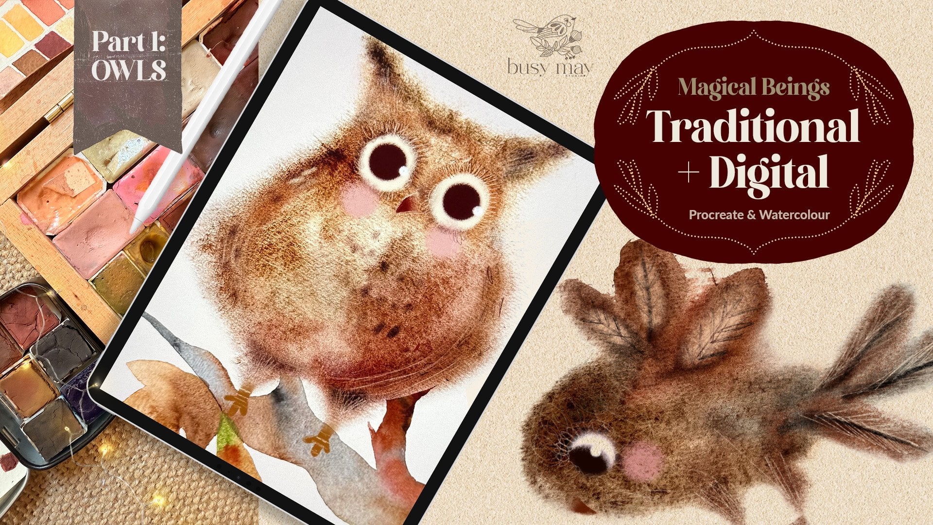
Transcripts
1. Introduction to the Class: Hello, fellow creative. Do you love birds?
As much as I do. I love all things, fairy tale, and whimsical, and my
birds are no exception. I could paint them all day long. And I invite you to
join me today for this class to paint this
cute whimsical bird with me. My name is Irina. I'm a digital and
traditional artist and the designer behind the brand of Busy My studio for this class. You don't need any
particular experience in academic drawing or painting. However, you might need to
know some procreate basics. However, I'm going to talk you through every single
step of our journey, so you may be just
fine following along. In this class, you're going
to learn how to easily sketch a bird stylize
at your own unique way. I'll share my tips and tricks of creating color palettes
for your artwork. And of course, I'll
walk you through every single step of painting. Our whimsical girl, making
it cute and special. Once you've created
your illustration, you'll be able to use it in so many ways in greeting cards, interior objects, or even table linen to impress
your dinner party guests. Sometimes I like to put
my art in the frames like this and hang it
around my house. And sometimes I give it as gifts to the
friends and family. I provide all the resources from brushes and canvases to
color palettes and guides, so you can just focus on
your creative process. I really hope you join
me in this class.
2. Tools Overview: For this class, I'll
be using an ipad. In my case, it's an
ipad Pro 12.9 inch. And it's the sixth generation. I'm going to be
using Apple pencil. It's the second generation
pencil procreate installed in the ipad Brushes
we'll be using in this class are Sm free
essential brushes, which you will be able to find
in the resources section. Under this Dio, there is also a PTF guide how
to install the brushes. However, you don't have to use this brush. These are mine. You can use your own
anyone you prefer. In this class, I'll be
using Autumn Morning Pot. It also comes in the resource section of this class together with
the three other powers, Happy Fog, November Woods,
and Midnight Globe. Also in the resources
for this class, you'll find the PDF guide how to install color
palettes on your ipad, and you procreate no canvases. For this class, I'm providing
two canvases of my own. Again, you can use
your own canvases, your own textures, but I'm going to be showing you
how I use mine. Usually for my art, there will
be two canvases provided. One is called paper bit canvas. And I'm going to show
you the structure. This is my standard canvas
structure for procreate. There is the very top layer on the stack which is
called sketch here. There is textures layer, there is paint here layer. The textures layer is basically the unique feature that makes
this texture the weight. In this case it's paper
texture, it's locked. However, you can unlock it. You can delete some of
the layers if you want, but that's the way I
designed and created it. Paint here layer is underneath
the textures layer, which means that the
textures are going to be applied to this pain here
layer, sketch here layer. I tend to put it on top of all the canvases because I don't need the texture applied. And my sketches don't tend to be part of the main artwork. I use them for guidelines
and then I just switch them off once I don't need them
in terms of the texture. I'm going to show you, this is the paper bit canvas and
I'm going to show you, I'm just going to grab my
essential filler, big brush, and see if I paint. You can see that there is this nice scratchy
texture going on. So to create that, I
use some coconut paper, some organic concreted paper. So you can see that
if I switch it off, it's an digital flat, but switch it back on, it has this nice scratches. That paper canvas
is the one we're going to be using for our
bird today in this class. Same with linen canvas. Same structures.
Catch here on top, linen texture and pin here. Again, I'm going to show you the actual
texture of the paper. So you can see this is
nice fibers going on, switch off, it's a
digital and flat. When I switch it back on, it's like a proper linen canvas. It's up to you which canvas you would like
to use in this class. I'll be using paper beds. Canvas? Yeah, let's move
on to the next chapter.
3. Sketching: Right. In this part
I'm going to show you how to create a
simple sketch of a bird. For this, you don't really need an academic previous
academic drawing classes, or you don't need to
know a bird's anatomy. You just simply need to follow my very
simple instructions. For that, I'm going to
create a new canvas. I'm going to select
the screen size. I wouldn't worry about
any textures right now, which is going to
literally use the canvas. What makes a bird bird? I would say the main feature of any bird is the beak under wing, Which means that
any creature with a beak and the wing is percepted
by our brain as a bird, no matter what shape
or size they are. These creatures, a beak and the wing show us
that it's a bird. Look at the specture, for
example, on the left picture, we can see a creature
with a beak and the wing, we can tell that it's a bird. On the right one, the creature doesn't have any
of these features. No, no wing, which
means it's not a bird. And we're going to be using this knowledge to create
a very simple sketch. And these two things alone
will be enough for us to create a sketch that even a child can tell
that it's a bird. And yeah, I'm going to show you
a couple of examples of my own bird illustration. So you can see that
these are both birds. How do we know that there is a wing there for both
birds and there is a beak? Despite the fact
that these birds are totally different,
they're still bird. Look at this one. This bird
is entirely different. It's a heron, but it's
still the same features. It's got the wing, and thus
we can tell that it's a bird. That applies to
literally any picture of a bird, any image. Even if you remove
the feet from a bird, you might want to
remove those feet, legs for various reasons. For example, if you create a flat illustration, a pattern, a folk type illustration, you don't use sometimes
birds feeds legs. However, the bird has the wing on the beak
and it's a bird. Hope that makes sense. Now we're going to create our own bird. Keeping this knowledge in mind, it's going to be very simple. First of all, I want to
use reference for that. I highly recommend the website
Unsplash.com where you can use royalty free photography of different very
talented people. You don't need to credit those photographers unless
you obviously want to, which would be a
nice thing to do. But legally, you are not obliged to credit
the photographer of an image you're going
to use. It's up to you. You can see that there is
a lot of images there. And we're going to
search for a bird. And let's see what comes up. We see that there are a
lot of birds coming up. There is a Kingfisher there, there is a para type
of a bird, robin. And all kinds of birds with of different shapes and sizes
all have got beaks and wings. And I think we're
going to be using this cute robin because
it's quite a generic shape. Robin, sparrows, Blutts, different mini types of
garden birds have this shape. I'm going to copy this image
and I'm going to go back to procreate to the canvas
we've created for our sketch. And I'm going to swipe three fingers and I'm going to paste my image of my Robin. Allow paste to my canvas. What's important to say right
now is that I'm not, I see. I'm going to reduce,
I'm not going to trace this image because it's somebody
else's photography. It's somebody else's piece and we don't want to create
a realistic bird. We're going to create
a whimsical bird. We're going to alter
a shape and size. However, we're going to be using this bird for just simply mapping the guidelines
for our sketch, which we're going to
stylize going forward. No tracing, we're
just going to be using simple shape mapping. I've reduced capacity
of this photograph by 50 or even maybe
make a 30% capacity. It's just still visible there, so I can use it as guidelines. I'm going to create a
new layer on top of it. I'm going to take the essential sketch brush from the brush set
provided with this class. And the color I'm
going to use is, it doesn't really matter
at this stage what color, but I'm going to try and
use some darker color, so it's a visible sketch
on the white background. So I'm just going to go
to our color palette, which is autumn morning
and I'm going to take this like dark mulberry burgundy
color from my sketch. Yeah, that's fine. What
I'm going to do now, you can see literally any
object consists of shapes. Any object can be broken down
into very simple shapes, including this cute Robin. I can see that there is a shape for the
head which is like a circle or a squished circle a bit depending on the bird. This triangular, angular type of shape for the wing like oval, again elliptical
shape for the body. Again, triangular
shape for the beak, circle for the eye, rectangle for the tail, and little sticks for the legs. That's pretty much it. Our sketch is almost radio. Yeah, I'm going to delete
this photograph so we don't need it anymore because we mapped the main shapes already. If you show this
picture to a child, they will immediately
say that it's a bird. If you don't believe me,
just try and check it, because it's got a
wing and a beak. Yeah, that's obviously
not a finished sketch, it's more like a draft. I'm going to reduce
the capacity of this layer to around 2020, 2% And what I'm
going to do next, I'm going to create a
new layer on top of it. I'm going to
increase the size of this brush so it's thicker. And I'm going to
join these lines together with smoother,
smoother sketch lines. See? Yeah, Bird's head and body
is usually one piece. I'm not going to separate them, but I'm just going to do this organic shape,
this type time. I'm going to join
these lines together. The beak is obviously
going to stay a little bit angular because that's
how we want it. The base of the wing, I'm just going to round
the shape a little bit. Again, I'm not being too
precious, don't worry, because we're going to alter
the sketch yet again in the next part when we're
going to stylize our bird. But on this stage, we just need to create
some basic basis for our next work, the legs. I'll just keep them as sticks. I'm going to add
this little feet. Cute little feet.
As you can see, absolutely no anatomy
added to this bird. And at this stage, by the way, you can leave your skitch
as it is because it's pretty much a ready skitch
for your next step. When we start painting
and mapping with color, I usually stylize my birds. I like bringing them
a farther away as from a realistic
shape and features. I'm going to make the whimsical, more folk style, more
fairytale birds. That's why in the next
class I'm going to alter the shape of this bird and I'm
going to show you how. See you in the next part.
4. Stylizing Part 1: In this part, we're going
to stylize our sketch, and first of all, let's find
out what stylized means. According to Oxford Dictionary, stylized means depicted or treated in a mannered
and non realistic style. That's exactly what it is. Very often artists understand stylized as the
opposite of realistic. I'm going to show
you some examples of realistic bird illustrations. For example, this are tiny
books, Scottish birds. You can see that there are a lot of little illustrations,
bird illustrations there. They are realistic, yet they
are still illustrations. Meaning they're not photographs, but every bird represented
in a very detailed yes, You can see that the
sandpiper and the sea gull, for example, every
detail is observed, all the proportions are
correctly anatomically observed. This is the realistic
illustrations. Another example of
realistic illustrations is the big
encyclopedia of birds. I love it because it reaches all possible birds of the world. Here you can see that
these illustrations, these drawings are
super realistic. You can see very
detailed feathers. You can see that the anatomy of every bird is very
accurately observed. You can tell which
bird is which, whether it's a duck or parrot
or some other type of bird. This is the opposite.
This is a book of Matul about English garden bird. This bird is stylized. You can tell because
the head is huge, the body is quite small in
comparison with the head. The eye is big, the
legs are bandy. This can be further
from realistic. Literally, every
illustration in this book is a stylized bird with big kids. Another book of birds
of the same author, again, hugely stylized bird with a beak in the wing
and little legs. However, it's not a realistic, but you can't even see a
single feather on these birds. The roof here, yeah, stylized, is also
a signature thing of the artist's illustration, the way you stylize birds. Stylize your
illustrations, sorry, not just birds, makes
you recognizable. You see for example,
these birds, there are no feathers there. However, there is the wing, there is the beak, and there
is some pattern overlay. The stylization is amazing, and you can immediately tell that this is the illustrator. This is the signature
style of this illustrator. For example, if you open
another collage of birds, you can see those birds
don't even have a wing yet. Somehow we can tell
that these are birds. They are hugely stylized. Now we're going to try
and stylize our own bird. Now let's move on to stylizing our sketch that
we've done previously. As I said before, feel free to use it
as it is because I think that quite suits the
purpose. It's quite cute. But I suggest that we try
different ways of stylizing. And the first one, the
easiest one I'm going to suggest is simplifying
our bird shape. Yeah, you would argue that
it's already pretty simple. There is no like anatomy
as we determined, there is a noval shape for the body and triangular shapes
for the beak and the wing. However, I do feel that there is a way to
simplify it even further. For that, I'm going to create a new layer on top
of our sketch layer. And I'm going to
reduce the capacity of the sketch by 20% Perhaps
on the new layer, using the essential
sketch brush and that same brownish
burgundy mulberry color, I'm going to combine
the bird's body and the tail in one piece because at the moment
they are like separate. Not going to try too hard. Just join them together like
even fish shape. That's it. That's pretty much all I
can do to simplify it. I'm just going to simply
outline the shape of the wing. Little triangle for the beak and little circle for the eye. Look, when I switch off
the previous sketch layer, you can see you
can also go ahead and erase the lines
that you don't need. However, at this stage
it's not important at all. And same little sticks for
the legs. And that's it. That's your bird
simplified again, if you like this type of sketch, go ahead and use
it for coloring. And yeah, the simplify folk
type bird simplifying is just one way of stylizing
your character, your sketch. Other ways of
stylizing is altering the size of different
parts of the character. In our case, it's a bird. We can change the
size of its wing, the head, the body. I'm going to grab. I'm
going to show you. I'm going to grab
the select to make sure that free hand is selected. I'm going to select
the bird's head. Then I'm going to
grab the move tool. I'm going to increase the size. I'm going to grab the distort, just to join the lines together. However, that's not
the point right now. Like I'm not trying to create a perfect sketch. I'm
just going to show you. You see the lines don't meet, but don't worry about
that at this stage. I'm going to do the
same thing with the, with the select tool and
uniform function chosen. I'm going to increase. Here you go. So you see the head is bigger,
the eye is bigger. And because babies have
bigger heads, and yes, we automatically
percept this character, cute like a baby bird. Let's try and make
the head smaller. Another way of stylizing, because you can alter
the size not only into bigger scale
but also smaller. Yeah, that's another
character looking absolutely different from our previous baby
bird type thing. Stylized has its own character. I'm going to reduce the size of the wing as well,
just to make a point. So you can see that
the body is now oversized and the
head the small, and the wing is tiny. Let's try and make
the bird's head like really exaggerated
As we know. The bigger the head and
the eyes are the cutter, the character is because
it looks like a baby. I'm going to increase the
size of the wing as well. I'm just going to sketch the missing lines just to bring it all
together a little bit. That's pretty much
my characters. Like the stylization
I use for my birds, I think it's something similar we're going to
be using in this class. Also, you can experiment
with different techniques. See how altering the size of the beak makes it even cutter. See, the bird is quite puffy, but the beak is so small. But if you increase
the size of the beak, it immediately makes the
bird look more exotic. Because for our brain, we percept Toucan, for example, and Flamingo as
some exotic birds. Yeah, I quite like this
type of beak for my bird. This is quite cute. So I'm just going to
add a few lines to make it slightly more finished. And the eyes probably, I'm going to increase the size
of the eye About the eye. I'll talk about it slightly later in one of the next parts, but have a look like
our transition. We made different types of the birds with smaller
head. With bigger head. You can still stick to our
initial sketch if you want, but I also encourage you to
try and sketch your own bird. Find the style that
appeals to you. Find the style that you
find really reflecting your own signature style
as an illustrator. Now I'm just going
to sit a bird. I know the look we're
going to go for. I'm just going to quickly
skitch bird shape. See how I start with
simple shapes again, circle for the head. I'm just going to
sketch the bird's body because I quite like
this fish type shape. I also like to see the
head is quite big, the body is quite
small in comparison, because I want my bird
to be extra cuted. I'm adding like triangular
shape for the tail. Now I'm going to add the wing. See, I'm not worried. Too much way to place the wing because we don't
observe any anatomy. I'm going to create
quite a large beak. Not too large. Not too
small, I would say. I'm going to put this
little leg to my body. This tiny little
feet on the eye. Usually I give my characters
this like oval shape eyes, like cheeky looking eyes, almost human type eyes. All the birds and
animals and people, they all have the same
type of eyes in my art. Now I'm going to erase the
lines that I do not need. But again, remember
it's just a sketch. It's just guidelines. And it's not going to be part
of our main illustration. Yeah, I'm just going to
do some alternations using the select tool
and the free hand. I'm just going to make
a little adjustments. I want the head to
be just slightly bit smaller and looking
a little bit up. I think I'm going to shift the wing a
little bit up as well, just so it's pointing down
down probably better. And make it a little bit bigger? Yeah. Yeah. Quite
happy with that. I'm going to change the
position of the eye slightly just to make
it extra cheeky. Yeah, That's my final sketch. This is the sketch
I'm going to be using color for our illustration. This is P to color in, but we're also going to add a little bit more elements to make the
illustration complete.
5. Stylizing Part 2: I think that to make the
illustration complete, some decorative elements
need to be added. Again, this step is
completely optional. What can be added to our birds? I'd say we can add some flowers, one flower or another flower. Our bird is, I would say, more on a side as
well as whimsical. The flowers I
suggest that we use are also on more whimsical side. There is definitely nothing
realistic going to be in the flowers in our picture
or other botanicals. However, if you're struggling to come up with your own ideas, you can find a file in the
resources section where I've combined the
different flowers and botanicals that you
can use in your art. For this bird, I think
what we can do like, I suggest very simple shapes, like the simple shape
for our character. Same simple shapes
I suggest that we use for botanicals
and flowers. For example, the flower
I'm going to use, I'm going to create this oval. I think I'm going to use like blue bell type flowers
for this illustration. I'm going to create
this unfinished oval. I'm going to put some like
the spiky type things on top. It's like a combination
of blue bell, gooseberry thistle,
that type of a bird, or maybe even some fruit. Second type, I'm going
to leaves again. I'm going to keep it
as simple as possible. You definitely don't want your botanicals to
be more complex than your character because
your character is the center of your illustration. Leaves are even simpler. It is like the basic shapes
of the leaves I usually use. Again, feel free to use my file where I combine different
types of leaves. You can use, Yeah, the leaves I'm going to use in our illustration are going to be like a little bit
of on various angles. I'm going to create this vein first looking down
slightly around this vein, I'm just going to make this squiggly line representing leaf. Looking down a little bit, maybe even a little
bit faded leaf. I'm going to put those leaves around my bird just
to complement it. Another type, again, I start
with the vein in the middle. This leaf will be looking up. See, It's pointing
up a little bit. I'm just literally drawing squiggly line around
like see this. There is no observation
of bird anatomy, neither there is observation of botanicals, anatomy,
and structure. Here's the flowers I'm
going to be using, Here are the leaves I'm going to be creating
together with my bird. But you choose your
own type of leaves. You can choose simpler
type, no problem. I'm also going to use
this little twigs just to complement the variation of
different sizes and shapes. The more sizes and shapes you
put in your illustration, the more interesting
it might look. The third type of
elements to add to your illustration is
decorative element. That's the way I call them, it's all of botanicals and
nature elements like twigs, leaves, blades of grass. You see literally feel free, free hand type thing.
You just go like that. You create a stick, you create long, elongated
leaves around it. Or you can draw like a
folk type of the leaf. I don't even know what it
is in real life, in nature. But that's what I tend to add
to my illustrations a lot, especially when I use
traditional media. I tend to add them in ink
and sometimes even marker. Yeah, that's the three elements we're going to be
combining in our bird. What I'm going to
do, I'm going to switch on our bird cage, because we need it for
arranging our composition. On the new layer, on the new empty layer
underneath the bird. I'm going to create
the first flower, this blue bell type flower. Don't worry about positioning of the flower because it's going
to be on the new layer. We can reposition it
the way we want going forward and even change its
size and shape if you will. I'm just going to create
this unfinished oval, add these little spikes on
top of the feel like you see. I'm trying to play around with the size to see what's
going to look best. If it's too big, You don't want it to overpower
your main character, which is in the center
of your illustration, which is the bird. I'm sticking to the medium size. Now I'm going to duplicate
the flower layer. I'm going to create
the identical flower. And I'm just going
to position it in the bottom of the bird
just to balance it. It looks like the bird
is sitting and there is this flower behind it. Yeah, quite like that. Quite happy with
that. Now, I'm going to add the sketches
of the leaves. You add the middle part. This leaf is going
to be looking up. I've added the middle vein and
I'm just going to put like three hand squiggly line
about around the vein. The leaf looks like it's looking up because it's
on the new layer. I can reposition it, I can change the size of it. So I decided to make
it slightly bigger. I'm going to create a new
layer and create another leaf. It's not going to be identical, that's why I'm not
duplicating it. I'm just creating a new one on the next layer to balance
the composition nicely. Yeah, I'm just going make sure that everything is
a nice balance. I'm going to create
this type of the leaf, you see like simple shapes. I just felt like I want to complement that big leaf on top. So I'm going to create a smaller
leaf looking up as well. I'm going to create a new layer and I'm going to
draw another leaf. This time the leaf
will be looking down. I've created the central
vein of the leaf, and that was not the leaf, That's the twigs I've created. These are the guidelines. Just to make sure to
map the composition, the sketch, I might
add some leaves there. You see I'm going to add this
looking down, leave there, or some other time, I may decide to leave them as sticks sticking up in
different directions. You see in this case, I've
created two leaves together. Yeah, I'm going to create
two leaves here probably. So it's like leafy floral, botanical illustration, botanical elements
around my bird. I've just created
four leaves around. Just to make sure that it's nice and sitting in a nice position. I think I'm just
going to try and reposition this
flower a little bit. Yeah, you see one flower is bigger than the
other, which is fine. The more different shapes and sizes you have in
your illustration, the more interesting it looks, the more whimsical it looks. Once you're happy with
your composition, I encourage you to just
to make sure that it's position exactly in the way you want it to be
around you, bird. Yeah, I think I'm just
going to add a few more as we determine, like decorative elements, I'm going to put a little
bit more like this. Fine looking sticks or twigs or whatever you
prefer to call them. This one, I just think
I'm going to make into this unidentified
eucalyptus type thing because I think it's quite in keeping with this folk
look of this bird. Maybe just a couple of very
simple leaves here and there, small and simple, and this is just like dry type of twigs. I'm going to flatten
the whole composition because I'm quite happy
with the way it looks. I'm not flattening it
together with the bird, I'm just leaving it behind. Not that it matters too much, but I'm just going to erase the lines that are
behind the bird. I've not flattened it
together with the bird. I don't accidentally erase
anything from the birds cage. And the very last, final thing for our sketch. What I feel like I should do, I think I should set my bird, like give my bird some
grounding to stand on. Because at the moment, again, it's up to you. It's fine if you wanted
to leave it like that. It's pretty much finished
sketch, but I just, I'm going to add this branch
to make it look like this. Like my bird is standing or sitting on
top of this tree branch. And all these botanicals
are part of this tree. And I'm just going to make it a little bit
more interesting, not just log but a proper branch with a
twig coming on the side. I'm just going to
switch the botanicals off to properly see
if I'm happy with it. Yeah, I'm quite happy with it. And I'm just going to erase
the lines that I don't need. Yeah, the sketch is pretty
much ready, this leaf. I just need to decide
whether it's going to be behind the branch or in
front of the branch. Depending on which I'm going to take a decision
to erase the lines. See, I decided that the leaf is going to come on the
front of the branch, that's why I'm just
deleting the lines. Deleting the unnecessary
lines can be good so they don't confuse you when
you do your color mapping. And I'm just going to
use the move tool, just the positioning
of the branch. And there we go, the
sketch is ready.
6. Choosing Colours: So picking colors, guys, colors are very important. However, I'll not load you with the information
of color wheels, complimentary colors, et cetera. Instead, I'm going
to show you how to pick colors from
literally anywhere. And you can see now
that's the examples of my own artwork and
the color palette. The main colors
are used for them, which are mixed and diluted. And just to achieve
this color palette, so very often I take
photos of something that attracts my attention that could be in my own house or outside, or check anything with
nice color combinations. I save it in my camera and
then I just put it in my ipad. You can see that
this is a picture I took in my living room, which I thought was lovely, peaceful color
combinations one morning. And I opened the
picture in my ipad, and I'm literally hand picking
the colors from the image, creating this nice palette. I know already that it works, but now I look at it and just making sure it looks
good together. What I do next, I'm
going to create a new palette in the palette
section and procreate again. I'm going to pick, hand pick the colors
and I'm just going to add them to this slots, this little squares for
the color swatches. I always can add
some more colors to make sure that it looks good. I'm constantly collecting
different pictures that I like, the color combinations or
I use traditional media to explore different
color combinations and shades and tones. I even use my own artwork. So you can see right
now that these are my own patterns that I
created some time ago. And very often I just go back to my own artwork to pick up some color for my
future artworks. And I also recommend that you use cuttings
from different magazines. Like, for example, I've
got a subscription of different magazines and it's also handy when
they're seasonal. Like for example, this is a nice autumn palette that
I can get inspiration from. So depending on the
time of the year, different magazines may contain different color
combinations that you could be using for your art. Create a book and Save
Your Cutting Savior inspirations and Ideas. I have my own inspiration. Books where I create collages, where I paint
family photographs, pictures I take myself. And sometimes that's a drawing
of one of my daughters, which I thought was really
nice color combinations. I picked colors from it and
created this illustration. In this class, I've
supplied four, we using auto mooning
color palette, but I've also supplied a three additional
color palettes in case you prefer to use them. Midnight blow, November
woods and Happy folk. These colors, you can easily attach them to your procreate. So now you can see like same artwork and different
color combinations. The ones are provided
with this class. Depending on your mood
and your preference, you can use one of them. But I also strongly
encourage you to explore colors around you trying
different color combinations. And yeah, let's move
to the next one.
7. Preparing Canvas: Our sketch is ready. We are ready to move it to the final textured
canvas from this draft. If you remember,
we created it on a screen size canvas which
is quite small in format. But now we need to transfer it to our
final texture canvas. We will be applying colors to our illustrations
where it's going to be a pretty unrealistic
paper looking. This is the paper beds
canvas I'll be using. As I said before, you can see
the layer structure here, sketch here, layer is on
the very top of the stack. We'll be pasting our sketch
there, or if you wish, you can hand sketch your
own illustration there. Next group. It's the
unique combination of textures that create a
special paper effect. I tend to create myself all
the textures from my artwork. If you open it, you can see that it's locked. You don't accidentally
delete any of it. However, feel free to unlock
it and maybe switch some of the effects of underpin here, layer is underneath because the texture will
be applied on it. So I'm going to quickly
show you what I mean. Again, I'm going to go to
our auto morning palette. I'm going to set it as default because that's the one we'll be using for
our illustration. I'm going to pick this
nice soft orange color. I'm just going to create using the essential filler brush. I'm just go to create
this blob of color. You can see the
paper texture again. It's the paper bits canvas
I'm using for our class. If I switch the texture off, you can see that
it has no effect. It's flat, but when
you switch it to, it brings some color on. You can see this little
white scratches and specks. That's basically what
will make your artwork authentic and unique and
true to life looking. I'm going to try a
different color, which is darker in tone
and you can see that the white scratches
and specs come up even better.
That's without it. And I'm going to switch it
back on to bring them all up. So you can see that
this lovely texture is applied to a color. And that's the layer
we'll be painting on. The layer will be sketching on. We do not need texture
applied in it, It's going to be just
draft lines that we'll be using as guides to
color our bird. You can see like, I'm
going to grab some dark, maybe a brownish color and
I'm just going to scribble. You see the lines are so
thin that it doesn't really matter what texture is there. And as I said, that it's not
a part of the final artwork. That's why I'm
definitely not going to put it underneath
the texture stack. I can easily switch
it off later on. And you can see that
whatever remains underneath will be on
paint here, layer. What I'm going to do next, I'm going to go back
to our sketch file. What I'm going to
do, I'm going to pinch these layers together
because if you remember, we've got our burden botanicals and branch on different layers. I've pinched them,
I'm checking that that's the right
ones I flattened. I'm going to swipe with three
fingers. I'm going to copy. I'm going to go back to my paper bits canvas making sure that I'm
on skitch here layer. I'm going to swipe
three fingers and paste our sketch in our canvas. You can see that the canvas is quite much larger than the
sketch that we've created. It doesn't matter because we'll just take it
and stretch it. We don't need to preserve
the quality of our skitch, as it's only our guidelines. I'm just going to stretch
it to fit our canvas. I often get asked why
the canvas is so big, so you can print it without
the loss of quality. It will look as nice on the
print as it is on the screen. Now our sketch is finally
pasted to our final canvas. I'm going to reduce
the size of it so we can comfortably color
our main shapes. I'm going to make sure
that I'm paint here layer and let's start
mapping the main shapes.
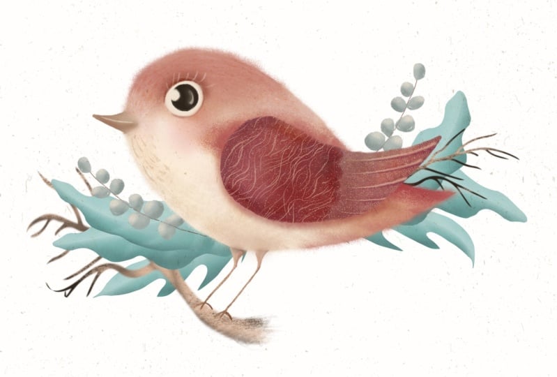
8. Colour Mapping 1: The Body: An our canvas is ready. Our bird cage is sitting comfortably on top
of the layer stack. And we're ready to
start coloring. However, before I
start coloring, I'd like to change the color of my background just
to tone it slightly. For that, I'm opening the
autumn palette and I'm choosing the very first
color in the middle row. And I'm just going
to a make it white. The color is slightly off white. I'm going to show you, this is a printed card with the off white color on the
background for comparison. This is plain white card. The back of this card
you see is plain white. It's basically down to
your personal preference. What background you want to
put your illustration on? I just always prefer to
tone my canvas slightly. I think the colors
stand out nicely. Yeah, I've changed
the background color to the nice of white one. And I'm going to start painting
on the pain here layer, which is underneath
the texture stack. I'm going to choose the
essential filler, big brush. The color I'm going to use is that very first color on the middle row on the
autumn morning palette. I'm going to just to choose the size of about
41% but the capacity should be 100% This is
important because going forward you are laying the foundation for
our illustration. You want the background, the foundation to be
solid in case you want to cut it out to
create or a sticker. It just will make your job
easier to cut it out when the foundation layer solid
on the pane here layer. I'm going to go ahead and
rename it right away to body. Also, I highly recommend naming the parts of your
illustration in accordance with the bird parts because we're going
to be stacking, clipping masks on top of them
and we don't get lost in the abundance of layers with the essential
filler big brush. I'm just going to start
coloring in my bird. There are different
ways, of course, to fill shapes with color, but that's how I prefer
it because it's like replicates a
traditional media way. I'm going to change
the size of the brush, alter the size of the
brush for smaller areas, but capacity will still
remain 100% That's basically, it's as simple as that. I filled my bird's body with this color and
that's going to be the foundation for the
next color things. But I like making
the edges fluffy for my character because
I think that will make our bird
extracute for that. I'm going to use the
essential texturizer brush. I'm going to reduce the size, but capacity is still 100% The
size would be around maybe 20% And I'm just going to go ahead and paint the
edge of the bird. See if I'm too
close to the edge, it's going to be too fluffy. That's why I'm
just staying maybe half an inch away from
the edge and that gives us nice fibers fluff around
the bird's boarding. I'm just going to go round and paint around the
shape I created. Going to reduce the size of
the brush for smaller areas. See like I went outside
the lines there. And just remember that the
sketch is only guidelines. It's not set in stone. You can alter it. Because if you feel like
something needs change, just go ahead and change it. While painting, it happens
to me all the time. You don't need to
stick to the lines. Also, see for example, I would like to
change the shape of my bird's body because I think it's a little
bit too long. So I'm going to grab
the transform tool and using the free transfer, I'm just going to
squash it a little bit. I think that's much better. Yeah, I'm quite happy
with the result. And let's move on
to the next one.
9. Colour Mapping 2: The Rest: We filled the body of our
bird with a color. And see. I've switched the sketch
off to see how it looks and it looks great.
Looks very simple. But that's exactly what we need. Nothing more complex here
through the bodies radio. Now we need to color map, fill with color the
rest of the bird. I suggest that you create a
new layer and name it wing. Let's using the
essential filler, big brush and that purple, heavy purple color which
is in the bottom row, the one before the last one, you just start
feeling the wing with the color exactly
in the same manner, same way as we did with the
body in the previous part. Just as simple as
that. Yeah, it's done. However, I'm not going to make a fluffy edge
around the wing because I find that the more variety you've
got in your illustrations, like different edges,
different textures, colors, mediums, the more interesting
the illustration looks. So in this case,
I'm just going to leave the wing a little bit sharper than the body just to create this texture contrast. Yeah, yeah. Now I'm going to create
a new layer again. I'm going to grab the
essential filler, small brush because feet and
beak are quite much smaller, but I keep the capacity still to 100% I'm going to
rename this layer to be feet because remember
we'll be building up stacking layers on top
of our mean color parts. The color I'm going to choose is the fourth one from the left, in the middle row with the
essential filler, small brush. I'm just going to fill the tiny part with the
color with this color, like this brownish ocher color. Just remember, don't
be too precious. It's digital. You can
always cancel it. You can always easily raise it. The worst thing that can happen is you're
afraid to be creative. You are afraid to paint. Please, please, please feel
free and feel no pressure. That's it. It's, it's
just as simple as that. Now we are ready to move
on to the next part.
10. The Body: So in this part, we're going
to work on our bird's body. Despite the fact that
we filled it with color and we've laid
the foundation for it, there is still some
things to be added. Let's just work on it right now. Yeah, the paper is textured. It obviously gives this natural
effect for our artwork. However, I always look
for different ways to replicate the
traditional media and digital art I
create like brushes. To fulfill this purpose, I would like to do some
color transitions. Because different
colors mix together, they create texture
of their own. I'm just going to add it to make the bird
look more whimsical, more interesting to our
solid color foundation. Let's see for that. Now we're going to
work on the body. I'm going to create a new layer
on top of the body layer. Yeah, I'm not going to
switch the wing off. If you want, you can do it, but I'm just going to
keep the wing because it's in place and it's
not going anywhere. I'm not going to
move it because I'm quite happy with its position. I'm going to create a new layer
on top of the body layer, underneath the wing layer. And I'm going to
create a clipping mask to attach this layer to our color foundation layer using the essential
shader brush. Also, I'm going to increase
the size of the brush. However, I'm going to
reduce the capacity. Unlike the foundation layer, I'm going to be
reducing the capacity of additional layers brushes. The color I'm going to go for is probably the
peachy pink color. I'm just going to try
and see how it looks because the body color is already a little
bit orange, peachy. With very gentle touches and moves of the pencil on the
castionsc can increase the capacity and size a
little bit to make it more visible but still touching
very, very gently. I'm just going to add a little bit of color
here and there. There's no particular order. I'm not trying to do
lights and shades here because I don't tend to do lighting and shading in my art. However, I'm just trying to make the smooth color transition like sometimes granulated
water color have this effect. Yeah, that's why
randomly, here and there, I'm just going to place
different splashes of color. Now I'm going to
try this candy pink one and see how
it's going to look. Just going to also randomly
add different strokes of this gentle effect here and there on the
bird's body and tail. Yeah, I quite like that,
this color transition. So we've got like three
colors going on there. I'm going to show you a little
trick for digital artists. It's only available in digital. I tend to keep my colors
on normal blending mode. However, you can always try and experiment with
different blending modes. For example, see how when you start trying different ones, you can see that
they're all different. Some of them can seem
too much like this one. For example, I'm
not going to use that one because it's
just too bright. This one is, obviously. I'm not going to go for it
either because it's too dark. It just doesn't make much sense there quite like color burn. But I might want to
reduce the capacity a little bit to make this effect a little bit more gentle. Now, staying on the same layer with color burn blending mode, I'm just going to add a little bit more
deeper color because I just felt like a little
bit more contrast is needed. Yeah, I quite happy about that. Next thing I'm going to do, I'm going to create
another blank layer above the body stack. I'm going to create a
clipping mask to attach it and keeping it on
normal blending mode. I'm going to add
some light areas. If you look at my card, you can see that
the bird's breast is lighter than the
rest of the body. Again, it's just a mixture
of different defects. The brush I'm going to use is the essential texturizer brush. You can use the shader as well. Just again, down to a
personal preference. The color I'm going to use is the lightest color of the whole palette
and the middle row, because that's the
effect I'm after. I'm going to increase
the capacity to 100% and increase the size to around
20% With gentle strokes, I'm just going to add this whitish lightish
stain to this area, to the bird's belly and breast. What else I am I do. If you open the classic
view of the palette and just shift the
color a little bit towards the snow white,
pure white color. And increase the brush size, it will add a little
bit, even lighter areas. See, I'm not making it solid. It's like cloud like area and
that's the way I want it to be sometimes just I recommend switching
the sketch layer off to see how it
all comes together. I think it's coming
together really nicely. I can still see this orange
base underneath the birds, the lighter area, that's that. Let's continue layering
our textures on the bird. Again, if you look, I'm going to add a
little bit more details. Despite the fact that there is textured paper and the brushes are quite textured as well, I'm going to add
this little details, imitating feathers on
the bird for that. As always a new layer on top
of the stack clipping mask. The brush I'm going to use
is the essential filler, small brush because it's quite fluffy and it will
make nice feathers. Because it's the
look I'm going for. The color I'm going to use
is the slightest color. Again, in the middle
of the palette. Just with gentle strokes, I'm just going to increase the capacity of the
brush and show you properly the shape
of the strokes. I'm going to go for
something like this. No, perfection, please. I'm going to reduce
capacity again with a little
gentle brush moves. I'm just going to add
those little strokes, imitating feathers
here and there. I'm going to alternate between
the weight of the strokes, the length of the lines. Some are going to
look like scratches, some are going to look
like little spots. The looks like spotted feathers. I'm just going to go
around the bird's head, adding the strokes
here and there, a little bit on the bell, a little bit on the tail. Now I'm going to take a slightly darker color and just add a little
bit of feather, little stroke scratches on
the lighter area of the bird. Yeah, quite like that. Just here and there
in random order. No uniformity. Just don't try to
make it perfect. I might actually use
even darker color. I think the syringe is
going to be quite nice. I'm just going to add a little bit of darker
filers here and there. Again, like the color
sizes of strokes you, the more interest it creates, the more whimsical look you
get about your illustration. I'm going to add a little
bit of orange strokes on the We lighter area. Also a trick, you can use a smudge if you use essential shader which
is great for smudging, you can smudge some of the harsh lines if you're not happy with
the intensity of it. I sometimes use like finger control to
use the smudge tool, just like with a
pencil on the paper. Which is quite nice. Yeah, keep alternating between the brush
tool and the smudge tool. Yeah, keep going. Yeah, happy. Now, I'm going
to move on to the tail. No complicated work
I'm going to do on it. I'm going to just try and
keep it as simple as I can. I'm just going to show you
some examples of my artworks. For example, seeing this birds. In this illustration, the tail was quite
sharp and detailed. In our illustration, it's
going to be quite simple, but you see in this color way, I was happy to leave it as it is without adding any details, which is also the way to
go if you feel like it. But I'm going to show
you how to simply make the tail look a little
bit more interesting. A little bit more whimsical. So after creating a new
layer on the top of the stack and clipping mask and changing the blading
mode to multiply, I'm going to select
my essential filler, small fluffy brush. And the color I'm
going to choose is this brownish orange color. With gentle strokes,
I'm going to make this thick
lines on the tail, imitating long feathers, because we know that the tail
has longer feathers. I probably want to add a
little bit more color. I'm going to try
this candy pink. You see on the multiply mode, it looks at scarlet, which is quite intense. But yeah, I'm quite happy
with the way it looks. It's nice contrast to
the rest of the bird. It makes it look a
little bit more exotic. I encourage you just to try different ways of using colors. Of using blending modes of
trying different brushes. Yeah. Feel free to use different ways of painting feathers and tail, birds, tails. Now I'm going to do, you can see that I don't really use lights and shades in my art. And it's very important to emphasize because I'm trying to be far from academic drawing. However, I feel like adding a little bit of
darker areas here and there just to create this lovely color transition from lighter shade
to darker one. But again, not creating
lights and shades, I don't want to create realistic
bird or a three D bird. It's definitely not the
look I'm going for. You're going to see
what I mean right now. I'm just going to try and experiment and no strict
rules apply to this. I'm going to make a new layer on top of
the lighter layer. That's important. But underneath the
feather textures, the feathers are still visible. We're creating a
new clipping mask. We change the blending
mode to multiply. However, we might change
it later if we are not happy with the way it
looks at the moment. I'm just going to keep it
to multiply the brush I'm going to use as the
essential shader brush. I'm going to reduce
the capacity, reduce the size of it. The color I'm going to use is this heavy lilacy gray color, which is the one before the
last one in the bottom row. With very gentle strokes, I'm going to just
add a little bit of darker shades here and there. For example, on the bird's face, maybe a little bit around
the wing on the bird's back. See like no strict rules apply, I'm just going with the flow. You see like I'm
creating a little bit of a contrast on the
bird's body in case, because the lighter part of the bird's body
sometimes might blend with your canvas if it's very similar in color,
here and there. And basically that's said, let's switch the sketch
layer off and see. Yes, I'm quite happy
with the result. I'm just going to add slightly
darker, very carefully, with this dark mulberry color
with quite low capacity. I'm just going to add a little bit of darker
areas here and there. Again, remember,
not for the sake of lighting and shading
and the realistic look, but for the sake of the
lovely color transition. Imagine if you dilute
water color with water. Some areas will be darker, some areas will be lighter. Or when you use soft pastels, you smudge them
with your finger or with the blender
of certain type. That's basically the look we're
going for here and there. See, this creates a really
nice texture effect achieved by alternating color. Now I'm just going to try and
make sure that the feather texture that stands out too much, I'm not
going to use that. The feather texture is
still visible after we've darkened some of the areas. Sometimes you can experiment
with blending mode. Sometimes I duplicate layer
and reduce the capacity. Just see the look that
works best for you. So I just still want the subtlety of the
feathers to remain. Switch the sketch off and yeah, essentially that's all what I'm going to do with a bird's body. Nothing else ready and done.
11. The Wing: Right, In this part
we're going to work on the bird's wings. We finished the body of
the bird and yeah, look, it's all nice and textured and the colors are
transitioning nicely. Yeah, it's great,
it's looking good. But the wing is flat and boring, which means that we need to do similar work on it to match
the rest of the bird. And there are so many
ways you could paint the wing if you can see like this as
examples of my artwork. I have similarity in my pictures like how
I create the wings. You can definitely see there is a certain way I
do it a little bit like folksh way imitating the shorter feather and
slightly longer ones. But let's start with the color. The color at the
moment is flattish. I'm going to start with adding just some
color transitions. Oh, by the way, I recommend that you combine all the body
layers into one group. I would rename it to Body, just so we don't get confused and we don't get
lost in our layers. And you can even lock it
just in case you don't accidentally push something
or draw on one of the layers. Let's work on the wing now, let's create a new layer on top of our main foundation layer. Let's create a clipping mask. I'm going to keep the
blending mode normal. I'm just going to
add a little bit of color, which in tone, just in depth going to match
the wing just to create a slight gentle transition which might not be obvious
immediately for the eye. However, which will create this nice color transition
effect for that, we've created the new
layer on top of the wing. And the brush I'm going to use is the essential texturizer. With the size increase to 70 something percent and the capacity is
slightly reduced. Just slightly, just enough
for the color to be visible. The color I'm going
to go for is going to be similar to the color of
the wing to the base color. I'm just going to
take this beige one, I'm just going to gently apply. You can see like
there are spots of color with this feathery brush. And I'm just going to try this hot pink color as
well and see how it looks. But remember just to
use it very softly, barely touching the cano. See? I'm switching it off. You can see now it's visible. It's not super obvious. However, you can definitely tell now that this transition
has appeared there, creating the new layer and
making it a clipping mask. I'm going to change the
blending motilinar burn. I'm just going to try that
might change it later. I'm just going to see
how it looks with the same pinkish color,
bright pink color. I'm going to make this
area a little bit more intense color wise, even darker. See, I'm going to take this mulberry color and I'm just going to make the top
of the wing really dark. At first, it seemed to me that it's a little bit too dark, but then I thought
that it's just right. It, it creates
this nice contrast between the bird's
body and the wing. So, I'm just going
to add a little bit, even like the almost
burned therea. We're going to add some details, but I think it's looking really nice already. Nice and textured. I absolutely love this
color transition. Just you see, it's like
it goes from like really, really dark, almost black, this deep brown, moving to this burgundy mulberry color and then transiting to yellowish
brown and then to beige. I think that's really nice. That's exactly what
we're going for. Now let's create some details
on the wing for that, Creating a new layer, making it a clipping mask. I'm going to take the
essential filler, small brush. I'm going to reduce the size
to around 20 and capacity to around 80% The color
I'm going to choose is probably the
very first color in the middle row because I need a lighter strokes to contrast
with the rest of the wing. With again, gentle moves
from left to right. Of course, depending on what
hand you use for drawing, like whatever is
comfortable for you. I'm just going to create
this stripe type strokes, imitating the longer
feathers of the bird's wing. As simple as that,
just adding them, Drawing them like
this, like a little bit like bended shape. Now I'm going to create
another layer and this time setting the
blending mode to multiply. I'm going to use this
magen maroni color. I'm going to reduce capacity
probably slightly more. I'm just going to
repeat the same moves, the same lines right
underneath the lighter stroke. Exactly the same but with a different color
and multiply mode. Maybe just outlining
the wing a little bit. You see how I usually
emphasize that. No need to have the knowledge
of the bird's anatomy. However, in this case, I've decided to adopt for my art this anatomical
structure of the bird's wing, but only once, and I keep
repeating it for all my birds. Basically, the rule is on top you've got
shorter feathers, the underneath you've got
slightly longer feathers and then the longest feathers moving to the point
pointy part of the wing. I've learned it once and now
I apply to all my birds. Again, if you don't do that,
that's absolutely fine. You can put just
a nice flower on your wing and it will
still look nice because remember the beacon the wing makes the bird now with
the same essential filler, small brush on the new layer. On the multiply mode, I'm just going to
create this like second layer of middle
length feathers. And I'm just going to color them in just exactly the same way. If you ever used coloring book
and pencil just like that. I'm not going to color
all the way because I want to keep this nice
transition of colors. That's why I'm going to take
the smudge tool and I'm just going to gently
smudge the edge. I think the essential
texturizer will work best here. Yeah, I've sued the
this harsh transition between the newest layer
and the top of the wing and that's essentially that second layer of
feathers is ready. I'm just going to
maybe make sure that of course you could have
done it all the way around. You could have started with that and then move on to
the longest feathers. It's up to you. That's
just the way I do it. What I'm going to do next
is I'm just going to add a little bit more
texture to the wing. For that, I'm going back to this linear burn layer and I'm going to choose the
essential texture brush. And I'm going to
pick that orange, brown color and begin
with gentle strokes. Remember? Just gentle strokes
everywhere, nothing harsh. I'm add this nice
grainy texture, my wing because it's
just way too light, way too much contrast
in my opinion, I must confess, I usually don't have a certain plan in place. I change things all the time. Sometimes I write things
down and then change them. That's what I
encourage you to do. You have a plan, but if you feel like something
works better, there is just no need to keep
the things set in stone. Just go for a change. Because visually, it can be different from what
you imagine in your head. So now this area
is way too dark. Obviously we need to
do something with that too dark and too flat. That's why on the very top
layer stack of our wing, I'm going to make a new layer and make
it a clipping mask. The brush I'm going to use
is the essential filler, big brush, because I think it
best fits for the purpose. The color I'm going to choose is the very first color in the middle row because
it's quite light, nice. Let's try that's a
little bit too bright, so I'm going to just
reduce the capacity, reduce the size, and
see what I'm doing. I'm creating this imitation of the shortest feather
on top of the wing, but I'm making them in the shape of water drops to fish type, tear drop thing,
petal type shape. Yeah, I'm just arranging
them in certain pattern. I'm not following any strict
pattern, strict rules. I'm just looking where
I can feel you see I'm applying different
pressure to the brush. I'm making them different
shapes and sizes. Shape is essentially the same, but the sizes might
be just slightly different and some of them are a little bit
longer than others, some are rounder and chubbier. And that again, creates this interesting combination of visual elements that make
your art unique and special. Essentially filling
the hole darker areas. With that, you can still see the color transition underneath, but it's already
considerably lighter. Next thing I'm going to do, I'm going to take this
essential sketch brush and on a new layer, again, selecting a
very light color to create a nice contrast. I'm just going to
add a little bit more hand drawn
texture to the wing. For that I'm doing this. Gentle scratches along the
shape of the longest feathers. Very nice and gentle. I'm not trying to make this
obviously visible stripes, but like a little bit of
scratches here and there, just making it a little
bit more texturized. I also feel like I want
to add a little bit of this feather type details
to the lighter feathers. It's the pattern you find
on the leaves as well. Essentially, it's a middle vein with the little veins
going from the center. Yeah, you do it on the simple leaf or
just on the feather. I think it's a
structure similar. I'm going to add it
to every single one. I'm not being too
super precious, I'm not even trying
to stay the lines. I'm just creating, um, a little bit of detailing now, I decided also to add this little dots on the
edge of the medium feather. A little bit of dots on the
longer feathers of the wing. Yeah, that's pretty much ready. I'm going to try and
maybe experiment with blending mode of these details. I'm going to change it to add to bring them a little bit up. There are a little bit more
obvious, quite like that. If you completely want to
embellish your artwork, you can create another layer underneath the lighter
details layer. You can change the plan
de mode to multiply. You can choose, you can select
the essential small brush. And this slightly darker yet bright pink color just
reduce capacity a little bit. And gently color some parts of the shorter feathers
here and there. You don't need to do all of them but a little bit of
a longer feather, it just gives you a work a
little bit better finish. Now I feel that the lighter
details are too sharp, so that's why I reduce
the capacity of them. I definitely don't
want them to be too sharp and that's essentially.
12. The Eye: Now we are close to finalizing our illustration of our
character, which is a bird. The body is ready.
The wing is ready. We just need to
move on to the eye. I'm going to group all the wing layers so we
don't get lost amongst them. I'm going to rename
the group wing and I'm going to
lock it so we don't accidentally change
anything to create the eye. We need, again, solid
layer foundation of color which we're
going to use to build other layers and
textures on top of. We're going to do the following. I'm going to create a new layer and I'm going to choose the
essential filler bake brush, because it's the
most densest brush. I'm going to increase
the capacity to 100% but I'm going to reduce the size to
like under 10% here. Maybe maybe even smaller, maybe 7% I'm going to choose the lightest
color in the palette because that's going to be the main foundation
color layer for our eye. And I'm going to
show you how the eyes I draw for my characters. And I'm also going to show you alternative way to
drawing the eye. First of all, the first step
is I create this oval shape, fish type shape of the eye. That's always the eye I give to all my characters on top of it, I'm going to create
another layer. I'm going to create
a clipping mask. And choosing the darkest
color of, of the palette. Using the essential
filler brush, I'm going to just create this
dark circle for the iris. The other thing I just need
a little bit of highlight. That's essentially,
that's all the basics you need to create for the eye. I'm not even bothered
about clipping mask at this stage
because it's going to be like tiny little
strokes or I can create a clipping mask
depends on your preference. Using the essential filler, small brush, I'm going to
reduce capacity and size. Again, I'm just going to choose the pure white color,
just less opacity. And I'm just going to gently
create this highlight. I use the smudge tool to just smudge a little bit of sharpness and bringing
the opacity right up, I'm going to create this
big mean highlight. That's pretty much it. That's essentially most
of the eye is ready. Now I'm going to show
you how to create another type of a little bit, if I may say that a little
bit more realistic. I'm going to group
all these layers in one and I'm going to
switch this group off. Just to show you the
alternative way of painting, the E, I'm going to create a new layer and the steps
are essentially the same. Using the essential
filler Bic brush, using the lightest
color of the palette, I'm going to create
a foundation layer, but instead of the oval shape, I'm just going to
create a nice circle. Add another layer. I'm going to create the
darkest color of the palette, and I'm just going to create
another circle on top of it. No, I'm just going to create highlights using the
essential filler, small brush, reducing
the capacity going for the pure white color. I'm just going to
create a little bit of a high light and the mean highlight in the
corner, that's the eye. It's a little bit
more realistic. It depends on what look of
your bars you're going for. I'm going to switch
this eye often, switch my type of eye back on. I'm just going to add a
little bit of emphasis to the eye to bring it slightly up on the face just to make it a little
bit more visible. Oh, see, I was going
to create a new layer, but I've run out of layer space because the canvas is so big, I recommend that you do
see how I'm absolutely sure that I'm not
going to change anything about the bird's body. That's why I'm just
going to unlock that group and I'm just
going to flatten it. All these layers
automatically become one. I've created more layer
space for my bird. I'm going to create a new
layer on top of the eye layer. I'm going to change the
blending mode to multiply. I'm using the
essential shade brush with quite small
size and capacity, around 80, 80% I'm going to
choose some darker color. I think this reddish
brown is quite nice with very gentle strokes. I'm just going to work
around the eye just to make a little bit
more darker area. It's not really an upper lid, but it's like hints that
there is an upper lid there. And it casts a little bit of shadow to the white of the eye
and in the bottom as well. But it's basically essentially, it's an outlining of the eye with a darker
color just to make it more homogeneous
with the rest of the bird. That's pretty much it. Sometimes I like giving my characters a little
bit of eyeshadow. In this case, I'm going to be using this dusty pink color, and I'm just going to apply a little bit more tones
to the upper lid, just a little bit on
the lower lid as well. When it comes to the
other type of the eye, which we call it more realistic, the steps are exactly the same, creating a new layer
on top of the eye. Changing the blending
mode to multiply. I'm just going to take that reddish brown color and I'm just going to
work around the eye, creating this darker outline to make it more visible
on the bird's face. Just remember, touch
the canvas very gently so you don't need
like harsh lines. And say you can even add this nice pink color just
to make it more whimsical. Yeah, that's pretty much it. It's done. I'm going to
switch back on to the type of the eye I usually go for
and it's pretty much ready. However I feel like the eye needs just a tiny
bit more definition. I choose this nice berg
in mulberry color, the essential
filler, small brush. I'm going to reduce the
size of it and capacity. Literally staying on the
same multiply layer. I'm going to put a
little bit more like this eyeliner definition to the top lid of the eye just to make it a
little bit more expressive, a little bit more mysterious, a little bit more whimsical. That's all I'm going to do
is just as simple as that, the eye is ready and I'm
not going to overdo it. And I'm going to try and
switch the sketch off, and I can see that our bird is coming together
really, really nicely. See you in the next step.
13. Beak + Feet: Our bird is almost
completely ready and the only thing that we've got to do is the beg and the feed. Because at the moment, obviously they're too
flat and we want to make them in the same style with the rest of
the bird character. What I'm going to do is honestly it's going to be
super simple this time. No hard work at all. Probably the easiest part. I'm just going to get
rid of all this layer, just group them beacon feet. This is our layer where we've
got our color foundation. We're creating a new one on top of it and creating
a clipping mask. The very first thing
we're going to do is just to add a little bit
of darker color to the. I'm not going to
be adding a lot of different color
transitions because these details are quite small. I'm going to take the
essential shader brush. I'm probably some darker color like this, reddish
brownish color. I'm going to reduce the
capacity quite considerably the size with gentle strokes. Just going to add a little bit of darker tone
underneath the beak. Maybe a little bit on top, maybe a little bit around
just to make it not so flat, but because the
details are so small, like I'm not going
to spend a lot of time working on them. I'm just going to
add a little bit of this mix in this dark color
into the bird's feet as well. Just going to maybe
try and change the blending mode to
multiply A quite like that. This brings the darker
color a little bit top with this darker
mulberry color. I'm going to add a little
bit of this burnt age, like if you remember what
we did with the wing. I'm just going to add a
little bit darker emphasis on the beak and the feet, creating a new layer on top
of the stack clipping mask, Keeping it on the
normal blending mode and with the essential
filler, small brush, I'm just going to take
the light beige color and even make it
slightly lighter just to mix in some lighter color to create this nice transition
On top of the beak, just like imagine adding
water to the water color. That's like the
effect I'm going for, added a little bit to the legs. And that's pretty
much it. It's radio. What I'm going to do
now, you see like the beak is a little bit
too fluffy to my liking. This is down to a
personal preference. If you prefer to keep
it fluffy, that's fine. But I'm going to take this
essential sketch brush because it's quite
dense and sharp. I'm going to increase
the size to 100% and the capacity is set to
100% With gentle moves, it looks like I'm
on the wrong layer. Yes, I'm going to go back on the foundation layer
with gentle strokes, barely touching the canvas. I'm just going to clean up the edges of the beak just to make it a
little bit sharper. It creates a nice contrast between the bird's fluffy body. Yeah, I like making
the of my birds just a little bit
sharper all around. Not just the pointy part, but the part that's
attached to the face. Just a little bit of
cleaning up around the feet. No way trying to make
it realistic looking, just keeping the same
illustration stylized look, but just a slightly tidy way. You also see this leg
is behind the body. I'm going to take the essential shader using
the Erasor tool still. And I'm just going to
raise the, oops, too big. Going to reduce the size, keeping the capacity to 100%
I'm just going to raise that sticky parts of
the legs and making it look like the legs are like tucked in this fluffy
body of our bird. That's pretty much it. Almost done, yeah. Quite happy with that. The
final step on the new layer, attach this clipper mask. I'm going to take the
essential sketch brush, choosing this dark
mulberry color, increasing the size a little
bit, and reducing pacity. I'm just going to gently separate the two parts
of the bird's beak. The top from the bottom. And just make a little
bit darker edges to the, just to make it a little
bit more prominent. Because it seemed to me
that it's blended in with the bird's face a
little bit just for fun let texture on the
bird's legs and feet. And that's literally
everything I'm going to do and who our bird is ready. Very well done and see
you in the next step.
14. Finishing Touches: Talk to her. To guys. Well done for coming so far
and our bird is almost ready. Almost 99.9% ready. But I feel like it needs
just a little bit of finishing touches just to give this illustration
whimsical look even more. I'm just going to group
pecan feet, layers. I see like switching
the sketch layer of the bird looks
pretty good for me. Like without sketch
it looks good. It means it's ready. Basically, I'm going
to create a new layer, change the blend
mode to multiply. I'm going to grab essential
texturizer brush. And the color I'm
going to use is this reddish brownish color. I'm going to reduce
the capacity now. I'm going to reduce the size
and increase the capacity. Let's see how it's
going to work. I'm just going to add gently darker touches
here and there. You see on the bird's face. I think it needed a little
bit of darker areas just to give it a little bit more like this fluffy feather
texture look. That's it, I'm not
going to overdo it. Just maybe a little
bit around the wing. You see the step is so subtle that you might just want
to omit it altogether. But I just felt that it needed a little bit of
definition of certain areas. You see, I'm adding a little
bit of darker color to the wing and I'm just going
to reduce the capacity. And the color I'm going to
take is a slight bag color. And the reason I turn to the lighter color is because
I'm just going to add a little bit of darker areas to the spale fluff
of the bird's body, just so it's not too harsh. I don't need like
harsh contrast with the essential fill
of small brush staying on the same
multiply layer. I'm going to select this
lilaky, gray, heathery color. I'm going to reduce
capacity slightly. I'm just going to put the
strokes on the board's tail. It's like this little
details here and there just for no reason really to give it a
little bit more interest, A little bit more finished
look. Yeah, quite like that. Yeah. Now I'm going to create another layer
for lighter details. Oops, I've run out
of layer space. It's time for the wing
group to get flattened. I flattened the wing and I'm going to create a new layer
on normal blending mode. I'm just going to add with
essential texturizer touches. See what I'm going to do here. I'm going to increase the
capacity to 100% and increase the size to almost 100% and I'm going to take
the lightest color. I'm just going to
poke touch with stamps on the bird's wing. See you can see this. Cross
hatch elements added, giving it vintage scratch paper. Look, which I think is amazing. I love this brush
is so versatile. You can do so much with it. I'm not cross hatching, I'm not painting with it though. I could, but I'm not doing that. I'm just making stamps though. It's not stamp brush. I'm just like literally touching
my ipad surface with it. I could have painted. I
could have done that. But I'm just doing this
so you can see properly the defined scratches
on our surface. I'm going to take this
brighter orange color just to add a little bit of like unify all the
elements together. You see I'm adding
this orange touches here and there on the
wing, on the body. Yeah, that's pretty
much it, I think. No rules apply here. Apply those gentle stamp
strokes here and there. Yeah, that's fine. Next thing I'm going to
do a totally down to a personal preference
with essential shade or because I just
know for a fact that it's not to
everyone's taste. I'm going to increase
the capacity to 100% but the size is
going to be really small. I'm going to select
this candy pink color. I'm going to add
the blushy cheek. I do it with almost all my
characters I draw because I like this folk whimsical look it gives to, to my character. Literally everyone,
birds, animals, people. I always put this
pink plushy cheek, usually with a fluffy, with some fluffy brush. In our case, it's the
essential shade brush. I'm going to just experiment with different blending modes. See linear burn, it's just
maybe a little bit too. I'm just going to
reduce capacity. However I do like
the look of it. I'm just going to leave it to
linear burn blending mode. Yeah, quite like that. Almost an gas, a promise. Almost ready this time
with the essential filler. Small brush, increasing
thepacityybe reduce a little bit. Just going to try and experiment
with the lightest color. I'm going to add this strokes on some feathers. I'm going to emphasize the
middle veins of the feathers. Again, it's not a must. It's just up to you whether you want to add
those things or not. But I just felt that
my bird did this. A little bit of a
finishing touches. You see, I'm adding the
lighter lines here and there, Not to every single
feather, just to some. I just decided to follow
along those lines. See I'm doing it at
different areas. This brush, by the way,
is pressure sensitive. The more you press
down on the paper, the thicker the stroke becomes. Also, I'm just going to reduce the capacity right away. Right. I'm just going to add
this little scratches around the bird's eye to
give it even a chekier look. Yeah, I just see like with
gentle scratchy motion. I'm just going to add this barely visible
strokes here and there. I think it just gives
it this fluffy, filthy look that said guys, that's pretty much the
bird is ready to fly. In the next step, I'm
going to show you how to add the botanicals and
decorative elements around it.
15. Flowers: Right guys. Our bird is ready
and as we agreed, we're going to add
some decorative botanical elements around it to make our illustration completely finished and ready to use
wherever you want to use it. In this step, I'm going to add a couple of flowers as
we previously discussed. So first of all I'm going to do, I'm going to create a new layer. So let me grab the
essential filler, big brush, because it's
the most solid one. Let me group the layers first. They are all in one place. We don't get confused. What's important here is that
you can flatten the bird. You can always create a
backup file in case you feel like you want to come
back and change something. I would duplicate the
canvas on the duplicate, I would just flatten
the whole bird. Our bird is in one layer so we don't get confused with
the layers and everything. We can start focusing on
the botanicals around it. So I'm going to create
a new layer and the flowers are going to be
tucked behind this board. But at the moment I'm not
going to worry about that. I'm just going to switch
the bird layer off. And then going forward, I will just arrange the elements the way I want them to be. As I said, the essential filler bag brush and the color I'm going to use is probably
the peachy pink. Yeah. Because I'm just
trying to keep it unified with our main character. I'm going to start
laying down the, the color foundation
with the densest brush. The principle, the algorithm
of painting the flower is going to be pretty much the same as we've painted our bird. However, it's not going to
be as elaborate as that. We don't want the essential
filler, small brush. I'm going to make a
little bit sharper, so the capacity is 100% I've reduced the size a little
bit just to make it a little bit thinner so I
can create the spikes. What I was saying is that
I'm not going to make the botanical elements
too detailed because I don't want the attention
distracted from our bird. However, I don't want them
to be super flat either. That's why I'm
just going to make them a little bit
more interesting. We've done our color layer now on the new layer
created as a clipping mask. I'm going to change the
blending mode to multiply. I'm just going to
see how it works. I'm going to add
darker areas here and there with the
essential shade of brush. The color I'm going to use
is this bright pink color. I'm going to slightly reduce
capacity, increase the size, so I can see this little
specks, speckles and grains. I do want them to be quite visible because it
creates this nice texture. I'm maybe decide going forward
what I'm going to keep, what I'm going to get rid of, I'm going to reduce
the size of the brush. And I'm just going to add a bit. You see darker details, Not quite details but more like darker areas Maybe just defining
the shape of the flower using this vertical lines coming from the spikes
and a little bit of darker shading
color transitioning in the bottom. Quite like that. I think what I'm going to do next is maybe I'll just add a little bit more like
sharper details. I'm going to create a clipping
mask on the new layer and I'm going to change the blending
mode to multiply Again, I'm going to take the
essential filler, small brush. This time the color I'm
going to use is this, like Pinky Maagente color. I'm going to keep
the size relatively small and I'm going to reduce
the capacity of this brush. And I'm just going to add a
little bit of a darker areas. Again, I want to see, I don't want harsh lines. I'm keeping my pencil slightly tilted in relation
to the canvas. I'm just gently cross
hatching some of the areas. There is no principle of what areas exactly to
color to darken. Moreover, my botanicals
are normally nonexistent. What I usually do, I combine different elements from
different flowers and leaves and other wonders of nature in one just to create this whimsical, nonexistent fairytale flowers. This case is not an exception. I'm just adding these lines coming from the spikes
because I just felt like I want to keep this feel and look of
this blue bell shape. And with the lines, I'm defining the shape. Now with gentle scratches, I'm adding these darker
lines along my flowers body. Don't press too
hard, Imagine that, that you're holding a
needle and you're making gentle scratches on the paper
with this type of movement, you just add this darkish
on the other hand. Don't be afraid to make
them a little bit more intense because you can
always remember it's digital. You're not wasting any
expensive art materials. You can always
reduce the capacity. You can always go a
few steps back and redo the strokes or
scratches or whatever. That's why make it a meditative act with the flaw and see
how it works best for you. I'm quite happy with the
way it's coming together. Right now, you see
the anatomy of this flower doesn't make
any sense whatsoever. And that's exactly the
look I'm going for now. I'm going to add
lighter details. I'm creating a new layer with normal blending mode and I'm using the
essential scag brush. It's the finest sharpest
brush in the set. Just undecided a
little bit here. I think I'm going to go
for the lighter color, reduce capacity a
little bit with the same scratchy moves. I'm going to add the
lighter strokes, creating this vintage paper
effect on my flower se, going from the bottom and throwing it on
top a little bit. Now I'm going from the
top to the bottom. Moving from up to down. I suppose it's not a rule. It depends on whether you are right handed or left handed. Whatever is handier for you. Yeah. Again, I'm not too
worried about making them too obvious because I can
always change the capacity. See, I'm just going to reduce
capacity a little bit. You can always experiment
with blending modes. See for example, add
blending mode makes it quite sharp which
is not too bad. You see, I'm going to
grab a smudge tool. I'm going to take the
essential shader brush and I'm just going to smudge this little sharpest edges of the lighter details of the lines because I don't really want it
to look so rough. Yeah, there we go, our
flowers pretty much ready. Now, I'm going to
create one more flower. I could have duplicated, but I want it to be unique. I'm just going to paint it
using the same algorithm, same principle as I used
with the first one. And I'm just going to speed
it up for you a little bit. But feel free to make
this video slower if you want to follow
along step by step by. Yeah. But the process
is exactly the same. That's it. That's both flowers
are finished and I'm just going to drag
the bird layer on top of them so the flowers
are tucked behind it and yeah. Oh.
16. Leaves: Right now that our
flowers are ready. And I was just going to pay your attention a little
bit that I've sharpened the edges a little bit to make a better contrast between
the bird's fluffy body. Just again, to go to for
this variety of textures. And what I highly
recommend that you do is tidy up the loads of
layers of flower pieces. In my case, I'm flattening them because it's
highly unlikely that I would like to go back to them and change something. However you see, now it's flat. You can move it around, you can make a final
decision where to place it. But I'm happy with the position
my flowers are right now. I can move on to drawing leaves, and there will be two types
of leaves, green and pink. And I'm going to start
with green ones. Having created a new layer. Again, like same principle, I'm going to layer with the
essential filler, Big brush. I'm going to create a
foundation of solid color. In this case, the color
I'm going to choose is this gentle sage green color, which matches the
orange quite nicely. I'm just going to fill the
leaf shape with the color. Just paint the whole thing. You can keep changing
the size of the brush to bigger size for larger areas and you can reduce the size
for smaller areas too. Yeah, I'm not going to be too precious because it's
not a mean element. It just like helping element. Now I'm going to take
essential filler, small brush, increasing the capacity to
100% reducing the size. I'm just going to
make the tip of the sleeve slightly sharper and maybe even the edge itself. You know, I like both
fluffy and sharp. So just I suppose it's
just whatever you prefer. In my case, I decided to go for a more sharper look again. Probably because
the bird's body is fluffy and it's
going to overlap. So, yeah, But I'm
quite happy with that. Now I'm going to
add a little bit of color here which is quite
different from green. The color I'm going to
add is this orange color, which I use overall
in my illustration. Because I want all the
elements to be unified, to be brought together using the essential texturizer
brush, reducing the capacity. I'm just going to select some
orange, muted orange color, which is the second
swatch in the middle row. Gently, remember, no harsh
strokes. Very gently. I'm just going to leave this fluffy marks
here and there On the leaf you see like we got this sage green mixed
nicely with orange. Which now creates a nice
composition with the rest of the illustration
creating a new layer. I'm going to clip to the main layer and changing the blending multi multiply, I'm going to select the
essential shade brush with the darkest G til color. I'm randomly going to
add some darker areas. Remember, I'm not trying
to do light shade effect. I'm increasing the capacity
of the brush because I want the grains to be more visible, because it creates
a nice texture. And just randomly, I'm moving
around the leaf surface adding a little bit of darker
shades, colors. You see? I also decided to define the darker areas
where the veins of the leaves going to be in the
next substep in this part. Yeah, I'm quite happy with that. What I'm going to do
now, I'm going to try and apply different
blending modes. I quite like color
burn because it brings this orange
color up a little bit and makes it even more
united with the flowers like they belong to
the same treo plant. Now creating a new layer and
creating the clipping mask. I'm going to use the
essential filler, small brush because I'm going
to create the veins now. Which should I go
for? I'm going to go for the slightest sage color that I used for laying
the foundation. Yeah. Probably increase
the capacity a little bit. To make it more obvious, I'm just going to draw the
central vane of the leaf. See, follow the sketch. Remember how we did the sketch? So it's like a curved line going from the base of
the leaf to the tip. I'm going to reduce the size
of the brush and see gently, just going to pull the color
from the central vein, creating this nice, lovely
little delicate veins. Also pay attention that I'm not using the same line
weight for every single vein. I'm applying more pressure, making the line the
line of the vein. When I ease the pressure off, it creates a more delicate
touch, like barely visible. And it's again about using
different techniques, using different looks
for our elements. And that's what creates
a nice finished, authentic look and illustration. You see I'm moving gently to
the top of the leaf here. That's the skeleton
of the leaf is done, not trying to make it perfect. Imperfection is the
look I'm going for. I'm just going to
emphasize a little bit of the lighter areas using the
essential sketch brush. This time I'm using
the lightest color in the palette which we have been using for
lighter details so far. I'm just outlining,
emphasizing some of the areas, not all of them, because I don't want it to look too uniform. I'm still trying to
preserve this natural, various types of elements. For our illustration, I
just literally touched up a couple of veins and I'm quite happy with the way
the veins look. Let's see a check, That's good. Now I'm going to
create a new layer underneath the skeleton layer, because I'm going to add a little bit more deeper shades of color with the
essential shade of brush. And having changed the
blending mode to linear burn, I'm going to try and experiment
with different colors. I think I'm going to go for
this golden, yellowish green. I think it's going to create a new additional
effect to our leaf. Because the blending mode
is changed to linear burn, it intensifies the depth of the darker shade of
this color, darker tone. You see I'm just moving gently along the central
vein of the leaf, on the other side of the leaf. I think I'm just going to go around the edge
a little bit more. But again, see for yourself
how you prefer it. I'm just basically repeating
the veins pattern. And yes, I'm not going to do
anything else about that. Quite happy. Let's switch our bird on and see how
it all looks together. I think it looks great together. The colors work perfectly. Yeah, I'm going to now create the rest of
the green leaves, but I'm going to speed the
process up for you because the process is going to be exactly the same, step by step. Feel free to slow the video down if you
want to follow along but see you in a moment when
we start painting painklets. Here you go, guys. The
green leaves are ready now. As you can see on our skate, we've got more leaves to
color in here and there. And I didn't color
them the same green just for the reason of mixing up different
colors from the palette. I think this time I'm
going to make them pink. I think there going to sit
nicely in our composition. Let's just try and see
how it's going to work. I would probably recommend flattening the
leaves layers again, because personally I'm not going to change
anything about them. I'm quite happy I'm
going to create a new layer and I'm first
color in this leaf. I'm going to take the
essential filler, pick brush. As always, I'm going to layer the color foundation which
is this bright pink. I think I'm going to go for, I think it will
look nicely next to overlapping that green
leaf next to it. Again, alternating the
size of the brush. I'm just going to color in
the surface of the leaf. That's where we're
going to build up additional layers on top. That's, that's it's done creating a new layer and
turning it into clipping mask. I'm just going to
soften a bit of the color with the
essential shade of brush and choosing the peachy pink red, increasing
the capacity. I'm just going to add this
little yellowish orange, soft texture to it again, for the same reason,
with anything else, to unify it with the rest
of the illustration. This time I'm going to create a new layer and create
a clipping mask, repeating exactly the
same process as before. I'm going to change
the blending mode to multiply with the same brush, essential shade of brush. I'm going to choose
this bright pink color can reduce capacity
a little bit. Again, here and there. I'm going to gently paint
darker areas of the leaf. With broad strokes, I'm mapping where the vein is going to be
going forward, the lighter. In just what I decided on
the spur of the moment, it doesn't need to be like that. It could be just darker
areas here and there. I've created a new layer
clipping mask as always. And selecting the
central small brush, this time I'm going to choose the lightest color
of the palette, again the one that
we use for details. I'm going to create the
central vein to brighter. I'm going to reduce capacity. I'm going to create the
central vein of my pink leaf. I'm going to just pull the little side vines
from the center. Again, with applying
different pressure, I'm making the lines
some lines thicker, some lines almost like
scratches, barely visible. Because I want to
create this effect of different mixture of styles. Now I'm just going to grab
the essential Skagebrush. I'm going to emphasize
not everything, but just some of the veins to make them
a little bit lighter, brighter than the rest I, I'm even adding tiny
ones a little bit more. The final step for the leaf is underneath the skeleton layer. I'm going to create a new layer and change the mode to linear burn with the essential shade
brush color should I use. I think I'm going to go for this maybe brown brownish
type of color. Muted brown. I'm just going to add a
little bit of darkness to the leaf to make it slightly less flat
around the edges. Just a little bit, I did exactly the same thing as
with the green leaves. Just slightly different colors. That's not slightly but
absolutely different colors. But the principle is the same, the process is the same. You can see that I've still got more pink
leaves to color in. I'm going to speed up
the process for you, and I'm just going to
go ahead and color in the rest of the pink leaves.
17. Decorative Elements: So guys, here is our
botanical elements ready. And what I'm going to do now, I'm going to group them
individually, the pink leaves. And I'm going to go
ahead and flatten them, because now I'm going to add the tiny little details
here and there. You can see on our sketch that I've drawn like this
decorative elements around. By the way, if you're struggling to come up with your own, go ahead and use my
document provided for this class with the
ideas of botanical elements. Feel free to use them this time. I'm not going to use any elaborate method
of painting them. It's going to be
super simple just to create even more contrast between the more
complex elements. Let's start with
the very first one, the one on top on a new
layer underneath everything. And I'm not even going to
switch off any of them because these elements are
quite not super important. Choosing the essential
filler, small brush, increasing the capacity to
100% and increasing the size to around 45% color. I'm going to go is something
I'm going to go for, this olive green color. I think it's going to match
the rest of the picture. I'm just going to paint, almost scrabble the leaves here. You see, I'm deliberately not feeling solid color into the, into these details because I
want this hand drawn effect. You see there are a little gaps, the white gaps left
on the leaves. That's deliberate. I've
reduced the size of the brush so I can create
harper tips of the leaves. And that's all I'm going to do. Just scribble,
scribble, that's it. Nothing else with these leaves. Now, I'm moving on
to the next one, and this time is this
Eucalyptus type of the branch. I'm going to use this medium
green teal green color. The technique I'm going
to use is the same as I used for the top elements. Just like freehand central line, look for the stem and this oval shaped
scribbles for the leaves. I'm just trying to preserve the scribble effect because I'm not striving for perfection. If you're familiar with my, you probably know that it's anything but perfection
which is fine. That's the way I like it,
that's the way I love it. You see like this oval shaped leaves a little bit
smaller at the base, a little bit bigger
in the middle. Going smaller again approaching
the top of this branch. And that's it. I'm not going to apply
any color textures or anything because
it's textured enough. Very happy. See another trick for
you for digital artists. Duplicate that branch layer and just drag it
along and position it wherever you think
it belongs best. I'm just going to try and play around the positioning of it. I think I might just
flip it horizontally. Quite like that. I can reduce the size. They will be different though. Nobody's going to guess at
their exactly same elements. You see that the very
last element of God is this type of dry twigs. It's screaming in terms of
color, is screaming to me. The brush I'm going to use
is the essential filler, big brush, because
I want it solid. The color I'm going to use
is this dark mulberry color. Just for the contrast, because everything is
quite orange and warm, I think this one is going
to be darker than the rest. See what I was
going to show you. Essential filler. Big brush
is also pressure sensitive. It's taper brush. The lighter pressure
the line is, the more pressure you apply, the thicker the line gets. That's exactly what we're
going to go for in our twigs. You see started with
thick pressure pressure. That's why the base
is, that's too thick. I'm going to reduce the size, letting it go in the end. Almost like dropping
it from the height. Light light drop drop. See that type of hand move, light light drop that creates this effect of almost
invisible tips of the twigs. I think that's quite
a magic effect, like a magic forest. I'm going to do the same as
with the previous element. I'm going to duplicate it. I'm going to reposition it. Let's see where it belongs best. I like it there in
between those leaves. Yeah, I'm quite happy with that. And our illustration
is almost ready, and all we need to do is to
add the branch underneath. And that's it. See
you in the next step.
18. Branch: That said, friends, we are on the finishing line,
to be honest. Looking at this illustration, I think that if you wish, you could keep it this way
without adding anything more. However, since we've scribbled, sketched that branch at the beginning and
we decided to give our bird a little
bit more foundation. It's just not floating
but sitting on something. I'm just going to paint this brush and I'm just going
to keep it super simple. Nothing complicated for that. All the leaves, I'm going
to create a new layer when I'm going to add the
main color foundation. See it's underneath everything because our leaves are going
to be on top of this branch, Overlapping it with the
essential filler back brush. I'm going to choose the, the beige color is the fourth
swatch in the middle row. I'm just going to
fill our sketch, the branch with this
beige flat color just to create a
color foundation. Color blocking, color mapping, whatever you prefer to call it for the additional layering. See, I've switched the
leaves off just so I can see properly the branch in case I want to
shift it around. Move it around with the
essential texturizer. I'm just going to
add some color, transitioning it's not as flat. I'm just going to make
some orange color just to bring it all together
with the rest of the bud. See, no principle,
no uniformity, no pattern, just little stains
of orange here and there. Then I feel like adding
maybe some other color. We've used olive green on
the top decorative elements. I just feel like maybe adding a little bit on
the branch just to make it slightly
more interesting and at the same time unified with the rest of
the illustration. Again, here in some places
overlapping orange. Yeah, new layer
clipping mask multiply, which means that we're
going to be adding darker areas with
the same brush, the essential texturizer. The color I'm going to
use is this brown color. I'm going to add different dark patches just to create a nice texture
color texture effect. Not observing, not
trying to observe any light and shade rules,
just randomly painting. But just remember to
do it very gently. It's not too harsh, the contrast is not too sharp, everything should
be nice and hazy. In this illustration,
that's pretty much it. The very last probably
thing I want to add is using the
essential sketch brush. I'm just going to add
the scratches using that light bache color just to like not trying too
hard but imitating the texture of wood
texture of a tree branch. Because when you
look at the bark, you can see that there
are lines there. I'm just, with free hand, I'm just scribbling, scratching
those delicate lines. See now I'm hatching here, almost coloring in scribbles. You can do any way you prefer. You see here I'm showing
you different techniques, how you can do it, even
diagonally, little bit. It creates this nice
vintage type texture in keeping with the rest
of our illustration. Yeah, quite happy with that. Now I feel like adding a
little bit darker element. I'm going to go back on my
previous multiply layer, which is underneath
the lighter layer. I'm going to take
this orange, brown, darkish color with the
exactly same pencil moves, I'm going to add darker
strokes, darker scratches. It's the essential sketch
brush we are using. For that, you see like sketching here
and there, scrabbling, making some areas darker
around the edges, around the bird's
feet just to make them a little bit more
visible on the branch. Like literally scribbling, scratching with
gentle hand move. Some strokes are
longer, some shorter. You see, the more
variety you add, the more interesting your
illustration is going to look. Now I feel like maybe, yeah, I've switched
the leaves back. When you see just feeling like creating just slightly more since the leaves
are overlapping, I feel like adding a bit. As for the contrast on
the same multiply layer, I'm going to grab
the essential text and this olive green color. And I'm just going to
darken this piece of wood, the leaf around the place where
the leaf overlaps a leaf. And that's it guys, it's ready. Very well done.
19. Final Thoughts: So guys, thank you so much for following me
along in this class. You've made it so
far and I'm really looking forward to seeing
your birds here on scale. Share or feel free to uplad them on social
media and tag me. I guess my final
thoughts is going to be that don't be
afraid to paint. Digital painting is
amazing because that's definitely allowing you not to be afraid to make a mistake. You can always cancel some
steps or you can start again. You are not wasting any
expensive art materials, so don't be concerned
about that. Feel free, don't be afraid
to experiment with colors, with blending modes
with different things, artistic textures and paint
brushes, just go for it. Yeah. Looking forward to seeing your birds or maybe you come
up with some other ideas. And also since it's my
first class on skillshare, I'm really looking forward
to hearing your opinion. I would greatly appreciate if
you leave me some feedback. And if you also let me
know if you want to see more of my skillshare
classes and the topics, of course of things
you would like to see. Thank you very much.
Follow me on social media. I post regularly on
Instagram and Youtube. I give away a lot of free
tutorials and materials. So I hope to see you
soon again. Bye.
 Irina Young, Busy May Studio