Transcripts
1. Class Introduction: Okay. We all begin our reading journey with many wonderful picture
books from our childhood. But have you ever considered reimagining characters
from your favorite book? Have you thought that more
than one personality type could suit a book character? Hello, lovely people, and
welcome to my new class. My name is Irina. I'm
a UK based artist and illustrator behind the
brand of Busy My Studio. Alice's Adventures
in Wonderland has been one of my favorite
books since I was seven. Its magical world
and its characters have always been an endless
source of inspiration for me. That's why I decided to create a series of
classes where I share how reimagined some of the characters
from this book. In this class, I invite
you to join me on a wonderful adventure of reimagining the dormuse
from Alice's Adventures. We'll explore the
character's personality. Think of ways to modify them, to still fit the story, and I'll share my
illustration tips with you, covering everything
from stylizing and painting a fairy
animal character to using various texture
and pattern brushes to elevate your artwork. I'll be drawing the
dormse and procreate, so I would advise that
this class is for an intermediate level
procreate artist or for a very
ambitious beginner. I hope to inspire you to illustrate the characters
from the books you read or perhaps even to write and
illustrate your own story. If you are ready to embark on the magical journey through Alice's Adventures in
Wonderland with me, grab your iPad, your
pencil, and let's begin.
2. Class Project: For your class project, I would like you to pick a
favorite character of yours, reimagine it, and
illustrate it based on all the things we'll
discuss in this class. Alternatively, if you don't
feel confident enough to have a take on the character of
the book that you read, feel free to illustrate
an imaginary one. Or follow me step
by step through the lessons to
illustrate this dormuse. That could be a great practice before you illustrate a
character of your own. Please make sure you
share your creations by uploading them here so
not only I can admire it, but other students can draw some inspiration
from it as well.
3. Tools & Materials: So for this class, you
will need an iPad, you will need an Apple pencil, and you will need proprit
installed of your iPad. If you want to follow this
tutorial step by step, you will also need the brushes that I provide together
with the class. It's a number of
various brushes. Some fillers, some shaders
and some patterns. So we will be using them in the tutorial and also
called palettes, which you can download. I offer you four
different choices. I will be using the mean one, but you can choose
different ones if you want to be more colorful,
more natural palette. And I will talk about the color going forward a
little bit in more details. I'll also be using an overlay. It's completely optional,
but I love using overlays on my illustrations
because they give this nice papery
effect and later on, I'll tell you how to use it. All these things
you can download in the resources
section of this class.
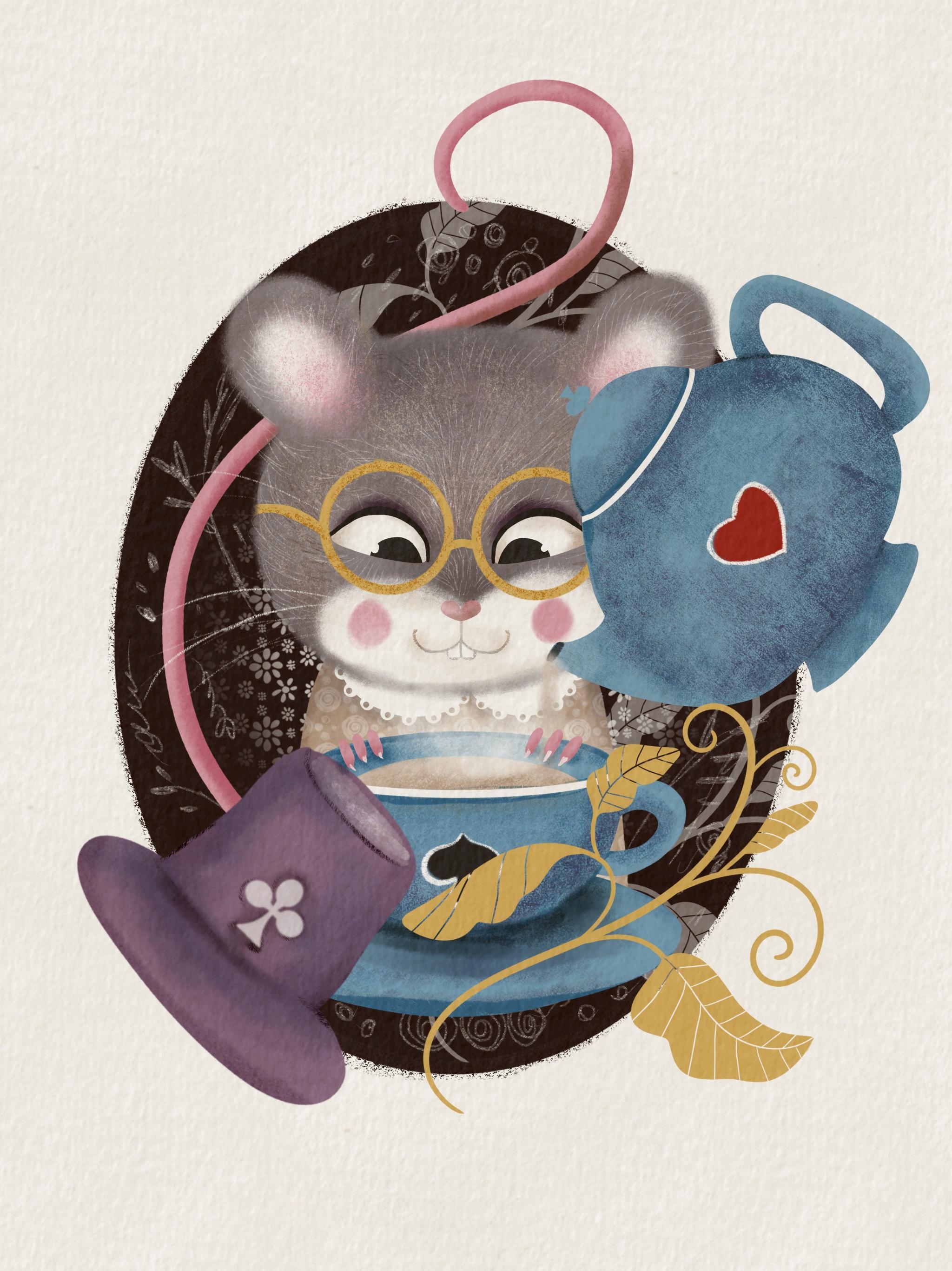
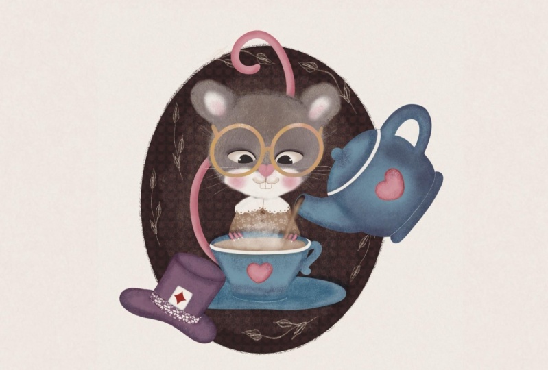
4. The Character: A I have owned numerous illustrated editions of Alice's Adventures in
Wonderland over the years. Some editions I loved
more than others, and a few made me
think about taking a slightly different approach to illustrating
certain characters. I've decided to begin the series with the door
moouse for two reasons. Firstly, as a mouse, a minor character in the story, it's one of the easiest
characters to illustrate. Secondly, this charming,
modest creature deserves our closer attention
and greater emphasis. So how does Louis Carroll
portray the dormouse? From the story, we understand that in Alice's
Adventures in Wonderland, the dormouse is a small, sleepy creature
who spends most of his time dozing at a
Mad hatters tea party. Nestled between the hatter
and the march hare, he occasionally
wakes up to mumble strange remarks or tell
bizarre unfinished stories, such as the tale
of three sisters living in a treacle well. Easily startled, he dislikes loud noises and often retreats back into
slumber mid sentence. His gentle, timid
nature contrasts sharply with the chaotic
energy of his companions, making him an oddly
endearing figure. The dormouse embodies
whimsy absurdity and a dream like
detachment from reality. And in many editions
and illustrations, the character has been
preserved for a while. But then I remember that in
the 2012 film, for example, they portrayed a different
version of the character, a feisty yet rather
loony female dormouse. So I thought, why not
reimagine it a bit and give this cute little creature slightly different
personality traits. But what's also important
to consider, of course, is that our character
needs to resemble a mouse, not a cat or a dog, for example. So let's have a look
at some mice pictures. By the way, if you've done
my whimsical bird class, you may remember how we
discussed drawing a bird, what the mean things to consider to make
sure that the viewer has no doubt that
they are looking at a bird and not a butterfly, for example, and
how to stylize it. So the same principles we'll be using here with
our door mouse. What makes a mouse a mouse? From what we can see, a mouse
is a fluffy furry creature. It's got relatively big ears, it's got black beady eyes. It's got certain
posture and gesture, typical for rodents and gerbils. It's got a long pink tail
and little pink fingers. I think that's the
features we're going to reflect
in our character, plus the newly
developed personality. So I thought my dormouse
will be female, a sweet, good natured old
lady who loves her tea. She's cute and fluffy. She loves sleeping, so her outfit will be a pretty
old fashioned night gown. But she's also excited about any opportunity to have
a nice cup of tea. Keeping in mind all these
things about what a mouse is, and at the same time,
we want our mouse to be the dormouse from the story. Let's make a sketch of
our little character. So for that, I'll be
using the pencil brush, but you can use any brush
you want, any color, really. So I'll just maybe grab something
darker to keep it more. Natural. Let's start
with the head. I've already created
a screen size canvas. At this moment,
it doesn't really matter what format or size. We're just sketching
the character which later on we're going
to elaborate with a color. I'm going to start
with the head, which is going to
be some form of an ellipse and mouse
has good ears. I'm not going to make the ears massive because I
don't want obviously to create a mickey
mouse, just a mouse. And I think I'm going
to draw the body. The body is not going to be very detailed because
it's going to be mostly hidden behind
behind the tea cup, which is going to be
somewhere maybe here. And um, I'll probably put the central line to draw the face and the
eyes of my mouth. The eyes are going
to be a little bit lower because I
want my character to look down at the teacup
which is in front of her, and I think I'm going to give
her the little hardship. Snout and a heart shaped nose. Something like that.
So we know that it's excited about a cup of tea. So I'm gonna make her happy. It's a mouse, so I'm gonna
get a pair of teeth. And, the eyes are probably draw in different
level because I'll probably and, uh it's got to
be looking down. Mm. Duplicate. I think I'm going to give my character because it's
probably a little bit funder. Gonna give my character
some nice glasses. Just a little bit of
old ladish. Look. You can see that
the head is quite considerably larger
than the body. And this is how I make my
character look extra cute. So this is the gown. Gonna put a little color. I go maybe some buttons. So um now let's put a cup
of tea in front of her. Just so make sure
that the eyes are looking the right way. Source and maybe making the cops like me. Pica. And let's maybe let then. Somewhere there. And's holding the cup. Something like that. We might adjust a few things
going forward, but that's basically
the sketch of my mouse, which I'll be using for
my next illustration.
5. Composition and Additional Details: Right, so I've cleaned
up a little bit our sketch and just erased
all the lines I won't need. I might still adjust certain facial features when
I work with a color already. But at the moment, this
is pretty much it. This is our mouse. And the
next thing I'm going to do, I would like to create
a final composition, the one that we're
going to be using. So this is more relevant. So why do we need a composition? As I always say, if you're
more comfortable just to leave your character as
it is, it's great. It's cute enough, especially if you put it on a card,
for example, or something. But in this class, I would like to show you how to make your character
relevant to the book. So in our case, the story is Alice's Adventures
in Wonderland. So we want this character
not to just be a mouse. And not just to be the
mouse who likes tea, but we also want it to be
the dormuse from the story. So we need to show
the viewer that this character somehow is
relevant to the story. So how do we do that?
We've already done a few hints on our
illustration. It's a mouse. It's got a cup of
tea in front of a and what else can we do to make sure that it's the dormuse from Alice's
Adventures in Wonderland. I suggest that maybe we put the teapot because a teapot and the tea set both create
the idea of a tea party. So it's not just going to be a cute mouse
with a cup of tea, but it's going to be some mouse with surrounded by a tea party. Let's quickly put the
sketch of a teapot. We'll dwell on it a
little bit later. That will be our teapot. I'm going to make it
maybe slightly bigger, and I want it to be tipping tipped over
pouring tea in the cup. So this is going to be
tea coming out of it. It's just very, very
rough sketches. I just need it for
my composition. Also, I would like to
put a background behind my character just to
make an indication that it's like a cameo
from Victorian times, which is also a reference to the time when the story was
created by Lewis Carroll. So So I'm going to
that background. So for that, I'm going
to make an ellipse. I'm going to hold it down, and I'll probably, um, I'll probably change
its shape and size because I would like my character to the
whole composition not to be completely inside
of this oval background, las cameo background, but I would like certain
parts to go beyond, which creates this nice
illustrative look. Something like that. Let's erase the lines that we don't
need of this background, something like that,
we'll work on it later. Obviously, and I thought, again, just an idea, how else can we make relevant? If we think about the story, the participants of
that Md tea party is apart from Alice, of course, herself is the dormouse, the march hair and the hatter. The hatter who is
wearing a top hat. I just thought that
maybe I'll put a little top hat
next to the mouse just to make it
again another hint that it's the dormouse
from the story. I'm just going to quickly
sketch to a top half, and I'm just going to play
around with the size of it. And I think I'm just gonna make it that
size just to balance, just to balance the stepot also, when I was creating this, I was debating whether to
put something here. So just in case,
maybe in this class, I'm not going to do that
because I decided probably that I'm more inclined to leave it as it is in terms
of the composition. But I've created
the stamp brush for you with these nice
fairy tale leaves, which you can stamp and just decorate your cameo
with it the way you want. Maybe you want it
to be like this, maybe just a little bit
smaller, see how it goes. But maybe in this class, I might not use it. So finally, what else can make our character
relevant to the story? We've got the tea set
indicating the tea party. It's a mouse, which is probably the dormuse
from the story. It's the hat belonging
to the mad hatter. I thought that what else little decorations
might actually help I thought that some
little decorations, dropping certain hints
of the story might help, and what else can be part of the story of
Alison Wonderland. I thought it could be roses, it could be flamingos, and it could be cards. So that's what I decided
to choose for here. I thought that I will put
a little bit of hints of the cards on the
teapot and the teacup, something like that,
for example, sorry. For example, a spade here and maybe a club here. But again, there is also a pattern brush with different patterns and different elements
we can extract from. I will show it to you
in the next lessons. For now, I would say our composition is
pretty much ready. We've got already
something to work with. In the next lesson,
let's talk about colors.
6. The Colours: Before we start color blocking, I thought I'd explain
my choice of colors in the main palette and see if I can get you on
board with those. The center of my palette
is this dusty blue. It's the color I associate
directly with the story, perhaps Alice's dress from
the old Disney cartoon. Then I've added
some warm gray and some warm beige for the fairy character
of my illustration. For the bright pop of color, I've chosen this red
as a reference to the red roses and
the red card suits, a golden yellow for
various accessories, some pink for the
cute nose, cheeks, and tail, a nice
shade of purple, as this color is directly associated with magic
and fairy tales. For the darkest shades, I'll use the Cami brown and this deep charcoal for the
eyes and the black card suits, and I'll also be using the pure white for
many small details. So in this class, I'll be
using the main palette, but I've also picked a few other palettes
for you in case you prefer to keep it more natural or on the contrary,
a bit crazier. Or feel free to choose
your own colors instead. So we've discussed the colors. As I said, you're welcome to use any other color palette
of your choice, but I'll be using the
one that I called Min. Basically, from now on, our complete final
illustration begins. So this was a draft. So
what I suggest that we do? First of all, let's merge all our pieces together
in our sketch, including the background,
and I'm going to copy it. Next, I'm going to
create a new canvas. Guys, this time, I'm going
to work on the screen size. But if you intend to
print your artwork, please make sure that you
choose a four, for example, or other high resolution artwork so the print
comes out good. I'm going to create
a screen size, and I'm going to swipe three
fingers and I'm going to paste my um sketch. I'm going to
increase the size of it because I would like it to take pretty much
most of the canvas. And this is my sketch. It's not going to be a
part of the final artwork. It's only for the guidelines. That's why I'm just
going to leave it. On top, maybe I'll
change the color to the plenty mode to multiply so I don't see
the white background, but only the pencil. And now I'm going to
put the overlay on top. I've saved my overlay
in the photos, so I'm just going to
add insert a photo. And here is my overlay. I'm just going to adjust it. It's an A four GPC, high resolution GPG size, but I'm going to adjust it to fit my canvas and
I'm immediately going to turn the blending mold to linearar and maybe just tiny bit reduce
the opacity of it. You see it gives me
this nice paper look. I'm also going to
create a new layer and place it directly
between the sketch and the background because I want my mouse with the sketch not to be the part
of the canvas, and I'm going to reduce
the opacity of it, and I'm going to drag
immediately on top of the whole layer stack,
something like this. And I'll be painting
on this new layer. As I said, we're going to
do some color blocking first before we proceed
to proper details, proper textures of
our illustration. For that, I'm going to use the
filler brush for my mouse, I'm going to start with a mouse, so I'm going to use this
grayish blue color. That's pretty much the only
gray part of my character, and now I'm going
to block her body. On the new layer, we will
need each color blocking on the new layer because
we're going to be building other layers
on top of them. For that, I'm going
to use probably this white beach
color for her gown. I'm going to put it underneath. Now, let's color
block the T set. It's gonna be blue. By the way, I'll come back to the T set because I'm going
to paint them separately, and then copy and paste them on my picture so I don't
create too many layers. I'll dwell a little bit more on this t set once it's time
to properly work on it. At the moment, I'm just
blocking the colors. I've decided to make the
hat this nice purple color. The tail will be pink. And finally, I
would like to drop the darker background to make the whole
composition stand out. So on the new layer with
this dark chocolate color, I'm going to create this cameo and I'm just going to
drop darker color on it. Let's make it smaller. S. That's basically the
color blocking done. Why did I do those
color blocking? The reason is that
I need to make sure that my colors work nicely
together with each other, that they interact,
that the tones and shades work well together. I would say, from the
very basic level, I'm quite happy with that. I can work with these
colors further. In the next lesson,
we'll work on the mouse.
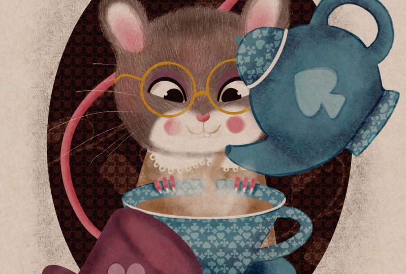
7. The Dormouse Part 1: Right now, we'll be
working on the mouse. It's a very important
part because the mouse the door mouse is in the focal point of
our illustration. It's the main character
of this illustration. So I suggest that we switch the T set off and the hat off, and we'll just
work on the mouse, but we'll keep the background on because we need
to make sure that all the details and colors are working nicely on this backdrop. So let's put the tail
in the very bottom. So let's start with the head. The very first thing I can see, I would like to reshape
the head a little bit because it's kind of like I don't want it to be in
perfect symmetry because otherwise I would have used a
symmetry tool in Procreate, which I'm not a great fan
of drawing characters. I usually like them to be more
organic more true to life. So what I'm going to
do what I usually do. I go to adjustment part of the menu and I'm
going to grab Liquefy two, and I'm going to be making
sure that push option is on, and I'm going to
increase the size a little bit and maybe a
little bit of pressure. And all I'm going to do, I'm just going to adjust the head, so it's a little bit more
symmetrical to the other side. Yeah, quite happy with that. Now I would like to
make my mouse fluffy. For that, I'm going to select the brush from the set that
is called texture fluff. There's also another
brush lay with more texture which you can use, but I'm going to be using this fluff brush with
the same color that I painted that I blocked my
mouse's head on the same layer. I'm going to paint round, I'm going to increase
opacity to 100%. Maybe size to 13, and I'm going to move around my mouse's head to
create this fluffy edge. So that's it. That's my mouse
is nice and fluffy now. And next thing, I'm going to
add a little bit of light a part on the face
and on the ears. For that, I'm going to create a new layer, clip it as a mask, and I'm going to choose pure white colour with
the same fluffy brush. I'm just going to add a little
bit of of the face. Here. Maybe grab the eraser and
using the same texture clove. Brush, I'm just
going to erase. Bit. Now, I'm going to
add a little bit, maybe reduce the
opacity a little bit, and I'm going to add
some white on the ears. Let's work on the
eyes right away. I probably said that before, but I usually do the
eyes first because it immediately gives my
character personality and you feel the immediate
connection with them. Created a new layer.
With a filler brush, I'm just going to create
one eye and I'm going to duplicate it and flip
it horizontally. Next thing, I'm going
to create a pink nose, which is like a simple hardship. And that's the main
features, color blocked, and now I'm going to start
working on color details. So I would like to make
the gray fur of my mouse a little bit more colorful and a little bit more textured because at the moment,
it's too flat. So I'm going to start
with creating a new layer on top of this head layer, but underneath the
white ears and face layer and I'm going to
change the color to multiply. Using same texture
flof brush that I used to create the edge
around the mouse's face, I'm going to grab
the same gray color. I've used for the mean backdrop. I'm going to increase the
size but reduced opacity. I'm just going to add a few darker areas like
shading here and there, probably some here, maybe
on top of the ears, the top of the head. Depends where the
light comes from. I can see the light
coming from the bottom, so I'm going to put a
little bit of shadow to. And I would also like to add some other colors just to make it a little
bit more vibrant. So I'm going to grab
this beige color, which we used for the gown. I'm just going to add a
little bit of color here and there to add some
brownness to my character. Now I would like to add
some lighter areas. I'm going to create a new layer, which will automatically
create a clipping mask. I'm going to keep the
blending mode on normal. And this time, I'm going
to grab the shader brush, and the color I'm going to use is the lighter beige color. I'm going to increase the size, maybe reduce the
opacity a little bit. I'm just going to add a little
bit of lighter texture. Here and there. And it seems to me that
I would like to add a little bit of
pink to the ears. So for that, I'm going to
create a new layer this time on top of the ear
and the face layer. I'm going to clip it as a mask, keeping it on normal
blending mode, I'm going to grab the pink color and
using the same shadow. Brush, I'm just going
to add a little bit of pink or texture fluff brush, which will work fine as well, just a little bit Pink. All right. And finally, what I would like
to do with the fur, I would like to create a
new clipping, a new layer. It doesn't have to be
clipping mask necessarily. And again, the reference to
my whimsical bird course, if you've done it, you know
what I'm going to do next. I'm going to select
the fur details brush. I'm going to use the
pure white color, reduce opacity a little bit. I'm just going to
add little strokes Imagine how the animal
strokes like fur grows. So I'm going to add a little bit of details here and there. These fur techniques
are super useful. You can use them painting, working on any animal, whether it's a rodent
or a wolf or a lion, or even a bird. This all gives this nice
texture to the fur. And now to add
even more texture, I'm going to create a new layer, turn the blending
mode to multiply, and using either this
gray or this beige color, I'll probably choose
this beige color. I'm just going to
add more strokes of darker color just to
make the fur a little bit more mesy a little
bit more fluffy. Okay. That's the fur idea. Let's switch the sketch off
and see if we are happy. Yes, we are quite
happy with that. And now, the next
thing I'm going to do, I'm going to flatten it, presuming that I'm not going
to be changing anything. And now I'm going to
work on the eyes. So for that, I'm going
to create a new layer. I'm going to grab
the filler brush and I'm going to choose
this dark gray color. Let's see. Maybe the
size quite small. And it has to be on top
of the eyes, of course. So I'm gonna create the
upper lid on the eye. Maybe a little bit thicker here. And I'm gonna duplicate it. Flip it horizontally and
bring it to the side. I'm also going to maybe
flatten it together, and I'm going to
create a new layer, change the blending
mold to multiply, and I'm going to grab the
texture love brush again, maybe this, this purple color, and I'm just going
to add a little bit of color above above the eyes, almost like eye shadows
because it's a lady. And let's switch the sketch off. I'm going to create a new
layer on top of the eyes, create a clipping mask and
turn the blending to multiply, choose this like
maybe beige color. And then I'm just going
to add a little bit of sort of like sheading
in the corners of the eyes and in just to indicate that the
eyes are actually eyeballs, not just some flat eyes. And I'm going to
add a little bit of highlight with the filler brush with a bright white color. I'm just going to
add a little bit of highlights just like that. So that's pretty much Oops. The eyes are radio. I'm going to put them
in the separate group. Now let's switch
the sketch back on. And now I'm going to work
on the nose a little bit. So I'm going to create a
new layer clipping mask. Let's make a sketch opacity, and I'm going to change the
blending mode to multiply, and I'm going to use the shader. And the color I'm going to
use is the same pink color. I'm just going to
add a little bit of shading on this nose
and same with the tail. I'm going to create a new
layer, clipping mask, multiply. Let's use maybe this
texture fluff again, and I'm just going
to add a little bit of shading to the tail. Let's do some on
the notes as well. Something like that. And
now let's finish the face. So I'm going to create a
new layer and I'm going to grab the pencil brush and
with this beige color. I'm going to draw the face. So I'm going to draw
a straight line. And I'm gonna just create
this sort of arch shape. Let's add a little bit of gray. And I'm just going
to duplicate it, and flip it horizontally. So it's nice and
symmetrical on both sides. And I'm going to flatten it, add in the new layer. Let's create some teeth. Very simple, just
a couple of lines. The other one coming
from the middle, let's grab the eraser and let's make the teeth a
little bit more rounded. Something like this. So it's
not too vicious looking. It's not a bad character. So something like
this. And maybe I will add a little bit of
touch of shading on the face. For that, I'll
create a new layer. I'm going to change the
planting multi multiply, and I'm going to
the texture fluff. I'm just going to with
the lighter beige color, I'm going to add a
tiny bit of shading. I'm almost done. Finally, I would like to add
the blushy checks. I'll add a new layer and I'm going to select this
pink color again. I'm just going to add blushy checks with any
brush of your choice. I'm still using the the fluffy texture brush
texture fluff brush. Something like this. And finally, I would like
to add some whiskers maybe on the same layer
with flashy cheeks, I'm going to grab
the pencil brush, the white color, and I'm just going to add whiskers.
8. The Dormouse Part 2: So we've painted the mouse. These little fingers I left for the last moment because they're going to be on top of the cup, which is not ready yet. So right now, I would like
to work on the outfit, which is the night
gown and accessories, which let's start with the gown. I would probably
recommend to put all the head layers into
the separate group. So it's out of the way, and I'm going to flat and I'm
going to flatten the tail. So this is the gown layer. I'm going to create a
new layer on top of it. And the very first, I'm going to clip it as a mask and
the very first thing, I would like to create
this lacy type color. For that, I'm going to
grab the filler brush, the pure white color, and I'm just going
to draw the arches, close them together, and
just fill them with color. But because as I said, it's
going to be lace type, I'm going to add a little
bit of an ornate edge. And using the eraser tool
with the same filler. Brush, I'm gonna just punch tiny holes and the color to make it a little
bit more pretty. And that's it. I'm not going to do anything else with the color, and let's work on the gown. We're not going to
spend too much time in it because most of it is going to be
hidden behind the cup. But now, I would like
to add a new layer. It's going to fall right between the color and then layer, colored layer, and it's going
to be clipped as a mask. And what I would like to do, I would like to add some
pattern to the gown. For that, I've
created two brushes, um dots and daisies. I'm going to be
using probably dots, but you choose
whichever you prefer, and I'm going to use
the bright white color. However, I might just reduce the opacity a little
bit and see how it looks. Probably a little
bit more, I don't want to clash with a color, so something like just a hint. And that's it. Another reference to my other class,
class about patterns, texture, texture magic, I
think texture magic Part one, where I explain how to use
pattern texture brushes. You can change the scale of
this brush of this pattern, make it less slightly bigger, or you can reduce the scale, make it slightly smaller. I'll leave it up to you to decide you can change
the direction, but I'll probably
going to change the direction of mind
or something like this. Yeah, quite like that. The only thing I've got
to do right now is to add a little bit of shading and maybe a couple of
buttons on top. For that, I'll create a new
layer on top of the pattern. It will automatically
clip itself as a mask. I'm going to change the
blending mode to multiply, and I'm going to grab the
maybe painterly brush, and the color I'm going to
choose is this beige color. I'm just going to add a little bit of
shadows on the side, under the color, maybe
grab it and this gray just to unite it a little bit with the rest of
the mouse because it's kind of like purply
gray or something like this. And let's add some buttons. I'll probably use
the feller brush. I'm going to select
the same beiche color, and I'm just going to add a
little bit of detail here. Just like me buttons. I don't know. Should we keep it or maybe we don't need it? Maybe we don't need
it. That's okay. That's pretty much
everything we're going to do for the gown. Now let's maybe put the
gown in separate group, and let's finally add the golden spectacles
to our lady Dormouse. I'm going to create a new layer. With the filler brush, I'm going to choose this
golden yellow color, and I'm just going to do the
duplicating things again. I'm going to create
an ellipse circle. Depends if you want
a perfect circle or you are quite happy
with that type of circle. I think I'll probably do
them quite big glasses, maybe something like that. Or maybe I'll make them a little bit smaller,
maybe something like that. And I'm going to create the sort of thing that
goes behind the ear. I can delete. Maybe using the
texture flove brush, I'm going to de erase the edge of it or
something like this. I'm going to duplicate it. I'm going to flip
it horizontally, and I'm going to put
it on the other eye, maybe even like reckless. I'm going to flatten
them together, and I'm going to put this
middle bit in the middle. Let's add a little bit of you can actually
see this handles. They don't have to be here. I'm just wondering if, um know that they go
behind the ears, but it might be
more beneficial for the illustration to
put them in that way. Just a little bit more
compositionally appealing. Maybe something like
this. Let's add a little bit of shading, clipping mask, multiply, and let's use the hada
with the same gold color. I'm just going to add a
little bit of to the glasses. Something like
that. Let's switch the sketch off and see if we
are happy with our mouse, and I think the mouse
is pretty much ready. Now we can move on to the T set.
9. The Tea Set: This is the part where we're
going to create the T set. So I flattened my mouse because probably I'm not
going to change anything on that and I recommend that
you do it as well so you can avoid the memory or performance
issues of your device. So if you have an opportunity to flatten it, if you're sure, going to change it again, let's just flatten it. So now let's paint
the Tset This time, I'm going to refer you
to my other class, which is called Berry
Summer Tea Party, where I explain in detail
how to draw vessels, teacups, teapots, et cetera. So if you've not seen it, make sure you go
and have a look. But now I'll quickly talk you through how I paint vessels
starting with the cup, and I've switched
the mouse layer off, so we know already
that the colors work. So I'm just going to paint separately the
teapot and the tea set, and I'm going to
arrange them around the mouse according to
our plant composition. So what I'm going to
do, I'm going to create a new layer on top
of the whole stack. The main sketch is switched off, and I'm going to grab
the pencil for sketching the darker some dark color
doesn't really matter. And I'm going to sketch. I'm going to work on
the tea cup right now. Usually, I create my
vessels this way. I start with ellipses depending on what angle you look
at your cup from. So in our case, it's obviously going to
be a little bit from the top and it's going to
be tilted a little bit. And depending on the
shape of my cup, I'm going to create
another ellipse, so that's going to be
the cup and I'm going to join them together
just like that. I usually duplicate it
and flip it horizontally. So it creates a nice nice
ves, nice vessel shape. And now I'm going to
add a handle to my cup. M just like that, nothing more. On the new layer now, I'm going to create
another ellipse, which is going to be the
saucer, something like that. So that's going
to be the saucer. And let's erase the source
of wine. We don't need that. That's our cup of tea. I'm going to erase all the
lines that I don't need. And the same way, I'm going to create the teapot. Somehow turned out to be like a Ginny's lamp. Let's fix it. Maybe more like this. Here is our T set sketch, and now I'm going
to color the cup. I leave this as a sketch. I've created a new layer already see how mouse
layer is hidden, the background is hidden. I've created a new layer
to color the teacup. First of all, I'm going to do I'm going to color block it. I'm going to use
the filler brush. I'm going to use this
nice blue color. I'm just going to Now I'm going to add a
little bit of shading. I'm going to create
a new layout. I'm going to create
a clipping mask, change the blending
mode to multiply, and I'm going to use
the pottery brush. It's going to create
shade and some texture, and I'm going to be
using same blue color. I'm going to reduce the
size maybe to around 30%, and I'm just going to add
a little bit of shading. First of all, here to separate
the cup from the saucer, a little bit on the
bottom of the saucer. Oh. And a little
bit around the cup, just to show the edge and the side. Top of it. Something like that. Now just to mix in
some more colors, I'm going to add a little bit
of purple to the bottom of the cup with the
same pottery push and a little bit on the edges, and maybe just a
tiny bit. Saucer. Now I would like to add a
little bit more decoration, decorative details to my cup. I'm going to create a new
layer, clip it as a mask, and I'm going to
grab the filler, and I'm going to add the white and like rim around the edge. Just as simple as that.
Sing my brush down, I can raise les
that I don't need. And let's add a little
bit of a drink. I'm going to create a new
layer on top of my cup. And I'm going in my case, it's going to be milky, like
English, proper English tea. But if you want, you can make a lemon tea using the yellow. I'm going to use this
as sort light beige. And all I'm going to do, I'm just going to
add a little bit of the sort of
shapes just to show that there is
something in the cup and I might just or I
might use the same layer. I use the shading for the cup. I'll use the pottery brush
and just use a little bit of shading just to make it
less flat. The tea itself. Let's switch the sketch off. I think I would like maybe
to add some edge to the cup. I'm just going to
grab the pencil, the blue color on the
same multiplier layer. I'm just going to put a little bit more
definition around the cup so you can probably tell the cup and the
saucer from each other. I feel like it needs a little
bit more depth, perhaps. Just added a little
bit more shadow Shen ten to the sausa. Right. I think that's it. So now I'm going to put my
cup in a separate group, and I'm going to colour in
the teapot the same way. Here is our T set ready. Now, talking about the
relevance to the story, I thought that they definitely not just need to
become a proper set, though they do look like I
said, because of the colors, but I would also like to add some decorative details
which we talked about in our composition and
additional elements lesson. What I'm going to do I'm
going to flatten the teapot. I'm going to flatten the cup. I would like to keep
them separately because I'm going to
still be moving them, arranging them
around my character. But I would like
to decorate them. I'm going to create
a new layer clipping mask and there are
basically two ways. There is a deck of
cards brush that included in this set and you can you can create a pattern on the cup,
something like that. But I thought that I'll do
slightly different idea. What I decided to do, I decided to drop the
pattern like that. It's another tip for you that
I use a lot as an artist. I would like to extract just one tiny element
from this cup. I would like to extract
the speed sign. So I'm going to grab the select. Oh, sorry, I'm going
to select a pattern. I would like to make it bigger, and I would like to cut
out this spade sign. I'm just going to grab the
free hand selection tool. I'm going to outline it
like that, copy and paste. And that's the element
I'm going to keep. You can try and use
different color. You can try and use the
darker one if you prefer, which in my opinion,
is quite nice as well. Or you can leave it as white. It's up to you what
you would like to do. I would like to put
something here as well, and just using the same pattern, I'm just going to grab and
drag it on top of my teapot and I'll probably
take the love heart. Copy and paste. And maybe I will I will make this love heart
red. Let's see. I think that's quite nice. Yeah, let's make this one dark. And this one red. So this is more Alice
and Wonderland related. You can do other things, of course, with that,
you can, for example, add a lighter outline just to make it slightly
more decorative. I'm not going to dwell too
much on this in this class, but I'll just leave
it up to you to decide because there are
so many things you can do. Obviously, if I properly show
you my whole art process, it wouldn't be enough time
for even the longest class. The different decorative
elements to make it a little bit more finished,
something like that. And I think on top
of the handle, What I'm going to do, I'm
just going to extract, let's say another speed
sign, copy and paste, and this is going to
be let's make it blue, and I'm just going to
turn it around like that. I'm just going to
make it like the top of the teapots handle
the lid thing. And that's pretty much it. I'm going to do the Tset now let's add it
to the character. I'm going to flatten Teapot
and teacup separately, and let's switch our mouse on, and let's switch our
color blocked areas on, and I'm going to reduce
see so we can see it. I'm going to reduce the
size of it so the cup goes here and the teapot goes here. Something like that. Let's
switch this color look enough. The only thing we need to do is just add some tea pouring. Let's create a new layer, and let's use the fluff
brush, beach color. It's like tea pouring
from the teapot, maybe let's also grab the painterly brush using
the pure white color. Let's create the
illusion of the steam. Imagine that our tea being hot. Switch this. Just like that. As I said, you
obviously can work longer on your T set
on all the details, but I'm just giving you
ideas in this class which would be amazing if you
take these ideas further. In the next lesson, let's color the hat.
10. The Top Hat: In this lesson, we're
going to color the hat. So I suggest that we put
our tea set together with the steam and the pouring
liquid into a separate group. And in terms of the hat, the sketching
process is exactly, I'm just going to switch
these layers off, create a new layer, and
grab a pencil darker color. The sketching process
is exactly the same as how you would sketch a vestiti cup teapot because it's also
cylindrical shape. In my case, it's a top hat representing the Md hatters hat, which is quite tall. It's gonna be the same
on top and bottom. I made it exaggeratingly. Tall, taller than
a normal top hat. And the bottom part. And what's erased there. Why so we don't need.
So something like that. Let's switch the
our layers back on. And I kind of like how we put the color block topped
hat, top hat here. And yeah, I think I'm just
going to keep this purple one. I might just make
it a little bit longer. Something like that. Yeah, I'm quite happy. So it's the idea is to
balance the teapot, so you can just play around with the angle and I'm going
to color it exactly the same way that
I've colored using the same principles that
I've colored the T cell. Maybe this time, I will
use the painterly brush. See how I'm mixing it now, the blue color to make sure that we use the
same color shades throughout the whole painting, something like that, let's
put the club sign on it. For that, again, I'm going
to grab the deck of cards. Pata I'm going to draw
a little bit on it, and I'm just going to grab
the free hand too and extract this club symbol. I think I'll keep
it white this time. Something like that, maybe a
little bit reduced opacity so it doesn't too much,
stand out too much. I'm just going to add a
little bit of darker areas. As I said, you can
work as much as long as you want on your
details going forward. But at the moment, I'm just going to leave it like this not to make this
class super long. Yeah, that's basically all
additional elements ready. In the next class, let's add some finishing details to
the rest of our painting.
11. Finishing Touches: Right in this lesson, let's complete our illustration with the rest of the details. And the very first
thing I would like to add is this little fingers, little pause of our mouse. For that, I'm going to
bring the sketch back on. Let's put the hat
in a separate group and maybe flatten the hat. And on the new layer, I'm going to grab
the filler brush and using the pink color. I'm just going to add little fingers holding the
cup. Something like that. Let's switch the sketch off. And let's add a little bit of
white type of longer nails. Something like
that. And let's add a little bit of
shading, clipping mask, multiply texture fluff, and I'm just going to
grab this pink color. Just go to add a
little bit of shading just to make them less flat. And let's maybe add a little
bit of shading behind them because they're on the cup and I'm going to
create a new layer underneath, change the blending
to multiply and with the same flof brush using
this blue color of the cup, I'm just going to add a little
bit of shading like this. That's it. I'm not
going to do anymore. And I think overall, our illustration is ready. It's just a background
that would work on a tiny bit. Again,
it's optional. It's up to you, but I
wanted to make the edge of my cameo a little
bit more textured. So for that, I'm going
to grab the shader. I'm going to take the
same chocolate color that we used for the cameo, and I'm just going to
go around the edge, adding a little bit of
this sort of, like, fluffy edge to it. Again, absolutely
optional button case. You want to Make
it extra special. Extra vintage Victorian. In my opinion, it needs a little bit of maybe
lighter details. That's what I usually do when I create backgrounds like this. I'm going to create a new layer. I'm going to clip it as
a mask to my background, keep it on a normal blending
mode and you can use some some of the patterns,
just stamp them. See a background like this, which is quite cute. You can also clap a mask. You can also use
the detail brush, lighter color, and you can use throw different
botanical elements. That's at least that's
what I usually do. You don't have to do any of it. But I just think it adds this nice finishing touch
to the illustration. Maybe some sort of, like, handrawn texture here and there. In more random little things
that add to this fairy tale. Look. To make the
illustration complete. Yeah, something like
that. And finally, as I mentioned before, I'm not going to do that, but I'm going to show you
what else you can do. You can add the stamp to create some nice additional
detail here if you want. You can choose any color. I tried it in bright red. I thought it worked nicely. So it's up to you or you can use the stamp to put on the
background a lighter color. If you sick quite, for example, something like this, which
also creates some nice detail. I'll leave it up to you to decide whether you
want to use it or not. But, um, that's basically pretty much how
illustration is ready.
12. Final Thoughts: Thank you so much for watching my class. I hope you enjoyed it. I hope I've inspired you to illustrate a character
from your favorite book, and I really hope you'll
join me in the next series of this class of illustrating Alice Adventures
in Wonderland character. Next time, we'll be
painting the White Rabbit. The red Queen Aki the
Queen of Heart and, of course, Alice herself, probably accompanied by
some other character. Hope to see you next
time. Thank you. Bye.
 Irina Young, Busy May Studio