Transcripts
1. Class Introduction: Alice's Adventures in Wonderland
is a favorite story for many reimagined countless times in picture books,
films, and animations. It's magic doesn't
feed with time, inspiring many
illustrators to take a different approach in its
characters personalities. Hello. My name is Irina. I'm an illustrator behind
the brand of Visi Studio, and today I would like to
welcome you to my new class. In this class, I invite you to continue
exploring the story. This time, we will focus
on the white rabbit, another minor
character, yet a very symbolic and full
of personality one. In part one, we
explored the door maps, which I hope you really enjoyed. Thank you so much for sharing
your amazing illustrations. Today, I'll show you how to approach the character
of the white rabbit, we'll look into his
role in the story, build up his overall image, and, of course, we'll illustrate
this curious animal. We'll discuss
sketching the rabbit, creating the entire
composition of objects related to the
story, and, of course, adding some nice colors and decorative elements to
complete the illustration. I'll be drawing the white
rabbit and Procreate, but a substantial
part of this class is information can be applied
to working with any medium, either digital or traditional. I suggest that this class is for a confident procreate user, but if you are an
ambitious beginner, I encourage you to
try nonetheless. I really hope you join me. So grab your iPad,
grab your pencil, and let's continue to the
magic world, the Wonderland.
2. Class Project: For your class project, I would like you to illustrate
a character from a book of your choice using the
techniques from this class, either in Procreate or
using any other medium. Or feel free to follow along
this class step by step, creating your own version
of the White Trap, if you choose to share your illustration
by uploading it in the discussion sections of
Skillshare or on social media. I'll be super grateful as
myself and other students will have a chance to draw more inspiration
from your artwork.
3. Tools & Materials: For today's class,
you'll need an iPad, an Apple pencil, the
dormouse brushes we used for part one, the decorative stamp
and border brushes of Victorian elements, a default procreate brush
before they upgrade, you can find it in
textures Victorian. The dormouse color palette, the shades of white palette, the paper overlay texture from the previous class to keep the illustrations
even more consistent. I've attached all the brushes, palettes and the overlay in the resources section
for this class.
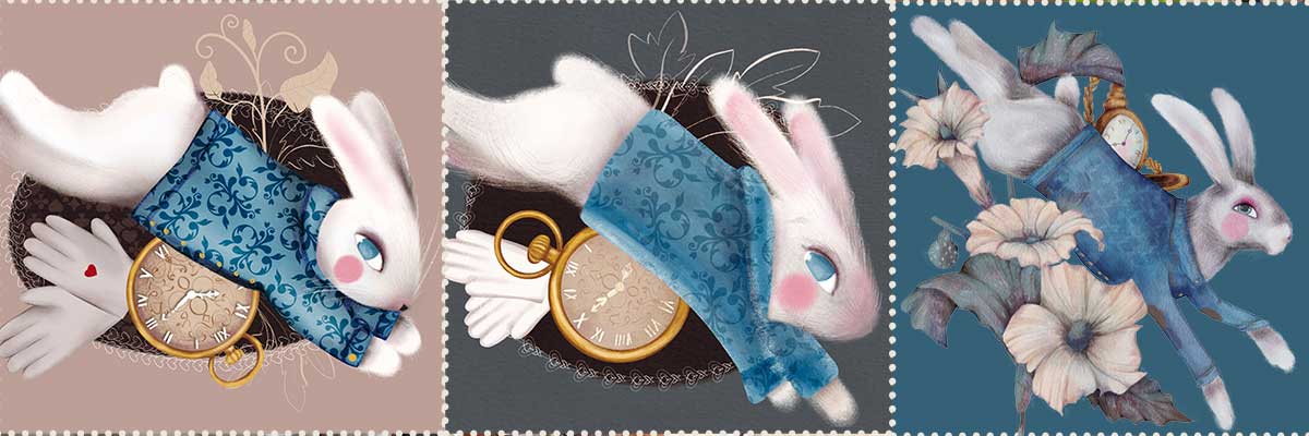
4. Character Overview: The White Rabbit is one of the most iconic figures in Lewis Carroll's Alice's
Adventures in Wonderland. Unlike the self assured Mad Hatter or the
cryptic Cheshire Cat, the White Rabbit is insecure, timid and often
overwhelmed by authority. Visually, he's striking
a talking rabbit dressed in a waistcoat, sometimes carrying a fan, gloves, and his ever
present pocket watch. His anthropomorphic qualities, being closed, speaking English, and serving in courtly rows, create a blend of the
familiar and the surreal. For Alice, the White Rabbit
is more than a character. He is a symbol of wonder
and transformation. Chasing him leads her
down the rabbit hole, the threshold between
her everyday reality and the chaotic dream world. Ultimately, the White
Rabbit is a paradox, both minor and crucial, nervous yet commanding
attention, ordinary yet magical. His hurried presence captures the essence of Carol's
world, strange, whimsical, and driven by the old taking of its
own clockwork logic. So how can we apply all of it into our illustration
of the White Rabbit? Let's create a quick
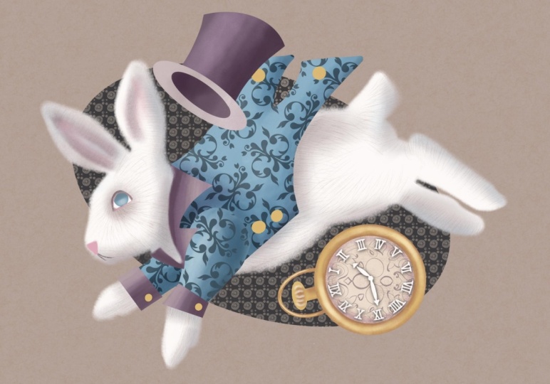
character mood board. So our White Rabbit,
it's a meal. It's always busy,
always on the run, dressed as an English
gentleman of Victorian era, looking smart and official. That's why Victorian
pattern on the jacket. And, of course,
some accessories, a gold pocket watch,
white gloves, maybe a fan, whatever
you feel like related to the story or to the overall
image of our character. And now we are ready to
begin our illustration.
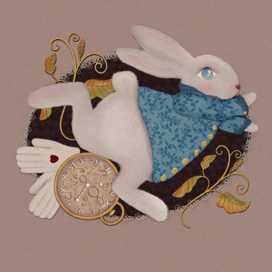
5. Composition: Like in part one of the series, we are going to create a
composition with a character and the center surrounded by symbolic elements
related to the story. We'll begin with the rabbit. There are hundreds
of different ways to draw a character
illustration. Sometimes you want to
illustrate a story line. In this case, illustration
will show the character in action or interacting
with other character. Sometimes you want to feature the character's personality. Very often, it's
the mixture of it. If you look through
a picture book, you'll probably notice that illustrations that show motion, action, and interaction are more interesting and
appealing to the viewer. That's why in this class, I've decided that
my character will be move leaping to
be more precise, as in the story, the white rabbit rarely stops. I'm not going to
focus on anatomy and gesture in this class
for two main reasons. The first reason is, if you'd like to dive
deeper into the subject, there are tons of educational
materials out there. I can recommend the book
that helped me immensely. It's a book by Ken
Halkren The Art of Animal drawing Construction, Action
Analysis, caricature. There are also some great
classes here on Skillshare. For instance, this extensive
animal drawing course by Ava Moradi, 10 hours of lessons pack the super valuable
education information. I left the link down below. The other reason I don't want
to focus on animal anatomy here is that I know from my own experience and from
my students' experience, that when you have a
magical illustration for a storybook and your mind, starting with animal anatomy
can be quite overwhelming. And let's be honest,
can put you off the whole process altogether for some time,
sometimes for good. My goal is to give you
space and tools to actually enjoy the process and admire your results fairly
quickly in the end. Though learning
animals anatomy is beyond any doubt a very
important skill to gain, especially if your style of illustration is more
on the realistic side. In this class, it's not going to be the focus
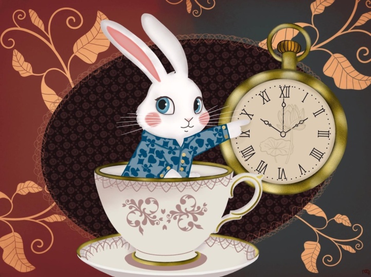
of our attention. For example, this
illustration of the White Rabbit is
definitely more realistic. I made it to
illustrate my set of procret brushes where my goal was to showcase the
brushes abilities to be used in various
illustration style. But in this class, we
will also try and keep the characters from
the same story unified by the same style. Our dormsk is far
from realistic. She's cute, and there's
also some humor going on, and we'll try and keep these elements for the
white rabbit, too. Let's draw the rabbit now. I've gathered a
small collection of photos in a Pinters
board for you. You can find the link
in the description, which you can use as more reference rather
than inspiration. They give you the idea of various motions of
your character. I usually combine features of a few photos in one drawing. So I'm going to start with creating the
screen size canvas. This canvas is for sketching and for
building our composition. And that's why I'm not bothered about the
overlay just yet. For sketching, I'm going to use the pencil from the
collection of the brushes. And I'm going to start with
very, very simple shapes. So it's a jumping
leaping rabbit. So it's important to
put some guidelines. So I think it's just
going to start. It's like jumping in
the middle of the leap. From here to here, kind of, like, from
higher up down. And that's just to mark the
direction of the character. So I'm going to
start with the head. And here higher up
will be the bum. So I'm using simple
shapes as I always do, and I always recommend everybody because
it's so much easier. So this is the head, this
is the bum higher up. And let's make sure that there is a little
leg going in there. And there is the other leg. You can see it like
a little bit behind. And with the head, there will be some long ears. So one ear will be
on the foreground. The other will be
slightly behind. And let's connect the body
and the head together. So this is, like, supposedly
the spine of the rabbit. So the tail will
be somewhere here. And here, I'll have, like, the front legs which
follow the movement. Very simple shape,
something like this. And one slightly behind. And Tommy Let's move
it to little bi head. And let's see. It looks like these
legs are a little bit too short for the body, so I'm going to grab the free
hand and using freeform, I'm just gonna stretch
them a little bit and make maybe the body
a little bit shorter, at the legs a little bit
longer, something like that. And let's do more
more confident lines to connect all of it together. Just gonna press a little
bit harder on my pencil. See, I'm not observing any
anatomy at all whatsoever. The face may be just a
tiny bit of a snout. The eye will be somewhere here. And now, these front paws are a little bit too short,
in my opinion, so I'm just gonna maybe erase them and just make
them a little bit, just a tiny bit longer. Like this. Our rabbit is
not that short pulled. Something like this. I'm
quite happy with that. Let's um sorry. M Let's immediately pop
the jacket on our rabbit. I'm going to create a new layer and maybe using a
different color, why not use this blue
color of our jacket? I'm just gonna make my
pencil slightly thicker. And that's just just to indicate that the
jacket is there. Sneeze. So I think there will
be like some collar detail. There will be probably
some form of cuffs, not gonna dwell too much, but by all means, research
Victorian jacket if you want to be more precise
in the representation. I'm not gonna do that here, so that's the jacket in place. And let's create some objects
around the composition. Again, in my dormouse class, the previous one of the series, I've explained why
it's important to use various objects to illustrate a character to make him
them related to the story, to put these little
anchor points that the character is
connected to the story. So for our rabbit, I suggested that we
use a pocket watch, like a gold pocket watch
because he's a gentleman. And maybe a pair of white gloves because he's
a well dressed gentleman, and maybe we'll put some
decorative elements of Victorian era later on. Let's see. Again, at this stage, I'm not going to spend too much time sketching
the watch and the gloves. At the moment, I just need
really rough sketches to build my composition and
to make sure that I'm happy with those objects
around my character. So I'm going to grab again some neutral and on a new layer, I'm going to sketch the watch. It's up to you what angle you would like to
put your watch, so you can make
them front facing, you can make them
slightly tilted on the side if you are more confident in drawing
three D shapes. In this class, I just
thought that I'd make our job as simple as possible and my watch will
be proper flat front facing. So I'm just going to quickly sketch the
shape of the watch. And let's just make it bigger. So that will be my watch. So I'll dwell on all
those details later, and I can play around deciding
which way to to place it, and seeing that, it
doesn't mean necessarily that I somehow I'm going
to just set it on stone, and it's not going to be
changed going forward. So most probably
I will change it. But I'm just going to play
around with the shape. So just to balance
the composition, I've placed my wash
somewhere here, and on the on the new layer, I'm just going to quickly
sketch a pair of white gloves. Again, nothing, nothing
fancy at the moment, just for the sake
of the composition. And let's put them in
the group together. And also, I can play
around a little bit with the positioning
of the lement. They can I can arrange them like they
are flying behind him, like he's losing them
while leaping again. I'll probably have
a look at it later and maybe just maybe. It's the stage of planning. I might just put a little bit of a
Victorian element here. Look, it's important
to remember. Like for example, I personally, my style of illustrations,
I love collages. I like everything
collage related because it all comes from my love to paper collages
which I create. Sometimes in my sketchbooks, that's why my illustration
style, I rarely first, complete the whole drawing and then color everything
in based on the, like, determined position,
all the elements are. Usually, I create a composition, I make sure I'm more or
less happy with that. And then I color each
element separately, and the situation might
change a little bit. I arrange it in a
collage style the way I prefer it to look in
the final illustration. So I hope it makes sense. But at the moment, I can see there is
nothing really nothing really wrong in
this composition, everything seems to be balanced, especially if I put some sort of a circle or
cameo on the background, which we'll talk about later. So let's just quickly check. This is our white rabbit from Alice's Adventures
in Wonderland. It will be wearing a Hor. He will be wearing a blue jacket with Victorian pattern on it. There will be some
objects flying around him like Victorian style
gold pocket watch. There will be a couple
of white gloves as part of this overall image. And maybe we can mix in some of the elements like playing
card suits. Let's see. Maybe Ooh sorry. Let's just grab a
sketching brush again. Possibly we'll put some like a speed element,
for example, on the glove or yeah,
something like that, just to make him even more
relatable to the story, but that's totally optional. And yeah, I'm quite
happy with that, and now we can move
on to color blocking.
6. Colour Blocking: Right. In this part, we're going to do some
colour blocking to make sure that our colors
work nicely together. So what I've done already, I've created the background, the canvas of the screen size. I've already put the
overlay on top of it, and I'm going to change
the blending mode of the overlay to color burn exactly what we did with
in the mouse class. So I pasted it. It's not a
part of my illustration, so I'm just going to reduce
the opacity a little bit. I'm just going to try and place it somewhere in the middle. And there's a color burn here. And I'm going to create a layer, new layer, place it in between the background and the overlay, the paper texture
overlay because I definitely want the colors
to be reflected through, um, through the overlay. At this stage, it's important to decide what color your
background is going to be, as it will determine
the colors of all the objects of the composition and the main
character in particular, especially when it comes
to the color white. For example, the darker
the background is, the whiter the rabbit can be. And the way around, if the
background is pure white, the white character
will need to be darker Shades of White
to create the contrast. Otherwise, you simply won't see anything or the objects
will look faded, and as a result, the character
will look unconvincing. When I was little,
we had a joke. You bring a sheet of white
paper to appearance and Mom, Dad, look at my drawing. They would naturally
say that there is nothing there to
which you reply, It's a polar bear in the snow. So if you decide that your background is going
to be white light, and you're not sure how to
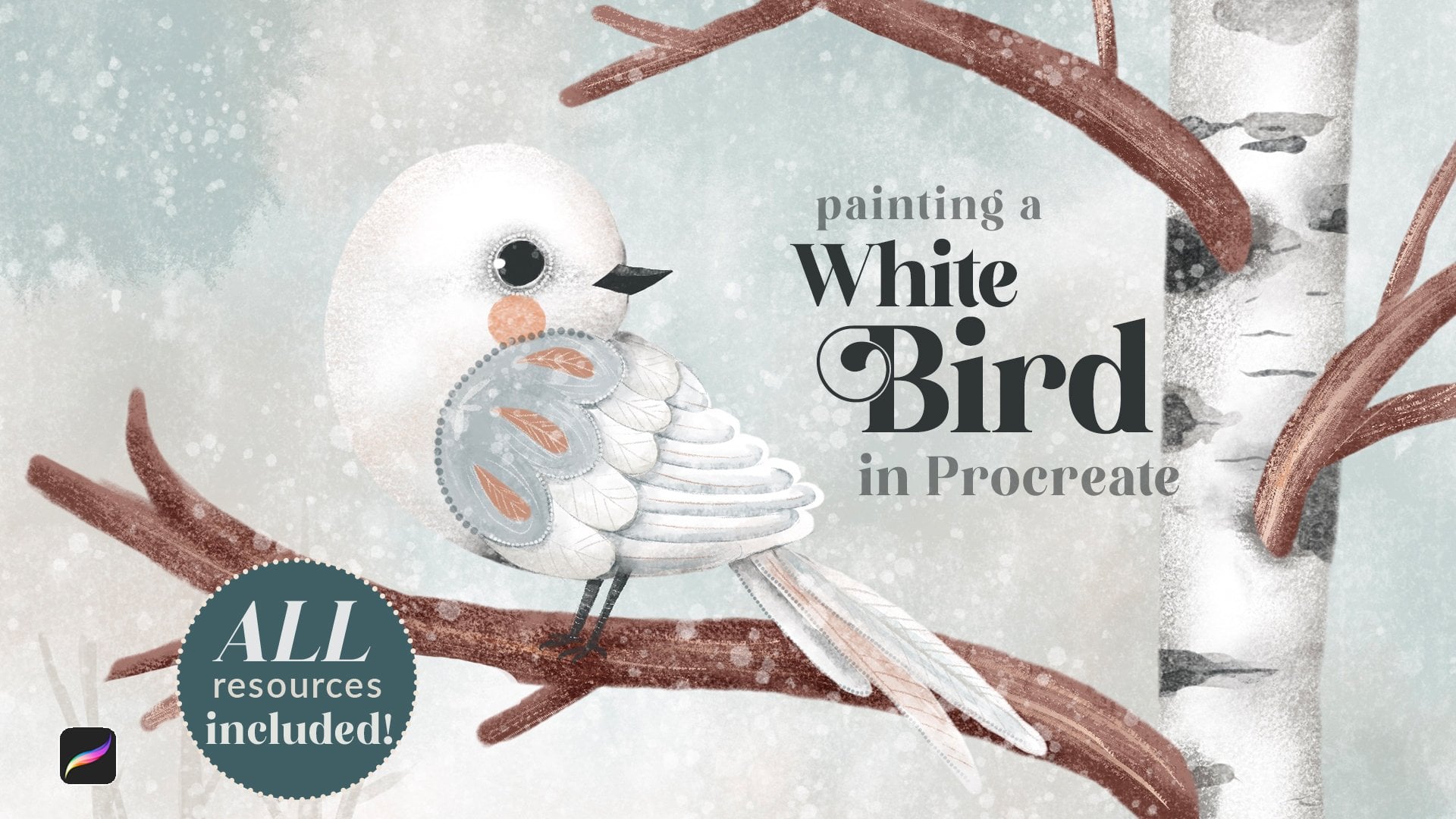
approach your white character, I recommend watching my White
Bird class where I explain in detail how to tackle white objects on
various backgrounds. So in our illustration,
I've decided like, in most of my
illustration, really vast, but majority of them, I'm not going to be using
pure white color. I might not have decided yet which color
I'm going to use, but it's definitely not
going to be pure white. It's going to be
on a darker color, and possibly there will
be darker cana there. So for now, I'm just going to choose this color
as my background. And I'm going to build all my colors on this background to make
sure that they look good. In this case, no matter what tone darker or completely dark I'm
going to use in the end, I know that my objects
will look good. Let's start colour blocking
with our White Rabbit. The brush I'm going to use to create colour blocking
is the filler brush, and I will obviously add additional details
in the next lesson. But at this point, I just need to make sure
that the colors work. So I'm going to use
the filler brush and I'm going to use pure
white color because I can because I can use it as a base because I know that
it's going to be a very good contrast between the background and
the character. I'm just going to fill
the rabbit with a color. The watch is gonna
be behind my rabbit, so I'm definitely gonna create a new layer underneath the rabbit layer because
it's going to be behind and using
the yellow color. I'm just gonna create a
circle. Details over it. And maybe maybe one more layer and just the face of it will
be some kind of that cover. Just an idea.
Something like this. And new layer, the gloves, I'm just gonna grab some kind of off white color
from the palette, and I'm just gonna create
one glove duplicated, shifted a little bit. Let's put them
together in the group. And I think they will be behind the watch because the
watch is more interesting, more sort of like
complex object. And we can put either
speed sign or maybe we'll Or maybe we'll go the hot sign, just to add a little bit
of red. So let's see. Let's plunk some
Victorian element. Maybe purple. That kind of
blends with a background. And how about we create a cameo. Let's just use the filler brush. Let's just use this
deep chocolate colour. And let's create the same
type of cameo we've used for our dormuse place it somewhere
here, something like this. And in this case, we can
already experiment with different color of this
in stamp. Let's see. We can use lr. Something like that. That's it. I'm 99% sure I might reconsider this
element going forward, but at the moment, I'll be happy with the
color combinations overall, I am happy I you. So now, once we are happy
with all the colour blocking, we can move on to
the proper coloring.
7. The White Rabbit: So in this lesson, we're going to properly
color the white rabbit, our main character of the story. I'm going to start
with cleaning up some of the borders that I don't really need that
go beyond the lines. It's not that I'm
saying that it's necessary to stay
within the lines, but in this case, I don't want my rabbit to be too chubby. So I'm just going to go with
the same filler brush in the same set using it
as the eraser tool. I'm just going to
go round my rabbit. And I'm just going to erase all the parts that
I blocked in color, and I don't need for
my illustration. I will also add some parts. Maybe, for example, this paw looks a little bit
too short for me, so I'm just so I'm just going
to grab the filler brush, pure white color, and I'm just going to make
it a tiny bit longer. It's not perfect, but it doesn't need to
be. At this stage. So next step, I'm going
to make my rabbit fluffy. For that, I'm going to
take the brush called textured fluff and with the same white color
with these motions. I'm just gonna go around the rabbit's whole body and
add this lovely white fluff. Es before we add more shades of white
to our rabbit, I suggest that we pop
the jacket over him because the shadows obviously will be affected by
this piece of clothing. So we've caught the jacket. Here, I'll probably start again. I'm going to clear this layer. I'm going to switch
the sketch back on, and I'm just going to create a new layer on top
of the rabbit. Using the filler brush, I'm going to grab
our blue color. And obviously, I can go
on with the eraser, too. After that, and erase
all the things that I don't need or add
details. I did. The very first thing I would
like to do with this jacket is to make it look more organic. I would like to fluffify
this edge because it's obviously in bordering with
the fur of the rabbit, and you can do it two ways you
can add the blue flofO you can erase something
with a fluffy brush. So I'm just going to grab the
texture flof from our set, the one that we use
for the rabbit's body, and let's just erase this
sharp edge of the jacket, which overlaps the fur, just to make it a
little bit softer because that's our
rabbit's head. And we can also
erase a little bit. Here, just soften it the cuffs. Just to make it a
little bit softer. You can also do that. With this ch, let's
try and do it. How is it gonna look? I
think it looks good. Yeah. You know what? I feel
like I need to I need to make the jacket
just a tiny bit. Longer because it's more like, more Victorian type
of the garment. So the jackets used to be much longer back then
than they are now. And let's just And now we can I'm going to
leave the jacket for now because I think it deserves a separate attention in the next lesson
and the next part. And now we're going to focus
on the rabbit himself. So let's add some of
the shades of white. I'm going to create a new layer right on top of my rabbit, and I'm going to
clap it as a mask. And the brush I'm going to start with is the texture fluff. And the palette I'm going to
use is the shades of white, which is attached to this class. And the rule of the
thumb is start with lighter shades and move
on to darker ones. I'm going to start with the
second color from the left. I'm gonna reduce the
opacity of my brush. I'm going to increase
the size to almost 30%, and I'm just going to add some gentle shading where
shading would naturally occur. So the shading will naturally
occur somewhere around the. Jacket. The back leg would be probably just
a tiny bit darker. There will be some
sheading around the floor. A little bit next to the cuff. So basically, everywhere
around the jacket, there will be some
shadow casting. A little bit on the front
of the rabbit's face. Obviously, the back ear. So I usually for my characters, a little bit gonna use the flowers just to
tidy a little bit. Make sure that
everything looks good. Yes, so the rule of the thumbs, if you have some limbs
on the background, I personally usually make
them slightly darker shades to show them to show that they are actually
on the background. So I'm just gonna add a
little bit of shading here. Little bit. Yeah. That's the first
layer of shading. Let's take another color. Let's take the small purply one. Again, I'm going to be careful
with the opacity because I don't want the shading
to be too intense. So I'm going to
increase the size, so it's nice and
soft transitioning. And I'm just going
to add some shading, intensify the shading
that we've added already. I'm going to change
the blending mode to multiply because I feel like it does more justice to the
shading, a little bit. I would like to mix
a little bit of other colors to make
it more interesting. So I'm going to take
this bluish gray color. And I'm going to add
even more shading, but not everywhere we've added. But in really dark
ways, for example, you can obviously
see that the source of light is coming
from the front. So which means like more
further away parts. Will be in the shadow. If I feel that the
shading is too intense, I always can grab
the smudge tool, and with the same brush
which is texture flof, I'm just gonna gently
soften the shading, especially, see, I
can see that it's a little bit too intense. Yeah. And now I'm going to add a
little bit of darker shades. So I'm going to create
a new layer just in case because
with darker shades, I always try to be more careful. Clipping mask, I'm
going to change the blend them out to
multiply right away. With the same texture fluff, I'm going to pick maybe
this brownish purple color. And with very low opacity, maybe 30 or percent. I'm just going to try and
see what it's going to do. And I think it's time
that we can add our eye. I'm going to use white, so I'm just going to add
a little bit more shadow here just to make sure that
there is some contrast. I'm just going to it like that. So I'm going to
switch on my sketch. I can reduce opacity. And on the new layer, using the white pure white
color with the fill up brush, I'm just going to create
en almond She I Love. We'll switch the schedule off. Let's make sure it, please. And let's put the
iris right away. I'm gonna clip a new
layer as a mask, and I think I'm gonna use the
blue color from the mouse. Pop too match his jacket. Something like that. Um like us. And let's intensify the eye. As always, I'm going to create a new layer
on top of the eye. And the brush I'm going to
use is the pencil brush. And I'm going to choose one of the shades
of white colors. It's gonna be this
purplish blah color. Let's reduce the opacity, you increase the size and
with very gentle strokes, I'm just going to
add the upper lid of the eye. Look happy with that. And I usually mix in
some other colors. So I'm going to go back to
my default dormaus palette, and I'm going to select
this lovely purple color. And using the same brush, I'm just gonna add a little bit of purple
on top of the eyelid. And this rabbit is white. We know that very often
their eyes like reddish. But instead of
making his eyes red, I just decided I'm going to
add a little bit of pink too. I. And let's work a
little bit on the iris itself because I
think it deserves a little bit more attention. And on the new layer, I'm going to change the blending mode to multiply because I'm
just going to add a little bit of
darker shade and with the pinterlimb brush with
the same blue color. I'm just going to
because naturally the top of the eye
will be there will be shadow cast from
from the upper lid, so I'm just going to add a
little bit on top of the eye. I can always make it
a little bit more. And I think that to make the eye a little bit more sort
of like glossy type, I'm going to create a new layer. I'm going to clip it
as a mask as well, and staying on the
normal blending mode with a painterly color, I'm just going to grab
the pure white color, but I'm going to reduce the
opacity a little bit and just add a little bit of
this cloudiness. And on the new layer, using the filler brush, pure white color, you can add a little highlight
if you want. Now it's time to add
some pink to our rabbit, and I'm going to be adding
some pink to the nose. I'm going to make
a blushy cheek, and I'm going to
make a little bit of pink in the inner ear. So I'm going to
create a new layer. I'm going to take again
our texture fluff brush, and I'm going to use
this bright pink that we used for
the mouse, as well. And for the ear, I'm going to reduce the opacity
a little bit. And with gentle stroke, I'm just gonna add
some pinkness. I'm gonna smudge it a little
bit. Something like this. Let's add the blushy cheek. I'm going to increase
the opacity to 100%. And I'm just gonna
draw a little circle. Totally completely optional.
You don't have to do that. And I'm just gonna add a
tiny bit of pink here on the nose because quite often white rabbit's
nose can be pink. And I'm gonna add I'm gonna
grab the filler brush, and I'm gonna grab this
darker charcoal color, and I'm just gonna add
a little bit of it. Mm. It's like half triangle. And maybe I'll I'll just smudge the snows a
little bit around, so it's not to. To shop, something like this. And, of course, finally, the very last thing that we
did with the mouse, as well, we're gonna add some strokes
to indicate the fluff. So the fur is quite soft, so we're not going to be
using a lot of fur strokes, but will still use some. So I'm just going to add
a new layer maybe on top of the body
rabbit's body layer, and then I'm going to grab
the fur details brush, and I'm going to start
with pure white color. And I'm just going to create little strokes here and there, just to make the fluff
a little bit more. Fluffy, a little bit more soft. And now I'm just going to add a little bit darker strokes. So I'm going to
create a new layer. I'm going to change the
blending to multiply. And I'm going to choose
very light colour. I think the spazi color, the fourth from the left, and I'm going to
reduce the opacity. And I'm just going
to very gently put some strokes on the rabbit, just here and there, because I don't want it to
be a gray rabbit. I still want it to be white. But just to add a little
bit more details, especially on the face
because at the moment, looks a little bit
too flat to me. And that's it.
8. The Jacket: So we've colored in our rabbit, and let's now
coloring the jacket. First of all, I
suggest that we add some shading to separate
some parts from the others. So I'm going to duplicate
the jacket just to make sure that there
is no gaps in it. The jacket is not going to be
so fluffy or fluffy at all, so I'm just going to grab the filler brush and
erase eraser too. And I'm just going to
make sure that I'll make it as smooth and
consistent as as I can. I'm going to create a new
layer on top of the jacket. I'm gonna clip it as a mask, and I'm going to change the
blending mode to multiply. The brush I'm going to
use is painter lip. And the color I'm
going to use is the same color as
the jacket itself. I'm going to reduce capacity
to make sure that I build the shadows gradually
as opposed to harshly. And I'm going to start
with the obvious. So as I said, I usually
make background body parts. And it's clothing part,
respectfully, darker. So I'm just gonna add
some of their shading. To the sleeve that belongs to the other to the pow
that's on the background. Now I'm going to
increase the size. I'm going to reduce the opacity, and I'm gonna gently separate the collar from the
rest of the jacket. I can always grab the smudge
too and just smudge it. Well, always smudge it out. Something like that. I'm
gonna add a little bit on the edges of the jacket because it's like a
cylindrical shape. See, I'm building
it very gently. No harsh lines. A
little bit here. A little bit on the cuffs. So I think I'm going
to separate the cuffs. So there'll be a cuff like this, maybe even some gold details, like buttons or something. Okay. And let's make sure that the core is modifined
something like this. And I'm just gonna add a little
bit of shading ing there. Just like fabric fabric
dips and creases. Now, on the same layer, I'm going to grab
the pottery brush, and the color I'm
going to use this time is this purple color just to add a little bit more interesting color varieties to the jacket, just a tiny bit here and there. And to give it some
texture as well. Now on the same layer, I'm going to grab the
texture flofbush. And with this grayish color, I'm just going to
increase the opacity. I'm going to add
even more shading. I'm just going to make sure
that it's so nicely blended. And now I should probably
add some highlights. I'm going to create a new layer. I'm going to clip it as a mask and with the same
brush, fluffy texture, I'm going to use the
pure white color, but I'm going to really decrease the opacity, reduce opacity. And I'm just going to add a little bit of a
highlight here and there. Uh but what makes
this jacket special, we're going to use
some pattern on it before we add a little
bit more details. So on top of the blue layer, before we did all these
highlights and shading, I'm going to create a new layer. And the brush I'm going to use, I told you at the very beginning that it was a default
procreate brush, which if you've
upgraded your brushes, you won't have, but grab it
from the resources section. It's called Victorian. If you're still using the older versions of
procreate brushes, it will be in
textures Victorian. And I think using
the same blue color, but changing the
blending moot Lineber, I'm going to add some
Victorian pattern. I'm going to make it
slightly bigger so I can scale the pattern
down like this. And they can also decide on
the direction of the pattern. I think this is more
organically looking. And you can immediately tell that you might if you
want a little bit more, highlights you can
add it and shadows because the pattern
kind of managed to override all the
shading and highlights because even despite the fact
that it's underneath them. But instead, I'm going
to create a new layer. I'm going to change the
blending multi multiply, and the brush I'm going to use is the pencil
from the main set. And I'm going to
use maybe a darker, slightly darker shade of blue. So if you open the classic
view of the palette, I'm just going to make it
slightly, like, darker, too. And I'm going to now properly
separate the cuffs and the color so you can
properly properly see them. So I'm going to clip it as
a mask so it stays within. I'm going to reduce the opacity because it's quite
an intense color. And I'm just going to
add this sort of, like, darker sheet around the cuff, just to separate them
from the main jacket, so the jacket
doesn't necessarily look like one solid piece. It does look like a jacket. Okay. I feel that this color turned out to
be a little bit too dark. So to fix it, I'm just gonna try and play
around with blending mode. I like that. I think I'm going
to do color burn, but reduce opacity a little bit, so it's not black
but blue color, and it's also more visible. So that's pretty much it. We can also add a little
bit of gold details. So with the pencil brush
with this yellow color, I can add like a gold. But in here it will
match obviously our gold Victorian watch. And I can add a little
bit of detailing. Yeah. Um, yeah, that's our rabbit. Pretty much ready.
9. The Pocket Watch: I really wouldn't want
to make this class about drawing a watch. It's just an asset, it's just an object to
complement our character. So I'm definitely not going
to spend too much time on it, but I'm just going to show
you the basic principles, how I would draw, how I would draw and
color the watch. So what I'm going to do, I'm going to group the rabbit, and I can even put it out
of the way because we know already that
the colors work. So all we need to do we
need to just draw a watch. I'm probably not
going to sketch too much because it's
pretty much circles. So I'm going to
create a new layer. I can switch the rabbit
off obviously so it's not sits out of the way. And I'm going to use
the filler brush. The watch will consist
of obviously of gold, outside part, the face, the hands, the Roman number, we'll try and make it
Victorian looking. So I'm going to grab
this yellow color. No, actually, I'm going
to start with the face. So the face will be
the slide beach color which is in the palette, it's going to be the
fourth from the left. And I'm going to draw a circle. Holding the pencil down, I'm going to make sure
that it's perfect circle. And I'm going to
fill it with color, and I'm going to
duplicate it and ping it together to make sure
that it's solid. I'm going to create a new layer and the stem with
the same brush, but with yellow color. Gonna increase opacity or size. By the way, the
opacity is all 100%. I'm gonna create another circle, and that will be the
outside of my watch. Maybe I love it. By no means, I'm gonna
try and make it perfect. The imperfect size can be
hidden behind the rabbit, and I'm just going
to duplicate it to to to make it
as solid as I can. On the new leer, let's
create this, like, sort of a top top detail. So kind of mechanism
that you use to wind to wind the watch up. Looks something like this. And let's create
another smaller. So co And that I can work with that. I actually quite like
this imperfection because by no means I want everything to
be perfect shapes. And let's just decorate it. Uh, we can also add
some Roman numbers. I don't want to
use symmetry tool. What I'm going to do.
I'm just going to create a quick sketch. I can do it on top
of the overlay. I can grab a pencil, some neutral color, and
what I'm going to do. So basically, the metal line, the middle of the watch
is somewhere here, so that will be the metal line. So that will be 12, six, three, and nine. And we just need to break down each segment into three additional smaller
segments for other numbers. And we can just take this and make sure that these lines
go through the circle. It's not going to be perfect. We don't need to
measure that the angles are all 30 degrees. It is what it is. It's
just a rough sketch. So basically, that's the
center of our clock. Watch. And let's just put the sketch the
Roman numbers here. I'm just going to grab
the darker color. One, two, three. You can make them
as big as you want. Doesn't really matter. Four, five, six, seven, eight, nine, ten, 11. 12. And the hands will be. Something Victorian. Remember, it's Wonderland, a imand so we can do basically, and we can show
whatever time we want. What's something like this. And that was just a sketch. Let's reduce the opacity of it, and let's color it in. So I suggest that we
start with the fist. This is our light beige color. And I'm going to
add a new layer. I'm going to clip it as a mask, turn the blending
Multi multiply. And with the pottery brush, with the darker beach color, I'm just going to add this
sort of, like, older effect. Around it almost
slightly, like, worn out. I really don't want my
watch to be shiny new. And I'm just gonna add maybe a little bit of purple
for the shading. Yeah, something like this. I might also add a
new layer clipping mask and with the
multiplb ending mode, and this additional
Victorian elements, which we've not
touched upon yet, but we will in the
finishing touches, I'm just going to grab this Victorian element
on the very top. And with this
darker beach color, I'm just going to stamp it and just to make it part of the cloak
like it's part of the design, just to make it a little
bit more Victoria. And, yeah, that's it. And now I'm going to
create a new layer and I'm going to
make all my numbers, white, just to have
a maximum contrast. So with the pencil and
the pure white color, I'm just going to quickly
throw the numbers. Alright. Is the sketch
off. Yeah, that's right. And let's put the the hands. And trying to make
a Victorian style. Alright, let's switch
the sketch off. Yeah, something like this. Yeah. And I would like maybe to increase the contrast
a little bit. So on the same multiply layer
with the painterly brush, I think with this purple color, I'm just going to go around the edge just to make the face stand out
a little bit better. And another trick,
I would like to add some shading behind the
numbers and the hands. So what we can do. So I'm going to duplicate this layer and I'm going to switch the soft just so I can see
what I'm doing. And on the one underneath, I'm going to make sure
that I'm on that layer. I'm going to go to adjustments and hue saturation brightness, and I'm going to
decrease the brightness. I'm just going to make it black. Let's switch the white
numbers on again. And let's go back
to the black layer. And what I'm going to do,
I'm just going to go to adjustments again,
Gaussian blur, and I'm just going
to drag my pencil along to create the blur
of the underneath layer. So you can see there is shadow, and I'm just going to reduce the opacity a little
bit, just a tiny bit. You can also just shift
it a little bit so it's even more sort of three D. And now let's move on to the rest because I think we're spending already longer on this
wash any plan too. So I'm going to
create a new layer. I'm going to clip it as a mask, and I'm going to turn to change the blending
mode to multiply. And this time, I'm going to
use the most delicate brush, which is texture fluff, the same purple color because it will look
different on yellow. I'm just going to go
around the edge of this gold bucket watch just
to make it a little bit more, give it a little bit more folre. And on the external side, too. So it doesn't look
like we've got paper cut outs on
top of each other. Now, see, I'm not trying
to make it perfect. Maybe it's a little
bit battered. Maybe the rabbit dropped
it so many times. Already. And let's do the same thing here
with this sort of, like, little let's actually merge them together so we don't So I'm just gonna add a
little bit of something. And on this little part, I'm just going to
create a new layer, clap it as a mask, change the blending
multi multiply as well. I'm just gonna make it a
little bit more new luminous. Just to add a little bit of
details, something like that. Let's add some highlights
to the overall thing. So let's go back to the watch the gold
part, clipping mask. On the normal blending
mode of the layer, I'm going to use the same
texture fluff because it's, it's fluffy and nice. I'm going to grab
this yellow color, and I'm just going
to almost use white. I'm just going to add a
little bit of a highlight. And same for this
little details, detail. I'm gonna clip it as a mask. I'm just gonna add a little bit of highlights here and there. And that's it. That's pretty
much the watch is ready. Let's group it together. Let's switch our abit on, and let's move it somewhere,
something like that. And in the next part, let's create a pair of white gloves.
10. The Gloves: Right, so the rabbit is
ready, the watch is ready. Let's move on to the gloves. I've grouped all the
elements of the watch. I've grouped the rabbit, and I'm gonna switch them both off. And first of all, I'm going
to just sketch my gloves, and I'm just going to grab the pencil and with
this white color, I'm just going to
sketch the glove. How I sketch gloves usually. I create a rectangle,
something like this. And the glove, like you
can imagine, like a hand, the four fingers will be up and one thumb
will be on the side. So let's divide it into parts. And I'm just gonna
throw fingers. Sounds like as like a and one slightly on
the side like this. Well, that's it. Basically,
that's a glove sketched. Let's make it bigger, so it's easier for
us to color it. And let's keep the sketch one, reduce the size, and let's go
back underneath our layer. Let's create a overlay. I mean, let's
create a new layer. And with the filler brush, this time, let's go back to the palettes and let's
get shades of white. And this is the one we're going to use. It's the very first one. It's slightly of white color. Second one. Yeah. So we'll be using
the second color, which is almost gray, but it's the right
shade of white we need. And let's just
outline our glove. And let's duplicate
it to make sure there is no gaps left, and we'll be using the same base for both gloves left and right, just slightly different
shade it will be. So I've duplicated it so
we can use them them too. I'm going to switch
the first one off, and I'm going to work with
the with the bottom one and this one will be the glove for the rabbits left
hand if you had hands. So we're going to
create a new layer, and we're going to
use a clipping mask, and I immediately going to turn the blending
mold to multiply. And what I'm going to do using our shades of white palette, I'm just going to I think I'm going to grab this
grayish blue color, and the texture
flush fluff brush. I'm just going to reduce the
opacity a little bit and add some gentle shading. So where I'm adding the shading. I'm going to add the shading around the glove itself
to make sure I sort of, stands out a little bit more. I'm going to add some
shading in between around the fingers because
they are cylindrical shapes, essentially, and that's
how we shade cylinders. Such a little bit. And a little bit behind
the thumb and the thumb itself. And that's it. That's our left glove ready. I'm just gonna add a little bit more shading of different colors just
to create more interest. So it's not like a boring
glove but it's not necessary. I'll leave it to you to
decide what you want to do. U Now to save
ourselves some time. I probably don't need
this duplicate anymore. What I'm going to do, I'm
gonna group this glove. I'm gonna duplicate it, and I'm just gonna adjust the shadow of this glove
making it from left to right. So for that, all I'm gonna do, I'm just going to
smudge this shading and instead do this. EmblaO glove has turned left. To right? That's all. That's all I'm
going to do not to waste any more time also. Remember, we spoke about adding some playing cards
element to our glove. So it's probably going to
be on top of this one, so we'll add the new
layer to this group. And I think using
the feller brush, I'm just going to
grab the red color from the Dormouse palette, and I'm just going to
add the love heart representing the heart
from plain heart. Something like this. Or we can just extract it like
we did with a door mouse. We can create a new layer. This is the deck of cards. Pattern, and I'm just
going to add some here. And I'm just gonna
grab the select, change it to free hand, and I'm going to extract out, and that pin paste. Things. And here
is our glove card. The glove. So it all
looks super consistent. And that's our gloves ready. And let's move them down here, and let's switch the rest on. And obviously, you can tell that these objects
are way too big. We don't want them to
compete with a character. So let's just quickly arrange them in the way that
will actually work. So let's start with the
watch. I think the watch. We don't need the watch
to be so small that they would actually realistically fit in the pocket of this jacket. But we need them we need
it to be small enough not to compete with the main
character of this composition. And the gloves are going to be much smaller
than that, obviously, as well, and we want to
make sure that we can see a nice love heart element. Just playing around,
looking what works best. Maybe this glove should and this should
something like this. And as I said, at the beginning, it will probably need
some element here, but let's talk about
it in the next part, which is finishing touches. Oh
11. Finishing Touches: So I'm pretty happy with this
composition at the moment. It does need something here, as I suspected from
the very start. But let's first of all, make sure that we've got all the finishing
touches in place. So first of all, I suggest that maybe
to avoid creating too many layers will
flatten everything we have. If you want to backup, you can always create
a copy, select, duplicate, and let's open the
copy of our illustration. Let's get rid of all the
elements we don't need anymore. And let's flatten the
groups of objects. So that's basically it. So in terms of
finishing touches, so I suggest that we
start with this cameo, we need to make sure that we are happy with
the size of it. I kind of when I create cameos, I really like my characters
and objects to sort of, like, jump out of it. I'm just trying to it works slightly different.
I think I prefer it. See, it's a non stop
evolving process, just to make sure that the composition works nicely
or something like that. And I would like to create a more fluffy
edge to my cameo. So I'm going to
create a new layer. And I think I'm just using our trusted texture fluff brush, and I'm just gonna
go around the edge, creating this little
bit more blurred line. You can only, like, glorify
it in the visible sections, so you can switch
the objects off and go through the whole object, the whole cameo,
but I don't want to spend too waste
time on it right now. So that's basically it. So that's my cameo ready. I can pinch it together. So let's see what we
can put on top of it. So I'm going to
create a new layer, and let's check out
Victorian elements. And here, what we have, we have like static elements like the one we
used for the watch. And we also have some leaves and we also have some borders. And the thing we'll be
using some borders as well. So let's just try
and use a leaf. And the color I'm going to use probably this
beige color of white. Like, let's see how
it's going to work. I'm just going to stamp it. And I'm just gonna play around making sure
that I'm happy, and let's stamp one more. It's a slightly different one, and I'm just going to flip it horizontally and
reduce the size of it just to create this
nice curly element. I can always erase some of the parts of them that I
don't need quite like that. Obviously, you can also use, if you remember from our previous class tip
from the mouse, we've got this nee stamp, so we can use that one. If you prefer, which I think could work
quite nice as well, you just need to figure out
the best way to place it. Or you can use both and just reduce the size of
the leaves to create, like, a more complex
composition. Yeah, I think that looks nice. And I can also try maybe and
put some of the pattern. So, for example, deck of cards, which is quite a busy pattern. So I'll probably use the pure white color
just just an experiment. And I'm going to put some here. And I'm going to
clip it as a mask, and I'm really going to reduce the opacity of it just to
give a hint. Just an idea. Maybe it's too much, maybe it's just making
it way too too busy. But I kind of like the hint, like it's like old
Victorian wallpaper. And you can also use some of these leaves
here on the bottom, just to just to create a more
interesting composition, you know, just to match it all. And the last thing I kept in
mind in terms of decoration, I would like to
create a new layer and I'm going to use one of
the Victorian border brushes, which is one, two,
three, four of them. And I think the one
I'm going to use is Victorian element four. And I'm just going to go round the cameo creating
this sort of, like, border edit it, and I'm just gonna put it almost
inside of this cameo. And I think I might duplicate it to make it a
little bit brighter. Yes, it's fuzzy. It's busy, but I think that sort of create this
element of madness. And the very last thing that I just realized
I forgot to add, I'm going to create a new
layer on top of the rabbit, and I'm just going to
grab a pencil brush, full opacity, pure white color. And, of course, I'm
going to add whiskers. B like that. Because it's a rabbit has whiskers. And that's it. At this stage, you can also experiment
with the background colors. So whichever you prefer, this one looks nice. Was even something madder. So I'll leave it up
to you to decide. And this is the
illustration of our rabbit, the White Rabbit from
Alice's Adventures in Wonderland ready.
12. Final Thoughts: Wow, you are here,
which means that you've actually completed the whole
class. Well, damn you. I'm so so grateful for you
to join me this time again, yet again in this
creative journey of ours. I really hope you've
enjoyed drawing the rabbit, the white rabbit from
Alice's Adventures, and I'm really looking
forward to seeing your beautiful creations here on Skillshare or
on social media. For example, in my Instagram at my Underscore Busy underscore
M. Don't forget to tag me. I always love gathering your
beautiful illustrations, and it gives me the purpose of creating and to keep going. Thank you so much and
see you in Part three.
 Irina Young, Busy May Studio