Transcripts
1. Class Introduction: Oh. I think the heat this
summer is getting to everyone. Never have folks been so much looking forward to cool
days of mushrooms, misty forests, and
pumpkin latte. So I decided to take
even even further for you guys and give you some fresh winter hug
or frosty illustration. Hello, beautiful
people, and welcome to my new class.
My name is Rena. I'm the artist and illustrator behind the brand
of Busy Me Studio, and I hope you follow
me on Instagram at my d score Busy underscore
M. And on YouTube, where upload a lot of nice
tutorials which are free. So make sure you join
our lovely community. I've chatted to some
of my students, and I think we are all tired of the scorching heat this summer. Birds have always been one
of my favorite subjects. I've taught many a lesson
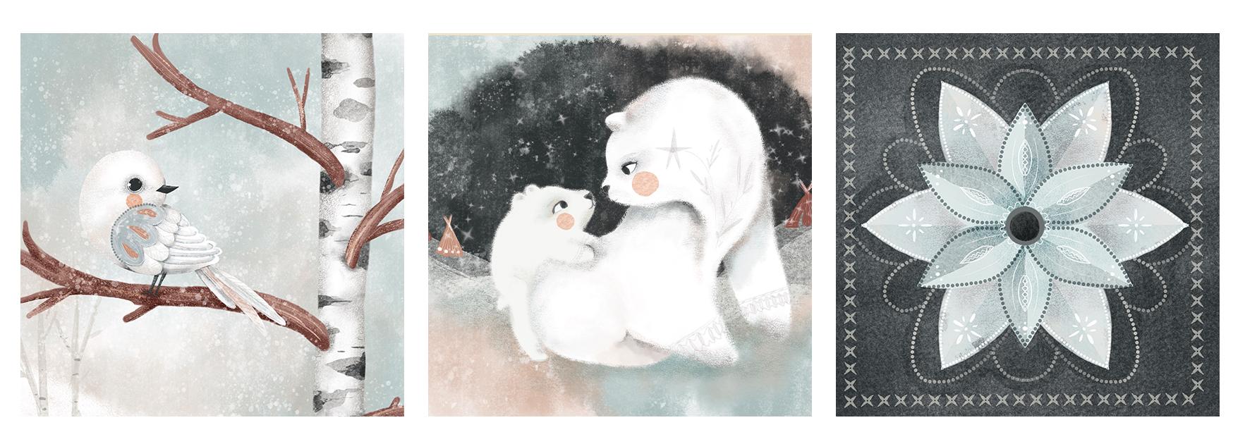
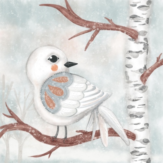
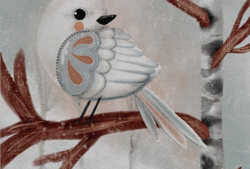
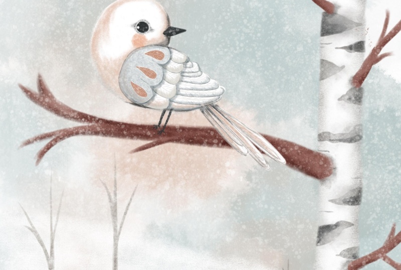
on painting birds, but never white birds before, so why not start now in July. Today, I'm inviting you to paint this lovely white bird
and procreate with me. In this class, we'll touch upon building an
illustration composition. We'll learn to paint a white
subject and procreate. So going forward, you won't be scared to paint white birds, polar bears, or flowers. And we learn to paint a
gorgeous silk birch tree. And another reason. Guys, do I need to say more. So grab your iPad, your Apple pencil. It's begin.
2. Your Project: For your class project, I would like you to paint a white bird and
procreate sitting on a silver birch tree branch and aplod your creation
here on Skillshare. Or you can paint any
subject of your choice, for example, an animal either on a dark or
light background. Or if you don't feel like
painting a character, a simple white flower will
do as long as you base your illustration
on the principles we'll discuss in this class.
3. Tools & Materials: For this class, you will need, as always, an iPad Pro. You will need an Apple pencil, and you will need Procret
installed on your right pad. Also, additionally,
there is a set of brushes I've created
especially for this class, which you can download from
the resources section. But you don't have to
use them as always. You can use the brushes
of your choice.
4. The Colour White: You know that birds are my
most favorite subject ever, and I've noticed
a curious thing. When I ask my students, children or adults to
draw or paint the bird, no matter how advanced they are, the immediate choice of
color is anything but white. After some contemplation, I
came to a conclusion that the reason might be
the fact that we all learn to paint
on white paper. So by default, we pick any color that will be contrasting
enough with white. So very often, it's enough
to choose a background of a darker color to
paint with white on it. But if we look even
deeper into the subject, a photograph or a
painting will discover that white is not quite that white as we used
to think about it. In fact, it's often
mostly not white at all. Like in this illustration of the white bear by
Josiah Woodwipa, there's literally no
pure white there at all. Sometimes you do get
pure white, though, like the white cat
by Mets cornlesh with a deep dark background
certainly helps. You can spot shades of gray, brown, blue, and divent purple. That's the shades you can
use to create swatches for your own white bird or
any other white subject. Just keep in mind that
yellowish and pinkish grays and browns will create a warmer feel
to your illustration, while bluer, purpler and shades of slate gray will
make a colder effect. Hence the palette I've picked
for our winter white bird. The secret is that most
of the shades need to be very subtle and
transparent, diluted. Think of watercolor. These shades need to
be very diluted with water to give us
this white effect. Background plays an important
role here too, of course. The darker it is, the
easier you can get away with those shades
being less saturated. The trick is to create a contrast between the
background and the subject, even if this contrast
is super subtle. Saying that all the
above doesn't mean that no saturated colors
are allowed to be used. The deeper shades
contrasting with the rest of the shades will only emphasize the whiteness
of your subject. Sometimes you can create a color palette
using a photograph, importing it directly
to procreate, but it's too fussy
sometimes because look at all these greens and browns
that I don't really need. So I'm going to share with you a few recommendations
of some apps I use on my phone that I
find really helpful and particularly with the
subject of white color. First one is pixelizer and I'm using a
free version of it, that's why PSK as, but I don't really
use it quite often. So you just add a photo and
you just slide this slider as much as you want to create a nice pixels of the
colors you need to export. The next one is called Vivid. You just type white, and it gives you all these
lovely shades of white, which are obviously
not pure white, but it's such a great variety. You can create so much
with those colors. And finally, color palettes, which also extracts
some nice watches from a photograph or a
picture of your choice, which you can later export to any graphic software you are
using for your illustration. Now let's move on to
our illustration.
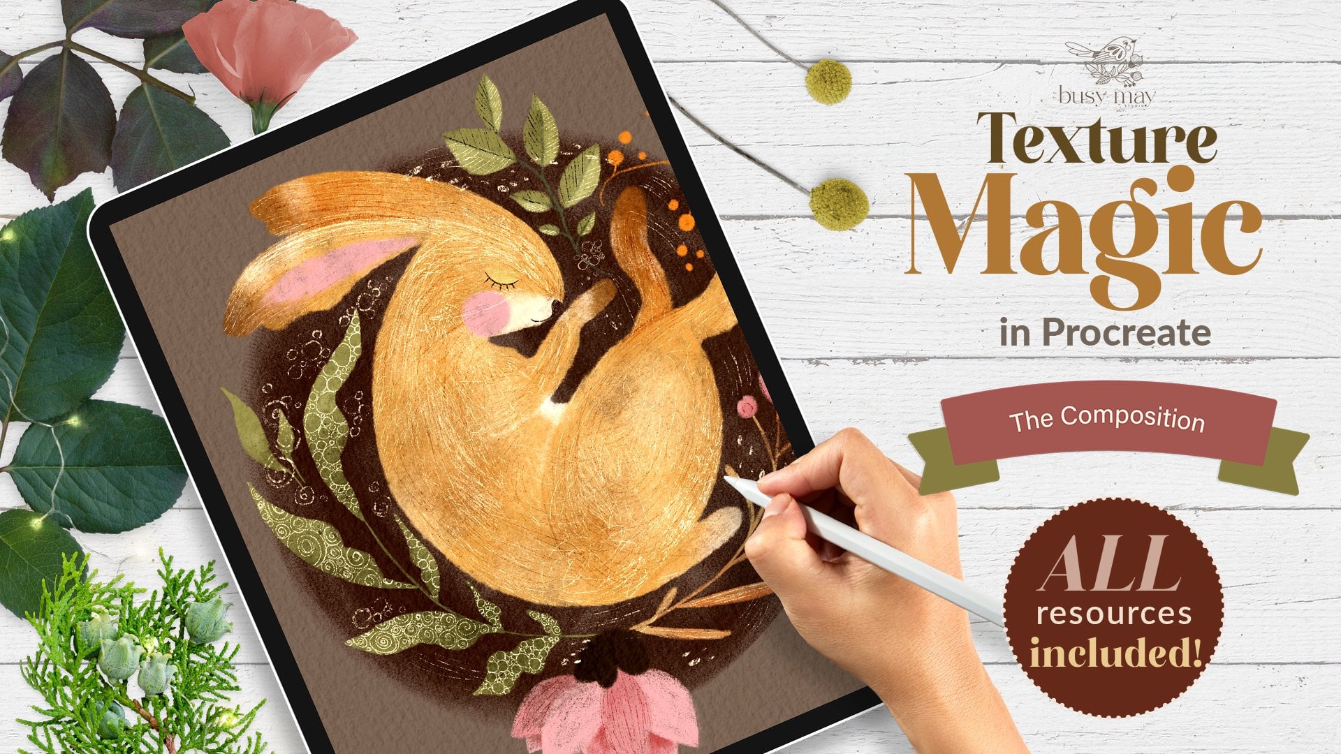
5. Composition and Sketching: It can be overwhelming to
start with a big blank canvas, especially if you're still contemplating your composition. You can even get
frustrated and give up. That's why I usually start
with drawing small shapes, achy, thumbnails, representing
my future illustration. So I've created two thumbnails representing my
final illustration. I'm going to start with
dividing both canvases into three parts vertically
and three parts horizontally. So I'm going to
create a new layer and with a sketching brush, detail brush I'm using. So I'm going to start
with a thumbnail, and I'm going to just
draw roughly divide the whole area into three equal parts horizontally and same vertically
into three equal parts. The grade can help
you, of course, but the point of the
grade I've created is just to draw straight lines,
really, and that's it. And I'm not trying to
make three perfect parts. You can see that they're
not super perfect, but roughly like this. And the intersection of these lines these
dots, these four dots. And basically the rule of thumbs is that you mean subject, your focal point should be in
one of these dots, roughly. And let's duplicate this grid, and let's place it on
the other thumbnail. You can also reduce opacity a little bit so
it doesn't interfere. And I'm going to switch the
grid off and let's see. So our subject, the main focal
point of our illustration, is a happy cute white bird. And I would like to I would like it to sit on
the branch of a tree. It's natural place
and possession. So I'll also need a tree, and I've chosen a silver
birch tree as to me is the type of the tree that springs to mind when
I think of winter. The Christmas tree, of course. So I'm just going to doodle roughly sketch the bird and
the trees and the possession, keeping in mind those
intersection points. I'm just going to create a
new layer so I don't draw on the grad layer and I'm going to reduce the size of
my sketching brush, and I'm going to start thinking maybe I'll set my bird here. So you get the idea, basically, I'm not going to try I can create 1,000 of
sketches like that, but my point right
now for our simple, very simple illustration,
where we don't need to keep in mind the
text, the book content, the backstory of our character, the character's
personality, et cetera, et cetera, all these things
you keep in mind when you create a character
for a book, for example. In this case, in this class, our point is just to create
a simple white bird. That's why I'm just showing
to you how you can do it. And you see in both
these sketches, I placed my bird into one of the intersection points of
these four lines, basically. And I think I kind I
like both of them. I probably can work on both
illustrations later on. But for our class, I think I'm going to focus on this one because I kind of
like it's quite unusual. I don't think I have any
illustrations with the bird like with being in this
part of the canvas. So why not? And I would like, also to feature the
silver birch tree here. So I think I'm going
to leave this one. And I'll switch the grade
off and you can immediately see that there is a little
bit of too much white space. It's okay if, for example, you have intention to
put some text here. For example, you create an
illustration for your journal or you're creating
a greeting card, so you do need to keep
in mind the space, like the negative space, negative for your text. But my case is just going
to be an illustration. So to fill this negative space without affecting our
main focal point, I'm just going to
add maybe later on, some sort of a maybe background like a hill going
down or something, and our horizon will
be somewhere there, but it doesn't matter right now. So that's basically our sketch. Our composition is ready. And what we can do, we can resketch it
or we can just use our picture here and just copy and paste
it on our canvas.
6. Winter Forest: So I'm going to start
coloring my illustration with the background and
also in this lesson, we'll color the tree 'cause
it's sort of like simplest. Um, part. So I flattened my sketch, and I'm gonna immediately
bring the opacity down. I still can't see it. I can, so I'm going to use
my sketch as my guideline. I'm going to
immediately lock it, so I don't accidentally
start drawing on it. And I'm going to create in
are and drag it underneath. That's going to be
my background web. The background is gonna
be super super simple. Um, from the brush set
provided for this class, I'm going to pick
this frosty brush, which is like salted watercolor. Love it. It's amazing. And from the
palette, I'm going to select. Basically, I'm going to work
with this sort of, like, icy blue colors and a little bit of the
pinky cory orange. I'm going to show you. So I'm going to grab
this very last color, very right one in
the middle row. And I'm going to
reduce the opacity of my brush to approximately
50 odd percent, and the size I'm
gonna bring to 100%. So we can see all this, like, frosty beautiful texture there. And with gentle touches
here and there, I'm going to add this sort of like salted
watercolor stains. This bluish color, icy blue is going to be our main
color of the background, but good make a little
bit maybe darker. The edges just to make sure that we bring the
picture nicely together. But I would also like to add a little bit of this coral pink, which is the third
color swatch from the right on the very top
row of our color palette. So I'm just going to add a nod, very, very subtle shade
of pink here and there. This color combinations
and especially this, like, frosty brush, remind me
of this winter afternoon. And I think that's it. I think for now, that's our background ready. It's very subtle. You can see. So our white bird will definitely have good
contrast with it. But you can make it as subtle
or as intense as you want, by adjusting the opacity. So I'm going to
keep it like this. And that's our background. Next, I'm going to color
our silver birch tree. Trunk. So I'm going to
create a new layup. And this time, I'm
going to select the solid filler brush. It's the most solid brush
out of the whole set. So I'll be using it for creating color
blocking of the object. And the color I'm
going to choose is the bright white color. I didn't add it in the palette because it's so easy to find. And what I'm going to
do, I'm just going to cover the sketch of the
trunk with this white color. So now let's work a little
bit on our tree trunk. So I would like to
add some shading, and I'm going to start
with subtle shading. So as you can imagine, our tree trunk has
the cylinder shape, and that's why the front view will have most of the light. Imagine that the source of
light comes from here and the sides will be more dark because I can
it goes round like this. So I'm going to
create a new layer. I'm gonna clap it as a mask, and I'm going to straight change the blending to multiply
to intensify the color. And the brush I'm going to
use is the florishader. And the color I'm going to use
is this subtle gray color, which is the fourth swatch from the right in the
middle row in our palette. And I'm just gonna try it. I'll probably bring
the opacity to 100%. And I'm going to bring
the size to 100% as well. Let's switch the sketch
off because at the moment, we don't really need it
with very gentle strokes. I'm going to add
some of the shading. This brush has a
really nice texture, which also reminds me
of something frozen, some sort of, like, pile of
snow maybe or something. So that's part of the
idea of the Illustration because the brushes I created specifically for
the Illustration. And on the other side as well, I'm just going to go around on the edge with gentle strokes. So you can see that we've
got a little bit of shading added. Here and there. So next thing I'm going
to do on the same layer, no need to create a
huge stack of layers. I'm going to grab
this brownish color, which is the second swatch from the left in the middle row. And this time, I'm going to reduce the opacity
a little bit. And I'm going to go over. But this time I'm going to try and stay closer to the edges. You can occasionally,
like, move. Your pencil closer to
the middle of the trunk, but mostly I want to, like, burn the edges of my tree trunk. I don't want to color to make the whole tree
trunk too dark. And finally, on the same layer, I can either bring the opacity up of the same brush
of the same color on the same layer and just
add a tiny bit more shading. I'll probably choose
even darker hour, which I think I'm going to grab this third switch
in the middle row, and I'm going to just
reduce the opacity a tiny bit and just burn the very edge of my tree just to give it a
tiny bit more volume. Don't cover the whole trunk with the shape because we still want to keep our
silver birch white, Okry the impression of white. So the trunk is ready,
the base of the trunk. And now let's add the silver
birch darker patches. So you can flatten it, so you don't create
huge number of layers, and I'm going to make another
layer and I'm going to multiply change the
mod to multiply and create a clipping mask
and what I'm going to do. The next brush I'm
going to use is the icy filler brush.
I'm going to grab. And the color I'm going to
use is this very last color, the very first from
right on the top row. And let's check, yes, I'm
quite happy with that. And I'm going to increase
the size to maybe 50%. Yeah, 50% is fine. And let me quickly
show you the brush. So I'll just create
this new draft layer. It's precious and the brush, one of my favorite types. So if you press lightly, it greys thin light, the more you press down
the wider the straw gets, and then you ease it off, and it becomes very sink. So that's basically what we're gonna do with
our tree trunk. On our layer, we flipped and taught the blending
mode to multiply, which is gonna use
the same principle. We're going to create
this type of thinner, thinner shapes, but not straight in the
middle of the chip. We we got to try
and keep most of them somewhere
outside of the trunk. Here, I'll explain
to you what I need. So I'm going to start from
here and I'm going to do that. And I'm going to start here
and just leave it out. I might reduce the
opacity just a tiny bit again. See? They kind of, like, embracing the tree trunk can
add smaller details. But remember still to leave some whitter part of the trunk. Oh. Just to make sure that
the shapes are not too rough, I'm just going to blend
some of them using them blending tool and texture
blender brush from the set. And I'm just going to
blend some of the shapes, the organic shapes,
the ones like I'm not particularly happy
about here and there. It's like when you
paint with watercolor, you would probably sometimes blend two sharp
edges with water. And that's just a tiny bit just to create this
watercolor effect. And now, using the same brush, which is the icy filler, I'm going to select darker color and add some darker spots, but not in each shape,
but in some of them. Like, I'm going to reduce
the size a little bit and the pasity so I don't
overdo it right away. And I'm just going to try a
little bit here and there. I can always blend
them if I'm not happy. Maybe reduce opacity
even more see like this one is
asking to be darker. So I'm just adding some darker areas on
my tree just to create the variety of different bones. Something like that.
I'm quite happy. Make some I can make
some areas even darker. So you've got, like, different sheades
of black and gray. Just add maybe some
lines here and there. Mm. So that's it, I'm quite happy
with my tree trunk. So next thing I'm going to do. Obviously, I'm going to
switch my sketch back on, and I'm just going to paint
the branches on a new layer. So I'm going to
create a new layer, and with the same
solid filler brush as we painted the tree trunk
because we want it to be solid. I'm going to grab
this brown color, which is the second from
the left on the top row. And I'm going to start with this main brush where
our dirt is sitting. So that's the main
branch is reading. And I'm gonna definitely
create one more on top. And just to save me some time, which is another trick for you, I'm going to duplicate
this branch. I'm going to reduce
the size size of it. And so it doesn't look
exactly the same. I'm going to change the
positioning a little bit, and I'm just going to
grab the eraser to, and I'm just going
to erase some part. So it's just easier
for me to take the solid filler
again and just to add some more details which
are different from this one. And let's see if we
need some more here. So I'm gonna
duplicate this brush again, this branch, sorry. And I'm gonna flip it horizontally and maybe reduce opacity or size a little bit. And let's sit here. I
think that's right. Let's erase this part again, just grab your brush
and add another detail, which is different from
both other branches. And let's see if we
need another one. So we have duplicate
it the top one again. Again, I'm gonna flip
it horizontally. And let's maybe
something like this. And I'm just going
to erase this part. I do that. Yeah, I think
I'm quite happy with my tree with the
branches positioning. And I'm gonna now
emphasize, like, add a little bit of
texture and shading to my brushes to my branches. I'm gonna flatten all
these layers together. I'm going to create
a new layer on top, clipping mask, and blending
mode change to multiply. And again, I trust the florishado and let's first use exactly
same brown color. Reduce the size,
and I'm just gonna add some texture cheap to the
bottom of these branches. Just a little bit and just a tiny bit on top
because, remember, we decided that our source of all light comes
from somewhere here. So they will have the
same sort of, like, shading situation
as the tree trunk. And normally, unless
our light source of light is on the bottom, which unless it's some
sort of artificial light like a torch or
campfire or whatever, daylight usually
doesn't come from. The bottom, it always
comes from top or from. On a side. And I've just
added some of the shading. And now on the same layer, I'm going to add some texture. So there is a
textured brush that I ca branches just so it's
easier to identify. So we're going to
grab this brush, and with this
darkest brown color, reddish brown, I'm going
to add some texture. So I'm going to
increase the size. And with this sort of
like tap tap tapping, I'm going to add some
texture on the branches. And the final touch, so we don't spend too much
time on the branches. Again, new layer,
flipping mask this time, let's keep it on normal. I'm gonna use twigitizer just creating brushes name is a separate creative
art, you know. And I usually have so much
fun thinking of these names. And the color I'm going to use, I'm going to try maybe
the slighter brown color. Let's see. Yeah, quite happy with that. And what I'm going to do, I'm going to reduce the
size to maybe Well, maybe 15 and the opacity 100%. And what I'm going to do. Following the shape of my brush, I'm just going to add
this gentle strokes. You see, when it's too harsh, just blend it thin
and start again. I might bring the colour just slightly on
the lighter part, so it's not too pink. So the branches are ready. We will obviously add a little bit more shade when
we do finishing touches, but at the moment, I'm just
going to leave it like that. It's already good enough. Sort of like accommodation
for our bird. And the fin nothing I'm going
to add is the slope hill. Let's pinch the branches together with them with
the details and texture. And I'm gonna on top of
the background layer, I'm going to create a new layer. And what I'm gonna do, I'm just going to
grab the fly shader, bring the opacity to 100%
and maybe size to around 70 and with the pure white
color with gentle strokes. I'm going to paint 100%. I'm going to paint this hell. You can see it right now. But the reason I'm using Bush because I like
the fluffiness of it. At the same time, I like
the transparency of it. So you can still see the
background through it, creating the impression that this slopy hill is further away, indeed, let's switch
the sketch off. And yeah, I'm quite happy. You can always duplicate it to make it a little
bit more opaque. But I'm quite happy with
that. And you know what? I think I'm going to put
a couple of very, like, faint light cheese
on the background using this icy filler and very, very light gray color. I'm just going to
place place a couple of silver birchs on the back. And that our landscape
is ready for our bird.
7. Bird Base: Let's switch our sketch back on. I would probably
recommend to put all the landscape elements into the same group just to
get them out of the way. And let's have a look. So trying to keep in mind
everything we talked about in one of the
previous lessons about making white objects, but don't worry I remind you. We're gonna start
painting our bird. It's actually very, very simple. So what I'm going
to do, obviously, I'm going to create a new layer, and all the layers I'm gonna build I'm gonna be above
this layer on top of it. So on this new layer, I'm going to create the outline of my bird
and fill it with colour. For that, I'm going to use solid fill up brush and
the purest white color. And I'm just going to outline the whole shape of my bird
and fill it with the colour. So that's it. Remember how we talked
about the contrast between the white object
and the background because we've got
colorful background. Our bird is already white. Bar looking a little bit flat, but the point is right
now it's already white. You can tell it's white, and
you can tell it's a bird, you can see it, and
that's the point. However, we switch
the background off. And that's it, the
white bird disappears. Sketch off. It's there,
but we can't see it. So the way we're gonna color it, keeping in mind all the niances
of covering white object, we're gonna color it,
so it's suitable for both darker and lighter
background. Don't worry. It might sound complicated, but I'll show you what I need. So let's bring everything
back, our background, our sketch, and let's
start building layers. It's actually very, very simple. So I'm going to
create a new layer and similar to what we
did with a tree trunk, I'm going to clip it as a mask, and I'm going to right away, change the blending mode
to multiply because I'm going to add some
subtle shading. So let's grab the
floury shader brush. And I'm going to use this color, which is the second from
the left on the top row. I'm gonna reduce opacity
because I really want my shading to be
very subtle for now. And I'm going to add some
shading, not everywhere, but just in some places, a little bit here neither one. A little bit here on the bottom. Very, very subtly. I absolutely don't want to cover my bird with
loads of shedding, maybe just a tiny
bit around the head. And that's it. Next,
on the same layer, I'm going to grab
this icy blue colour. And I'm just going to add
a little bit of blue. I'm just gonna maybe
blend it a little bit. Only touch. I don't want the bird to blend
into the background. And now I'm going to add
the subtle pink color. And I'm just gonna add the
little coopet here and there. Just a tin bit a little
bit on the tail, and that's it for the shading. And next thing I would
like to do is the beak and the eye because I just want my bird to have a little
bit more personality. I always do the
eye first because it immediately brings
a character to life. So I'm going to
create a new layer. And I'm going to grab maybe maybe a fella brush with 100%
capacity, but small size. And the color I'm going
to use is the darkest, like this anthracite color, charcoal anthracite, and I
fit more depth if I want to. So I'm going to reduce
the size to about 3%. And I'm just going to And they obviously want
them to be darker. So I'm just going to add a little bit more darker tone
to the bottom of the beak. And I think the whole
eye has to be much, much darker. Alm black. Just like that. And a Pearl mi use
the eraser tool and make the beak just
a tiny bit sharper, so it doesn't look
like we've got the duck sitting on a
tree for whatever reason. Unknown. I just just a little bit more
around the eye. And still somehow feels
that it's not dark enough, so I'm just going to duplicate
it and ping it together. And let's add some highlight
right away to the eye. I think I'm going to use
the solid fill up brush, pure white color, and I'm just going to
add And that's it. We'll obviously work
a little bit more on the eye area in vial. And let's now add a little
bit more shading around. So we've created subtle shade, and now let's create a little bit intense
more intense shape. So it's all about
layering of shade. So I've created a new layer, change the blending
mode to multiply. But this time, I'm not going to use the
floury shader brush, but I'm going to use
the icy filler brush. And what I'm gonna do, I'm gonna be using brush
and I'm going to be using the blending blender
to mix the coloring. So icy filler, and I'm going to grab this first shade
of brownish gray. The first watch in the middle. And again, our most shaded areas are somewhere underneath. So I'm just gonna
add a little bit. I'm gonna add a little bit. Yeah. And I'm gonna immediately
wrap the blending too, and Blender, crush
texture blender. And I'm gonna just
blend most of it, and a little bit here a nice and organic and a little
bit from the up. And what's immediately blender. Supple. Actually, let's
switch the sketch off, so it's out of the
way so we can better see so we don't have
to sharp transitions. It can be coming
together already. Let's add a sy bit here near
the tail on the bearing. I would also put a little bit maybe around
the wing somewhere here. Very, very subtle
because we still want our bird to be
white, not gray. Now, we know it's
not going to be pure white because
we are artists, but we want whoever is
looking at our illustration, we want immediately them to
percept the bird as white. So very, very
subtle shading like this and we'll work on
the wing separately. Let's add just a
tiny bit to separate the feathers of the tail. Mm. Again, we'll work on
the tail separately. And that's it. And the last
thing in terms of shading, I might actually stay
on the same layer. I'm going to add some
really dark, deep shade, but very, very subtly, so I don't ruin the
whiteness of my bird. So this time, I'm going to
grab the very first color. In the bottom row, I'm gonna maybe set the size to about 3%. Yeah. We're still on Oh And I'm just gonna add
a little bit of darker sheads and I'm gonna
immediately blend them. So blend the edges like this. And just a little bit here. Usually, you add these darker, very deep dark shades. The more with nooks and
fannies the pieces. The more sort of
like hidden parts, the darker they will be. This a little bit
here just to separate the wing from the tail,
very, very supple. I like this and maybe just
a tiny bit around it. Just a tiny bit. And very, very blended in. Now, quality check. Let's see. Switch the background off. Right. That's
basically what I was talking about in one of
the previous lessons. Our bird is white on white. So obviously, again, as artists, we know that it's not white. But as just the
perceptor of the eye, the perceptor of
your illustration can immediately see
that the bird is white. And we don't see the edge of the wing, but don't
worry about that. We'll sort it in a minute. And I can see that some shading is needed
around the eye area. So I'm just going to stay on one of these multiply layers, and I'm going to grab fly
shader with reduced opacity. I'm just going to add this
little bit of a shaded area. It's like a sora mask. I'm gonna blend it
in a little bit, so it's not too intense and make it even
darker around the eye, so the eye is a
little bit deeper. And I feel like I need to add the white edge to my to the bird's eye
resupucle whatever it is. So I'm just gonna grab the
solid filler tiny size, and the color is the
sort of this gray. And I'm just going to outline the eye and holding
the crush down. I'm just going to
create a circle. And I'm just gonna
locate it properly. They might actually even
reduce the opacity so the trim around the
eye is even super. Yes, I know that the
circle is not perfect, but I don't want it to be. So something like this. And, of course, let's
add a blushy check. For that, I'm going
to use icy filler, and I'm going to use
this light coral pink and reduce the size. I'm just going to add this
check to my bar and there is the and in the next lesson, let's work a little bit on the wing on the tail,
and on the details.
8. Beautiful Wing: Now, let's move on to the wing, and I'm going to try and
keep it short and sweet. So what I'm going to do, let's put all the birds, like main parts in
a separate group, and let's switch the sketch back on and see what we wanted to do. See, like, as I sketched before, I've bought them short feathers, gym feathers and
longest feathers. So that's what basically
I'm going to do. And I promise you, I'm
going to try to put simple. So I'm going to
create a new layer. And first of all, I'm going
to fill with color this part, which is the shortest feathers, and I'm going to use
the icy fill up. And the color I'm going to
use is this mid bluish gray, which is one, two, three, four, from the right in
the bottom row. I'm going to reduce
the opacity, Oh, the size of my
brush to maybe 5%. And I'm going to basically
coloring this shape. Now, let's switch the sketch
off and using the blender. Extra blender, I'm just going to mix in all this sort of like brfhEges leaving some where I want some artistic presents. I want some super flat. And that's sort of like
the main feathers. And on top of it, I'm going to create a new
layer, and this time, I'm going to use
solid filler brush, and I'm going to fill with color this sort of like
tear drop shapes. And for that, I'm going to
use this brownish coral, which is one, two,
three, four, five, fifth from the left
on the top row. Tim Ikeg. And I'm just going to help
them about this color. Let's move on to the
secondary row of feathers. So I'm going to
create a new layer, and I'm gonna right away
drag it underneath them, the shorter stop feathers. And I'm just going to create, like a really light
shade of gray. Maybe this color. T's see this. And what I'm gonna do? I'm going to color in this one, and I'm going to just
create strokes like this. So I'm not going to completely
color all the feathers. Let's switch the sketch
off and using the blender. I'm just going to blend one edge of these
feathers, just like so. I might just add a little
bit more definition. And also just blend
sharp edges, then. And now let's do the bottom row of the feathers with exactly
the same principle. I'm going to create a new layer. And using the icy filler, I'm just going to select
a little bit darker prey. And I'm just gonna repeating the shape of the
longer feathers like this, this hook type
motions. Fishing hook. And let's switch the sketch off, and I'm just going to blend
the sharp edges in as well. And I feel like I do need just a tiny bit of definition of the
feathers on the wing, so I'm just going to create a new layer on top
of everything. And I'm going to grab
winter detail brush, and I'll probably change
the blending mode to multiply let's see that's
a little bit too intense. So I'm going to reduce
the size a little bit, opacity a little bit. And I'm just gonna
with gentle Shops. I'm gonna go around
the edges just to give the feathers a tiny
bit more definition. And same here. The second feathers. And finally, the
very bottom row, longest feathers is to
give them a little bit of definition. Something like this. And it looks like I would
like to add a little bit more shading underneath
each feathers layer. So underneath the top one, I'm going to add a new layer and I'm going to
use the icy filler, and the color I'm going
to use is darker gray, change the blending
mode to multiply, and I'm just going to go
around the edge like this. And I'm going to use
the blender just to blend out the bottom sharp line. Just a tiny bit. Same here. Press harder when you go down. Oops and using the blender. Blend out the bottom sharp
line. Just like this. That's it. I'm not going to do anything else apart from the of adding some decorations because obviously
something is needed here. But let's quickly do the tail. And now let's add some details. So on the very top one, I'm going to create a new are. And for that, I'll be
using the Deco dots crush. It's fun. And let's see. I'm going to change the
blending mode to multiply. And I'm just going to
go around like this. Beating a dotted line. Just to make my dug a
little bit more whimsical, I'm just gonna delete
the very edges of it. And I'm going to change I'm
not gonna change anything. I'm going to add a
little bit of dots here, maybe slightly smaller size. And now on the new layer, I'm going to change the
color to the lighter one, and I'm just going to add
a little bit of edge here. And I'm thinking maybe
around the eyes well. Just like that to make the bark a little
bit more whimsical. And I was thinking I wanted
to do something here, so I'm just going to
grab the winter detail, and I'm just going to work
around the coral feathers. Maybe to make a little bit
more interesting touches here. And with slightly dark color. Spray, for example, just
gonna add a little bit of sort of feather texture
on my bird's feathers. And maybe some
darker color back to the multiplayer. Like that. And let's put the
legs finally in because with the same
brush winter detail, I'm going to switch
back my sketch, and I'm going to add this
little legs of my bird. Switch this off and there's
always I'm just going to blend in the front leg, and I'm gonna erase part of the back leg to indicate
that it's in the back. And if you want, you can add some texture on top
of those lacro legs. Right. So that's pretty
much our bird reading. And let's add a couple of finishing touches
in the next lesson.
9. Finishing Touches: Oh right, almost there. Finishing touch it. So first thing I'm thinking
about is that I really would like to add
a little bit of shading around those sort of, like, bases of the branches
so they don't look so disjointed from the tree. So let's first of all, put the parts of our
bird in the same group. You can flatten it if you know that you're not going
to be making any changes. And, oh, by the
way, let's check. The bird is still white. See, that's what I
was talking about in the previous lesson that
the white on white is basically the
matter of selecting the right shades of gray,
blue, brown, whatever. Very, very diluted
shades to create this contrast between the
white and the white object. So Branches. So let's go back to
our three parts. So these are our branches. So I would like to create let's start with the
trunk. So we've got this. I would probably
create a new layer clipping mask, multiply mode, and I would grab the flowy shader brush and some darker shade
of brownish gray, which is the first from
the right on the top row. And then just gonna gently
work around increased opacity. Each brush just gently. So just to connect
it with the tree, so it doesn't look like it's It doesn't look it has nothing
to do with a tree like floating in the air,
just a little bit. Just like that. It doesn't really
matter that much. It's just all the little
details that you would like to add to make the
illustration complete. Next thing, I would like
to add a little bit of shade on the branch where
our bird is sitting. So these are our branches. I'm going to create a
new layer, multiply. I'm going to clip it as a mask. And I'm just going to grab this dark brown brush color and with the same brush
which is floury shader. I'm going to add a little bit of darker areas where
our birdy is sitting. I'm going to tell you
again to make sure that our bird looks like a part of this whole landscape
was just a cut out, collage, which is also
good, by the way, but just depends on what
look you're going for. And the year, I'm
quite happy with that. Next thing, while
creating this bird, remember our rule of remember the grade I was talking
about two vertical lines, two horizontal lines dividing. And we put our bird into one of the
intersection points here. Sometimes and I can see on this illustration that you need to balance it a little bit. So our sort of intersection points are
sort of taken already, but this one is sort of empty. It's not critical. I could just as well
leave it like this. But I feel like we
need something like maybe a frozen lake here or
something, very, very subtle. I'm going to try it if
it works, it works. If it doesn't doesn't I invite you to try
it with me, as well. So I'm just going
to grab icy filler, and I'm going to
choose this sort of like lighter bluish color, increase the size, and
just do a gentle stroke. I'm just going to add some
I want it to be subtle. I don't want it to
compete with my bird, because she is the main
character in this illustration. And now I'm just going to
on the new layer, multiply, I'm just going to make the edge the edge of it just slightly darker to create the depth and
some ripples on the water. And that's it, it doesn't
matter. You don't need to. You don't have to put this, especially if you're
working on the card and you are planning
to put some text here, Merry Christmas or whatever. But I just thought just
as this illustration, I would like to balance
it a little bit, but not if I put something
like a house here, for example, or a cottage, like dark wood cottage. I would probably
compete with the bird, so I don't want to do that. And finally, I'm going to create a new layer
on top of everything. And there is some
fluffy snow brush, and I'm just going to put
some snow overlay on top. So I'm going to grab
the pure white color. I might reduce
capacity a little bit, and I'm going to
increase the size. And I'm just gonna I'm
going to increase the size, and I'm just going to gently
add some falling snow. As I said, optional. If you would like to
create an ice snowy day, you can use this option as well. So, and that's our bird
ready. Thank you so much.
10. Final Thoughts: I did try to keep it short, so I hope you're not too overwhelmed with the
amount of information, and you're not too
sick of my voice. But you're listening to this, it means that you
most probably came this far in this class
and well done you. And I'm looking
forward to seeing your projects here on
Skillshare or on social media. Just don't forget to tag me. And thank you so very much. I hope this winter
white bird brought a little bit of cool fresh
air to your scorching hot. Come on. You next time
and thank you. Bye.
 Irina Young, Busy May Studio