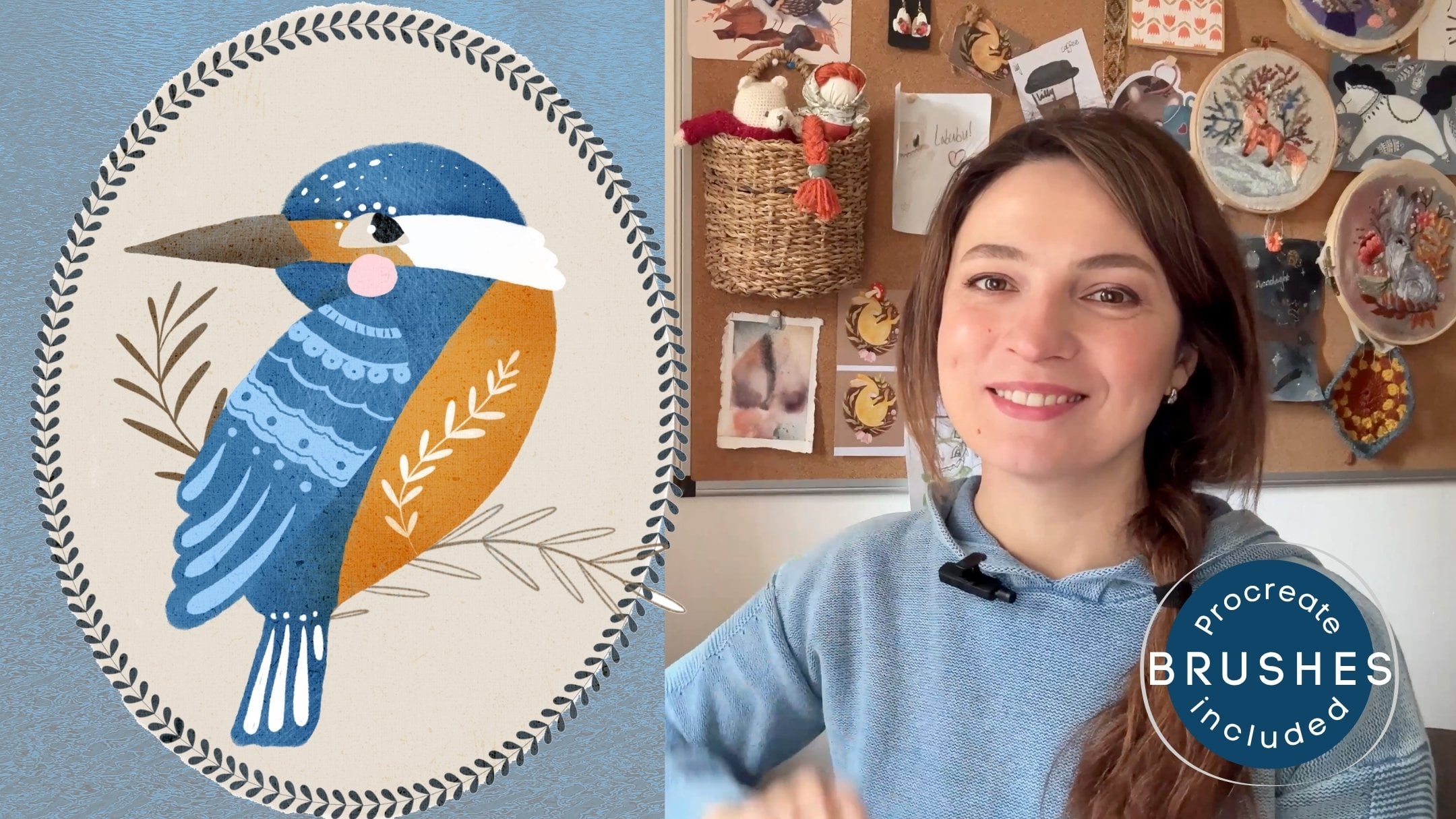
Transcripts
1. Introduction: You are here, which probably
means that you love Alice's Adventures in
Wonderland as much as I do. Or maybe you've even completed the previous three chapters
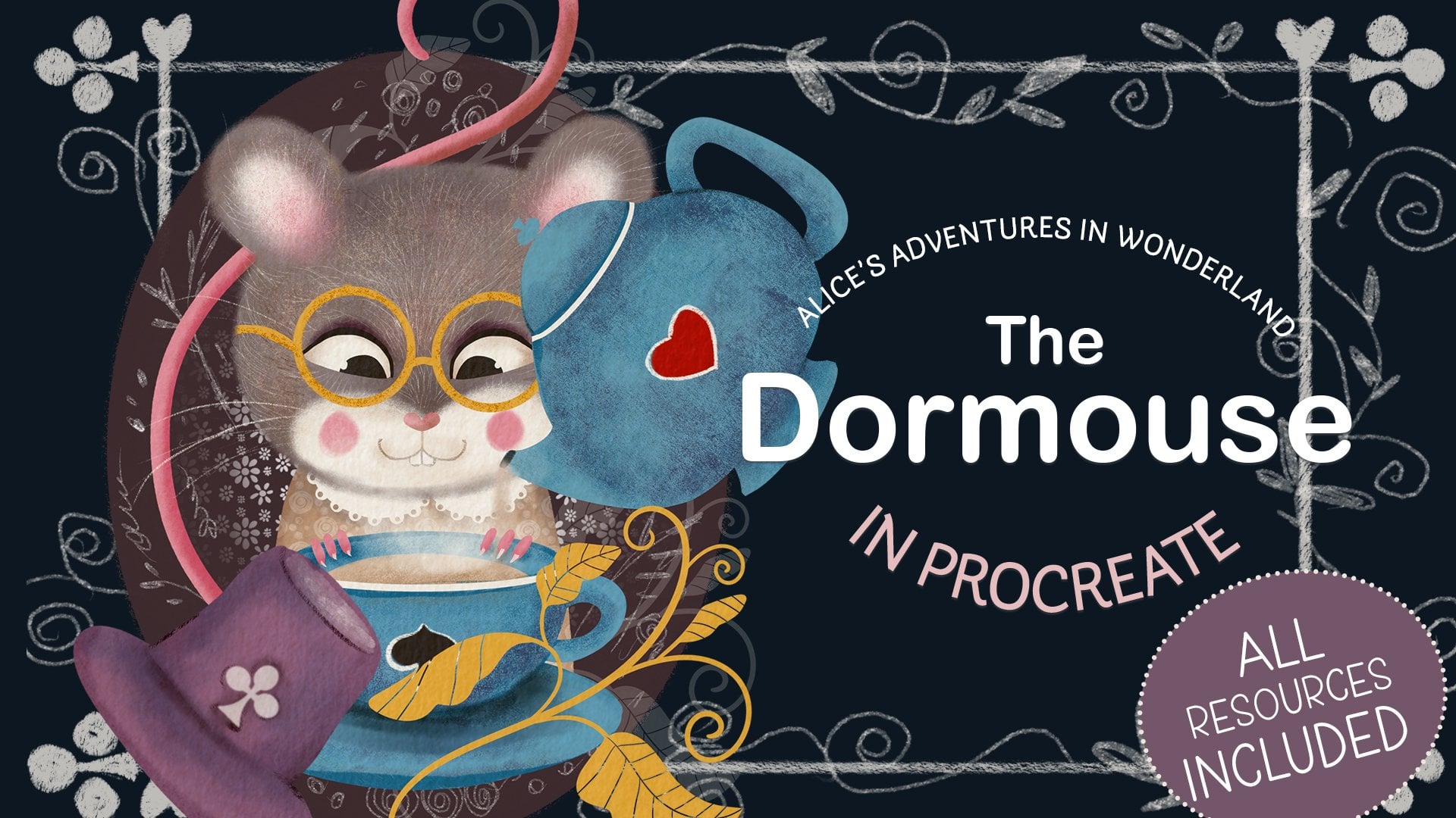
where we painted the dormuse, the white rabbit, and
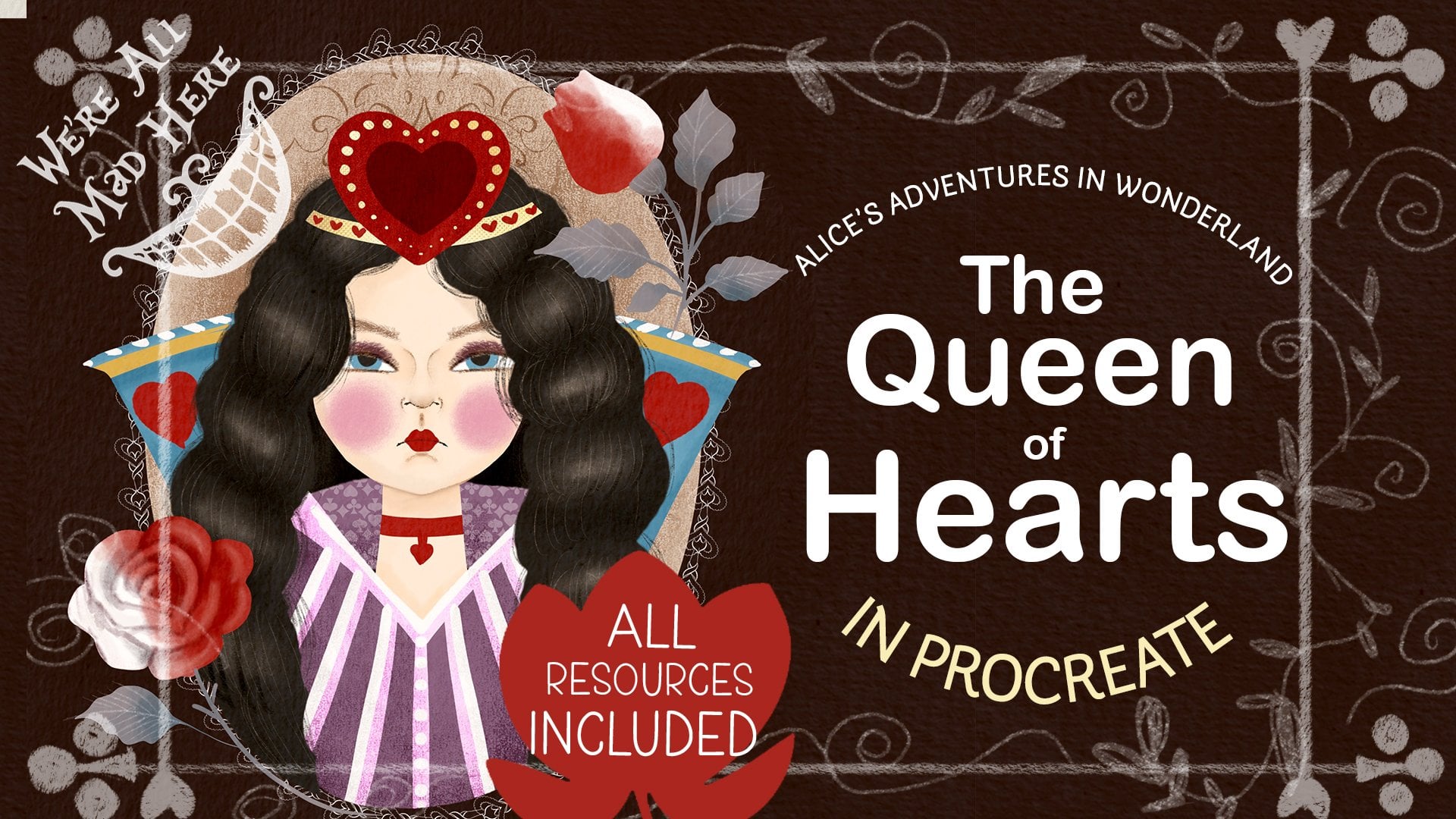
the Queen of Hearts and are ready to tackle the
final chapter of this series. You are in the right place then, in this class, we'll
illustrate Alice, the main character of the story, accompanied by the Cheshire Cat, another mysterious and
enigmatic creature. Hello, friends and welcome to the final part of
our Alice series. If you've completed the previous three parts
of the series, this will be your
final exam where you'll illustrate a
human and an animal. If you've just joined
and would only like to draw Alice and a
cat, not to worry, though this class is linked
to the previous three parts, it's totally fine to
do just this one, as I'm going to give you clear
step by step instructions, which you can easily
follow alone. As always, we'll
discuss the characters, sketch the composition,
map the main colors, and work on each
element individually. I'll show you the way I
draw a three quarter view female face so we can illustrate a nice portrait of the
beautiful, curious Alice. And, of course, we'll
draw the Cheshire cat, a big and super fairy creature with big eyes and
mysterious grain. So are you ready to embark on our final journey to Wonderland? Then grab your Ipad, your pencil and let the
adventure commence. Oh
2. Class Project: For your class project, I would like you to create a portrait of your two
favorite characters, a human and an animal, with the human having a
three quarter space view. You can also draw your own
interpretation of Alice and the Cheshire Cat or follow along this class step by step,
which is just fine. Please consider uploading
your project here in the discussion section for us to admire your work and to draw
some inspiration from it.
3. Tools & Materials: For this class tools
and materials, you will need an iPad
with an Apple pencil. You will need the main brushes that we've used in the
last three classes. You'll need our main
dormouse color palette. We'll use it again to keep
the illustrations consistent. You will need the
skin tone palette because we're going
to draw a person. And optional, you will need a texture overlay that you will change the
blending mode of. You don't have to use it, but I recommend that you do, especially if you've used it in the previous three classes. All tools and materials are attached in the
resources section.
4. The Characters Overview: Alice is a curious
and brave young girl who loves exploring
and asking questions. She often feels bored
with normal life, so she gets excited when
something unusual happens, like seeing a white
rabbit in a whisker. She's polite and kind, but also stubborn when she
thinks something is unfair. Alice tries to make sense
of wonder and strange food, even though nothing there
works the way she expects. She cares about good manners, but sometimes loses her temper when things get too confusing. Overall, Alice is adventurous,
a little impatient, and always searching for answers in a world that
rarely makes sense. The Cheshire cat
is a mysterious, mischievous feline, who loves to confuse and tease
others in Wonderland. He has a wide unmistakable grin that often appears before
the rest of his body does. He enjoys speaking in riddles and giving advice
that sounds helpful, but usually leaves Alice
even more puzzled. The cat can appear and
disappear whenever he wants, floating in mid air or leaving
only his smile behind. He doesn't take sides
in Wonderlan's chaos. He just watches and
enjoys the madness. Calm, clever, and
a bit sarcastic. The Cheshire cat seems to know more than he
ever fully explains. Alice and the Cheshire cat have a strange but helpful
kind of relationship. The cat is calm, clever, and a little mysterious, and he appears when Alice
is confused or lost. He does not give
her clear answers, but he guides her
by asking questions and speaking in riddles that
make her think for herself. Even though he
sometimes teases her, he's one of the few characters who treat her politely
and honestly. Their interaction shows how Alice learns to question things, trust her own thoughts, and find her way in
a confusing world. In Lewis Carroll's story, Alice is around 7-years-old, but in various films and
animated adaptations, her age is shown differently, sometimes as a young child
and sometimes as a teenager. Because of this, I see Alice's age as open
to interpretation. In my version of the character, she will be a pre teen
around 11, 13-years-old. So I've decided that
in my illustration, Alice's character
will be a young girl, aged 11-13, blonde hair, a curious friendly character, so big eyes and a
smile on her face, a cute blue dress, a book with stories, and the potion bottle to link
the character to the story. The Cheshire cat,
it's obviously a cat. It's fluffy and large, bigger than a normal sized cat, a mysterious human
like character, so unusual eyes and white green.
5. Female Face 3/4 View: Right in this lesson, I'm
going to show you how I draw three quarters
of a female face. No anatomy, just very, very basic using lines. So I start with drawing a perfect circle and
then I'm going to, like, kind of squash
it into an ellipse, and I'm going to switch
the grade on to help myself draw straight lines
because the next thing I'm going to do is dividing
the ellipse into four parts into four quarters, horizontally and vertically. And now I'm going to
draw the next line, which will indicate the
center of the face, but it's going to
be like somewhere midway between the left side and the middle of the circle. So also consider that human
head is essentially sphere. So the line indicating the central part when it can
be turned away a little bit. It's not straightforward view. It's going to be curved. So the central line
will be curved. The eyeline will be curved, too, depending if your character
is looking up or down. But our character's
eyes will be um, looking straight at us. So the line indicating the
eyeline will be straight, too. So you see this blue
line I'm drawing. I'm going to turn it into
a curve line to give a little bit more
indication that it's a sphere that the the
head is not flat, the object is not flat. So I'm going to reduce the
opacity of this layer. So that's my initial map. Now I'm going to grab
a different color just for your convenience to
show you what I do next. Next, what I'm going
to do the side that is turned away from you, it will have this little indent. That's where the eye is going to be the right eye in
our character's case. And the face lines will
be like on one side, it will follow the
initial circle that we drew the ellipse, and the chin will be
somewhere in where the middle midline
crosses the red ellipse, and the ear will be approximately on the same
line as we drew this endent. And let's map the
eyes approximately. So the left eye, the right eye say will probably take most of this
half of this quarter, and the other eye will be
somewhere in the middle, matching that middle red line. The tip of the nose will be
slightly off the center, again, to the side, which is turned away from
us a little bit. And the mouth line is also like the third part of the
bottom half of the face. So these are the irises
and the eyebrows, and the hairline
will be somewhere where the blue line
crosses the red circle. You can see it obviously it's far from being
perfect, but later on, I will have a lot of
opportunities to adjust it, to tweak it the
right way I want, especially this is by no means a final sketch that I'm going
to base my illustration on. The neck, I usually give my female characters a very
whimsical type of neck, like almost too thin to
hold the head of the size, but that's just the way I draw
my characters, you do you. So I'm going to reduce the
opacity of this map again, and now I'm going to outline which is already
resembling the final sketch. It's not a final sketch
of our character. It's not a final
sketch of Alice, but I'm just going to show you the way like I do
for most of my characters. So I've outlined
the green faceline and now you can see that
I'm outlining the eyes. And in this case, I made them like cat
type almond looking eyes like a little bit cheeky. I think that I'll probably use this type of eyes
on Alice as well. And the eyebrows and the nose. Um, I'm not going into many, many details like the bridge of the nose, like proper lips. I usually like very with very light touches map
the nose placement. You know, probably, if you
look at other illustrators, a lot of other illustrators don't give the
character's nose at all, but I do, depending on what
kind of character it is. And basically,
essentially, that's it. That's the principles
we're going to be using in sketching Alice. And I'm just erasing all the thicker lines
that I don't need, and they can see already what I would tweak on this
particular phase, using the liquefied tool. But in the next lesson
when we actually sketch, Alice will have a
look what we can do.
6. Composition: Sketching Alice: So when we have an illustration with more than one character, it's obviously the case when characters somehow
interact on the illustration, or they are about to
interact or they've interacted and it
after the interaction. So when we look, we've looked at Alice as a character and the
cat as a character. Why is there relationship
interaction in the story. They are hardly friends. However, I would say
they are friendly. The Cheshire Cat is Alice's sort of like indirect
invisible helper, because it acts like
a little anchor that holds Alice
reminds her of she's, and she's still in Wonderland. However, she's sort of like she's still on
the right track. His appearance throughout
the story shows us that Alice is still sort of
like where she should be. So what's the sort
of like contraction. So I've decided that
on my illustration, it's going to be a portrait type of representing the
two characters. So Alice will be three fourth
turn to us as a viewer. And the cat will be looking
at Alice in a friendly way. I did consider sort of like
making Alice hug the cat. I thought that would be too familiar because the cat is not that type of the character
that you would probably hug. I see the cat as massive cat, a man coon type, who is wise, who is a little bit
of a trickster, and definitely not
a flufy lap type of cat that you can squeeze
and cuddle, et cetera. So let's see what
we can do here. The same set of brushes that we've used in the
previous three classes, I'm just going to grab
a pen so you can use any sketching brush
of your choice, and I'm just going to
map the characters. So let's see, Alice
will be somewhere. Here and the cat will be looking up at her,
something like that. I'm just mapping. I'm not
sketching yet properly. I think traditionally
like we did in the previous classes, we'll put them in a cano. Something like that. And I will obviously arrange
some objects around them. So I thought maybe, like, what objects can
we associate with Alice to tie our
illustration to the story. I thought maybe a
potion that says drink me or an
open book or both. So I'll just for an example, I'll put a book here, and a potion will be
flying somewhere here. We note here that says, drink me. Something like that. So that's basically approximately the
positioning of the character, so I can start sketching. So first of all, I'm
going to sketch Alice. I can switch that layer off. By the way, this is the draft. This is just the canvas I
created of the screen size. We're not doing
any textures yet. We'll move on to the textured paper when we start working on the
final illustration. So at the moment,
we're just sketching. So let's sketch Alice. I'm going to start with
a perfect circle. Clips. And like we discussed
in the previous class, I'm going to create
the free form. I'm going to choose
the free form option of the selection tool, and I'm just going to squash
the circle a little bit. Now, I'm going to find
the center of the face. Obviously, because we are
doing the three fourth view, it's going to be the central
line is going to be off center to the viewer
and the middle line. The eyeline will
be somewhere here. I'm doing it all approximately as we did in the previous class
with the Queen of Hearts. I'm obviously going
to map the face, and then I'm going to
adjust using liquefied two or I'm going to move
some facial features. So don't worry about that. It's not set in
stone at the moment. So let's start placing
the facial features. I'm just going to divide the bottom half into
three iclish parts. The tip of the nose
will be somewhere here, so off off the
line a little bit. And the lip line the bottom of the lips. And let's place. It's just a mapping. Remember at the moment, I might adjust the
feature just to make sure that everything
sits sits okay. So the eyebrows will be w here. And the ear will
be somewhere here. I'm not sure if we
need the ear at all, and the hair line will
be somewhere here. And the neck here. Just a map. Now, let's refine everything. So I'm going to
reduce the opacity of this layer and I'm going
to create a new layer, and I'm probably going to take just some darker color so I can just map a
little bit better. So there is this little indent. And there is a jaw line
here going into the ear. And I think I'm going to make Alice's eyes a little bit
more like almond shape. Now, let's think here. So as we discussed
previously, in my case, Alice is gonna be a girl
like pre teen girl age 12, 13, that's how I
imagine the character. And hint she's gonna be wearing like she's
gonna have long hair, but at the same time, maybe I'm not gonna
put Alice band, but it's gonna be
still like, girlish, not like grown up young
woman type of hair. So I think that, the air it's going to
be something like like this type of like like it's swiped a
little bit from a face, and the mass of hair
will sort of, like, come out of here maybe
something like this. And very cheeky face, isn't it? But that's the way I wanted.
That's the way I like it. So now, I'll refine
it obviously still. But the essence is
something like this, and she'll be wearing
a huge blue dress. There somewhere here. So the arm somewhere here, but we don't really hear
that much about the arm. It's just to make sure that the posture is where
we want it to be. You can put a pretty
color on Alice's dress maybe with a little bit
off. Something like this. And let's switch the map off. And I'm just thinking maybe
I'll create a backup. That's what I usually do. And let's adjust with
the liquefied two, the face and the posture. So I'm going to
grab liquefied two. And I'm just going to maybe make the cheek bones
a little bit softer. I don't think we
will need the year. I'll probably erase
it just to make sure all the features work
Yeah, something like that. I was also considering maybe making her head a little
bit like tilted like this. Yeah, I actually quite like it, so I'm just going to grab the eraser and get rid of all the lines
that I don't need. I'm gonna lose the ear, as I said, because I
don't really need it. And let's just put the hair
over part of her face. Something like this. Let's
make sure that it works. Again, maybe liquefy little bit. So that's our Alice. And we're gonna build
the rest of the objects, including the cat around, so I'm just going to sketch
the cameo right away. Again, sort of the style
will be that they sort of, like, come out of this cameo. But at the same time,
they will be sort of, like, partially enclosed in it. And let's maybe delete the lines we don't need.
An optional thing. And now let's catch the cat.
7. Composition: Sketching The Cat: So as we determined previously, the cat is going
to be quite large. And I'm thinking my cat will be kind of
looking up at Alice, and it also will go
beyond the cameo. So Alice sort of will go
beyond the cameo on this side, and the cat's tail will go beyond the cameo
on the other side. So I just wanted
to say that it's obviously we're not
going to observe any anatomy in our cat. And the type of cat, I would say it's going to be
more cartoony type of cat, more in the style. We created the white rabbit and the dormouse previously to
keep in the same style, and it's going to
have a big head, it's going to have big eyes, and it's going to have big fluffy ears and
the big fluffy tail. So I'm just going to
sketch my cat now. There we go. Here is our
cat, almost a tiger, massive, but not
scary, but hatty. I've created a new
layer and I'm going to sketch a book now. I had a couple of ideas. I thought maybe maybe a book which is maybe
half open like this. I can say something like stories or whatever, or it can be a
book that is open. A cover some sort of
like pages like this. The cover can be a
little bit thicker. Something like this. And
let's just try them. This or This quite
like this one. And let's put some portion. For Al saw a portion, created a new layer. A portion is
essentially a bottle. Cylinder so we can
just draw it like a normal cylinder
with a thinner neck. Let's get rid of wines
that we don't need. And it will have like
maybe something. That will probably say drink me, and maybe the drink me
will be somewhere here. Yeah, I can decide about
it later on the potion and go flying somewhere maybe
together with the book. Maybe something like this. And again, in our brush set, you can use the wine stamp, maybe somewhere here
in the end just to add a little bit of decoration
to our illustration. And yes, so I'm pretty happy with our
composition right now, and next thing I would like to do is I would like
to block the colors.
8. Colour Mapping: Let's lay down the colors. Again, a little reminder that this is not our final
illustration just yet. It's it's the stage where
we decide how much of what color to use
to make sure that our colors work nicely and
harmoniously together. So, as I said, in the tools and
materials lesson, you will need our main
color palette that we used for the dormouse and throughout the class
Dormouse mean. And we will also need the
skin tone palette that we used for the Queen of Hearts. So Alice, in my illustration, Alice is a fair skinned
girl with blonde hair. That's how I portray her. And that's why the skin tone I'm going to use for Alice
for her face is this one. If you look in the
white skin tones range, and it will be the
very left one from them of the second row. So I'm just going to
grab the filler brush, the solid brush, and I'm
just going to color block. Sorry, I forgot to
mention that I would like to flatten all the
layers, first of all, so I'm going to go to
add cope canvas paste and or the layers. I won't really need them. I go to get rid of them, and I'm going to change
the blending mode of this layer to multiply so
we can only have outlines, and I'll be color blocking on the layer underneath the sketch. I can even lock it just in case I don't
start drawing on it. So with the filler, I'm just going to quickly fill
the skin are as of Alice. Oh, by the way, that probably makes
more sense if we start with the cameo
knowing that it's there. So we know how our colors
work against the cameo. Traditionally, as we did
in a few previous classes, I'm going to use this dark
chocolate color for our cameo. I'm going to Make sure that
it's in the right place, and I'm just going to fill it
with this dark brown color. So we can see already
how our colors look. And Alice here, I'm going to use this yellow color as a base. But we will obviously when we can come to the final drawing, we will use highlights and shade and um, Alice's dress is gonna be blue. The hair. Now, let's see. Alice's eyes are gonna
be blue as well. And her cheeks are
gonna be pink. Something like this and maybe
the color will be white. And now Alice's color blocked. Let's move on to the cat. The cat, I think I'm going
to give it this gray color, which is going to be
quite light against this cameo dark color. So I'm just going to
quickly color block the cat to see if this
gray color actually works, making sure I think
it does work fine. Obviously, again, there will be darker colors for the stripes
because it's a tabica. There will be highlights. So the face, for example, it will be white. I as well. The eyes themselves probably
will make them yellow. Thing like that. Again,
I'll have a look. I'll properly decide
once I'm working on the final illustration
and it looks great. In my opinion, the
colors work fine. The only thing is that there
is not enough red and purple to unite this illustration
with the rest of our series. Maybe I'll make the book red. Maybe might change
my mind later. And the portion, I
can make it purple. Purple is a magic color. Why not? If I decide to go for these flowers on the other side just to
balance the composition, I might actually
make them make it either red or maybe purple. Something like
that. And probably once I work on the
final illustration, I'll add something on the
camera on the background. Yes, so basically, that's it. That's my colors are block. I'm happy with the color, so we can move on to
the final illustration.
9. Alice: Part 1: We start our final illustration, and I've already created
an A for Canvas. You can also go to the
screen size canvas depending whether you want to
print your picture or not. I think I'm going to print mine. That's why I created a high
resolution A for Canvas in the portrait pardon,
landscape layout. And I've already placed
our texture that we used for the three previous
illustrations on top of it. It's our texture overlay. And I'm going to immediately
turn it to Caliburn. And I'm going to lock it so I don't accidentally drone it. Now, I'm going to go
back to our sketch. Here we have our sketch, and I'm going to copy it. And I'm going to paste it. Ration. Now in this lesson, we are coloring Allison. I'm going to start
with her face. For that, I'm going to take the filler brush a little bit. And the color I'm going
to use for her face is this bottom left color
on the white skin tones, and I'm just going to start filling in her face
with this color. Let's switch the sketch off to see that we are happy
with all the lines. And I'm gonna add the hair
now with the same brush. I'm going to create
two separate, even three separate layers for the hair because this is
one part of the hair do. This is the other one, and this part will be
behind the face. So that's why I've broken the hair down into
three different layers. And this here part will be
underneath the baseboard. And now the dress And that's it. Now we can start working
properly on the face. So I can see that I need to grab my razor with the
same filler brush, and maybe I just the face and
the neck a little bit more. Same as we started with
the queen of hearts, I'm going to start with
the shading of the face. There will not be much
shading going on. So I'm going to
create a new layer and I'm going to
create flipping mask. And what I'm going
to do, I'm going to change the blending
mode to multiply, and I'm going to take the
same filler brush with the same can tone that we
lay down the mean color. Let's test it. Yes,
I'm quite happy. It's got the pinkish undertone, and I'm going to bring the opacity down and
bring the size up. And let's see
something like that. And let's put some of
the basic shading. So the obvious one will be
under the face on the next. And obviously, if we imagine that the
light goes from here, so this part of the face will be turned away slightly
from the light, so it will have more sheade
Then this one, this park. I'm just going to add a
little bit of shading here. I'm going to smooth
it out anyway, and a little bit around the eye, maybe a little bit here. And I'm just gonna
grab the smudge two. And from our main set, I'm going to grab the
texture flof brush, and I'm just going to reduce
the size a little bit, and then I'll gently
smooth down the edges. And now let's work on the ice. So I'm going to
create a new layer, and with the same fill brush, I'm going to take the
pure white color. I past 100%. I'm going to reduce the size, and I'm going to paint
the whites of the eyes. And all the next eye features, we will be clipping
on top of the white. So I'm going to create
a clipping mask, and I'm going to
put the coloring, which is the color blue
as we determined before. Something like this.
And the other way. And let's put the pupil then. So again clipping mask, I will grab this dark We can also add a little
bit of highlights. If we want to make the ice
a little bit more sort of like natural, more glossy. And now let's add a little
bit around the ice. So I'm going to
create a new layer. I'm not going to clip it, and I'm probably going to change the blending
mode to multiply. And the brush I'm going
to use is texture fluff. And I'm going to go
back to my skin tones. You see we used this part. So I'll probably grab this darkest one of the
lighter skin tones. And I'm gonna gently
work around the eye, creating sort of like this upper lid to make the eyes a little bit more
natural, a little bit deeper. I've switched the
sketch off just to make sure that everything is going according to the plan. I might smog at it down the ice. And now I'm gonna grab a go to change the blending
mode to multiply again. And this time, I'm going
to grab the pencil tool, and the color I'm going to
use is from our main palette this darker beach color
which is turned quite much darker once I use
it on multiply mode, I'm just going to create
the darker sort of like eyelash line on the upper lid to make the eyes
more expressive. Remember, we are not aiming for the correct
anatomy or anything. We are just creating a
flattish illustration here. So I've grabbed a little
bit of purple just to add a little bit on top of the upper lid and to
just cast a little bit of shade on the eye
from the upper lid. Okay. Now, I would like to
add the eyebrows. The eyebrows presumably
are going to be same color as the hair. With a pencil brush, I'm just sketching
with a sketching move. I'm just adding the eyebrows. And let's make sure that the facial features are more visible than
they are right now. So I'm going to
create a new layer. And with a pencil, too. And the color I'm
going to try and use, I'm going to use this
light this beige color. Let's see. Oh, maybe
no, this is too cold. Let's use something warmer. I'll probably use
the pinkish color. Yeah, I think that's better. And what I'm going to do, I'm just going to
add a little bit of a hint of facial features, the nose, the lips. So we know they are there. So I'm just going to add the bottom of the
nose a little bit, the nostril, on the
sides of the nose. Let's see, we might need
to adjust some shading. And, uh, the mouth. I'm just maybe I'm gonna
make the lips just tiny bit thinner. And let's see. Right, now, it looks
to me like the mouth needs to be lifted a little bit. And I think I will adjust
the shading a little bit on the nose because the bridge of the nose is somewhere here. And I don't like the mouth, so I'm just gonna probably probably
leave the mouth as it was in the
previous sketch.
10. Alice: Part 2: And I'm just going to add a
little bit of darker area, so I'm just going to
grab this dark color from the darker skin tones. I'm going to reduce
the opacity of the color and I'm just going to make this nostril a
little bit darker. Something like this, and I'm going to add the pink cheeks, ton a new layer with
the texture flouf. I'm just going to
grab the pink color. And reduce the opacity to make
sure it's not too intense. And I'm just gonna
add a little bit of pink on the cheeks. I can actually flip
it as a mask to the face to make
sure that nothing goes beyond I still gonna work
on the face a little bit. To make sure that
everything works. And I'm wondering
if I should add a little bit more
color to Alice's lips. I obviously don't want
to make them red, but maybe this sort of, like, peachy ton type of lips. Yeah, quite like it.
Something like this. And now let's um
let's do the here. I would actually add all the facial features in one group so we don't get
confused with anything. Let's color the hair now. On the here, if you remember how we did with the Queen of Hearts, the principle is
going to be the same. We're going to put shades, we're going to put highlights, and we're going to put
some of the hair details. So I'm going to start with this par because
it's closer to them. Neck, it's going to be darker. I'm going to create a new layer, clip it as a mask, and turn the blending
mold to multiply. The brush I'm going to
be using is pottery. I'm going to use
the same color as I use for the base hair color, reduce opacity a little bit, and I'm just going to add shading to the hairs
in the bottom, and obviously the
darkest part will be where the hair is closer
to the body, to the neck. Let's move on to this part. So we create a new layer, we clip it as a mask, turn the blending
mode to multiply, and same let's gently
apply some shading. Yeah. And let's clip a layer. Here is a mask, multiply, and the same principle. So there will be
some shading here, and this part generally
will be slightly darker because it's sort of away
from the source of light. And this one will be lighter. And because we have quite
a specific here to here, so we will emphasize the style. Yours it's sort of
like a fringy types. And now let's add some details. And for this he part, I'm going to create a new layer. I'm not going to clip
it as a mask because I wanted to go a
little bit beyond. So it's not like a
straight line of hair, but more of a detail. So I'm going to grab
the pencil and, um I'm gonna turn this layer
into multiply blending mode, I pass it to 100%, and I'm just going to add going to make the
size slightly larger. I'm just going to add some individual hairs showing the direction the here falls. It falls down, and
there is obviously a little bit of sort
of fly away here. And the same thing I'm going to do with the top mass of hair, so I'm going to
create a new layer. I turn the blending
multi multiply, and I'm just gonna add a little
bit of individual hairs. Just to make it more
natural and not as lot. No, smug a little bit. If something is a
little bit too harsh, And what else I would
like to do probably, I'm going to add a new layer of the same of normal
multiply mode. And with the same color, I'm just going to
add a little bit of here just to complete the look. Don't want it to be too flat. And now let's add some
highlights to the here. So let's go back to this part, maybe just a little
bit of highlight here. So I'm going to turn the blending mode
to screen maybe and using pottery brush with
the same yellow color. Maybe bring the opacity
up a little bit. Just add a tiny bit of a
highlight and same yeah. Green. Dancing. Green. Yeah. And some highlights. Yeah. Okay. And finally, we need
to work on the dress. I'm gonna clip it as a mask. And see you in the next lesson.
11. Alice: Part 3: So let's put some shading first. I'm gonna clip the layer as a mask and turn the
blending mode to multiply. And using the texture clove, same blue color of the dress, I'm just gonna shadow the
sort of like the arms part, suggesting that there
are arms there. Maybe something like this. And let's put the color on top, flipping mask, normal,
blending mode. White. Something pretty. Maybe even some detailing. Similar to what we did
with the dor mask, if you remember, and going
back on the shadow layer, I'm just going to add a
little bit more shading and to the color. As well, I'm going to put the
clipping mask on top of it. Going to turn the
blending out to multiply, and I'm just going to use this beach color just
to put a little bit of shading on the color and a little bit of purple
with low opacity. And let's add some purple
shade underneath the colour, I'm just going to
smudge it a little bit. Just to make the dress maybe a little bit more interesting, I'm going to add
some pattern on it, so I'm going to create
a new ware pattern I'm going to add is
this maybe daisies. Let's grab the white color. Maybe something like this. Let's play around with
the blending modes. I think overlays quite nice, and maybe I'll reduce the opacity just to leave
the hint of the pattern. And, um, Alice is pretty
much pretty much ready. There is literally a couple
of things I would like to add just to complete to make the
illustration more completed. I would like to add the
contour to her face because somehow it can blends
with the neck right now. So for that, I'm going to create a new layer and I'm going to change the
blending mode to multiply. And I'm going to
take the fur detail because I need really
delicate brush. And the color I'm
going to use is this brown color in the
skin tones palette. I'll probably reduce
the opacity as well. And just gently, I'm going to with the sort
of gentle motions, I'm going to go around her face. You separate it
more from the rest. The face. See just like
that on the neck as well. And what I would
also like to do, I would probably add some
deeper shades on her skin. So I'm going to go back
to the phase group, and I'm going to probably create a new layer with
multiply blending mold, and I'm going to use
texture fluff brush, and the color I'm
going to use just to make the shades that just tiny bit deeper is probably
this brownish color. And I'm just going to add a little bit more
shade underneath. The neck can always smudge
it a little bit more. A little bit of
shading with the color covers the neck and
maybe a tiny bit here. I'm just gonna give it a good smudge just to make the facial features
that tiny bit deeper. And I thought that we can
also put some highlights on her face that I'm going
to create a new layer. I'm using the pure white color. I'm just gonna add a little
bit of highlights maybe on the tip of her nose to the usual highlights call
the corner of her eyes, a little bit on the eyelids
and the top of her lip. Looks like a little bit
more shading is needed. Yes, something like that. I think for our
illustration, that's enough. Let's switch this gauge back on. In the next part,
let's work on the cat.
12. The Cat: Part 1: Now, let's move on to our cat. So for that, I would put
Alice Alice's layers. Somewhere separately. If you're sure you're not
going to alter anything. You can flatten Alice's layers, and especially if you are trying to save space
on your device, it makes more sense
to flatten them. And now, I'm going to start
with adding the cameo. I'm going to start
with the cameos. I'm going to grab
the filler brush. I'm going to take our dark
brown chocolate color. I'm going to put the
fluffy edge right away, same as we did with the
previous illustration. I'm just going to grab
texture fluff, full opacity, and a smaller size, maybe I don't know, ten. Okay, he's quite
happy with that. So Alice is back. And now let's work on the cat. So on the dark background, I obviously can't see my sketch. So what I'm gonna do, I'm gonna go to Hugh
saturation Brightness. I've inverted the sketch, so I can see it so I can
start filling it in. And all I need really is
the outline of the cat. I'm going to create a new layer. And I'm going to fill in the cat because it's a fluffy
cat in my illustration, I'm going to make it
fluffy right away without sharp edges going for right
away from the very start. So the color I was thinking
is this gray color, which still makes sense to me. I'm going to increase the size, and what I'm going to do, I'm going to start coloring in making sure that
the edges are fluffy. So let's switch the sketch off. And yes, I'm quite
happy with this color. I can see that it's gonna work. So I'm just going to fill
in the rest of the cat. I can reduce the
brush size if I need to smaller details like ears, for example, I'm
just going to fill in the rest of my cat. Don't worry about this part because it's going to be
clipped to the cameo. And let's fill in the tail. Now I was thinking that maybe I want to add some extra fluff. Let's see. We've got
the extra fur brush, and I was thinking
maybe some fur. To the to the tail. Don't want it to look too spiky, but I really want I want to
make my cat really fluffy. I want to go for it. So
I'm just going to add this extra fluffy texture to it. And now let's add some
details for the face. So I'm going to switch
the sketch back on. I'm going to create a new layer, and with a texture of log
brush with a pure white color, I'm going to add this
part of the face. Let's see. You're
quite happy with that. Again, I can go for some extra lag by increasing
the size of the brush. And let's just
eraise a little bit. And let's add the ice. So with the filler brush
with a pure white color. Let's reduce a little
bit of the size. And I'm gonna add the ice. It looks like this eye needs
a little bit adjusted. Let's adjust it because it's
kind of like And let's see. Like, Okay, we can
work with that. Let's clip this layer of the
mask and let's add the eyes. And let's add the little nose. Do I want it pink? Let's do it make it pink, and then we can change
change it later. And let's add the mouth
using pencil perhaps. Beach color. Right. And now let's
work on our cat. So first of all, I suggest that we
work on the face. Like I always say, you know, I start my characters with the face because once the face, the eyes are there, it starts
looking at you and it kind of tells you already
what to do next. So let's start with the eyes. Right. So on a new layer
with a filler brush, I'm just going to draw sort
of like the upper lids. As blending mode to multiply. I'm going to draw the
upper lens just to emphasize the eyes. Bit more. Now I'm going to create a new
layer underneath the eyes white and with the
texture fluff, same color, I'm going
to reduce the opacity, and I'm just going to add some shading with the
multiply blending mode. I'm just going to add some
shading around the eyes. Just show the depth of them. Now let's just now let's
work on the irises. I'm going to create a
new layer clipping mask, multiply blending mode with a for detail brush because
it's the thinnest one, I would like to add a little bit of dark rim around
the yellow eye. Let's put some black pupils. Now, I'm thinking
maybe I'll make the ice tiny bit smaller.
13. The Cat: Part 2: Et's work on the nose. I suppose it can stay pink. Let's just make it
a little bit more. Probably less hard shape and
more like a little triangle. And let's draw proper mouth
with the filler brush. I'm just gonna use
this same gray color. Something like this. And now I'm gonna work on shading
and the stripes. So for that, I'm
gonna actually put the facial features probably
in a separate group. Um, like this. On top of the main cat layer, I'm going to create a new layer, clip it as a mask and turn
the blending multi multiply, and with the texture flouf
with the same gray color, I'm going to reduce the
opacity, increase the size. I'm going to lay down
the main shading. I would say the
main shading will be on the back behind the head. A little bit here on the base of the tail
and around the tail. And down here on the side of the base little bit here. You can always, if
you are not sure, you can always take
the smudge to and, like, distribute it a little
bit more even around. Now I feel like adding
a little bit of other colors and so I'm
going to create a new layer, keeping it on normal
blending mode with the same fluffy brush. I'm just going to grab
this brownish color. Just add a little bit of
brown just for the interest. Now let's go back on the shading layer
with a texture fluff. I'm going to grab
the purple color, and I'm just going to
keep adding the shading. And now let's add
some of the stripes. Dipping mask, multiply. And for that, I'll be using
this darkest gray color. Yeah, something like that. I also thought it would
be nice maybe to add some white because it's kind of dark, darker cat on the
darker background, so I'm just going to
grab some white fluff. I'm just going to
add a little bit on the tips of the ears. A little bit here and maybe
a little bit on the tail. And now, if you remember
what we did with the rabbit and the dormuse we're just
going to add individual hairs. So for that, I'm going
to create a new ware, turn the blending
mode to multiply, and I'm going to grab
the fur detail brush. And with this beige color, I'm just going to start
adding the individual hairs. And now let's add
some lighter strokes. And now, the last thing
I would like to work on is maybe this area because
that's a little bit flat. I'm going to add change the
blending mode to multiply, and I think with the
texture of love brush with the purple purple shade. I'm just going to add a
little bit of shading here. I think it's mostly
around this area. I'm just underneath the poor. And I don't really like this
sort of flat mouth type. So I think I'm going to
change it a little bit, so I'm just going to reduce a passage so I
can keep it as a guide. And with a further detail, I'm just going to grab
this sort of like darker shade and I'm just going to table it in a slightly
more artistic way. Yeah, I'm quite happy. Now I'm going to work on
the nose a little bit. So first thing I'm gonna do, I'm going to just
make it smoother because it's got some
weird edges to it. And I'm going to create
a clipping mask. I'm going to turn the
blendimo to multiply. With a texture flouf, I'm going to add a little bit of shade to the bottom of the nose. And I'll probably make the top a little bit flatter,
flatter. Tiny bit. And I'm not even sure if I need a highlight
there. I probably don't. Just refining it
around the edges. Yeah, something like
that. And, of course, I'm going to add whiskers
as a final touch. I'm gonna grab the
details pure white color. And I'm just gonna this
area a little bit more and that's essentially
our cat is ready. In the next class, we'll be
adding additional elements.
14. The Story Book: Right. So in this lesson, we are moving closer to the completion of
our illustration. And for our Alison Cat, we're going to add these
additional elements, a book and the portion. And we talked about
to unite them with the whole theme of
other illustrations and with the rest of the story. So I've created a copy of my illustration
because I personally, I'm not sure that it's
the final one for me. And that's why I
created a backup copy. What I'm going to do
now, I'm going to flatten Alice and the cat, not together, but individually, but still I'm going
to make them flat. So this is a cat this is Alice,
and what I'm going to do, I'm going to flatten the cat and I'm going to flatten Alice. And I want to clip them
as a mask to this camo. So for that, I'm going to
do the same trick as I did with the Queen of Hearts. So what I'm going to do, I'm going to grab the
selection tool rectangle, and I'm going to cut this part of the
lice, cut and paste. You can tell I'm going
to switch the cut off, so you can see that why I did that because I
don't want this part. I want her head to still go out of the cameo a little bit. But I want the bottom part to be clipped to the
cameo like this. I can just adjust the way I
want, something like this. And same with the cat, I want the tail to be
coming out of the cameo. But I want the cat to. But I want this part to
be clipped to the cameo. So what I'm gonna do, I'm just gonna grab I'm
going to grab the free hand, and I'm gonna cut
out cut and paste. And I'm just gonna drag the sparks and clip it
to the cameo, that's it. Now let's add a
book and a potion. I'm going to create a new
layer and I'm just going to twitch the keen
with the red color, as we agreed, I'm going to create the book this
represents the cover. And the inside of the book, I'll probably use this
sort of beige color. And let's just add the
clipping mask, multiply, and using the texture flof brush with the same beige color, I'm just going to
add a little bit of shading to the book. And I'm going to just
grab the fur details and just indicate like
individual pages. And the cover say, I'm going
to create the clipping mask, change the blending mold to multiply and using texture
flush and the red color. Now add maybe a little
bit of shading. Not too much, and probably just to make it maybe
slightly more interesting. Let's just put some decoration
on top of the book. I might actually use
this wine stamp. Let's see how it's
going to work. Change it to hard white. And let's maybe put some sort of some sort of a title here. And we can just write
stories or something. But that's optional. That's option, totally optional. Maybe you don't want
to put anything there. In the next lesson, we'll
do a potion bottle.
15. The Potion: So potion bottle. I've created a new layer, and first of all,
I'm just going to sketch it for my convenience. But again, I suggest that we
don't dwell on it too much because it's just an auxiliary
object in the picture. And that's why in this class, it's not sort of our main focus. However, uh, when you create
your own illustration, I strongly encourage you to kind of work a little
bit longer on each object, just to make sure
that all the details are well thought through, refined because that will make your illustration
more put together, more cohesive, more complete. So I'm going to
sketch the bottle. And for that, I'm just going to grab the fur details brush, and I'm going to take
any sort of, like, darker color, and I'm going to just move here
somewhere on the white. Just remember to sketch
it on a separate page. And drawing a bottle, it's basically like drawing,
sketching any vessel. If you want to learn how
to how I draw the tips, how I draw vessels,
teacups, teapots, and vases, check my other classes about
summer berry tea party and the Kensugi vase where
I explain in details how I sketch and draw vessels. So let's see. See, no dwelling
too much of it is just an object that helps us. Also, mind you that I'm just
going to merge it together. Mind you, the cork goes in, which means we will see the cork and some of the
bottleneck will be behind, so it's tucked in. Something like this and
before we color it then, I suggest that maybe we decide about where we're going to
arrange it in the picture. So I thought, first of all, we need to decide how
big it's going to be. It's obviously not supposed to compete with our
main characters, but at the same time, it
should be quite visible. And maybe something like this. And also see because it's not straight
angle, it's tilted, we'll need to readjust the liquid level by
the law of physics, the bottle goes here, but the liquid stays
paperworks, whatever. Something like this,
let's just color it in. What I'm going to do, I'm
just going to zoom it in, keep it straight
for my convenience, and I'm going to
create a new ware. I'm going to drag it
underneath my sketch, first thing I'm going to do is filling this
bottle with color. I suggest that we
use the filler, and the color I'm going to use yes, not overcomplicate it. The color I'm going to
use, I'm just going to grab it from the skin tones, this sort of like
of white color. I'm just creating.
It's not going to be the complete color
of our bottle, but it will create the, the color and, which
we will use to build up other layers
of color on top. So I'm just going to And I just filled
it with a colour. I feel like maybe the
cork is too too tall. I'm just going to make
it slightly shorter. And now I can build my colors
on top of this bottle. So I'm going to
create a new layer, clip it as a mask, and I'm going to change the
blending mode to multiply. And the brush I'm going
to use is pottery. I like it's nice texture. It's perfect for shading. I'm going to grab our purple
color from the main palette. I'm going to reduce opacity
and what I'm going to do. I'm going to add some sort
of like this cloudy shading. In this bottle. So I'm just
going to go around the edges. And I'm going to
color in the neck of the bottle because it's
obviously going to be darker. And now I'm gonna reduce
the size of the brush, and I'm just gonna go around the erase cause we don't
need this color on the irk. That doesn't really
not critical, though. And I'm just gonna add some
darker areas, some shading. Now, I'm just going to
grab the painterly brush because it's a little
bit more less textured, more solid, and just add
some more delicate shading. A little bit in the middle
just to show that there is some magic going on inside. Yeah, I'm quite happy with that. Next, let's color in the cork. So I'm going to
create a new layer, clip it as a mask and with the same painterly
brush because why not? I'm going to choose
this brown color. And I'm going to color in we can add a little bit of lighter beige color with
really reduced opacity, a little bit of texture, and to leave the top part. Slightly darker
at the same time. Now, let's put a label on. Let's switch the sketch back on. For the label, I'm going to create a new layer
and I'm going to clip it as a mask and with a normal blending mode
using the filler brush, I'm going to choose
the slide beige color. Reduce the opacity
of the sketch, and I'm going to rink
me probably using them maybe for detail because
it's quite thin brush, and I'll use this
dark brown color. Obviously what it needs needs more vintage paper
effect. So shading. I'm going to clip a
new layer as a mask, turn the blending mode
to multiply and using the pottery brush using
same beige color, I'm just going to gently add some of the
shading on the side. And now I'm going to grab the pinibush and I'm just going
to walk around the edges. Something like this.
Now I feel like I need to add a little
bit deeper shades. So I'm going to go back
to our shading layer. And with the texture flow brush, I'm going to grab maybe
this grayish color, and I'm just going to
add just gonna add some darker shading
under the neck, maybe a little bit darker areas on the sides of the bottle Yeah, something like this. Now our bottle is almost
ready and now we just need to add the potion that
Alice is supposed to drink. For that, underneath all
these clipped layers because we want all these layers
applied on the liquid inside, I'm going to create a new layer. Let's switch them catch on. We see that the level of our
potion is somewhere here. I'm just going to
grab the filler brush and let's make it pink. I'm just going to coloring. The pink area, and let's
switch the sketch off, you can obviously
put some indicate the top of the liquid layer so I can change the
blending mode to screen, for example, and with
the same pink color, I'm just going to draw like an ellipse on top indicating that it's
top of the liquid, and that's our portion
bottle is radium. What I'm going to do next? I'm going to flatten this bottle and I'm going to duplicate
it and what I'm going to do, I want it to be half
transparent usually how I make objects of my illustrations transparent is at the moment, I'm just going to
switch the top layer off the bottom layer, I'm going to change the
blending mode to multiply. You can see it instantly
becomes transparent, but only the darker
colors come through, and we want all the
colors to come through. I'm switching on the top layer and I'm just going to reduce
the opacity a little bit. In this case, we still have the lighter shades lighter
tones values coming through, but at the same time, the
bottle is half transparent, you can see that it's made
of some sort of thick glass. And probably the last
thing I would like to add to this bottle is I'm going
to create a new layer. I'm going to grab
texture flav brush and the pure white color. I'm just going to add a
little bit of sort of highlights here and there just to show that
it's actually glass. Just to add some gloss, and that's our bottle radium.
16. Finishing Touches: Now, it feels like our
illustration is almost 96% ready, but it's asking for
some embellishment, some decorations to bring
it together and to make it consistent with the rest of the illustrations from
parts one, two, and three. What I thought that we've
got this nee stamp, and I think we're going to just utilize it in this illustration. I'm just going to group
the bottle. Layer here. I'm going to create a new layer, and I'm going to use
divine stamp because obviously I can see there are
some objects here going on, but to balance the illustration, it looks like something
is needed on this side. I thought that red, a red color is quite saturated and even aggressive color because
if you remember, we used a lot of it
for the queen of hearts and we meant it. I had a strong meaning. But Alice sort of
she's all about childhood, curiosity,
happiness, magic. So I thought that maybe
red would be too harsh. But at the same time, we want
this vinee to be visible. So I thought maybe we'll try the color blue that
we used for her dress, which will match nicely. So I'm just going
to stamp this vine, and I'm gonna play around
deciding where I want it to be so I think I quite like it repeating
the curve of the cameo. And I'm going to
grab the eraser, and I'm just going to get rid of the tail because I feel
like it's not needed here. And I think that perhaps I
need to add some more leaves. I'm just going to grab
my vine stamp again, and I'm just going to maybe
take some leaves from it. Something like
this, just to make it a little bit more complete. And I feel like maybe I will put some of the nee here
just to balance. But I don't want this
wine to overlap Alice. So I'm going to do I'll probably create a new layer and just
go behind the cameo. And let's see if
it's going to work. So I'm just going
to stamp the wine. It's kind of asking to be
between Alice and Camo. There is a trick
for that as well, so we need to sort of, make sure that it
doesn't overlap Alice, so it's behind Alice
but on top of Cameo. But we put if we put it here, we will only it will clip itself as a mask. I'll
show you what to do. So, um, let's arrange it first
the way we want it to be. I thought that maybe also
repeating the curve. It's just as simple as that
I'm going to duplicate the wine and just drag
and drop it behind Alice. We've got two copies, one behind the cameo
and the other inside. We've got two copies here. I think that looks nice. And the very last thing I kind of thought of doing,
kind of like the idea. I'm going to create a new layer on the very top of the cameo, and I'm going to use the
pattern brush deck of cards with this beige layer. And I kind of like a little bit of the feel of
Victorian wallpaper. Just to make this illustration a little bit more
magic and interesting. I've just stretched this
pattern and I'm going to change the blending mode to color dodge and I'm going to
reduce the opacity. I'm also going to
grab the eraser and get rid of this part
because I like it darker. You can even take the eraser, maybe take the texture
flush, reduce texture fluff. Take the texture flof brush and reduce the opacity,
increase the size, and maybe gently just erase this sharper edge
of the pattern. I want to get rid of this. And that's it. That's our
illustration is ready, or at least to the extent
that you still can spend some more time working
on it bringing it to your own standard
of perfection.
17. Final Thoughts: Uh Thank you so much for joining
me in this class. I hope you enjoyed it and even
managed to have some fun. I do hope to see you beautiful illustrations either
here or on social media. As always, I encourage you to spend more time on
your illustration. As due to the time limit, I can only give you the basics, but you can take it much, much further at your own pace in a nice, relaxing atmosphere. And please remember to
be kind to yourself. See you in the next class.
 Irina Young, Busy May Studio