Transcripts
1. Class Introduction: It's almost summer, the perfect time to dive into some
bird illustration, not that we ever need an excuse. In this class, I invite you
to explore the beautiful, whimsical world of
folk art with me. Hello, and welcome to my class. My name is Irina, and I'm the UK based artist behind
the brand Busy May Studio. Today, I'm thrilled to invite you to join me on a
creative journey, where we will design
a common Kingfisher in a folk art style. If you've taken my
previous two classes, you know we've already painted
this lovely bird using digital watercolour and the
stylized cartoon style, perfect for picture books. But if you're new here,
don't worry at all. You absolutely do
not need to have taken those classes
to enjoy this one. I'll cover all the
essentials from scratch, and all the class resources are available to you for free. This time, we're approaching this gorgeous bird from an
entirely new perspective. If you follow my
work, you probably already know that I'm a
huge fan of folk art. Today, I'm so excited
to share some of my favorite personal tips
and techniques with you. This class is perfect
for you if you love the folk art
aesthetic as much as I do, and if you want to create quick, charming illustration
without getting bogged down by rigid anatomy
or complex botany. By the end of this class, you will have a charming, completed illustration
of a common Kingfisher, a piece of art ready to
turn into a custom sticker, a greeting card, or a lovely
print to hang on your wall, a toolkit of core folk
art design principles that you can apply to birds, animals, flowers, or even
people in your future project. I'll be using the
mini version of my Folkio Procreate brush set, which you can download for free, and it will be perfectly enough for you to create this
cute illustration. But if you'd like
the full folko set, it's available to
purchase in my shop. It's definitely worth looking at as it's packed with brushes, animal bird and
botanical elements, beautiful pattern brushes, decorative border brushes, and colour palettes
and texture canvases. I'll leave the link
in the description. If you are ready,
grab your iPad, your pencil, and let's begin.
2. Materials and Tools: If you intend to follow
this class step by step, you'll need the
full Komini brush set for Procreate,
the colour palette, texture overlay
and the Kingfisher sketch we used in the
previous classes. All these materials are free to download in the resources
section of this class. For sketching, I'll be
using the Scopus brush. It's a default Procreate brush that can be found in
the pencils group. I'm also attaching it in the resources section
for your convenience. And of course, you
will need an iPad, a pencil, and Procreate
installed on your iPad.
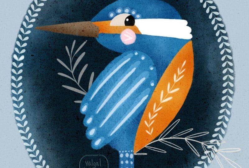
3. Style Overview: Folk art is a decorative
art style that focuses more on storytelling
and charm than realism. It often used simple, flattened shapes with a naive, stylized look,
intentionally ignoring traditional rules of
perspective and proportion. Colors are usually solid with very little
shading or volume, often using a limited palette. Common motifs include
animals, birds, fish, and detailed botanical
decorations, which can act as backgrounds, decorative elements, or cultural symbols
within the artwork. Different figians have developed their run folk art traditions. Scandinavian folk art is
known for its clean lines, symmetrical patterns,
and cozy floral designs. Eastern European styles tend to feature intricate
florals and bold colors, while Germanic and
American folk art, such as fracture,
include hearts, tulips and geometric
decorative patterns. In my own art, I don't
usually stick to one specific traditional
folk art style. Instead, I like to focus on
the universal elements of folk illustration while
naturally leaning into the rich visual history of my Eastern European background.
4. Applying Style: Colours: Now let's see how we can apply these features to our
old friend Ken fecha. Let's begin with the colors as it's the most
straightforward aspect. In the first two
classes of the series, we've determined our very
limited colour palette, blue, orange, and brown. The values of each tone, light, medium, and dark. This time, I'm going to stick
to three main colors for the base layers plus
black, white, light blue. And pink for details. If I need darker areas, I'll just use the blending
mode change technique. I'm going to use
botanical elements to create a folk art motif. And in the next lesson, we'll see how we can simplify
the shape of our bird.
5. Applying Style: Shapes: Previously discussed, folk art is characterized with
its simple naive shapes. That's why we're
going to simplify our initial sketch first, yet still preserving the
main features of the bird, as we've also determined before, what makes a common kingfish
recognizable apart from its distinct colour
palette is the shape and size of its head and beak
in comparison to its body. So while sketching,
we need to make sure we more or less
observe those features. There is a quick
way you can sketch any birds side view
in simple shape. An ellipse for the
head, a bigger egg shaped ellipse for the body, a triangular shape for the wing, a triangle or rectangle
for the tail. And the smaller elongated
triangle for the beak. Let's practice quickly. If you're sketching digitally, it's even easier as you can
move your shapes around till you find their perfect
positioning and style.
6. Sketching: So I've created a new
screen sized canvas, and now I'm going to paste in
the sketch we used before. You can find it right in the resources section
of this class. First, I'll reduce the
opacity of the sketch layer, since we'll only be
using it as a guide. Then I'll create a
new layer on top. Using the Scopus brush, which is a default
procreate brush, you can find in the pencil group or download from the resources. I'll start mapping out the
mean shapes of the bird. We want to keep it as
simple as possible. A squished lips for the head, an egg shaped the
lips for the body, around the triangle
for the wing, a soft rectangle for the tail, and a long, sharp
triangle for the beak. Now I can switch the
original sketch layer off as I won't be
needing it anymore. Looking at my simple blocks, I want to decide what
else I can do to really make the sketch
match our folk art style. I think I'm going to
make the body just a bit smaller to move it slightly further away from
realistic proportions. I've also decided to turn
the head the opposite way because I think it gives the bird a
lot more character. Next, let's join all these map shapes together with
a smooth curved line. I'll also add the
detail for the beak, the eye, and the little cheek. I definitely want to map out the distinct colour
patches on the face, too, as that's one of the Kingfisher's most
recognizable features. And just like that, the
main bird sketch is ready. I also want to add a simple curved line right below the bird for the
sake of our composition. My kingfisher is going
to be sitting on a twig, but since we'll be using stamp brushes for the
botanical elements later on, the line is purely for guidance. If you feel like you need to tweak anything in
your own sketch, I highly recommend going
to the adjustments menu, selecting the liquefied tool, and gently pushing the lines around until you're completely
happy with the result. It's a lifesaver for
quickly fixing proportions. With our sketch
completely ready, we can now move on
to the fun part, coloring our final illustration.
7. Base Colours: I've created a
screen size canvas and just a quick reminder. If you intend to print
your final illustration, make sure you choose
a larger canvas size on the higher resolution
from the start. The very first thing
I'm going to do is drop our overlay
texture right on top. This step is
completely optional, but I personally love adding textures to
my illustrations. It gives them so much more
character and visual interest. For folk art pieces, especially a good
overlay creates a beautiful wood
fabric surface effect. I'll change the blending mode of this texture layer to color burn and then lock it so I
don't accidentally drawn it. Next, I'll create a new
layer and drag it down so it sits right between the background and
our texture overlay. From here on out, all
our illustration layers will live in this space. Now I'm going to copy and piece the sketch we created
in the previous lesson. I place it above the texture layer since
it won't actually be a part of our final artwork and I'll reduce its opacity, so it's just a subtle guide. When planning the colors
for any illustration, I always start with a background because it sets the tone
for everything else. Right now, my background
is pure white. However, I know I want to keep some parts of my kingfish
pure white, too, like those distinct
patches on its face, and I don't want them to
blend into the background. So we're going to
change things up. One option is to simply tap
on your background layer and choose a soft
off white colour from your palette or color feel. But since I want
this piece to have even more of that
traditional folk art charm, I'm going to add a novel
background instead. If you're familiar with my art, you probably know how much I
love a good cameo vignette. To do this, I'll grab the
ultimate filler brush from the Folkio mini set and
pick the second swatch from the left on the
bottom row of our palette. I'll draw a large oval, and by holding my apple pencil down at the end of the stroke, Procreate will snap it
into a clean shape. You can easily tweak it using the handles in the
contextual menu at the top. Once you're happy with the
shape, just fill it in. Our background is ready. Now we can start creating
our solid color shapes. An important tip for organizing your
layers at this stage. We are going to keep
the head, body, and tail together as one solid
shape on a single layer. The wing will go on its
own separate layer, and the beacon facial features will be kept separate, too. Let's create a new layer. Using that same
ultimate filler brush, I'll pick our main
blue swatch and outline the head,
body, and tail. Then drop the color
to fill it in. See how beautifully
that overlay texture is already coming through. On another new layer, I'll paint the wing in
exactly the same way. Then on a separate layer, I'll paint the beak using the brown colour
from our palette. Next up the orange belly, the facial details, the
eye, and the cheek. I'll create a new
layer right above the blue body and set
it as a clipping mask. With our orange swatch, I'll paint the belly and the
orange patch on the face. Using a clipping mask keeps all our new brush
strokes perfectly inside the lines of the
body shape below it. Next, let's add that lovely
feathery white patch on its own new layer. At this point, let's turn
off the sketch layer for a moment just to make sure we are happy with
our base blocks. When I say happy, I don't
mean looking for perfect, flawless shapes and lines. That's actually what I
love most about folk art. It's wonderfully naive,
childlike approach. My shapes are far from perfect, and I fully intend to
keep them this way. Let's turn the sketch
back on so we can map out the facial
features on a new layer. I'll start with the eye. Because the eye sits right against that pure
white fish patch, I'm going to pick our off
white color so it stands out. I'll sketch a classic
fish shaped eye. This is the signature
eye style I love giving to all my bird,
animals, and characters. On a new layer, clip to the eye, I'll add the black pupil. Oh. You can add a little white
highlight if you like. Finally, I'll add
a sweet rosy check using the pink from our palette. We can now turn the sketch
layer off completely, since we won't be
needing it anymore. Our base colours are locked in, and in the next lesson, we'll start bringing
the fisher to life with shading and
even more texture.
8. Shading and Texture: Now let's add some shading. In folk art, we don't add shading to create
realistic volume, but rather to accentuate the character's features and give them a bit more definition. First, I'm going to clean up
my layers panel a little bit by flattening all the layers that contain the
facial features. Looking closely at my bird, I also feel like the back of the head could
use a little tweak. So I'll grab the
liquefy tool and gently push the edges until I'm completely happy
with the silhouette. Now we are ready for shading. I'll create a new layer right between the blue body layer and the orange belly layer and change it blending
mode to multiply. I'm selecting the cross hatch texturizer brush from our set. And for the color, I'm
actually sticking with the exact same blue
we used for the body. Using very light gentle touches, I'll build up just a subtle
hint of shadow in key areas. Next, I want to add some
depth to the orange belly. I'll create a new
layer right on top of the orange layer and
set is a clipping mask, so our work stays perfectly
inside the shape. Just like before, I'll switch the blending
mode to multiply, select our original
orange color, and use light sweeping
motions to add a touch of shade to
the belly and face. To keep a beautiful
bold contrast between the wing and
the rest of the body, I'm actually not going to add any shading to the wing at all. Oops, I can see that a little
bit of my orange shading spilled over onto the blue parts of the body. No worries at all. I'll just grab the eraser to and quickly clean
up those edges. Let's add a tiny bit of shadow to the
underside of the beak. I'll create a new layer
directly above the beak, clip it as a mass, and change the blending
mode to multiply, using the same brown color
we used to paint the beak, I'll add just a soft touch of shadow along the bottom edge. Before we move on,
I've realized I forgot to accent the area
right around the eye. Let's jump back down to
our blue shading layer for a quick moment and
add a tiny bit of definition there
to make the eye pop. Finally, even though
we already have our gorgeous canvas
overlay texture running through the whole piece, I'd love to experiment
with an extra layer of texture to give the illustration even more depth and character. I'll create a brand new layer right at the top of
our illustration stack and pick the same cross hatch texturizer brush we
used for shading. This time, I'll select our light blue color and
increase the brush size. Using a gentle tap tap motion, I'm going to dust this
texture over the bird. To blend it beautifully, let's change the
layer blending mod to lighter color and bring the
opacity down just a bit. Looking at it now,
I don't quite like how this texture looks
over the orange belly. It washes it out lethel, so I'll grab my razor and lift the texture of the
orange parts entirely. However, I absolutely love how it looks on the blue areas. It gives the head and the body this gorgeous subtle
feathery effect. And with that, our kingfisher
is completely textured and ready for the
most exciting part, the decorative details.
9. Decorative Details: The very first thing
I'd like to do is stamp the twig that
our bird is sitting on. To do that, I'll create a new layer right above
our oval background. I'll select the leafy twig, to brush from the set, pick the brown color from our palette and stamp it
anywhere on the canvas. From there, I'll flip this botanical
element horizontally and adjust its position, creating the perfect
impression that our kingfisher is
perched right on it. Now I want to add
another twig on the opposite side to balance
out our composition. On a new layer, using
that same brown color, I'll grab the leafy twig three
brush and stamp it down. Again, I can scale and rotate it whichever way
looks best to me. If you'd like your twigs
to look a bit darker, you can either pick
a deeper color from the color field or you can experiment with
blending modes. Try changing the layer mode to multiply to see how it
interacts with the background. Next, I want to use
a different twig stamp directly on
the bird's belly. I'll create a new layer right on top of our
orange belly layer. This time, I'm using the leafy twig one brush and
picking a pure white colour, I'll stamp the twig onto the canvas and play around
with its positioning and scale to make sure it sits beautifully within
the shape of the belly. I'm going to stop with
the stamp brushes here, though you are welcome to use as many as you like
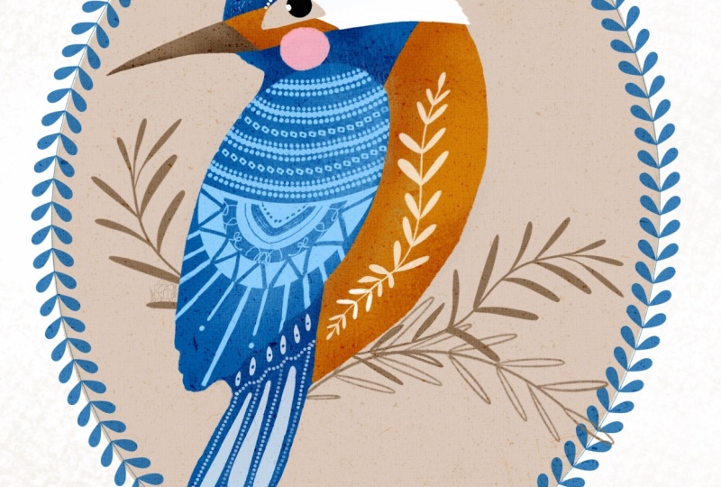
in your own piece. Now, it's time to add hand drawn decorative elements to
the rest of our bird. This is absolutely
my favorite part, because there are no rules, and you can have as
much fun as you want. Let's create a new layer, making sure it sits underneath our feathery
texture layer. I'll grab the colored
pencil brush, and the colors I'll be using are our light blue and a
little bit of pure white. First, I'm going to draw some decorative patterns
directly onto the wing. Because the wing is
right in the foreground, it's very common
in folk art to see this area most richly decorated. Just relax, use your imagination and let your pencil guide you. Next, I'll switch over
to the eraser tool, making sure my eraser
is also set to the colored pencil brush
so the texture matches, and I'll create a few
tiny areas within my drawings to add even
more intricate detail. To balance out that bright
white element on the belly, I'll switch back to my
brush using pure white. I'll add some simple decorative
strokes to the tail, the face, and the
top of the head. And we're almost done. The very last thing I
would like to add is a decorative frame around
the background oval. For that, I add a new layer right above
the background oval. Take the classic
folk frame brush and pick this dark blue color. Holding the pencil down, I drew a frame around the shape, making sure it closes smoothly. And just like that, our folk
style illustration is ready.
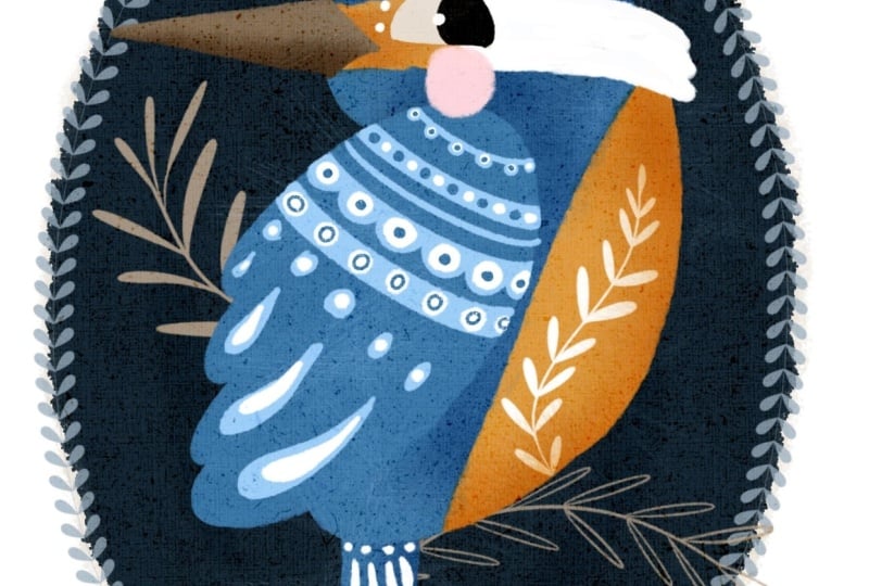
10. Bonus Lesson 1: Quick Alterations: In this bonus lesson, I'm going to show
you how to make a few quick adjustments to give your illustration an
entirely different look. Before we begin, I highly
recommend duplicating your artwork so you don't
overwrite your original piece. To do that, just go back
to your Procreate gallery, swipe left off on your
artwork and select Duplicate. Now, let's take a
few simple steps to completely transform the
mood of our illustration. First, I'd like to change the color of our
background vignette, turning it from light to dark. Making sure you're on your
background of a layer, select a dark blue color
from our palette and simply drop it right onto
the shape to fill it in. Now that our background is dark, we need to make the twigs lighter so they create
a beautiful contrast. To do this easily, I'm going to pinch
our two twig layers together to merge them. Then I'll head up to
the adjustments menu, select hue saturation
and brightness and bump the brightness
slider up to about 60%. Look at how beautifully those
botanical elements pop now. Finally, I want to
change the color of our decorative
frame so it stands out clearly against that
new dark background. We're going to use a
similar trick here. Make sure you are
on the frame layer. Open the adjustments menu, select hue saturation
brightness and slide the brightness up
until the frame becomes a lovely
vibrant light blue. To give it an even
more striking effect, I'll use the transform
tool to slightly scale down and adjust the frame
so it sits perfectly snug, just inside the edge of
the background oval. And that's with just a few incredibly simple
color and brightness tweaks, you can completely change the overall look and feel of
your folk art illustration. I can't wait to see which
version you choose to create.
11. Bonus Lesson 2: Inspiration Sources: As a huge fan of folk art, I have built a large collection
of books on the topic. Today, I'm sharing some of my absolute favorites to help inspire you on
creative journey. The top spot on my list
goes to this masterpiece by US based artist
Dinara Mertipova. I consider her an absolute
star of modern folk art. This book is a treasure chest
of stunning illustrations, inspired by Slavic folk tales and traditional village life. Even better, Dinara shares practical tips for
drawing characters, buildings, and small
design elements alongside advice on
choosing materials. It is my personal
folk art Bible. It never leaves my desk, and whenever I hit
a creative block, I simply open to a random
page and start drawing. The magic happens every time. I'm such a big fan
that I think I own every single book she
has ever illustrated. Creative folk art and
beyond by various artists. If you want a broader
mix of inspiration, this book is fantastic. It features folk art and craft projects from
several talented creators, while Dinara's work leans towards Eastern European styles. This book focuses heavily
on Scandinavian designs. If you love huge vibes and traditional Swedish
Norwegian or Danish art, this is the perfect
addition to yourself. The Creature Garden by
Harry and Zanna Goldhag. This book offers a
wonderful look into mystical fauna and
whimsical botanicals. The authors take a slightly different approach
to the folk style. Their work is less flat and
uses more shading and volume. If you want to challenge your skills by adding
depth to your drawings, I highly recommend this one. Now some hidden gems, vintage charity shop books. Some of my best sources of inspiration are old books
from charity shops. They often have nothing to do with modern
illustration and art, and they usually focused
on old school textile, pottery, or traditional crafts. Despite that,
they're packed with beautiful pictures of
authentic folk art elements. Keep an open eye for these
when you are thrifting. They usually cost
next to nothing, but their artistic
value is huge. And some of unexpected
inspirations everyday covers. Do not limit yourself
to art books. I find immense inspiration
in everyday books that have striking covers
or internal graphics. For example, this poetry
book I used to read to my children has a
truly remarkable cover that always sparks new ideas. Whenever I spot a
beautiful book at a friend's house or
a local library, I snap a quick
picture on my phone to save to my digital
inspiration folder. What about you? What
unique sources of art inspiration do you
keep on your shelves?
12. Conclusive Thoughts: You made it to the end. Well done. Amazing job. I hope you'll consider sharing your beautiful illustrations in the discussions below or
on Instagram and Facebook. Be sure to tag me on Instagram, so I can see your
wonderful work. If anything was unclear
or you have questions, please do not hesitate
to leave comments below. I'm always here to help. Thank you so much for creating with me and see you next time.
 Irina Young, Busy May Studio