Transcripts
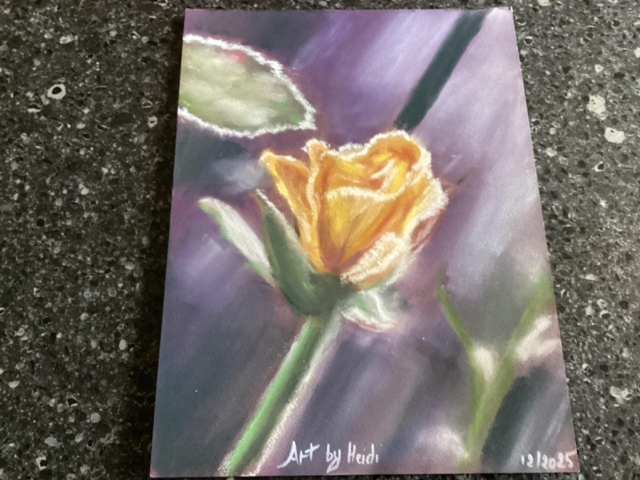
1. tea rose intro: Have you ever wondered how to portray frost in a painting? That was a question that
came in my mind because we've just had our first frost
here on Vancouver Island, and it reminded
me of a time when I saw frost on a little tea
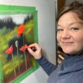
rose and I took a picture. My name's Heather Nelson, and I'm a soft pastel artist. I love to work
with soft pastels, both in pencil form,
pan pastel form. Lots these little guys here, or also in stick form. Either way, it's
like, direct pigment, and I really like that tactile
aspect of soft pastels. In this project, we
are going to work on starting out right away
with our soft pastel. We will form our
foundation and create our sketch directly with our
soft pastels on the page. I'm going to be
using pen pastels, but that is completely optional. You could do everything just
with soft pastel sticks. But if you have them, crack
them out. Let's use them. So we're going to
create that foundation. We're going to create a
nice soft background. It's a little out of focus where our flower can be
the star of the show. We'll be learning how to use different values to
create that form of our flower and the illusion of all of these different
layered petals, as well as the frost around the edges and on
this little Bud? Is that what that
is? Is that a bud? I would love to see what
project that you come up with. So please upload it to
the project section. And if you'd like, you can
even tag me an Instagram, and then I'll share
it in my stories. Please give me a follow here on Skillshare so you can find out what other courses
I have coming up. And I'd love it if you take a look at some of the
courses that I already have. And you can also follow
me on my other channels like my Instagram and also
on my YouTube channel. If you check out my website, I have a free
resource which shows you how to get more
painterly in your work. Let's move on to our next video, which is about the
materials we'll need.
2. tea rose materials: So the materials
that we're going to need for this little project, I'm working in my sketchbook. This is a sketchbook
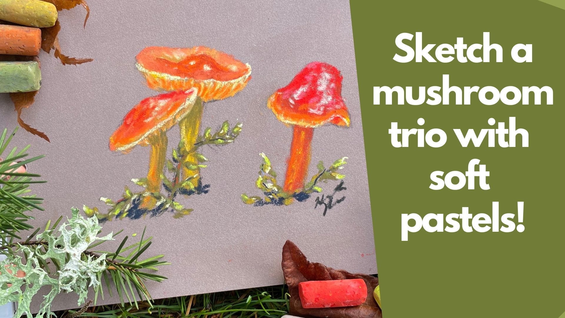
I made myself, and it is 6 " by 8 " tall. And we've already possibly done the class with the
mushroom and Skillshare. Now our tea rose. For the optional supplies, I've got some pan pastels here. I've got an assortment of different violets
and a golden color and then an assortment of green. But these are optional. I like to use them
in the background because they cover really well. But if you don't own these, you're just going to use your soft pastel sticks
and you're just going to blend them in the same way that you would do
with the pan pastels. As for the sticks
that we've got here, I've got an assortment
of values of green from dark all the way
to quite a light color, but I also have some more grassy a lot of yellowy green
kind of colors as well. But use what you've
got in your greens. And then I have an
assortment of these kind of carameli kind of colors like to the mustard and then coming in with our different
yellow colors. And that's going up in value. So I'm gradually going from
dark through to, like, saturated yellow and
then to a very light, very light colors, right? So we've got quite an
assortment of those. You don't need to
have as many values. Again, use what you have, but you will appreciate
having some sort of golden color unless your rose is completely different color. Now, your hands, they're
probably going to get dirty. I like to use some type
of wipe for my hands, but, of course, you can
just use soap and water. I just find I like the
cloth to wipe my hands off. For cleaning off my pastels, I like to have a nice,
like, fiber cloth. Like, if we look at this
pastel, it's quite dirty. It's going to put colors that we don't want down onto our page. So I give it a quick wipe, and then I'm back to
the original pigment. You could use these to
clean your hands off too. I used a little bit of tape
to tape my painting down. I wasn't super concerned about that with such
a small canvas. I did have some soft tools. These were my blending tools. But if you don't have
blending tools like this, you can use your
finger, a bit of paper towel, even
blending stump. Even a pool noodle would work. Paper is the most
important thing you're going to use for soft pastels. You want a sanded paper. So that's paper with
a little bit of a texture that's going to grip those pigments
and hold them. The better quality
paper you have, the less powder you're going
to have around on the table, and also the more
layers you're going to be able to get down
onto your painting. My favorite paper by
far, is pastel mat. It is expensive, though, so use what you can get, but it is going to make a
difference to your painting. So use what you can. I've even used automotive
sand paper before. You know, UART is quite
a nice sanded paper. So there's papers out there
and use what you can find. But definitely try to buy the best paper
that you can afford. You can download
the reference photo from the Projects and
Resources section.
3. tea rose sketch: I just want to dive right in, see where the journey
takes us today. I may begin with my
pan pastels and just kind of carve out
the idea of where this little t rose
is going to show up. And so going to be
thinking about, there's this angle
here of the stem and, yeah, no, I don't want to
go too close to the edge. I want to be
thinking about that. So sometimes I just
kind of like to plan out my strokes and then, visualize what might happen. And this color that I'm putting
down now is Pan pastel, but you could use soft
pastel if you want, and we're just going to kind of, like, lay in the idea. So it's almost like
creating a sketch. I'm going to have other
colors on my soft tool. I'm choosing to use the
triangular one here, and we're just going
to be thinking like, I think some of the yellow
is going to be up here. I'm not worried about these other colors because I know that I can go right over top of them. I want to step down
with that T rose, probably have it come in this
section here at this stage, this could be all that
matters to me is, we're going to have T
rose in about here. Maybe I do want it to have a little bit more length
because I like how it's tall. I might say that it comes in. I'm just mapping it out. That's
going to be about there. Then I might bring in some
green now and just say, there's going to be this
little aspect here. It's going to have
a little line. Then there's going to be
the base of that flower. This is me sketching, but sketching in my
own. That came off. Actually, I'm just
going to flip that. Put a little green on there, and just say it comes
to about there. That's me saying this is where the T rose is going to
live in this picture.
4. tea rose background1: Now I can come in with some
of the background elements. I'm using my squarish
one this time. Again, I'm still
going to be using a little bit of pan pastel, and I'm going to just
bring it in there. Grab a little bit of
the lighter gray. And now we can even
start thinking about carving out a little bit of
our negative spaces even. I'm gonna think about where would that flower actually be. And I'm just gonna rub
that around on my paper. It's particularly powdery today. It makes me wonder,
L, I've got something crusty on the backside
of my applicator. Who knows what I
was doing with it? But anyway, colors aren't blending in as well as
they normally would, but we're just gonna go with it. Seems like I'm getting
that crustiness off by working it into the page. So that's right. I'm okay
with whatever that is. It's like some sort
of blue or something, but, it works for me. I'm not going to have that
one leaf coming across there. I'm not very interested
in that one, so I'm just blending. We've got some grays
and some blues. Might even bring in a little
bit of a purply flavor, and I can mix that in
with my lighter gray. Get that, like, purply gray. And purple, of course,
it's going to be a nice complimentary color
with our gray and our sorry, purple will be a
nice complimentary color with the yellow. And at first, when you're
painting like this, I just want you to enjoy the joy of the
painting like this. Like, you might think, Oh, but it looks kind of
weird. Yeah, that's okay. It's all part of the process. Putting a little
purply up there. Have fun painting that in. Using like circular strokes. Now, if I wasn't
using pan pastel, would actually be
doing something really similar with my soft pastel, but I would just be blending
it in with my blending tool, I'd put the color on, and then I would just blend
it in with my tool. And if I didn't have a tool, I would use whatever I did have. I might use my fingers,
that kind of thing. And because I had all
these little crusties on here, I don't know. I must have had some
sort of underpainting happening in one of
my last projects. You can see more powder on the page than there
normally would be. I'm alright with whatever
this blue crusty stuff is, but we might just try to
blend it into the page. You can look for
where things are lighter in your reference photo. But I do like the
purple in there, so I'm gonna rocket that
around in there, too. And I might play more and
more with that over time. Like, I like how that gray and that purples working together. I'm even going to add in a little bit of
that greeny blue. I think you took this
picture in the yard. I'm probably going to skip that stem that comes
in through there. I just don't care for it. And
I want to keep this simple. I kind of grabbing
different greens. I think that's
quite a dark teal. I have to get out the dust
buster after this one. It's not usually this
dusty with the uh Yeah, it's not usually quite this
dusty with the pan pastel, but this is what we
got going on today. There's even a little bit of a glow backck here,
the yellowy glow. I'm going to bring
that in cause why not? See how it works later. Bring in some stronger,
more green greens. Some of the other things
in this background, hard to say whether
I'm going to use them or not. We'll see. But for now, this is probably gonna be how
my background looks. Bringing a little
bit more of that. Lighter gray kind of blending
that out with the purple. Okay, so that's the
basics of our background, but that doesn't mean we're not gonna put more background in.
5. tea rose background2: I've added a soft
pastel here that's a little bit of
grayish purply color, and I'm just going
to bring this into the areas that I want
a little bit lighter. One thing about soft
pastel is it's going to go down stronger than
your pan pastel, and it's going to
have more impact. So you can throw it in there, and then you can still use your applicator to blend it in. So that's how I would
do the background if I wasn't using pan pastel. And I don't want you to
feel like you have to have pan pastel to
have success with this 'cause you really don't and just gently making my circles and just kind of
blending the edges here. You can still leave the
idea that there might be kind of a stock in
the background here. But I'm not planning
on putting one in. Yeah, I just like how that brightened to lighten
things up a little bit. Might not want it lighter
and brighter everywhere. So I'm going to use this a
little bit lighter here. And then I might even bring
in some of the darker green and even maybe
a little well, no, we won't bring that in. We're just gonna use this one. Now, if I was to blend
this in with my finger, the colors would stay
a little bit stronger. When I use the soft tool, it kind of lifts some
of the color up. Now making that transition, and it's got a little
bit more purple to it. It's just grabbing a little more purple to make that transition. Now, you will find you do not regret time spent working
on your background. At the time that you do it, it'll often feel a little bit, when am I ever going to
get to the good stuff. But actually, it will make your whole picture look
better if you concentrate a little bit on
it now, pays off. Transition there. Be a little
lighter transition in here. Okay, so that's
where I'm going to have my background
at this level.
6. tea rose mid ground 3: Then we have more
of our midground, and I am going to put in a
little bit of our midground. I'm going to bring
in a little bit of our grassy green in a stem. I can also think about that color on my actual
stem of my rose. Don't worry, we're going to be blending this
out a little bit. It's not going to be
quite as sharp as this and a little
bit of my darker green we'll be bringing that
in on the bottom of our row. So I'm just taking a
little edge of my color, carving out a little half circle here and I'm going to drag it down a little
bit down my stem. And then when I bring
in my blending tool, I'm going to be in careful. I don't want to lose the dark there and just drag it down. We're going to blend in
this background a little. And I do want this to be
a little bit fogged out. But I can even bring in a
little bit lighter colour. Ooh, that one's a
little powdery. Again, we're just
going to blend it in, so it's not going
to be so strong. Can kind of use all of it there. I'm just dotting this around. But I'm going to
blend that, too. So people won't be able to tell what is happening back there? They just see things in the same way that you
see things in the photo. And I'm using a really light pressure here as I'm doing this. Just kind of gently
blending it in. So, yeah, people aren't sure. What are they seeing
here? Who knows? But they'll assume you've got a rose with other things
in the background. Other plants, maybe,
maybe even other roses. Could get a little stronger
in this dark section. I want a little contrast there. I might even bring my
finger into blend because I kind of like the effect that
I get a little bit better. I like that little bit
sort of stronger color. So now we kind of use
the negative space from that dark color, sort
of blend that in. It's funny, too, because
I was thinking, Oh, I'm not gonna really
concentrate on the background. Just kind of keep it
really quick class. And I couldn't help myself. So we're just gonna be
blending in those greens. So you know something's
back there, but you don't know what. And this, too. Again, I kind of
like that, like, moodiness that it gives
to my background. So I'm gonna embrace that. Now, there's a little
bit of light here. And some of this is
to do with the stem. So here's like kind of
a light I don't know, it's a little bit
of a light teal. Just put it on the edge where some of this light is, and
then also in the back. And so I'm just using
the edge of my pastel. Just go to dot that in. I don't want that one blurred as much. It's even a little bit of, like, reddish, pinky kind of things. And I'm going to dot
those around too. And by carrying that
color around two, it's going to make more sense when I stick it in my flour.
7. tea rose greenery 4: So I'm going to
take my dark green, now this to I won't be blending, I'm going to just use it in that little half
circle for underneath the bud area and a little bit at the base
of my rose as well. You can always cover up
anything that's dark so we don't have to worry. And
I'm going to bring it in. I brought it in kind
of like on an edge. For that part of the rose there. C even use this color a
little bit up here for this piece and a
little bit there. Here I'm just drawing with it. I'm almost acting
like it's a pencil. But say for this
back piece here, now I can use my more minty teal color and
draw it on top of that. That's what's giving it
that dimension a little. We have it a little
bit in here too. And you can carry it a
little further if you want. So we should probably do something like that
out here, too. So we can see this piece here, so I'm using the edge
and carving it like so. And then I can bring in a
little bit of my other colors. So I have a little
bit of orange kind of color on the top of whatever. I don't know what
you call those. Sort of stem like things, and I'm getting a
brighter color, too. I'm just going to keep layering. Onto there. And then I can bring in my
lighter mintier color, and I can blend over top. I'm using it in little circles to just blend right over top. So I'm taking into account that I had other
colors underneath, but I knew I would
be able to blend it with this minty color. And then when you
want a sharper line, just use a little
bit more pressure. Like so. And then I can go
sharper line again, you know, underneath
here, too, if I want to. I kind of like how that works, and I can use that on
its edge for hers. Well, it's good. And we can use maybe that grassier green
and just really light. I'm kind of scumbling it, so that means that I'm
not fully drawing. I'm kind of, like, letting it make contact sometimes,
but not all the time. And I actually want a little bit of a yellowy color
in there, too. So I'm going to grab
my yellow terry ludwig and gently add that. And I might even end
up blending that out a little bit. We'll
see what happens there. I'm gonna see if I can
scribe across the back. And so that was kind
of interesting. I'm gonna grab my little soft tool that's
like a triangle. It's got a lot of color on it, so it's kind of got to be
careful here how this works. Just really gently blending that part in the back
there on that rose. And I can use that a little bit here if
I want to as well. I got to be kind
of careful there. I want this to be
quite dark under here. Like, I'm looking for
quite a lot of contrast. So I'm just going
to draw that in. And so that darkness
against the light, that's what gives
you that contrast. That's where you want to
really see dark and light, which will give you something
to play with a little bit. Kind of wanted it
dark there, too. And there's even
a little bit of, like, throw that reddish
terracotta color there. And if you get too
strong with it, well, don't worry about it. You can always take another
color over top of it later, or you can blend it back in. Actually, that
worked. I put this as my lighter color,
and I'm kind of, like, rolling it on almost for
my little bits of frost. That's kind of a cool
effect that we're getting. And we might use that
a little bit here. Ooh, got to have a steady
hand for that one. But I like this, like mintier
color for in the back. And so I'm drawing that on. Like so. There's still a little bit of reddish
colors back in here, too. Alright, it didn't go on in the right spot, but that's okay. You can just kind
of blend that out. Never worry. We need a little
bit lighter color there. And again, that'll
bring us our contrast. But you might have to very carefully rub it
in. There we go.
8. tea rose flower part 1 - 5: Now I'm going to take that
darker reddish color, and it's going to come
in around the back here. And I'm not concerned about the fact that it's quite
dark right now and it's darker than what I
really want to have in there because I'm laying
in a foundation right now. So I'm bringing in, and
I'm like, sweeping it up. For this area of the rose that I'm going to
want to have darker later. So kind of carving
out those areas wherever you see
something darker. And so, like this rose has these moments here
where this is going up, and then you can see,
where this, fold is. So I'm going to come
down that fold, just like drawing with the edge. Because I'm gonna be
blending over top of that. I can use that in
other areas, too. Like, I can look for other spots where there's a bit of a fold, and I can add a little bit of this terracotta kind
of color to those spots. And we can always put
lighter color over. But as we add these areas, they're going to be
like our contrast folding petal areas, which you can kind of already
start to see coming in, but we'll be putting
things over top of this. And actually, this part over
here is more of a green. So I'm going to
grab green color, but do the same kind of thing. So I'm going to carry it
up, really light pressure. And even a little bit
through the back here, I think it has to do
with reflections, just gently dragging that up. And you might think, but,
Heather, that's so crazy. And then here, we're going
to have this come through. I'm just bringing a little
bit brighter color, greenier, and then I'm going
to bring my like, minty teal and just
blend that all in. And I do think I'm
going to need to add a little bit of
the terracotta color. To make sense of it, as well. Or maybe even this is like a little terracotti color, too, but it's like
a lighter one. And maybe even a little purple. Just put a little
purple on here. And we can always
sharpen that up later. So don't be concerned
about that right now. It's these little details that
are going to matter later. So I'm kind of blending
that in a little bit. Time to pick a bolder yellow. So this yellow is
quite a fun one, and I want to use it sparingly. I'm going to glaze it over
top of this terracotta color here really lightly because I want some of that dark
stuff to show through. And just dragging it up where the main part of that, rose is. And then we can use
a little bit of it sparingly on the
outside as well, dragging it up again. And same thing over here, but really gently, like
the gentlest of pressures. And then you can decide whether you want to blend a
little bit of that. So I'm just going to
do that with a finger, and I'm just
dragging it upwards. So I'm getting in there, just kind of dragging that
up 'cause this is, like, my foundation, right? I'm going to want
some of this texture, so I don't want to
blend in all of it. So I'm just now I might
bring in, like, a lighter. This is more like a
very bold butter. And I'm going to use it on
the edge, as if I'm drawing. And that's going to
be that edge there. We're going to need a little bit of lighter
color, too, there. And now I'm making a little
bit of circly lines, sort of blending
it into the back, grabbing a lighter color still, again using just the
edge and drawing again. Like so. And then
I can put that on its edge and kind of make that, like, fold area there. And it does kind of
fold over on itself, but it does that
with a darker color. So I'm taking this,
like, really light, I don't know, it's
a bit of a mustardy color, putting that underneath. And I might even drag
that a little bit under this petal and under
where that fold was. I need a little bit of
that inside here, too. Lighter buttery kind of
colors. This is like a yellow. And I'm gonna come in and,
like, kind of pull in. But again, not so much that I cover over the color that I put underneath because I
want that color there. I put it there for
a reason. I'm going to kind of wiggle it
'cause it is wiggled. I'm going to blend it a little
bit with my finger here. It's a little bit out of focus. Some colors blend really
easily and some don't. I put this lighter color
over on this edge to kind of indicate the highlight
here, and I'm making, like, little circles kind of
over the lip there. And I might draw a little bit
with this too on that edge. And I think I could
use the same one, actually to draw this edge. But it's not as light, so I do need to come in with my more yellowy kind of color. I'm going to mix and
blend because I don't have all the colors here
that I want, I can tell. I'm going to bring
that little bit of a buttery in there just
'cause it's interesting. And I'm going to use
that one for here. Again, just kind
of dragging down. I almost need, like,
a peachy color. You can see that
sometimes as you're getting a little bit
deeper into the project. If you see areas that are
a little bit lighter, you just pop those
into the folds. That also might be where
more of my frost is. So I'm just I'm making, like, a twisty line. We're probably gonna
need some extra colors for those frosty bits, though. And I'm just gonna wiggle it
around here a little bit, just to kind of give myself
an indication of where it is. Like, I will probably
be making changes, but this kind of gives
me a sense of it. Bringing in more of a
banana e color again. Dragging upwards. I kind of
want that back there, too. And a really gentle pressure,
putting it in there. And yeah, I can see that I want something that's,
like, peachy, actually. Just go to take this
and just drag it down. Be really careful
when you're blending. You don't want to lose all
the dark bits that you added.
9. Tea rose flower part 2 - 6: I think this is the pinky peach that I
was kind of going for, and I want to just sort of glaze it in amongst the
yellow a little bit, especially in these areas that
are a little bit lighter. I think it's a good addition. Could even use it a
little bit on this edge. And I'm gonna play with
it a little bit in this frost section here,
along with some yellow. Let's get some little
circles in there. I know it doesn't look
quite like frost yet, but we still have
a ways to go here. I'm getting some
interesting texture sounds. A little pinky here, too. And then starting to use a little bit of pink on
some of these edges here. Maybe that needs
to be a little bit more of a yellowy kind of cream. And then I see that I
will definitely need a little bit of my butter
yellow, but so gentle. Don't go too crazy I like that dark shadow coming
through there as well. When you want to keep the Oops. When you want to
keep those in there, you just don't want to
put so much layer over top that you're
scrubbing it out. I don't know if you can
hear my kitty snoring. And we can throw these along these folds and lips and edges, 'cause this is that,
like, light color. And I want a little more like a bright yellow
in the back here. So now I can kind of
throw I don't know, wherever I think little
fold or a little edge is. You start putting some of
the yellow back in there, but I still want to be able
to see my shadows as well. Otherwise, I'll lose
everything that I created. So that's not what I want. And then I can start bringing in my lighter highlight colors, kind of glaze across the top, and I can even say make
that some of my frost, which means I'm kind of,
like, tweaking and rolling. My color over the top, I think we'll get
an even lighter color to do that with as well. What you want to
be able to do is see that you have these
little folds in here. I know, just wiggling those in. And, of course, I can add. Like, if I come out further
'cause I wanted to, I can add a little bit more yellow to make some
sense of that. You can even add a
little green in there. Oops. Okay, that one was
not the best choice. Ah, but luckily with pastel, if you make a mistake, you
just go over top of it. It doesn't matter. I kind of want a deeper deeper red vibe going on in there, too. Then I brought in another
lighter color for the edge of that, whatever this is. It's kind of the
casing, I guess. And we do need some yellow for this back part because
this is still a petal. But there's also some
mustard colors back there, so I'm going to
mix those in too. Kind of throwing
colors around to get the idea of those little
cinnamon folds in there. And then you can come back
over top again with yellows. Always do that. But
then sort of count on your dark colors in behind. Even putting this green
back here to be my shadow, but I'll just have to
blend it in a little bit. Actually, maybe I'll
just blend it in with a little bit of a pastel. So really gentle glaze over top, and then that'll blend it in more organically than you can do with your hand, you know? Can add a little hand later. Gray green in the back here. I'm going to just throw that in. Maybe a little purple there, too, sort of get that crispier edge. You can always play in
the background still, but just be really
careful as you're coming up to the
edge of your flower. I just wanted that
yellow in there. I wanted it to be a
little more yelloi. Now, we do need I think, anyway, I think we need a little bit more of that frosty color. I want that, like,
fold over there. I'm gonna create this
shadow behind the fold. It's a little bit of the green. Okay
10. Tea rose final 7: To blend this in a
little bit more. I'm about to put
some frost on it, and that might
change how it looks. So this is quite a
light gray unison. It's even got some
shards which I like. I'm going to start
in the background, see if I can get this color
to go on and I'm wiggling it. Is the wiggles. I think part of the
key to this frost is going to be having a
little bit of darkness in underneath so that you
can see the difference. Frost is harder
than I anticipated. Whoops. Yeah, and if you do get it
somewhere you didn't want it, if you wiggle it in somewhere, and you're like, I didn't
want that over there. Well, you can always
color over top of it. Don't worry about that. And a little bit under
here and over here. And I'm going to wiggle it on my little narrow piece and
across that back piece. This one, I'm going to, like,
dull down a little bit. I think I went a
little bit high here, so I'm going to bring in
a little bit of yellow. I'm going to step back,
take a good look. Oh, I see that I need a little
bit of a glow back here. And I'm gonna put that down. Like so. And then also
some boring green. Well, it's a bit
of an olive green, 'cause I don't want
quite that saturated. Not so sure that roses do
exactly what I've got. I want this as a little
bit more of an angle here. I'm going to let this come
down a little bit more, that edge is going to
be more down here. You can do this. After
you look at something, feel free to make
some changes to it, and it's coming a
little more down, it goes up down. I'm just going to scridge
this in a little bit here. Scrige technical term. And I like like that shadow
coming in back there. But I just want to
change a little bit, and I don't want
this quite so dark. Find my eye just goes to that, and then I don't
notice anything else. It's creating too much of a
focal point, so to speak. Same with, like,
maybe this one here. I just kind of want it
wrapping around differently. So study your reference picture and make sure that it
actually looks like a rose. And then this goes up a
little bit of an angle, too, because I think
these things kind of like they're not perfectly
like a cinnamon bun, you know? They have a little bit
of a spiral to them, but not quite
cinnamon bun, spiral. Like, I want this petal to
kind of go up and folded, and then there to be another
one in the background. Then I can add a little bit
more of the frost idea to the background and
to this one here. I'm just going to
add a little more purple and gray to
the background. You can always do,
like, whatever whatever finishing
touches you want. I kind of want to make
it seem like there's a little something back there, but they're
not sure what it is. With the folds of a rose
and how a rose looks. Maybe. I don't tend to grow roses because
deer eat them here. Okay, there does come a time. I think you all know by now, if you've taken
enough classes with me that I can get a
little bit overworki. We don't want to overwork
this whole project. So we're wiggling a
little bit of this in a little dark
speckling in there. That's to make it
look more like frost. I think it kind of works. Really gently. Okay, be
a little bit more back here for a little bit
of a dark shadow. And, no, I'm not going
to leave it like that. I was just going
to glaze over it. I just want it a little
bit darker next to that. Petal. 'Cause
remember, contrast is everything. And then we sign.
11. Tea rose outro: Thank you so much for
attending this class. I really hope you enjoyed
it and that you had fun creating these different layers and forms with this tea rose. Hopefully, you were able to
get that illusion of Frost, as well. I know it
was challenging. I would love it if
you would follow me here on Skillshare, and you can also follow
me on my other channels like my Instagram and also
on my YouTube channel. Is there anything we're missing? You shouldn't really be
doing that in the video.
 Heather Nelson, Pastel artist