Transcripts
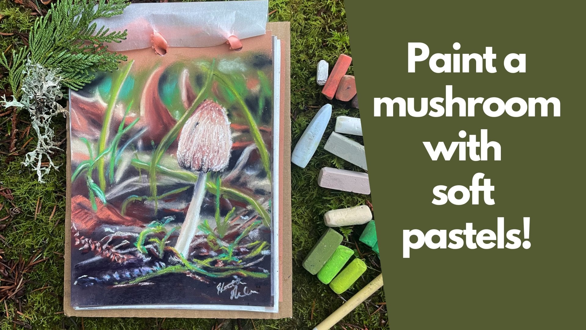
1. Mushroom Trio Into: Would you like to paint these adorable little
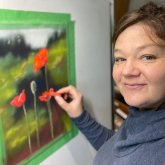
mushrooms with me? Hello, I'm Heather Nelson and
I'm a soft pastel artist. I love to paint things that
inspire me from nature, especially here in the forest. I discovered these
adorable little mushrooms while I was out walking
with my horses. They were so cute.
I couldn't put too much attention on them or I knew that the horses
would run them all over, but I've come back
to explore them and maybe to collect some samples
the horses did run over. We're going to
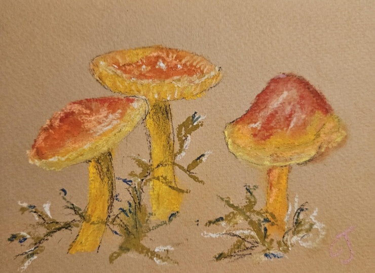
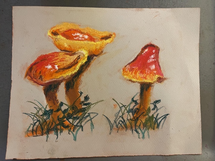
sketch those up in soft pastel and we're going to work with these
orange and red hues creating lovely
little gradations. We're going to add
highlights and we'll finish up by sketching in a little bit of foliage to create the scene. I would love to see the
project that you come up with, please share it and upload
it in the project section. You can follow me
here on Skillshare. I have lots of classes, even another class on mushrooms. You can also follow
my YouTube channel, and you can check
out my website. I'd love it if you'd sign
up to my newsletter. You can find out more
about painting in a painterly fashion
with soft pastels. Next, we'll take a
look at materials.
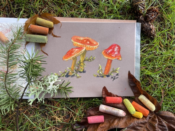
2. Mushroom Trio Materials: For the materials for our
little sketch project, I've created a
little sketchbook, but you certainly
don't have to do that. And inside my sketchbook, I have eight inch by six inch sheets of pastel mat
and their glassine paper. So pastel mat is my
favorite paper to use. What you're looking for is a textured or sanded paper that's really going to grip
the pigments of your pastel, and you're looking for
something where you can layer. That's my favorite
thing about pastel mat, but it can be expensive. So there are less
expensive options, but it may affect
quality of your work, you really do want a high
quality pastel paper. But you can also use sandpaper. I've used automotive
sand paper in the past, and that's given
me okay results. These are our soft pastels. The brand isn't important, and you're going to want,
like red and yellows. I've got a couple of
different values of yellows. I do have a dark blue wasn't
absolutely necessary. And I've got some
different values of pink and sort of
peachy kind of colors. You don't need to have every single one of the
colors that I have, but you are going to
want a little bit of a range of some like browns, orange red, yellows,
pinks and greens. For the sketch, I used
some willow charcoal. You could just use a
bit of soft paste. I like willow
charcoal because it's easy to erase and it
covers really well. And then I also
had table eraser, speaking of erasing
it can pick up soft pastel and willow charcoal. Your hands are
probably going to get dirty when you're
handling soft pastels. And for that, I tend to use little makeup removing
wipes or baby wipes. I like the friction of the cloth getting my
hands clean quickly, but, of course, you can
just use soap and water. You can download
the reference photo from the resources section. I had some paper towel. I like to keep my pastels
on the paper towel. But also, if a
pastel gets dirty, like if we look at
this yellow one, I can take that
paper towel and I can wipe it off so that I can reveal the true
pigment underneath. That's really it for materials.
3. Mushroom Trio Sketch: This is another project that I think is gonna go
in the sketchbook. So you may have already joined
my little mushroom class. And if you haven't,
then please do. And we've got Yep,
we've got this one. That's also another
one of my classes. This is a Skillshare
class, the rose. And let's work on I've got some different
colors of paper, but I want to work on the brown. So this is where we're
going to begin our sketch. Now, we're going to sketch
with some willow charcoal, and I've got my kable
eraser at hand. I'm looking at my
reference photo, and this reminds me of
a few friends chatting. So I'm just going to
think about where I want those little friends to be positioned and
create some kind of, like, simple simple shapes. So we can even accentuate. Maybe I want this one
to kind of come up and swoop and then it's got
its little underpar there, and I like how
this stem is a bit curved and I'm going to accentuate that
curve on that stem. Like it's leaning in to chat. I like this little kind of hat vibe I've
got going on here. And then we've got this
other friend standing nearby maybe even more so. Let's just This one's like a little more
different kind of hat, more like a little Mexican hat. Has a bit of a bowl
sort of to it, and we can play with that,
do what we will with it. We can make them
overlapping or not. That's kind of up to you how
you want to roll with that. And then I like how there's
this little swoop here. You can make that bigger. If you want, or we can make
it a little shallower. This is your project, so you can do what
you like with it. And we can even make this one go up a little bit
bigger into there. A little more overlap.
This is your sketch, so and then here's where
my stem is gonna come in. Kind of like that
little leaning shape. And then we have this other
little friend over here. This one reminds me more of like a surf little smurf toadstool, and I like this
little dip in behind, so we definitely
want to get that. And then I like this
kind of clash cap. Little curve. So we're thinking of, like,
simple simple shapes here. And if you don't get it perfect, don't worry about
it. You know what? This is just for fun.
We're just having fun. And then this one
I'm gonna have kind of, like, leaning away. Maybe it's aghast at what
they're talking about. Who knows? Like that. I'm probably going
to do the greenery, but that's not so important. I'm not going to do
all the greenery. I just kind of like
this one, because it's almost like it's its
own character as well. But I'm just going to kind
of suggest that in there, might even do this part
of that greenery as well. Just because. Okay. And
that's our sketch, really.
4. Mushroom Trio First Layers: Got this color. This is
a tinny yellowy orange. I don't know. It's like
a dark mustard color. If you don't have it,
you can always mix. I was thinking about
mixing a green and brown orange,
yellowy color together. But I'm just going to take
this and I'm going to just put that in on that stem, and I'm just drawing with it. I'm just using this little
end of my soft pastel, using it almost more like a pencil and just
really light touch, just gently putting it in here. And I'm going to use that same exact color over
here for this one. Just laying it in really
gentle, very soft. And I will probably lay
that in in part of the top. Sort of like my foundation, and I can make little circles
with it over the top here. And I might well, why not? Let's lay that foundation
in as our sort of under this little hat a little. Of the light that's going
to come through there. This colors working for me, so I'm going to just embrace it, and I might even put it a little bit on the top of this hat here. I'm calling them hats, but you can think of
them however you like. And you might throw
it around the edge. Of this one because this color is like I said,
it's working for me. And if I see it's working
as I put it down, then I'm kind of
going to throw it in other locations too. So that's going to
be that one for now. And I'm going to also I
think I'm going to take this as more of a greenish color, but I'm going to very gently
glaze it in here, too. I just kind of like the tone. And I think that because of the little greenery
that we have, there's some sort of green
reflecting going on. So I'm just going to
bring that in there. Put that in my used pastel
assortments, right? I'd be nice if you
could see that. And now let's just
think about what we want to add in next
for our color. There is a little bit
of an orange glow, but I'm going to bring
in try this one. This is kind of a soft orange. I'm going to put it a little
bit in the back here. Oh, that's kind of
a saturated color, but whatever, we're
putting it in there. But I am going to
use that on the top. So I'm using the whole
side of this little stub. This is probably about,
like, I don't know, not quite half an inch,
not quite a quarter. And I'm going to just
glaze that in back here. This is sort of our mid value. I can overlap a little bit
over that previous color, but I don't really need it
in the back of it here yet. Then I'm going to make
little circles and scoop it into this other little hat
here into these little dips. And it is quite a
vibrant, saturated color. It may be as on just the edge. So I'm going to glaze it over the part that I
already did with the yellow and just kind of put it gently in there
and then lift it off. So I'm putting it
in, lifting it up. And there is some oranges
in the stem of this one, so I'm going to just
add it in there. I know that I'm going
to, like, glaze it in and I'm going to mix some
other colors along with it, so we're adding that
to our used segment. Then I think I'm going
to bring in more of like this is a good
caroty kind of orange. And lay it over the orange
that I already did. But I want to see some of that more peachy orange
that we just used, so I'm not covering it all up. But I'm bringing it into
some of those spots that were a little bit
more vibrant. Orange. It doesn't have to be perfect, but this is us just moving
to that next value of our orange can even
go a little bit glaze it in just below to
make things interesting. And now I am going to add it
Woohoo up over the top here. I think it goes a
little bit into this dip, making little circles. And I'm going to just
kind of gentle touch, glaze that up over the
top of our little hat there and kind of into the
basin of our little hat. Oh. A little swoop. And then I do think I'm
going to just touch it in on this edge. Very gentle. Just mix it in with
our previous colors. We still want to see
that yellow there, and I'm going to glaze
it over my stem. You put a little
bit of it into that under side that kind of glows. So, yes, we used
that color as well. Now, this color is a little
bit less saturated, I think. We'll find out when
I put it down. It's more of a rusty color, and I'm going to use it
to kind of blend in, give a little bit of shadow to the back side of
this little hat here. And I'm using it really
gentle to blend.
6. Mushroom Trio 3rd Layers: Here's the more
vibrant orange for my glowing parts in
between with those lines. And I want to put those between the yellow and the peach color. I'm gonna put this in
that gradient here too. Let's put this one. This is more of that light
peachy kind of orange. We're gonna put that underneath. And more of like a goldy, the darky goldy
color in between. I do not know the parts of a
mushroom. Sorry about that. Little bit of that
overtop there, too. Just kind of dull it down. To adult, so I'm adding
a little orange. And then I want quite
a light yellow. Putting it in along
this edge here? And that's going to be
my highlight color, I think, on this one. So again, scumbling that in might need an even lighter
highlight color. We'll see. And around this rim here. Just using the
edge of my pastel, using it more like a pencil. And I can pull it
in from the outside for some of these highlights
to showcase that texture. Just dragging it down a little bit along the lighter part
of those little vents there. And even along this edge here. In spots where there's a sketch, you can decide if
you want to keep that sort of the
willow charcoal, or if you don't want
it, that's up to you. I think I'm going to
bring in just like a vibrant pink on this mushroom just because
I think it'll be kind of interesting and add a
little bit more texture, and I can even use it over spots where I see the willow
charcoal a little bit. And then bring back
in that red Oops. I kind of want the rusty
color on the back side, but then I think I'm going to see if my
willow charcoal will erase. And if it doesn't just
gonna leave it in. Yeah, it's erasing. So I can just take it out really carefully when I get close to the
actual pastel, 'cause I don't want to
rub the pastel all over. Like that. Sometimes
you can lift it up with your
kneadable eraser, too. And if not, well, we'll just throw in a
little bit of orange there. And that'll make it
kind of interesting. Sometimes it's kind
of nice to have that sketchy vibe there anyway. We'll highlight back in. And I might bring in I think
a little bit of orange. Get that kind of textured edge. Pulling it up. I just tamped it down with
my finger a little bit. I'm wanting this to be there's a little bit more of a
change in value here. So we might need a bit more bold so I'm going
to go with this kind of rust just because I do want to see that change in value
between the back and the front. And I'm going to put it next to that light highlight, too. And then I can still bring in my quite vibrant orange
and play that even a little bit more really gently blending it with
the color down below. I like that kind of, like,
peachy vibe back in there, so I'm thinking I might get
kind of like a light pink. It's maybe too light. Could use it as a little
highlight over here. I'm not gonna put
the stick in there. We don't need that. I mean, you guess you could add
it if you wanted to. And I'm going a little darker. This is like an olive green. I'm gonna be using this
color for the plants.
7. Mushroom Trio Foliage: A little bit of my highlight
yellow around the edge here. Whoops. Okay, I got a
little carried away there. Just dragging it down still. Throwing it in on the back
side for a little shine. That one might be
a little bit bold, but I wanted more of a peachy
kind of color back there. And I'm liking that, and it's even a
little bit in here. So this is, like, a kind
of a peachy orange color, and I'm just blending it really gently with
the other colors. If you don't have
all these colors, don't worry about it. It's okay. It's just when you do have them, you really do want to use
them just because it's fun. You've got them. There we go. And I'm still
enjoying that, like, kind of bright orange feeling
coming in from down below. I just want a little
bit more of it. And then my shadow. I blended it a little
bit with my finger, and it might draw a little
bit of a line here. So you can see the
difference between one mushroom and another. And I can also use my
yellow color to do that. So you can really
see a value change between one mushroom
and another. That contrast there. Is how we can spot
the difference from where one mushroom stops
and another one begins. And we probably don't want to overwork these little mushrooms. So let's think about
that plant now. I'm going to make
this plant here, and it's kind of got
its little line. I'm going with the olive green and just kind of giving this little end here
and just kind of swooping it And then
peeling it away. So I'm, like, sweeping it in, peeling it away from
my little plant. And by moving it on the edge, I can kind of use it a
little bit like a pencil. And then I can grab a
slightly lighter color and do the same thing in some areas just kind
of overlapping. Kind of bring in a little
bit of dimension and shine. I almost want a
darker value as well. I'm going to use
this bright yellow for the highlights on my leaves, and I'm just going
to kind of just randomly throw those
in so they get the sense that there's some glistening light on these little bits of
moss is what they are. And I do want something
a little bit darker, which I could use
my willow charcoal to add in a little shadow in some places. Just a bit. Scratch that in
every now and again. And we can also use
a little bit of our rusty red really
gently on some of those areas where we want a
stem, just to tie that in. And then I think I'm going
to grab a dark color, maybe like a dark blue. This is a dark blue, just To add a little more
dimension to some of these, so they have a little
shadow side to them. And I'm just kind
of scratching that in in certain spaces. And then I can also add a little dark shadow to the
base there. That is okay. And it might do that
to this guy, too. That's just to ground him. And then we'll add a little
bit of the greenery, too. Just here. So we're
going to go a little bit dark, kind of the same idea. It curls around. You can
just throw it in randomly, and then a little bit lighter. And a little bit lighter still. So spots with a little highlight on the leaf just to
give it some shape. And if we wanted something
just a bit greener, we could, but I don't
want something too green. Here's one I think will do good. It's more like a grassy,
sort of medium green. Just that vibrancy. Want an idea of
where the stem is. I do want to just
play a little bit with this grassy
green for a moment. Because I think it'll add
just a little more dimension, and I'm kind of adding it
to the tips of some of my leaves the very end. I think it's just
bringing just that little bit more light in. Just kind of fun.
But not all of them, a little bit 'cause we want some in shadow as well, right? Well, that wasn't the
color. Here we go. That's it there. Alright,
project finished.
8. Mushroom Trio Outro: We can thank our now
very sleepy ponies for helping us find such
a fun subject to paint. I would love to see the
project that you come up with. So please share it and upload
it in the project section. I would love it if you would
give me a follow here in Skillshare and join some of
my other soft pastel classes. You can also follow me on
Instagram and on YouTube. If you check out my website, I've got a newsletter you can
join with a PDF that will help you develop a little
bit more painterly skills. Thank you so much for joining
this Skillshare class. I hope it was a
positive experience for
 Heather Nelson, Pastel artist