Transcripts
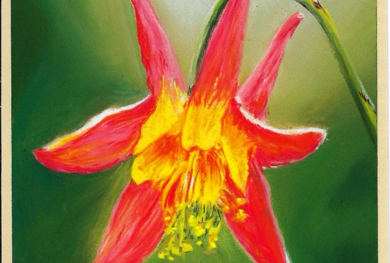
1. Columbine intro: People tend to
think of blending, like blending with
fingers or blending with a tool whenever they
think of pastel painting. But what if we could
use glazing instead, which is a little less hands on, but we're still blending
our vibrant colors. I'm Heather Nelson. I love
to paint with pastels. Our project is going to be to paint an adorable
little Columbine. They're actually native to the West Coast of
Canada where I live. It's not summer right now, so I don't have any
outside to show you. We're going to be working
from a reference photo, but they look like adorable
little fairy hats. So I just love columbines. We will start our project
with blending as we create a vignette gradient
style background. This kind of background is so perfect for showcasing
the subject. It's great for botanical study, and it's something I use a lot when I'm creating pet portraits. It really makes the subject
the star of the show. We're going to skip sketching altogether when we
create this one. We're actually going to
block in shapes instead. That's another great way to create a foundation
for a painting. Then we're going to bring in
lots of different colors, and we're going to be glazing and creating highlights
and shadows. I would love to see the
project that you create, so please submit it, and I'll give you feedback. And if you're having
any troubles, then post that in the project. Let me know how things
are going and ask any questions so that I can
support you along the way. I would really appreciate it
if you'd give me a follow because then I can notify you when new classes
are coming up, and you can also
take a look at some of my other classes
on skill share. I hope you're going
to have a lot of fun creating this columbine.
I know that I did.
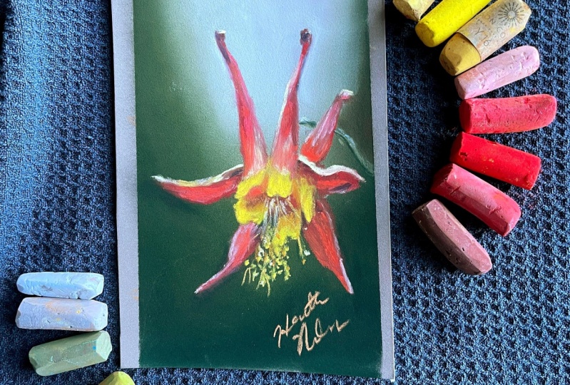
2. Columbine materials: For class materials you'll need a fairly small
piece of paper. So this was a seven by
4.5 inch piece of paper, which is a 17.5 by
11 centimeter piece. I always have scrap bits of pastel mat that I always keep
for my smaller projects. When it comes to paper, it's going to make or
break your project. Pastel mat is the
best paper I found. It can take the most layers. It produces the least
amount of dust. The blends that
you're going to get on it are absolutely beautiful, but it is very expensive. And if you're looking for a
low budget piece of paper, then I actually
suggest sand paper. This is 600 grit, but really anything between 400 to probably 800 is going
to be your best bet, but this is the most economical
thing that I have found. I will sometimes use, like, a Strathmore mixed media, but it can't take
a lot of layers. And so, yeah, it's
it's not ideal. A lot of the papers
that claim to be pastel papers just don't
really cut it for me. Reference photo
comes from a site called Pixabay where we can use free photos and you can download it directly from
the resources section. When it comes to the
pastels themselves, I have an assortment
of brands and I don't think it's brands
that is so critical. But for this
project, we're going to want an assortment of values of green and
some blue blue grays. If we actually look
at our picture here, that's in the background. Then we have an assortment
of values of dark reds, to our bright vibrant reds, to our bright pinks
and our light pinks, and then some various
different values of yellow. I've got a gold yellow, really light one,
a very bright one, and this was a
very muted yellow. It comes to blending, I just blended the background
with my fingers, but you could also use a
blending applicator or a bit of paper towel or even something like a
packing peanut would work. I like to clean my
pastels on a rag when I want to put down some pure color that makes sure I'm not putting down color I never planned. I had some painter's tape
to keep my paper in place, so it wasn't shifting
around while I was working, then your hands are
going to get pretty dirty just like your pastels. I'll often have some wipes
around, but of course, you can just use
soap and water as well. That's it for materials.
3. Columbine background: So I've picked out some
leftover pastel mat that I had. I'm going to come in
around the edges with my dark sennelie here. Just come in over those
dark spots there. Then I see that there is some other tone
and color changes. For my background here, and I'm coming in
with a bit of a purply gray for
that middle area, even a little bit deeper green. Maybe it's a little too bright, but we can always
dial that down. We've got this kind of
brownie green here too. Just smearing everything
all over the place. My composition. Then I'm going to just
start rubbing this in. I'm going to start with
that lighter color. And gradually get
into the darker. Looks like I put a lot down
because it's rubbing off. We're going to
create that sort of vignette around our Columbine. I've got some
scratches in there, so I'm just going to
kind of fill those in with some greenery. It's possibly from my
last project I was working on because I did do some sketching
and then I just decided not to bother
coloring it in because we are allowed to start projects and then not
really do much with them. Might even want a little bit. I go to bring in an
even lighter kind of purply blue here. I'm going to use a
different finger to blend, start from the middle,
and then gently blend, fogged out around the edge. See how that goes.
Even brush a little. It's hard when you're working
with such different colors, you're just going to
carefully blend that in. A lot of this is going to end up being where our flour sits, so we don't have to worry
too much about that. Just want it to make
some sort of sense. Then I'm going to
wash my fingers off.
4. Columbine blocking: So we could do a sketch, but I decided, let's just go for it. What
have we got to lose? So I'm going to
grab a dark one of my dark smaliss a
reddish purple and I'm going to just I'm just using
a very tiny edge of it, and I'm going to
kind of sketch in my concept here with
my my darker red. I might even be able to go bigger here. I'm
just a bit nervous. I don't want to get too
close to the edges. I know I'm going to go up
because there's some yellow there and I'm going to just
create an archy swoop. There's that. Yes, that is
going to be other colors too, but I'm just going to block
in that reddish color there. Give it a little
swoop for there. And block that in. We're blocking in, in a way,
we're sketching with this. Now I know there's going to
be a bunch of yellow stuff. I'm going around
to the edge here. Again, I'm making
a little S swoop and just blocking that in. Imagining the negative space
that takes place in between. There's even going to be some
little red areas inside. They might not be this color, but this is the color
I'm putting down for now and we can go up from here. I almost looks like a little
fairy had, doesn't it? It goes up and makes a
little little curve up there and come swooping down and there's another little
hat like that over here. Starting from where
I've got this and swoop and little fairy antenna and
block that in just like so. This one is going to
come a little bit down and that one's going to come down
because they are going to overlap a wee bit. Then I can see
that there's going to be I'm going to
add a little bit of width to this just because I see this and
I'm going to go whoa. That's that petal
there, little hat, and off we go off to the side
and making a little curl. Now I have essentially
blocked in my columbine and I've blocked in the areas where things
are going to take place.
5. Columbine glazing: In with my purple, a little bit of an
interesting purple for this little head of the horn
here doesn't do too much. Seems like I need a darker for that. Just make a
little line there. This one even looks like
it needs to be taller. Then I'm going to come
in with a bolder red. This is a senalie red. I'm going to put
that down and make a nice line on that
I'm laying it down. I notice it's not
covering amazingly well. I'm just going to rub it a
little harder onto there, glaze it in, and
then I'm going to come around and do something
similar over here. Forcing it a little harder
to get it in there. It's okay if it
scrapes off some of my blocked in color from
before, who knows? Maybe I should have just used
the red from the beginning. Maybe it should have
been my block in color. You learn
things as you go. And this, I'm going
to do a little S. Whew. I followed that. I want some of that
dark stuff there, but I also want to let that. By glazing this in with
the two different colors, we are adding depth and interest because the one color is glazing over the other color. I don't need to get into here because we're going to
go much later with that. Following those lines,
glazing that over the dark. It's not 100% flowing
over the dark. It's just flowing a little bit, but it is you can
see it's starting to get a little
bit of dimension. Then we can start
going in a little bit lighter pink little
bit of a pinky tone. I might even go pretty bold. Let's go really bold, see what happens. Oh, yeah. That's bolder. I
just glaze that in. Throw this in on this edge here, it is bold for now, but
I'm like, you know what? I'm cool with it. For that highlight,
streak it up a little. Think about where
you want this pinky. We're just glazing it
over this bottom area because I don't want it to take too much precedence down there. Same with here. Give it a little glaze because I'm going to go with more
of an orange tone in there. Draw some little lines here because you can actually
see some texture. I'm also going to come
from the center and just glaze up and out a little. Now I'm starting to maybe
start to bring in some of those yellow so I can envision where those
are going to go down. I've got this is a senalea
it's a little bit of a yellow yellow yarn, just not 100% yellow. I'm going to bring it from this little petal back in
here shoop join it in. I'm going to make this
little swoop there. And just bring that up. I actually starts to blend
when I do that, you see. As I start to pull up, I'm blending it with the pinks and the reds that
I put down before. We actually have a bit darker yellow in this spot over here, but I'm going to
bring in that idea anyway because we can
play with that later. Again, it wants to blend a
little but wants to make it a little bit orange. I rub it off. And then form that
shape down in here. This is maybe a little bit of a messy stage. Don't
worry about that. Then I can see I've
got another one so I don't want to
eliminate that red area, so I'm just carbing around it. Now we're going to glaze over
top with this lighter one. I'm going to blend. Make it seem like it's all a good idea. I'm going to do that again, but a little bit less
through this one. I'm just putting it down on the yellow and then picking it up and then it's streaking
in blending and glazing. I actually is an
interesting effect. I'm going to use it as
my edging highlight. I'm going to take the very edge, I'm going to drag it down there. It's all right if it's like
that because painfully here, we can do something similar. Here and cap that
little edge there. Might even cap that
one and that one. Then I want to get this fold. I'm going right on the
edge of this yellow, coming over the top of
this and going like that. We can do something
similar over here. Follow that curve like that. Now I do see I want a
little bit of a red maybe an orangier red I can
come in from back here. Sometimes you might get a
color that you're like, Well, that's not quite right. But then when you blend it
with your other colors, it can start to bring
that pop and seem right. I'm just going to bring it
in here a little bit too, and also on this side. I'm actually liking this orange, even if I don't, 100%
see it in the picture. I just like what it brings
and how it blends in. I'm going to just throw it
in some of these petals. We're going to be able to make some changes to
some of this later. I get that edge whoops. We can always come
back over too with the darker color
when we need to. Especially down
here, we just have essentially the one tone, so I can just gently
rub that back.
6. Columbine more highlights: I found myself even
lighter canela pink here. Going to give another
little doop to the top there and pull in
from down below, glaze over, bring in some
more of that light color. I might even bring
that a little bit in combining it with
the yellow highlight. I can see that it's a
little bit on this edge, so I'm going to just
roll that like that, just give it a little line. I'm also getting
that curl in here. I'm going to dip that in, and there's a little
bit of it there. Now we have quite a lot of
a lighter color down here, I can pull that over, I can
rub it, I can glaze it. I like when these
edges look fun, so I'm going to swoop that
out and pull that down, and then I actually want to
bring my green in again. I'm just going to make this
more hollow with the green. I'm going to just shed
that out like that. And we can vary carefully
with our finger. Pull that away so it
doesn't look crazy. Now, this doesn't have
to be perfect, right? We don't know this columbine. So as long as we have the idea of it,
that's what matters. I'm going to bring this
pretty little pink in here, do a little glazing for texture. I think there's a little bit
of an orange doing that too, I might bring in a
little bit of orange in time and I'm going to
involve it in my yellow. Not 100%, but just a little. I like the contrast being
created in this curl back here. I'm going to bring
back my dark and I'm going to just get it in there a little bit into
that shadow pocket. Might even have to
bring in more of a blue there very gently. See what happens if I bring in that deeper blue shadow
contrasts our friend. Oh. That maybe
wasn't our friend. But if we get a mistake, we just get in there, play with it, fix it. Going to bring
this color in here too for a little shadow on that little hat and same
with this side here. Find the edge, draw a line. You can always mess
with it later. I actually want that contrast
a little in here too. I'm just adding it
for a little drama. I think it's even
going to be good as a background through
this section to have a little bit more drama here coming in
through this curve, giving it a little texture, good stuff and even on
the inside of this curl. We don't want to get
too crazy, though, so I'm going to start
controlling myself. I'm bringing this
back in here to go. Swoop it up for a
little bit more. Shape and this pedal. Do you have to wonder how many strokes are
you gonna make there, Heather, before you figure
out whereabouts to make it? Well, it's about
practice, everyone. In golf, you have to
do a lot of strokes. People don't get all
head up about it. So no sense in us
doing so, either. Okay, I'm bringing this red to get this curl in
here a little more. It's a little deeper red. I want to indicate
that there's a bit of a shadowing behind that curl. Then I'm bringing
in my yellow Lo as I used to call it
when I was a kid. This is one of those ones
that doesn't want to go down. I'm going to see if I
have a different yellow, which maybe has
stronger opinions. About actually showing up. Yeah, this is a unison and it's just a little
shard of unison. Your shards are your friends. Do not throw shards out
because you can draw with them and they have a
little more impact. So we have that little
swoop there and there. I can just fill that
in with this unison. And it does something
like that out here. I've said it once and
I'll say it again. We're not supposed to blow the pastel dust off and yet it does not seem to
stop me from doing so. But we're not supposed to
do it because you're not supposed to be breathing
your pastel dust in. Also going to rub it
in here just because I like the vibe of this yellow. Now we have some pinks and
some reds inside here. I'm going to go in
with a little bit of a vibrant red first. But it is darker, but
it's still vibrant. Just lay it down, mix it a little bit with that
blue I created, and go in, mix it in there and you can see how There's a little bit
of a shadow in here too, so I'm going over top, bringing in that little
red, bringing it down. And I like it in here. But then we also have an orange or an orange or
yellow back in there. Maybe even I don't know if this is going
to be the right tone, but we're going to try. N. I mean, it could
be the right thing, but it just bored me, so I'm going to look
for something else. Maybe goldier something with more gold to indicate
that it's further back. Inside. There's
another one over here. Not that this has
to be absolutely perfect. I don't
know what this is. It's probably cat
hair, honestly. Might have been a scrape. That. I would like to get a brighter. Getting these yellow
down is hard. You got a yellow that
really is a ticket. Has really nice coverage.
This is bright. Put it in, lift it off, so I'm putting it
on, lift it off. Put it on, lift it off. And through here. That one kind of mixed
in with a little bit of red, but it's ka.
7. Columbine stamens and stem: I'm going to use this color for the little stamens
that are coming out. These things pretty random. They actually come
down pretty far. I might have to lengthen
that petal there, but I'm just going to random dot and tuck and roll
here with this pin. Calling it a pin, but it's a
pastel through some lines, make some quick dots and
dashes. It's painterly. And we're going to
have to go with something a little bit lighter on the inside because we
can see that that's more. For some reason, it's lighter. Draw a little lines.
Don't let them overlap as much as what it actually does in the drawing
because if you do, we're just going to throw that in a little bit out here too, just to give a little dimension. Yeah, if you overlap
it too much, it just come out
to be a big mess. You don't want that. Then
we're going to go in with a little bit darker
gold. Do the same thing. Again, to give it a
little dimension, the human eye will fill in and give a sense that,
there's a lot going on here. You don't have to be the person
who fills all of that in. I'm actually even
creating a little bit of a blend line between there. You want a sharper line back in here because I
like this heal. I'm just going to create
that little blend idea. I want more length to this one. I'm going to just pull that. Then I need a little bit
lighter to go along with that. The highlight. Scumble that over top. And then I do need something
a little bit darker. I don't know if this is
going to be dark enough. Might have to be bolder.
Let's go bolder. If I can get this
inelia to cooperate, one edge of it cooperates. I don't know what
that's all about. Anybody knows why Snelia
sometimes just doesn't go down. You can let me know. And
maybe even a little purple. I've changed the shape. Just a little of that
particular petal. I do want to have a
little more highlight just for my own interest sake. So I'm going to
take this pink and just.it onto the edge, like so. Okay, now we need to
take a stand back. See what we think. I'm kind of happy with where
it's going here. I mean, it's a little bit messy, but that's kind of
what we were doing. And then I am going to bring in because I don't want
to just to hang in the middle of space here. So we're going to bring
in that damn idea. But we don't have to bake it
too much part of the show. Oops. Sometimes I guess wrong
about where my edge is. And that is gonna
happen sometimes, so don't worry
about it too much. I can always darken that up. Rub that in again. Make it seem like it was all
part of my plan. Run it up so that it seems
more like a vignette. And then you probably
need a little bit of shadow on that little stick. So I'm going to use
fawn dark coming down, follow the same line
and a little bit in here so that we can
kind of buy that is, in fact, coming in and holding up our flower
little highlight. Even a little more highlight there. Be a little here, too. Just a little darker underneath. Just 'cause I'm not
sure I did buy it. I'm kind of liking
where that's going. I might even be thinking
finished thoughts. I'm just gonna go a little
darker down in the bottom. Give it a little more grounding. I don't know if that appears
on the camera or not. I do have to blend it though.
It needs to make sense. Can't look like it got
added after the fact, which it, in fact,
did, but we know that. We don't necessarily want everybody looking
at it to know that. I'm thinking that
looks pretty good. I do like the little
horns up top. I might even want those
to be a little bit more slim and accentuated, but it does have the danger
of messing things up. So we're gonna very gently
blend that idea in. Yeah. And a little bit on
the outside here, too. Just making this
a little smaller. And then see if I
can blend that in without making too
much of a mess, which I would say I
didn't succeed with. So gonna have to work a
little bit with that. There are sometimes people
where we shouldn't be making big changes because it messes up everything that
you were already doing. But let that be a lesson.
Don't do as I do. In a way, it creates
a little glow, which I'm kind of
liking the glow. I think I'm happy with
where we're at right now might add in a
little more orange. Just a little dab of it on the inside
for interest's sake. Even here. I always
say that I'm done, and then I add a
bunch more things. I don't know. I
like this orange. I know I shouldn't get
too too happy with it. When you're doing
this, get crazy, love it if I could
get this yellow, even a bit bolder. So I'm grabbing on, wiping it off first, of course,
make it nice and clean. Come in and swoops degrade a
little bit more highlight. I almost looks like we could have even a little
more mess down here. Yeah. I'd be kind of good to have a little
shard of yellow. You see how we have
these little lines. I've got a shard,
and I'm just going to do this kind of thing. Doesn't have to make any
sense to anybody but you. I'm just carving
some little lines in I really like that
one that's down here, but I don't think I can
get that one because I made a little bit too
much of a mess there. If I'm really
careful about this, I might be able to kind of
was able to fix that up, and then I can bring
this into there. Yeah, it's better. I like
that. I like the colors. I like the drama we've created. I want this to be a
little more folded. So. Time to sign, which is always a
little challenging. Let's see about what we
can maybe sign with. Maybe sign with my new pastel. I'm going to use orange. I'm gonna go. I'm gonna make
this one kind of small. I don't want it to be
too much in there. Okay, I hope you enjoyed this and let me know if
you've got questions.
8. Columbine closing: Thank you so much for
attending this class. I would love to
see your project. Please submit it, and I will definitely
give you feedback. Please give me a
follow so you can see any classes that I have
coming up in the future.
 Heather Nelson, Pastel artist