Transcripts
1. Bunny intro 1: It's snowing today
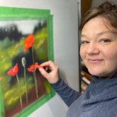
on Vancouver Island, which is actually really rare, so it's quite novel, so I set the camera up here. I'm Heather Nelson, and
I love to do pastels. The focus of this
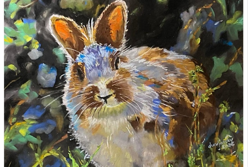
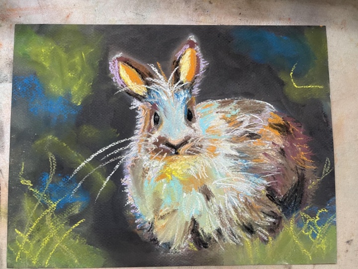
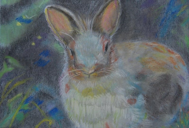
class and the project is going to be this
little bunny here. I love the way the
light plays on this rabbit and on the leaves and foliage
around the rabbit. Focus of this class
is that I'm going to be using pan pastels. Now, if you don't
have pan pastel, I don't want you to feel
like you have to go out and buy them because
it's not necessary. Working with pan pastels, the fun part about them is
they cover really easily, and they're actually a lot like working with regular paint. But if you don't own them, then you can use pastel sticks, and you're still going to be
able to get the job done. So I don't want you to feel
like you have to go out and make a purchase
of pan pastels. If you have them and you want to crack them out for this project, then that's a great idea. Let's have fun with
it. They're going to be our underpainting
for this rabbit, we're going to do our base
coats with the pan pastel, and then we're going to
come over with the sticks. So in this class, we will
begin with a sketch. We're going to go free
hand with this one. If you're not comfortable
doing a free hand sketch, you can always look at my
measurement method that I used in the class
with the fluffy Robin. And then we're going to
do the background and underpainting of the rabbit
with the pan pastels. But like I said, if you
don't have pan pastels, go ahead and just use
your sticks for this. Then we're going
to come over with our soft pastel sticks, and we're going to bring in
various different layers to capture the fur and the light that's playing
over this rabbit. I think the shadow
and light is what makes this project most fun. We'll be adding little
details in there, like the whiskers and the eye. The eye is kind of a small focus in this particular one
because of the angle. You don't have to
be an eye expert. We'll also bring the foliage and grasses that's in the
foreground to life, bringing the light in there with some pretty little colors. I'd like to introduce you
to my little cat, Liam, because he despite a lot of
comments during the video, he thinks that what he has
to say is quite important. And I apologize. I can't
cut out all of his meows. He's very vocal and
very opinionated. I would love to see your
project, no matter what. If you're struggling
with the project, please pop it into the projects and let me know what your struggle is so
that I can help you. If it's going great, then let me celebrate
that with you. You can get your reference photo from the download section. Whoa. Speaking of down. The snows really coming down. We're gonna have fun working
with this little bunny and bringing the light into his coat and bringing
the light into the fold.
2. Bunny materials 2: For our materials
for this bunny, we are, for sure, going to need our
reference photo, and you can download
that from the resources. I got this from Pexels. Pexels is a website where you can download
images for free. Printed out fairly blue. I actually just embraced that while working
on the painting, but yours might print out
a little bit differently, or you can always just
work off your screen. I use masking tape to tape down both my reference photo and the actual painting
that I was working on, so it's not going
to slide around. I want something like, you know, painter's tape that's
going to easily come off of my paper after
I'm finished with it. The paper super critical. This is actually a repurposed
piece of pastel mat paper, repurposed meaning I already had done a painting on
this pastel mat. Did it for an exercise in a class where I was the student. I got something
out of the class, but I didn't necessarily
love the painting, and so I actually
brushed it off, washed it off, and then
I created this painting. And that is actually
one of the cool things about pastel mat. It may be expensive, but you can reuse it, which I think makes it a leader. Not to mention, you can't
compete with Pastel maa. I don't think for
just how many layers it's capable of taking, it will take so many layers. It's such a great quality paper. Costs a lot of money,
but I think that it is well worth that money. It comes in all
different colors. I happened to use I think I believe it was
the anthracite gray, but you can see
the blue on here. That was from the
previous painting. The color itself doesn't matter, but it's nice to work
on a toned paper. And if you can't
get the pastel mat, then I actually recommend construction sand paper
or like a UARt paper, which is really just
a sanded paper. There are papers like
mixed media papers like the Strathmore can be okay, but they really don't
take the layers, and you get kind of funny
textures with them. For the pastels itself, for my background, I incorporated a lot
of the pan pastel. Now, you don't have to have
pan pastels for this project. You could always
just use the sticks. If you're going to
buy pan pastels, then I recommend one of
the pure color sets. I have the set of 20. The reason you want the
primary pure colors is because you can mix
them just like paint. I do enjoy the sets
because they come with these different types of foam
applicators, and lately, I've actually been experimenting with a Mr. Clean magic sponge, and I actually find that
it works really well. But pan pastels
cover really well, and it's kind of
like just painting, and you apply them with, like, these little
foam applicators. But you don't have to use that. You could even use,
like, a piece of paper towel or packing
peanut to do your spreading. You'll often even see that
I'll just use my fingers. Speaking of fingers,
they're going to get dirty. So I use wipes. I find that they can get the pastel off my
hands the easiest, but, of course, you can also
just use soap and water. Then the sticks that I used are mostly sanelie but I don't think the brand
is really so critical. I've also got some unisons here, and I did incorporate, and I think it's
really nice to have some new pastels
from prisma color, at least a black and a white. I enjoyed using the orange
on this one, as well. Color wise, I liked an assortment of sort of
purples and blues to black. I did incorporate the white. Then I've got an
assortment of greens. I really enjoyed
bringing in, like, the lime kind of greens
into the painting. And then there's some oranges, brownie pinks that's in, say, our bunnies ears and coat. But I even incorporated some of those oranges into the grasses, where they were kind of dead
and lit up or had the seeds. I have an assortment
of pencils here. These happen to be
carbithelostbilo, but I don't think it's in
central that you have pencils, but if you have them,
you can use them. I think the one that
I probably used the most would have
been the sky blue. It's good for highlights
in the eye, but, you know, you could get that
with a soft pastel, so you don't have
to buy pencils. But if that's what
you have, use them, and perhaps that's all you have, and you could do the entire project with them
if you really wanted to. For the sketch itself, I used
a bit of willow charcoal, but you could also use
a pastel pencil or you could even use a new pastel to do your sketch or
even a soft pastel. You just want something
that would easily be covered up by your pastel. And I find that that's
not the case with, like, a graphite.
We don't want that. I have a microfiber
for cleaning off my pastels themselves so
they can get pretty dirty. And I'll admit that I use
my pastels quite dirty. I cleaned these off
after I did the project just so that you guys would
be able to see the colors. But in actual fact,
I rarely clean them. But if you want to clean them, you can quickly just
scrub them off, and then bam, almost goonew
and you can just wash these. I like to work at an easel, but you can work on a
table just as well. I mean, the easel
is nice for me. I like to be
standing and moving. I sit enough during the day. But working at a table
is perfectly fine. I do like the way I can see
a little bit more real to the actual size by working
on an easel because I'm looking straight on at it as opposed to trying to
bend over the project, but that's really
not that critical.
3. Bunny sketch 3: We're going to begin
with our sketch. I'll be sketching with a
bit of willow charcoal, and we're just going
to free hand this one. We want to think about
approximately where on the painting we
want our rabbit. I like to mark out
sort of my corners. So these are how
close I would like to get to the edge for the ears. And I'll think about where
I might want his head. I just mark out my
specific lines for that. I'm looking for shapes.
We've got this, I don't know what you would call the shape of this marking, I'm going to just
mark out my ears. This one has a little
bit of a swoop to it, and then my eye will
probably fit in about there. I I'm thinking about the
line across, like so. And then this other
ear is going to come very close to where this one starts and it arcs
out and makes a swoop here. And that marking, it's not that I need to
mark that so much, but it just kind of
helps for my brain. So I'm just going to make
that little mark of where his where his nose would
be and his little mouth. And these little cheeks. Like so. And I'm making him
maybe a little bit big, but we can we don't have to have him
the same proportion as he is in the
picture in terms of, like, how much of the
picture that he takes up. Like, maybe his legs are
gonna be down below. Or maybe I won't swoop
this out as much. You can kind of sketch that in. But maybe I'll make
this a little smaller. I will be about, so there'll
be another I about there. You can think about
his markings. That's actually all I really need for a sketch at this point. I can keep my sketch pretty simple because I'm
really going to be painting right
over top of it, so it's not going to
matter quite so much. The important thing
is that we can stand back and we can look and see, oh yeah, that looks
like a bunny. That's our most important
piece of the sketch. He does. He looks
like a little bunny. We do want everything
to be good for now. I'm actually going to make
this a little bit narrower so his eye is going to
come in about there. His little lashes will be there, his face making his little
face a little bit narrower. You want to at least get
your main proportions really right because it's a lot of work to try to fix
that after the fact. I say that from experience of messing up on sketches
and then having to kind of try to rework that
in pastel and then that becomes much more difficult than if you just got them
correct at the beginning. And of course, if you're not
confident in your sketching, you can always use the
measurement method that I use in my pastel
painting of a robin, or you can use transfer papers. Like, there's different
options if you're really not feeling confident in
your sketching abilities. But I think that'll do
well enough for now.
4. Background foundations 4: Going to use pan pastels
for the background. But if you don't
have pan pastels, you can just use
your soft pastels. I'm also going to use
this Pan pastel tool. But again, if you don't have these, don't
worry about that. You can use other things. Just use your soft pastels,
use what you have. I'm probably going
to do the last layer with my regular soft pastels. Anyway, I just find that my
pan pastels cover really well and you can decide how much of this background you
want to include. I really want to make the
rabbit the star of the show, so I'm not overly concerned about all the other
elements in the background. Great. A little light
dusting of pastel. And pan pastel, I find
is kind of dusty. I'm still gonna use
the black along here, even though I'm probably gonna do some of those
little foreground. Just shade that in
there. Might even use my pastel to get in some of these darker tones on the bunny. I don't know if I'm
gonna include that rock, so we'll kind of blend that out. Certainly going to
make it nice and dark in between his little ears. And, like, once I block this in, I might decide,
Oh, you know what? I want a little bit of different
proportion on my bunny. That could happen. Maybe I want his ears a
little bit bigger. Maybe I think it'll
be cuter that way. You can decide, and I'm still gonna use my dark black in
here in the background. I probably will do a
little bit of, like, a bouquet style background
that's really blurred out. So just kind of randomly using this black spreading
that around. Areas I want a
little bit blacker. Going to do a
couple more layers. But areas that I
want really dark, I'm likely going to bring in a soft pastel stick
for that because I find you get more coverage than you get with a pan pastel. I like to have my pan pastels because you can work so quickly. We can even do a little bit of some of the
tones of our bunny here to lay in our first
foundation if we want. Doop. Actually blurt it off. Anyway, I'm going
to come in with a few green bits
in the background. Nothing too definitive. Just gonna wiggle them all over with my This is my green
that I've picked for this. I'm a little bit over here. I'm really randomly just
throwing in these kind of spots. For our little foreground bits, we'll do something else later. Just indicating there might be some other colors
in the background. But overall, I want the bunny
to be the star of the show, so I'm not planning
on getting too crazy with my pan
pastels for this part. Dotting it in to give you a
sense of what might be there. Then I can test it
out too and go, is this something
that's working for me? I'm going to use this
pan pastel blue. Again, just to bring
in some elements from the back like this blue. It's fun. I don't mind that
that green came on there. I'm seeing some little bit
of a blue on the bunny. Now, I do think that my
photo came in funky. I think that my printer
is low on ink or something because it
made my bunny very blue, but I might go with that. Sometimes I go with funny colors and it
makes it interesting, and that is entirely up to you. So just kind of a
pad that around. This is very much like painting. And even I see some blue
in the bunny's fur. So I'm gonna kind
of put in some of the blue undertones already in that bunny When you put
these bright colors in, it can actually make it
fun and interesting. If you want your
bunny to be super realistic, you don't need them. Although it's interesting
these colors, they're in there and sometimes bringing some
of those wild colors in actually makes it more
realistic, not less realistic. Don't be too shy sometimes, give it an experiment, try out some of these bolder colors. I just dab them around,
see what happens. I've got kind of this
limey yellow here. We'll see if I can
get it to go on. My brush is so dirty. You can clean your applicators
with a cloth, too. Make little little
bouquet circles, little lines. Just
dab it here or there. This doesn't have to be correct. Like, none of this
has to be right. Nobody knows what your
background looked like. All you need to do
is create something that's moderately
believable as Oh, yeah, there might have
been plants there. You can change the angle of your foam applicator to
have different effects, whether you want to
create more of a line or whether you want to just
create a little dab, circle. And actually, this color, we're just going to
throw that around. Now that I'm starting to get it to actually come
out of the dish, That one I'm going to blend
in a little bit more. I don't want it to
be quite so bright, which you can just do with your finger or with
a blending tool. It's interesting how
with pan pastels, it is like painting. You can even do it with
a brush, actually. I am going to come in
with clearer stuff later for these areas, something that's a
little bit sharper. But these will be my blurred out backdrop vegetation bits.
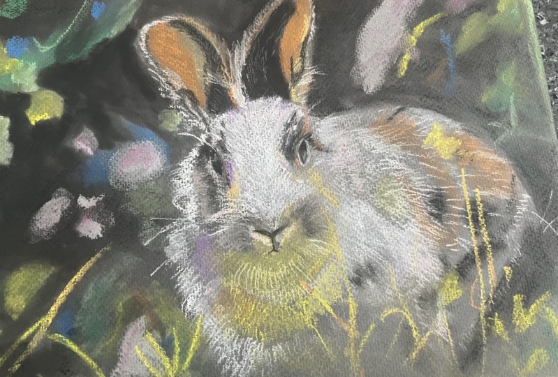
5. Bunny undercoat 5: Many of you observant artists are going to notice that this rabbit's not identical to the rabbit that we just finished
with in the last video. That's because I had some
corrupted video files. So I'm going to show you with this particular bunny how to lay in the
foundations of the coat. And then once we catch up to my healthy files of
the original rabbit, we're going to jump
back over to him. So, I've got a little bit
of gray pan pastel here, and I've got a little
bit of green still on, and I'm actually going to use that for the chest of the rabbit because we've got green reflecting up from the
foliage down below. So we're just going to make little swoopy motions
with our bunny's coat, and you want to make
these little motions about the length of
a rabbit's coat. You don't want to
make big swoops. You want to make these little
short little short whoops here just to get that
little undercoat of fur in, and we're just going to
put that in wherever we see some of that kind
of grayish whoops, grayish green showing up. We will be doing layers
over top of this. So this is just our
undercoat for the rabbit. And we're confining kind
of our green mixture to the chest and our lighter
mixtures off to the side here. And yeah, I'm just
kind of shaking my little applicator here. I still want to leave
the blue parts in. Always go with the
direction of the coat. That's probably the
most important thing whenever you're
putting in any kind of animal fur is that you always go in the
direction of the coat. I do a little bit around some of these
highlight points in the ears wherever you see
lighter spots showing up. A little bit on the
front of the face. A little lighter
part there. We can even use a little bit of white in the areas that
are kind of bright. So we're just going to throw
in a little bit of white. Not too much because we want our other colors to
do this job for us. Okay. I'm just going to go with that. I've got this golden
yellow pan pastel, sound like old yellow. We're going to just apply
a little bit more of it into some areas where we
see the little bit yellowy. Now, I've got some
yellow areas underneath the rabbit's chin and even little bit
next to his nose. So creating that
glow in the ear. Even a little bit on
the edge of the ear. And anywhere you see
just a little bit of a yellowy kind of glow from vegetation that might be
reflecting off of his coat. And if you need to add
anything to make it a little bit more yellow in the foliage, then go for it while you've
got it on your applicator, whatever your
applicator might be. And then we're going
to come in with maybe even a little bit more orange yellow, a little bit of that. I wouldn't get too carried
away with that one. Then I've got this brown. I would say it's
like a sienna color. And let's just apply that. I'm just dabbing it the
cheek of my rabbit, little bit in the muzzle,
next to the eyes. You can stroke up with this
if you see that in the hair, and then I'm just dabbing
it through the ear. And remember, we are going
to be covering this. You can even blend a
little bit out here. We're gonna be
covering this with colors and layers later, so you don't have to
worry that you think, Oh, but my bunny looks kind of like some sort of
funky poka dot bunny. You could even use this for, like, seeds in the background. And the areas that
we see the brown, little highlights in his coat. And again, I'm just going
to kind of.it around a little bit randomly
through the foliage. I kind of like this
lit up seed area here a little bit through there. Maybe a little bit on this rock, it seems to have some
warm elements to it. Oh, there's a little bit here on the side, little seed head. I'm gonna bring
my white back in. It's actually mixed a little bit with the
orange right now, but I'm just going to
kind of make these little more like fur lines. Where I have some of
those highlights. Maybe even a little on the
side of the face there. And a little in the
ear, more there. We've got that fur that's
just kind of swooping up. I can do that also with some
of my soft pastels later, but just gonna add
those in there. Bring some of my blue, kind
of mix it in a little bit, bring it down the
head a little here. Kind of mix it with the
white. This blue here. There we go. Can even bring a
little bit of that into the middle of his nose. I'm going to use this black and just come in in the direction
of the hair for some of the darkest points
just to put in a little foundation that's going to be darker and add
a little bit of depth, like up through the
dark parts of the ear, and even on the inside
kind of rim of the ear, a little over the
brow of our bunny. I'm just kind of using a
little shaking motion again in direction with wherever
the fur is headed. Okay a little bit
over this brow, and even I can get
a little bit into where that eye is going to be can do the same
thing on this side, just a little into
where the e will be. We can even start to think about our little V of the nose
and little T looks like the flux capacitor from back to the future and a little bit of his muzzle where we see
those darker brown tones, we're going to put
a little bit of black foundation in
underneath that. We can also use it on the
outside here just to kind of suggest that there's
fur in these spots. So it's kind of like filling
in the negative spaces. Well, it really is filling
in the negative spaces. Then between the bunny's
front legs there, this marking that's over here, if we want to have that marking, I mean, that is
up to you because your bunny doesn't have to have all the same
identical marks that the reference
photo bunny has. You can get creative, or maybe you even want to do a particular
bunny that you know, so the markings don't
have to be the same. But just keep that in mind
that you want it to go in wherever you see
something that you might want to make just a
little bit darker tone.
6. Darken background 6: We have officially caught back up and are back to
our healthy files. So this is the original rabbit, so you might notice a few
different little things. And then you can
choose how you would like to blend that
black in there. I might use a little bit
of paper towel for that, or suppose since I've got
these little applicators, I might just use one of these
little foam applicators, or maybe they're not foam. They're kind of um well, I
don't know what they are. Sponge, I guess. Just close. I'm going to just kind
of do that sort of idea. And then further away, I'll
blend it in with my finger. And that contrast is gonna
help us when it comes time to get those lighter
colors in those highlights. Next to the rabbit. Blend that in with
my little sponge. Okay. So this goes darker than
the pan pastel goes, especially if you just use
your figure to blend it in because then it'll
hold a little bit better. I won't just get brushed off. And you could actually leave
this rough if you wanted. You don't have to blend it in. I kind of creates like an interesting effect when
you do it that way. I have a little trough at
the base of my easel that's catching all this
dust that's falling, but sometimes you can
kind of knock it. And you can have little areas of darker in the background, but maybe not all of it
that you want darker because then it'll kind of show that there is stuff back there. Or you can make the
entire thing black. It's your painting,
do what you like. But I'm gonna create these
little crevice areas that are a little bit darker. I'm gonna knock the
back of my easel.
7. Warm coat 7: I'd like to bring in a
little bit of fun color, so I'm going to work
in the ear a little. I've got a conalia here. I'm going to do a
scritch dad in. There's some areas
that I want to keep that more yellowy
color that we had. Just lightly dust it
into the areas of the ear where you see it showing up and even if you don't quite
see it showing up, you can still throw it in
there because it can still be interesting because that's what makes it very unique to you. I used to do a lot of realism, and I still occasionally
do realism, but I prefer to be able to get creative and just throw
color in willy nilly. That might not be your
style. That is okay. You don't have to do that. But I enjoy getting crazy
with the colors. But letting my color choices help me express kind of
my own unique rabbit. Just shake it. As we shake
it in line with the fur, that's what gives
it that fur look. So just kind of scrape it back. I'm using just, like,
a little part of my pastel and then just kind of giving it a little sweep in the directions that I
want to show that fur. Even bring some pink into
the ear. Said, why not? Although this pink might
be a little too light. Can use it as a bit of a highlight fur color
over here, though. It's actually quite a
nice highlight color, so I'm just going to go up here. Sometimes the color
is not so important. What's important is the
value of that color. So how light or dark is it? Because like in
here, I would say this is more like
a yellow color. But if I want to see how the
pink rolls out in there, I can just use that pink
there. And following. And here I'm almost like sketching these
little flufes in. And maybe it's a little
bit light rather soon. But sometimes it's just
fun to get it in there, and just see what
it looked like. And then I don't want to wait. I still want some of these
other colors to show from beneath as I throw
these lighter ones in. And as you're working,
you might think, well, this doesn't
look like a bunny. But that's kind of
normal for pastel. As you're working, it
starts to come together, but it goes through this
very funny looking phase, and you don't want to you don't want to back off
during that phase. You want to keep on trucking
cause if you back off, you are never going to get
to the cool looking phase. I'm picking this purple for
the same reason I just said, I want to get a little
bit fun with this bunny. I will be bringing in maybe
more realistic colors later. But there are purples
in the bunny, so I can bring some purples in. This is still quite a
light value of purple. I might need something darker. I can just kind of throw
this purple around. I want to keep some of
those blues in there still. But I'm kind of transitioning. I'm using this blue as a bit of underpin this purple as a bit of an underpainting for where I'm going to put those lighter
colors over later. So this is my part
again, of, like, it's just another layer
for underneath the coat. And again, color doesn't
matter, the value does. So if we've chosen kind
of like a mid value, as long as we put it where
the mid values belong, it won't seem so crazy out of place, even
though it's purple. You've probably heard
the idea before that sometimes you should
squint and if you squint, you can start to see where
the value changes are. Sometimes with those
undercolors, too, you can give a bit of a
little bit of a blend. I just don't want you to get
too crazy on the blending because I feel like
people get too crazy on blending with
the pastels and then everything lacks
texture and dimension. You can look for areas where you think transition
would be useful. Putting this next to
his eye down this side, and then soon I'll get some
brown colors in for that.
8. Bunny browns 8: Somebody spoke about brown. Here is a brown. Let's see what kind of brown it gives us. I'm going up over its eyebrow, so I've got to be
careful in that area. And if I want to create fur, then I just use, like, the edge, and then I almost start just
more drawing, you know, kind of sketching
with the color, glazing over top of
the other colors. And that's where
I can get kind of my fur idea. It
also helps blend. Cove at the top of that here. Definitely gonna
have to come in with a little bit of a lighter
color in there somewhere. Throw in some of these
longer sweeping ones for a little bunny forelock. I have horses, so
I go for forelock. I don't know what bunny
parts are called. Little shaking here
inside the ear, not covering over all of my
highlights and low lights, just giving it a little
little dimension. So make sure you don't cover everything when
you're doing this. You always want
to make sure that you've got some of
those colors that you painstakingly put down showing up underneath as you
scratch over them. And you see me popping
all over this painting. It's kind of anywhere I see
a color, I throw it down. Can use this for
the kind of shape that's occurring in
his little face here. And yeah, maybe I put a
little too much down. So I can fix that later. I can just bring
my color back in. And I definitely
want the dark to appear because this isn't
actually a very dark brown. So I want to let the dark
show up underneath it. Always in the sweeping
motion of the fur. If you want more definition, always just go to the
edge of your pastel, like for some of these
little sweeping hairs. Like I said, nobody actually
knows your bunny's markings, so you can have fun with it. It's not the same as when
you do a pet portrait. Then you've got to
get it perfect. All the markings
have to be exact. Now, I've picked
a lighter brown. It's more of a tan. Going
to see how it comes up. It's a unison pastel and
going over the edge of his year for those highlights coming down the back this year. So now, this one is not
wanting to go on so well. What that means is that
it's a little bit hard. So when you find they don't
want to go on really great, then there may be a little bit harder than the pastel
that's underneath them. One of the cool things
about this bunny is the light that's
playing all over him. So we want to get that in there with
these lighter colors. And you can really
only get those if you've put down the
dark layers down below. It's so tempting to go
right to the light colors, but it's some of
these dark shades underneath that are going to allow these little light
glinty bits to show through. That's what makes
it look like, Oh, he's got sun on his coat. Just when I'm
blending in because I actually want it to blend a little bit more with
the color underneath it. And then I can come over
top later for some texture. And, yeah, there's
gonna be some areas where maybe it doesn't
want to go down. And if that's the case, we're probably going
to have to find a softer pastel
that'll do the job. So anytime you're
having trouble, just see if you can find one
that's a little bit softer. One thing I think
is hard to get with pastels or at least
they don't seem to come in the sets is like, good grays, good neutrals. This is, I think,
like a grumbche. Maybe it's Grumbacher.
I don't know. Anyway, it's something I
got used off marketplace, and it's not a bad gray.
It's kind of a purple. So I'm going to try it out, see if I can get the tone I want on
this bunny's forehead. Might not be light enough but we're just going to play with it,
see where I get to. And like I said, we're going to kind of give it
a little shake in. We don't want it to cover all of that underpainting that we have. And these are short
little hairs. So because they're
short little hairs, you don't want to
make big sweeping motions like I made up there. Instead, you just want to
make little tiny vibrations. That's what's going
to give the idea of short little flufs
instead of big ones. You can also dab sometimes
for those shorter hair I like how it blends in some of these colors.
It's quite nice. I don't want to go
too light under here because he doesn't have a lot of
sunlight under here. We've got to be a little
careful about where these different values start to transition to
make it believable. But we can throw it in and give it a little
sweep. These little sweeps. That's what starts
to glaze and blend the hair so that it looks fury. And it's going to be
lighter in there, but I can play with this
value over top of that value. And this color isn't
quite the color I want. I want to stick with,
like, that kind of green vibe that's reflecting
off of the plants. So I need to find something that's in that kind
of color scheme.
9. Bunny eye foundation 9: We should do a little
work on his eye. I have this, like,
orange brown unison. I'm going to see if I can be
accurate enough with this. So we want to really
plan this one out. I want just the edge of it. And we'll see if that seems like the right spot for his eye. It needs to be a
little bit darker. I'm gonna get a pencil for that. So this is like a little bit
of a reddish brown pencil. And you might not have pencils, and then you kind of have to
make do with what you have. Pencils will sometimes blend
your soft pastels, too. I think we need to go a little
darker down at the bottom. I'm taking my new
pastel for that. Little tough to get the
light in there that I want. So to get the light in there that I want,
I'm gonna go with, like, a maybe a tannish color. Using different colors
of brown to try to get that glint from
the eye in there. I think what'll actually
help is when we can have that lighter value
right next to it. I'm actually going to
come in with the white, which we don't do very often. But I'm going to
use a new pastel to go next to the eye because going next to the eye is going to make that eye seem darker
and pop out at us. I might even be a
little too light, so I might end up
regretting this. Well, I'm doing that. I'm gonna bring this down in here just to try to
make sense of it. Little scratchy hairs.
Kind of overtp. The concept is coming there. I can do these little
whisky kind of hairs with this new pastel, I could probably do that with, like, my white canalia as well. I'm kind of glazing
it in. I don't want it to show up bright white. I just want it to
occasionally make these little sweepy
sweepy little hairs. They're actually pretty long. But, yeah, that's working.
Long sweep up. There. And if we glaze them in, then it won't matter that it's white because it
won't show up 100% white. Here's quite a light purple. We can experiment with that, see if we can get our
highlight in with that. Yeah, it works pretty good. So not everywhere over here. I'm drawing it in
from the outside, kind of pulling it in. That's maybe a bit too big.
I'll have to fix that. If the start of where you're
if it seems too harsh, then you can use a finger
and kind of gently sweep it back to
the other color. I kind of make it
make sense for you. This is quite a
light, purply pink, but I think it's working well. You could also probably use like a really light yellowy kind of color to do the
same kind of job. I still gonna be searching for the right color for
this bunny's forehead. I am catching the light
in the dark aspect. This color's probably too
light on top of his nose, but I need a color
for his little nose. I could try it with this tan, but I don't think that's really what I want
to do, but we'll see. Kind of start up the top, and then I'm going to
blend that out a little. There's even a bit
of pink in there. We may have to redraw
the black. That's okay.
10. Building contrast 10: I think we need more contrast. So I'm using the darks
because one thing that I know is that when I
make things darker, the things next to it
will seem lighter. And this time, I'm
not going to blend it in because when you
blend things in, you lose some of your pigments. So we're just going
to play around a little bit with
our background. And bringing in some darks, and then we're gonna start
bringing also more lights. I'm just throwing in this
dark in between things. And then I can bring
more light in a well. Oh, Kitty is bumping the camera. His tail is ginormous, and it's bumping my camera. I'm trying to hold
it out of the way, but he's not loving that I'm
holding his tail the way. I now will bring in some
of my other colors again, like my greens and blues. And I'm not putting the black everywhere,
you might notice. That's because I'm
kind of letting some of these other colors, kind of going to let
them do their job, too. Like with this blue, which blue should I pick? I think I'm going to pick it's a very very bright
sort of royal blue, but I'm kind of enjoying the color story that's
happening here, so I'm gonna go with it. Even though I do think it's not 100% accurate in my picture. Like, my picture came out
kind of funny, like I said, before with the I think it has something
to do with my printer. But I've decided to
kind of embrace it as sort of the look that I'm
gonna play with here. 'Cause sometimes I like to play with colors anyway.
I mentioned that. And sometimes it creates, like, really cool effects when you start bringing in fun colors. Now, that's already giving me
a little bit more contrast, but I'm going to play with
even more of that kind of get a little bit greener in
my background in some parts. Going to throw sort of the
side of my green around here. I'll bring other greens in too. So this one is maybe a
little bit saturated, but sometimes that brings in something you can
see from a distance. Like, sometimes when we look
close up at a painting, we don't quite get the right. I guess I'd say perspective
about that painting. Like, you'd think, Oh, it's super bright or
it's super strong. And then you look at it
from across the room, and you realize, You know what? I can't even I can't even
see anything with that. So it can be useful to
go across the room. Bringing this yellowy green in now for these areas that have
the light captured on them. So yeah, useful to go
across the room and see, like, what does that
painting look like? When you want to create that dappling light. So
I just went ping ping. I didn't do the whole
piece of grass. Just kind of threw
it in on some parts. Whoop, that went over the edge. Yeah, by adding some
points of light here, you're going to get that idea of the sun dappling out
some of these grasses. And of course, we're going
to need some other colors to get that concept
in there, too. But I also want sort
of a bluy green, but I'm more darker. Curious if I have
one that I like. Sometimes it's hard to find
colors that you want to have. Here's a darker, I guess
more forest kind of green. And, you know, you don't
actually even have to do this background if you
don't want to with me. This is just something
I'm kind of playing with with this context of
this little bunny. But there are times when, say, I just do, like, I don't know, just a black background more like I would do in
a pet portrait where I'm just kind of framing the conversation instead
of attempting this. But I kind of like to
try different things. What you mostly want is
just different tones of green while you're doing
this for some of these, you're going to put the
green on part of your grass. That creates that light
dappling and for other pieces, you might want it
the whole piece. So you can decide how
you want to do that. Again, you are painting. I'm just setting the scene
for our little bunny. When we see this
from a distance, we know that he was
in some grasses. But at the same time,
from a distance, I kind of want it that
you're not tirely sure exactly what's going on. So maybe these rocks aren't 100% focused. They're
just kind of blurry. Sorry about the cat's
opinions about things. He often likes to talk
when I'm talking. I guess he thinks
I'm talking to him. I'm not. Yeah, he got
depressed about that.
11. Highlighting fur 11: This is not white. This is a yellowy. It's a little unison,
but I'm going to use it in the
highlight areas, as if it was white to bring
more light to those spots. Again, you want to
keep the fur idea. You don't want to completely cover all of your
previous layers. I know I say that a lot
in all of my classes, but I'm serious about it. It is such an important thing because you don't want to go
to all that work to create these layers and
depth and illusion of fluff and then come in with a light color and smush it all and lose
everything that you made. We're just going to kind of lighten up some
areas just a little. So when I do it just
a very light touch, when I just want to
kind of glaze it over, but I don't I don't want to eliminate the I don't want to make it completely
light, I guess, I should say. So I'm going to even do
something like that here. Just really light touch. Like, it's almost just barely making contact
with the paper, and that's because
I really want to keep a lot of the
color from below, but I also want
to lighten it up. And I just shake it
over in the direction that these cute little flops are he's in the
direction with the hair. Might even have little swirly
cow lick in his forehead. If he's anything like
a horse, he could. I don't know if you
guys can hear the quail outside. I like that. Because, yeah, I don't want this to show up as a big highlight, I just want it to be the
Bones fuf I'm just going to mute it a little bit
with my hand because I'm looking for a little
bit of a lighter color and I'm looking for fur. But I wasn't looking
for sunlight. Whereas here on this side, yeah, I want more of a
sunlight effect, so I can keep it
fairly light there. With these hairs here, I'm
just going to kind of pull in. Now, I can also do
that with a pencil, but it's interesting
sometimes a pencil, just because a
pencil is so hard, a pencil won't always show up on the background,
but we can see. Yeah, see, I think that
the soft pastel came in with more mp
than the pencil is, which doesn't say that
the pencil is useless, but it doesn't give me quite the results
that I want to have. It's always worth trying though. Especially because
you can do kind of like the fineer
hairs with it. But no, I don't love what
I was getting from that. I'm even going to bring
in something even lighter now for really highlight
sections on this, bunny. So I've got a white. And it won't come
up as completely white because I'm glazing
it with the other colors. So that is kind of on purpose. If I wanted to push really hard, then I could make it come
up more as a pure white. Like that. I just like to do that on
certain points there, little points that
would be in the light. Same out here. We want to show that that
sun is behind him. If you get too heavy
handed with it, well, you've always got your darks
that you can come back in with Here I'm just drawing some of those kind of wispy longer hairs that are
getting caught by the light. You could argue
that I could have put more darks down first, but this is how I'm choosing
to do those longer ones. There's even some
whiskers in there, but I still want more
brown on his face, so I'm not ready to Not ready to do that
with his face yet. Might even come in
with some little maybe my light light brown
again some of these. Yeah, I pushed a little
hard there just to kind of see what color I would have, how it would show up. I like to smudge. If I'm going to smudge,
I smudge, like, the start so that it
doesn't come on too boldly where it starts
because those hairs are actually hidden under
other hairs, right? It's the end hairs that
we see with our eyes. We don't see the start of fur. And occasionally, this little lighter color comes in here. Now, underneath his chest, that is where we have
more of that green color. And I might have to
find a color that suits that so that I feel like I'm being accurately
represented there.
12. Bunny chest and face 12: Might be able to just sort of glaze with something like this. It's kind of like a
khaki kind of green. We'll see if it shows up. Just add a little bit
of depth and shadow. So it's really I was
actually something that was really interesting when
I first learned this. You know, I didn't
really think about the fact that the fur
would look green because the grasses are reflecting
on my rabbit's fur. And once I started to
understand that principle, it made a lot more sense. And then also, it means if you
change a background, like, let's say you decide that
there isn't going to be any grass in your background. Well, then you wouldn't want
to be showing any green fur because you're not going to
be reflecting green fur. The hard parts knowing what is a decent amount, like I said, I think my photo came in
kind of kind of funny. Here's a little reddish brown that I'm gonna bring
in for the face. I know that I want to do some
other things in this face. They'll be like
darker reddish browns and lighter reddish browns. And I probably should have
started with the darker first, but I'm going to bring in this for that little
area next to his nose, but then I'm going
to blend it out because it's too
light of a color, but I don't have a color
that I love for this, so I'm gonna used to use that. And then I'm going to
kind of blend it with the color down beneath, and that happens
again over here. And probably even up above. Can decide how much you
want to blend that in. Let's get the cutest
cutest little face. So I'm kind of dabbing it on actually going Dab dab
dab, dab dab, dab. And then I'm dabbing with my
finger kind of blend it in. Go with the little hairs. And then when I'm blending, I want to do that, too, so
I'm blending up and out. You can decide how much of his little white
marking you want, whether you want more
brown or more white. And how much also
that you want to blend or how much you want
to leave kind of strong. Because, of course,
he's going to have little areas in his chest, too. I'm just going to draw that, but then I'm going to
blend it in more again, up at the top than I
do at the bottom to create those little hairs. I bring that maybe put
that purply blue back in for these edge hairs here. I will blend them out, but That's just kind of
how the light how the light went on this edge. But he doesn't have
as much light here. So that's why I'm
blending this out. And if you have the right color, you don't have to blend it out. I just had to blend
it out because I don't feel like I've got the
color that I want there. I gone dark or brown
around his nose. What does this brown look like? Yeah, still too light. I wonder if I've got a
brown that I would like. A lot of times, I find it is hard to get a really good brown. This one's pretty good. So I can kind of spot and.it
in. So different areas. You might need to bring
some lighter colors in to bring that in around his eye. He has that shadow kind
of going up there, too. We can bring that in along
the edge if we want. Create a little more
depth in his ear. Again, these darker
colors are going to help with the lighter areas. They'll create that
contrast that makes it so it stands out a little
bit more in the long haul. You can look for
different patches where you see that
brown coming in. And you can make it up. We already established
that unless you are painting your
aunt's rabbit freckles, you can make the markings
whatever you like. But if you are painting your
aunt's rabbit freckles, make sure you get it right
because she knows where those markings are and would be a disservice to her bunny if you didn't take
the time to get it right. That's why it takes
me so long to do pet portraits. 'cause I
want to get it right. I'm gonna blur
this edge a little bit so you don't
quite see where does the bunny and the
world start and end.
13. Eye details 13: Bring in a little more of the
eye and the eye lash Oops. I want to be in the right spot. S with this eye here. And there actually is a
highlight in this eye. It's harder to see, but it's
actually with, like, a blue. So I'm going to see
about finding maybe my blue I have a sky blue
pencil I like to use for this. It's a carbothello. And I'm going to see about
just making one line, and it is a little light, so
we're going to just dab it. There we go. That kind
of tells you, okay, that's where his other eye is, and we're going to make
a little highlight on the lid of this one. I think I'm gonna go
bold for a second here. I'm going to use, kind of, like an orange this orange
new pastel for this eye here. Could be a mistake, but I like to give a little
extra depth in there. I think it's doing
what I want it to do. Still might want to use
a little bit more of the black at the bottom. And even at the base of
where I put that little, sometimes it's hard to
get that just right. But if you are having trouble
getting it just right, you can always come back in. That's one of the great
things about pastel. It is so forgiving. Maybe he needs some
orange eyelashes. Because Oops. It maybe a bit too bold and
instead of rubbing that out, I'm going to just bring
in the dark Otap? Okay. You know, he doesn't even
have eyelashes over here. How about we just give him some just because the
eyelashes are cute. Okay, now, you need
some yellow, I think. I know I'm using a
lot of colors here, and if you don't
have the colors, don't worry about it.
Just use what you have. But when you have the
colors, you get very, like, tempted to use everything. I mean, you got them, so you want to use them. And right now I'm being
a little bold with it. I'm not scrubbing. I'm just making,
like hinging lines. A few of them back here. Maybe like spices of
it just to highlight, but not Not for sure. Not creating individual
hair so much. Hair's for a hair, but
he's not really a hair. We'll do something about
creating for hair, too, and then I'm just
gonna blur it out. Just to create a little bit
more dimension on his chest. And if it looks weird, what you can do is kind
of, like, overlay. And then come in again. Kind of scrub and brush. Well in a little bit more of my darker brown around
the side of his mouth here to give a little
bit more shape to where his little mouth is. Kind of to help our viewer to
know what is going on here. I will have to redraw. I think I spoke about that already. I got to kind of redraw in his nose because it's
disappearing a little bit. And that is always a challenge. 'Cause once you've
drawn it once, and you kind of need to get
the same line, Here we go.
14. Bunny proportions 14: I would like to make
this one ear smaller. It doesn't necessarily have to be as small as in the picture, but it does need to be smaller. And, you know, the
wonderful thing about soft pastel is that
you can do that. You can just come on
in and make that ear smaller and nobody
needs to know. And yes, that means that
I'm gonna have to do a bit of work here, but that's okay. Also, just adding a little
little black edge here. More contrast next to my
little cutie bunny because that will make him stand out
more from the background. So just carrying that over. And now I can kind of
think about What I like to do with this little ear? I go maybe here. Make sure I don't just
make it big again. That kind of thing can happen. You think you're
correcting something and then next thing you know, make the same mistake again. And we call it a
mistake, but, you know, really in art, I don't really want you to think
of it as mistakes. It's just all part of
your experimentation. There's every kind
of art out there, so there's correct bunnies and
there's incorrect bunnies. But those incorrect bunnies
can still be beautiful. Let's bring a little more
pinky Beach into this year. Even a little bit more of that. Orange kind of lit up color. That's the sun in behind his
little translucent ears. If you want these
ears to kind of seem like they're almost
glowing a little, this one I more
want to glaze in. I don't want to muddy things, so I'm gonna go a
little easy on that. I'm just going to bring
this bit of white in just to make some stronger
areas of highlight. Sometimes it's fun to just make a strong mark like that,
too. Here's an eyebrow. And we do need to get some
of those things in whiskers. I find, like, a new pastel is good for
that kind of thing. You can also try
that with a pencil, but sometimes the
pencil won't go. But this one did,
so that was nice. These little flufs
are kind of fun, and they do not have to be
identical to the bunnies actual flufs Whiskers always kind of bring an animal
more to itself, I feel. It's like, Oh, yeah, that's
definitely a little animal. Now, there's also
some dark whiskers. You always want to make
just kind of like one line, 'cause if you make two, then
they don't always connect. Oh, I got a nice edge
on that new pastel. Sometimes you don't get that. Yeah, I see how those
little whiskers kind of make him seem
more bunny like. And then I can still bring in some of my little
dark bits if I want. Always fine, though, and
I was explaining this to my mom, actually, and my aunt last
night is I can spend a long time just kind of
fussing on the final details. But I often find that
all my final fussing, it doesn't amount to all of that much at the end of the day. I like things to have a little
bit of a painterly vibe, bring in this dark color to make things a bit
more interesting. And so it's better not to just keep fussing
endlessly with things, but instead to just go, Oh, yeah, that's
coming together. I need to know when
to stop, you know? And so my bunny itself, I might not do more
with the bunny, but I do want to do more with some of the
background and foreground.
15. Final details 15: So there's some areas
in the background and foreground that have like,
these orange grasses. So I'm going to bring those in. I'm using my new
pastel for that. I'm also going to
experiment with my pencil, see if my pencil can
bring me anything. And yeah, it didn't
bring me quite enough, so I'm going to
grab a soft pastel. And add some points of light
on that piece of grass. There's even a little bit of
something something up here, but I can decide how much of that I would
like to incorporate. I'm just kind of I guess I'd say divvy dabbing it over
just to give a suggestion, like, Yep, something grass, eat. Nice thing about going paint
rellly you don't have to have everything be perfect. And I really like that. When I was doing so much
work that was with realism, and I think realism is very
much like a meditation, because you really spend so much time just carefully
ticking away at things. And I think that is like
a mindfulness practice, which I think can
be really great. But I also love sort
of the creative dance that happens when we work less with realism and just more with a kind of
quick paintly idea. And you just kind of
want to think about what kind of benefit do
you want to get out of it. If, uh, you like the idea realism with mindfulness
meditation, go for it. And if you want to be a
little bit more dancy paintrily, do that. It is really so much up to you. It is your art, and I want you to have
so much fun with it. And if you have a project
and you think, Oh, I can't put it in because
it doesn't quite look like the class. No,
I want to see it. I want to see what you
creatively come up with. What does your artistic
mind bring forth? It doesn't have to look anything like the reference photo. It doesn't have to look like
my bunny. It's your bunny. And I love to see what
you come up with. You like these little orange
little orange points. They kind of lend themselves
to some interest here. You can kind of dot them around. There's even something a little darker underneath this
one, little shadow. So I'm gonna just
incorporate that. And I'm going to use this
blue to kind of come in here and fill some of these edges and even some of these areas transitioning between some of the
black that I did. I'm just going to fire
that all over the place. Again, it can be a little
bit of a dance and a play can add some more black. Add as much black as you want, you can make the whole
thing black if you want. Can you add a little
dots of green to there and even bring in a
little bit of that. You can look around, see what
other areas you might want to bring some of
those colors into. I do like my colors to
kind of echo around the painting so that
there's no surprises. If you have your background, have some of the
color of your rabbit, then it just ties it all
together like a matching outfit. I say that having absolutely no fashion sense whatsoever.
So there's that. And if anything in the
background just doesn't seem completely balanced to you, well, you can just kind of play with it
a little bit more. I find it's easy to
overthink your backgrounds. This is a fun blue. Is it
really in the background? Probably not. But
it's fun anyway. That's why I'm
bringing in purple, as well. No, not up there. That just sort of
creates all these different interesting
points of light. Maybe a little more fluff. I love these fluffy bits. My bunny can be a little
fluffier than Actual bunny. I find sometimes it's
easiest if you start away and then quickly pull towards your animal when you're trying to do some of
these longer hairs or whiskers, that kind of thing. Sometimes it works that
way in flowers too. Oh, look, we have a high
lip piece there as well. Just throw that on
some of my grasses. Maybe they're glistening
in the sun a little. And then, again, I'm
going to just stand back. But I'm actually pretty happy with the way
things are here. It may be a little bit of a different bunny than what
we see in the picture, but I'm pretty
content with where this bunny is going
with his life. Create a little
contrast in there. And like I said, it's always funny when I start playing
with things like this, 'cause it's like,
Well, you're not really really adding anything. And so when you found you're
just not adding anything, it is time to call her done. And so then you need to decide where are you
going to sign it. And that can always
be a challenge. And with pastels, signing can
be a little bit difficult. I'm going to go
into this corner. I'm gonna use my new pastel. Sorry about my kitty.
And there we go.
16. Closing 16: Thank you so much for
watching this class. I would love to see your
project. Please submit it. And please check out my other
classes on Skill Share. You can follow me to see what
classes I have coming up, and you can also join
my website newsletter.
 Heather Nelson, Pastel artist