Transcripts
1. Introduction: Hey team, Welcome to Authors
and my name is China. And today I'm going
to be showing you a really FUN technique to
be able to paint Your Home. Homes are really special to us. They are somewhere that we live is somewhere that
we host our guests. But it's something that we are involved in
every single day. We'd like to keep it tidy
or we try to keep it tidy. We raise our children, that we raise our dogs, that for all plants, Home is really
important to be able to do this for yourself
or for a loved one, is a great thing to be
able to do. In this class. You're going to need your ruler, your pencil, your watercolor
paints, watercolor paper, some water clean Rag, and an eraser just in case
we make any mistakes, which we probably will. So grab everything you need
and I'll see you in a second.
2. Stage 1 - The Drawing: Once you have everything ready, the first thing we're gonna
do is taped down on paper. This will help to prevent
the paper from warping, especially if we're
doing something that's quite geometric and angular. So tape it down with
your masking tape. So we're actually going to add two more pieces of masking tape. We're gonna put these
either side of the paper because the paper that we've
chosen is a bit smaller. But even if your
painting this on a full, you still want to have your vanishing points
way further out than your paper because it's
just going to help to make your drawing feel a
little bit more accurate. Now, the Perspective
on my building is not center to
the horizon line, so we've actually shifted closer towards the right
hand side vanishing point. And it means that the
left one is gonna be way further out on our page. So let me show you
where I would place my vanishing points
and have a think about where yours would be. You'll be able to
notice this because you'll see that some
lines are really sharp. If they're really
sharp, it's very close to the vanishing point. And if some angles
are less severe, so maybe that pointing
in this direction, then they're going to be further away from
the vanishing point. So let's place our
vanishing points and then we'll start
our Construction. So we want to have
a vanishing points, a very different
places on this piece. So the first one
I want to put as far away from me as possible. And the second one, I think
I'm actually going to pop that on the page. So I need to make sure
it's on a horizon line. So I'm looking for my Ruler
to be parallel with my paper. I don't really have to
draw the horizon line. Only need to do
is a little mock. You can see with one
vanishing point is and then another mark to see
where it is on this side. So I can see these
two marks there. And that's just
going to make life a little bit easier for me. So we don't have to keep
rubbing out this horizon line. And I can start with my Outline
3. Stage 2 - Perspective: So we always look to the
corner that's closest to us. For me is the corner That's
right next to the door. So I want to think about
where to place that. I'm looking at the
picture kind of halfway between the edge of the building and the edge of
the toys, just over halfway. So what I'm going to do is think about if that's half of my page. If I didn't lie on
their behalf, my page, I'm just going to move it
slightly to the right. And then I'm just
going to extend that line down that it doesn't really matter if it's the right length or not because
we can always change it. So I like to extend
them a bit to match. I had a bit of
room to play with. Now, what we can do
an easy when it's a think about where
the building ends. So every time you have a corner, you remember from our
previous lessons, always aims towards
the vanishing point. So that means I can draw a line that goes
from that to that. And I can also draw
a line that goes from this vanishing
point to that corner. Again, overextend
it if you need, I think that's quite
helpful thing. And then I need to
think about the top. So obviously we have a roof and I want to think about
where the roof ends. This probably is way too long. So instead what I
can do just saying, what if I put my
roof down there? And then than I could
think about where some markers can
be placed to help me figure out my proportions. So an easy one is to think
about the top of the door. So let's say that lives here. Then we can think about
the top of the window. So where that drainage I guess that's where the
drains go where they are. Probably the same distance
actually from float to Joe, Door to drain, drain to roofs. I think about those
three as proportions. Then what I can do is find my drain point and attach
that to my vanishing point. And I'm starting to build
that wall in the middle. So this section is going
to be quite narrow. Speaking, draw a line there, and then I can construct the rest of my roof on
the right-hand side. So I've got a new
coordinate inverted. I can just extend that. And then at the
bottom there from the corner and extend that. So that is a very accurate
version of my joy. Also need to just do the
top of that going down. Great. So I've got my dual plane, and then I've got
my window plane. Then I can think about
where this needs to end. So I've got a bay window that, but I've also got perspective. So anything that's closer to us is gonna be bigger in size. So for example, from the corner to the edge
of the bay window is going to be bigger than from this corner to the edge
of this bay window. Always work from
the closest area. We can make a little mark here. So from the coordinate to
the edge of the bay window. And then from that first glance, I can do a line to the
wider middle section. I can do a line,
the skinny slump next to that and maybe
it's even skinnier. And then to the wool. So this section is smaller than this section
is the same on the house. If you're standing
right in front of it, you would notice
that there probably exactly the same size, but in perspective, we
need to be aware of that. So now I've got that. I can do a vertical line
going up to the roof. This will help to set
my proportions and also helped me to get the
top of the point here. Now the same rules apply. The point at the top
of the triangle is probably right in the
middle of this white pop. But because we have
perspective from this section to the middle actually will be a little bit
bigger than it seems, because this part
is further away. Therefore it looks smaller. Now I've got that. I can just do little mock top. I don't know how big
I'm gonna go with that, so I'll just do a
little dot for now. And I will, I'll actually
add to the roof. So this is on the same lines
that is on the ground. So I can just overextend that. I can actually get rid of this line because we
don't need that anymore. I just wanted to draw
my triangle ends. I think about the height. Happy with it. Could it be a bit low? I might be a tiny bit lower. So once I've got
my point in place, I'm then gonna do sideways line. And a sideways lines. These actually don't fully
perspective because they're on a very interesting angle. Now I feel like this
should be something in here just because of the rules. But let's see, let's
just leave that for now and continue drawing
the rest of the building. So let's do the bay window. So only want to do because it goes pretty much all the way
up is a couple of nuances. Make life easy. I'm just gonna do
some straight lines. Remember they have
to be parallel with one another if they're
going up to the sky. This is going to
help me to see what bay window really easily. Now, obviously, we do have some sections
coming further out, but what I wanna do now is figure out the
proportions of the height. Again, just use little
dots and you can always move them around if they
need to be changed. So let's start from the ground to the bottom
of the bay window. So I'll do a little mark.
Then we have the window. We've got that big
Brookie section above, which is probably
the biggest section, then you've got the
window as the remainder. So again, think about
the proportions. The window on the top
compared to the bottom. This will be slightly smaller because it's
further away from us. So I'm actually going to
move that line tiny bit. How is easy when, at this point is to draw perspective lines
across to our dots. Attached your rule it to
your vanishing point. Then just work your way down. Good window, brick brick window. I don't know why I
did it in that order. Doesn't make any sense. So you've got window,
brick, window, brick. Good. So let's think about these
lines are on the bay window. This is a little bit tricky because the angle of the break, if we were face on, you'd have a flatline and then you have these two
lines that go out. And then you'd have
the waltz your corner. So it means that this
angle isn't following the same perspectives as this is not going in a
perpendicular way. But what we can notice on the picture is the
change in directions. So the first two
lines, oh, angular. And one's going probably
in this direction. When you move up, it
probably flattened a little bit, not too much. Then when you move up again, there's a change in direction, so this starts to
point downwards. Instead of going upwards. I can do a lot that
and then at the top, that angle is going to
become more severe. So I can pop that line there. You see this starts to give the illusion of this
coming forward. Obviously, I need to do a
little bit on the button. So that's my angle that it's
gonna be a bit more severe. Then I can just pull
that, Draw that in. That. That looks fabulous. And it also means
that the bottom of my very window has
actually changed, so I can pop that back in. Then it's gonna be
a very similar case on the left-hand side. So this one, it does need
to touch that quota. So I know that,
that you go that. Then they start to
get a bit flat. Slats it again. And then we change
direction completely here. So, so satisfying when it starts to look like that. Okay, fabulous and fairly happy with those
proportions as well.
4. Stage 3 - Final Drawing: So long as you follow the rules, even if it's slightly off, it will still work. So hopefully, you're
at a point at this stage when it's working
charters coming together. If not, you may need to revisit my perspective episode just to help you remember the
rules and depression. But for now, let's carry
on and let's add the dual. The dual lives in here. We do have a roof
that protrudes it. So why don't we start with that. Let's think about
where the ends. So he said this was
the top of a job, but actually now I'm
looking at my bay window. I think it should be
a little bit lower. So let's say that's the top. And then I just want to wedge it does so it
stops coming forward. So we don't want to
do on this background because that means
you won't have porch. And I'm just going to do some rather long
lines over here. And that should show I, you got a bit of a porch going. Now. You can see the roof
on my perspective, maybe not my actual picture. If it needs one, draw one. Then there's think
about the doors so I can do a little
pointers again, actually, think there
is a window and frame. There is still perfect window a frame because that's
bigger than this. I might even just first
that tiny bit actually. First time. It's not perfect. Celebrate too soon. Just put them all a little
bit and then we can do. That's cool. I just
have a look at it. You happy with it? Or can it be smaller? I think nine, be a bit smaller. Which is sad. It's annoying when
that has to happen, but it's better to make the
change than live in regret. So let me make that smaller. So you're actually going to
go, you're gonna get that. You should never
say it's perfect. Because if referred
to change this the most yeah, that feels better. I think when the doors in there, it's going to feel a bit narrower and a lot
more accurate. Fabulous. Okay, so we can draw
the detail in a second, but for now I just want
to get a window in. And I'm thinking about that
corner and going all the way. There we go. So let's
think about edge. So I think that'll come there. And then the rest of
the window and go that so bigger than
what it should be. But the only person that
will know leave alone because this is actually and then the bottom of the window. Then of course, a
straight vertical lines. Now, let's separate this
house from its neighbors. And actually, I want it
to be that separate. That line ending up there, which means a
window does need to become less and maybe this
would be much more accurate. There we go. So this is a gift
which means I'm just going to open it up. I think what I'll do is
I'm just going to add, how would you end this? Obviously, if we
were painting it, you can end on there. But maybe I do just have
to just have to extend it. And that's annoying. But I'm not going to add any of the neighbors details
because it's not about that. Okay, good. So what do now is
fill out the details. So think about your Windows. How many are in there? Do you have any
frames around it? Is there any detail in the word? But don't worry
about things like brick or doorbells
like nothing small. Just think about
frames of windows, frames of the door. And also on this brick part, this extends a little
bit further out so we can add that detail as well.
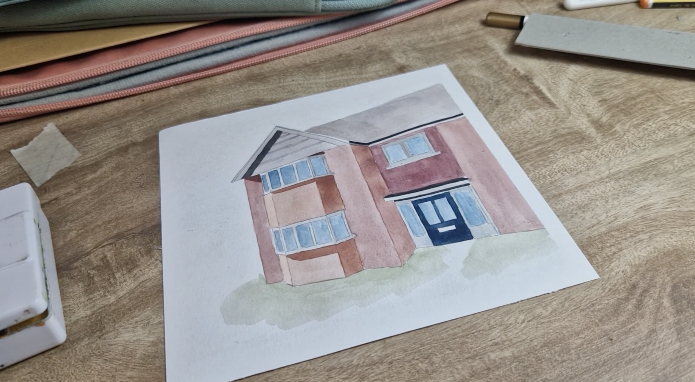
5. Stage 4 - Watercolour Base Layer: Okay, So the hard work is done. We've got outline which is quite stressful.
I'm not gonna lie. You're often like, Oh, is it too big to small? The main thing is
if you've followed the rules of a line going
from one vanishing point, hitting a corner, going
towards the other, then it will work. It will still look like a house. That's so many of you
are saying, well, it doesn't look like the house, but it looks like a house. So there's still winning that. But I also think people would recognize it as the house
you're trying to draw as well. So give yourself a break
because it is tricky. Now what we're gonna do is we're going to paint it
in watercolors. I love this. I love Watercolour, so much. So grab your paints and let's get started on
the Watercolour stage. The first thing I'm
gonna do is just paint the whole thing in a base color
except the white windows. Now, if you do have
masking fluid, feel free to use that to
block out any of the white. Or you can do it
section by section. So I think I'll do
section by section just because not everybody
will have masking fluid. I want to think of
the average palette. So it was quite warm
house this orangey red. So I want to think about
those colors for my base. So first I want to add a bit
of water into my palette. I've done two big drops. And I'm going to add
some yellow ocher, little bit of red,
which is quite nice, but it's very, very bright. So I'm just going to try knock off the brightness a
bit with literally the smallest amount of blue and then still feels quite orangey. So maybe I'm gonna go
for a bit of purple. Yeah, there we go. A little bit of purple, which I suppose is,
is blue and red. And that's gonna be
a really nice paint. So just notice how thin it is. So if we're gonna go
section by section, we're trying to get rid of
as much white as possible. So we're not worried
about shadows too much at this stage. All we want to do is
get color on the page. So I might actually just
start with this side on the edge because this side
doesn't have to be perfect. This is just blending it away. They do have to work fairly quick with
watercolor because you want it to be
consistent and smooth. That's what we're aiming
for in this painting. Guess I probably could have
done with a little bit more, was actually a bit more haste. So just going to
let that dry for a second and move on to this side. I think just staying in the
lines helps for any drawing. It gives you a bit more time just to make sure you don't
get any streaky lines. So if you just work within the sections of
the house anyway, then it's gonna be much nicer. Now the reason why
we're gonna do it in a couple of ways is because layering it really can
change a whole painting. We have a Base Layer
with an average color. Then it's going to help a
whole painting to become a much more 3D looking
and realistic. So that's what we're aiming for. Just work your way around now, adding your color and
you'll notice I'm just skipping a
section each time. Just gives it previous
one a bit of time to dry. So you don't get any
weird like to know Water, spillage or whatever
it might be. So I'll give all of that a
second and I'm gonna go in with a bit of navy and
black for the Windows. I'll just pop them
in there so much. I'm going to try and go for
the furthest away from me. So much water. You've got too much
water or too much paint, then you can just put your paintbrush on the Rag or the sponge and then
just get rid of that. Be very careful in here. Really use the tip
of your brush, tries to avoid going
in that white section. So that's gonna be
the hottest part. Trying to keep the
white, extremely clean, water colored lights to
dry extremely quickly. And especially if
you're in a warm room, it's just going to want
the water to disappear, evaporate as soon as possible. So if you're getting
any edges that aren't blending in or you're getting annoyed buys because you're fighting with science, which I think painting and drawing is a lot
like science actually. So just be mindful
of that when your painting now I think
a little bit of texture in a Windows
is absolutely fine. It doesn't have to be perfect. But if you're a perfectionist, like me, I know the struggles that
you're gonna go through. You're gonna be like,
Why isn't this perfect? It will be nice. That loaded texture, I
think that's pretty cool. Actually. Move up here. So there's all of
a Windows done. Let's continue now
with the brick. So let's get rid of all
the white of the brick.
6. Stage 5 - Shadows: So let that dry, go grab a cup of
tea and come back when it's room temperature
and when you touch it, it's not cold, it should be the same temperature your paper. That means we're ready to
go for a second layer. So stretch your legs, grab a cup of maybe
this good, Okay team. So now that most of
the Y is knocked off, we've only got the dual to
really have a bit of color on, but we want to stop
pushing the shadows. So think about when
you're building, where is the dark is wool? For me, it's this one then
this side of the building. So I do actually have
some very nice shadows that are being cast
from the roof itself. So I'm actually going
to draw those in first. I'm just going to switch
to my mechanical pencil just because it's sharper. But let's just draw any
shadows that are on our keys. So my picture actually
has open windows, but I couldn't be bothered. So I closed and shadows and
ask slightly different. So let's start with
our darkest shade. Now. If you use brown, I think sometimes it
squishes it a bit, so I like to mix a bit
of color with my brown, so I'm adding a bit of purple and just a touch of red as well. I want to make a good amount
of it so that it will last. But I do want to make it thicker than the previous layers so
that it really contrast. So if I attach that, you can see that
it's much thicker. But this one might actually need a second layer because
this is a dark is one. So let's see how we get up
because it does dry, lighter, but having that color
underneath will just help it to stick to the value
that it should be. So paint that in. It's just starting to
have this weird pooling so I can try and blend that in. It's just because things are
drying at different stages. So it's really important that we work as quickly as
possible just to avoid that. So I'm just gonna go
over the whole thing again just to make
that nice and smooth. My voice, it goes so deep. Now, that's what I mean,
concentration mode. Okay. So, uh, let that dry. And then a break here is
a little bit more yellow. So I'm just going to add
more yellow ocher to that. Which will naturally
lighten it a bit. But should be, well, it should still have the colours from the big boy we just done, so we can add that as well. This one's a bit wetter, which means the pooling in
theory shouldn't be as bad. It's always hard to
do the straight lines on the right-hand side. Let me get I'm going
to pull that color into this shadows being
cast from the window. Just a lot of paint my brush, I can just dab that
back home was good. Then I can paint this. So pick up a bit more, pop that in the shadow
underneath the window. This shadow is bigger. Underneath the bottom window. Anything that's just the
position of the sun hoping that to elongate itself. Again, it's just
trying dots them. Excess paint. And then in-between
here so you can see there's a bit of a
difference in brick. So I might just mixed up purple
vacuum with it, with OK, I said this shadow
here should be a mixture of the two shadows
that we've just done. A lot of color. Good. I like it. Now AAA is, this one is
really standing out. So I'm actually going to
just remake this one. And I'm just going to plot that because
technically this would be really similar and
it just looked to lights or at least
will make it a bit darker and it's similar
colors to what was that? So pop that on. Then hopefully we can
just forget about it. Okay, good. And then there's
a final shadow up here which is very dark. I just want to get a
thick paint there. There's really thick. This paint is almost like a pen. Also here too. Okay. Good. So let's add the door. So this is a navy TO
all that as array. And then make sure it's dry. And I'm just going to
paint around that. Essentially it's the
same colours, a Windows, but because there's
more pigment in it, it looks like a completely
different color just because it's darker. Okay. So we've got a lot done. We have added the shadows. There's still a bit of detail
that we can add to it. But what I want
to do before is I just want to find those
little black edges that are around the door and across the top of the ceiling because we just haven't
touched that at all. So let's do that
bit of detail and then we're going to relook
at the rest of the painting, seeing if there's any
shadows we want to add to make it look more 3D
7. Stage 7 - Final Detail: I'm just going to
pick the black cup straight from the pigment. And it's black on
the top row here. So then very gently go cross. Trying to keep my brush down. To me. That line is incredibly smooth, ER, done the bottom to top. So hard to talk can do that one, but very pleased with
how that's come out. So the roof, this done, I'm gonna get black on the top. Then the first row. Underneath. There we go. So
that just makes it look way more interesting. And I just noticed as well, does that shadow on
the roof on the left. So let's add that one. I did it brown and
a bit of black, which I think is
fine for the roof because it's a very
uninteresting roof. Sure. My parents don't want to
hear that about that. Beloved house. Rules are a bit boring. Other Draw that in is too
much paint on this brush. Sure if he can hear, but
it's raining outside. And oh my God, I absolutely love it
when it's raining outside and I'm inside painting. Okay. Perfect. So that's our main
Detail done, I guess. And now I just
wanted to re-look at these two panels and think about the light source of light is
coming from this direction, which means that should
be the lightest. So even this, this, this, and this will, these four
should be a little bit darker. So just going to
mix a little bit of paint and make sure
it's got purple in. And then make sure it's
nice and wet as well. Just gonna go over
it so it looks a bit dark as I pop it on, but it was spread. Spread it out and then
it will get thinner. Again. Remember it will dry a
little lighter as well. Then it do the
same on this side. Shadows, which is fine, there's no harm not being
darker. There we go. Give it and I'm
just going to add a little bit more yellow for his brakes here because they are different
color and it's also nice. It's nice to have different
colors on your painting. Makes it look a bit more
interesting, doesn't it? Fabulous. Now, what's standing
out to me at this point is the white. So that never pure white, but we can leave the left
side a little bit wiser. The right side, we do want
to just knock the Y off. So I'm going to make a gray. And then I just wanted
to paint over it. So it's still, you know, we would still read
this as white, but it's just not as wide as the window closest
to the light source. If that makes sense. Anything that's closer to the light source will
be the brightest. Everything else will
be darker and darker. So yeah, that's fine. And then I'll just under
the door blue coming off. Then the same for these windows. And then it will be a
little bit lighter next. So this side will be
lights or if it's not, feel free to do another
layer on your dark ones, sorry, no new light ones. That doesn't make any
sense. You might just do. Make this one a bit darker
than these windows on the right because
the in shadow too, so you can get that
window on the top. Then this strip here. Then I'll get this strip the dark a bit there just
to show those Shadows. Just the roof I think
needs a bit of work. So let's make blackish brown. Hope that in. I'm just going to let my
brush run out of pigment. Can add to touch a Water. That's going to get
a bit of a gradient, but maybe I can add a little
bit more pigment here. Yeah, good. I just want to add a little bit of shadow underneath here as a
way too much juice there. Then the ground. So Final Bit, it's just
a little bit shadows. I'm actually going to
make a greeny brown. Just go like grass even though obviously there'll
be a path that, but all they wanted to do,
just get a bit of an edge. You see that green really
lifts up those colours. And I'm just going to
add a bit of water. I might just leave that. I want to try. Just bring that out that let
me push that in the quota. That blend that. Don't
ever write that. That's going to
annoy me forever. Now that little edge. There we go. My friends
have Final thing to do is to peel off your
masking tape and have a look. This is a really
beautiful exercise and it really teaches
you about focus, about shadows, but perspective, and also drawing something
that you really love. I hope you enjoyed that. Do leave me any feedback or show me what you've done
because I would love to see. And congratulations,
well done on your two-point
perspective building. Let's peel off the
masking tape now, do you have to be
careful it doesn't rip. So I want to be very gentle. You see, I'm pulling it. This angle is just a little
bit that if no reps, they say that I didn't know
the artwork is going to read, but just do it slowly,
really, really slowly. And just adding the masking
tape actually creates a nice little border as well, which I think is a great
touch for any artwork. Went to quit. That's why. Right? And the final thing to do is just your little signature
right in the corner.
 China Jordan, Art Teacher