Transcripts
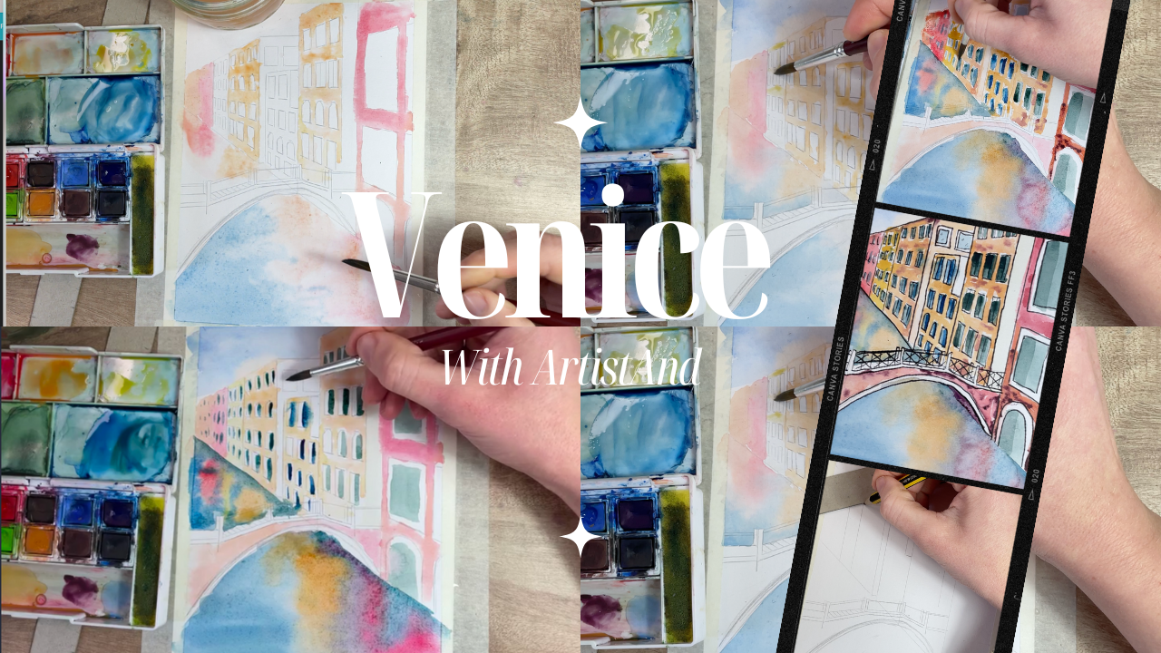
1. Introduction To Venice Scene: Hello, my name is China
and I'm an artist wanting to show you how to become the artist you've
always wanted to be. I'm a trained oil painter, but I can paint in watercolor, acrylic, and I can
also draw as well. I have lots of videos to help you on your
journey to become more creative and feel like
you can actually do this. In this course,
I'm going to show you how to paint a
scene from Venice. We are going to be looking at lots of different techniques from wet on wet to wet on dry. And trying to see if we can get buildings
with reflections, which sounds quite difficult, but actually it's not too bad. What you'll need for this
course are your materials. Make sure you have a
watercolor palette. I prefer to use the dry
squares rather than the tubes, and it might be easier for you
to follow along with that. Anyway, next you'll just
need a small brush, a pencil, a ruler so we
can look at perspective. Just remember if you are
confused about perspective, by all means, head back to
one of my classes previously. Finally, you will need an old rag, a glass of water, not to drink, but to
use for your pates. And finally, watercolored paper. It's very important we don't use normal paper because it will just warp and
ruin our artwork. Grab your materials. Do this in one sitting,
in several sittings. Whatever you want
to do at the end, if you want to add a fine
liner to crisp up your edges, you can do so too. Let's get started
and enjoy the class.
2. Stage 1 - Draw The Outline: First things first, we need
to start with our outline. Now this will take some time because it is quite a
complicated drawing. We look at perspective,
which is the first point. Perspective, meaning everything's
going in one direction. However, our vanishing point isn't in the center of the page, it's actually just to the left. Make sure you're ready. Make sure you have a
ruler and a pencil, and definitely an razor, because we might get a
few mistakes on the way. And let's begin our outline. Okay, so we're going
to start off with our drawing and we're going
to do a bit of perspective. It's one point perspective, which means we have
one vanishing point, but our vanishing
point is going to move all the way over to the left. So I suggest drawing this
on your masking tape just to give us as much
space as possible. We want it to be fairly high up. If we imagine this is
halfway up the page, then we want to go maybe
another six of the way up. So I'm just going to do a
little circle and here, and that means that's
how our horizon line, our buildings are
going to try and aim towards this for
the top and the bottom. And we're going
to have a lovely, nice bit of river over here. With any one point perspective, the first thing we need to
draw is a face facing us. In this one, it's quite
challenging because actually all our buildings are
going to come across here. We're going to skip that stage and we are going to try and draw a general generic shape. And we're going to go
all the way across. Draw it quite lightly so that
you can rub it out easily. Then for the top I want
to aim about here. It's just to the
right of the center. I've got my ruler on
the vanishing point, and I'm going to pull
that out over there, so we can see that something
is being pulled across here. Now what I want to do is
separate my first building. These lines all have
to be vertical, any edges of buildings. And I'm just going to
draw that up there. I'll move across a bit, and I'm going to draw one here. And then as I move across, the gaps of the buildings are going to aim to get smaller. We'll have different size roofs. Then we want to really push in those details as
we move further across. This is helping with our
perspective and understanding that as things go further away
from us, they get smaller. It looks a little bit weird at the moment because of what
the hell is this line, this is actually just
a different size roof. I might extend that a bit just so we can get
more of an angle. And then I want to go to the
vanishing point to a corner. And then hit that up there. Okay. And add a little roof, so a vertical line. Then we have a corner, so that means we need to go down there. That looks interesting.
So that's what we want. Okay, Get rid of this line
that separates the buildings. If you wanted to separate the buildings or
you have any roofs, the facing us, not this side, that's going towards
a vanishing point. The face facing us has
to have flat lines. Hopefully, it'll make
sense when I draw it. It just helps us to see that
this building is separated. And if I wanted to separate
this building as well, which I don't, then I would
draw a flat line here. Now because we have water, we're not actually going to see any the flat lines at the bottom because it's
basically just a street. So the only separation we can see is the top of
the building here. I guess actually we could
do a little gap down there. Why it might be
covered by the bridge, but we'll see in a second. But that's just a nice way to see that the buildings
have separated. Why do I draw that back in? This needs to be flat as well, if you can see the roof. Okay, so let's think
about our bridge. Where is it going to go? Will
there be a gap in between? I think actually we do need
to add a bit of a walkway. So let's draw a
straight line here. And that's for me to
know that the bridge is going across the water. And then down there
for the bridge, think about where it ends. Mine is where all of our
should end at the water line. It's going to curve up and
then it's going to go across. Because we have a perspective, It's much harder to draw, but try and think of it as a
sharper turn on the right. And then it's more
elongated on the left, so it's as if this arch is just being pulled
across to the right. And then we are going to think
about the bridge itself. So I'm going to twist
it ever so slightly, which means I'm
down on the left, and this is going to be the
centerpoint of my bridge. Anything on the right will
be a smaller distance. And anything on the
left will be bigger. Just because of perspective. We are closer to this end
than we are to this end. Let's go down a little bit. Go down more roughly
the same angle on the opposite
side, but not quite. It doesn't matter.
If it's not perfect, then I'll draw a parallel
line just to show the detail. Okay, then let's have some
pillars going up to read four. Fabulous. And actually
I'm going to do a longer line on the left and
a longer line on the right. Then I guess we need to make these two have parallel
lines as well. Good. And then just four ease, let's close those off and
then attach the ruling. Excuse me. Okay, Fab. And then the final bit is to
have this going into here, that's the path in
it where people go. And then we'll have the
final bit, railing. Okay? This bit is
going to be difficult, but spend a bit of time on
it and you will get there. I think the most important thing is just getting this arch. Let's do dual curve. Good. Now, can we see on
top of the bridge? We could probably
see a little bit. Let's go for a little bit
of a mirroring system, won't be able to see all of it, so I'm just going
to add a few steps. It could be a ramp to be fair to know why it has
to be stepped off. Then we do have a bit of
railing behind there. Make sure we get our
posts on as well. P here, of course. Nice. All right. Let's add some windows. These are nice and easy. Basically, you want to
figure out the top. Then all you want
to do is got 1234, and then you figure
out the bottom, we want to go 1234. Then we want vertical lines
that go up here super quick. Now what you do want to make
sure is that your windows on the right hand side are bigger
than the ones on the left. Let me do slightly
better version of that. This time I'm going to
have arches on the top. All I want to do is just got, then I can go straight line, straight line,
straight line arch. Straight line,
Straight line arch is a bit more
Venetian, isn't it? Then we'll go 123123. Cool. Then I'll do
final row windows on this 123123 straight
lines that I'll do. Spend a bit of time just
adding some windows. That was terrible. I will speed this up, design the windows
however you want. Have fun with it. And then we'll do some painting
in just a moment. So it might take a bit of time, but this is totally worth it.
3. Stage 2 - Paint The Buildings: We've got the outline that might have taken
you a bit of time. It took me around
ten, 15 minutes. Yeah. Don't feel bad if it was a little bit slower
than you wanted it to, if you did it quicker.
Worldly done. Now we outline, we've
got some structure, It's time to start on wet. On wet practice. Make sure when you put water on it's not too
saturated because your paper will
start to warp and your paint won't spread nicely, in that you just want it to be slightly more wet than damp. And we're going to start
to add some color, Grab your paints, and let's
start the coloring in. Okay. So Venice is a
nice warm country. We want to use warm colors. The buildings are
orange and red, and they're quite
scatty as well. What we're going to do is
a wet or wet technique, which means my paper is wet and the colors I
add are wet as well. First of all, I actually want to wake up some colors
and get them ready. Let's pop that in there. Let's go for red. Wake you up and maybe
let's get like a yellow. Okay, cool. So I'm going to start with this
big building over here, and then I'm just going to try to avoid the
windows for a second because this building in front
of us is going to be the clearest we'll see. For people that wear glasses, it'll be the easiest
thing to see. I want to make it damp. It's soaking wet, but it's not going to dry
in a couple of seconds. Let's just get paint
on there then. All they want to do,
dab the colors in, so it's mostly red. I want to make sure, not
too shy on the pigment. And then as we go down, maybe I'm going to introduce
some of that yellow ocher. Okay, then I'm going to skip this gap is
actually quite helpful. Then I want to do
a similar thing, again leaving the windows. I'm going to try and get in
between those buildings. And we're going to
make this one a little bit more orange. A little bit more yellow. So let's start with this color. Dab it in yellow maybe. Okay, skip the next building
so we don't get any bleed. And then let's go
for the next one. For this one I want to go
a little bit of orange, dab it in the skip one
and the end, maybe. Let's go a bit more
red again now. It's much harder to see the detail as you
get further away. So I'm just going to paint
it followed by the next on a little bit of orange and let them do their
own thing. Okay.
4. Stage 3 - Paint The Reflections: Now it's time for the fun bit, or maybe it's a scary bit. We're going to do
the reflections. This is actually much
easier than it looks. It's very effective
to be able to paint reflections and all it means is that it can
be quite abstract. But so long as you're
picking up the color from the building above
and putting it in the water in wet on wet, then it's going to
be absolutely fine. Let's start by making our ground wet and we can
start to add the color. Whilst that's drying, let's just have a little
look at the water. We want our colors to come
down into the water and they're going to reflect
on a straight line. That means I want to make
sure my water is wet. Because I don't
want the paint to have seriously strong edges. I want it to really blend in. This is a lot more wet
than what we've just done because I want to
have as much time as possible to try and
add blue as well. Then all we're going to
do, pick up that color, then just try and
mimic what's above it. I think actually this
has a little bit of orange in there as well. And then let's go straight
down for this building. Let's go straight down
for this building. A little bit of red here, a little bit of orange there. We're starting to show that
the colors are in the water, but then I want to have the
actual color of the water. I'm going to go for
this darker blue, a little bit of dark green. Then all I want to
do is go sideways for this because it's
a much easier effect to create the water to go sideways because the
color is still wet. And the wet, wet, wet. You should be able to mix
those colors in a little bit. Okay. And then just remembering
what the back line was, it will do the same
up here again. Sideways, brush, left,
right, left to right. Okay. So we're starting
to see a little bit of reflection going on down
there and then in the sky. Yeah, I want to do a blue sky, but I don't want it
to be super dark. So I'm just going to get a thin version of
this other blue. Then I can spread
that out, it's fine. Just add a bit of water. Spread that out, then let that dry team so
there's a lot going on. Let it dry, we'll come back to it and we'll add a
bit more detail.
5. Stage 4 - Finish The Other Buildings: Let your reflections dry, and let's just fill in those
buildings that we missed at the start because we didn't
want the colors to bleed. Okay. Make sure it's dry, make sure nothing's
coming off on our hands, and it's the same temperature
as the rest of the paper. What I'm going to
do now is just try and fill in these
gaps a little bit. I'm going to start off
with a lighter yellow. I'm just going to throw that on there and not worry too much. Let me go, let's go for
an orangey color here. Actually, even let me wet this one in
between, there we go. Just roughly go round, There's loads of
water in my brush, so I know it's
lasting a long time. And then pick up that
orange dab, that **** in. I say that not to
try and be funny, it is, but just to
not overthink it. Literally dab it in,
don't be precious. I say that and then literally
just went onto the bridge, push that off, and then let's get this
building over here. It's much trickier over
here, more yellow. I do want that to be
separate to this building, so I'm just going to
hover on that for a set. But instead, I can actually paint this brick
work on the bridge, so we get damp water. Then let's go for a red
that turns into orange. Pop that on here. Pick up
the orange as we transition. There we go. Just let
that do its thing.
6. Stage 5 - Reflection Second Layer: May or may not know, but water color really benefits
from multiple layers. We're actually going
to do a second layer on at the reflection. We're really going
to start to see some good results
now inside here. Why not? Let's do
something in there. I'm going to go
for a dark green. Not too precious, but I'm going to try just leave a bit of a white edge for some brick work to do
the same down here. It's going to,
trying to work quite quickly so that it's nice. And even over here we go owed. Then let's have a look at
the water that is dry. And I do want to do
another layer here. I want to try and
get a marine edge. And then I'm going
to try and introduce those colors again. Let's add a bit of blue
to this darker color. Then I'm going to add
some water first, just like we did before. Let's take it all
the way across. We want to make
sure that we have a high ratio of pigment because obviously
we've got water at the bottom. I want it to be nice and thick there and look at how
that's pulling it across. That's so nice. Let's pick up some of
this red that is rich. Gag And then there's, pick up some of this orange. Pull that down, let them blend. And then we want this color
to blend in left and right. Okay, It looks really grainy, but I need to let it dry. I think we've got to trust it. I'm not super happy with it, but I think it
will come through. I just want to add a tiny bit of orange there as well
from the other building. Let's let it do its
thing and let's test. The back is dry as well, so I can do exactly the
same thing down here. Then we want that rich
color going down here, followed by whatever
colors your buildings are. Let's pull that,
introduce some yellow, Pull that down, introduce
some red, pull that down. And then pick up
some of the blue. Let's add that in, can wiggle in between. Okay. And then let that dry, folks.
7. Stage 6 - Finish Windows: Bit should be nice and easy. We're just going to use
a nice emerald green to get some details
on the window. Have fun with this bit. In the meantime, we can see
whether anything else is dry. Maybe in between these windows, we could add a little
bit of window stuff. Let's say these shutters, let start with one half, the top ones, these
are going to be open. Then the bottom half, I'll just do one half again
and then let that dry. I think as we move on, let's add a bit of blue. They're not all going
to be the same color, so why not spice it up a bit and I'll do the same
again. I'll do one, two. Oh, that was silly, Wasn't it? On wet? Please don't do it.
I did. We just may as well just finish
these. It's fine. Because it is a bleary
ish painting, sir. I think it could be. All right. Okay. And then
let's go for the next one. The reason why I'm doing a
half is so that when it dries. Going to put the second one
in, it should give it like a natural center in theory. Yeah. It should just make
it a bit more interesting. Okay. And then this is dry. So these are just gestures Now, it Okay, And then why not just do fill those
in a little bit? All right. Okay, so let that dry again, and then we'll work back
into it in just a second.
8. Stage 7 - Add Texture: We are nearly there. All we need to do on this layer is add a little bit of texture, help bring up the
vibrancy of the color before you have the optional
part to add a fine liner. Or you can skip that
if you want to. For now, we're going to
try and add some texture, make it a bit more lively, and you'll start to see some
very nice work come through. Let's get to it.
All right, team. So everything's
looking much drier. What we want to do
now is really bring up the vibrancy split. The more down there, the
vibrancy of the buildings. We want to do the
same thing again, to really elevate the
painting at the minute. It looks a bit natal,
a little bit boring. I'm actually going to
go straight on with the paint and also just
add a few more colors. I want to be a little
bit scaty with this. I'm not the impressiousll, I haven't been before
either. That's good. Just literally allow yourself to scumble away whilst it's wet. You could add a few
dots into the paint, let that become a bit textured. It's going to look
quite nice with a huge variation in
textures and color, and you should start
to see the painting look way more
interesting as you work, you weigh down again, scumbling roughly, honestly doesn't matter if
you go over the lines at all, then we can add a
few dusty bits of texture because they are quite
crumbly texture buildings. If you can hear my dog
going to shake you like any attention, Cool. I'm actually going
to add a few drops of water just to help push that paint
around a bit cool. Then let's go for the
same on this one. I hope I missed a bit there. A bit of a gap and I can
add a few dots again. I actually add a bit of a dot line at the
top of at night. The next one as well. A little bit of it in the
yellow one, red again. Wow, that was gross. Very wet as well. All right. Well, it's like I'm shoving
that on then and then there. So the only thing really that
I need to do is just get a little bit of paint on this first layer because
we didn't quite do that. Why I missed out that one. Cool, So yeah, let's
do the same here. Okay, nice. So I do actually want to add a little bit of a
dark edge at the top, just going to put
it in my wet paint. And then let's try to add the other half
of these windows. Let's see how it looks. Not the worst. Not the best. It's just a gesture. It's
making it interesting. Let's maybe just do
like a half on here to y help, you know. Then the other one was blue. That might be a tiny bit, but actually the one,
okay, nearly there. Let's get the same
texture going on in the brickwork scum, not too pressure, change
the color a little bit and then let's get a
couple of dark dots. And then actually
what could be nice is to get dark purple. Underneath here just
shows a shadow. Shadows underneath it. Okay, let's just add
a bit of water here.
9. Stage 8 - Finally, Add The Fine Liner: This is the end. Now we've
done our perspective, we've done our first layer, our second layer,
and our texture. Now we just want to
refine the edges. I think the best way to do that is with a fine line of pen. You need to make sure your
artwork is completely dry. If you find it looks a
little bit messy like mine, this will actually bring it
all together and give you some nice crispy edges to make it feel a little bit
more recognizable. So grab a fine liner, or maybe you just want to paint the edges a
little bit thicker, completely up to you, but this should be really enjoyable. After that, we're going
to take off the tape, we're going to stick it
on the fridge and go, yes, I made that look at it, Isn't it good? Cool. All right team. So
let it dry and then let's get a ballpoint
pen or a fine liner. And we're going to go over the whole thing and
make it look thick. Okay, so all I want to do is draw around all
of our details. You can use a
straight line or you can go freehand for me. I am going to go freehand
just to add to that not perfect sort of attitude that we're
having towards this. A little bit of wobble, I think sometimes suits the
painting if your painting is slightly more abstract in
the sense that we're not trying to copy each millimeter
by millimeter actually. We're just trying to
play with paints. We're trying to
play with texture. We're trying to get reflections, let's go around the whole thing. But if you are
perfectionist and you're **** in a brick by me saying, oh, just get a free hand. And like whatever, of course, do whatever you want,
This is your painting. You can use a ruler. I don't know what the option is. Oh, that was it. You cannot use a pen and draw around it, and you might
want to leave it. Maybe you're happy with it completely up
to you, my friend. But for me, I just
wanted to find the edges a bit more going freehand,
going around it. I think we'll just make it
quite a cool little painting. Let me speed this up again
because it's boring, maybe it's not, maybe
I'm completely wrong. But if I were you all right, teacher, Let me get on with it. So I'm going to shut up. Let you get on with it. The last thing we
need to do team is obviously peel off the tape. You got to be really
gentle with it. You want to pull it away from my painting just in case
it rips like minus, but it will give you a
very nice crisp edge. Pull that away on
the other side. A bit too much, Rick. Fine, it's fine. If I was
putting it in a frame, it would be mounted anyway. You wouldn't see it. Care.
There we go. There we have it.
 China Jordan, Art Teacher