Transcripts
1. Class Intro: Hi. Hi. I am Ola, a landscape artist,
passionate about creating expressive and
atmospheric scenes. And welcome to paint the mood Expressive Landscapes
with acrylics. I am so excited to guide you
on this creative journey. We will explore how to capture the beauty of landscapes
through loose brush strokes, bold colors, and a touch
of mood and drama. Together, we will learn how
to create depth, balance, and light while embracing the imperfections that
make each painting unique. Whether you're just starting out or looking to
expand your skills, this class is all about enjoying the process and discovering
your own artistic voice. It's not about perfection. It's about storytelling through your brush and finding joy
in every layer of paint. Let's create something
beautiful together.
2. Class Project: Your project will be to create
an expressive landscape painting that captures
depths, mood, and light. Using the techniques we
will explore step by step. Don't worry. This class is designed to be
approachable and enjoyable, whether you're beginner
or more experienced. Let's dive in and get started.
3. Art Supplies: In this lesson, I'll guide you through the tools and materials we will use to create a vibrant
and textured landscape. Let's start with the paint. While I have a variety
of colors displayed, you won't need them all. For this class, I'll focus on a limited palette,
ultramarine blue, yellow ochre, or yellow oxide, burn sienna, raw amber,
and titanium white. This selection is
versatile and perfect for creating harmonious and
cohesive landscapes. Next, let's talk about the
palette for mixing colors. I prefer using paper instead
of a traditional palette. These papers often become
part of my creative process, as I reuse them for collage or even paint
directly on them, resulting in unique textures
and unexpected elements. Now for the surface, I'll be working on a
fabriano bristol pad. I love its smooth surface which complements acrylic
paints beautifully. However, feel free
to use watercolor or mixed media paper if
that's what you have on hand. For brushes, I use mix of professional and
affordable options to achieve a variety of brush
strokes and textures. Having a selection of flat, round and detailed brushes allows you to handle everything from bold sweeping strokes
to intricate details. Lastly, don't forget
a jar of water for cleaning your brushes and some
paper towels for dabbing. Keeping these essentials
close by will make your painting process
smooth and enjoyable. Now that we've
covered the supplies, let's get started on painting.
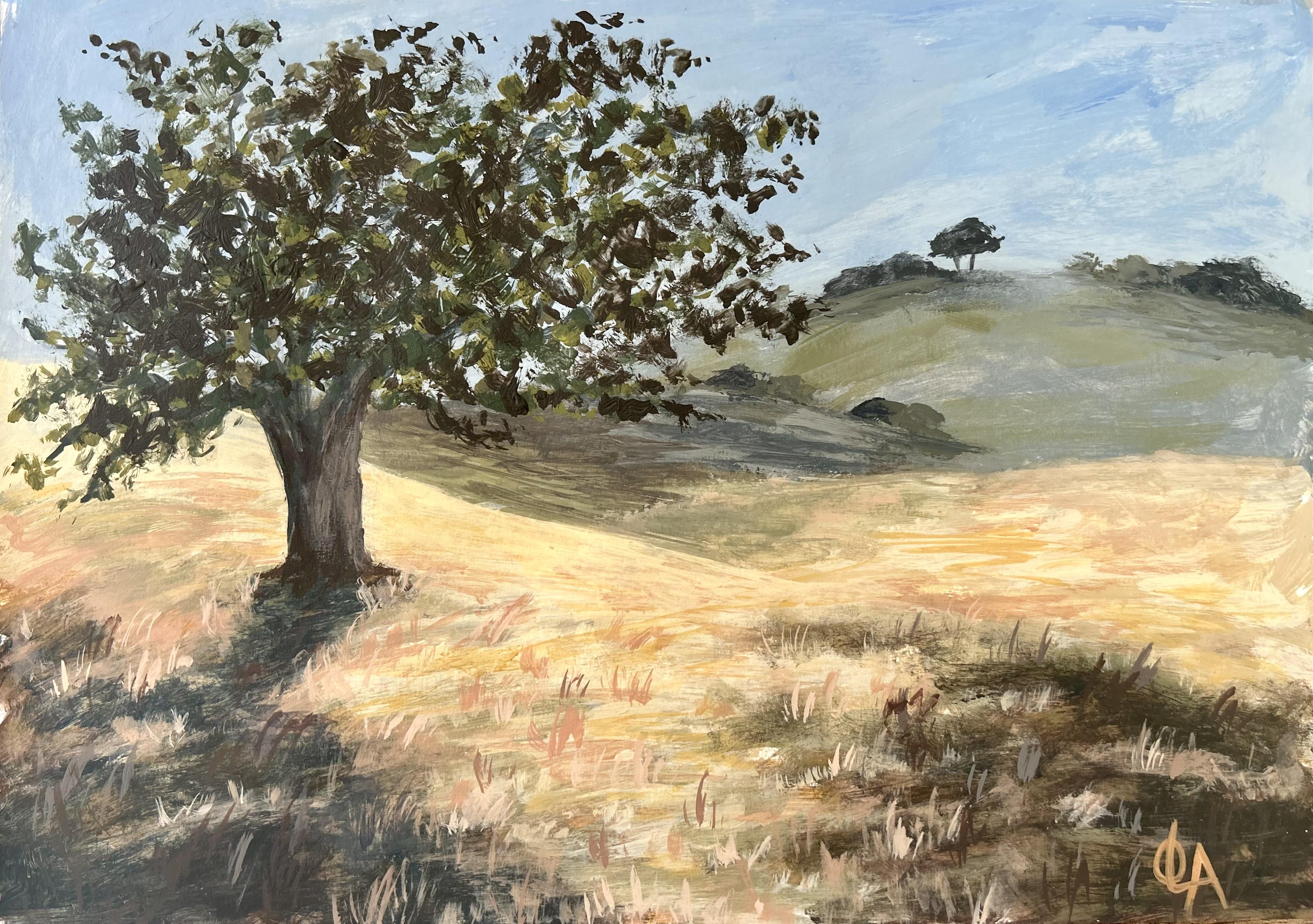
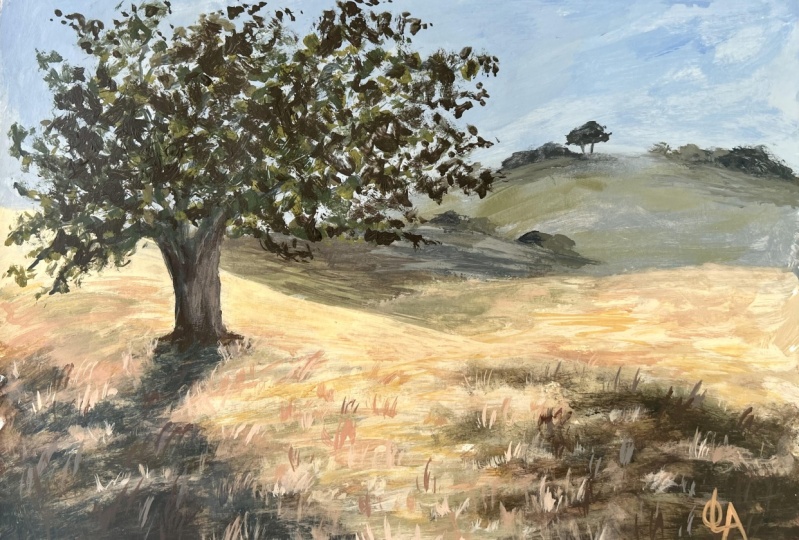
4. Laying The Foundation: Sketching And Blocking In: In this lesson, we're
starting with the physics, laying the foundation
for our painting with a simple sketch and the
first layer of color. This step is all about
setting the tone and the structure in a
relaxed, approachable way. I begin with a
very simple sketch using a piece of
fellow charcoal. I love using this
because it's soft, forgiving, and helps
me stay loose. It's perfect for roughing out
the mean sheets and getting a feel for the composition without worrying too
much about details. If I don't like a line, I can easily smudge
or adjust it, which makes the
process really free. At this stage, I'm just mapping
out where things will go. Large shapes like the sky, the land, or any big
elements in the scene. It's quick, relaxed and gives us a good foundation before
we dive into painting. Don't worry about perfection. It's all about creating a guide to follow
as we move forward. Now that the sketch is complete, I am starting with the
first layer of paint. I begin by mixing ultramarine
blue with titanium white to create a soft
light blue for the sky. To mute the color slightly, I add a touch of
Burnsen to the mix. This gives the blue a more
natural atmospheric tone. Using a large brush,
I apply this color in smooth horizontal strokes across the upper part of the paper, covering the sky area. Now I adjust the mix by adding a bit more titanium
white to lighten the color. I lend this directly on the paper to create subtle
variations in the sky, giving it a natural gradient
and a sense of text. At this stage, I am keeping everything
loose and expressive, focusing on covering
the paper with color and building the foundation
for the next layer. The details will come later
as we refine the painting. With the sky complete, I move on to the distant hells. To create a sense of depth, I start by using the
same mix as the sky, ultramarine blue,
titanium white, and a touch of burn seen. This ensures the heals feel
connected to the atmosphere. I then dip in the tone by
adding more ultramarine, a bit of burn sienna, and a touch of yellow oxide. This creates a
muted natural color that contrasts subtly with
the lighter sky tones, adding dimension and
a sense of distance. To soften the edges of the halls and enhance the
illusion of distance, I like to use my finger. By gently blending the
edges with my fingertip, I create a smooth
transition that helps the hells recede
into the background, giving the scene a soft
atmospheric quality. To maintain consistency and
harmony in the painting, I mix new colors by adding them to the colors
already on my palette. This approach helps
create smooth transitions between tunes and ties the
entire painting together. I begin by painting
the shadows in the foreground using
the same large brush, I take the existing mix on my
palette and add ultramarine blue, Bernsiana raw amber, and a touch of yellow oxide to deepen
and warm up the tone. I apply this mix in
broad sweeping strokes, focusing on areas where the
shadows naturally fall. This adds depth and
grounds their composition. Next, I move to the midground. Again, using the
same large brush, I build on the existing mix
by adding yellow oxide, ultramarine blue, and a touch of titanium white. Oh This creates a muted, soft greenish tone that
transitions smoothly between the color tones of the distant hills and the
warmer tones of the foreground. I apply this with loose
horizontal strokes, allowing the colors to blend naturally into the
surrounding areas. As I continue layering, I make subtle adjustment. For lighter areas, I add more titanium white
or yellow oxide, and for darker areas, I incorporate raw
amber or ultramarine. This variation keeps
the painting dynamic and prevents it
from feeling flat. Throughout this process, I keep my brush strokes
loose and expressive. My focus is on building the structure and tunnel balance while maintaining
a natural flow. I frequently step back to
ensure the composition feel cohesive and the colours transition seamlessly
across the painting.
5. Developing Depth: The Second Layer: Good in our last lesson, we focused on blocking
in the major shapes and creating the foundational
layers of our landscape. With those layers in place, it's time to bring more life
and focus to the painting. As you can see, the tree has faded under the paint
from the last layer. That's perfectly normal when building up layers
in a painting. Now, I'll quickly
resketch the tree, keeping the structure simple and focusing only on the
key shapes and lines. Remember, this doesn't need to be perfect or
overly detailed. Now with the three sketch, I'll start defining it
with darker tones to build its form and make it stand out against
the background. Using a medium brush, I loosely paint the
trunk and branches, letting the structure
flow naturally. The branches extend outward, creating a sense of
movement and balance. Next, I'll deep in the shadows on the
ground beneath the tree, adding depth and grounding
the composition. Notice how I use a mix
of darker greens and browns to blend seamlessly with the earthy tones
of the landscape. As I work, I am constantly
referencing the photo to guide my shapes and values
while keeping the brush strokes
loose and expressive. I'll add smaller branches to enhance the tree's
detail and natural flow. For this step, I am
using kits paint brush, which I have customized by cutting its bristles to
give it a unique shape. This allows me to achieve different textures and add
variety to my strokes. I'll add a warmer sheet to
the tree trunk to create depth and highlight the
sunlight's effect on its surface. This subtle warmth
brings the tree to life and makes it feel more connected to the
surrounding scene. Next, I'll return to
the ground shadows, darkening areas to add contrast and connect the
tree to the landscape. This helps anchor the
tree firmly in place, making it feel more
integrated within the scene. When working on the foreground, I blend warmer and darker sheds using vertical brush strokes
alongside horizontal ones. The warmer tones drew the
viewers attention while the darker values and vertical strokes add
a sense of depth, pulling the foreground closer. Together, these elements
create a layered effect, enhancing the transition between the foreground and background and guiding the viewer's eye naturally through
the composition. I am now shifting my focus to the distant halls
in the background. I use a mix of
cooler muted tones to push them further back, creating a sense of depth
and atmospheric perspective. These softer sheets help to establish contrast
with the warmer, more defined elements
in the foreground. As I layer these tones, I am careful to use
horizontal strokes to suggest the gentle
curve to the Ls. This subtle detail
adds dimension while keeping the background harmonious with the
rest of the scene. Now I am turning my
attention to the sky to enhance the contrast and create a more
dramatic atmosphere. I'll add softer and
lighter sheets. I'm using a light
touch with my brush, focusing on creating smooth transitions
between the colors. This lighter tone
helps the tree stand out more clearly
against the background, emphasizing it as
the focal point. With each layer, I am carefully balancing the tones
to ensure the spy complements the warmth of the ground and the darker
shade of the tree. This step is all about
creating harmony within the composition while enhancing the overall impact of the scene. I'm adding some depth
to the landscape by painting little clusters of trees and bushes
in the distance. I gently dab the brush to
get a soft, natural feel. I'm keeping the details
minimal here so they don't take attention
away from the main tree. To soften the edges
of the trees, I'm using my finger. This technique helps create a smoother transition
and a more natural look. Occasionally, I wet my finger to make the blending
even smoother. It's a simple trick that works beautifully
for a dreamy effect. I'm also adding a few small
trees along the horizon. They're simple, but they
help guide your eye through the painting and
toward the focal point. It's always good to take a step back and check how
everything looks together. This helps me see if any areas feel too
strong or too faint, so I can make adjustments for a more balanced
and harmonious look. H
6. Refining The Mood: Third Layer Techniques: Let's bring more life to the landscape with
the third layer. I'm starting by
refining the ground, introducing warmer tones
with soft delicate strokes. This adds a gentle
glow to the field, balancing the color used
in the sky and tree. Next, I am painting patches of grass with short
vertical strokes. Varying the direction
and colors gives the landscape a
natural organic feel. These small details really enhance the texture and
depth of the scene. I am adding a warm glow
to the field using a mix of burnt sienna and
wine to create a bitchy tone. I'm lightly brushing it into areas where
sunlight would hit. Blending it softly to
keep the look natural. This simple touch adds
depth and warmth, making the field feel
alive and balanced. Uh h as we finish up the foreground, I mix yellow oxide
with a touch of white to give the field its
final glow under the sun. I save this vibrant touch
for the last to create contrast against the muted tones used throughout the painting. This adds warmth and
brings the scene to life. Now you can take a
moment to rest while watching me add some final
touches to the field. Once that's done, we will move on to painting
the tree leaves. Oh o.
7. Last Strokes: Defining The Tree And Scene: Now we're moving to the final step painting
the tree leaves. Since the tree is
our focal point, I'll use different sizes of brushes to add
variety and texture. I'll work with a mix of greens, layering them to give the tree a full and lively appearance. This step will bring
the tree to life, enhancing its presence
and completing the scene. I am painting the
tree leaves with light touches and
expressive brush strokes. This approach adds movement and a natural feel to the tree. Okay Okay. He
8. Final Thoughts: As we wrap up this class, I hope you've
enjoyed this journey of creating expressive
landscapes, together with explored
techniques to bring depth, mood, and light
into our paintings. All while keeping the
process loose and creative. Remember, painting is
about expressing yourself and finding joy in the
process, not just result. Each brush stroke you
make tells a story, and every painting you create is a step toward discovering
your unique style. I encourage you to
keep practicing, experimenting, and
pushing your boundaries. Don't be afraid
to make mistakes. They're part of the process and often lead to unexpected beauty. Thank you for joining
me in this class. I would love to see your work and hear about your experience. So feel free to share your
creations until next time. Happy painting.
 Ola Alhamedy, Landscapes & Nature Paintings Acrylic &