Transcripts
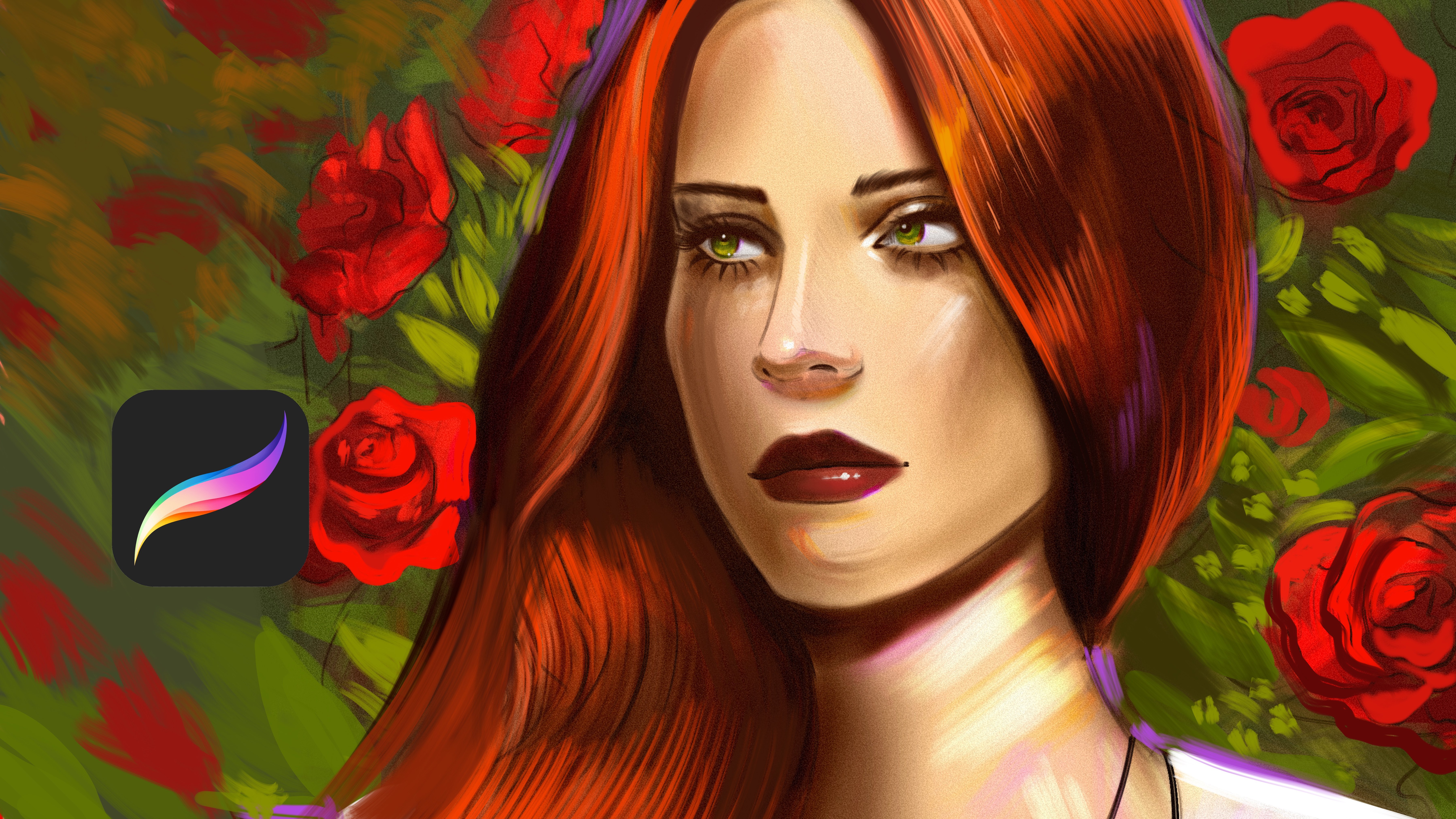
1. Introduction: Hi, everyone, and welcome to portrait painting in
Procreate for beginners, create an atmospheric
and romantic portrait. In this class, I will
guide you through my simple process
for painting a soft, expressive digital
portrait in Procreate. You don't need any
advanced drawing skills, I will show you beginner
friendly techniques to create beautiful lighting, harmonious colors, and
dreamy romantic look. And you will learn how
to choose color palette, build a portrait with
soft colors, painting, soft skin, and adding
atmospheric lighting and use blending techniques
to create deep and emotion. For your class project, you will learn how
to paint portrait, and you will paint your
own atmospheric portrait using the techniques
from the lesson. You can follow along with me or use your own photo reference, then share your finished
artwork in project gallery. I will excited to see your unique style and give
feedback whatever I can. If you are ready to create
portrait that feels soft, emotional, and full of
atmosphere, let's get started.
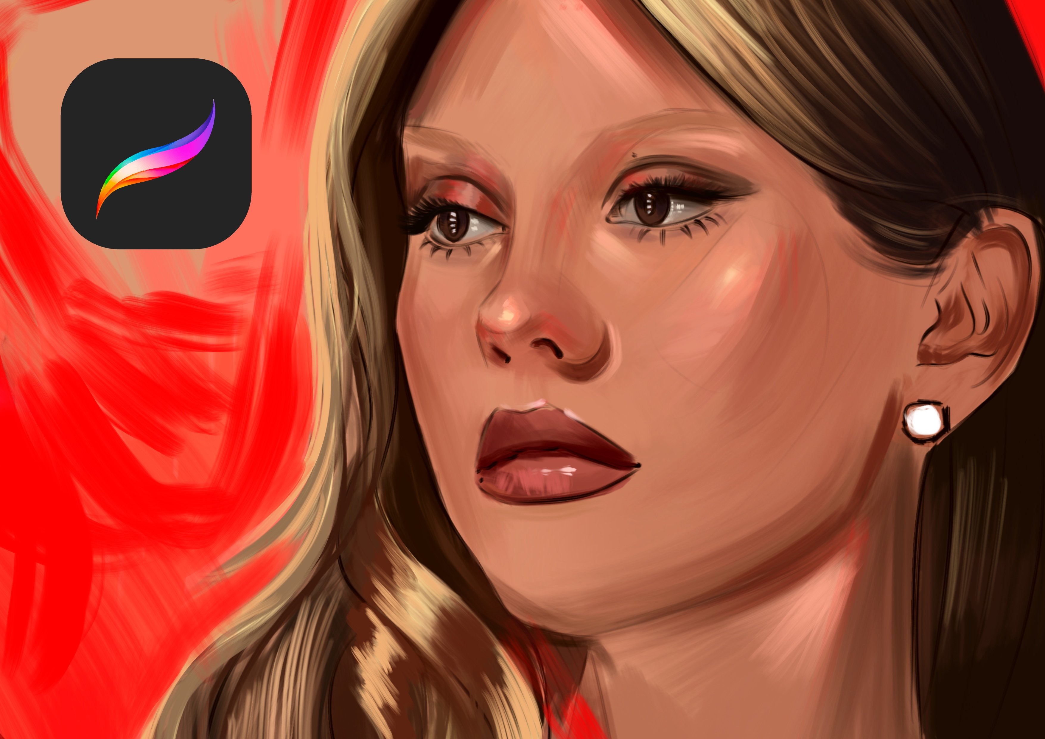
2. Painting Base Portraits: Welcome. In this
Skillshare class, we will paint these
illustrations together. At first, we need to open another new layer under
this sketch layer. Basically, it is in art, and let's open another layer with tapping
plus and for brush, you can use any
airbrush for shading. At first, I will start
with the background. Because it is also seen
not only the portrait. So we need some background
for our concept, and the corners can be
darker because I want to keep the focus
on this point area. So after this, I will select lighter color and will
apply over the face. You can use general like this
and maybe for hairs also. And these parts, by the way, these figures from the game of thrones House after
Dragon a spin off. And these two characters
are my favorite, and I will paint them together. And I will select much more warmer
color right now. And let's open the color step and select maybe this color. And I will think about it a bit for maybe we
can use darker tones. And I will use this color over here because
sometimes we need to think before we select the
tools and especially for the colors because if we
use so much bright color, we will miss the shadows. And sometimes we need
to think about balance, and it is really
much as important as the technical chronology
about art and colors. And it is all about
how we use them like lesion and I'm using saturated warm colors
for their face. And if you can focus
on this point, there is a cheek
bone, which makes the portrait much
more characteristic. So this place will be darker for make this cheekbone
much more visible, and these planes will
be really darker also. And this point for nose
will be also darker for create the drop shadows
and at this point, also, and for his portrait, these planes have much
more darker colors because they are in the dark, and we need to use darker colors at the shadow
parts of the portrait. And I will continue to adding
details over their face, and I will use some red color, but don't push hard
just push gently because it will be better if you use your colors
much more rich, especially at the point
3. Adding Base Details: If we keep it much natural because the figures from the
movie is in a different age, and we need to make
everything fits for the lens. For example, they
living with the dragons and they don't usually have lipsticks or
some fancy stuff. And yeah, let's
make it like this. And for the background, I will use really saturated
colors here and really, really saturated
color from here. Because I want to make
this point look really, really deep and have some big
rim light effect from here. Like, there is a
war behind them, and this war creates a
really mess behind them. And we see how the background
is dark and chaotic. So this background should
be really, really dark. Especially these parts. But also this darkness will include some chaotic
look in it like this. So you can use different kind of hues of the orange and red
to create this illusion. And I will use some orangeh and maybe much
more muted orange she. And the background also will be some really vibrant
colors just like this. But the main point is this area. So the midpoint will be
really important for us. And for now, I will select much more darker
color for their face, and I will apply
over here gently, especially at the neck parts, and these parts for the neck
also will be really dark. And for their costumes, I will use black
colors, and I mean, dark hues, not directly black because if we use
directly black, it will be much more boring. And for their hair, we will use muted color, not directly white again, and like white color like this. And let's zoom at their face. And this time, we will use much more darker tones
for here at the face, maybe here, and
these points will be really dark and these
points will be dark. And maybe I will go
back again and we do it much more controlful
for keep the portraits, like, much more great. And after this point, I will select much more
lighter and warm color, and I will apply all
over their face. Because their face are
really muted right now, and we need to have some
middle tones and highlights for keep their portrait
much more alive and, for example, like this. Maybe these points
will have for example, this guy's boon
chi will be here. And for the nose, it will be like this. And this point and this
point will be really great, especially this point maybe. For her. And let's add
some litel details here. And for the hair, I will use some hair brush. You can use any
hair brush you have or procreate manual hair brush, fine hair will be really
helpful for this step. I will make the
portrait like this, much more realistic and here are floating over the
screen like this. And yeah, these details
will be like this. And for now, I will make
this part much more lighter, just like this,
and zoom in here. And this time, I will
add details for the nos, and it will be really
also darker because it is in the dark
and maybe we can have some extra lights
over here, just like this. And for their dress, I will use much more darker
color, just like this. At first, I will make this crown much more darker
here, just like this. And for her dress and his dress, I will add a details
just like this. Maybe he's wearing some armor, like some armor that reminds
the shells of the dragons and maybe she have some
fabric cloth here. And these details for hair also can be
different for example, like this for keep the
details interesting and adding much more detail for all hair and other
details of the portrait. And let's continue to create the portraits, just like this. And for hair, I will use like
this and like this. Maybe
4. Adding Color Gradients - Mood: And his hair will be like this. And after this point, what is Mr. Singh is shut Here at the portrait, and his face will be
much more darker here. And after you do all the change, go to the adjustments
and curves, then play with the
curves a bit like this. This will bring your
illustration much more realism. You can make make the darks much more dark and light up
the lights a bit, much more. And for hue saturation
and brightness, give a bit, much
more saturation, but don't overdo it
and give sharpen a bit much more if your
brush strokes are so smooth, and you can also add different kind of
gradient maps here. For example, I will make
maybe blaze 1 second, maybe blaze like this
for make the colors much more maybe
noir is also good, but it is so dark. Let's select blaze one and make it maybe
like this and okay. And this time, what
we're going to do is opening new layers and select the smooth shading and select really warm color
here and apply over it. But the need to be really
at the top of these layers, and it will come
from this point. Like glowing thing. And it can be also
colored Dutch. And just like this, the backlight will touch the corners and will paint the corners
like the rim light. So we will read the
character's face, and we will feel the red color comes
through to their face. And it is really important
for understand the scene, and maybe we can use
another layer with the screen layer mode will be also helpful for
our illustration. And I will select some
orange color here, and I will paint the fires
just like this from behind, and maybe we can also have
some fire effects here, and maybe some particles
at the air just like this. And let's continue to adding
details over their face. What we need is a big
light, like rim light. So I will use the green
mode for the rim light, and I will use these colors
like these colors coming from the back And we have really strong
back light here. And after this, I will open another new layer over the top. And this time, I will use
really dark colors here, and we will do much more
confident shadows and mid tones create the scene
much more realistic because these lips
will look really darker in this back light because we see light
only from the back. So we need to see light
comes from the back, and it comes really
strong and make the corners really vibrant and it touches the
skin from the back. Just like this. We will read the face and pause from the
back just like this. And also the armor will
have some back light here and also the
silhouette here for her. And now, what I'm going to do is I will duplicate
it save for later. I will duplicate again. If your lines are not
confident enough, you can open another layer
and duplicate your line art, then make them one
just like this at one layer and go to the settings again and add much more
light just like this. And go to the curves and
make the scene really dark because we need
really dark colors for understand the scene
and make it realistic. So I will play with
5. Complete Illustration: And light and their colors just like this. And I will continue to add
some details for my striation. And at this back light, I will make this fire much
more visible just like this. And like this. And like this, these points for these lights will be like this and open
another new layer right now with the color Dutch and
select some darker color of the orange and apply
over this back light, just like this and try to catch their corners with
this light brush. And yeah, this time, we made the scene much more alive and much
more realistic. So I will continue to create the hairs much more
visible, just like this. And maybe armor will have
some reflections like this, but don't overdo it just at some specific areas and face
will have some lights here. This point also can have some
lights and just like this. And yeah, it is
looking really great, and I will add much
more fire here, just like this before I finish this illustration
and hope you enjoy and I can't wait for see
your works with my sketch. I will also share
the sketch file with you and I can't
wait for see what will we do and hope you enjoy and see you
in the next classes. I will add some
particles here, and, yeah, I'm about to finish
this illustration. And now go to do adjustments
again and this time, duplicate the layer
and select Gxmblur and make this like
this much more blurry. And duplicate the
layer and move it to the front and apply it to
the corners just like this. And with this way, we will focus on the
middle point more. And after this, go to
the settings again. Select noise and give it a really great amount of
noise here, just like this. I will give your illustration
grain like this. And this grain will
make your illustration look much more textured
and premium look. And you can also make the
hairs much more like this, like floating also at
the air like this and
 Yasar VURDEM, Creative Art Director