Transcripts
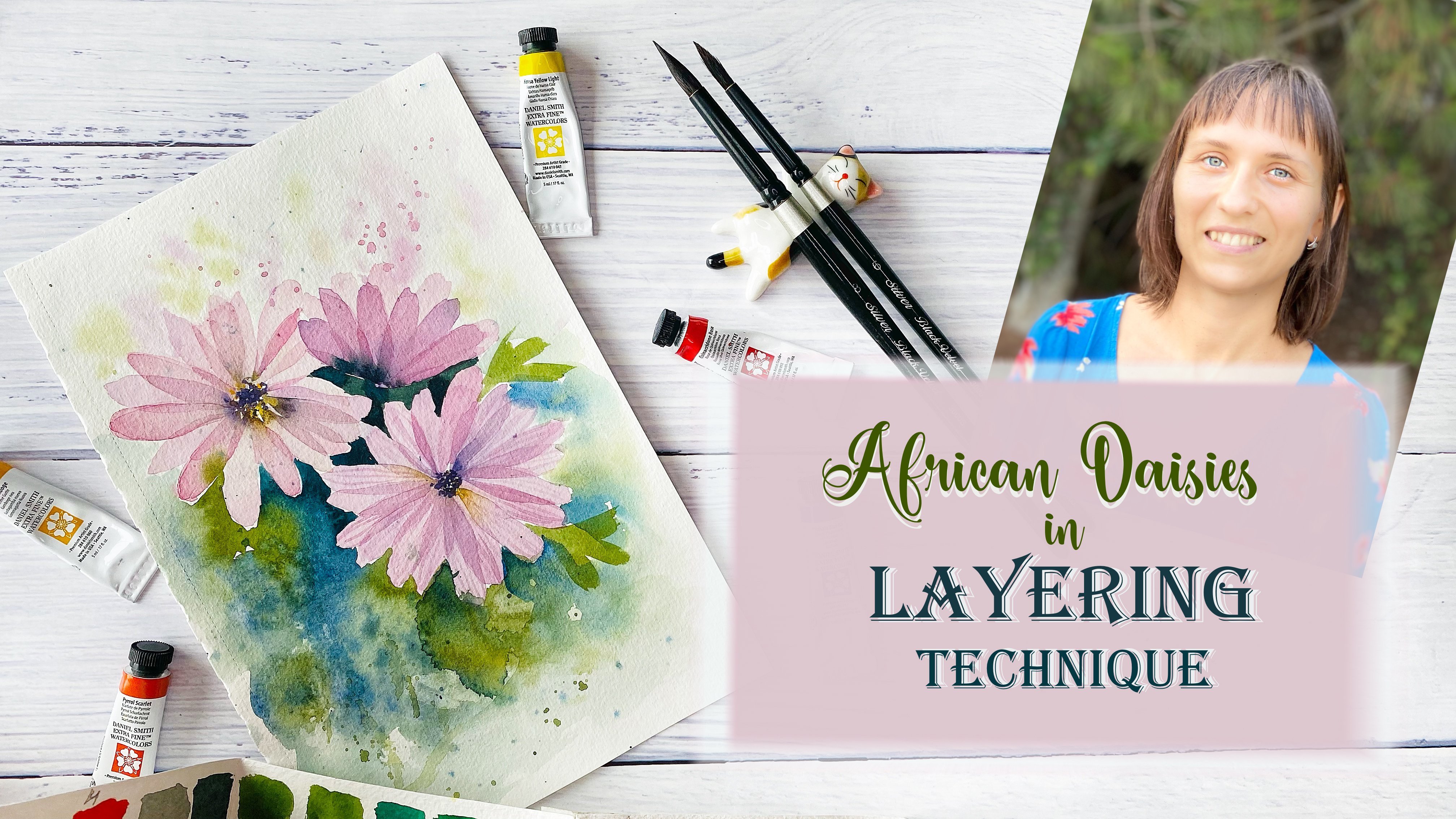
1. Loose Watercolor Sakura Blossom Intro - : What could be more fun
than a creative mess. That's exactly what
we are going to do in this new watercolor class. Let your inner child play
with colors and water. There are no rules here, no right or wrong way to do it. At the same time, I will give you gentle guidance to create a safe place where you can freely enjoy the
creative process. And slowly, you
will start to find your own unique way of painting loose watercolor
sakura in blossom. Hello, I'm Nina. I
watercolor artist working in loose spontaneous style and
a certified art therapist. Also known as music
art on Instagram. Welcome to my channel. The aim of all my classes is to show you the
way how to express your inner beauty
colors and to inspire you to play because having
this playtime is essential. It's what helps us feel alive. Are you ready to dive in?
Press a follow button to be the first to know when
I release my new class. Grab your brushes, and
let's dive into painting.
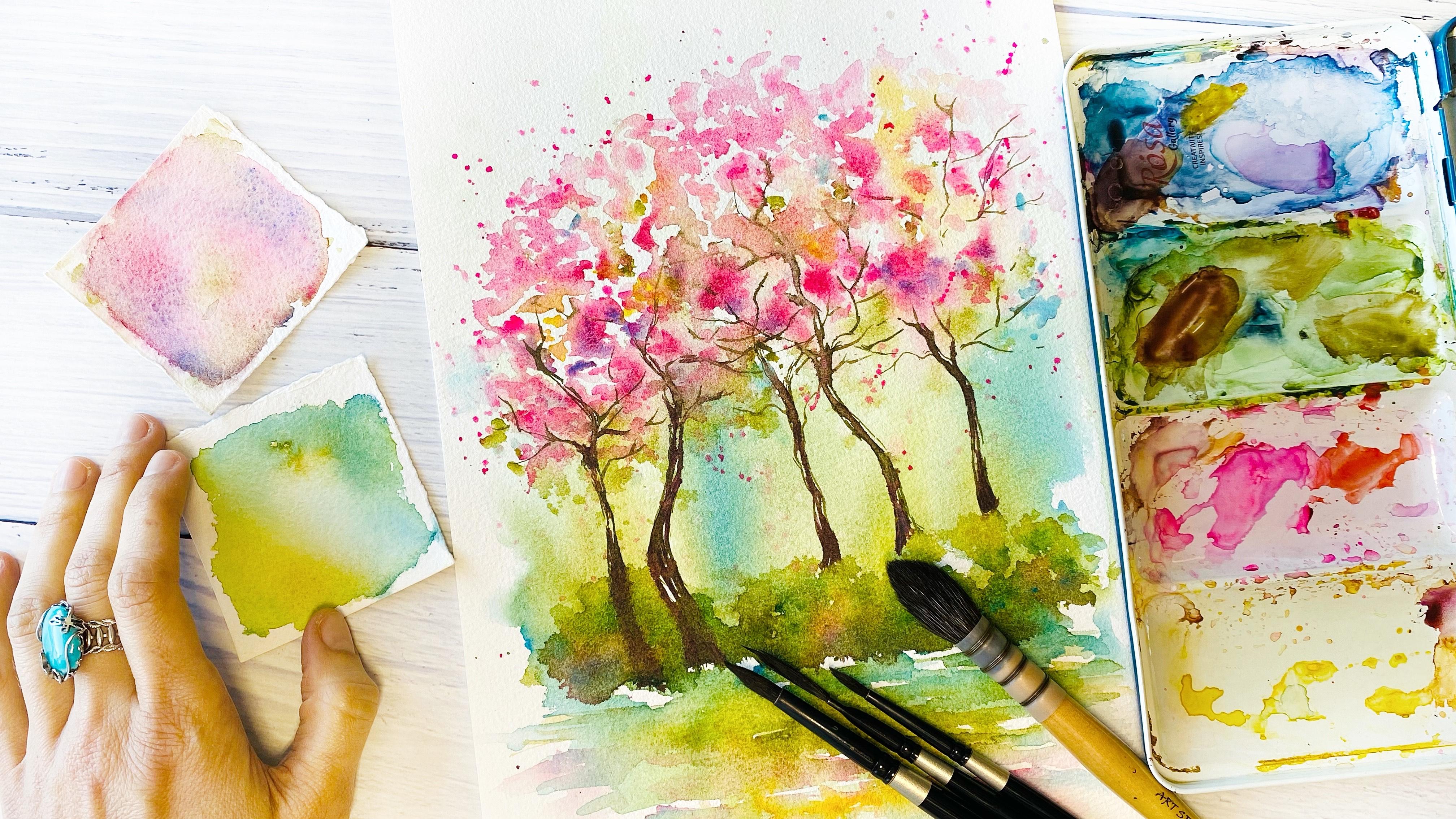
2. Supplies: Welcome to this playful class, and let's prepare the materials. I will use watercolor paper. This one is 100% cotton
paper, fine grain. Take different types of paper, and you will see which one
will work the best for you. Then we will need watercolors. The selection of colors, you will find in
a separate class and you will see
how we will play while choosing those colors
which will suit the most. Then we will need
watercolor brushes. I will use one big
one for spreading water and two round
ones, number eight, number four, and
as well as striper for creating really
thin delicate lines. As well, we will need
two jars of water. And this time also we
will need a spray. So just check which one you
have so that you can use it. As well, kitchen paper to
absorb extra moisture. And in my case, I will have
quite a lot of moisture. So have prepared somewhere nearby kitchen
paper or some kind of cloth to remove the
water and color palette. Just grab your materials, and let's have fun.
3. Color Selection: Welcome to New lesson, and I'm really excited
to start the paint. We will start with colors
and to play a bit with wet-on-wet technique
because that is one of the
techniques which we are going to apply
for this painting. So first, we will need to
select some green shades. And for this, I would suggest
you some olive green, some blue, which would be like this kind of cool shade
of blue and yellow. Have a look at the
ones which you have. They shouldn't be
the same as my ones. This one, I will
tell you the name. So this one is olive green, but there are two
different brands, and you can see that this
one is a bit warmer. So if your one is more this shade and you just
can add a bit of yellow. You will see where we will play. So now where we will
place the colors so that now when we will start to play and to see
how they interact, that's where you
will experiment, and you will decide
which colors you would like to select for
your main painting. So here is the first selection. And the second one is going to be different type of pinks. So this one is opera
rose, medal rose, rose of ultramarine
and quinacridon gold. This yellow is special one. It's called Nickel EO yellow, so it's very transparent, so that if you will
look in more details, then that is one of
the characteristics. I would suggest
to you that check on your paints the
transparent one. And here I have several
pieces of paper. If you have different because I have already this selection. I would suggest you
to take four or five pieces of paper where you can test the different
combinations of different blues and
different yellows. And in this way to select the ones which
you like the most. Okay, so I have
two jars of water, one with clean water and another one just
to rinse my brush. And okay, so first, I'm making it wet, so that's why it's wet-on-wet technique. And I will start with placing in different points and to
see how the paint reacts, you can see that olive green
is really beautiful to get some kind of beautiful
color fusions. And now I will place my blue. I think this one is
called cobalt teal blue. For example, I
have another blue. I can also place it here to see what you can see
that this one is stronger. That one is I don't remember
the name of this blue, but you can notice that it's
stronger than the other one. And now the yellow. So that would be the
most fascinating part. So here I will see what kind of reactions do I get when I
place my yellow with blue. And with olive green
and just on its own and then starts
the fun part when we start mixing together
these different colors and see whether we like
or know how they are. So I will add a bit more of
blue and to see how is it? We I like this kind of Because at the end
with these colors, the idea that you will get
beautiful shades of greens because we will use these
colors to make the ground. So the grass. And
that's why we are really interested to
have beautiful shades. So, for example, this
blue, which was stronger, you can see that it has given me in the mixture this
kind of green. And I'm more looking for
this kind of shades so that it would be like spring Yeah. So here is going to
be one experiment. And here would be another
one with my pinks. And let's seem the
same. I'm making wet. And then I start to
place the colors. Opera rose a beautiful
part of opera rose that also gives
some granulation. So it gives texture. Then medal rose. It's stronger this color. And this is already
rose mixed with violet, not with violet with
blue ultramarine. And it gives this shade. And also, this color is granulating so that with
water, once it will get dry, you will see that look,
I will add more water, and you will see that
it will get some kind of beautiful
granulation of blue. It's because it contains
ultramarine blue, and when with water, it's like, separates
two pigments. So if you don't have this color, you can just add
ultramarine blue. Here I have my ultramarine blue, and we can experiment. So this is Imadin
ultramarine blue. Uh, that is the color. Oh, let me place here. You know, this
beautiful blue so you can just mix these two, and also you will get
some similar color. For example, here, you
can see that it has already split it into colors, and it has, like,
this blue shade. And also, I will add some olive green because
I'm going to paint sakuras and I want them to be
really juicy spring colors. So here I have my colors placed. And let's see to move them and to see whether you like this combination. So just play. And also, you will start to feel so that this technique
isn't so scary. However, you can control it
some parts, but other parts, you just let go the paint to create those
beautiful textures, beautiful fusions for you. So don't be afraid
and just enjoy. And for sure you will find some really beautiful
discoveries. Okay, so these are
my two experiments. So here is for the greenery. I really, really like these
shades is so, so, so juicy. I like them. And this one is
going to be the other one, which I will use for sakura. So here my selection of colors. And I hope that you also
will make your selection, which also is going
to be beautiful. I shouldn't be like my one, play with those colors which
you have, and for sure, I'm sure that you will find
your perfect selection. You can share it by the
way in the class project. So if you are unsure, you can just take a picture and share this
in the class project, and we'll see I will help you to maybe to recommend you some calories among the
ones which you have. So I'll see you in
the next lesson.
4. Expressive Watercolor Background Wash: Welcome to the
funniest part where we are going to play
and actually to let go Aset control and to
connect with our watercolors, with water, and just to listen what our painting is
trying to transmit us. I will tell you that this one is really like letting
go technique. And I also don't
know how it will be for me that that's why just don't feel so
much responsibility that this should be
just a perfect piece. What I can suggest to you is that it will depend
quite a lot on which paper you will choose that depending on some papers, they absorb quickly the paint, and you won't have that
time to start to move it. Yeah, so that to spread. That's why just have selection
of different papers, and we'll see for this technique which paper works best for you. This one is 100% cotton
paper, cold pressed, yeah. So this means that I will have time so that it won't
absorb quickly the paint, and I will have time to
be able to spread it. And we will need also spray, have it nearby because we'll
have to act quite quickly. You know, that you won't
have time to think. You just will have to act. And that is also really
beautiful because it helps to disconnect your mind from having
so much overthinking. So here you won't have
time to think at all. You just will have to act. So we have made the
selection of colors, and for this first part,
I will use these colors. This is also going to be
wetter and wet technique, but it will have some
difference compared to that part when we were
selecting the colors. Because here we will add water just after we
place the paint. And it will give even
more unpredictability and lack of control compared to that previous experiment now when we have played with this technique, but
it's really beautiful. You will love it. Okay,
so this is a four size, and I think that I would like
to leave some white areas, so that it would be more like beautiful framed
by my white paper. And we are going to place
here in the lower part of the paint, and I start. My paint is quite liquid when I take it
directly from the pen, but my brush is really wet, so you can see that
there is, like, the paint is running, so it's really wet. Yeah. Then Iris I clean my brush, and I start to add blue. The same. It's quite And I want also to add some areas where it's going
to be more clear blue, not mixed so much. And probably for here, And the next one is
going to be yellow. Rinse quite well your brush
before adding yellow. And you can see that, it
starts already to interact. The pigments and it's
really beautiful. Okay. And now let's start. I think the most scary
point here is that you will start to think that Oh, no, and if I will. So here I okay, you see that I also
have some problems with my spray, but it doesn't matter. For you also, it may
happen something similar. It doesn't matter. Just play. Experiment, you know,
that at some point, you need to find angle, and you can see
that I'm also not perfect. And that's fine. That's fine. So,
let's clean. Oh, yep. It has been running.
Yeah, it's a bit messy. But also, it's pain. Playful.
Yeah. So here I have. And I will need to add more color because you can
see that once you add water, it starts to disappear. And now, yeah, that
we are working this wet-on-wet technique
because my paper is already wet and I start
placing directly. And just to try to you may notice that this
combination of green, which is warm, olive green, and another one is blue, which is cool shade. And that also creates that
kind of beautiful balance of so just play because now it's really beautiful moment and observe and bring that intensity of color because water has dissolved that colors
which we had initially. And now we need to and
you can see that now it also can run more water. For me, it's a bit
challenging because I need to comment all that mess
which I'm having here. But that's fine. So I have napkins or some
clothes nearby to remove water. And I think that I would
like to add a bit more of bloom because now it
starts to disappear. And here, also pay attention that we add these colors
in the lower part. We don't want these
shades to go here, top top part, we keep of pinks. And I think a bit
more of this. Yeah. What else you can
do is also with clean water to help
to spread this way. You can see that then
once you pass your brush, that the paint will
start to run on its own. And here I would like to remove this part with kitchen towel. So here is my beautiful
wash. And also, I think that I would like to make it also here
in the lower part. It's also really beautiful
to make it also run down. I here some blues. And then just with clean water, I make in here the pass, also leaving some kind of
these white areas of paper. And with warm here,
it's olive green. And the blue, I think that I want clear color of this blue. So just experiment
because for sure your one is going to be
different from my one, but do not worry. That's fine. What I'm really
sure that all the works, they are going to be unique. And I haven't did it
yellow. Let's add yellow. Yeah, let's add yellow because
it will add some sunshine. Yeah, for here where
there some yellow, a bit more of olive green. There is no right or
wrong way to do this. The way you feel. So that's why I really encourage you
to play like in childhood. When you felt like you're experimenting and let's see
what you will discover. Okay, so I think that is
going to be my this part I will remove a bit because I need to keep
that part light. Okay. So here I have my
background ready. I think it has been really fun way to create the background. Please let me know whether
you have enjoyed this part, or it was really challenging. And like I advise you to
practice with more papers. And at some point, you will start to enjoy it
and you won't feel so scared. You're like, Wow, it's
rolling water for everywhere. And also, I think
it could be nice if you have something
some protection for your table just in case because blue
could be staining, and so that not to destroy and to make it, like,
permanently dirty. But anyway, then it would
really artistic part. And now I will leave
it a bit to get dry. And then I will start with these top parts to
add pink colors.
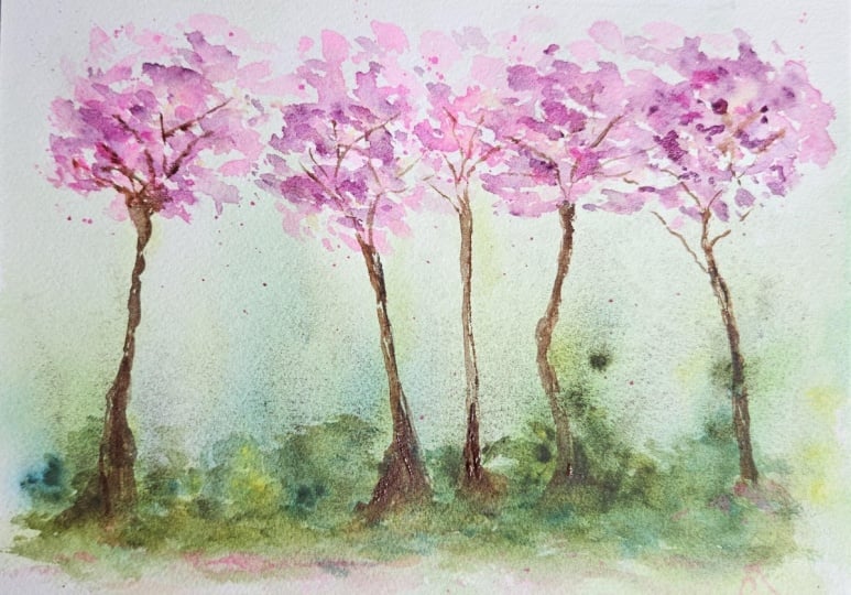
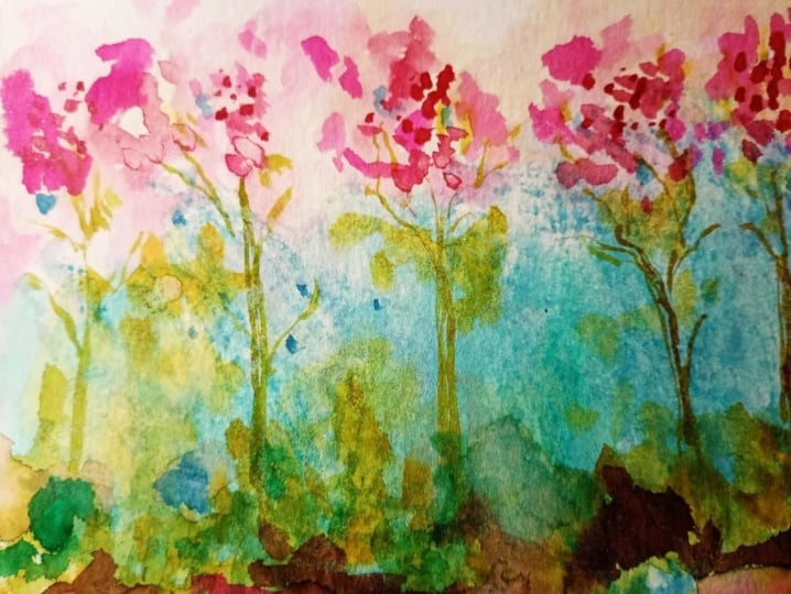
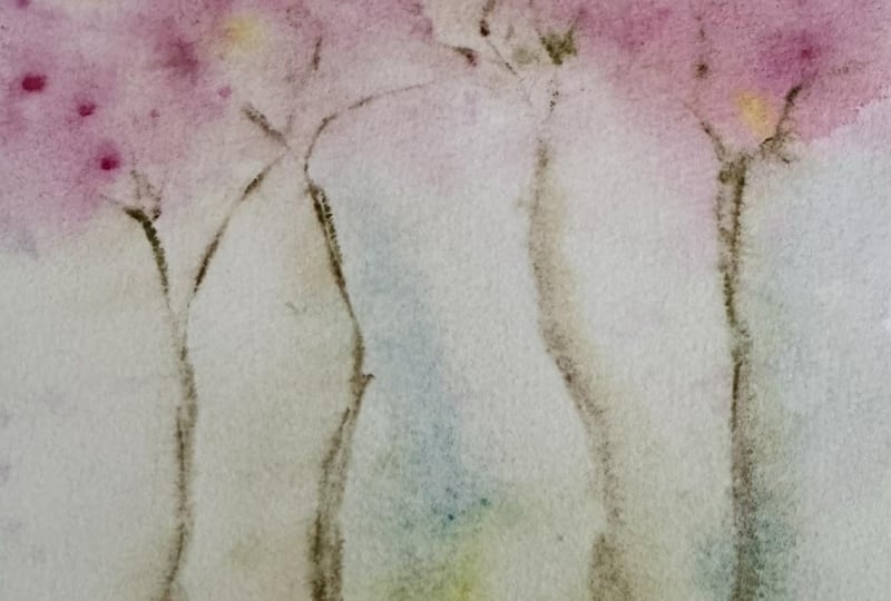
5. Sakura Trees: Welcome to the next lesson
where we are going to keep on playing and enjoying
this letting go experience. And this time we will go for sakura trees and to
play with pinks. This time, as well, we are going to paint and to play with
wet-on-wet technique. But this time it's going
to be a bit different that we will make quite
wet water our paint. So here I have you
can see that it's really like pedal and the
color is quite light, so that we start with
a really light color. Let me show you
that you can see, Yeah, really, really light, and it's watery so
that you can see that the water is the
paint is running. No. Okay. And we will start to create the shape of
our sakura trees. Here, just play with your brush. Do not control it so well, but also try to make
the shapes so that they would remind the
overall shape of the tree and leave also
pay attention to leave those areas of white paper,
not cover everything. And you may notice that this
paint this is Opera Rose, by the way, really
diluted color. And it should be it should be really light this first layer because we are going
to create contrast. And for this, we need
different tones, and this is the first one. It's going to be very light. And watery, so you
may notice because also we want to get
beautiful color fusions. So just pay attention
to these moments and I make them like connected, and then I will start
to separate some. Okay, so here you
can see. The shapes. And what else we will do? But probably this will make
sense to add a bit later. Let's see. Some kind
of also splitters. For this, the pain
should be quite watery. Otherwise, it won't these
droplets, they won't fall. Okay, here we have and be careful so
that they won't fall really a lot here
because otherwise, here, they will create this
effect of cauliflower. This kind of like broccoli. And now I, again, start with opera rose, but just a little
bit, stronger color. And in some areas, I just touch and let it spread. So this is very
relaxing technique. You don't need to rush. And especially if you're
using cotton paper, then it also will allow you to play longer to play
for longer because it will keep the paper still
quite wet and made a rose. This time, you can see that
it's stronger this color. So every time I'm adding color, which is a bit stronger
than the previous one. And this one also, I
will add to some points. But with each next color, I added more like less amount, so that here it was, like, almost everything covered
with really light one, then a bit stronger, I have covered less. Amount. And with
this stronger one, I cover even less amount, so that it just should
be the proportion of stronger colors
should be less than the proportions of the
really light values. And I go for rows of ultramar. So this one, if you
don't have this color, similar one, you can use also magenta. It
could work here. And also, it could be, if you will mix Opera rosa
with blue ultramarine, also, this will work and
will give you this color. Okay, so here we have. And what we are
missing is a bit of yellow that here is also some areas and pay attention
to place near pink. I will add some other yellow. This is quinacridone gold, and before it was Nicolezo
that transparent yellow. So here I have, and you
see that it starts also to get more transparent. And I will add as well now in the lower areas
some olive green. And also, I add
that olive green in some areas of white paper, which we have left before. I So just play. Your one is going to be
different from my one. You need to observe. And I think that is a
beautiful part of painting blue style that you
will get unique work. And also, it helps
you to connect with your work so that
you aren't coping. So that is the beauty
that you aren't coping others work or just
following, you know, that without really just
doing like as an instruction, all that step by step. But here in this style, that it makes you to be
present because it's you who is taking
those decisions where I will place my brush, where I will add that
next brush stroke. And I think that is
really satisfying. So then it gives you that feeling that it's you who
is creating this work. It's not like you
know that sometimes people say that, yeah, I can follow tutorials and copy works following
the tutorials, but I don't know what to paint
and how to find my style. So that is actually that point that here with this
unpredictability, however, you are following me those stages of
creating the painting, but it will be yours. It will be your color selection, and it will be
your brushstrokes, which will which will reflect
like your handwriting, know the way you place
where you will place them. And that's why it won't
be already so much like coping copying
someone else's work. But also, you will bit by bit, you will discover your
own preferences and your own signature
signature style. So here I have my
trees and, um, here, it's really important
part to know when to stop because quite often, we start to feel like, Oh, I want to place keep on placing, placing, and you start
you can fall into parts. One thing that you will make everything similar because
you will stay like, Okay, I will let green
here, here and here. Then I will let pink
here, here, and here. And then you will see that
everything is the same color. No, like in the same pattern, so that you are
creating a pattern. Now, make it so that it
won't be symmetric, no. And second part that
also pay attention, it's quite often that when you start placing
those brushstrokes, that you will finish covering all those
white areas of paper. So pay attention and just patients know that
you will need to resist, not to cover everything, all those white areas
with brushstrokes. And I think this is the
most challenging because with this style, when you ask, like when it's difficult
to know at what moment, you need to stop so that
in order not to spoil, because sometimes we don't need so much detail and we just need to stop in
the right moment. No. Okay. So here we have, just let it dry a bit, and then we will pass
to the next stage. See you in the next lesson.
6. Adding Bushes: Welcome to New lesson, and I have left for a
while to get it dry, but it depends on
your paper, maybe, you don't need to leave
it for so long as me. And now we'll start to
add the details and just to bring to life so that it will be now noticeable
what we are painting. So that out of this abstract, we will start to add their shape so that our
mind could relax that like, Okay, now I see what it is. So I will add first bushes. I have switched to smaller
size brush and also just tapping and adding their shapes this like lines of
some kind of bushes. So, just the spots and marks, like you don't need
to make it Perfect, every leaf or whatever, and also pay attention so
that they won't be like fence so that they would be
also on different levels. And here the same, we can add some blue in some areas because it's
really beautiful and what it creates there volume is when we add different colors,
different shades. In some areas, there is
blue in the lower part. Then I will add the same rose
ultra Mar in some areas. Also, I will add a bit of green. Here, I will show you
which colors I'm adding. So here, I think it's green mixed with that violet,
which I have had. So here is the green. And I add also so that now
to create the illusion of volume in our bushes, so that I add in
some areas a bit stronger green Mm hmm. And also, let's add
a bit of yellow. Yellow will go in
the top part because there is more light over there and also a bit
more of olive green. A bit more of green. The idea is to add different values and
different shades so that it will create also that
illusion of volume. So it's not like one
plain colored area, but there is some
shadow, some lights. I think I will add a bit
more of this rose l drama, so that a bit stronger
in some areas so that also it will give more
interesting shade. And I will mix this green I think this color
is called Mars brown. I will show you with this brown. And also, so here
it is this color, and also we'll add somewhere for here in the lower areas
and also where there is, like, some bush separation. So you see that it starts
to get more interesting. When I have added
some darker values. And this is really
beautiful shades of greens, and I like the fusion of colors. So I think they are
pretty much beautiful. Our bushes. The next part that let's place
let's make separation to our sakura trees and with the same color mixture,
green with brown. Let's add interesting color for adding the
trunks to our trees. So here is here is that
kind of greenish brown. I really like this color. Color mixture. Yeah,
so here it is. Yeah. So really beautiful
and rich color. And let's see that first, I would suggest you to make them interesting so that try to make to bend them so that
they won't look like, you know, like, really
all four straight trunks. So let your hand
just do it for you. Don't control it so much and
also leave some white areas. And here I have one brush
which is really good for making this kind
of delicate work. Really nice lines. So this is a dagger, striper. And I also will add
here inside as well. So just try to let your brush dense without
controlling it so much. So here is one. Probably I
will add another one. Oh. So for this, I will
use this round brush. And then for the for adding
that kind of tiny branches, I will use a striper. This is also quite
meditative part, so that you just be attentive and be careful in
those areas where still you have some wet paint that it won't allow you to make these kind of really
delicate branches. So here we have these two trees, and let's add here several more. And one more or yeah. I will switch to smaller brush so that to make
them more delicate. Just don't be afraid to leave those white areas because they will help you
to create textures. Of barn. Tree barn, so Mm hmm. So you see you will have to find your brushes because
not all of them, they are perfect for everything. So I combine these three. And for here the same, I can add And if there is something which is not really perfect, don't worry. You can arrange,
make it thicker, create some new branches on the other side. Take your time. This is quite slowly process. So here I have these trees, and I think that I would
like to add one more. Okay, yeah, we'll start
with this branch. That is the point when
you are painting, you hold, how many brushes are
you holding at the moment? Let me know. Here one more, and I think that I would
like to have it a bit more like this way. Mm, so just enjoy this moment because it will
take time. Do not rush. And, uh So here I have these trees, and I feel that I would
like some of them, bring closer probably these two. Be careful because those bushes still could be wet like my ones. And then the painter won't have that really good definition, but they would be quite blurred. But anyway, I will
create here that part, and then I will
add more texture. So here I have my trunks, and now I will add some
beautiful shadow to them. So then they would
combine several colors, and this also will create
their illusion of volume, also pay attention to
live darker to make them darker here in the lower part where they are more in the
shadow behind the bushes. And so now you see
that there are different shades
and they look more interesting and really create
this illusion of volume. For here. And for here some. And this one the same. And this is Ibadinoso ultramar, that kind of color,
which is beautiful. And this way, they
start to have more. They look more interesting
and also because this color contains
a bit of pink. So it connects also with
the top part of the trees. Okay, so here we have this part.
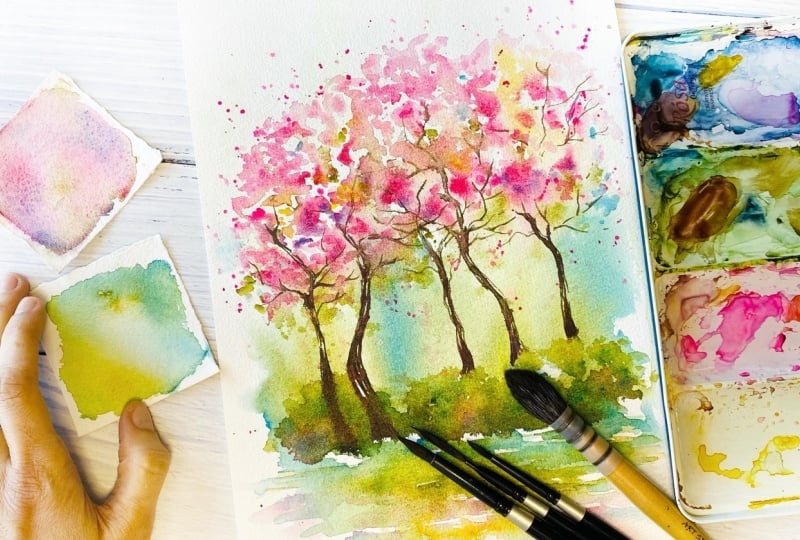
7. Final Touches: We are almost there.
What we need is to add some kind of final details
which will help us to join all different parts here so that I will take
bigger brush for this. This is number eight. So
I'm adding second layer to give more volume to
my sakura trees. So just tapping. And adding second layer. Remember to leave
some white paper. Don't cover everything. And I want to leave
these kind of textures. So for this side. And for here. So that your one would be
a bit different from mine. And I do hope that
at this moment, you feel already
really relaxed and calm and just playing
with your watercolors. So here I have that
what I want to add some more splitters
of darker color. So more concentrated, yeah. So here I add splitters. And I think it would
be nice also to add some of this color
here in front. And to make it more, like, diluted and not so
defined so that it give us that idea
that maybe there are some petals which have been flying over there
and have fallen. Yeah, and probably also some
other splitters for here. Yeah, this rows of Ultramar and a bit more of Olive green. So creating also some
different levels, which will help us to
create this kind of volume. And probably reflection,
I don't know, that it could be and a bit
of blue in some gassy areas. No, it starts to look
really beautiful, I think. It's some kind of
beautiful park, or you are walking in
some park and enjoying this kind of um but
it really nice. So I think that, actually, I would leave it the way it is because I think that
it's already beautiful. The way it is. Maybe I will add several touches.
I don't know. We'll see. Because that
sometimes, you know, that you can that final moment, you can add something and
spoil. That is another blue. Maybe. I don't know. Maybe I will also for here
somewhere. This blue. Just several points.
It's beautiful. This color is cobalt
teal blue, I think. A cobalt turquoise, something. I don't remember. But
it's beautiful blue. And here somewhere.
Several dots. Yeah, I think I need to stop. That is the most challenging
part of painting loose that sometimes
when it's too abstract, you're thinking that, like, Oh, I need to add more details
and more details so that to give better idea to the viewer what I have painted so that a person
won't tell you like, Oh, this looks like a cow. No, it's not. No. It's not. And then there is some
point where you say, No, it's not enough
yet, not enough yet, but then you reach one point
and you say, like, Oh, no, I have over passed already that point when it was
really sufficient. No, it was sufficient. Um, details in order to understand what I want
to tell with my painting. And it's really important
to know when to stop. I am going to stop, but it just because I have
noticed this part, I need to add more color
so that it would be noticeable that
this one is growing here in front and the other
ones they are at the back. So I was waiting
until it will get dry before add this darker shadow. And this, with this,
I will finish. I won't add already
anything else. And for here to make it a bit darker because it's at the
back and there is some shadow. And that's all you need to know when to stop so that
not to spoil that beauty. So here our sakura in blossom. I really enjoyed painting them, and I do hope that you also have enjoyed this moment
of painting with me. Please share your creations
in the class project. I really looking
forward to see them, and I'm sure that it's going to be like every work is
going to be unique. So please share them with me and see you in
the next class.
8. Final Thoughts: Thank you for taking this class
and for painting with me. I would really love to see
your sakura creations, so please share your project in the class project gallery. Also, I would be really glad to read about
your experience, how it was to play and
to make that mess. So please just also share several words about
your creative process. I love to read them
and also to give you my feedback and to support
you in your art journey. If you're going to share
your creations on Instagram, no, do not hesitate to tag me. And if you have
enjoyed this class, please take a moment and leave
me a short class review. This really means a lot for me, and it really inspires me to
create new classes for you. Also on my channel,
you will find a big collection of
classes where you can put your loose watercolor style in practice and just trust
the creative process, trust yourself and let it go. Also check my YouTube channel. There I have really
interesting projects going on 100 days of letting go of
spontaneous watercolor. Meanwhile, enjoy creating and
seeing my next class. Bye.
 Nina Nyusikart Watercolor, Artist| Art Therapist | Loose Watercolor