Transcripts
1. Paint Loose Watercolor Bee Eater - Trailer: There is something
both magical and a bit challenging when you start
painting on a blank page, and slowly let the image
appear out of nothing. It feels a bit like
in childhood when you see something simple and
it feels like a miracle. And this class is
exactly about that. A creating those small
miracles yourself with watercolor and a
few brave brushstrokes. Hello, I'm Nina. I am watercolor artist
specializing in loose style and
certified art therapist. Also, you may know a
music art on Instagram. In all my classes, my main
aim is to help you to feel the joy of the
creative process and not just the result. In this class, we will paint a colorful be eater
without a pencil sketch. Step by step, I will guide you through
building the shape, adding volume, and
most importantly, letting go of control,
because I truly believe that imperfections are what
make our artwork unique. And that's why I love Louise
watercolor style so much. If you feel more comfortable
starting with a sketch, you can find a template
in the resources section. You can also press a follow button to be the first to know when I
release new classes, and I invite you to share your creations in the
class project section. I always read them and respond. And remember, if you have any questions during
your creative process, you can always ask me
in the discussion step. Meanwhile, grab your brushes, and let's dive into painting.
2. Supplies: Welcome. Let's
prepare the materials for painting B ether. I will use the
following materials. That is watercolor paper. That is A four size and
300 grams/square meter. And it's 100% cotton
paper, fine grain. Watercolor brushes, I
will use round brushes. That is number four, eight, and big mop brush. Water brushes or
just you can use any other brush for using
it with clean water. Uh, water colors, color palette. As for the colors, you will find a separate lesson
on colors selections and as well sketchbook and pencil for our rough sketch for
creating our mind map. And water. Better to use two jars, one keeping with clean water and another one for
rinsing your brush and as well as
some kitchen towel for absorbing the
extra moisture. So just to get prepared
your materials, and let's dive into painting.
3. Shape Study Bee Eater: Welcome to a new class. And before we will
move to watercolors, it's really important
when you're painting in loose style without any pencil
sketch and the drawing. So you need to have
really clear about shape and those tiny
details which you need to keep in mind and to
pay attention while you are painting already
directly with watercolors. So that's why I would ask you, first, not to skip this lesson. And second, not just
watch me doing it, but also sketch with me. That is going to be you will
see that at some point, I would say that it's like
when you are doing this part, it's like introducing those
coordinates that location. No, I know the route to the
final point for your mind. So that's why it's
really important, and that's what I can observe. That it really you need to do
it with your own hand now, so that not just watch, you will get the result
by doing it. Okay. Let's have this shape study of our colorful and
beautiful bee eater. And let's see. Usually, it's the shape. This one is quite simple, no. And what we need to do
is that for our mind to show those blocks and
those components, which we will be looking for. Usually, I do it in my mind, but in this case, I can show you what
exactly I mean here, what we can observe
some simple shapes like here, oval one. Here is going to be
another bigger one. And this is shaped
like triangular, and this one is going to be
the line, like smooth one. So here, it's not so noticeable. That's why that's fine to
keep in mind this kind of triangular joining this
oval with another oval. By if you are looking like this, it also reminds me a bit like
sunglasses or glasses, no. And then it's going to be here, one triangular and
another one for here. The most important
part is going to be, and that is actually while
you're painting birds, that is the crucial, and that is the most
important part. So the rest is fine.
You can adjust it. But this you need to pay special
attention because there, it will mark whether your
bird looks like a bird, certain type of bird or no. Okay, so here is going
to be the shape. Of an eye near how it is. This one, you can
see that it's red, and this dark area
is like the shape. It's a bit like
prolongated like this. And another important thing
is the shape of the beak and even more important than
the shape is that line, that line which connects
an eye with a beak. And at which inclination it is. So usually the big
that middle line is at the lower where
the eye is finishing. So here, it would be if I will make this line a continuation,
it will be touching. And then as well, proportions. Yeah, for sure, you need to keep in mind this
kind of distance. And you can see
that more or less. Yeah, I think, like this
one equals this one. So you need to keep in mind this while we will
be placing the big. And then finally the shape
of the big depending. No, that that part, there is some curve and as well, that this part is a bit
wider than the lower one. And generally it's a bit bigger. And one more thing I haven't
noticed is this one. It's also somehow like, let's say, it's the
triangular shape. Like long triangular shape, we can make it. In fact, it's going
to be this one. And then what we cannot see
is the tail. Are you ready? Now, once you have
understood this kind of simple areas, let's do this. Let's reflect this
in our sketch. First, I need to decide
where it's going to be. I would say like this. That is that kind
of diagonal and an I so I have it a bit more complicated because here
I have camera on the top. But let's see. That is really important
to start with an eye. And here is going
to be really black. On the top, there
is a highlight. And the shape so that
in the lower part, it has like this. Then what we have been talking that line of the big
goes under an eye. Please, I really ask you to draw with me now because
it's really important. Then I wear nie finishes, more or less that should
be half distance. Mm. Yep. And then here
is going to be the big. This way. Okay. So then it's the
most important part. That some kind of curve line. And uh I will add
the top part first. It shouldn't be perfect, yeah. So if there is something
wrong, don't worry. You are learning and the
most important so that you would enjoy doing it painting. I think like this, and then let's add that oil shape. I noticed that it's more
starting from here. Here, there is this
kind of dark line. Then a bit different colors. And for here. A bit brighter, and this is another. I see that it's like
triangular shape like this. And here, another dark area. Mm. Next one, let's
make this oval. And do you remember what
we were talking that here is like this triangular? And for here is going
to be this line. And here is where
that oval comes. More or less. And now
we're joining these areas. And for here would be the wing. That we can see the
legs, the feet. Yeah. And over here, it's also like the same
line is going to be a tail and another wing
from another side. It's another triangular. This area, I see that
it's quite dark. So kind of dark feathers. And for here, it's
also a bit dark. And some feathers, the textures
and some kind of branch. I think that I would like
later to modify it and to make it more beautiful with
some flowers maybe on it. So here we have our better, and it shouldn't be perfect. The idea is to keep in your mind those areas which you need to pay special attention
while you will be painting. And the most important
area is this. I can see that I have
failed a bit with distance, but I don't find it. And probably with
an angle of an eye, but it's rough sketch, and you will see
this one is to have an idea which step and which
areas to key points no, like to pay attention to. And once you will
start to paint, you will see that it
will be completely different and you
will have just to engage with your watercolor
and to see how it evolves. So don't worry if this
one isn't perfect. That's fine. That's
completely fine. And let's move to the next
lesson where we are going to make a selection of
colors of four be eater. So
4. Colors: Welcome to new lesson, and let's choose colors
for our colorful be eater. Let's choose the ones which
would be light first, so that I see yellows. And in my case, I think this one could be here. Yellow. This is Hansa yellow. I think hansa yellow
light. This color. Then I see some
beautiful orange colors, and here I have
some this orange. Probably it's too light. And maybe I will, this one. I think this color
which I have is kinacrdon burnt orange,
the name of this color. And then choose the
ones which you have. That's why I'm
showing how I testing and choose the ones
which fits me. So this like for brown, I find them really great. And for some green ones, like, this one is
really beautiful color. I think that I have one
green, maybe it will work. This is I think it's mineral
one or net actually, I think it's called mineral
or malachite green. But I would say that
it will work better with some kind of with
yellow. Let's see. Yeah, this looks nice. Also, what you can do
that, for example, olive green with a bit of green and you will get
something similar. And then yellow. And see that it's
quite similar color. These ones we have and blues. They are really beautiful blues. And let's see. I think that I will use. I have one really
beautiful color that is called cobalt turquoise. I think this could
be really beautiful. And another one
blue, which I have. This is blue horizon. I think it's called this blue. So Taloblue. Let's see. What kind
of blue is this one? This is Taloblue. And I have another
beautiful blue. This one. I think I will use this one, and this blue is I don't remember how
it's called this one. I don't remember this blue. Later, I will check on the tube. How this blue cold. I think I will use this
one with this one. There is also some kind of at least I see that like violet, maybe I will add
this kind of color. This is a rose of ultramarine, but maybe you won't have
the same colors as my ones. Just pick up the ones which you have and play and see which ones you like,
how they look like. And so I have these two. Probably. For browns, I have
another color, which I think it
would be nice here. This is this color
is piamot genuine, which I really like because
it gives also some textures. And what I especially like is to mix this piamotd genuine with rows of ultra ma and
then I get this color. So this is that color
which I really like. For brown here, dark
areas of brown, I will use this
color, this mixture. This is this color and that
mixture of these two colors. Amato genuine and
rows of Ultramar. And I think about blues, I have one more
interesting color. You know, I like colors. I think it will join
really beautiful. And also once it gets dry, it gives beautiful
like Surin effect. This one is like electric blue. I think I will use this color. And for dark shades, I will use indigo. Oh, let's see. That's what's going to be like for big and this area, indigo, and probably I will mix
this indigo with a bit of violet so that it won't it will have some
interesting shade. Let's see if to mix it
with a bit of violet. And yeah, I think this shade
is much more beautiful. No. Do you agree? Yeah. So this is indigo
mixed with violet, and this one I will use
for this dark areas. We have already at least I have already the
colors prepared, make watches and
see which ones you like colors one with another. Have a look at the
reference photo, and maybe you will find
another combination of colors, you know, which would be like, your vision will also be
reflected in your colors. So just do not limit
yourself to try to find something which
really similar to my one or exactly
those colors which I. Just play with the
ones which you have, and for sure, you
will find a solution. Yeah, I will see you
in the next lesson, we will finally
move the painting.
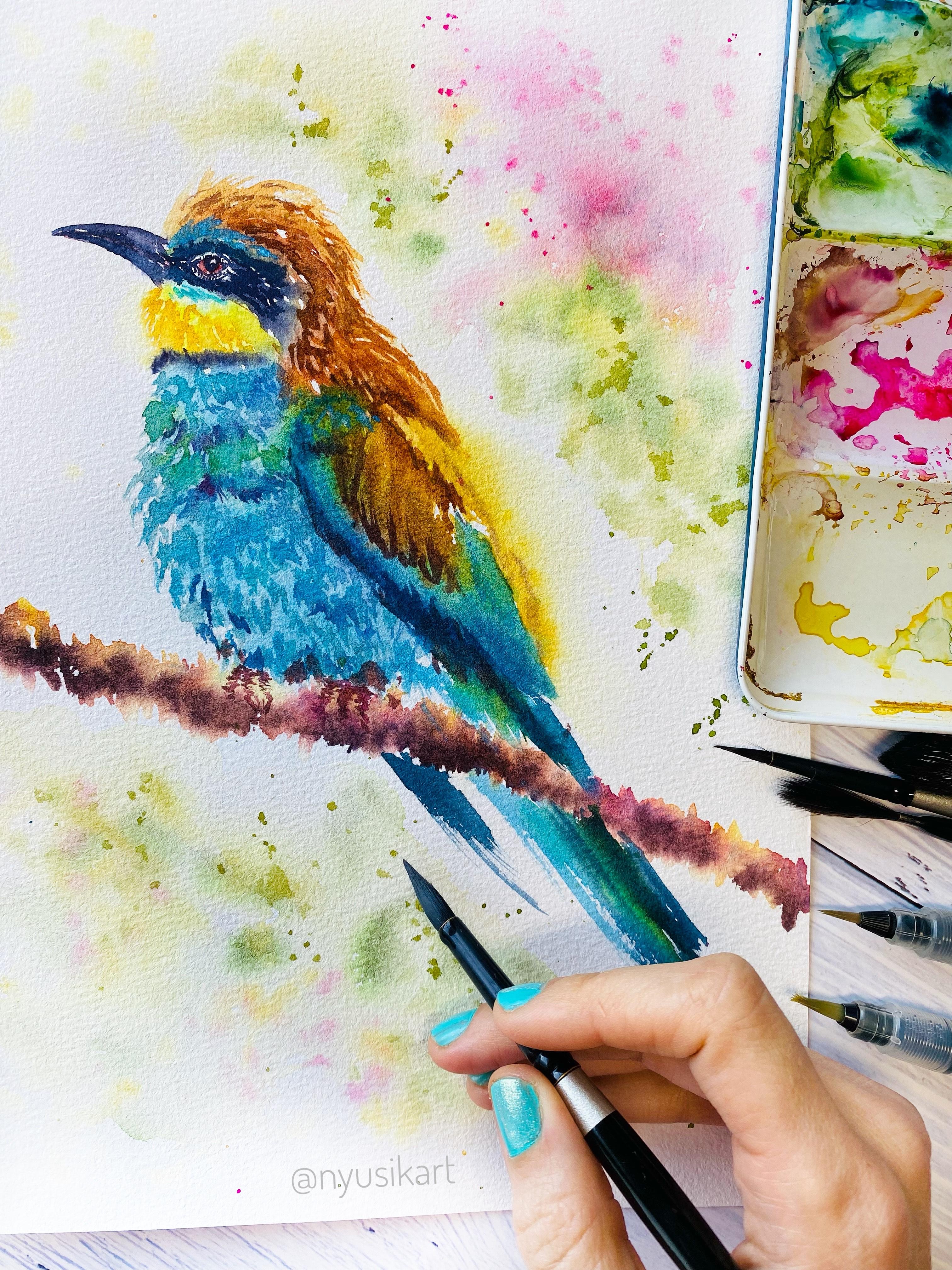
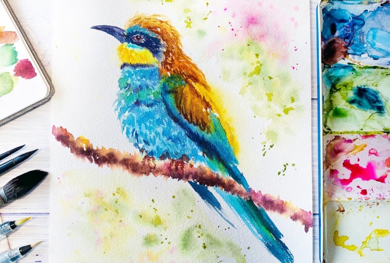
5. Bee Eater - Head: Welcome to a new lesson. And finally, we will
move to watercolors. Just before we will start, I wanted to show you
also this color, electric blue, which
once it has got dry, that it has this kind of
beautiful shimmering effect. So I have colors prepared, my brushes prepared,
and let's start. The first part is
going to be the most I will we will
need water brush, and I need to warn you that the first part is going to
be the most complicated. We will start with an eye so that the most important part
we are going to do this one. And once we have the
most important area, then it would be much more
relaxing to move further and to play with color
fusions and color bleeds. So that's why concentrate and focus on the first,
the most complicated part. The next stages as they will
be already much easier. I will use smaller brush. So here we will have to decide where we are going to
place the be eater. And so you need to have an idea that a bit that it's more like in diagonal
is going to be. So to leave enough space
from this side for tail, now, and so that the tail
won't go out out of the page. So have here, like, leave here sufficient amount of paper here would
be my main body. And I assume that probably
here is going to be an I yeah, so probably here that first, I'm using water, and I will make I think that I think probably even to
move it a bit further. Just several I think
probably four here. So I'm making marks with water. As I don't have
any pencil sketch, what will be the advantage that my watercolor
is going to be really transparent and
with lots of light. So because I will reserve
the white of the paper. And let's see. So I'm making the
shape of an eye. Because I want first thing
so that it will bleed. And I'm making the
general shape. Then with small brush, I will use me red. And so probably you won't see, but here comes my Yeah. So that is going
to be the shape. And I will add also a bit
of pia mooted genuine. The first step, I remove
a bit of color so that to preserve a white space for the highlight in the eye. Mm hmm. We will start first with some light colors
as we have been talking while
choosing the colors. So it's going to be
hansa yellow light, and it's going to be here I have another water brush
which is a bit bigger. So I'm just checking
the area around eye. And I will move bit by bit. So in this area, there was yellow, and I will
use Hansa Yellow light. And it was like
triangular shape. Mm hmm. And also, there was one tiny line of blue. I will place now that blue. And it was more
or less for here. I'm all the time checking
the reference photo. Also, I noticed that
there is, like, a line from blue
towards the yellow. So now I can modify
just with a napkin, that absorbs really well
the moisture and the paint. And here I have this blue area. I need to make it
more intense yellow. So let's start also with yellow. Here it is going to be
stronger and with water, I make it bleeding. A bit more of blue comes
here in the top part. And I need to add first water, and it goes for here later and it's like bluish, greenish. And more or less here. And then with some
this greenish, yellowish, beautiful mixture. Here I have that
green mineral green, and a bit of yellow. I would say quinacridon gold could give me beautiful yeah. That is that color what
I was looking for. Mm hmm and for here, there is, like, white, and also a bit of this color, I add a bit more of
quinacridon gold. Really beautiful. I really
like a bit more of blue. And it's also going to look fantastic once we
will add the big. So here I have. And I will keep on with
this part of the head. So to make the shape. And now it's time to use those
beautiful orange colors. So here is, again, inacrdonGld. And for another one, I have chosen that
is too orangy. And this is Whoa. This color is really fantastic. I like this color and mix it with a bit
of piamot genuine. Any brown which you have or
also it could be Bern sienna. Burnsiena is also
really beautiful color. So it's too orange, I would say. So let's create some
beautiful brown color. For this, I will mix for here, mated genuine with
a bit of rose and ultramar so here that beautiful
orange color. At the moment, I think that probably I
will add a bit more. You will have to look at your work and how
it works for you. But in my case, I will
need to add this blue. Yeah. Perfect. So that
it would be brighter. I will move down because I want now to leave this
area so that it will get dry completely before
I will start with adding darker areas and the big ss is one of the most
important parts. Burnsiena and I will add for here creating
this Okay, so for here. So I'm using water, and I'm checking the shapes
because here, again, you can notice that there of this brown orange mixed with mix with yellows,
beautiful yellows. So textures as well, so that they would
remind us freers. And here more orange color. Oh, this is really
great. Beautiful orange. And I'm creating this tiny
like with a tip of my brush, creating these brush strokes, imitating the feathers,
feathers texture. And a bit darker again. I'm using pemted mixture of pemted genuine with
rows of ultramar It's mainly all the time I'm
taking the reference photo and see in which stage I'm here so that to
add those strokes. Kina grid on gold. For yellows, I'm using hansa yellow light and
Kina grid on gold. Yeah, so at the moment, I will leave this area, and I will be back to that eye area because I see
that it has got already dry, so I won't boil anything. And let's make a dark
mixture of indigo. Mixed with violet. Warm shade of dark color. And now it should
be very important. While I'm greeting the shape
with a tip of my brush, I'm creating the shape of the eye Mm hmm. Then it's noticeable some
texture like this around i. There are some dots. Then there is one which goes a bit lower. And for here as well. So you may notice
that on the top, I still have quite wet area, so I need to be quite careful. And for here, I
will start to add those feathers with really
tiny brush strokes. Mm hmm. So here I have this dark area. And what we are really missing is to see that eye
looking at us. 'Cause otherwise,
it's really strange. Okay, so that's why I need to I think that I will
need to add a bit more of red because I see that area around eye
really, really red.
6. Bee Eater - Body: I'm all the time checking
with a reference image. So, perfect. I have this part already. And now it's time
to add the big. And let's see. So here, it should go
more or less this way. I will start with this brown
first to make the line. And it's more lower this line. It's more like this goes, touching the lower
area of the this part, and here it comes. And then I can make the shape. It's really light color. I do not start with really
dark one because I'm not sure. And probably I will need
to correct the shape. And the lower and it goes like this. And now, once I have indicated for myself the
lines of the general shape, now I can go with darker colors
and to create the shape. This is the most
responsible part because you need to
keep the proportions, the inclination, the shape, and it really requires some special attention
and concentration. But once you place
a big and an I, so the rest is going
to be fun to play just with colors and color bleeds. I think that probably should
have a bit Mm hmm. Yeah. Now I think I made it too wide in this part,
but that's fine. So for here, for here
and it goes also. The top part. Mm hmm. Perfect. Now I will need to
this part to make it softer. And what we are
missing is to it. Now, and I will create more this mixture
of indigo with let. And let's see. Probably this one I will
make more because I notice this is more like, warm, black, no,
mixed up with violet. But this area and especially
the poplala is quite black. And remember to leave white
space for the highlights. And now I also will add for here some more of these textures. So here we have and now
with a bit more of violet. To make the lower part darker. So it will create the
illusion of volume. The the central line. And I think at the moment, I will leave the head as it is and concentrate more in the lower part where we are going to play with
different blues. And this is really exciting. Okay, so for this lower part, I will use bigger brush
to create The shape. So like this. Mm hmm. And now I will use different blues
which we have chosen. I will place first the blues. You know that here, you can
see that there is one line, dark black line,
but it's darker. So first, we will place blue
colour, which is lighter. And once it's there, then we will place
that darker shades. So just play and have
fun with these blues. And water helps us to create this beautiful
fluffy effect. This one is cobbled
blue I'm using. And also, I can
notice that there are some greenish I
will add for here. Then I will add also that horizontal blue color somewhere so that it would be a mixture
of different colors. From this area, I
will add a bit of a rose dramat And another blue which I have. Oh, such a beautiful
shades of blues. So Mar blue. And, uh a bit more of violet. I think that it
will go for here. Oh, ways away. Here, I haven't left enough space for that wing, which would be also
with some green areas. Okay, so I will fix. You know, this happens,
and don't worry. There is nothing
which you cannot fix. That green, and probably I will add a bit of
yellow to this green. Yeah, beautiful green. And for here, I will
start also to add that green to make a wing. And in the lower area, so it's too much blue. Yeah, I haven't paid attention, and I was just excited. So that's what I was telling you that when you are painting, you will get different
result. And that's fine. I think that is also the beauty, because we aren't cameras, so that we add our own hinge, and I think it's more
it makes more alive, our works and more unique. So that's why don't worry if something is
missing or whatever. The idea is to enjoy
the painting process. So here I have electric blue
to add some shimmering. So here it is. Mm hmm. A bit more of
violet in these areas. Okay, here I have it. And what I will add
while it is still wet, I will add line. I need, again, to
add yellow for here. Mm hmm with water
to make it softer. To add some blue over here. Stronger. And here I will add that dark
feathers dark line. So it will add also some
contrast. Yeah, perfect. One of the things
which actually, I think we gain
from the experience of painting loose is, like, to let go that control
and to trust ourselves that like whatever watercolors will show us what will happen, that we will manage to
find a solution and like, to convert something
unexpected into beautiful. O
7. Adding Feathers & Texture: And now I would like to create
that texture of furthers. So somewhere I will make these white areas like
lifting the color. So just in several places so that it won't be
like monotonous. And also, we will add
later some darker shade. But yeah. So here I have. And now I will move to the wing. And for the wing, I will need greens. You can use some
green mixed with yellow to get that really
bright green color. Mm hmm. And I will add for here a
bit darker these areas. So for here, and then it
was somewhere over here, some more of this green. Also, there is orange color. Let's add here that
kind of orange. And to create the texture
again of feathers. And it's more like brownish, so I will create the
mixture of pia mati genuine with a bit of orange and with a bit
of rose of ultramar. So this is the
color and for here. Some yellow, I will
add some yellow on the top so that it will
add some bright shades. It's really beautiful
for this kind of painting to work
on cut and paper because that will
help you a bit more of blue because
it will help you. It will give you actually
time to play, to move, like, bit by bit modifying and, like, molding the shapes. So here comes electric blue. Your one could be
different from my one because different colors and
also the shape, for sure, that is the difference
because there is no like, there is a template if you like, don't want to play
and to get stressed with painting completely loose. But I do encourage you to
check and to see what you will which discoveries you will make while painting
this subject. It's complicated. I know. Lots of colors, lots
of shapes, textures. But I know that also, you will manage
and even more that you will make discoveries. And you know that once you
will manage to paint this, you will feel so happy
telling like, Wow, it's me. And I have painted it. That's why don't worry. We will add some darker
shades over here. Starts to create also the
textures of feathers. So for this, I will mix
orange with piamottGenuine. So for here, just the lines
and then on the top part. The same, I'm creating textures. A bit more brown. It could be also burn sienna. So for creating these kind of different textures and contrast, that's really important
to create contrast. And a bit more of orange. Here I see it's even
really like red color. No, I have some now, but I think that I will
Kinacrydon gold for here so that it will create this kind of really shiny layer. And for here also will be Kinacydon gold for
creating this light. Mm hmm. He starts to look
really gorgeous. I bitter. And I will add here water. Sala to make it bleed and
sauce it will look smoother. And for here, probably
also textures. Like some feaers. Wow, really gorgeous guy. I like how it turns. Yeah, a bit more of this orange with pia mooti
and with rose Ultramar. So here I want to
make it the shape. Yeah. And for here, it's more like brownish. Um, so here to add the contrast from this
side, a bit darker. So, now he starts to
look really pretty. But you may notice that's
different from the reference, but that is the beauty
of painting loose, and I think that he looks great.
8. Adding Branch: Let's move with our bitter. And what now I would add is this branch so that to place it first somewhere so
that he won't be floating. And then I make first
with some water, some lines like this. I think probably I
should have moved it a bit upper, but that's fine. So first, I'm making
regular texture. Of the branch and so just like this. And then I will
start like this one with a bit of, like,
yellowish brown. Okay, I can go for chinacridon gold to make
it also a bit brighter. And then it could be
another beautiful color. This rose of ultramar
and once as a mix, violet with yellow, you know, that it's complimentary colors, we get this beautiful,
beautiful brown mixture. Mm hmm So just tap
in with your brush. Should be just irregular. And a bit of piamtigenin
like this beautiful brown. And also it's like
a mineral color. So then it leaves some
beautiful textures. That's what I really like. That's why I really
like this color for these textures
because it makes, like some granulation
once it has got dry. Yeah. And probably
for darker shades, I would mix this brown
with a bit of in my case, it's punchy genuine
with a bit of let. And then I get this kind of darker parts to create more contrast and contrast actually makes create that feeling that illusion
of the volume. So that's why it's
important to have some darker really dark shades, dark areas and what you are painting and really light ones. So then it gives like
all three types of oil which will make you feel
that e that it's not flat. That there is some.
And why also I like different colors Because
it also adds this. So if you will paint,
you know, like, we'll take brown and we'll paint everything like this with the same kind of brown,
it will look flat. But now you can see that
it's like really playful. At the moment, I will live
like this because for me, I really would like to make
more interesting background, not like this white,
but next step. First, we will finish our eater. And for this, we will
continue with adding textures to our so
here to our feathers. With brush strokes. It's a moment I'm creating. I made dinner with
cobalt turquoise. So here and later, I think I will use
electric blue to make it more create those textures. And I also really like
this paper because it has this texture, and it also like the
texture of the paper also helps to create these
textures of feathers. So one thing complements
another one. Okay. So here I will need
to change also the color. So I had to make it fluffy and more like triangular shape and a bit more of this one, and then I will switch
to another blue. The really tiny lines. I think it should
be really relaxing. So just enjoy and see you can check with
me what I'm doing. But also, I encourage you
to have your own look at the reference image and to see how like what
is your vision, how would you create this
pattern of feathers? Which colors will you use? So it should be something. You know, that it's
noticeable that they go a bit like triangular shape. So that's what I'm
trying to also replicate this triangular
shape of feathers. And for here, for example, also, I see a bit of this
kind of violet shade. I think it's lavender, this
color, which I'm using now. So take your time. Don't rush and enjoy this process of creating
these textures. But don't overwork because
that is another thing. What may happen is
that at some point, you may start to overwork. Okay? Here I'm mixing blue with rose because I want
to add some depths. That's what we have been talking that some areas
to make them darker. And this helps to
create that volume. So a bit more of bloom. Now, it shouldn't be many. Actually, these areas
really dark ones is what you usually add
just in several places. And it's enough. Okay? We have this part. And here I see a
bit like greenish. I would really like to
add greenish shade. Here I have some beautiful
that green mixed with yellow. For here. And from these areas, I will add a bit of green So it's a bit
more like mint green. And electric blue. So just play with your colors. I think this was
too strong green. I just dilute it. Mm hmm. And I think the best thing is to place this electric blue, which we get we give
here the shine. Yeah, that is set color, which will fix everything. So it will add some shine. And, yeah, for here, this is beautiful color. To add those details
and to make them bright to be really
bright and shiny. Textures with this color
probably it's too much already. Okay, so I will have to
finish with this color. Okay. And what we will
do the next is actually the tail and that part of another wing which
we cannot see. Oh
9. Bee Eater - Wings & Tail: What we need to keep
in mind while we will be adding the tail. And so the tail goes more or less like this.
Is the direction. It's really important. So it should be like
one straight line. Yeah. And here is going to be
that top part of the wing, and for here, it's going
to be another wing. Mainly, we will have
to act quite straight. So I'm using electric blue, so that attract also some
attention to the tail. And then goes also
some greens for there. So I will just start adding
some green and some blues. Okay. A bit of yellow
to make this green. Yeah, this is green, much better when it's
mixed with yellow. And also, here, I think
it would be nice. Here it is. I have
another color, which is really beautiful,
like mint color. And that's what I would
like to add here, a bit of this mint color. Ya This looks nice and
probably for here. Um, yeah, so that do not overwork because I know this colors really beautiful
and I really like it. But let's keep on moving. Next one would be a bit
of dark blue for here, and I think it's dark blue. I would mix it with some indigo so that it will
create that darker shade. So for here is the darkest area. And, uh, and it goes over here. So just in the opposite direction, some strokes. All that from darker
shade into brighter one. Over here, there are also some dark several
dark areas here. And then the top
part is also like some kind of blue dark blue. Mixed with this, like
stripes of darker shade. So let's add. Like this. Here we have. And from another side, this one is also
is okay, a wing. Another wing. Is it
shouldn't be perfect. And I think like this is enough. I can add a bit
darker over here. At the beginning. Okay. But this part I won't touch because it's
like a dry brush effect. It looks really beautiful. So I won't touch it anymore. What I would like to add the
next is this part to fix it. And also, I noticed that here, we can add a bit more of
bright, beautiful yellow. So that's what I will add. Beautiful yellow
color. So here I have. I think it's nickel
is a yellow color. Here it is and just
a bit of water. Mm hmm. Maybe with
a bigger brush. Yeah, and I will add a
bit more of texture. Probably with kina crudonGldw. And forga. And again, this yellow, bright
yellow color. Perfect. Just with water. Removing some parts,
some areas so that they won't be so big. Mm hmm. So here we have a big eater, and it's almost I think
it's almost ready. What I would add is
probably we'll lift some color over here to
create the textures. Mm hmm. And for here also. Probably I will add
some electric blue, this shiny color over here because those colors which I have placed at the beginning, they
have disappeared. And for here, also could
be this beautiful blue. We need to add more textures. So also just some brush strokes. Creating these
textures of feathers. Here, it should be more
like brown orange color. Burn sienna with some violet, rose ultramar and a bit
more brown and just So also for here, a bit more of contrast. Over here, there are some
also areas which are darker, and I remember that we still
need to add those tiny legs. For here also. Some areas just to add shadows. This is also with dry brush. I can create the
texture of feather. Oh, here. Mm. There could be beautiful
to do some really orange. This one. And that I start to feel
that I really overwork, because I already have
edited so many details. Okay. So probably it's moment to stop. Mm hm. So, here it is, and it's already
beautiful the way it is. I will add there just
with rows of Ultramar. And that here these
beautiful tiny fingers. Uh huh. One, and for
here would be one. So they shouldn't be
really detailed. So. Okay, so here it is more probably with a
bit of brown on the top. Especially in this area
which is with a shadow under the under the feathers. And for here. I really like this.
It's so colorful. Perfect. And the
final touch would be to add some background.
10. Adding Background: And as for the background, I would say that
just imagine where like what colors were his stain and so on
that in my case, I think that I would like so that to transmit
that feeling of spring. And for me spring, it
should be more like bright green color and pinkish when there are
already some flowers and only starts to appear
some leaves on the trees. So I will go for probably
something pink color. So that it would be spring. Shouldn't be really a lot, but just somewhere over there. Probably there are some
cherry blossom. Could be. Yeah, for sure. This is the rose of ultramar
it's a bit darker. Probably it's too much
but anyway, okay. And for here, there
would be some greens. Probably also it's
already too bright. I will use olive green,
the one which I have. And here would be nice to
add also some dark shade of green probably this one in
somewhere not everywhere, but in some areas. Uh huh. Perfect. And, um here a bit Green. Mm hmm. Yeah. This line, I would like to
make it not so strong defined. And now I really like that final touch
of, some splitters. Probably yellow ones could be then they will
connect yellow ones. This that feathers color with. So it's like some
kind of really sunny. And what else we can add? A bit darker shade, I would say olive green. Probably olive green with a
bit darker shade of green. And also, let's add splitters. Probably once your
paper will get dry, you can add some more splitters
just on the dry paper. So then they will stay
with defined shapes. So here is our eater. I think that it's quite fluffy, pretty, looking for
some best to eat. And I do hope that
you have enjoyed that painting loose and to
see what you will get. It's always something
surprising. And the most important of that, you would have enjoyed the process you have
dedicated this time to you to paint and just to play with colors and to see what
will appear on the paper.
11. Final Thoughts: Thank you for taking this class
and for painting with me. If you enjoyed this class, I would like to ask
you for a small favor. Please leave a class review. This will help my class
to reach more people, and for me personally, it gives me a huge amount of energy to keep on
creating new ones. And the same with your project. So when you share them, for me, I feel like that small
connection between us, and I'm really
happy to check them and to leave you my feedback and to support you
in your art journey. So feel free sharing
your creations and your thoughts in the class
project and discussion depths. If you feel like to explore
more, lose watercolor style. On my channel, you will find
a big collection of classes which will help you to explore in more details color mixing, expressive flowers, also how to paint more freely with water
and also about wildlife. So some kind of funny creatures and
more expressive birds. And there are more
classes to come. See you in my next class. Bye. Oh
 Nina Nyusikart Watercolor, Artist| Art Therapist | Loose Watercolor