Transcripts
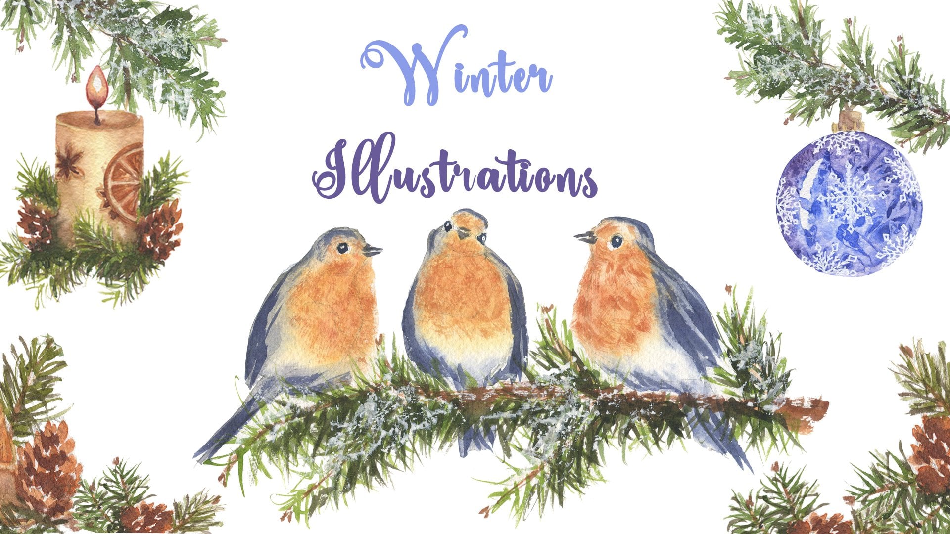
1. Winter Holiday Cards with Watercolors Trailer: I are afraid of making
mistakes while painting. Then I invite you to play with watercolors and to practice
your brush control. Unlike other mediums
like oil or acrylic, where you can fix the problem
just with white paint. With watercolor, it's important
to learn to play with transparency and the accuracy
of your brush strokes. For all of these,
practicing brush strokes is crucial to make
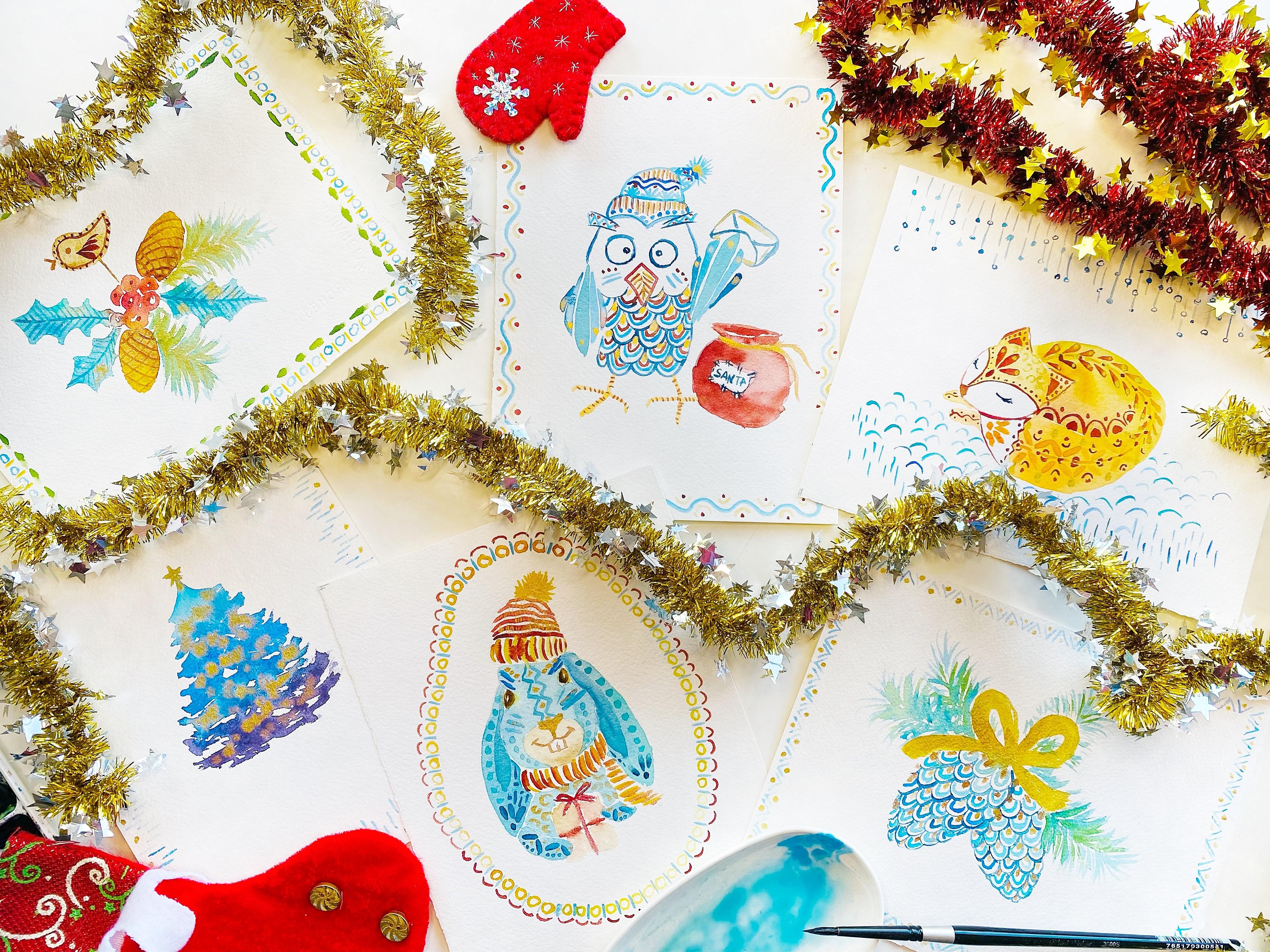
your brush drill. I have prepared you six fun, easy, and colorful
class projects, which will help you to maintain the uniformity of your strokes, to exercise the muscles
of your hand and wrist, and to be more detailed so that you can focus
more on brush control. I have prepared for you
class project templates which you can find in the
class resources section. Hello, I'm Nina, also known
as Music Art on Instagram. I'm a full time
what color artist specializing in loose
watercolor style, which means that painting directly on a blank paper
without pencil sketch. Also, I am an art
educator teaching watercolor art online
and in person, in English, in Spanish,
and in Ukrainian. After many years observing on me on my personal auto
color practices, this deep relaxation and
therapeutic effect from watercolors and also
observing it on my students, I decided to
investigate it more, and now I'm an art
therapist in training. I also have a special interest in those art
techniques which are beneficial for our mental
and emotional well being. I have been teaching on
skill share since 2019. During these years, I have been spreading the joy from
painting with watercolors. More than 9,000 students
all over the world. This is my mission, to
inspire you to paint with watercolors and to
enjoy the process. This class covers modern watercolor
techniques and could be enjoyed both by beginners and also by experienced
watercolor artists. Step by step, I will
guide you through the six colorful projects
with a golden touch. Grab your brush and
let's have fun.
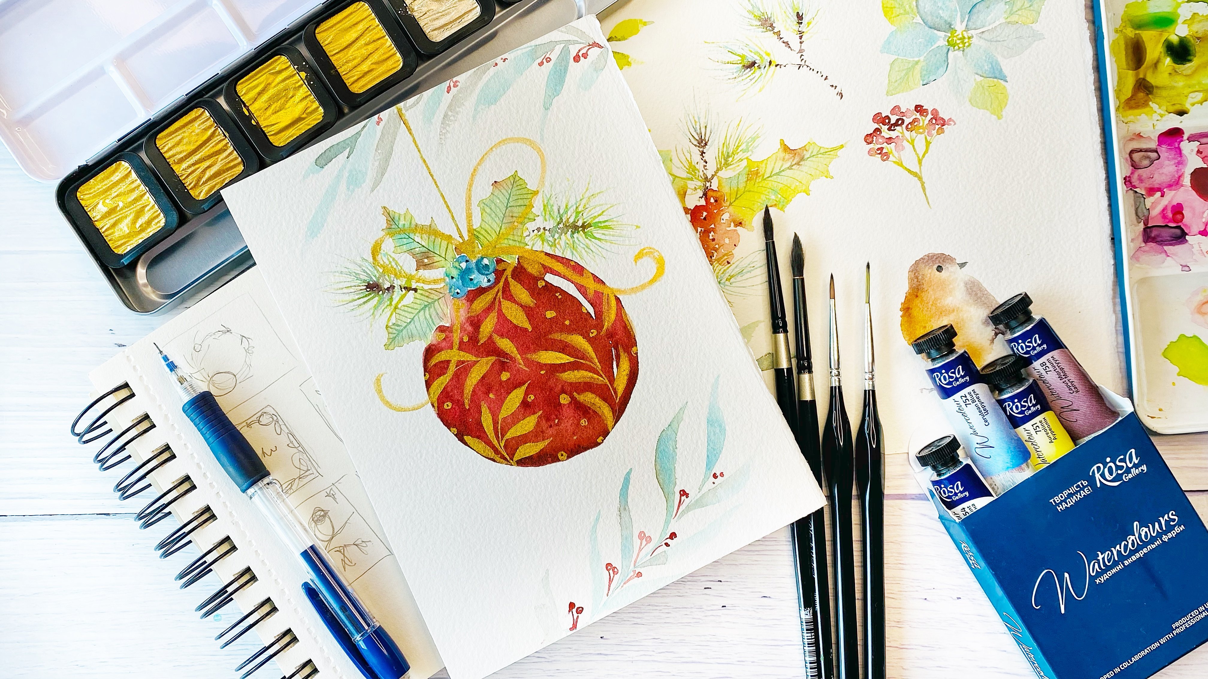
2. Materials: Welcome to the class. Just prepare the
materials for this class. We will need water colors. My ones are from tubes. As for the colors in
each class project, I will tell you which
colors I will be using. Also, one of the colors which I will use in
all my projects, that is going to be gold. I'm using this set of paints, and the color which I will use the most is Arabic gold 60. This one brushes, take
all different brushes, small ones for details, bigger ones for washes. And the color paper for
class projects I'm using. This is 100% cotton paper
by the brand arches fine grain and the size is 14 centimeters by
19 centimeters. Here we have different projects. I already waiting for you in the next lesson
because I'm really eager to start the paint there templates
for this project. You can find in the
class resources. You can pass them to your watercolor paper with a pencil. Let's start to paint.
3. Warming Up Brush Practice: Welcome to the new lesson. In this lesson, we
will have a look at the different lines and marks which we can
make with our brushes. Grab different brushes
of different sizes. I will show you quite
quick warming up exercise. If you need more practice, then you can find in my
class what a call brushes. One of one more details
what we will need for this class in order to
master our brush control. The position of brush. It could be totally vertical or also it
could be horizontal. Another thing is pressure. Let's practice
with these things. Once my brush is
totally vertical, I can really thin line. If I apply a bit of pressure, then it could be a
bit thicker line. If I apply even more pressure then it is even thicker.
What else we can do? We can make marks also
depending on pressure, they are going to be
smaller and smaller. We can make different
elements like arches. Then we can make some lines, just grab different brushes
and test and see which ones, which marks is easier
for you to do. It could be triangular shapes, it could be dots. It could be also this marks Just practice and see what
which brushes for you. It looks easier. Do it. This is angled brush, but also
you can use the flat one. Also. Just check which way is easier for you to make, like arches test as well. Smaller brushes, what kind
of dots they can give you, What kind of lines and also the circles this way. Also, you may have
these brushes. They give different
marks and lines. Just play around and have fun. And if you need more drills for your brushes or to know better
your watercolor brushes, then also you can dive in more detailly in my class,
watercolor brushes 101. In this one, we just do
this really short war with brushes and now we dive into our first
watercolor project.
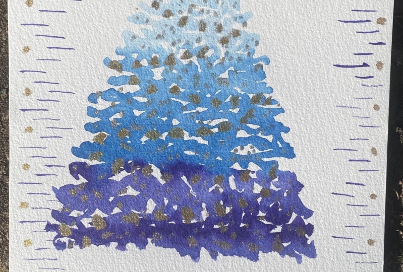
4. Christmas Tree Holiday Card in Watercolor: Welcome to our first
class project. For this project, I will
use the following colors, different shades of blues. This is cerulean blue, fellow blue, Tramarine blue, Prussian blue, and
violet as well. If you have some
metallic watercolors or paints that also
would be great if not, you can substitute
it with some yellow. In my case, this golden
one is from this set, the middle one that
is Arabic gold. Prepare your colors
and we will start, we are going to paint pine tree. For this, you need
to keep in mind mainly the shape because we
will paint without pencil. Sketch this project. Just practice on
some separate piece of paper, the central line, how it would be the
pine tree and then this the shape so
that it would be wider in the lower in the bottom part and more like triangular shape in
the top part. Yeah. Just have this plan in your head in your
mind. Let's start. We're going to play with
different shades of blues. I'm starting with
quite diluted color and it's going to be here
somewhere near the center. It should be diluted. This is cerulean blue. This one is from brand. That's why it has different
shade compared to others. It could be I'm adding more water so that
the paint would flow. Meanwhile, I'm
creating the shape. Then I start to
add another blue. You can choose any
blues which you have, in fact that the only thing we are interested so
that there will be, some of them would be lighter
and others would be darker. Now it's turn of
ultramarine blue and now we are to the darkest
that a suppression brew. I'm moving just randomly and then the final one
is going to be violet. Here is coming my
Christmas tree here. I have the darkest
one in the bottom. Then we are practicing water control brush marks here you see that it
would be beautiful. If you will leave some
areas with white paper, then it will give this illusion
of snow on the branches. Quite quickly. We move to this yellow golden one and then the
magic starts to appear. Try to make it like some pattern now that it would be
like Christmas lights. I think this is very satisfying
part and very playful. Just enjoy if you don't
have this golden set. I really recommend it
because it adds this kind of playful feeling when you are playing with
your watercolors. And what we can do in
some areas, again, to add more of this gold so that it won't be absorbed by darker colors and our
Christmas tree is ready. This is really a lots of fun, let's add as well
some bright star. Really beautiful. What we are going to do
next is we are going to add their frame to our
Christmas tree. This we will do by quite diluted blue
or quite light blue. Let's start, we are
going just to play with different lines,
different plans. That is how you will
practice your brush strokes. This also reminds me a
bit like this Frozen, icy, it's like fro pattern. You have understood it. It's
quite meditative part that I will make all four
borders for you. Just you can pose this
video and to take your time to make it in
your own, your own pace. This is my Christmas
tree which is already with this pattern at the edges. While adding it, I have been rotating my paper. That's why. Don't worry, it's not a problem if you don't reach
oral just to start rotate. And now I will add more details, just this shiny golden dots. But they also will
create this feeling of festive celebration, bright. You can create your own pattern. For me, I really like
this color combination and that it adds this shine. But you can use some
parts of this idea and to apply your
own unique approach. Here I have already, our first card is ready. You have seen it's really
quickly here in this card. For painting this card, we have practiced the
following brush control, how we can add brush marks, like loose brush marks, in order to hold,
to keep the shape. Then we have practiced there introducing one color into another so that it
would be gradual. This is also related to
their water control. Then lines, we have
added this pattern. So you have practiced how
to add really thin lines, holding your brush
totally vertical. And then some dots, which is just really
playful and relaxing. And I hope that you have
enjoyed this project. Painted with me. And let's
move to another one.
5. Pinecones in Watercolor: Welcome to our new lesson and
for our next class project, I will use the following
colors. Um, blue. I will use two different ones. This is van ***** brand and this one is Rosa Gallery brand. And you can see that they
are a bit different. Prussian blue mint sap green, Kinackerden gold, and the
same gold, Arabic gold. We are going to
paint to pine urns. And the template for
this class project, you can find in the class
resources that you can see, I have it really light. Usually, I don't use pencil
sketch for painting. I really enjoy painting loose style without
pencil sketch. But for this class, I show you how you would do
this class project. Then with this needing razor, you just remove
this pencil line so that you won't be able
to see this gray, dark lines below
your watercolors to make them look more
transparent and translucent. In this class project, we are going to
transmit the texture of the pinecns by
actually patterns. The first thing what we
are going to do is to add the pattern here. I have indicated
just the first ones, I'm using the dark blue, this is Prussian blue,
the following on. I just make the
pattern so that they won't that in the middle of the previous row, you just add the new one. This is really meditative part, that's why just take your time. Enjoy. Don't rush.
Make it slowly. Remember forgetting thin lines. You need to hold your brush totally vertical For better
brush control as well. You can keep it closer to the
tip you control movement. One is ready and
the other one we won't be able to see all. Also there would be
one part covered from this side with the ribbon. You see that? I'm relaxed doing these lines that take
your time and just play. There are no perfect ones. That's why don't worry. Here I have a y
pine cones reading. The next one, I will
go for this ribbon. For this I will use first
that is Kinachrydon gold. And let's paint it. This is beautiful, bright color. That is another
point if you don't have golden metallic paints, so use Kinacrydon gold. That also it will give you this kind of really
shiny effect. And bright here, another one from this side. These projects are
very relaxing. So that's why don't rush. Take your time. Maybe you will feel like
you would like to add something and just play here. I have my ribbon and the next one I will
add the golden part, so it would be shy. This makes your postcards,
greeting cards cheerful. When you add a bit
of this shine, I think that probably
like unconsciously, it should remind us about sun, summer, good weather,
and joy, actually joy. No, that's why enjoy. If you have the golden powder, just play and add this hinge. Now I will use one of the thulium blues to
add another arch. So here comes my arch. Some of them would be lighter, others would be darker. And also you could switch to
other shades, for example, Tramarine blue to make more interest in
the color as well. Other shades which
I have showed you, another cerulean blue, you can see that it's
different shade. Here we have and
let's do another one. Just take your time because it's really relaxing. Don't rush. And here you are,
working also on your brush control
and precision. The next part is going
to be, again, quite fun. We're going to add
some gold here. I'm going to add
different shades of gold, this one and a bit darker one, like bronze one here that we're adding this texture
just randomly. And then I will add also
different shades of gold. The darker one, it gives more contrast. You can see that also like this darker shade, That's fine. Also to have this contrast
between different, like lighter and
darker golden shade. Seems like I haven't missed
any of these patterns. The next one we are going
to add some pine trees. For this, I will mix two colors. That is, one of them is my thum blue from Rosa Gallery mint. It will give us really
beautiful shade. It's like turquas. Just with simple brush strokes, remember to hold your vertically and then it
would be easier for you to make this really thing brush marks one then another
one. For here, I really like that. It gives you that feeling, I don't know, For me it transmits that
feeling of like some kind of folk folk Christmas decorations. And I like this color palette. One more for here. Later we will add
a bit of green. Actually there is a variety
of pine trees which are, it's called blue pine tree. Near my parents house, there were several of
those blue pine trees. And actually they aren't green, they are like bluish. And when you look like generally the shade which
you see it was more or less, I think maybe it's nostalgi. That's why I went for
this pet. I don't know. Then we will use a bit
of sub green also to add some shade darker areas. Not a lot, just a bit. So here we have and with
a bit of darker blue, I also will add several brush trucks in order
to create their contrast. This is U blue. I think that I'm quite happy. I will add also some pattern. This is, this time I'm
using different type of cerulean blue to add some really simple
pattern like this. Then we will add up and down. Actually, it's quite
difficult for me. I find it quite difficult
while making patterns to talk because you need to keep
your mind quite structured. Otherwise you make errors here. Here, because it's
quite geometrical. If you make an error, then it, it won't look so nice. I find it very different to what I usually do because I like to flow with their nature and
with more natural shapes. This one, it doesn't allow me, I need to keep quite highly concentrated in order not to make a mistake
in their pattern. Just let me know.
How do you find it relaxing or the opposite? More stressful when you're
adding the pattern. Here are my cones reading
that I have finished with this pattern making in
different directions. And then I have added a bit of gold and shine with
just simple dots. And you can see that just by
adding this simple pattern, it creates more like
finished our composition. And it looks really nice. I really like it
for greeting card. So looking forward to seeing your pine cones and
seeing the next lesson.
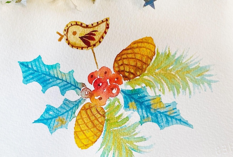
6. Gingerbread Bird in Watercolor: Welcome to a new lesson. For the next class project, we will need the
following colors that could be over in yellow. Kincredon Gold Burn, Siena
Rociena, Cerulean blue mint. And then for red berries, we will need some bread. In my case, this is
cadmium red medium. And this one is
meded a bit of gold. That is for old projects. So just prepare your
colors as well. Copy the template to your paper, and let's start
painting this project. I will start with red berries. Have prepared the mixture. I'm mixing just a red
with Dd and I will start with some central berry. This is quite dark, I would like to make it so
that it will be warm red. So here I have. This will require more efforts from your side and we leave
some area white. Then with water, I clean a bit my brush and then
add another berry. The same. I'm add
a bit more red. Here comes for this
side. One more red. I leave a bit of
white paper between the berries so that to give them that space for separation. And I will add a bit of bright color that
is golden yellow. This is also very relaxing
to paint these berries. For here, I will add one more that it would
be behind that one and probably smaller
one here we can add a bit. I think that it could be
gold or reline yellow. And a bit of darker shade here to some berries
in the shadow. So that they won't
be all of them the same color, much better. Next one we will
do the pine corn. This time we will make
it in a different way. Here I have just the
general shape and I start with line yellow
and then switch. It should be quite wet. Then I switch to burn Siena and all that extra. I'm moving towards the end where I need that the paint will flow and a bit darker. Here we have one from one side. I add a bit more of
Burn Siena because I want that this side
would be in the shadow. Here I have one shape and
I go for another one, the same, starting
with light color, quite diluted with water, moving it towards the center. Then I start to mix
these two colors. Is that burn sienna. And to mix these two colors, perfect, in this one
I'm making darker. This site, the one
which is lower, there is less light
coming through. And the light is
going to be here. Here. And this is the
shadow ones, perfect. Next one I would like to
add leaves, holy leaves. For this, I will mix two colors which we have
used in the previous lesson. This is ugly blue and mint these two colors and we'll get really beautiful shade here. I have just the general
lines of direction where I would like to paint my leaves. I just start, they
look really beautiful. I can add a bit more of blue. So to start changing the shades so that they
won't be really boring. And a bit of mint. Here we have here, it will mix a bit. And also we'll get
a bit of shadow. We can add a bit more of blue, some darker areas like this. Let's go for another leaf, the one which is into this direction time
quite quickly with, with watery paint making
the general shape. Here we go. We can add a bit darker shade of
blue in some areas. This time I also
invite you to make, to add a bit of shine. So let's add a bit
of gold for here. And also we can add
to that one as well, one more leaf from this side. You can move it in
different directions, starting near the berries. Then to move it towards. This is more complex because here we don't have
the whole shape. But if you feel more
comfortable having more shape, then first paint the whole
shape with a pencil. Here we have another one. Let's add a bit darker areas like this and as
well a bit of gold. Now they look really beautiful. Let's make the bird bird
we are going to make with that is just simple wash here. You need to be more careful
not to go out from the border here, the stick the same. We can add a bit of gold. We will add two
branches of pine trees, the same mixture, but maybe we will add a bit
of sub green as well, so that to make it greener. And let's add for here, for here another one just with brush strokes make
these kind of meals. The main thing is to keep in which direction they need to go. Here we, we can add a bit of green color that could be
S green or just olive. Olive green also is fine. Then it will look warmer
because the leaves, they are quite cool shades. This olive green will add
more worms to our branches. Here we have our
watercolor part. Now, before we will be
able to add the patterns, we need to wait until it
will get completely dry. Put it aside and keep a patient. And wait until it will get dry.
7. Gingerbread Bird Adding Details: The first layer has
got completely dry. And now let's start
to add the textures. And I begin with the fine
corns that we will add, this kind of texture burn
sienna with a bit of brown. Here we have and another one, the wedding, The
pattern so that people would understand that
these are pine curves. Let's add here also some
details to our berries. And the same color we can
use here for creating the filling of the cooking. Mm hm. And we can add
some dots and some wings. For this, I will use
a mixture of red with royal red for here. Bigger, one smaller, and
even smaller looks great. And then let's add some dots. Perfect. Let's move to the next part. That is going to be to add
just some lines for our lives. I'm rotating. That is really what happens if it
happens to you like this. You just remove
quickly, that's fine. You know that sometimes
it happens to everyone. Again, here I have, then I start to add these textures from one
side, from another side. All right, Other to all these parts, they are really relaxing and just
don't think so much. I mean like it is
relaxing even for me, difficult to talk and to
commend what I'm doing. Because in fact, like I disconnect already
from the verbal part. No, and let's add a bit of gold. I think we will add
a bit of this one. This is Olympic gold. Just to switch to
another one here, we will add these
textures and shine to our pine cones here
from this one. Also, you may notice that now our pineces start
to get more volume. Yeah, perfect. I will add as well, some textures to
our pine branches so that they start to shine. Here we have the next part. Let's add some frame
for this time. I will make it like this. Circles just make
lots of circles. The next one is going to
be to add some lines. I will skip this part, keep on doing the whole border. Then I will show you the final. Then the third part which I will add that is going
to be sub green. I will the marks our
frame will be ready. Just relax. Take your time and
make this frame. I will connect in several
moments. I will be back. I will be back in
several moments. So here is my greeting card with pine cones and holly berries is ready and I'm looking
forward to seeing your wife. Please share your artwork in the class project of this class.
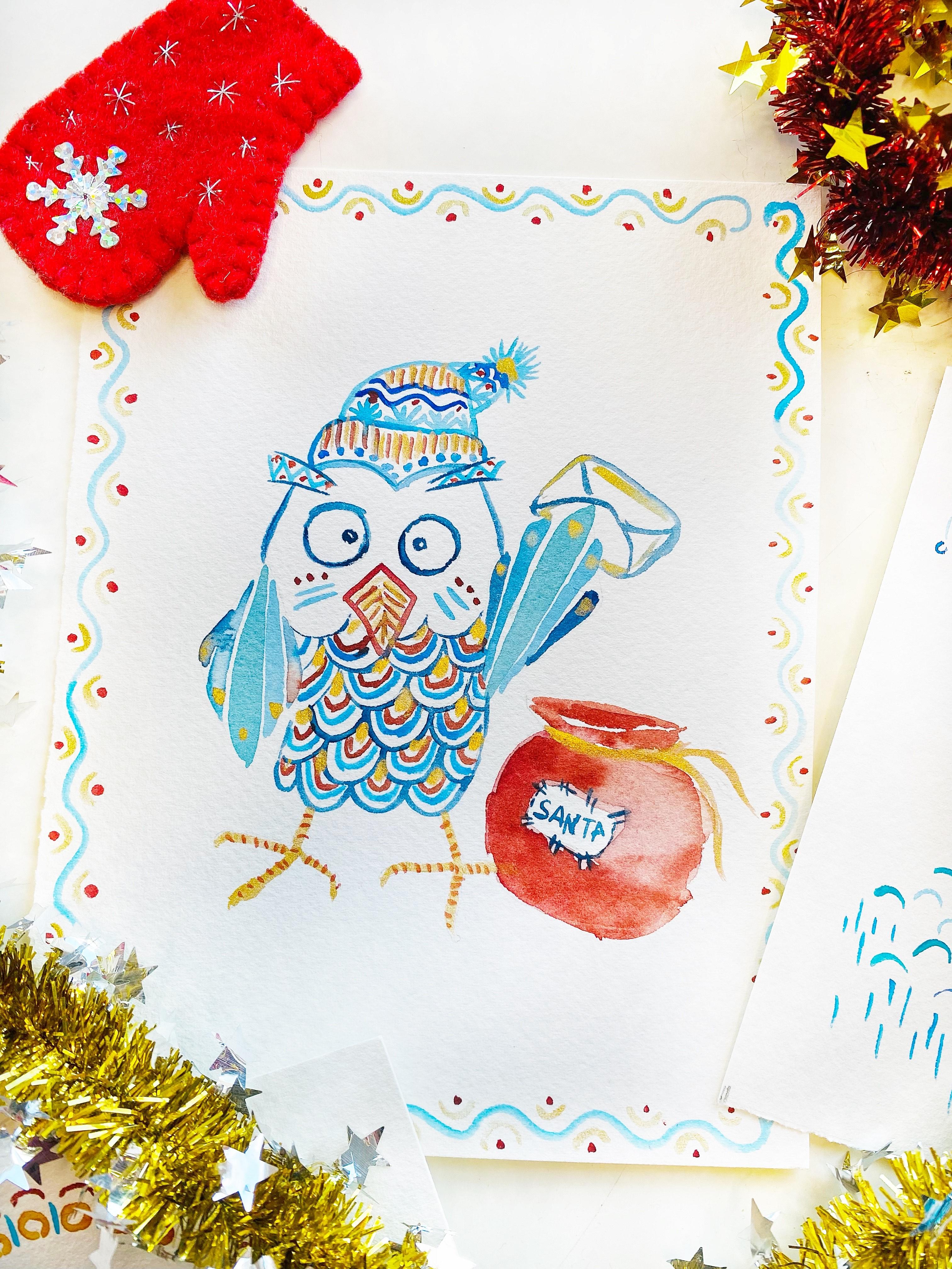
8. Winter Owl in Watercolor: Welcome to a new class and this time we
are going to paint really funny Winter,
who is like. For me, it reminded me a bit
like about Harry Potter, who has brought some
beautiful greeting cards or some long awaited letter. So we will need actually
the same colors as four previous projects. So it's going to be
Sally on blue mint. Then it's going to be Rosanna, and royal Red, and Kinard. God as well, Gold. Then just copy their drawing. You can find it in the
Cs Resources section and prepare your colors. And let's start to
paint you ready? Let's start with some dark
sheets that I will start with Prussian blue and we'll make their borders,
defining the lines. That is the most important part. So here we have the ice, we can add as well rose. And then going for
here that we will need to add in
details, this pattern. We have used it already
in the previous projects. It's won't be so complicated. Here we go. The next part is
we can add here definition. This is rule on blue. Yeah. For here, to make it fun. So we can add with
some ultramarine blue, some lines over here, and some snowflakes here we go. And also
from this side. And we can add some
dots over here. Mm hmm. Let's add the big, so he will starts
to alive a bit. To get alive, perfect. Then we can add a bit of
decoration rule and blue up and again we can
decorate it with red. And the same for here, we can make line and
some other lines going out this way. And we can add for
here some lines as well from this side. Mm hmm. Perfect. Now, we'll
add some further. This is su, blue and mint color. Let's start this one. It will be the middle one. And I'm making it th, on the top and to the bottom. Perfect. This one I
will make the opposite. It will be also the central one, but it will be thinner in the lower part and thicker
in the top part perfect. Then the next one, it will be with
more thulium blue. This to be really attentive to leave that
small area of white paper so that the colors won't
blend because we want to keep them separately perfect. And now another one from this side perfect. And we will add two more. They will be the darkest
this one I have touched. So be careful not to touch because otherwise
they will blend. This color is brush and blue. Mm hmm. Perfect.
So the next part is let's add some decoration, the rule in blue. And we'll add some arches. And we can add here also some pattern like this. It looks more and more cute. I think maybe to make a
bit darker and thicker these slides, you're
perfect birding. Next one, let's add
the same color, that red with moderate. Let's add one more
Archie for me. As I like to paint in
loose watercolor style, I really enjoy when
it's bleeds and then it's not so perfect. I think that actually water
colors help us to accept. I am not perfect. I'm not perfect. That's fine. The important thing that I'm enjoying my creative process, I think that I would like
to share this with you. When you make any mistake, just tell yourself
that that's fine. I'm not perfect.
Okay. What else? Actually we can For you, it happens something like this. You can remove it with a soft brush and
remove that color, and we can a more
and the same here. We can remove in case if you feel that
No, no, no, no, no. I want to keep it real perfect or I want to
correct it or whatever, For example, Sometimes mistakes can make you feel really stuck. I don't want to feel stuck, I really want that you would
enjoy this class projects. That's why I show you
also how you can fix it. Also I show you that I also
make this kind mistakes. That's why, don't worry,
everyone makes mistakes. So this is some parts of gold. Here in the top, I will
add a bit of gold. Yeah, here I will
add in that part. It will give this pattern like helps us to
create the volume, and also it imitates the
feeling of feathers. At least for me, it
looks like this. The legs really tiny, I will make them golden. However, I think that,
that in reality, they also should have
a quite thick, strong, and big pose to be able to hunt. But our is kind. He's working for Santa office
and deliver some mails. Perfect. We can add also some golden pattern
here. Here we go. We have as well here
what we can add, by the way, with gold, the same with gold. We can add here some dots. And to decorate him, we can add here also some
pattern, This looks better. And let's add, I think
it would be like red. Quite diluted color for here. Yeah, and there we will
write like for Santa, all these letters for Santa, this is red with Madd mixture. Perfect. Meanwhile we can write Santa. Great. We will need
to add some pattern. Yeah, I will show you
which one here or later. Once it will get
dry, we will add some more details to the sac. But at the moment, let's add the pattern that to make nice. My pattern for this greeting
card is going to be waves. I will add golden
details and some dots. So I will skip this part, so just enjoy making
your pattern. My funny old looks gorgeous. I really enjoy how it is. I have finished
adding the pattern, so you can see that
it has been wave. Then there were golden arches
and then some small dots with the same red,
royal red color. I will add more
textures and the same. Let's finish their bag. Here we have and
I will make some, I think, golden lace. What we can do is to make a
bit darker some areas here, for example, in the lower area, so where it is darker because
of the shadow for here, then just with water, dissolve it so it will
have more volume perfect. Also. It could be nice
because actually it's not so like round. But with volume, we can add
some textures like wrinkles. We can add more red dots
over here, for example. Here is the same also, so it will be very similar
pattern to another one. My funny all is ready and I'm looking forward
to see your ones. So please share your class
projects in the class gallery.
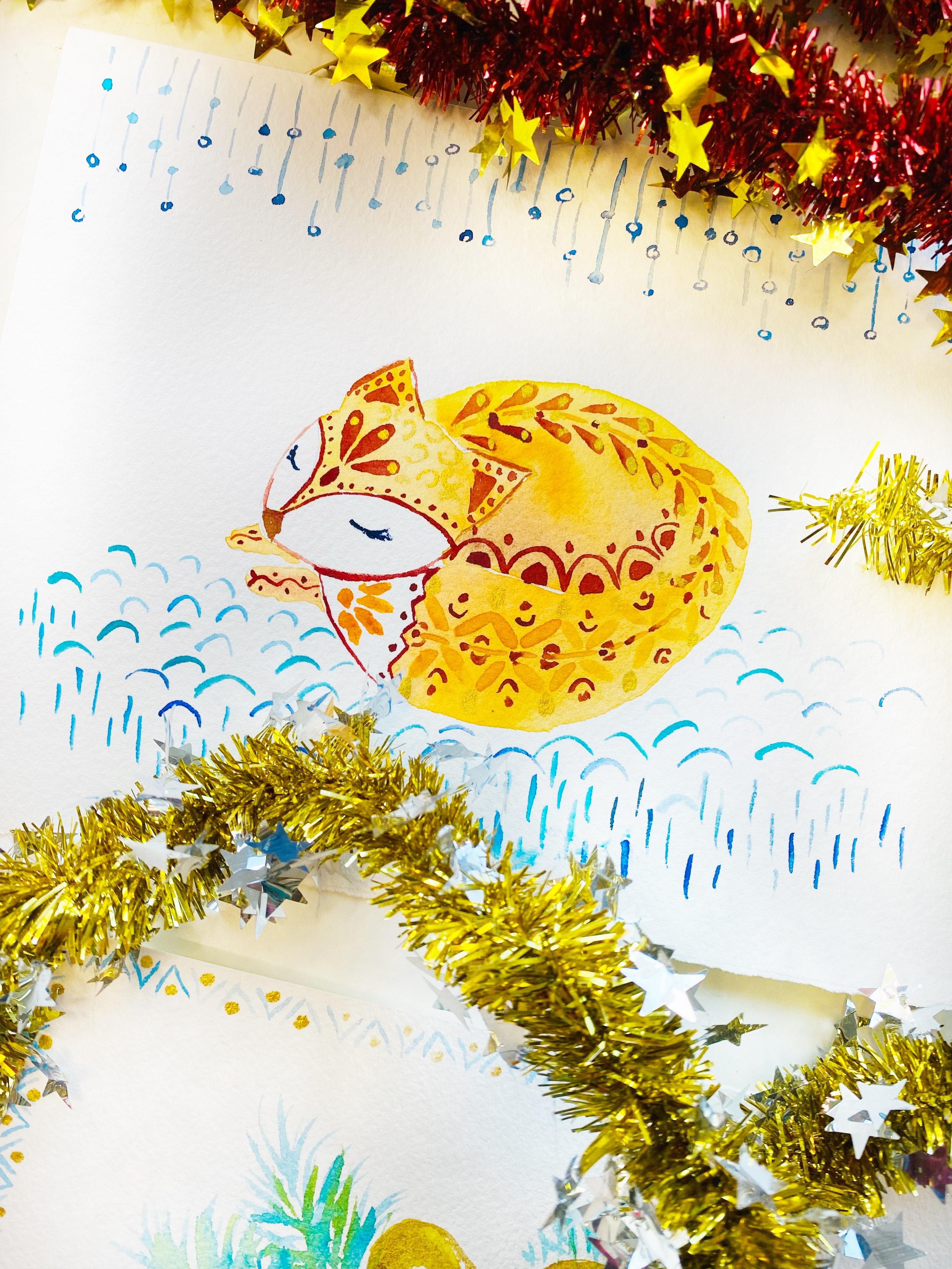
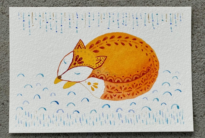
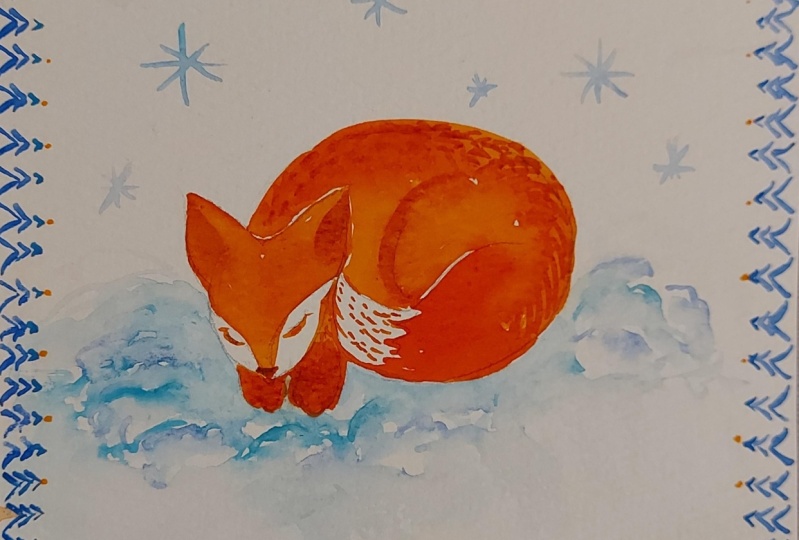
9. Snowy Fox in Watercolor: Welcome to a new
lesson and we are going to paint a
new class project. This time we are going to paint a really beautiful folky fox with like abstract snow scape. I will use the following
colors for this project. This is our line. Yellow, golden, yellow,
meter red, royal red. Four colors, they
are by Rosa Gallery. These two, they are from Wangk. This one is Rullan blue
and ultramarine blue. And as well, I will
add a bit of gold. Prepare your colors,
copy their line work. You will find the template in the class resources section. Let's start with painting
with this class project. We are going to practice other skills in
our brush control. Actually, we are
going to make a wash. It would be dual wash
with different colors. I'm using the brush which
holds quite well water. Keep this in mind while
you are choosing your one. I will start from here. It should be quite
transparent and we will need to move quite quickly by adding
different shades. Now is coming golden yellow again. Here I start with our lin. Yellow, really light and bright
color, really sunny one, and then we start to
add golden yellow. It's a really bright color. It interacts really
well with water. So you can see that
how it starts to spread from this side. So you can add orange. The end of tail, I will leave it white as it is. That's why here also,
you will need to be quite precise here. And then here I will
need a bit more, less, more of this color. And of water, if
it's too watery, then you get a really huge
pedal of color of paint. A bit more here, where will be the shadow? Actually, for this side, I can add a bit of Burn Siena here and here. To make it brighter,
we can add a bit more of golden yellow. The next step, we will have
to wait till it will get completely dry before we will be able to
add the patterns. So just patience. And leave it so that it
will get dry completely. My fox is already dry and
is ready to get decorated, so let's start with some brown. I will make a nose, and then I will
start with a mixture of royal red with meda red, so it should be quite
dark, beautiful red. And I start this
part and this one some brush prints and dots. And from this side as well. Mm hmm. Let's add their ears. And here could be quite
nice triangulars, mo, triangulars and
some more dots. Here we have the, let's add more pattern,
golden yellow. This one a museum. And I can mix this golden
yellow with a bit of mad. And then to add this pattern, the brush marks just practice. So that to get bigger and
smaller ones from another side. When it starts to get like this, it means that it's just
already run out of paint. Let's add some dots that
it was too much water. Next one it could be
some arches, the same. I will make them a derate with royal red and
they could be poor. Here, This area, we can make it to fill
it with the color. And then we can
add some dots over here, the same color. I will define the
shape for this. You need to control
really well the brush. Then let's go for the tail. That also we will need
to mark the shape. Here we have, I can add here
the same, some dots here. I can decorate as well, some line with dots
and another one. Hmm, perfect. Here in the center, I would like to decorate it with some orange color that is
going to be golden yellow. And also some brush marks, perfect. And some more brush
marks that here I may keep on with this line. Now I will make
this brush marks. What you need to keep in mind
that the further they are, the starts to get smaller. Here we have Maza with
a really tiny one, we can add some more decoration. For example, some more arches like this as well. Some dots can add
some more details. If you feel like we need
to add some eyes for that, I will use a dark shade
of blue, Prussian blue. Pay attention so that
it would be really, otherwise, if it's
too much water, it won't allow you to make
a really precise line. Here. We have already
almost everything. Now let's make it like the composition complete
and let's add some pattern. This time I will use even
easier one that we will make. This is rule on blue. Just some lines later, we will add some
circles to the lines. Just keep an eye. For making it rhythmical
so that it won't look boring or very similar. Here we go. And then let's add some circles, but also so that it would have some rhythm so they won't
be in the same line. You can make them
filled with color or just white space inside. Also, we can add with
different shade. This one is a bit darker here, we have that part. And now let's add also some more textures
so that it will look like she's lying in the
snow just with some arches. I'm creating this
feeling of snow. Use different shades of
blues, darker, lighter, and try to make them so that they won't
look all of them in the same area so that they would be a bit like creating that
filling of fluffy snow. I am switching the colors. I have used a cerulean blue, ultramarine blue, the mixture of cerulean blue with mint color. Here we have, then we
can add just some lines, different lines at levels. Then it will create
that feeling of snow. Here I have my fox. Let's add some golden parts I think that I will
introduce somewhere here. Maybe if you will do like
me to place the hand. Yeah, it may finish like this. What you can do is to remove water, sometimes it happens. So it also gives add
some texture for here, we can add also
some golden parts. This is my Fox greeting card and I'm really looking
forward to seeing your ones. Just enjoy creating and
adding the patterns.
10. Winter Bunny in Watercolor: Welcome to new lesson and
this time we are going to paint Christmas
bunny, Winter bunny. I know really fun one. The template you will find in the class resources section
to copy the watercolor paper. And as for the colors, we are going to use
almost the same ones. That is going to be
thulium, blue, mint, rosana, med, red and royal red. Kind on gold and golden one. Yeah, just prepare your colors
and let's start painting. We're going to practice more our brush control and water control. I'm preparing the
mixture which I'm going to use for
the main body of the rabbit that is going to be mint mixed with thulium blue. Here I have the color, it should be quite transparent. I start with wash. Be careful not to overpass
the line for this project. Yeah, it's important to keep the line under painting,
like this sketch. All you can modify. If you feel like I can
make it a bit bluish. Then I add directly this blue and also a bit more of this
mint here we have. Then I will go for
stronger color, this blue. And we'll start to add ears in that area near the cheek. I will add a bit more of
blue to make it darker. Here we have one now
let's go for another one. I will make it a bit greener. My green is mint mint color. It's not so strong. Here it is. I will add also a
bit more of blue in these areas so that
where there is more shadow and add more texture also
the lower part here, I leave some space to separate
here there is a scarf, ribbon the pose, let's make
them more into bluish colors. And another one, this is
I'm using rule on blue. My here I have it. And this part, we'll
have to leave it till it will get dry completely, till we will be able
to move further. But meanwhile, we
will be able to add their pattern on his head. Kind gold. Yeah, it looks funny. And then with dared
mixed up with royal red, we can add for here some lines. Try to make them thicker, thinner, like waves south. And they will
create this kind of texture and it won't look flat. Yeah, I think like
this would be nice. We can add the same
color over here. At this stage, we'll
have to leave him and to let him to
dry completely, and then we'll be back to work. My barney is dry, so now
I can add some patterns. I will start with blue and we'll add here some darker
shades with his ears. So that to show that
it's like inside. To show some depths
and create the volume. Perfect. Mm hmm. Next part that, we can add also
some darker blue. I have taken Prussian blue. And here we can
decorate just with some brush marks. Mm hm. Then also, we can
add more details. For example, here to add some dots perfect, we can add some more dots. For example, here is saying
we can add some lines. This is blue. We and for here some more dots. We need to cover this area
which is light with row Siena. I forgot be very attentive
to leave the teeth white here in the lower parts to make it a bit darker like this. Meanwhile, we can
also the color to his eyes greenish yellowish
or which one you would like. And also remember to
leave some white areas. So here we have. Meanwhile, my rabbit
has been getting dry. Some parts I have used to this time to add
the pattern, the frame, and I'm really happy
with this frame, so it just circles with a Cd
and gold with rule and blue, some sticks, some
lines between them. And then with royal red, I have added like the shape. No. And you can notice
that it's not perfect. And you know what,
I really like it because it's handmade.
It's not perfect. And it looks that the main
thing is like, you know, that you have enjoyed
the process and you can transmit
it and you know, it's like us, we aren't perfect. No. Next one, I will add their scarf in Cd on
gold or in yellow. You can use any of these
colors or if you don't have, you can use any yellow or any other color
palette if you feel like here we have and
then I add the red. Love this combination of this color palette
so that it's like warm colors with cool shades
and beautiful combination. Then I would like to make a really beautiful pink
color for his nose. Yeah, perfect. Let's add some patterns
and then we can add that area for here. I can add some dots there. I can add some lines from this side here. Lines, and that
area would be dots. Mm hmm, Perfect. Then a bit more of eyebrows, it starts to get really funny. This was ultramarine blue, but I think that I would like to cover it with a bit of um, blue because it's too
strong like this. Then I will add a bit more of, here is a central line. I will add like this one. Zizothere here we have. What else we can add here?
We can add one more. One more actually, we
can now make the ribbon. Mm hmm. Perfect. Now I think that it will
bleed and that is my idea. So with row Sienna to cover a bit the color of the box and it will get
blended with this red. So it will be what
I'm looking for. It won't be perfect. Let's add here more definition with brown or burned sienna. The dice. And we are missing his ice. Let's add ice so that now
will be some darker color. And I think it could be really
dark brown here we have. And probably to make them even darker in these areas because
here there is a shadow, so they look darker
and can wilt. Our rabbit is almost ready. What we are missing
us to add some gold. Let's add some gold
details. Golden details. I think that I would add
probably for here some dots. Then maybe over here
here we can make some pattern on his sweater. For here we can add
also points here. I think it would be
nice also to add some texture lines of different sizes that
some smaller, bigger. I think also could be
funny to make his nose as well, gold golden one. So here is my funny bunny with a present for you, and I hope that you have
enjoyed painting it and really looking forward to seeing your creation in
the Glas Gallery.
11. Final Thoughts: Thank you for joining
me in this class. I do hope that you have enjoyed the creative process
and I amazed by the variety of
patterns which you can create using just
simple brush strokes. You can apply these
techniques in your artwork in order to add that finished
look to your compositions. Or in order to add
that full card, wipe your artworks, and also to use them as a warming up before your main
watercolor practice. It's fun and easy. And also you know that
the more you practice, better results you get. I need to confess something
that at least I think during last five years I
have been painting in low style directly on blank
paper without pencil sketch. This class, it was first one after a really
long time since I have been using pencil
outline in the artwork. You know what I felt
during the process. I felt the need of more
control from my side in order to keep more presented so that not to
cross the pencil line. And generally, I have got less level of relaxation than usually I get when I paint in loose style. And sometimes that sudden this supposed
mistakes, whatever. But being free and being prepared that I don't
know what will be the result. That I will go with my watercolors just by being present and observing how
the watercolor behaves. And based on this, I will
respond with my brush strokes, creating out of something like more understandable shapes. No, but this time I
was thinking that I would like to make the process easier for you and
more enjoyable. So that you would be able
to focus directly on a watercolor part without suffering with shape
study and so on. And so that your end result
would be more predictable. I have provided you with pencil sketches,
outlines as well. I have used them
during the class. And I should admit that
the pencil outlines, they made me a bit
like feel stressful. Because every time when I was
passing a bit pencil line, my mind immediately was sending
me that signal of like, oh, I have committed
an error and like, oh, and how are you
going to fix it? It was all the time, One part of my energy controlling that not to
overpass that pencil line. I couldn't relax
the same deep level as I do during
painting loose style, just directly on paper. I find this experience
quite curious. It makes me think that coloring, because actually when we
have a pencil outline, what we are doing a
color are actually creating something which appear something out of nothing For me. What I have noticed that this coloring brings
less relaxation. Let's say that painting loose
directly on blank paper, it brings much deeper level of relaxation and provides
more therapeutic effect. Because you are
actually very connected now here with your artwork. It reflects your inner
state at this moment. You don't have any limits. You don't have the limits
by pencil outline. I would highly
appreciate if you could share your feeling,
your experience. If you have noticed
this difference between coloring
pencil template, between painting loose style
without pencil sketch, I will be super excited
to see your creations. Please share them in the
class project section. I will be more than happy
to leave you my feedback. In fact, it's very encouraging
to get the teachers feedback or to ask your questions and
express your doubts. I think that it will
allow you to evolve and to enjoy your
art journey more. If you're going to share
your artwork on Instagram, please do not
hesitate to take me. I will be glad to share
your artwork in my stories. I will be extremely
thankful if you could find several moments to
leave class review, especially if you have
enjoyed this class. For me, it's like your thank you and it's very,
very valuable. All your class reviews, they really inspire me to make new classes
to improve them. So I'm really deeply thankful
to all of you who are finding that moment to
write me a class review. If you are a beginner and at some point you are unhappy
with your brush strokes, the reason could be
also in brushes. In such case also, I would recommend you to check my other class on what
a color brushes, 11. Then you will know better the possibilities
of your brushes. And probably you will find some hidden gems, your brushes. If you haven't tried painting directly on blank paper or
you feel a bit like afraid. I also invite you to try another watercolor class where
I share you step by step, how you can loosen up and to start to create
beautiful flowers, especially roses in
loose watercolor style without pencil sketch as well. On my channel you will find a big collection of
watercolor classes, floral ones and some birdies. How to paint in loose style
without pencil sketch. Thank you very much
for joining me in this class and in
my next class. Bye.
 Nina Nyusikart Watercolor, Artist| Art Therapist | Loose Watercolor