Transcripts
1. Here's What We Are Painting!: Hi, guys. In this lesson, we are going to
learn how to paint loose and beautiful
watercolor flowers, and then we're going to apply
these flowers to painting these beautiful
fashionistas right here. Are you ready to dig in?
2. Hello I'm Clarice: Hi, guys. My name is Clarice
and I teach you how to go with the flow and paint loosely in therapeutic
watercolor. In this lesson, we are
going to learn how to do a lot of the very
key important things in watercolor while painting
some gorgeous loose florals in a very, very
different manner. And you're going to see exactly
how that happens shortly. So if this is your
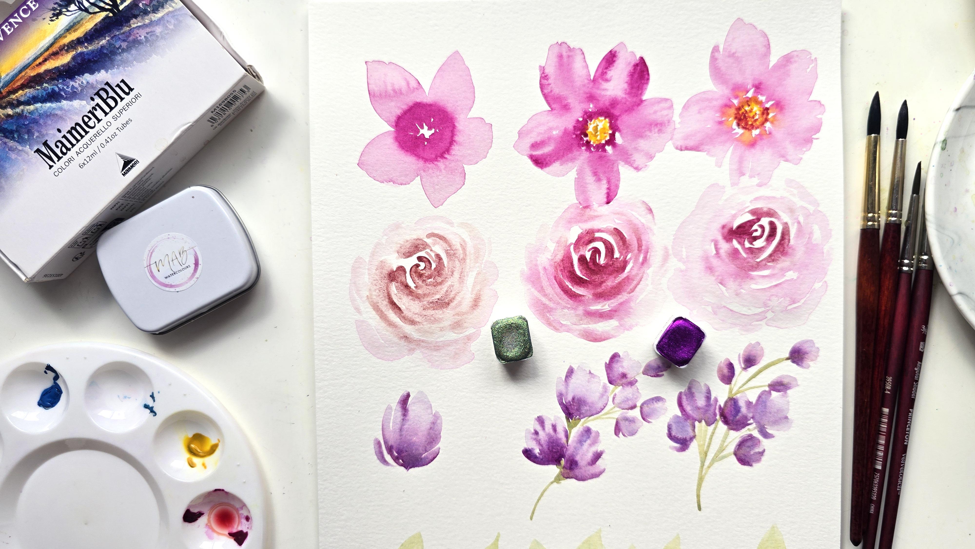
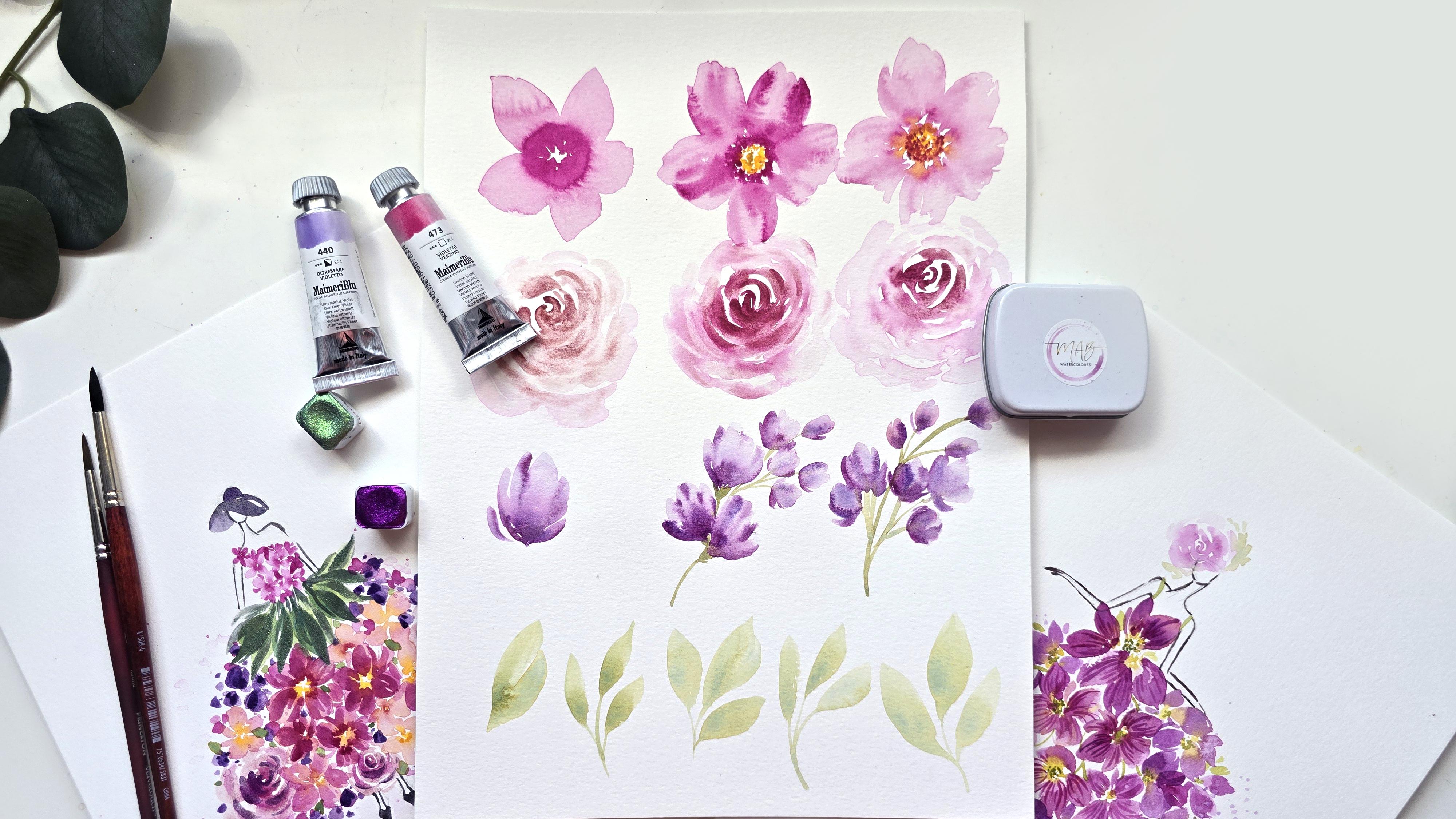
first time coming across me and you have
no idea who I am, I first started out on YouTube painting for fun and putting out tutorials
on how to paint flowers. Yes, flowers are my thing. I love pinks, I love oranges. I love all those pretty things, and painting flowers, loose
flowers is what I love.
3. About Me & Go with the Flow: I also have a watercolor
membership called Go with the Flow while
being an ambassador for Princeton and I also love hosting watercolor retreats that I personally curate myself, and it's pretty much me teaming two things that I love
watercolor and travel. If you're interested
in any of this, I have linked it
in the description of this lesson, go check it out.
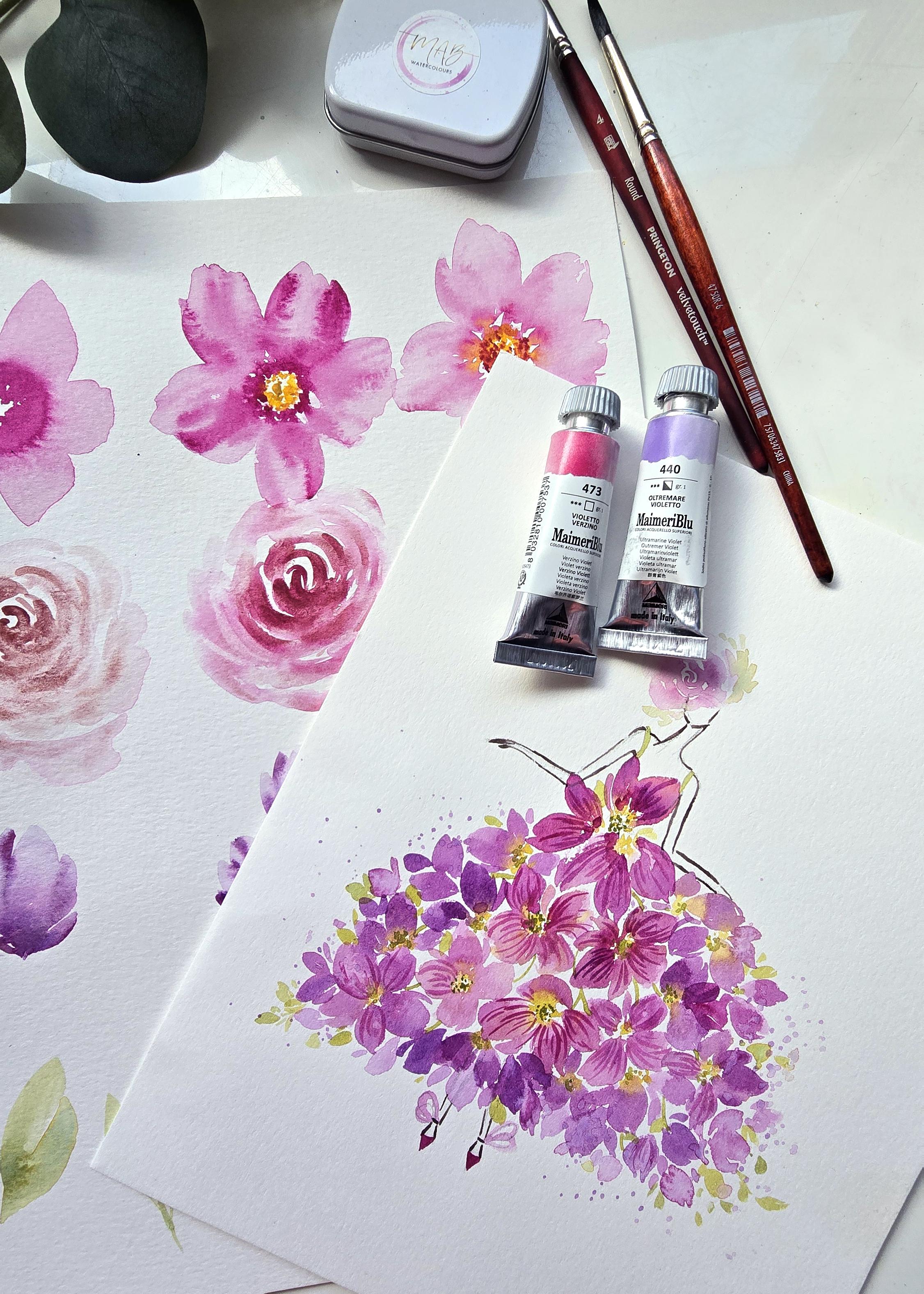
4. The Lesson: Let's talk a little
bit about this lesson. In this lesson, like I
mentioned in the beginning, we are going to be focusing a lot on how watercolor works. I'll walk you through
water to color ratios. I'll walk you through getting
some brush control in, walk you through the wet on wet technique and the
wet on damp technique. This is what we're going
to be teaming together to create some loose florals,
which we all love. That's why we're
here. Then we're going to take those
loose florals and create some beautiful pretty
projects. You ready for this?
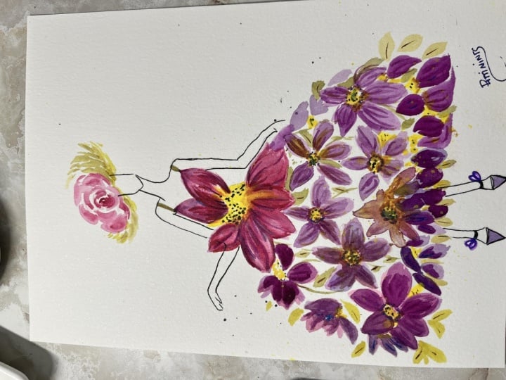
5. Your Project: For this lessons project, go through all the videos, sit down and paint in real time, pause if you need
to try it again because practice doesn't
quite make perfect, but practice certainly
takes you there. Now, in addition to that, we are going to then
take everything we learn and then in true
Clarice lesson fashion. Meaning, if you've watched my past videos, this
is what I always say. I'm teaching you how
to do something. Now I want you to
take it and put it together in a composition
that comes from you. Using your judgment in
terms of what colors, what techniques, placement,
all those things. This is how you grow, not only in learning
composition, but coming into your own
true style of painting. And once the project is done, please I would love it
if you post your work in the gallery so I can see what you have done
and comment on it. I always find it so inspirational
to see folks who watch the video paint along and
have those aha moments, and it is so satisfying to me. Nothing brings me more joy to hear from you telling
me that you got it. Please do that.
6. This is how I teach: I teach you to
paint, it's not to paint to be a picaso or a mona. It's painting to find
your inner calm, to find your joy and to give you satisfaction through the
process of painting. We focus on the process, not so much the end result. Then we also focus on finding all the positives within
our work because so many of us are overly critical over little things simply
because of one thing. We copy or we think we need to copy or our brain
tells us we need to copy. I'm here to tell you to
let go of all of that, understand how watercolor works, and then flow with it.
7. How Watercolour Works (Magic): So we're first
going to start off swatching some colors
really quickly. This process is not going to be not just going to
be about swatching, but it's also going to
be about me showing you those color ratios when
you're mixing the colors. I'll be showing you a couple
of different examples just to give you an idea
of the colors I'm using, I will be using the set of
Provence, Mmaryblue colors. We've got some amazing jewel tones that I
like to call them. We've got two different
kinds of blue, a cerulean, a cobalt green, golden yellow,
ultramarine violet, erzinoVolet and potters pink. That's what I have
in my palette here. For this process, like I
said, we're going to swatch, but we're also going
to be talking about color to water ratios or
water to color ratios. I'm using my Princeton
number six for this exercise and we are going to very
loosely activate the colors. If you're brand
new to watercolor, remember a little
goes a long way. If you have dried up color in your palette like
I do over here, all you need to do is just
activate the color by adding water to the color. Now some of these colors, the consistencies are going
to be looking very different. I know the pink is very bright. I know the potter's pink takes a lot more work
to get it activated. Same with the purple
or the violet. Then the other colors are also quite potent like the pink is. We're going to start off with mixing very basically like this. The way I love to
introduce watercolor to people is simply
through this technique. I'm going to use the
number eight just to show you this and
then we will begin. I'm just using this to get
some water on my page. By the way, I'm using Canson
Excel paper here for this. Then all I'm going to do is take my color and drop
it in the water. You see that beautiful bloom, that is the beauty
of watercolor. This is called the wet on
wet technique where you're adding color to a
surface that is damp. This is what made me fall
in love with watercolor. This is the part that
bloom that you see is what I find so therapeutic
about this medium.
8. Swatching - Part 1: So we're first
going to start off swatching some colors
really quickly. This process is not going to be not just going to
be about swatching, but it's also going to
be about me showing you those color ratios when
you're mixing the colors. I'll be showing you a couple
of different examples just to give you an idea
of the colors I'm using, I will be using the set of
Provence, Mmaryblue colors. We've got some amazing jewel tones that I
like to call them. We've got two different
kinds of blue, a cerulean, a cobalt green, golden yellow,
ultramarine violet, erzinoVolet and potters pink. That's what I have
in my palette here. For this process, like I
said, we're going to swatch, but we're also going
to be talking about color to water ratios or
water to color ratios. I'm using my Princeton
number six for this exercise and we are going to very
loosely activate the colors. If you're brand
new to watercolor, remember a little
goes a long way. If you have dried up color in your palette like
I do over here, all you need to do is just
activate the color by adding water to the color. Now some of these colors, the consistencies are going
to be looking very different. I know the pink is very bright. I know the potter's pink takes a lot more work
to get it activated. Same with the purple
or the violet. Then the other colors are also quite potent like the pink is. We're going to start off with mixing very basically like this. The way I love to
introduce watercolor to people is simply
through this technique. I'm going to use the
number eight just to show you this and
then we will begin. I'm just using this to get
some water on my page. By the way, I'm using Canson
Excel paper here for this. Then all I'm going to do is take my color and drop
it in the water. You see that beautiful bloom, that is the beauty
of watercolor. This is called the wet on
wet technique where you're adding color to a
surface that is damp. This is what made me fall
in love with watercolor. This is the part that
bloom that you see is what I find so therapeutic
about this medium.
9. Swatching - Part 2: Now, let's talk about the
mixing and the ratios. You can have various
mixtures going on, for the sake of
this lesson here, the first thing I want to say is the more color you
add to your water, if there's more color
and less water, you're going to
get a dark result. The more water you
add to your color, you're going to get
a lighter result. Let's just say this
is my dark tone, where you can clearly see that it's almost like a syrup base. It's very potent and I'm just going to go
ahead and do a swatch. Look how beautiful
and dark that is. This is very, very dark. Now, the way I like to proceed
is as I'm creating more, actually I shouldn't
have gotten more color. I like to just dip my brush in water and I know I'm
getting a lighter version, and then I'm just going
to do another swatch. I'm going to dip
my brush in water again and do another one. What's happening is as we
are laying down color, all we're doing is adding
more water to the brush. As we create more,
it's getting lighter. This to me is the easiest way
to show you how you can get different variations or
values for that one color. Now I'm going to try and wash
off as much as I can to do this one final little blob. I should have probably
had more space there. Let's just do it
here. Actually, let's do a couple more
because I don't want this whole area to be wasted. I'm going to try
and go as long as I can until it gets
completely white. Some might look
marginally the same. But you get the idea.
The more water you add, the lighter it gets. Now look at the very
different ratios or values you're able to
get with just one color. This is where you can absolutely
use one color to paint a whole flower because you're
getting different values.
10. Swatching - Part 3: Now we're going to swatch the next color and
I want to show you how this takes a little
bit more to activate. This is going to be the
violet that I'm using. I'm mixing that directly on the color well palette,
whatever you want to call it. Now it's a nice syrupy
base or syrup consistency. Look, when I add this
in, yes, it looks dark, but the coverage isn't quite as opaque looking as the pink. As we add more
water and proceed, you're going to see
that it gets lighter a lot faster than the pink. This is why I always say, it's important to swatch out your colors and
really get a good feel for the different values
you can get with it, which will really help you plan out how you want to
use these colors. This is a simple,
simple exercise to just figure out the different
variations you can get. I'm going to wash off as
much as I can right now. Look at that. You can get
super light, super dark. One thing you're going to notice is as watercolor dries up, it dries up lighter than what it looks
like when it is damp.
11. Swatching - Part 4: So we're going to move on
to doing the next one, which is going to be the
cobalt green, I believe. Again, trying to get that nice syrapy base or consistency, and then we are swatching. I'm not going to swatch
all of this in video, but I encourage you to
pause or once this is done to just allow this moment or these moments to be an area of rest
and pause for you. Just take your time
really mixing, really noticing how the colors are showing up on your paper, really feeling how the full span of your brush is
hitting the sheet. Notice how I have my full brush and I'm going back and forth. These are things
that will really not just help you calm and get more accustomed and
warmed up to the supplies, but it's also going to be informative to your brain as you start painting
and creating. The more you tune into
little details like this, the easier things get, the more you understand
how this medium works and the more
joy it brings you.
12. Swatching - Part 5: So like I said, I'm just
going to swatch the rest of these without doing
that whole process and you can go ahead and pause
and do that by yourself, allow that to be
your little me time. I have a little bit of green
in this yellow right here, but I'm just going
to use it anyways because it's still
majorly yellow. This is what that
yellow looks like. I'm just going to swatch
out the remaining colors. I have that as a reference
once we begin our painting. Like I said, you can
take your time to do it with the water to color ratios so that you have a better understanding of
what you're able to achieve. This is the cobalt
green. That was the Cerulean sky. My mistake. Then finally, potters pink. Now, this is a
very pretty color. This is also very muted tone, a beautiful earthy tone. If you're looking for vintage flowers or looking to paint, vintage flowers, I should say, this is one of those
colors that will give you such a pretty effect. Look at that. It's a
pinky, brownish color. But the consistency of this is very similar to the purple. It's harder to get an
opaque feel for it. This is more of a
watercolor watercolor, if that makes any sense. All right. I have just
watched everything. Like I mentioned, take
your time and swatch out the colors you have chosen or if you're following
along with these, just take your time and
swatch out the colors.
13. Swatching - Part 6: Now this is entirely optional. I'm also going to be using some metallics and I've
got these lined up here. These are the same
metallics I will be giving all my attendees for the Tuscany Watercolour
Retreat that's happening in October
and I'm super excited. Actually, we're
missing two more. There's actually six in total, but this is what I'm
going to be choosing for this particular lesson, in particular, we've got copper. To be specific, I mean, plum. Purple rain, absolutely
stunning, so is the plum. Then we've got Hummingbird.
Don't be fooled by the plum. I know it looks green, very
similar to hummingbird, but this actually has
a purple sheen to it. It's almost
holographic in nature. These beauties are
by MAB watercolors. Again, if you're interested in any of the supplies I'm using, I have listed them
in the description, so make sure you check that out. Again, metallics are optional, so feel free to
completely skip out the metallic part
and just focus in on the watercolor colors. But let me just show you
guys what this looks like. It's also helpful for me
because this is going to be my palette for this lesson. I'm going to start
off with the plum. I'm just going to
do that over here. I know it looks
very dark on here. But when you actually apply it onto paper, it's very light. This almost looks
like a lavender. I'm going to show
you a side view of this once it's had
a chance to dry. But for now, this is
what it looks like. When you're just
looking at it simply, I'm going to do the hummingbird next and I'm going to
put that right next to the plum so you can see how different it looks.
Look at this. When you're activating it, to watch all that glitter go all over the place,
it's so satisfying. Now, this is what
hummingbird looks like. Look at all that glitter. Again, if you notice it doesn't
give you full coverage, it gives you little
pockets of glitter. Now, purple rain
is also similar. It just has a beautiful purple
sheen to it. Look at that. I'm going to do purple rain right below Hummingbird because I feel like these
two are kindred souls or kindred watercolors. As you can see, little pockets, it gives you pockets with lots
of white space in between. When you mix these
in with watercolor, say the pink or the purple even, you get a sheen in your results. Or maybe you want to do this as a splatter or perhaps
you want to add it as a pattern detail instead of mixing it in
with the watercolor. In which case, that would be
a wet on dry. Here we go. This is a little bit
more opaque in nature, and this is copper.
Beautiful colors. I think we've got some
really nice glitter and glam to add to
our loose florals. That's all the swatching for me. When you're done
swatching, hop on back and let's get to our painting.
14. Loose Florals - Part 1: So the first thing we're going
to start off with is using our angular shader brush by Princeton and it's part of the velvet touch collection. I love this to create some beautiful loose
flowers and also leaves. I'm going to show
you a couple of varying styles of flowers we can do first with the palette
we've just watched up with, and then we're going
to get into leaves. I'll first start off with
doing a very basic flour, and we're going to give it a little bit
of detail as well. We'll start off by really mixing to get a very light pink. Now, this is quite dark. What I'm doing is I'm just going to take that and mix it onto a different palette and then
dipping my brush in water, I'm dropping in
drops of water here. Now, it's giving me a
nice watery consistency. I know this is probably
going to give me a very light pink and we're going to actually look to
see which light pink I get based on the swatching that we did too,
just for funzies. Here we go. Nice
watered down pink. I'm going to use the tallest
portion of this brush. Hold it like a pencil as if
I was writing on this tip, and then I'm going to
start painting petals. The first step to that is I'm going to hold my
brush halfway using the tip. I'm going to press
down and trail off. Now, I'm going to
modify this shape. I'm going to do it again,
starting from the top, press down and trail off. Now that can be one petal. Using that long tip to pull
it down. That's one petal. Let's do another. That
can also be a leaf, by the way, pressing
down, trailing off. You can start your second
portion of the petal down this way and you're getting more control over how
these petals look. Again, now I'm going
to do it sideways. Using the tip, pressing down,
pulling into the center. I'm going to do
that one more time. A third time even
if you need to. I don't know why I
dipped my brush in water because it's very water down already. Here
you go fourth. As you go sideways, I'm
not turning my sheet. Feel free to turn your sheet
though if that's easier. For the sake of this
video, I'm just going loose and allowing the brush
to give me different shapes. See the first two because
we started on the tip, we were able to get
more um pointed petals. The others because
I went sideways, I'm able to get more
rounded petals. Pay attention to this. I think this is a great
learning curve for you to see exactly the different shapes you can get by using this brush. Now I'm going to get this brush. This is what I meant by
adding adding the metallics. Actually, before
we do metallics, let's just add
more of that pink. I'm getting more of the pink and I'm using my velvet touch. Use another brush and
I'm dropping it in. Do you remember
that first exercise we did when I showed you guys, this is the beauty of watercolor in that
wet on wet style. Where I added water to the base and then
added the color in. That's exactly what
I'm doing here except now I'm applying
it to my flower. Watch that bloom. That
is the effect we want. This is taking our simple flower and now we've
suddenly elevated it because we've given
the center depth.
15. Loose Florals - Part 2: Now let's try this
one more time. This time, I'm going to show you something
slightly different. We'll use the purple
rain at some point. But for now, let's just
keep that first one basic. I'm now going to go back in, get my lousy color. Let's do this flower
one more time. This time we're looser now because we've tried
this exercise already, Go looser, add more than
two strokes if you need to. In fact, if you watched any of my other videos or lessons, I like to create a very
loose rough circle, and this is what helps
me figure out exactly where I'm placing
my petals and I can work faster into really making a conscious effort to not close up all that
middle white space. So try all the techniques
I'm talking about. If you have other ideas, go for that and try, go rogue. When you find your flow or the technique that works best for you,
stick with that. Now look, because I added
so many more strokes, I've got veering outer edges for the petals and it
just looks a lot looser. We're going back in now. We're going to drop
that color in. To the center and some of
these areas have dried up. That's why it's not blooming. Those areas are still damp so you're getting more of a bloom. Make a note of this guys. These are all things to note when you're first
trying out watercolor. Now, I'm going to
elevate this even more. I'm going to take this
color to add some detail. All I'm doing is
adding little strokes within the petals
we have created. It's almost like indicating little folds within our flower. You can use a thinner
brush if you want thinner strokes
because if you notice, when you first add
in your stroke and if the area is
completely wet, it blooms out immediately. But if you want a thin line, then you use just the tip of your brush and paint
thinner looking lines. Now, I like different
varying thicknesses going on just to give
us a nice variation. Now look, just adding those variations
elevates the end result. There we go. Now, here's another thing
you can do to this flower. Again, these are suggestions. Get some of that
yellow, drop it in. I typically leave my
centers wide open. I don't really have a bunch of center colors for the flower. I leave it open. This is a suggestion
because the yellow really elevates and enhances
the end result. Now there's a pop in the center.
16. Loose Florals - Part 3: On with our study of these
flowers and I'm going to continue using this brush because now for
this third flower, we're going to finally
not only add the yellow, but we'll also add a little bit of the metallics. Here we go. Same thing that we did
the first few times. Actually, this time, what
I'll do is I'll start off with a center. Then I'm going to
make sure I have enough water left. Here
we go. Starting off. This time I'll
start up this way. And then go sideways. I'm going to try and
leave some white space in between my petals too. Let's see if I'm
able to do that. I'm going to do one more. Then another one. Now notice how much looser
my strokes have gotten. I've gotten away from the
semi perfect flower to now really loose over here with lots of white
space in between. Now we're going
back in with this. I'm going to get nice
fine pointed brush, get some of that dark, beautiful pink and drop that in. Remember to breathe
guys because this is the part that adds so much like joy and calm that you almost hold your
breath because you're thinking, wow that looks so pretty. Now look, notice how because
I've got white space, it just mildly trickles
into the petals. Beautiful effect. You got to notice the importance
of white space. I can't stress that enough. Now I'm going to take that
same amount of color on my brush and I'm going to start from the top and I'm going
to lightly pull downward. I'm just adding little
bits of detail, just like we did
in that first one. The first one though, I
did get a lot more color, which is why a lot
of it was very dark. And really good contrast. I'm showing you different
ways and how you're mixing the amount of
water to color ratios that you use for all these
different areas while painting do play a role
with the end result. Now I'm going to take
this flower a step further and instead of
doing more of the pink, I'm going to get
some of that yellow. This time we're adding that yellow right
in the center here. I'm touching a little bit of that pink before I get right into the center
and start dabbing. Again, even with
this part, we are leaving we're leaving the center with lots of white space. Now because I added it in
while the area was damp, it did the exact same
thing that it did here, that it did there. We're doing a wet on wet bleed, which is a very
pretty effect again. Then now just to add a
little bit of contrast, I'm dropping in a little bit more of that dark pink
right at the base. Of this circle or the center. The consistency
here is more color, less water so that it doesn't fully bleed into the background, but it retains its shape. I'm not going to fill
up the whole area. I just want mostly the base. Now we've got more contrast
going on for the center. If you notice, all three look vastly different
and it's all dependent on how how
the brushstrokes are, the ratios of mixture, and then also adding in the timing of when you're
adding in plus the ratio, plus the brushstrokes,
plus the white space. Lots of elements over here
that you really need to be very intentional
with while painting.
17. Loose Florals - Part 4: Okay. The next thing
we're going to do is I didn't add any of the
metallic in those flowers, but there's more opportunities. So we're going to move
on to the next flower and I'll show that to you there. I'll be literally
the same kind of technique technique, if you say. Getting some of the potters pink mixed up because
we're going to now do very loose roses and I want to show you
what that will look like. We'll start off with using
the number four and then I'm going to use the
number eight to give me some nice beautiful blooms. I got a very thick syrup like consistency of
the potters pink, and we're going to
start off with doing little sea curves
just like that. And then we're pressing down to really build
up on the curves. Then as I'm going more
outward, I'm creating more. I'm just dipping water
on dipping the brush in water and that's how I'm getting the dark to light consistency. Then I'm going to
use this brush. Just going to get a
little bit of that pink. It's full of water and
I got a little bit of that pink hue and I'm going to continue doing
the same strokes. I'm going to add touch
to get a little bit of that potters pink from here as well onto the brush
full of water, and we're going to continue
creating these sea strokes. Essentially, what we're
doing here is we're blending two colors to get this pretty variation and we're leaving lots of
white space in between. Now this rose is facing upward. As I'm creating more petals, I am using just the tip of my
brush to do the top petals. This way it really gives you that impression that
it's going upward. Now, the center, I feel
like it's very dark. All we're doing
is taking some of the color and you're
moving it around. So that it doesn't
quite sit there without giving us a
nice smooth feel. We do want that nice
contrast for the center, but we also don't
want it to look completely out of whack. Now, when I say out of whack, I mean we go directly
from dark and then light. We want that smooth transition. Sometimes you might
find yourself going that's not a
smooth transition. It's a bit too stark, so I blended it out and now
with a clean number four, I'm going to go in and lift. Lifting is another great way to add or rather we're
subtracting color, but we're creating white space, and we're allowing the folds to give as negative detail,
I guess you could say. What we're also doing is blending the color
more smoothly. We're using this technique
to lift color and then also blend in areas
that we see fit. That was looking more
like a blob before and now because I've gone in with these smooth little strokes, it's given me a little bit more loose detail in the center. That's one way to do it. If you feel the need to
go back in and add more, just to touch up in some
areas because sometimes the lifting is not as perfect and that is completely normal, go in and help it along. All I'm doing is using
just the tip of the brush to lightly add these strokes in. That's how we get our rows. Now, let's try that
one more time.
18. Loose Florals - Part 5: Time I want to challenge you
to do it with this brush. Remember, guys, it's
just a piece of paper, so don't worry if it
doesn't look too great. But we've done three flowers
with this angular brush. Let's do one more. This time
we're going to do the rose. I'm going to get some
of that potter's pink. I'm going to dip it in some of that regular pink of mine just to see what
it's going to get. I lightly got some
water on there just so that the two colors at
the tip of this brush can maybe blend better and let's
keep the number six handy. It's a clean brush right now. Clean wet brush, it needs to have water
on it so that you can spread the color around.
Same thing here. Let's start off with
quick little sea strokes. Then as we create outer
petals, we're pressing down. Then I'm going to dip
the tip of my brush in water just to get
more color flowing. Getting my wet brush. I'm now spreading
this color around, leaving white space as I
do these large strokes, pulling some of the color from the center to flow into the
new strokes I'm creating. The white space is where
the magic happens. I cannot stress this enough. You need to have white
space, otherwise, your flower tends to
look like one big blob. Okay. Whitespace or even having two
different color variations. Those are what's going to
cause differentiation within your flowers or your petals and that's what
adds to everything. If you're not careful,
you could just continue creating so many petals, making it super huge and big or just going over
it and making it big. I'm just going to get a little
bit more of that color. 1 second. I need a little
bit of water on it. It's very dry. Then all I'm doing is dropping
in some of these strokes. While it is damp, just
to get a nice bleed. Now, this was unintentional for it to be that
dark out there. Sometimes that happens
and sometimes this is what I like to call a
happy accident because, hey, now that this color is very close to the center,
guess what I'm going to do. I am going to make the
center even darker. This is what my brain is
telling me to do right now just so that the center always
remains the main focus. Mind you, it looks great
the way it is right now and we could get away
with just leaving it as is. This is just me honing into my creative intuition,
thinking, I want to do that. What I can also do, and now
this is my brain thinking a different way is taking my brush and just like
we did here, we lifted. If I take a clean
brush and I choose to lift and then just
dab onto paper towel, I am now taking back control of this color
that just spread out and gave me the results. I did. You can definitely control what you get if the
timing is right. This needs to be damp
for that to work. I'm going to get a little
bit more of that color, potters pink mixed into a
little bit of the regular pink. I'm going to drop that
into my center here. Yes, I am using the number four because I want to
be very intentional. You can use the angular
brush for that too. I want to be very intentional of where I add these
little strokes. So three things,
making sure that we have lots of
water as we go out, and then the center
is the darkest. The more syrup consistency
needs to be in the center. As we go out, it's
very watery and that's what gives us that
dark to light effect.
19. Loose Florals - Part 6: Really quickly to revise
what we've learned. Let's do this all over again. I'm going to stick with this
nice angular brush of mine. I love a good challenge, so we're going to
stick with that. Here we go. This time, I'm going to try and
do my rows this way. Slightly turning my sheet, creating these nice
little strokes here to indicate where things
are going to be. Then taking this brush, mixing in some of that
pink because I love that whole transition that
happens with the two colors. This time, you know what? I'm going to try and not really mix too much
in the center. I'm just going to lightly
try to have them connect. Without overworking the center, I'm going to leave a
lot more white space in between I still get my
very light pink here. Then what I'm doing,
if you notice is I'm adding more pink on
the outskirts here. I'm going to lightly touch this area here so some
of that color seeps in thicker strokes down, thin strokes at the top to indicate that it's
pointing upward. That's how you go with that. Then I'm going to get a little
bit of that darker pink. I just want to enhance
this area here, have that bleed into some of the petals just to give it
a very smooth blending, maybe a little bit
down in these petals. Then I'm just going to let it do its watercolor magic because
we're not. These are loose. Remember, these are
supposed to be loose, eclectic and the
colors are supposed to speak for the beauty of it all. You can even go in and add some really loose
fluffing strokes at the end to shape it, give it that nice rosy look. We've got dark to light
effect happening. Great way of doing loose roses.
20. Loose Florals - Part 7: All right. Moving on
to our next flower. For this next flower,
we're going to use let's use the
Princeton number six, and I'm going to get
some of that purple, mix it in with some
of the pink that I had on to this palette here. We're going to use a nice watered down version
of the purple, more watery, not syrup like. I want to paint very basic flowers that look like maybe they
are on a spray. Holding the brush loosely here, we're going to lightly notice how my brush is going sideways and then trailing off, and then I'm going
to use the tip. That was way too curved,
you can do that. It's supposed to be just almost like a tulip shape flower. If you create several of these and you have them on a spray, you're getting more of a loose
background flower effect. I'm going to get
some of that purple. I'm dipping it into that pink. I love getting those two tones, and I'm just going to drop that into the bottom of this flower. Now, it's not quite giving me that immediate bloom and that's okay because sometimes if you have too much
water on your sheet, it doesn't quite give
you the prettiest bloom. I'm going to do the
same thing that I did with the flowers at the top. I dropped in the
color at the bottom, and then I'm just
outlining very lightly to give us a different variation
of the purple outside. That's typically the
idea of how we're doing these spray of flowers.
Let's do that again. Same idea, loose or
watered down rather. This time I'm going
to do, let's say, I'll do three. One. This is one flower and
we're going in right away. Let's get some of
that purple with the pink. Drop that in. Watch it bloom, add a couple of strokes in there to really
give it some variation. Now let's do another one. Feel free to have the
topmost version that you paint to be the
uh, the smallest, you can have from small
to large if you want, or you can have them all of
approximately the same size. I'll leave that up to
you. I get some of that. Let's do one here. This time I'm deliberately touching this petal or this flower right here. It isn't quite damp,
so that's why I'm not getting a very startling blend, but I'm just going to help
it along while doing that. I'm getting more of
that pink this time, dropping it down in the
bottom of this flower. Perfect. This is the idea. It doesn't have to
be as detailed. You could be a lot
looser and maybe just drop the color at the bottom. This is just a suggestion. Then we want to take the number four again and this time,
let's get some green. Love the idea of using the yellow and any one of
the blues to create a green. I'm going to challenge you to insert me telling
you what to do. Pick any blue and
any yellow and mix it together and form a
green that you like. Now, one word of advice is if your
flowers look like this, you want to get
something a little bit muted so that it doesn't quite fight
with the flowers. I'm getting some of this oliv green and lightly with
the fine tip of my brush, we're going to create those little tiny bits of green at the bottom that
hold these flowers together. Then the idea, once we
progress on is to create a stem like that and then we have several
of them all over. Now, just to give you an
idea of what this would look like is if we
elongated these stems, and created additional little
areas for more flowers. This part getting those
nice thin areas takes a little bit of brush
control and practice. Make sure you're able to get a little bit
of that done in. I do have another series on here on brush
control and stuff. Do a revision if you
need to or just stop, pause the video and do your
own brush control techniques. All you need to do is
make sure you have a nice fine pointed
tip, lots of color, and you sit down and you literally use the
tip to lightly graze and create pretty lines and check out how
thin they can be. Now, here's my base adding
some detail to these buds. You can literally just
drop in little strokes. Because remember,
these are still supposed to be loose and fun. And almost background like, but I ended up making
them a lot darker. I'm just going to
run with what I did. But this is the idea. They could be a lot lighter so that they don't fight
with the main flowers, in which case, you
can lift some paint. That is always an option and just dab the excess
paint onto paper towel. Now you have a little bit more control over how these look. That is the idea for our nice
little array of flowers.
21. Loose Florals - Part 8: So now we're going
to move on to doing a more full version of these array slash
spray of flowers. Again, using the fine pointed
tip of the number four, taking some of that green, let's go in and first draw
in how we want this to look. So even I'm not perfect guys, look it's thicker at the top and thinner at the
bottom. It happens. Thankfully we are
painting very loose, which means we're going
to get we're not focusing too much on things like this and we can
actually cover it up. As long as it's not super
thick, it's all good. We're all work in progress and sometimes there's
a lot of beauty in imperfection, embrace that. So I'm going to I'm going
to use my angular brushe. I'm going to get some
nice little buds happening and I'm moving faster. You're going to maybe notice that the
color looks slightly different because I had some
leftover pink, I believe. Same idea that we used to paint the initial round
we're using here. I'm just rushing a bit faster
because I want to go in and add my darker detail
before these areas dry up. That's the whole point. That's what's going to give
us some nice little round, contrast and loose detail. I want to make sure that wet on wet technique or
effect takes place. I'm getting some of the dark purple with that second brush, going to get a little
bit of that pink, start off with the
first flower that we painted and really drop that in add a darker detail there. Sometimes when you move fast,
you get different results. Notice how you're going to
get different results based on timing of when
you drop things in. How much have you
mixed your water to color ratios,
proximity, white space. All these factors play a
huge roles in what you get. This one is almost
completely dried up, so it's not giving
me that soft bloom. Lots of different things
to pay attention to and notice how you're going to
get a different result. Look at all my flowers
that I have painted. Look at all your flowers
you have painted. Really pay attention
to what you're seeing. Remember, I don't know if you feel that you can remember if you look at them
like what you had done, but paying attention
to details like this will go far for you when
you're trying to get results, when you're trying to
understand how this medium works and really grow in it
and get the best out of it.
22. Loose Leaves - Part 1: So for the leaves, we're
going to paint something very similar to what
I have over here. I'm going to be using
the angular brush, and I've taken
some of the yellow and I've mixed it in
with the cerulean blue. Now, these colors almost look
like granulating colors, so you're going to get a beautiful you're
going to be able to see little hints of bluish
green within your green. Stunning, just a stunning
effect. I love it. So it's more of a water
down consistency between the two colors and I'm using
the long area of this brush. We're going to first start
off with the tip press down. Notice how my brush is fanning
out, and then trail off. That's a good enough loose leaf. But if you are someone who's more of a
perfectionist, you like to, like, tweak things a bit,
go ahead and do that. There you have a two stroke
leaf or even three strokes. Entirely up to you. Now, I did that in slow motion. We're going to do that a little bit quicker
and you're going to notice that we can get
some really nice results. Fine point to tip,
press down, trail off. Fine point to tip,
press down, trail off. I'm going to dip to get a
little bit of water because I can see the white space
happening within here. That means my brush doesn't have enough water. I'm going
to do that again. Now, you can go
ahead, like I said, and you can shape them up if that's what you
feel like doing, or you can just simply use that fine pointed
tip with a lot of control lightly grazed to get some nice thin
stems happening. Then you have some
beautiful whimsical leaves. Now, let's try and do
the two stroke leaves, and this can be maybe
your larger leaves. Fine pointed tip, press down, trail off, and here we
go. That's one leaf. Okay. Very intentionally, starting with the tip pressing
down and trailing off, that is what gives you a nice thick coverage without
you sitting there and having to go over it several
times to fill it up. When you press down the brush and then trail back
off on the tip, you're essentially
doing all that work that you typically would
if you're using a pencil, you draw one arc, then the second arc
give you that shape. You're getting full coverage and without having to
sit there and paint in. This is what makes your
end results smoother, gives you nicer results and
looks really loose and fun.
23. Loose Leaves - Part 2: Now I'm going to
show you how to do this from this angle right here. Again, fine, pointed tip. Press down, trail
off on the tip, and then using the
tallest portion, lightly grazing to
attach that stem. Again, you can leave it as is or you can go ahead and create another little stroke to perfect that shape and then
you have your leaf. Let's do that one more time for more clarity
and observation. I'm going to start with the tip, press down, trail
off on the tip, and then just have that connect. And there we have our leaf.
24. PROJECT 1 The Lady in Roses: So for our project, this is what we are
going to be painting. We're using everything
we have learned. We've learned how to
paint the flowers, and now we're going to
take those flowers and we are going to get started
on painting this little fashionista right here and give her a dress of flowers. I hope you're excited for this. Let's hop right in.
25. Lady in Roses - Part 1: So on my Strat moore
watercolor sheet of paper, I have quickly sketched out a very basic shape like
head shape with a hat just so we don't
have to deal with the facial features and then just very slim
neck and shoulders. Now, this is literally just a base point for me to
know exactly where I'm going to start painting the first set of flowers for the bust and
then go off into the skirt. I also have very
basic feet here, AKA with some shoes. I don't know why I
said AK but yes, feet with shoes is
what's at the bottom. So now we're going
to fill this up with the gorgeous florals
that we have learned. One way to deal with this
is, like I mentioned, I put these little points of guidance over here for me so I know exactly
how to go about doing it. But now we are first
going to tackle off with using the number four so we
can start off with the bust and create some beautiful
flowers right there. So for this one, we can use the basic flower
that we've learned, the one with pink, and we are going to start off with using a very
muted version of the pink. I'm taking some of the
pink, mixing it in, and I'm going to
get a little bit of the lemon in at some point
as well just so we've got some nice beautiful mixtures of different colors happening. We're going to start off
with that and then slowly flow into the other details. I hope you're excited.
Here we go. Let's begin.
26. Lady in Roses - Part 2: Starting off with covering
up this area with flowers, we're going to do
tiny little dots. I'm just placing my flowers
before we actually begin. Let's just say this
is a strapless dress. I'm just placing things
so I can fill up the top portion before
we get into other areas. Now that I have that in, I'm washing off my brush
really quickly. Now, because this is
such a tight space, we need to have a lot
more brush control, less water on our brush and I'm going to pull out these petals
and create our flowers. Or sorry, pull out
those little dots of color and paint our flowers. This is a great standpoint
or a starting point for where we want to place things and
then from here we are just going to build up to
see how this all fits in. Now that that's done,
I'm going to get a little bit more of that
darker color and I'm dropping that into the
center just like we did when we were
doing the flowers. Great way to create that nice depth within
these little florals. Now using the same color,
what I'm going to do, I just want to make sure this
one's blending in properly, so I'm getting second
brush and blending it out. Now the next thing I
want to do is just add a little bit
more detail using this darker tone of color and we're
filling up this space. Dipping the tip of
my brush in water, I'm just going to go ahead
and create a couple more. Actually, you know what?
I'm going to give this girl a beautiful dress
that is one shoulder, one of those one
shoulder dresses, if you know what I mean. I'm lightly creating
these little left out or standalone petals to
fill up the area. Then let's do a cute
little flower over here. So we've gone from strap less, we've now evolved
to one shoulder. Feel free to go strapless
if that's what you want. This is where my creative
journey is taking me, and this is what it means to go with the flow as
you are painting because you're going
to be inspired as you paint and I
really want you to honor that intuition of yours because this is
how we learn and grow. This is how we grow
in confidence. Once you grow in
confidence when it comes to creating your own
pieces of artwork, there's no stopping you from really learning and
growing because now, um, you're confident and
you're ready to bloom. This is going to be the
top portion of the dress. We're now going to go down
to the flaring out portion. For this one, we're going
to be adding a couple of green leaves and then we'll
get into some nice blooms.
27. Lady in Roses - Part 3: Okay, so I'm going to
continue using this brush. Can also use the angular, but I'm going to use
this brush just so that I'm just very comfortable
with it right now. So I'm going to make
some of my green. Let's just get that here.
Make some of my green. I think this would be
a great green to go with the pink that we have. Now once we have this,
we're going to start off by creating some nice
leaves coming outward. What I'm going to do
is turn this this way. Now I have more idea of where my flare is going
to be so I'm going to start off with the tip and go outward and then
create a nice leaf, starting with the tip,
pressing down, trailing off. I'm going to get more color. I'm going to create
another one right here. We're starting light.
When we speak about color ratios from the
beginning of this class, we're tuning into our senses of making sure that we are
not starting off super dark, but we're starting off light and we're still giving it some beautiful
movement with our leaves. Some are here, some are here. They don't all have
to be absolutely consistent in terms of sizing. For instance, this one here I'm going to do is
just going to be a side leaf and I'm leaving
it open ended that way. I'll do another one over here. And very light, dip
the tip of my brush in water and I'm going to do one that's just
flaring outward. I have a little bit of
something something here. Let's take that out. Perfect.
Now that this is done, what we can also do
just to build and add some depth is add a couple
more leaves and this time, we can make them
darker and a little bit darker in color and also
more in terms of ratio, more color, less water. And let's just I'm going
to start one right here. So kind of going over what we've done to create a
little bit of depth. My base is a little bit damp, so I'm going to get
some nice bleeding, very basic or
blending of colors. But this is just
making it more layers, if you know what I
mean. All right. Perfect. I think if we need to add any more, I'm
always going to come back. I can always come back, I mean. But for now, I'm just
going to leave this so and we're going to continue
creating more down. So we've got some
beautiful leaves, now we can get
into some flowers.
28. Lady in Roses - Part 4: Flowers down here down below. Again, I'm going to have
an array of flowers, starting with these
basic ones that we did, but we're going to go lighter and we're going to have
different variations of sizing and placement will
start our big ones first, and then we're going to create our smaller
ones around it. Exactly like you would
do in a composition, you create your
main blooms first, and then you add the
smaller ones around it. That's exactly what
we're going to do here. Starting off with some of the yellow and also
just to keep in mind, we're going to use
two brushes for this. Number four, to
add the yellow for the centers and then number six, to get some pink and spread it out and create
some beautiful petals. You can also use
the purple if you wish. I want you to give more. I want to give you
more creative freedom in terms of selecting your own colors color choices
for this. Here we go. I have my pink set
up. Yes, I do. I just want to make sure
it is active and ready. All right, starting
with the yellow, we're going to start off
our big main flower, one of the main flowers here. And then immediately
I'm going in with the pink dipping my brush in water so that as
I am painting more, I am able to pull from the yellow and spread
it out with the water. This is the idea right here, and then you can drop in more of the yellow if you really
want that nice pop. Look how pretty that looks. Let's do another one
happening around here. Like I mentioned, if you're
able to really control, these will be the
biggest flowers, so we want to place
at least three or five around these areas to help us fill up most of the spots before we go in and add some nice filler
florals of a similar kind. Getting more of my yellow, we're going to
create another one, a couple more around here. Because of the tight space
and because you're trying to maneuver and create that
beautiful shape for the skirt, you're going to find
yourself having to go a lot looser and that is
completely okay. When we try to fit things
in tight little spaces, you're going to find
that's going to be something you got to be very
intentional about doing. Now some of them can be
peeking out from underneath. Like that. You can keep
switching back and forth for this between the two brushes and continue
painting your petals. Notice I'm going very light
with these flowers and again, very loose with how I'm
painting these petals. Now, what you can also do is get a little bit more of that pink. Let me just wash
off all the lemon or yellow from my brush. I'm going to get some
more of that pink and you can drop that in. I need to get it mixed up
a bit more. Drop that in. Just so you can get slightly more details in
some of these flowers, these background
flowers, that is. Then continuing on
with our lemon. Really figure out where you
want to place these flowers. Now as I'm creating more
of the outer petals, I'm going to leave a
lot more white space, a lot more looser to fan out from tight
painting to looser painting. Just for the sake of this video, I'm just going to give this way, I have an idea of
where things are. I'm just going to give a basic outline for the
shape of the skirt. Now I know exactly I where
what my outlines are. This is definitely
a lot more helpful. Otherwise, you can get
lost in the sauce. As we're going outward,
I'm going to fan out leaving more white space. What I'm going to
do at some point, I'm going to mention
that as we get there, but I'm giving you a warning
is we're going to add a couple more leaves and we're going to add some roses. The roses, let's have one here, one here, one here, this way, we're going to fill it up
with some cute little flowers that we've learned how to paint. Probably should have put one of the roses in the center,
but that's okay. I'm just going to fan these out these little basic flowers. And Run with that. Time is of the essence
here just so that we can get some beautiful
center blooms. That's why I'm doing a little
bit of a quick rush here. These are okay for now.
I'm going to move on to doing the roses,
like I mentioned, and for that, I'm
going to keep using the number four brush
for more control.
29. Lady in Roses - Part 5: For the roses, I've
taken the potters pink and I'm going to mix
some of that on here. And then maybe even
get a little bit of the pink involved with it. But let's start off
with this and then we'll slowly build
on the darkness. Again, roses, we start off with the C shaped curves curve, comma strokes, we want to try and leave lots of
white space in between. Then once we've created this, continue with your
comma strokes or your se strokes and
be very intentional. Take your time adding these in. It can look like maybe some of the rose is hidden behind
some of these flowers. Something like that. I'm
going to leave that for now. I'm going to create
my next rose, which is going to
be around here. It's exactly how we have been how we learned
to paint the roses, just on a smaller,
more controlled scale. Lots and lots of white space, leaving lots of
beautiful white space, which is what really makes this loose style of painting
so much fun and um, relaxing because it takes away that added pressure
of having things to look a certain way and filling every nook and
cranny with color. You know what I mean.
Now, once these are done, I'm going to get a little
bit more of that pink and this is me just going
with my intuition. I'm dropping in
some of the pink in the centers here just to give us a beautiful tie in with the colors from
the other flowers. Again, this is also something we explored when learning
how to paint the roses. Really hone in on that. Et's do one more rose because
I like doing things in threes and I've got some of
that leftover potters pink. Let's make one rose
peaking right here, and this is going to
be super controlled. Let's try and make this super
small as well, peeking out. All right. That's for that rose. I'm going to get a little
bit more of that pink, drop it into the center. Really give it some
cute little detail so you can see that it's a rose. What I'm also noticing and you might notice
this in your work, when it starts drying up, if it's the wet
on wet technique, sometimes it just
blends in super fast, and then it gives you
a beautiful blend. But then you lose that
detail for the center. In which case, just go
over it with a thicker, more creamier
consistency of color, where it's more color less
water and you're just enhancing the areas to
hold the shape some more.
30. Lady in Roses - Part 6: All right, so now why don't
we add a little bit of those cute little purple flowers that we practiced
at the very end. I'm mixing oops, mixed
it in with the pink. That's okay. I think that'll
be a pretty color too. I'm going to get some
muted purple and we're going to place in our cute
little purple flowers. Let's do a couple
here. Again, you're going to notice
that I'm going very loose with how
these are looking. Literally just a couple of
strokes and maybe a couple of dots to indicate, buds. That's what I'm
trying to say. Buds. Let's do some here. And I'll do a couple
here as well. Then once we have
our placements, we're then going to get into adding some darker
tones within it. Just hold off, finish
the placements first. Get this to a point that
you are satisfied with it. Okay. I'm going to add a couple here. Really focusing on the
shape of the dress as well. Use these buds as
an opportunity to really connect or
shape the dress a bit more tightly tighten up everything, the skirt. Now that this is done, I'm going to get some
darker tones of my purple. I'm just going to drop
in little stroke. Again, this is a lot looser in comparison to what we
painted the first time. That is okay because we've
got very tight spaces here. This is a different feel, but now that you had
that more intense lesson on how to paint
those flowers first, now you're trying it
in a space that's a lot smaller and this
is a different feel. We're going to pepper in
some of this in between Okay. Now finally, what I want to do is go back
to the pink a little bit and pepper some of the pink in and around
these areas here. I'm getting a very
muted tone of pink. Let's just add a couple
of spots here and there. You could even add some right
around the purple bits, so it can look like we've got some purple mixed
in with the pink, which I think personally
is a very nice touch. And then added pink in areas
like at the bottom here. For instance, you want to just make it look like
there's more petals. Ended up painting that
whole flower there. Now, what I also would
love for us to do is get a little bit of
a splatter happening. I'm going to use the pink for a splatter and I'm
watering it down a lot. Very watered down and
I'm just going to add a splatter right around
these areas here. Just on the outskirts of the skirt is where
I'm adding the splatter. What you can do, I've got some nice little
larger splatter here. Like I said, watered
it down a lot so that it isn't overpowering. Then you get some of that
happening around here as well. Then you can just
take your brush and lightly blend some of this in it looks almost that it is
coming out of the dress, maybe some cute little
details like that.
31. Lady in Roses - Part 7: So now that placements are done, what we need to finally do is
go in and enhance a lot of this a bit more to get a little bit more detail
out of what we've painted. I feel like this has got some really nice detail and
we could leave it as is. These flowers over here can use a little bit more
detail to stand out. So we're going to use more of a darker mixture, more color, less water to get a slightly darker tone than
what we've placed down, and then adding detail in
a wet on dry technique. For instance, I'm going to
use the number four again because everything is
fairly small and tight. We're going to select
certain flowers to enhance and allow some of the
other flowers to fall back. Here's one flower that I'm like, I'm going to create some loose
little details within it. So now all of a sudden this
flower stands out more. In the lesson for how
to paint these flowers, we had done this we had done this step right when
it was still damp. I'm doing this step right now
while it is completely dry. The main reason is
because we needed to get a full setup done before
we could do this. You're getting again,
the best of both worlds, learning when to use your
judgment when to use, wet on wet, when to use wet
on dry. Notice what I did. I added those little details and then I went
in and dropped in more of the color to really
enhance that center. Let's do something like that
over here for this flower. If you notice, I'm not
painting the entire petal. I'm just adding in two little curves and
then I'm going in and dropping in that
darker color right in the center so that it
really sticks out. Now, if you notice
some of the areas where the color is just sitting, help it, move along. Otherwise you're going
to get a little bit of a cauliflower stainy effect, which again, if this
is what you like, you can absolutely keep. But I prefer a nice
seamless blend, so that's why I'm going in and slightly touching stuff up. Here's another flower
where I'm going to highlight by
adding these details. All right, so there's
another one and then I'll add just a little
bit around this guy here. And then just adding
little dabs so that it stands like you're giving it more
texture, like I said, you're adding value
to value texture, depth to your flowers, okay? I'm going to add a
couple of tiny looking very ambiguous shapes
to make it look like there's little
darker flowers peeping out from
little areas here. This is again going to help tie everything in
together very nicely. Notice how all of a sudden this is starting to
look very different. This is how essentially you're flowing with
where your artwork is taking you and you're using your creative judgment to figure out what is happening where. It's all entirely up to you.
32. Lady in Roses - Part 8: So now I'm going to
get a little bit of green and I'm going to drop in some green spots
in and around. This is going to help break up everything we
have just painted. So we're creating
visual interest and a little bit of
loose separation. This way, the eye is able to tell or the brain is
able to decipher and tell that there's some
background foliage happening and there
are leaves going on. I am also going to get
more of that purple, just like we did with
the pink flowers, we're going to add a little
bit of dark purple dab, more color, less water.
And let's just add. Remember I said this purple, you really need to activate it. So I'm really adding ton of water here to just
kind of get it going. Otherwise, it's not dark enough. Then I'm just dropping
in little dabs like that within the flowers
that we've painted. So take your time and figure out where you
want to add these. I'm really honing in on all these little areas
that I think need it. Then you can drop some in
between the pink flowers too if you see value in that.
33. Lady in Roses - Part 9: Please with how this is looking. Now I'm going to take a
darker green that I've mixed. I mixed a little
bit of purple in with the teal and the lemon. I want to go ahead
and add some detail happening with these
leaves that we've painted. Starting with the tip and
pressing down and I'm just adding similar detail to what we had painted with the flowers. It's that same concept of going
in with a darker tone and really just adding some
layers to our leaves. I'm adding a couple
more lines or stems to really tighten up this area and then
just make it look really full like that. Then we're pretty much done. We're going to end
off with doing some metallic and I'm going to add some of the purple
metallic we have. Then we're going to put
our brush down and sorry, we're not going to
put our brush down. We're going to stop painting flowers, we're going
to paint the girl. Adding some of this metallic, let's get some detail
within our roses. All I'm doing is just highlighting those darker
bits that we've painted in. And just giving it a little
bit of glisten and shine. Okay. That's that. We're now going to
paint the hands and the face and all
that good stuff. But I want to keep this more
centered on the flowers. What we're going to
do is get, again, a fine brush and feel free to
use a pen like an ink pen, a black graphic pen or whatever
you call those things. I have some by etcher, but I'm going to continue
using this and possibly create darker black or
color that looks black. We've got not a
harsh looking black, but something that's related to the colors we
have on the palette. I'm using this tone right here. It's a very grayish
looking color. Something I learned
in design school that you never use black. You use the darkest
color you can achieve with the colour
palette you have. I'm lightly grazing.
I create her arm. Her neck. I'm extending here because it just
makes sense to have her arm hidden down,
possibly behind. It's behind the dress. Then this is her face. Perfect. Now let's get a little bit of
detail for the shoes. I'm going to elongate
her legs just a bit. I'm not listening to
what I had sketched out. I've just made it a bit longer. It's more of a cocktail dress, you can say, as
opposed to a gown. Then I'm just painting
the shoes in. Obviously, she's
wearing stilettos, and these are pumps. Stiletto heel pumps. And let's paint the
hat really quickly. I think for the hat, I think
if we do a nice wash of the same grayish tone that
we have just so it doesn't interfere with the
rest of what we have, I think that might
work out nicely. Something like this
and just outlining it. Then what I'm going to do
is get a little bit more of that purple and just drop
it at the top of the hat. Now we're getting some
nice loose purply hues within our hat as well. I ties in with everything else. Then I'm just dipping
the tip of my brush in water and then I'm using
that leftover color to paint the inside of the
hat that you can see there. Just because I know everything watercolor
dries up lighter, I'm just going to get
a darker variation mixed and just drop it in at that base
portion of the hat. I think we're done
with all the elements.
34. Lady in Roses - Part 10: This is what my end
result looks like. I added some glitter
to the leaves and as I'm looking at
it and critiquing it, I'm noticing that the perspective
for the shoes is off. Now, happen to the best of us, and this is a perfect
example where show yourself some grace
because mistakes happen, happens with me and I'm
going to try this again. I'm going to try it with maybe different placement
of flowers and perhaps, like I said, you don't even have to show
the feet if you're uncomfortable painting
them and all that stuff. If you don't want to get
challenged on that level and you just want to flow with
the flowers, go for it. If you want to try some
of the other flowers, different colors,
try it, really, really sit down for yourself and paint for
yourself because this is how you get to compose and
design a dress in this case, and maybe have several
versions of this. For those fashionistas
out there, I feel like this would be a
great way to relax and paint, but then also great
gifts because this framed on a wall
would look super cute. Hope you guys enjoy this and can't wait to see your project.
35. *BONUS PROJECT 2 - Lady in Pink: Hi, guys. In this video, we are going to paint this
cute little flower lady. Absolutely love how
cute and delicate she is. I hope you're excited.
36. Lady in Pink - Part 1: So I've sketched
out my drawing of the girl and I've left pretty
much most of the area open. Let's just see where the
flow takes us with this. A little goes a long
way in watercolor. If you're wondering, how
come it's so little? A little does go
a very long way. I've got water
handy on the side, so I'm going to start mixing. Let's get some of that purple. Mix that in here. Then I get some of that
pink, put it in here. Look at that beautiful
beautiful purple. That jewel tone, I love it. I think it is so stunning.Ga
get some water in there. Mix that up. Now this
is more of a 40 60, 40% colors, 60% water. Et's get a little bit more. Perfect. I've got a good
amount of water on here. I also want to mix some
nice green yellowish tones for the center and something
like that over here. I mix some of the yellow with one of the blues,
I believe, cerulean. What I'm going to do
actually is I am going to get another thin brush that I'm able to
use for the center. I'm introducing this brush. It's the Princeton
Heritage number. I believe this is zero. Yeah, it's the zero. I'm going to mix that in here. I want to get a good enough. I want a very pretty
green which is like that. But I also want to add a
little bit more of the yellow. To get a slightly more yellowish tone
for the center first. Mixing that in. This is a good enough tone.
Let's start with that. I'm going to start
with the first flower being around here. We'll do the petal
just going up there. So here we go. I'm
going to do a couple of little lines to indicate
the center of this flower. Then using this brush, I'm dipping the tip
of it in water. We're going to do
our first petals. I'm going to start about here. This is where she's
going to be covered. Very basic looking
petal like that. I'm going to get
some more color. This time, I'm going to shape
another one around here. Then what I'm going to do is
get some more of that color, drop it right here to give me a soft bloom of
color going on there. Now we're going to
go ahead and create a couple more of
these. That's one. I'm going to add another
little bit over here. Then from here, I'm
extending and pulling out. I'm going to dip
the tip of my brush in water, extend this. We're doing these flowers or these flower petals exactly
like we did in the lesson. Um, Let's do another
one over here. I love that that happened. That just pretty much
means there was not a lot of color or water on my brush. I'm going to add one
more little stroke here for another petal. Look how open ended.
I'm leaving this. I love the various tones
that are going on. Let's go and get some more. I drop some of that in here. This time, I'm trying
to give this a shape. We're going to build
on the layers. I'm going to do one petal coming out from
here right into that. Another one here. Then you can drop in the color
in the centers here. If you're looking
to give more of those variations in
values that really make things stand out
and then we proceed and build up on the dress. Let's go ahead. Let's do a couple more
happening this way.
37. Lady in Pink - Part 2: So let's start from the
center a little bit. This way I get my bearings, getting some more
color on my brush and we're just going to
again go very loose. What I'm going to do
is do two petals. Then I'm dipping the tip
of my brush in water to get a slightly muted
tone on my brush, dipping again and I'm going to proceed to continue
creating these petals. Now once that is done, I'm
going to get some more of the darker tone and
I'm going to drop it in very simply in the center. Perfect. This is how
we want to do it. We want to have those different
varying tonal ranges. We want to create that
beautiful beautiful feel for romantic petals and
colors and flowers. That's where we are going with this and we're going to
continue creating more flowers. I'm keep this not
as complicated, so we're repeating the same
flower over and over again. Then you can finesse some
of the petals if you want to if you want to just
push in some of the color, flatten some of the areas, maybe even add some of the pinks in some of the areas
to enhance it even more. This way, we're getting
different tonal ranges. Okay. Now all of a sudden
you're getting more of a pop. Then what we want to do is
as we're going outward, we can't be creating
full flowers everywhere. The idea is to build the shape of the
dress as we go along. So why don't we just do this portion first and
then as we go outward, we're going to see how we
create these flowers and how we're going to tackle the
half flowers on the sides. I'm going to leave a
little bit of space. Let's do another flower here. I'm just dabbing and doing a couple of little lines
to create that center, dipping the tip of
my brush in water, and we're going to
create another flower. This time I did more
of a curve at the top, so it looks like that
petal is folded a bit. Then I'm just creating the
same petal style outward. Look at that. Beautiful again. Go back in, get a little
bit more of this color. Let's do one over here. This one, I'm going
to create this way. Getting a lot of
water on my brush, and loosely adding
these little details. Then let's just create
another one here. Now if you don't want to touch the center, that's totally fine. If you want to leave more
white space in between. That's also a thing. This way we're going really
loose and white space is the epitome of loose
style of painting. You want to go that route, that is totally fine.
I love how this looks. Really and truly, this
could just be the dress, but we're going to
enhance and create those loosy flowers
going outward. For this one I'm
going to do is get a little bit more
of that purple. I'm going to mix that in because now I want to get a
slightly different tone. And value. This way, we're creating more depth. Let's just create
another one here. Then now you can go in. We're doing the reverse and
drop some of that color in. Again, continuing on. Let's just create maybe another flower here
at the bottom, peeking out, and then I'm
dropping in that purple. Simple enough. We're just peaking little flowers
here and there, but it's tying all the colors in to create this holistic view. Let's do another one over here. If you need to
turn your sheet to get better reach or
just better strokes, that is totally
something you can do. I might end up turning
my sheet as well, and you're going to see
firsthand what I mean by that. Now let's do another one here. Going to get some more
color, drop that in, drop it in, and just watch the color flow
and bleed. It's beautiful. This is the therapeutic
part of watercolor that so many people fall in love with and also get frustrated with. It's a two edged sword almost. That's why I stress
so importantly on how learn the techniques, learn how this medium works. That is what's going
to bring the joy. The more you do,
the better you get. So all these things
to keep in mind. Instead of doing that,
we're going to continue creating open ended
flower petals like this. Notice the white space
is what makes it really airy and fun. Giving it more of
that loose effect. It's the white space, guys. And now as we go this way, I'm just kind of building
up on flowers that are kind of going downward.
38. Lady in Pink - Part 3: Okay. This is the part where I'm going to stand up
for this portion to just see where exactly do I need to add extra little petals. That's one area. I'm going
to get some more color. Let's get a couple of petals
just peeking out from there. Then I'm going to
get one flower here. I'm just going to do
that and then extend to get a petal kind of like that. Still keeping with that
whole loose effect. Sometimes, see if you
can use paint the pedal, so it gives you more
movement going on. I'm going to add a couple here. I'm trying to see
if I can maintain this whole cocktail
feel for this dress. Then as we go along, we've got a full flower here. What I want to do is this almost looks like it's going upward
and this is just down. Controlling, I'm just going to do a couple of petals there. Then I'm going to get a
slightly different tone. I'm just going to mix a
little bit of that purple in. Then I'm just dropping in little strokes to indicate
loose petals like that. You want to add
these little what I like to call fluffing it's literally just
extra strokes that enhance the flour
or make it look, enhance the overall
look to create more shape if you're trying to finesse things more
or tighten things up. That is what fluffing is. When I refer to when I say let's do a little
bit of fluffing, that's what it means.
We've got some of that. I'm going to get a little
bit more of the purple. Let's get that's the top
and we're going downward. Let's get another
one going on here. I'm going to spread out some of these other
ones that I have. I would love if some of these
strokes that we add are super light and almost
like fading off. That's why I'm not
adding any extra color. I'm just pulling from the
first one we painted, and I'm continuing to create
a underskirt so to speak. This is where a little bit
of brush control comes in. So long we've been
pressing down and pulling the color and
all that fun stuff, but now I'm really managing how these
petals are showing up. It's a little bit more
control. Here we go. Let's do if we do a
nice little flare out, let's just say we do
couple more flowers here. Let's say we do one there, and I just extend it
towards this hand. It looks like this one is in the hand or
covering the hand. Then we just add a
couple more fanning out. Then dropping that
lemon for the center. I love how this is
turning out super pretty. I'm going to create another I added a little bit more purple sorry pink to that
color mixture. Then I'm just creating more
little extended petals. I'm going to add some of
that pink on here too. It's again, more of a
fluffing technique where I'm showing that there's a lot more of this
pink in other areas. So you're teasing
the eye to kind of notice other things
happening with that same color. So she looks like she's fanning out her
dress a little, right?
39. Lady in Pink - Part 4: A little bit of a splatter. I'm going to get the
Princeton number six. I'm going to get the
leftover color that I have. I'm going to get water on my brush because I want
as much water as possible. It's going to be very faint. I'm just going to
do a splatter just around the edges of the skirt. It's fanning out. Let me get some
more water on this. More loose detail. Then I'm going to
use the number six, sorry, the number four brush. I want to get a slightly
darker variation of that pinkish hue. Maybe we can get a little
bit of that purple and. Really see which tone you like. Then I'm going to go in and add a couple of little details within this flower and these
flowers and this is what's going to make the rest of
it just pop a bit more. For instance, I'm
just going to go in, create little lines pulling from the outside into the
center of the flower. Same thing here and I'm
lightly grazing my brush. This is what's giving me full
control over the strokes. The more I'm pressing down,
the thicker the strokes, but I'm just lightly grazing and I'm painting in uneven lines to really bring some
texture to these petals. And it needs to be in a slightly
darker tone than what we painted with and this is
what gives us those details, those very loose details. This is what makes
it stand out from the rest of the painting really. For example, let's go here. I'm lightly just grazing. I'm creating these lines in the direction or
shape of the petal. Again, you're giving
it some movement, very, very loose movement. I would stick to keeping this
just to a couple of flowers so that it doesn't take over the entire bit and it still gives your
brain a little bit of an idea of where
the key elements are. Pause if you need
to, don't forget to breathe as you're going
outward and painting these in, you don't have to do it
for every single petal. You might just choose
to do it for a couple and leave the rest of it open. Again, this is fading
out with the detail. You go super tight
with the detail on the main ones and
then as you go outward, just peppering a couple
of details here and there to give the brain some guidance. For instance, if I do one here, if I do one on this flower, leave most of it open ended. Then I always say take a stand, look at it as a whole, and then see if you need to
add any more details anywhere else or if you're happy with the shape and the placement
of where things are, then you allow it to dry
and you can proceed. Now before it dries
up completely, I want to add the centers.
40. Lady in Pink - Part 5: So I should say
while it's drying, I'm just going to add a couple of light green to some
of the yellow centers. I'm going to do is get
some of that light green. We're just going to
go in and lightly dab to create the tiniest, most delicate little
green details. Doesn't have to be
steven or evenly placed. As long as we pepper
it here and there, it's the perfect amount of
green without going overboard. I just in some of them, I'm just adding one or two dots and the other ones I'm spending
a little bit more time. Similar concept to the details in the petals where I said, for some flowers, we're
adding details all over. Some of the other
flowers were not. We're leaving things
loose and open ended. You know, use your
creative intuition. This is where you
decide what's going where and how you would
like to see things happen.
41. Lady in Pink - Part 6: So I'm actually motivated to add a little bit
of green in between, instead of keeping
this strapless dress, I feel like I want to add some
green leafy details here. Here's what I'm going
to do. I'm actually going to just do very light little
strokes within here. This is supposed to mimic more, I guess, the flowers
just being connected. It's the tiniest detail. I think for a lot of people, it might be like, is
it even worth doing? But I love how this green looks against the pink and
so I'm going to take full advantage of
that and create my own little connections here. Then at the bottom, maybe even add a couple of
green little strokes to show there's leafy action happening
or even on the edges. And you can go
lighter on the edges. This way, it doesn't
stand out as much. By lighter, I mean, adding
more water to the color. Just very delicately. Now for the straps
that I was mentioning. I'm just going to get
that green mixed up. You can see how beautiful
this brush is when it comes to really adding details. Sorry, I'm just going to add a couple more of these
strokes at the bottom too. I want to make it seem like
there's leaves just trailing off from the dress. Okay. So now here we go. For the straps, I'm just
going to lightly graze. To create one strap
and then another one right here. So very simple. Nothing super complicated,
two little straps to kind of really give it
more structure, and then that is it. Now for the shoes, let's talk
about the shoes real quick. Let's go with a nice pink. I'm just going to
take that pink. I'm going to paint it in. Two little triangles,
very simple, very very much brush control. Now, I'm taking a little
bit more of the soft pink. What I'm going to do is
just for these little bows, I'm taking the softest
color and I'm just doing a twirl around just like that. You can do the same
thing on the other side. Those are the shoes with
the little bow action. Then we're going to go
in and outline some of the body details.
42. Lady in Pink - Part 7: Design school we learn
and even art school, you learn that you never
really use a harsh black. You use a mishmash of the colors to create the
darkest color you can get, and then you use
that as your black. So I've mixed a
little bit of green. I've mixed some of the purple, and I've gotten like
a brownish hue. I know I can get a better, darker tone. But let's see. Here we go. Something like this, this is a very dark brown. I'm going to continue to
use the number four brush. Notice how I'm twirling my brush around to get a nice
fine pointed tip. This is where brush
control comes in handy. I'm going to lightly graze to very lightly draw
this base drawing. For the body. What I'm also doing is
varying my pressure, and also not fully connecting every little stroke that I do. Leaving a little bit of
white space in some areas. Some areas are thicker. This is how we get
the nice lousy feel because we're going away from
the whole even things out. Take your time, maybe practice on another sheet
before you try this, especially if you're
not fully comfortable getting thin strokes with a
brush that's a number four. I promise you, it's
not that hard. It's literally just
you getting used to muscle memory and then going
with the flow that way. Try it a few times before
you sit down to do this, and that might give you a little bit more
comfort and confidence. Same thing with the feet. I'm doing the thickest
strokes more towards the feet and then the thinner
strokes coming from above, the fineer strokes
coming from above. Perfect. Then for the face. For the face, I'm just going
to keep it blank and minimal because I'm going to put a nice little flower on her head and it's going
to be more like a rose. Let this dry and then come back to finish with
that final detail.
43. Lady in Pink - Part 8: So for her cute little rosy hat, what I'm going to
do is get some of that leftover color
that we have here. And I'm going to start off with doing the roses
just like we do it. I'm going to position
it over here. Let's start off with
little sea stroke, another sea stroke,
pressing down to create more thicker ones. I'm leaving white
space as I build up. Then we're going in with the number six and
it's got water on it. It's got a very little
bit of this color on it. I'm just going to go in and
make it bigger, bolder. I'm getting most
of the color off. I'm leaving lots of
white space as I do very light strokes
to make it seem like a big flamboyant looking rose on her head. We don't want to
make it too big, it might get too intense, but we do want to
have a little bit of a darker center
to the rose here. I'm just dropping that
in and then leaving it. And then I'm just
going to get very, very muted version of the green. This is entirely up to
you if you want to. I'm just dropping in a little
bit of green at the top, in make it look like it's one of those really fancy
hats, a fascinator. Then I'm going to leave it
like that and let it dry.
44. Lady in Pink - Part 9: All right, so this
is the end result. I hope you love it
as much as I do. I am actually motivated
to do a couple more, so I'm most likely going
to do a couple more. But this is part of the
Skillshare lesson that is also something that I
have opened up to the Tuscany Watercolour
Retreat workshops. It's part of that as well. Yeah, it's just a snippet
of what we have learned and the flowers that we learned through this process using the Mamary set of colors, which is called Provence. Yeah, lots of great little
tidbits in this lesson, including learning how to
take the flowers and make it into something else
entirely like a dress.
45. Intro Conclusion: So if you're watching this
portion of the lesson, that means you are done. Congrats. It takes a lot of dedication and consistency
to show up for yourself and carve out time from your busy day to sit down
and do what brings you joy. I'm happy you're here. I hope
you enjoyed this lesson. As I mentioned
before, if you want more fun with watercolor
in this style of teaching, check out my YouTube channel. If you're looking for
something a little bit more consistent
that will help you just grow on a more
consistent basis and you want to make that
commitment for yourself, check out go with the flow. All right. Thanks,
guys for watching, and I will check you out
in the next lesson. Bye.
 Clarice Gomes, Go with the Flow in Watercolour