Transcripts
1. Introduction: Hi, hello and welcome. My name is Amber, and I am super passionate about all
things watercolor. I started painting in 2018, but stepped up my own game in 2020 when I decided
to paint daily. Even last year, I took
on my own self challenge of painting tutorial every
single day of the year. And that has really
helped me grow. I've gained all these different experiences and perspective. I try to bring them into my
own life and see what works. And today I want to
share that with you. So if you're stuck in a rut and don't know what
to paint next, I think this is the perfect way to loosen up to play with color. In today's class, we'll
explore the use of colors within a
similar composition, as you can see, to
show how the power of color can change your mood
in a simple and small way. Those little changes
can make big impacts. This class is designed for
anyone who has picked up a watercolor brush before all
the way up to intermediate. We can all use a bit of
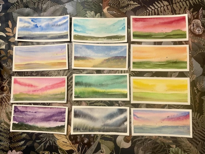
relaxation and letting go, right? We'll create nine landscapes
plus two bonus pieces. I'm so very excited to
see what you create. Each project is
short and sweet and quick for you to get a
break in your busy day, grab your supplies, and
let's jump in and get going.
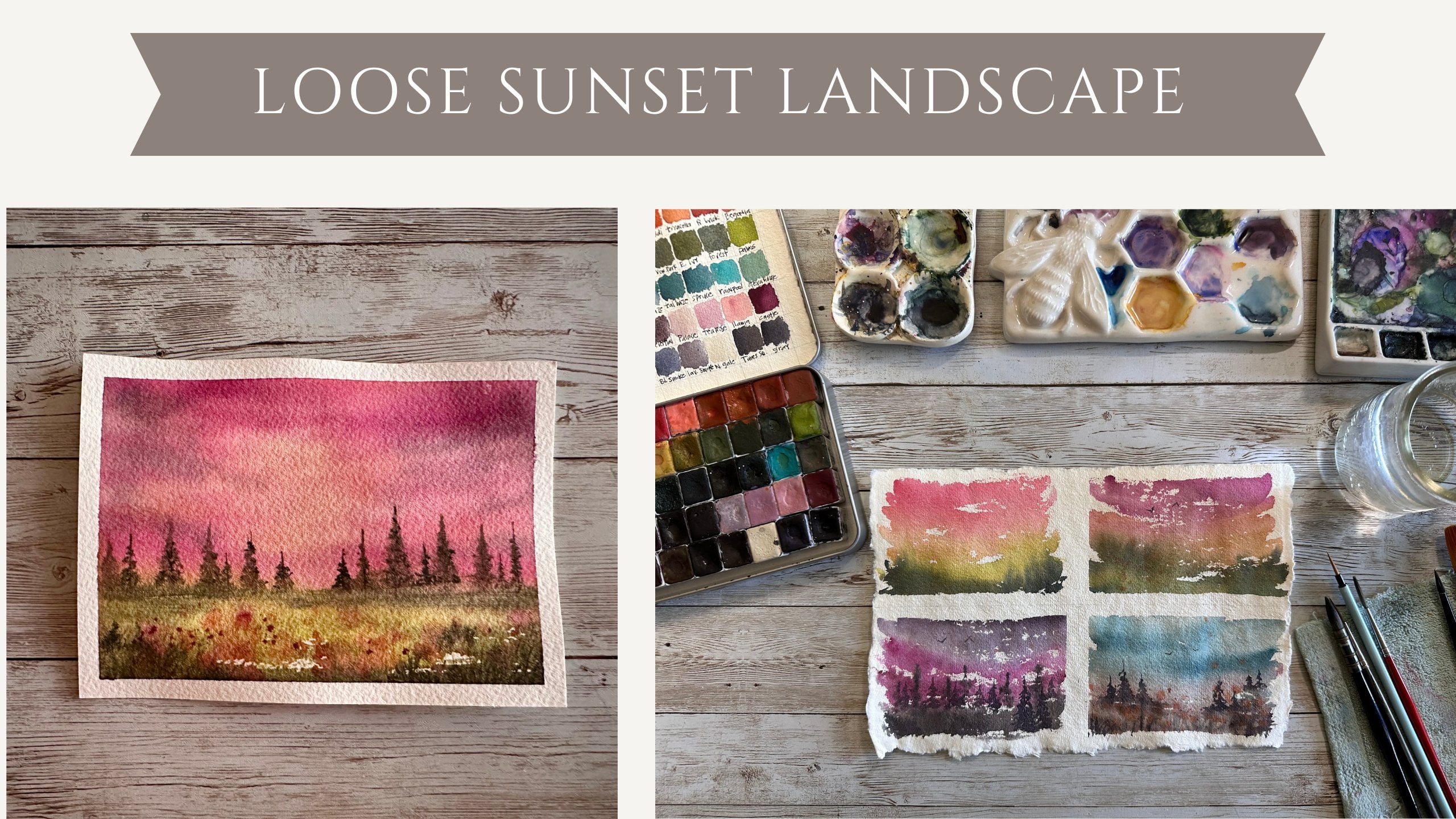
2. Materials & Supplies: For this beginner class, the most important
beginner friendly class. This can go up from beginner to all the way to intermediate. If you just need to
loosen up and let go and explore this class
is definitely for you. But the most important
thing we want to have is 100% cotton. I prefer RS. You can also use
Bow hung meeting. I would also suggest having
an assortment of brushes. The brushes that
I'm going to use in this class are
going to be a mop. I'm going to also
use a round size six and a round size
two and a rigger brush. And they all serve
different purposes, and I will tell you exactly what purposes
each of those serve. Also, what I prefer to
use are handmade paints. I love using handmade paints.
That's my preference. And also, you'll
want to have a rag nearby or some sort of towel
to dab your brushes on. I like to use cloth. I also have this old paper towel that I
use over and over and over. You also will want to have a plexi glass type surface that you can put your
cotton paper on. And you'll also want
to have some tape. My favorite is
Holbein soft tape. This is not hole
bind right here. This is some cheaper stuff
I'm trying to use up, but my preference is
holbin soft tape. You'll maybe want to have
a few shimmers that you can splatter on the double
sided median water vessel. I love this one. It will never knock over because
it's very shirty. I'm excited to get started. One other thing. You
want to have water pets. Water ceramic water port
pets. They can be anything. You can use a plate. Just
something that you can mix your paints in
close to next glass.
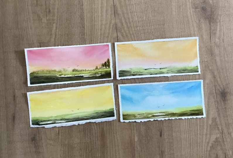
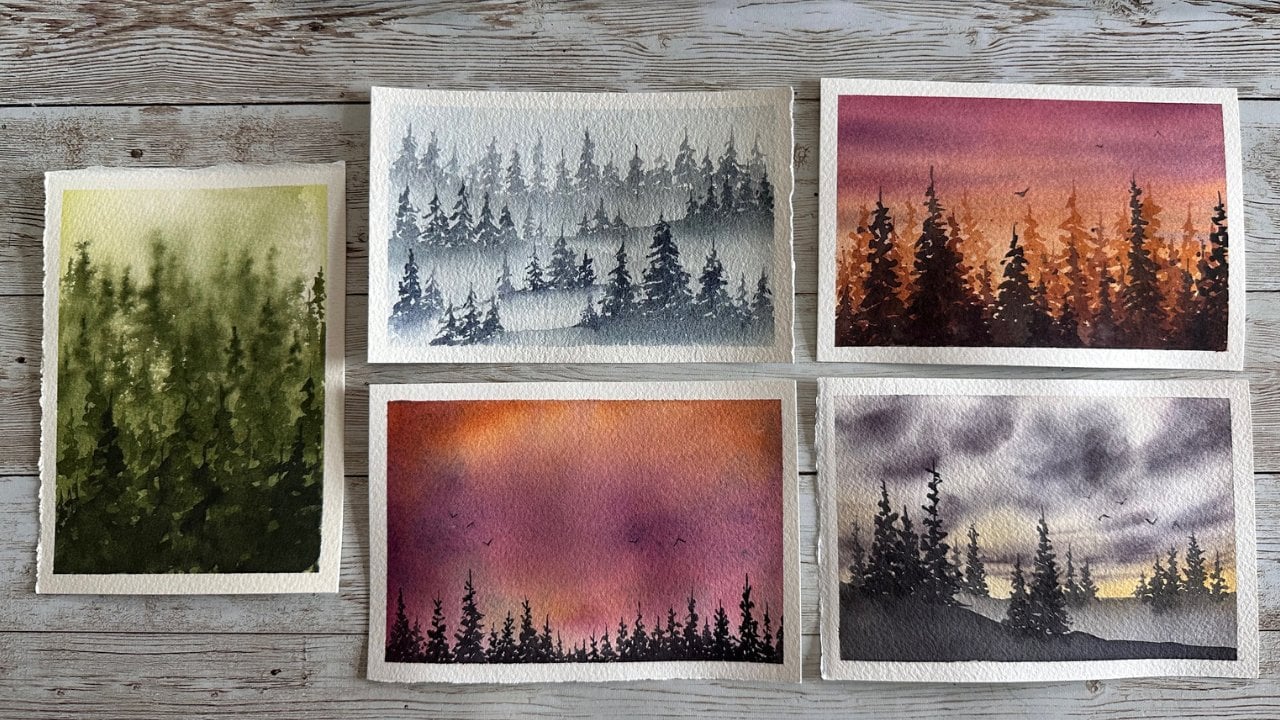
3. Class Project 1: Red: So let's get started. Here's my one eighth
inch plexi glass that I've already shown you. I'm going to use my
100% cotton paper. I'm going to tape it down. I'm going to tape the bottom, then the top and the side to side in hopes that
it won't leak. If it does leak,
it's okay with me. First of all, these are
mostly practice pieces. And if you were to
truly frame something, a mat would cover up. The area with the paint on
it. So it's not a big deal. I do like to make my
edges rather thin, so I have more
space to paint on. But for a different
kind of artistic look, you could definitely
use larger tape or have less or more of borders. It
depends on what you like. You can also use a block here, 100% cotton block, that way you would not have
to tape anything down. It's a personal choice
and completely up to you. My paper is about two
and three quarters. To about 5.5 ". That's my flat wash brush. I'm going to show you my paints. I'm going to use
differ handmade paint throughout each one of these. And I won't nessly call
them out each time. I just want you to kind
of play with what you have and explore, really. So, this one is
going to be our red, and so we're going
to start off with some reddish pinkish hues here. And I'm just mixing rather than using straight
from the pan. I do like to mix on a
palette so that I can vary the water strength and
the strength of the pigment. So you'll see me
dipping into the paint, sometimes directly
onto the paper, and other times you'll see
me dipping into my palette. So I kind of I kind of bounce from those those
ways of doing it. And I'm just adding
different colors. So I added a red, and I've kind of got a more
of an orange or red, and I'll keep moving
slightly through that now a little bit of a coral color. So I went from red to
orange red to a pinkish. And you could do any colors
you wanted to really. But I was going to
focus on more of a rainbow feel for
each of these pieces. So this one does focus on red, which I feel does turn out to be a little bit
pink, but I guess, like Pink is just kind
of a form of red, right? Less pigment, maybe a
little bit of white. I'm going to drop in a little
bit more darker red for the sky to create
kind of cloudy feel, add a little more texture, a little more rusticness and you can really do
whatever you like here. I'm going to use a
little bit of orange, to do the kind of the same
thing and just basically add a little bit more rather because you know when
it's going to dry, it's going to be lighter, right? So this is our opportunity
to add a little bit more. I did not pre wet
the paper here. I sometimes will, in this
instance, I did not. So after we wrap up that
sky and horizon area, we're going to work
on the foreground and the lower portion of
technically the horizon. I'm using an kind of a lighter
green greenish yellow. I like to use that kind of green because it has a
little bit of the yellow in it, and it kind of mimics the feel, the glow of the sky or
the sunset area as well. And then I like to quickly switch to a darker color
for the foreground, leaving a little bit of
that negative space in the middle as sort of a
pathway or maybe it's a river, and it's just
suggestions, right? These are so quick and so loose that really we're
just suggesting stuff. Like see the horizon where the paint starting to
bleed up into the sky. We're kind of suggesting trees
or shrubbery back there. And so quickly, We're going to dry with the heat
tool or you can let it dry. And we're going to
add little birds. I like to use the
Shimoni rigger brush. It is a very, very thin and it leaves very, very
delicate birds. So you're just getting a
more of a hint of birds. Again, a suggestion of
something happening in the sky, your eye leading your
eye is being led to this center with that
weight negative space and those birds and the
horizon color change. And that is it for
our first one. These are quick and these
are pretty swift going. They're very basic.
We're kind just keeping it more so that we
can experiment with colors. And we can explore
different compositions, actually, not so much compositions
to explore the colors. So the colors I used there. I used the reds and the
pinks at the top row, little bit of those
yellows and the greens. And that is it for
this first one. Thank you for joining.
And I hope you explore and use as many colors as you feel like you'd
like to in the sky, so you get a good
variation going. Okay. So again,
I've used this red, red, this other red, a little bit of starting to move into the corals and
then the pinks, and we used a little bit
of an ocher style yellow, and then just dark greens
and spring greens. And that was it for this one. So this was supposed
to be a red pace, and it did turn a little pink, but we did use red. So I think it was a success, and I hope you'd enjoy, and we'll see you
in the next one.
4. Class Project 2: Orange: We are back for our next piece, which is the orange piece. Again, we are going to tape
down top and bottom sides, and then side to side. And we're going to push to make sure our tape here's
pretty tightly. You can see here that I
like to use reuse my tape. I find that tape is a
pretty wasteful thing. I'm not super picky
about my edges. So re using tape for me
is an absolute mess. It may not look as pretty
or professional as some, but you know what, it's worth it for me to be able
to reuse the tape. Okay, so we are using
100% cotton again. I am using my C
Chamoni mop brush, and I am using wet on dry, which means my paper is dry
and that my paint has water. Mixed in with the pigment.
And I am just brushing on a variation of yellows
and oranges here, particularly orange at the top, and then I work my way down
to using a orange yellow. And you can do this
in any way you want. You can go bright orange. You can do more of a peachy orange totally
and completely up to you. I like to use a lot of different colors to get variations. And so now I switch to a coral. Coral is one of my favorite
colors for sunsets. I really love using coral. I think it works really well, especially in oranges and
yellows and with other reds, but particularly here with
the yellow and the oranges. And so I'm bringing it down
pretty far. On this piece. And so basically we are kind
of working on a wet on wet because our piece is so
small and almost you know, almost most of our
work is done when the papers kind of wet
with the previous paint. So here, I'm going back into the upper portion to darken
up the sky a little bit, which you'll see me do
a lot in this series. And, you know, since
these are so quick, we want to make
sure we're adding enough texture and
enough depth and enough contrast to draw our eye and make these a little lee a little bit interest. We also don't want
to underestimate the power of simplicity,
though, right? And the power of suggestion, you'll hear me talk about
power of suggestion over and over and over in this series because I think it
is really important. And I think that's what
helps with the simplicity of these pieces is that we can easily suggest things without
actually painting them. And it's a really it's really it opens a lot of doors
when you learn how to embrace this, I feel. Once I kind of learned that, I didn't have to paint
the perfect tree, it really really lightened the way off my shoulders
and I can go forward. And I didn't feel like I had to do things exactly
the way I saw them, or others did in tutorials
or demonstrations. So I am just, you know, adding some texture and
contrast in this foreground. We did light greens.
We did dark greens. We left some white space. It should be noted that
I was careful not to introduce too much extra
water at this point. I am tilting my plexiglass so that some of that green
goes up into the horizon, so that we do add
some suggestions of trees or shrubs,
grasses or anything. So again, with this Chamoni
rigger brush, it's so fine. I'm just doing those
faint little birds, just two right in the middle. You could do two, you could do 12, you can
do however many you like. I either do two or no dd number, and I think that's just
the perfect little hint. And that's all these
are really going for. You're exploring with color. You're testing out maybe color combinations
that you're unsure of, or maybe you stick
with monochromatic. Really, these are to inspire
you to do what you want. Do you have to do
the way I'm doing? Absolutely not. I encourage you. I really, really
encourage you to try what makes you happy and
what brings you joy. And please post all of that. If you create
something you love, post it, I'd love to see it. So take that tape off. And let's see what we have here. We have a nice look at
that bleed on the horizon. I love those. I live for those. They make me happy. They make
me really, really happy. And I hope you enjoy and I hope it makes you
happy, too. Okay. So that was project number
two. We'll see you next time.
5. Class Project 3: Yellow: Alright. Here we go. Round three Class
Project Number three. This one happens to
be focused on yellow. So, we went from red, orange, and now we're
on yellow skies, and I think this is just
such a fun exploration, and to see what a difference, the tiniest shift in
colors can make, right? Or the biggest shift in colors, and you can see the
dramatic difference. So I am starting with a
few different yellows. Take all the yellows you have, maybe, and just explore, right? There's some warm yellow in there, probably, like an ochre. And there's some cooler
yellows, like a lemon. So when I say, I don't need to use that
word overly use that word. But my handmade colors, I don't often have them, the labels or the names visible. So sometimes I'll
just grab yellows, and that's why I'm saying, you know, similar to an
ocher and similar to a warm. And also, handmade
colors have cut C names. And so I didn't want to
give you the vanity name, and you're like, What is
she even talking about? So warm and cool yellows. You see that I'm layering them. I'm dropping them in.
I'm adding texture. I'm going back to the
top, back to the bottom. And we're already
to the horizon. It really can be that quick.
It can happen that quick. This is a leaf green, a very spring green color, and I'm just letting
it again touch that yellow so that we get some
bleeds going up in there. So we have some suggestions
of shrubbery and some trees. If you hear me repeat myself, I know that some people do you like to skip around for
different projects, you know, if you feel pulled
towards a certain color. So that's why you might hear me repeat myself, some
of the same things. And some of these, I
don't leave white space. I am trying to leave
that white space. So this is a bit of a I
wouldn't say dry brushing, but it's definitely
less water than I sometimes use when I get
to this point when I want to leave a little bit
of the white negative space. But I don't want to
leave it on that bottom. So definitely going
to want to add some darker paint to
that area down there. And I want to keep
that middle light. Do you see how light
in the middle is just glowing? I'm really
striving for that. So a little bit of
dark around the edges, a little bit dark in
those bottom corners, and the way the sky is kind of pointing down
into the middle and the way that foreground and that ground near the
horizon coming up. It's just kind of leading
you there with that light. This one was just kind
of a happy accident. I'd love to say that was
one 100% intentional. But sometimes you just get lucky with how the brush
your hand leads the brush. I'll be honest. I don't think about what I'm
doing a lot of times. My brush just kind of happens, and I've had a lot of practice. So this is dry, and I'm adding my birds once again
with my Chamoni rigor. Again, my favorite brush, love it, just the
most delicate birds. Just adds just a really tranquil
peaceful feeling for me. And, yep, go to remove
my re used tape. I'm going to save it because
once it starts leaking, I'll toss it. But look at that. Those lines look
pre dar and Chris, so I will keep using that
tape until it leaks on me, and then I toss it. But sometimes I'll
get, you know, anywhere 3-5 uses out of it,
and that makes me happy. And I paint a lot. So, for me, it's it really works. It doesn't have to
be for everybody. It's a personal choice, but it's my part, and I do my part. So remove that plexi
and let's take a look. I didn't add any
shim or anything, but I think this is
just really pretty, a really suggestive,
pretty piece, and I cannot wait to see
your version of the yellow. So I will see you
for the next class.
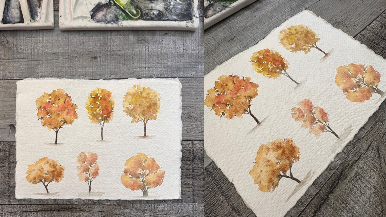
6. Class Project 4: Green: Here we are starting
off the same way. Our 100% cotton paper taped
down to our plexiglass, our one eighth inch plexiglass, super strong, doesn't
warp super nice to be able to tape these
pieces on so that you can rotate the paper, you can rotate the board. You know, you can
put it at an angle 45 degrees if you
want something to kind of bleed or if
you just want to pick it up and be able to sometimes I'll paint
when I pick up. So anyway, taping down the tops, the bottoms, the
sides, the sides. I like to do the toe two tops first and
the side by side one, and I press the tape down. And as you already
know, I reuse my tape. So there we have it, and if you're not doing these in order, it's why you'll
hear me say a lot of the same things twice or three or however many
times you're in the project. So I'm going to use a mop brush. You could use a
larger size round if you wanted.
This one is green. So we are starting
with a green sky. What do you think about
that? Interesting, right? I am using a cobalt greenish. So I feel like cobalt green kind of lends to a bit of
a almost like a blue. I wouldn't say I
wouldn't say it's blue, but it felt more
blue to me than say, using a like a a different
a typical green. So I used this green
thinking that we could just have suggestions again of maybe some mountains
in the background. Maybe that's just clouds. I don't know. It depends. So I did leave some
more white in this one, but I'm kind of
unsure. So we'll see. And at this horizon line, I did paint a line of
water versus more paint. So you can see how
that's bleeding up and kind of pushing
the paint away. I'm going back here again to
a very spring lime green, which has a lot of yellow. So that does help with the glow. So I would probably
highly suggest having some sort of
spring green leaf green, a very yellow green on hand. It is one of my favorite
colors to use since I do paint a lot of landscapes
and a lot of green. And now I am doing
what I always do. I'm bringing in some dark
colors in the foreground. I really love the way
this frames the pieces, and you can see
now, look how much that water is moving
up into the sky. And that's kind of what
I did why I did that. So, if you will, let me call that middle spot the horizon where that water. So I took a clean brush and just swept across with more water
than I typically would use. And so that's leading those fun funky bleeds that some
people would say, Oh, no, I don't want those, but for me, I really love those. And the foreground this time is a little bit of a more
of a rustic olive green, and I'm adding a little
bit more texture. So there's maybe some
patches of grass and some darker s for contrast here. And so I am pretty much following the same
formula each time, right? This one I did finally
splatter a little bit, but I am doing the sky, the horizon, the foreground. And those are all kind of
blurring into basically, you know, two two steps. But I feel like you can really play with these two
steps and alter things. And for painting the same
thing over and over, you're getting drastically
different results, even though you're painting essentially the same
thing over and over. It's just the color can change
the mood so much, right? So I am using a size. I think that's a size two or size zero round
brush to splatter, and I used that gold shimmer to splatter
in the foreground, just to mix it up a little bit and add a little bit of texture. That's a little bit
different. For this piece, I used my handmade Masha paints, and I'm showing you the
coal balt green that I use and the other greens. I love her line of greens. They are amazing. She makes super granulating
handmade paints, and they're just phenomenal phenomenal phenomenal
phenomenal. Okay, I can't say
it. Alright, dry your painting or let it dry. Of course, we're going to add our birds with our rigger brush, just two little
birds in the middle. I think I stuck with two birds this whole time in all
my class projects. I felt like it was just simple enough and just
suggestive enough. And it gets your
practice, right? Doing these things over and
over, builds muscle memory, and it builds practice so
that when you do this again, it becomes easier and easier, right, more fluid
and more natural, more organic and less
trying so hard, right? I remember starting
off and I was always trying so
hard to get it so. Anyway, tape off. Look that. I think it's fun. I think
it's fun and funky, and it's just suggestive
enough that you don't exactly know what's going
on, but that's okay, too. All right. S in the next class.
7. Class Project 5: Blue: I All right. Now that we are on
our fourth one, I feel like this one's
going to be pretty swift. Okay, I'm using a round again, round mop on 100% cotton paper. Papers taped down
to my plexi glass, so it doesn't move around, and
I can move it if I'd like. I am using ultramarine blue and a little bit
of another blue, just to kind of mix
those two together. You don't have to use
these same blues. You can use Prussian. You can use indigo,
you can use Ceron. You could use any
blues you want. Don't feel tied to my blues. But I thought playing with
these different blues, different hues of blues and different variations
is fun, right? Through the darks, typically go near the horizon like I'm doing? Not necessarily,
and that's okay. So I did that, put
those darks there, and then I used kind of
just a wet brush to kind of blur and bring pull that paint down a little bit
to break it up a little bit. Maybe those are
mountains back there. Maybe that's an icy pond,
right? We don't have to know. We can just suggest
these things. And very quickly, I'm going to go ahead and go in
with the foreground. I decided that I didn't
love that green, but I wanted to leave it because I think it's okay to
question the colors you use. That's what we're
doing this for, right? To find what colors work for us, what colors make us happy. What colors make us want to use them again and again, right? What colors maybe
don't work for us. Maybe the colors that we need to mix with
something else so that we like them they're more palable for ourselves, right? We like them more. But again, you got to bring that
dark to the foreground. So a bit of dark somewhere
in the middle of the top and then a little
bit more in the bottom, kind of help ties the
piece together for me, helps me bring it together, helps me kind of
sandwich it, right? Make it makes sense for me. It doesn't mean it has to
work that way for everybody. And these are just quick, loose experimental pieces
just playing with color and trying to be in the moment without
stalling out like I was doing. It was stalling and overthinking
a little bit too much, even though this one
is under 5 minutes, which is I think is
pretty darn fabulous. So these are great if you
just want a little warm up, if you're just wondering
what to paint for the night, if you you know, have a long, busy day, and you just don't have enough
time in your day. You can grab one of
these, grab one of these. You can, you know, pull
one of these up and do one of these little
class projects. Alright, let's go again
with some shimmer. This time, I'm using
my simony round size six to sprinkle on the shimmer. Different size brushes are going to give you different
kind of spatter, right? And that's important for you to practice and decide what
works best for you. But you also want to be careful about not dropping water onto your paper when you're
dipping in and splattering. I often way more
often than to admit, end up introducing more
water splats to my piece, which is unfortunate for
me because you'd think I'd learned by now,
but nope, not at all. All right. So after this,
we're going to dry the piece, and then we're going
to add our birds. You know, I love
my birds by now. So I'm going to use again
my Chamoni rigor and just do these little
light suggestions. You can put them anywhere. You can put them up high,
you can put them low, you can put them
off to the side. You can make 13 birds, or you can make no birds. You do what you want. Okay. There we go. That
is it for this one. It was really, really quick. And I wanted to make these
accessible for people on a time time crunch or just to get you playing with
color. That's it, really. And there we have it. I hope you enjoy this one. I look forward to
seeing this one and your versions and your color and see what you end up doing. So, right, we will see
you for the next class.
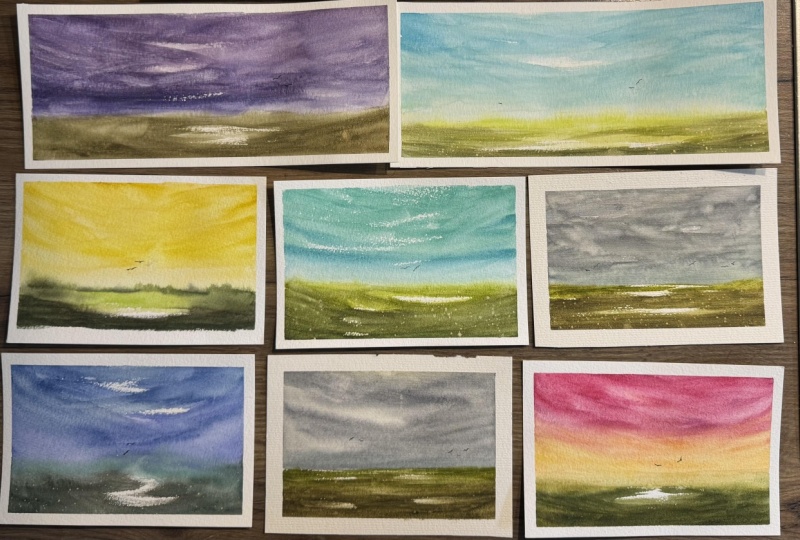
8. Class Project 6: Blue Violet: All right. Welcome back to
Class Project Number six, another quickie here, and I wanted to show you a variation with a slightly different blue. And we're going a little
bit lighter here. It's actually an
ultramarltra Marin violet. So it has more of
a purple hue blue, but it just goes to show how
many different variations, which we all know, right? But you can make so many
different variations on your skies and adding
so many different texture. So I'm using the
mop brush again. I like to sweep from the
sides inward and Hopefully, that creates the illusion, the suggestion of clouds
of movement, of the sky, not being just stagnant, but maybe of it changing
or flowing with the atmosphere or maybe it's
more of a windier evening, you know, just to
give it something to think about versus just
a flat perfect wash. I'm not always a huge fan
of flat perfect washes. They do have their
time in place, and I do love how
pretty they can be, and especially a gradient that is perfectly executed, right? And there is definitely
a time in place. Like, if you're doing that
with some trees, beautiful. But in this piece, I invite you to add the texture to play with the brush
strokes, to just explore. And so here we are again, I was that quick, a very, very quick sky and a very,
very quick foreground. Again, with the lighter at the horizon, a little
bit of darker. Now, this combination, I
don't absolutely love. So maybe you could tweak yours to incorporate a better
color combination. I love the ultramarine
violet in theory. I don't love the greens that I chose to pair with
it necessarily. And I am going to leave
this because I want you to know that it's okay if
you don't love something. And maybe it adds
some depth, right? Maybe those green hills are a little bit farther back there. But adding a little bit
of dark at those sides, maybe we'll help kind of
pull it in. I'm not sure. I do almost really like
the negative space, though going on in
the foreground, and almost looks like
a little zigzag, maybe a little waterway
going through. But I'm going to leave it. These are just
meant to be quick. They're meant to be done without too much thought
or over thinking or trying to overwork stuff like we typically might want
to try to do, right? We might want to go in and
try to fix everything. These are meant to just invite you to explore, invite
you to experiment, invite you to play
with your brushes, and just kind of it down, get it down, and get it done. And not that you're trying
to rush through it. Just that you're trying to
be less indecisive, right? Try to just be there and be
in the moment and get done. Okay. So, Those spotters
went a little crazy there. So I just wanted
to kind of s mere them in a little bit
with my round size six. And I do need to get this
dry. So we're gonna dry. And of course, we're
gonna add our birdies. So there we go with the
Chamoni rigor again, and those suggestive
suggestive birds, a little hint of bird there. And I Oh, when I do this, I'm usually using maybe
a brownish blackish mix. Maybe I'll use whatever's
in the palette and just mix the darkest
one and use that. And you don't go heavy
with the pigment. So it's more of a watery but
not super watery, right. You don't want your birds
to faded at nothing. You want them to be, you
know, visible after they dry, 'cause of course
everything dries lighter. That's it for this one. I don't end up not liking it as much as I thought I
wasn't going to like it. I didn't think I'd like
those colors at all, but, you know, surprisingly, it
surprised me and I do like it. It's not so bad, but, you know, these are just meant to really, really get you to explore. So, again, I'm
excited to see yours, and we'll see you
in the next class.
9. Class Project 7: Aqua: Hello, welcome back for
Class Project Number seven. We have taped our paper
down onto our plexi. We are using a
round a mop brush, not around, I'm
sorry, a mop brush, and we are playing
with some Aqua, some tii cobalti
turquoise colors. And I don't say the
specific colors because I want you to explore
your own colors, right? I want you to use
what you have so that you can adapt to what you have and be able to
use what you have instead of wishing you had
something else, right? I went through so many
tutorials thinking, Well, I wish I had the
colors they're using. That's all I want. And I hyper focused on
that idea of having those exact colors because I thought it had to look
like their piece. Come to find out. Obviously,
it doesn't have to. It's more fun when
it doesn't, and it's more fun when you can
make it your own. So again, I'm playing with
the textures in the sky here, adding more pigment in places, and I like to bring
that horizon down with just kind of a wet brush
with a light amount of a lot of light amount of paint so that we
can kind of have the sky and the
horizon or the horizon and the foreground touch and have a little bit of magic
happen where they meet, right? We want a little bit of
that foreground to make its way into the sky so that we have a little bit
of texture back there, a little bit of
suggestion of greenery, of shrubs, of
anything back there. And so that's why you'll see me playing with
this lighter color. This is a more of a mint
color handmade paint. It's a really pretty blue color. And so now I am
again playing with some sort of lighter
green leafy green, spring green, and just
letting it touch that blue. And I love what happens. I can use these greens all day every day,
and I kind of do. They are my favorite
favorite greens. And so I am leaving
negative space again here, and you can see the
brush skipping over the paper and leaving
those white spaces. And I love that about RS paper. It leaves that texture. And so you don't have to
even make much effort to get that negative space
there because rs just has that perfect amount
of texture of the paper, that tooth so that you know, your brush skips right over it and leaves
that space for you. It really does all
the work for you. Between good brush, good paper. And some amazing paints you set. But really, the most
important thing is, make sure you're
using 100% cotton when you're creating these
pieces when you're playing, when you're learning, 100% cotton is really,
really important. Even if you are brand
new to watercolor, use the good paper. If you want to cheap out on paint brushes or paint
themselves, do that. But don't cheap
out on your paper. And don't think you're not worth it, and don't think, like, Oh, I'll use it when
I'm better because The paper makes you better. I promise it makes you better. I got a piece of hair stuck
in my work right there. Trying to dig it out
and in doing that, you can see I left a I dug out some of my
pigment, my paint. And so it has a spot there. So I'll have to fix that. Or I can I can leave it
does if it bothers you, fix it, if it doesn't,
you can leave it. It's kind of a personal
preference kind of thing. I don't like to leave the
hair because it or the fuzz, because it will leave a mark
on the paint sometimes. So let's splatter with
my round size six again. Adding a little bit
of color there. Just to add the texture, nothing major or big. And after that,
we're going to use my heat tool and dry it up. You can let it dry if you
don't have a heat tool, but this is the best $10.99
I've ever spent on Amazon. So I would highly recommend it. And again, here we
are with the birds. We're just going to do two
little suggestions of birds off a little bit off to the right from
the center this time. And I just love the way
the light is on this one. These are so much fun
to explore the light. I love doing that, like,
less pigmented middle part. This one is a little
divided, but that's okay. The colors make
up for it for me, really, really pretty colors. So I do suggest that you explore this kind of rainbow
color feeling thing. I think it adds a lot of invitation to play
and invitation, just kind of have fun with it. I really do love how
that one turned out, and I am very excited
to see yours, and I hope to see them
in the project section, and I'll explain how
to do that all later. So, see if for the next class.
10. Class Project 8: Purple: Welcome back. Let's get on
with our next class project, which is going to be purple. I am using a darker purple here. You are absolutely free to
use whatever purple you like, mix your own purple, use a
convenience color purple. Convenience color just means color that's already mixed up. I love to use
convenience colors, but I also like to mix in other convenience colors and other single pigment
colors. So I use them all. I love to mix them all. I love to add the variations of all the pigments
in the textures, pigments, the different
pigments add to the textures. And so for me, it's just
fun to play with a lot of different colors and making sure that I'm mixing those up, right, because if I used the same purple
in the whole sky, it wouldn't always be as fun. It actually can be really effective if you have
granulating colors and you're using different amount of different hues and different amount of
pigments in your colors. So you can do a very successful
very successful piece of art, not saying
that you can't at all. But for these, I do like to drop in a lot of different
colors since they are so quick and we're not
doing necessarily that build up of layers, right? So I'm quickly adding the
foreground and again, with that water layer
so that the green will kind of be drawn up into that water near the horizon and introduce some sort
of suggestive shrubs, or maybe it's a wetlands. Maybe it's a meadow.
We don't know. We don't have to know. It can be whatever you want it to be. I am using a mop brush
again for this one, and I'm going to add a
bunch of not a bunch, but I'm going to add some dark
color to the bottom here. I'm going to retain some
of that white space. And I just want
to make sure that I leave that light
in the middle. So our eye is drawn. In and back, and sort
of through the picture. It makes us think like, Okay, we can there's more to this other side of
the world, right? There's more to this
side of this wetlands. There's just more
more in general. And that this isn't
just it, right? There's always. There's
always more to life. And so that is kind
of it with this one. I just wanted to keep
it really simple. I'm going to add some dark. I felt like it was
lacking a little bit of contrast in this
foreground I created. So I'm using a color
called tree bark. It's kind of it
is a green brown. And so I just added a little bit on the sides just to kind of to force the eye
in a little bit more. So, here we go with the
splitter again, because by now, you all know that I'm quite
obsessed with splatter, whether it's shimmer
or whether it's a yellow to contrast with green. It's kind of up to you,
use what you like. If you don't have shimmer, you can use water splatters even. You can use white paint. You can use whatever you like. It doesn't have to be shimmer, and it doesn't have to be Anything that I
call out, right? If you don't want
to, don't do it. Absolutely 100% skip it. We're going to go ahead
and dry so that we can do our birds because we don't want to introduce our bird on top of
wet sky, right? Then we'll just end up
with a bleedy mess. We don't want that. So again, with the rigger brush using that to make my
tiny little birds, my tiny little V
bird suggestions, they really are just
a V. That's it. That's what keeps
these birds so simple. And we're going to
take the tape off, and we have a really, in my opinion, a really
pretty and simple piece. And that's what these are all about just pretty
and simple and just exploring the colors that
you already have and trying to see what you can do on
your own with your own stuff. And that's that. I think this would also be awesome
if some trees added in. But for now, we're leaving these really simple and
we're leaving them as it is. So I hope you enjoy this one, and we'll see you
for the next class.
11. Class Project 9: Pink: Here we are back for Project Number Class
Project Number eight, and we are doing pink. I'm using more of
a magenta pink. You can use a softer
pink if you prefer. You can use a more purple pink. You can use whatever
kind of pink you want and just play with
whatever ones those are. You can add more water to
your pink. You can add less. You can make it
really saturated. You can not. It's really,
really up to you. I don't want you to feel
obligated to do as I'm doing. Or do exactly what I'm doing. I want you to feel that you have permission to explore
and that you have permission to play with
the colors that you have so that you become more comfortable with
the colors that you have, not the colors that, you know, maybe somebody else has. Because you're going
to ultimately, you want to use what you have. At least that's
how I feel. And I wish someone had told me that. Instead of trying to buy all the colors and all
the tutorials, ended up with way too many
colors that I don't even use. And or necessarily
even love, right? Because you can pretty much make any color you want and you can use any
color that you want, and it'll be very similar
to another color. You know, so I want you
to use what you have. Okay. After that quick sky, which is very quick. And what was that under
a minute for that sky? We're going to move
onto the score ground, and I chose kind of a
brighter Vortian style green And I'm tilting my board
right now to the top. So that the green runs
into the sky and creates, again, those suggestive shrubs or trees back in the
background near the horizon. I decided to drop a little
bit of the brighter grain since I did not use it closer
to the horizon on this one. So I decided to drop it in now, and then I'm going
to add a little bit more dark to the bottom to kind of sandwich that
green in the middle. So it's not just popping out
of the front for no reason. So it's going to add some depth hopefully because we got
the dark in the front, and then we're moving towards the midground of the foreground to the lighter and
then the dark again. And then the light at
the back of the horizon, I feel is another point
to draw the eye into. These little spots of
highlights of lights light. I feel kind of help make these little mini pieces
successful, right? Because there's
not a lot to them. Let's be honest, right. They're pretty simple. They're
pretty straightforward. They're really just a lot
of playtime for us to sit down really quickly and
maybe pop out three or four. Maybe you could do four
versions of each color. Totally up to you.
Alright, so dry, let it dry or use a heat tool. More splattering because
I love splatter. Splatter just doesn't
get old for me. If it does for you, you
can obviously skip it. Skip anything you don't like. If you don't like it, just leave it out, take what you like, leave the rest, and that is pretty much for
all of life, right? I think we learn that
the older we get. You just need to leave some
stuff out of our lives. Because it just isn't
worth it or doesn't suit us or it doesn't serve us, and we just need to get better about just
leaving that there. Alright, I am going
to dry my splatters just so I don't put my hand
in them when I do my birds, 'cause I do have a tendency
to do that sort of thing. And again, I'm using my
rigger brush for my birds. I'm using a watery mixture of a dark color from my palette. And I'm Joy going to do these little V shaped
birds, and they're all vs. I don't make any upside
down vs. You can, if you'd like, you
know, 'cause birds do alternate the way they fly. They're not always
a V, like mine are. And I'm not a realistic painter. And that's okay. You
don't have to be either. Or you can be. Whatever. Whatever you like, whatever you enjoy. Whatever
makes you happy? Oh, look at me
adding more birds. This is the first one.
I've added three birds. I do like odd numbers, so. I added that third bird, and let's take the tape off. My tape is still holding strong. Look at that tape. Go. No bleeds under
there. Pretty darn impressive for used tape, right. And even if they did bleed, if you wanted to matt it or frame it, you would
put a framer on it. So I do like the rough edges of this sh paper that I tear
that I cut up myself. I use big giant sheets. So that was it for
this pink one. Excited to see yours in
the class project section, and we'll see you
for the next class.
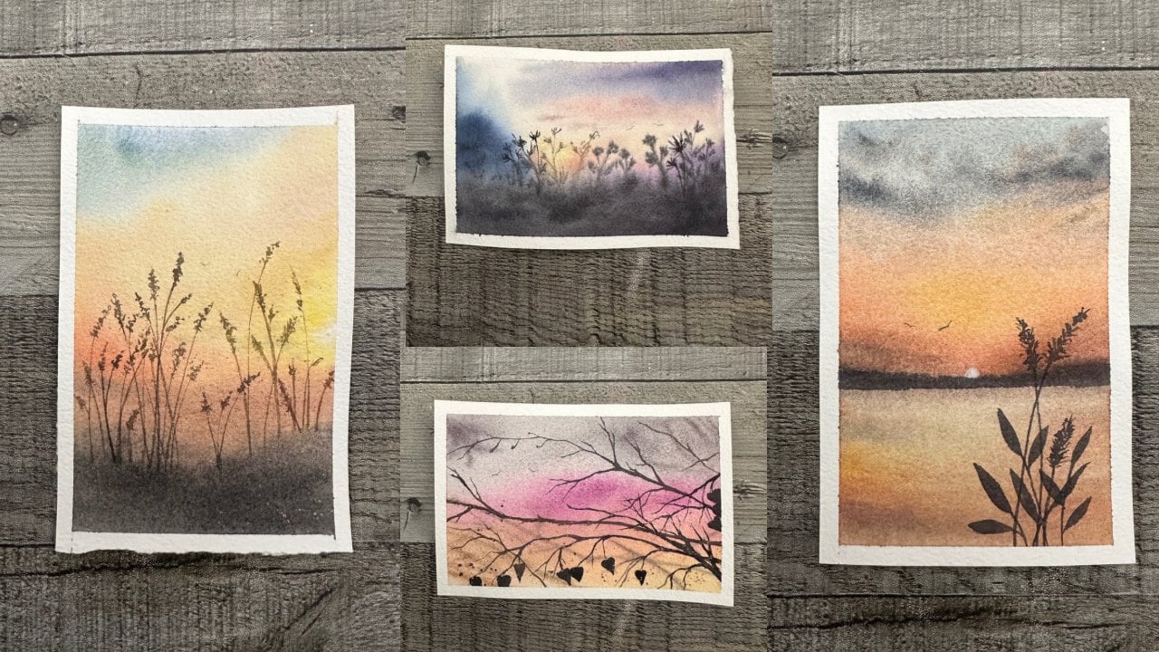
12. Bonus Project 10: Gray: Okay, truth be told, these pieces started off as original project
class pieces. But as I went, I
did two of these, and they both had
mishaps in them. And so I thought I'd share
them with you as bonus pieces. So what I am doing here is
I'm painting a blue sky. So this was going to be
one of the blue pieces. And you'll see quickly that
I had a little mishap. And Rather than just toss it, I wanted to show
you what could be done if you have one of
these mishaps, as well. I have these a little more
often than I'd like to admit, and you think by now
that I maybe would not. But again, I continue to
have them. And that's okay. I take it as a
learning experience, an opportunity to embrace and an opportunity to see how I can rescue myself in my
own situation, right? And so I take this
opportunity too, again, I'm just playing
with these blues here and maybe adding mountains. Maybe these are skies,
maybe not skies, but maybe those are
clouds that one on the left might be a mountain, a little range in which it
looks like it could be. And so here I go
with a little bit of a blue green background to mix
it up a little bit, right? But I do want to keep
that light in the middle. So I'm not going to add too much pigment in
that middle area, just so the light
hits right there where I left that little
bit of negative space. We're going to add the dark in the foreground just to kind of, you know, make your
eye go in the middle. A little more dark
on the edge there. I am quite obsessed
with doing that. As you know by
now, since this is the tenth piece we've worked on together so far in
this little series. And so I kept the little
white area, again, the negative space, and just wanted to make sure that I need to yeah, I
needed to do that. I needed to be a
little bit less. So if you end up with too big
of a space. Did you see it? Do you see it? It's getting
bigger. There it is. And I don't notice it quite and you'll see them when I
notice I was like, Oh, no. Because it's spread so slowly, Wham O. What a way, too. I drop another water
spot. That's what I do. So right next to that one, I drop another water spot, and I kind of play off and I realize that I'm going to
make these into trees. And so that's why I put
the second water drop. Should I have done a
third probably because I prefer things in thirds
rather than twos. But I'm letting the
water do its thing, and I wanted to show
you as it spread out and what we end up with. So that's what we end up with. I'm going to take my rigor, and I'm going to add a trunk, and I'm going to kind
of let that trunk bleed into that tree that's
already kind of wet. And so that helps just
diffuse everything and kind of gives the branches a chance to give some
coloration, as well. That's how I work those trees. And so I will add a little
bit more color in there, which you could technically
leave it like this. It's kind of like I don't know, kind of a ghost
tree, if you will. It's definitely a
different kind of look. But I'm just slowly adding branches with this
really tiny rigger. It doesn't hold a lot of paint. So I'm just going back and
forth and having to, you know, re dip, grab some more
paint, grab some more water, and just kind of have this mix, dance of enough paint on my brush to get what
I'm even looking for. And I'm not sure the proportion, the perspective the
sizing is right on these. I probably should have gone a little maybe a little more
sturdy with my trunks, since we're kind of I
feel like it's closer up than that I'm
showing it as to be. That's okay. Again, this is all play and
just practice and trying to just adapt to things
quickly on the fly, right? And I feel like that's
a big part of my art, especially since my pieces
aren't necessarily, you know, three to four to five hour pieces or they're not, you know, weeks and weeks
of work put into them. They're just these
quick intuitive. Fast, you know, on your feet, kind of adapting
as you go pieces. And I love that. I enjoy
that instant gratification. I don't think working on
pieces for hours and hours, the tiny detail, you know, days and days on end would be as satisfying to me as these
style that I do are. And maybe down the road,
maybe I'll enjoy that more, and maybe I'll adapt. And
maybe that will be my thing. But for now, I love these
kind of quick and loose. Mythical, fairy
tealish story tale, storybook sort of
feeling pieces. And I think they're a
fun escape from reality. I think they're great,
and they're therapeutic. I find that they just really help me kind of let go in life. You know, I already have
a lot of things that kind of are not flowing as easy. So, We're going to
dry those trees, and we're going to
dry everything, and we can add our birds. And at that point,
after we add our birds, we can kind of re
evaluate if we want to enhance those lollipop
trees or leave them as is, kind of up to you,
what you decide to do. Do I love mine? Not
really, necessarily, but I did want to share how the adapting part took
place on this piece, and I wanted to, I guess,
kind of see what you thought. They are a little round for me, I like my old school
style lollipop trees, and I did add a few
more birds on this one. So also, that was kind
of fun and different. I'm liking the
light on this one, but my trees do kind of look
like they're sitting on top, and I'm not sure I'm
a big fan of that. So let's add a little bit of splatter to kind of mix
this up a little bit. Maybe that will help.
Taking my round size zero, which is a little too
small for splatters. But I thought we'd add
a little bit there. And let's go ahead
and get the tape off this and see what we think and see why this ended up
as a bonus and didn't stay in the original
class project section. I think that
exploring, you know, making your errors turn into, you know, learning
experiences is the way to go. So If you try some
water dropped trees. I'd love to see them in
the class project section. If you skip this, I completely understand as well, but I think it would be fun
to see your water dropped trees or even if you don't
make the water drop trees, just to see how your
colors work together. All right, we will see you in the last class, very soon here.
13. Bonus Project 11: Bright Pink: Okay, truth be told, these pieces started off as original project
class pieces. But as I went, I
did two of these, and they both had
mishaps in them. And so I thought I'd share
them with you as bonus pieces. So what I am doing here is
I'm painting a blue sky. So this was going to be
one of the blue pieces. And you'll see quickly that
I had a little mishap. And Rather than just toss it, I wanted to show
you what could be done if you have one of
these mishaps, as well. I have these a little more
often than I'd like to admit, and you think by now
that I maybe would not. But again, I continue to
have them. And that's okay. I take it as a
learning experience, an opportunity to embrace and an opportunity to see how I can rescue myself in my
own situation, right? And so I take this
opportunity too, again, I'm just playing
with these blues here and maybe adding mountains. Maybe these are skies,
maybe not skies, but maybe those are
clouds that one on the left might be a mountain, a little range in which it
looks like it could be. And so here I go
with a little bit of a blue green background to mix
it up a little bit, right? But I do want to keep
that light in the middle. So I'm not going to add too much pigment in
that middle area, just so the light
hits right there where I left that little
bit of negative space. We're going to add the dark in the foreground just to kind of, you know, make your
eye go in the middle. A little more dark
on the edge there. I am quite obsessed
with doing that. As you know by
now, since this is the tenth piece we've worked on together so far in
this little series. And so I kept the little
white area, again, the negative space, and just wanted to make sure that I need to yeah, I
needed to do that. I needed to be a
little bit less. So if you end up with too big
of a space. Did you see it? Do you see it? It's getting
bigger. There it is. And I don't notice it quite and you'll see them when I
notice I was like, Oh, no. Because it's spread so slowly, Wham O. What a way, too. I drop another water
spot. That's what I do. So right next to that one, I drop another water spot, and I kind of play off and I realize that I'm going to
make these into trees. And so that's why I put
the second water drop. Should I have done a
third probably because I prefer things in thirds
rather than twos. But I'm letting the
water do its thing, and I wanted to show
you as it spread out and what we end up with. So that's what we end up with. I'm going to take my rigor, and I'm going to add a trunk, and I'm going to kind
of let that trunk bleed into that tree that's
already kind of wet. And so that helps just
diffuse everything and kind of gives the branches a chance to give some
coloration, as well. That's how I work those trees. And so I will add a little
bit more color in there, which you could technically
leave it like this. It's kind of like I don't know, kind of a ghost
tree, if you will. It's definitely a
different kind of look. But I'm just slowly adding branches with this
really tiny rigger. It doesn't hold a lot of paint. So I'm just going back and
forth and having to, you know, re dip, grab some more
paint, grab some more water, and just kind of have this mix, dance of enough paint on my brush to get what
I'm even looking for. And I'm not sure the proportion, the perspective the
sizing is right on these. I probably should have gone a little maybe a little more
sturdy with my trunks, since we're kind of I
feel like it's closer up than that I'm
showing it as to be. That's okay. Again, this is all play and
just practice and trying to just adapt to things
quickly on the fly, right? And I feel like that's
a big part of my art, especially since my pieces
aren't necessarily, you know, three to four to five hour pieces or they're not, you know, weeks and weeks
of work put into them. They're just these
quick intuitive. Fast, you know, on your feet, kind of adapting
as you go pieces. And I love that. I enjoy
that instant gratification. I don't think working on
pieces for hours and hours, the tiny detail, you know, days and days on end would be as satisfying to me as these
style that I do are. And maybe down the road,
maybe I'll enjoy that more, and maybe I'll adapt. And
maybe that will be my thing. But for now, I love these
kind of quick and loose. Mythical, fairy
tealish story tale, storybook sort of
feeling pieces. And I think they're a
fun escape from reality. I think they're great,
and they're therapeutic. I find that they just really help me kind of let go in life. You know, I already have
a lot of things that kind of are not flowing as easy. So, We're going to
dry those trees, and we're going to
dry everything, and we can add our birds. And at that point,
after we add our birds, we can kind of re
evaluate if we want to enhance those lollipop
trees or leave them as is, kind of up to you,
what you decide to do. Do I love mine? Not
really, necessarily, but I did want to share how the adapting part took
place on this piece, and I wanted to, I guess,
kind of see what you thought. They are a little round for me, I like my old school
style lollipop trees, and I did add a few
more birds on this one. So also, that was kind
of fun and different. I'm liking the
light on this one, but my trees do kind of look
like they're sitting on top, and I'm not sure I'm
a big fan of that. So let's add a little bit of splatter to kind of mix
this up a little bit. Maybe that will help.
Taking my round size zero, which is a little too
small for splatters. But I thought we'd add
a little bit there. And let's go ahead
and get the tape off this and see what we think and see why this ended up
as a bonus and didn't stay in the original
class project section. I think that
exploring, you know, making your errors turn into, you know, learning
experiences is the way to go. So If you try some
water dropped trees. I'd love to see them in
the class project section. If you skip this, I completely understand as well, but I think it would be fun
to see your water dropped trees or even if you don't
make the water drop trees, just to see how your
colors work together. All right, we will see you in the last class, very soon here.
14. Final Thoughts & How to Post: And we did it. Congratulations.
I'm so proud of you. These are so much fun. I love painting these loose landscapes. I love playing with
the different colors. Even if we did stick with
the same composition. I think it's really fun,
and it's really neat to see all the different
variations that you can get by simply
playing with color. I can't stress that
enough, right? Different brushes,
different different colors. I do highly recommend sticking with the
same cotton paper, the 100% cotton paper. But gee, just by changing
up these colors, you just can change the
mood of an entire piece. And also, I'd love to
hear in the discussions, which color was your favorite. Which one was your favorite? Which one was your
favorite of mine, and then which one was
your favorite of yours? Which color mixes did you
enjoy painting with the most? I'm super curious. I'd
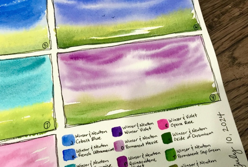
love for you to post them in the projects section. So I will tell you about
how to do that here in a minute after we look at these colors because I
think there's so much fun, especially seeing them all lined up in a little
rainbow like that. It was just a fun
little project, and I hope you enjoyed
it as much as I did. Even with my two errors. I still had a lot of fun. So I'd love for you
to take a picture of your project and post it in
the projects and resources. You click on the image and
you can upload the image and you can write a little description, and
then you just publish it. It really really is quite easy. You can slow this
down and pause it. I'll also add a little
picture of this in the resource section
under to the resources. And I'd love also if you
wanted to leave a review, it really helps
helps me improve. And that's where I was
saying, if you have a question, if you
have a comment, you want to start a discussion
about anything at all, feel free to reach out to me. I welcome all and any of that. So I thank you so
much for joining me, and I can't wait to see you
next time. Bye for now.
 Amber Lane, watercolor landscape artist