Transcripts
1. Introduction: Hi, Welcome. Hello,
Hello, Hello, I am so excited to be painting four sunset landscape pieces from four different
reference photos today. These lessons will be kind of short and sweet
so that we can keep things simple and as
frustration free as possible. We'll get to focus on keeping
things fun and loose and kind of maybe taking our own adventure versus
being tied to what we see. We'll go over some
color choices and we'll see if sometimes
we'll have to pivot. So we'll see what
happens when we have to change our ways and try
something different. We'll play with composition. We'll be adapting to some maybe choices we're going to make within
these photos. And I want mostly you just to have fun. I want you to explore. I want you to use these reference
photos as a suggestion. A suggestion and an
invitation to have fun. We'll go over some ways that we can make landscapes a
little more doable, right? So that they're not
so overwhelming. When we see these
reference photos, we don't get so scared. They're like, oh,
don't know what to do? How do I approach this? And we'll make sure
that we're having fun. Because I'm a firm believer that watercolor is
very, very therapeutic. And I want to share
that with you. I want to show you that it can be fun and it
can be carefree. And we can just embrace
the challenges. We can change our
minds if we need to. And we can play with different colors and different
ways of doing things. And there are no rules. So I'm hoping that you'll see these reference photos and at least one of them
will intrigue you. So grab your paints
and let's get started. I'll see you next lesson.
2. Class Description: Welcome back. I just
wanted to talk a little bit more about what
this class will be about. We are going to take
four reference photos and make them ours. We're going to explore, we're going to look
at these reference photos and decide what we like, what we want to add, and
what we might leave out. What calls to us, what works for us, what
doesn't work for us. We'll talk about
techniques and how we're going to paint our skies
and our foregrounds. We'll talk about how
to add our mid ground. And then we'll finish
up with some details. And I just want you to remember that they don't
have your pot photos, don't have to look like these. They can veer. You don't have to stay on
this railroad track of how to do something or how you think you should
be doing something. Just because someone
is doing it one way. You have the opportunity
to explore and create your own journey
and follow that path. So by the end of this class, I hope that you'll
have four projects. Whether they're my references
or other references. You are actually open and free to choose your
own if you prefer. But I would love to see you post four projects that you chose. And I'd also love to see the
references, so please share. And you can also
start a discussion or ask some questions if
you have any of those. And I am just really
excited to see these all together and to see the techniques that
you choose to use or maybe ways that you haven't thought
about trying before. Maybe there'll be something new in here that you'll be like, oh, I need to try that way. I have yet to do
that. Or it'll be just a reminder that maybe
you haven't done it that way. Or just an invitation to
practice some things that maybe you haven't
been painting lately or maybe that you've
been intimidated by. So I am super excited to
see what you come up with and I'd love for you to share them in the class
project section. There'll be plenty
of instructions at the end of how to do so. And I really hope
you'll join me. Enjoy, and I'll see you
in the next lesson.
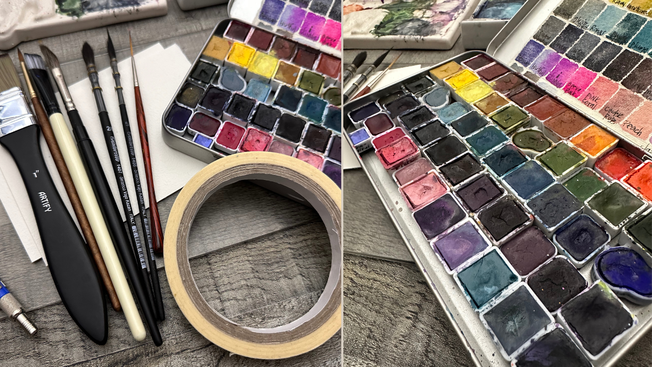
3. Materials & Supplies: Let's talk supplies.
The first supply, the most important
supply ever, ever, ever, is 100% cotton paper. This is Bauhung paper.
I also use Arch. The next supply that
we'll need with our paper, we'll use some tape. The next supply with
that is our plexi glass. You don't need a plexi glass, you can just tape
directly onto your board. You can tape onto cardboard. You can tape on
anything you like. We do use a little bit
of bleed proof white. You don't have to
have that. You can also use a white guash. We have a titanium
white from M bran here. I do like to use a flat wash. I like to use some sort of
round using a flat brush. You'll see me use a dagger. You'll see me using this
mop style kind of liner. And you'll also see me using this liner which
I dubbed my bird. My bird liner. Okay. Also in addition to
this, I always have a soft cloth nearby to
wipe and blot off paint. Also, to rest my brushes on, I will have a spray
bottle full of water. Any spray bottle will work. I will also have a clean cup of water. This is
a handmade one. I also have my palettes in
front of me for mixing, So this is one of my mixing
palettes. I do not wash them. I keep them dirty like that, so that I get a
fun mix of colors. I have another, so that's
three clean mixing wells. And then one of the
most important ever, ever, ever, ever, is paints. I love to use handmade paints. These are my Masha
handmade paints. I will also touch a bit with Steak Stacy's from Steak
Kiwi, her handmade paints. And I also use Addison. I do use a lot of
different paints and these ones because I feel
you can use what you have. Another one I use, I used, and this one, this is
for my portable palette. These are American
Journey and Da Vinci. If you have any
questions in regard to supplies, ease, reach out. Or you can also start a
Discussion and Discussions tab. And I'll be happy to help and maybe explain
more of what I use. So let's get started.
4. Warm up: Color Swatches: I do typically gravitate
towards handmade paints, but I thought I'd share
with you this palette. I put together, I filled the half pans with paints from Da Vinci in
American Journey. They're just colors
that I picked out that I thought would be nice
to have in a palette. So if you had something
around these colors or if you weren't sure what colors would be helpful in a palette,
this is pretty much it. You know, I pick a
pretty well rounded, basic color, set here. A warm red, a cool red, some yellow, some blue, some purple, some greens. And at the last one I pick a buff titanium that's
tinted with blue. And so that could be
really amazing with skies. And I just want you to
explore the colors you have, so I won't get
caught up in telling you each color is
in this palette. But I did want to share
with you that you don't always have
to use handmade. You don't always have
to use commercial use. What you have, use
what you like, what you gravitate towards,
what makes you happy. The colors you know
that excite you. The colors that you
happen to know, that you kind of lean towards or that you just feel
really warm towards. Right? You want to work with
things that make you happy. It's also important to
work with, I think, a well rounded palette at
times so that you can push your boundaries instead of maybe gravitating towards the
same colors all the time. But I think both can be nice. It can be nice to
try things that you're very comfortable with or try things that
are new, right? Not try things, but use
things that you're very comfortable with and then trying stuff that is new to you. And so I just, again, wanted to share this palette
with you because I enjoy putting colors together and deciding
what would work. So this palette was
put together so that I could use it plain
air, outside painting, and I would have enough
colors to get me through painting a typical
landscape that I like. So I hope you find
colors you love to.
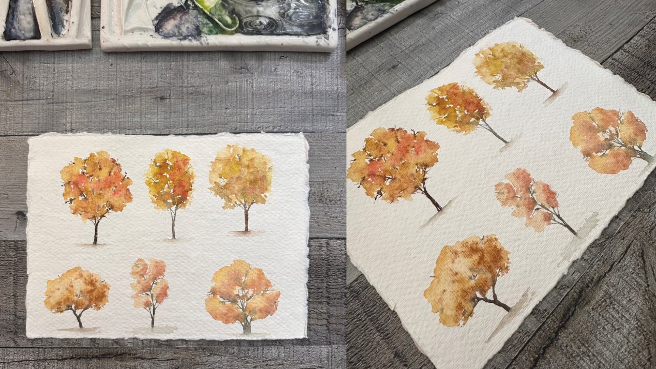
5. Warm up: Foliage Pracrtice: Okay, so midway
through this painting, I decided that I needed to practice these
shapes that are in this reference
because I wasn't 100% sure that I could paint
these at command like that. I'm not usually
very good at that. I usually need to practice
something before I try it. So I decided to take the smart
route, and I'm glad I did. After all this ended
up turning into a good little quick
little practice for me to just kind of see
where I was with this and what I felt was good or not like how Dre by brush there. So I'm just using
different brushes. That first brush was a liner and then I switched to around. And now I'm back
to another kind of a longer script liner
round type brush. And I'm just playing with
all these different brushes. I did speed this up because I didn't think you needed
to see it step by step. It wasn't necessarily a tutorial
on how to do something. It was just showing you
that you should practice or maybe maybe offer you different shapes that
you could explore. So if you were like, I
don't like those either. Maybe I'll treat
these different ones. Oh, I'd like the leaf she tried, or I like this other one. And so I just wanted to put
these out here in case, as an invitation as well. To, to explore and
to see what works for you and what comes easier for you or what comes natural, or maybe there's something
you want to try. And so you get your
piece of paper out too, and try with your
different brushes. So this is around
a different brand. And I'm just going
through a lot of different brushes to
see what feels right, to see what can make shapes. I'm liking what shapes
come natural to me. This shape did not come
natural to me at all. I've tried a lot of
times as you can see. Although honestly, to really
get ahold of something, I feel like you probably
should at least try 100 times. And I probably didn't
try that many times, the more the merrier when
practicing and just keep going. Try all the brushes,
right? Try the rounds. Try the liners, try the daggers. Try the oval, try
the cat tongue. Try the calligraphy brush. Try them all. I really
just can't say it enough. You just never know what's going to work for you that day. What's going to
feel right, right? Maybe you want something
softer and smush here. Maybe you want a wispy look. You can fill your
page with grasses. It is an open invitation to
do what you like and explore. And now I'm just making loose flowers because I do tend to like loose florals
and fog foliage, foliage that's a little
on the looser side. And I think that's
what turned me not into doing the first ones very well is they were
so precise, right? They look like these little
duck bills or pointed duck bills and I just couldn't
get that how I wanted it. I was comparing to
the reference way too much and I couldn't
let go of that. So it was hindering me. Right. And they feel
like that's what happens a lot of time with tutorials
or reference photos. We get so stuck on how we want it to look exactly
like what we're seeing. And we just have to accept that it's not going to
because we have different skills and
different levels. And that's good. That's okay. That makes us unique, right? That makes our work,
part of us and part of who we are versus just, you know, copycatting
and cookie printing. Cookie printing, I'm not sure if that's a
cookie cuttering. Cookie cuttering out
different, cookie cutting, different, the same thing that
someone else says anyway. But it really is just a time for you to test out your brush. And you know what, You
can watch this and if you want to save this
section for when you are on the class
project that this goes, takes place in,
you could actually come back to this and
practice at that point. And you'll know it'll be noted
in the, in the tutorial. I'll add a little text notes so you'll know that this
can go with that. And you don't have, this is not a necessary class, obviously. You can just listen and
be like, okay, cool. She wants us to try
different shapes. Cool, got it. But you can take it for what it is,
take it for what you need it. If you want to practice
some shapes, go for it. If it's not in your plans
today, that's cool too. So then there's
just these leaves. I try, I'm just trying all these different
things to see what potentially would and could work for me and what I
felt like doing. I really love the
idea of silhouettes. First, I was very tied to
what they had in the picture, but I have to remind
myself that that's not always what works out
for me and it's okay. And so this is just paper. I'm just practicing
on cotton rag paper. You can use what
you have. You could use a lesser expensive
paper for this, but on an ideal world, you'd want to use the
same kind of paper that you're painting
on, which I didn't do. So I am kind of
breaking my own little, I won't call it rule, but
my own little, you know, thing here by not using the
same paper because, you know, your paints and your paints and your brushes and your hand all work different on
different kind of papers. So, you know, in hindsight, I really should have used the same paper, but that's okay. It's just practice.
It's just for fun. I did switch to another
round for these leaves. Just playing with different
rounds, different tips. You know, you can
use a larger brush and sometimes they
have a finer tip, you can use a smaller brush,
and sometimes it just has a fat tip that just
doesn't do anything for you. Brushes are very so differently that I always
tell people just to keep trying and trying and trying all the brushes to
see what you can get. So again, this was just practice and just
some play and it's odd. I think I ended up with
the very last one. I'm like, yep, this is it. These are the ones
I'm going to do. So take your pick,
take your page of practice and see
what works for you, and you can add it to
your final project. Or maybe you'll just
stick with the original because you like them
and the shape is great. So I see you in the next lesson.
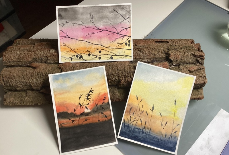
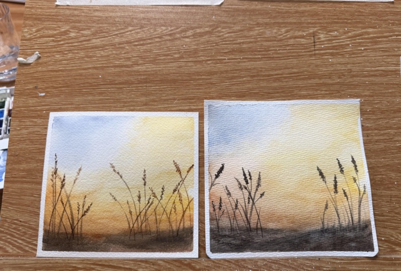
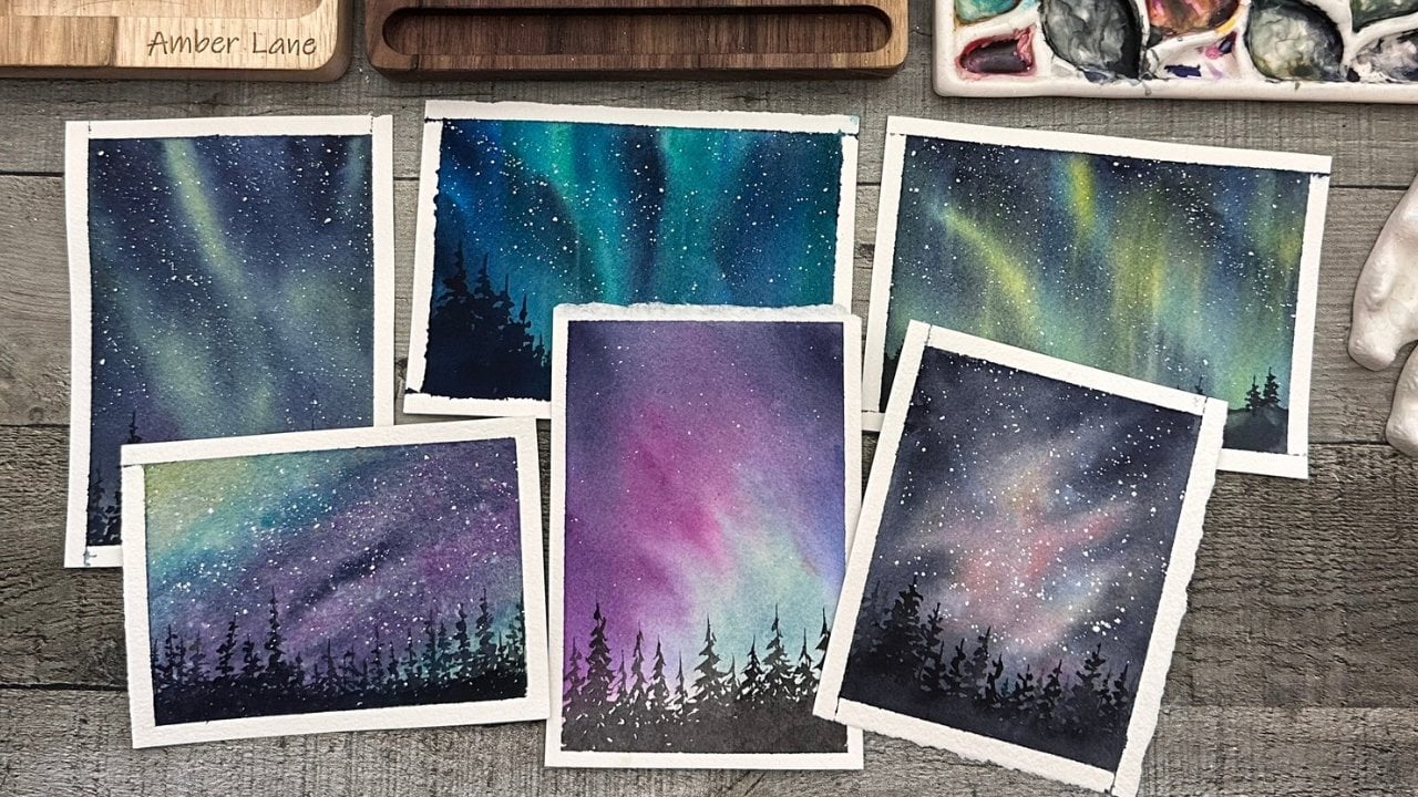
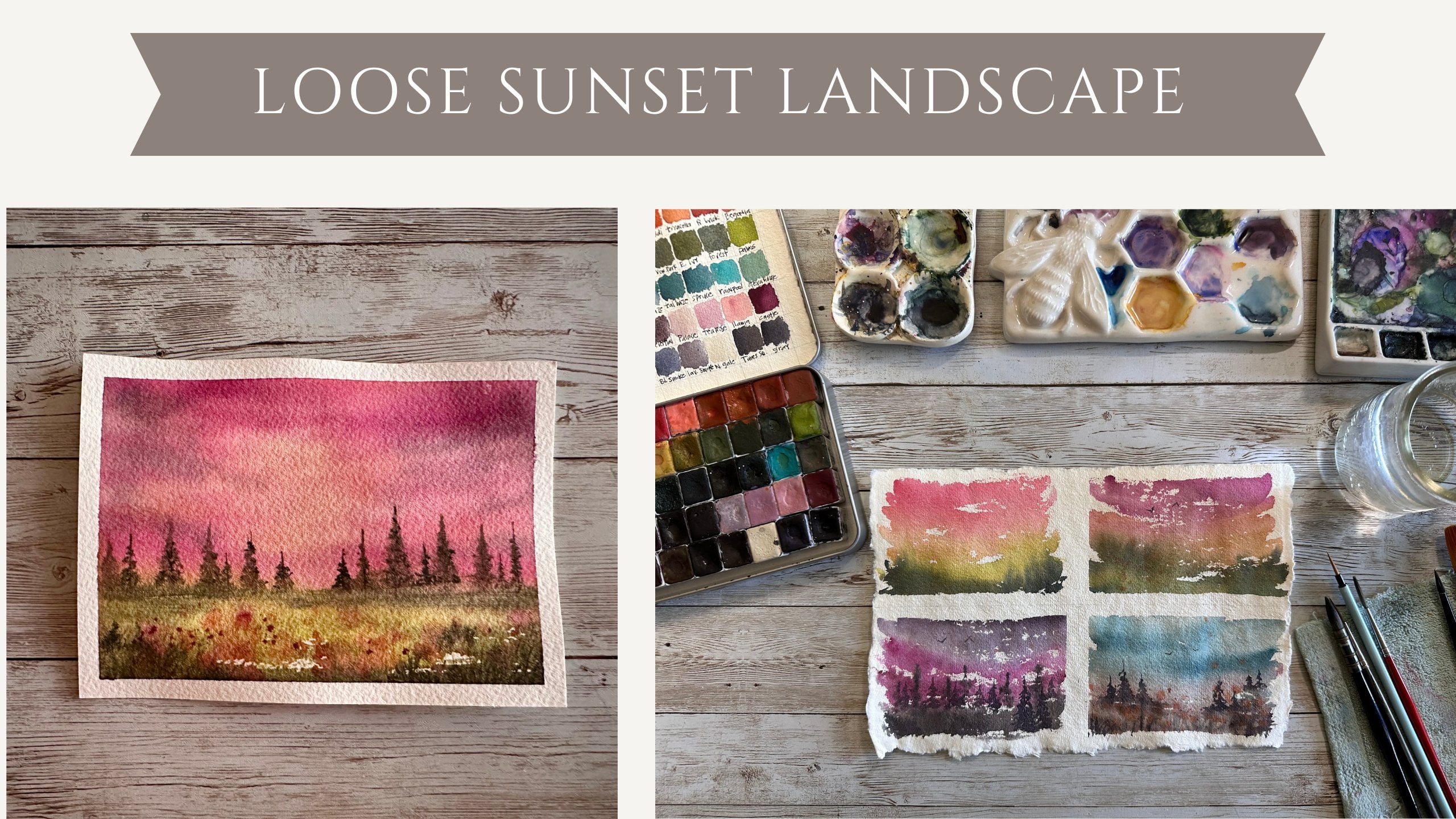
6. Class Project 1: Sunset Wheat : Hey, welcome to class
project number one. I just showed you a brief
collection of the paints I'm using. We'll
put that together. And one of the techniques,
so if you miss that one, go back there and I
will show you what those paints are for
this first project. So I'm using a flat brush
to wet my paper all over. I have it taped down
on all four sides to a plexi glass plate
that I like to use. And I am just mixing up colors with a round Tintoretto brush. If you have any questions
about those brushes, I can let you know
what they are. I was going to say
I'll link them, but I'm on the wrong
topic for that. What I'm doing, I am just
getting color on the paper. I took the reference.
As you can see. I'll post it up on here and
you'll see what I'm doing. And I'm trying to
simplify it with still keeping the
suggestions of what's there. Well, I take out the
fuzz on my paper, so I'm just getting
the yellows in. I'm getting that hint at
that peak, at that blue sky, trying to keep that little
little sun ball right there. And I'm just picking that
up with a wet dry brush and picking up a little
more with a dry cloth. And when I say wet dry brush, I just mean a wet brush that's
actually not soaking wet. Right. So we're not putting
more water onto the paper. We're actually able to pick up what's already on the paper. So it's drier than it
normally would be, but not so dry that
it is smearing. Right. There's a
difference. I'm just adding some orange
for the horizon here. And these colors you can use
whatever colors you have. That orange is
really a bright one. For me, I did mix up two colors from that
palette to get that orange. And it's pretty darn
bright. But that's okay. We're going to mellow it out.
We're going to add to it. We're going to just hope
it creates this kind of atmospheric
looking thing, right? So I'm also mixing in some
browns, some more orange. I decided that was too heavy. I'm just looking
at the picture and going back and forth
thinking what I can add. What I can take away what it needs and what
it doesn't need. And it's, there's less
of an instruction. It's more of how
you feel, right? And just playing and doing these over and over
and over, honestly. The best thing you can do is just do these over
and over and over. If I'm going too fast, I do move fast and I'm not even speeding this up. Just go fast. But it frees me and lets me
kind of just less focus on the details and just
kind of be loose with the colors and let the colors
kind of do the work, right? Because this paper is wet. We wet it before. So
it's technically, it's wet on wet, right? And so we're letting
the paints kind of play with each other and
seeing what they can mix. That's why you'll see me
going back and forth, back and forth with
different colors and trying things again, even if I already tried them. Sometimes you got
to try them again. Right? Like I'm messing around
with this brown right here, not feeling it, not
liking what it's doing. But I try not to
give up too soon. Because I can help that
evolve on its own. And I can help change
it. And see I'm tilting my paper here and
that can help move the color and the paint
down just a little bit. And even if it's a tiny bit, it's crazy how it does work. It does make a difference,
even just those tiny bits. And so I'm just bringing some
orange up into that sky, trying to warm the
whole thing up, trying to make it work,
hoping it works right, because I'm trying to show you, so I'm hoping that it does. So I'm adding some
more yellow here, a little bit more concentrated
right by that white. So if you have white, you want to add something
a little bit darker. Even though yellow is
not technically dark, I did make it darker. Sometimes I use my finger like that, I don't
love that I do that. But sometimes you can just dull something
enough to kind of, you know, I wouldn't
say erase it, but could just kind
of diffuse it. Diffuse it, that's the
word I'm looking for. And so again, back
to that white. So when you put something
darker around the white, it kind of helps
the white pop more, right? So that's why I did that. And I'm just going
to keep kind of building on this
initial layer here. And, you know, you
could let this dry at some point and you could re
wet and add more that way. Or you can just keep
working as long as your paper is wet, you
can keep working on it. If your paper does start drying, you would want to
finish drying it. Either make it dry
or let it dry. And then you would continue
with another layer of water and go from there
and just keep adding more. And you can do that as
many times as you want. Quite honestly, sometimes
it's helpful because you're less likely to get a
muddy, muddy scene going. So now here I'm just adding that dark base
because in our photo, which, you know, my
photo doesn't look like, my picture doesn't look like
the photo. And that's okay. It's inspiring you to
choose these colors and do what you like with them when
you have a reference photo. I'm a strong believer that you don't have to follow
that reference. You can let it inspire you
and take you where you want. So what I did was when
it was still wet, I just suggested those
background trees and shrubs and bushes very lightly with
just some water down paint. Not too watery though,
because you don't want to introduce a bunch of water because then you'll get blooms. But not necessarily
a bad thing, right? Blooms can be fantastic
in many ways. And so if you don't mind
blooms, let them be. If you do then don't
use as much water. And if you know enough about blooms, then you'll
know this already. So here I am, letting that
sunlight come through my stalks of wheat
or grass or foliage, whatever you want
that to be, really. I with these reference.
This is the first one. With the other ones I'm
going to show you as well. I'm not a stickler to the exact details
of the references. And you can be, if
that's what you like, that's what you prefer,
that's what you need. Do that for me. I'm taking it as a suggestion. And I'm just going to let
my brush do what it wants, and sometimes I'm capable of
making really nice little, cute little wheat grass
things, and sometimes I'm not. That's okay. It can change from day to day and that's okay. Again, that's okay.
I feel like we get so stuck in this thing that once we learn how
to do something, we should be able to replicate
it every single time. And for me, that's not the case. Often I'll find I can't replicate a thing
over and over again. I don't know why
different brushes, different different
day, different mood. I don't know, the moon, maybe it's a full moon and
it just happens to be. This actually does happen to
be a full moon right now. Not when I painted this
though, so who knows? So I'm just adding
these little details. I did switch to a
thin, finer liner. This is a script
liner I'm using here. So script liners and liners are fantastic tools for any of
these fine little things. For me, I'm not handy
enough to use a round. I just cannot get
those fine details. So for me, a liner
is absolutely must. I have many of them and I
do have a few favorites, but they change actually. So pick up your other tools and use them and see which
one you like the best. You'll also see in
another one coming up. You can practice over and over and see what
works best for you. You'll see one of those
techniques if you want to go back and maybe you
skip that one too. There's a techniques video
where we just go over and over some strokes to see what brushes work for you,
which brushes don't. And hopefully, that
will encourage you to go back to your
brushes and kind of just give them a play,
a play time, right? Exploration. Instead of
just letting them sit in the cup and just wasting away. Use those suckers, right? Decide that maybe I
do like this brusher, maybe I don't like this brusher, maybe I forever don't want
this in my cup anymore. And I just recently did that. I removed 28 extra brushes that I just decided for
now I'm not going to use. So I took them out,
slimmed down the cups. Put them away for now. Right. It doesn't
have to be forever. But for now, I put them away. And hopefully that's
going to help me use the brushes that I
do want to use more often. And as I keep going,
I'll do the same thing. Again, I'm making these wheat stalks away from the sun,
a little bit darker. I did leave the wheat stalks that you can see coming
through the sun. They are either a lighter,
burnt sienna or they're just a lighter, anything. It doesn't have to be burnt. It can be whatever
you want it to be. You can do purple
wheat stalks and you just make the lighter
part in the middle there. I am just letting this
brush be sloppy and messy. On these little floral portions, whatever you may call them, if they are wheat,
then the little, the weak grasses themselves, just letting that
be really loose. My favorite color go to color for this is
typically sepia. This palette does not have that. So I did just mix up some colors and into a brownish color. And there's lots of
videos on mixing colors and how to get a brown if you don't have a
brown that you like. I do like convenience
colors myself, so I do prefer to have a brown versus mixing a brown every
single time I need a brown. Again, that's a
personal preference. And totally up to you, with me, there is no right and
wrong in water color. Maybe the only thing there
is one thing that I do probably insist on that
is 100% cotton paper. But if you follow me at all
or ever watch my videos, you'll know that that is
one of the things I am. I'm pretty a strong believer. I'm 100% sold on
100% cotton paper. It will allow you to do things you just can't
do on other paper. It will allow the water to do things that it can't
do on other paper. It' allow your paint brush, it's just magical and it changes your whole game and you just have to use
100% water color. That is my final
rent. Okay. That is probably one of my only rules. Otherwise, use what? You have used the paints, you have used the colors, you have used the brushes, you have use the tape, you have use the pellets. I happen to love
ceramic pellets. That doesn't mean that you can't paint off plastic pellets. If that's what you like,
you can do what you like. You can use a water
colored brush, you know the kind you
fill up with water. You can use a round 12 if
the tip gets really fine. You don't have to use a liner on these foliage
pieces I'm doing. You can use anything that
will give you a tip. And if you have a steady hand, you can use anything that
will get you that fine line. So again, I just want you, I know these are less
of a step by step. Let's do this, do that,
do that. But this is more of an invitation
for you to explore. An invitation for you
to play with color. For you to play with
the brushes and the tools that you
have right now, versus me listing off all the colors that I love
that I think you should go by. Do I think you
should go by them? Sure. If you love
them and if you have the finances to do so. Absolutely. I love this
set I put together, this set off to the left
is American journey from Cheap Joe's and
Davinci, the two together. Rumor has it that they are the same company or
not the same company, but they are made by
American Journey, is made by Da Vinci. And so these colors just work really
related well together. But mostly, I find
that most colors do work really well together. I mix and match all the
time, all the time. I have no qualms with it. I work with several handmade
paint makers and, you know, I straight up tell them
that I probably will mix their colors with
other people's colors. So for me, that's just part
of the magic and it involves all this love from all
these different peoples and makers and then as artists
putting it all together. And it's just, it's
magical for me. And so for me it's
very exciting. If you also, I should touch, if you want a tutorial that's
maybe a little less chatty. There are so many out there. So you know, I am a little
bit more on the chatty side. So if that's not something
you like and you need more detail and you need
very much more instruction, there are so many amazing
makers here on skill share, I highly recommend that you just try so many until you
find what fits with you. Okay, so I kind
of fine to finish that foliages just playing
around the script liner brush, I am going to use my
metallics, my shimmers. I had to show you
those and I'm just going to sprinkle a little
bit of shimmer in there. I did add some little
birds with the fine laner. Again, they're just V shaped
birds, Very, very simple. You can practice on a
separate piece of paper. They're very fine, you can hardly see them. But I like it. It's my hint of birds,
just a little hint. And so I'm just sprinkling
a little bit of a golden, kind of a warm golden
color on there just to kind of give
it a little bit of something and I didn't
want to go in the sky, and so I use this piece of
scrap paper, and this is, this shimmer is called Soca and it's one of
my favorite colors. Actually, if you need
more information on it, I'll be happy to
give that to you. And you can start a discussion. And I'll happy to link it there or send you a message or
however we need to do it here on skill share to make that, make that happen for you. But then I'm just going to add
a little bit more in there because it's so
pretty and why not? And that is really about it. We're about to take the tape off and you can keep going with
as many details as you want. You don't have to
stop because I am. You can pause me
all along this way. You can listen to me
first and come back. There are so many different ways you can treat these skills. Chair projects, you know, you don't have to do what
they say all the time. You know, don't always listen to us necessarily enjoy it and
make it your experience. So that's it and we'll see
you in the next lesson.
7. Class Project 2: Moody Branches: All right. Let's get started
on your next project. As always, we are going
to tape all four. If I can find the end of
my tape all four sides of our paper down on a surface, it can be your tabletop
if you prefer. If you don't have a plexiglass. I really like the
plexigrass class. That way I can tilt the board
around as I need to twist, spin any of those things, which I do often turn my board around to get different angles and better positioning
and whatnot. So I'm going to pop this
reference photo up, which you see now
just to give you some ideas to think about
what we'll be painting. So we can see that I really
was drawn to the sky. I was drawn to the silhouette, whether or not mine
looks exactly like that. That's not the goal here. The goal here is
to get the feel, the suggestion, the part
that inspires us, right? So I'm used this round mop
brush and I did wet my paper. I'm sorry, I didn't show that. I made sure it was nice and wet. And I am just using
some grayish, blackish color here to kind of get in that really moody
top portion of that sky. And I'm not doing anything particular. You can
go side to side. I'm not really sure
why I choose to do this texture texture stroke and I guess that's probably
why I do like the texture, you can absolutely win
100% hundreds percent do a very smooth and sometimes
I'll smooth it out later. So just because you do a text textured stroke like this doesn't mean
it has to stay that way. You can smooth it out. Will it be the perfect
gradient smooth later? Maybe not. But if you want
the perfect gradient smooth, go for it in that way. So I'm adding the gray, I'm adding the pink,
I'm adding the orange. I'm just trying to feel
this out right now. I don't plan my colors
in advance again. I won't call out the
colors so that you're not stuck using the
colors that I'm using. But you can see
from the picture it goes gray to pink to
orange to yellow. So that's I'm gonna follow
that kind of a feel, right? Am I going to be
exact? No. Am I going to match the picture? No, but I'm going to be
adding these colors. And in the beginning,
make sure that you do get your paper nice
and saturated with water. No puddles or pulling,
but you definitely want a nice sheen on your paper
so that it stays wet. And of course, you're
using 100% cotton paper, so it should stay wet for the duration of the time that
you need it to stay wet. If not, you can always add a little bit of water
to it, even right now. If it starts drying, you don't necessarily
want to do that. But if you maybe
thought you didn't get your paper wet enough, you
can go ahead and add it. At this point it would be okay. And you could spray
it if you wanted to. Or use a brush I like to spray. It will affect your
paint at this time, but we're so early on that you can fix that owl and
just keep adding more. So there you go. There I'm
sweeping. I love a dry brush. I love love, love. Can't tell you how much I really do love, but I also love
that there's still texture and so that's what I do like about adding
the paint this way, you'll leave texture, right. But there are times when I really do love a
smooth gradient. So we all just have our
preferences and time and place, right, And season
for everything. So I appreciate all of it and I like to
play with all of it. So again, you can do either one. Again, I'm just going back and adding more color to
the places that I think I'd like a little
bit more intensity and a little more color. And I like the way that this opera pink that
I grabbed is mixing with the orange opera pink can
be pretty darn fun to use. I know it's not maybe
a popular color to some people because
it is a fugitive color, which means it's
night light faced, so it would eventually
fade over time. But I'm not super concerned. These are practice pieces. These are playful pieces.
These are fun pieces. I'm not expecting
anything to be on a wall for 20 years, you know. So take it for what it
is or what you will. And you can also
add things on top. You can add fixatives, you can add all sorts of stuff. They have tons of
products out there. Just do a little research.
So I'm sweeping again. Again, I have not dried yet and I'm now gathering my
liner type brush. It's kind of a
different liner brush, but essentially
it's a liner brush and I'm just trying
to add some texture. If you remember for the picture,
which I'll pop back in, there was some
texture going on in this corner from the trees, but maybe they were slightly
out of focus, right? So I am doing this wet on wet. So that these branches will
just kind of have an idea, suggest that there's more tree
back there, more branches. I'm not trying to go for
the exact shapes right now. Actually, if you know me, I don't really ever go
for the exact shapes. But I did switch to
some orange right here. And so I'm adding
some orange branches down there just so that, you know, not
necessary that they're orange branches, but the
light's hitting them. So they're going
to look lighter, right as they're kind of blown up in this bright
area of the sky. And I'm just going to
keep going with that and keep playing with it until I kind of
have what I like. And that'll be different
for everybody. You can follow the picture, you can make up
your own branches. You can make up your
own story, right? It doesn't have to follow the
narrative of the picture. This can follow
your own narrative, your own decision making. This is your creative
process through your creative journey,
your everything. So do what makes you happy. If you're in the beginning
and you feel safer, maybe just following
along with me and the photo, that is awesome too. You can do this three more times and change it
each time as you go. So I just decided to do
a little more sweeping. And just so you know,
that hockey brush right there is completely dry. It is my dry brush forever. I never wet it. I
do wash it nightly. So it lays flat
to dry overnight. So it is always dry. I
never put it in water. It can go in water. It's
just that I like to designate that as my dry brush
that I use for sweeping. Okay. So I'm just adding
these little details. I did switch to a
different brush. Oh, did I switch? No,
I did not switch. I still have my liner brush. Any thin tip brush will do. Again, see, I'm obsessed
with that sweeping. So why am I sweeping
it that many times? Because the paints
have kind of bled out, or maybe they have
extra lines in them. And I'm also sweeping those
branches so they're not so they're just more
loose and organic. Right? And so I did try, my paper is completely
dry right now, so I did pick up that same brush that I was using,
my line of brush. And I'm using, you know, any kind of brownish, grayish, darkish. It's totally up to you. That corner right
there that you just saw me grab the paint from is kind of my
whatever goes corner, it'll end up being like
a black or blue brown. Sometimes we'll
add greens to it. It's kind of like,
it's just a rec, I don't wash that
pal very often, so it's just kind of
a miscellaneous pile. So yeah, this lots
of dark colors. What I really liked about
that reference picture, this reference picture is that it had a very vibrant
background and then you had these dark silhouette
style branches and leaves and whatnot. So I just really tied to
that or called by that. And so now I am adding little, kind of like little nubbins where maybe the leaves fell off. I'm not really entirely sure it didn't really super
study. I'll be honest. I don't really
super study photos. I maybe should more,
but I don't want to be so caught up on what
the photo says. Right. Like I said
before, I want to tell a story that maybe
is my own as well. And so for that I
like to, you know, and here I am moving, turning my paper,
it's easier for me, especially with
branches and trees, to rotate my paper so that I can access those corners
and those areas. So I am just trying to stay very loose
with these branches. I'm trying not to
be too particular, these take me a lot of practice. I'm still working, progress on getting branches
how I like them, and kind of getting a more
free feel on the branches. And so that's what
I'm doing here, just trying to go light enough. Trying, I might be trying too hard and usually that's what
happens when I try too hard. They feel too positioned,
if you will, You know, like too exact so I don't know. Maybe maybe do a
scratch piece of paper and just do a bunch of branches on there to
kind of loosen it out. Get it out of you.
Kind of shake it up a little bit and just
kind of let go. See I'm spinning this
board all around. So yes, it's kind
of hard to follow, but it works better
for me to kind of move it all over like that. I, again, I am just still adding little bets here and kind
of seeing what works, what doesn't work, and
hoping for the best. Quite honestly, a lot of these are not
necessarily practice but the accumulation of what
I've learned over the years and over all the
classes I've also taken on skill share
in other places. And so I like to
just take what I've learned and try to
demonstrate that here. And for anyone else who you know wants to listen and
share that with you. And just kind of, I don't know, it's less of a teaching
and more of a, I keep saying this
over and over, I know. But it's more of an
invitation to just to explore and to find what
works for you, right? See what inspires you. Maybe this photo doesn't, but you find one that does,
and then you go from there. So I am going to wrap this
part up of this one soon here, and we'll go to the next video.
8. Class Project 2: Part 2 of Moody Branches: Welcome back. I
just wanted to keep these segments in
smaller parts so that potentially you could do
this in two bits if you didn't have a full 20
minutes to work on this one. This one is a little
bit longer than some of the other projects, but I think that is kind of a fun one and
therapeutic in a way. You could do the sky first, you could let that
dry overnight if you wanted to and come
back to the branches. You could also do it where
I stopped and come back for the leaves and just
kind of take your time. I am going to rotate between my liner brush and between
a smaller round brush. So I'm going to keep adding more branches as I see
they might be needed. Like here I'm adding
another one and I'm trying to let that
brush do its work. I'm trying not to hold too tight on the brush when
I do these branches. Almost like I've had some
people say, it's not funny. But it's interesting
because it's probably the only time they're like welcoming that, you know, arthritic type shake or
any kind of wrist shaking, you know, as you have
issues or whatnot. So I have had some
people say, you know, that shake really works for
my branches and I'm like, oh yeah, finally the
tiniest silver lining to, you know, something
that's pretty crappy. But I just want to
say that, you know, letting go on these branches
is kind of the key. It's like that,
organized chaos, right? And so these leaves, I'm using a small size two. I think I rotate
between like an tra, round two and whatever else. I have an artifi round two
and I'm just, you know, I am kind of getting
painstaken on these leaves only because I
feel like maybe they are, I don't want to say the
highlight of the piece, but they are kind
of the showcase. And I kind of was really
drawn to this because it felt like they were
almost like hearts, almost like a little love note right hanging from the tree. And so I don't know, this just kind of like called
me and so here I am taking way too much time drawing these little hearts
in these little branches. So yes, I could have
sped up this process. I am usually a pretty fast
painter, pretty fast talker, and I do try to get out a lot of extra like see
me off to the right. They're doing a lot
of mixing and stuff. I try to take that out. So you're not
necessarily bogged down. But sometimes it, I feel like it's kind of
nice to leave that in because it does give you time to also do these things, right? So if I'm just cutting all those out and
barreling through, which I do often, but also it makes that class shorter, that project shorter. And so it's more,
you know, accessible to some people that
don't have the time. So it's kind of a
double edged sword. So you'll see me do both, but I do prefer to keep
the classes shorter. Obviously, I feel like that's more interest for the
majority of people. The majority of people
don't have a lot of time. They don't really want to listen to me ramble for that long. And I do tend to ramble, I feel that there's such an opportunity to
share with so much said I love and so much amazing
things about watercolor. And getting the opportunity to talk to you about that
just makes me happy. And I have you as a captivated
audience by default, so I think I will just
keep talking away. And so yes, if you do prefer not to hear me talk, I
mean you can mute me. I know that a lot of
people do not like chatty demos or tutorials
or any kind of thing, so it is perfectly
okay to mute me. There are a lot of demonstrations that
have no sound at all. So you know what works
for you, works for you. And do it by all means. If my voice irritates you, just just mute that
sucker. It's fine. I will not take offense to
it at all. In the least. I watch, like I said, I watched so many
tutorials and tutorials. I am one of those people
that does have to listen to all the words and what they
say and the instruction. I like to learn any
single thing I can. I am holding two brushes in my hand because I'm going
back and forth so much. Have you seen people hold it
in one hand? I've seen that. And I'm a little clumsy, so I'll usually end up
dropping something. So I just hold them
in two separate hands and do it that way. And it just, I'm just enjoying this process
even though, yes, it's a little slow going and it might not be the
most exciting to watch. But again, I like to chatter a little bit
because I feel like it kind of feels like we're painting
together versus me just painting at you or
for you or something. And I'm not an expert, but I can share so
much passion with you about learning, and
about exploring, and about staying curious with watercolor that I feel that, that's, I wouldn't
say just as much, but I feel like it
has equal amount of, not leverage but equal amount
of like, enjoyment, right? I enjoy listening to
people while I paint. I almost feel like I'm
painting with somebody or maybe I'm at a class or maybe
I'm just with a friend, somebody who's talking,
you know, like often I'll want to put a podcast on, but it's hard to listen to
something or audio book. It's hard to listen and retain and absorb that while
in focus painting. So I feel like if
I watch a Youtube or listen to somebody like that, I feel like it's easier
to listen, listen to. I don't know if that
makes sense at all. Anyway, so I'm just
adding more details. I do mess this up over
here, just don't do this. I know often most of you paint how you feel like you want
to paint in the moment. Not often do you feel do
exactly what I'm doing. So that's an awesome part. So whatever I'm doing
here, I messed that up. But let's just
pretend it's a lot of branches that
maybe got tangled, that grew funny, and they're
just kind of stuck together. And that's okay. Nature's
not perfect either. So you know what,
maybe there was a storm in this really
strange branch just. Fell from above and got
caught on this other branch. And it happens all
the time out here. We get branches stuck in trees
and branches all the time, and I'm pretty sure that's what happened
out here as well. So we are going to go with that and just pretend
that's there. I do however,
really like the way that really tumbly
looking branch area got really dark
against that yellow. So maybe I was onto something
and it wasn't half bad, you know, because for
there to be light, obviously there's dark
and dark to be light. So I feel like whenever you
have something really light, you definitely need to
have the dark next to it to make sure that really
pops and vice versa. Right, when there's
something really dark, you got to keep those lights. And lights are hard to retain. Luckily in this one we're
not really dealing with that in that way of
retaining white. But still, I'm still playing
with these darn branches. And again, I could
have got you skipped all this out of here
for you, edited it out, but I guess I felt
obligated to leave it in, in a sense because we
all have struggles. We all have to pivot, we
all have to overcome. We all have to take a
look at our reference, our inspiration and be like, well, is this the
direction I want to go? And it's just paper though. So if it's not,
just try it again, finish this one out and try it again. It
could try it again. I've done the same picture. I think eight, maybe 12 times, but I know for a fact there
was one that was eight. I want to say there was
one that was like 12. It was one of your
paint your styles. And it was a very, very,
very frustrating one. But I just kept trying
to do it over and over. What I should have
done is take a break and come back to it, but I didn't. I kept going. And so I do say if
you're frustrated, I'd take a break and maybe
find a different reference. It can be anything. It can be something similar
with a sunset, with different types of trees, different type of silhouettes. You can just go on your own. This is a very
easy one where you don't even have to use
the reference, right? Pick three colors, make your sunset background and
add some branches. If you're watching
this beforehand, it's an absolutely easy one to, um, kind of make what
it works for you, right, To customize it to your own self and to what you prefer. I am just going nuts
with that branch. I wouldn't say I'm loving what I did
there, but it's okay. It's all a learning experience and that's really what
I'm doing this for. To get that muscle memory, to get that playing with
the paint brushes right. To make sure that I can take away something
from this that I can learn. I can learn from my own
stuff and I learn from my stuff all the time. I might even learn more
from my own than tutorials. But I feel that it's just the perfect
learning opportunity really just to keep painting, painting every single day
and not stopping right. I paint one to 3
hours every day. And sometimes it's for me, sometimes it's
strictly intuitive, sometimes it's tutorials,
sometimes it's just playing with stuff like this and seeing what will come of it. And it doesn't always work. But I'm going to add some
shimmer because I love shimmer. I've been adding shimmer to
almost everything lately. These are my cosmic
creation shimmers. These are mostly what
I use these days. And I'm just going to
take a little bit, any color really, it doesn't really matter what
color you pick here. You can go with a
darker, you can go with the lighter, you
can go with a golden, you can go with an orange
color. Anything honestly works. I did add some of
that mud color, that darker brown,
black mud color from my quarter and I
just sprinkled it in, so that was a little
bit of texture within the leaves
in the branches, so it wasn't just like cut
and dry because, you know, there's always like some
sort of texture and I kind of like that
grainy feel of like an old picture with
maybe like lint and stuff kind of
sitting on top of it. So that's another reason
why I don't mind if my paint bleeds under this
cheap tape I'm using today. I normally will use
whole bind tape, but I'm trying to get through
my other cheaper tape and so it may blade through. And I don't mind that
because it kind of gives that rustic vintage feel. All right, I am splattering
some shimmer on there. I am using a round brush
and I just tap gently. You can practice all sorts
of ways of shimmer, shimmer, all sorts of ways to splatter, and there are lots of
different ways of thought. I typically grab a size, two to four to six round brush in splatter away and
I get the ratio. Try to get the ratio correctly with the
water in the pigment. There I am adding a few birds. I just like the simple,
simple V shaped birds. And I got a little heavy, so I'm just dabbing it
off with a cloth. Sometimes it works,
sometimes it doesn't. Sometimes that paint
dries super fast. It's crazy how fast sometimes.
Alright. Tape peel. That's a wrap, you
can skip the birds. If you don't like
birds it's okay. Do what you like and do what
makes your heart happy. And it didn't bleed
out the tape too bad, even with this less
expensive tape. But again, I wouldn't
mind if it did. So that was about it and I'm pretty darn
happy with this one. Turned out you could go
dark with the colors. You can do all sorts of different things
with your colors. It's up to you again. It's your journey, your fun. And I hope you take the
invitation to play and explore. I'm just going to add
on all the brushes I used a round, a little round, and my liner, and my flat that I use for the wash. And
what else did I grab? Oh yep. Another
little artifyilver, black velvet, silver brush, and my flat for washes. I love that little
flat for washes and my hockey and that's it. So I'm super excited that
you joined for this one, and I'm looking forward to painting the next one with you. So join me and
we'll get started. Let's see the next lesson.
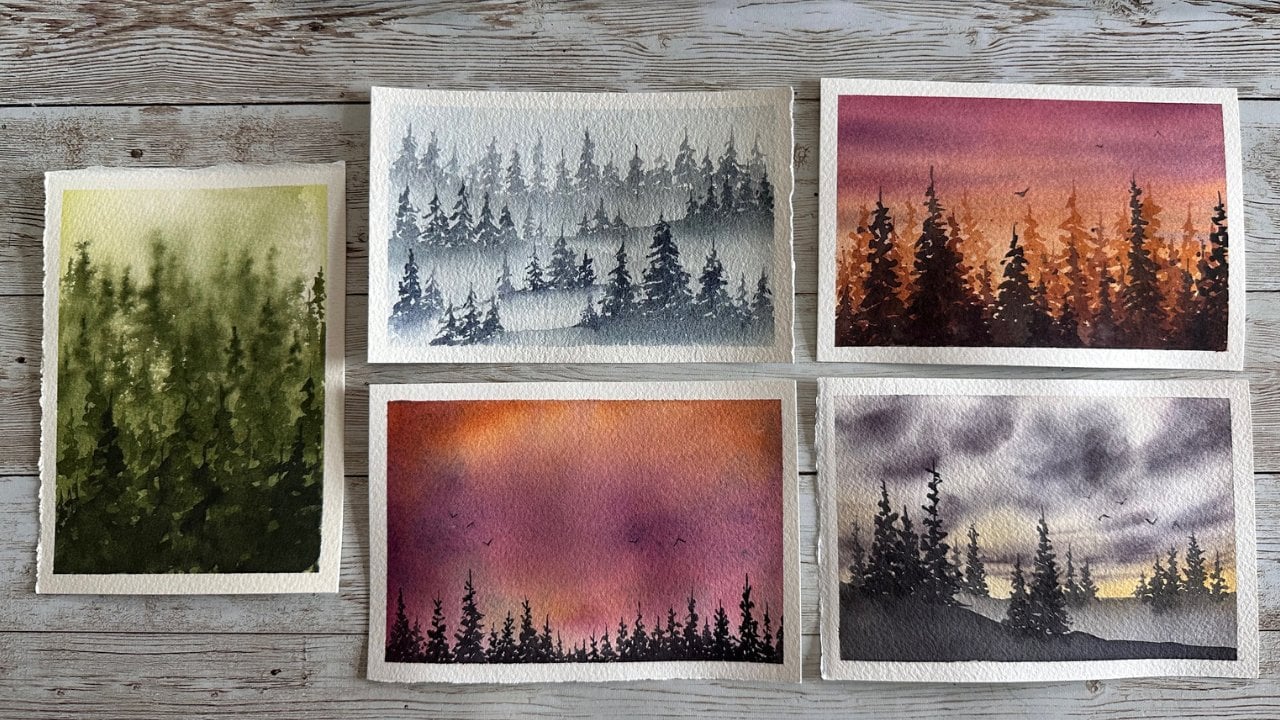
9. Class Project 3: Sunset Before the Storm: For this lesson, I
thought it would be fun to use these handmade
paints by Stacy. They're Sta Kiwi paints. This is my collection. The colors I have,
each reference. By the way, I did mix
up the paints I use, but use what you have and use what colors you like,
what color is called to you. Just explore with what you have. Again, as always, I'm
rewetting the paper, wetting the paper here. I'm going to get some sky
color on there, get some blue. And I'm going to
kind of go light at first and you'll see
me gradually build up. So I'm just sweeping
some color on there. I'm trying not to be too picky. I am using a round brush here and I'm just kind of sweeping some of the
blue in the horizon, foreground below area, because
I see some blue in there. Now, if that's not correct, you know, do what you feel like. It doesn't have to be
exactly what you see. It can be what you feel, what you think, what
you want it to be. Right. This is our world. We can create it how we want it. Right. It doesn't have
to be an exact thing. I thought I'd go
for the sun, then I decided not to splore together. I didn't want to create green with the yellow and the blue. So I'm being mindful of that. I'm, there's kind of
a invisible barrier there, sort of to speak. And I'm going to add this orange here to kind of help
with that glow. And again, I'm going to
not go too far into that blue because I don't want to
make it too muddy or gray. But I'm kind of okay with
most of those things. So it doesn't really
bother me extremely. Because see now, I'm just going to add the
orange in there. Anyway, it's a
reflection, orange and yellows and a little
bit of hint of a red. And do whatever colors you like. You can even add a
magenta in there. You could, you could do a red. More of a purple red. Really, it's anything. I'm adding kind of
an orangey red here, not a head mixed up. And I'm just playing kind of, I'm kind of glancing
at the reference, I'm kind of thinking
about what I want to see. I'm kind of trying to
make what works right. Sometimes it doesn't even
matter what you want to paint. Sometimes you just
have to go with what works for you and what, you know, your abilities
and capabilities are. So I'm adding in the
sun, erasing it. Again, I didn't really wasn't feeling what I was trying to do. And some days are like
that and it's okay. You can take some, give
some take some again. Take it away again,
give it again. And that's water color for me
a lot of the times, right? It's a give and take
game. It's a balance. It's adding in, taking out, putting in more trying
different brushes, switching things up,
that kind of thing. And so now I'm taking
a brighter orange. I think this is a funny
name like Safari orange, or Safari Sunset Orange. And I'm adding that and I'm going to dry. And
I'm going to dry. And I'm going to rewet my paper. So I rewet the whole thing. I'm not sure why
that didn't show. I did kind of cut some of the extra R movements out when my arm crossed over
the screen so that you wouldn't have to
see that I did rewet the whole paper so that I
could add in these clouds. And you want to rewet so that
you don't get hard lines. Right? So anytime your
paper starts to dry, you want to fully dry it. Right. And then rewet
it 100% the whole way through again so that you have an even surface to work on. If it's partially dry
and partially wet, you end up getting
with these hard lines. And sometimes you'll
end up adding too much water and
you'll get funny blooms. And sometimes those will
absolutely work for you. And those can be very much a joy to play with,
right, To have fun with. And they can add excitement and unexpected outcomes
that you're not really used to or maybe that you're not usually
thinking that you want, right? But sometimes it really,
really works out. So I did use a dry
brush and I swept that sky a little bit and
I like to dry sweep a lot. You'll see me doing it a
lot and so that it kind of just lessens the harshness
of those clouds. And I'm not really sure
what I was doing with those clouds and I'm still not really sure how I
would tackle that. It's been a while since I've
really played with clouds. Right here, I'm
taking my round brush and I'm just going
to pick up color. And then I'm going to blot out that center and make
a little sun area, a little glow of light
coming from that area. You can also add a little
bit of guash later on, or a little bit of
a little bit of a white water color to just spread that paint
away from there. You could also drop a little
bit of water in there. Sometimes that works, you can explore with
different things. It just depends on what kind
of effect you're going for. I did want to define that
horizon a little bit, so I'm just adding
a darker color there just to kind
of accentuate that because it did lose its everything adding
more to the sky, The clouds just slowly
adding in bits in here. What I do is I look, I stand up and
look further back. I am using a dagger
brush for this, by the way, which is kind of an interesting
choice for a lot of people. I love the dagger brush a lot, and I love my
hockey brush a lot. That's the dry sweeping
I'm doing again, and I just go back
and forth with that, add some in, and take it out, and try to get that glow
that you see in that photo. And I really don't
know how to do that. I've come across
this a few times that glow and so I struggle. And so this is just a time for you to play and see
what you can do. And, you know, you
might get it the first time, be
like I don't know. Again, why does she
keep struggling? Because I want to share with you that it's okay to struggle. It's okay to wonder how
someone gets that and not know how and want to learn how
right and want to explore. And I take a lot of tutorials for these reasons so that I did cover up my son, so I'm going to have to go fix that again and that's okay. I just knew that I wanted
the whole sky to be darker, so I decided to
kind of start over, if you will, or not start over, but add another whole layer to kind of get more
of an intense sky. And then I'm just
kind of blending that intense sky into that already existing kind
of muted upper layer, which I'll have to deal
with a little bit. So again, I'm just
adding some more color. You could have stopped
and left kind of a pale looking background
and that's okay too. I kind of don't mind that look, but I was driving for some more bolder,
vibrant colors for here. So here we go, adding
the sky colors in, Just taking some darker colors, trying to add the mood, the overall mood and blending
of those all together. Yeah. See my arm. I did try to cut
those out for you so they weren't so many of them. I do keep paints all over to the left, to
the top, to the right, and so it's inevitable that I'm reaching across
the screen like that. So I do try to get
those out of there most of the time for you,
but it doesn't always work. So I decided to go kind of more bold and see where I could
get that to take me. So I'm just adding
this darker color and just kind of playing with it and thinking
and wondering like, okay, do I blend this? Do I sweep it yet? And you want all those thoughts
to go through your head, like all the things that
you learn or remember. And so I've just decided to
kind of blend it together so my brush isn't
super wet because I don't want to add necessarily
more water, right? I just want to be able to blend without adding more water. So you'll want to clean off your brush frequently
so that you're not just dragging that color around into the orange and padding
it off on a cloth. I like to use cloths
versus paper towels. I love reusable and plus they just seem to work
really well for me. I'm just going to keep
trying to add some of that orange glow to these
clouds and see what I can do. I guess that's why I
wanted to make them darker so that
maybe that orange, the brighter orange would help contrast against the darker. And again, I'm not sure
if it necessarily worked, but this is about exploring. It's about pushing
your own boundaries. Pushing your own limits. And just kind of seeing
where that could go. And yes, I keep my
banana stickers on my sleeves sometimes because
I go to peel banana, I will put them on my sleeve
instead of in the compost. So that's what you're seeing. Sometimes I get so caught up in painting that I don't
realize I do these things. That's just a little
bit of my life, okay? More dry sweeping. Kind of getting these
clouds to intensify, soften, build up the
layers build up, the contrast build up. You know, just build it up. And I'm going to do the same
with that horizon line. Just kind of trying to
get it to go a little bit moodier but keep the glow right. That glow is obviously part of the main reason I was really attracted to this photo
in the first place. How I pick photos is I just
wait to see what grabs me. Wait to see what colors
really entice me. I often like silhouettes,
hence why, you know, I did this little series on basically silhouette
looking type things, right? Silhouettes in
nature and whatnot, and kind of waters and
reflections and things that I try to challenge myself and make sure that I'm not doing something that just
comes too easy. Because I want to
learn. I'm really big on learning why I take
so many darn classes. I take so many classes on scale, Share, and other platforms. And I just constantly
want to learn. And I feel like I learn
a lot from myself, but I also learn so
much from others too. And just the practice,
the daily practice really does it for me obviously. So got that horizon darker, I put in some, I guess you
could call them land masses. So what I'm doing, I'm just softening up
the top right there, so those are less
of a harsh line and it kind of just bleeds
into the sunset because I feel like this is a softer
piece and they don't want this background horizon to be a, you know, very sharp line. I want it to be faded off in the distance because ultimately, our silhouettes up front
will be our main focus. And if the cameras in focus, then that's what
we'd be focusing on. We wouldn't be focusing
on this background. So I'm taking my dagger and I'm doing that
wet, dry thing. So there I'm going to go
back for my son, which, you know, clearly I lost a
long time ago and that's okay. Sometimes that happens, sometimes you mean
to let it go and, you know, you can fix it later
or build it back up later. And sometimes it just
is what it is and maybe your sun changed
positions and that's okay too. So I'm taking a round size
two at your round and just picking up the paint again
and seeing what I can do. Dabbing it off and, you know, it's all been dried what, two or 3102 times now. But still, depending
on what you're using, you can pick it up, you can also add some white
wash like I had mentioned. So I did take that little break if
you wanted to check out that technique video
to decide what kind of What kind of plant,
what kind of foliage, what kind of design
I wanted to do here. And again, that's
in the techniques, and I'll label that
for you if you skipped over it before you
can go back and explore that. It's just a couple of minutes
of exploring what kind of shapes you could
potentially use. In this part, I wasn't
feeling the other ones, I wasn't comfortable
making them. So this is the
shape I decided on. I just just went with a dark, you could potentially make the ones closer to the
sun, a little lighter. I just went with a solid
color for most of them. Wasn't really wanting to vary up those colors because I feel like this was so
close that the sun, technically the glow
from the sun wouldn't really come into play as
you can see in the picture. And so I just had
a few of these and I am using a script liner brush. So that is a liner
with a belly on it, so it holds a little bit more. And then I decided
to use this other. This is a really
inexpensive brush, but it has a great,
great tip on it. So I decided to play with that a little bit because
the tip is so nice, and I knew it could get
these little fine lines. But ultimately, I
wanted to add some of these leaves here that
I'm going to add. And I do like this brush
for making leaves. And so I'm just going to
add a little bit of leaves. And just because again, a reference picture says you have to make
something a certain way, it doesn't mean you have to
follow the rules, right? We're making our own story, we're designing our
own, our own adventure. Or choosing our own adventure,
that's what we're doing. So pick what you like. If you don't like this shape,
don't do these, right? These, are these
the perfect shape? Or are these what I would pick and do all over
again, maybe not. But this is what it
worked out to be, and this is what it is
for now. And we learn. And we can do it again,
right? We did it once. We can do it again and
again, and again and again. We can do it however many times
we want. It's just paper. It's a small under four
x six sized paper. And, you know, if you buy a
sheet like I do, you get, I think 16 out of 12 sheet, is that what
ended up getting? I think And so I cut down my paper from sheets and
I just get a lot of it. And so it makes me feel
less stressed about using my good paper and so I do always use Bauhung
and Arch paper. I find those are
my two favorites. So that's about finishing up. You can add a little bit of gold shimmer splatter
if you wanted to. At the bottom, I just take a little bit
of buff titanium and add it to the sun right there just to give it a
tiny more brightness. Although buff titanium
dries very dull, so it will not stay like that. So I decided to add some Dr. ph Martin's bleed proof white
and this is pretty white. So you want to be
careful with this stuff. You don't want a white glowing
sun necessarily like that. So I kind of end up muting it a little bit so it's not as white. I did add some birds,
you can see there. I did my simple
two little V birds and that's kind of become
my little signature birds. Very subtle, very soft. I use my Shimon Fibonacci brush, which I love for birds, and that about wraps it up, take the tape off, and this
is an endless possibility, you can make all the difference, sunset colors and all
the different foliage. And so I hope that you enjoy and you can use these
techniques elsewhere.
10. Class Project 4: Moody Field: Welcome back. We are
rewetting our paper again. Like always, paper
is taped down to a Plexi or whatever kind
of board you would like. I am going to make sure I've really got the
water white on here. I want to last a long
time. Like pretty much in all of our
four pieces today. This is a common theme here. These are the paints
I'm going to use. I'm going to use some
handmade water colors here, different than the
ones I used before. I'm trying to mix
it up just so that you know that you can
use any colors you have. You don't have to
use what I have. Use what you have for sure. Here I'm using a
round, a smaller size, and I'm just sweeping
on color again, always I start with the lights, so I'm going to try
to bring in the sun. I'm going to try to bring
in the light of the sky, a little bit of that
gray just to get going. And just adding it slowly and slowly and slowly and building it up like always. The reason I picked this
moody sky just called to me. I wasn't sure if I
could do it justice. And doing this in hindsight, again, there are things
I would probably change. And I always recommend people do things more times just to keep trying things to see if you could improve and ways
to change things. Because there's always ways you wish you'd done something
different, right? I think every time, even if you've done
it five or six times, I think there's ways
that you think, oh, I should have done that or oh, I wish I could merge all
these six times together. So again, I'm layering
these colors and I'm just trying to keep
everything really loose. So far, I don't sketch
anything in on these. I think they're loose enough
where we don't need to. I'm building up these colors, these different
layers of colors. Now, I would have probably made that blue a little less on the left there and the sky, I've liked this
color combination that I've used for that sky. And I'm just letting things bleed together and kind of see what happens before I try
to control it too much. So yes, I bounce around from the top of
the sky to the bottom, to the side to the
sun and that's okay. You can do it, whatever
works better for you. If working from top to bottom works better for you, awesome. Do that. Because
sometimes it works better for me that way as well. This one I was just bouncing around because I wasn't really sure how to tackle it
and I just decided to, I usually start at the
sky first or the sun. So start with the lightest and brightest places
first, right? And then work your way
up to the boulders. So yep, I did the yellows and blues and reds and the
pinks and the purples. And then I did that
big blobby blue on the side and then that
darker color on the bottom. And I'm just trying
to, trying to get a glow around that sun or those little blossoms of lights. And I don't even
know how to do that. That is just something you
have to explore and play with. And I am always a
forever beginner, so I'm always learning
new ways to do things in exploring myself. So I invite you to do the same. And I think that we can
learn so much by doing that versus not exploring. Right? If we don't
try, then then what are we going
to gain, right? So try all the different ways. If you have a way
that you know works, do that, absolutely do that. And sometimes that is better than following what
someone else says, right? Because again, we all do things different ways and that's okay. So I'm taking a liner
and I'm just going to start kind of pulling
out a little flowers, a little foliage, little
leaves, little stuff. And again, I'm staying
loose with this. I did not dry my paper, so my paper is still wet. So these will kind of be
fuzzy and out of focus, They won't have hard lines, they won't be distinct. But if you want them to be a
little bit more so detailed, you can just not add so
much water to your paint. And so that's what I am doing. I'm using less water. As you'll see, these ones over here have a little
too much water. So I'm just kind of using that. I just did that as like some background noise so to speak. Right? Some background
weed, some foliage, just some stuff going on. And the rest, I'll use a bit of a heavier pigment just without water so that the
water doesn't spread. So if you just use
straight pigment versus adding too much water, the pigment will stay
where you put it. But if you start adding water, that's when it starts
to move, right? Because you're putting
water on water. So it just wants to, it
wants to move around on you. So the less water, the more stuff will
stay where you want. You can also, if it's
your preference, just dry the paper now and
then do your florals on top, or your little foliage on top, and you'll have no
problems whatsoever. And it's not that I'm
having a problem. You'll have, you know, finer lines, if that's
what you wanted. I just kind of
wanted this looser, sweepy, sweepier
movement, right? I feel like, I feel like if you let them kind
of be fuzzy like this, they have a little bit
more movement in them. And I think that's a fun way to sometimes
approach things. And so you do want to make anything that you
put in front of the sun, probably a little bit lighter, if that's what you want to do. Potentially, the light would kind of make them glow a bit. Right? And I think that could be a really fun
way to handle that. And I'm just adding little
squiggles and little just, I'm not being too particular, I'm not trying to make a
particular shape or a flower. It's just a loose
interpretation of something. So if you don't
know this about me, I cannot see things in my head. So if you tell me to
picture a field of flowers, I can't do that at all. I can't even picture an apple on a table, That kind of stuff. I can't see it in my mind. So for me, it is a different
kind of a challenge. And if you also deal
with that challenge, then you know what
I'm talking about. And it's very hard to
just picture things. So you'd think, I would love
painting from references, but painting from references
is still pretty new to me. So it's kind of a new challenge for me and I'm trying
to embrace it. And part of doing this
is helping me step out of my box and embrace
it and share that with you. That you can do these kind of things too,
if that's what you want. So here I am just again, playing with more details. Adding and then I'm going to
dry and I'm going to add a few more because I did want some of them to
be kind of sharp. And so I love the
mixture of sharp and then the kind of blurry ish so that you have a
bit of depth, right? So the sharp ones obviously
are closer to you and the blurred ones
either maybe have some movement going on or
they're just a little bit, they're a little bit farther
back and that's okay. Whatever works for you. I did kind of mess this
one up a little bit. I'm not sure what's going on. I got a little heavy handed,
Didn't exactly work out. I try to dry it off a little bit and then I just
try to wipe it away. And that sometimes is
the best way to do it. I kind of just like
erasing sometimes. So I just wet that a lot and
erased it, and it went away. And then I got to start again and just kind of doodle
something over it. But you will want
to dry that after if you try to erase
something like that. And, you know, looking back now, the sky didn't get as dramatic
as I would have liked. If you check out the
reference again, you'll see that the
reference is much moodier. And so I think as we go
back and look at our stuff, we always always see
stuff, like I said before, always see stuff
that we could do better or could do
differently next time. And I think that's part of
the part of the fun though, because there always is an invitation for next time, right? There's always an
invitation to learn more, to do more, to be better for
ourselves and to learn more. Um, and I think that's super
important and kind of fun, but in hindsight, I also see that odd light
at the top of the left. I thought, well, I
was painting it too, but I just wasn't sure
I wanted to touch it. It was kind of fun, even though
we already have the sun, there's this like
extra light, you know, almost how the light bounces off things sometimes and it
makes a weird glare. So I did actually kind of
want to leave that in there. And so that's another reason
why I didn't cover up that area or try to go back
and make it more moodier. I'm just blotting out some
of the heavier lines down by that foreground so
that it doesn't just have like a stick
sticking into the ground. Adding my birds, which
means that's a wrap. So just two little V shaped, very, very light handed birds. That's what I've been
doing these days. Kind of making it my own
little signature thing. Since I finally dowled
in what I like. I thought I had one I liked
before, but this is it. The two birds peel the tape
off and we'll be good to go. And yes, I'm using
some tape that bleeds and so right here
I'm just using my brush to kind of lessen that with
some water, and here we are. It's a perfect no, but it's a
great invitation to explore and to have some fun and to try out different supplies
and brushes and paints. And I hope you enjoyed it. And I'll see you in
the next lesson.
11. Final Thoughts: Thank you so much for
painting with me. I hope you enjoyed
these classes. I would love to see your pieces. If you would post them
in the Project and Resources tab under my Projects. I will leave all
the prompts here. You can upload the
image at the title, at the description, and submit. And your picture will be
there for me to cheer you on. Here's some more information
about where to find things. I did post these on
other slides as well, but I just wanted to
be in double places. It'll be awesome
if you could leave a review and let me
know what you think of the class and if
you have any questions or you wanted to
start a discussion, there's a discussion and
question tab there as well. And thank you so much. I really, really appreciate you being
here and painting with me today and I really, really can't wait to see yours. Thanks for joining.
See you next time.
 Amber Lane, watercolor landscape artist