Transcripts
1. Introduction: Have you ever struggled to make your watercolor paintings
look truly realistic, especially when painting
shine in glossy textures, while you're in the right place. In this class, I'm
going to share the secrets to making your
paintings pop with light, depth, and that
beautiful, glossy effect. Hi, my name is Alexandrina, and I'm a watercolor artist. I invite you to explore this beautiful world of
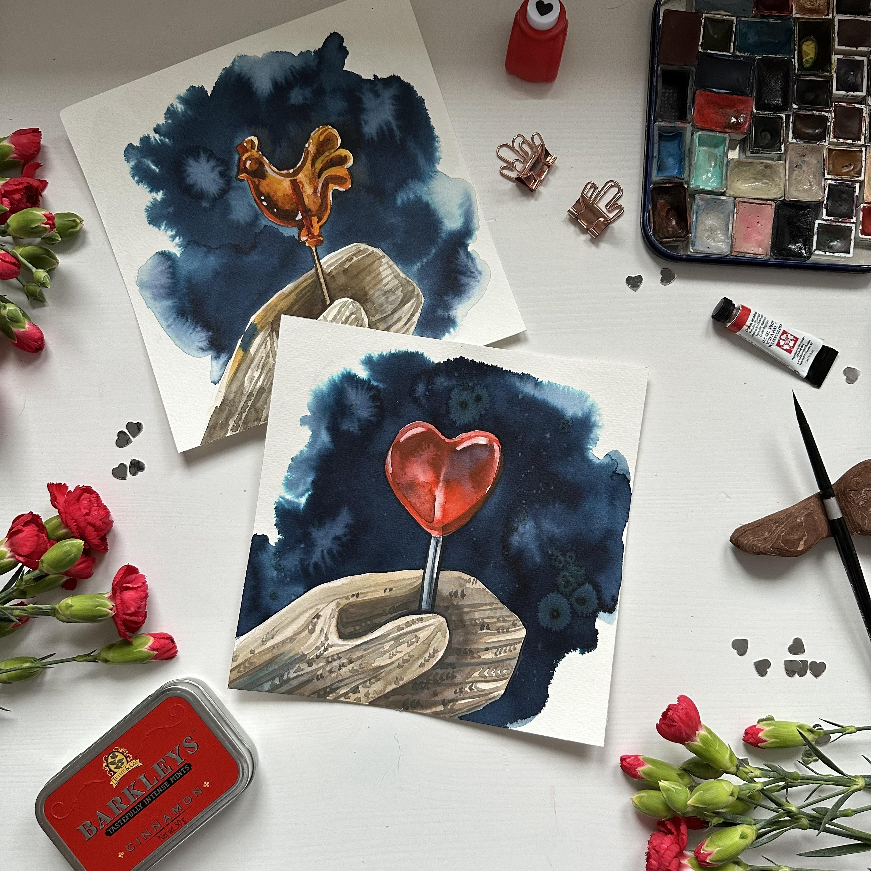
watercolour with me. As a class project, you will paint a beautiful, heart shaped lollipop
against dark, blurry background that can become a great Valentine's card. We will start with
the foundations, color mixing and
drawing a sketch. Then we will dive into
step by step painting. I will share three
techniques of creating highlights which make
painting look more realistic. Also, you will learn how to paint a blurry dark background. Grab your brushes,
prepare your watercolors, and I hope to see
you in the class. Man.
2. Secret of Painting Realistic Objects: Have you ever
wondered how to make your watercolor paintings
look truly realistic, especially when painting
glossy or shiny objects like glass metal
or wet surfaces? The secret is
simple but crucial. It's all about highlights. In watercolor, the brightest
areas of your painting, the highlights are created by preserving the
white of the paper. Creating highlights
also help us to make more eye catching
painting because our eyes like to see
contrasting objects, and highlights always enhance the contrast on the painting. There are three main techniques I used to achieve
that realistic shine. First one is muskin
liquid or skin fluid. Before you start painting, you can apply skin liquid to the areas that should
remain bright. Once the rest of your
painting is done and dry, you simply remove
the muskin liquid to reveal crisp white highlights. This is especially useful
for complex reflections or tiny bright spots like the shine on a
cherry or a diamond. The second bun is simply preserving the
white of the paper. For this method, you don't
need any additional materials, and this one we will use
for this class project. You carefully paint around the highlight areas,
leaving them untouched. This requires good planning
and brush control, but it gives the most
natural and luminous result, perfect for smooth
reflections on glass or metal or caramel, like in our case. You can also create highlights
by lifting the color from the wet surface using
clean and dry brush. The third one is using
zinc white at the end. While traditional watercolor
avoids white paint, you can break the rule
slightly by adding a touch of zinc white watercolor or even white gouache
at the very end. Like I did on painting the lollipop rooster or
hard lollipop and the lips. This is not ideal method
because you can see in comparison to the
cupcake, for example, where I used masking liquid that preserving the
white of the paper looks more bright and shiny. Now you know all the techniques, and we can move to painting.
3. Color Mixes and Art Materials: Let's talk about materials. I will use brush number six by silver brush,
black velvet. I will use also brush
number 12 by Squadaperla. It's round brush, synthetic one. And I will use mechanic pencil, 0.3 millimeters, but you can use any other
pencil that you like. I will paint on cellulose
paper by aurora. It's a glued pad, so I don't need to fixate my
paper on the drawing board. You can find links to all the materials in the
description of the class. Now about the watercolors, I will use a watercolor by
white nights in the pen, which called Pettis bookocha. You can use just yellow Ocha and zinc white and
mix those colors. Organic vermilion
by Daniel Smith and liquid watercolor by
alkaline, indigo color. I will also use yellow
ochre and paints gray. I will use these
colors for painting mittens mostly and create
in different shades. I will start by
swatching the colors, and I will start from the
latest one BettsburgOka, and basically just yellow
ca with white pigment. Also, I have just
pure yellow oka that I will use foam mixes, and I will start by
mixing these colors to create more interesting
shade for the ten. I will mix these
two colors and add a little bit of paints gray
and organic vermilion. If you see that your
mix is too red, you can add just a little
bit of paint gray. And if you see that
your mix is too dark, you can just add a
little water and just make the color more
transparent and watery. It should be something
like this, like top color. Now just a swatch of Pains gray. I'm using Pains gray to darken my main colors and create
colors for the shadows. For example, I can mix organic milon and
add some pains gray, and it will create
dark red color. To show you how the
liquid watercolor looks like on the paper, first, I will wet the surface of
the paper with clean water, and then I take the liquid watercolor
and apply it to the wet surface for
creating background. You can use ordinary watercolor, make sure that you
use a lot of pigment. I can reapply color while
the surface is still wet, and also I can add this color to the palette for my future mixes. As I told you earlier, you can use mix of red and pins create to
make the dark red, but also I can use mix
of red and indigo. It creates nice shades because they are connected
between each other. So basically, we have this lollipop that is
quite see through. And basically, we see through the red surface
of the lollipop, the background, and
background is dark blue. So these are our main colors. If you have different colors for your painting, it's okay. Just try to find the right proportions in the color mixes that
you are going to use. And also, it's very important
to not use a lot of colors because it creates
mess on the painting. It is better to use a limited
palette for any painting. You can find my
watercolor supplies guide in the attachments
to this class, which will help you to understand how to read
watercolor labels, how to choose watercolor
paper and brushes. Also, it has links to
my favorite products. Now, I want to show you what
to do if you don't have, for example, petted bock Ochre, which is quite rare color
and how to mix same color. As I mentioned earlier, you can just mix zinc
white and yellow Oca. It will create very similar
shade to PetsbagOca. Also, we can create
a bit of paints gray to make it more muted. And if you need to create more dark color like warm brown, you can make paints gray, a bit of zinc white
yellow cha and add a bit of red
because without red, it will be more green shade. And with red, it will
balance the color mix into the very warm,
nice brown color. You can use this color
and add a bit more zinc white to have this color, like, top color that we will
use for painting the mitten. Before we move further, I want to show you a simple way to paint
the knitted pattern. First, I apply first layer
with a very light mix. Then I use a bit dark mix, and I create a lines and a little details as
a knitted pattern. It's very important to make it not in a very strict order. But later, I will show you a bit more detail how I
paint the knitted mitten. Now let's move to the next
lesson and prepare our sketch.
4. Sketch: Let's start with a sketch. First, I will mark the main measurements of the highest point
of the objects, and I will place the
middle line of the paper. It's just approximate
middle line. I'm not using any rulers, but I can use units
of my pencil to measure if it's correct
half of the paper. And using siting method, I'm checking the measurements of the lollipop
regarding the Mutton, and I'm marking these
measurements on the paper. You can just Google the site and method and
check how it works. I'm starting to draw
a shape of the heart. It's very simple,
and I'm placing it a little above the
middle of the paper, the center of the paper. And if you want, you can just trace the copy of this sketch that you can find
attached to this class. Oh When I'm sketching the mitten, I'm using very rough lines to just draw a simple
shape of the mitten, so you can use straight lines to understand the angles and the direction that
this shape goes. And then you can just
make them more smooth. I'm also sketching
some direction of the knitted pattern on
different parts of the mitten. For now, it just simple lines, and I'm just drawing
some pattern, but I will show you a bit
later how to paint it so we wouldn't go very deep into this replication
of this pattern. I also draw a stick
for the lollipop, and I do not make it very
thin because I will need to paint the shadows and light areas on
this area as well. And I can remove some lines that I don't need with ordinary
eraser very carefully. So basically, I'm
using table erasa for the lines that I
will need just to make them a bit lighter and ordinary eraser to remove the lines that I
don't need at all. I can also draw some highlights on the
up part of the heart. You can take a look at the reference to see
where the highlights are. And now I will
also draw the area where the dark bids will end. It will help me when I will use watercolor and
wet wet technique. And my sketch is done, and I can move to
the next lesson.
5. Painting the Mitten: Before I start painting, I want to make sure that all the color mixes
are on the palette, and there are enough of puddles. So now I want to prepare some light and dark
mixes for the mittens. As I mentioned before, I mix in Pettsburgoka and other colors like
organic vermilion and a little bit of paints gray. For now, in the paddle
that I'm using, I also add yellowOca and it
makes color more intense, brownish, and I will use
it for the mid tones. Also, I want to renew
organic vermilion on my palette because I will paint with wet
on wet technique, and I need to have enough
color on the palette. And I want to renew
my mixes with red that I already showed
you in the previous lesson. So I'm mixing very thick
organic vermilion and some indigo that I have on the palate to create
this very nice, rich, dark red color for
the shadows on the heart. And now I want to make some
lighter mix for the mittens. So I'm using Pettisbgoca. I add a little bit of yellow Oca and a little
bit of paints gray, just to make it a bit more interesting than just the
pure color from the pan. And now I will take
a scrap paper to test out my mixes that I
already have on the palette. So now I have three
shades of each color, the latest middle tone, and for the shadows. I started by
painting the mitten, and I will split it into halves. And first, I will
paint the left side. So I'm covering this area
with a clean water first, avoiding covering the area behind the thumb because
it will be the shadow, and I will paint it a bit later. So now I'm creating
the first layer with the mix that I have on the
palette, Betts bogoka, yellow cha, and paints gray, and I'm carefully covering
this area with this color mix. Once it's done, I can switch to painting dark area behind the
thumb where the shadow is, and I load my brush with the
same mix, but more intense. And you see that it looks dark. It has more paints gray and
more yellow oak inside, and I applied it to
the wet surface, letting the colors blend on
the surface of the paper. Color can travel to the areas, and you can just
lift the color with a clean and dry brush if you want to remove
it from somewhere. For example, I see
that it travels on the area of the thumb, so I will need to
remove it later. But now I just want to create some pattern direction of the lines while the
surface is still wet. And as you can see, I also add some dark color at the bottom of the mitten closer to
the edge of the paper. I'm using mix of paints
gray, yellow ca, a bit of red and pets bug cha. And now, as I told you, I need to clean my brush and
dry it with a paper towel, and I will remove the dark color from the
surface of the thumb. So I'm pressing my
brush and I'm lifting the color from the surface,
creating the highlight. You can lift the color only
until the surface is wet. And also, while the
surface is still wet, I can apply more and more
color to the wet surface, letting the colors blend, creating patterns and intensify some areas in the shadows. Be careful because the
paper gets dry and now colors won't blend with each other as much as they
did in the beginning. So we don't need to
leave any rough edges. So make sure that you add somewhere more water
into your color mixes, and maybe if you have
already two dry paper, you can just stop. I decided to make a bit more artistic appearance and to add some indigo
into the left corner. So I place indigo on
the palette and I add it to the wet surface
so the colors would blend. You can skip this part
if you don't like, or you are not sure that you want to add this blue
color to the ten. You can just leave it
as it is or just darken the color in the left
corner with paints grey. At this point, you
can add a little bit of dark dots into
the wet surface to create diversity
of the pattern and to show that it's needed fabric. But we will work on it later, a bit more detailed. And now we can already move to the right side of the
mitten, and I'm creating, again, this puddle
of Pets book Oca, yellow Oka, red color that
I have on the palette. Mixed with indigo and pins gray. Basically, it's all
the colors that I have creating this neutral, close to brown color. And I start placing this color from the
edge of the mitten. Now I'm carefully painting the right area with a very light mix that
I have on the palette, and I will load my brush
with a bit dark mix and carefully paint around
the thumb and the stick. But you see that colors are
look the same on the paper, so I mix in a bit dark color
with indigo red, yellow, ca, and paints gray, and I mixing these
colors until I will get pretty neutral but
dark brownish color. Apply this color right below the thumb on
the wet surface, and I'm using not too much water because the
surface is already wet. So I use pretty dense color. I can add more yellow cha and pink gray if I see
that color is too red, and I need to make
it more brown. The paper gets dry too fast, so now I see that colors
are not blending. So I'm cleaning my brush and
I load it with a light mix, and I'm slowly moving from the right side
towards the left one. And blending the colors create and also this
pattern with lines. Now I can darken my mix
by adding more pink grey, and I need to create pretty
dark area at the bottom of the ten below the thumb because the thumb will be
pretty light area, and everything on the right
side should be pretty dark, creating contrast
between these two areas. I can add some wear patterns
with this dark color on the left side of the ten
so it would look united. So you wouldn't have two different halves in
two different colors. Now I can add more pink
gray and using this color, apply again to the most dark
parts where the shadows are. So it is below the stick on
both sides below the thumb, and I'm carefully
lifting my brush, creating these smooth
areas of the shadows. Now using this dark color, while the surface is still wet, I can create this pattern
of the knitted mitten, and I'm just leaving
these little marks, little dots and brush strokes creating this effect
of knitted area. The main thing is to not
make them in a strict order. So somewhere leave
different space and make the color
slightly different. I'm using the very
tip of my brush, which allows me to create
very little brush strokes. And now we're almost
done with the mitten. Of course, we will add
a bit more details, more dark areas, and so on. But for now, it's
pretty good already.
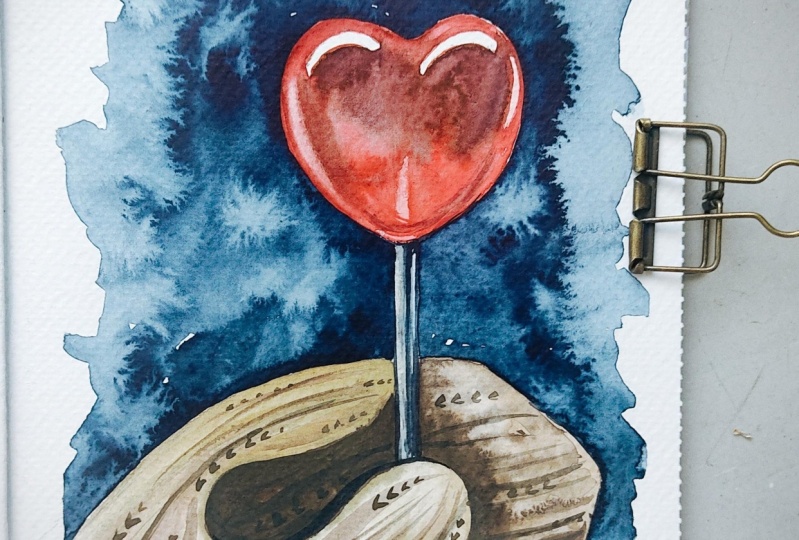
6. Painting the Heart: Now let's move to
painting the heart, and I will use organic vermilion that
I have in this puddle, and I want to renew the mix
of organic vermilion and indigo to create
this dark red shade. I clean my brush and I apply clean water to the
surface of the heart, avoiding covering the highlights at the upper part of the heart. You can apply muskin
liquid to these areas, but I want to show
you how to paint this transparent glossy
surface without muskin liquid. So I'm just avoiding these
two highlights at the top. I add pure organic vermilion
to the wet surface, and the color just travels
on this wet paper. I use pretty dense color because the surface has a lot
of water already, and the color should
be pretty thick. And I'm pressing my brush
carefully painting the edges. In the middle there will be
a stick from the lollipop, and I will just remove
the color later. For now, our task is just to
apply this bright red color. At the top, I apply dark shade, mix of organic
vermilion and indigo. And also, if you can see, I marked some areas at the top, where the dark area will end. For now, I'm increasing
color value, so I load my brush
with more red color, and I apply it on both
sides from the stick. So I don't apply
it in the middle. I'm just trying to make the color on both sides
more intense and bright. I want to create
some highlights. I clean my brush and
dry on the paper towel, and by pressing, I lift the
color from the surface. So I can create very nice
and smooth highlight on both sides. And I will do the same with the middle part
where the stick is. I remove some of the paint
from the wet surface. And I see that on
the right side, my edge got a bit rough, so I just reapply some color, create in more smooth edge. If you struggle with create
in this very smooth line, it means that you either don't have enough paint
and wet color on the brush or you just don't press it enough
because when you press it, you can control the brush
stroke and make it more smooth. Now I apply this
dark red color mix of organic vermilion and indigo. To these areas that I
marked during the sketch. So the colors are blending with each other
because the surface is wet, and this is something
I want to achieve. These very blurry
effects on the candy. I apply more pure
red color just to make this edge more
natural and more smooth. I add some dark red color on
the edges of the lollipop, and I want to remove some
color from the middle, just creating diversity and
creating this effect that it's a caramel candy and it's quite transparent
or see through. I can also drag some color to the side on the highlight
to make it more smooth. While the surface is
still shiny and wet, I can create more highlights, and I decided to remove some more paint from the middle
part where the stick is. Now I will wait for it to get dry and I will see you
in the next lesson.
7. Painting The Stick: Now let's paint the
stick for the lollipop, and I will mix the colors
already have on the palette. The shade I used for painting the meat and it's Pettus
bug oka, yellow ocha, a bit of paint gray, and I add more water to create more
transparent light mix, and I also can add
a bit of indigo. I'm mixing the colors until
I get the mixture I want, which is pretty
neutral gray shade. And now I can apply
this light color, starting from the left
side of the stick. The left side will be
lighter than the right side. So for now, I'm
keeping this area, and I will apply
light dark color. But for now, I can already
mix a bit of indigo and apply a bit right below the heart and drag the color
towards the bottom. For now, the surface is too wet, so the colors will
blend with each other. So be careful if you see
that it's hard to control. Just wait a bit for the
surface to get dry. The surface got dry and I add a bit more
indigo to the mix, creating more
intense gray shade. I start by highlighting
the shadow below the heart and I'm making
this very thin brush stroke, which represents the shadow. It's not totally
on the right side. I keep a bit of light
reflection on the right side. So this dark gray line is almost in the
middle of this stick. And I'm trying to highlight
the shadow on the right side. I use the very tip of my brush, but it can be tricky
and quite challenging. So you can switch to the smaller brush if it's
more convenient for you. I'm also highlighting
the shadow below the thumb, outlining this shape. I also want to add a bit of reflection and darken
the shadow on the heart. And to make it more smooth, I add pure organic vermilion, and I'm smudging the
edges of this reflection, repeating the shape
of the heart.
8. Background: Our work is almost done, and now we are moving to
the most relaxing part, which can be also quite stressful creating
the background, but the main challenge
is to work very fast. Now I switch to my brush
number 12 by SCOda and I apply clean water around these objects we
already painted. I don't apply water close to
the edges of the objects. You see that I leave
a bit of space. And I don't apply water close
to the edge of the paper, even though I have glued pat, but I want to create nice and blurry background which will not fill the whole paper. I applied enough water, and now I can move to
applying the color. I will apply it close to
the objects in the middle. So I don't apply the
color on the edges because color will travel
on the surface anyway. If you have watercolor, not liquid, but
in pens or tubes, just use your brush
and a very dark mix or dark color and apply it
also closer to the objects. And now we have to
work very fast. You can use brush that is
more convenient for you. And now I will just move this color closer to the
edges of the objects, trying to create
this dark background behind these light objects. Somewhere I can drag the color towards the
edge of the paper. It's fine, but I'm trying to not do it every time and everywhere. I'm pressing my
brush, and I'm like, outlining the heart with
this dark indigo color, creating this dark backdrop. It also helps to create more
sharp edges of the objects. If somewhere you paint
it not very smooth edge, you can fix it now
with a dark color. Just make sure that the surface is wet and you are
moving color around. Feel free to rotate
your paper to find the most
convenient way to work. If I see that I don't
have enough color, I can just grab some color from another puddle on
the paper like here. But of course, you can also load your brush with the
color from the palette. I'm just trying to avoid creating puddles of
water and color. It's not very good. And the darkest areas should
be around the objects. So I'm trying to drag the color towards the heart the
edge of the mitten. I think I'm done with
the middle part, and I want to create more smooth edge of
the background itself. So I'm cleaning my brush, and I'm just dragging some color because I have
a puddle of the color. So I'm just lifting the
color on some edges. I can splash some clean
water into the wet surface. It will move color around
creating nice effects. And also, I prepared
some table salt, or you can take sea salt to create more interesting
effects on the background. Before applying the salt, I want to wait a little
bit for the surface to get more dry
but not fully dry. And I see the puddle
above the heart, so I'm waiting a bit longer. Now I can apply sea
salt in some places. If you already like the
result and the background, you can leave it as it is. But I decided to create this nice effect that I usually
use for the backgrounds. We'll leave the salt
till the very end when the whole engine
will get dry and ready, and now we are moving
to the next lesson.
9. Final Details: Now I want to add some final details to
the mittens first. So I'm mixing a little
bit of Pets pack Ocha. I added two indigo, and I use some red shades that I have left on the palette, and I will add a
bit of yellow Oca. So I will get basically
this pretty dark brown mix, and I will paint again
buttons on the mittens, creating these lines and
just a little brush strokes. Using this dark color, I can also add some more
shadow behind the stick and the thumb and also create this pattern of a
knitted mitten. Now, I think I'm
done with the ten, and the most important
thing is to not make a strict order of these brush strokes and
dots and different details. So try to make it
in some places, leaving others very
simple and light. Now, I want to
outline the stick, and I'm using indigo color. You can use paints
gray mixed with yellow Ocha or some dark colors that are left on the palette, and I'm carefully
outlining the stick, creating this very
dark contrast. Also, I can add a little
bit in the middle and outline the thumb it also helps to fix some rough edges or just outline the
shape of the object. I'm using a pretty
big round brush, but I have a very ointy end, and I'm holding the brush very
close to the brush belly. You can switch to the smaller brush if
it's more convenient. And now I want to add some
final details to the heart. I'm cleaning my brush, and I want to make more smooth highlights
because now it's just white. So I'm just dragging
some color around the highlight using clean
and a bit damp brush. So it's still lighter than
the main color of the heart, but it's not bright white. And I'm loading my brush with a bright and intense red color. And I'm just also highlighting
the shape of the object, creating this dark
area on the edge. I want to increase
contrast around the stick, so I'm placing this color on the left side from the stick. And I want to remove
these rough edges, so I'm loading my brush with
light a mix and more water, and I'm lifting the color
towards this dark area. And our painting is done. Now I will wait until
the background will get fully dry and I
will remove the salt, and it will be the final touch. I will see you in the next
lesson for the final thoughts.
10. Final Thoughts: Congrats. You've
successfully completed the class. Awesome job. I'm super excited to
see your painting. Don't forget to submit it as a class project and drop review. I hope this class has not
only boosted your art skills, but also brought you
joy and relaxation. Thank you for being
part of this class. I can't wait to see you in my other classes where we
will paint everything from stunning landscapes and
botanicals to animal portraits. Keep practising,
keep experimenting, and most importantly, have fun.
 Aleksandryna Gromyko, Watercolor tutorials for everyone