Transcripts
1. About the Class: Welcome to my new
class where we will paint a serines
escape at Sunrise, complete with graceful skels. In just a few simple steps, you will create a beautiful
watercolor piece that can brighten any room or be shared as a hand
painted postcard. For this project, you will need just four
watercolor paints, two brushes, and of
course, watercolor paper. I'll guide you through
every step of the process, starting with art materials and color mixes and
moving to painting. As a class project, you will create a
painting with siecles in any size you want from a
postcard to a proper Canvas. This class is suitable for the beginners and
intermediate artists. So get comfortable,
gather your supplies, and let's capture the serene
beauty of the sea together. I hope to see you in the class.
2. Art Materials: Hello, and welcome to
my new class where we will paint this
landscape with Sigels. It's pretty simple, and
it looks very nice. It can be a decoration for
the wall or postcards. For this painting, I used 100% cotton paper by
arches as I normally use. I used two brushes, number 12 by Escoda
ultima and round brush, number four by silver
brush, black, Velvet. I will also use a smaller brush, double zero by Peble
for the final details. Now let's talk colors. You can also find a list of all materials in the
attachments to this class. For the color of the
sky and the sea, I picked two colors, Lavender, by White Knights
Engine brilliant number two, by Mija Mission. Burnt Umber by PVs
Shinhan art and Paints gray By Van Go
for the color of seglls, and also some Zinc white for the final details like
highlights on the Seglls. Now let's move to
main color mixes. I will use for this painting. First, I will show
you some swatches of the four main
colors I will use, Lavender, Jan Brill number two, Burnt Uba and Pinscreen. I will start with
the very simple mix of lavender engine
brilliant number two. I will use this color for painting the sky and the
sea, basically background. It's a very nice, muted pastal gray that I will use in
different proportions. At the top of the sky, I will use more lavender, and then I will move to
the bottom adding more and brilliant until I use
just purgin brilliant. Next mix is lavender
and burnt umba. I will also add a little bit
of brilliant number two, while I will use this mix. Our main purpose with
this mix to create more intense and
dark gray shade for painting the sea
because the sea in this image will be darker
than the color of the sky. And you can see on
the palette that this gray has a bit
more muddy shade. But we need to make it and pure. I'm trying to find a
per proportion until the color will get nicely gray. And this color is almost the
same like the previous one. It just has more gray shade. Now I move into the mixes, I will use for the Sigals, and the first one will be burnt Umba plus Jan
brilliant number two. It will create a nice and
warm shade that we will use for painting the body and the
light areas on the wings. You can also try and add some sarin crimson or yellow color into the mix
to make it more bright. But I will use this
limited palette mostly, and I will try to create the painting
with these four colors. The last mix is Bantuba
plus paints gray. This mix I will use for painting shadows on the wings and
on the body of the sells. Mostly, I will use this color for the dark areas on
the wings of the birds. We will use different
combinations of these colors just using the colors we have
on the palette. That's all about color mixes. I will see you in
the next lesson where we will start
drawing a sketch.
3. Color Mixing: In this class, I have
some specific colors, Lavender engine
brilliant number two. If you don't have these colors, I will show you how
to mix them using some colors from the
main primary palette, like blue, red, and yellow. I will take ultramarine blue and lizarn crimson
as primary colors. Also, we will need zinc white
for mixing these colors. First, I will show you
how to mix lavender. I will mix ultramarine blue and a lizarn creams and
creating a purple shade. Normally, if you don't have
some color that artist, for example, has
in the tutorial, you can just read the
description with pigments or Google it and try to mix
the colors on your own. Because basically
all the colors are mixed from three primary colors, blue, yellow and red. So if you don't
have, for example, a lizard in crimson, you can also try to
mix this shade with ruby or ermine or some
red shade that you have. The color mix can appear
to blue or two pinkish. In this case, I just
add another color more. For example, if this mix
would appear to pinkish, I would just add a bit
more of ultramarine. Now I have a perfect
lavender color. Now I will show you the color
from the tube a mixed one, and you will see that
it's pretty similar. Now I will try to mix
brilliant number two. I already know that this color consists of four other colors, yellow, orange, brown and white. This one will be more
challenging because we have to find the right consistency
and ratio of each color, and we have three of them. I mix in orange and yellow. Now I add burnt umber that we
already have in this class. And finally, I will add some white pigment
to see how it looks. Looks like the color I
got is a bit more orange. I will try to add more white
pigment to see how it looks, but still it's pretty similar. So this one I mixed
from the three colors, and now let me show
you another way to mix this color with just
red and yellow pigment. This time, I will mix alizarin crimson that
you already know from the previous mix and
yellow color. I have in. But if you have another yellow
color, it can also work. So I'm mixing colors
on the palette. And of course, it can be a
bit yellowish or to pinkish. We will see and
depending on the result, I will add other
color accordingly. So now I add white and I see that the mix I
got is too pinkish. I had to have to balance
it with yellow color. So I add more yellow. If it's too yellow, I will add more red. I think that I mixed enough, and now we can try the
color on the paper. It looks like it will be even more similar to
the original one. Yeah, it looks pretty the same, and you can definitely use red and yellow colors for
mixing brilliant number two. So this is how you can easily create your own colors
with your primary palette. If you don't have these
particular colors, I use in this tutorial.
4. Sketch: Let's start preparing
our painting and we will draw a sketch. The sketch will
be pretty simple. I'm drawing a horizon line, which is below the middle of the paper closer to the bottom. And I will draw some
simple shapes of the ss that I see
on the reference. You can find a
reference photo in the resources attached
to this class. I also attached some of the inspirational
photos that you can also as a practice before you paint your
main masterpiece. Ohh Oh. Now my sketch is almost done. I will just remove the pencil
lines with needable eraser, and I will fix my paper on the drawing board because
it's not a glute pot, and I will use wet on wet tie. So I have to fix the paper
on the drawing board.
5. First Layer: Yeah. Yeah. I will start mixing colors on
my palette, and basically, I'm using this mix
of lavender and an brilliant number two
for the color of the sky. I'm mixing these two
colors trying to create more gray shade
because lavender itself, it's pretty bright, and I
will use different amounts of both of the colors to
reach some different shades. And closer to the horizon, it will be more pitchy. I will use maybe even pure
an brilliant number two. But first, I will
cover the surface of the paper above the horizon
line with a clean water. I'm using bigger brush. So if you have a mop brush
or just a round brush, bigger size like number
ten or number 12. It will be useful to
use it right now. I will start from the
top to the bottom. I will move from more bluish
color from pure lavender, to the mix of lavender
ge brilliant number two, and then to the pure brilliant. If you don't have these colors, you can also try to
mix some red shade and blue shade with zinc white color and try
to reach this shade. It's also possible. I will use also some yellow and red colors
I have in my palette for paint in the ss and maybe to add a bit to the
color of the sky, some more bright orange color. For now, I'm painting just above the horizon line because we see on the reference photo
that the color of the sea will be darker than the color of the
sky and more gray. I will have to mix some
more intense color. But I can create also the
first layer for the sea. Right now, I decided to make some more intense orange color using zarine crimson and line, and I apply this color
closer to the horizon line, creating this more
intense shade. I'm picking up the drawing
board from time to time and creating this angle
to let the colors blend in a nice way
because it's watercolor and it allows to create
direction of the flow. And now I'm just moving
closer to the bottom, and I will just this
layer cogen brilliant and a bit of lavender. Later I will create a second
layer with more dark colors. Right now, I just need to create this very warm shade and
quite light actually. No. No. While the surfaces getting dry, I will prepare a color
mix for painting the sea. I will mix lavender
and burnt umber, which creates a very
nice, muted gray shade. I'm using quite a lot of water
and still my bigger brush. It's number 12. And I'm creating
this gray shade. To use it when the
surface will get dry. If you are not sure about
the color you mixed, or you just starting
with water color, I highly recommend to use
the scrap paper and test your color before you apply on the painting on
the scrap paper. I can see if it's too dark
or it needs to be blue, more red, like I see which color I need to
add to a mix I want. I will add a little bit of lavender and burn
umber into the mix. It will make the color
more intense and gray. The surface is just
a little bit wet. It's not fully dry, so the waves will be blend with the existing color of the
first layer and it's okay. But if it's totally
dry, it's also fine. I'm just going with the
very white strokes. But a very important thing, you have to keep
some light areas. So try to make these darker areas closer to the horizon to
highlight the difference between the sky and
the sea and also to leave some light
areas in the middle, just like we see on
the reference photo. Now, the background
is almost done, and I will move to
paint in the ss.
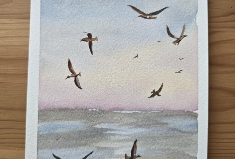
6. Seagulls: I will start painting
the Segel using this mix of burnt umber g
and brilliant number two. I will start with this
pretty light color and will cover the body of the s.
I'm using brush number six by Windsor and tons synthetic and probably
I will switch to another brush number
f by Silver brush to have control over the
painting and little details. I will add some dark shade
at the bottom because we remember that the shadow normally at the
bottom of the object, and this is how it works
with the sigl I'm just using the mix of an Brillian and
burnt umber just a little bit more burnt umber in this mix than the first
layer of the body. I will use this dark
mix of burnt umber and paints gray to paint the wings It is important to paint the wind with not too dark color and to put some highlight because the sun is shining on the birds. So I'm placing some light
color on the right side, and I'm just lifting the
color towards the corner. And I will add some shade, but you see that now the color blending
with the darker one, and it creates nice gradient. The whole painting has
this very nice feeling of a sun rise sun and sunlight. We see that seglls are have
very brown and warm shade. So that's why I'm using burnt
umber to paint the wings. So I'm trying not to make it dark and co because
normally we would paint seglls with gray
shade because they're white and their wings
are like black. They have some black elements. But here we just paint
these brownish shades, trying to catch this
feeling of a warm sunlight. At the very end of the wing, I can add some dark shade, mix of burnt umber,
and paints gray. And now I will
highlight the beak of the bird and the
shadow on the belly. Now, using the same principle, I'm moving to paint
on the right side, and I'm using the same of
Jean Brill and burnt umber. I'm mixing some more cold
shade for the right wing because I see that it's more
cold than the left one. I'm mixing lavender
and burnt umber trying to create this
dark and gray shade. I will apply this color
on the right wing. Now, also the darker
mix of burnt umber and paints gray on the
very edge of the wind, because we have to
make this area, so we have to some darker
areas and lighter areas to create the dimension
like it's flat object. Now I'm moving to
paint the left wing with more worm shade
with burn tumber, and Saman Brill number two. Be careful because
the body of the bird, which we painted
first, is still wet, and I'm connecting these
colors very carefully, so the dark colors
wouldn't blend totally with the light
area of the body. If you see that
colors are blending, you can use clean and
dry brush and just lift some colors from the surface of the paper, making it lighter. And now I will add also
the shadow on the belly of the bird and we'll add
some dark shade on the beak. And maybe later, I will
even darken this shadow, but when the surface
will get fully dry. I think by now you
got the main idea of painting these
birds that we are making a very light belly
and the head with one mix. Then we paint some darker wings, and we carefully connecting
them with the body. If the colors are blending and the light area becomes too, we can lift the colors with
the dr and clean brush. If you see that the dark color blending with
the light one, you can lift the color with a dry and clean brush and
remove this dark area, keep in the highlight. Before I move to painting
the last wing on this bird, I decided to change my
water because it's, and it can affect the
colors on the painting. I will see you in
the next lesson where we will continue
painting the birds.
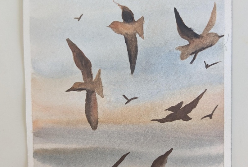
7. Seagulls Part 2: I cleaned my palette, and while I was away, this area got almost dry, so I can paint this wing without being afraid
that colors will blend. And I'm using just pure burnt umber to cover this
dark area of the wing. Now I will move to painting
the bird on the right side and we don't see the
belly of this bird, unlike the other birds
we painted before. I will use more dark mix of
burnt umber and paints gray. I will not add probably
Jean brilliant number two, so I will have just more water to control the
lightness of this mix. Be careful, it
shouldn't be too dark, but at the same time, it will be darker than the other birds we
see on the left. Now, I want to paint a bird on the right side that
I forgot to sketch, and let's hope it won't be ugly because it's quite
hard sometimes to catch the shot a proper
sketch beforehand. And you see that basically all the birds that I
already painted, they have different direction. They're not similar, and
you can just take a look at different references and pick the shape of the bird that
you would like to paint. Well, I think that I will
work on this bad a bit later because I
don't love how it turned out, but it's okay. I think it's f. Now only two birds left to paint, and I will start with
a very light mix of brilliant number
two and burnt umber. Normally, this bird
will be pretty dark. But on the upper part of the
wings, we see the light. That's why I will
keep the light areas. And I will add some dark color mix of
paints gray and burnt umber at the bottom of the wings because basically the salute of this bird
will be pretty dark. The colors are blending, and I'm okay with it because this bird should
be pretty blurry, and it's more a rough shape
of the bird, and that's it. Now I can add some darker
areas to each bird, like to paint the edges
of the wings or beak or eyes because it's already dry and I can add
some darker details. I'm mixing some burn timber
and engine brilliant, the colors that are
left on the palette and a little bit of a
lazarin crimson to paint the last bird that I actually haven't
sketched properly, but it will be a
very simple shape, simple silete, so I decided to do it without
a proper sketch. You can sketch it or you can even just miss it and paint it. And here, I will just make a very simple silett
with this light color. We'll add some dark color on the edges of the
wings, and that's it. Now when all birds are ready, I want to add some more birds
like in the background, very small like dots or a simple shapes with a darker color with
a pure burnt umber. You can first sketch it if you are not sure
where to place these birds. But I'm just looking
at the composition, and I'm trying to understand
where I would like to put some little birds on this image. The main thing is
to not overdo it. With this one, I will
stop because it's enough. If you feel like you
want to add more, I would suggest to add one in the corner or maybe
a area of the s. But I think it's
to it like this. What I also want to do, I want to add some white
highlights with the zinc white. If you don't have zinc white, you can use for
example, pastel pencil, white one or ink or
something like that, or even just, if you have it. I will just place
some highlights to make the painting
look more interesting. Can actually skip
this part because I actually like the painting
as it is right now. But with highlights,
it's normally look interesting
and eye catching. I'm using a very
small synthetic brush double zero by pebo, and I'm just placing a small white dots on some
dark areas of the birds. And our painting is done. The only thing left is to remove the masking tape and
to put your signature. Thank you for joining my class. Please don't forget to
share your painting in the class project
and to leave a review. I hope to see you
in other classes. If you decide to share your
painting on Instagram, don't forget to tag
my account. 55.
 Aleksandryna Gromyko, Watercolor tutorials for everyone