Transcripts
1. Intro: This class is all about drawing and painting mountains. You'll learn how to start with simple shapes to establish the overall composition before moving on to more complex textures and lighting patterns, my goal is to help you see through the complexities so that you can approach any mountain scene with confidence. Using the provided references you'll be able to paint along with me as I talk you through my thoughts and techniques for achieving more interesting mountains with demonstrations in both watercolor and gouache, this class is aimed at a wide variety of students who have the same goal. Painting better mountains. As always, my teaching style is to understand the reasoning behind the choices and provide repeatable strategies so that you can feel more confident in approaching your own unique scenes for years to come. So grab your sketchbooks and let's get started.
2. Seeing the Structure: If you've taken any of my previous classes, you know that I'd like to begin with easy sketching exercises. I truly believe it's important to have a strong drawing foundation in order to make better paintings. Drawing is a fast way to express ideas on paper to break things down into basic forums and understand the underlying structure of what we paint. First, let's take a look at some mountains. As a reference. This may seem a bit intimidating at first, but at first glance, what do you see? You might notice the light hitting the peak or maybe the soft clouds drifting over the mountain. This is what I see. When I sit down to draw mountains, my first thoughts go to what are the basic shapes? Once I have the skeleton of the mountain worked out, I can add any materials and textures and colors and lighting effects that I want to the surface. With practice, you'll be able to see this way too. Much like my class about breaking down a complex rock forms. I want to begin with an exercise that will help us do this with mountain ranges. Starting with triangles is probably the most obvious, but I prefer to think of them as cones. Unless you are going for a very flat 2D look. Getting into the habit of seeing these basic shapes in 3D will be far more helpful. If you fly through the mountains in Google Earth, you can start to see what I mean. Imagine that each of these peaks begins as a cone. Look at what shapes are connecting them. Sometimes they're very simple shapes, sometimes a little bit more complex, and very often everything is sort of overlapping. As a beginner exercise, this is a great way to start visualizing the mountain forms. I took some screenshots and put them in the class resources if you want to give this a try. Following this simple formula is a great way to begin the mountain journey. So grab your favorite sketching materials and we'll get started.
3. Warmup Sketch: A lot of times we are adding mountains to our backgrounds as though we're standing on the ground looking up at them in the distance. In that case, we have a very different perspective than when we are flying through the mountains in Google Earth. But seeing mountains from different perspectives will really help when it comes time to add depth and definition to the mountains. The easiest way to begin is with a horizontal line. This represents the base of the mountain range. But of course, in reality, this would probably be going up and down as the valley transitions into a mountain. But we'll start simple. Next lay in some basic triangles. If you can really try to visualize these as cones, decide where your light sources. I imagine the sun is off to the right. So the right side of my mountains will be highlighted. Start shading the shadow side. I'm using perpendicular lines because that is my preferred style of shading for quick sketches. But you can use any style of shading that you like. Starting at the peak and working down towards the base, my lines get wider and wider. By now you can probably see why it's important to be able to visualize these as cones. Shading one side automatically adds lots of depth. Continue shading each of the triangles from top to bottom. When you're shading the mountains in the distance or the ones that are behind the foreground. Stop your lines when you get to the edge of those foreground mountains. And there we go, a simple mountain cluster. Let's try it again, but this time add even more peaks. So it's the same idea as before. Only we're adding multiple peaks to some of those triangles. I like to vary the heights of all of my peaks. So we'll do the same style of shading as before. And if you feel confident, go ahead and play with the shapes of your shadows. The peaks are often connected with ridges. When shading those connecting ridges, my shadows don't go all the way down to the base. This is what helps achieve the look of multiple edges at my peaks. Continue this exercise a few more times. Take your time. Start with simple triangles. Choose your light source, then start shading. When you get a little more confident, you can try to play with more unique forms. Try wobbling your line slightly instead of drawing perfectly straight triangles. Try adding little bits of shadow, breaking up those big highlighted sections. The more you do this, the easier it will be to create your own unique mountain ranges. Next, we're going to draw a more detailed mountain from a reference photo. But I encourage you to do this warm-up exercise. Fill a few pages in your sketchbooks and don't move on until you are ready.
4. Value Study: When drawing from a reference photo, I like to squint my eyes to reduce the detail and make it easier to see the shadows or highlights as a whole. Sometimes I'll also make the photo black and white to get rid of any distracting color. I think this reference photo is a really good way to practice capturing the structure of the mountain. For the most part, I'm ignoring all the soft clouds that you see you flowing over the mountain. Starting with basic triangles, just like we did in the warm-up sketch. I'll use an HB pencil to lay in those lines very lightly. They will just be acting as a guide for my next layer. Then with a 5D pencil or anything that's much softer, I'll start defining the peaks and some of the edges. I like to plot out all of my peaks first and then draw some of the connecting ridges. Once I have the skeleton of the mountain on the paper, it's time to start shading. It looks like a bright sunny day and the sun is highlighting the right side of a mountain. The ridges and peaks cast shadows towards the left. When in doubt, squint your eyes. This will reduce the detail and show you some of them are obvious shadow shapes. Even when I have multiple ridges and peaks, I often think of the shadows as one whole shape. I'll use a single shadow value to represent all of the shadows. It really isn't that dark yet because I'm saving my darker darks for the next step. Once I've shaded in most of the left side of these peaks, I will start making darker marks by pressing harder. And these darker marks represent some of the more dark exposed rock. We have these darker areas in both the highlight side and the shadow side. Remember that because it's going to be super important when it comes time to paint. I want to point out that I am simplifying everything I see. I could sit down and try to draw every single crack and crevice and highlight and shadow in all the different values. And sometimes I do really enjoy doing detailed drawings like that. But if we're just going for a sketch or a value study before we start painting, I find it's much more useful to simplify things. Try to understand the overall shadows and highlights of the mountain and some of the textures before moving on to painting. But you can use these basic concepts to go into as much detail as you want. I do recommend using a much bigger piece of paper if you are going to go into a lot more detail because it'll be so much easier. So in this shadow side, I have some lighter areas and darker areas. The lighter areas, in this case, our snow sitting on those rocks. I don't want to use white obviously because then it won't seem like it's in shadow, but using a slightly lighter value than the rock face will really help show that there is some snow sitting there. In general, my marks or lines will be following the contour of the mountain. So if I'm working on an edge that is kind of diagonal, my lines will be diagonal. Sometimes I'll even kind of swoop from my lines or curve my line, depending on if I'm representing softer edges. Using little visual cues like that will really help the viewer to understand what's happening. I know we all sort of have a different drawing style or approach to drawings and sketches. So finding something that works for you, something that suits your aesthetic will come in time. The more you draw these complex mountains, and the more you've learned how to simplify them, you'll find fun ways to indicate what materials are what, and have fun with the highlights and shadows. And I use a lot of these techniques when I'm actually doing my paintings of mountains. So instead of a pencil mark, It's a brushstroke. And speaking of which, next, we are going to start with a watercolor painting. I recommend doing a couple different value studies like this before you jump into painting, because it will really help when it comes time to simplify things in the painting.
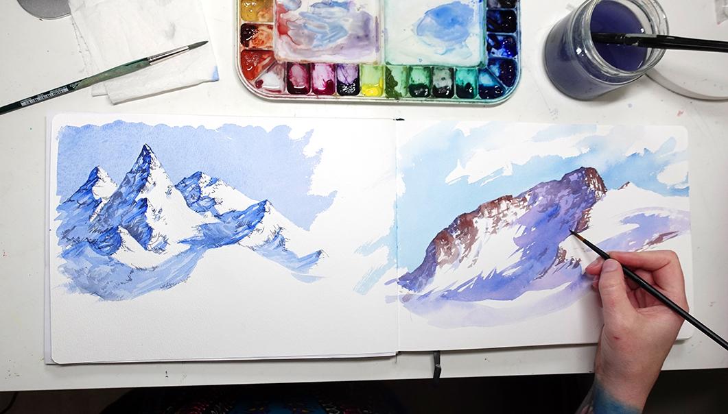
5. Watercolor Beginner: For this watercolor lesson, you'll need some watercolors, something to mix colors on, like a pallet or white ceramic plate. A couple of brushes. I'm using a larger number 12 and a small number 8, round. And your watercolor paper. This is an at your everyday sketchbook with cold press paper, which is quite textured. We only need two colors for this painting. I'll be using ultramarine blue for the majority, and then towards the end, a tiny bit of black. But you can really choose any two colors you want. So first, let's take a look at our reference photo. As you can see, there are some lovely highlights and shadows to play with. I really love how bright the sun feels in this photo. So we wanna make sure to capture that feeling. The first step to achieving that is painting a darker sky. The darker our sky color is, the more intensely bright the snow will appear. Just like in the drawing exercise, we want to squint our eyes to minimize the detail and start to locate those larger chunks of shadow. Will begin with a really light sketch, laying out our simple triangle shapes until we get a good composition. Once we have those in place that we can start defining the peaks and the edges, just like we did in the drawing exercise. I'm trying to accomplish two things with my sketch. First of all, giving me a good idea of where all of my peaks and ridges are. And secondly, I'm kind of mapping out where those big chunks or shadow are going to be. We have a strong light source coming from the right. So our shadow side is on the left. So I'm actually outlining the bigger chunks of shadow when it comes to painting, this will make it much easier to remember where my shadows need to be. Our first step in the painting will be to lay in our sky color painting around the top edges of the entire mountain range. First, I'm going to dilute some blue with some water and paint in the sky. I'm not going too dark and it's also not too light. It's a good in-between color. Basically, I just like to think about a nice sky blue. But remember if it's too light, the snow on the mountain won't appear quite so bright as I paint the sky. I'm being careful not to paint over any of my highlight areas. We need those areas to remain bright white. If it helps, you can turn your paper upside down so that it's easier to move the point of your brush along the edge and get a nice crisp line. The benefit of using 100% cotton paper is that it takes a longer time for the paint to dry. You have extra time to play with your layers. And if your paper is drying really fast, you might notice that you're gonna get more splotches and blooming effects and undesirable effects. So ideally we want to use really nice cotton paper for this. So what I like to do is lay in the big chunks of shadow before my sky even dries, but I'm just using the same exact color as the sky and I'm using those areas of shadow that I outlined as my guide. I'm just filling them in with one solid color. Again, if your paper dries really fast, you might notice that as you lay in the shadows, you'll get some of that color seeping up into the sky and giving you some undesirable effects. So when you do your own painting, feel free to do the sky and the shadows all in one go. If you're finding that it's happening to you. Later, we'll add another layer of color and build up some depth. But this is the first step to achieving mountains with depth. It's also a really great way to capture mountains really quickly. For instance, if you're painting outside and you don't have a lot of time. Or if you just want to lay in like a hint of a mountain for a background that you're painting. But as you can see, it doesn't take much to get the look of mountains as long as you understand the differences between the highlight in the shadow side, which again, we talked about a lot when we did the sketching exercise. And you can apply this technique to any type of mountain. It doesn't matter what shape or size they are. Okay, we are going to let this dry before we move on to the next layer. Now it's time to have some fun. We're going to start adding another layer of the same exact color, only this time, slightly darker. So gathering more of the pigment and a little bit less water on the brush. I've also switched to my smaller brush so I can get a little bit more detail. I like to start at the peaks and work my way down. As we saw in the drawing exercise, we have different values within the shadow area. So some of it is going to be a little bit darker and some will be a little bit later. With my brush, I am basically just making kind of random marks. I don't want it to feel too stiff. I don't want to cover the whole thing with this layer, and I also don't want to leave too much alone. So it's a little bit hard to explain my process because I've always done it so quickly and spontaneously. And basically what the reason I wanted to show you this is because even with just very quick marks, you can achieve a lot of depth in a mountain. It's a really great way as a beginner to start to explore your aesthetic and making more expressive mountains. It's also really fun because it means you're not sitting there in obsessing over every single little detail. My marks go up and down, left to right, diagonally. They're all over the place. I don't have a rhyme or reason to why I make certain marks here and there. Because when it comes down to it, the most important thing are the values. If you get your values right, it almost doesn't matter what colors you use or even what your brushstrokes look like. One of the biggest things I've noticed is that when it comes to values, the peaks and the area that's just to the left of the highlight areas is a little bit darker. So I can come back with even more pigment and start laying in even deeper value in those areas. I will also make little test marks here and there and just try out a darker value and see if it feels right. So much of this comes from just staring at mountains for so long. So the more you fill your visual library with mountains. And really staring at the cracks and crevices and the edges. When it comes to painting, you'll start to get a sense of what is working and what isn't. When you put a brush mark down, it either looks right or it doesn't. If it looks wrong, you can usually quickly get rid of it or if it's already dry and you don't notice it in time, just use it as a lesson learned. If I'm going for realism or trying to paint a reference photo like an exact replica of a specific mountain that exists in the world. I will be much more careful about my brushstrokes and the placement of all the different forms. But for this beginner exercise, I really want you to feel comfortable exploring and just playing with the values and your brushstrokes. Give yourself a time limit of five to ten minutes. I know that might feel like a rush, but the faster you move your hand and the more times you repeat this process, the easier it becomes, and the more you start to explore new ideas that maybe you are a bit too afraid of because you are hesitant with your marks. Hesitation stifles creativity. Don't second guess yourself, just try it because in trying it and making that mark, you learn so much. Okay, enough of that. Let's recap quickly what we've done so far. We painted in our sky, being careful not to paint over our highlighted areas. And then we quickly moved into laying in a solid color that filled in all of our shadow areas. And then we came back in with a slightly darker version of that same color and we started touching in some deeper values in the shadow areas, only. To take it a step further, we can paint in our rock textures or a rock material. I'm going to take a little bit of black and mix it with the blue that I used. With a smaller detail brush, I will start making tiny, tiny little marks. And again, it's not so much about replicating what you see in the photo. It's about getting that feeling of Iraq. The snow is sitting on the edges of these mountains. The blue shadows and this rock texture are going to make the snow areas seem super bright. My marks go through the shadows and the highlights. So I'm not just painting one area now. I can use these marks anywhere I want in the painting. And something I've noticed over time is that quite often the snow is much thinner. If it's a very pointy peak and more vertical peak, it's a little bit harder for this. Notice sit up there. So I will paint more exposed rock near those more vertical peaks. To keep it simple, I'm just using black mixed with my blue, but you could try to use different colors if you want to. And we'll get into that a little bit in the next lesson, which is more advanced. For instance, using a warmer color in the highlight side compared to a darker rock color for the shadow side will make the depth even stronger. My brush is pretty dry. I have enough pigment on there to get it onto the page, but I can use lots of lovely dry brush textures. If you've watched any of my other tutorials, you know how much I loved dry brush. So you can apply pigment with the tip of your brush and get really fine lines or turn it more to the side and sweep some color over the texture of the paper, letting the pigment just slightly graze the texture of the paper. If you want to have a lot of fun with this method, you can vary the colors from the top to the bottom. So this dark shadowy rock texture, you can go from like a black near the peak of two more purplish down near the base. It's up to you. Have fun with it. Even with just a few quick marks with this darker color, it'll come across as rock texture because Viewers going to understand it in the context of a mountain. I know how it feels when you're sitting close to your painting, staring at all the little mistakes. I mean details. And, but then when you back up and you see it from a distance, becomes a mountain. So I don't want you to be harsh on yourself at this point. Give this method a try and maybe make some tweaks of your own and find a way to paint mountains that you love. I like to call this my mountain sketching technique because it's a very loose, fun way of working. And if I ever get a chance to go back to the mountains of Colorado, I will definitely bring my sketch book. I will provide the liner for this particular painting if you want to use that as your base. But I do recommend that you try exploring different colors, different textures, different marks, and even a few times before you jump into the next lesson, which is more advanced.
6. Watercolor Advanced: In this lesson, I will show you how I like to paint mountains most of the time. This includes lots of wet into wet as well as really lovely dry brush textures. But most importantly, it shows that I like to have fun with color and my brushstrokes. So if you're painting along with me, I really encourage you to play with color. As I sketch. You'll see that I'm not starting with the basic shapes as I covered previously. I'm jumping straight into the outline of the top edge of the mountain. From there, I'll start to drop in some of the edges and some of the cracks and crevices and any major areas, especially highlight areas because I wanna make sure I don't paint over those. I'm sticking with a nice sky blue color. And this was mixed with my phthalo blue and ultramarine. So in comparison to the blue that I will later add to my shadows on the mountain, it's going to feel much warmer and brighter. I'm using quick loose brush strokes and I'm actually painting around some of my clouds just a little bit here and there to kind of break up that big sky. If you need help painting skies and clouds. I have a whole other Skillshare class about that. You can go check that out if you need to. But for the most part, I just drop in a bunch of color painting around the highlights of my clouds. And then I come back in with a clear brush and just soften some of those edges. And then I used a heat gun to dry it because Laozi said, this paper takes a really long time to dry and look how light it gets when it dries. Watercolor tends to lose a little bit of saturation and goes up in value when it dries. So just keep that in mind when you're choosing your colors. You know, I said I was going to have fun with color. Here we go. This is pretty much the same approach as I showed in a previous demo. I'm just blocking in my areas of shadow only this time I am varying the color. I start with this purple, but then before it dries, I add in other colors such as blue. You can do lots of variation within the shadows. And as it bleeds and flows, it's going to add so much more interest. And even if you're going for realism, you can still do this technique with realistic colors. My brushes loaded up with a pretty decent amount of water and pigment. However, the tip of my brush is where the pigment sits and the base of the brush is where the water sits for the most part. So I like to use both the tip, the base of the brush, the fat part, a little bit differently. In a way you can almost achieve both a dry brush look and a very juicy wet look. You might notice that my sketchbook is moving. That's because I'm tilting it up slightly so that the pigment will flow downwards. It's not too intense, but it's just a little bit to help it along. And believe it or not, this is basically it for my first layer. I will just keep touching and little colors here and there. But for the most part I don't want to fuss with it too much because I want this first layer to just be a very soft, letting all the colors bleed together. And I don't want it to feel overworked. And once again, I will let that dry. Next, I'm going to be playing with the rock color. So in the reference photo you can see there is a lot of exposed rock, especially at the peak. But this time, instead of using one color for all the rock, I'm going to be using a warmer color in the highlighted areas and a darker cooler color in the shadow areas. The reason for this is that when the sun hits the rock and it's in the highlighted section, it actually appears much warmer in a little bit later in the shadow side it appears cooler. And even though I could use one color for the whole thing, I really like the effect that this adds. And once again, you could use this technique for literally any mountains that you want to paint. It adds another dimension of depth and interests. And I think it looks great in pretty much any mountain scene. In terms of brushstrokes, I'm using a very similar approach to what I did in the previous demo. So just making really tiny quick marks, especially in this case focusing on the vertical lines. I really like that aspect of this mountain, so I wanted to capture that. But as you can see as a transition between the highlight and shadow areas, I changed my rock color. In the shadow side, it's much more bluish purple. And the highlight side its way warmer. The effect becomes much more apparent the more you fill the page. So it might seem a bit strange at first, but once you start getting more of the paint on and even backup a little bit, look at it from a distance. You can see how powerful this effect is. If I go really dark and intense with this rock color, my snow is going to appear so much brighter. And I probably could've darken the sky just a bit to make the snow feel more intense. But I wanted to use more intense colors in the rock, so I didn't want to go overboard. When I'm painting a single chunk of rock. I like to work quickly so that my colors bleed into each other. But I don't have to rush as much as I would with the first shadow layer where I wanted everything to be soft and bleeding together. Adding a second layer of rock color can do even more for the painting. Just depends on what kind of look you're going for. It is easy to go overboard with color and value in this part of the painting. And I've been guilty of that many times. So what I always say is less is more. Start with a little bit less and just continue to build up and use a critical eye as you go. In the next demo, I'm going to show you how I would approach mountains with a line and wash technique, meaning ink and watercolor. And that is a really fun way of working, especially when you're outside. If you're familiar with urban sketching, it's a very common technique and it has a very distinct look. And I personally love it because it leans a bit more towards illustration in my mind, something that I'm very interested in.
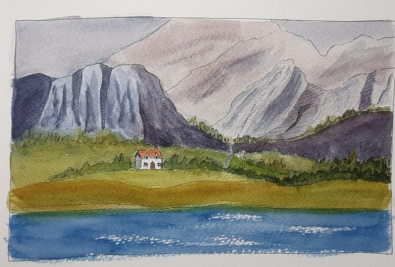
7. Line and Wash: Line in wash, or also known as ink and wash, is a really fun technique for, I would say, more leisurely stylized painting. For me, it's something that goes hand-in-hand with painting outside. Even if I'm just sitting in my patio sketching my garden, It's a really fun way to work and you only need a couple of supplies. Nice to meet you. A lot of people like this technique for urban sketching, because you can quickly capture the likeness of a building with the ink and then play with the color as much as you want. There are two ways you could approach this. I like to start with my ink and it's a waterproof pen so I don't have to worry about that bleeding all over liter. So I'll lay in my lines and then I'll do watercolor on top. However, you could also sketch in everything with a pencil and then do your watercolors and then do the ink last. Some people say that by doing the ink last, they're more likely to use expressive marks with their water color. Whereas if you start with the pen, sometimes it feels like you're stuck coloring in all of your pen marks like a coloring book. So perhaps you are a little bit less free with your color, but I think it's completely personal to each artist. So I'd say try both and see which one you like. Sketching with a pen instead of a pencil is a really great way to ignore mistakes. Be more loose and free with it, and work quickly. You won't be fussing with every single line and placement, making everything perfect. You put a mark down and it either works or it doesn't. But either way it's permanent. And you just do another mark and then another market, another mark and you keep going. Even if you mess up an angle or a proportion or whatever, just keep going in the end, this will be your interpretation of the scene. Nobody else's. And trust me, the more often you do this, the more fun it becomes. As you can see, I'm using very loose marks to represent a lot of things that might drawing for the clusters of trees. I'm simply doing almost like a wavelength. It's going up and down, lots of spiky tree shapes, but it's all just one big shape. For my mountain. I'm not really putting in a ton of detail. I'm mostly just dropping in some of the major lines that I see a hand doing my usual perpendicular sketching technique for some of the shadowy bits. But most of that will be represented by watercolor. I know this can be a bit intimidating at first. So if you want, you can use my liner as your reference. But I do encourage you to try using some other reference photos I provide or even your own, and just doing loose interpretations of them with ink. This demo isn't meant to be a copy me step-by-step tutorial. It's more of a Hey, did you know you could do this? So if you've never tried to ink and wash, I just want to show you my general process. What I like to do is lay in a wash of color over the entire thing. I changed the color based on what areas I'm working in, like sky color or mountain base color or grass and water. And then I'll let that dry and come back in with a second or even third layer. I really like to glaze when I do my ink and wash technique. And glazing just means that you put down a color, let it dry and put down another wash of color on top of that. You can do that as many times as you want. And when it comes to color, I am usually a very expressive with my choices. So rather than copy the reference photo exactly, I'll let the mood of it sort of inspire me. Or maybe it's just the forms and I'll choose my own colors for everything. But ultimately, my goal is to create an interesting piece or something that pulls the win. So making my own choices about color is a lot more fun. I also think glazing is a really fun way to add depth to our mountains or really any subject. So I'm using a very watered-down kind of bluish, grayish color and I'm only touching it in near my shadow areas and some of the cracks. Obviously I'm using very bold brushstrokes. I'm not being super careful about the placement, really. I just want to emphasize the vertical structure of the mountains in this case anyway. And having these long vertical brushstrokes will really give that sense to the viewer. But technically with ink and wash, You don't have to use watercolor to represent your shadows. You could just cross hatch or color in or draw in your shadow areas. It's completely up to you and your style preference, I guess. What I think is that you should try a bunch of different techniques and approaches and then settle on something that feels comfortable and suits your aesthetic. The way I like to see it is that usually when I'm doing ink and wash, I'm outside, I'm painting on location and they often need to work quickly. So painting is a much faster method than drawing. If I'm doing really quick loose lines with my pen and then defining some of the lights and the shadows with my brush, it just goes so much faster. So this represents my personal aesthetic and just some of the habits that I've built up over the years. Here we go with the third layer. This time I'm emphasizing the shadows even more. And usually on the final layer is when I'll do my darkest shadows. And already you can see that mountain I just painted stands out from the distant mountains so much more. So, think about your layering and what colors you want to use from the very beginning. If you go too dark from the very beginning, it will be difficult to build up these glazes. In the future, I am planning on doing a planner class, but for now, I just want to show you my typical process for if I were outside on location, painting a mountain in the crazy weather. This particular location was especially when D, because we were up on some bluffs and there was just a crazy storm moving through the Isle of Skye that weekend. But I honestly love hiking in that kind of weather because the moodiness is just so dramatic. I feel like that Moody weather is what makes the colors pop even more. So that's something I like to play with a lot in these types of sketches. Now obviously, these mountains aren't covered in snow, like I showed you in the watercolor demo. But they are a different type of mountain. They're more exposed rock in. There's actually lots of green moss and grasses sitting on top of the rock. So my strategy was to start with a dark gray color, then drop in some of that bright green, that pop of green, let it bleed and flow and then come back in with my pen to define some other rocky edges. And of course, if my sketchbook head and blown away by that time, I could go back in and layer more colors and more textures. But this is just a really quick way to draw or paint mountains on location. So once again, I want to emphasize how much fun this method is. If you find yourself getting a little bit too stuck on making perfect drawings or paintings. And honestly, using this technique is how I personally learned to pick apart the structure of mountains and paint them a little bit better. And then once I got more comfortable, I took away the ink and I could just paint with watercolor. So this might be a fun way for you to start if you're brand new to painting mountains. In the next lesson, I will demonstrate how I like to paint mountains with goulash.
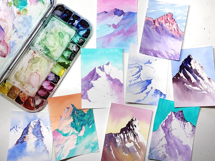
8. Bonus Round: Welcome to the bonus round. Okay, Sorry, that was super corny. But what I wanted to do is offer a little guidance. So if you ever find a painting of a mountain that you absolutely love, you can sort of pick it apart and understand how it was painted so that you can attempt to try it on your own or learn from it in some way. And this is a really great skill to have as an artist in general. For this lesson, I'm going to stick with watercolor mountains, and I'm going to give you three examples and tell you how I would look at this and pick it apart and figure out how they layered things in order to paint it. It will help if you have a basic understanding of how watercolor works. And if you've already watched this class, then you pretty much know. So at first glance, I'm always looking at whether there are hard edges or soft edges. In this painting, you can clearly see that in the sky there is a variation of color from white to light blue, as well as parts of the mountain shift from a faded blue to white. So that indicates to me that there was some wet into wet going on. It's assumed that the wet into wet happened first because sometimes when you do a wet into wet technique on top of other colors, they can be slightly changed or are the edges can be a little bit blurred. It completely depends on the actual colors that are being used. But in general, wet into wet happens first. So what you could do is start by painting the sky nice and soft and then laying in some of those soft areas of the mountains, which in this case are only in the shadows. So this could be achieved by getting the paper wet with clean water and then dropping some blue pigment into it and letting it fade. Next, we can see that there are some hard edges of the shadows. So in addition to some of the soft areas, they used the same technique that I showed you, where you're just sweeping on brushstrokes of the shadow in one solid chunk of blue. As for the brownish red color, that is probably the exposed rock. So in this case, they used a deeper purple ish read in the shadow areas and a warmer brownish tone in the highlight areas. Exactly the way I showed you in my more advanced watercolor lesson. And there you go. That's the basic concept for how this painting was created. And of course, you never really know for sure how they painted it. But by doing a little detective work, you can get close in case it isn't super obvious. I did paint this. So when I'm saying they, I actually mean me. But we're just pretending that it's strangers art. This style of mountain is another one that I always get a lot of questions about. I think because of the high contrast, it's very striking. So it's a really interesting painting to look at. You know, it's a mountain, but it's a little more abstract. And it is so incredibly easy. So again, let's put on our detective hats and figure this out. Again that we have lots of soft edges. However, we have a distinct difference between colors in the sky and in the base of the mountain. So again, I start with what are the soft areas? Having painted lots of mountains, I know that it's much easier to paint the sky separately from the mountain. And that's usually my approach anyway. So of course I look at the sky as its own shape. I can see that the top of the sky is pink and near the mountain it's more yellow. So with a wet into wet technique, getting the paper wet and then dropping in some pink near the top and some yellow near the mountain and letting it bleed and flow together. That's basically the sky. And of course there are probably multiple ways you could approach this. But one thing I'm noticing is that the dark purple at the top of the mountain slowly fades down into a lighter purple and then goes straight into that orange and pink area at the bottom. And there really aren't that many other marks on the paper besides those. So to achieve this, you could start with a really dark purple and start blocking in your shadow areas, just like we talked about in the watercolor lesson. So we're not doing a wet into wet technique. We're just going straight into some hard edges, get brave and start sweeping in those shadow areas, starting with the dark color. And then as you move down from the peak towards the base, start introducing more yellows and oranges and pinks into the mix. Instead of waiting for things to dry, you're just touching in those new colors and letting it all bleed together. But you're trying to paint all of the shadow areas in one go, just shifting from color to color. So a painting like this really only takes about five minutes. The only reason it takes that long is because you're waiting for the sky to dry before you paint the mountain. Now here's one that's a little quirky. Let's take it slow. First, I will look at the sky. It's pretty much one solid color. It shifts a little bit here and there, but I'm just going to go with a light orange. And straight away I can see that the peaks of the mountain have a bit of white on them, but it definitely doesn't match the white of the paper. So I can see that that was a little bit of white gouache. Will leave that for later. For now, let's look at the shadows. First, I tried to figure out, are the majority of the shadows all one color or was it a wet into wet technique again, where it's shifting between lots of colors. If I ignore all the little scraggly, dark blue marks in the shadows, I can see that the majority of the shadow is that bright teal color. So what I would do is paint all of the shadow areas as one solid color, that bright teal color. If you look at the highlight areas as big chunks are big shapes, you can see that near the tops of each shape, it's a little bit more pinkish and then it fades down into sort of white near the bottom of those shapes. So my strategy would be to paint in the pink near the tops of those shapes and then add a bit of white gouache near the very top peaks. If you squint your eyes at this mountain, you'll really start to see the bigger areas of shadow and the bigger areas of highlight that should help you dissect this mountain. My last step would be to add in all of those dark cracks in the mountain with a darker blue. So there you go. Three paintings, three different approaches. I hope that really helps you guys and I'm not saying you should go out and copy mountain paintings that you see everywhere, but it is a really good learning tool if you're learning how to paint mountains, looking at how someone painted something that you think is successful and see their technique and figure out ways to apply those things you've learned to your own paintings is very helpful.
9. Gouache Warmup: The reason I want to demonstrate this in guage as well is because using an opaque medium requires a different approach. Or at least I use it differently. For gouache, I like to use hot press or super smooth watercolor paper because I liked the way that the gouache flows more smoothly across the surface. I simply took an A4 piece of paper and cut it in half for this demo. For brushes, I prefer flat wash brushes. I usually use a one inch or a half-inch to start out and then a smaller flat as I go down to the details to keep my gouache from drying out on the palette for a little bit longer. I use a stay wet sponge with a piece of pallet paper on top. They're both quite damp but not dripping. And this is just my little removable tray from my watercolor palette. I like the fact that it's really portable so I can move it around my workspace as needed. We'll be using a limited palette today because I want to show you the power of only a few colors. You can do so much with just your primaries plus black and white. Even if you use super vivid intense colors, your painting can still be slightly muted and more neutral. And that's what I really want to emphasize today. So before we begin the demo, I want to do a little color mixing exercise or a warm up. This is something I like to do whenever I switch out one of my primaries because it just gets me more familiar with the mixes that I can make. And it's also just a good way to warm up my brush and a little bit more used to the water control. If I've been using watercolor for a while, transitioning into gouache is always a little bit tricky, but it just takes a little while to get warmed up and get used to it again, you don't need a ton of gloss on your palette because the pigments are so densely packed into these tubes, each color is quite vibrant. Plus as you'll see in the demo, I like to start my layers with slightly thin down washes. So each pile of pain goes much further than you might think. It might just take you a little while to get used to how much to put on your palette. Start with a little bit and continue to add more, but don't be afraid to use your pain. I know sometimes people are a little bit intimidated to use their gouache because they might think it's expensive or that they don't want to waste it, but by keeping it in the tube, you're wasting it even more. One of the most important aspects of gouache painting is water control. And I think this style of brush makes it easier to control the amount of water that is in your bristles. So to begin the gouache exercise, we are going to mix all the colors on your palette. There's so many ways you could do this, but I like to do it in a more casual way. No need for measuring out grid lines or columns or anything like that. We're just going to use this whole sheet of paper to explore our colors. Let's just swatch each color individually using a varying amount of water. Allow this time to explore how much water you need to get a more transparent color. And it really will show you which colors are more intense and more saturated than others. And then add a bit of white to each color, see the varying values that you can achieve. I specifically chose super vivid colors like Permanent Alizarin crimson and Prussian blue. Because in this demo I'm going to use more muted neutral colors. And I wanted to show you that even if you only had these intense colors, you aren't going to be stuck with a super vivid over the top painting. Typically with gouache, white is our most used color because white is often used to dilute the paint or D saturate that paint slightly. If you add white or black to your mix, it's going to desaturate it a little bit. If you're in a pinch for time, adding black to a mix is a really quick way to neutralize your color. And when I say neutralize, I mean, removes some of that intense, brilliant color. So as you explore your colors, try mixing the primaries with each other. Try adding all three together. A quick tip for mixing brown is to mix all of your primaries together. If you add a bit more red to that mix, it's going to lean more towards a reddish orangeish brown. If you add more blue to the mix, it's going to lean more towards like a dark, earthy brown color. It's very common for gouache paintings, especially for a beginner, to appear a bit on the garish side. And it's not always a bad thing sometimes that's what we want. But here's the thing. We want to be able to control our color, right? So learning how to mix subtle colors, subtle neutrals using grays and browns will come in handy and it will give you more power as an artist. So if you've ever had that problem where you're painting just doesn't feel right because the colors seem to unnatural. Maybe they're too vivid. The reds are two red or the pink, or two pink. Try adding the opposite color or the complimentary color to your mix, or add a little black or white. All three of those options are really great for neutralizing your color. So please take a moment to explore your limited palette on a sheet of paper before jumping into the wash demo.
10. Gouache Demo: Sketching before painting with gouache sometimes feels counterproductive because our gouache is going to cover this for the most part. But it's a really great opportunity to get your hand moving over the paper, warm up a little bit, loosen up a little. Even though our lines will be covered, it acts as a guide as we begin to lay in our squash. But as you can see, my lines are very loose and gestural and it's just a really quick sketch to get me started. I'm simplifying a lot of this scene. I'm not adding the house or lots of trees or anything busy in the foreground. By keeping the foreground simple, I'll be able to send the focus to the mountains in the distance. Starting with my large one inch flat wash brush, I will begin to lay in some of the base colors of my whole painting. I spend a little bit longer on the sky because I only want to do one layer up here. I don't want to be fussing too much with the sky. So I start with more diluted paint. Mainly it's my blue mixed with a little bit of white and black. Prussian blue is extremely vivid, so I want to knock it down a little with my white and my black before it dries, I'll touch in sweeps of white here and there to sort of give me that soft cloud look. But I only spend a couple minutes on the sky so that it stays very loose and I know it won't detract from my foreground. If we take a look at our reference photo, we can see that this follows the general concept of atmospheric perspective, meaning elements in the far distance appear much less saturated and even on the cooler side of the spectrum. So lots of these mountain colors are more like grayish blue or purple. And then as it comes closer and closer to the foreground, we are seeing more saturated, warm tones. In the very foreground. You can see that bright patch of grassy green, which is just totally quintessential Scotland. But I'm going to keep my tones generally on the more neutral side as I go. So that warm up we just did is going to be very helpful. I can look at that little chart I made and know exactly what colors to mix to get the base color of my mountains. By mixing my three primary colors together, I can start with a brown and I can even darken it with a little bit more of my darker tones, such as black or blue or red, depending on which way I want the color to lean. So after I mix a generous amount of that color, I will apply it over the entire mountain range. This is why I love using big brushes to start out because it allows me to fill in large areas and let it dry before moving on to more textural elements. If you look closely you can see my pain is slightly diluted, which is completely fine. Sometimes I want it to be very thick. Other times I like to work a little bit more on the transparent side. But in general it is covering up the paper. Sometimes I use gouache, more like watercolor, and I actually use the highlight of the paper as my highlights and my painting. But in this case I'm going more opaque. Once again, water control is so crucial for gouache painting and you really only get a good understanding of it as you paint more and more. So be patient with yourself, be kind to yourself. If you're brand new to quash, it will take time to get used to it and knowing how much water you need to add to your mixes. But each painting you do will inform the next painting in the next one and you'll get even better over time. As for my water, this is the one place in the painting where I'm going super intense. The reason for this is because I'm sort of playing off my memories and my emotions in this scene. When I'm on sky, it is so incredibly beautiful and I'm always surprised by how brilliant the water is. Sometimes it appears almost like a deep black or indigo color. And then other times it has a beautiful bluish turquoise. On a bright summer day when the water is reflecting the sky, it's so bright against the more muted tones of the landscape. So I'm taking my artistic liberty and going very bright with it. But the rest of the painting is getting a nice coat of earthy tones like browns and rusty greens and reds. And a quick tip for mixing these earthy neutral tones is that I don't clean my brush very often between mixes. I let one mixed kind of flow into the next one. The only time I clean my brush off is if I notice it's a little streaky or if the paint is getting a little too sticky and I just need a touch of water to soften it a little. The color that you see on the base of my mountain is technically going to be my darkest color in the mountains. This type of rock is reflecting sunlight and it comes across as a more muted grayish, purplish blue color. So I'm going to dust that color onto the highlight side of the rock even though it's not technically in direct sun for any peaks or areas that receive Bergerac Lei, I'm going to mix up a brighter, warmer tone. My brush is mostly dry and I'm just kind of grazing this color over the paint that's already on the paper. It is sometimes a little tricky to layer goulash. So you really have to be careful of how much water is in your brush. If there's too much water, you're going to instantly pick up the color that's underneath it, and sometimes that's not desired. And now this can seem a little tricky at first. So what you can do is get a test sheet of paper and using your mountain colors, triad layering them, let them dry in between each layer, but then see how much water it takes or how much pigment it takes to mix into the underlying layer versus letting the colors sit on top. I will let my brush naturally run out of color and keep dusting it back and forth to get a nice soft blend into the existing color that's on the paper. If I speed this process up slightly, you can see how quickly it dries and how much the color changes. Darker colors will typically dry, lighter and lighter colors will typically dry darker. So that's another thing to get used to. Once I have my shadowy tones on the paper, I will start to lay in some of the highlights or where the sun is directly hitting the mountain. I'm still keeping my colors rather muted. They're not bright yellow or bright orange or anything, because elements in the far distance of our landscapes should be slightly less saturated. It just adds to the illusion of depth. I'm using the same technique where I just dust the color across the page. I'm not doing super solid streaks of color. One reason I love using this dry brush technique is that it almost gives you a broken color effect. Where if you backup from the paper slightly, all those colors start to blend. The viewer's eye sort of fills in the gaps and it makes more sense, rather than using thick, solid lines where I have to control the exact placement of every single little mix of color. This dry brush technique, in a way is actually easier to give the sense of texture and a variety of colors in your landscape where the land meets the water. I'll darken it just lightly with a bit of this dry brush color. Mainly because this area of the landscape is at such an angle away from the sun that it receives less light. So remember when I was talking about how colors will dry, lighter or darker? Well, one thing I like to do is put down some color, let it dry, and then sort of assess where I am. Sometimes I need to come back with more saturation or even less, or lighten or darken my colors. But I really won't know until I get it on the paper and it dries. Especially when you're using a diluted mix because water throws even more surprises into the mix. So now I can see that my bright areas of the mountains where the sun is hitting them directly need to be warmed up a bit. They needed tiny bit more saturation. I still don't wanna go too intense because I really want to capture that effect of atmospheric perspective. But even just a hint more yellow and red will help. I often feel like painting with gouache is all about the subtle changes. So if you want to go for more realism, you really have to be patient and make quick changes in your mixes. It's almost like a dance with your paint. You have to lead, but you also need to react to your partner. You have to sense the changes in their step and make adjustments accordingly. As I paint the foreground, I'm going to be going into slightly more saturated colors, but still staying quite neutral. The body of water is actually separating the mountains in the distance from this area in the foreground. So there's quite a big jump in both value and saturation between those two areas. I'll be using more pure color in the foreground. However, as I said, I'm still trying to go for neutrals. So I'll either mix a bit of black or white with them or I'll mix complimentary colors. Because again, that is a super-fast way to get neutral colors. It can be difficult to avoid really muddy mixes, but again, using a limited palette reduces that chance a lot. If you want brown, you have to work at it to give the foreground some interest. I want to vary it between flat patches of grass and tall wispy grasses. I also want to vary my colors from purplish, reddish rusty tones all the way to more bright green tones. One quick way of making grassy textures is to point the tip of the brush at the paper, press down and as you sweep your brush stroke upwards, lift your brush really quickly. You can also fan out the brush by hand and make even wider, bigger grasses. You want as little water as possible on your brush when you're doing this, because otherwise you'll end up with lots of just blobs of color. It takes a little longer to do this, but in the end it's totally worth it because all this texture will build up and build up. And eventually it'll feel like a nice soft grassy field for the flat patches of grass. And just simply taking my large brush and sweeping a little bit more of a solid brush stroke over certain areas. But I'm being careful not to go too intense with color or to cover up all of the grasses I've painted already. A lot of times when I make my grassy fields, it's a constant back and forth between these flat grassy areas and the taller grasses. So I'll just continue that back and forth until I feel like my grasses are well-represented. So now you have a little more insight into how I like to paint mountains using the basic ideas and techniques I showed you in this class, you could basically paint any types of mountains you want. It definitely takes practice and repetition. But remember it's about the journey, not the destination. I encourage you to try using a limited palette as that will teach you so much about color mixing.
11. Homework: So now that you have a well-rounded view of how I like to draw and paint mountains. I suggest trying this on your own. Starting with basic shapes, moving on to more complex sketches, and then diving into painting is a really great way to approach my methods. I've posted a few screenshots and references in the class resources so that you can use them as guides. And if you'd like, you can paint along with me for the watercolor or gouache demos. Don't forget about the power of a limited palette. You can achieve such a variety of beautiful color with only a few tubes of paint. And if you decide to share your class project, make sure you ask for feedback if that's something that you want. Otherwise, I look forward to seeing your work. Feel free to use my hashtag. Sarah Burns tutor if you want me to find you on social media. Thank you so much for watching this class and I'll see you again soon. Take care.
 Sarah Burns, Painter / Photographer / Youtuber