Transcripts
1. Intro: When I think of painting on the beach, I think of warm sun and my toes in the sand. But more often than not, I'm greeted with strong winds and even rain. So I like to have a game plan when I go out to paint beaches. In this class, you'll learn how eye pain from start to finish. I'll show you how I layer what colors I use and why, and how to create a wide variety of textures. Will start off with a quick lesson about composition before I move on to the real-time demo. As always, my goal as a teacher is not to simply have you copy me, learn how I do, what I do and why so that you can take that knowledge and go out and paint amazing scenes of your own. So gravity or sketchbooks. And let's get started.
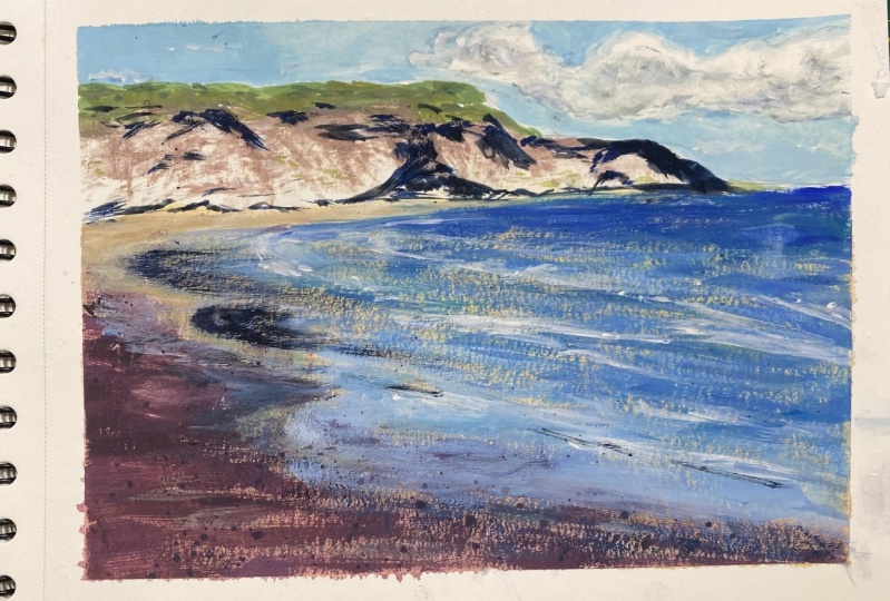
2. Drawing & Composition: To start off, we're gonna do a value study and that's just going to be with our basic graphite pencils. So grab your favorites, doesn't matter what kind they are. And a piece of white paper and I'll show you how I go through a couple of thumbnails and work out my composition before I start painting. So let's just get a couple boxes on our paper. Actually, let's do four. Really loose. Doesn't have to be anything fancy. Just basically try to keep these boxes the same, the same ratio as what you're going to paint. So for instance, I'm going to be using my sketchbook, which has a horizontal orientation. So these are longer horizontal pieces. And just to begin, we'll look at the reference photo and think about what elements we like and what we don't like because we don't have to copy it exactly. We're just using it as inspiration. I really do like the strong shadows that are on the distant hills. And I really like that reflection in the sand. So those are the two things I'm going to focus on. So how can we draw the focus to those things? We'll be doing that with value and composition. In general, compositionally, we wanna think about the rule of thirds. So if we divide our box up, mine isn't very even, but you get the picture. So these four points are where the eye is going to go most naturally. And we want something to be intersecting with this, whatever our focus of the painting is. So for instance, if I want my cliffs and my reflected sand to be my focus, I want to make sure that plays within that realm. So one way I might do that is to have the distant hills kinda like this, which goes across this whole area. And then the angle of my sand would cross this intersection. So the water would sort of stop here and that's where the waves come up onto the shore. So this that would all be dark. That would be my distant hill. Of course, we would have variation in there. And then this area would be my reflected sand and where the waves hit the shore. And we can add a lot of interests in play with the different values within that area. So as long as we keep our strong values and our strong colors in these areas will be fine. It would even work if we wanted to zoom out a little bit. So as long as we remember these are intersections. I can have the horizon line up with those and the hills coming up just above that. And then the shore line could be a little bit more parallel. Again, we'll have some waves and there by our strong, our focus will be here where we have that reflection in the sand. So we have our intersections here. So instead of having the dark elements in those intersections, we could have the distant hills Way up here going off the page and are lighter areas could be intersecting. So we would have like a foam. So you know how the waves come up on the edge of the shore and they create like that cool foamy line. We can have something like that there, which would be a nice strong White element coming through. So the waves would be right here really strong. We would have a white foam lip on the wave coming up onto the shore. And then we would play with reflections of the sand, which would be reflecting the sky. And the sand and the foreground would be darker. So our focus would be that wave on the shore of the reflections in the sand and they would cross over those intersections. It would keep the focus within this area. Another way that we could play with this as sort of change our orientation to the beach, which would be the distant hills, kind of off like this. And we can imagine we're standing at the edge of the water and it's more parallel to us. So we can have a really strong reflection here, crossing these elements, the waves up here. So if we did this, we had the hills up here on the left side. That's going to draw a lot of attention up there. So we need to balance it out somehow down here. And we can do that with contrast with values. And then balance out that darkness down here where the sand is. And make sure our colors are a bit stronger down here. So we'll have some darkness underneath the lips of the waves, which will give us some nice contrast, especially in this lower area that intersects, will have some bright white filmy bits. And we'll make sure our colors are really strong. So It's hard to depict that in a value study obviously, but it's just something you have to keep in mind if you decide to go with that. But just to keep it easier for this demo, I'll use one of these two because it matches the actual reference photo a little bit better. And it'll just be easier for you to follow, I think. So let's get started. I'm going to press my page by taping off my box. I just eyeball it, try to get it as straight as I can. So if you need to go ahead and draw in your grid line and I'm just gonna eyeball mine and get started. I will give you guys the line R of this drawing in case it's helpful. I forgot to mention this little trick, but imagine this is your reference photo. If you're trying to match the angle of the beach, of the waves coming up on the shore. Just hold your pencil up to your reference photo either on your computer screen or wherever it is, and match the angle with your pencil. And then keep that angle as best as you can. And then hold it down onto your paper and now you know what angle you need your shoreline to be. And that actually does make a difference in how the viewer experiences the scene. If you draw the shoreline completely parallel with the horizon, it's going to feel like you're looking straight out. And then if you do an extreme angle, it'll make it appear as though we're really close to the water and the water's like coming up under our feet. One hosts. So for this, I'm just going to, you know, try to match the reference which kinda goes like this. It kinda cuts across the page which works out well for our grid lines that I was showing you earlier, you can draw some darker lines for the Waves and some lighter lines for the reflected sand areas.
3. Color and Examples: Not setup our palette. I'm using this palette paper, which I will put the name of it in the description. I like to get it wet before I start, so I just dip it in my water and I place it on there and it kind of sits snugly because it's it's almost suctioned to the tray because it's wet. Alternatively, you can just use a piece of damned paper towel, just cut it into a finished strip that will help our paint stays wet a little bit longer. And for my colors, we're going to keep it really simple and go with a limited palette again. So we're gonna do zinc white, which is our mixing white, cadmium free lemon yellow, Permanent Alizarin crimson, ultramarine, and jet black. And that's all you need. I want to quickly look at a couple examples that I've done in the past of beaches and waves coming up on the shore. So one thing to keep in mind is that you don't have to use the same colors you see in your reference photo. You can have a lot of fun with color and it'll still look like a beach. It'll still local EEG waves coming up onto the shore. In this case, what I did was I went really dark on the sand. It's like a dark blue. I used a lot of dry brush on this piece, so that little hints of that sandy color would peek through. And the dry brush here of the light blue is kind of indicating the reflection of the sky on the wet sand. So it's all about layering. It's all about the different textures. So these two close-ups of the shoreline are just studies of how the water looks on top of the sand and the rocks. Perhaps I could do something like this in a future tutorial, but I do have similar examples in my how to draw and paint water class, which is here on skill share. In this case, we didn't have a sandy beach. It was a rocky beach, so the rocks on the shoreline were really, really dark and the waves were just crashing up onto the rocks. So I was just using lots of teeny-tiny little dabs of paint to represent those rocks and tons of dry brush texture up here, another example of how to play with color. So using a really rich blue in the shadows will help play off of that warm sandy colour. This one is obviously a more zoomed out view. So we're looking down at the beach from above. But you can still see a hint sandy colour. But what really makes it look like the water's coming up and you have a lot of wet sand is just that hint of dry brush with the blue colors and a bit of that deep purple ish, gray color. And an extreme example of playing with color. This one was a sunset piece and it's a lot of dry brush again. So mainly just starting with that break Heller and then layering up the dry brush, all those deeper tones. And finally we have a double-page spread of a beach which is lots of wet sand. This is a good example of showing the difference between the damp sand and the wet reflective sand. There's a hint of the sand color underneath which is what helps make you realize that this is wet sand of here we have some dry sands so you can see that comparison. So anywhere you want to indicate that there's like a little pool of water on the sand you will want to reflect the sky is all just dry brush texture on top of that sand color. If you are interested in any of these paintings I've shown you, I have a lot of tutorials on my YouTube channel, as well as livestream replays.
4. Underpainting: For gosh, I typically like to use flat brushes. I like to start off with my biggest brush. This is a one inch flat wash. And then I'll slowly go down to my smaller flat brushes. If you only have one brush, that's fine, but it just makes it a little bit easier. And then for the final little details at the end, I'd like to use these round brushes and these script brush or rigor brushes because they give really fine points and they can do lots of little details. Look at the reference photo again. There's definitely a hint of warmer tones and even purplish pink tones in the sky and the clouds particularly. So I want to capture that sense of sunset because I was at that beach right before sunset. But it's still going to be a blue sky with blue reflections and stuff. I like to start with a very watered-down layer of color just to get rid of all that white and set the undertone of the painting. So we'll go with some white, a bit of that red and maybe a hint of the yellow, nothing too intense. And just lay that on the paper. It's going to be like a light pinkish, peachy tone. And add a bit more as they come down into the sand. You really only need the tiniest amount because these colors are very strong. So laying that in, adding a bit of water anytime it starts to thin out too much, I'll just grab more pigment there now we have something to play with. For my sand area, I like to do a bit of purple. So I'll get some of that red and blue and a bit of white and leave that on the sand pretty much all the way to the shoreline. And now we have a nice gradient. I got rid of all that distracting White and gives us something fun to play with. For the most part, this is going to be covered up, but little hints of this color will peak through in the end. And it'll just help slightly unify the painting. If you want. You can even go a little bit into a cooler purple down at the very bottom. Fine if you have a bit of streaking or any kinda weird splotches because this is just the background layer. And honestly a little bit of imperfection will kind of lend itself towards realism because it's really rare when you see a her perfectly smooth beach. There's always little rocks and dividends and bumps and seaweed everywhere. And now we'll wait for this to dry.
5. Gouache Demo: All right. We're dry. We're good to go. For the sky. I'm actually going to be using a negative space concept for the clouds. So I'm going to be painting the blue color around my cloud shapes. This sky color I already have down will technically be the cloud color. I can always come back and add a bit of shadow or highlight to the clouds. But that's how I'm going to start off. So we're going to mix up a very light blue and tested out. The darker the blue is now, the more the clouds are going to stand out. So I don't want my clouds. I don't want my sky to feel too dark. So we'll make it as late as I think that's pretty good. I might add a bit more white and sweep it across. For the Clouds and some areas, I'm going to use more of a dry brush texture. So I'll just be a let my brush dry out as I go so that background color will peek through here in there between those dry brush textures and indicate there are clouds there. Try to only use a little bit of water at this point because the more water you have on your brush, the more likely it will mix with that color you already put down. If it's helpful, you can draw out your clouds before you start this process. I usually just wing it. One a bit of blue by the horizon. It's okay if you paint over your hills, your distant hills, because those are going to be darker anyway. Okay, so now we have a nice happy little clouds in there. If you prefer soft clouds, you can get your brush damp, not dripping, just damp. And you can come in and sweep it over the tops of what you just did. And it'll start to blend a little bit with what's below. And it'll soften them blue that you just put down. So if you don't like those hard edges or too much dry brush up there, then this will help. I don't want my sky to be the focus. I don't want it to grab the attention, so I'm actually going to keep mine pretty soft. And now I'm just going to work my way forward. So we did this guy and now I'm going to work on the hills and then we'll do the water and the sand and we'll just keep coming forward. And for these hills to help give that sunset feel, we want all the light that's hitting those hills to me warm. So on the yellow, orange or red side rather than bluish, greenish. And I'm gonna keep my shadows cooler as in, they're going to have more blue in them. So to start off, I'll mix up kind of a mid tone color and start blocking in some of those shapes. I'm actually going to mix my lemon yellow with a bit of my black because it gets a really nice kind of olivine green color. And I can just start by placing that on there. It's on the warmer side. So it will work well for some of the highlights of those grassy bits. You can actually walk along the top up here. There's trails up there in the shrubbery, whoever it is. And and then these are big cliffs that just dropped down into the water. And then I'll just get me started. And now I can come in with some variety, so I'll add a bit of red to that green. And it becomes more of a brownish green, orangey color. And I will start dropping that in. Next to mine green. Break it up a little bit. The rock that makes up that Cliff is pretty light to make a sandy colored you can start off with like an orangeish tone and then slowly touch in your other colors until you get it the perfect shade. So I'm gonna go with that and drop it in. It's obviously darker than what's on the paper. I can let a hint of this lighter color show through on the highlight areas of my rocks. So I'm using a dry brush and some of that light color on the paper is showing through. And now I will start blocking in my shadows because the shadows are what really will set it apart. So I'm gonna do my, have a bit of my blue and black, which gives me a nice dark, cool gray. And of course we can always come back and light in it or darken it, so don't worry about it at this point. I prefer if we just focus on creating the shapes at this point. So blocking in our shadows, I don't want to be too repetitive with the shapes that I'm making. So that's why this is kind of like a practice. Run. The darker we go in the shadows, the more that bright highlight is gonna stand out, it's going to make it feel like the sun is really hitting those cliffs. I don't want it to be too intense back here because it is in the distance. And generally things in the distance appear a little bit less saturated and there values are a bit closer. So by that, I mean, it won't be really, really, really high contrast up close, you can see it is pretty messy. I'm going to add just a little bit of an orange tone to some of the edges of the rocks. So I got my red and my yellow. They'd have white just to lighten it up a bit and just get rid of a little bit more of some of those bright brights. So this will be more of like a midtone, I guess. A lot of times when you're color mixing with guage, it's about mixing something, putting it on the paper, trying it, and then seeing if a dried properly, if it matches what you really wanted, because it does change a little bit. It has a color shift, value shift for the color of the ocean. I'm gonna stick with more of a pure blue. So we're going with the ultramarine again and a bit of weight because we don't want it to be straight out of the tube. And I'm going to be using dry brush again or the ocean and the distance, it gets a strong blue color. And I'm letting the brush just naturally dry out as I sweep it left to right. It'll give me that nice, it'll give me that nice textured look. And I can even come back in with a bit of a deeper blue on top of that. Just keep in mind that the more water you have on your brush, the less of that texture you might see. So at first you might get a really broad brushstroke rather than that soft, dry brush texture. So it is a lot about water control on your brush, but you kinda get used to that as you go. So just keep going, keep trying it. So I want my sand to still kinda be visible there. So I'm angling my shoreline down from that point. If you want to indicate a wave, I'm going to add some like lots of white, almost pure white. And I'm gonna start touching that in. Even this is dry brush. I'm not going to lay it on too thick. I just want to hint that there's like a bit of a lip on this wave poring over that dark water and it's still at an angle. One thing you'll notice when you use why is that it instantly starts mixing with what's already on the paper. So to get really peer Why you want everything else to be totally dry and you want to load up that white on your brush and then dust on very lightly. But sometimes not having pure white is good, like it mixes a little with that blue and it just has a nice natural transition. I'm going to switch to my half-inch brush because I wanna get some bold shapes up here in the foreground when it comes to the area where the water's coming up on the sand and it's reflecting that sky. It's way lighter than the sand. I'm going to mix up a darker sand color which will represent my damp sand. Who I have my blue and my read. And I have kind of a deep purple color. If I add a bit of yellow to that, it's going to hint towards the brown side of the mix. I like having kind of a sand color that leans towards Purple. And I'm letting It's all dry brush again Now, I'll add more water to my brush and mix that color. Get a bit more of it. Now I'm gonna sweep some stronger brushstrokes on. I'm sweeping towards the shore line. If my brush dries out really quickly. So I'm constantly reloading it with my pigment and my water. In this case, it would actually help to premix your colors with a palette knife. Kay, so we have a bit of the sandy color showing through in some parts when it comes to the reflection on the sand that we want to lean more towards the sky color. So I'm gonna get that blue mixed up again. Maybe a hint of black just to kind of give it a bit more of a gray tone. And I'm going to sweep it over that color. I just put down, letting it dance across the texture really quickly. The later I go, the more light is going to appear as though it's reflecting. So I can get some really bold marks like that. Really reflective sand. So it's kind of mixing as it's wet, but it's also got some dry brush going on. But I have a lot more fun doing this for my sand events, sitting there and painstakingly trying to blend everything perfectly together. We have a lot more light reflecting rate here, some adding a bit more whites. So a lot of times as the water comes up and then it starts to recede, the edge of the water will be bright still. If you're overwhelmed or confused, it's okay. It's a lot of trial and error. I have just been slowly figuring out my technique for doing this over many, many, many paintings. So I recommend trying it once, seeing how it goes. And then maybe next time you can shift your colors just a little bit or try more dry brush or less dry brush texture. It's really up to you can totally dictate how stylized it is versus how real it is. We do have a bit of dark reflection rate here, so I'm going to mix up a version of that. There's not going to be as many colors in the reflection. So I'm just mixing like a dark grayish, bluish purple tone and I'll just sweep it on there. The left edge of that is very crisp and then it gets very wispy and almost disappears as a sweep it to the right side. Alright, and now underneath some of our waves we wanna bid of shadow. So we'll mix a nice dark blue. And I'm just going to hint with a very thin line. I don't want to draw it across the entire scene. I don't want, cuz I feel like that would be just too distracting. But just little hints here and there. On the underside of any of the waves may even do a bit of it down here, but with broader strokes. If you guys have any questions at all, feel free to ask me either come over to my Discord chat or ask me on social media or hear on skill share where you can post class projects or discussions. And it's a really easy way to talk and get feedback. Now what I'm gonna do just for fun is a bit of a splash of this plum color. And the foreground, just to kind of indicate there's like little imperfections here and there. So at this point you can decide if you want to lay in something or darken something. Now that my dark sand is dry, I can see that it would probably benefit from a bit more light reflecting on it. But if you are going to layer more than this, you definitely need to wait until your paint is dry. Otherwise, it's going to end up smearing and mixing with what's already on the page. And just having a bit more fun with the reflection. Briefing up. It is going to mix with what's on the paper a little bit. Because white always does that. The fun thing about Guassian, but it does dry really fast so we don't have to wait too long before we can see where we're at with the colors and the values. So one thing I noticed is my wave here. It's not quite separated from the wet sand. So in order to do that, I'll just come back in with a bit of a deeper blue color and sweep it over that wave. Maybe a bit of a lake foamy lip on the edge of that wave coming on the shore. And might even be fun to add a bit of a warm splash of color. And your splashing color. Try not to add too much water because little water droplets will land on your paper and, and those spots will become a little bit lighter as they dry, which can be super distracting. So you really just wanna make sure you have just enough water and just enough pigment on there to release that onto the paper.
6. Final Thoughts: For your assignment, please choose a reference photo or use mine and paint the way that I showed you using thin layers at first and then building up your texture with the dry brush. I really hope you have fun with painting your beaches and work on getting lots of that fun dry brush texture. Remember that it's all about water control. For those of you who have been following along this series from the start. I want to thank you for your feedback. I've been taking it all to heart and trying to improve each class as I go. I know some of my techniques can seem a bit more advanced when you're just starting out with goulash. And based on your comments and reviews, I definitely see a need for very beginner friendly tutorials. So I want to let you know that I'm going to pause this mini series for now, and I'm going to work on a couple of watercolor and guage tutorials over the winter that I hope will be very, very beginner friendly. If he would like some feedback or just want to share what you've been up to. Feel free to head over to my class projects section. Just click create a project and then post a photo and maybe let me know some of your thoughts or what you want feedback on. In addition, I have dozens of watercolor and guage landscape tutorials for beginners. Basically the same step-by-step process, but there are anywhere from an hour to three hours long. And if you sign up to my patron for the $5 tier, you get access to all of them. If you want to take it a step further, you can get access to the bonus tutorials I post each month. If you go up to the $10 tier, I'll leave a link in the description. Just remember when you're out there painting, take it step-by-step. Just work one layer at a time and have fun. Thanks for watching and I'll see you next time.
 Sarah Burns, Painter / Photographer / Youtuber