Transcripts
1. Intro: water, the source of life for all things, a source of beauty, mystery and tremendous power. The more I paint landscapes, the more often I want to incorporate this magical element. But how do you draw or paint something that has no color? How do you capture the energy and the motion of water in a still image? In this tutorial, you will learn the basics for capturing water in lots of different ways. We'll start with a crash course in how color and light interact with water, so that no matter what type of scene you're trying to capture, you can understand the why and the how will move on to drawing techniques, bringing energy into our sketches so that the water feels like it's moving across the page . I'll also demonstrate how to paint water with digital watercolor and wash so that no matter what you prefer to paint with, you can incorporate these techniques into your practice. You'll also receive several beautiful reference photos and all of my show notes, so that you can reference them at any point in the future. The goal of this course is to break it down to its basics and understand the variety of approaches to capturing this beautiful element, so that when you go outside to pain, you are less overwhelmed and more comfortable in your practice. So grab your sketchbooks and let's get started.
2. Water Basics: welcome, everybody. Okay, let's start with the basics of water and I'll be demonstrating this on my iPad Ah, digital program. But these basics, these concepts can be applied to any medium. It's just easier to film this way and talk about all these little things when it's digital . So understanding these basics will help you paint water in pretty much any scenario and with any medium. If you want to go a little bit deeper down the rabbit hole with me for a moment, we can talk about what color actually is. And I This kind of thing really helps me when I sit down to paint, because rather than just learning how to copy what you see, it's so much more valuable to learn why things are the way they are, because then you are able to apply that knowledge just so many different types of scenes. So let's think about color objects around us like this. Stylists and my hair. None of it has color that the color that you're seeing is literally light reflecting off of the object. You can kind of think of color as like wavelengths. So everywhere around us there are waves moving around and depending on what objects are made out of, those waves are bouncing off back to our eye. And it's we're perceiving as a certain color. It's it's honestly pretty magical. If you stop and think about it like the rods and cones and your i r translating those wavelengths into color in our brains in a split second, like, Can't even think that fast, it just happens. Okay, so how does that relate to water? Well, I have a little spray bottle here that a use for painting and there's a bunch of water in there, and it's clear you can't see color in it. It's just you can see through it can't really see me cause it's distorting the image. But yeah, it's clear. So this is full of water molecules, this little area right here, and there's so few water molecules that all of those waves, they're just passing right through it. So if we think about a larger body of water like the ocean, very deep water, there's way more water than this in there and way more water molecules floating around all of these wavelengths that are passing through the air that we can't see, those are getting absorbed down into the water. So the red, the yellow, the green, those go down into the water, they get absorbed. But the blue lay actually bounces around off those water molecules and scatters around and bounces back to our eye. And that's how we perceive it as blue. Of course, there are other circumstances where the water is going toe look green or red or yellow or brown. But that's usually because there's actually like particles floating in there that that are the lights bouncing off and weaken. See those colors? So how about we start with the most basic form of water, which would be a water droplet? So I'm just gonna make a perfect circle here and fill it in with white. So this is our water droplet. Even though I dropped white in there, you have to envision that the water is transparent. It has no color, has no capacity to it. So in order to help us see, that helped the viewer see that we're going to take a very soft eraser tool and we're going to erase out the center. I'm gonna go almost all the way to the edge I still want there to be a little bit visible, but this center completely transparent. So if I drew something behind it, you'd be able to see it still. But unless we are in outer space, we are going to see something like this where it's just a perfect circle, a perfect sphere sitting in space or sitting on an object like this. Water has some weight to it. So how can we demonstrate that really quick way? I'll take my selection tool and I'll just use the warp. So warp option and I can flat in the bottom. So already it's gonna kind of mimic how this droplet would look as though it was sitting on an object like a leaf or something like that. And just by doing that, we give it the appearance of having some weight to it. OK, it's looking better, but how can we take it to the next level if you think about the scene that you're in? Maybe this is a water droplet sitting on a leaf outside so we might have a blue sky above, so I will take a blue sky color, something just really light. I'll get my soft brush again. I'll select that layer, uh, or you can make a layer on top of it and do a clipping mask that's usually a little bit easier, and I'll get this boat that size. So in this case of the sky is blue, we're probably going to see a little hint of that, especially in the upper part of the water droplets. So up there. And if it was sitting on a leaf, we might find some green reflecting off the lower bit. In addition to these soft reflections, there's usually going to be some kind of harder edge reflection so I can make another layer on top. And with that light blue color, maybe we'll lighten it up a little bit. I'll take one of the a little bit medium soft brushes. Give a little highly, may be on the top edge, and you can play around with how big they are, where they're placed. It really depends on how you're looking at the looking at the water droplet, which direction which angle. You could have a really large reflection, and you can have a lot of them or you can even just hint added, with just one If you zoom way down, you can automatically tell that this is a reflective thing, and our mind is telling us it's a water droplet, so just have fun. Maybe try a couple of the EU's play around with different placement of your, um, reflections. And sometimes you'll find that on the edge kind of between the reflection we had earlier with the blue sky and the interior area, you'll get a bit of a darker appearance, depending on what's around it. You could also get dark reflections on the surface. It really does depend on your scene, so I suggest playing around with that. Try different shapes and differently layers of reflections versus what you're seeing through the lead through the water droplet. If you're relief in there just to give you an idea, it's a very crudely drawn leaf, but it works, just gives us a little bit of context. I will provide you guys with a couple of reference photos of close up water droplets on my roses that air in my garden, and you can practice, zoom in on those water droplets and just practice copying what you see. It will really help you. My final thought about just the water basics is, let's think about in another sense, how about water that appears to be a different color? Or there's so much colors going on that you don't know what you're seeing. A lot of times when I'm out there observing water or whatever it is, I can get really overwhelmed. Ah, but there are certain patterns that you start to notice, and you can kind of take those patterns and those repeatable, repeated things that you see out there and kind of, ah, package them up and take them with you into the studio and use those to inform your paintings. So, for instance, in most cases, water that's moving is going to have lots of disruption on the surface, and that can be viewed as reflecting what's a browned it. You can also see through it in some cases, and that can lead to a lot of different colors. But I have found a few things that help me break it down a little bit easier. So I always go back to the basic idea. We aren't actually painting water. We're painting what water is reflecting or what is below it. So if we follow that logic, we aren't painting the water. We're painting what is below the water, and we're also painting what reflects on the surface. So just in these three steps, you can kind of get an idea of how to break down your steen and use these repeatable strategies to help you paint a little bit more realistically. You could even have fun by changing the colors of what's below the water and what's reflecting on the water like a sunset. For instance. You'll have a lot of different colors going on, and it could be a lot of fun to play with that. So hopefully that wasn't too abstract for you. I hope it all made sense. Ah, honestly, the best way. Even if you don't want to go this deep into it, the best way for you to learn about how we perceive things is to go perceive them. Go look at things go out in nature and Sterritt water, Sterritt waves, Sterritt, waterfalls, whatever. And the more you do that, the more you're going to be just taking in all of that information and it'll fill up your visual library and you can apply it to your paintings
3. Reflections: reflections are so much fun, and they have the power to captivate us and feel almost other worldly. And our immediate reaction is to simply mirror what we see above the water. But if we observe reflections in nature, we can see that most times the reflections are darker. There may be some kind of distortion, and it's much more rare to see perfect still reflections in nature, especially on larger bodies of water. If we start off with a simple scene, say you're walking outside on the trail and you come across a few puddles, depending on which angle your viewing the puddles at you're going to see something different. Let's just imagine our horizon is up here, although it would probably be much higher than that. Pretty much everything is gonna be reflected based on the horizon, so the sky color is going to be reflected down as well as closer objects like the grass. And in some cases it might look a little bit distorted, depending on the angle that you're viewing at. But you also have ripples that go through the water, and you can use a little smudge brush, and you can drag the brush through. You know, depending on how dramatic you want to be, you could make it really intense. Let's say we have a mountain off in the distance and there's a lake or something between us and the mountain. So if this is our horizon line at the base of that mountain, it's going to be reflected below. So we can just duplicate that. We can flip it vertically and we can pull it down, try to line it up, and that would be kind of rare to see a absolutely, perfectly still reflection. And of course, you do see that in nature sometimes, and it's kind of cool and a little surreal. But a lot of times you're gonna have lots of distortion on the water, which is going to change how it looks. So I may take a just kind of rough brush to demonstrate this, but basically we're just erasing part of that water, and you can do as much or as little as you want. Teoh. Depending on how much you do erase, it's going to be it's going to make the water appear more rough. So in this case, I would erase just a little bit by the horizon and a little bit less towards me, because I still want some of that reflection to be visible. This automatically gives that impression that the water is moving because it's not going to be a mirror any longer. It's gonna be all different angles, and our our view of that reflection is gonna be disrupted. What about a scene like this where the water is moving a little bit more gently and you get thes really soft waves happening? So it's not choppy, It's not splashing water. It's not wavy. It's a really cool form of a reflection. And you can zoom way into this scene and really look at all the variations of color. And that actually really helps you figure out how the waves air reflecting. I can show you how I would go about doing this. Um, and it's gonna look very stylized because I'm not taking too much time to show like all of the variations of colors. But just as an example, we can minimize this mountain reflection as a darker version of the colors we see, and they're very broken up. It's almost like long fingers. He going this way in that way, and you can practice copying from the references and just get used to how these forms appear. And then if you want to go to the next step, you could start adding in the sky reflections. And if there's anything else around you, like boats or grass or something, the colors may be reflected as well. So as the more colors and the more variation you add, the more realistic it's going to appear. And it does take a little time to get used to doing this kind of scene. But I really recommend checking out the photo, the reference photos I give you like, zoom way in to those shapes in the water and see and try to count all the different colors and you'll see just how much variety there is. All right now, this was a really simplified breakdown of reflections, but as we continue on through the tutorial, we'll talk about how to apply these two different types of scenes. But hopefully this at least helps you get started
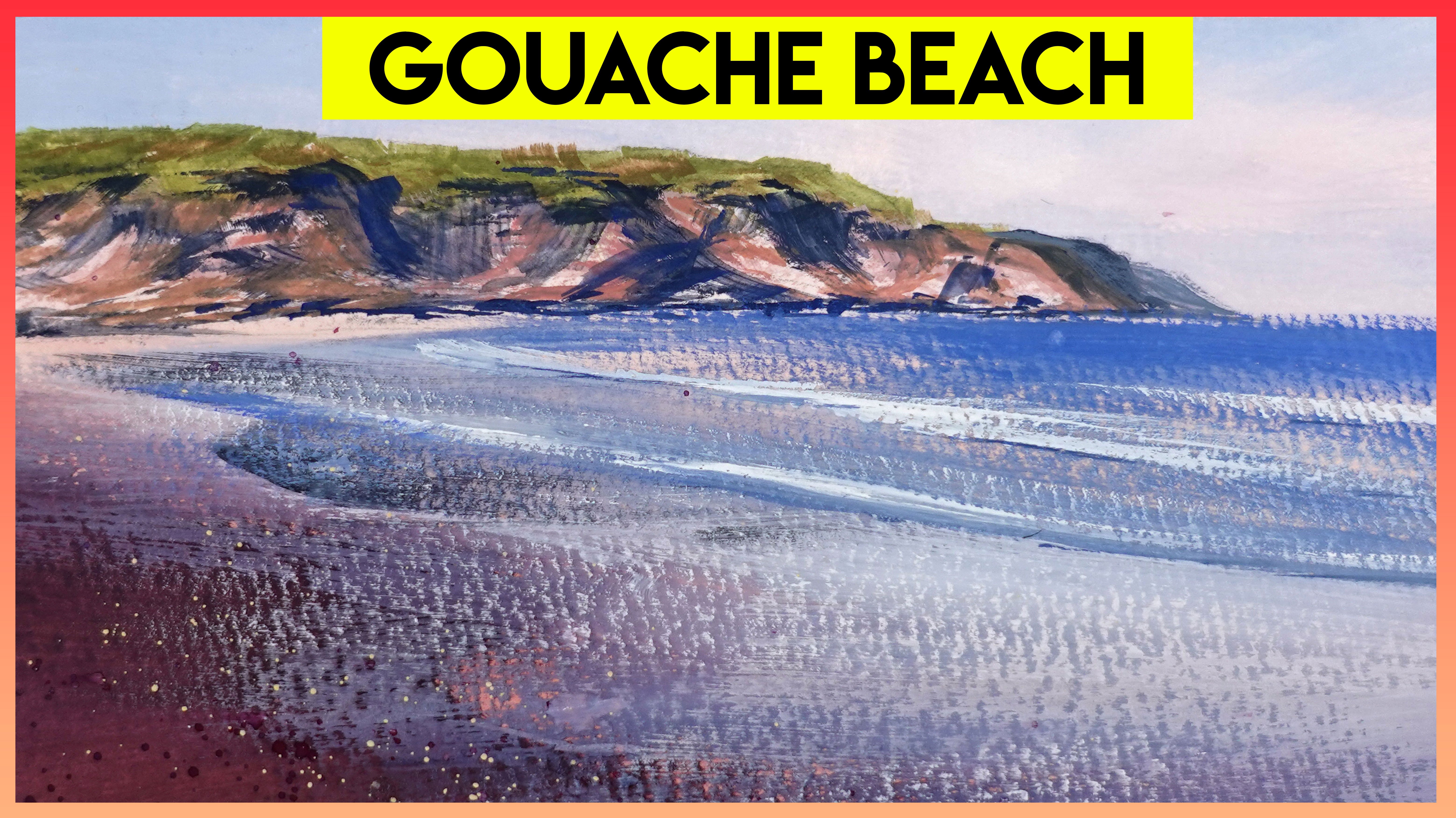
4. Ocean Water: before we jump into the waves. I just want to give you a really quick overview of just talking about ocean water in general. And I'm gonna use more stylized colors here just to exaggerate it a little bit. And I'll just talk really quickly about how color applies here. So again, we're not painting water. We're painting what's reflecting on the water or what's below it. In this case, the water itself has some particles, like algae and stuff floating around, so it may appear a little bit more green. Most of the time, the water in the distance is going to be much darker and more blue, and the water in the foreground is going to either be clear for turquoise, green, even have other colors, like a sandy tone or muddy even and it just depends on the situation. But here's just a basic rendering of that, so the water further away from us is darker. Most situations when you're closer to the water, you can see down into it, right, so the shoreline is gonna appear much warmer, much lighter, and the water that's further away from us, it's still gonna have that blew that deep blue look to it, and you're also going to see a lot of reflection in the distance. In some parts of the world, you see really beautiful, vivid, almost neon blue and turquoise colors. And it's honestly, when I was in Jamaica, I was like in awe of how amazing that water looked. So being the ocean, it's in perpetual motion. It's never gonna be completely still. And we're gonna have a lot of stuff going on. First of all, the waves or the movement on the surface is going to cast shadows down below. So if we're looking at this as like closer to us is the shoreline, we're going to see shadows cast down onto the sand below, and they may appear just as a darker version of the blue or the greens and the scene. We're also gonna have some sunlight refracted around. It often appears as almost like a Web like pattern on this on the sand below, and we're gonna have some reflections of the sky so you can see I start. I added in a bit of soft sky reflection, like a lighter blue color, and I know I can start. It starts to feel like a lot at this point. But if all else fails, you can kind of start to draw these things in like a net like pattern. So almost like a lattice shape. And of course, there gonna have some, like, flowy movement to them. But just as like a base point, you can at least start with that, and then you can start to work your way up to something more realistic. And lastly, as the waves starts to form, you'll see a little bit more warmth there because the sunlight is pouring through it. But we'll get into waves in a second. A lot of times you'll see some glistening like sparkles on the surface of the water as well . And all of this combined, it's like you can break it down into all these layers, and when you're out there in person again, it could be a little overwhelming. But if you just go into it with these things in mind, it will at least help you get started. So this is also gonna be in the class resources for you to reference as well
5. Waves: just as a starting point, I I highly recommend that you practice something like this for the homework. If you're a digital painter, you can do this kind of stuff really easily in your program, and it's a lot of fun. So, you know, maybe throw that into your homework or the your practice after the class is over. But basically you could just start with Ah, plane. So say we're kind of above the water looking down at it. There's a bit of perspective to it, but it's nothing too fancy. It's just something to start with. And then again thinking about how the water further away from us is a deeper blue color. And as it comes closer to the shore, more light is filtering through, so it's gonna warm up a lot, and we're going to see more of that turquoise. So that's just a simple Grady in applied to the top of that first shape. And then we're going to throw in those shadows which are being cast down onto the sand from the waves above, and then we can add in some reflections of the sky color so we can start to really show that the water is moving at this point, just something simple back there to show that the water is starting to become wavy. But the sun is off in the distance behind the wave. As that water starts to rise up, sunlight is gonna be filtering through it from behind. So it's gonna appear a lot warmer. So if we start with a very basic wave like shape, all I did was draw little almost like a mountain shape. And then I erased the bottom of it with just a soft eraser and put it right in sort of the transition area from that dark blue to the lighter turquoise color. And there's a little bit of yellow in there. There's a little bit of lighter turquoise, and it's really just to show that the suddenly is pouring through it. And then we'll take maybe a textured brush like the dry ink, which is a really fun one, because that water is moving up and lots of air is mixing around. And there were going to get that frothy, um, like white wave tip kind of thing going on. So, um, at the top of the wave, we're going to see a lot more of this. And as it curls over, we might even see a lot of it coming down towards us. It kind of lines the wave, but we're also going to see it in the foreground. Okay, I took it second to draw this in. I clean this up of it, and I'm starting to explain what's going on, but basically, let's zoom in and kind of talk through this. Um, As I said, the top of the wave is going to get nice and frothy, and the water is going to start pouring over the edge come curling towards us. And a lot of that time that tip of that wave is is completely white and foamy. We're also gonna have all this phone down in the foreground, which will be as much or as little as you want it to be. I did a lot because I wanted to make it feel like it was really active waves. There's also all of this curling action coming down from the top of the wave. Something that helps me sometimes is to actually draw in a cylinder. So again, knowing your basic shapes and how to draw them in perspective is really helpful. And now I know that anything that as that wave curls, I need to make sure it kind of adheres to that form. With all of this foam in the foreground, you could start off by just filling in the whole area and then coming back in with more of a rough eraser and erasing little pieces away until you kind of get however much foam you want. Because, um, it's a lot of fun to add that kind of stuff. One of the most important things is to think about how there's actually going to be some shadow on the wave. So if I take a cooler brush, maybe, like a bluish tint, and I just get my soft brush again underneath the wave, the wave is actually casting a shadow on itself. So under here, this is all gonna be in shadow, depending on the angle of the sun. There's also going to be some of these bits and shadow, and once you start going into this much detail and you kind of step back for a second oops , that was too much, so you can add a little bit of their depending on how dramatic you want that to be, how angled the sun is. And if you zoom way out, you start to see all of those elements really come together to give you a more realistic wave. And I actually broke this down into a little memorable thing. Anatomy of a wave. So if you guys want you can reference this in the future, it's in the class resources. This is Jean Rozier Smith and oh my goodness, I love her landscapes, her Seascapes, airwave paintings. She's actually a pastel artist, and just the way that she indicates light moving through the water. You guys can learn so much just by observing her paintings, and she does it. It's a really cool thing. Toe look through her gallery because you can see what the waves look like from backlit light from front lit, light side lit, overcast, so many different lighting situations. So again, if you can't go out on your own, it really helps to observe things like this. And even if you just observe a couple of them, you can see how she indicates that shadow under the curl of the wave and let some of that warm light come through. Sometimes she'll have her pastels kind of wipe off the back of the wave. Um, you could also do that with paint just by, like, swiping your brush, and it makes it look so windy that the mist that phone was being carried away. Irena Cumberland is another artist who doesn't gorgeous wave paintings, and she actually does a lot of these really beautiful close up scenes of the ocean are, you know, different types of water situations, and some of them are super abstract. Some of them are hyper realistic. You can go browse through her gallery, but you can get a really cool sense of how there's so many different ways to represent water and paint water in different lighting situations. Um, so, yeah, go check her out for some really good inspiration. There's no exact formula for how to paint water or getting the wave perfect every time, and it's going to depend on so much else in your seen. So just starting with these basics, I think helps, and we'll go a little bit more in detail with it later, when we get into the drawing and painting portion of the tutorial
6. Waterfalls: waterfalls are a lot easier than you might think, but we'll just quickly go through the basics just to get started. I know. For me, like when I first started, my first instinct was to make the waterfall all one color. Usually it was all white. Maybe it was all blue, but there wasn't really. I didn't add any variation into it, and the more I observed them, and the more I just painted them from life, I started to notice some repeatable strategies duplicated that over on the right, so we can just kind of talk about it. But I'm gonna put the light source kind of behind and up to the left so that the light is just pouring over the top of the waterfall, which means that the whole right side with the most of them the majority of the water as it pours down that cliff is actually gonna be in shadow. So I'll just take away all that white and I'll start with a blue base, and then we can just build up the light from there. So if this whole area is in shadow, that means this and kind of this area or wherever we think that light is going to hit is going to be illuminated, and depending on the angle of the sun, more of the light might be hitting it. So maybe this whole area will be in in highlight eso. It just kind of depends on your situation. So let's see what happens if we turn on some of that light. So if I turn this layer on and then off, on and off, you can see that the light is catching this area. It's also just barely catching some of that miss down there, and it's starting to be seen just over here at the edge. So this whole area is still in shadow, so it still remains that deeper color, and that deeper blue color may change depending on your situation and what's in your scene . But this, you know, Let's I'm trying to keep it simple here. You can really give the viewer a clue as to where the sun is in the sky, depending on how much of that is illuminated. So if more of the front of the waterfalls illuminated, it'll make the the sun feel but higher, more directly above than if it was less eliminated, depending on how dramatic you want that son to be coming over the edge, you can erase like a harder line of mist, and it will really make it appear as though the this whole area is in shadow. You can also add a lot of foam down here in the foreground if you want to. I like to vary it, so add some rim lighting at the top of the waterfall. Add some of that missed just slightly, catching the light, and then I'll add some surface foam or something like that down below. Let's take a look at a couple examples you can cut and get an idea of how artists have applied this to their scenes. So in this case, you can see the very top of that waterfall is really bright compared to the rest, and it's making it look like it's just the sunlight is just turning over. Just tipping over the top of that waterfall. All of this middle area is in shadow, and then down here, closer to us, where the sun can hit it again. It's illuminated, and they just go back and forth between those really bright brights and the shadow side of the waterfall, and it adds so much life to it. Here's another great example. Mike Hernandez, Amazing artists. You have to go check him out. This is a really great view of maybe early morning or a late day scene where the light is really close to the horizon is just pouring through almost straight at us. So the top of the waterfall is crazy, bright, illuminated and the bottom This whole section down here is all in shadow and just getting that little glimmer of light on the top before the water pours down over the edge is gonna make it just pop and stand out so much more.
7. Sketching Water: before painting. Let's quickly talk about some strategies for drawing water, because drawing is such a good way to grow your sensitivity to values and composition and perspective, and all the important elements that help us make better paintings. I actually love doing value studies before I jump into painting my scene because it's extremely helpful to be ableto have a little bit of practice. You can try out different lighting situations and really nail the composition on the form before you get started painting. All the tools I'm using today are listed in the class description, so feel free to go check that out. I'll quickly demonstrate three ways you can sketch water, which is really helpful to know when you're outside painting and drawing, because a lot of times you're working rather quickly and you don't have hours to spend on one sketch. So thinking back to the lesson about moving water, let's practice drawing a choppy ocean. Let's quickly take a look at a reference photo so you can see from a distance. It kind of all looks blended together. You can't really tell how choppy the ocean is, but if you zoom way in and Ukrop a section of it out. You can start to see those forms, and if you actually trace over the photo, you can see this pattern almost like little triangles or peaks in the waves. We can use that information when we sit down to draw this type of scene so we can start by drawing these little triangle peaks and they can overlap and they can be a bit random. But I'll make the ridges closer together in the distance and a bit more spread out as they get closer to me and this tent type structure. It just gives you something to start with, and then we'll come back in and add the shading and everything. After once we're happy with the placement. We can lay in a base coat of a medium or mid tone value. If you want. You can use a charcoal stick or whatever and blended out and make it really smooth. But I'm just using my pencil to to be, and I'm using it pretty quickly here so you can even see there some streaking. But it doesn't really matter at this point. And now let's identify where the highlights are for the most part in this scene There at the top of these little ridges or these little 10 structures, you can use an eraser to lift out some of that graphite, Um, or you could have pain, or you could have drawn around the highlights from the beginning. But I find that to be a lot more tedious, and it's gonna be very light at this point because we didn't press too hard in that first layer. But you know, as long as you can see it, that's all that matters because we'll come back in and make it a little more noticeable. So every little tent gets a little highly at the top, and for the most part it ends up erasing those darker lines, which is okay. Then, using a bit more pressure, I'm going to start laying in the shadow part of the weave, and in this case, it's on the side that's facing me. So underneath each of those highlights of just going to start filling in those little triangles towards the bottom of the triangles, I'm keeping it a little bit later, and it's a teeny bit darker at the top, the very peak. Then you can use one of your blending tools, and you can start blending them a little bit. So they're a bit softer here and there. And in some places you can leave it alone because I think it kind of helps toe have a combination of the hard edges and the soft edges, and that's pretty much it. So this is just a super quick way. You can indicate choppy water in your sketches, and next we're gonna move on to maybe more of a smooth, flowy wave surface for a smoother surface. We want to avoid those peaks or pointy tent forms, so this time will use longer, flowy horizontal lines that gently rise and fall. They're a bit closer together in the distance and more spread out as they get closer to us . And honestly, this is probably the quickest way to sketch water and just really easily show that surface movement. I'm just simplifying the entire thing down to these longer streaks of highlight and shadow Here and there. I'll make the lines a little bit thicker and a little bit thinner, which will just help indicate the different types of waves, different sizes of waves and, of course, you could always come back in and blend different areas together as well. But just as a really quick technique for sketching water, this is probably one of the easiest to sketch out. This swirly type surface will do something similar on Lee. This time we need to incorporate more ovals and swirls in the distant part of the water, draw in a few elongated ovals and swirls and shade around them. So you're leaving some of that white paper showing through as you move towards the foreground, switched to shading inside the ovals and swirls and continue working back and forth like this. Try not to be too repetitive in your placement and size of the ovals and swirls. And, of course, if you want to go for a much more realistic approach, you're gonna need to get a reference photo and just practice copying exactly what you see. But I find that minimizing it to something like this is much more helpful when I'm outside doing those quick concept sketches before I start painting
8. Sketching Waves: leaves come with a unique set of challenges. To make waves appear as though they recede into the distance, it's helpful to know a bit about perspective if you're totally unfamiliar with the concept of perspective in art, I recommend watching a few videos later on that topic. But for now, I'll walk you through how I use two point perspective to draw a wave, start with a horizon line and then add a little dot on that line on the very far left. This is going to be our first vanishing point. Draw a couple guidelines radiating outwards from that 0.1 below the horizon line and one above. You can add more if you want to now draw another vanishing point on the very far right side of the horizon line and continue drawing guidelines radiating out from there. But this time there's no need to go above the horizon line. We're going to be using this grid to plot out our wave. So starting with long, sweeping motions at the bottom where we drew that secondary grid, I'll do like a very long, sweeping kind of a backward C shape up towards the top guideline, and that's going to be the peak of our wave. I also want to point out that I'm making a little bit of a lip at the top, so it kind of curves back down, and that's because the waves actually rolling over. It's not just a solid line there that's gonna curl over from here. We can start to draw the portion of the wave, the tip that curls towards us and is gonna create that funnel that we usually see in waves at all times. I'm trying to remember that this top guideline is where the top of the wave is going to be , and I'm picturing how the wave might curl over that line. Sometimes it helps to erase some of the guidelines as we continue to progress so that they don't get so distracting. As you draw this curl of the wave. Try to remember back to the Basic Wave lesson where I showed you how I would draw a cylinder, and I try to imagine or visualize how the wave is going to curl around that adding a bit of shadow underneath that that curl of the wave will also help to find and add to the depth of the wave. It might help if you add a bit of white to the drawing so that you can remember where your tip of the wave is and even just throw in some of that foamy nous that we often see with waves. So now that you can see the wave taking shape, it's probably obvious that this is more for a scene where we're, like, really close to the sand or the ground, looking straight at the wave or up at a wave. So maybe for a really big, massive wave. But for a lot of scenes were pro. We're more likely going to be looking slightly down at the waves. So next I'm going to show you that once again, we'll start with our horizon. In this scene, the vanishing point is way far off the side of the paper, like across the table. So instead of drawing the grid in, I'm just going to visualize it in my mind. This time, the guidelines are all below the horizon line, which will make it appear as though we're looking down at the wave, starting with a guideline for the top or the crest of the wave then moving on to drawing as many more guidelines as you need. But for the most part, I usually just stick with that one and then following pretty much the same steps as I did before. I just continued to plot out the overall shape of the wave, making sure to try to capture how it curls over. And as I continue on, I'll start to add in a little bit of shadow here and there and really try to emphasize the foamy nous and how the wave curls over and crashes down on itself. So I added a bit more, Um, like splashing and bubbly action at the bottom as it crashes over. I also wanted to add some of that winds. Wept, look. So with the white pencil, I started sweeping it across the top of the wave and back away from us and just continuing to beef up the values. So getting a little bit darker and a little bit later here and there, adding some shadow in the distant water and then a little bit more at the top of the wave will also help make it stand out. And I basically used the tone paper color as my mid tone in this piece, which in my mind was reflecting the sky. So the sky stayed just paper color and then in the foreground with the wave, all of that area that's just the brown paper showing through in my head. That was what was reflecting this guy. So I hope these little tips were enough to get you guys started withdrawing waves. Ah, lot of times I don't even draw the guidelines if you do it a few times and just kind of get used to how the wave forms and hopefully it'll continuously get easier for you.
9. Watercolor Demos: before we jump into the water color demos. I want to show you two really important techniques for painting water scenes of any kind, and that is what into wet and dry brush. If you've watched my other tutorials, you know all about this. But I'm going to demonstrate it here in a way that I utilize it for water scenes in particular. So what into what is exactly how it sounds? You're putting paint into already wet paint or wet surface, and you're letting the pigment flow and bleed throughout that wet surface. And a lot of times we can tilt the paper and use gravity to our advantage, and we get these really beautiful flowy forms. It's one of the biggest things that sets watercolor apart from other mediums, and I think it's one of the most magical aspects of it. So go ahead and try this on your own. Maybe get a sketchbook page, fill it with a few different squares of use a variety of colors and really just practice that water control and see how much water you need to get these really beautiful flowy forms. If you're using a lot of water and you notice that it's starting to collect at any one of the sides of the page. You want to pick that up with a paper towel, just dab it lightly and otherwise. If you don't do that, it's gonna bleed back into what you've painted. And it's going to create a hard edge and and kind of look a little bit splotchy. For the dry brush technique. You'll want to clean off your brush and remove almost all the water from your brush. You need just enough to be able to pick up the pigment, activate that watercolor but instead of pointing, are brushed down at the paper. Were actually going to use it kind of parallel. And what this does is that it kind of grazes or dusts the pigment across the surface of the paper. And if you're using cold press paper, which is more textured, it'll emphasize this. It's one of the reasons I absolutely love cold press paper, especially for coastal scenes or Seascapes. By doing this, we're allowing that under layer to show through in that negative space is going to become are highly on the water, so if you have only a little bit of that showing through the water is only gonna have a teeny, tiny bit of glimmer. But if you leave more of that first layer showing through, it's gonna look a lot brighter and it's gonna seem like it's reflecting more light. One thing that makes water really special is the way that it reflects. And when we're faced with a scene outside where we have a lot of light reflecting off the little waves or ripples and we get a lot of the sparkly or the glimmer that sometimes is almost blinding. I am so inspired to paint it, and at first I had no idea how to do this. But after a lot of experimenting, I discovered that using this combination of wet into wet and dry brush, I can imitate how that glimmer looks on the water. So we'll start off with a scene that we're looking out into the ocean. There's a big sky, lots of clouds in the sky, maybe a little bit of ah, darker cloud. And then there's bright light glimmering off the water. If you're unfamiliar painting clouds, I have a whole skill share class about that, but basically we're just gonna paint around the highly of our cloud So we're just painting in the sky color If you wanted to be a little bit of more of dramatic you can add a hint of shadow to the cloud So I'm using more of a grayish blue for my shadow and we're gonna think back to that dry brush So now, without even getting the water or the ocean part wet First I'm gonna go jump straight into dry brush So I'm gonna load of my brush with a good amount of pigment and I'm gonna let it graze across the surface. And the reason I'm not doing wet into Wet first is because I want the glimmer that appears on the water to be bright, white like almost blinding. So to get that really high contrast, I don't want anything on the paper first. Depending on how dark you go here, it's gonna be more dramatic. So if you make your sky pretty dark and pretty dramatic, and then you add a lot of pigment to your brush and do the water so that there is a really high contrast that is gonna seem extremely blinding, that glimmer is going to be even more dramatic. So it's up to you to kind of decide how much you want to do there. But I suggest trying this in your sketchbook. Just do a couple of squares, um, and really push the contrast in a few of them to see how it feels to see how that looks. It doesn't take much. It's really only a couple minutes and a few brushstrokes, but you can accomplish a lot with just very little. I think that's one of the wonderful parts about working with such a versatile medium like water color, since watercolor dries a little bit lighter. Sometimes I have to come back and add more depth or more value darker value to my painting so I can just come back in with another dry brush layer and lay it down on top of that. Sometimes doing this is fun as well, because you can start to emphasize things like waves or bright colors, or I don't know it. You just can't have fun with it. And so, yeah, try a few of these in your sketchbook and see what you can come up with for a scene. Let's a little bit more complex like we're at a beach and there's some distant rocks and we have a lot going on. Ah, we can approach it a little bit more structured. So you see, here I started off with a sketch, and I'm just gonna lay in the background very, very lightly, and I'm going to try to capture a bit of splash against those distant rocks. So if I go a little bit darker with my sky, the splash is going to stand out even more. So I lay in a bit of, ah, darker blue and then pick up a little bit with my paper towel or tissue. And then I can use my dry brush to capture a bit of that glimmer on the distant water, being really careful not to paint over my wave because I need that negative space for my wave. So it appears bright. So I'm using a very small brush here, as you can see, and I'm just trying to be very careful where replace that pigment. I don't have a lot of pigment, so it's not like it's out of control or anything. I guess that's one of the benefits of doing these smaller studies thes small sketches. This is only a four by six postcard size paper, so it's not overwhelming at all for any waves that I want to add. I'm gonna add a hint of that fellow green, as we talked about in the previous in one of the previous lessons about color and waves. More light is coming through that wave, so it's a bit illuminated with that green or yellow light for the waves that air splashing up against those rocks. I'm gonna add a teeny bit of blue to the shadow side so that only a little bit of white shows through. But it's just enough to emphasize that it's big waves splashing up against the rocks. And from there I'm just going to keep working my way forward, just using dry brush pretty much. And here and there I'll add in maybe a hint of a wave with a little bit of that turquoise green. Sometimes I'll blend some dry brush and wet into wet, but for the most part I'm using dry brush because I don't have a lot of space toe work, and I don't want to lose a lot of that glimmer that's on the moving water, so I'm allowing a lot more paper to show through. And I can always come back in with more pigment if I find that something dried a little bit too light or if I just want to emphasize one particular area. But I try not to go overboard. It is really tempting to just touch the painting too much, and it loses some of that freshness and some of that liveliness. So I try to keep it, keep my brush strokes to a minimum and then just move forward. Adding in a bit of sand color in the foreground will emphasize how bright the tip of that wave is. That's coming up on the shore, and I'm using a potter's pink mixed with a little bit of yellow Oakar to warm it up. And the potters pink is heavily granulated, so I get a lot of beautiful sandy texture there, and since we can usually see down into the water that's closest to us, I'm gonna add a hint of that sandy color to the waves that are closer to me. But I'm trying to be careful not to get rid of all the highlight their cause. I do want a bit of that foam to show up on the tip of the wave as it comes up on the shore . I know there's a lot going on in this scene, so if you want to try it on your own, but you're a bit timid, I'm going to give you guys. Some line are in the class. Resource is that you can use as a reference. And really, though the most important thing is to practice the water control as well as the wet into wet and dry brush technique. Because you can apply that to so many different types of scenes, and once you're more comfortable with that, you'll feel much more free to explore. Next up, I'm going to show you guys how to paint a waterfall with Wash, which is an opaque medium and has a different approach than watercolor. If you really find yourself loving watercolor and you want to take it a step further, I have tons of full length tutorials over on my patron page, and I also do live streams and live paint alongs on my twitch channel as well as my YouTube channel. So feel free to follow me over on those platforms. Come by, Ask questions. I love demonstrating stuff live and talking to you guys about all of these fun techniques. So enjoy those. And if you feel like supporting me further, come on over to patri on.
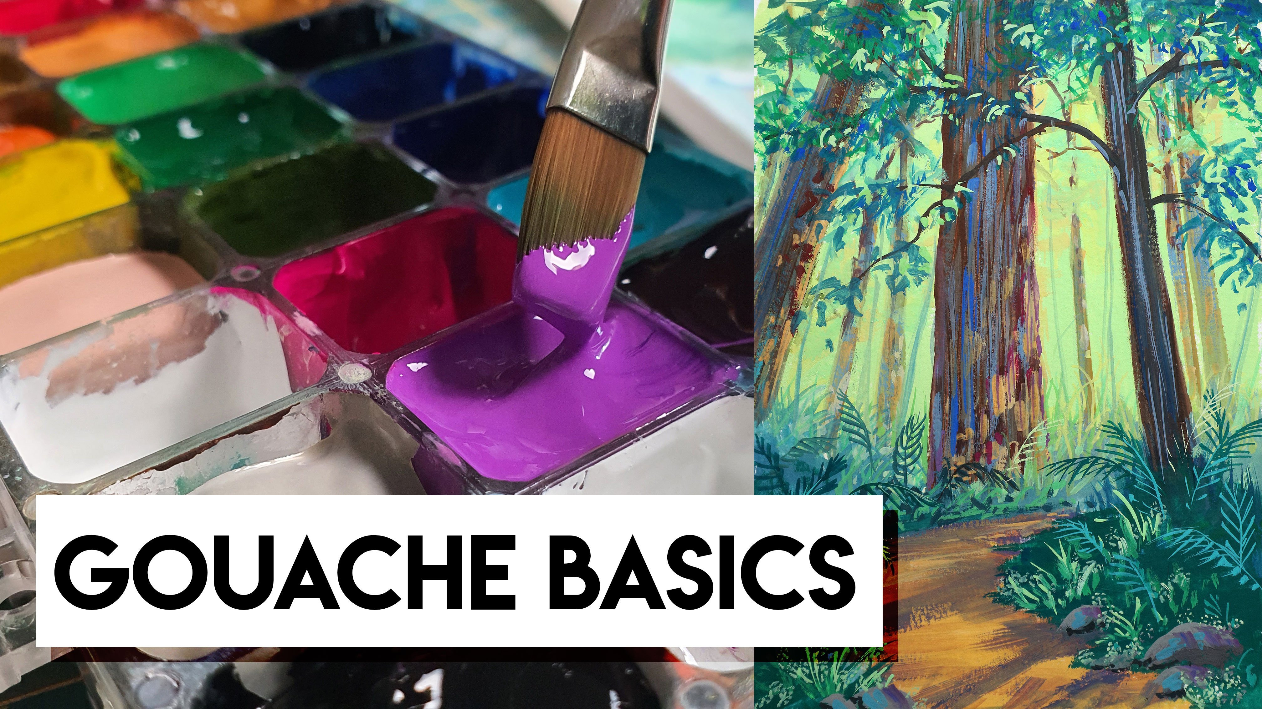
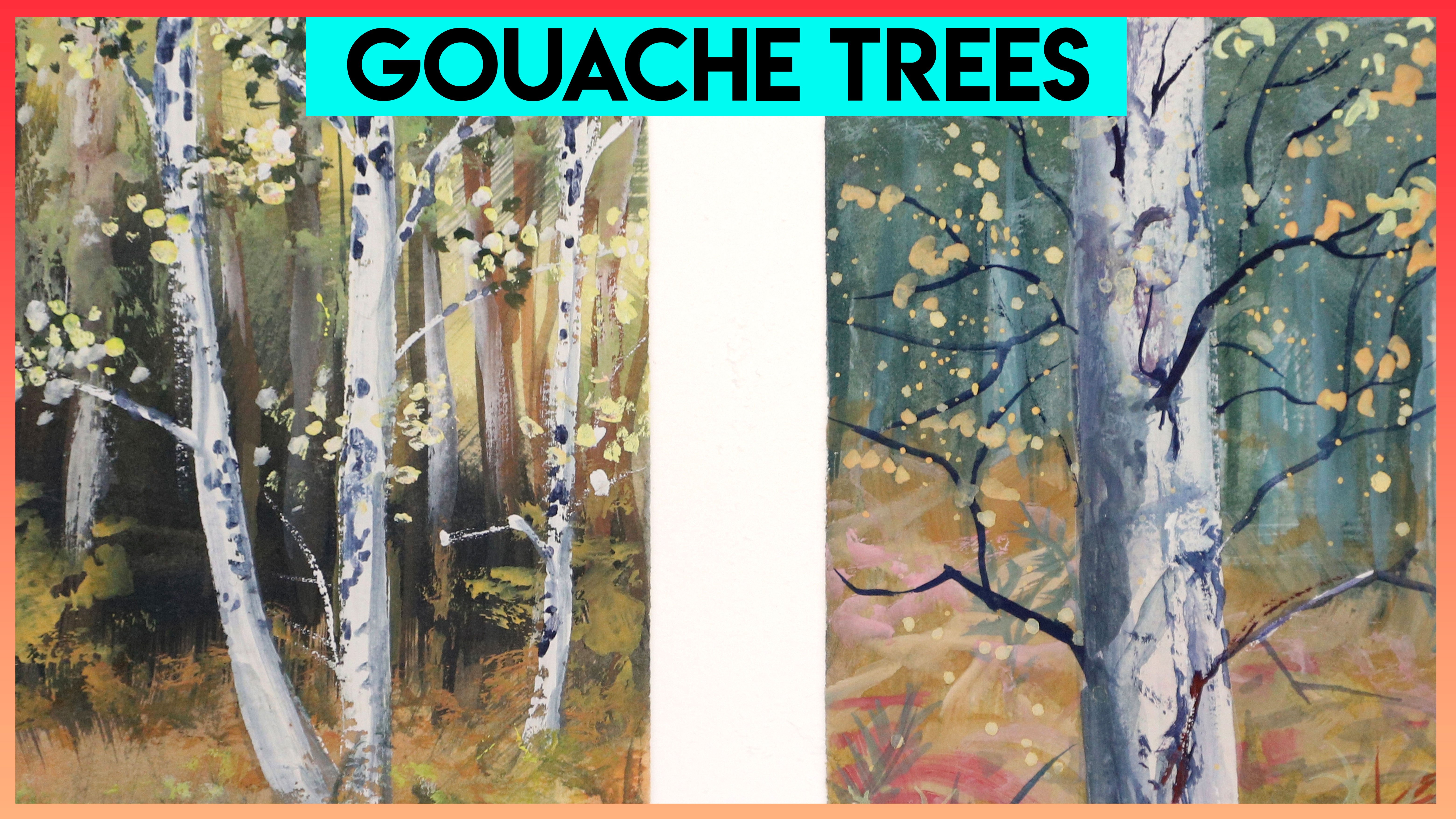
10. Gouache Demos: when using wash or any opaque medium, we can relax a little bit because we don't have to let the paper show through for our highlights. So in this case, because our waterfall is going to be the brightest white of the paper, we can draw that area in and just keep it in mind. But if we happen to paint over it, no big deal. I've dropped this photo in the class. Resource is so you can use it along with some others. But in my painting, in my demo, I'm not staying super closer, super true to the actual colors in the photo, I'm sort of inventing my own light and my own color palette. I felt like I wanted to paint more of, ah, bright summer scene rather than a fall scene that's really overcast. So for my colors, I'm mixing a lot of browns and greens, but mostly leaning more towards the warm side. So there's a little bit more yellow mixed in. And for the sketch, I'm not paying super close attention to all of the details. I'm trying to use this big flat brush to lay in more of the colors where I kind of envision them being, and then later I can come back and add some more detail and some textures on top. But don't worry about being too obsessed with capturing every single detail in this exercise. It's more about practicing the getting a feel for how the paint flows in creating the waterfall. So you can really do whatever you want around the waterfall like Adan rocks. Or keep it all one color. Keep it just grassy, whichever whatever you feel more comfortable with. And then when it comes to the waterfall itself, I'm going toe. As you can see, I'm laying in a base color of like a deeper blue here and there. There's hints of sky blue here and there. There hints of more oven, ultra marine color and not much of the white is showing through. I think the most fun part about Gua sh is the fact that you can get really thick with it, and you almost get a physicality to the painting because there's literally a shadow underneath the thicker wash. So for the waterfall, especially, it's a lot of fun to load up that bright white on the brush and just sweep it lately across some of the under color is going to show through, and it's actually gonna appear as though it's like a hint of a shadow or a lot of movement on the water. So when it comes to capturing the movement, all you need to do is is similar to like dry brush in a watercolor. You just let hints of that pigment dense across the surface and the viewers I will do the rest. I'm also adding in splashes and lots of glimmer on the water, just keeping it really active and not focusing too much on one area. I just want to give a hint of the landscape, but mostly focused on that beautiful texture, that foamy water pouring down the rocks. Sometimes you can actually see dirt or mud being swept through the water in a waterfall because it's like usually pouring down the rocks with lots of force. So adding just a hint of a light brownish color to the waterfall will imitate that and add a bit of variety, so it's not quite so boring. Next up I'll walk you through step by step, how I would pay a wave with wash. I welcome you to join me for this little paint along demo. You can grab your sketchbook or just loose watercolor paper, whatever you prefer and your wash. I often times use a container like this, which is airtight, and I keep my gosh in here, or I pour out some of the gua sha onto a mixing trade, which is actually what I'm going to do for this session. I prefer to paint with flat brushes with wash because they hold less water. And water control is extremely important with wash, regardless of whether you're using a container like this or a palette, I really recommend having one of these little spritzer bottles to keep the gua sh moist because it's really important that we don't let it dry out throughout the session. You kind of want a baby's at your wash a little bit. You want to make sure that the surface of the gua sh has a little bit of a sheen to it, that it looks little glossy. If it looks Matt, that means it's drying out and you'll want to just give it a little spritz. I'll be using a limited palette for this. It's going to be just white, blue, yellow and a teeny, tiny bit of burnt number and raw sienna. So thinking back to the lesson about the shape of the wave, I'm going to draw just a very simple close up of a wave, pretty much focusing on just one area where starts to curl over and I'm gonna practice painting the colors that I see there. There are tons of gorgeous photos you confined online for reference. But for this particular piece, I'm just using my imagination and playing with colors to see what I can come up with. One of the benefits of looking at a lot of reference and observing from life is that these images are just instilled in our mind and we can play with that and kind of be more spontaneous. And our paintings, However, I will stay true to a lot of the colors that I commonly see. So in the distance we tend to have more of a sky color or a deeper blue. So I'm just using peer white and the ultra marine blue mixture, and it's actually pretty light. I'm not going dark yet. I want to keep my darkest darks for the foreground. Using a really old brush like this, which has slightly frayed bristles, allows me to get a really good kind of rough surface on my water. It's it's got that built in texture so I can just load up the paint on the brush and sweep it lightly back and forth, and it shows up as kind of a streaky texture. And as I transitioned to the wave in the foreground, I'm going to start using more green. So I'll just makes my blue and my green and probably at a hint of white, because I want it to stay pretty light or use it a little bit more watered down so you could do. You could do a combination of both of those, but basically, you just want to keep this first layer a little bit lighter, a little bit thinner, and we're just filling in that hole foreground. I am painting around the highly of my wave, even though I don't have to. But when I paint my first layer of wash, it's much easier to work very thin, and I might as well leave that white there because I know where it's gonna be another benefit of working with a little bit more of a wet first layer is that now this paper is wet. I can touch in other colors into it, and it's gonna bleed and flow just like watercolor would. And this is a great first layer to start with as I build up my thickness and build up the rest of the colors. This is also a good opportunity to mix in a bit of a sandy tone. Nothing too intense. But because that paper still wet, anything I add now is just gonna kind of feed. And this will be a really nice under layer for the rest of it. So what I imagine is that I'm able to slightly see down into the water here, and I'm going to catch just a hint of that sand or the rocks below showing through. And then it's time to add some warmth because we want to indicate the sun poring through the wave. So I'll get my yellow mix in a little bit more blue and try to come up with just a really light greenish turquoise color. And I'm gonna lay that in just where the wave is starting to curl over and slightly below that area. Adding a bit of that warmth to the top of the wave is also really good for indicating the light coming through. Because the wave is much thinner than the large body of water it's coming out of, you can see I'm still leaving hints of white, because why not? I mean it for me. It helps me visualize the whole thing. I don't have to do that because washes opaque. I could paint the white paint on top of everything, but it just helps me kind of keep everything fresh in my mind. Now I'm coming back in with a little bit of a darker turquoise, and I'm laying in the shadow of the wave. So if you remember back to the lesson about the colors and are waves there, the the wave cast a shadow on itself. And so I'm adding this blue to just under the main part of the wave and just little hints of it in the foreground at the same time. I can also add more of the sandy tone if I, you know, if it didn't add enough earlier or if I want to add a little punch to the foreground because after this, I'm going to come back in with my white foamy nous and really, um, lay in it up. And so having this color underneath is gonna just peek through a little bit here and there . As that lower part is drying, I can now start to add some of the foamy spray on the wave itself. So just with a smaller brush and lots of thick white wash I'm dotting in the foam and the tip of the wave, it is blending a little bit with the colors that are already there. So it's not pure staying pure white. But that's okay, because I can always come back and add more. And in fact, if you remember back to the lesson about waves, we actually do want a hint of shadow in the foamy nous or the white area of the wave because of how it casts a shadow on itself. So on the side that's facing us, we're just gonna add in a hint of blue, and then the top part or the the area that's like kind of sweeping off the back of the wave will stay really, really bright and be like more of a crisp white, indicating that spray flowing off the back of the wave will just make it feel like it's moving really fast in the wind is blowing it. So you know, depending on how active you want your wave to feel, you can add more of that. And for the most part, this is all just dry brush, like hardly any water involved, because I don't want to blend into what's already there. I just wanted to dance across the surface. When it comes to adding the little details on the wave, I'm going to switch to a very fine pointed script brush. And once again I'm just using pure white. And I'm trying to draw in those streaky, foamy bits that you often see in waves. If you look at a still photo of a wave, you can see all sorts of swirls and, um, sweeping lines, and so I'll do a few of pure white lines on the top of the wave. And then underneath, the Wavell switched to a light blue. And again, that's because all the foam under there is going to be slightly in shadow. So just adding a hint of blue just underneath the wave is gonna help the viewers. I see that it's in shadow. If we added Pierre White under there, it would be far too bright, and the lighting scenario wouldn't make sense. At this point, it really is up to you to figure out how much you would like to add, so you could leave it very simple and just at a few streaks, or go really over the top and add tons of foam. And honestly, both of those scenarios exist in life, so you really can't go wrong. And as we transition away from the shadow underneath the wave, I'll start going back to the white, and I'll let the brush kind of dance slowly across the surface of what I've already painted here and there of more of the under painting will show through and in other areas will use really thick, bold strokes and pretty much without following any particular pattern. I'm just trying to indicate lots of movement, keeping the lines very soft and organic, nothing to straight or geometric or anything like that. And as I get closer to the foreground, I will usually switch back to a larger brush so I can fill in more of that foam. And finally, I can just come back in with any other little details. I think I need, like adding more shadowy foam underneath the wave or more bright foam on top. One quick little note about Gua sh is as you've watched this, you've probably noticed I was working rather quickly quashed. Dries really, really fast, especially if you don't add a lot of water. If you use it more like water color and you thin down all of your layers, it does stay wet for a little bit longer, and it allows you to blend and get more bleeds and stuff. So that's another perfectly fine way of using it. I have tons of free videos on my YouTube channel about wash if you want to see me using it more like water color as well as really thickly
11. Final Thoughts: so I barely got a sketch done, and it is looking very stormy. It's also starting to spit rain, so I am going to pack up and run away before I get soaked. Painting on plan air or outside on location presents a long list of challenges. I hope this course gives you a jump start on painting water so that when you go out there, you have a good foundation toe work from. I encourage you to explore the variety of techniques I shared with you in this class and keep an ongoing sketchbook so that you can look back and see how far you've come. If you're looking for more inspiration, I have a Pinterest board that I frequently update full of beautiful photos and artwork of water and a lot of other things as well. Keep observing. Fill up your visual library and try new things. I would love to see your sketches and paintings, so if you'd like to share them with me, you can post them here in the class project section. Or, if you want to use social media, feel free to use my hashtag Sarah Burns tutor and I'll be able to find you. As always, you're welcome to ask questions or request feedback. My hope is that your journey takes you somewhere beautiful and you enjoy the process of learning. Thank you all for your support and I'll talk to you soon.
 Sarah Burns, Painter / Photographer / Youtuber