Transcripts
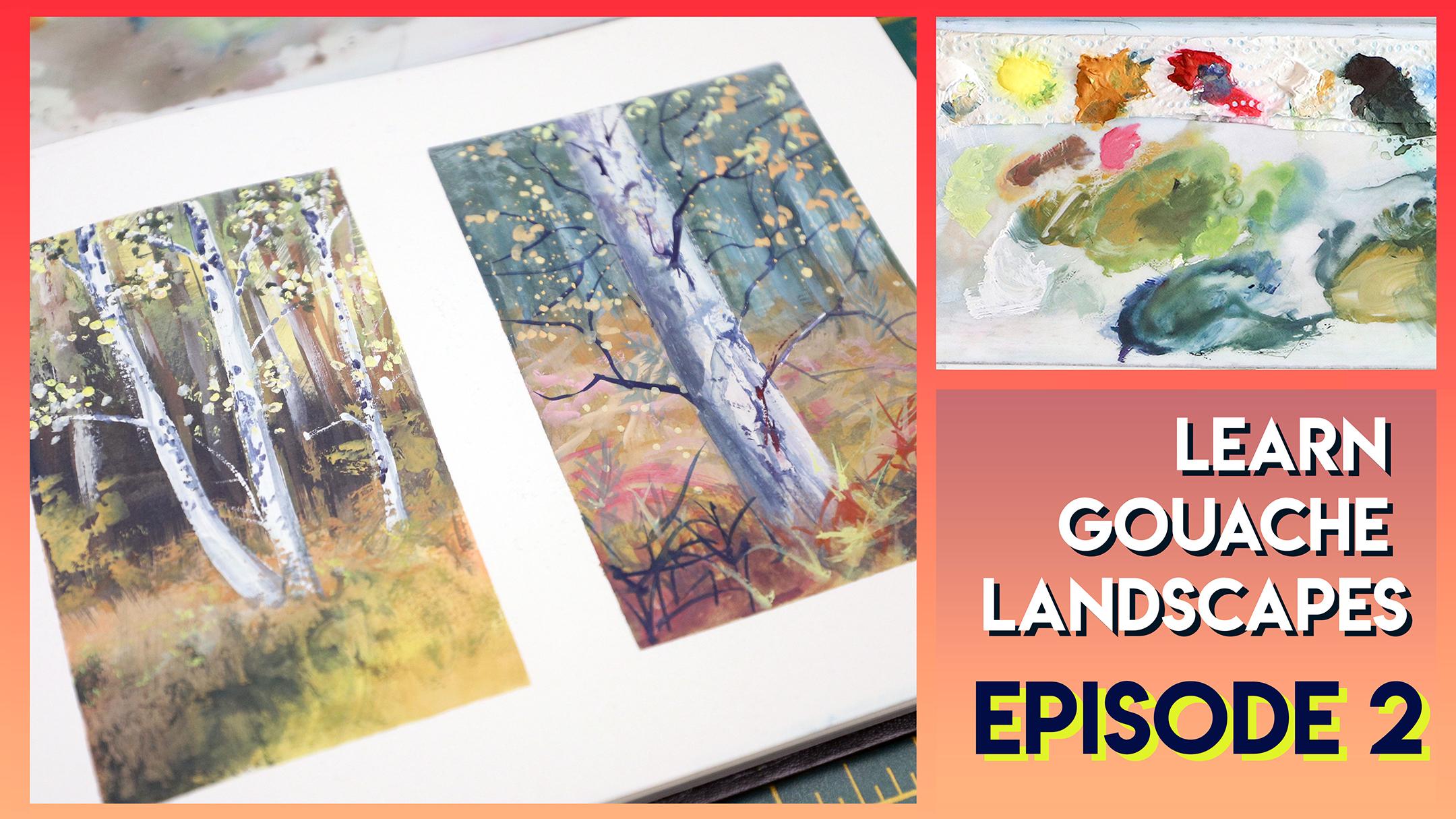
1. Intro: Welcome to episode two of mine learn guage landscape series. This series of classes offers real-time instruction for how to paint a variety of landscapes with wash. Each class is 60 minutes or less, so you can fit it into your busy schedule. I'll show you my techniques, talk about tips for getting the most out of your goulash. And talk about my own struggles and how I overcome them. In episode two, we'll focus on Autumn forests will do to small scenes in order to discuss different strategies for layering and creating interesting textures. As always, my goal is to give you repeatable strategies so that when you're outside and the inspiration strikes, you feel confident to pick up your sketchbook in paint. So grab your sketchbooks and let's get started.
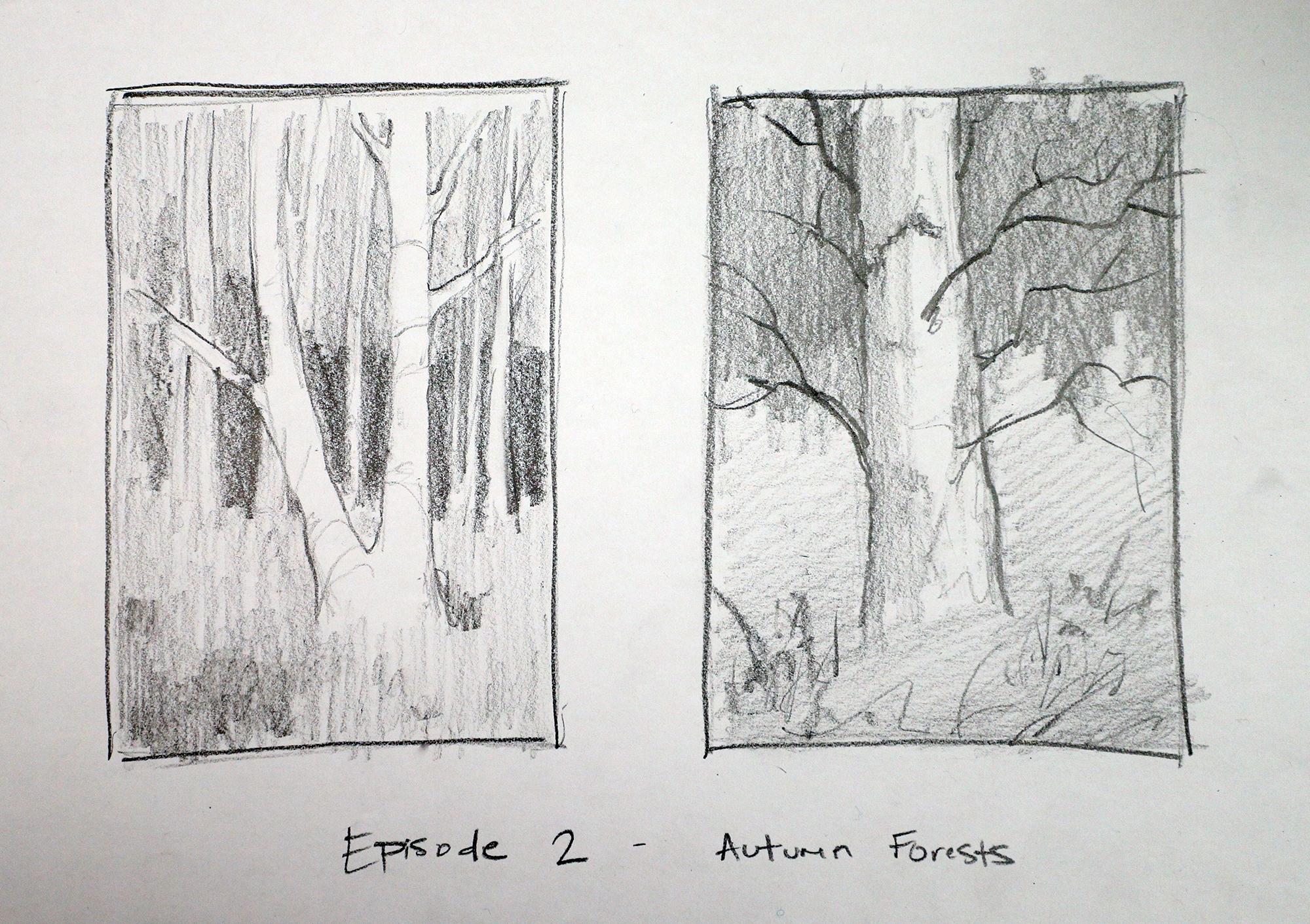
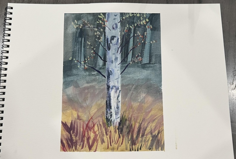
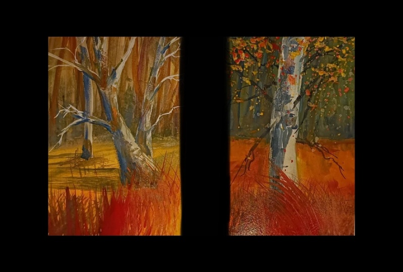
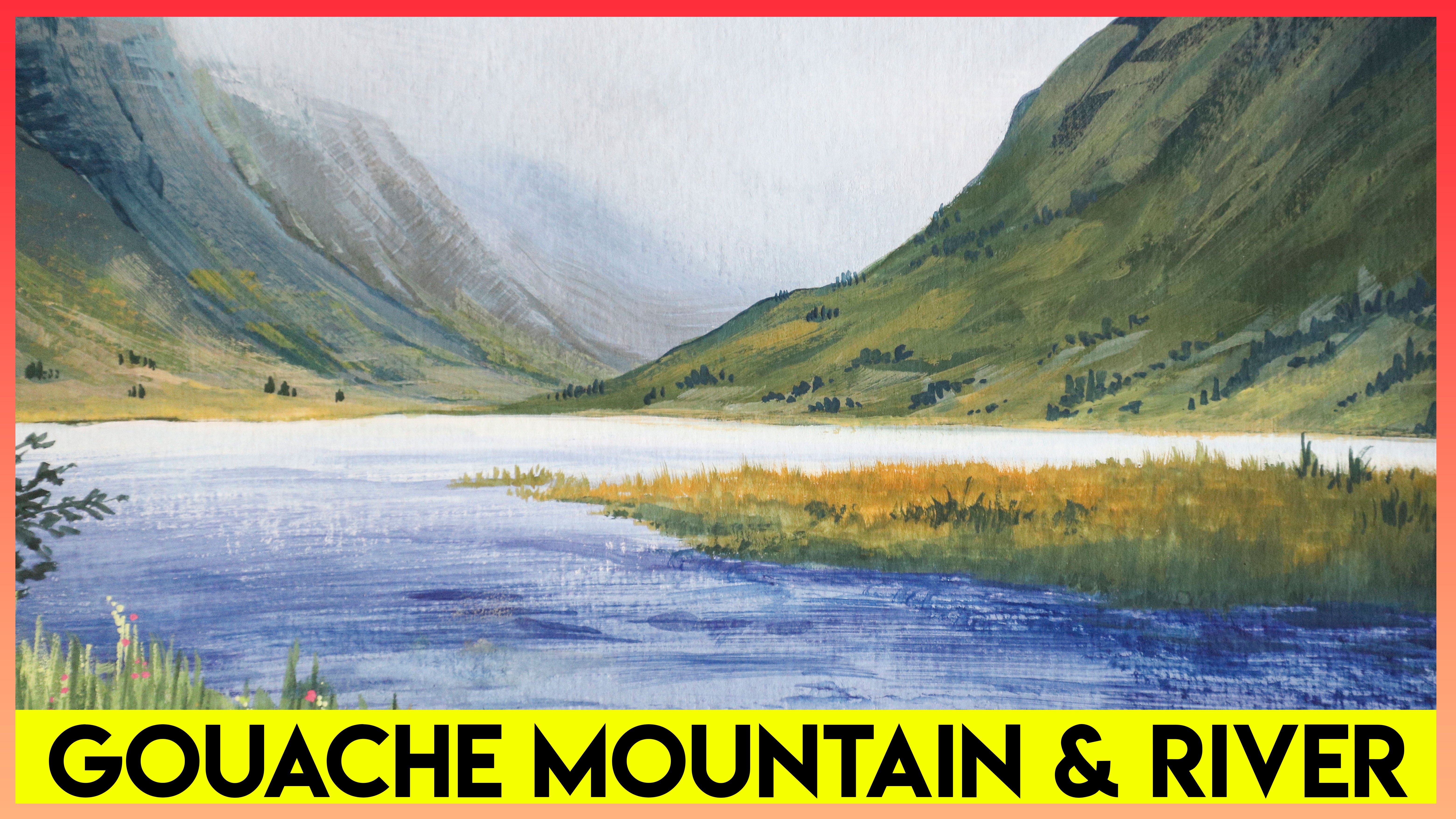
2. Sketches and Planning: Let's first take a look at our references. I chose two scenes with completely different lighting. On the left, we have a frontline scene in the late afternoon with bright light hitting our subject, creating really strong shadows. On the right, we have an overcast day with really even lighting and really soft shadows. We can use this same layering technique for both of these once we start painting. But how do we address the lighting? This will drastically change the look of our painting. So we want to think about this carefully first. Before we jump in the painting, let's make a game plan by thinking about our values through a value study sketch. I'm using just a piece of regular computer printer paper and a 90 graphite pencil. It's also handy to have an eraser. Let's start easy by just drawing toolboxes. Doesn't have to be perfect. In this first reference photo, one of the most important things we need to look at and focus on, especially when we start painting, is the contrast between the background and the foreground. The background is quite dark in the foreground is almost pure white. So in order to start, I recommend just blocking in your main focus. And in this case it's going to be the foreground tree. And you can simplify it like i did. So for instance, we'll only have one of each of these main trunks instead of two or three like the reference photo has. I mean, you can you can copy the reference photo, but I was just trying to simplify it for the purpose of this lesson. And of course we can have branches coming off, but at first, just keep it really simple. No need to go into overdrive on detail at this point. We just want to kind of work out our highlights and shadows. The great thing about goulash is that it's opaque. So you can do your highlights last and you don't have to paint around your highlights like you would with watercolor. So just for the purpose of this sketch, we wanna kinda block in our darkest darks and then leave the paper showing through for our brightest brights. Of course, that's a different approach to when we're painting with guage. But it's helpful to just kind of visualize where those darks will be and of course, where the highlights will be. In the end, there are going to be a few background trees. So you can just block in however many you want. And then we'll start laying in the shadows around these trees. And it's okay if it looks like a crazy mass at first. Let me darken this so that you guys can actually see what's going on. If you need help. Drawing especially trees. I have an entire Really, really in-depth class about that. Make sure you check it out. And just for now, it's okay if you're trees look a little bit blocky because again, the purpose of this is more about getting the lighting. So basically how I would start is just to kind of squint my eyes and look at that reference. And I want to start laying in my darker areas. So if I squint, I can see a big dark spot kind of behind this right side trunk. And it just kinda goes, it fades from light to dark as it goes left to right in the page. So you can emphasize the darkness in one particular area. Or you can have a line of darkness behind it. But for the most part, it kind of stays within this part of the drawing of the painting. It doesn't really get dark up on top and the foreground is lighter than this dark area in the middle. So sometimes when I'm laying in my dark areas, I like to hold my pencil like this rather than this. When I hold it like this, I can move my whole arm versus just moving my wrist and it helps me get consistent dark lines. When we lay in our dark area. Try to think about where you want some of the background trees to be peeking through and leave those whites. It's okay if you color too much because you can always come back with an eraser. Just uses as a practice run basically. Just a quick little note here. You might be able to tell already, but I kinda zoomed into the reference photo, so I'm focusing more on the lower area of that foreground tree. I'm also not drawing in a lot of the leaves that cover the tree. I'm going to be painting those later, but I'm just keeping it in my mind and trying to visualize it for now. So again, I kept the darkness mainly in this area and there is going to be some shadow in the foreground. So of course I can just block that in a little bit later though. And pretty much just using vertical brushstrokes. It doesn't have to be, I don't have to worry about, you know, drawing any leaves or grasses or anything. I'm just thinking about the highlights and shadows. And because I want my tree to be very, very bright, I want to emphasize that whitebark. I'm not really going to shade any part of the tree itself. When we do the guage, We can add hence of shadow here and there, especially because the leaves will cast shadow onto the bark. But we'll talk about that later. But just in doing it, this little version, it's gonna help us kind of get it in our mind. How we can do how we can handle this lighting. So we want to make sure there isn't any paper showing through in any areas other than the foreground tree or any of the tree. To be really, really bright, you have to make it the brightest part of the painter of the paper. So the paper is our white obviously. So I'm going to fill in everything else. Which will remind me when I'm painting and that the foreground tree is the brightest. There is a tree that care that I might leave white as well, we'll see. But otherwise all the other trees are going to be a little bit darker, so I'll shade those in. If it helps you, you can outline them just to remember where they are because, you know, it can get kinda lost in this mass. But that's okay. When we tilt it slightly so you can see and know the graphite is a little at reflective. And we'll come back and we'll add a lot of variety to the foreground once we're painting it. But let's keep it simple so I will stop there and we'll move on to the other scene. So this scene is much more evenly lit. There's nothing too dramatic happening with the lighting. So we can really just focus on this foreground tree. And I'm just going to lay in vertical lines are almost parallel. Some of the branches and the bark is where he the bark is really rough in some areas. So you can kind of wobble your lines a little bit. That's okay. And there is a lot going on with texture on this bark. So just using my side of my pencil, I'm going to rough in it up a little bit and add a little bit of shadow here and there. It is going to be our brightest part of the painting. Once we get to that. These are some imperfections in the bark that are really, really dark and the branches themselves will actually be the darkest part of the painting. If you want, you can outline the tree just to remind yourself where the extents of the R and kind of give it a rough, wobbly shape. I like to add a little bit of shadow somewhere, so I'm gonna choose the left side of the tree. Let's just pretend the sun is over here, even though it's overcast. And so we're gonna get a hint. More darkness on the left side of the tree. There's a bit of white showing through rate here. For the ferns and stuff that are down here. I don't really need to go into too much detail now, but I'm gonna do some dark areas just to indicate that we have something going on. And otherwise I'm going to kind of feed from a darker, a midtone, all the way up to a lighter in the background. So let me just show you. Up here on the top, it's going to be a little bit darker than the tree. But it might feel really, really dark in terms of this drawing. However, when we paint it, I'm actually going to choose a color that is complementing this foreground area. So it's going to be maybe green and this'll be reddish orange. So it'll actually, it'll be a darkish green but not too dark. Because again, the branches that come out of this tree are going to be the darkest thing in the painting. But by contrast, this background area will feel darker and cooler and further away compared to the what's down here in the foreground. That might be a little confusing right now because we're not doing color, but we'll talk about it when we get into the painting. So I'm just laying in the darker area back here still in the tree in the foreground, I'll start blocking insulin my branches. I don't have to use this exact layout in my painting, but this is just to remind myself that the branches are really, really dark. So you mean feel free to use this as your template when you're painting. But sometimes I change it based on my feeling, well him, while I'm going into the painting, this is kind of like a practice run. Or I'll draw something. And then when I get into the painting and like not only like the layout of that branch, and then I'll adjust it. But they're all kinda scraggly and they twist left and right up and down. Don't want anything to street or perfect. Once again, I did not draw in the foreground leaves. Those are really easy to paint in later. And for now, I'm just reminding myself that there there that will deal with them at the end of the painting. So I know it's a kind of reflective and I'll show you an angle. But basically, this is the idea. Again. This gives me a plan of action. So I know this shadow back here represents the cooler green that I think I want to use. This lighter area represents a orangey red, rusty color. And the tree itself is going to be the brightest thing with these really dark, dramatic branches. And that should be enough information for me to work from. So this combined with my reference photos is what's going to help guide me through my painting.
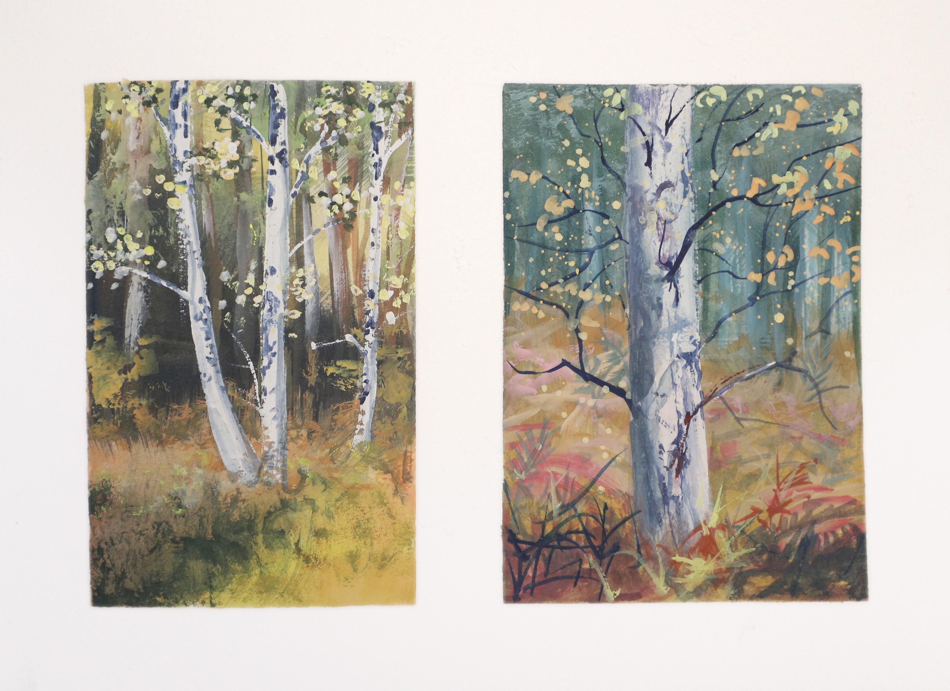
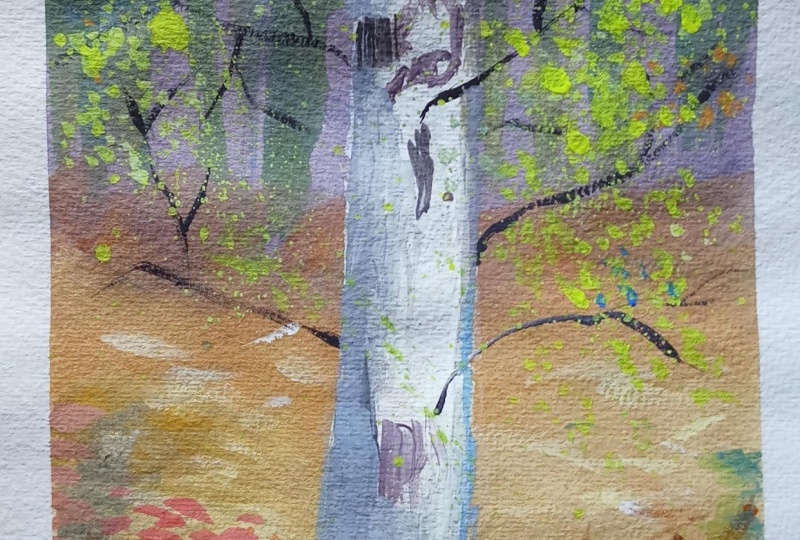
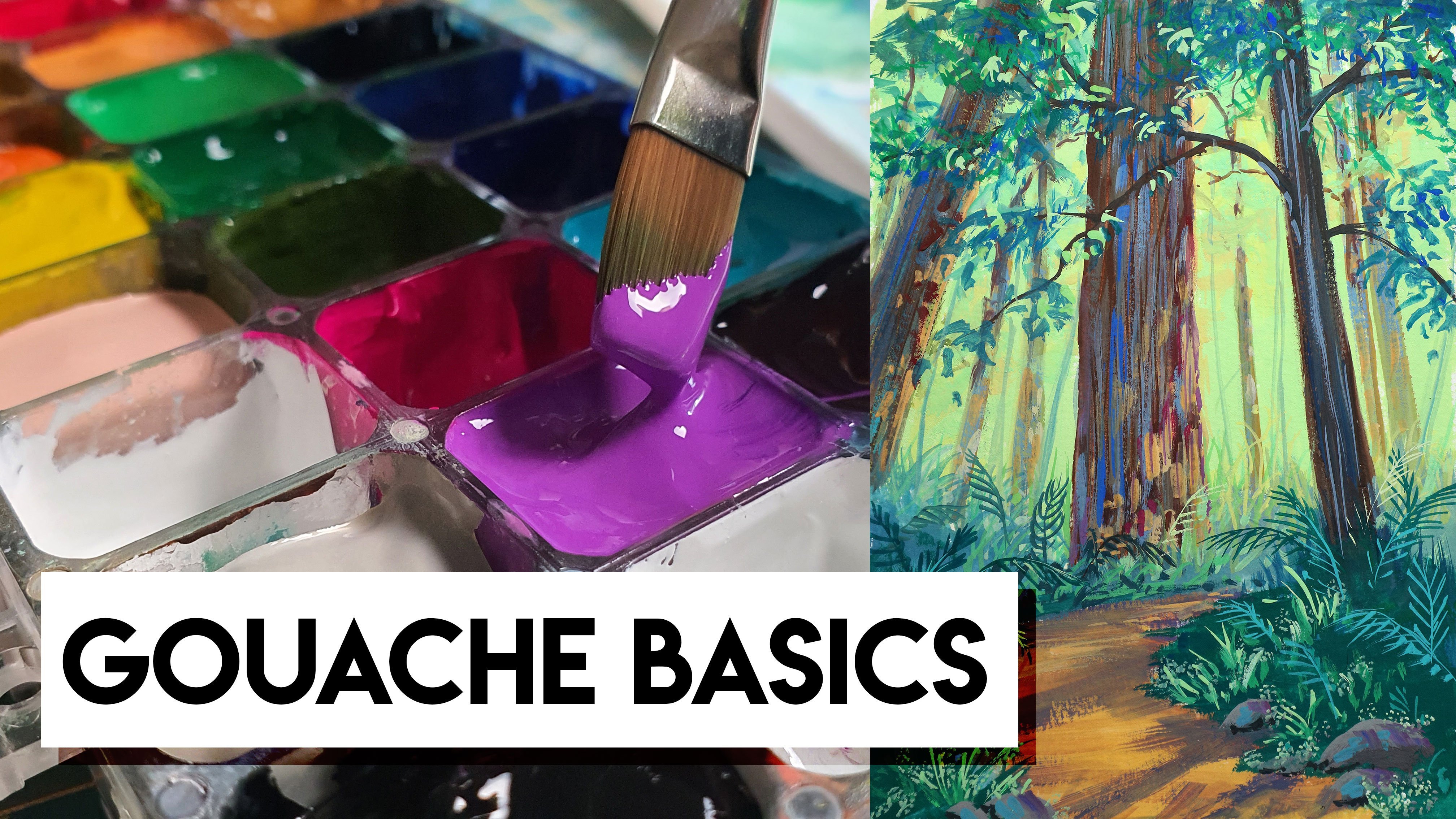
3. Gouache Demos: We'll be doing these two paintings sort of simultaneously. But by that I mean, while one thing is drawing on one painting, we can work on the next painting. Please excuse my wrist brace. Everything's fine. It's just a little repetitive stress injury and arthritis. No big deal. With most of my gosh scenes. I like to start off with a really thin down layer of color. Sometimes this is purely just to remove the white of the paper because it really helps me see the values a little bit better. So I choose a warm ish, grayish orange for this background layer and just sweep it over until the whole thing is filled in pretty evenly while it's still wet. I'll use this as an opportunity to add in any other pops of color that I might want to show through in the final painting. But since we're using guage, which is opaque, it's more than fine to cover this up in the end. It's kind of just like a first. Sometimes it's just that first mark that gets me started in the painting and then I just go from there. If you're ever hesitant to start painting because you're worried about messing up. I highly recommend this strategy because it gets you started. It, it forces you to just put something on the paper and then you have to make the next Mark. At this point, I'm sort of thinking about where I want some of the hints of red to peek through, especially in the ferns below. Because in Scotland in the autumn, the ferns that usually cover the entire forest floor become this brilliant, rusty red tone and it's just gorgeous. And while that's still wet, I wanna touch in a little bit of shadow. So using a complimentary color, light green, I can mix that into my current color and start just dropping it in here, in there. So I'm squinting at the reference photo and looking at my value study my sketch that I just did. And I'm starting to drop that darker color into those darker areas. I have to admit that a lot of times I am a little hesitant to go dark from the very beginning of the painting. I guess I just want to get a little hint of shadow down. And then later as I continue to paint, I get a little bit more bold and brave. So if that's how you are as well, know that you're not alone. It's almost like a US this initial water down layer as my practice run. Now while that's drying, we can work on the background of the next painting. And this time I'm going to start with my cooler tones, still quite watered-down. So I'm getting like a nice grayish blue and I'm adding quite a bit of water, so it's going to be very transparent and it'll stay light. And I'm looking at my reference as well as the sketch I just did to remind myself where the darker area is in the background. As I approached the bottom of the painting, I'll shift it into the warmer colors so it's easy to get a transition when it's wet like this. So if you're using a lot of water, you'll get a nice smooth gradient. But it doesn't have to be smoothed because there's a lot going on in the forest floor. It's actually better if it looks a little bit rougher and a little bit splotchy IRR. In the bottom area, the foreground, it'll be much brighter and a little bit more colorful. Here's a good lesson learned for you guys. So as I'm laying in this bright orange color, I can see that if I squint, it's actually darker than the initial layer of blue. And I need that to be the opposite. I need the top area, the background area of blue to be darker than the foreground. So I can mix up a darker version of that blue and go over it now. And while I do that, I'm actually going to start painting around some of the tree trunks. I want to be visible in the distance. Just keep in mind that this background area doesn't have to be even close to perfect. It doesn't have to be detailed either. If anything, it's actually better if it's a little bit more abstract and Bullard out because the foreground tree is our focus. And now that I'm feeling a bit more brave, I'm gonna darken some of the areas of the distance even more. And that'll make the trees pop out as a lighter part of the distance. One really good strategy to use with Guassian is to lay in blocks of colour and then we can come back and blend after even if it's dry, that's the beauty of goulash. You can always come back and blend into it. So if you just want to kind of block in your darks or any particular shape, knowing that you can always come back in and smooth it out. It does sometimes mean that certain times in your painting it's going to look absolutely crazy. And I call it the ugly phase. But it's something that, the more you do it, the more you just know that's supposed to happen and you work through it and you don't get discouraged. I'm going to start adding hints of lighter areas to the ferns. So again, it's pretty blocky and abstract because it's, it's the background. All I've done is mixing a little white to that initial orange color and it gave me a little peachy version of it. And my brushstrokes are quite quick and kind of like twitching my hand against the papers so that I get a lot of variety now and then I can touch in a red or a pink or even a purple. It's just good to have a lot of variety of color and value in the fern area because there is a lot going on. Now I can come back and start blending in some of the background areas. So anything that I want to smooth out a little bit, I'll just get my brush a little bit damp and run it over the color that's already there. And I can also introduce new colors if I want to. Perhaps a bit of grayed out, blue or purple, we'll do the trees justice because they do have a bit of color to their bark. I'll add a tiny bit of white to the green and start touching in to high ne, little highlights in the distance. Just know that you're guage tends to dry a little bit lighter or darker than what it looks like when it's wet. So you might have to do this more than once. Just put it on the paper and see how it dries and then you can decide if you need to lighten or darken it. Some other firms are catching the light, so we'll use a peachy color and using an almost dry brush, I'll just sort of dust that color over the foreground area. Because my paper is not 100% cotton, it does dry a little bit faster. So even though I'm using quite a bit of water and diluting my paint down, my layers are pretty much dry. So as I'm laying in some of this background, I'm thinking I might as well just start painting the foreground tree. And this is where we're going to start using thick gosh. When I'm using wash thickly and more opaque, I wanna make sure I have more than enough color mixed. So I usually use my palette knife and get a nice big pile ready to go. In this case, I'm using my white mixed with the tiny little hint of yellow and maybe even you can gray it down with a bit of blue if you want to. By doing this with a palette knife, we avoid clogging up the bristles of our brush and we give ourselves a little more time to work with the goulash using confident brushstrokes, I will lay in the base of my tree with that bright white color. You can see the way I brush it. There is even some background showing through which is okay because the tree itself has a lot of roughness to its bark. And the more variety that we end up with on the bark, the better. But basically what that shows is that I'm barely using any water at this point. So using a dry brush technique, I'll just graze this color over the surface of the paper and that texture of the paper will help vary the brush stroke so that I have a lot of visual variety to it. So there's a built-in texture with this technique. For the darker areas of my bark, I'm going to mix up a grayish plum color. So it's really dark, but it has a hint of white in it, so it's not the darkest thing in my painting. I'll use the same dry brush technique and just kinda let it dance across the surface of that bark. We want to avoid repetition. We don't want to repeat any particular shape and also avoid getting the same size marks throughout the tree trunk using a bit more of my blue, which in this case is Prussian blue. I'm going to add that to this current mix and I'll start laying in the darker shadows and the tree branches. So you don't necessarily have to use black as your darkest color, even if something appears black in a photograph. A lot of times in nature, it actually has a lot of color to it. So I prefer to mix my blacks. And usually my approach is to use Prussian blue, Alizarin crimson, and even a little bit of my powerline black, which is technically a dark green. Or I can add any other colors I have on my palette, but with the Alizarin crimson and the Prussian blue, I get a super deep purple color and that a lot of times looks black compared to the other colors in the painting. This is a stylistic choice. You can use peer block if you want to. And in fact, black is a great color to have on your palette. Because when you mix it with yellow, you can get some really beautiful green colors. So anyways, back to the branches. I'm using this long wispy script brush because it gives me a really, really thin lines. Just like in the sketch. I want to make sure my branches are really scraggly. I don't want anything too repetitive and I want them to go all over the place. We're gonna come back in with leaves soon. So we'll just put the branches in wherever you want them, knowing that parts of them will be covered up here in there. To add a bit of shadow to the side of my tree, just like I did in my sketch. I am just watering down the purple color and adding a bit of white. So it's like a pale purple and dusting it across the left side or really anywhere that you want to shadow. I wanna thick in a couple of my branches so that they definitely pop and show through in the end when the other parts are covered up by leaves. Speaking of leaves, this is the fun part, using white mixed with yellow. And occasionally I'll touch in some green or orange. I'm going to just dot a bunch of highlighted leaves, especially in the upper area, anywhere that I want it to be. A bright leaf, looks like. That looks like it's catching the light. In addition, we're also going to splash are painting. So yes, you have to be a little brave for this, but it's a lot of fun and I just wanna do it because it shows you guys that there's more than one way to get a certain effect. Because who wants to sit here and paint every single leaf that just is going to take forever. And a lot of times when you're outside, you're pressed for time. So you can do a splash of color to indicate a cluster of leaves really quickly. And before you splash it, you wanna make sure you cover up anything else around the painting that you don't want to get wet. If you don't have enough water on your brush, the splash won't work. So you can see here nothing came off of my bristles. So I want to keep adding more water and a little bit more pigment until I start to see that as bladder effect. Sometimes it's a little bit of trial and error, but it's better to be safe than sorry. If you start a little bit slower with less water and less pigment and build your way up. You won't have any mistakes or get huge splotches on accident. Now it's time to let this side dry and we'll go back to that other painting. At this point in this session, I'm feeling more bold and brave and so I can start working on my dark darks. I'm going to mix up a nice deep bluish purple color and lay it into that middle area where all that shadow is. So if you think back to the sketch that we did, I kept the majority of the shadow in the center area, kind of horizontal. It does get a little bit larger on the left side and then it goes back down into the distance on the right. When using any amount of water in a layer, you wanna make sure you brush as little as possible. Because the more you brush, the more likely you are going to reactivate that first layer. So a lot of times I'm using quick, confident brushstrokes. It may not be that I'm absolutely sure that it's the right brushstroke, but I'm going for it anyway. Using a darker green color that is a little bit diluted, I'll lay in some shadows for the upper foliage, keeping it quite abstract and making sure it's nice and varied. I don't want any particular solid chunks of color or shadow. And I'll do a little bit in the foreground shadow as well. For the distant trees in this scene, I'm going to use a color that I would call dark salmon. It's basically just a little bit of my Permanent Alizarin, crimson and yellow and a hint of the purple just kind of neutralizes the little, I have a decent amount of water in there because I don't care if they look a little bit transparent. These are just the supporting characters of the painting and it's, and I want them to just fade off into the distance. You can even vary them from dark to light or add splotches to them. The more variety, the better. If you look at the reference photo, you can see some of the distant trees do have highlights, but I don't want them to be the brightest bright in my painting because I want to reserve that for the foreground trees. So a quick little tip is that I can use pure white, but I'll diluted. So as I sweep it over the distant trees which already had a lot of color and shadow. That slightly diluted paint will start immediately blending into that color. So I'll automatically get a slightly more grade down or neutralized version. But if you find that it's still looking a little bit too bright, just add a tiny hint of grey or another color and then dusted across that tree trunk. And you could even blend in a little bit with your finger or another dry brush. I want to break up some of these tree trunks with some foliage. So in order to do that, I'm going to use a grade version of my green. So it'll appear as though it's in the distance. It'll be behind the final layer of foliage, which will be nice and bright. Miguasha is a little bit watered down, and that means some of the background will show through, which is totally fine for this layer. I'm using really quick twitchy brushstrokes in order to get a lot of variety. And just by sweeping it in big clusters, It'll indicate these big bushels of foliage. Bushel the rightward, Probably not. And Fourier our focus of the painting, the foreground tree, I'm using pure white, just like I did in the other painting. I'm gonna try to use a nice, big, confident brushstroke. And again, it's a dry brush, so it's very, very thick paint with barely any water. And I want it to completely cover the background as much as I can. But I'm okay with the fact that there's a little bit showing through here and there because it actually ends up looking like there's texture on the bark. And now was also the time where I would add in any other trees that I want to be highlighted or touch in a bit of this highlight to anything I already painted. It's probably obvious by now, but at this point you want to make sure that your background area, that your background layer is pretty much done to the point that you're happy with it because it's much harder to go back and fix that or change things after you had these bright white trees? No, it won't take long for this to dry, but I do wanna make sure that I let my bright white dry completely. So while that's drying, let's go touch up the final layer or the final details on the right side painting the other painting. One reason I really like to do to small paintings like this at the same time is because first of all, I'm impatient and it means that I can work on one or the other as I'm waiting for things to dry. But it also gives me time to consider or think about one particular area of a painting. If I'm struggling or just give my time, my brain time to process something. So in this case, I'm adding more shadow to the left side of my tree because as I was sitting here sort of looking at it, as I was working in the other painting, I noticed it just wasn't popping out quite enough. So adding a bit of more of that darker purple color and coming back in with a darker red to do some shadow to the left. The tree on the foreground is gonna make that stand out from the distance a little bit more. It might also be because I get a little bit more brave at this point in the session. And I'm like, hey, why not? Let's just throw some dark color in there. Ehrlich, See how this color looks audit. So yeah, there's potential for maybe taking it too far as well. But either way, I learn a lot when I do this. So I'm, I'm fine with it. So in the foreground here, I'm just trying to get a variety of shadows. And again, I can come back in with a brighter color and do my highlights on top of these. So it doesn't have to be perfect. Doing lots of little scenes like this is a great way to practice different types of foliage or different types of plants. So you can try one strategy in one painting and a different strategy in another painting, and eventually you'll find something that works for you. But I'm mostly keeping my shapes pretty simple. I don't want to draw too much attention down into the fern area. It's mostly just there to give me a pop of color. But that variety does lend itself to giving the sense of like a lush forests. Because if you don't have a lot of variety, changes in color or value, it kinda looks a little bit flat or spares like a man-made lake a someone went in, planted a tree in a field. So yeah, a lot of variety really helps to help keep the focus on this tree and not get lost in the background. I'm adding a bit of bright red as well as a dark greyish purple color in the foreground. So that I will kind of flow from the tree down to those firms and backup to the tree. I'll even add hints of the really bright highlight down here, but nothing too detailed or distracting because I don't want the viewer's eye to stay down there. And now I'm ready to move back and finish the other painting. Before I do the foreground foliage, which is going to be nice and bright and colorful. I want to add a bit of shadow to the tree trunks and the branches. So using a diluted version of my purple, I'm just dotting in Little Shadows as though the leaves themselves are casting individual shadows down onto the tree trunk. You can also do bigger blobs if you want. Depends on how much space you have and how much detail you want to go into. Using a really dark olive color. I'm gonna lay in a base to the clusters of leaves that are going to appear in the foreground. This will make the foreground leaves pop even more against it. And then once I'm happy with that, I can start mixing up my bright yellow color for the foreground leaves I mainly using pure white mixed with my yellow so that they really pop forward and it's pretty thick and opaque so that it doesn't show any, Nothing in the background shows through. I'm not gonna do the splash thing over here. I'm just gonna dot in a bunch of this color in clusters here and there. And at this point you can really see that the darker you go in the background, the more of these are going to stand out in the foreground. So if you want your foreground tree to really be vibrant and stand out against, against the distance forest. You wanna make sure you use darker colors. And you can also make the distance a little bit cooler. My overall color palette for this painting was quite warm. I didn't use a ton of cool tones, but that's another strategy you can use. And finally, I'm adding a really dry brush texture to the foreground shadow with a dark green. And again, barely any water just letting it just across the texture of the paper so it gets a nice varied look. And then we are done. Of course, you can always add more and more detail. Since my paintings are so small, I was mainly just using it as a lighting study. But if you're using a larger piece of paper, there's a lot more that you can do. So if you're brand new to guage or landscapes, I recommend doing something a little bit smaller and more manageable like this at first.
4. Final Thoughts: For your class project, choose one of these references. Starting with the values studies sketch, focus on blocking in your darks and lights. For your painting, I recommend using a limited color palette. All of my colors are listed in the description if you want to use them. But you really can use any primaries you want two, plus black and white. If you want, you can share your painting and the class projects, or if you applied it to social media, please use my hashtag. Sarah Burns tutor so I can find you. All right guys, I'll see you in a couple of weeks for episode number three, which will be all about painting waterfalls. Let's see.
 Sarah Burns, Painter / Photographer / Youtuber