Transcripts
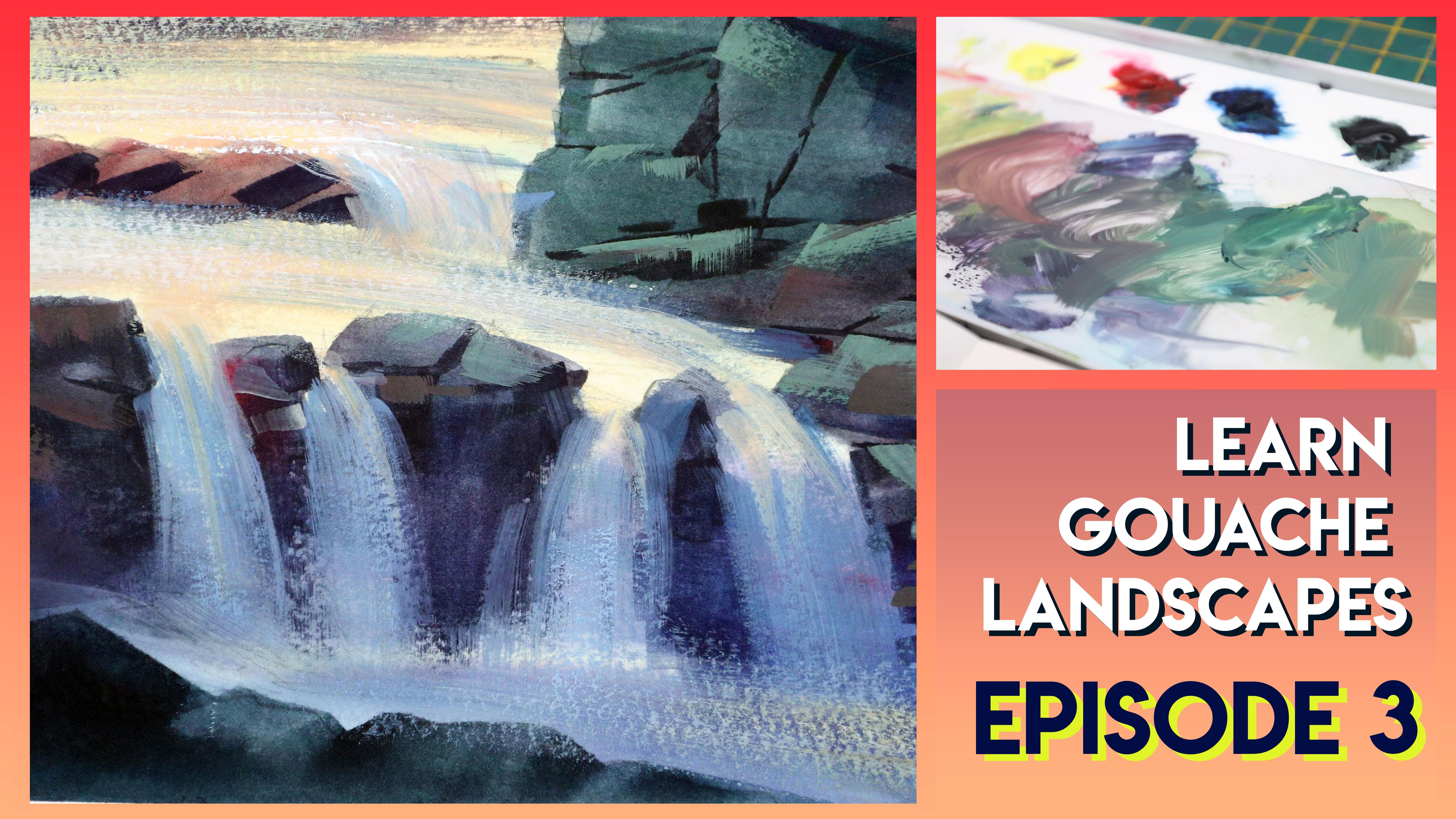
1. Intro: Welcome to episode three of my Learn unwashed landscape series. This series of classes offers real-time instruction for how to paint a variety of landscapes with Guassian. Each class is 60 minutes or less, so you can fit it into your busy schedule. I'll show you my techniques, talk about tips for getting the most out of your goulash. Talk about my own struggles and how I overcome them. In episode three, I'll show you how I beat this Waterfall by using wash a little bit differently than in episode 12. My hope is that you'll come away from this class with a better understanding of the great versatility of wash. As always, my goal is to give you repeatable strategies so that when you're outside and the inspiration strikes and you feel confident to pick up your sketchbook and paint. So grab your sketchbooks and let's get started.
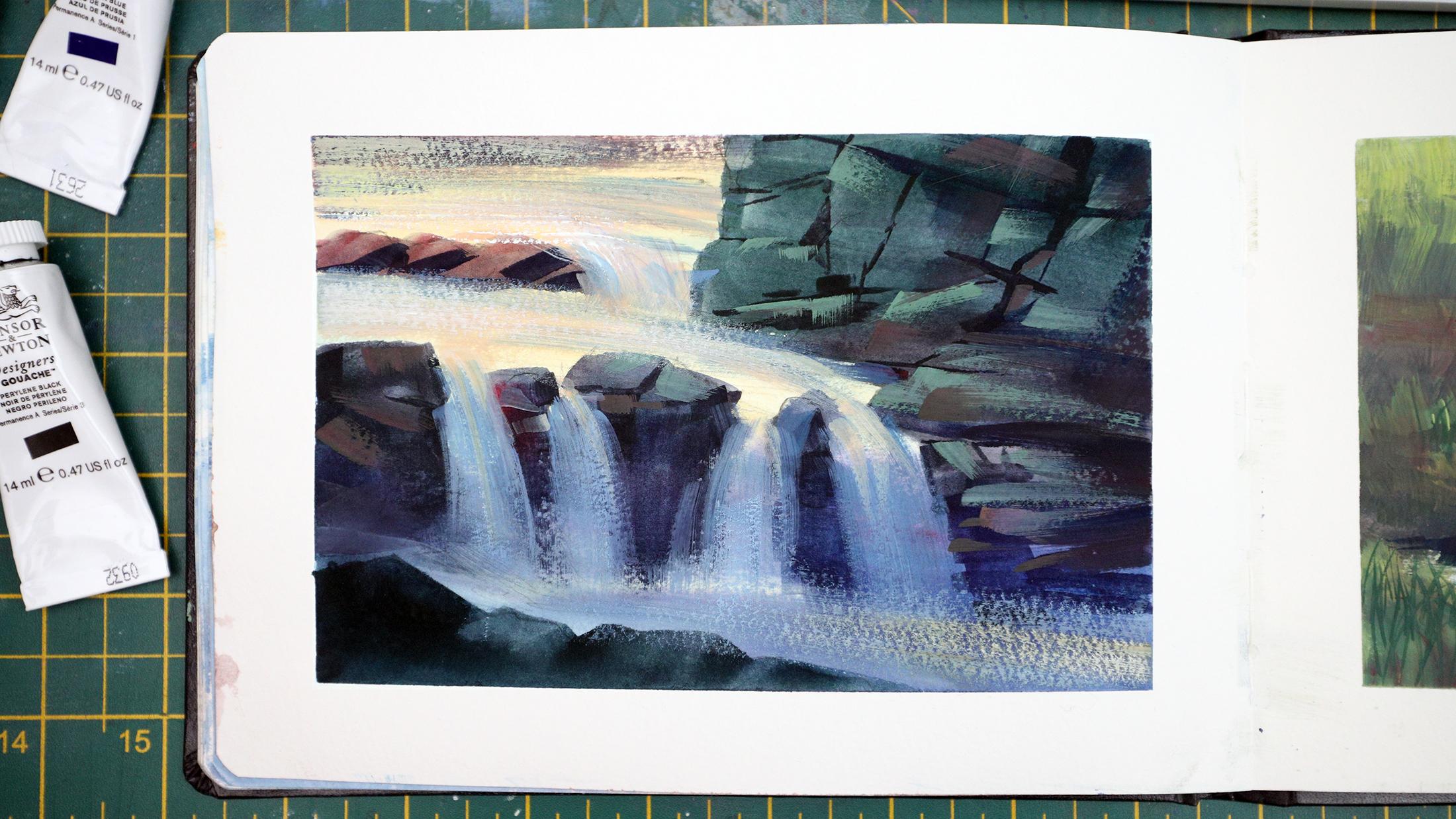
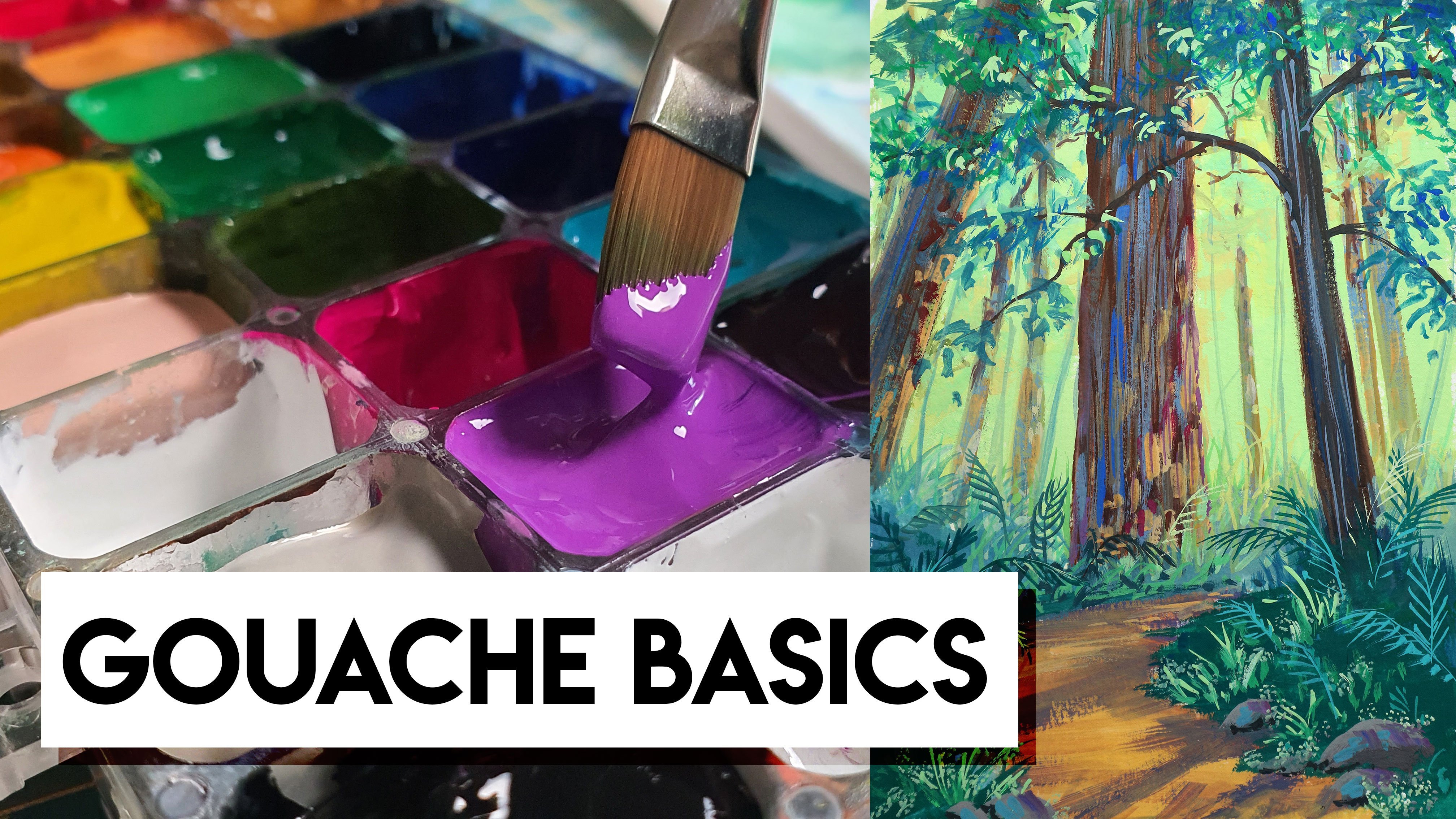
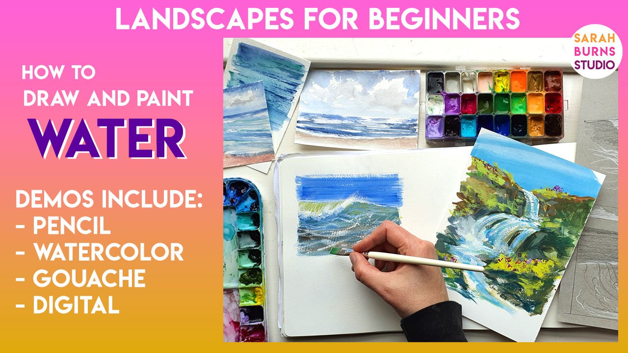
2. Supplies and Sketch: I hope you guys are enjoying the series so far. If you're brand new to goulash, I highly recommend watching my Intro to guage class first. As usual, my materials are pretty simple. It's an A5 seaway of Brighton sketchbook in a limited color palette. I'm using zinc white, cadmium free, lemon yellow, Permanent Alizarin crimson, Prussian blue, and powerline black. To begin our sketch, we need to analyze our reference and decide what information we want to capture. I prefer to use my references as loose inspiration. Therefore, I don't necessarily copy the exact forms or colors or lighting. Whoever I know it takes time to develop the skill to paint from imagination. So to make it easier for you, I've put some simple liner in the class resources for you to use if you want. But let's take a look at the reference and think about how we can simplify this. For the most part, we can approach it in three steps. The background, the middle area or mid ground. And then the foreground. For my sketch, I'm going to simplify everything. Typically when I'm drawing rocks and waterfalls, I tried to ignore the water for the most part and draw the underlying structure of rocks. If you look at the reference, you can see the long durations and the different levels of rock. And it all sits at a slight diagonal. That's something I'll try to capture later on when I paint. It's no use trying to draw out every single little rock and crack and crevice at this stage, since the paint will cover a lot of it. But even just by doing this quick little sketch, it's like doing a practice run and it gets your mind thinking about the structure. If you're a little lost when it comes to drawing rocks, I have a whole skill shared class about it, which includes how I break down the underlying structure into more simple forms. In order to build the more complex scenes. Go check it out if you need a little more help there.
3. Gouache Demo: To begin, I'd like to get a colorful wash on the paper with very diluted gosh. This does two things. First, it gets rid of all the distracting white of the paper. Secondly, it provides a colorful undertone to the whole painting, which will peak through later if I want. And this is the simple way to help harmonize the painting. And of course, that is further achieved by using a limited color palette. I've decided to add sort of a warm glow to the upper left and middle area and a more cooler green blue tone to the other areas such as the top right and bottom left. So in this case, my lighting source will be coming from the top left side of the painting, which will come into play later on when we do more of the highlights and shadows. Because my light source is coming from the top left, it won't quite reach the bottom middle area of the painting. So where the waterfall kind of pours over the edge, that's going to be mostly in shadow. So I'm going to use a purple tone while it's still wet and kind of sweep it left to right to start indicating that those rocks are in shadow. You don't have to go too dark at this point because we can always add more later. So you can kind of think of this as like a hybrid between wash and watercolor. I am painting the under layers or the darker parts of the rocks, knowing that I can come back with highlights. But in other areas, I'm leaving the paper completely alone so that it kind of acts more like watercolor and it lets some of those highlights show through. This is totally a stylistic choice and it doesn't have to be this way. You can use the guage very thick, but I just wanted to show you guys how I like to do it sometimes. As they continue to lay in the base color of the rocks, I'm touching in a little bit of green, a little bit of red here and there. Just to break it up, I don't want it to all be one single color and I want to give a lot of variety. I'll come back with lots of other colors later. This just helps me get a nice interesting bass tone. In the upper left area where the sun is coming from, I'm going to shift my bass tone to more of a warmer tones. So anything more red, orange, even yellow. And just help that feel a little bit brighter. And because I'm using a complimentary color here, red versus green, it's going to feel like it's in a separate level or it's going to feel a little bit further back, especially when I come back later and add a bit of highlight. Any rocks that are going to be peeking up over the waterfall in the foreground and need to be really dark. And you can also add foliage or grasses, whatever. But I'm gonna keep it pretty simple and just stick with like a solid rock form. One reason I love these flat brushes for rocks is that it already has a sharp edge to it. And just by changing the pressure or the direction of the brush stroke, I can make like one single edge of the rock or one facet of the rock. As the paint begins to dry, I can start thinking about my shadows or the cracks and crevices that I want to paint into the rocks. Since I want them to have a bit of a hard edge, it is important that the paint we already put down is much more dry. Otherwise, these lines that we paint will bleed and flow into that color and they won't be sharp enough. And when it comes to actually designing or painting the lines in the cracks and crevices. I am completely just winging it. I'm looking at the reference now and then to get an idea of how those cracks appear. And for the most part, I've noticed that they're they vary from really thick to really thin and their placement is nowhere near perfect. So just go for something really random and that will get you started. Once I started doing this, it's really interesting what happens in my mind as I go, I start to realize that my brain visualizes where they should be. And I start to see the rocks appear in the paint that I already put down. So at first it might feel really random. But then the more I add, the more I like seeing the rocks actually form before my eyes. And I do think this comes with lots of practice. So if it's a struggle at first, don't worry, it was for me too. So I recommend just keep doing it. Try several of these sketches or several Brock paintings. And each time you do it, it will get better because it did for me. And of course, if you're really struggling, I do have that rock skill share class which goes into so much depth about how to do this with watercolor, guage, digital, everything. And the other thing with this strategy is that it is much more like watercolor. So right now, I am actually painting around my highlights in a way which isn't the usual tactic with guage because goulash is opaque. Typically, you know, you can work from the background forward or dark to light. But again, I wanted to do more of a hybrid painting in this exact strategy is what I do a lot when I'm outside because I love watercolor, but I love the convenience of the guage because again, you can just add more to, more to it later like highlights and shadows and build up the depth with a thicker wash. So again, you don't have to do it the same way I'm doing it, but I really wanted to show you guys this method. At this stage, we're still just thinking about the rocks. So if you look at your reference and you try to visualize how those rocks appear without any water in front of them. That's what we're painting. If you have a clear idea of where you want the water to fall down, you can sort of paint around that like I am. But otherwise you could just paint like a solid face of rock there and then add the water later. If that's easier for you, then go for it. In terms of color, all of my shadows at this point are pretty much the same color. It's a mixture of my Prussian blue and powerline black. Occasionally, I'll add in a little of the Alizarin crimson to add a bit more like a purple tone. And just for fun, honestly, it's not related to the referred lad. All I like to stylize my colors a lot. So in this case, I'm sticking with the purple in the shadows where the water is coming down and elsewhere the shadows get a little bit more of a green or blue tone. I think one thing that helps with painting waterfalls in guage is to make sure you get some dry brush texture or wherever the water is flowing down because it naturally lends itself to looking like moving water. And when it comes to painting the water, I'm using a very dull bluish purple tone for the shadow areas of the waterfall. And by that I mean, anything that I don't want to be in bright highlight, I'm going to add this darker blue. Now, this is a little tricky to explain because it's, it very much depends on what colors and what values you've already used in your painting. So I can't tell you exactly how dark to go. So you really need to adjust it with each brushstroke. So as I go, I'm adding a little more blue, little more. Why am lightening and darkening it a lot, maybe eating, even adding a hint of color now and then. But for the most part I want the shadows of the water to appear on the areas where the light isn't hitting it directly. So in this case, as the water flows over the edge and pours down, it's going to be in more shadow. The top of those little bits are going to be in Highlight. And then as it comes, goes back into the distance that's where the brighter light is. That will be a lot more highlighted. While I'm painting the water flowing down, I'm mainly using a dry brush technique. So barely any water in the bristles and I'm just letting them Brush Dance across the surface of that paper so it leaves just a hint of paint on there. It reveals a lot of texture and just looks like it's naturally flowing and foamy water. You could do a really thick brushstroke now and then, but for the most part I like to slowly build up my water with this dry brush method. And I recommend painting with your shadow tones as for as long as you can because it's much easier to paint highlights on top of the shadows. And especially with water, we want to save our brightest brights for last. If you are copying the reference photo more directly, you can see that the light is coming from the where the viewer is standing. So the front of the waterfall is more illuminated. In that case, you would have lots of bright color on the water itself. In my case, the light is coming from behind, so only hints of it are going to appear. And especially down in this lower area. Once you've built up enough of the shadow color on the water, it's time to add the brighter colors. But even now you don't want to go straight to your brightest brights. Let's stick with a middle ground highlight color. And in this case I'm using more of a peachy tone. If you want, you can neutralize a, a little bit with your other shadow colors, and that'll give you a more subtle increase to the brightness. You'll probably notice that your highlight colors really quickly blend into whatever is below it. So it's helpful if you continuously load up your brush with the fresh paint. As I get closer and closer to my background where the light sources from, I'm adding more of this color to cover a bit of the shadow. Because in general I want that back area to feel a little bit brighter, almost like there's a lens flare or something happening. For the highlights on my rocks, I'm gonna mix up more of a sage color and apply it with a dry brush texture. I'll also touch in hints of the Alizarin crimson to add a bit of variety in terms of placing the highlight on the rocks. I mostly sticking with the top or left side of the rocks because that's where the sun will hit at the most. I'll slowly and steadily increased this highlight color, but trying not to go overboard because it's really easy at this point. I think it's better to approach it with a less is more mindset. Occasionally I'll bring a little more of a brownish tone and just bridged the gap between some of the colors. And I'll darken up some of the areas as well. But for the most part, we're just trying to maintain the original vision of where our lighting is. In my case, it's in the back left. So I wanna make sure that anywhere that I think the sun is going to hit my rocks or my water is a little bit brighter. We're getting into the final touches now. And I'm going to add just a bit of peer white in the distance on the left. As I do this, it's going to immediately start blending in with the colors below, so it won't seem quite as bright white. But the whole point is just to be able to capture that glimmer of light on the surface of the water.
4. Final Thoughts: No, no, we covered this pretty quickly and there are a lot of things you'll want to practice, but I hope you learn something that will help you approach your waterfall scenes with more confidence in the future. Don't forget to leave a review of the class, which really helps other people get an idea of what it's like. If you have any questions, don't hesitate to post it in the discussions tab. And if you paint a waterfall and want to share it, you can upload it to the class projects, but make sure to specifically request feedback if you needed. Otherwise, if you share your work on social media, you can use my hashtag, Sarah Burns tutor if you want me to find you. Just a heads up. The bonus tutorial on my patron this month is another waterfall, but this time using thick wash. So feel free to check that out if you want more practice. The link is in the description below. In episode four, which I'll post in a couple of weeks, I'll show you how I paint wet sand beaches. Thanks for watching and see you guys soon.
 Sarah Burns, Painter / Photographer / Youtuber