Transcripts
1. Introduction: Hello, As cherry blossom season
is just coming to an end. Here's a fun project to
continue enjoying the beauty. Join me to create
a whimsical cherry blossom tree using
watercolor and salt. Salt is a very common ingredient
in all of our kitchens. Food never tastes right without the right
amount of seasoning. Today we're going to see how salt is going to
season our paintings. We're going to use salt to
let her watercolor washes, granulate and create a
beautiful effect on paper. This can be a really
great effect to create a beautiful whimsical
cherry blossom tree. This class is really great for all watercolor enthusiasts. Beginners would really enjoy
this effortless project, especially with the few tips and tricks which I've
explained in this class. I hope you will enjoy painting this beautiful tree with me. Happy painting everyone.
2. Suggested Materials: Let's look at some of the materials that we
need for this class. And we're starting off with
the most important material, which is watercolor paper. The watercolor paper
that I'm using here is Saunders Waterford, 300 GSM watercolor paper. It is best to stick to a
watercolor paper rather than another sketching paper as we're using
watercolors today. And the thickness
of the paper is very important for today's work. The next material is
watercolor paint. And I'm going to use watercolor
paint from tubes today. I also have a pallet
or a mixing area. This is just my personal choice. And if you do not have
watercolor paint in tubes, you can always use
watercolor paint in that comes as cakes or
in pounds as a set. It really is a personal
choice and you can always have the materials that you
are more comfortable with. The watercolor brushes
that I'm going to use, medium-sized, round and
pointed at the tip. I have two different
sizes here, similar ones. One is 12 and the
other one is size ten. I'm just showing it
to you to give you an idea of what sort
of brushes I'm using. You don't need two
different brushes unless you want to keep a
smaller one for details. Towards the end. For this, I'm going to
use an angular brush. You do not need to have
the exact same brush. Again, any smaller brush with a smaller tip is completely
fine for finer details. Another very important
material that we need today is salt. I'm going to use table
salt and not rock salt. I personally prefer the
fine grained table salt and the effect it gives
compared to rock salt. But again, if you
would like to use rock salt and experiment
with how it looks, you are most free to do that. And finally, I need
one jar of water. You can also make it
two jars of water if that is what you're
most comfortable with. And that is all the materials that we need for this class.
3. Watercolour Techniques: Water-pigment ratio: Let's warm up with our
beautiful medium watercolors. If you're new to this medium, I'm here to explain the very basic techniques
to get you started. Watercolor, as the
name suggests, depends a lot on water. And learning how to manage
using water and pigment. And understanding the ratio of water to pigment
is very important. So let's start off with
using a medium-sized brush. And we need our jar of water. I'm quickly going
to dip my brush in the jar of water and less. Let's introduce some water into the pigment that I
have here on the palette. You can use any color that
you personally prefer. This is just a practice session. If you're using
watercolor cakes, they might be dry. And it is best to
add some water into the cake and leave it to moisten for a couple of minutes before
you start painting. And once it's moist, you can introduce
some more water and start mixing onto a palette. And now you can see
here that once I introduced some water
into the paint, the pigment has sought of
diluted into the water, creating a nice wash. Let's try this paint
onto our paper. You can make a
little shape here. I'm going to make a
little rectangle, or a square or a circle, anything that works
best for you. So let's look at this
little swatch that we made. And you can see the
glistening of water. You can see how the pigment
is a little bit flowy, mainly towards the bottom. You can see that
it's collecting. That was a medium consistency
wash. Or as you can see, there's enough color or
pigment on the paper. Now let's introduce a
little bit more water from the jar into this mixture. So which means we have a
little bit more water and a little bit less pigment as I'm not going into
the pigment anymore. So introduce some more water, maybe a couple of drops more
water shouldn't be fine. And now let's try this again, making a little
rectangular shape. You can immediately
see how the paint that we've just placed on the
paper is a bit more watery. And you can see it's
definitely a little bit more lighter
than the first wash. And that explains that it has lesser pigment and more water. So that is a considerably
lighter wash. Let's introduce some
more water from the jar. And let's try another rectangle. This is definitely lighter, even lighter than the
second wash that we did. And more watery as you can
see, there's water there. I'm going to introduce
some more water. And let's try that. And that has really watery. And you can see
that the amount of pigment is very less and
water is really more. So these are different ways
that you can use watercolor. You can vary the
amount of water in each wash. And you can also vary the amount of pigment depending on your needs. So the first wash is the most
saturated wash. And further towards your left you can see that it has gone a bit lighter, which means that it's
got lesser pigment in the wash. Now let's start straight away with
some fresh pigment. So I don't need a
lot of water here. Just some fresh pigment
from the pan or the, the little tube of
paint that you have. And you can see how, when I place it on the paper. You can see the brush
strokes almost, which means there's
very less water here. And it's really thick paint and very saturated color,
very bright color. It couldn't go any darker. For this color. That's
the deepest tone that this color can make. Compare that to the
first little square or the rectangle that we made. It is still a little bit darker compared to the
first one that we painted. Now let's introduce
a tiny bit of water. And let's start dragging
that pigment outward. Because I am a left-hander. I have started to painting from the right
side of the paper. It just makes it easier for
me to work to the outside. So if your right hand or you can just simply start
from your left side. So getting back to
what we're doing now, let's introduce some
more water into the swash and keep
dragging the pigment. You can see how it gradually begins to dilute
and lighten out. And you can also
see that there's a little bit more
water compared to the first wash that we did
with just pure pigment. Let's keep introducing
more water into that wash and
let's paint it. Every time you introduce
a little bit more water, you're touching on the
wash or where we stopped. We're dragging the pigment outside into the
newly painted area. And you can see how
you can compare your wash to the first
four swatches that we did. You can see how it is lightening out,
getting more watery. We've created an nice
tonal gradation, a tonal value starting from
the darkest to lightest. Feel free to practice this
technique as much as you like, as understanding and
getting the hang of this particular
technique will give you more confidence
in using this medium.
4. Watercolour Techniques: Washes and Common Mistakes: Let's try the different types
of washes with watercolor, or simply put the different ways we can paint with watercolor. So first, I'm going to wet
the surface of the paper, which is seven freshwater
from your jar. And I'm going to
go straight into some fresh pigment
diluted very slightly. If you remember the first
ever wash that we did, the first-ever little
shape that we did. We're going to try and bring a consistency similar to that. So enough pigment,
little bit of water. I'm going to simply
drop that into the wet surface that
we just created. You can see how immediately the paint feathers out as
it touches the wet area. You can also see that the paint stays only
where the paper is wet. It is very important
to remember that we need a lot of pigment
and less water, especially when you
have a wet paper. Let's look at what happens if we had a weaker pigment ratio. So let's wet the paper again. And this time I'm going to
use a very diluted wash here, instead of using fresh pigment or lack of saturated pigment. So I'm just going to introduce
that into the wet surface. And you can see how watery it is and how light it has
turned out to be. This way. You won't get the effect that
you're looking for. So it's always important to remember that we need a
little bit more pigment. This is quite a common
mistake that we make, especially if we are
just starting out. But there's always
ways to fix it. So here I'm going to
wash my brush clean, just take out excess water on a tissue or a kitchen towel. And I'm going to
go straight into some fresh pigment or
a very saturated wash. Here we need very less water. And let's introduce some pigment straight into that wet
surface we just created. You can immediately see
the difference here when we introduced a little
bit more pigment into that wet surface. So in case if it happens that you started using
a lighter wash, you can always fix
it by introducing some fresh pigment
into that wet surface. And this is also a great
way to create some texture, like I have done here, simply placing dots and
just watching its print. One thing about
watercolors that will have no idea how it's going
to end up when it's dry. But that is the beauty
of watercolors. So finally, let's try painting
straight onto the paper. A medium wash, so enough
amount of water in a month, amount of pigment, but
not too strong pigment. And it's quite
common that we start painting something with
watercolor like this, with a medium wash. But let's just say
we needed to add more value to what
we were painting, then we would need more pigment. But it's, again, it's quite
common that we just keep on adding more medium wash
or a lighter wash. Which means every
time we're adding the same amount of
pigment and water. And as you can see here, there's not much happening except that the amount of
water has increased here. And again, another
common mistake is that we wash our brushes very often. By that way, we are washing off two pigments and
just simply adding more water into the wash.
And if that happens, it's very easy to just
have a huge puddle of water and have nothing else and no tonal value
in your painting. So let's just introduce, deliberately introduce
some water into, into this area and
see what happens. You can see the puddles of water that I've just introduced. The pigment is sort
of moving away. There's a huge puddle
in the center.
5. Watercolour Brush strokes: Now let's try some
watercolor brushstrokes that is necessary for
our project today. I'm using another color. It is, again, just
a personal choice. You can use any color you like. As it's just a practice session. Going to create two rectangular or square
shapes with the pencil. And I'm going to try and do some brush strokes
inside this box. I'm using a medium-size
brush and just simply using the tip of my
brush, creating lines. You can also create little
branch like structures. As you go along. In the next box, Let's create squiggly lines. Something that
resonates or looks like the branches of
a tree or a shrub. So again, using just the tip of my brush and very
freely moving my arm, continue practicing these lines. Or if you want to add more boxes and
practice these lines, feel free to do so. Let's also try some
thicker areas, e.g. something like the
trunk of a tree. So I've just painted like a
thicker area with my brush. Again, just simply using it just like how you
would use a pen. Just thickening that area, just painting that area in. And just like how we
learned in our washes, you can introduce a
little bit of water into your brush to lighten
that area out. And that way it gives a dark
and light to the tree trunk. You can also introduce
more pigment. So without dipping your
brush in the water jar, you can go straight
into the pigment, just introduced that,
drop it in into the thick area or the wider tree trunk
that we just painted. So you can see how it's a
light wash in the beginning because we introduce water and then I introduce
some fresh pigment. And you can see how the
fresh pigment sits on top of the light to
wash in another square. Let's introduce some pigment
using the same brush. This time, I'm going to be really free with
the brush strokes. So if you look at the brush, It's sometimes held high up, only the tip touching the paper. And sometimes I placed the
whole body of the brush down. All the bristles
are on the paper, creating a wider area of paint. If you mix and match
these movements, you can create something
that looks like this. And this could be a great way to create foliage when
you're painting trees. It also adds more texture to whatever you're
trying to paint. So this is what I call
a lazy stippling. While you're doing this, you can introduce water as well as more pigment
depending on your needs. So again, just a reminder that
if you need more pigment, you need a rather dark, damp brush to introduce more fresh pigment
into this wet surface. And if you need more water
to lighten up the edges, simply wash your brush and drag the pigment
along to the side, creating a lighter area.
6. Suggested Pigments: Here are some of the pigments that we are using
for this project. This is just a
guideline and if you do not have the exact
same pigments, you can change it into a
pigment that you have. The first color that I'm going
to use is permanent rose. This is for the bright
cherry blossoms on the tree. Next I'm going to try
out several in blue, which is for the sky. If you do not have
cerulean blue, you can also try cobalt blue. The last color is sepia. It has a very neutral color, but also has a
brown tinge to it. And this is the color
that I'm going to use for the tree trunk
and the branches. If you don't have this color, there are other ways
of mixing dark brown. So let's look at some alternate colors in case you don't have
these colors with you. So starting off
with cobalt blue, it is a slightly different blue compared to
Sarah Lean blue. But if you don't have, so really in blue, you can
always use cobalt blue. It is a great color
to use for Sky. For cherry blossoms. The best color would be
permanent rose or opera rose. One of the bright pink
colors that you have. If not, another option
would be Alizarin crimson. It does have a
reddish tone to it. So if you don't mind that, you can always try with
Alizarin crimson red as well. You can also mix it with
some cobalt blue to get more of a wine red
color or a purplish shade. And try that for your
cherry blossom as well. For creating dark
brown or brown, you can use a mixture of
ultramarine blue and orange, which is a great combination to create grace as well as bronze. If you vary the amount
of orange and blue.
7. Salt on Watercolour Washes: Let's introduce some salt into
the watercolor washes now, as this is a major part
in our project today. So I'm starting off
by creating a medium, wash just the right amount
of pigment and water. And I'm going to paint a square, or a rectangle, or a circle, any shape that you like. It's not very watery. And at the same time there's not a lot of pigment in
here, as you can see. I'm going to introduce
some more pigment. So this time it's going to be slightly more pigment
and slightly less water. You can see that there's more pigment by comparing
the two shapes. And what I'm painting now has a little bit more
pigment because it's a bit more deeper in color. And the third one, I'm just going to use some fresh paint
straight from my pan. You can see there's brushstrokes happening on the paper because there's not
a lot of water. You can see that it's not really spreading as easily as
the first two washes. We've got three different
squares or rectangles. And you can see they're all different in their tonal value. Now I'm going to
introduce some salt, starting off with a pinch
of salt in the first wash, the second one, and
finally the last one. Just simply sprinkle
over the washers. And we're going to
leave this to dry completely and see what sort
of effect it brings us. While you're waiting.
You can also experiment with
different colors. You can even experiment with the same colors
that we're going to use for the project today. And see how the different
colors behave with salt. My washers are completely dry. You can see how beautiful
the effect of salt is. I like it especially on
the permanent rose color. As you can see, there's a clear
distinction between the washes and whether
salt has been. Whereas with the blue, not so much as the
blue that I used is severally in blue and it's already slightly
granulating anyway. And the effect of salt
is not clearly seen, but the rose color is perfect. And this is the
color that we'll be using for our cherry
blossom tree today. And finally, let's see
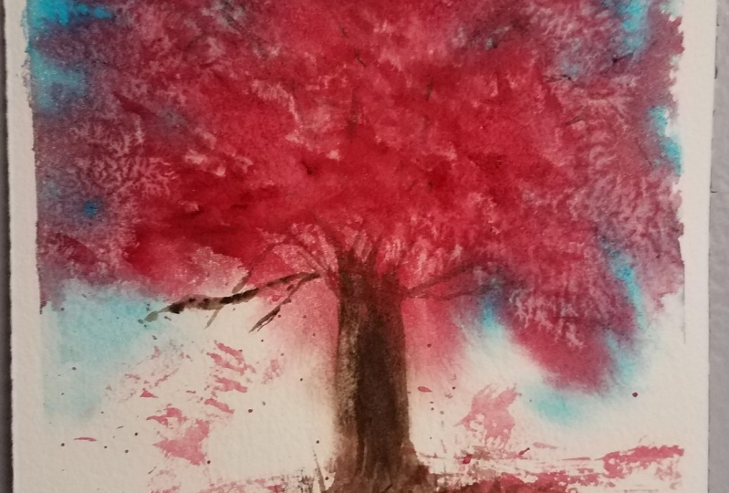
how Alizarin crimson red and cobalt blue behaves with
an introduction of salt. So I'm going to paint a
square shaped swatch with Alizarin crimson red and
another one with cobalt blue. And let's introduce
some salt in it, just like how we did
for the other colors. Once it's completely dry, you can see how
beautiful the effect is. Cobalt blue works really well
with granulation or salt, as well as Alizarin crimson. So they are great
colors if you don't have the original
colors I'm using.
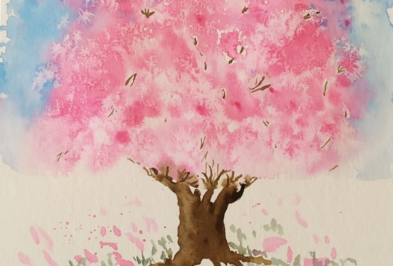
8. Paint Cherry Blossom Tree: First wash and adding Salt: Let's start painting this
beautiful cherry tree. So first I'm going to introduce you to the paper that I'm using. I'm using 100% cotton
watercolor paper. It comes as watercolor
paper in Sketch pants, loose sheets, as well
as watercolor block. I'm using a watercolor block, which means all the
pages are glued together and is also
pretty stretched. I personally like this, especially if I'm
using a heavy wash, such as what we're doing today, if you don't have a
watercolor block, even if you're just using
a simple watercolor sheet, make sure to glue it down using a masking tape onto your
table or your drawing board. Once we've done that, we're going to start
preparing our pigments or the watercolor paint that is necessary for today's painting. So I'm going to start off by
preparing permanent rose. I'm going to create
a saturated wash, which means I have just
enough pigment and enough water to make it a little bit smooth,
not too watery. So when you place it on paper, there'll be a good
amount of pigment. As you see on paper. The reason why I'm starting
like this is because we're going to first
wet our paper. Next, I'm going to prepare
some serially in blue. The same way as we have
prepared permanent rose in a very
similar consistency. Now, let's put that on the side and start wetting our paper. I'm going to start with a clean brush and
some freshwater. And I'm going to wet the
paper evenly using a brush. You can change it into a
flat brush if you like. If that makes your job
easier of wetting the paper. I'm only going to wet the
top two third of the paper, leaving the one-third
without any wetness. As soon as we're done with that, we're going to get
prepared paint and start applying the paint. So I'm going to start
with, so really in blue, I'm going to leave the center free and go around the center. The center bit, which
I'm going to leave free is for the
foliage of the tree. You can see how I'm
applying the paint. I'm just simply dropping it in, leaving little bits of white
areas that shows through. Again, making sure
that the pigment does not go into the center. The pigment will actually flow into the center as you can see. But I'm not going to
deliberately paint in the center because
that's where I would like permanent rose to go. Just dropping in a
little bit more pigment because I feel that once it dries it can dry a bit lighter. So I'm dropping in extra pigment to make
sure there's enough. Once it dries out and it does
not drying out too pale. Watch how beautifully
the pigment is spreading and feathering out
on a wet sheet of paper. Enjoy the process and
the movement of pigment. As you go along. You can also see the little
unpainted areas that we left and how
beautifully the pigment is spreading into that wet area. Now I'm going to completely
washed my brush clean. I do not want any pigment of
blue to be left in my brush. So I'm making sure that the
brush is completely clean. And now I'm going to take
out extra water from there. Just by dabbing
it onto a tissue. You can even squeeze
some water out. But not too hard
because we don't want a dry and parched brush. So the best way to do is
just dab the water out. And let's go straight into
the prepared pigment of rows. The reason why I dabbed out the extra
water is because I did not want to introduce
any more water into the prepared pigment
as this is the right one. Consistency. I want for
my cherry tree foliage. Once I load my
cherry tree color, which is permanent rose, I'm simply going to drop it in. Just random drops of paint, starting with the center, just working your way around, deliberately leaving
unpainted areas. It will eventually be covered
with pigment any way. But it is also great to see how the water or the pigment is feathering out on a wet surface. Slowly, bringing a
shape of a cherry tree. So the foliage first bright
pink or permanent rose. Just dropping it in. You can even add some splatters to make your
process more enjoyable. And the effect is very dramatic
on a watercolor sheet. So by this time, after I have introduced
both rows and blue, I can see there's an increase
in the amount of water on top of the paper and there is a slight puddle here
which I like to fix. So I'm going to get my
tissue using a damp brush. I'm just going to simply run
it over the affected area. Just bring it back to the tissue and the tissue will
absorb the extra paint. So once I've taken
out some pigment, I'd like to introduce a little bit more brighter
shade of permanent rose. I'm going to get some thick
paint with no water at all and introduce into the
already wet area on the paper. So we have water on the paper. All we need is a little
bit more pigment. We don't need any
more water there. The pigment is slowly flowing down into the middle
of the paper. As you can see here, the permanent rose is creating a tree trunk
already for me. But I really don't need a permanent rose or
a pink tree trunk, so I'm just going to
lift out that color. So introducing my tissue paper or the kitchen towel again, squeeze out the water from my brush and just run the dry or the damp brush across the paper where I like to
lift out some pigment. And I'm going to
continue doing the same in all the areas
around the tree as well. So just bringing back
some white areas. Every now and then, it's a good idea to quickly
give your brush a rinse, and squeeze out the water again. So you're not re-introducing any more pigment
onto your paper. The pink tree trunk is gone. I'm bringing back a little
bit more bright areas into the background. That is the sky and
around the tree, as well. As soon as I'm happy with it. And before the paint dries, I'm going to
introduce some salt. So simple table salt here. And a quick sprinkle over the areas where
you'd like a little bit of granulation happening or a little bit of texture
in simple words. So just a sprinkling
a little bit here and there just randomly. If you don't have any idea, just randomly sprinkled in small areas and see
how it works for you. You can also try sprinkling
on the blue area if you like. But we're mainly concentrating
on permanent rows, are the rows color. And while that is drying, let's get our brush and try and leave a little impression
of tree trunk. I'm going into my color sepia. Or if you don't have
the color sepia, you can mix orange
and ultramarine blue to get a nice brown shade. A little bit of water is fine. And I'm going to quickly
activate some sepia pigment. You don't need a
lot of water here. Again, the paper is
still quite wet. So we're only looking for nice saturated pigment and
almost no water at all. So getting that on
the tip of my brush, I'm going to quickly draw a line to suggest
the tree trunk. And since the paper
is still quite wet, you can see that the pigment immediately just spreads out and feathers out on the sides, which is completely fine. There's no need for
any panic here. And I'm also going to bring in some lines to the
dry area as well. Just some random lines, dots. You can even do some
splashes if you like. Going to add another branch. It'll definitely feather out. So you will have no idea how this is going to
look once it's dry. But we're only giving it
a suggestion right now. And we can always come back
to it later once it's dry. If you think the feathering
out has been a bit too much, you can again lift
out some pigment. Here I'm getting are squeezing all the water
out on my tissue paper, just rubbing into the
area with the damp brush, lifting out some pigment. With this, I'm done with the
first layer of painting. I'm going to leave it
to completely dry.
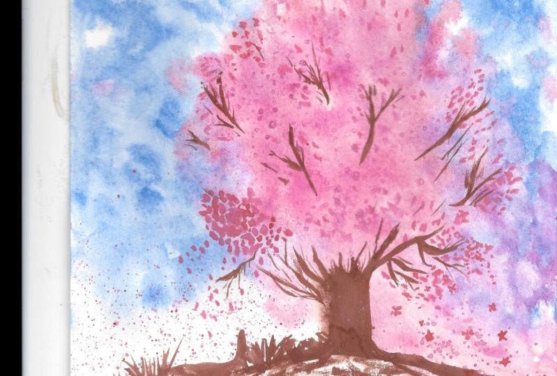
9. Paint Cherry Blossom Tree: Adding Layers : The first layer and the
salt is completely dry. Now, you'll be amazed at the dramatic effect this
tree has right now. Although I know I do, I do need to work
a little bit more to bring out the final details. So let's get started with that. The second layer of this
painting is only to add value to our painting. We are almost done
with the painting just for some finishing touches. So I'm going to start
off with the tree trunk, which is where I
need the most work. So going back into sepia, I'm going to try and add some extra color
or deeper color. Once a watercolor layer is dry, any extra color that
you add on top of it, we'll stay on top
of it and do not blend into each other
like it did at first. So now I'm going to start
adding branches, a darker area. The right side of the tree is where I'm thinking
the shadow has to be, which means the left side
would be a little bit lighter. I already have something to
work there because I can see a lighter area and I
can just introduce or lift out some pigment and
make the left side lighter. If you're painting has dried
in a different way and you feel that the right
side is more lighter, even in terms of foliage, then you can always keep your lighter area
on the right side. So at this stage, it depends on how each of your paintings have
dried out to be. So I'm going to add
in some details of branches using the
tip of the brush. And remembering all the practice that we did before we started this project of the brushstrokes and the tiny lines
for the branches. You can add as many
branches as you like in any areas that
you personally prefer. Your tree may not look
anything like how mine is. Because each of our watercolors
will dry differently. I would like to
make the left side of the tree trunk a bit more lighter and also add some details of
branches there as well. So I'm starting off
with the bronchus and then using a little
bit of water, I'm going to dilute my wash and create a
lighter area there. So now my tree trunk is
looking a little bit more 3D like with the
dark and the light. And now let's continue
adding more branches. Finally, to finish off, I'm also going to add
a few random strokes to depict the ground
where the tree is placed. It can just be some quick
lines, dots, dashes. You can also add
details of grass. Also to bring a more 3D look
to the tree foliage as well, I'm going to add an
extra layer of permanent rose using lazy stippling. If you remember the
practice session, we had practice lazy stippling using the tip of
the brush as well as the bristles of the brush placed firmly
down on the paper, creating something that
looks like foliage. So I'm going to use
this technique in several areas where I think
I need a little bit of a deeper color or an
extra layer just to show the 3D look
of a cherry tree. And I'm also going to
splatter some paint, just creating some
movement there. And I can also finish off
with some branches to connect those dots and make
it look more realistic. Finally, I'm also going to
splatter some paint for the ground just to depict Fallen Flowers
of the cherry blossom. I can also do a quick wash over it just to such a
stickler on the ground. And with this, we're done painting our cherry
blossom tree. I'm going to leave this layer to completely dry before I decide if I should make
any more changes or introduce anything
more in here, it's always best
to step away from your painting and to give
it enough time to try, rather than using a hairdryer. That way, you are able to take enough breaks and decide
what's best for your painting.
10. Final Thoughts: The second layer of watercolor
is also completely dry. There is nothing much to do
here unless you wanted to add a little bit more extra
details like branches. I'm going to add a few
more branches on my tree. This is just my personal choice. If you're completely
happy with your tree and field as you do not
need any more branches, then you don't have
to add anymore. You can stop whenever
you feel like with this, we are done with a
cherry blossom tree. I hope you will enjoy
painting this beautiful tree. It was such fun creating this painting using salt as
granulating medium as well. And I hope you will enjoy
it the same way as well. If you do try using rock salt instead of table
salt, by all means, please share the
results with me and share the results with your
fellow students as well. I am really looking forward to see some of your projects here. And also a little bit
off your process. It will be really
great if you can share some process and behind
the scenes as well. You can also discuss
your challenges and the exciting
bit of using salt. Did it actually go the way you want it to go or
when it dried out, to dry out completely different to what
you were expecting. Please feel free to share all your experiences and
I can't wait to see them. I hope you will enjoy
painting this scene. Happy painting everyone.
 Suzanne Abraham, Artist