Transcripts
1. Sunflower intro: Would you like to learn how
to paint expressive florals? It's summertime,
and nothing says summertime quite
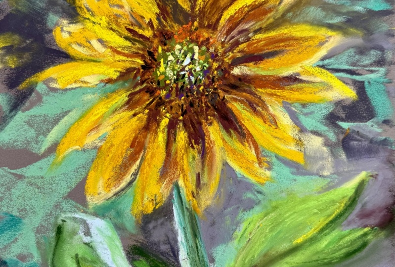
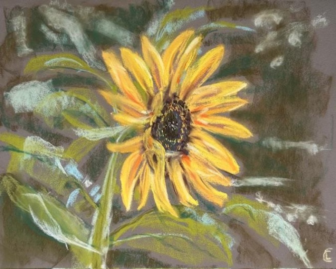
like a sunflower. And that's what we're going
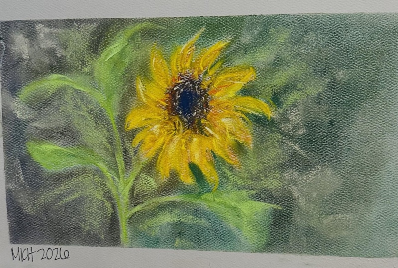
to paint with soft pastels, but not this one
because it's fake. Instead, we're going to work
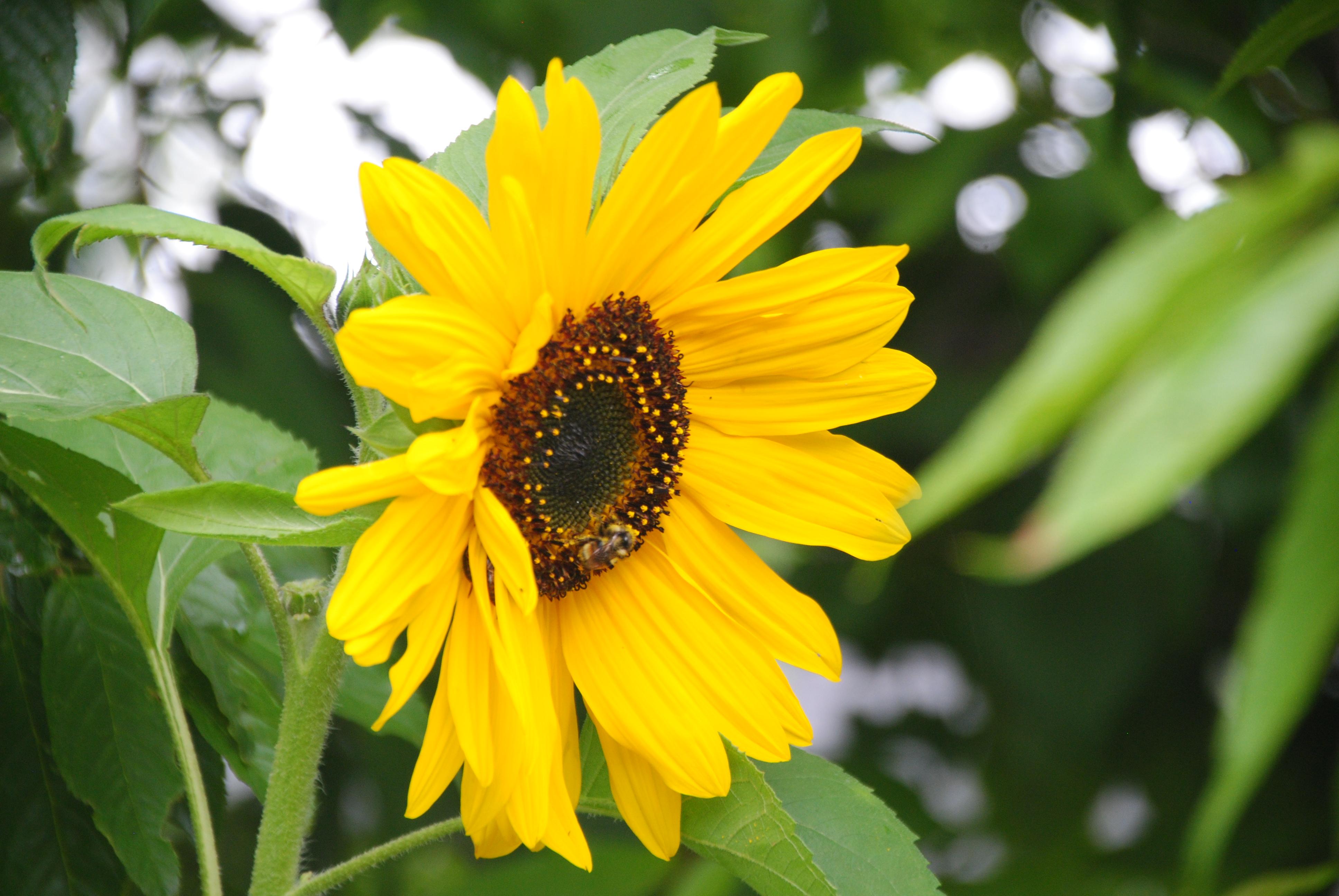
from a reference photo. We're going to use soft pastels, and essentially, it's just
going to be a sketch. We're gonna go a
freehand sketch. We're gonna get loose with
it. We're gonna have fun. It's not gonna take that long, we're going to
learn about how we can use darker colors than we think to bring more depth
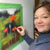
and drama to our paintings. I'm Heather Nelson and
I'm a soft pastel artist. I enjoy painting paintings
that are quite expressive, both wildlife, florals and
sometimes even still life. I hope you upload your project
to the project section. I would love to see it and
give you feedback on it. And if you've got any questions
about it, let me know. You can give me a follow
here on Skillshare, and you can also follow
me in these other sites. If you're ready to
join the class, next, we're going to learn about the materials we're
going to use.
2. Sunflower materials : Let's talk about the
materials we're going to need for this little
painting of a sunflower. Now, the thing that's
going to make or break your painting is going to be
the paper that you choose. So you want to be working
with a textured paper. That's what's going
to actually grip your soft pastel the
best and get you that, like, special look and
that special texture. There's a lot of papers
on the market that claim to be soft pastel papers, and they actually really
don't work that well. My favorite paper
is the pastel mat. It is quite expensive, but you can get it on sale, and it's just a
texture that I haven't found anything that I can
really compete with it. The Canson matons velvet. I've heard great
things about it, but I haven't used it myself. And then there's sanded papers, like the UR paper can be quite good at gripping
your pastels, and you could even
use a sand paper. Like I find automotive sand
paper can work quite well. When we're talking
about the pastels themselves and the colors
we're going to be using, I used various different
colors of yellows and even this bright orange
because I really wanted to get that vibrant orange into
the center of my flower. You don't need to have as many different colors
of yellows as this, but if you've got them, you're
going to want to use them. And then I've used various different shades of green from, like, mint and grassy and a medium green and even
a dark forest green. Also, some rusty colors. I did love to use my Terry
Ludwig eggplant color. It's like a deep purple, and it's a wonderful
color to work with. But you don't
have to have it. Just use what you
have. There isn't going to be a lot of
blending in this. We're going to be using the actual strokes
to create texture. I did just a little bit
of blending in the back. For that, I used a soft tool. If you have one, you can use it, but I wouldn't go out
and buy one just special for this project because
you could also just use a bit of paper towel or even your fingers to
blend. That's no problem. And you could even use something
like a packing peanuts. To clean off your pastels
or even your hands, I like to use a
microfiber cloth, so I just give it a little wipe down here so that
I can actually get to the color that I want and not just spread other colors
onto my painting. For cleaning your hands, you can either use
that microfiber cloth or I like to use
some sort of wipe, like a makeup wipe
or a baby wipe. But of course, you
could also use soap and water to get
your hands clean. I used painter's tape to
tape my painting down onto my easel and you could also be working on a
table if you prefer. You can download
our reference photo from the resources section. Now, let's get started.
3. Sunflower foundations 1: Part is usually just the
beginning when you've got this blank page and
you're not really sure. So a lot of times
it can help to sort of practice your
first strokes like, Okay, where do I
want this sunflower? I want him, like, about
one third of the way in, at least the center of it. I'm starting out with a Terry Ludwig eggplant
quite a deep purple, but you could even do,
like, a really deep brown or even a black for this. I'm just going to practice, and I'm just going to I'm just gonna get in there, and
I'm going to make, like, a little half see kind of shape and then I'm
going to finish that off. So I'm making this little oval, which is setting it's almost
like a, it's an oval. And that's setting the tone
for where I'm going to be. Then I'm going to
bring in my dark green and my dark green, I'm just going to kind of
skate over the center here. I can see I need
to wipe that off. I've got a microfiber cloth, and I'm just going to
clean that off because it was putting other
colors on besides green. I'm going to kind of
just skate that a little over the center because I can see there's some dark
greenish colors. Then while I'm doing that,
I'm going to think about, well, where does
this flower come in? We might never see that green, but I just want to just
put that in there and I'm going to do one
line down to where I think that my
stem is going to be and I might even
shoot that off into where I think my
leaves might end up being and I'm I'm making an arc, but I'm also changing the angle, and there's this
little bud up here. I'm just going to make
a little mark for that and also that leaf
in the top there. You might be concerned.
You may be like, Heather, what's with
all this dark color? I don't see that dark color. Don't worry with pastels. We can go over it, but
it's always good to layer. And when I change the angle, so I put on the flat,
I get more surface. When I turn, because
mine is a funky shape, this line creates that. I'm just switching
the angles up. If you don't have
a lot of angles, eventually as you play
with your pastels, more angles will appear. I'm actually going to go
in with a little bit of a medium green now, and I'm still going to kind
of carry that idea forward. So I'm just grabbing,
throwing it on. I can see that's a
little bit I would like a little more blue
green probably than what that is. But
don't worry about it. And I'm going to just
skate that over the top. I'm just going to add
it to here because I want to go painterly anyway. So I'm just making these marks. And when you're making marks, you just really
want to get bold, get in there and
just throw it down. It's a very forgiving medium. So if you're not happy
with marks you made, you'll make more marks and
coming over the top of here, like so, and then I'm just going to bring in a little bit
for the top of that. But this is a little
bit of a telish color. It's quite light, but I'm just going to kind
of throw it in some of those areas that have
a little more light blue. Kind of vibe going for
them and remember that our colors don't have to
be perfectly accurate when we're doing
something painterly. You just throw them on there and I'm just making these quick
marks. I was like, Wow. Sometimes I find the
sand effects useful. I'm going to be
chopping out this V here and away we go and
just adding that on top. Going to add a little
bit the bud there. I'll just know that
for the future. Now, you're gonna look at
this, and you're think, That doesn't look anything
like a sunflower Heather. Don't worry about it. I go to bring in kind of a deep brown color and
just sort of scrub it. I'm making these little,
like, scrubby motions around the center
of this flower. I still want some of my deep dark purple to
show up underneath. So I'm just sort of scrubbing
this in kind of like I would do feathers or fur. There's a little bit of brown peeking out underneath,
so I'm gonna do that. And then some of those petals. I think I'm going to
bring in this is, like, a rusty color. And maybe first, I will scrub it a little bit on here, too. It's going down really easy. It's super soft, so
I have to be really careful about how I scrub in or I'm going to end
up with more than I want. And I'm just going to kind
of look, Where do I have those lighter tones just
kind of dotted around.
4. Sunflower petals 2: Going to use this as a base
for some of my petals. And so I'm going to come
from the outside in. I'm using about one third
where I'm laying it on, and for some of
these, I want to get in the dark parts first. That one didn't want to go on. Anywhere where I
kind of see that there's like in my
reference photo, where I see that rustier color. I'm just going to come in, and I'm just going to
throw this in here, and that's going to kind
of lay down that idea. Doesn't I don't always have the rust go all the way out
to the end of the petal. So some of them you can just put in these shallow bits where you see that kind of rusty
is like a rusty, kind of pinky orange color. And I'm just bringing it in, kind of like radiating it back. Then I'm going to go to
kind of my next value, which is, like, rusty
orange, I guess. I don't know the colors. And I'm going to start
from the outside of my petal. Wow, pull in. These ones are a little
bolder, and that's right. You can either go
over top of the color that you had before and it'll
still leave a little bit, or you can go next to it. So you can decide
for yourself or just kind of going in in this, scoopy kind of motion. You can decide how much of your pastel you put down
based on the angle. If you put it in a
really sharp angle, you're going to get a line, and if you put it down
more on its side, you're going to get
these big fat marks. I just throw them in. It
doesn't have to be perfect. It doesn't have to look
exactly like this sunflower. You're not doing a
sunflower portrait that people are going
to complain about it, but it doesn't look precisely
like their sunflower. You're just doing sunflower.
This is a reference. Now I'm going to come
in with a goldy color. So this is my next value up. Same thing. You guys
know the drill now. I'm going to skate that
over and see how it shows that darker rust, but it's also now showing
this kind of gold. Okay. When you want to
create more of that, some of those
shapes are oval and some of them are kind
of like a spike, that's going to be
how you lay down. Like that made more
of like an oval, like what we've seen a daisy. But if you wanted to be spikier, then I made it like a tip,
and then I came down, but I could go down the
other half, too, like that. So I can do like both sides. And maybe we want
to go further out now now that we've
got a color that's a little bit more sunflowery
coming from the outside in, and I'm just gradually
lifting up as I come in. If you don't see this color, you don't have to use that. So some of these areas are
going to be lighter yellow, and we don't need this
particular shade there. So I'll just look for
where I do see it. I don't want to completely
cover up my rust. And you can make some of
these little ones, you know, that are foreshortened
coming towards us. And there's quite a mess
of petals in there. So I'm just I'm going
to bring that one back. Now this is already starting
to look like a sunflower. And we jump up to
our next value, and I'm a little on the fence about which one I want to use. I've got two choices here. So this one maybe it's lighter, but it's close, and
this one's more yellow. This one's going
to be definitely give us more bang for our buck, but we probably need
a little bit of both. So I'm going to go for
the fancy one first. That's kind of a
brighter yellow. G to bring that in there.
And you can see sometimes in the reference photo
where there's like a little ridge
line to the petal. So I'm going to put my pastel
more on edge for those. And then you might see
areas where, yeah, I want that other tone, that kind of duller sort of like dark butter tone.
So throw that in. And then you can come in with your really brilliant color. And you can just be switching. Sometimes I'm going to
do like half of a petal. And other times I might
do a whole petal here. I try to get a little
shape in sometimes too on some of these ones
that are kind of wiggly, so you can wiggle yours. For shortened ones, I just make like a funky
little mark there. Sweeping it in. Yeah, if you put it
on its side more, you're going to get those wider. And it's all about the pressure. So a lighter
pressure is going to show some of this work
that you made underneath. We definitely don't
want to cover up all that work
that we made, right? That would be a big
mistake. Here we go. And just throw a little bit
of the buttery color in, but I don't want everything
just to blend together. I'm going to bring my
lighter yellow in now. It's almost more like a
sunshiny kind of color. And now that I'm putting
in more highlights, I'm using just the edge. I'm using it a little bit
more like a pencil for those ridges and running
it around the edges and also running it
a little bit through the center to create that little ridge look. If you like a particular mark, like you like how
wiggled, they use that. And maybe these ones in
the back don't have it, but one in the front does
have that lighter color. You don't want
everything to have it because if all of
the petals have it, then they're going
to look too uniform. You can just ripple it along some of those four
shortened marks, and maybe the lighter
color doesn't go all the way in some of these. Maybe it's just a little
through the middle here. Following these edges. And as you lift up, you'll
start taking the pressure off, and then you'll show more of the color that you
left down below. So you put it down, and then
you lift it off like that.
5. Sunflower centre 3: Now I do need to do more with
the center of my sunflower. I want to bring in an
extremely vibrant orange. This is very bold. I'm gonna just use it sparingly a little. Okay, I don't want just an edge. I wanted to, like, lay
a little down here. So I'm gonna kind of
use it just where I'm thinking it could
be a little fun to have a little punch of color. Because it's my picture,
and if I want to use a little bit more
color than maybe is there in the real world, I can. That's part of being an artist. You get to decide these things. And then I'm going to just
kind of sprinkle it in here to represent all these
little stamens and things. Just a little bit more on
the inside of our flour. We are going to have
to play with this a little bit more. I can see. We're going to need to
make more of those. So I'm even gonna bring in my lightishy kind
of like sage green, and I'm gonna
sprinkle it in here. But I'll also bring darker
colors back in again. So this was my really
bold eggplant color. It's really dark. And I'm just gonna kind
of shake it in here, maybe.it around a
little bit where these funky little
curly edge things are. And it peeks through
a little bit. And then something
that'll make quite a difference will be when we bring in our
little buttery yellow. So I'm doing a
little tweak here. I'm rolling. I'm putting
it down and rolling it. It does not have to be perfect, so you can just kind of, like, sprinkle and dot
those little guys in. You don't want them
to be equal space. There is a bee in here, but I don't know that I'm concerning
myself with the bee. You can, if you
like, but I'm just sprinkling and dotting
these around. There you go. And then you might
see areas where you want even lighter values. So I'm going to come
in with this very, very light yellow and just
find some areas that I really want to highlight. And again, don't overdo this. Just bring them in where you think just a little bit
more light would be fun. And maybe give you a little
bit more delineation between some of the other
things you've got going on.
6. Sunflower background 4: Now I'm coming in with more
of a grassy green, I guess. And I'm gonna play a
little bit with my leaves. Do do do. Sprinkle that in. I'm Always dropping
things. That's why I've got the foil to
catch it underneath. And this one is kind
of like curling, so I make this C shape. Again, this is paint rele, so it's not going
to matter too much. Just make a little mark
there to indicate. Yeah, there's
something going on. I ended up covering
up my little bud, and, I don't care about that. So we're just making those. I don't want it
too much in this, but it was underneath the shape. And down through that stem. Okay, maybe it's too
strong of the stem. Can kind of give it
a little bit of rob, it'll still be there,
but that's right. And then maybe I go and
make some more leaf here. And then I will bring in a deeper color to
work with that also. So we're just going to it's
like a little darker color, Bingbing, kind of
covering over that. And it might even bring
in a little darkness there just to indicate there's something
going on back there. And you could decide
if you wanted to bring that into
other spots, too. Yeah. It's kind of like
this really pantry not overly concerned about
it sort of background. We're not gonna I'm not
planning on putting all the points of
light and everything, but I maybe cut it. Something like that.
And if you want, you could bring in
some other greens. Oh, that was I don't love
how that went in as a line, so I'm actually going to kind
of give that a little bit of rub with one of my
little applicators here. I guess I'm just gonna
rubbing up most of that. Well that's okay. I guess that's where we're
going with this. Wasn't in the plans originally? But why not? Kind of like the
darker color here. So I might have to bring
in a little bit more dark. Come back with
this darker green. And you can, like, cut in and create the negative
space if you weren't, like, loving some
of your petals. I'm just moving kind of
quick on this. Like that. I'm going to come in
with one lighter value for the leaves. It's actually kind of like
a minty sort of color. I think it'll be just a
little interesting just to define some of
these leaves here. And I just kind of
going across to Kind of dotted up there, gave it a little go. And if you want to add some
of those points of light with that lighter value, you can. I go to rub these ones
in 'cause I don't it to be as obvious there.
And maybe even here. I'm just gonna kind of fog some of that out a
little with my fingers. I'm probably gonna
leave that at that. The only thing that
I could maybe do is bringing a little bit, like, darker color sometimes where I want that little bit of shade, and I'm just kind of
dotting it out a little. A lot of times, though,
when I add more, it doesn't necessarily
make it better. So don't go crazy adding more, just giving it a little
bit of delineation where some of these petals
are coming in. I'm kind of coming
from the outside in, and I might create a little
more shadow in behind our foreshortened so I'm just creating a little
bit of shadow spots, but I don't want to go too
crazy with this. Yeah. Just coming a little with my
darkest value under some of those ones. But I'm good. There, pretty happy
with how that's going. Little little gold rim through
here, little dotty dot. There is a little bit, like, where they all
kind of come together, but I don't know if
I want to, like, overdo that because it might
draw your eye too much. A I'm okay with that, though. Just not too much, so
I'm just going to create a little liny liny in here just to separate
that out a little. Okay. Then we sign
that we call her done. I think I'll go over
to this corner.
7. Sunflower closing 5: Thank you so much for
joining this class, painting this soft
pastel sunflower. I would love to see what
you've come up with. So please upload it to
the project section so that I can give you feedback
and answer any questions. I hope you really had
fun in this class, and I hope you feel
confident to go on and paint some other
florals on your own. Or you can always join one of my other Skillshare classes. You can follow me
here on Skillshare. You can join my newsletter for some information on how to
make some painterly work, and you can also follow me
on Instagram and YouTube.
 Heather Nelson, Pastel artist