Transcripts
1. Beta intro: A Are you interested in an exercise in
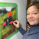
loosening up your work? I'm Heather Nelson and
I'm a pastel artist. I have experience with
creating very realistic work, but it's actually
the expressive and painterly work that I'm
the most passionate about. When you're trying to create
this painterly expressive, sort of impressionistic work, there are some keys to it. And in this particular class, we're going to be
focusing on gesture. We're not really
going to be creating a sketch in the
conventional sense. We're going to create
that gesture just through how we put
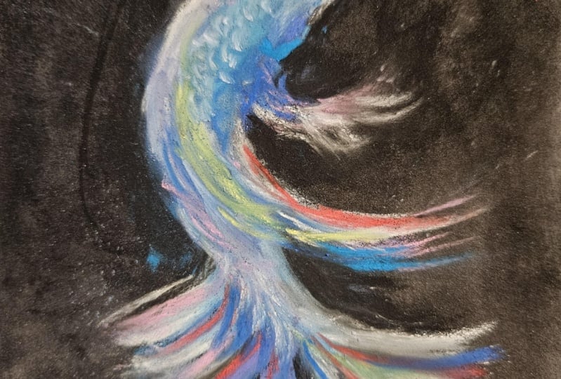
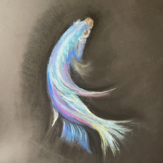
our pastels down. Our project is going to be
this little Beta fish here. This class, we're
going to begin by creating this very
simple background, which is just one color. And then we are going to
actually create the fish less with the sketch and more
just flow with our pastel, putting down vibrant color and having fun playing and
experimenting with. Would love to see the
project that you create. So please upload it in
the project section, regardless of whether
you create it in the same way or even
with the same medium. I would just love to
see what you make. If you're struggling with it, please put it in the projects so I can give you feedback
and help you out. And if you really are
happy with what you did, then let's celebrate
that together. You can follow me here
on Skill Share to see the other classes that I have available and the classes
that I have coming up. If you're ready to loosen up and leave the details behind, and have some fun,
then let's get going.
2. Betta Materials: Supplies for this class, you are going to need about six by eight
inch piece of paper. You're going to want that
to be actual pastel paper. My favorite paper to
work with is pastel mat. The amount of layers
that you can get on this is amazing and
you get minimal dust. This is a fantastic paper, but it is expensive. However, you can cut it
up into smaller bits, which is what I've done here, where I've actually made
myself a sketchbook. So I have a little sketchbook with different paintings in it. This is even a
mushroom from one of the previous classes we
have here in Skill Share, and I've got this
little hummingbird, which I haven't
done a class for. It's a good idea to have
a toned piece of paper. So it's nice to have
like grays or browns. I used a brown color for this, but I also could have used a black, which would
have been handy. When it comes to other papers, let's say you can't
get pastel mat or maybe you just don't
have the funds for it, then I actually recommend
automotive sand paper. So I actually got this
from the hardware store, and you want something
that is an ultrafine grit. So the higher the grit you go, the finer it is, and a 600 can be quite
nice to work with. It's got a little
bit of texture, but it's not rubbing my
hand off, for example. Another paper that can work is the Strathmore
mixed media paper, but it does have a little bit
of a weird texture to it. And so when you work on it, your work is going to
get that kind of, like, odd texture unless you
really blur it out. So, I prefer to work on pastel
mat or on the sandpaper. I did use some pan pastels. If you don't have pan pastels, you're not going to need
them for this project. But if you do have them, you know, crack them
out, have fun with it. I worked with a selection
of blues and purples. But you could make your fish a totally different
color if you want. I had a couple of
different applicators for my pan pastels. I used this big round one when I wanted to cover a lot of
space and do the background. But when I actually
worked on the fish, I like this one because
it's fairly big and chunky, so you can't get too
detailed, but it's got edges, so I could create that like
gesture feeling with this. But if you're not
going to pan pastels then that's not even
going to matter. When it comes to the
pastels themselves, I used an assortment of fairly chunky pastels because when you're trying not
to get too much detail, chunky is your friend. It's hard to get detail when
you have chunky pastels. So these are sines, unisons. I've even got a
Terry ludwig here. The brand isn't
absolutely critical. When you're looking
at, like, what colors did I use for my project? Well, I have an assortment
of blues and purples. I have the sort of pink, and this was like
a reddish brown. This eggplant color is, well, just like the
outside of an eggplant. And I also used this, like, bright fuchsia color
and some darker blues. And I did have a black.
Black was important. Then when it came to the pan
pastels, same sort of thing. I had purples,
blues, and a black. I did use some prisma
color new pastels for when I wanted to get
a little bit more detail. I don't consider that to
be absolutely critical, but these were the This was the color assortment I used when it came time to do
the new pastels. But you could also just use
pastel pencils, if you like, or you could also use a shard from your soft
pastel for the details. There isn't a lot
of detail in here. As a matter of fact,
the only time I focused on detail was when I was working on her eye. So that eyes the only time that I was thinking
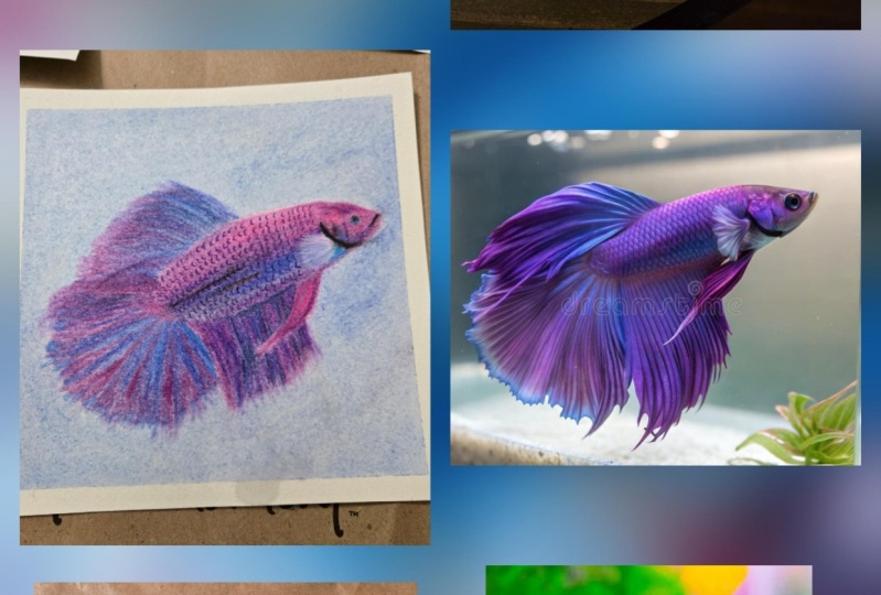
about detail. All. You can download the reference photo from
the resources section, and we have Snoji 1989 from Pixabay to thank for
this beautiful little fish. And remember, we don't need
to create a perfect replica. Your hands are gonna
get pretty dirty, and that's where I tend
to use baby wipes. I actually find it gets my hands cleaner than
just soap and water. But of course, you can
just use soap and water. I used a bit of wet
paper towel when I wanted to just knock the
pastel dust off my painting. I knocked it onto a little
bit of wet paper towel. And you can also either when you want to do some blending, the only time I did blending on this painting was actually
in the background. I just used my fingers, but you could use
a packing peanut or you could use one of
these blending applicators, or you could even use a
bit of paper towel for
3. Betta 3 background: So I'm going to begin just by
making my background black. I'm going to use pan
pastel to do that. But if you don't
have pan pastel, you can use a soft pastel. I just find it's easier to cover a lot of my paper
with the pan pastel. You can just work speedily. It does have a certain
transparency to it, so I usually like to go over
it with my actual pastels. I'm just working in
my sketchbook here, actually maybe I'll even I have a design so I can
take my sketchbook out. I'll just cover it with
a little bit of black. Now, if you're
doing backgrounds, the pan pastel is really quick, which is something I appreciate. I can get across the
paper rather rapidly. But because there's some
transparency to it, it's not going to give you that incredibly rich
black background. We're probably going to
add more color later. This is just going to give us our foundation that
we're working with. This will be enough for now. If you've got a nice paper, then it's going to be able
to take these layers, so it's not going to matter that we've put black and
then we're going to put the fish over top of it. But nice thing about pan
pastel, if you have it, is that it doesn't put a
lot of material down on the paper so it doesn't eat up the tooth of the
paper very much.
4. Betta 4 foundations: Pastel is very forgiving. You can make gestures here
and this is what I want you to play with is this
fish has a movement to it, so I'm just going to
grab a color of blue and I'm just going to make some
movement with that blue. I'm going to take this blue. This is a Thalo blue, but you could also use a soft pastel for this in
place of this if you like. I just to be able to
use the applicator. I'm just going to play
with this a little bit, get a little bit on here, it doesn't matter that much
what's going on with the fish. At this point, I just want
to follow that gesture, the main through line of
the fish, really his spine, if you will, or her spine, I should say, because it
looks like a female Beta. And so we're just going
to put that down and just let it dance across the page. It doesn't matter that
you might not get all of it covering in the
way that you dreamed. Just see did you get the dance
of it the way you wanted? If you didn't make more. You can always dab
a little bit more, grab a little bit more
of your soft pastel and just create that
curve and that swoop. You might even want to
create the curve and swoop of the line of the fin. Now, I've chosen
quite a dark color as my foundation piece here, and so you might not
see it so easily. You don't have to worry
that this creates a square because we're going to be putting lighter
colors on later. I'm even going to grab
a lighter blue now, just dab a little bit on there. I am playing with my
pen pastels right now. Play with what you
have, putting it down, following the curve, and
I can mess with it later. But in a way, I want it
to be artsy and flowy, it doesn't matter if it's
working out perfectly yet. Right now, I'm just going for, what's the vibe of
this little fish? I can cover that on there. Then I might want to get
into putting just the end. The nice thing about this
triangle is you've got sharp edges and you've
got bigger edges, so I'm just going to put that
on just going to be swoop. I'm just getting the idea of, where do I want this
little fish to be? Where do I want
the flow and ideal of my fish to be and you
can make your marks. First, this might be scary. You might be like, Well, that doesn't look like a fish.
That looks really weird. But I'm just going
for the gesture. It's like I'm just
sketching at this phase. You can even bring
in other colors, so I might bring in a little
bit of purple at this point, I might just go for that lower fin and
even this part here, might top that up there, bring in his gill shape. In the beginning,
you might be like, but, Heather, what
are you doing? What are you thinking? Um,
well, I'm just playing. I'm having fun with
shape and gesture. Now what I might do is bring
in some actual colors, and you don't have to go for exact colors
of what you see. I'm thinking could
be cool to have this pink swooped in here. I'm just going to bring
that in on the curve of my little gesture
of my little fish. I I don't love
something about that, I always have the option about
bringing other color in. So I'm going to bring
in this blue now, and I thought that I kind of I'm just going to
drag it on its side. I'm going to drag it down. That's for that lower fin idea. You're looking for values. Colors don't matter so
much as much as values. I'm going to create that curvature and
that swoop in there. I'm going to put
just this little end about a quarter of an inch of my pastel and I'm going to
mark the area behind the gill. Might even do is a swoop thing. You know what? It might
be a little bit big, but hey, I'm not
bothered by that. I'm going to get a
darker tone in there for these dark areas that
are next to him or her. Again, I should call
her her mark those in, mark those down, put
things where they're dark, put things where you see
that they might be light. When you're trying to go really wild and paintly
you're the artist. You honestly, I'm going to bring it from out here
and I'm going to pull in. It didn't all go down, so I'm just going to do that. Then it's not going
to matter so much. I'm even going to
mark out where I want my eye to be
with that blue. And then I'm going to go
for an even darker color. Maybe something that's
more like a black. Go find a black here. Now I might start to carve out the negative spaces next to my fish because these are going to be that's going to be my
black background in the end. Now I can even cover
more of that background. I'm just going to
put this on the side and scrape that around. I can use that line of the
gesture that I talked about. Fill that negative
space in there. Through this negative space, we also carve out our shape
of our fish that we want, so I used it in a C. I went. Now I can carve
her out like that. She starts to come a little bit more alive on the
page just with that.
5. Betta 5 add colours: Now you're going to
get some buildup of some pastel powder. I'm just going to take this and I'm going to give
it a little knock. I just knocked it
onto a piece of paper towel that I had here and that'll just collect
my powder for now. I can put that to the side. I often work at an easel, so I don't have to
worry about that. But right now we're working flat and so you occasionally might have to tip it up
and knock it off. Now you have choices
about whether you blend, but I'm actually going to play with not blending right now. Might bring in other
colors and things later. Now I'm going to take
in some of this. Actually, I'm going to go
to my darker darker black, put in the hint of where
that eye shadow was there, and we probably don't need
to get the eye in just yet, so I won't get too carried away. Let's look for a lighter,
more playful tone. I think I might want some turquoise color,
little bluey green. We're going to grab that.
Again, I'm going to follow the gesture
and throw that down. Throw it on its side, play with different ways
of making marks. Don't worry about trying
to make the perfect thing. Just play with your marks, throw it down, see how it goes. We can do that a little
bit down below here too. I might just drag these out
a little bit for the fins. At this point, they're just
like the suggestions of fins. You might even have a
little bit down here. This is, of course,
a stronger color than what we had before, so it's going down a little
bit more because there's more transparency
in the pan pastel. This is a lighter tone of blue. Going to throw that down through the center here where
we had the light. I like to make the
sound effects. You might notice
that I just again, just going to drag more like a pencil here, throw that in. I see there's another
little fin down below, I think that's
called a caudal fin, but I'm not even
sure, we're just going to throw
that in there too. And even this little
highlight on the eye. Again, these lines, they
don't have to be perfect. That's the thing about
working painterly and that can take some time to learn how to go
painterly and learn how to let yourself just
go, vibe with it. We do have some rusty orangy
color and I want it to be something that works with the tones that we have here.
I'm just going to play. I might even pull
in this pink for that we can scritch it. See what scratching it does. You get to practice
with different marks, little scratchy scratch in here. Anywhere you think,
could be pink. Now I see that I made
the gill in there, so I'm going to
do that that fin. To get these other
fin shapes in here, I want to pick a color
that might be fun. I might work with
that. It doesn't have to be the actual color, but I might go a
little bit more. Tone down, something
a little similar. This is a yellow orange. I guess it's a peachy color. I'm actually going to mark
it over the fish's lip. It's bold. Just like soap. Then I'm going to come
down a little bit through these lighter areas and
again through the fin. But we can play
with rubbing that out so that it has that more
transparent ethereal vibe. That same color is in
these fins back down here. And you can I mean,
you can throw it in anywhere it's your fish,
right? Have fun with it. I think I need more
of a bluey purple. Find a purple. And I like color, which probably pretty
obvious by now. Following that gesture again, we're following
the movement. That's what we're
going for here. You can even use it
to blend if you want. But I wouldn't advise
blending too much with your fingers when
you're doing this work. Create that fin look here. We are going to need the black to create that fin look as well
because we do have this transparent moments
of the fins or we can see down in between that
do that same thing here. You're almost drawing
it more like a pencil. You're taking it out and see
how that creates that idea. And I see it's a bit
narrower through here. I'm going to just too much. That's right. We can
fix that up in a bit. It's our fish. We'll
do what we want. That one cut in a
little bit close, so I'm going to flesh that
out, make it more interesting. Maybe I will come
in with something a little bit darker uptp here. This is a darker red. Maybe even throw that into the eye and to the
top of the fin. I like to carry
colors through to other places so that
they make sense. We do need something
darker in here. We need to find a color
that works for us. I'm going to maybe go with
this dark eggplant color from Terry Ludwig and I'm just going to make
a mark in behind the gill here and a little
bit behind the eye. Even behind this eye to create that little
line that we know appears and then to shadow
in this concavity here, and even a little bit
maybe at the back of this fin and along this side. You can use that
to create some of that texture and shape as well
that you were looking for. Just drag it down and I want a little bit of lightness
on this fin. Just go. Because by creating those fun
shapes and I can bring this back in here where I made it a little Sure it was
better before, but these things happen. I'm just going to vibrate
that around to create a sensation of some
movement. So scales.
6. Betta 6 finishing up: Let's make a mark for
black for the pupil. We don't want to bring
in too many new colors, so I'm going to use this pink for highlight marks
around the pupil, it starts to become
more like an eye. I might need a darker black. If a darker black
would be a new pastel, that'll give me a
darker black tone. A little hard to see. I might even use that
market behind here. Then I start to look
and I go, well, what else do I need
here to create some of this sense of I want this vibe going on
here like this. Carve out a little
bit of this notch too because from
the negative space, so just to make that
a little bit smaller, I like how it just
shoots off there. Let's embrace that. It doesn't really matter if you end
up with colors elsewhere. You can even use that to carve off a little
bit of that eye. I can always put more
in if I want to. Like, I might put this in here to give a sense
of where that was. Even on the mouth, I can add a little
bit if I like, and I can even chop this out a little bit with the
black if I like too. This little fin here was a
little bit more fun before. I'm going to create
the waviness of it. I'm even going to bring in
a little bit of the purple, but I'm just going
to make it really light and make it wavy. It's believable that it's
doing this wave like motion and you can.it a little bit
just to take it out there. So you know that
there's a fin there, but you don't know
what's going on with it. Now, we still might want some lighter tones just
for our highlights. This is a very
light blue unison. Going to just drag
it across here. And around the I doesn't have to be everywhere where you see something light. I just drug it
through down there because your picture
doesn't have to be anything like the
reference photo. The reference is
just your reference. Sometimes we get a little
caught up thinking references you got to make them
exactly like it. But actually, it's
more interesting if you get creative
with your reference. Use your reference as
something to look at, but not as the be
all and end all. Then you just look for places. Try not to overwork
it because honestly, the more attention
that you give to it, probably the more you're
going to make it look weird. Have a little step back, take
a look, see what you think. I think I want a sharper
look about this gill. I'm going to take this
color and just go. Just to give some more
definitiveness to that gilt. And even to this back
of this eye over here. Maybe just tie it in
a little on that fin. I decided I didn't love the cross patch marks
that I made there, so I'm just going to bring
something else into that. This I like how it comes down, so I'm going to
emulate that as well because I like that rhythm
that's created there. There is a little
bit of a highlight, I'll just do
something like that. Now this is already coming
together pretty well. I have decided I want to
blend out the background, so I'm just going to do
that with my finger. You could use a packing
peanut or even a piece of paper towel to blend
out the background. But I just decided that I want my little fish to stand
out a little bit more. I want it to be the
rough thing and I want the background
to be smooth black. Then I'm going to take
a look at it for a bit. I decided that she
has done aside from, I want a little bit
more detail in her eye. I have brought a little
bit of red new pastel. We'll see if it
brings me anything. Sometimes it does,
sometimes it doesn't. You have to be
really careful here. Soon as you're coming into
an eye, Yeah, I like that. I might even bring in the
orange because I have it, but if you don't about it. Just for a little bit
lighter moments there. I might even use this a
little bit on the snoot. Not sure that did
anything for me, but I don't want to get too
crazy into the details. There is a little bit of bluish
color in the eye as well. I just happened to have
this turquoise one handy. So I'm going to just make a little line with that
to create a little light. I don't think that's mandatory, just so you know, might be calling this done
pretty quickly. Oops. Because what starts to happen if you leave
these things too long, you will start to overwork them. One of the keys to being
painterly is not to overwork. Try to resist the urge to get all crazy
and overwork things because your job is to make
it seem like this quick, flowy ethereal movement
kind of thing. If you start to try to make things too perfect, you're
going to take that away. This is one of the
things that humans have the most problems
with, I think, because we love to just get
in there and Overwork stuff. Now I'm going to
take my new paste. I'm going to say, it's done. Okay, well, I might
just highlight a little through here
just because I can. See what happens. So you start
thinking about one thing, then you're just like,
Oh, now I can do this. Now I can do that.
Try to resist. Now I shall write down. I'm just going to sign
it. We're signing it. I said I was going
to leave it at that. But my signature, I think
is a little too big. I'm finding it distracting. Cool thing, and maybe
not such a cool thing if you don't ever
want anybody to. This is why you should sign
the back of your paintings. You can just rub
out your signature, knock that into the
wet paper towel. And I can assign it
smaller this time. Still in the same spot. I
just don't want it to be as. There we go. If you've attended
any of my classes by now, you know
that I always like, sit with it for a little bit, and then I always end up making
some sort of adjustments. So I wanted more shadow
in underneath the tail. Gonna try to do that with
my um eggplant color here. Maybe even a little
bit with the black. Just to create a little bit
more delineation between, uh, one color and the other. I still want that
gesture shape in there, though, so To do. Do do do do to do. Might
even bring a blue in. Just tie it all
together. Alright.
7. Betta 7 closing: Thank you so much for taking
this class on how to paint a little beta fish with some gesture and
curvature and expression. I hope you enjoyed the class. Please let me know if
you've got any questions. Give me feedback
so I know how to better create classes
for you in the future. I would love to see the
project that you create, so please upload it in
the project section. You can follow me here
on Skill Share to see the other classes that I have available and the classes
that I have coming up. You can join my newsletter on my website or follow me
on Instagram or YouTube.
 Heather Nelson, Pastel artist