Transcripts
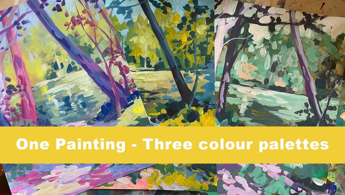
1. Introduction: Welcome to my class one reference for artworks. In this class we're going to be using one reference image to create four different artworks, all using the same colors and the same themes. This is to help you learn how to work in a series. So why should you create artwork in a series? And what even is a series? Well, if you create any collection of outpaces that have a common theme, this is cold working in a series. Many successful professional artists will work in the series. And there are many benefits to doing this. That might benefit working in a series will allow you to explore your subject in full. This means that you can create lots of different compositions. You can try out different colors. And yet everything that you're creating is still the same, same and the same subject matter. So you will learn how to paint or draw that subject metta really, really well. Your skills as an artist will increase because you are repeating the same steps over and over again with a subject matter that is now familiar with you. It will help you to learn how to focus and say an idea app through the end. And it's also going to provide you with a collection of artworks that are going to be sellable. At collectors like to say then the oddest is kept rule, reproducing an idea and a fame more than one wife. And so by creating a series, you provide them with many opportunities and many different versions of the same thing that they can purchase. In this class, I'll be using acrylic paint. However, you can use the ideas that I will be talking about, even any medium. It's really more about learning how to use one reference photo to create a series of different artworks that will look cohesive. And so anyone that in their journey towards being an artist can enjoy this lesson. Whether you're just starting off, you're already at the stage where you want to sell your work.
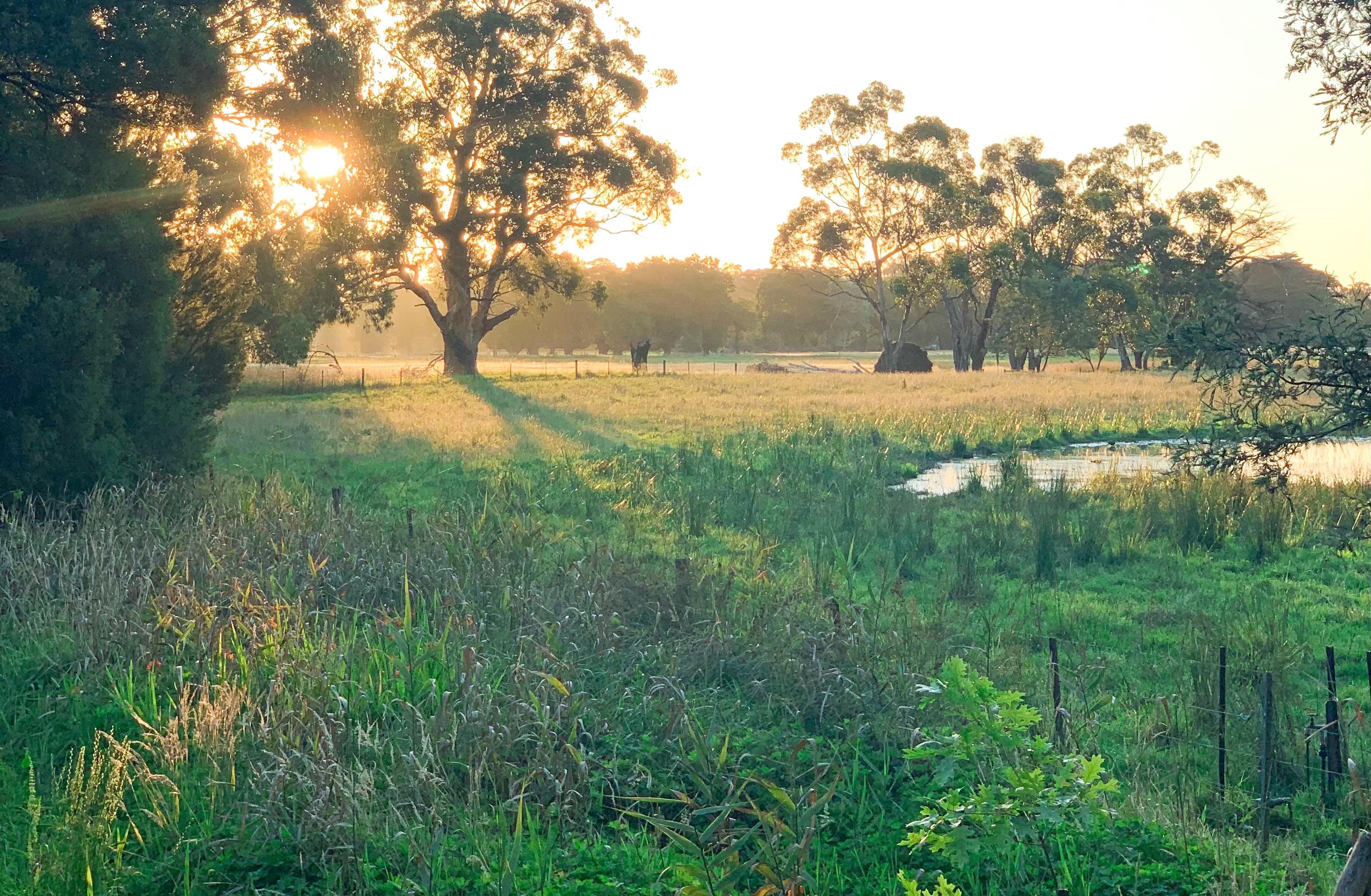
2. Composition: In this class I'm going to be taking you through the steps of creating a collection of artworks or based on the same reference image. This is an image that I took myself. I will put a copy of this photo in the description for you so you can use it as well, or feel free to use one of your own images. The reason I chose this particular image is that it does have quite a variety of elements in the image. And there's a lot of areas of interests that I can focus on. And sorry, it has a little variety and opera we get quantum compositions out of this one particular reference. However, you can use your own reference, just try and find something that has a lot of information in it. So the first thing you're going to want to do is create a little cardboard V Fonda. These are just some that pieces of card stock and just ruled they out in these two L shapes. And you can use these on your reference photo. Pick it up, probably designing on different areas that you think would be interesting as compositions. And by doing this, you will often explore things and foreign things that are a lot more interesting and that you didn't really notice to start with. So for example, even just this little area down here with all these greenery and the fence line. It looks a bit boring in the far die, but you can create quite an interesting artwork with this by changing up the colors, working out genome different details. So this can be made out of anything, scraps, Python, cardboard, this is just called stalk, and that you can print out your pitch up. This is just a glossy front of their principal, my home printer. You can also do this digitally obviously as well. So if you have a editing app on your phone or on your computer, you can crop it out and it had like that however, I like actually having at the reference photo that I'm using in front of me. Because I can see the whole thing for a start and I can sort of move things around a little bit easier when it's in front of me. And I also like having it printed out to paint from as well. Sorry, that's a personal choice. May some people prefer to have them digitally on? Don't mind printing them. Sorry. What we're gonna do, the first step we're gonna do is we're just going to spend a few minutes finding some areas of this composition that we find interesting. And we're just going to pick the sketch them out. So I've just got some skeptics, the pipa and simple pencil, and I'm gonna do some thumbnail sketches. Sorry, a thumbnail sketch is essentially just a really rough pencil sketch to block out the main areas of interest in your composition. So for example, we have aka really be trachea. We actually have another DACA tree over here in the background. And of course the lot is going to be coming through here. I really like how this shutter is coming down in here and shattered all through here. So you've got this really nice, interesting launch. And you can actually see some trees in the background very loudly as well. Okay, so that's one composition that we can do. I can actually work the sign composition, but I can make it landscape instead of portrait. So I buy every crop it like that. I can then sketch it again, but I can sketch it in a landscape format. And this member that it's got the same elements in it. It's going to end up looking like a different painting because you're approaching it from a slightly different angle. And it's got different things in there that's going to hold the interests to the viewer. So it's actually pan back a little bit further, but we still got this nice shutter slip off as trees in the background. And this really interesting big tree in the foreground here. I actually got a little doctors or the DHA, the fence line and on a panic. So that's another composition we could do it. I'm then going to bring this before and are that's the other side of this picture. Because this is little pond here that we can use as well in a totally different different artwork. So I'm actually one lens has the tree line up here. So again, I'm sketching out my little thumbnail. Very wonky thumbnails because I can't do straight lines. Okay, So God, there's a horizon paddock back here, is a tree line, shadow area back here as well. And then we do have these trees. And this really nice potent. It has lots of grass in front of it. So it's no longer grass in the foreground. So we can use that. At any obvious things that jumped out to me stride y, sorry, I'm now going to play around a little bit and have a look at some of the less obvious compositions that we could have in this landscape. I mean, we could focus more on the grass down here and just have unlocked this lot in the shadow. I still think that's quite interesting. But maybe we can focus a bit more on the grass that's down here. Because you can get a lot of texture and interest in color, variety in the grass. So maybe we'll just keep a little bit of that tree and focus a bit more Dan hands. So that could be another composition that we could work with. So we'll just thumb now back down just so that we remember. So in this one, the horizon for them fence lines actually much higher up blocking that tree. That's about here. The SRE still peeks into the shadows. And there's a rubber trees back here. Put that shutter that comes down into here. And all this grass. I'll just do a really rough for a rough interpretation of all the grass that's down here. And that will be a lot of interesting composition. I actually really like this one. And we can do the same thing over here with the with this fence and the pond. We could actually property and include this fence line and this voltage down here. So I might leave a little bit more of the train in this one that I was actually similar to the other one. Notice pitches similar. Maybe we'll go for landscape. Yeah, maybe we'll do it that way. That's a bit more interesting. Okay, so it's been more of a landscape vision of this one here. So we'll sketch that one-inch. Stick that in down here. Okay, so for this fun little pond, come there to be further here. And the horizon is here. Is quite a bit a grass happening. Then he does actually a fence that runs through. He going to just say it. And there's still all these trees back here that we can say. Another panic That's actually quite dark back there. There's really nice light coming in here. I really like that patch of light that's there. So that's another composition that we could do there. And you can keep going like honestly, you can make a collection of like 10, 20, even our x just based on a photo like these, for example. Dan here you could focus on just these grasses because pilots of bras that's heating from the sun, a really pretty, I'm really interesting. You can do just the trace of the light coming through the trees. You can do these shadowy area, you could do. And you know, you'd coffee in like superclusters and do just this tree with the shutter if you wanted as well. So you can see that by exploring just one photo, you can create a whole collection of different images. And they're all going to look really cohesive and they're going to work together as a collection because the bulk of the sine vise to them, they've all got the same reference that you're working from. So there's going to be snippets of different areas of the same image appearing in the artworks. Sorry, that means they're going to look really cohesive and really not ask, especially if you stick to the same color palette for the whole, whole piece as well. So, so yeah, I think I'm actually actually just click that little space down here. I want to feel every single inch of this piece of pipe boss or I'm not actually sketching this little, this little composition as well because I liked the fact that the tree is really dominant. So it actually comes up in here. And there's a lot, a lot in behind here as well, which I really like. So I'm going to sketch that in. And then there's the row of trees in the background, which are quite dark. It's runs along here like that. That looks like that looks like a callus on this note. It's actually just to think I am a piece of cloth or something that was on the fence. Sorry. You could make it a cab. You want to treat them? I'm just going to ignore it and pretend it's not there. I'm going to bring that shutter and make sure I get that shadow area down. And the fan sits alone. Here is some more shadows back there as well. Okay, sorry. Once you've spent a little bit of time exploring a reference in agent, blocking things out and doing some thumbnails. You, I'm not even a kind of narrow it down and think about which ones you want to then develop into paintings. And that's going to be our next stage.
3. Colour: So now I'm just going to briefly talk a little bit about color. Now the color palette that you choose to use in your artwork is totally up to you. The colors that I'm using here today are a little bit different to my normal color palettes. I'm, I tend to go for a bit more of an obvious primary color palette in these videos, you've watched my other video is you'll know that I usually go with silo blue, quinacridone, magenta, and cadmium yellow or a lemon yellow. I'm mixing it up a little bit today and I'm exploring some different colors because sometimes it gets me boring, Nice, and assign colors all the time. And also want to show you guys that you can explore different primary palettes and work with pellets that aren't as obvious as what that primary palate is. So I usually use, sorry, I'm at the colors that I'm using in this palette, I'm kind of working them out, narrowing them down at the moment. But I'm fairly sure I've chosen the ones I'm going to use. But this is how I tend to sort of go about finding and discovering the color palettes that I want to use and the colors that I choose for my artworks, I tend to pick a few colors that I think will go together. Nothing will mix nicely. And I do some mixing and some experimenting. So at the minute I'm sort of experimenting with yellow ARCA and viridian grain to sort of say what sort of grains the backend that create, because the reference I'm using is a very obviously green and, you know, yellowy, orange biased reference. My colors are going to be more grain, although I am going to be using some different shades and things and mix it up a little bit like I always do. I do want to have some nice greens. So I'm playing around with the different greens that I can make with these colors. But I think I'm, I think I'm going to keep the yellow Oregon, but I'm also, I'm wanting to use some of this Australian sienna. Sorry, the colors I've got, so I've got yellow, Orca, viridian green. These are bright golden colors. The other golden color that I had is alizarin crimson, which is this ready purple color here. I have some white, and I also have some Prussian blue, Australian sienna, and yellow hansa. So these are mutase colors. These a golden colors. However, all of these colors are available in all different brands on this, just the brands I'm using today. But you can yet you can mix and match and change around the brands that you use. But these are the colors that I'm choosing to use today. And you can see that the Australian sienna, which is a color that I've mentioned a few times and some other classes. And it's a mutase color. So it can sometimes be difficult to find this indifferent, different places, but it's essentially this is yellow ARCA, which I hope that you can see. I'm okay with that too much reflection. And this is a striking sienna. So I'll show you what the differences between these two. This is yellow or gotten this is Australian sienna. Sorry, if I hold that up at the closest to the camera, hopefully the colors of the shot would be that off. You can see that there's a subtle difference that the yellow, orange, the SRA and C and a has more orange in it. So it's, I think it's got a little bit of burnt sienna in it which makes it orange or maybe even a little bit more yellow. I'm not entirely sure, but they are caught clause, sorry if you only have yellow archive and you don't have the Australian sienna, that doesn't really matter. Most of the colors that you'll mix will be very similar. This just has a little bit more orange unit, so it has more of a pop and bit more vibrance to the colors. But if I mix the string in C and in with the viridian green, which I'm just going to do really quickly here. So the Australian sienna, a little bit of reading and grain and a little bit of white. Just to change the opacity. We get some really nice greens happening. Sorry, the other yellow as well as you can add some of the yellow lot handsome and as well to lighten up and make it a bit more fresh. But there's really nice grains that something happened with these, with these colors, these four in particular. Now in order to get our docs, I'm going to be using Prussian blue. And also I'm gonna be using alizarin crimson. Not using black because I never use black X, which you've seen my other videos you will learn. But if we added bit of Prussian blue into these mixture, We them on the using small amounts of pine hand. So it's a bit of a challenge, but we can get really dark, really super dark, grainy cut migraine times. And even with a little bit of the yellow ocher, just to dial it down and beat, we'll get some nice dark colors. And the Alizarin crimson is going to help give us a bit more of a purply time in some of the shadow areas because I don't want to be using all grainy. I want to have some purple shadow colors in there as well, just to make it a bit more interesting. So I buy a little bit Alizarin crimson to that blue mixture. You'll see we'll get a bit more of a bluish shade, can even add a bit of white to that. So you can see the shape a little bit better. Okay, we're gonna get some nice dark purple area people call is in there too. Sorry. This is going to be the colors that I'm using for this outlet, all these collection of how it works. I'm not going go into too much detail about color peeking and things like that because I feel like it's really important that you do that work on your arm. You need to experiment and you need to play around with your colors. I can tell you, Hey, use this color and that color and this color and that color. But you're not really going to learn anything by doing that, you need to use what colors that you have, and you need to spend some time mixing them yourself so that you become familiar with what you can do with your palette of colors. Sorry, I recommend, and I've said this at the start of all my videos. I do recommend spending a little bit of time playing around with the colors that you have chosen or you think you're going to use and see what you can make with them and what you can create. And the colors that I might. Before you begin. Sorry to recap. Because I think this, this part of the video a little bit all over the place. So I apologize for that. To recap. The majority of the colors that I'm going to be using in this collection is yellow ARCA, Australian sienna, viridian green, Alizarin crimson and Prussian blue, and a little bit of yellow, a lot Hansa, which is a lot of yellow. And of course walked, sorry. These two are essentially a very similar color. So I've got a blue, a red, and a yellow. And so then my primaries, I've got a couple of secondaries in there as well, but I'm using, Sorry. Say yes. So that's the colors I'm going be using for my collection of paintings. Feel free to use these colors as well or you can use your own colors. Yeah, that's, that's all I'm going to really say about color.
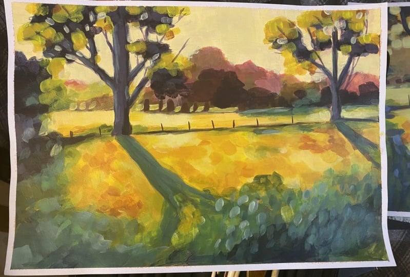
4. Painting 1 - Part A: So this is the first composition that I'm going to go. I really liked the lot that was coming behind this tree and the way that they raised a big patch of sun and then the shutter. So the first step is to just sketch in the basic composition. And I'm just gonna do this really loosely. It doesn't need to be perfect at this stage because we're going to be painting over the top of it. But I just want to get locked into the basic Lorentzian of way things are. I'm just sketching this in. We really watered-down paint and a flat brush. If you haven't already watched my other landscape painting class on Skillshare, then I would highly recommend that you watch that. First. Purely because I do go into more detail about how to actually put together landscape painting with this particular class. It doesn't really matter what subject it is that you're painting. In this example, I'm using a landscape photo because I am primarily a landscape. A landscape artist, however, you can use any reference photo you lock. It can be a still life, that could be a pit portrait. It can be it can be anything. Sorry. Yep. I'm going to be showing you how to paint landscapes, but I just wanted to say that you really don't need to be a landscape artist to use this technique a lot to make a series of artworks. You can, you can use anything you like for you. I'm the AMA landscape painter, sorry, I'm obviously choosing landscapes. That's what I'm going to be demonstrating. Sorry to get these basic sketch down. I'm just looking at the large shapes that I can see in the composition and just loosely blocking in those shapes. Sorry, obviously, there's a lot of trees in the background of what this tree in the foreground. I've indicated where the shutter for that tree is going to be with a fence line is. And I'm just putting in a really loose tonal wash on where the sort of shadowy areas are going to be. Now I'm just going to block in the base colors of the landscape. So these are called the local colors. So what if the color Eastern Bloc and see straight off the bat in my reference photo is what I'm going to paint benzene. It may not be the exact color, but it's a close value color range. So for example, this area in front of heat by sunlight and it's like this orangey yellow color. So I'm just blocking that in with an orangey yellow color. There is a bit of a lotta yellow color in the field behind. So on blocking that mean and some just going to go around the artwork, blocking in these local colors as a bit of an underpainting. Now I did forget to mention that at the beginning that I have actually put a colored ground onto these pipa. Hi, In fact, I don't think I even mentioned the fact that I'm painting on paper. I'm sorry. This is PIPA. This is Arches 300 GSM watercolor paper. I believe it's a hot press paper. And I have given it a coat of a sort of pale pink. It's actually a mixture of the alizarin crimson and titanium white. And I've just blocked that whole pipette with these tight and let it dry completely. And the reason I do this is because I don't want to paint on a white surface. And this layer of paint also helps to seal the pipe up. If you're painting with acrylic paint on PayPal, the acrylic paint for the first few layers will absorb into the paper really easily and you can end up using a lot of paint. So by putting down a layer of paint to start wave, it seals the pipe OS so that everything you put on top of that, it doesn't absorb quite as much. So I do apologize. I should've said that at the beginning of the video and I got to this odd tract. So our anyway, now I am looking in that the base colors, all the underpainting for desal work. Sorry, you can see that I've nested a built-in world, the yellow chartreuse. I'm now looking in where will the graininess. And an easy way of sort of working out where these colors, oh, where they think should be going is to look at your reference, float farther and squint your eyes. Sorry, squint. So that you're kind of looking through your lashes and that's going to make everything really blurry. It's also going to bring out the basic values of everything. So you're not gonna see any detail, you're just gonna see a lot and dock. And that's what you're kind of looking for. There is a lot and dark colors and that's what I'm blocking in now. This layout can be really rough and it does not need to be perfect at all because most of this is going to be painted our evolve with the subsequent layers of paint. But it's a really good place to start because once you get these base colors in the end, these local colors situated, it's really just a matter of layering extra values of those colors on top of the artwork. And sorry, the painting can come together quite quickly once you've got this rough ideas in the values don't need to be precise. The colors detonate the bazaars. It really is just a rough blocking. Once I have all these basic shapes and values in, I'm going to let this dry completely. I actually, I'm going to give it a blast with the hair dryer. And then we'll be able to move on to the next stage.
5. Painting 1- Part B: So now that this has completely dried, we're going to start working on building up the contrast because all the values that we've put on the in, that we put in there at the moment, There's Dymola, sorry, we're going to start increasing the lots in the docs. So the first thing that I'm going to do is start by blocking in the sky because that is the largest pot in these, in these reference image. So I'm just mixing up a really lot color. It's a mixture of the titanium white, a little bit of the Alizarin crimson, and a little bit of yellow just to make a warm, really piled warm color. Titanium white is actually a cool color. Sorry if you use that stripe on the sky, it can look really cool. That actually tends little bit bluish. Sorry, I'm just will make it out but with some of the warmer yellow and orange colors. But I still want the value to be quite large, or sorry, I'm not going in too Doc with those colors. And again, if you've watched some of my other videos, then you'll be familiar with this technique of negative painting. So I'm blocking in the sky and I'm leaving the areas of the trees in the background where I want the trees and I'm also going to paint around the branches in the trees in the foreground. Just as, sorry, the lot is sort of picking in-between these trees ends these areas. So again, I'm still being quite loose and expressive. I'm not worrying too much about detail of perfection. These, these artworks that I'm going to be doing it, I want them to be very loose. Sorry. I'm sort of forcing myself to not put in too much detail. And so that's also why I'm working quite quickly. Sorry. You can say here that I'm just blocking in the sky area in these color and I may end up coming and lightening up the speed and the more later on. But for now it's, the value is pretty close to what it easy in the reference image. And that's what I'm working from. Now. I'm going to start coming in and adding a bit more variation to the value in the backgrounds. So this had a rubber trees, it's in behind everything that the light's coming in from this corner. So on this side, the trees actually quite yellow and washed out and they get progressively 3D oranges occurs across. Sorry, I'm just trying to add a bit more interest. And this, this whole part of the painting is really just building up those levels of contrast. So once again, looking at your reference picture that you're using, squint your eyes while you're looking at and get a little bit more refined with where the lights and darks up. But still, I still recommend that you squint while you're looking. We're not looking at detail. Still at this stage. We're still just looking at shapes and lots and dogs and click it and trying to get the values in the painting a little bit closer to what they actually are in the reference image. But I'm not trying to get realism here. Sorry, my colors are a little bit more exaggerated and not perfect. But that's okay. I'm just trying to get a general feeling for it. So you can see that I'm coming in and adding in some, some lighter pinks and some more interesting colors in this background. Tree area. And just slowly working my way down the painting. Hey, what's going on in the Middle East is equal, right? If I look closely at the reference photo, there's a bit of a green poetic that sits in behind all these traits. And it's got a bit of a cool green color to it because it's in shadow. Sorry, That's what I'm putting in here. And I can also use some of this shutter color in the foreground to bring out the colors in the grasses in the foreground. Sorry, when I mix up a color and I use it in some way in the painting, I always make sure that I put it in more than one place, just so that it doesn't look out of place. However, because I am using it limited palette. All the colors are going to work together quite nicely. Once again, I have mentioned this in other videos, but I will mention it again. The reason why it's a really great idea to use a limited palette is because you live with less choices and all of the colors that you mix from the paints that you have chosen a going to work together nicely because they all have a little bit of each other in them. Sorry, That's why I'm working with a limited palette. Sorry. Now I'm just blocking in the dock of this tree. This tree that's in the foreground is actually quite dark. So I'm just making sure I get the contrast of that darkness in and blocking in just little squares of color to represent the bulk of the leaves. And adding a little bit of alizarin crimson into omega B, the purple color. Just to add a bit interesting to the tree trunk because I didn't want it to be just a block silhouette. I want to have a little bit of color in there. Sorry. I'm working on it. Most of the shadow areas are going to be cool colors and most of the suddenly areas are going to be warm colors. Sorry, the trays obviously in shadow, so I'm going to add a bit more purply blue time. Hi. As I get around the edges of the feathers in the field in the foreground. You'll notice that I am making my grain color a little bit more mass. So that just means I'm adding a little bit more yellow because the edges of the shadow a little bit warm. And then as that go into the shadow becomes cool. Sorry. That's again Omni, just squinting at my picture and picking that up as I look at my picture, I'm still not doing a Superman Monday towel at the moment. I'm making the brush strokes really loose and just paying attention to the values of the colors and also with the warm color or Coca-Cola, sorry, anything that's cool. Icon of keeping to the shadows and anything that's warm is going to go into where the sun is heating. And I'm just changing up the value of those colors to create a bit of interest. Sorry, for example, the p-adic that's in the back here. We've, I look at it more closely. It's actually a lot. The foreground. So I'm just, I'll use a little bit of that as patches in the foreground. To get stronger. Hello. Okay. To me. All right. Okay. I'm now going to stop. Sorry. I meant was thought is smaller brush. Sorry, this is just a smaller flat brush. But it'll ask me to have a little bit more control over the paint and what I put down. So I'm putting a little bit more interesting the trays. I'm adding a bit more of this purple color into the shadows. And I'm going to stop moving down into the field foreground area, where I'm going to add a bit more interests. We've variations, owes, different grain values and lights and darks just to make it look like at say, a rough field of flowers. Hi. Hi. Okay. Okay. All right. Right. Hi. Okay. Good to know. All right. The last session. Okay. All right. The video actually washes out the colors quite a lot. Sorry. I will show you a picture of what the artworks look like once it's finished and dry and photograph properly. Because yet that the light that I have to use to film this is quite bright. Otherwise, my room is too dark to filming, but it doesn't wash out the color APHAB it so say yet, I have to pull it up for that. But this is sort of what looks like at the end and this is how it came out to, sorry, I'm quite happy with this first one. And I'm going to move on to the next painting now. Disaster.
6. Painting 2 - Part A: So this is painting number two, which I'm starting now. And I do have to apologize if you can hear brain or we'd sounds because it's just started raining here and I have a tin roof, sorry, the writing can get really loud when it's heavy. And it's so much I can talk about that. Sorry for this one. I wanted to focus a bit more on the foreground area of this Florida. I still wanted to include the light and the tree because I really liked the shadows and the M lot coming through and I felt like that kind of data to be kept in, to keep it interesting. But I wanted to focus a little bit more on the grasses down in that lower corner. Some studying this one in the same way that I started the other one. And I'm using exactly the same color palette. So I'm just going to be loosely sketching in the basic lines of where everything is. And I'm going to be going through exactly the same process. And this is why painting in a series like this is so beneficial because I've already gone through the process of painting this landscape. Already know what cold mixes I'm going to make and where to put them. And so I can come into this second painting with a lot more confidence and a lot more freedom. And I can sort of put things in slightly different places and emphasize things sludge in the first painting. Because I'm revisiting the same subject matter. Sorry, that means that I can Experimental bit more with the colors. So maybe add a bit more of the warm thin layer or bit more coolness and play around with a little bit more. But I met Jim Lee starting in the same way there. But working in this series and this is going to work. It doesn't matter what your painting, you can get older. We are using one reference photo for this particular project. You can just have the same subject and you take lots of different photos of the same thing. So for example, if you wanted to focus on more Still Life top of series, that you can just take the same still live arrangement and further graphic from a bunch of different angles. So you still painting the same subject in lots of different ways. It's just not one reference photo. The reason I'm using one photo for this example is because this particular Ferrari just happens to have a lot of information in it. But if you're, for example, wanting to focus on a painting that a series of portraits, you can just take a series of different portraits of the same person. Or you can take a series of different features of the same flower, or it doesn't really matter. The point is that you want to explore your same subject over and over and over, because that's where you're going to find the benefits. So you can see that I've blocked in the background area. So the same as the first painting. I am squint my eyes. I'm having a look at the reference image and working out the base values of where things are. And so the background trees in this competition are a lot sort of larger and more of an impact. Sorry, I'm adding in that the values of those trains again, this is just an estimate of the value to start with. Just not going to get it perfect right off the bat. This is just to get started. And I'm going to work my way down blocking in those undertones and the local colors underneath everything. When I say a local color, I'm referring to the basic color of that area. For example, the shadows are a bluish color. The lot is an orange's color. The grass is green color. So I'm just blocking in those local colleagues and getting a feel for the values in the painting. Okay. Thank you. Okay. Okay. Okay. So with this foreground area at this time, I really wanted to create an expressive, really a lot of movement in this area with that grass. I wanted it to be really rough and full-load, pretty brush strokes. So you can say that I'm blocking, getting quite rough. And as I do more Malala's, I will move down to a slightly smaller brush and do some more detail. But To start with, I really wanted to get a lot of texture in this area. Once I've let it dry, I can then come in. Step 3, find the values. Sorry, I missed the first time. This is just a little bit. So I saw at the areas in the reference photo focusing a little bit more on what they're closer values and colors. This is actually a bit of a challenge, this one, because this area in the background is actually quite hazy. And so I kind of struggled a little bit getting that hazy look because yeah, it's sort of have that luxury of fully sort of look to it. And sorry, I start making a little bit to the value was wrong to start with. And sorry, I had to play around with that a little bit, but that's just part of the process of painting. Sometimes you got to play around with different values, but once those base values are in, you can spin a little bit more time on this second pass, so to speak, to make the values of the colors a little bit more correct. But it doesn't have to be perfect, especially when you're just learning. Just get, it's more important that you get the values correct rather than the colors. Because it's the value that's going to give you the distance and the feelings of the painting and get that three-dimensional look to it. Sorry. When I'm teaching that landscape painting to begin is the one thing that I see. A lot of people have the most problem with it. He's judging the rod value. So sometimes it can be easier if you have a digital image that you're working from, you can use a painting program when you're firing too. Actually select pixels within the image, and then you can look at the value in their color range. Block that. And otherwise you'd do it if you just have a photograph that you're working from is to get a hole punch and punch a hole into some cod and put that that whole It's hard to explain, but put that hole over the area of the photo that you can't quite work out what the value of iz and compare it to another area. And so because you're oscillating just a small part of the image at little bit ESEA to judge the value and to look at the value. So you can then move that little hole or banjo pizza and see how the value changes from lot to dock. And that can sometimes make it a bit easier for you to judge it. But it really does take practice. You know, you need to just practice looking and judging and I don't get it right first time off the bat very rarely. So usually have to go back and forth quite a bit to get those things right. But that's just the beauty of painting. But you can say here that I met adding a lot more red and more vibrant CSU, those trees in the background. And adding a bit more variety to the tones and things just to make it a bit more interesting. And up move dental slightly smaller brush as well. You will notice that I haven't really spoken much about brushes because again, the brushes are going to still change depending on what you're painting. If you're painting along the, in the same way that I am though, you'll notice I'm using mostly flat brushes aside that with a bad a 1.5 inch flat brush and dis-ease, I half an inch flat brush, and then I go down to a slightly smaller one. Generally speaking, I have a pint with flat brushes. These are just soft acrylic brushes are really lock the way that they feel. They're not expensive brushes, they just cheap craft shop brushes. I don't really use expensive brushes yet, but I do prefer the soft pursued acrylic brushes compared to the HOD, sort of hold hematocrit. But I think they really work that well for acrylic painting. Down softer brushes are a lot. But for this style of painting, I also decided to bring a little bit at the sky into the top of this painting, even though a typically in the reference image, the trees is still covering that area. And you can't really say much SQL-like. I felt like it needed a little bit of locked up there. It was a little bit too dark. So I have used a little bit of artistic license and added a bit of them. Sort of breakthrough lushness on top of the trees there. Because, you know, as usual, although I am looking from this reference, it's still just a guide. I don't need to copy it exactly. It's just a starting point. And so I have sort of also did a little bit because you're creating a painting, you'll not. Creating a photograph will represent replicating the photograph. Sorry, you are allowed to change things and move things around if it doesn't suit composition that you've picked out. All right. And so on. All right. Okay. Okay, welcome back. All right. So why? So Logic Apps. Right. There you go. And why? This is hi. Right.
7. Painting 2, 3 and 4: Okay. Hi. All right. Hello. Okay. And why? Right. Hi. Okay. The philosophy, I know that the cameras reflecting overshoots that a lot is reflecting a little bit off the bottom of the painting. So it's a bit hard to say, but I'm just adding in extra details and building up the layers of color in this area. Because as I said earlier, I want this area to have a little interesting little movement in it. So I just want multiple sharks and mocks. Inhale. Hello. Okay. I have to stop filming basis. Otherwise this Skillshare class will end up going forever because there's like mere hours of footage of me painting. So I spent these ones out, but essentially I'm following you get exactly the same steps as what I did for the first two paintings. Blocking in the base colors, letting it dry, coming in with more details. And that's Abadi it sorry. With these two compositions are kinda went full one. Again, more of the grassy area and the shadow, the shadow side of the Ferrari, which is this one here. And I'm not sure if I'm as happy with this one as the others. But again, you gotta try all different types of compositions and things defined. The one that you like and ones that aren't. And that's the good thing about doing so many of these and using the same reference is used sort of sought workout. What's going to work and what's not going to work. And if you end up doing more than just full paintings, you'll have a whole collection of artworks that you get to pick and choose at all which ones you like and which ones you want to show and which ones you just want chuck into B and then, sorry, I'm not saying I want to check any of these in the beam, but you know what I mean? Like, they don't all have to be fantastic artworks that still we still serving a purpose. I did really like the way that the lot heats up of the grasses in this sought of the composition, which is why I chose it for this particular painting. And, and how you can still see some of the lot and the trees in the background. Sorry, this was painting number three and then I moved on to painting them before. And this one did cut off the bottom. I didn't really angle my camera very well. But luckily others, I fled cent versus I just blocked in that the base colors and worked my way up from there. This is composition was based on the little potent area that I didn't actually put in the first two compositions. That whole other side of this photograph has like little Poland in it. So I did include the pond in this one because I had really no S lock reflecting out of it. So I've put down on the base colors and let it dry. And then I came back in and adjusted value use and added in some details. And I really liked this one. I think this one came out really nice. I liked the difference between the highlight of the grass in the mid ground and the darkness and all the detail that I put into the grass in the foreground. Sorry. Yeah, I was really happy with these. So out of these outputs, I was actually quite happy with the series. And I hope that you guys found this interesting to watch. And I would recommend that you have a garden that you can use. The reference photo that I have provided, that's totally fine. Or you can fund your own reference photo that's up to you. But you can use the colors that I've used or you can use your own colors as well. And have a bit of a play around. And I'd really love to see the results. So make sure you put the results into the description of sorry, the M discussion section of this class. And so everyone can sort of see everything. And yes, the final shot. So I'm going to show you the finished artworks. Sorry. You can have a bit of a closer look at them. And yeah, I really hope that you got something out of this. And I hope that this encourages you to push yourself a little bit further to try and create a little series of artworks based on. I will see you all again in my next class.
 Clair Bremner, Professional Artist