Transcripts
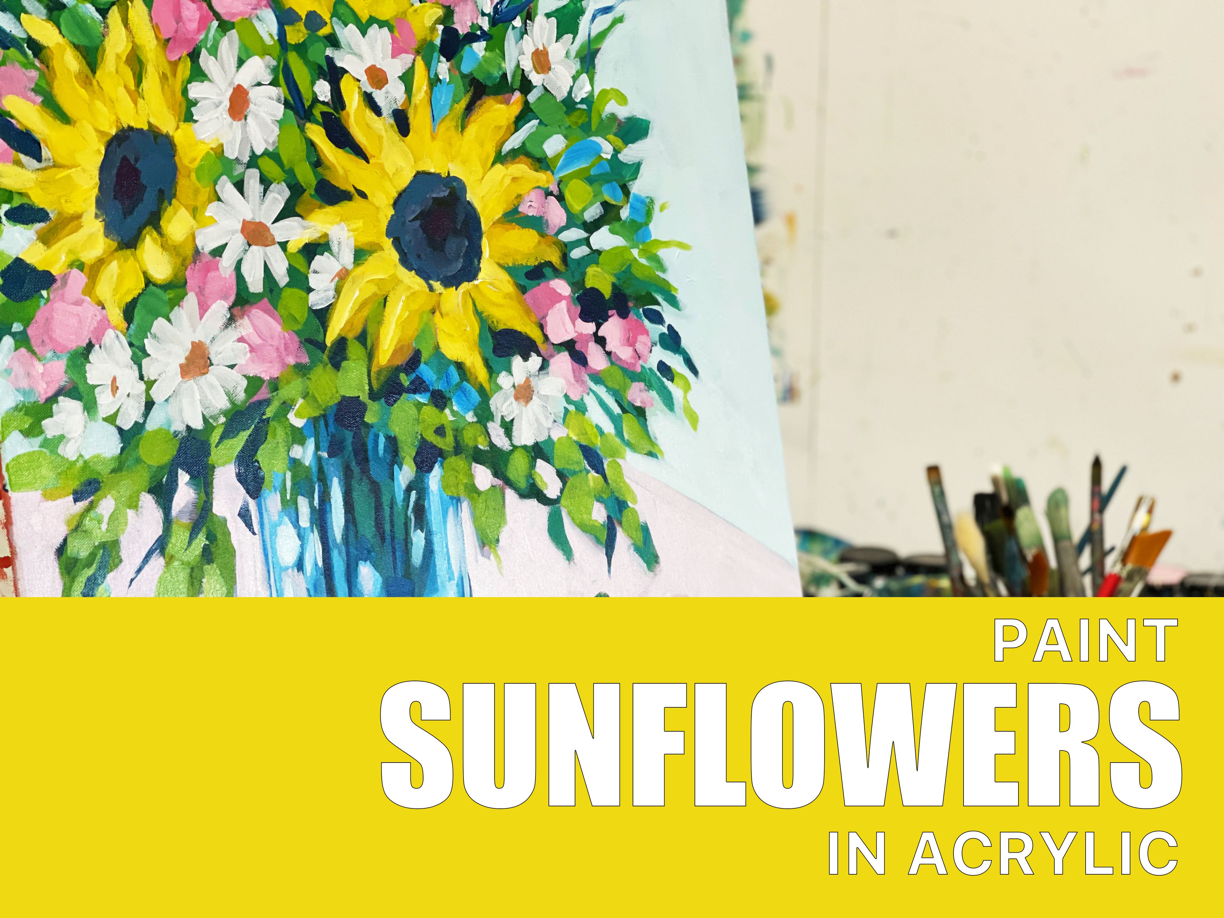
1. Intro: In this class, we're going to be discussing using different color palettes to create variety and interesting color mixes in your artworks. We're going to be focusing on three main color palettes. We have a cool primary palate, a warm primary palette. And I'm also going to experiment with some secondary colors. Now I'm going to paint essentially the same painting three times our eval, using these different individual color palettes just to show you the difference that colors can make. And try and open your eyes a little bit to the choices you have when it comes to color mixing. So for the first painting, we're going to be using a cool primary palette, which is this one here, a one prime and pellet. And then finally, we're going to be using a secondary, primary palette. If you want some more information and a really good guide to mixing colors and playing with colors are highly recommend. This book called confident color by nato Leland. This book has everything that you need to know about color mixing. It is a really comprehensive book. It covers all media. Doesn't matter whether you're painting with watercolor, acrylics oils, the rules of color are pretty much the same, and this covers the basics and it also delve a bit deeper into more difficult stuff. It also gives you some color recipes and some suggestions on color palettes to use. And I really liked this guide and I've used it myself quite a lot. So if you want a lot more information than what I'm going to give you in this class. I highly recommend picking up this book. And yeah, anyway, onto the classes.
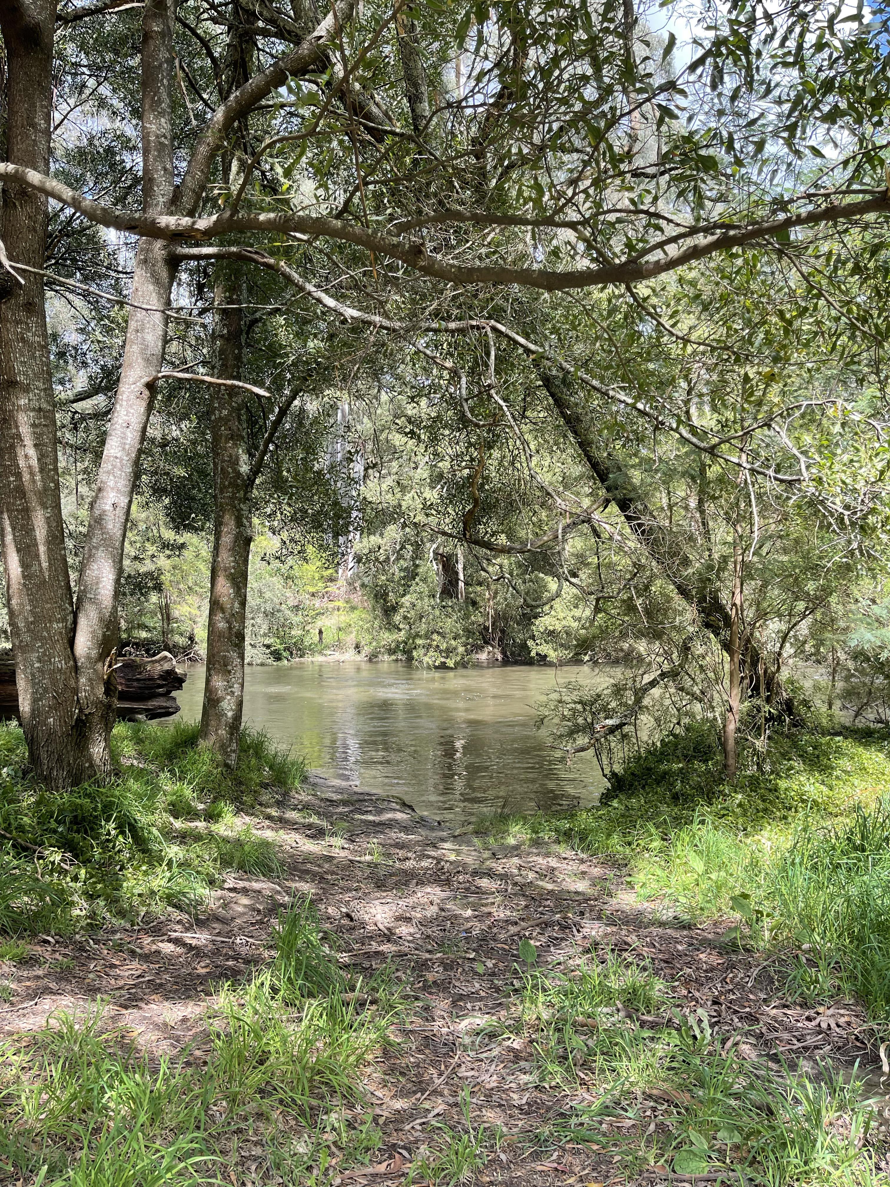
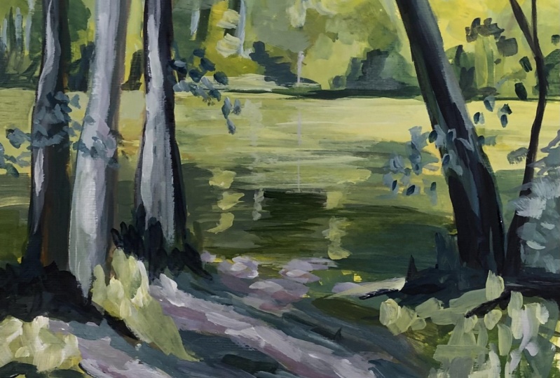
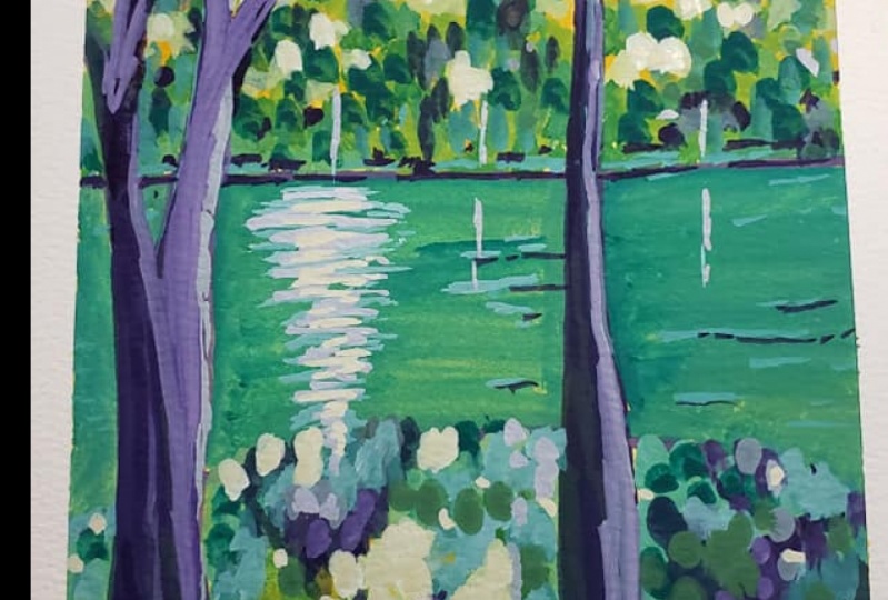
2. Cool: Sorry, the first colors that we're going to be working with these, the cool primary triad palette. So this is made up of a red, yellow, and blue that full ol into the cool side of the spectrum. So cool reds, such as magenta tend to fall more towards purple. Cool yellows, such as this yellow light hansa, tend to have a bit more of a green tone to them. And cool blues, again, like Ultramarine Blue, tend to have a little bit more people turn to them. Sorry, that's what puts them into these cool spectrum of colors. But even within these cool spectrum, there is still cool and warm colors, which is why color mixing can be confusing. For example, the red and the yellow are very much warmer colors in the spectrum, while the blue, the ultramarine blue, is the cool side of it when, when combine these three colors. But at the moment we're talking about the temperature of these colors in the overall spectrum and the temperature of each of these colors foals more onto the cool side. So I find that generally when you paint with these cool Uttarakhand colors, you tend to get quite vibrant colors. Specifically quiet, vibrant purples. Purples can be found really easily in this cool spectrum. So you'll notice that out of the three paintings that I do, the spline that will be the most vibrant and it will be the, have the most purples and pinks in it. So all I'm going to be doing it ease that painting exactly the same that painting or was close to the same painting as I can using the same reference. And painting with these three different color palettes. Sorry, I'm just sketching in the color. Sorry, they are the rough composition where everything's gone to guard. And you can see that I have given my paper a wash all the ys this mid-January color. That's because I always like to work on a surface that has a bit of advice card on it. I'm painting on that watercolor paper. This is 300 GSM Arches watercolor paper. And it's a hot press paper, so it's quite smooth. And I didn't mention it because I can't have expected it to be obvious. But along with these three colors, I am obviously adding water to these colors as well. So I have the three colorism watt. But essentially the three protocols are the only sort of hues that I'll be using. The white is just to use to change the values of the colors from light to dark. So the first step in these little sketches is just going to be blocking in that the base colors, sorry, the base colors are just the colors that you'd find underneath all the details. Sorry. For example, the sky I'm putting in a bit of a light blue. The trays will be in grains, the shadows would be and purples. And by blocking in all of these things off early, I can get a good idea of depth. I can also establish way all of my landmarks are going to be quite quickly and simply. And that leaves me room to then add details and contrast and expression on top. Sorry, if you have watched many of my other Skillshare classes or classes online, you'll notice that our fellow, a very simple, simple, and very similar principle. Every time I paint, I always lie down these bass carts and then I go on top with various layers. Sorry, the first step is just adding in these base under painting sort of lions. And then I'm going to go into details. So let's talk a little bit now about color harmony in general and why it's a good idea to limit your palate and limit your choices when you are creating an artwork. So when you are reducing your palette to two to three colors, you're going to create color harmony, pretty much guaranteed in your artworks, because any color that you mix from the three that you choose are going to work together because they have the same undertones, they have the same sort of variations and it just works so much better. And it really takes a little bit guesswork out of creating paintings that look nice and that have harmonious colors. Because you can't really make a bad decision when you're working with a limited palette like this. Most of the color palette, so I'm working today, all the three color palettes that I'm working on tend to have high, high intensity color pallets, which means that they are, the colors that I'm using are quite highly saturated. However, you can use any combination of three basic primary colors to create a triad of colors, sorry, even if you wanting more lower intensity colors, if you still live. Choose a basic red, yellow, and blue. You can create a harmonious palette. But I low-intensity, harmonious pallet would be something like, if you'll read, would be like an Indian red, yellow or yellow, more yellow and cool blue, say a cerulean blue, for example, then all of your colors are going to be a little bit more muted and a little bit lower in intensity. And that will still work together really nicely. So the color palettes that I've used at the moment, this cool palate and the warm pallet and the secondary palate, they're all quite high intensity palettes because I prefer to work with really high intensity colors. The color palette that I use for most of my paintings tends to fall into the cool palette. However, I do tend to use more phthalo blue instead of ultramarine in this cool palette, I've chosen ultramarine because it's a cool blue. However, when I'm using my palettes attained to use phthalo blue as my blue, which is technically a warm-blooded because I locked the reach of grains that you get with that phthalo blue. So the more you paint, the more you kind of work out which colors work for you and which colors you prefer to use more often. But it really takes a lot of experimentation and a lot of trial and error. However, the biggest tip that I can give you is to really just choose Tool three colors to work with at a time. Mix them in all different combinations that you can mix the main experiment, play around with what you can do with those colors, and then decide whether you like it or you don't lock it. A lot of being an artist is trial and error. Sorry. Hopefully by demonstrating these three pallets to you, I can take a little bit of that trial and error at the why, because you'll be able to look at threes, three paintings at the end and think to yourself, RK, I obviously love the look of cool colors or I locked the local, the warm colors a bit more and sorrow. All right, You can, they emit, jump off from there and start experimenting with cool colors and warm colors. And of course, you can mix the woman cool together as well. Sorry, you can make a color palette of red, blue, and yellow that contains a mixture of warms and blue colors. Sorry, woman, cool colors. I am just trying to limit this down to the bare minimum because otherwise this video and this class would go for either 24 hours. And even then I wouldn't cover everything. Sorry. I'm just trying to loa, loa loa the restricts the amount of colors that are in these choices just to give you an idea and a bit of a taste. But it will be up to you guys to sort of go out and explore a bit more with colors. Once you've decided what you, what you lean more towards. Now as I block in the colors to this little study, the way that I'm choosing which colors to use for which area is the value, the actual collab. Sorry, I'm making sure that most of the colors that are in those background trees are quite bright because that is where the sun is hitting them. And as we come closer in, a lot of the area under the trace is going to be in shadow. So as I come further down the page, I'm going to start moving into more purple tones and some more shadowy colors to sort of have the idea, I will show the idea that there is shadow under here. But at the moment I'm still booking in an underpainting. And as you can see that the ultramarine blue, it creates a really great kind of feeling in these grains. The reason why I tend to use fallow blue more often in my traditional palettes and things that I paint with is because they lived really doesn't have that gray tone to it. Instead, you get a little bit more of a vibrant blue. Ultramarine blue is a very traditional blue. And so a lot of the old masters used the ultramarine blue as their main loop. And so it tends to tip a little bit more towards realism colors. Whereas I don't usually paint in those colors as much. But you can say that it does have a little more of a gray tone to it. But once you mix it in with the magenta, it creates really, really beautiful purple colors which are going to be used in the shadow area. So as I was saying in regards to which colors I choose to use and where to put them on cognitive looking. Obviously, I'm not going for an ultra realistic look here with these colors, but I'd still looking at the values, sorry, I'm mixing up a darker color for the dark areas. And logical is that a lot areas, the yellow color palette is still a warm color. Colors tend to jump out and cool colors recede. But I want that warped to show in the background area because that's where the sun is hitting the trees. And also with a sun these heating the, the Grosse a little bit here and there and patches. I can use that warm yellow to really bring out that sunlight and create a bit of an emphasis on that sunlight and the sun patches. And yes, sorry, I'm just looking at values. I'm looking at where is the dockworkers the lot. A really, an easy way of it sort of helping you to see values of the Beta without worrying too much about the color. Is the other tenure reference card or a black and white, sorry that YOU removal of the color. You can also squint your eyes while looking at the reference image. That's going to block out all of the detail and it's going to show you the values. So where the dark areas and the light areas, instead of focusing so much on the different colors that you can say. But I'm really, this is just a small study, so I'm really not going to worry too much about details. I just want to get an impression of the scene down onto the pipa as closely as I can to what's in the reference without spending too much time doing it. So this, this whole painting that, and are each of these paintings really only took me no more than half in Iowa because it's just a quick study. And yeah, I I'm going to just sort of probably don't really talk that much through these. I mean, that's pretty self-explanatory what I'm doing. So you can just watch along and if I see something that I think I need to mention, you know, what I'm doing that I will. Otherwise, you can just sit back and enjoy what chain that is painting experience. And yeah, I will introduce the next video. In the next video is ready. Now for a little while. Yeah. What time is it? Hello. So this is the finished cool study. Using the cool colors I really like how that warm yellow in the background on the trees and the opposite bank really lifts the painting and all the nice cool purple colors that form the shadows in the foreground. And so now it's time to paint the same painting again using a different color palette. So this time we're gonna move on to a warm color palette.
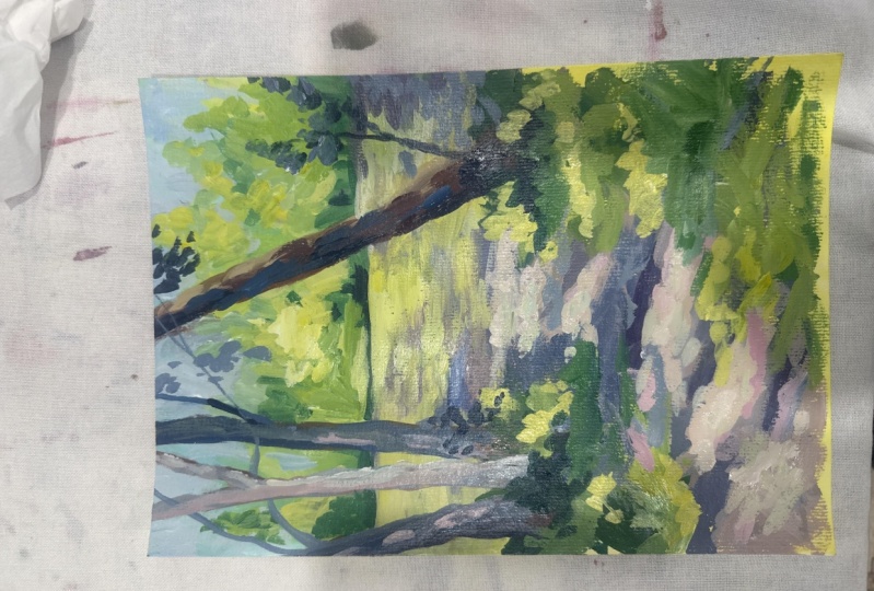
3. Warm: This time I'm going to be using the same reference photo to create the same painting. However, I'll be using a warm primary pellet instead. So we have a NetFlow crimson as our red, crimson tends more towards orange tones, which makes it a warm red, we have cadmium yellow, which also moves more towards orange tones, which makes it warm. And we have phthalo blue, which moves more towards the green tone, which has more yellow in it, which makes it warm. So these are three warm toned colors. And you will notice that the main difference you will find with this color palette is that the purples are not as vibrant and not as rich. And the reason for that is because of the red. Red has a lot to do with purple. Now I will apologize firstly, because this missing footage, I don't know what happened. He bought for some reason the first part of this painting. It's totally disappeared. So I'm picking up after I've already done the base layers. So just like the previous painting, I've just gone through an adenine, a base layer of all the colors that are in the artwork. And I'm now going to start building up the contrast and the depth. Sorry, I'm really sorry that this part is missing, but I don't know what happened. Anyway. As I was saying before, the main difference between this palette and the previous palette is that this one is not going to give you a really nice rich purples because the rate has too much orange unit. Orange is the opposite of purple sari because that red has too much orange in it. As soon as you mix that with the blue, you're going to get some really dark brown tones instead of purple tones. And so for that reason this painting that generally tends out to be a lot more grain. And instead of using purple shadows, attendees, more blue tones, shadows. And so that affects the overall look of the artwork. It actually, it does make the colors a little bit more realistic because the cool palette that we use previously has a lot more purples and vibrant colors in it. This one has a lot more natural tones, so the grains come at much more grain. The shadows come out a little more blue and there isn't that whimsical, pinky, purple warmness to it. So that's the main difference between these two color palettes. So again, I'm just going to let you guys watch me paint. The reference photo is up on the screen and I'm again, I'm using a titanium white as my watch to change the values of the colors. And I will let talk to you again at the end. So you can see that I am finishing up the sketch now. And as I mentioned at the beginning, you can see that the main difference between this pellet and the pellet is that these colors are a lot more realistic tonight job. And sorry, like the shadows have more blue tones in it. There isn't that is highly saturated, purpley red tones because the red just doesn't really have that much saturation in it in regards to those purple tones. So instead you left with that more muted grays and quite vibrant greens because the phthalo blue and the yellow create really vibrant greens. But the red really doesn't create that vibrant purple column.
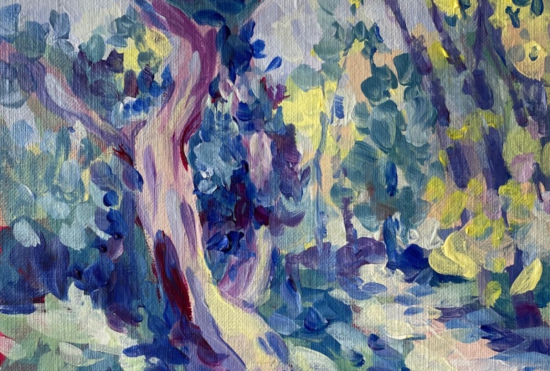
4. Secondary: Sorry, this is the final color palette stop you but humans today and this is a secondary, primary palate. So primary colors are the, when thinking about the color wheel, you've got red, blue, and yellow secondary colors of made up of those primary colors. So obviously, red and blue mixed together make purple, green and books are yellow and blue make green, and then yellow and red make orange. Sorry, this color palette is made up of those secondary colors, orange, green, and violet. These very extreme versions of these colors, obviously it's a very bright orange. I brought people and abroad grain. But you can use any sort of secondary color. So for example, I could have used a brown, say burnt sienna. I could have used more of a dioxazine purple, and I could have used a 3D in green for example. So this is just a basic example of the secondary colors. You can also say use a lot of different versions, which is why I haven't really mentioned the specific color names. I've just saved green, purple, and orange. These are actually golden. So flat Matte paints because I don't really have these colors in any other paints. These came in like a collection. Sorry. They just happened to be the colors that I needed, but I don't have these imitates because I really don't use these very often. But I did want to do a secondary color palette just to show you something that's a little bit outside the square, sorry, something that is not your typical red, blue, and yellow. And because this isn't something unknown we paint with, I did struggle a little bit with it, but in the end, I did like the result that I had. That with these colors, you are going to get a lot more gray horns and a lot more muted colors. They're not going to be as saturated and as vibrant. What that would be mixing the pure primary colors. There are a lot more. Yeah, just desaturated really. And so I went about this in the same way as the other two paintings. I am just sketching it in and then I block in the base colors and then I come in. We've more details and some more vibrant, vibrant, some different values on top. So, so yes, Sorry. Just sit back and watch this one and you'll see the results at the end and at the very end of this video, you will also see, I'll compare all three paintings next to each other so you can see what they all look like next to each other and had different viola? Yes. So he can see the final painting with the secondary palate. So obviously I didn't really use much of that orange attention. Use that to mix up different grains instead of using its strike because it was quite harsh. But you do get the idea that these colors are going to give you a lot more of a muted palette because they're the combinations of the primaries and sorrow. They're not going to be as vibrant. So you can see here are the three paintings that I did laid out next to each other. We have the call of the warm and the secondary. So you can say the main difference between the cool palate and the warm pallet is obviously there's intense pinks and purples. You just can't get that with these warm colors are because of the red. It's not going to allow you to have that purple. And the obviously the secondary palate is again, a lot more muted and desaturated to all three of these pallets. So that's the main difference that you can say. And I really hope that you found this interesting and helpful. And I would be really interested to see you guys experiment with some different colors, like not necessarily the color choices that I've made, but different primary color combinations. Just apply an explorer because that's what art is as playing and exploring. And I hope you enjoyed this and I will see you in my next class.
 Clair Bremner, Professional Artist