Transcripts
1. Introduction: Hi. Welcome to my class
Loose landscapes in acrylic. My name is Clare and I'm a professional artist
based in Melbourne. In this class, I'll be taking
you through the steps of creating an impressionist,
vibrant landscape painting. I'll be taking you
through the process of selecting your
reference photo, talking a little bit about color choices and color mixing. I will also then
take you through the step by step process of building up the painting
from the bottom to the top. This will involve lots of
layers and lots of talk about color mixing and working out
distance in your paintings. I hope that This is accessible to a lot of
different levels of painters. Ideally, you would like to have a little bit
of experience with acrylic painting
before you tackle this out of all of
my classes so far, this is probably going to
be the most challenging. But I think that it will be a lot of fun and I hope
that you enjoy it. If you don't have a lot of
experience with acrylic paint, I recommend that you go back to my profile and have a look at some of the
other videos that I've already put up on using acrylic paint before
you tackle this one. But if you've already
watched those, then I think you'll be
ready to dive straight in, and I hope that you have fun.
2. Composition: In today's class,
we're going to be creating a landscape painting, and I'm going to be using
photos as reference. But there's a couple of
things that I wanted to talk about in regards to using photos as a reference for landscapes before we
get too far into it. The first thing you need
to remember is that you should be using these
references as a guide only. You don't need to copy
everything that's in the photo. It's not meant to be a
exact representation. I use photo references
as starting points and the basic guides to the direction that
I want to go in, I sometimes refer back to them
when I'm painting just to see details and elements that I want to include
in my artwork. But generally speaking, once I reach the stage of painting, I don't really refer back
to my reference too much. Now, you want to think about the composition that
you're wanting to get when you're looking at
reference photos as well. And because for photos, obviously because
they're photographs, they can be incredibly detailed and you really don't want to focus too much on the detail. What you're wanting is you're looking for
something that has nice nice dimension,
for example, this one here, it has
lots of brights and darks and the composition
can be manipulated. For example, you can add
less trees back here or emphasize the brightness that's coming
through these trees. You can play around with it
a bit, that's a good one, whereas, come back
to this one here, for example, there's really
not a lot happening in this. The light is fairly flat. It's really boring. Obviously, there's detail
that you can bring out in the foreground and you could play around with
this a little bit. But as far as depth goes or
interest and composition, it's really not as
interesting as this one, you can see that when you
compare them side by side. You need to look at
your photographs with an objective mind and try and keep in mind
that you're wanting to find inspiration
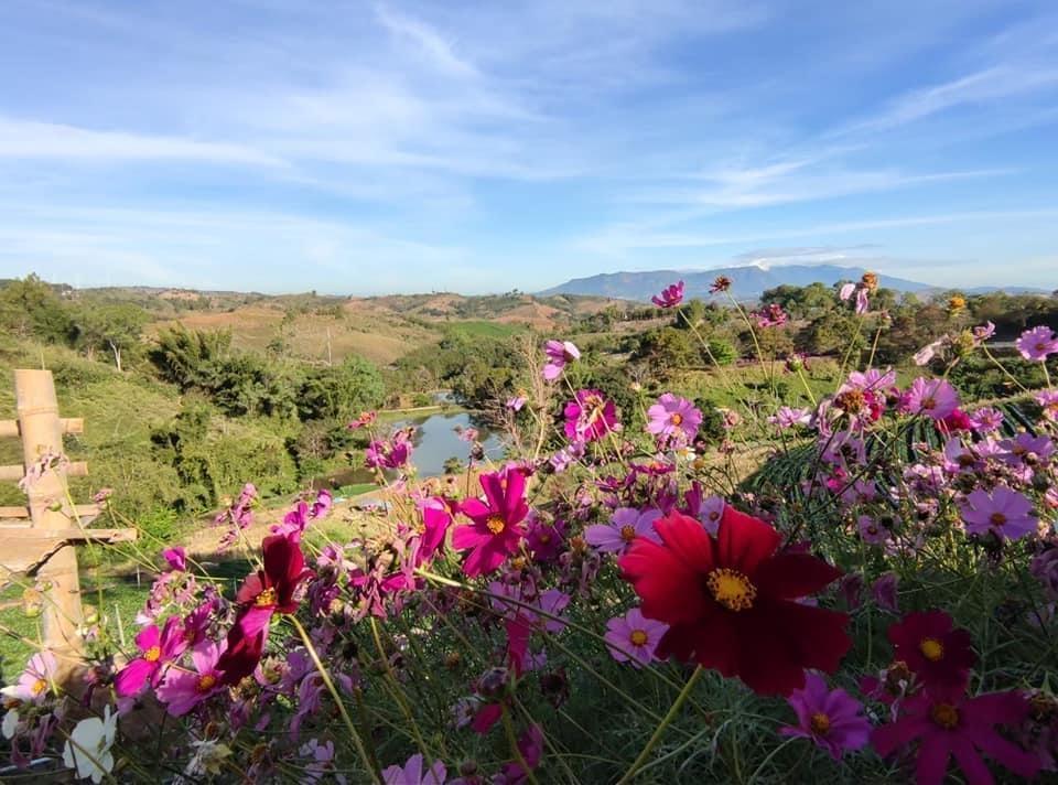
for a composition. Today, I want to do
more of a landscape. These ones while I This one here is really nice. I
also really like this one. I think it has lovely
light coming through and you've got the
vertical trees and then you've got the
shadows and the pathway. It's a really nice
composition in itself. But today, I'm looking
for more a bit more of a landscape with
some distance in it. This doesn't have much distance. I'm narrowing it down
to these two here. I really like the pond that's
in the foreground here, the light that's
in the background. However, it still doesn't
have quite enough distance. I'm wanting to teach
you guys how to paint things further away and capture the whole landscape. This one, if there was mountains and things back
here, which again, you could add in, but
I'm not going to. I think I'm actually going to fall on this one
because I really like the fact that there is
a lot of distance in this, you can see the hills
all the way back here. Then there's more hills here
and it slowly comes forward. There's a bit of a
lake and it's got these beautiful flowers
in the foreground, which I think would be
a really lovely touch and add a bit more color
to the actual painting. I think that we're going to use this one as today's reference. I'll get these out of the way. I'll just talk about this
reference a little bit. This reference came from a Facebook group that I'm part of. It's a group that they share reference photos for artists, purely for artists to
use as reference photos. If on Facebook, you can just search up
groups that are near you or there's
groups even that are international that willingly
share photographs, that they are happy
for artists to use as reference photos. You don't necessarily have to give credit or
anything like that. It's just a sharing platform. Uh, you can also find really
great reference photos on some copyright free
websites such as unsplash.com and Picks Bay. There's lots of places you can
get reference photos from. Generally speaking, because I'm not going to be copying
this photo exactly, I don't need to worry too much about breaching copyrights
and things like that. But I do always make sure that I am using a photo
that's not my own. Okay. This photo,
most of these photos here are actually photos I've
taken, but this one's not. I'm using photos
that's not my own, I do make sure that
those photos you have general permission from the photographer to
use it as a reference. Anyway, A couple of things
you need to keep in mind. As I mentioned already, we don't want to
copy this exactly. This is just a starting point and it's to be used as a guide. You can also manipulate your reference photo in
regards to where you put things and you can remove elements, change
elements, simplify. In order to do that, we're
going to be creating some thumbnail sketches using this reference as
our starting point. The first thing that
I'm going to do, the canvas that I'm using is
actually a square canvas. Depending on what surface
you're painting on, whether it's rectangular
or square or you know, round triangle, I don't know. You always want to make
sure that you sketch out your thumbnails in the shape of whatever canvas
that you're using. I'm not very good at drawing
nice straight thumbnails. Excuse this. You can
see that for example, this reference photo
that I'm using, it's landscape orientation, but my canvas is
actually square. I'm going to need to sketch out a few composition ideas that are going to
be cropping this. I'm going to start with just loosely blocking in
this paddic back here. I'm then going to do
some really loose shapes to indicate that this is where some flowers are going to be. Then there's a river back here. There's a bit of a hill with some trees on this hill here. We're back in here
at the moment. Some of these flowers actually come all the
way up over here. I'm going to sketch those in. You can see I'm just blocking in the really simple shapes of what's happening
in this landscape. As we go back further, there's some more bushes back here. The horizon sits
probably about here, I'm going to pull
that horizon down. There is another simple
hill shape over here. Within this horizon, there
is a bit of a valley. I'm going to block that in.
A few more shaped in here. Maybe some trees and things. You can see that
I've now converted this really
complicated reference image that's full of heaps of different things into
a much simpler sketch that has a lot more
basic shapes to it. I can now work out where
things are going to go without needing to focus
too much on all the detail. That's one way that I could
interpret this image. I could also focus
a little bit more on maybe just this side
and cut out that actually, no, I will I think I'll actually change over to this side because I want to keep that hill in here because I really
like the distance. So I'm going to
keep if you divide your canvas into these thirds. This is going to help
you to determine where your horizon
is going to be. So I want my horizon
up here a little bit. So I'm going to use that guide as an indication as to where my horizon
is going to go. I might actually move
that hill over a little bit more and make
it a bit more prominent. I can also if I wanted to take out that lake
completely and just have hills and valleys
weaving its way down. I can pull this paddo that's in the
foreground up to here. Once again, I want to add in these flowers
in the foreground. There's a line of
trees still in here, but you can see that I've
now edited out that lake. If I feel as though
it's going to be too distracting or
I don't need it, I can edit that
out and I can add more tree shapes as
well if I wanted to. What would happen
pull that up there? If we do crop out
that hill altogether, I'll just do another
quick little thumbnail. Maybe if I use this as a The locking out, maybe you
just don't need both them. I could drop this
horizon down a little bit and have more
of a stormy sky, even though this
sky is quite clear, I could change it to
more of a stormy sky. And if I pull this
pond back in again, all the river, I can't tell
if it's a river or a lake. It's a bit far away. Pop the roller trees back in. That's here. There's also
another roller trees here. I always like to do my
trees quite dark in my thumbnail sketches
because generally speaking, anything that stands
vertical is going to be your darkest point because
your light is coming down. Trees are always going
to be in shadow. That's why I always like to make sure that they're dark so that I can visually look at the
contrast that's happening. I'll just do some more trees and there's a little
lake in here, and then this pad I can
just bring up in here. We maybe some trees
trees sitting in front. Then if I really wanted to, I could totally leave
out these flowers. I don't need to
have them in here. I find that they're
a little bit too too much or I can just
turn this field here into a field that has the same colors
of these flowers, but they're just smaller
and further away. I can do that too if I want to. So that's another option
that we could go for. Okay. If you wanted to cut
out these flowers. But I think I usually
when I do this, I'm always drawn to the
first sketches that I do, so I'm actually more
drawn to this one here. I think I'm going to
do one more thumbnail, but I'm going to
put a little bit more detail into this one, so I can sort use it as a
reference when I'm painting. So sketch out my
my wonky square. And I think I am going to
put some clouds in my sky. I think I might drop the
horizon just a little bit. So probably just under
where the third would be going to make it dip down and then this hill being here. Some paddos and stuff back here. Okay. Skin sketching this row of trees that's up over here, sort sits in front of this hill, and this hill comes down to our little lake
that's happening here. There's some more trees
and things in here. And this is the hill. I'm just going to loosely
sketch in some of these flowers and things. I'm going to obviously, this is not perfect
too much detail. I just want to get in an idea of where these things
are going to go. There's some more
things up here. And we'll in there's a couple more hills and trees that are behind everything here. Okay. So I'm going to just quickly block
in an indication of some clouds that are
over here as well. And there is the mountain
in the back. Okay. Sorry. I think this is probably a
really nice composition. You've got interest, you're
going to have the distance, so we're going to
have the distance all the way back into here. And then as you're
coming forward, all this area back
here is going to be less detail and bolder strokes. In here, we're going
to have more detail. The further you go back, you
want to have less detail. As you're coming forwards, you want to have more interest. Even though this looks
quite busy in here, this is actually going to be a lot less detail than
what's in the front. It's going to bring it forwards. Another thing to remember
as well is that we're going to be using some
atmospheric perspective, which means that as
we go further back, everything is going to become
a little bit more bluer, a little bit, loses saturation. The coloring that we're going
to be using is going to help give that idea
of distance as well. Okay. Anyway, I'm going to
I'll put this image in the notes or in the project
notes of this video so that you can use it as reference yourself and you can do your own sketches in
your own compositions, or you can just follow the
reference the composition that I'm pulling up here and use that as
your inspiration. Anyway, that's the planning
that we're going to be doing. The next thing that we're
going to be talking about is I'm going to talk a
little bit about color, and we're going to work
on our color palette that we're going to
use for the project.
3. Colour: I'm going to talk a little bit about the colors that we're going to use in today's project. I'm going to be using the colors from this reference
image as inspiration. I don't want to introduce any different colors
to complicate things. I want to try and keep this as simple as I can for you guys. Normally, I would be a little
bit more free with color, but I'm just going
to refer back to this reference image for colors. Now, that being said, I'm not trying to get a 100%
accurate color match here. I'm not painting realism. This is impressionism, so we can be a bit bit bolder than
what's actually in reality. But But when I say
I'm going to take reference from the photo
in regards to colors. That means that
the areas that are green, I'm going to make green, the areas that are brown,
I'm going to make brown, the flowers are
going to be pink. I'm going to directly pick
the colors from here, but they're going to be a
little bit more vibrant. Now, as my other videos, if you haven't watched
any of my other videos, I highly recommend going back
and watching them because I do talk a little bit
more about color mixing. In a few of the other videos, I actually take you through showing you how to mix colors. I'm not going to do that
as much in this video, but I am going to talk a little bit about the colors that I'm using and why I've
chosen these colors. So I'm working with a limited
palette as I always do. However, normally
my limited palette tends to have just
three colors and white. Normally I'll use a
basic primary palette, which consists of a blue, a yellow, red and white. Today, I've got a little bit of a different
variation on that, and I'm introducing
two other colors. I've got five colors plus white. For a beginning, I've actually
got two different blues. I'll be using Palo blue, which is a very green blue. It's a cool blue, it tends towards more of
these turquoise blue colors, and I'm also using
ultramarine blue, which is a warm blue. It has a bit more red in it and it tends a bit more to
those red purple shades. The reason that I've
got two different blues is because this is
going to help us a lot when it comes to working out the
atmospheric distance. Because when you're
working with landscapes, This is talking a
bit more in regards to a realism style of painting, but it's still really
helpful to keep it in mind. The further away elements are within your landscape.
Two things happen. One, the colors
desaturate because the atmosphere is
making them dull down, and they also tend to go a
bit more blue because again, the atmosphere and as things are receding
the atmosphere is affecting the colors. By having two different colors, I can play with that a little
bit more and emphasize that a bit more
with my distance, for example, the hills all the way back in the background here. I'm going to be using the
ultramarine blue because it has more of that reddish tone, and also you can desaturate
the colors a lot better. As we come forward in the foreground areas and
also even in the lake area, I'm going to be using the Palo blue because it is a lot more vibrant and the colors
that you get from the halo blue are a
lot more saturated. Naturally, they're going
to be coming forwards in the image and they're going
to be drawing your attention. Anything that's
painted more with these saturated colors is
going to come forwards. Anything that's
painted with these desaturated colors is
going to push backwards. We can use these two blues in our color mixes to help
manipulate the distance. Another color that I've
added is burnt sienna, Burnt Sienna is a really
great basic color to have in your palette because you can use burnt sienna to desaturate
all of your colors. Anytime that you want
something to be less vibrant, for example, these
yellow colors. These colors here are the
yellow and the burnt sienna. Normally, this yellow
is quite saturated. If you want to knock
back that saturation, you can mix a bit of burnt
sienna in it and it will knock back the saturation and
make it less vibrant, which again is going
to help when we start to paint some of these
areas further back in the distance because the
colors back here are going to be less saturated and less vibrant than
the colors up here. We can use burnt sienna
to achieve those colors. The yellow is yellow mid. This is just a
basic warm yellow. Cadmium yellow is very
similar in appearance. This is yellow, I think
it's called as well. We've got magenta quin Volet. Now, I'm using I've
also got golden. Generally, any professional
quality paints, they're going to have
similar names to them because they use
similar pigments. You may not be able to
find the Mates brand because this is an
Australian brand paint. But I know that golden acrylics, for example, use a lot
of the same names. For example, there is a
magenta Quinlequinc violet in golden acrylic
as well, so Anyway, Mega quin volet,
this is a cool red, it tends more towards purples, and that's what we're
going to be using to get all these flowers and things
happening in the foreground. You can see that the
quin vvilet mixed in with the ultramarine blue creates all these really
nice purple colors. You can mix it in with
the thalo blue as well and we'll give you some
more pinks and purples. We're mainly going
to be using these in the foreground to create interest and to lift up
the colors a little bit. If I just flip this around so you can
see it a bit better. Okay. So all of the
colors on this page have been mixed just with
these five colors here. So you can see them laid out and they're the only colors
that are going to be on my palette besides white. So even though I may not go through it in detail how
I'm mixing each color, you can presume that it's a combination of these because that's what's
going to be on my palette. I'm not going to be
introducing any other colors into it, so That way, we can keep things a
little bit more simple, and we don't need to worry too much about complicating things. Also, as I mentioned
in my other videos, I always use limited palettes. The reason for that
is when you're mixing on the fly and mixing
as your painting, having a limited
set of colors to choose from means
that your painting is going to be more harmonious
and the colors that you mix are going to work really well together because
they have the same base, they have the same undertones
and they're all worked from the same basic composition
of these colors. The greens that I mix
with these two are going to work well with the purples
that I mix with these two, and the same with
any green I mix with this is going
to work with this because it's got
the same yellow. By limiting the amount of
colors you have to choose from, it's going to make
your color mixing choices a lot more
simple and hopefully, you'll be able to
then focus more on the process of painting rather
than mixing your colors. So that's just a little
bit about color. I will, you'll see as I start painting how everything's going to
get worked in together, so I won't go into much
more detail about that. And we're going to move
on to the next step, which is getting some
paint on our canvas.
4. Sketch and block in: So the first part of this
process is going to be sketching our composition
out onto our surface. Now, you can see that I've given my canvas a wash
of burnt sienna. This is just to knock
back the white, and I always paint by giving
my canvas a ground first. So it's just a watered down
mixture of burnt sienna, lightly washed over the canvas
and then completely dried. And then I'm using
burnt sienna again, watered down on my brush
to just sketch out the basic landmarks
of the composition, where the horizon is, where
some of the hills are, and some of the trees, you don't need to sketch
every single little thing in. Remember, we're
keeping it simple, and this is just going
to be a guide for the next day when we
start blocking in color. But you want to make
sure that you've got everything roughly
where it should be. If you're having
trouble with scale, stand back and have a look at your canvas from a
bit further back, so you can judge the scale of
things a little bit better. Remember that as things get
further away in the distance, they are going to get smaller. And as things are closer,
they're going to be larger. So remember when you're
blocking in trees and elements to keep
that perspective. And I'm not going to sketch
in any of the flowers in the foreground because I'll be painting them in
free hand later on. So I have sketched
in where the field is in the foreground,
and that's all. And, don't worry too much. You can see I'm being
very loose with this. I'm just blocking in shapes, not worrying too
much about detail. You just want to get
everything in place so that we can move on
to the painting part. Okay, now we're ready to start blocking in our underpainting. Now, the underpainting is a
way for us to map out colors and also the different areas of the artwork to help
define the areas. This is a very loose block in, and we don't need to
worry about detail. If your color values and things aren't exactly
right at this stage, that also doesn't matter. As long as we get a rough idea of where things
are going to go, color wise. So I'm going to be
starting with dark colors. So I want to put in all
my darkest darks first. Most of these dark
dark areas happen in the trees in this mid
range sort of area. And so I'm just going to loosely block in where those darks are. I know you can't see my
palette while I'm painting, so I'm going to do
my best to try and let you know what
colors I was using. This color here
being quite dark was a mixture of the thalo
blue and the magenta, so it's quite a dark purple. And you can see that
I'm putting it into the foreground area as well because the foreground
is in a bit of shadow, so I want to darken
that area up to. But I'm being very, very loose, and you can see that
there's some of the burns in a background
showing through, that's okay. This is just one layer
of quite a few layers. These paintings come together
by building up layers. So this first sort of underpainting is very loose
and very wishy washy. It's the best way to
sort of describe it. All I'm doing is plotting out where my colors
are going to go. So now that I've got
most of these darks in, I'm going to start
working more towards the back and towards the furthest areas and
blocking in those colors. I'm starting to block some of the lightest part of the sky in, and this is
ultramarine and white. And when you're painting skies, the closer it is to the horizon, the lighter it is, and then as it goes up towards
the top of the sky, it will start to get more blue. To start with, I actually made
it a little bit too dark, so you can see that
I did just lighten that up with a little
bit more white. Again, this is just
the first pass, so it doesn't need to be
the exact correct value, as close as we can
get at this stage. I'm just blocking in all
the way across the horizon. And I'm going to start adding in a bit more balu as I go up. So I've just added in more
ultramarine blue into the mix to increase the blue and have a
little bit less white. And it's just really
roughly blended. It's not really a
super smooth blending. I like to have lots
of brush strokes and lots of sort of
messy kind of areas. I don't want this
to be too perfect. And I've just added a
little bit of thalo blue into the mixture as well as
I get closer to the top. Mm. The brush that I'm using at the moment is
about a two inch flat brush. It's a soft acrylic flat brush. And I will use this for most of this initial block in stage. You don't want to use a
brush that's too small. You want the brush to be big
enough that you can get lots of movement and nice
thick brush strokes, and you don't want to
be worrying too much about detail at
all at this stage. So the bigger the
brush that you use, the less likely you are to
fuss around with detail. So this is a two inch brush. I'm not sure exactly,
maybe 1.5 inch. I'm not sure, but it's a flat brush that's
roughly that size. Now that I have covered
most of the blue, I'm coming back in with
the more white down the bottom because
I want to sort of create these wispy cloud effect. And while the paint
is still wet, I'm adding in the white, and I'm just loosely
brushing it in wisps because it's
going to blend in with the blue and make it
appear a little bit transparent like that wispy
cloud kind of effect. We will come back
in and do a little bit more in the sky later on, so don't worry too much
about finishing it, but you do want
to add in some of this white cloud while the paint is wet because it will blend around a bit nicer. Don't worry too much
about what it looks like. Clouds can be any shape, so you can be really abstract with it and really
loose with it. Just using that brush and doing some really free
natural brush strokes to create that cloud effect.
5. Underpainting : So we're going to
continue to work our way down the painting now, and I'm going to block in this furthest hill that's all
the way in the background. Now this is quite far away. Again, the atmospheric
distance effect is going to mean that this hill is quite
blue and also que faded. We're using ultramarine
blue and white again. But we're using a slightly
darker version than the sky because the sky is obviously going to be
lighter than this hill. And we're just loosely blocking
in the shape of the hill, varying the color a little bit, so you can see that there's a little bit more
white in some areas. While I have this
color on my brush, I'm also going to use it to
block in the lake because any kind of body of water is
going to reflect the sky. We want to make
sure that the lake is the same color as the sky. We're going to use
that same pale ultramarine blue
and white mixture just to block in
where the water is. Now we're going to start
blocking in some of the hill colors using the reference photo
as a bit of a guide, I'm mixing up a green
color that's desaturated. I'm mixing it using
the ultramarine blue, yellow and also a touch
of the burnt sienna. And I'm going to vary up
this color a little bit. Each time I add a
little bit down. So I had a bit of
a darker version, and now I've just
come back and mixed up some with a little
bit more yellow in it, and I'm going to add some
touches of that around. Then once I've added some
touches of that green, I'm then going to mix it
again and change it slightly. I might add it a bit more brown or I might add
a bit more yellow. But you want to
sort keep altering the hue and the color of this
green to break up the area. You don't want it
all the same color. You want to make sure that
it's got that sort of mixture of different
values and tones. So now I've just mixed up. It's a bit more of a
brownish sort of color. Still using those
same muted colors. You don't want anything
too vibrant yet, so you wouldn't go in with
the straight vibrant version. But some of the hills that
are in the background of this reference
photo are quite brown, but I'm kind of
trying to make them a bit more of a purply brown rather than just a flat brown. But you can see that I'm
just working my way down, changing up the
color in the value, and if I add a bit
of color somewhere, I'm going to move
around the painting and add it somewhere else
to make sure that it's cohesive and
work my way down until all of these
background hells have got a bit of a
base color to them. And as I said earlier, these are not the final colors. We are going to go back and
alter these colors a little bit and tweak them and
add in some more detail. This is just still
the block in stage. So all we're trying to do is get a rough idea of what the color and the value is going to be in that area, and then we can go back and fix it up if we
need to later on. We'll notice that
I have changed to a slightly smaller brush. I think this is about a 1 "
flat brush because there's quite a bit of different values and things and
colors in this area. I've just moved to a slightly smaller brush to make
it a bit easier. And when you're doing
the brush strokes for this area,
generally speaking, as the landscape recedes into the distance and
gets further back, most of the values become
quite vertical, horizontal. So that will go across
the landscape in lines. They won't usually go
up and down because the distance makes everything
become a bit more linear. So try and keep your
brush strokes a bit more horizontal across the landscape
as you go further back. You can see that I'm also
adding in some darks as I'm going down these
different areas as well. These darks would be
ultramarine blue, thalo blue, and a bit of yellow, and you can add those in
where you need to. Just use your reference photo as a guide to roughly where
the darks and lights are. As you start to move more
into the foreground areas, you can make the mixtures
a little bit more vibrant. So you can see that
the green that I'm putting in on the hill near the lake has a lot more vibrancy to it to the ones further back. As things come closer, they can become a little
bit more saturated. For the greens, that means adding it a bit more
yellow to the greens. That means that they're going
to be a bit more vibrant, a bit more my and have a bit
more saturation to them. And that's going to bring those colors closer to the viewer. So duller colors will be pushed away and more vibrant colors will
come forwards. And of course, the
field that is in the foreground and closest to these raw flowers is
going to be the lightest. So I'm putting in quite a
light green in this area. And I'm going to bring it all
the way down and mix it in with the shadowy area
that's in the front. The more variety
and brush strokes and texture that you
can add into this area, the better because it's
going to add to the depth into the dark shadows of where all these
leaves and flowers are. So, you can see that I'm just scribbling the brush
quite a bit and adding some really expressive
brush strokes and marks into this area. And it may look really messy, but just the process. Once we start layering
things on top of it, it will come
together and it will look like it's meant
to be that way. This is what the painting
looks like at this stage. So the underpainting
is totally done now. So you can see that I have
covered over the whole area. Every single thing
is covered in color. However, I'm now going to go back and add a bit
more interest to it. So this is not the final part. But you can get an idea now,
this is what it looks like. You can also this is a
bit of a closer look at everything as well to see how messy the actual
brush strokes are. It's a bit hard to tell
when that's further back, but you can see that they
are very loose and messy. Even the paint isn't
really super thick, it's watery and a
little bit transparent, and you can still
see quite a bit of the background burns in a wash
through the brush strokes. So this is why I'm saying it's important to remember,
this is an underpainting. It's very loose. I haven't
used a huge amount of paint. But when you step
back from the canvas, you get a general idea
of the values and the colors and the
placement of the landscape, which is the whole
purpose of this step. So now we can come
back in and add a bit more color and a bit
more life to the painting.
6. Refining Values: Now that we have
our underpainting done and we've got
everything blocked in, we can start to be a little
bit more expressive and add a little bit more character and movement and interest
into our artwork. So to begin with, I'm going to add a
bit more interest to the sky because I want to kind of emphasize the wispy clouds, but I want them to be a
little bit more substantial. So I've mixed up a pale
white color, again, mixed with ultramarine
blue and white, but obviously more
white this time. I'm just really loosely
and gesturally brushing in some cloud shapes using the large two inch
brush that I started with. Now, there's really
there's really intuitive, the way that I
paint these clouds, you can see that it's just a lot of expressive brush strokes. But you need to just have
confidence to go in and do it. Look, worst case scenario, you can dry it and you can do this part again.
It's just paint. But the more that you
actually practice this way of loosely and
intuitively blocking color in, the more confidence
you will have, and the better you'll get at it. You just have to trust the
process to begin with. But remember a few key concepts of keeping the lightest area, the closest to the horizon and the darkness will go up as
it goes up into the sky. So as you can see, I'm mixing in some few different
colors here. I've gone back
with a bit more of a thalo blue to add in
a bit more of a shadow. And it's just a bit of playing around with the different values to add a bit more
interest and movement to the sky because I don't want
the sky just to be flat. I wanted to have a bit more of a impressionist
kind of look to it. So that's what I'm
doing at the moment. Now, I'm also going
to play around with some of the lights and
darks on this distant hill. I've just come in with
some lighter ultramarine, but it's obviously
a bit darker than what was originally placed down. Again, some light. You can see how I don't
have a solid color. I want it to have a variation
and I want it to have visible Visible brush strokes. That's really hard
to say. I don't want it all nicely
smoothly blended. I'm kind of altering
the tones a little bit just to create a bit
more interest in this area. Next, we're going to add in a little bit more color and interest into these
background hills. The moment, there's
a bit of variety, but it's not quite
enough variety. I am going to move down
into a smaller brush. I'm still working
with a flat brush, but this flat brush is about, I think it's a half an inch, so it is a lot smaller. I'm going to start bringing in some more pinks and oranges
into this background area. Now, I'm still keeping these
colors quite muted, though, because remember that they are because they
are further back, they're not going to have
as much saturation in them. Just keep that in mind. You don't want to come in with saturated colors too quickly. But I am creating some warmer colors and
some warmer mixes. These colors have a little bit
more burnt sienna in them. But it's still a combination of a little bit of the magenta, a little bit of burnciena, a little bit of the yellow and probably some
ultramarine as well. And I'm just going to be
doing some smaller marks. I don't want to completely cover over everything
that's back here. I want to keep some of
the original mixes there, but I'm just adding
some touches of other color and sort of different variations
of that color, just to add a little bit
more interest and to just refine the area in the
background some more. You can use your
reference photo again as a guide as to where to
put some of these colors. But generally
speaking, I just like to work on the actual painting and make decisions
based on what I already have in regards
to where to play stuff. I don't really like referring too much to the photo anymore. The painting takes on a life of its own from
this point onwards. But you can see that by using
the smaller flat brush, I can be a bit more delicate on where I
place these colors, and I can do some smaller
marks because there's going to be a lot less detail in this area because
it is so far away, so you don't want
to get caught up in making too many small marks, but at the same time, I want it to be a little
bit more refined. So I could do it
with a bigger brush, but I find it a bit easier now, as I'm starting to add
these details and changes, I like to work with smaller
and smaller brushes as I go. If you're having trouble visualizing the subtle changes in value and where to
place these brush strokes, when you're looking at
your reference photo, squint your eyes and then
look at the changes in value and then squint at
your painting and look at where those changes
are in your painting. That's a really great way of
taking away the detail and making it easier to see
the value and not getting distracted in all the little
tiny bits and pieces. I'm just going to
continue to work my way down the painting
more into the foreground, and you can start to add in some different
green mixes as well. Like for example, you
can see I've added in a bit more of a
mentia green color. Just have fun with color mixing. You can't really mix
a bad color with a limited palette like this
because any color that you mix is going to work
within the painting. So sometimes if there's a little bit too
much of one color, you need to add in another. The thing I find that a lot of beginners struggle
with is getting different varieties of greens and different
varieties of color. So make sure if you
do mix another color, that you're not just mixing the same version of the same
color over and over again. So experiment with
adding a bit more of a thalo blue into
some of the colors, especially as you come
closer into the foreground and maybe make sure that there is more yellow
in some of the blue, make sure it's more of a blue or blue, play around with them. But if you find that
your painting is too flat and there's not
enough, variation. The main problem
that you're probably having is a change in value. Value is the key. There needs to be a distinct light and dark. And if everything
is the same value, then you're not going to get interesting color mixes and
interesting kind of painting. And if you're struggling
to see the changes in value compared to
the changes in color, take a photo of your painting
and in your phone settings, you can change the photograph
to black and white. By looking at the white version, it's going to give
you a better idea of where you're
lacking in value. If everything looks like
it's the same tone of gray, then you need to make
some brighter values and some darker values in order
to get a bit of variety. Another good thing to remember
when you're painting in a loose impressionist
style is to think of each element as a
shape rather than a thing. For example, you
can see that I'm painting the clusters of
trees in the background. However, I'm not really
thinking of them as trees, and I'm not using my
brush to paint trees. I'm just using my
brush to paint shapes, and those shapes
represent the trees. By changing your mindset
and thinking about shapes and brush strokes rather than what it
is you're painting, it's going to be a
lot easier for you to and to loosen those shapes, and you won't get
too bogged down in the fact that it
doesn't look like a tree. You're not painting a tree,
you're painting a shape. So you can see that I've
added in a lot more variety in the greens in those clusters of trees in that middle area. And I'm just using simple
brush strokes to do that. As I mentioned earlier, when we were doing
the underpainting, the same concepts of
which colors to use and need to be kept
in mind when you're creating these different colors. As we come closer, we
still need to start to get vibrant and more
saturated with colors. So a lot of the colors
in the background are a bit and the colors that I'm using in the foreground
are going to be more vibrant. So you can see that
I'm starting to add in a lot more lighter colors to the fields in the foreground and I'm bringing up the vibrance
of those colors a bit. That's because I'm
keeping that principle of distance in mind. E.
7. Flowers and final touches: So once you are happy with the general look of the
actual landscape part, we're going to start putting in the flowers in
the foreground. And the reason that
I've waited until very last to do this is
because it's quite difficult to paint details around these flowers
once you've put them in. So you kind of want to have your landscape section to a point where you're really
super happy with it, and you don't really
need to change too much because once you
put these flowers down, it's going to be hard
to change anything. So I've mixed up a light
purple color to start with, and this is magenta and ultramarine blue
with a bit of white. Because some of the flowers
in the reference photo are this nice purple color and others are a bit more
of a megenicolor. I've put down some
of these first, and you can see that I'm really loosely creating
these flower shapes. They're basically
just blobs of color. The great thing about
the human brain is that we are really good
at interpreting things that we are
familiar with. If you place random
blobs of color, in this context,
surrounded by green. The viewer and your brain is immediately going to
interpret that as a flower because your brain is used to seeing those shapes and
recognize them as flowers. You really don't need
to worry too much about how perfect your
petal shapes are. Generally speaking, I like
to keep it a lot more loose and abstractly rather than
going into too much detail, but that's a personal choice. Anyway, you can see that I'm layering up some lighter
versions of that color as well, just to add a bit of a highlight and adding them wherever
I feel like adding them. Once I'm happy with
the lighter flowers, I then mix up a magenta color. This is just pure magenta, the udacon violet with a
little touch of white in it because the magenta is
actually a transparent color. So by adding a bit
more white to it, you add a bit more body and a bit more opacity and it
will show up a bit more. So I've kept it
quite dark though, because I will be
coming in with a lighter version on top. But I'm just blocking in
really loose flower shapes. Doing some larger ones as you become inch to the
foreground and making sure that I do add some a bit higher because
in the reference photo, they do come up into the landscape area quite a
bit. Just have fun with it. This is a great way to
be expressive and add in a punch of color into the
front of your landscape, and it's really I love painting
these types of flowers. I find that really
satisfying and super easy. Once most of the
flowers are in place, you can start adding
in some more details such as the stems
and the leaves. Here, I've just mixed up a little bit more
of a green color, and I just super loosely
blocking in some stems, and you're going to
start to build up a bit more depth in
this area by again, mixing up some different greens and adding in some
foliage shapes. You really just
have fun with it. You can't really go wrong. I keep them really
loose and really colorful and alter
your bh strokes so that you've got some long, some, some fat,
some thin to keep it looking really
interesting and a lot of variety happening. Well, we are now on
the home stretch. So from this point onwards, it's just a matter of
adding in some details. And you can add
as much detail as you'd like or as little
detail as you like. It depends on how far you
want to push your artwork. So I'm just going
to go around and The main things that
I tend to look at is where can I boost
a bit of contrast? Do I have darks and lights
where they need to be? Do I need highlights anywhere? Is there some darker areas
that need to be placed in? Is there some variety, what's drawing my
attention too much or where do I need
some more attention? You just kind of have
to look back and assess your own artwork and make some decisions based on your painting because
your painting is going to end up
different to mine. It's going to end up different
to another person's. It's just the way that it is, you know, nobody can
paint the same thing. So your painting is probably going to look a
bit different to mine, and so you need to assess
it based on your artwork. So what I'm doing is,
I'm just coming in and adding some touches of dark. This is a really dark mixture of the Thalo blue
and the magenta. And what this is
going to do is add some real dark contrast in the background areas and where
I feel like it needs it. A few shadows in the water, some shadows under the trees, and a few in the foreground
as well underneath the flowers just to boost
that contrast a bit more. I will probably come in and
do the same thing but with a lighter color and add in some lightness
somewhere as well. I'm just going to be doing some final finishing touches on this until I feel as though it's a stage where I
can call it complete. In order to get lots of dimension and interest
in the flowers, make sure that you
change the value of the color that you're using
to create the petals. You can see that I added
the darker colors first, and now I'm coming in and
adding lighter highlights. If you've watched some of my other floral painting
tutorials on Skillshare, then you will know the
technique to do this already. If you haven't seen those and you're a bit stuck
on how to do this, go back and watch
those floral videos because that's going to
show you the technique in a bit more detail that I use when I'm creating
flowers. Oh. The final thing that I
decided to do was to brighten up the
color in this field, just a little bit more, just to create a
bit more contrast between the field
and the flowers, just to sort of emphasize
the distance a bit. So I just mixed up more of a yellower color and
a lighter color. And you can see that you can paint in and around
these flowers. It just takes a
little bit more time, and, you know, it's easier
if you don't have to. But the thing with
painting is that, especially acrylic
painting because the colors dry a lot der
than what they are wet. Sometimes you do need to make adjustments like this
because the colors that you originally put down dry a little bit duller
and little bit darker than what
you expect them to. And so you need to
sort of come in and make small adjustments
to the values. And that's just a part of acrylic painting,
and it happens. So I do come in and I add
in a little bit more of that lighter yellow color
to the background field, just to lift it up a little bit. And I think that's the last
thing that I ended up doing. O here is the final artwork. And I hope that you guys
enjoyed painting along with me. I really hope that you show me your finished pictures from this project. I always
like seeing them. I don't always get a
chance to comment and reply to everybody straightaway, but I do look at them all, and I know that
other people that do this class will appreciate looking at
the other people's work. And just remember that painting, it's a process, and
it's a learned thing. So if you're very
new to painting, give yourself a bit
of a break and, you know, relieve some pressure. This artwork on the scale of, you know, artworks that I've taught so far is
pretty complicated. You know, there's a
lot going on in here and a lot that you need
to get a grasp of. So if you struggle a little bit, getting through this,
don't get disheartened. Just have it go
again. Keep painting. The more you do it, the
easier it will get, and the more successful
you will be at it. You have to keep practicing. So, just remember to give a go, let it be a fun thing to do. Don't put too much
pressure on yourself. And I hope that
you enjoyed this. And if you haven't
seen my other videos, go back and have a look at them. And if you have any questions, make sure you leave
a comment, and I'll try and get back to
you as soon as I can. And thank you again for
joining me on another class.
 Clair Bremner, Professional Artist