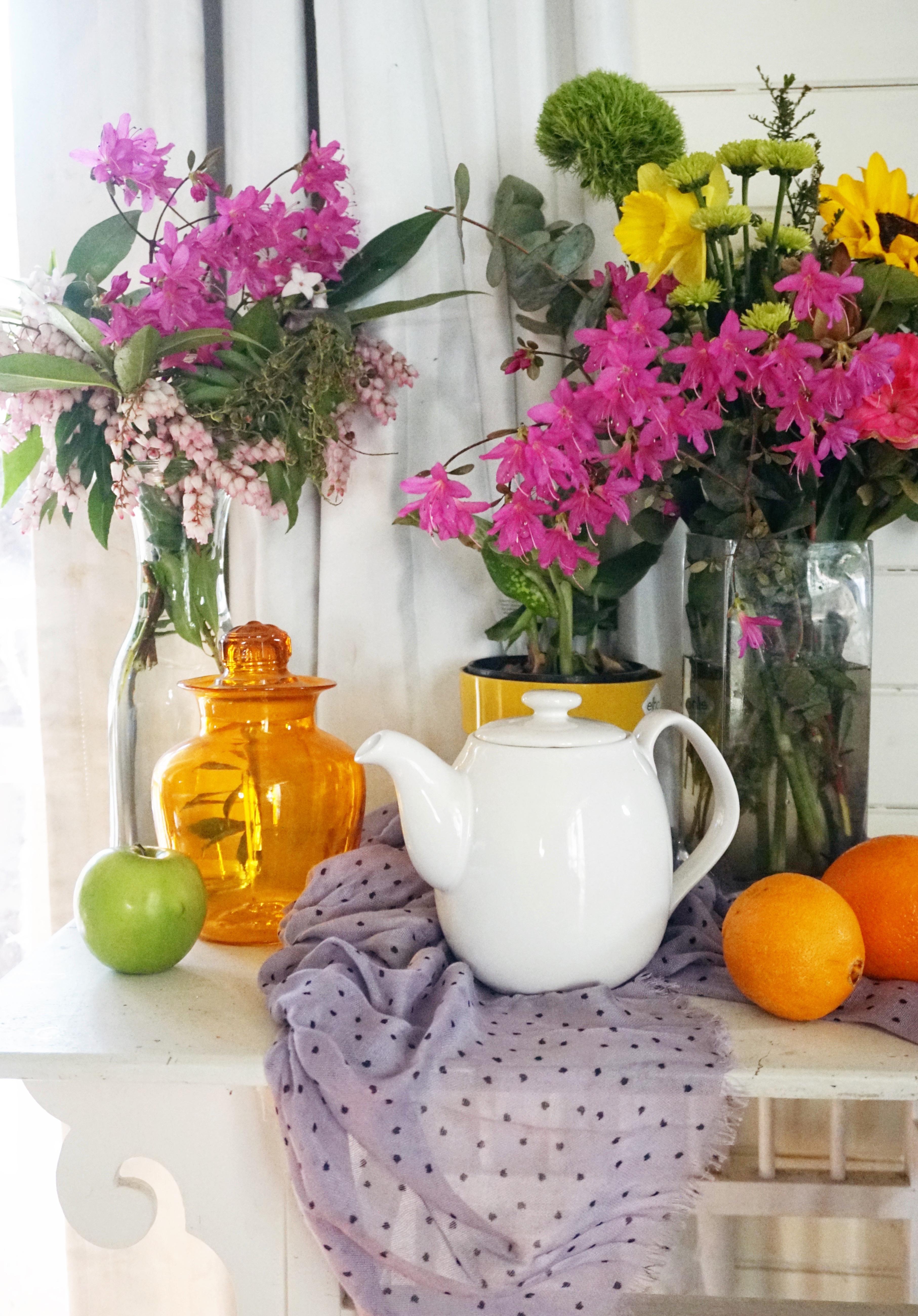
Transcripts
1. Intro and materials: Hello, Welcome to my class, had paint. I still live in this lesson, I'll be taking you through the process that I used to create still-life painting. I will be showing you the step-by-step process, all of it, choosing the colors, painting each element, and being everything together. I hope that you enjoyed watching this. I look forward to showing you my process. The colors that I'm using in with our cadmium yellow medium, yellow, lot hints of Matisse words matter. They lie blue, Prussian blue, and titanium. What? These colors are made by the brand, the taste bud there then, which is an Australian brand that I use. How about you can find substitutes for all of these colors, for the other brands of paint. You just have to look around a little bit. Cool. Sees what other brand panky lock and also different colors you like. I've chosen this palette based on most of the palettes that I use in my outlets and my other classes. So this is a fairly limited palettes. So we have a basically a primary red, blue, yellow palette. And from these colors, I'm mix all of my other colors. Now, the only exception to this would be the where is my data? I would normally use quinacridone magenta. However, I didn't have any of that at home with me at the time of filming this. So I've substituted rose madder, which is just a cool pinkish red color. Sorry, as I said, you can use quinacridone magenta instead. So this is the reference photo that we're going to be working with today. So my still life setup that I did in my house. So like I have done with previous workshop in the past, I always make sure that I spend a bit of time studying the reference further and working at my compositions. This way, we sort of spent a bit of time getting familiar with the composition and we were going to place things because you don't necessarily have to copy exactly what is in here. You can leave some things out, you can move some things around. So I'm going to just do a couple of little thumbnail sketches based on this particular reference further and show you a few little options that I may have. So I knew from looking at this photo already that I want to include the two parts of the two vases of flowers on the side. And I knew that the teapot was going to be the main focal part of the composition. So I wanted to keep that in as well. However, I did remove one of the this like a small plant pot behind the taper. I decided not just sketch that in and leave that out because I thought it made a little bit too cluttered. And so I just sketched today out without that particular element just to see what that would look like. I also wanted to emphasize the negative space that was behind the teapot and in-between the two vases of flowers. So I made sure that there was plenty of negative space in there too. I then decided to sketch out this composition again and just zoom in a little bit just to again emphasize the teapot being the main focal point. And then I also decided that there wasn't really enough contrast in the background with it being white because the teapot was mostly white and Jimmy, everything was quite broad. So once I sketched these little zoomed in version of the composition, I then decided actually color the background in a bit of a different value to see whether that would work or not. And I decided that it would, sorry, when I started painting the actual painting, I decided that instead of having a white background, I would make the background a bit more of a darker value. Sorry, these are the substrings that I made with that you can do when you're sketching gain and having a bit of a think about your composition, sorry, you can change a lot of things around and that any sort of reference photo should really only be used as a guide. It shouldn't really be used as a, you know, something that you copy exactly. In order to be a little bit more adventurous and use your creativity a little bit more. I always recommend actually not using the reference exactly how it is. Use your imagination and your artistic loss. It's a little bit and change things around because you're always gonna get a much more unique and original looking artwork at the end of it, rather than just a copy of your reference photo. So you can see here that I have darkened up that background. And these are the two sketches that I ended up with. And the one that down the bottom is what I'm going to be basing this painting off. So you can say I have darkened up the background. I also added a bit more of a pattern onto the teapot because I didn't really lock it being totally watt. And yes, so this is where I started and this is what I'm going to be using as reference from here on.
2. Sketch: So the first part of this process is to sketch our composition directly onto our canvas. So you can see here that my canvas is now is yellow. That's because I have given it a base coat of acrylic paint. This is just a ground so that I'm not painting directly onto what it doesn't really matter what color you painted. I've just painted a yellow because that's what I happen now. And on top of that, I'm just sketching it with watered-down acrylic pipe and the pipe brush. It's really doesn't need to be a perfect sketch. You'll just roughing in that way everything is how I like to begin with my focal point. So that would be the teapot in this case. I find that in order to get the scale of everything correct, starting with the focal point and makes it a bit easier. Because once you've got the scale of your teapot, correct. And in the right place, you can then sort of base everything else off that. Sorry. Based on where the teapot is, I can name them. Judge, the size of my oranges and put them in. I can then put the cloth in and work my way around and just slowly block in the shapes of everything. And I like to sketch with a brush just freehand. Because I find that that gives this sort of whimsical kind of feeling to the painting. It's not precise. You know, things are a little bit wonky and a little bit off center, but that's okay. That just adds a bit of charming character. And the elisa your sketches, the looser your painting will end up being as well. Because you won't be so precious about painting over the top of everything. So I'm just working my way around the canvas, getting everything roughly in the right spot. Not worrying too much about detail. I just want to get everything set out where it should be. The sketch, the EEG you put down on your canvas is not set in stone as well. You might make changes once you start painting. For example, you can see that I have sketched in the bottom of the table. But once I start painting later on, you'll notice that I end up just painting over that and making the table go all the way across the bottom of the canvas. Like details just do like a loose where the shadows are going to base or with the apples and oranges. I have just loosely block D in the shadows for with the flowers. I've just blocked in the general shape of the bunch of flowers. I haven't worried too much about individual flowers and all that stuff gonna get painted of. Anyway, this is just a bit of a man would be the guideline to get you started.
3. Block in: So now that we have our sketch in place, the first stage of this painting process is to just block in all the areas of color and value. You don't have to be exactly correct in your colors and values, but you just want to get a rough estimate of where the darks are and where the lights are, and what the colors of everything you're going to bake. Sorry to start with, I've just mixed up a dark greenish blue color and I'm going to be filling in the areas of not the darkest darks, but the areas that are darker amongst this composition. So the most of the shadow areas. So that's sort of underneath the flowers in the viruses on the right where all the foliage is. And I'm just going to work my way around the painting and fill in the colors. So as I mentioned in the beginning, I'm only working with a limited palette. So all the colors that you see me mixing here, I made up of the colors that I mentioned at the beginning. So this dark green here, for example, is the Prussian blue and some of the yellow and a little bit of the pink as well, just to make it a little bit more of a purple tone. And I'm just going to work my way around filling in the shapes. So I'm still not worried about detail at all at this point. I'm just blocking in there and that's why it's called the blocking in stage because detail is irrelevant. We're just doing it the underlying layers. So it gives you the color of the under painting as well as blocking in. And we just want to loosely get rid of all of the yellow and work our way around the painting. So generally speaking, when I'm painting, I start with my darker values and work up to my lighter values. You can say that I'm kind of traveling around the painting as well. I don't just focus on completing one area at a time. If I have a little bit of a dark area that has a similar color that's on my brush on the other side of the canvas, then I'll just use it on the other side of the canvas. And I am going to speed this part up a little bit because it's pretty self-explanatory. Sorry. I don't think I really need to do it in real time. But yes, so the only thing you need to really think about it, this stage is a rough idea of the colors that you're going to be using. They don't need to be the exact colors or the exact values. Just a rough idea. Sorry, for example, I'm just roughing in some orange color for the oranges and that vars has got the same sort of base of orange. I'm just blocking in them the shape of the pink flowers. I'm not doing individual flowers, I'm just blocking in the shape of where they are. And I will just work my way around the painting until everything is sort of covered. Yes, sorry. That's what I'm doing in this stage. So I don't think I need to do a commentary for the whole process. Sorry. I'll just let you watch this part and I will talk to them in the next section. Okay.
4. Values: The next step is to start building up in your composition will be the base cards on everything that they really strong contrasts anyway, this step is really just a matter of the dock area. Adding in a bit more variety of values. Again, I'm starting with the dark areas in the background. This is like the area underneath the flowers with that deep shadow is. So I'm just deepening those shutters and adding in a bit more variety into the grains. I usually start working from what's furthest away to what's closer. So obviously the background area and the flowers sort of further into the same. So I want to get them completed to a point where I'm happy with them then before I move on to the things that are in the foregrounds such as the teapot and the oranges. Because if you paint the teapot and the origins now, you're going to have to paint all the background sort of behind it, which can be difficult to do. Sorry. Yeah, That's why I still work from the furthest thing about each of the closest thing. So with the vase in the back, I'm just looking at the shapes that I can see in the reference photo. And I'm using that just Docs and Laertes to sort of define those shapes would be better. Sorry, I'm not thinking of them as stems or gloss or anything in particular, I'm just looking at shapes. And this is the easiest way to kind of break down a complicated scene like this. Instead of thinking of it as this is a glass vase and I need to paint the stems and then I like to paint each individual firewall. Instead of thinking of it like that, think of it more as just groups of shapes. So the reflections that are in the glass, there is just a shape of that reflection and there was the shape of the darkness. If you think about it in this more abstract way, you're less likely to get put off for sort of lost in all the details. A good way of doing this is to actually squint when you're looking at the picture. So for example, I've blurred the reference image now, sir, when I'm looking at the reference image while I'm painting, I'm squinting my eyes, and so this is what the reference image looks like to me. So by doing this, I can see much more clearly where the darks are. And I can also see the shapes of all of the elements as more sort of abstract shapes that takes away all of the date house. So all you're left with is shape and value. And so that does make it a lot easier to just roughly block in these areas of docs on lots without worrying too much about what it actually is that I'm painting. So you can see that I am men doing a glass vase at the moment. I am actually going to, in the next video showing you in a lot more detail how to paint glass. Sir, at the minute, I'm just blocking in that the lights and the darks in the vases in the background. And once I've done that, ONE, move on to the orange vase. And I will show you in a lot more detail with a lot more of a close-up video, how I actually approach painting, that gloss effect. So that'll be in the next part of the video. Now I'm going to stop bringing in that some more color into the flower area in today's lab, Burke, hey, I'm just going to add in some values. Again, I'm not trying to get the exact color that's in the reference photo on working with the colors that I have, that pink of those, I think there is an alias is like really fluorescent pink and I don't have a color in my palette that's going to reach that sort of vibrancy. Sorry, I'm just doing the best that I can and getting it relatively pink at trying to get the values right. And I'm still not tried to paint individual flowers or petals. I'm just doing that Bulldogs of column. And the great thing about the brain is that as soon as you put some condo blob of color up against a green foliage background, the brain is automatically going to rate that as flowers. So I don't make, tried to had to make the specific flower shapes just yet. I can add those details in much later on down the track. I'm just trying to build up Max brush marks, colors, values, and interests. Sorry. I'm just you can see I'm just slipping on the page. Don't worry about it too much. This is the Laius will get built up. And as they get built up, you can have the opportunity to add in more detail later on down the track. I'm now going in and adding a little bit more interest and variety of values into the background area. And I'm just layering different values just a little bit flaps so our carnivora to beef it up a little bit and make it look a little bit more interesting. Sorry. I'm just mixing up different values of the same color. Sorry, I'll add a little bit more blue into it, a little bit more white into it, and just cutting in that background area again. And just do you just change the value in it because at the moment the values a bit of a nothing value. It just means that it's not doing anything. It's not adding to the painting at all.
5. Painting glass: Sorry, this still life painting has quite a few glass vessels in it. So I thought, I'll just spend a little bit of time just focusing in on how I approach painting glass and transparent objects. Because this can be a little bit intimidating and quite scary. And so I thought that I'll go into more detail about how I actually do that. So instead of thinking of it as glass, you need to think of it more as just a combination of values. So you can see that looking at these orange vase, although the majority of the vase is made up of this orange color, there was actually lots of different areas of different values. So there's dark parts, a lot areas, midtones. So if you just think about those different values and shapes, and we'll look at each individual shape that the value has. You can kind of start to break it down. So you can see here that the darkest values, and probably in these areas here. Then there is the mid-tone color makes up the majority of the shape of the vase. And then you can look at the sort of highlight area. And then the brightest spots are like a lot of value. Sorry if you sort of think of it in this way, it will make a bit more sense when you see me actually painted because this is what I am thinking of and what I'm, what I'm looking at when I am painting, they sort of gloss objects. Sorry, I usually start with the darkest value. And I will have a look at the reference photo and look at where I can see this darker value. So you can see that there's quite a bit of shadow over to the right of the vase and most of the light is on the other side. Sorry, I tend to just block in that the shadowy areas first and work my way to the latae areas, sorry, try and think of it as broad shapes. So I'm not looking at this as, and I'm trying to think to myself, okay, I need to make these look transparent. I'm just focusing in on the general shapes that this darker value has in amongst the bots. So there's bits and pieces here and there. And once I've blocked in the darkest values, I then go to the next lot of value, I guess from that, which is a little bit more of a yellow tint to it. And I block in that area. Now because these darker values have the adequate drives still a bit wet. Although I'm not blending these colors together in any way, when I do put a lot of value on top of some of the darker areas. It does get a little bit of blending. Sorry. I'm still just looking for shapes that I'm looking for war. Areas of the vase that have this kind of value in them. And the color doesn't need to be exactly correct. It's more important that you have the value correct? So the darkness and the lightness of the color that you're using. So I just worked my way through the values. So now that I've put these values on an incoming with a lot of value. And I worked my way around the vase in the same way, adding in this lighter value. The only thing that I don't do it this point is I don't put in the very wide age, the E can see over on the left. I will put that in lighter on. I did put that in just yet because I need to refine some of the areas behind this jar first. So I'll put that really white highlight on lighter towards the end of the painting. Sorry, the lightest color I'm putting on at the moment is this yellow retiring? And the other thing that I will comment about in regards to this particular reference photo, you can see in the reference photo that you can see some of the leaves showing through the glass that coming actually from the vase behind. I'm not including that in my particular painting because the way that I have drawn in and composed this painting, that device is actually not sitting behind the orange one as it is in the reference photo. You can see that reference photo by cleavage is directly behind the orange. And so you can see some of the leaves that are down in the bottom of that clear vase showing through the orange bars. I haven't included those because my composition that that orange bars it a little bit pushed over to the side. Sorry. If you want to include those grain shapes or those darker shapes, it would just be a matter of adding a darker value in the areas where that is. So that would give you the illusion that that is behind the orange bars. That make sense. But yeah, I haven't included that because my boss is sort of a bit more off to the side. But you can say that I've just added in a little bit of an orange, a highlight, and popping in a few areas here and there. It's really important, don't get too carried away with data. You just want to look at blocks of value. And once you have the general blocks of value in place, don't fluff around with it too much, don't add too much detail or fuzziness to it. Keep it really simple. And as I said, I will be putting super wide highlights onto this as well. I'm just not doing it at this particular stage of the painting. I will do that a little bit further down the track when I add in other details.
6. Values con: So now we're just gonna keep working our way around the painting. You can see I'm moving onto the oranges now. Sorry. That's just a matter of again, looking at the shapes of the lights and the darks within the oranges and just blocking in those colors are where Vc doc, you adopt my VC lot. You had lied. It's as simple as that. So I am going to speed up this footage just a little bit because I feel like these next few minutes of footage, pretty self-explanatory. I'm still just working my way through the painting piece by piece. And I will slow back down, end my comments where I feel as though it's necessary to commit. So this is where I start blocking in that the cloth, sorry to begin with, I just mixed up a rough color or value of the majority of the cloth and just started blocking it in. I didn't really follow the exact pattern of the cloth bricks in the reference photo icon. When little bit rogue, I wanted it to be a bit more bunched up them what it was in the photo. Sorry. I just start adding in volts, but it's essentially just a combination of lights and darks, just like everything else. And sorry, obviously, where the folds are there, DACA. And with a lot heats the cloth is going to be a lot. So I just worked my way around filling this in. It's still very loose at this stage. I'm not worrying about the towel. I know that I'm going to be adding more layers on top of these and adding in detail as I just wanna get to the last of the dogs. Just as a general reference without worrying too much about detail. In this part of the video, I start to boost up my lot of values a little bit at the moment, everything is quiet. Midterm, midterm. And I would say there's no real lots of dogs. So I'm starting to add in some more vibrant colors and some lighter colors, especially each of the vases and the foliage area. And I do adding a few highlights as well just to try and boost the contrast because at the moment it's looking a little bit flat to me, so I need to stop playing with the lights, especially under the shadows to get a little bit more interest happening.
7. Making changes: But this is what it looked like at this stage. It was at this point, I decided that I wanted I felt as though what they did a little bit extra wasn't really I didn't have as much contrast as what I was looking for. So the first thing I decided I would do is add a bit of a pattern to the cloth. In the reference photo, the cloth has a bit of a subtle pocket or pattern. I wanted to make it a little bit more interesting. So I decided to just add in some, some highlights on the cloth and also at, in some spots and various shapes and patterns and things on to the cloth to sort of save, I could make that area a little bit more interesting. What, what, what. Now this is the point where I decided to get really drastic. You might remember at the beginning I said that I wanted the background to be dark out. And the reason why I made that decision when I was sketching out the composition was because the background in the reference further, it's a little bit of a nothing color. It's not really super bright. It's not super dark. It doesn't really offer anything to the actual composition. And I wanted it to be darker. I could have gone the other way and made a lighter. But I felt like if I made it darker, the teapot, which was meant to be the focus, would pop out a bit more. So I decided the original color that I put down, the value of that color wasn't quite dark enough. So I then decided to mix up this much darker value and pop that into the background. And I think I made the right decision. I was actually quite happy once I did this and I think it helped to make the whole composition and the whole artwork pop a lot more and be a lot more interesting. It needed contrast and it just didn't have that contrast beforehand. So once I added in these dark into the background, I then felt a lot more happy with the colors everywhere else. So you can see straight away that the orange vase, for example, now, when it's up against this really dark blue color, the orange vase pops. Sorry, it really helps to push that vast forward and create a lot more interests. And the teapot or soap starts to pop out a lot more. And so that's why I decided to do it. So you can start to make your own decisions based on how your work is looking at the moment. You can keep the artwork background light, or you can go dark like this. It's totally your choice. And sometimes it does depend on each individual artwork about the decisions you make as you go along in the process. But at this stage, I was really happy with this decision and I was glad that I did it. And I think it made a huge difference to the binding. What but what? The next drastic step that I decided to take at this stage of the painting process was to turn the teapot yellow. And the reason I made this decision was because of the predominantly blue background and purple cloth. I felt like the white tape part was a little bit boring. And I wanted to bring a bit more of a contrasting color into the composition because I mean, really this black table was supposed to be the focal point. And until this point, the orange vase in the background was overpowering these white teapot. Sorry, I had decided to fight fire with fire and turn this teapot yellow. So what I'm doing here is I'm just giving it the the white tape odd I wash of a watery yellow paint because the teapot, I've already added some values in there. I didn't want to totally lose those values. Sorry. I've just water down some yellow paint and edited on top of the teapot. And so from this point, I can now use the values that I already have to help me put down new values in a yellow color instead of white, so you can save it. I understand. Moved to a darker value and put that on where the dark value is. And then I'll put the light yellow values with a light values are so. But yeah, I just had a change in yellow. Again, this is a artistic choice, a spontaneous choice. I often do that. Sometimes it works, sometimes it doesn't. If it doesn't work. If this hadn't have worked, I would have just painted on watch it again, but I think that the yellow tea pot worked at definitely brought it back into the focal point of the painting. It's no longer lost next to the bright orange vase and the oranges in the foreground, it was getting lost. So once I made it yellow, it definitely bought it back into the attention and made it a little more interesting. And so I was happy with this choice. Back into the composition. More interesting. So I did this just by moving to a flat brush, the paint, and just to add a bit more interests, I just continued to build.
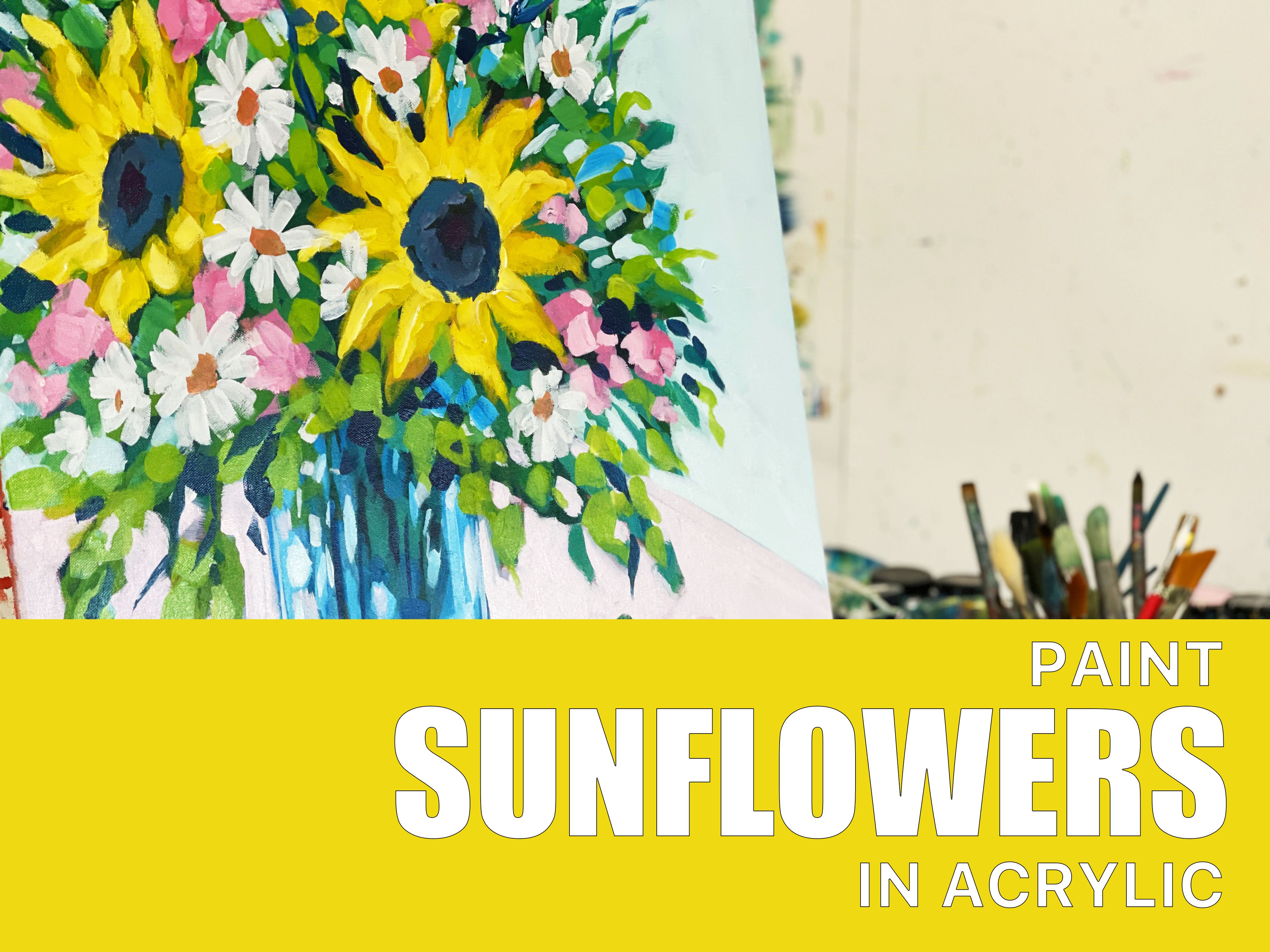
8. Finishing up: So now I've reached the stage where I'm just doing some finishing touches. And that's going to involve adding in some more details into this cloth. I'm also going to add some details and flower elements to the teapot and just some highlights and touches here and there. But this is the point where you can kind of get a bit carried away if you watch yourself. So only add what you feel is necessary. And if you're starting to look around for things to add to the painting is probably a good sign that it's done. So another thing that you can do is actually put the painting away for a few hours or even a day or two and look at it again in a few days. I think the idea is to not watch this last few minutes of footage. Hi, in this lesson. In this lesson. So here is some footage of the finished artwork. I thought I would do some close up a video for you. Sorry, it's little bit shaky. I'm not very good at holding its Titi. But you can see the close-up of the day titles and themes. And I hope that you enjoyed this tutorial. And I hope that you are not too intimidated by these. Once you break down the parses, it really isn't as tricky as it looks, but, um, if it's if it's intimidating for you, I suggest that you just have a Gary and you can always paint it more than once again. You can always do it a few different times until you feel more comfortable. But I hope that you did enjoy watching this and that it has inspired you to get your paints out and have a go. And if you have any questions or comments, please leave them in the comment section. And I will see you a minus-plus.
 Clair Bremner, Professional Artist