Transcripts
1. Introduction: Hello, everyone. I'm Jinny. And in this class,
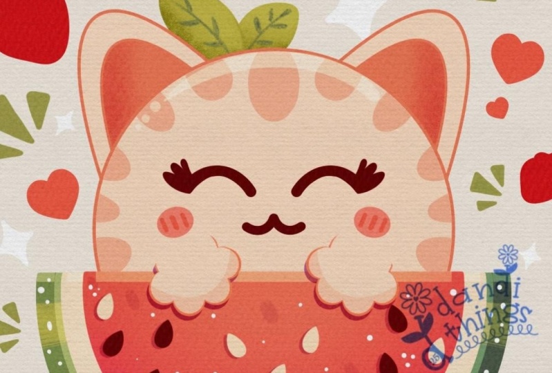
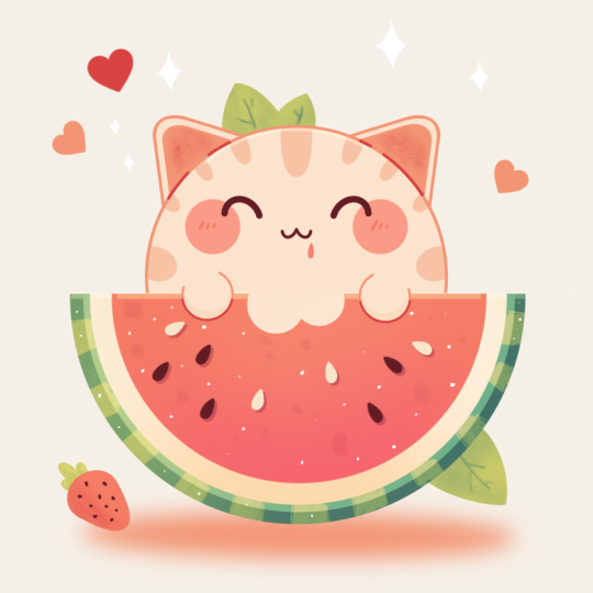
we again to draw this cute Kawhi illustration of an adorable watermelon
kitty in Procreate. During this class,
you'll get familiar with a lot of useful features
like symmetry tool, Gaussian bl, alpha
lock, clipping masks, and blending modes, and learn the basics of drone
in procreate. By the end, you'll not only draw an adorable illustration
you'll be proud of, but also feel super
confident using procreate. And now let's spend
some time drawing.
2. Watermelon: Let's begin by deciding what kind of canvas we
are going to be using. Today we are using a standard square canvas from Procrite with pixel weed and pixel
heights at the 2048 pixels. DPI 300 color profile is set as SRGB with
this loan number. When it's all done,
we will hit done, we will get back
to our new canvas, and let's begin our
preparational parts by first going to the project and retro stab and downloading all the materials
mentioned for this class. When you need it, let's
go first to our layers. We'll go to the
background color layer, and we'll go to the color
palette that you down. Go into the palette
on the bottom and to the cards on the top to
see the colors names, and we will change
the background color to the color with the
title background. When we did it, let's go
to our color palette, again, go on under palettes, go on under cards and we'll pick our first color
that will be green. Now when we are done with it, let's decide on the brush. Go into the brush library, calligraphy folder, and
choose the online brush. Let's adjust our brush
slightly to make it more soft. We will tap onto
our online brush, go into our brush
studio stabilization. We are playing
with the amount of streamline and amount
of stabilization. You can send the
settings the same way as you see them right
now onto your screen, or you can adjust
them on your own, try out onto drawn pad, decide whether you are satisfied with how it looks and feels. And when you are done, let's hit down and start with
our illustration. Firstly, let's decide on
the size of the brush. Let's, for example,
set it to around 4%. And the first thing
that we will need to create will be the
perfectly rounded circle. So let's get to our canvas, and with one line, we
will create a sheep. We will hold it at the end, and we'll put one of our
fingers on the screen. Let's adjust the size by moving our Apple pencil to the outside, and we will get something
going in that way. When we have the
result like that, let's position it at the center. We will go to our Air
key on the top plot. We will need to use
uniform method, and we will also go under snapping and turn on
snapping into the settings. When we are done with it, let's
go and find the center by moving our APO pencil and we are looking for
these two orange lines. So when we have the
result like that, we will move the
shep slightly higher going along this line that
we have on a vertical axis, so very, very slightly. And when we have the
result like that, we will go to our La
straight away and we will create one more lay by
typing on the plus icon. When we did it, we will go on horizontal axis and we will create a straight
line like that. Again, holding our Apple pencil, holding one of our
fingers on the screen, and then we will go again to our ki on the top left and
we will need to position this line straightly
at a line that we have as our guiding
line on horizontal axis. When we did it, let's
grab our eraser and we will go and get rid of all the extra lines
that we don't need. Go on like that and starting to erase everything
that we don't need. Going on both sides and
erasing this extra line. When we are done with this task, let's go to our layers, and we will go to
our previous layer where we have our circle, and we'll do the
same thing here. We don't need the top
part, so very accurately, we'll first make the cuts
like that on our side, and then very boldly with a
bigger size of our eraser, we'll go and erase
this line on the top. Now when we have the
result like that, we will need to go to our
layers and we will go and make a pinch movement to
these two layers that we have to have
everything on one layer. Now, when we have the
result like that, let's straightaway go to
our icon with a color and we'll drag and drop the
color inside this area. Now, when we are
done with this task, let's go to our layers one more time to make a copy
of this layer, swiping the layer from right to left and choosing the
option duplicate. Now when we have
the second copy, we will go to our color
palette one more time, selecting the color with
the title of white. Dragging the color
towards this area. Now, let's go and make this
thing slightly smaller, go again to our Ake
on the top left. Uniform method, snapping is on, go into one of the
nodes, for example, to the middle one that
we have on the bottom, and we will drag it higher to have the smaller
shape on the top. You can see we are moving
it not only on the bottom, but also on the top. So we will need to go to
this node that we have on the top two and we will
need to make the thing small. Also, pay attention to this area right here
between these two shapes. This thing doesn't need to go too high away from
this first element, but we also don't need to have any green element right
here onto the top, any line or something. When we hand the
result like that, let's go to our layers
and one more time, we'll make a copy
of this element. Swiping the layer from right to left and choosing the
option duplicate. Now let's get back to
our color palettes and we will select
the reddish color. Again, we are dragging the color inside and making
this thing smaller. Doing the same thing with our uniform method and snapping, trying to make it nice and decide on this
size on your own, you can go with a bigger
size, with a smaller size. Try to make a nice connection
right here on the top, and when you are
done, let's tap on our Aoki to go away
from this mode. Now when we have the
base for this element, let's go and add some details. First, let's get back to our list and we will
start from the bottom. We will go to this
green element that we have and we will create
one more layer on top. To stay inside this ship, we will tap into this new layer, and we will use the
action clipping mask, and then we will go to our color palette to switch
the color to yellow green. When we did it, let's get
back to our brush library. We are staying the same
calligraphy folder, and we will go and select
a different brush. For example, let's go with
the brush pen or streaks. With one of these brushes and with a bigger size
on this brush, let's go round this
sheep and we will start to add some
additional little elements. You can go straightly with the sheep or you can create
some pattern with it. So let's go around,
and let's create a couple of these additional
streaks of color. When we are done with this task, when we have the pattern
on our bottom part, let's go and add a bit more
interest to this thing. Let's go firstly to our layers. We will go to this layer where
we have a whitish element, and we'll make a copy of it. So let's swine the
layer from right to left and choose the
options duplicate. Going toward the bottom
of these layers, tapping on it, and using
the option clipping mask. We also will go toward
the icon right here onto this layer and we will change the blending mode to overlay. Now, going back to our o chem and we are again
using our uniform method, we are using our snapping. We will make this thing
a little bit bigger. Go down with our node that
we have on the bottom, and if you see that we moved
it slightly on the top, if you have a little
gap right here, we also will go to the
top node right here and make this thing slightly
bigger right here, too. When we are done with it, let's get back to our layers, and let's tap onto this icon. So it is our blending mode. Let's go and adjust
the opacity slightly. So when they are
done with this task, let's continue working on the bottom part by creating
one more lay on top, tapping on it, clipping mask, and again, we will use
the or blending mode. Let's add some highlights and a little bit of
shadow right here. Firstly, we will go
to our brush library. We will change the brush
to airbrush and folder, soft blend, and we will change the color to
light yellow firstly. Set the opacity of this
brush something around 35%, make the brush pretty big
and we will start very, very softly from
the left and you can see we are adding a
bit of a light right here. Try to create a very soft
transition between the colors, so we are not trying to
create something blotchy, some part is bright, some part is non bright. We are trying to create very, very soft connection
between the colors. When we are done with
it, we will go and switch the color to
dark, s and blue, and we will do the same
onto the opposite side, but with these darker colors, we are adding a bit of
the shadow right here. Again, trying to make a
very super nice transition right here between the
colors, nothing too harsh. And when we are done with it, we will go and adjust the opacity slightly
so we are tapping onto the icon onto this layer
to make it not that bright. When we are done with this task, let's continue by going to our next layer where we
have this whitish element. We will create one more
layer here, tapping, selecting clipping
mask, and again, we will use our
overlay blending mode. Let's select the
darker reddish colors, for example, dark lines color. And again, very, very softly, we'll go toward the
middle part right here, and we will add a bit of
the color right here. When we are done with it, we will change the
color to white, and we will go toward
the edges right here, and we will start to
whitening them slightly. So again, trying to make very super nice transition
between the colors. Now when we're done
with this task, let's continue by going to our next layer where we
have the reddish elements, doing the same thing,
creating a new layer, tapping, selecting
clipping mask, going to the icon, selecting overlay blending mode, and changing the color to
this dark magenta one. With the same brush, we are going somewhere in
the bottom and we are starting to add a bit of the
secondary color right here. Again, try not to overdo, try to make a very soft
transition between the colors. If you think that
this is too much, if the color is too bright, you are welcome to go
back to the layers, adjust the opacity
on this thing. When you add, if you want to, we can add a bit of a
lighter color right here on the top to add
to this picture. Again, we can go to off white color or background
color and very, very softly, we can go
right here on the top in the middle and add a bit
of a color right here. Now when we are done
with this task, let's continue by adding some details towards
our flesh part. So first, we'll go and switch
the brush to calligraphy, either moon line or script, decide on your own which one is more comfortable
for you to work with, and then we'll go and create
one more layer on top. Once at this new layer,
we will switch the color to browns and we'll go and
create some seats right here. So firstly, let's go zoom in our canvas and create a
drop shape like that. Try to make it close and then drag and drop
the color inside. If you need to adjust
the shape with your eraser or with your
brush to make it more neat, you are welcome to go
and do that on your own. Now, when we have
this little seat, let's go to our Aoki on the
top left uniform method, and we will go and find
the placement for it. So you can go and rotate it
by going to the green notes, find the placement for
it by dragging it. For example, let's
go a little bit higher and position
it in that way. When we are done with it,
let's get back to our layers. Let's make a copy of it. Swiping the layer from right
to left, choosing duplicate, going into our hokey and finding the placement for
the next element right here. You can rotate it, you can
find the different placement, position it lower, position
it higher, it's up to you. When you are done with it,
go again to the layers, create a copy and find
the placement for it too. Try to position the elements on the round shape right here, so we are not putting them
straightly right here. We are going on the edge right
here on the round element. So position them in that way, and when you are
done with this side, let's go to the opposite side. Again, going into the list,
making a copy right here, go to our o key, and dragging it to
the opposite side. Let's rotate it. Let's
find the placement for it. When you are done, go again
to our list and creating one more layer here to create
the last of the brown sets. Let's go again to our arrow key, and let's move this
shape slightly down. Again, rotate it, find
the placement for it. We are filling the area with the flash with
these little seeds. When you are done,
let's get back to our list and create
one more lay on top. Let's change the color to
off white one more time. Let's grab our brush and
let's create one more seat, but this time with
this whiter color. You can go and adjust
the sheep if you want to dragon drop
the color inside. When you have the seat, find the placement
for it by moving it by using your key on the top. Find the placement for it,
and when you are done, go again to your list, make a copy, go and find
the placement for it. So for example, let's
go toward the center. We will rotate it here. We will make another
copy right here. We will fill the area with these little additional elements to make our illustration
super cute. So for example, let's go
with something like that, and let's create one
more Copy the last one, and we'll position it right
here on at this site. Now when we are done with this whole thing with the seats, let's go back to our layers, and you can see that we have a lot of layers for our seats. Let's go and make again
our pinch movement, so putting one of our fingers on the top and another
on the bottom, and we'll position every seat
that we have on one layer. When we did it, let's go
and add some interest to the picture by
adding the shadows underneath the seat. What
we're going to be doing? We are going to this layer
with our seats and we are swiping it from right to
left to create a duplicate. Now when we have two
copies on these layers, we are going to the bottom one. We will tap on it, and we
will use the option select. Now, we will go to our
color palettes and select the color with
the title Dark Magenta. And as for this
panel on the bottom, we will need to let
color feel right here. You don't see much difference
right now onto your screen, but if you go back to your last, you will see that every seed that you have on this new layer, the co pit one, you
will see that you have everything recolored
with this color. That's exactly what
we need. Now, let's go and tap onto the icon, and we will adjust
our blending mode to multiply and we will set the opacity to
something around 30%. When we did it, let's
get back to our Aoki. We will go with our uniform
method and we will drag these sheps slightly down and a little bit
toward the right. When we have the
result that we like, let's tap onto our yoke and let's check out how
everything looks. If everything looks fine to you, let's go back to our
list and let's go above all the lists that we have
to create one more lay here. Let's go to our N icon and adjust our blending mode,
set it to multiply. Let's go with
something around 20% or something around 15% or between these two values for our opacity with
the same color, and we will go to
our brush library to change the brush
to our water pan. We will go towards the empty spaces right here
and we will start to add some interest right
here in the shape of the like some kind
of the texture. So let's go and add a couple
of details like that. Try not to overdo it,
add a couple of them. When you have them,
take a look at it from the distance to decide whether they are too bright or not, has the opacity if you need to. We will need to have just a
glimpse of the texture here, so nothing too bright. When we have the
results like that, let's tap inside this layer. And let's go and add some
highlights right now. For the highlights, firstly, let's create one more
layer and we will change the blending
mode to overlay. We will go to our color palettes and select our off white color. We will get back to
our brush library. We will select our Meline brush, something bigger with the size, going a little bit
bigger with the size, and going over the top to create a line going across the
whole thing on the top. If you need to adjust it, go to the Editing tool on the top. Try not to have any
gaps on the top two, and when you have something
going in that way, let's get back to
our list to adjust the opacity to the level
that will look nice. For example, something
around 40, 45%. Now to add some interest, too, we will get back to
our erasmF example, let's go right here
and we will cut little pieces right here
to make it even nicer. So for example, go
in that way and do the same onto the
opposite side too. Now when we have the
result like that, let's go again to our layers. We will create one
more layer here and we will change the color to white. With this white color, we will get back to our brush library, and you can go with
the online brush or you can select script brush. Let's go to some blinks pieces
that we have right here, and we will go and start adding the texture in the
shape of the dots and little lines toward the flesh and towards all the elements
that we have right here. Try not to overdo it or
if you want to overdo it, you are welcome to
go and do that. Try to make it sparkly,
try to make it nice. And when you have the
result like that, we are done with our watermelon, so let's move on to the cat.
3. Kitty: Begin working on cat
by going to layers, and we will go toward
the bottom right here to the layer where we don't
have anything attached to it, so no clipping mask or to the last clipping
mask right here, and we'll create one
more layer here. We will need to
select this layer. We will need to hold it,
and we'll need to drag it underneath everything
that we have right here. So this layer will
be the last one that we have into
our layers panel. Now when we did it, let's get
back to our color palette, and we will select the color
with the title pin climbs. When we did it, let's go back to our monoline brush and to the smaller size
of a brush of 4%, and we will go towards our
little shape right here, and we will create a perfectly rounded circle one more time. So the same way as before, creating our shape,
holding it at the end, holding one of our
fingers on the screen, adjusting the size slightly. So we will have something
going in that way. When we have the
result like that, let's get back to our oke on
the top left uniform method, finding the center with the sap and moving
it slightly down. We are looking for the
orange line like that, and when we have the
result like that, we again slightly higher than the center on
the top right here, so it will be a little
bit protrudon right here. When we have it set in that way, let's go back to our
layers and let's create one more layer
on now onto this layer, we will go and add some
additional elements in the shape of the ears
and something else. So let's go and do it with one little creation of our lens. When we have this layer, we will go to our range
icon over the top left. We'll go on the canvas and we will toggle drawing
guide right here. Can see we have the
cells right now, but it's not the
option that we need, so we will toggle
eight drawing guides and we will go under symmetry. You can see we have this
straight line going towards the bottom parts, is
going through the center. We are not touching anything. We will hit done
and we will go with our brush with the
same color with the same size towards
one of the sides, and we will start to create a triangular shape right here. So let's go with a
triangle like that. So hold your line at the end. If it's not happening
for the triangle, try it out one more time,
maybe try it like that. When you have the
result like that, you also can go to this
option on the top, and you probably will
have the option triangle. Decide on the size and decide on the position
of this element. Try to make it slightly bigger than you want
your ear to be. And when you have the
result that you like, let's go and tap onto our
screen to accept the changes. Now, when we have the
result like that, let's go toward the
top and we will turn this very straight corner into a soft one by creating
a curve right here. Adjust it by going to the 18 mode and moving your
little notes right here, try to create a nice
connection between the parts. And when you have the
result like that, let's grab our eraser and let's get rid of all the
lines that we don't need. So everything that
we have right here on the top should be gone. Now when we have the result
that we like like that, we will go towards the middle
part and we will try to recreate the shape right here by creating the inner
part of the ear. Let's go and create
something going in that way. Try to repeat the shape
that you have on the top. When we have the
result like that, we are done with our ears. Let's go and work on
our facial features. If you feel that your lines
are a little bit wobbly, if you want to maybe try out something different
or if you want to spend more time right here to adjust the shape that
you have right here, you are welcome to
go and do that. Let's adjust everything
that we want to adjust and then we'll meet up while
creating the facial features. So for the facial features, let's get back to
our color palettes and let's select brown color. We'll use the same brush
and the same size, and we will go toward the
middle part of our cat's head, and we will go and create
a mouth like that, going toward the
side and creating a little kitty mouth
going in that way. Now, when we have the
result like that, try to position it in a center, and when the acids fed with it, let's go with the bigger
size of the brush of, for example, 13% or maybe
something like 10%, let's go toward this side and we will create an eye right
here going like that. Hold your line at the end, go to the same line where
you have your mouth. Adjust it if you need to by
going to the Editing tool on the when you are satisfied
with everything here, let's go and create
additional little details. Firstly, we will go toward our layers and we will go toward these two layers
that we have for our cat and we will merge
them together by again, making a pinch
movement like that. Now, creating one
more layon onto the layers panel and
we will hold this lay and drag it underneath
our layer with the cat. Now let's again
tap onto the layer and use the option
drawn *** to be able to create the details on one
side and they will be mirrored on the opposite
side on their own. When we have it set in that way, let's get back to
our color palette, and firstly, we will select the color with the title checks. Let's go with a very big size of the brush almost going
to maximum right here. We will go and put the dot
right here onto our eyes. I'll probably go with
slightly bigger size. Find the placement
for this element, try it out a couple of times, find the perfect
placement for the cheeks. When you are satisfied with it, let's go and change the
color to cat stripes. Adjust the size of
the brush something smaller and let's
go toward the top, first going toward
the middle part and we will go and create
the first stripe like that. Try to make a nice
connection on the bottom. If you need to adjust
the line going towards the editing tool
over the top, adjust it. When you are satisfied with it, let's go and add the
line on the top to close the shape and then we'll dragon drop the color inside. Let's go along the shape
that we have for the cat. Again, going on
the round movement right here, not straight lines. We will go and add a couple
more stripes like that. You can vary the size
of these elements. You can vary their
position or anything. Go along the shape
and add a couple of these elements so our
cat is looking nice. Let's finish up by creating
a bigger stripe right here, adding the color to this part. If you want to add more
of these elements, you are welcome to
go and do that. When we have the
result that we like. Let's go and work onto the coloring part right
here for our cat. What we're going to be doing
is go into our layers, and we will go and create one more layer between
these two layers, and we will need to grab this layer and
drag it underneath our layer with these additional elements that we've just added. Now, what we need
to do is to go to our layer with our lines
that we have for the cat. We'll tap onto this layer and we will use the
option reference. That way we will be able to go back to the layer
that we've created, change the color to cat and drag the color inside and use these
lines on a separate layer. When we did it, let's
go toward the ears too. Let's add the color inside too, and then we will
change the color to pin lines because
we use it right here and let's add
the color toward the inside part of
our cat's ears. When we have the
result like that, let's go and start adding
a couple more details.
4. Final Touches: Firstly, let's go
and add little pore. So for the pore, we will use the same color that
we are at right now, but we will need to go above all the layers
that we have right here and create one
more layer here. Let's go toward this empty space that we have on the bottom of our cat and we will create
the shape of the pore. So we will need to
use the same size of the brush that we
used before or 4%, and we will go and create
a shape going like that. If you want to
create the pause on both sides evenly and you
probably want to do that, let's get back to our layers, tap onto this layer that we've created and use the
option drawn assist. Let's try to create the
pow one more time to go like that and creating
something goon in that way. Adjust it by going to the
editing tool on the top, make it bigger, make it smaller, adjust the placement
if you need to. Find what looks good to use. For example, let's go with
something in that way. When we are done with
positioning these things, let's go back to our
list and let's create one more layer underneath this layer with this
line for the pause. When we have this layer, let's one more time tap on it
and use the option drawing assist and we will go toward our color palettes and
select the cat color. We will adjust the
size of a brush, and manually, we will go and add the color to these
areas right here. Just with the brush, go like
that and add the color. When we are done with this task, let's one more time go to our last and we'll create
one more layer on top of this colored part of the pause. Let's
tap on the lay. Let's use clipping mask
and one more time, tap on the layer and use
the option drawing assist. Let's change the
blending mode to multiply and set the apache
something around 30%. Again, let's go to
our colored palette and change the color
to, for example, cat stripes and
we will go toward the bottom part
of our cat pause, and we will create
some shadows here. Adjust the placement, adjust everything that you want
to adjust right here. Create nice shadow, and when we have the
result like that, let's tap on the screen
and let's continue by going and adding some
additional little details. Firstly, we'll go to word that
so right here on our cat. We'll go to our last above
all the layers that we have. We'll use the overlay
blending mode and the opacity of something around 50% and the color will be either off
white or white. You can select the color on your and when we have
the result like that, let's go toward the
top and we will create a big
highlight right here. With a smaller size
of the brush of 9%, we will repeat the shed that
we have for the top part of the head of our cat and we will create a big
highlight go in that way. If you see that the
highlight is not enough, you can go and adjust the opacity by tapping
onto the O icon right here and maybe make it slightly more visible.
It's up to you. When you have the
result like that, let's go and add
a bit of interest toward the ears by adding
a bit of color right here. Firstly, we will find
the layer where we have our inner
parts of the ears, select this layer and create
one more layer on top. Tap on the layer and use
the option clipping mask, and then we will go and
change the color to, for example, these red lines. Firstly, we will go
towards our brush library, and we will go and select
the choke brush right here. Now, with a bigger size
or with a smaller size, it's up to you decide on
the size on your own. Let's go toward the
inside parts right here with something around 40 or
maybe 30% of the opacity, and we will go
toward these parts, and we will add a bit
of texture right here. Do the same onto the
opposite side too. So let's go with
something like that. Try to add this texture only
inside the reddish elements. If you ad use your
eraser to erase the parts that you don't
need to be recolored. And when we have the
result like that, let's also go and add some
interest towards the checks. Firstly, let's see
where our checks are they are right
here onto this layer. Let's create one
more layer above it, and let's get back
to our Mline brush. Let's adjust the
size to something similar to what we
used before, 4% or so. Adjust the color to reddish and let's go
toward the cheeks right here and let's go and add some blushing in the
shape of some lines. Let's do it on both
cheeks evenly. And when we have the
result like that, let's go and add a couple more details outside the shape so
it's not that empty. What we're going to
be doing firstly, we will go toward our
layers and we will need to turn off reference that we have right
here onto our lens. Tap on the layer where
you have reference and turn it off by selecting
from the list right here. Then let's go underneath everything that we
have right here. We can stay right now
onto this layer that we are right now on and create
one more layer here. And with this new layer, we will go down underneath
everything that we have. Now when we did it, let's get
back to our color palettes and let's select the color
with the title yellow green. With this color, we will
go toward the top part of our cat and let's go and create some
leaves right here. For example, let's go with
the element like that. So with the rounder
shape for our leaf, we are creating it, again, by holding our apple pencil
at the end of the line. We can go to the editing mode right here to adjust the shape. Let's close the sheep by going like that and creating
the closed shape. And when we have
the closed shape, let's drag and drop
the color inside. If you want to rotate the thing, go toward the Aoki
on the top left, rotate it right here,
find the placement. When you are satisfied with it, tap onto the yoke and go toward the opposite side to create slightly smaller
leaf right here. Again, closing the shape, dragging and dropping the color, taking a look at everything
from the distance to decide whether we maybe want to go a little bit more rounded
with the shape, adjusting the
corners right here. If we have some, you can
go along the lines with your eraser and with your brush to adjust the
shapes to your liking. For example, let's go with something like that on the top. If you want to move
the shape one more time when you have the
second element right here, you are welcome to
go and do that. When you are satisfied
with everything, let's get back to a brush, and let's go toward
the bottom part right here and add
another leaf here. So for example, let's go
with something in that way. Again, trying to create
a rounder shape, going and adding
the color inside, going towards the
lines right here to the outlines and making them
pretty rounded right here. Let's go with the
sheet that will be some kind of laying
on the surface. So if you overdid it, if you want to adjust it, if we have more elements
than one on our, can go to the Srben icon
right here, use the option. Free hand if the color field
is turned on, turn it off. Go and select the
element that you want to adjust and then when
it is selected, we will go to the
Aoki on the top plot, and we can go and
easily reposition, rotate or do whatever
we want with the layer with the object that we are working
on right now. So find the placement, find the rotation that you like. When you are satisfied, tap on the first icon that you used. I was S ribbon icon. And when we have the
plain elements like that, let's go and make them a
little bit more interesting by adding more details
right here to that. What we're going to be doing
is going to our layers, creating one more layer on top, tapping, using the
clipping mask right here, choosing the different color. So it was our yellow
green for the main color. Let's go with yellow
green that is a little bit darker right here
for the shadows. We'll change the brush to choke and we will go again to
the elements right here, and we will go and add some shadowy parts to them
and texture parts to them. Again, you can decide
whether you want to go with a bigger size of the brush or
smaller size of the brush. Let's go and add some
texture parts right here. Going mostly toward
the bottom parts and if you want to divide
the leaves here too, you are welcome to use your
brush in that way too. Now, going toward
the bottom parts, adding a bit of the
cat shadow right here, and then going towards
the very bottom parts to the side and adding the
second shadow right here too. Now, when we have the
result like that when we like how our little leaves we can go and switch the
color to green and adjust the size of the
brush and go toward the middle part of our leaves with a smaller size of the brush and add some kind of the separation right
here and some veins. So let's go along all of the leaves that
we have right here and add these additional
little details. So let's go like that. Let's add our little
lines like that and going toward the
bottom when we are ready with the top and
doing the same thing here. Starting to add some pattern
with our little veins going toward the sides and creating something
going in that way. When we are done
with the leaves, let's go and add one
more detail right here onto the opposite side to
balance up everything. And firstly, we'll go and switch our brush to moonlin
one more time, and then we'll go
to our leaves and create one more lay on top. Let's change the
color to reddish, and let's go and create
also strawberry. So for this strawberry, we will start by creating a little rounded shape
on the top like that, and then we'll create a very, very soft triangular
shape onto the bottom. Try to create a nice shape, drag and drop the color inside, and then work with
your brush and with your eraser to adjust the
shape to your lichen. Try to make the bottom
part of it a little bit more flat so it is
laying on the ground. If you need to adjust
the placement or tie, go to your key and adjust
it to your lichen. When we are done with it, let's go back to our least. Let's go underneath this lay and create one
more layer here. Change the color to yellow
green one more time, and let's go toward the top and create some
leaves right here. Close the shape or recolor
the thing manually. When you have the
result like that, let's go and add some
interest here too. Firstly, by going
towards our las and creating one more layer above
our y with the green stuff, tapping on it, using
the clipping mask, changing the color
to yellow green, changing the brush to chalk and adding these texture parts towards one of the sides that you chose to put into
the darkness right here. When we have the
result like that, let's go to our las. Let's create one more lay above our main shape
of the strawberry, doing the same thing, tapping
on it, using clipping mask, changing the color to
red lines firstly, and going toward the
bottom to add some texture and some shadowy part
right here onto this side. When you are done with it, let's change the color
to something lighter. So for example, cat stripes, and we will go to the
opposite side to add a bit of texture in the shape of
the lightning right here. When we have it, let's change our brush back either
to monoline or to script and change
the color to brown to add little seeds toward
our little strawberd. Again, we are going with the
rounder shape right here, not with straight little lines. So go like that and
adding seeds in that way. When we have the
result like that, we can go and add a bit of shadow right here
onto the bottom. So let's go and create
one more layer, and we will drag this
layer underneath every layer that we have
once our layers paneled. So holding our lay and dragging it under
everything that we have. On this layer, we will go and change the color to
something reddish. For example, cheeks
or pink lines, and we will go underneath everything that we have
right here and create a very big and not too
open element like that. If you need to adjust it, go to the error key, you can use the free form
method right here to adjust the size and adjust
the openness like that. Try to position
it at the center, so we are looking for this
orange line in the center. When you are done, drag and drop the color
inside this sheet. If you want, we can
make it slightly softer by going
toward the magic one, two on the top left and using
the option Gaussian blur. For the Gaussian blur and for adding some
blur right here, we will need to hold our
Apple pencil and move it toward the right until
we like the result. When you like the result,
let's get back to our layers, and let's go and add a bit of interest outside
the shapes right here. I will probably go and hide the layer with
the background so it will be better seen on the
camera, so what I'm doing. But you can keep the background
right now for yourself. So I'm hiding the
background color layer, and we will need to go to the top that we have
for our layers panel. We will create one
more layer here. We will use the same color that we have for
our bottom part, and we will go to this
folder that you downloaded. So it was our simple
stamps brushes. Let's go to the hearts
first select one of them. And let's go toward
the outside parts, and we will start to put some additional little
details outside the let's end the color inside these two little hearts and then let's switch the color
to something more red. For example, reddish. You can adjust the size of this brush. You can adjust the rotation
by moving your canvas and when you have the
third element right here, let's go and switch the brush
to something different. For example, let's
go with sparkle thin full and we will adjust
the color to white. The white color and
with bigger size of this brush or with a
smaller size of the brush, let's go to some of the areas, and let's add some sparkles. You can adjust the
size of the brush, as I mentioned before, go with bigger size, with smaller size. Go alone this whole illustration and create
something you in that way. Now when we are done
with this thing, we will go toward
our layers and I will unhide Aly with
the background color. And the last thing, the very last touch of what we are going to
be doing right here, we'll be going toward some of the lines and we will make
some definitions right here. So what we will do, firstly, let's go towards the
pause right here, we tap onto this layer and we
will use the option Alpha. We'll get back to
our brush library and go into the
calligraphy folder, monoline brush, changing
the color to red lines, and going toward these
areas where we have almost no difference
between the color of the lines and our watermelon, and we will go right here and add a different
color to the lines. And we also can do the same
right here on the ears. So let's go toward our s, find the layer where
we have the ears, select it, tap on it, and use the option
Alpha L. Right here, we'll go over the
top and we will add a bit of the difference
with our color. So let's go and create
something in that way. We'll do it on
both sides evenly, and we will create something
going in that way. When we have the
result like that, let's take a look at
it from the distance. If you like how it looks, we are done with
our illustration. Thank you for
watching this class. Let review if you
liked it and can tin subscribing for more kay
videos in the future. Looking forward to
seeing your project.
 Uni Corn, ⭐Kawaii Art Enthusiast⭐