Transcripts
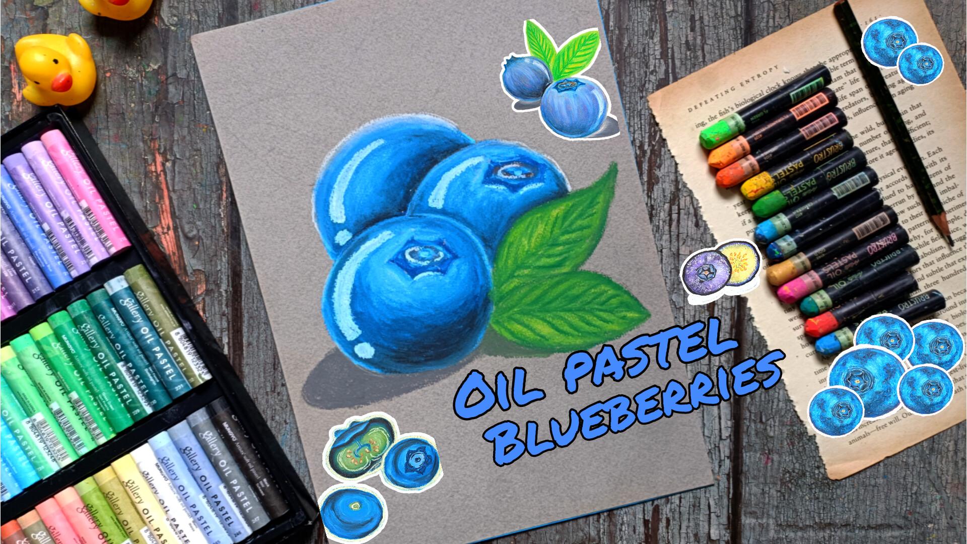
1. Welcome and Introduction : Hi, everyone. Welcome to my new class
oil pastel blueberries, Abiner friendly oil
pastel fruit class. In this class, you will
learn how to paint vibrant, juicy and slightly realistic
blueberries using oil paste. We'll be creating five different blueberries illustration, each focusing on a slightly
different look and technique. This includes
blueberries with leaves, sliced blueberries sewing
the inner texture, and a few creative
composition that help you understand form,
color, and depth. We will begin the class with
three sort tutorial slation where I'll show
you how to sketch simple blueberry shapes, apply color and weld layers to make them
look more realistic. I'll also cover essential
oil pistil basics, including pressure control,
blending, seeding, color mixing, and
creating smooth gradient. We'll briefly explore how
techniques like hatching and layering can be adapted
for the oil pistils. This class is big net friendly. Most of the lesions are
recorded in real time, so you can easily follow along, pause and paint at
your own piece. Hi, everyone. My name is Vishal, and I'm an artist from India. On a skill sayer I teach
classes in oil pastel, ink illustration, other big enough friendly art techniques. You can find more of my work on my Instagramma on YouTube. The five project
we'll be creating in this class are cool
blueberry sword. Then we have sets of blue, sliced and sweet blueberry, sunny blueberry, and
blueberry portrait. I hope you will join
me in this class, relax and enjoy painting this colorful and delicious blueberry illustration together. So let's get started.
2. Class Project : For your class project, you will create one on more
blueberry illustration using eye pistols. You can follow along with
all five projects from the class or choose just one
that you enjoy the most. Feel free to experiment with different color combinations, backgrounds or compositions. You can also add your own
elements like extra leaves or different lighting icon or
make the artwork personal. Once your painting is complete, upload it to the
project gallery, you are welcome to share
your final artwork, close up details, or
even your practice ts. I'd love to see
your progress and how you have applied
techniques from this class.
3. List of Supplies : For this class, you will
need a pencil and reser to do the basic pencil
sketching for the blueberries, masking tape to secure
the paper, tissue paper, tissue paper to
avoid smudging of the colors and also for
blending some of the sections, Q tips, Q tips and the blending
stem to do the blending. Mostly, you can do all the
things using the Q tips, but if you have blending stem, the process will become
bit more easier. Then I'm using this
160 GSM Mugs calories colored, all pastel paper. You can use any paper of more than 120 GSM and
will do the work. I'll be using this Calories
artist oil pastels as well as Brustos
artist oil pistil. You can use whatever supplies, whatever oil pistel you have. Apart from this,
I'll also be using colored pencil that
I forgot to mention. So these are the simple supplies that you'll be needing
for this class.
4. Sketches : Welcome to the first
part of the tutorial. In here, I'll be showing you
simple pencil sketches for the different blueberries in different perspective as well as a few examples of the leaves. Basically, we'll be creating
very simple circular s for the blueberry.
Simple circular se. To make it a little
bit more easier, you can use intersecting
horizontal and vertical lines to determine the length and
the width of the blueberries. We'll also be trying to
make the blueberries a little bit three dimensional. And at the top of
the blueberries, we'll be creating the calx. I'll be creating simple
seeps like this, somewhat of curve, star
like see for the inside. And this is what I mean to say that I'll be
trying to create I'll be trying to sew the
blueberries are three dimensional by doing the seeding in such a manner by doing
the coloring in such a man. So here we have
got the blueberry. This will be the Calex
and as you can see, we are creating very simple sees star like see for the
inside of the cex. I'll be sewing you
two different example of the blueberries cut in half. Simple circular see
for the blueberry, and to make it a little
bit three dimensional. So this will be
the orientation of the blueberry the Calex
is facing towards us. And this will be the
bisected portion, the blueberry cut in half. So the seeds will be
visible like this. Now for the second one, the
sides of the blueberry, this blueberry is
cut in horizontally, so the cex will be
facing towards the top. So let me show you what I mean, starting with a simple circular
see for the blueberry. Simple circular see
for the blueberry. Most of the time,
I'll be creating simple circular sees
or a little bit of oval see for the blueberry. And as you can see the Calex
is facing towards top, and this will be the
bisected portion, the blueberry cut in half. So for two of the project, I'll be showing you insides
of the blueberries, and here they are going
to be quite interesting. So we have the calx. This
will be the small seeds. This part will be the
flesh of the blueberry. And in here, I wrote the
wrong spelling of the calx. So let me rectify it. It's CALYX this is
how we'll be creating very simple pencil eskeches or oil pastal eskeches
for the blueberry. The seep in the sizes
of the blueberry will vary a little bit. As for the leaves,
I'll be creating very simplified
version of the leaf. For only two of the projects,
I'll be adding the leaves. You can vary the see sides and outlines for the
leaves as you see fit. This one is a
little bit broader. Here we have got an
example of large leave. This one is a
little bit broader. For the leaves, I'll be
adding the mid drops and the veins for all the leaves for the insides of
all the leaves. You can also create
this kind of leave too. To make it a little
bit more easier, we can start with a
tear drop like C for the outline and
then add this kind of outlining for the leaves. So these are some of the
examples of the leaf. Now let's create a bit
larger blueberry in here. So simple circular
a And in here, I'm using the sakura micron fine liner to do
the outline for it. I'll be trying to
show you how I'll be making it a little bit
three dimensional. So this is a simple oval seed. I'll be adding the calex on top or a little
bit beside it, and we'll be adding the
coloring in this manner. Consided that the blueberries divided into different sections, different, elongated, and
curved sexon like this. Accordingly, we'll be
adding that color. The addition the coloring of the blueberries
will be a little bit different depending
upon whether I'm creating vertical blueberry
or horizontal one, but we'll be trying to make it look a little bit
three dimensional, add a little bit
more volume to it. Here's another example. This is a little bit different in sees. So this kind of
blueberry, here too, we'll be trying to make
it a little bit three dimensional by using this
kind of simple lines. Let me show you
one more example. In here, I'm just showing you a simple division of the
different section of the blueberries and
we'll be adding the colors in this manner. I'm making things a
little bit confusing, but when we'll be doing
the main project, I'll be explaining it and showing you what I mean in here. Now, one more important thing, the lights and the shadows. I'll also be creating
a little bit of highlights and shadows
for all the project. For this large blueberry, I'm considering
that the light is falling from the top right, so the shadow will
be on the lab. I'll be dividing the sados
into two different sections. We'll be creating the
highlights on the side of the light and a little bit of highlight on the
other side too. Like in here, the light is falling from the
top left corner. We have got highlights
in here and a little bit of shadow
on the other side. For this one, the light is
falling from the top left. So we have got
shadows on the right. For this one, we have got the light falling
directly from the top. So I'll be creating
very small shadow just underneath this blue berry. So this is how we'll
be incorporating light and shadows
for our blueberries. Here's one more example. Till now, I showed
you the divisions of the blueberries
in vertical way. In here, I'll be showing you how I'll be doing the coloring for the blueberries in
a little bit of horizontal or you
can see curd win. Adding a few more
leaves here and there. To do coloring for this kind of blueberry in horizontal way, I'll be adding the
colors in this manner. To so that the blueberry
is three dimensional, I'll be coloring in this manner, for some of the blueberries. So these were some of
the simple sketches for the blueberries and a little bit about lights
and the shadows, a little bit about
leaf and how we'll be doing the coloring for the blueberries using
the oil pastel. And as for the leaves, we have
got midribs and the veins. The simple straight line in the middle will
be the mid rub, and the lines coming out of it will be the veins of the leaf. And yeah, that's all
for this section. I'll be seeing the next section with the oil pistel basis.
5. Oil Pastel Basics : Come to the second part
of the tutorial in here, I'll be showing you some
of the oil pistol basics that we'll be using for some of the project in this class. Instead of starting with
the oil pistel in here, I'm using the Sakura
micron fine line to show you some of the example
of different techniques that we'll be using
with the oil pistol that are based upon pen
and ink illustration. So these are some of the example of the simple hatching lines, hatching the sealing
technique where you draw parallel lines
close to each other. Ines usually go
in one direction. But in our case for our project, we'll also be using a little bit of broken hatching lines, a little bit of curved
hatching lines to give the blueberries a little
bit of three dimensional. Next here, we have got
the crosshatching. As you can see, crosshatching
is created by drawing another layer of hatching
lines that crosses each other. We'll be using this
cross hatching technique to do a little bit of
layering for some of the sections to make
it a little bit more darker and to blend
some of the colors. Next, we have stippling. So I won't be
creating this kind of smaller dots for our
project, but instead of it, we'll be creating
a bit larger dots or or bit smaller strokes
with the oil piston. Stippling basically uses small
dots instead of the lines. The more the dots are darker
the area and the fed dot. Feud dots, the lighter the area. We'll be using this to create a little bit of shadows
and do a little bit of blending to get a bit of rough texture for
one of the project. And next we have got scribbling, scribbling in just a loose
sading method using free, circular or random lines. For one of the
project, I'll be using a little bit of scribbling
using the oil pastel. I'll be creating the lines with the oil pastel that will be
overlapping and changing the direction to create a
little bit of shadows and a little bit of lighter region to create a textured blueberry. So these are some of the
techniques that are based on the ink and pin
illustration that we'll be using in our project. Now, let's start
with the oil pastel. The first thing is braisin. So presser is one of the most important things in oil pistil. In here, I'm starting
with the light preser and as I'm moving up, I'm just increasing the presser. So starting with the
light presser and then increasing the
intensity a little bit. Here's second example,
starting with a heavy present and decreasing the intensity a little bit. These are the
simple strokes that I created using medium presser. These are with the heavy freezer and these are with
the light preser. And now let me show
you three examples of the simple circular seeds with a different presen.
This is light present. This will be the medium. And
the next one, the heavy one. Basically, light presser creates soft and pale nyers and medium presser builds
color gradually. And with the heavy preser it
gives bold and opaque areas. Mostly, I'll be using the medium presser for most of the project. Now in here, let me show you how I'll be using the different
techniques that I showed you, hatching, grass hatching and a little bit of strippling
to create blue berries. In here, I'm using this kind of bit curved hatching lines to add the three dimensional
look to the blue berry. We'll be using different
combinations of the blues and the blacks
for the blueberries, but we'll be adding the
colors in this manner. To give it a little bit of
three dimensional look. Here's another one,
same kind of lines. But instead of using
hatching lines in here, I'm using cross hatching lines. Mostly, I'll be using this
kind of hatching lines. I won't be using the
cross hatching that much. I think for one of the
project, I'll be using it. Next we have got a stippling. Instead of using a smaller
dots to create the stippling, I'll be using a
larger strokes with the oil pastel to do the
stippling technique. Here's just a rough example of the stippling
technique that I'm using to give a little bit of three dimensional look
to the blueberry. We'll be creating a bit
larger strokes with oil pistil to give it a little bit of three
dimensional look and use it as the stippling
technique for one of the project to give it a bit textured look to the bluebery. Next, we have gradient. For the blue berries,
we'll be using different saints
of blue, blacks, and white to create a
little bit of gradient, a transition in between different sets of the
color from light to dark. So as you can see, we'll be adding the colors
in this manner, starting with a darker one. And as we progress, we'll be
adding a bit lighter one. But I'll also be changing
the order of the color, put some of the sanction instead of starting
with a darker one, we'll be starting
with the lighter one, then we'll have darker one in the middle and then once
again, lighter one. So depending upon the area
we are doing the coloring, whether the light is falling
from the right or the left, we'll be creating different
kind of gradient. Here's another example
of varied gradient. I started with red and
ended up with the yellow. For the leaves, we'll
be using yellows in the greens and we'll also be
creating gradient for that. A little bit of color
mixing for the oil piston. For this example in here, I'll only be using
the primary color, the red, yellow, and the blue. In here, I'm starting
with the yellow and the red to create orange. The order of adding the
colours also matter. For the first one, we overlaid the red on top of the yellow, and in here, as you can see, I'm overlaying the yellow
on top of the red. So as you can see
the middle region, the orange that we created
is a little bit different depending upon which color
is laid upon each other. So this will become a bit
more apparent in here with the red and the blue to create a little bit of violet color, overlaying this red on top of the blue and you can see
instead of the violet, we have gotten somewhat of burned channel light
color or brownish color. And for this next one, here, I'll me overlaying this
blue on top of the red. And you can see it's a
little bit of grayish color. So we'll be keeping this into consideration and accordingly, add the colors and do the
mixing of the colors. So here's another example of
the blues and the yellows. So starting with a
blue and in here, I'll be overlaying the
yellow on top of it. So we have got somewhat
of greenish color in this middle region. For another example in here, I'm overlaying the
blue on top of it. Both the greens that
we have created are somewhat different in sad. First one is a little
bit of yellowy green, and this is somewhat
of bluey green. Now here's an example using all the gradient and the color
mixing, putting in reuse. So in here, I'm starting with
a darker side of the blue. And now let's mix it with a
lighter side of the blue. So this is cobalt blue. And to make it a little
bit more lighter in here, I'm using this lighter
side of the blue. Now to make it a little bit darker to sew a little
bit of shadows, I'm using a little bit of black. So overlaying this black, particularly on the regions where we use darker
side of the blue, we'll be making it a
little bit more detail. But this is how mostly we'll
be doing the coloring. I'll also be using a
little bit of white to add highlights and a
little bit of reflection. We have also created the
shadows on the other side. Now here's another example. So we have got overlaying
by overlaying what I mean, adding one color on
top of the other. But in here, the main goal
is not to blend that color, creating a little
bit more details we'll be using two different
kinds of overlying in here. For this example,
I'm showing you the overlying in which we
are not blending the color, but for most of the cases, we'll be overlaying the color to do the blending
or mix the color. And as you can see, it's easier to do the
overlaying on top of the lighter color and
it's a bit harder to overlay the lighter color
on top of the darker one. So that's all for this
oil pistol basics. I'll be seeing in the next
video with a little bit of more oil pistol that we'll
be using our projects.
6. Blending colors : Welcome to the second part
of the oil pistil basins. In here, I'll be showing you
different tools that I'll be using to do the blending
and mixing of the colors. In here, I'm creating three simple circular
seeds using low, medium, and high preser and we'll be using the
Qtip to blend the colors. Mostly, I'll be using Q tips
to do most of the blendings. Apart from that,
I'll also be using blending stem and a little bit of tissue paper for
one of the project. To get a smooth and
uniform blending, you'll have to appli
it heavy preser. When you are blending in
this circular menal you will get a bit more uniform
and consistent blending. This is the result we
will get on blending different kinds of preser the low medium and
the heavy preser. Now here, I'll be showing you another way to do the
blending of the colors. In here, we'll be doing the
overlaying of the colors, one on top of other, and then do the blending of the colors or
mixing of the colors. So I'm using a lighter and a bit darker
side of the green. The first one, we just simply overlaid one top of the other, and in here for the second one, I'm applying a little bit of
preset to do the blending. Now for this third
one, we are using the medium preser and for
the piece of the blending, we are applying heavy present to do the blending of the color, as well as we are overlaying another layer on top of it to get a bit of smooth transition. In here the transition
is not that smooth since the two colors are a
little bit different. For our project, we'll be using a little bit adjacent colors, so we'll be able to create beautiful gradient
and transitions. And in here, for this example, we'll be using different tools to do the blending
of the colors. I'm using light
green and jet green. We have got two simple
streaks of the colors. For the first one in here,
I'm blending the greens, the jade green, and the
light green using the Q tip. Mostly, I'll be using the Q
tip to do the blending quite easy and it gives uniform
and consistent results. Next we have got blending stem. For the smaller
regions and to get a little bit of definite
outlines, I'll be using it. This takes a little
bit more time. But yeah, for some
of the project we'll be using it
to do the outlines. Then next, we have tissue paper, fold the tissue paper in this manner to get a
bit of conical same. With this, we'll be
getting this kind of a bit smooth blending. For the larger areas,
I'll be using it. And lastly, we have
got our finger, just apply freezer
with your finger to get a smooth blending. Now here's another
example of the gradient. In here, I'm just
showing you an example of using rough texture
to create a gradient. Mostly, I'll be using
the blending tools to do the blending, but in here, if you want to
create this kind of rough texture for the
blueberries, you can use this. You'll have to apply
two or three layers of the colour to
blend the colors. Now, let's extend
it a little bit more using a bit more
lighter side of the bloom, overlaying one
color on top of the other and to make it a bit
more lighter, I'm using white. So overlaying white in here and then extending
it a little bit. So you can also do the blending of the colors in this manner. Here's one more example,
seem like the last one. For this gradient, I decided to start with the brown and
end with the yellow. So here's how we are
going to use it. For the blue berries, we'll be starting with a darker set at the bottom section to
sow the sadous and a little bit of darker
region on top of it, we'll be using darker
sets of the blue, sapphire blue or prosen blue. On top of it, I'll be
using a bit lighter set, cobalt blue or
ultra marine blue. And then depending
upon whether we are creating bit lighter version
or a bit purples version, we'll be using light blue
or light purple and to sow a little bit of more cads for
other regions near the cex, we'll also be using a
little bit of black. Now let me show what I mean. In here, I'm starting
with the darker side of the blue to create
the rough outlines, using these kind of
bit hatching lines to show the bit darker region. Below it will be making
it a bit more darker and Avat will be making
it a bit lighter, a little bit of black
near the Calex. Now for the lighter color for
the lighter color in here, I'm using this light blue, extending the light
blue a little bit more. Here I'm using the QTIP
to do the blending, simply blending the color. In here, I'm using circular
moson to do the blending. I'm extending the black
from the bottom towards the upper section to make it
a little bit more darker. To make it a bit
lighter, you can just extend the
blues to the black. In that manner, you can make
it a little bit lighter. This is not that much detailed or defined, but for
our main project, we'll be using a
bit more colors and try to give it a little bit
more three dimensional look, but this is just
a simple example. Let's add a little bit of highlight using pale
yellow in here, small streaks to
sew a little bit of reflection or highlight. This is just a simple
example of the blue berry, a little bit of the
shadows on the other side. Let's blend the sados too. So for this one, the light
is falling towards the left. If you want, you can also add a little bit of yellow to make it a bit yellow if the color
of the light is yellow. Mostly, I'll be using white or a little bit of pale yellow
for one of the project. So this is how we'll be doing the coloring for most
of the blueberries. Here's another example of leaf, starting with the grass screen
to create the outlines, now adding a little bit of
lighter side of the green for the sign. Now, let's blend it. Simply blending the lighter and a darker side of the green. Here the contrast
between the two courts are not that different,
but for our vein project, we'll be using a bit lighter
sets of the yellow stop to make it a little bit
more lighter and create this kind of subtle gradient
or subtle transition for the leaves as the base
layer on top of it, we'll be using bit
darker side of the green to create med
drops and the veins. Using the dark green to create
mid ribs and the veins, simple straight line for
the midrib and simple lines coming out for the veins, and to subdue its
intensity a little bit, blending it a little
bit with a Q tip. You can also use
the blending stem to get a bit more
precise control. So this is how we'll
be creating the leaf. It will be a little bit more
detailed a bit more defined. We'll be using the
blending stem to make the outline a
bit more distinct. You can also use the oil pastel
colour to do the outline, or you can use the
colored pencil. Here I made a little
bit of mistake, but I won't be doing it
in our main project. So that's all for this video, and I'll be seeing
you in the next video with the first project.
7. Shades of Blue: Welcome to sets of Blue Project. In here, we'll be creating three vibrant and colorful
blueberries with two leaves, starting with the
pencila sketch. Creating this kind
of very simple version for the blueberry. Two of the blueberries, the upper part, the
Calex will be visible. For the third one, I
won't be adding it. If you want, you can add
it or you can create the bottom section
of the blueberry with a little bit
of yellow color. So this will be the simplest sketch
for three blueberries. Let's add the leaves,
two leaves in the front. If you want to add
few more blueberries or if you want to decrease
the number, you can do that. You can also add few leaves
in here if you want. I won't be doing the coloring
for this, but if you want, you can proceed with it in the same manner
that we'll be doing the coloring for the two leaves in here or as we have practiced. This is Opnal. So
either you can do the coloring for two leaves at the top part or the
two leaves in here. I'll be creating the callax for the blueberries at
the top, in here. This will be the central part, and for this one in here. Creating a little bit
of star like see for the callax Feel free to make changes
and adjustment to the pencilskis that
you have heated. I'll be adding the
sadose in here, a little bit of sadose. In here, as I was mentioning, I won't be doing
the coloring for the leaves, so erasing it. As for the coloring in here, I'll be using bottle green, yellow green, and lemon
yellow for the leaves. And for the blueberries, I'll be using cruisin blue, cobalt blue, sky blue. I'll also be using a
little bit of red oxide, a bit of black and stone gray. I have lightly erased
removing the asisust. In here, I'm using Bustos
artist oil pistil. You can use whatever
oil pistil you have. For the blueberries, in here, I'm starting with the sky blue, going over the pencil outlines and redefining the outline, the circular see for the
blueberries with it. Adding it a little bit for
the central part, the galax. Let's do the same thing in here, a small circular dot like this, oval circular dot like
this and encircling it. Now, let's make it a
little bit darker. In here, I'm using comal blue. Like the earlier projects, we'll be creating this
blueberries in multiple layers. And for this one in here, I've already started with the medium freezer with
this cobalt blue. Try to create the circular
seep or oval like sep for the blue baries and add the coloring in such manner. Following the canton,
or you can see sphere of the blueberries
and adding the colors in such manner so
that it will look a little bit three dimensional or it will give it a
little bit more volume. We are trying to give it a little bit of three
dimensional look, so that's why I added
this in such manner. For this region in here, I added a little bit more
blue to make this a little bit darker to so the shadows cast by the
other two blueberries. Now let's make it
a bit more darker. In here, I'm using Blucenblue overlaying this
Blucen blue on top of the cobalt blue that we used. I'm not covering
the entire section, but mostly for the lower part. In here, for this one, making it a bit more darker so that the shadows that we'll be creating later on will become a little bit more
darker in here. And for this one, too, making the regions a bit more
darker for the sados. I'll be calling the
top one the first one. And the second one will
be the one beside it, and this one, the circular
one will be the third one. And with this, we are done
with the Prussian blue. In here, I'm going
in with the black. Overlaying this black on top
of both the other colors, the cobalt blue, and
the Prussian blue and mainly adding it
for the lower section. Adding it for this
one, the second one. Now moving on to the first one. In here, I'm applying medium
to high presser with it. We are done with the
black. Now, once again, going back with
the Prussian blue. I'll be using this
Prussian blue and creating a detailed and defined outline
for the calax like this. In here, I'm applying
medium to high preser. With these, we are done
with a simple calex. Let's do the same thing
for the second one. Adding a little bit of
it for the central part. Let's add it for this one, too. A little bit of brown in here. So this is red oxide, adding
it for this one, too. Now, to make this region made lighter to sew a little
bit of reflection, adding white just
beside the calx. Let's do the same thing
for the first one, a little bit of
white for the upper part to sew the reflection, and a little bit of
highlight for this one, the second one, adding
it particularly beside the calex and
overlaying a little bit of this on top of the sky blue. And with these, we are done
with the basic coloring. Now, we'll have to do
the blending in here. I'm using the QTIp to do the blending and
I'll be blending in the same manner
following the to the curved seep
of the blueberry, and we'll be blending
from bottom to top to make the blacks and the blues
extend a little bit more. If you want to make it
a bit more lighter, you can start from blending
from top to bottom. In that manner, you'll be expanding a little
bit of white in the sky blues and covering
the blacks and Pusan bloom. In here, I'm just doing the opposite extending
the blacks and the Pusan blue to overlay it on top of the sky blue
and the white. S carefully blending the color in here just beside the Calex. So just by following
the curved shape of this sphere like blue very, we are giving it a little
bit more dimensional. We are giving it a little
bit more volume and making it look a little bit more realistic and three dimensional. Apply heavy presser with it. And let's do a smooth and uniform blending for
the entire blueberry. Hmm. For this region in
here, apply a bit more press it to blend
it with the blues, the white and the blues, and you'll have to
bit caut us not to blend the protein
blue that we used for the Calex we have gotten only a small
region here to blend. Once again, following
the curve sweep of the blueberries and blending
it in such a manner. And with this, we are done with the first
layer of blending. If required, we'll be doing a little bit of more
blending later on, a little bit of blending for
the inside of the calex, a little bit of more blending wherever you think
it's required. With this, we have created both lights and shadows in here. The lower part is a bit darker, the region just beside the calax and the upper part
is a bit lighter, and we have got a very smooth and beautiful
tranucen in between. Blending the colors a little bit more in here to get a bit more smoother and a bit more
uniform, consistent blending. This is how we'll be blending the remaining two blurris Let's do this first one, starting
with the lower part. So extending the blacks and the protein blue to the
sky blue and the whites. If you want to make
it a bit lighter as menson you can start from
blending from top to bottom. Here, too, I'm following the curved sweep of the blueberries and
blending in that manner, extending the colors in this curved manner for the remaining section of
this first blueberry. In here, we are
applying heavy presser to blend it smoothly. For the outline
section, if you want, you can use the white to
do the outlining later on, you can use the colored
pencil to do the outlining. Apart from that,
you can also use the blending stemp
to do the outlining. So just apply heavy
pressure with the blending stemp for
the outline section. And with this, we are mostly
done with the first one. Let's extend it a
little bit more. In here, this region was
a little bit sketchy. So applying a little
bit more pressure and making this region a bit more uniform and a
bit more consistent. Here, too, as you can
see, we have created a beautiful gradient in between the three colors and three or
four colors that we choose, and the sados look
realistic too. We are done with the
first and the third one, a little bit of white
for the upper part. I decided to add a little
bit of white in here to sew a little bit of reflexion and make this region a
bit more lighter. And we are done
with the first one. Moving on to the
second one, start blending from the
bottom section, carefully doing a blending. We don't want the outline of this to mix with the third one. Here to follow the curd seep
of the blueberry and do the blending in that
manner so that we can get a little bit of three
dimensional seep to it. Here fully blending
in this region too. Here fully blending it here
near the first blueberry. Following the sep of
the cex that we have created and blending the
whites and the sky blue. Now, let's blend the sky blues and the whites to the
prosen blue and the blacks. Blending the colors for
this smaller region. I decided to do a little bit more blending
in here to make that distinction in
between the first and the second blue
berries a little bit. Also doing the blending for the calex for the
insights of the calx. Let's make the calex
a bit more distinct. So once again, using
the Pusan blue to go over the outline that we
created for the Calex. Doing the same thing
for the third one. For the outline in here, I'm using colored
pencil to make it a bit more distinct and
a bit more sharper. This is ops. If you want, you can use the oil pastel, you can use blending stamp or you can just
leave it as it is. You can also use the darker
sets of the blues or bit lighter sets
of the blue to do the outlining and then blend it with the remaining colors. And with this, we are done with the colored pencil
to do the outlining. I was not satisfied
with this section, so I decided to do a little
bit of mon blending, extending the colours a
little bit and following the curve shape of
the blueberries to do the blending
in this manner. If you are satisfied
with your blending, you don't have to do this. And with these we are done
with the blueberries. Now let's do the
coloring for the leaves. In here, I'm starting
with lemon yellow. Lemon yellow will be our primary or the base layer
for the leaves, adding this lemon
yellow in this manner, a little bit of lemon
yellow for both the sides of the knee using a
bit of medium raisin. And with this, we are done
with the lemon yellow. Now going with the yellow green, overlaying this yellow green
on top of the lemon yellow, a little bit of it, and
adding it beside it and for the empty species, adding
it for the second one. And let's add it a
little bit more in here. And with these, we are done
with the yellow green. Now for the darker side in here, I'm using the bottle green. So using this bottle green, you do the outlining first and adding it a little bit
for the inside section. Doing the same in
here for this one. Starting with the outlining and adding it a little
bit for the midrib. Now, let's feel the
remaining section. Overlaying this a little bit. Now let's do the
blending to create a very smooth and
beautiful gradient, or you can say transient
mid greens for the leave. Here, too, I want to make it a little bit darker for the edges, so I'm extending the color
from outside to inside. To make the leaves a
little bit lighter, you can do the blending
in reverse mentnd starting from blending from
the insides to the outsides. Applying heavy presser with
the Q tip to do the blending. And we have created
a beautiful tran in between the different
seeds of the green. Some of the regions
where we used a bit more lemon yellow
is a bit lighter. The other regions
with a bit more bottle green and yellow greens and a bit darker. In here, we have
created somewhat of realistic background or you can see coloring for the leave. If you want to make it a
little bit more and lighter, you can add another layer of lemon yellow and yellow green. To make it a little bit darker, you can use a bit
more bottle green. You can also use a bit
of white to make it a bit more and lighter
for some of the sections. So this is our first
layering for the leaf. Now for the mid drips
and the veins, in here, I'm once again using
the bottle greens and creating this kind of
mid drips and the ans, adding it for this leaf. If you don't want to add this and keep the leaves as it is, you can just leave it, adding the simple mid
drops in the means and doing the outlining
for this one. Now, once again, going
back with the Qtup to do the blending
I here and just reducing the intensity of the mortal green a
little bit by applying a bit of medium
pressure with the tube and blending it with the
remaining colors of the leave. A little bit of medium
pressure and just reducing its intensity so that it matches with the remaining
coloring of the leaf. If you want to keep it a
bit more bolder and darker, you can just leave it as it is, and to make it a little
bit darker and to add a little bit more
detailing to it, you can use the
other sads of green, jet green or light green and overlay a little bit
of highlights with it. You can also use white to do it. So going over the mid drops and the veins and adding a
little bit of detailing. But I'll be leaving it as it is, and we attend with
the leaves for the sados in here and
using the stone gray, a medium sad of the grey, creating this kind of outline. Creating the outline of the sido for the third blue bearing. Here we are aiming
to get a smooth and uniform blending for the sados. Now doing the same
thing for this one. The leaf. Only a small
sado is casted in here. Now let's do the blending. Going in with the Qu to get a smooth blending of the grain. We don't want the blues
to mix with the green, so carefully doing the blending in here for this
third blueberry sado. If you make a mistake, you
don't have to worry about it. You can use the colored pencil, the white to do the outlining
for the blueberry later on. Here we are aiming
to get a smooth and uniform blending for the sados And with these, we are done with the shadows, the leaves and the blueberry. If you want to keep it as it is, you can just leave it or
you can just follow along with me and create this kind of bit extravagant highlights, adding it a little
bit for the cex too, creating this kind of curve exclamation mark
as the highlights, or you can see a bit of
reflection. This is optional. If you don't want
to do this, you can just keep it as it is. Extending a little bit more. Now, adding small
circular dots like this. So this will be the
highlights or you can say reflection
on the blueberries, adding it a little
bit for the cex too. This is optional. If you
don't want to do this, you can just keep it as it is. With this, we are done with the highlights for the blueberries. Let's do a little bit of moon blending wherever you
think it's required. You can also use the
colored pencil to make the outlines of the weaves
a little bit more crisper, a bit more defined and detail. And with this, we are
done with this project. I hope you enjoyed
painting this. This was a lot of fun to paint, and it was quite easy. And yeah, I'll be seeing you in the next project,
happy painting.
8. Blueberry portrait : Welcome to the Berry portrait. This is one of the most detailed and most vibrant blueberry. So in here, I'm
directly starting with the sapphire blue to
create the outline for it. This is going to be
the biggest one, the biggest blueberry that
we have created so far. Creating this kind of circular or you can see oval
see for the blueberry. For this one, we'll be
using sapphire blue, cobalt blue, prucin blue, light purple, ultra marine blue, black, brown and golden yellow. Apart from that, I'll also be
using a little bit of why, creating the outline
for the calx. For the large blueberry, we have got a large calx. And here, I'm using Mongo
galleries oil paste. Starting with the Y,
creating small strokes with the Y to create the lighter
regions for the blueberry. So I'll be using this wide
to create this kind of small patches for some of the
sections of the blueberry. The regions that I want to
make it a little bit lighter. In here, as you can see, I'm applying medium
preserve with it, and for now, I'll just be
surrounding the calex. For now, I'll just be surrounding the calex
with this white for the section of the calexPicularly on the
bottom left side, I added a little
bit of more white. Now let's create small patches of white for the other sections. Small patches, these are
comparatively bit more smaller as compared to what
went for the central part, adding it on the other side too. Just simple random
strokes with the y. Adding it near the
outlined regions. Now going in with
the lighter seats. So in here, I'm using cobelblue and creating the same
kind of random strokes. I'll be overlaying
a little bit of this cobel blue on
top of the white, and mostly I'll be
surrounding it, creating this kind of
random strokes with the cobalt blue for
the remaining section, the white section that we have. The white small patches
that we created, surrounding it and
overlaying a little bit of this cobalt blue for some
of the white potson. So for this one, too, I'll be adding the colors and layers, and this is going to be multi layered and multi
colored project. We'll also be making the insides the calx a bit more detail, a bit more defined by using gallows and aquas to make
it a bit more darker, not darker, but more defined. Creating the petal like
see for the inside of the calx using
this cobalt plume. Now let's continue with
the remaining section. Surrounding the white and
overlaying a little bit of this cobalt blue
on top of the white. And, with these, we are
almost done with the blue. Now I'll be adding a
little bit more blue for some of the regions
just beside the white. Adding it in this random manner. So we have got lots
of empty spaces in between the different
blue and the white strokes. Now to make it a bit more darker here I'm using
this ultramarine blue. Overlaying this ultramarine
blue on top of the white, a little bit of white and mostly on top of the cobalt blue. This is a little bit darker as compared
to the cobalt blue. This is optional, if you
don't want to do this, you don't have to
add this color. But for this one,
to make it a little bit more defined and
a bit more detail, I'll be using more
sides of the blues to create a beautiful
transition effect as well as different sections of
the blue berry and making it a bit more defined
and bit more detail. Now in here, I'm using a bit
darker side of the blue. And yeah, overlying
mostly on top of the cobalt blue and
the ultramarine blue. So creating these kind
of random strokes and continuing on with
the remaining section. We are not going to cover
the entire section, as you can see. I'm leaving some of the section, the ultra Marines
and the cobalt blue that we used earlier untouched. Continuing on with
this. Moving on to the upper part and
doing the same thing, this kind of random
small strokes. And you can consider it to be somewhat similar
to the scribbling. Insides of the Calex a
little bit just beside the outlined section that we did that we did with
the cobalt blue. And with these, we
are done with this. Now in here, I'm
using the plaques. Now I'm using black and making this region a little bit darker. Just like we used white to
create different patches, I'll be creating the same kind
of patches with the black. The intensity of the black is a little bit less as
compared to the white. And yeah, also use this to create a little
bit of outlining. And here doing a little
bit more detailing and a little bit more outlining
for the inside of the galax. Creating this kind of petal like for the inside
of the calax. Now for the remaining
section of the calx, the outer part, using this black to do a little bit of outlining mid broken lines with the
black to do the outlining. Encircling the calx. And with these we
done with a black. Now, let's start
with the blending. Here I'm using QTIP. It's the larger region. If you want to use
the tissue paper, you can do that, but
with the tissue paper, we won't be able to create different sections and add different kind of texture to it. My different kind of texture, I mean this kind of blending, a little bit of uneven blending for the different sections. So I would suggest
you to use QTIP or blending stem to do the
blending for this project. I'll be continuing
on with this kind of uneven bending for
the remaining section. This is going to be our
first layer of the blending. I'll also be doing more layers
of the blending later on. I'll also be doing more
layers of blending later on. Mixing all the colors together, we have got sapphire blue, Prussian blue,
ultra marine blue, cobal blue, and a little
bit of black and white. Not a little bit of
black and white. We have got lots of white. Continuing on with
the upper part. So with this kind of blending, you can see the visibility of all the other colors
that are lying beside it with the different seeds of the cobalt blue and
the ultramarine blue. We have created a little bit of transition in between
the two colors. It's not that apparent, but if you pay a little bit more attention
to the painting, and if you are following
along with me, you can see a little bit
of transition in between the two seeds of the
lighter set of the blon, the cobalt blue, the
ultra marine blue. Continuing on with
doing this kind of uneven blending
for the remaining section of the blueberry. And for the darker tones,
the Saphire blues, the Prussian blue and the black, we have created this
kind of darker regions. Continuing on with
doing this kind of uneven blending
for the remaining section of the blueberry, making the outlines a
little bit more defined. We have got only a small
botin to do the blending. For this project, I won't be creating any kind
of background or shadows. If you want, you can
do that. You can also add larger leaves, but
I won't be doing it. I'll only be creating this
simple Mary portrait. We are almost done
with this side. Now we have got only a small
section in here, the white. We're doing uneven blending
in here for this section. And with this, we are done with most of the section
of the blueberry. Now moving onto the
insides, the calec. In here, we'll be spreading
the black with the blues to do a little bit of
partial blending like this. Spreading the black
on the side too. Now for the insides, spreading the darker sides of the colour towards the
lighter side, the white. And we are doing the same kind of uneven blending in here, too. And with these, we are done with the first layer of the blending. Now let's make the outline a little bit more
detail and define for the calax creating a little bit more defined outline
using this gray. I I'm using light purple. You can use light purple. You can use pale yellow or
white to do the outlining, but I decided to use
this light purple, making the outline a
little bit more defined. You'll have to apply
a little bit of heavy preset to overlat on
top of this many layers. Also creating this
circular broken lines. Now for the remaining
section in here, a little bit of
this light purple to make the regions a
little bit more lighter, the outline regions to sew
a little bit of reflection. Now, subduing its
intensity a little bit by doing another layer of uneven blending for
this light purple, doing the same thing
for the insides too, a little bit of partial
blending of this light purple. We are not going to cover
the entire light purple, but a little bit of
subduing of its intensity a little bit to make it a
little bit less lighter. Now for the center,
I'm using ocher, creating this kind
of simple ovals. Going with the golden yellow to make it a little
bit more lighter, overlaying this on
top of the ocher. Going back once again
with the ocher to create small dot. We are done
with the center part. Now we'll be doing a little
bit more blending for some of the regions to make
it a little bit more even. So for some of the section where there is
a lot of gaps in between. So blending some of the
regions with this Q tip. Once again, going
in with the white, we'll be making some of the regions a bit
more and lighter, mostly for those regions
where we used white earlier. So creating this kind
of small patches of the white for some of
the section here I'm flying medium to heavy pacer
to overlay it on top of the to overlay this on top of all the layers of the
colors that we have done, adding it in here
for this region. Small strokes with
the white like this. Instead of this, you can
also use light purple to make it a little
bit purples in color. Now, once again, let's do
a little bit of blending, partial blending, or you can see a little bit of uneven
blending for the whites. Subling its intensity
a little bit and blending it with
the remaining colors. I see a little bit of the texture of the white
so remain visible. So don't overdo the blending. Blending some of the light
purple for the insides of the CalexKing little bit of more blending for
some of the regions. Right now, the calx
is not looking that much distinct from the
rest of the blueberries, so we'll be making the calax a little bit more separate
and a bit more darker. Continuing on with the blending
for some of the sections. Now for the outline in here, I'm using white and creating a little bit of broader
or bit thicker outlines. This is optional. If you
don't want to do this, you can just leave it as it is. You can also use
the darker sites of the oil pit to do the outlining. You can use blues or the black. You can use Pusan blue or saphte blue to do the outlining. You can also use
the colored pencil. Carefully doing the outlining, we don't want the whites
to mix with the blues. And as I was
mentioning, I won't be doing any sados or
the background, but if you want, you
can create sados too. To add a little bit more
detailing or add patterns to it, you can create multiple smaller and simple blue berries
for the background. Let's make these
lines a little bit more thicker for the upper part. Here, as you can
see, I'm applying heavy preset with oil pastel to get somewhat smooth and uniform consistency
of the color. Making it a little
bit more thicker for the upper part since
the lower part and the other parts are
a bit more thicker. This is optional, and this is taking a little bit of time. So if you don't want to do this, you don't have to do this. And with this, we are
done with the outlining, removing the excess
oil pistol dust. Now for the Calex using a little bit of white to
make the outlines a bit more defined and a bit detailed adding it in the same manner, bit of broken curved lines following following
the seep of the Calex. And with these, we are done with the portrait of the blueberry. I hope you enjoyed this. This is one of the
most detailed one. We want to make the
calex bit more darker. You can do that. And I'll be seen in the next
project, happy painting.
9. Sliced and Sweet Blueberry : Welcome to slice
and sweet Mulberry. In here, I'm using
white colored pencil to create the outline for
the blueberry in here. We'll be creating a total of
two blaryO will be whole, and other will be bisected. Starting with this covet
blue to do the outlining, I decided to directly
start with the oil pistil, but if you are not confident, you can start with the pencil sketch and then do the coloring. This will be the complete
blueberry and this one, the second one that I'm
creating a bit larger. This will be the
bisected blueberry. So we'll be able
to see the flash as well as the seeds
for the blueberry. Making the outline a
little bit larger. Let's create a rough outline for the cex of the blueberry. In here, I'm going
with the light purple. Creating this kind of small
strokes with the light purple on all the sides of the
calex that we have created. Mostly adding it
on the right side, a little bit on the left side, but the side is quite smaller. I also added a little
bit for the inside. We are adding the light
purple from inside out. So what I meant to
say we are adding from scented towards
the outline section. So in that manner, I'll
be trying to create a little bit curb see
appearance for the blue vary. So that's why I'm adding
this in this manner to create a little bit of curb
see for the blueberry. And now in here, I'm going
in with the periwinkle blue overlaying a little bit of
this periwinkle blue on top of the light purple
that we just used. In here, I'm applying
medium preserve with it, and with this, we add in with the light purple
and the periwinkle blue. Now let's go in with darker sed. In here, I'm going
in with the violet, overlaying this
violet for some of the sections and adding it for the empty spaces in between both the light purple and the periwinkle blue
that we have used. Adding it primarily just beside the outlined section
with the cobalt blue. Adding it a little
bit for the Calex in here and creating this
kind of star like seen. Now let's continue with
adding it on the other side, the right side, making
it a little bit darker. So applying a heavy
pressure with it. And with this, we
are done with it. Now, let's add another layer
of coloring on top of this. So in here, I'm using
a little bit of lilac and adding it
for the lower section. And finally, to make it
a little bit darker, adding a little bit black. I'll be adding more
black later on, but for now, let's add
black for the inside. Going over the outline of the star like seem
that we have created. Now extending it a little bit. For this lower section in here, overlaying this on top of all the colors
that we have used, making this region, the left side a little bit more darker. Let's add a little bit more small strokes
with this black. And I'm also using this black on top of the outline section. Now let's do the blending. In here, I'm using QTIP,
starting with the alex. So blending the colors in here for the outline
section of the alex, the lighter seats
and the darker seats of the black,
blending it together. Now let's blend the
remaining section. So in here, I'll be blending
from outside to inside. What I mean to say that I'll be spreading black towards
the center region. If you want to make it
a little bit lighter, you can just do the reverse. You can spread the lighter seeds of the colour towards
the darker set, the light purple and the lilac towards the black and the blues. Apply medium and
heavy pressure with the Q tip to do the blending. If you want to use the blending
stem to do the blending, but with the tissue
paper or the cloth, it will be a little
bit difficult. We won't be able to
create this kind of bit smooth transition
in between the colors. Here I'm also trying to create a little bit of texture by
blending in this manner. Blending it for the
outlined section. Now, let's do the blending
for the remaining section. Extending the blacks
toward the central region and for the Calex in here. I was not satisfied with it, so I decided to make
it a little bit more lighter towards the
bottom right side, so adding a little
bit of white in here, a little bit for the Calex too. So we'll be making this
region a bit lighter. Doing a little bit of outlining
for the calx and adding small random strokes for some of the section to show a
little bit of reflection. Adding a little bit
more on the side too. And now let's redo the
blending once again. Applying heavy presser with us and doing a partial
blending in here. For this section too, we are not going to blend the
entire portion, but only the white
that we just added, doing a little bit of
partial blending with the QTIp to make these
regions a little bit lighter, to create a little bit
of lighter section for the different parts
of the blueberry. Going over the outline section, the blue and the blacks, trying to blend it a little bit. Later on, we'll be using a
little bit more black to create the bold and bit
more defined outline, blending the insights and
the outside of the alts. And with this, we are done with a second layer of blending. In here for the central
part of this galax, I added a little bit of ocher, a little bit of golden
yellow to make it a little bit lighter and
blending it with this cher. So with this, we are done with the primary blending of the colors going back
once again with the black to create a
little bit more sados for the insides of the galax making the outlines
a bit more crisper. Adding it a little bit
more for this region, the outside of the calex and refining the
outlines once again. Now for the outside region, creating outline like this, a little bit rougher
outline to add another layer of texture
for this blue many. Now, as I was mentioning, redoing the outline
for the blueberry, overlaying this on top
of the cobalt blue that we used earlier
to do the outlining. In here, I'm going to cover
the cobalt blue entirely with this black and then do a little
bit of blending later on. This is how our first
blueberry turned out. Let's do the coloring
for the second one. So this one is cut in half, so we'll be able
to see the inside, the flesh, and the
seeds for the inside. Overlaying this on top of the cobalt blue, a
little bit of it. Now, let's blend
it a little bit. For this one, too, later on, I'll be using black to
redo the outlining and making the outlines a bit more
bolder, a bit more darker. Instead of doing it
later on and decided, why not? Let's do it right now. So adding this black on top
of the blues and the purple, ensure that you are
using the tissue paper. Otherwise, you will get smudging all over your paper
by your palm. Now for the side, let's start with the lighter
seeds of the color. So in here, I'm starting
with the olive yellow. Eating this kind of
random strokes or you can see scribbling
with this olive yellow and adding it just beside the outline section
and a little bit for the middle,
the central part. Now for the remaining
section of the sign, going in with the pale yellow. And creating the same kind of random strokes to fill the most of the empty
specs for the inside. To make it a little
bit more lighter, now I'm adding a
little bit of white, adding the white for
the remaining section. Here, too, I'm applying
medium pressure, overlaying a little bit of
this on top of the green. Now let's do the
blending of the color. For this section two, we'll be doing two or three
layers of the blending. This is our first layer. So carefully blending it in here near the outline section. To get a smooth blending
for this region, I am blending the color
in circular manner. Since this is a large
portion, if you want, you can use the tissue paper or the cloth to do the blending. I will save you a
little bit of time. But in here, I'll be
continuing on with the KATp to do the blending
for the remaining section. We are also doing a little
bit of blending for the purples and greens in here. Extending the purple
and blending it with the lighter seats of the
color for the middle part. By doing this, we have created this kind of transition in
between the two colors. Now let's do the
reverse extending the lighter seats of the colour towards the blues
and the purple. And with this, we are done
with blending for the insides. Now let's add a little bit
more details for the inside, starting with this gray
and creating this kind of simple and random
dots for the inside. So in here, beside it,
we'll be adding the seeds. Now going in with a
little bit of lemon yellow to make this region
a little bit different. Adding the kind of
small strokes with it to make this region a
little bit more lighten. In here, you have to
apply heavy preset to overlay it on top
of all the layers. Now let's create multiple seeds. In here, I'm using
the golden yellow as the primary layering for the seeds and
creating this kind of bit overland elliptical
seaves for multiple seeds. Going with the ocher and adding
a little bit of ocher for the point in edges of the
seeds that we have created. Applying a little bit of
heavy presser with it and overlaying it on top
of the golden yellow. This is our second color. Now, using this burnt
sienna and creating a little bit of outlining for the outer edges of the seeds. Here too, you'll have
to apply heavy place to overlay it on top of all
the layers of the colors. This is our third layer. And apart from this, I'll also be using a little bit of brown. We are done with
this burnt sienna now going in with the brown, adding a little bit of brown, creating very small strokes with the brown and overlaying it on top of the yellows and the
ocher that we used earlier. And with these, we are
done with the seeds. If you want, you can use
a little bit of white to add a little bit of
highlights for the seed. Let's create the sados for
the two blue berries in here. For this, I'm using
this sky blue, and I created this
kind of simple seeds. And now let's completely fill the entire region
with this sky blue. With these we add sados
for the first one, moving on to the second one and completely filling
the insides with it. If you want to make
it a little bit more defined and detailed, you can use a bit
darker side of the gray and add it just beside the blue berries and then blend it with the sky blue
that we just used. Now to make it look a
little bit more realistic, I'm using this pale yellow
and creating these kind of small dots to sow some of the reflection by the
flush of the blueberry. Adding multiple small dots
throughout the entire region. Instead of this, if you want,
you can also use white. Now, we'll be doing the
same thing in here. So small dots in here
instead of adding the dots, when you for me, I'll be
adding it in this manner, a cluster of dots for
some of the regions. Small dots throughout
the entire region in different section
or different clusters. Here, too, if you
want, you can use the white to create
this kind of dots. This dots represent
some of the reflection caused by the uneven
surface of the lumery. Let's add a little bit
of smaller dots with it. And with these, we are
almost done with this. Now, as I was mentioning, going in with the black
to make the outline a little bit more distinct. In here, I'm just going to make the outlines a
little bit, broader, a bit more thicker, applying heavy presser with the black and making the outlines like this. This is optional, if you're
satisfied with your project, you don't have to do this, but I decided to make it a
little bit more bolder. So that's why I'm using black to redo to redefine the outline, doing the same thing
for the second one. To make it a little bit
more crisper outlines, you can use the
colored pencil to make the outlines a bit more
defined and bit more uniform. And with these, we are
done with this project, adding a little bit more
color for the side though. I hope you had fun
painting this one, and I'll be seeing you in the next project,
happy painting.
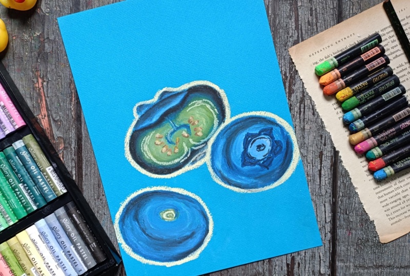
10. Cool Blueberry Swirl : Welcome to cool
blueberries world. For this one, we'll be painting three different blueberries. One will be bisected. For one, the top
will be visible, and for the last one, the bottom will be visible. For this one, we'll be using lots of color, lots of layering. And in here, I've already started with the white
to do the sketching. I'm using blue colored
paper to do the coloring. If you are using
other colored paper, I would advise you to taste
out your color on that paper. As different colours
seems a little bit different depending upon the
paper you are adding it on. So I would suggest you
to try out the colour on a rough paper and then use
it on your mean project. For the second one in here,
I'm creating a circular seam. Now moving on to the
third and the final one. For this one, we have
got an oval seam. This will be our three blueberry.
Let's do the coloring. In here, I'm using
sapphire blue, starting with the sapphire
blue for the upper part. The region just below the
calx of the blueberry. Adding it a little bit for the outline section of the calx, the upper part of the blueberry. Extending it a
little bit in here. So this part will be the
calx of the blueberry. Now for the insights, I am
feeling it in the sky blue. In here, I'm applying
medium presser with sky blue and doing partial
blending of the two colors. Later on, we'll be using
the blending tools blending stem per Q tip to do the
blending of the colors. O now just apply medium presser and feel nine sides of
the calax with this. And with this, we are done
with a sky blue phone now. Now going in with the black, we'll be doing the outlining, adding this white in here. To avoid smudging of the
color from the palm, I'm using the tissue paper. Applying medium pressure with the black to do the
outlining in here. Also doing outlining
for the upper part just beside the calex
that we created, making this a little bit
thicker on the left side. Now in here, I'm using
this light blue. Adding this light blue
just beside the black, as well as doing a partial
blending of the color by overlaying a little bit of this light blue on
top of the black. Overlaying this light blue on top of the black in here, too, the insights will be using
lots of colours, lemon yellow, moss green, olive yellow, pal, yellow, and yellow
along with ochre. So I'm starting
with a moss green. Adding this moss green just beside the sky blue
that we just use. No, not the sky blue, the light blue
that we just used. Now using this lemon yellow. Overlaying a little bit
of this lemon yellow on top of the moss green and
adding it in this manner, extending this middle person a little bit with
this moss green. Now, once again, going back
with this lemon yellow. So we are done with two
colors for the insides. Now going back with
a Saphireblue to add a little bit more
detailing for the insides. And now, once again, using this lemon yellow for the insides, a
little bit of it. And with this, we are done
with the lemon yellow for now. Now I'm going with
this pale yellow, pale yellow that I used, the pale yellow that I
used for the outlining. Oling a little bit of this pale yellow on top of the
lemon yellow that we used earlier as well as adding it beside the
moss green that we used. So with this, we add with the pale yellow for the
inside of this blueberry. Now let's do the blending. In here, I'm starting with the
darker side of the colour. To get a smooth and
consistent blending. I'm doing the blending
in this manner. Let's make the outline bit bolder and more darker
with this black. Apply medium to heavy presser with this QTIP to
do the blending. Instead of this TIP, you can also use the blending
stem to do the blending. We'll be doing the blending of the sides for the blueberry
indifferent layer. We are done with
the first section of the blending for the colors. Now in here, I'm
extending the blues and the black and mixing it with the moss green to do the
blending of the color. Extend these two colors a
little bit to mix it with the moss green to do partial
blending of the colours, doing it for the lower section, the bottom part of
this blue berry. Now, changing the
side of the tub and let's blend the
lighter colors. Now for this section, instead of extending
the blues and the blacks and the moss
green to meet the inside, I'm extending the lighter seats
of the color that we use, the lemon yellow and the
pee yellow and extending it to meet with the moss green to do a blending
of the colors. So extending the lights
colour to mix with the darker seats of the color for the flairs of our blueberry. Slowly and gradually, we are moving towards the
center of the blueberry. We'll also be doing a little bit of blending for the
sapphire blue that we added for the inside for the central part
of this blueberry. In here, you can
see we have created a beautiful gradient for the
flares of the blueberry. Blending it a little
bit more to get a smooth consistency
of the color, to get somewhat of uniform
consistency throughout the entire section
for the inside of this blueberries flush. I was not satisfied with
the consistency in here, so I decided to make it a
little bit more lighter. In here, I'm using a little
bit more pale yellow. Adding this pale yellow on both the sides and a little
bit further bottom section. Let's add a little
bit more detailing. So in here, I'm using
this yellow color, applying medium to heavy
presser with this yellow to overlay it on top of all
these layers of the color. Now, once again, we'll be doing a bit of partial
blending in here, applying medium
preserve with it to blend the yellows with
this pale yellow. Blending it to the rest of the colours to make this region a little bit more lighter
and a little bit yellow is. Moving on to the other
side, doing the same thing, first blending the
pale yellow with the yellow and then and then yellow with the
remaining section. Finally, doing the blending in here for this lower section. Now, just do a little bit
of more blending to get a little bit of smoother
consistency for the inside, the flair of the blue berry. And with this, we are done
with blending for the insides. Now moving on to
the upper section, the cex of the blue berry and
doing the blending in here, the lighter side
of the blue that we used along with
the sapphire blue, doing the blending for the
upper part of the Calex too. Now going with the black
to make the outline, the upper part of this calex
a little bit more darker. Let's redo the blending in here, blending the black with
other lighter sides of the blues and sapphire
blue with this black. So blending this black with
the remaining coloring. Applying medium
to heavy freezer. And we are not going to
cover the entire section, doing a partial blending for the upper part of this
blueberries Calex. And with these we with the
blending for this side, pull most of the section for
this small section in here, adding a little bit of sky blue. Making it a little bit darker with the darker
side of the blue. Now let's do the blending. Applying heavy pressure
with the Q tip to do the blending for
this smaller region. I'm also blending a little bit of the pale yellow
of the outline. Now for this region in here, doing a little bit more
blending just beside the sapphire blue that
we use for the inside. And with this, we are
done with this now. Let's start a little bit more
detail for the insides of this now let's create the
seeds for the blueberry. In here, I'm using Ochre
and creating this kind of simple tear drop like
C for the blueberries. Ted drop like C for the
seeds of the blueberry. I'll be creating 12 to 14
seeds on both the sides. If you want, you can increase or decrease the number of
the seeds a little bit, adding few seeds for
the insides too. Now adding a little bit of
lemon yellow for one side of the seeds that we created
on top of this ocher. With these we are done
with the lighted seeds of the colored food that seed. Now going with a little
bit of brown to make it a little bit
darker on one side. Here you have to apply a little
bit of more presser with the oil piststi to overlay on top of this many
layers of the colors. Adding a very small
amount of brown for all the seeds that
we have created in here. I'm also using this brown to redefine the seep of
the seeds a little bit, adding a little bit more
for some of the seens. Now let's make it a
little bit more lighter. So on the other sides, I'm using a little
bit of yellow. So overlaying this
yellow on top of the ocher and a little bit on
top of the brown, too. Let's add a little bit more detailing for the flairs
of the blueberry. Adding the details for the inside of the
blueberry in this manner. Simple lines, simple
curved lines like this for the inside
of the blueberry. Adding a little
bit more in here. So in here we are trying to
create a little bit of veins like structure for the
insides of the bluebafuls. Now let's do the
coloring for this one. I'm starting with the
sky blue for the center. In here, we'll be
adding the cex. Let's make it a little
bit more lighter. So overlaying a little bit
of white on top of this, making this circular region
a little bit more larger. Now for the side two, adding
a little bit of white. Now going back once again with the sky blue to make this region a little bit blues overlaying a little bit of sky blue
for this region two. We'll be creating the reflection of this blueberry on this side, so that's why I
added blues and the white in here to make this
region a little bit lighter. And for this middle region, as I was saying, I'll be
adding the galaxy in here. So that's why I decided to add a little bit of
lighter seed in here, making this region a
little bit more lighter, adding a little bit of white on the other side to make that
region a bit more lighter. Going in with this darker side of the blue, sapphire blue, I added a little bit of
blue for the outline sexon, so making the outline a
little bit more bolder. Now continuing on with
the sapphire blue, filling the rest of
the empty spaces in here that we have created. Filling the rest of
the empty spaces with sapphire blue for the entire
section of this blueberry. For the lower region in here, I'm leaving a little bit of space in between so that I can use a little bit
of darker side of the colour to make that
region bit more darker. Now, let's do the blending. Starting with the
middle. I'll be extending the slighted
side of the blues and the white to mix it
with the sapphire blue. Now, let's do the blending of the colour for the
remaining section, blending this sapphire blue with the sky blue and the white. In here, as you can clearly see, we have created a
beautiful gradient in between different
sides of the blue. The lighter regions in
here will be representing the reflections and
the darker regions will be sewing the shadows, and in between them,
we have created a gradient of sky blues
and the sapphire blue. Doing the blending on this side, doing the blending on this side, and making this region a
little bit more darker. Apply a little bit of more
pressure to do the blending, extending the sapphire blue
a little bit on top of the lighter sets of the
colon that we have used. To make the darker
region bit more darker, overlaying a little
bit of black on top of the sapphire blue
that we just used. I'm not adding the black on all the portion, but
some of the section. Only for those section
that I want to sew a little bit of
darkness or you can see a little bit of sadosG back with the QTIP to do
the blending once again. We are particularly blending this black with
the sapphire blue. I'm not going to extend
this black a lot to mix it with the lighter treat of the sky blue and the white
that we used earlier. And with these, we are done with parcel blending
of the black. Now let's create the calx, starting with this sapphire
blue to create the see for the Calex Creating petals like sea for the Calex Apart
from the sapphire blue, we'll also be using black. Adding a little bit of sky
blue for some of the section, the middle section of this cx. Now feeling the
remaining section of this petal like of the calex
with this sapphire blue, making it a little bit darker, so overlaying a
little bit of black on top of the sapphire blue
for some of the regions, but it car on the
lower right side, adding it on here too
on the other side. Adding a little bit more
black for the insides. We are not going to blend the colors in here, but
we'll be keeping it, but we'll be keeping it as it is to sow the rough
texture of the blueberries Calex and with these, we are done with the
second blueberry. Now let's do the third
and the final one. So for this one, the bottom
section will be visible. And in here, I'm using white to create the central region, the bottom section
of the blueberry. Now, using the cobalt blue, encircling the white that we just used with this cobalt blue, going with the sky blue and
doing a partial blending of the color and encircling the cobalt blue
that we just used. Extending the sky
blue a little bit on this side and creating this
kind of grease and same. To make this region a
little bit more lighter, adding a little bit of white
surrounding this sky blue. Adding a little bit more
covet blue for this region. And we are done with
the cobalt blue for this region now going in
with the sapphire blue. Creating this kind
of random strokes with the sapphire blue, adding it for this
crescent seen, creating this kind of
rough strokes with this. Now adding a little bit of this sapphire blue for
the middle region, the central part, and overlaying it a little
bit on top of the white. And with this, we are done
with the primary coloring. Now going in with the tip to do the blending here we'll be blending all the
colors together, applying medium to
heavy pressure with the tip to blend
all these colors. So in here too,
we'll be creating the same kind of landing that
we did for the second one. We are doing blending
and adding color in this manner to so
that the blueberries are a little bit three dimensional
in seep and also to depict the curved seep
of the blueberries and to give it a little
bit of more volume. Let's do a little bit
of more blending, following this crescent seep and doing the blending
in this manner. And with these, we are done with the first layer of the blending. Now let's make some
of the regions a little bit more darker. Adding a little bit
of black in here, adding a little
bit more black in here to make this region
a bit more darker. Now, once again, going back with the black to do the blending, extending the black
a little bit. Doing the blending for
this region in here, extending the black in
here to mix it with the cobalt blue and the
lighter side of the blue. This region was a
little bit more darker, so I decided to make
it a bit lighter, adding a little bit
of sky blue in here. Now going back with the QTube to do the blending once again. Blending the sky blue
with the black to reduce the intensity of
the black a little bit. Doing a little bit more
blending in here to get a smooth transicent
in wet winter colors. And with these, we are done with the blending of the colours
for the third blueberry. Now for this bottom section, adding a little bit of
moss green in this manner, overlaying it on
top of the white, and creating this small
circular C for the inside. With these, we are done
with this section. Now let's make the outline
a little bit more defined. So using this pale yellow
to redo the outlining. So this is option if you
don't want to do this, you can just leave it as it is. I use this wheel to
do the outlining in here since I am using
this blue colored paper, otherwise, it was not required for me to do the outlining. But since the cobalt blue
and the light blues are what seemed to the color of the paper, that's
why I'm using it. I'm not going to add any
shadows or background, but if you want, you can
proceed with that, too. Now, let's add a little bit
of reflection for the scene. So using a little
bit of pale yellow and creating small
dots for the seeds, adding it a little bit on top of the sapphire blue in here, too, blending it a
little bit to subdue it. And, with these, we are
done for the insides. Adding a little bit
more to make some of the regions a little bit more distinct, the outline regions. And with these, we are
done with this project. I hope you enjoyed this, and I'll be seeing you in the next project.
Happy painting.
11. Two leaves: Welcome to Sunny blueberries. Let's start with a
simple pencili sketch. For this one, we'll be
creating two blueberries. This one will be the larger one, and the other behind this
will be a bit smaller one. I'll also be adding two leaves just beside the
second blueberry. This project is divided
into two parts. This is the first part in here, we'll be painting
up to the leaves. And in the second
part of this project, we'll be doing the coloring
for the blueberries. But This is yet
another simpler one. As for the colors
for the blueberries, I'll be using prucan
blue, stone gray. I'll be using the stone
grave to create the sados. Then I'll be using
fluorescent sapire blue, a little bit of royal purple, a little bit of an dike crown, and a little bit of black
Atrment for the leaves, I'll be using fluorescent
yellow green, viridian green, as well as a little bit of
cadmium yellow. Creating these kind of very
simple versons for the leaf. Instead of this, if you want
to create other kinds of leave or change the
placement of the leaves, you can do that. If you want to make chines and adjustment, feel
free to do that. I'll be adding the sado
for the bluery in here, for this larger one,
for this smaller one, I'll be adding the sado
in here, just beside it. And this is going to
be our simple pencil sketch for the two blaries. In here, I'm using this yellow pastel paper to do the coloring. Instead of this, you can use any other color that you
have to do the coloring. Now, let's start
with the coloring. So in here, I'm starting
with this cadmium yellow, a little bit of
this cadmium yellow following the seep of the leave, adding it on both the
sides of the midrim. This is our first
layer for the leaf now going with a little bit
lighter seed of the green. So here I'm using
fluorescent yellow green. Overlaying this a little bit on top of the cadmium yellow, as well as adding it just
beside it like this. I also added it for the I also added it in
the middle region for the midrum moving on to the second one, doing
the same theme. Here I'm applying low
pressure with it to overlay a little bit of it on
top of the cadmium yellow. Using this green to define the seep of the
leaf a little bit. Thing the same thing
in here for this leaf, defining a seep, a little bit with this fluorescent
yellow green. And with these, we
add the yellow green. Finally, going with
this viridian. For most of the empty
spaces in here, just beside the outline
section that we have created, adding this viridian green, adding it a little bit for the middle section for the midrib. Now doing the same
thing for this one, adding it just beside
the outline section, applying medium presser with it, now adding it for
the middle section, adding it carefully in here, just beside the blueberries. Let's make the outlines
a bit more darker, adding it for the mid drops, creating simple and
straight mid drops for the middle
section of the leaf. And with this we turn
with a aridian green. Now let's do the blending. Blending stump in here. I'm using this Q tip
to do the blending. And I'll be spreading the
colors from the middle section. So spreading this aridian
green from the mid drips. The goal in here is to spread the viridian
green from the center, as well as from the
outline section towards the middle section. Creating a little bit
of trangesen in between the dark shades of the green and the yellow from
outside to inside. Let's do the same
thing on this side. Spreading the
Viridian green from the outside regions
towards the inside, as well as spreading this
viridian green of the inside, the midrib that we created
towards the outside. It will be meeting
at somewhat of middle section of the
remaining part of the leaf. Since mostly we use low presser
and the medium presser, so the intensity of the color
in here is not that dark. That's what I was aiming
for to get this kind of subtle gradient and subtle trangent in between the greens. If you want to make
it a bit more darker, you can apply a little
bit more presser and add another layer of
green on top of this. Put this one and decided to make it a little bit more lighter, so added a little bit more
floors and yellow green, making this side a bit more
darker using radiant green to so a little bit of shadows
casted by the other leaf. Now, let's do the blending
in the same manner, reading the radiant green from the outline
section as well as the radiant green of the mid
drops that we just used. Instead of this,
you can also use the blending step
to do the blending. With the blending step, you
will get a little bit of mold preseason and you
can apply and you can apply a little bit more pressure with it as compared to the cutipblending the
remaining section of this leaf, this
side of the leaf. Moving onto the other side,
doing the same thing, spreading the Vina
and green from the outline section as well
as from the midrib section. To make it a little bit lighter, you can just do the opposite. You can spread the
lighter color, the yellows from the
middle portion of the leaf towards the outlined section and towards
the mid drop. Now we have got a small
section in here where we added a bit more
radiant green, so spreading the colors in here. And since we added a little bit more idiant green in here, so this region a bit darker. Now, we spread the colours
a little bit more to get a smooth consistency and
uniform blending of the colors. With these, we are done with
a blending for the leaf. Now going with the blending
system to make the edges of the leaf a little bit more sharper and a little
bit more defined. Instead of this, you can always use the colored
pencil to make the outlines a bit more
defined and bit more crisper. You can also use the oil pastel to do the blending later on. Now, once again, I'm
using this radiant green to create the mid
drops and the veins. If you want to keep
the simple acts, you can just leave it aus. You don't have to add the
midribs and the veins. With these we are done
with the first one. Let's do the same
thing for this one, adding the mid drops and now adding the veins,
multiple veins. And with these, we are
done with a radiant green. Now, once again, going back with the blending stem in here, I'll be subduing the intensity of this radiant
green a little bit, applying heavy pressure with this blending stem and blending a little bit of
this radiant green with the remaining section
of the leaf, the background. This is optional to if you want to make this a little bit sour, you can just leave it as it is. You don't have to do
the blending with the Qtip or the
blending stemp in here. And apart from this, if you want to make it
a little bit more lighter and add a little bit
of reflection on highlights, you can go in with
the lighter seats of the yellows or pale yellow or white and go over
the mid drops and the veins, some section of it
to add those kind of reflections and a
little bit of highlights, doing the same thing
for this leave in here, the second
leaf we have. Just going over the mid
drops and the veins, we have created twice
or thrice to subdue its intensity a little bit and blending it with the
background color. Just subdue its intensity
in a little bit of blending till you're
satisfied with the result. So for this video, I'll only
be continuing up to here, and in the next video, you'll be coloring our blueberries. Here, as I mentioned,
if you want to you can always use the colored
pencil to do the outlining. Right now, I'm just
using this blending stem to make the outlines
a little bit more defined blending the colors a little bit more for
some of the sections. And with these, we had done with two leaves for
our blueberries. I'll be seeing you
in the next part.
12. Sunny Blueberry : Let's continue
where we left off. We have already
created the leaves. Let's start with the blueberry. In here, I'm using
van **** brown to start with the calax
of the blueberry, a little bit of van **** brown. Now going a bit darker
side of the blue. So in here, I'm using
Crucian blue and adding it a little bit just
beside the brown and overlaying a
little bit of it. Put the calx of the blueberry. These are the other
colors that I'll be using to do the coloring
for the blueberry, starting with a bit
lighter state of the blue. So here I'm using
fluorescent sapphire blue. And mostly in here, I'll be using medium to low
pressure to create different layerings of the
blueberry and then use the blending stem or the Qip
to do the blending later on. Applying low to medium
presser with this and adding it just beside the Calex for the
remaining section. Here, too, I'm adding this
in different sections so as to sew and
create a little bit of curbs for the blue bearing. Following the curb see or
the contour of the blueberry and adding this fluorescent blue for the remaining section. To make it a little
bit easier for you, you can just do the outline first and then add
the colors later on. In here, I was not able to
record the remaining section, but I'll be showing you what I did with the different colors. So we use Brucin blue, fluorescent sapire blue, a little bit of royal
purple to do the coloring. As usual, as I showed you, I started with the
brown to do the calx, use a little bit of this
Prussian blue to create a little bit more
detailing for our calx. Then started with this
fluorescent sapphire blue, applying light
presser with it and creating this kind of lines
following the curve sweep of the blueberries and
mostly adding it for the upper section
and a little bit for the lower sections. So I use this color in
this manner to add it for most of the region
of this blueberry. You can say that I added it
for most of the sections. As you can see, I
applied medium to low pressure with it as the first layer for this blueberry. I also added a little bit
more for the other side. I went with this purple. So in here, I'm using royal
purple from the Brusto and adding another layer on top of this fluoct sapphire blue, particularly on the lower side. And I'm also creating
some larger strokes for some of the section for
the middle section like this, particularly adding it
for the lower section. So this is how I use the royal purple as
the second layer. Now for the third
layer to make it a little bit more darker, here, I'm using the sapphire blue, not the sapphire blue,
but the Prussian blue that we used earlier
for the Calex. A little bit of it overlaying on top of the other two colors, the royal purple as well as the fluorescent
sapphire blue. And to make it a little
bit more darker, and to sew the sado, I added a little bit of black
in here like this. So overlaying this black on top of all the remaining colors. And this is how it turned out, so you can clearly see just by using different
color of the paper, the result looks
a bit different. And let's continue with
the remaining section. And here, I'm using Kotip and let's do the blending
of the color. Here to make it a
little bit darker, I'll be spreading the colours from bottoms towards the top. To make it a bit lighter,
as I said earlier, you can just spread the
color in opposite manner, starting with
blending the colors from the top just beside the calax and spreading it
towards the bottom section. Here for the blending, too,
I'll be spreading the colors following the curve sweep
of the blueberry to add a little bit more
depth and give it a little bit more volume to it so that it's a little
bit three dimensional. So this process is going
to take a little bit of time to make this
process a bit faster, you can use the tissue paper. With the Q tips
and blending stem, because of their small size, we are able to create a little
bit more texture and add a and add a little bit more
volume to the painting. So in here for the lower sexon I have just started
with the tip, but for the later
sexon I'll be using the tissue paper to do the blending for the remaining part. Ater on, I decided
to do the blending for the remaining section
with this tissue paper, as I have not used tissue paper to do the coloring for
any of the project. So I decided that it would be a good example to do the
blending with this tissue paper. If you want to continue
with the blending stump or the QTIP, you
can continue on. Applying heavy pizzer with the tissue paper to
do the blending. Instead of this tissue paper, you can also use small cotton
cloth to do the blending. It will make the result a
little bit more better. With the tissue paper, you
will have to be careful. Otherwise, you will get a
little bit of smudging or colors coming out from
the outline section, and we don't want that. Changing the side
of the tissue paper and continuing on with
the remaining section. Carefully doing the outline the upper part near the Calex, spreading the color a little bit near this outline section. Once again, changing the side of the tissue paper to
do the blending. Carefully doing the blending
on the other side too. Now, apply more prexer with it and do the blending for
the remaining section. In here for this upper
part since we use low to medium
preser with the oil pistil so this region is
a little bit lighter. We are done with the tissue
paper for the blending. Let's add a little bit more detailing for the
upper part, the calx. In here, I'm using fluxin blue and creating this kind of s, the star petal like
s for the Calex Now, let's make this outline sexon
a little bit more darker. You can also use a
little bit of black. I'll be using black later on. Now to do a little
bit more blending near this region,
I'm using QTIP. This will be a little
bit challenging using the tissue paper since the
age a little bit smaller. Spreading the color
a little bit near this outline section
for the Calex. Carefully doing the blending
on the other side too. Now for the region in here, the browns and the prosen
blue that we used earlier. Just apply medium preserve
and do the blending. Go in the black to add a little bit of more
darkness to the calx. I I spreading the
color a little bit, mixing the blacks
with a Putianblue. And with these, we are done
with the primary coloring for our blue being
first blue bearing. Now in here, I'm using this blending stem to make the outline cell a
little bit more defined. So just going over
the outline section and applying heavy
preset to get bit sharper and bit more defined curve see for
the blue bearing, doing it for the remaining
section in here. Instead of this, you can
always use the darker set or bit lighter seats
of the colour to make the outline
with the oil piston. You can also use the colored
pence to do the outlining. Using this blending stem
carefully near the screen part, we don't want these
two colors to mix. And now let's make some of the regions a
little bit lighter, applying heavy presser with
the white and adding it a little bit on top of the blues and the black for the Calex. I'll also be making
some of the regions of this blueberry a little bit
lighter with the white. For now, I'm using this white
to create kind of this kind of seep to sow a little bit
of highlight and reflection. A little bit of exclamation
marks like see. Adding a little bit more on this side to sow a little
bit of more highlight. Now using the
blending stump once again to subdue the
white a little bit, blending a little bit
of this white with the remaining section
of the blueberries. Doing a little bit more
blending near the upper part near the calax Now, later on, I'll be
coming back with the white and add a little bit of more texture and
detailing for some of the section of
this blueberry. Before doing that, let's do the coloring for the second one. In here, we have started
with the brown for the Calex creating this kind of s for
the cex of the blueberry, now continuing on with the
fluorescent sapphire blue. We'll be doing the coloring in a little bit same men that waited for the first blue berry. Using this
fluorescent, sapreblue as the primary layering
for the blue berry. Instead of this, if you want
to make it a little bit more darker as this is a little
bit behind the first one, you can use darker
sides of the blue. Instead of this
fluorescent, a file blue, you can use the cobel blue and then proceed with
the Prussian blue and a little bit of dark blue to make this blue berry
a bit more darker, adding it for the
remaining section. Making this right section
a bit more darker. And with this we add in
with the sapphire blue now to make it a little
bit purple in color. So using this royal purple and
adding it particularly for the lower section
and making some of the streaks of this purple a bit larger for the upper
part like this, We had done with the purple and now going with
the Prussian blue. Adding it carefully near the outline section of
the first blue bearing, making this right
section a bit more darker and fun black. Adding a little
bit more black in here to make the sados
bit more darker later on. Also adding it in here for the
sadose casted by the leaf. Carefully adding it in this curved magnet do the
outlining for the blue varying. And with these, we add with the coloring
for the blueberries. Now, once again, going in with the tissue paper
to do the blending. Instead of this for the
smaller region, if you want, you can use the QTIp
or the blending step, and you can just
continue with me and use this tissue paper
to do the blending. Apart from this tissue paper, you can also use a small cotton
cloth to do the blending. It will make the result a
little bit more better. Tinuing on with the
remaining section, spreading the color from bottom to top to make it a
little bit more darker. To make it a bit lighter, you can just spread
the color from top to bottom instead of spreading
it from bottom to top, spreading the colors carefully near the upper part,
near the Calex. And with these, we add her with the primary layering
for the blueberries. Now going with the
white, as I said, for the blueberries, some of the section I'll be
making it a bit lighter, adding a little bit
of white in here, moving on to the
second blueberry, adding a little
bit more white in here, comparatively more white. Adding it for the
outline section in here. Let's subdue the
intensity and create a smaller streaks of
white for the sides of the blueberry using this
blending stem to subdue the white a little bit
and blending it with the remaining colors
for the blueberry. So just by doing this, we are
creating small streaks of white throughout the entire
section of the blueberry. And as you can see, I
have added the white following the curve shape
of the blueberries to sow a little bit more roundness of the blueberry making the regions near the calec a little
bit more lighter, so using a little
bit more white. Now, once again, let's
do the blending, subduing its intensity
a little bit and mixing it with the remaining
colors of the blueberry, carefully doing the
blending near the Calex. I'll also be adding a little bit of white for the other side. For now, I'll just do the blending for the remaining
section of the white. You can also use the Q tip to the blending with
the tissue paper. It will be a little
bit difficult to do the blending for the
smaller sections. Applying heavy pressure with this blending stem
to do the blending. Now moving on to the second one, carefully doing a
blending near the leaf. Now let's do the blending with the remaining section
of the white. In here, since this
is a little bit smaller as compared
to the first one, I did not add it in the
white in a definite way, but following the curve
b of the blueberry, spreading the colors a little
bit the white and subduing its intensity by
blending it with the remaining colours
of the blueberry. Blending the white
in here on the side. Making the seep of
the blueberry a little bit more defined
with this blending stem. Now let's do the
remaining section, the white. You
have what in here. And with these, we are almost done with the whites in here. I'll be adding another layer of white for some of the section and creating the kind of exclamation mark
for this one, too. Blending the browns
and the blues in here for the upper
part, the Calex, threading the colors
a little bit and mixing it or blending
it with the white, defining the see of the calx
with this blending stem. Once again, making the seep bit more defined and
bit more detailed. Now, once again, going back
with the white other side of the calex in here a little bit of more wine just beside the leaves and
the second blueberry, carefully adding it, creating small strokes with a oil pistil. Once again, using
the blending step to blend this white with
the remaining colors, carefully blending the
colour on the other side. For the exclamation mark like highlight that
I have created, I'll also be subduing
its intensity a little bit by blending it
with the remaining color. I won't be touching the insides
of the exclamation mark, but outside the outline regions, I'll be doing a little bit
of blending like this. Applying a little bit of present and blending a little bit of it, the outline section of the exclamation mark
that we created. If you want to blend
it a little bit more, you can do that. And with these we are done
with our first blueberry. For the second blueberry, making the regions a
little bit more blended. So applying bit more praser
with the Qtip to blend the whites and the darker
sets of the blues, making the outlines
a bit more defined. Adding the same kind of exclamation mark,
not the same kind. This is a little bit different. I added this smaller
section up here. For the first one, I added the small portion at
the bottom section, but in here, I added
it at the top. Now like the first one, we'll
be doing the same thing, blending the outside region of this exclamation mark like highlight to the
remaining colors. With these, we are done with the highlights and the
coloring for the blueberries. Now I'll be doing a little
bit more blending for some of the regions where I
am not satisfied with it. If you're satisfied with how
your paintings stand out, you don't have to
do more blendings. But if you're not satisfied, you can add a little
bit more colors. To make it a bit more darker, you can use the
blacks and the blues to make it a little bit lighter. You can use the whites, and to make it a little
bit more purple and color you can use
purples and sky blues. After doing this, I'll
be going with the stone a bit darker side of the
gray to create the shadows. And I'm satisfied with
how it turned out. Let's do the sados using stone grey and creating
the outline for the sao. Doing it in here, too. Making the region near the blueberry a little bit lighter, adding a little bit of wine, adding it for this
larger one, too. Now for the remaining section
of the outline portion, adding this stone gray Now, once again, using this blending
stem to do the blending, making the outline a
little bit defined, and then we'll be doing the blending for the
remaining section. Moving on to the insides, blending the grease
with the white. In here, I'm blending
in this manner, circular manner to get a little bit more uniform
and consistent blending for the sados spreading the whites to mix it with the gray and
create a subtle gradient. And with these, we are
done with the sados for the larger one, moving
on to the second one, blending the white
with the grease and let's define the seep, making it a little bit more
crisper and bit more outline. And yeah, with this,
we are done with the cytos for both
the blueberries. Doing a little bit of mown
blending for this one, spreading the colors
the white a little bit. Tiding it carefully near the outlined section
of the blueberry. So this was fun to pent. And this was one of the
largest project of this class. After finishing
this, I decided to make the cex a bit more defined. So using a little bit of more blues for some
of the sections. You can also use
black to make it a little bit more darken
and blend the insides. And yeah, this time we are
done with this project. I'll be seeing you in the
next project, happy painting.
13. Conclusion : Congratulations on
completing the class and painting your
Blueberry illustration. I hope this class helped you
feel more confident using oil pastel and gave you a
better stranding of layering, blending, seeding,
and color mixing. This same techniques
can be applied to many other fruits and
subjects as well. If you enjoy this class, please consider
leaving a review. It really helps
other students find the class and supports
my work as a teacher. Don't forget to upload your
project to the gallery and feel free to explore my other classes here on the Skillshare. Thank you so much for
painting with me, and I'll see you
in the next class.
 Vishal Munshi