Transcripts
1. Welcome and Introduction : Hi, everyone. Welcome to my new class Oil
Pistel Mini Cakes. In this class, you
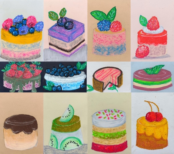
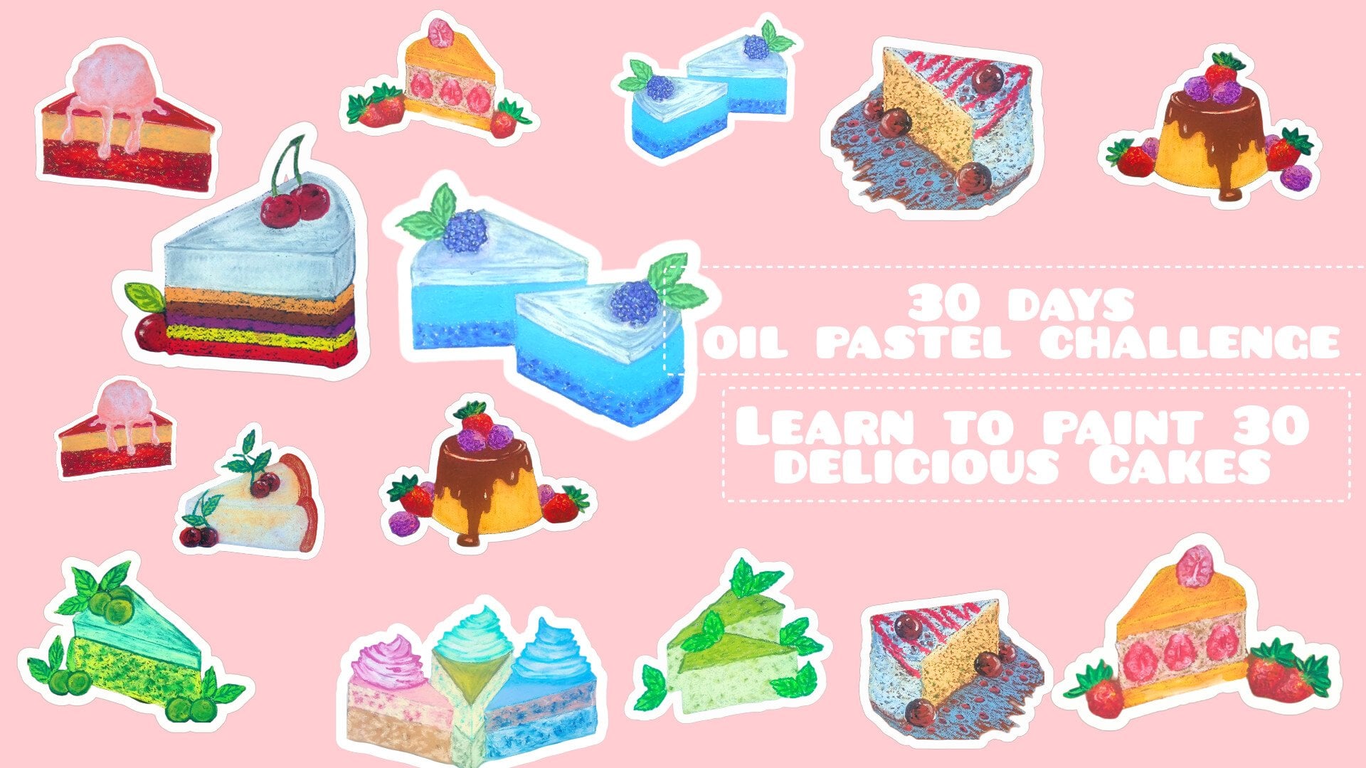
will learn to paint 21 delicious projects
and 15 minutes. We have chocolate
leased mini cake, cherry chocolate dough,
mini macha bites, golden custard treats,
watermelon slice cake, pomegranate pistasio laid cake, Blue maker on stack, cherry drizzle caramel cake, Kiwi Macha mini cake. Blueberry lavender slice, cherry chocolate slice,
mint chocolate cake, blue and green layered cake, cherry disel delight,
strawberry delight cake, Berry cream, mini cake, Golden Berry bliss cake, golden garden Delight,
sunset raspberry slice, emerald strawberry bliss, and lastly, blueberry
cream bowl. Hi, everyone. I am Michelle
an artist from India. I create fun bignet friendly
art classes where you can learn to paint and draw using simple techniques
with oil pistils, watercolor, ink, and more. These are some of the
food illustration classes that are related to this one. You can check this
out, and you can find my more works on
YouTube and Instagram. We will start our class with Basic oil pistel in which I will show you treater and little
bit of layering and color. Then we will do some basic oil pistel techniques like
blending, hatching. After that, we have basic seeps for our cakes and the slices, followed by leaves and berries,
outlines and sketches. We'll be coloring
the leaves, berries, and watermelon slice, followed by different
kind of berries. And lastly, we have some extra
elements that you can use, followed by 21 projects. So join me in this class, and let's paint
some beautiful and delicious oil pastel mini cakes.
2. Class Project : For your class project,
you will create your very own collection
of oil pistel mini cakes. You can follow along
step by step as we paint 21 colorful textured and delicious mini
cakes illustration. These bite size projects
are designed to help you practice
blending, layering, preset control,
hatching, gradient, and texture techniques while having fun and exploring
your creativity. Your goals for the projects
would be completing at least five to ten mini cakes using the techniques learned, experimenting with
different color combination and decorations to make
each cake your own. Don't worry about perfection. Focus on enjoying the process and exploring your
pressonal style. When you are done,
upload your artwork in the project gallery so everyone can admire your
delicious cretons. You can see photos of
your finished mini cakes, your practice seats,
preserve planning, layering, exercise, et cetera. A short note about your
favorite techniques or what you enjoyed the most. So these are all the 21 mini
cakes that we'll be doing. And these are the practice sites that you can also
upload and share. I hope you will learn
something new and exciting and have fun
painting these mini cakes. I'd love to hear your
thoughts on this class. Please take a moment to leave a review and share
your suggestions. Your feedbacks help me improve and create even better classes. Don't worry about perfection. Just enjoy the process,
play with the colors, and have fun creating your own sweet collection of mini cakes.
3. List of Supplies : For this class, you will need
basic supplies, a pencil, a eraser, a Sarner, oil pastels. Oil pastel, you can use
any oil pastels you have. You can use the
gallery, oil pastels, cre pass, oil pastels,
or any other. I'll be using this cre pass I'll be using this
expressionist oil pistil, and then we have got
oil pistil paper. An paper of more than 160
GSM will do the work. In here, I'll be using this Moyo galleries oil pistil paper, and then we have got this additional things
that you can use. Blending stems and tips
to blend the colors. Then we have got tissue paper. You can use that too. Masking
tape to secure the paper. And if you are going to do
a little bit of scratching, this is the scratching
tool that I'll be using. So that's all you
need for this class.
4. Pressure and Layering : Welcome to this section,
Oil pistil basics. Let's start with the
preceed control. By precised control, I mean adjusting how hard
or soft you praise your oil pistel on the paper to create different effects
and color intensity. Here I'm using light
presser. This is. This is medium presson and
in here, high presser. For the light presser,
use a gentle touch to apply a soft transparent
layer of the color. For medium presser in here, apply steady even strokes for
more solid color coverage. And here's the heavy presser, praise firmly to create rich
opaque and vibrant color. These are the three
ways in which we can create
different effects and color intensity just by wearing
the oil piece to presion. Now, let's create a few more examples using different color. With the presser, it's
always mated to start light. We can always add presser later, but it's harder to soften thick
layers once it's applied. And yeah, we garden with three
different kinds of preser. Now, let's do the layering
and simple coloring. Layering in Pi stel is
the process of melding up multiple colors on top of
each other to create depth, richness, and new tones. In here, I'll be
showing you three different examples
of the layering, and let's start
with the first one. In here, I'm starting
with a light presser with this yellow, and now I'm going in with
this orange medium freezer. And in here, we have created a bit of orange
color in the middle. This time, the same colors, I've changed the order and applied a bit of medium presser. Finally, the third one
with a heavy preser. So by wearing the preser we are getting completely different
kinds of layering. Based upon this just by wearing the present and different
kind of layering, we'll be creating
different projects and different kinds of
seeding and texture. Then now let's do a little
bit of color mixing. I'll be using the
three primary color, the yellow, the blue, and the red, and I'll
be mixing them to create different
seeds of the color. This is the red one. So I'll
be mixing them by layering. Mixing yellow and
blue to get green, blue and red to
get purple and red and yellow to get a
bit of orange color. In here, as you can see, I'm
applying medium preser and the reason in which the both
circles are intersecting, we have got a little
bit of green colors. And if you vary the preser and do multiple layers
of the coloring, you will get a bit of gradient in between these two colors. Let's do the second
one. Once again, medium preserG with this red
or orange color in here. And as you can see,
a little bit of orange color is formed
in the middle section. The last one, this orange
color and the yellow, and we have got a lights
orange color in the middle. If you change the
order of the layering, you will get a little bit of different seeds of the color, a different seed of green, purple, and the orange. And you can use this
layering and a little bit of color mixing to create
a beautiful gradient. So let's create a bit of
gradient in here using various seeds of the yellows and orange starting
with this lighter. Here I started with a
lighter seed of the yellow, and as I am progressing, I'm adding a bit darker sets. In here, adding the orange. And now let's add a bit
darker tone of the orange. So here we have got a kind of rough gradient in between
all these colors. In the next section,
we'll be diving into color mixing and color
blending and in there, we'll be creating
a bit more vibrant and more beautiful color mixing. Let's create another gradient. This time using greens. Here I've started with the
lighter side of the green, and as I progress, I'll be making it a bit more
darker and darker. Now going with a darker
sad of this green, let's add another sad. So in here, I'm going
with the olive. By gradient cretion, I
mean creating a smooth, gradual transition
from one color or one seed to another.
In allil pistols. It is used to blend color
seamlessly, for example, fading from dark chocolate
brown to light pink on a small miniake or
or in this case, from lighter side of blue to darker side of the blue
that we can use for the upper section or to
create a bit of sadose and a bit of lightning for
some of the mini cakes. And with these, we are done with this section. I'll see
you in the next one.
5. Oil Pastels Basics : Welcome to this section in here. I'll be showing you some of the basic all pastel techniques that we'll be using
in our main project. The first one is
blending. So by blending, I mean mixing two colors. This is how we are going to mix the color for
our main project. In here, I decided to mix these two colors, the
orange and the yellow. The first layer was the yellow, the second one, the orange, and then to blend
it, I'm using the lighter sad of the color
to do the blending. So we have got a beautiful gradient in between
these two colors, the orange from
yellow to orange. Let's do a few more. Once again, here I'm using yellow and the orange for all the
oil pistol blending. I'll be primarily using or applying heavy pistil
to do the blending. I'll be using the lighter side of the color to do the blending. So what I mean to say that using the lighter set and
then a bit darker set. And then once again
going back with a lighter set to apply a bit of heavy prison and do the blending or
mixing of the color, instead of that,
you can also use a bit of white to
do the blending. Then we have also got the
blending tools, the Q tip, the blending stem,
and tissue paper, or you can also use cotton. You can also blend
with your finger. And with this, we are done with our four demonstration of
color mixing or blending. Now let's create a somewhat more smooth blending
for the colors. Smooth blending comes out best if you're applying
heavy presser here. As you can see, I
use this yellow and use medium presser
to create this one. And now let's create a smooth and uniform
consistency for that. And in here, as you can see, I use this Tip to blend the color to get a
smooth consistency. Now let's do the same for
the yellow and the orange. Starting with the
yellow for this side and let's do the orange
on the other side, a little bit of blending of
the colors in the middle. And now, applying heavy pressure
with this Q tip to blend these two colors together to get a smooth and uniform
consistency of the color, as well as a beautiful
gradient in the middle. If you want to get this kind of uniform texture or consistency, you can proceed with this. Now let's do the same instead this time, instead of the red. And instead of the
orange and the yellow, in here, I'm using
orange and the red. Now let's do the
blending, applying heavy prezzer with this Q
tip to do the blending. You can use your finger
to do the blending. You have got tissue paper,
you can use blending stump. You can use cotton or you
can also use cloth and apply heavy presser to get
this kind of smooth blending. Let's do one more, a bit
of three colors this time. Instead of two colors in
here, I'm using three colors, lighter side of the blue, bit darker one and this
one the black. Now let's do the blending. In here, the consistency of the color was a bit
more different. So that's why in here, I was not able to get a
smooth blending. So you another kind
of smooth blending that you can get by
using the tissue paper. So in here, I'm using this
lighter side of the pink. Applying medium presser
to create this one. And now let's fold
our tissue paper like this and apply
heavy presser with it to get smooth and uniform consistency
of the pink. Mostly I so blending or mixing of color
using heavy presser, but for our main project,
I'll also be using a bit of medium presser and a bit of light presser and
do the blending. Let's do one more in here. I'll be using three colors, starting with the pink, and I'm applying a medium presser. And now it's going
with a bit darker set. So I'm going with this
darker side of the red, applying a little bit of red on top of the pink
that we just added. And after this, I'll be going
with another darker seed, and I'll be using
brown food that. If you want, you can
create a large gradient, starting with white and
ending with the black. So starting with the
white, a bit of yellow, then a bit of red, orange, brown, bit of blue and green, that will be something that
is something you can try. And now let's do the blending of the colors using the
same tissue paper. Applying bit of medium
presser in here. So if you apply medium presser, you will get this kind
of non uniform blending, so you'll have to apply
heavy presser in here. You can also do the
same thing a little bit of blending or mixing the
color for the outlines. I'll be using this also. So to create a bit of different kind of
outline for some of the sections of
the pudding cakes or slices, let's do one more. So using this
turquoise green and the green to do the blending
of theticul and this time, instead of using the Qtip, I'm using the blending stem
since with the blending stem, you'll get more
preceason and accuracy. And now let's do the
blurring effect. I'll be sewing it
two different colors and create the blurring effect. For this, I'll be
using my finger. You can do the same thing
with the tissue paper too, applying heavy pressure with it to blend it with the
rest of the paper. The mid center region will be a bit darker as we
move away from it, it will become a bit lighter and finally mixing with
the background color. Here's another example
with this red one. So this effect is
called blurring effect. And if you want, you can use
it in some of the project, but I won't be using that. Now let's do the outlining. So using a bit darker side of the color to outline a bit
lighter side of the color. This is outlining,
and for some of them, the cherries blueberries
will be doing the outlining. You can do the outlining
in the beginning or you can do the
outlining at last. I'll using both outlining in the beginning and sometimes outlining at the later stages. And now here we have
got overlaying, so adding darker side
of the color on top of the lighter side to add details or add more
definition to it. Primarily, I'll be using
this for the leaves. On top of the lighter
side of the leaves, I'll be going darker
side of the green to add the mid drips in the wins
and do a bit of outlining. Also, I'll be using it for adding more details or
highlights for the berries. Next, here we have got hatching, simple straight
parallel lines in particular direction and a bit more details
to the hatching. We have got cross hatching. I'll be using hatching and
the cross hatching to create a little bit of seeds for
some of the projects. Here we have got a
stippling, small dots. Dabbling a bit of
larger stippling, or you can say a bit larger
strokes. So this is dabbling. Primarily, I'll be using this stippling or dabbling
for the strawberries, blueberries or other kind of
berries or extra elements or details that we'll be
using for our projects. Next, we here I've
got scratching. I'm applying heavy pressure with this green to
do the scratching. Scratching is a technique
where you scrap the top layer of oil pastel to reveal the color underneath. In here, I'm not using
two layers of the color, but I'm just showing
you scratching using this scratching
tool that I have got. Instead of this, you can
use any other sat tool. So these were some of
the basic techniques that you can use for
your pistol paintings. The first one was the hatching that involves creating seeding and texture using series of parallel lines drawn
closer together. Then we had the cross hatching, which is a variation of hatching where you draw overlapping sets of parallel lines
at different angles to build up texture and value. Then we had this stippling, which is a sading
technique created by making small tiny dots or tiny marks with the tip of the oil pistel to build up
texture or depth and tone. In here, we have got dabbling, a painting technique where you tap or praise the pistol gently onto the paper to apply broken patches of
color and texture. Here, the strokes is quite larger as compared
to the stippling. And the last one
was the scratching. And now, let me show
you how creating the shadows and
the highlights for our subject in the mean project. So we have got the
spherical ball. Considering that the light is
falling from the left side, the highlights will
be on the left side as well as a little bit
on the lower right side. So going with the white
to add the highlights, applying heavy pressure
with the white for the upper section and a
little bit for the lower one. The upper highlight
will be a bit larger and the lower one
will be a bit smaller. And I added a little bit of sados on the other side,
on the right side. And as to create a
bit of darker region, you'll have to add a bit darker side of the color in here, a bit of darker
side of the brown on the lower right side, which I did not do, but
for our mon project, but for our main project,
I'll be doing that. And with these, we are
done with this section. I'll see you in the next one.
6. Basic Shapes: Welcome to this section in here, I'll be showing
you different kind of saves that we'll be using for our main project five to six different saves
for our mini cakes. I'll be starting with the
basic pencil sketches, and then I'll be going
with the wallpint paint to do the outlining and add a little bit of
more details to it. You can use this kind of
intersecting lines to use as the reference or the guidelines
to create the mini cakes. Using the horizontal lines
to determine the width of the eke and vertical lines to determine the length of the eke, as well as the
intersecting lines. The middle portion will
also help you to determine the length You can also use this kind of bit of slanted intersecting lines to create the outline
for our mini cakes. So using this as
the reference line from the center to
determine the length of the cake and just
extending the sides to create the remaining
section of our mini cake. Let's do another example of
this intersecting lines. This time it's slanted a
little bit towards the right, encircling this to
create the upper part of the cake and using the sides of this intersecting line to determine the
length for this cake. For this mini cake, I decided to remove one section or
one slice from it. So this is somewhat very simple. Divide the upper part of the
cake into different section, and for the section in which you don't want
to add the slice, you will have to draw
this kind of somewhat of triangular see
for the best and for the upper part to represent that sexon is missing or that
slice has been taken off. Let's do a few more examples of different kind of mini cakes. In here, I decided to create somewhat of a rectangular
C for our mini ****. Once again, here I'm
using intersecting lines. This time, it's somewhat
of rectangular C. Let's determine the
length for this one. Now let's add the Bs for it. In here, we have got a
single slice of the king. For the upper part, we have
got somewhat of triangular C, and for the remaining section, we have got somewhat
of rectangular C for the front and a little bit of curve rectangular
C for the side. Standing with a
triangular C for the top and this kind of rectangular
C for the front. Let's do one more. So
adding one more beside it, facing in the same direction, triangular C for the top, somewhat of curved
triangular C for the top. Rectangular C for
the front side, other side, in this
case is not visible. With these we are done with
the basic pencil skies for different kind of
sees for the mini cakes. Let's make the outlines a little bit more clear and
more crisper using this ballpoint pane I'll be adding two or three
layers for the mini cakes. I'll be adding various elements on top of it, cherries, berries, leaves, sauces, drizzles,
frosting, and other elements. So in here, I've
increased the speed, and yeah, let's do the outlining
for the remaining cakes. This kind of cake seems a
little bit challenging, but it's quite easy to do. Here we have got the
rectangular mini cake. Single slice of the cake. For the other side in here, a bit of curved
rectangular seep. A set of two slices in here, triangular see for the top and rectangular
sep for the side. And with these we are
done with the outlining. Let's erase the pencil sketch. If you want to make
adjustment and layers or if you want to create
any other kinds of minikes feel free to do that. Let's divide the minikes
into different layers, two, three, or four or as
many layers as you want. For some of the ekes, I'll be creating shadows. For others, I'll be
creating pieces, and for some of them, I
won't be creating anything. If you want to add plate,
spoons, you can do that. Or if you have any other ideas, feel free to say it in
the discussion section. Let's add layers for this one. For our main project, I won't be using the ballpoint paint
to do the outlining. If you want, you can use
the colored pencil to make the outlines a bit more
clear and more crisper. Or you can apply heavy presser
with the oil pastels to make the outlines a bit more crisper and a bit more bolder. And with these we add with a very basic saves
for our mini cake. I'll see you in the next one.
7. Pencil Sketching : Welcome to this section. This
is an additional section. And here, I'll be
showing you a different kind of leaves that
you can create. Apart from that, I'll
also be showing you the outlines and the
sketches for baries, strawberries, watermelon,
slices and black barries. Since our projects are
going to be small, we'll be creating bit smaller
versions of the leaf, but here are some of
the different ways or different kind of leaves
that you can create. Normally, I'll be using the
very simple kind of leaf, the first one and the third one. Sometimes instead
of a single leaves, I'll be adding two
or three leaves. Let's create a few more leaves. As for the coloring
of the greens, I'll be using different
seeds of the green, primarily a lighter seed
and a bit darker seed. I'll be starting with
the lighter seeds of the green as the primary
layer, and then on top of it, I'll be going with
the darker side of the green to do the outlining, add the mid ribs and the
beans, as well as the stems. And sometime I'll start with the darker side of
the green to do the outlining and
the mid ribs and distens and then go in with the lighter
side of the green, completely feel the sides
of the leave and blend a little bit of the
lighter side of the green with the outline
darker side of the green. And then once again,
going back with the darker side of the green
to redefine the outlines, at the mid ribs and the veins. And after that, I'll
be going in with the white to add the highlights
for the leaves also, make the details, the
mid ribs and the veins a little bit more clear
and more distinct. In these two weeks, I'll
be doing the leaves. These are the different
kinds of leave that you can use as additional
aliment beside your cake, hot puddings, or
slices of the cake. And we have got cherries here, very simple circular
saves for the cherries. Apart from the cherries, I'll
also be using blackberries, blueberries, strawberries, rasp berries, and then we have. And then we have slices of
the watermelon, kiwi slices. And if you want to
add any other kind of fruit or any other extra
aliment, you can do that. We also have an
additional section in which I'll be showing
you different kind of jams or sauces that
you can add on top or beside the cakes
and the slices, how you can create
almonds pistachio, and a few more element that you can add for your projects. So this is a very
simplified triangular sat for the slices
of the watermelon. Now let's make it a bit folder. So I'm going with
this ballpoint paint to make the outlines a bit
more leer and more crisper. And I'll be adding
a bit more details like adding the mid
ribs and the veins. Adding the ribs and the veins and making the leaves a
little bit more jagged, adding the seeds for
the watermelon slices and adding few more details to blueberries and
the blackberries. In here, I've
increased the speed. For our projects, I won't be doing the outlining
with the pin. If you want, you can go in with the colored pencil
to do the outlining, but mostly, I'll be using the dark cut seeds of the oil
pastel to do the outlining. I'll be using this
kind of leaves and the stem forward
of the project. I won't be using
this kind of leaves. But if you want,
you can add this as an additional element
for any of the project. Adding small tiny leaves. As you can see, I'm
not strictly following the outline that I created
with the pencil sketch, and I'll be doing the same
for our main project, too. I won't be following
the strict guidelines that I created with
a pencil sketch. Feel free to make changes and
adjustments as you see fit. And here's another kind of leaf that I won't
be using at all. After this, we'll be doing the outlining for the
cherries, the strawberries. We'll have two strawberries. I am not creating
the pencil eskech for the leaves of
the strawberries, but in here, I'll be using this small pint paint
to create the leaves. Let's add the stems
for the cherry, adding the stem for
the second one. Now, let's do the
strawberry in here, I'll be adding
leaves on top of it, as well as a small stem. In here, we have got a cross
section of the strawberry. I'll be using this kind of
image as a reference to add color for the cross
section of the strawberry. Let's do the blueberry in here. And lastly, watermelon slice. If you want to add any
other additional element, you to do that. Ana we are almost
done with outlining. After this, I'll be
adding a little bit of more details in the form
of midrib and the veins. Now, let's add the mid
ribs and the veins. The mid rib is the poison
that divides leaves into two different halves
or two different section. And the veins and the veins are the lines that comes
out from the mid rib. Primarily, I'll be adding four to five veins on each side. Let's add the vein for this one. Now, let's increase the
speed a little bit. In other section,
I'll be showing you how we'll be adding the
color for the leaves, the stems, the blueberries, the strawberries, the cherries, and the watermelon slices. Let's erase the pencil marks, and we will be done
with this section. If you want to make adjustment,
feel free to do that. And with these, we are
done with this section, leaves and the fruits. I'll see you in the next one.
8. Coloring for Leaves: Welcome to this
section. In here, we'll be sketching more
leaves and coloring them. I'll also be showing you how you can create green berries, cherries and lastly, a big
slice of the watermelon. Let's start with the basic
sketches for our leaves. So this is somewhat
similar to the one we practice in our last do. I'll be sewing in two
different kinds of leaves, and then I'll be coloring it. The coloring will be a
little bit different. I'll also be using some
tools to color it. But in our main project,
I won't be using that. So this is just to
show you how you can create other kinds of leaves if you are going
to use tools or if you want to experiment
a little bit further. Let's make this leave
a little bit went. If you want to practice more, you can draw a few more leaves. Now let's move on to creating the outlines for our
greenberries in cherries. In here, I'll be sawing
you two different kinds of two different colour
combinations of the greenberries, and three different colour
combinations for the cherries. Here for all the marries, the watermelon slices
and the leaves, I won't be adding that
much details to it. I'll be keeping
it a bit simpler. For our main project, I'll be using different kinds of color combinations as well as it will differ a little bit from this demonstration videos. Let's do the sketching for our last one, the
Watermelon slice. We don't have any watermelon
slice in any of our project, but we do have one
of the mini cake themed after watermelon slice. And apart from that,
you can also add few watermelon slices beside that or beside any other of the different
projects that we have. And, we are done with
physic outlining. If you want to add few more
details, you can do that. Adding the stems for the
cherries and small tiny leave. I'll be adding another
cherry later on. But for now, let's do the
outlining for all this. In here, I'm using this
ballpoint paint to do the outlining for
our main project. As I mentioned earlier,
we won't be doing that. Also in here, I increase
the speed of the menu. As we don't need to do the
outlining for our product. We'll be primarily using the oil pistol to
do the outline, but if you want to add a
little bit more details to it, you can use colored pencil. Doing the outlining with
the ballpoint paint won't work in our main project, since most of the
seeds so the mini cakes that lb using
will be of lighter sad. But if you are
going to use a bit darker sets of the oil pistol, you can proceed with
doing the outlines. In here, as I mentioned, Alvid showing you three cherries,
so let's add another one. We hand this two. And finally, doing the outline for this
large slice of watermelon. If you want, you can
add few more elements, and now, let's do the coloring. In here, I'm starting
with a lighter side of the green and primarily
adding it near the midrib. So mid rib is the line
that divides the leaves into two different section
or do different parts, adding it alongside
the mid ribs. Primarily, I'll be using two
or three different shades of the green to do
the coloring, mostly. Only two sads a bit darker
and a bit lighter one. And as you can see, in here, I'm adding a bit darker
side of the green. Going over the mid ribs, as well as adding it on the
outlines of the leaves. And then I'll be blending it. You can use the
blending tools to do the blending or
you can just use the lighter set of the green to do the overlaying and
then do the blending, or you can leave it as it is. So the choice is
here. And in here, as I mentioned, this will
be a little bit different. So I'm going with the Q
tip to do the blending. In here, I'm doing a little
bit of rough blending as I am trying to get a
little bit of textured leaf. So as you can see, I'm not completely blending all the
colors, but if you want, you can apply a bit more
pressure with the QTip or any other tools that
you are using to blend and do a complete
blending of the colors. And let's do the
coloring for the stems. As I mentioned, if you're going to use darker side of the color, then you can do
the outlining with a queen if it makes your
project a bit more easier. As you can see, I'm going
over the outlines of the mid drops as well as adding the veins
coming out of it. But for our main
project, we'll be adding a bit more contrasting
tones so that the mid drops in the veins
will be clearly visible. Let's move on to the second one. Once again, I'll
be doing somewhat of same thing that I
did for the first one. Here I'm starting with
this lighter set. Instead of this, you can also
start with the darker side, doing the outlines, going over the mid ribs and the veins, and then going in with the
lighter set to do a blending, blending the lighter set
with the mid ribs and the outline darker
sets of the greens. Primarily, I'll be
using that kind of blending for our
leaves in the project. But in here, as I mentioned, I'll be showing you
a different kind of techniques for the leaves. And instead of using
the darker green here, I'm using olive to
do the outline to create this kind of
gigant es for this leaf. As I mentioned, for
our main project, we'll be using a bit more
contrasting tones of the green. So that's why nourl
with a darker tone is a bit easier and it's
more clearly visible. We are done with the second one. If you want, you can do a
little bit of blending. I was not satisfied
with the first one, so I'm going back once again to add the mid drops
in the means again, since it was not that
visible in here, I'm using a bit more
darker tone of the green. If you want to add
more detailings to it, you can do that. Now let's do the coloring
for the green berry. Here, too, I'll be using two different shades of the
green to create that. In here, I'm starting
with this mutrtne of the green for the outlines and a little bit
for the insides. Now, let's go in with the peel yellow and feel the
entire section with it. Here I'm applying
a bit more presser with it to blend it
with the insides, blending it completely
with the outlines. And here, as you
can see, I'm moving the all pistal and
circular motin to get a better
blending of the color. And this is just
a very simple way in which you can create
the green berries. For a one mint project, we'll be making it a bit
more detailed. Now let's do the second one. Let's do the outlining with this darker tone of the green. And now for the lower section, I'm adding a little bit more going with this lighter
section of the green. Here the contrast in between that two colors not
that different. So it's blended beautifully. Adding the colours
for the leaves. The leaves in here are
not that detailed. Let's go over the stems and add a little bit of coloring
for the leaves too. I'm adding it on the sides. If you want to do a
little bit of blending, you can do that. Blending it a little bit with the lighter
side of the green. Yeah, let's blend
it a little bit more for the intersection. Let's create the leaves
for the second one using the same combinations of the color that we used
for the green bearing. Going over the
outlines for this one. And now let's feel the inside with this lighter
side of the green. So you will have eight to
ten seeds of the green, feel free to use any
combinations of the green, a bit lighter, a bit darker
seed, and a mid tone. If you're going to use three or if you're
going to only use two, you just use a lighter
and darker side, adding the shadows for it. Let's create a bit
darker shadow in here. And here, we are done with this. If you want to add a little bit more detailing to the shadows, you can add a little
bit of greens to it. Let's do the cherries. So I'll be showing
three different kind of coloring for the cherries
for this first one. Here, as you can see, I
have started with a yellow. This will be the lightest
of all the cherries. The second will be a bit darker, and the third will
be the darkest, overlying a bit of
orange on top of it and surrounding it. Now going with the red, and let's cover the rest of
the section with this. Surrounding the
stem with this red. And if you want, you can
go back with a bit of orange or yellow to do a
little bit of blending. Like in here, I'm doing. Later on, I'll be adding a bit of highlights
with the white. For now, let's blend the colors. And yeah, we are done with the lightest shade
of the searing. Let's do a bit darker. Instead of the yellow, I use the orange as a first coloring. Now using the red and
blending it with the orange, filling some other
region with it. Now, I'll be going with a brown. If you have a bit
darker side of the red, you can do that. But in here, I decided, why
not let's use a bit of brown. So it will make the cherries
a bit more interesting. And now, once again,
going back with this red to blend it with the
rest of the heri. And as you can see,
I did not cover the entire lower section with the brown. If you
want, you can do that. And with this we add
with our chicken cherry, let's do the third one. For the third one, I'll be
making it a bit more darker. Let's start with the brown. Adding the brown near
the two cherries. So load exon completely with this darker
side of the brown. Instead of the brown,
I'll be using the red, a darker side of the
red to blend it. Applying heavy present with this darker side of the red
to blend it with a brown. Here we are doing a complete
blending of the colors. And now for the upper section, I'll be using a bit lighter sad. In here, I'm going with
this orange sd of the red. Let's do another
layer of blending for the upper layer and a little
bit for the lower one. And, we are done with three
berries, three cherries. Let's add the coloring
for the stems. In here, I'm just
using this here, I'm just using chart
to do the stems. In our main projects,
I'll be using shades of green to create the
leaves and the stems. Now let's create
the shadows for it. So I'll be creating two
individual shadows. The first one is with
the slight seating surrounding the base of chars with this lighter
side of the green. And now let's do a
little bit of blending. If you want to create a
bit more defined shadows, you can also add a little bit of red for the lower regions. And we are done with the cherie. I'll be adding a bit
more details later on. For now, let's move on
to the Watermelon slice. In here, I've
started with orange, creating long streaks following the contour or the seep
of this watermelon slice, and now going with another sid. In here, I'm using a bit
darker side of the red, applying it on top of the orange for the upper and
the lower sections. This is just a
rough demonstration for the watermelon slice. For our project we'll be going in with the
smooth blending. In here, I'm just
roughly creating this. In here, I'm using the
extended oil pistol to blend these two colors. So applying heavy passer
with this extended to blend these two colors together to get a somewhat
smoother blending. If you don't have this extender, you can use a lighter side
of the pale yellow or even use a little bit of
white to do the blending. Let's add a little bit more of this extender color
for the lower section. Instead of this
color combination of the oranges and the red, you can use any other
two different sets of the reds or oranges to create the coloring for
our watermelon slice. Let's do the remaining section, going in with the lighter
side of the green, adding it just below it, and now I'll be going
in with extended to blend it with the remaining
section, the upper part. So applying a bit of
medium preset to blend it. And now let's add
the darker side. So going in with a bit
darker side of the green, adding it just below the
lighter side of the green, and doing a little
bit of blending in between these two colors, the lighter and darker green. Extending this darker
side of the green for the lower region or the base
of this watermelon slice. Finally, going with
the darker region of another darker side
of the green a bit more darker and filling it for some of the empty
spaces for the base. Finally, let's do the
blending of all the green. In here, I'm using this QTIP
to do the blending to create somewhat of a smooth coloring or gradient for the bees
and the upper section. Instead of using this Q
tip to do the blending, you can use the lighter
side of the green, or you can use the extended
to do the blending. With these, we are
done with roughly coloring our watermelon slice. Now going with a bit
darker side of the brown to create some semblance
for the seeds. The seeds that I'm creating in here are not
detailed or defined. But for our main project,
I'll be using the black to create and defined for the
seeds of the watermelon. Creating the sado for
this watermelon slice, using the same brown to
create a small sado. And now let's blend it to
make it a bit more smoother. Also, as I mentioned, you can
add a little bit of green to create a smooth gradient
in between the main subject, the watermelon
slice, and the sado. And with this, we are done
with this watermelon slice. Now let's at the
final detailing. So going with the white
to add the highlights. You'll have to apply a
bit of fraser with it to overlay on top of all
these layers of the colors, small dots, small streaks
to create the highlights. Let's add a lot of highlights
for our watermelon slice, a little bit more
detailing to the leaves. Going over the outlines of the midrib and the veins to
make it a bit more detail. You can do the same thing for
the outlines of the leaves. For this one, I decided
to add a little bit less, and yeah, we are done
with the whites.
9. Berries : Welcome to this
section. And here, we'll be sketching and
drawing strawberries, blueberries, blackberries,
and rasperberries. Also, a cross section
of a strawberry. This is going to be fun. Here,
I've already started with the basic pencil outlines for the three strawberries that
I'll be showing you in here. I'll be using various seds of the red and creating three
different strawberries. One will be of lighter sad, the other the other
the medium seed, and the last one will
be of darker sad. And mostly I'll be using
the stippling and dabbling. So in here, let's start with this medium one going in
with the sad of the orange. I'm using this sad of the
Onge as the primary layer. On top of this,
I'll be going with a bit lighter sad and
a bit darker sed. I'll be using the dart seeds
to do the outlining and add a bit more details to it and also to create a bit of
cados for the strawberries. I'm going for the rough
texture for the strawberries, since this will be smaller, since this will be much
smaller in our main projects. And now in here, I'm going with a bit darker side of the red, and let's do the
same thing, a bit of stippling on top of this. Compared to the first layer, this is a little bit less, and apart from this, I'll be going with a bit
more darker side of the red. So I primarily edit it on the lower left side and
a bit for the center. And in here, I'm going
with a bit darker side of the red or you can say it's
somewhat brownish color. Let's define the center
region for the strawberry, the middle part, and
the lower regions. Using this to make the
strawberries a bit more darker for the lower
regions and for the outlining. So this is our first simple
medium seed strawberry. Now let's create a
bit lighter seed one. In here, I started with
this darker side of the to do the outlining
and the center part. Later on, I'll be creating
two more strawberries. For that, I'll be adding
the leaves on top of it. But for now, I won't
be doing that. In here, I'm using the extender
to create a little bit of light reason near the upper side as well
as near the center. Also, adding this to make it a bit lighter for the fast
strawberry that we created. So I'll be using yellow, white or a little
bit of pale yellow to do the highlighting
for the strawberries. Or you can also use the extender going with
a bit lighter sad. Instead of using
the red in here, I'm going with orange. You'll have to apply a bit
of preset to overlay it on top of the extender
or any other colour. Anya, we are done
with this second one, adding a little bit
of more orange to it. So this is our lighter
seat of the strawberry. The final one, the third one with a bit
darker set in here. So let's start
with the outlining in here instead
of using the red, I decided to go with
a brown or maroon. So let's do the
outlining for it, and then we'll be adding
the colors for the insides. The strawberries in here are not that detailed or defined. If you want to create more detailed or
defined strawberries, you can check my other
class in which I created very detailed and
very beautiful strawberries. You can check out the
demonstration video for the strawberries in that class. For now, let's continue with the simpler version
of the strawberries. Adding this darker side of the
red for the lower regions. The region where the
light is falling, I'll be keeping it a bit
lighter and for the other side, I'll be trying to make
it a bit more darker. Primarily, I'll be using two
or three sets of the red. Apart from that, I'll
also be using yellow or orange depending upon the kind of strawberry I'm
going to great. If it's a bit
lighter, then I'll be going with the
oranges and yellows. For a bit darker ones, I'll be going with the reds
and the browns. With these, we are done with
our three strawberries. These are very simple ones. I did not create a detailed
one since we'll be creating much smaller strawberries
for our main projects. In here, I've
already started with a basic seed for
our blueberries. I'll be showing you
three blue berries of different seeds
of the colors. So let's start with
the first one. In here, I'll be
using the seds of lose bit of darker
set and a bit lighter one using this darker
side of the blue to do the outlining and
central part of it, adding a little bit
on the right side. This region will
be a bit darker. That's why I used this in here. Now I'm going with
this lighter side of the blue and once again, doing the step filling most of the insides of this blueberry with
this lighter blue, and now I'm going in with this extender to blend these
two colors a little bit. Instead of this extender, you can also use a little
bit of gray or white to create a little
bit of highlights for our blueberry in here. And with this, we are done with a lighter variation
of our blue berry. For the second one, I decided to make it a bit darker one. So in here, I've
started with black. Using this black to
do the outlining, as well as adding a little
bit for the insides, now going with a bit
darker side of the blue to feel most of the regions
inside this blue berry. Also, I'm overlaying this
on top of the black, and finally going with a bit
lighter side of the blue and overlaying this
and overlaying this on top of both the colors and doing a partial blending
of the color for this darker sd of
blueberry in here. Now let's create our third one. For this, I decided
to use purples going with this darker side of the blue to create the outline. Rough see for our blueberry, a bit for the center
and a bit for the other side, the right side. Since this side is a bit darker, the light is falling
from the right. So right side is a bit lighter and the left side
is a bit darker. That's why I added a
bit of darker seed for all the blueberries
on the right side, the lower right side. And in here I added the purple. Now let's do a partial blending of the color using
this extender. You can use the white or you
can use a lighter side of the gray or lighter side of the blue will
do the work too. And with this, we are done with our three demonstration
for them blueberries. Let's create the sados. So I'm using this darker
side of the purple to create the shadows
for the blueberries. And in here, I created the
shadows on the wrong side. The shadows would be
on the right side. That was my mistake. And we are done with
our blueberries. Let's do the black berries. So the blackberries will be somewhat similar to
the strawberries. I'll be using the
scene technique. Instead of the right, I'll be
using los and the purples. Since both will be a bit
smaller in our main project, that's why I did not decide to create much distinction
in between them. In here, too, I'll be creating two sets of the blueberries. So this will be a bit lighter, and the other one, the one behind it will
be a bit darker sad. So using this darker set of the blue to do the outlining
a bit for the center, and adding a little bit
more of this darker side of the blue for the inner
region of this blueberry, this blackberry that
we have in here. Now let's go in with a
bit more darker set. So using this to
add more details, so create a bit
more outlined seed for this blackbrry
that we have in here, primarily adding this
on the right side, the bottom right side, as well as a little bit for
the upper region two. So you can start with
both the lighter set to do the outlining
or the darker set. So whichever you feel
comfortable with and finally, adding a little bit of purple
to add more details to it. And with the paten with the lighter set of
our blackberry, let's do the so let's
do another blackberry. In here, I'm started
with the black to do the outlining a bit
for the center, and let's add a little bit
for the lower right side. And now let's go in
with the purple. Primarily, I'll be adding the purple and a little
bit of blue for this one, using this darker
side of the purple, using the stippling to feel
the inner side with it. Also, I'm blending a
little bit with a black, applying a bit of heavy preset to blend it
with the black. A, we are done with
the purple in here. If you want, you
can go in with a white or a bit of extended to do the highlight and do a bit of partial blending,
which I'm doing in here. So applying a bit of
heavy pressure with this extended to blend these
two colors to get somewhat of rough blending for this darker set of
blackberry in here. We are done with this. Let's
do another strawberry, a bit more defined one as
compared to the other ones, starting with the brown
to do the outlining. And now I'm going with this medium set of the
red for the inside, using a stippling to fill
the inside with this one. I forgot to add a bit of
brown for the center region. I'll be doing that
titer on what phone now let's continue with
the stippling using this medium set of
the red and filling the entire region
with this leaving a little bit of white space for the highlights and doing a bit of partial blending
it with a brown. Now, once again, going
back with a brown to add a little bit more brown for this region to make
it a bit more darker. Adding a little bit
for the central region of this strawberry in here, adding a little bit
of more red and blending it with a brown
that we just added. And now let's add a
little bit of highlights. Instead of using the extender, I'm going with the white this time to create proper
highlights for it. Primarily, I'll be adding
it on the upper side, applying heavy presser
with this white to create this kind of highlights for our
strawberry in here. So if you don't have the
high extended color, you can use the white to create this kind of highlight
for the strawberries. And with these, we are done
with our fourth strawberry. Let's add a little
bit more white for our blackberries in here
and the blueberry too, primarily adding it on the upper left side to
sew the highlights. Let's do the last
strawberry in here, so I'll be adding
the leaves on top of this strawberry starting with this darker side of the right
to do the outlining for it. So this is the last full
strawberry that I'm creating. Apart from this, I'll be
creating one more strawberry, the cross section
of the strawberry. Let's add a little bit more of this darker red for
this lower region. Going with a bit of white to create a bit lighter tone for this strawberry
for the upper part and a bit for the lower one. Overlaying this orange on top of this yellow that we just added. Once again, I'm using the
stippling for this strawberry. If you want, you can
proceed with the blending, but I won't be
doing that, adding a bit more orange for
the entire section, the middle section
of this strawberry. And now let's make it
a bit more darker. So going with this
maroon or brown for the lower region as well as let's add it for the
sides region two. A little bit of this brown. Let's blend it with the
rest of the strawberry. So going with this red to do a little bit of partial
blending with the brown. Now let's create the leaves
for the upper section. I'm going with this
darker side of the green. Creating rough seeds for the
strawberry and for the spot, you'll have to apply
a bit more presser since we have overlaid a
lot of colors in here. Another side of the green,
a bit more darker side. And let's add the
steam for this one. Apart from this, I'll
be adding a bit of white to create highlights
for our leaves. And yeah, we are done with the first and the
second layer for the leaves, adding a bit of white
to create a bit of highlights and clear distinction between
different leaves. With these, we are done with
a leaf for our strawberry. We have got one last
remaining strawberry in here. So let's do a cross
section of the strawberry. If you want to add this for your mini project,
free to do that. I won't be doing that, but if you want, you can
proceed with that. This is not detailed too, since all the projects
are mini cake. Starting with the outlining with a darker side of the rain. So you have got the rough
idea how you can create any kind of strawberry,
blueberry or blackberry. You can use this to also
create the raspberberries. Quite simple. Use
three or four sets of the ds. You have got orange. Also, you can also use browns, a bit of black to create a bit darker regions
for the strawberries. Apart from that, you
can use yellows, a bit of pink to, and we have got whites to
do the highlights. Let's continue with this one. Using this extended to extend the color and bit of
blending for the sides. In here, too, if you want
to add bit of leaps, you can do that for
the upper side. Applying a bit more through the blending in here
using the extender. Let's make the region lower
region a bit more defined. Adding a bit for
the upper region two and for the
central part two. If you want to do a little bit of more blending,
you can do that. In here, I'm using once again, extend it to blend this region to subdue the color
a little bit. The sides, the central
part will be a bit darker, the remaining part
will be a bit lighter, and we are done with this cross section of the strawberry. Let's add the cados
for our strawberries. So in here, I'm using the brown. If you want, you
can proceed with grease or any other color. In here, I'm using the
green for this last one. And with these, we are done with this section, the berries. I'll see you in the next one. If you want to create more defined or
detled strawberries, you can check out my other
class in which I have created much more defined
detailed strawberries, blueberries, and the leaves.
So feel free to check that.
10. Chocolate Glazed Mini Cake : Welcome to the very
first project. So this is the simplest
of all the project. For this, I'll be using
only three colour and a very simple cylindrical
shape for the cake. So this is the top and we'll
be making it a little bit larger or you can say we'll be making it a bit
longer for the base. And yeah, this is
the very simple seed for our first pudding cake. Here I'm using this
brown colored paper. You can use any
other colored paper, white, black, or any side. Here I'm using very
small sized paper. It's a six. Since I'm using
a single set of paper, ensure that your seat is secured or if you're
using a sketch pad, then there is no need for that. Now we are done with a
basic simple sketch. Let's start with. Let's start
with adding that color. Here I'm starting with the
darker side of the brown, Bundy brown for the top. And as for the
rest, I'll be using a combination of naples
yellow, and raw siana. Here, I'll be aiming
for a smooth texture for both top and the base. For the top, I'll be adding somewhat chocolate like
sauce or chocolate pudding, you can see, for the top,
and the rest will be a combination of nipples
yellow and raw sienna. And for both, I'll
be using or applying heavy preset to get a smooth
consistency of the colors. So first, let's draw out the guidelines in which I'll
be feeling this and brown. Feel free to use any
other color combinations. And yeah, let's fill this entire region
with this ndike brown. And here I'm applying heavy presser with
it to get a uniform and to get a uniform consistency
of color for the top. Instead of this
color combination, you can use any other
color combinations, like you can use a color
combination for red along with pink or with yellow
or you can use white, along with blue or red jam. So yeah, feel free
to experiment with different color combinations
and see what you can create. Let's feel this entire region. And after finishing this, after filling this top resin, I'll be going back
with the white or using the naples yellow to add the outlines or make the outlines a little bit
more clear and crisper. So this is what I
was saying to make the outline a bit more
crisper and more sharper. And this also act as the highlighted poison reflecting
a little bit of light. So if you prefer you can
use the white or you can go in with the pale yellow to
add this kind of highlight. And if you want, you can blend it a little bit
with the van **** brown. If you want, you can blend
it with the wendy brown a little bit to make it a
little bit more consistent. Here, I am blending
it a little bit to decrease the intensity
of the nipples yellow and to merge it
with the rest of the top. With the rest of the
wendy brown of the top. Yeah, we are done with the top. Let's add the color
for the rest. So here I'll be trying to create a gradient in between
the nipples yellow and the raw siana
So for the top, I'll be using a little bit of raw siana and at the bottom, I'll be using naples yellow, and in between them, I'll
be creating a gradient, a gradient between
the naples yellow and the raw siana I'm using this raw
sienna below the top to create a little
bit of darker reason, as well as to represent
a bit of sados from the chocolate jam or chocolate sauce that is on
top of this pudding cake. Let's add the nipples yellow. I have applied
medium presser with the raw siana and here I am using high presser
with the nipples yellow, and we'll be doing a
complete blending of these two colors to get a beautiful gradient in
between these two colors. Carefully add it inside the
outline of this pudding cake. Carefully adding it in here, encircling the sauce or the chocolate jam that
we have got on the top. If you prefer, instead
of a single one, you can create two or three ones of different color combinations. That will be something amazing. And yeah, let's go let's go over the osiana
once again till I am satisfied with the type of consistency and
blending for this base. Adding a little bit of more
highlights for the top. And with these, we are
done with this coloring. Let's remove the excess
oil pastill does. And if you want to make some
adjustment at shadows or Bs, you can add it using a darker
sets of the gray or brown, but I'm satisfied
how it turned out. So this was our very
simple and first project using only three colors, an **** brown, as yen,
and naples yellow. Let's remove the masking tip, and I'll see you in
the next project.
11. Cherry Chocolate Duo: Welcome to the second project. So this is somewhat continuation
of the first project, somewhat seam pudding
cake or you can say small cheesecake with brown or chocolate
sauce or jam on top. Instead of single one, we are sketching out
two guidelines, so there will be
two pudding cake for this simple project, and on top of that, we'll be having two
cherries, one on each. And I'll be using somewhat seam colour combinations
of browns and the nipples yellow
and Sianas a little bit of variant seed of
the browns and yellow. So yeah, this will
be another easy one. The new thing is the cherries. The cherry is
somewhat same that we practice in the tutorial
or demonstration video. These are the simple seeps, somewhat cylindrical seeps, and let's add the circles
for the cherries. Single cherries, if you prefer, you can add multiple one, or you can add leaves too. And with these, we are done with a very basic pencil sketch. Now let's add the colors. I'll be using as I mentioned, I'll be using the
somewhat same colors, the browns and the yellows. So once again, here I'm
starting with the andyke brown, like I used for the
earlier project. And the paper since the color of the paper
is somewhat different, completely different,
so the outcome will be different, too. So yeah, let's add the colors
starting with the top. For now, here, I'm applying somewhat medium preser later on, I'll be applying
heavy presser to get a smooth and uniform
consistency. Feel free to use any
other colored paper. Here I'm using black. So if you compare it
with the first project, you will see that different
color behave different with the type of the paper or
the color of the paper. So here, this men dike
brown is somewhat darker as compared to the one we did for
the first project. No, I was not satisfied with it, so I tried to make it
a little bit lighter. So here, I'm going in
with the brown color. So this top will
be combination of two colors, the
bendye and the brown. Here I'm applying
heavy pressure with it to blend it completely. So n **** brown and
the brown for the top. And as I was mentioning about the colored paper and the color, it would be advisable for you to have a spare or rough
sheet of the paper, the same colored paper
that you'll be using to draw your project on
and try your colours out first on that rough
sheet of paper and then apply it on the main project or main paper that you
will be going to use. Try to maintain a crisp edge
or outline for the top. And if you're not
able to do that, we'll be using lighter
shades of the colors to create the highlights and a
little bit of reflection too. If you are able,
then try to create somewhat this kind of
outlines for the top. And if not, we'll be
adding a little bit of darker and lighter tones
to create the outlines. And with these we are
done with the first one, let's do the scene
for the second one. Here too, we'll be applying
heavy preset to get a smooth and uniform
blending of the colors. If you want to make it
a bit more interesting, you can use a darker side of the brown to so that
the cake that is behind this first one is a bit darker inside as it lies behind it. To do that, you can use a little bit or a darker
variation of the brown, or on top of this brown, you can use or add
a little bit more Vandyk brown to make it a
little bit of darker side. Carefully encircling the
cherry with this brown. And, yeah, we are done with this brown for the second slice. If you're not satisfied with it, add a little bit of more
brown, but here I am. So let's remove the
excess oil pastel dust, and let's add the color for the cherries and
the rest of the slice. So here I'm going with
the yellow ocher. For the last project,
I used as iana, but here since the paper
is of black color, I decided to go with
this yellow ocher. If you want, you
can use the same color combinations as
the first project, or you can experiment with completely different
sets of the color. Carefully adding it
just below the brown. And let's move on to
the second slice. The second cake that is
doing the same in here, carefully adding it
below the brown. And apart from this, I'll
be using naples yellow, and as for the cherries, I'll be using vermilion or
in a little bit of crimson, and for the stem, I'll be using olive green. And with this, we are done
with the yellow ocher. Now let's go in with
this naples yellow. So I'll be doing
the same thing that we did for the first project, blending the yellow ocher
along with this naples yellow. But here I decided to create
a little bit of texture, so I'll be doing somewhat
of partial blending. I'll be applying heavy
pressure, but for the rest, I'll be trying to create
somewhat of rough texture. Carefully adding it below the brown and yeah,
carefully encircle it. Avoid smudging of the
color or overlaying of the sniple yellow on top of the brown and the nde
brown from the top. Here, as you can
see, the paper has a little bit of more texture as compared to the earlier one. So the kind of texture
that we are eating in here is somewhat rough as
compared to the first one. So that's what I was saying that I'll try to get a bit
of rough texture. This is not completely
rough texture. It's somewhat smooth but
not completely smooth. So you get it What I mean, I'm not able to convey it properly. Let's move on to the second one. First encircling the top
and then blending it with the yellow ocher and completely filling
it inside the outlines. Here, too, I'll be not
adding the bases or the sadosO I'll not be using the bases and the
sados for most of the project. If you prefer, you can
use dark shades of the browns or grays to
create the sados or the Bs or you can use or you can use or create plates
or other accessories. We are done with
the nipples allow. Let's do the cherries. Here I use the andyke brown. Now, this andyke brown will create a little bit of darker
regions for the chili. Now I'm going with
the armilion y. So you can use any variations or seeds of the reds and the
browns to create the cherries. So these are just
simple cherries, three or four colors at most, or you can create it using
only two colors too. So completely filling
this vermilion hue for the insides and blending it with the van **** brown
from the earlier. Now, let's make it a
little bit lighter. So I'll be creating regions of a bit lighter set and
a bit of darker set. The andyke brown will act
as the darker regions, and this orange and a bit of crimson that I'll be using
will act as lighter regions. So primarily adding it near the outlines and a
little bit for the top. And if you prefer, you
can use a little bit of whites or yellows to create a bit of more
lighter regions. But here I'm satisfied
with this orange. Now, let's add a
little bit of crimson. So this will create a
bit more variation in between the browns and
the ds of the cherries. The goal here is to create a bit of contrast in between
the browns and the rides for the
cherries so as not to confuse in between the
cherries and the top. Adding a bit of more orange. So you get what I mean to say to try to create a little bit of clear and crisp outlines in between both the
cherries and the brown. And here, it is not
that much clear, so I decided that I'll be adding a little
bit of light colour to create the outlines and add highlights as well
as reflections. Before doing that, let's
go in with this green, the olive green to
go over the stems. If you prefer, you can use
other combinations, too. But yeah, I am done
with the greens, a bit of more orange to
blend it with the greens. Now, let's add a little bit
of highlights with the white. Also, I'll be using
this white to create the outlines
and to create a distinction in between
the n dike brown and the brown of the top and
the rest of the cherries. I see white, it's
nipples yellow, a bit of this nipples yellow for the highlights and the
outlines for the top two. Adding it on the other sides, let's add a little bit for
the basis of this top two. And yeah, we are done
with the nipples yellow. If you want, you can go in when. If you want, you can go
back with the brown to blend this nipples yellow a little bit with
the rest of the top. And we are done with the
second simple project. Let's remove the masking tape, and I'll see you in
the next project with three slices or three
simple pudding cakes. So for that, we'll be adding
three different berries, cherries, blueberries,
green berries. And that will be an interesting
one and fun to paint. So happy painting, and I'll
see you in the next project.
12. Mini Mocha Bites: Welcome to the third project. This is somewhat similar to
the first and second one. So we'll be having the
top and the second layer. So two layers, and for this two, we'll be having berries. So three different berries for
each individual mini cake. I'll have blue berries, cherries, and green berries. So simple cylindrical
see for the mini cakes, I'll be sketching out three
mini cakes for this one, and I'll be using varieties
of color as compared to the last two in which I use only two or three
colors for the cakes. Here, I'll be using the same two or three
colors for the cake, but we'll be adding varieties of color in the form
of the berries. So I'll be using black, ultramarine blue, pale blue and gray for the blue berries. Then we have got
Sepia and pale orange for the bottom layer
of the mini cake, and we have 1
million and crimson. For the cherries and last green turquoise green and yellow
green for the green berries. So this will be fun to paint. It will take a bit
much more time as compared to the
first and second one, since we have a lot to color, and if you want, you can make adjustment, change the color. Instead of creating
one, you can create. Instead of creating
three, you can only create one or instead
of this three, you can even create four or five with raspberries and
blue berries, too. So a total of five, that
will be interesting. And yeah, we are done with the basic pencil outlines for the seep of the
three mini cakes. So this will be the top. The top layer of these
three cakes will be a combination of
white with gray and the bottom layer or the rest of the cake will be
pale orange and CPA. Make adjustment as you see it. And here I'm using black paper. Feel free to use any
other colored paper. And as I mentioned, if you
are using colored paper, try your colors on a rough seed and then apply on
your main project, so as to confirm the
kind of color and texture that you'll be getting
from that colored paper. And now let's start coloring. So first, I am going
with the black. With this black Alvey
doing the outlining for the blueberries and a little
bit of for the inside, it will create the
darker region for the simple circular
see with the black, and we'll be blending it with ultramarinne blue and the pale
yellow and the pale blue. Also, you can use it for the
cherries to make it a bit darker and same goes
for the Green berries, but for the green berries, I would advise you to use
darker sides of the green. So I'll be blending this
black with the pale blue and the ultramarine blue
to get a somewhat of gradient in
between this color as well as to create
a bit of texture. So rough blending.
Let's apply a bit of heavy presser with it and
do a partial blending here. So this is our first layer, and as you can see, I have
not done a good blending, but when I'll be applying
this pale blue on top of this ultramarine
blue and the black, I'll be doing somewhat
of proper blending. So once again, applying a bit of heavy presser to do a
partial blending in here. And as you can see, I'm using a stippling
technique, not proper blending, and you have to go back and forth till you are
satisfied with the consistency or
the color you are hoping to get for the lovers. This is the second
layer of the coloring. I'll be adding a little bit of white to add reflection
in the high light. For now, I'm going with
a green for the top. So I'll be adding a
little bit of green and doing the outlines with it, and on top of it,
I'll be adding white. So a little bit of
more green near the blue berries to create
a bit of darker regions. And now let's define the
outline region for the top. So the top and this small layer, we'll be using white and
blending it a smooth blending of the two colors grey
along with the white and applying
heavy pretzel with it. Since this black paper has
a little bit more texture, we'll be getting a rough texture no matter how smooth we blend. But still, I'll be
applying heavy pretzel to get somewhat of a smooth
blending with these two colors. And we are done with the white, going back with the green once again to add the outlinings and adding it a little
bit for the lower region. And with these, we are
done with a simple top. So for all the other two tops, we'll be using the same color combination in the same manner. Before doing that, let's complete this first
mini cake that we have. Adding random dots
of this sepia. So here we'll be using stippling technique and a little bit of partial blending to create a rough texture for
this mini cake. You are free to use
other color combinations like the raw Siana and the naples yellow
that we used earlier. Now going in with
the pale orange and doing a partial
blending or stippling, we'll be covering all
the Sepia with it and creating these random
strokes to cover it and being careful around the bottom of the top and being careful while adding it
near the top section. As you can see, I was aiming
for the rough texture, and this is the kind of
texture that I was aiming for. And I'm blending this color a little bit more for
the lower regions. And with these, we are done with our very simple first mini
cake. Let's do the second one. For this cherry, I'm
starting with the white, and now let's add a little
bit of green for the top. Here, for this one, as compared
to the second project, I'll be trying to create the
cherries in a later scene. So I used white as the
primary layering for it. Now going back with the
white to add it for the top, applying somewhat
heavy presa with it, to blend it with the
grease from the earlier. And with these, we are done
with the white for the top for the second slice
or second mini ke. Let's go in with the ds. Here I'm going with the
vermilion for the cherry. You are free to use any
other color combinations of the red and yellows. But here, I'll be using the
vermilion and a crimson. So completely overlaying it on top of the white
that we added earlier. Now, a darker side of the red. Here I'm using crimson red. Feel free to use.
And other sets, you can even use burnt Siana
to make it a bit darker. But here we are aiming
for the lighter sets, particularly adding
it on one side. Now, going with the
white to add highlights, tiny white dots so the reflection of the light for the blueberries
and the cherries. Moving on to the rest of
the second mini cake, the same color combination, CP and pale orange, random dots with the CPA, and going back with
the pale orange and creating random strokes
for the rest of this. If you want to make it a
little bit more different, you can use different color
combinations for the cakes, like for the blueberries,
you can use, blues for the
cherries you can use, combinations of the red,
and for the green berries, you can use combinations
of the greens. Here, once again, I'm creating a little bit lighter
venison of the mars. I started with a white to
create the first layer. And here I added the gray to do the outlining and a little
bit of darker regions. Going back once again
with the white, and let's blend
these two colors. Adding it carefully near the green berries that
we have got in here. And here, let's
color the greenbry. For this, I'll be
using turquoise green and the yellow green. Feel free to use other
color combinations. If you want to make
it a bit more darker, you can use darker greens. You can use varieties
of greens or even red, yellow, white,
whatever you feel. And we're done with the
turquoise green here, I'm adding the yellow green on top of the turquoise green. I added turquoise green on the left side to make
it a bit darker. I use this yellow green to completely overlay on top
of the turquoise screen. Going back once again with
this turquoise green to add a bit more dark seed
on the right side, and later on, I'll be adding
white to add the highlights. For now, let's complete
the rest of the cake. Adding the random dots with the sepia and going back with the pale
orange ones again to completely overlay it on
top of the sepia and doing a partial blending
of the color for our third and the
final mini cake. Once again, I won't be
adding any shadows or mas. If you prefer, you
can add those. And yeah, let's completely fill this entire region
with this pale orange. If you're not satisfied with it, you can add a little bit
of more colors to it. Here I'm going back
once again with a turquoise creen to add the stems and the leaves
for the cherries. If you want, you can add the leaves and the stems
for the other two berries, but I won't be adding it. I only decided to add
it for the cherries. The choice is yours. And if you don't want, you
don't have to add it. You can keep the three
berries as it is a bit of brown or sepia to sow a little bit of dark region for the bottom of the cherry. Add more colour wherever
you think it's required. I made the first slice
a bit lighter instead, and the other two
a bit darker as to so that they lie
behind this first one. With these, we are done
with our three mini cakes. I'll see you in
the next project.
13. Golden Custard Treats: Welcome to the fourth project. This is also similar
to the first string. So the first fourth project
are somewhat similar, very simple mini cakes, and this two has
three mini cakes, just like the third one. But the position
or the orientation of this are different. We'll have one in
the front and the other two will lie behind it. Also, instead of single layers, we'll have two or
three layers for it. This mini cake will
be of lighter seeds. I'll be using seeds of
yellows and orange, and on top of this, I'll be adding two
or three a pair of leaves for each individual
mini cakes that we have. Let's continue
with sketching out the outlines for our
three simple cakes. Feel free to make adjustment
and change the positions of the mini cakes that we have in here instead of somewhat
same or similar sizes. You can play with the sizes, make someone big,
some one small, or you can do a half section or cut the mini
cakes in various sections. The choice is yours. And yeah, I think we are done
with the simple sieves. If you want, you can
make adjustment. Here the third mini
cake is a little bit larger. The choice is yours. Lightly raising
the pencil marks. After that, we'll be
starting with the cake. For that, I'll be
using yellow orange, deep yellow, naples yellow, and a bit of pale orange. As for the leaves, I'll be using deep green
and yellow green. And the other colours that
I'll be using will be yellow ocho burnt siana and
a little bit of rose green. So let's start. Here I'm
starting with the yellow orange. For the last two projects, we created the mini cake
individually, but for this one. But for this one, we'll
be jumping from one to another since we'll be using
the same color combination. So let's go over
the outlines with this yellow orange and yeah, I'm applying somewhat
of medium presser and going over the
circular outline of the top of the mini cakes and adding a little bit of
it for the insides. Medium presser with it, and
let's add the top top layer. If you want to make it a bigger or smaller, the choice is yours. I decided to make
it a bit broader, and, yeah, we are
done with this one. Let's go in with another color. For that, I'll be going
in with a deep yellow, a darker side of the yellow. Oh, before that, I decided to add a little bit
for this layer too. I'll be using this
to create a bit of darker region as well
as it will be used to create a gradient in between the deep yellow and
nipples yellow later on. So deep yellow, the second
color for our mini cakes. And yeah, I'll be applying
heavy presser with it to get somewhat of uniform
consistency and smooth blending. So first, I'll be doing it for the top and then for
the other layer, you are free to use other
color combinations. You can add the jams in the sauce like we did
for our first project. You can add Bries like we did for our second
and the third project. The choice is yours. But here, I'll only be adding pairs of leaves two leaves for each
individual mini cakes. And this first, second,
third and fourth project are somewhat similar
and very simple. After this, we'll be adding more element to our cakes
and adding more layers. So we'll be making it a bit harder and more
fun and interesting. So yeah, we are done with it. If you want, you can
add a little bit of more colour if you're
not satisfied with it, if you prefer you can go with the rough texture instead
of the smooth texture, and you can do the
outlining using a darker seat as we did earlier
with our other project. Like going in with
that darker seat of the yellow or CPA or boundena so a clear distinction in between the top and
the layer below it. So here, as you can see, I'm trying to get a somewhat of distinction in between
the top and the layer. You can use this color too, but choice is yours and
we are done with the top. Now, let's do the rest. For the middle
layer, I'll be using naples yellow, and
for the bottom, I'll be trying to
create an ingredient in between the yellows
and the brown, removing the excess
oil pistle dust. Always remove the
excess oil pistle dust so as to avoid
smudging of the color. If you want to avoid
further smudging, place a tissue paper under
your palm to avoid it. Now here, I'm going with the naples yellow for
this middle layer. Once again, I am aiming for the smooth textion and
uniform consistency. If you prefer, you can create random strokes like we did for the second
and the third one. So the choice is yours. This layer will
be a bit broader, so bit larger than the side as compared to the first
and the bottom layer. Here, as you can see,
I have created it of somewhat same size as the
top layer, but later on, I'll be adding more
naples yellow, along with the seeds of
the yellow to create somewhat of gradient in between this middle
layer and the base. And yeah, we are done with this naples yellow for
all the three mini cakes. Adding it here fully near
the top of this first one. Okay, it's getting
a bit confusing. So the first mini cake
will be on the left. The second is at the front, and this is the third one
that is in the right side. Now, let's go in with
the pale orange. I'll be using this to create
the gradient in between the big layer and
this middle layer. So this is of somewhat same lighter weight
as that of the Nipus yellow. That's why I use it to
create the gradient. If you want, you
can use white too. Adding it just below
the nipples yellow. Once again, here I'm applying
a bit of heavy preser and you can clearly see I'm blending a bit
of a little bit, very tiny bit of it with the
nipples yellow near the top. And let's do a partial
blending of the two colors, the nipples yellow
in the pale orange. Now, going with the yellow occur a bit darker side to greet the gradient for the base layer. The choice is instead
of this peel ocher, you can use awiana Let's continue with the
yellow ocher for now, adding it just below the pale orange and we'll be
doing the blending later on. But for now, let's
add a small layer of this yellow ocher for the third layer or you
can see the base layer. And as you can
clearly see it's of somewhat same consistency
as that of the top. The top we created using the yellow orange
in the deep yellow. We'll be creating a bit of
difference with the top and this third layer by
doing a gradient. By creating a gradient here, I'm going back with a pale
orange and doing a blending. So blending it with a
pale orange and naples yellow on the top to create
a somewhat of gradient. Here, you'll have to
apply heavy freezer and go back and forth till
you're satisfied with the consistency and
the kind of blending or the gradient that
you are aiming for. Going with the burnt
channel to create a bit darker region
for the bees, bun Siena for the
bees the last layer, and we'll be doing the
gradient accretion by doing a better blending by doing the blending
of the colors, the yellow ocher,
the peel, orange, and the naples yellow, a gradient between all
these four colors. Here you can see that I am
adding a small layer of it comparatively smaller than
that of the yellow ochre, and it has a little
bit more intensity as compared to the yellow ochre. Let's decrease in intensity a bit going in with this yellow
ocher and blending it. Applying heavy pressure with this yellow ocher to blend
it with this burnt sienna. If you prefer you can use the pale orange to
do the blending. But I am going with this and continuing with this yellow
ocher for the blending. And yeah, we are done with it. If you want if you want to
big the edges a bit sharper, you can go back with the colors
to create sharper edges. Like here, I'm doing with this yellow orange
or you can use a little bit of deep
yellow to create proper outlines and distinction in between the three mini cakes. Now, let's do the leaves. For this, I'll be
using the green deep green and yellow green. With this deep green albd
creating the outlines, simple and basic
saves for the leaves, and we'll be using the other
lighter side of the green, yellow green to blend
it with a deep green. So I'll be blending the
outlines and the mid drips. The mid drips is
the straight line that divides the leaf
into two sections. And yeah, we are done
with this deep green. So I'll be going with a
lighter sad, the yellow green. If you want, you can
use any other shades of the green to create the
leaves. The choice is your. You don't have to
even add the leaves. Here, too, I'll be applying
heavy presser with yellow green to completely
blend it with a deep green. Completely blending with the
outlines and the mid rib. As you can see, the
intensity of this deep green as compared to this
yellow green is high. That's why, even after doing
the complete blending, you can clearly see the mid
drips and the outlines. That it's completely
distinct from the yellow green that we
are adding right now. Using this yellow green to make the leaves a bit sharper
and more crispy. And here, we are done
with this yellow green. Let's remove the oil pistol dust and going back once again with a deep green to add more detail to the leaves
in form of mid drips, you can do the
outlining to go over the seep of the leaf once
again with the deep green. But I'm satisfied with it. Now, going in with
the white to create a bit of highlights and add
the mid drips and the veins. So you'll have to apply a
bit of presser since we are overlaying this white as
the third or fourth color. And we are done with our
very simple pairs of leaf. Now for the base, here I'm
using the burned Siana No, it's not burnt sienna, but it's similar
to burnt sienna, but this is rose gray, and I'm just going to completely
fill this base with it. If you want, you can use
blurring effect or you can blend this color with the
tissue paper or the clothe. The choice is yours. So after finishing it, so, yeah, let's
continue with it. You'll have to be a bit
careful while adding it near the base of the mini cakes. And after this, we'll be
done with our third project, the fourth project,
and the end of simple mini cakes that
we have for this class. After this, we'll
move to a different one square watermelon mini cake. And with this, we are done
with the foot project, and I'll see you with a
watermelon cake. Happy painting.
14. Watermelon Slice Cake : Welcome to the fifth project. So for this one,
we have something interesting,
rectangular mini cake. For this, we'll be
creating the gradient, axime coloring as that
of the watermelon. So this is our mini
watermelon cake, starting with a rectangular
see for the top, and we'll be creating
two more rectangles, one for the side, and
one for the front. So this will be layered, but instead of creating
distinct clay, we'll be creating
the gradient for the bees using
seeds of the green, and as for the top,
we'll be creating the same colors or using the same colors as that
of the watermelon. And we will even add
the seeds on top. So, let's continue
with the sketch. Very simple easy sketch a rectangular box for
this mini slice of cake. And yeah, we are done with this. If you want, you can
make it a bit softer or smaller or instead of
this rectangular soup, you can go with the square seep. So feel free to experiment
with various seeps in the sizes for this rectangular
piece of mini cake, watermelon them mini cake, and I'll be only using five colors if I'm not counting
the white that I'll be using four highlights
and a little bit for the middle to create the gradient in between
the reds and the greens. The seeds of the red that
I'll be using for the top will crimson and vermilion hue. As for the base or the bottom, I'll be using sads of green, sads of green,
deep green, green, and sepia sepia to
create the seeds. So let's start with the top. So I'll be using the crimson and vermilion hue for the top. And here I'm starting
with the crimson. So for both the layers, the top and the rest
of this mini cake, we are aiming for
smooth texture. So I'll be applying
heavy presser here. I'll be trying to create
the cake in this pattern. I'll be trying to add the
colors in this manner that the inside of this cake inside of this top will be a
bit lighter in seed, and the outside will
be a bit darker. So crimson is the
darker side of the red that I'll be using
and vermilion, you'll be the lighter side. Let's do the outlining for the sides with this
darker side, the crimson. If you want to create
even darker outlines, you can use the
burnt sienna orbit of darker brown or andyke brown. So yeah, feel free to
use any other colors. And here I'm using
light colored paper. So if you're using
other colored paper, please check it on
your rough sheet of paper before using the
color on your mean project. With this, we are done with the crimson for the darker and sidoy regions for the
top of the mini cake. Now, going in with
a vermilion hue. Here I'll be applying
heavy presser and do a complete blending, blending with consistency
and uniformity to get a smooth consistency
of the color for the smooth texture for the
top of this mini cake. Apart from this rectangular
seep, for this mini cake, you can also add another
seep like that of the watermelon slice or you can even add watermelon slice
in front or add back. Let's completely fill this top with this vermilion hue and I'm applying a bit heavy presser to get this smooth blending. So since I'm applying a
lot of heavy presser, you can see a lot of oil
pretel dust is accumulated. So I'll be removing it with a brush to avoid
smudging of the color, and to avoid further
smudging or to prevent it, you can use tissue paper
under your palm to avoid. Also one more way to avoid smudging of the color
is to start from the top and slowly and gradually moving
towards the bottom. In that way, you will avoid smudging of the colors
from your palm. And yeah, we are done
with this side, too. Since I applied a lot of preserve with this
vermilion hue, the crimson that we added earlier is not
that much visible. If you want, you can go back
with the crimson to add another layer on the sides or at the same places
where we added earlier, or you can go in with the
darker sides of the brown, going back once again
with the vermilion to give a definite
and defined s for the outlines for the top of this mini cake with these we are done
with the top for now. Later on, I'll be
adding more details. But for now, let's
do the greens. For the Bs, here,
I'll be starting from the Bs and then I'll
be moving upward, adding white for the
middle to create the gradient in between
the rights and the greens. So starting with this
deep green to define the outline on top
of this deep green, I'll be adding green and
a little bit of sepia. Sepia for the seeds,
not for the base. Let's add another layer or another line of this
deep green for the base. Here I've applied medium
preserve with it. But when I'll be using
another sd of the green, I'll be applying heavy preser
to blend with it to create a beautiful gradient in between the greens for the base
of this mini cake. Et's go in with another
side of the green, the light green or simply green. Here I'm using this
shade of the green, feel free to use other
shades of the green, and to create even more
beautiful gradient, you can use three greens, darker, middle, and
lighter shades. I'm using this green, and
I am leaving a little bit of space between the deep
green and the green. I'll be filling the
white in between it to create a gradient
in between them. Also, as I mentioned earlier, instead of using the white, you can use another lighter side of the green in between
to create the gradient. Now, let's add the
white in between these two sets of the green
to create the gradient. Here I'm applying heavy
pressure with it. Right now I'm adding
this white in circular motion to get a
better blending of the color. Now let's overlay it on
top of both the greens, the deep green and
the green to do a beautiful blending to create the gradient
of the greens. We're done with the
white for the base, we'll be adding this
white on top too and we'll be blending this
white with the green. First, starting with blending this green with the
white and later on, I'll be adding another layer
of white below the red. With these we are done
with this layer now. The blending is
not that uniform, so going back with the
white and applying heavy freezer and going over
all the colors once again. This is the way that
I'll be creating the gradient in between the
top and the rest the base, red, white, and two
seeds of the green. So this is somewhat similar to the gradient that we have in
the real watermelon slices. So that's what we are aiming
for for this fifth project. Let's move on to the other
side, doing the same, applying heavy pressure with it to get a good blending
of the colors. Here, the aim is to get a
smooth and uniform consistency of the color to get
a smooth texture. If you want, you can experiment
with a texture using a stippling or strokes to
create rough texture for it. Going back with the deep green to make the bees a
bit more darker, to increase the intensity
of the bees, a little bit. And I'll have to
blend it once again, so going in with the white and adding it on top of it and
doing the blending once again. So we'll have to go
back and forth till we are satisfied
with the coloring. And yeah, let's
remove the excess oil pistil dust and
add final details. If you're not satisfied how
your mini cake turned out, add more colours,
add more layers. Now here I'm going in
with the CPA to create small saps in the sp of
tear drops for the seeds, 14 to 20 or as many
as you prefer, tear drop seeps and
we'll be adding a little bit of white to add highlight or you
can see reflection. To make it more realistic
or more interesting, you can add darker side
of the brown or a bit of black on one side of
the seeds to create a little bit of contrast
between the brown of the seed and the
black and white that we'll be adding to
create the highlight. Adding the white on one side, tiny small dot for the
highlight or you can see reflection from
the seeds that we have got on top of
this mini cake. Here I have not paid
that much attention to the crispiness of the
outlines and the edges. If you prefer, you can go
back with the white to cre definite and crisp outlines
for the top and the sides. So if you want that, you can do that, but I'm
satisfied how it turned out. And since this is
the fifth project, I decided to keep
it simple and easy. And, we are done with
this fifth project. I'll see you in the next one.
The next two will also laid mini cakes and we'll be
adding more details to the layers and making it a bit
more defined and detailed. I decided to add base for it, so I'm using the CPA. You can use other color. Instead of creating the base, you can go in with the seeds of the green along with
the green to create the sadosO you can add plate below it. The
choice is yours. And like some of
the other project, you don't even have to add
the base or the shadows. Feel free to skip this part, and I'll see you in
the next project.
15. Pomegranate Pistachio Layered Cake : Welcome to the sixth project. So this is yet another layered
cake, layered mini cake. For this one, I'll
be creating one, two, three, four, five. For this one, I'll be
creating five layers, and this is pistachio and Pomegranate five
layered mini cake. So simple seep, simple
cylindrical seep. So let's start with
the oval seep for the top and we'll be adding
two lines for the sides, and then we'll be
adding the bees. As for the coloring,
I'll be using seeds of green for
the pistachio, seeds of red, for
the pomegranates, and bit of yellow seeds
of yellow, you can see, for the middle layers
or you can say the pistachios for
the middle layer. And for the top, I'll be using the combinations
of white and gray. For some of the layers, we are aiming for the smooth texture, and for the others, we are
aiming for the rough texture. So this will be a combination of both texture, the
rough, and the smooth. So for this, we'll
be applying Haby and medium presser to create those different kind
of the texture. Now let's create the layers. Feel free to add or remove the
numbers of layers we have. For this, we'll be having
two yellow layers, one green layer to represent
pistachio colored, and one bright layer to represent the
pomegranate seeds layer. The width of most of the
leaves are somewhat seam. Only the base layer is
somewhat broader or bigger. So if you want, you can make it on the same size or same bit. Now let's remove
the pencil sketch, not completely removing
but lightning it, and we will move
on to coloring it. Very simple colors. And as for the pistachios
and the Pomeranian seeds, they are very simple
and easy to create. And if you want to make
it a bit more detail or add more lements cherries, marries, jam, feel
free to do that. And you can also change the color combinations,
Sam and sizes. Let's start with the top. The combinations of
grease and the white. Also for another two project, we'll be doing a
lot of overlaying, starting with the green
to do the outlines for the top and a little bit
of green for some of the darker regions are
to represent some of the sadoy regions that have a
bit of darker colors to it. A bit of gray for
the insides too. And as I mentioned earlier, I'll be using white to do a complete blending and get a
smooth texture for the top. So going in with the white and applying heavy presser with it to completely green for
the top and for the side. So apply heavy presser
with it to blend it and get a smooth and uniform
consistency for the top. And yeah, we are aiming for the smooth texture for the top. And for most of the layers, I'll be aiming for
the rough texture. Let's move on to
the side and apply heavy presser with the white
to get a smooth blending. As you can see, the grey from the earlier is
somewhat visible and it's creating a little bit of
contrast or you can say a bit of sadose or darker regions for the places where
we added more gray. No let's remove the axis. Oil be still dust. Let's
add colors for the layer. For this, I'll be starting
with the seeds of the yellows. So we'll have a layer of yellow, then a green, once
again, yellow, and the bottom layer
will be of the red. So here I'm starting
with a yellow ocher. Along with this yellow ochre, I'll be using nipple yellow, somewhat same color
combination that we used for the second project, the one with
cherries on the top. Start with this yellow ocher, random dot You can add the random dots
more closer to each other to make it a bit
more darker or denser. And if you add them
a bit farther apart, they will be less denser
or lighter inside. So in the beginning, I
created only four layer, as I mentioned but as
I mentioned earlier, we'll be creating five layer. So let's add a few more
layers going in with a pencil to sketch out the rough guidelines for all the layers that
we'll be having. If you want to make
further changes, feel free to adjust
the width and the length of the layers
that we have in here. So this top is the first
layer, then we have yellow, green, yellow, once again, and then the red and bottom. So let's remove the rethus dust, and let's continue with
the naples yellow. Oh before doing that, let's add the yellow ocher for
this third layer. So I'm making things a
little bit confusing. So white is our first layer, then yellow, our second layer, third will be the green, the fourth will be the
yellow once again, and the fifth will be the red. So yeah. The first is white. The second is the combination of yellow ochre and the nipple yellow that I'm
adding right now, random strokes and
closer to each other to create the rough texture for this layer,
the second layer. The same we did for our first and the second
and the third project, rough texture and yeah, partial blending of the colors, the yellow occurs and
the naples yellow. Now, let's do the same for this third layer. This
is the fourth layer. So yeah, random
strokes on top of this yellow occur to do
a partial blending. And as you can clearly see, we can see the
visibility of yellow occur behind or below this
layer of naples yellow. So that's what I'm aiming for, and that's what we will get
with this rough texture. And with these, we are
done with the two layers. Now let's go in with the greens. So for the greens, I'll be using a bit of lighter seed
and a medium seed, the yellow green and olive. If you want, you can use. If you prefer, you can use
other sades of the green, but I'll be sticking with
the yellow green and olive. So let's start with
the yellow green here, I'm creating a bit
of random dots, not random, but the sides the seep of the pizzas
you for the top. Let's move on to the layers, the middle layer in here. So this yellow green for the base or the bottom
of this middle layer, and on top of this yellow green, I'll be going with the olive. So yeah, same kind
of rough texture. So let's go in
with the olive and apply somewhat medium pres with it to get a rough texture. So yeah, let's add this olive on top of
this yellow green. And a little bit for
the pistachio too. So here I'm starting
with this olive, adding it on one side of the pistachio on top
of the yellow green. And now let's create more
random dots with it, overlaying it on top
of the yellow greens. And this is to create a
bit of darker regions. And on top of this, I'll be
going back once again with the yellow green for
the rough texture. Yeah, let's add
the yellow green, completely filling
this entire layer with it and overlaying it
on top of the olive and the yellow green
from the earlier to get the rough texture that we are aiming for this middle layer, not the middle layer,
but the third layer. If you want to make it
a bit lighter and seed, you can add a little bit of
white in the same manner, small random strokes to
make it a bit lighter. Now we have only got the pomegranate seeds
and the base layer. So for this, I'll be using combinations of
red and crimsons. So let's start with this red. Overlaying this red on top
of the white for the top, overlaying this red on top
and creating random dots, random small seeds for the
pomegranate seeds for the top. And now let's add the
red for the base. A bit larger random strokes for the Bs and a lighter seed No, not a lighter but a bit
darker seed the crimson. So here, I'll be adding
the crimson on one side of the pomegranate seeds
on the top, small dots, small tiny dots on one side, and later on, I'll be adding a little bit of white
to add the highlights. And now let's overlay
it on top of the red. Here I did a bit of mistake. I should have started with a
crimson and on top of that, I should we have added the red since the red is
of lighter seed. So to rectify it, I added later on the rose
green, a bit of darker sd. We should start with
the darker seed first and then add the
lighter seed on top of it so that the darker set will be visible if we are aiming
for the rough texture. Oh, yeah, let's go back
with the d a little bit more to get somewhat
of smooth blending, not smooth, but better than partial blending
for this base layer. And yeah, with this, we are
done with this project. So that's what I thought
in the beginning, but later on I added it. Stick with me, and I'll
keep all my all pists in the box and remove
the and later on, I'll come back once again to add the rose green for the base. So here I am once
again adding the rose green for the base to make
it a bit more interesting. And yeah, let's create a bit of more contrast
for the bees, a bit of darker seeds, and here I'm applying
somewhat more preser to blend it parsley with
the crimsons and the red. And as you can see, just by adding this contrasting color, the bees has become more
interesting and more vibrant. And with these, we are
done with the rise. Let's add a little bit of raise. Let's add a little bit
of rose gray for the top two on top of the crimson
that we added earlier. And yeah, we are done with the pomegranate seeds and the
pistachio a five layered, simple project,
simple mini cake. I'll see you in the
next project with another multi layered
cake Mini cake.
16. Blue Macaron Stack: Welcome to the seventh project. So for this one, you have
got yet another mini cake. This will be three
colored and five layered, just like the last one. But for this, I'll be using
a set of vibrant colors, greens, blues, and
a bit of yellows. And on top of it, I'll
be adding two leaves. So yeah, let's start with towing out the
skitch for this one. So this will be a little bit different from all the other. The top and the middle
and the bottom layer will be a bit broader or
you can say a bit bigger, and the second and the fourth
one will be a bit smaller, just like this, as you can see the top and this middle layer is somewhat broader
in thickness, and the seam will be
for the base layer, a bit broader and being. If you want to make adjustment,
you are free to do that. And I made a little
bit of mistakes since I want to be able to
fit this using this proposon. So let's erase it, and let's redo it. So continuing with the
seep Just for the colors, I'll be using turquoise green and the green
for the leaves. Then we have emerald green
and seran blue for the top, the middle, and the base layer, and for the second last layer, we'll have nipples
yellow and raw sienna, the same color combination that we used for
our second project. So yeah, this is going to
be an interesting project. Let's just sketch
out the guideline for the final base layer. If you're not comfortable
drawing it directly, you can use the ruler or scale, or you can use reference lines. So two intersecting lines
to draw the top and then an vertical line to
determine the length and two parallel lines determine
the width of the mini cake. And with these, we are done
with our rough sketch. Let's lighten it and
we will move on to coloring. Lightly erasing it. And here I am using this
green colored paper. Feel free to use
any other paper. So here I am starting
with the turquoise green. You are free to use
other variations or seeds of the greens. Here I'll be using turquoise
green and simple green. So far we have
covered six project. This is the 71, and you can
see it's the one third. So we have got 14 more project. The other 14 project will be a little bit
more different and bit harder since we'll be adding more details and more layers, not more layers, but
we'll be trying to create much more gradient and
beautiful color vibrant coloring for our project. Instead of single berries
or double berries, we'll be adding more. So yeah, let's continue
with the turquoise green. So the two leaves that I said, you are free to add green
berries or other baries if you prefer blueberries or black
berry will be much suitable. And yeah, we are done with the outlines and
the mid drips and the veins with this darker side of the green, the
turquoise green. Now going with a lighter sad, here we have got
the simple green. I'll be applying heavy presser
with it to blend it with the turquoise green and do a complete blending
of the colors. Here I'm aiming for
a smooth texture. Later on, I'll be going in with the darker side
of the green or perhaps white to add the mid drops and the
veins once again. Apply heavy presser
with it to get a smooth and uniform
consistency throughout the two leaves and use it to create crisp and sharp
outlines for the leaf. If you prefer you can
use the colored pencil. Now, going back once again with the turquoise green to
redefine the outlines and making a bit more defined since the two shades of the green is somewhat of the
same consistency. That's why when I added this turquoise green
on top of the green, the mid drips and the veins are not that much clearly distinctb. So later on, I'll
be going in with the white to add the
mid drips in the veins. Let's do the layers. So as I mentioned, I'll be
using the vibrant colors here. I have got emerald green and
this will be cerulean blue, the two colors that I'll
be using for the top one, the two colors that I'll be
using for the top layer, the middle and the bottom one. Here I have started
with the cerulean blue. So this is the darker
side of the two colors, the emerald green and
the cerulean blue. And let's do the outlining
and a little bit for the left side since that
side will be a bit darker. So I'll be creating regions of lightness and bit darkness. Now, let's overlay
this emerald green on top of the cerulean blue and completely fill the
top section with it. Here I'm applying heavy presser
with it since I'm in for smooth and uniform
consistency to get a smooth texture for our
fibate mini cake in here. Carefully filling it inside the outlined region
for this top, we are done with this
emerald green for the top. As you can see please
as you can see, it's a bit darker near
the leaves since we added a bit of cerulean
blue in there now. Let's do the first layer. Going back once again
with the cerule blue to do the outlining and I'll be adding a little bit
of the cerulean blue to make this side a bit darker. Here I'm applying bit
of heavy pressure with it and you can
see that with this, I'm also creating
a little bit of distinct outline in between
the top and this first layer. Going in with this emerald green and applying heavy
presser to blend it to blend it with the cerulean blue and completely filling
this first layer. Since I applied heavy
presser with it, a lot of oil beast dust
has been generated. So let's clean this up and we will proceed to
the other layers. So as I mentioned earlier
in the beginning that we'll be using the color
combinations of naples yellow, and raw sienna, just like we
did in our second project. But instead of combining
the two colors, the naples yellow and
the asiena together, I'll be using them separately. For the second layer,
for the second layer, I'll only be using
the naples yellow and for the fourth layer,
only the owiana. So here, once
again, I'm applying Habi Blazer with this
nipples yellow to get a smooth consistency for the smooth texture for
this second layer. If you prefer, you can use
another darker side of the yellow to create a
bit of distinction in between the layers
to make it a bit darker near the top as
well as the third layer. But I decided, why not? Let's only use
single color for the second and the fourth layer.
And we are done with this. And with this, we are done
with the second layer. Let's add the middle layer, the same color combinations, the cerulean blue for outlining and a little bit for the inside, and then lv adding
the emerald green. So yeah, let's
carefully add it below this naples yellow
and do the outlining. And now, let's add
the cerulean blue. Once again, apply
heavy pressera with it to blend it completely with the outlines and a little bit of cerulean blue that we
added on the left side. And yeah, let's gradually
fill this layer and move towards the right to completely
fill this third layer. And we are almost done
with this middle layer. For the fourth layer, I'll only be using
raiana if you prefer, you can use other
color combinations, you can use or create
rough texture using seeds of the green to match it
with the leaves on the top. Also, as I mentioned earlier,
you can add berries. The green berries
will do the work. And yeah, let's proceed
with the rosiana. And once again, here I'm applying heavy presser
with it to get a smooth consistency
and uniformity of this color for the fourth layer. Avoid blending or mixing
of this raw siana with this silvien blue
from the third layer. And yeah, we are almost
done with this raw sciena. As I mentioned earlier, you can use as I mentioned earlier, you can use other
dark seeds to create a bit of more variety
to the layers, a bit darker on the top and a bit darker at the bottom two, and the middle sexon
will be of lighter seed. So yeah, feel free
to experiment with other color
combinations to make it a bit more interesting. And finally, let's
do the final layer, the same color combinations. Here I have already
created the outlines. Let's add a little bit
more cerulean blue for this final layer since
it is at the bottom, so it will be a bit more darker. Completely fill
this entire section with this Meral green. Apply heavy presser with
it and blend it with the outlined cerulean blue and a little bit more cerulean blue that we added on the left
and a bit on the right. And with these, we are done with basic coloring for
all the layers. If you prefer you
can add more details or more color if you're
not satisfied with it. Going in with the white to add the mid ribs and the veins, overlaying it on
top of the greens, apply a bit of
heavy pressure with it to overlay it on
top of the leaves. And with these, we are done
with our seventh project. And I'll see you in
the next project with two cherries and another simple but more
defined mini cake. So yeah, happy painting.
17. Cherry Drizzle Caramel Cake: Welcome to the eat project. So this is going to
be a simple one, simple but more defined
and more detail. It will take less than 10 minutes around
seven or 8 minutes. This is somewhat similar to
the second project that we did to mini cakes with
single cherry on top. But instead of a single cherry, we'll have two defined and
more detailed cherries and we'll be using a bit
different sets of the color. For the second one, we
use darker seeds of the yellows and lighter
shades for the bees. But here, I'll be doing exactly opposite lighter
sets of the yellow for the top and darker
seeds for the rest. Let's sketch out
the second cherry. If you prefer, you can add even one more. So three cherries. Here, I'll not be
adding the leaves, but if you prefer
free to add leaves or make more changes or
adjustments as you see fit. Let's slide in the pencil
marks a little bit. This will be very simple as I'll only be using five colors. Dark rose, vermilion
for the cherries, then we have yellow,
orange, yellow, and yellow ocher
for the rest and a little bit of white to add tiny dots for the highlight
for our cherries. So yeah, let's start
with the cherries. So for this, I'll be using
dark rose and vermilion hue, the dark rose will be creating the darker sides and vermilion
you, the lighter sads. So I'll be using
the dark rose to do the outlining and a little
bit for the inside. And vermilion to
overlay it on top of it and do a complete
blending of colors. Here I've already started
with this dark rose, doing a little bit of
outlining and adding a little bit more dark rose
on the lower left side, as well as a bit more on the second cherry that lies
behind this first one. This region will
be a bit darker. That's why I added a bit
more dark rose in here. And now let's continue
with this vermilion hue. You are free to use
other seats of the red since here I'm trying to create a bit darker sets
for the cherries, that's why I use this
color combinations and applying heavy pressure
with this vermilion you to completely blend
with the dark rose. If you want to create a
bit more darker sets, you can use the
browns with the red, and for the lighter sets, you can use yellows
with orange in the red. Let's apply a bit
more present and do a complete blending
of these two colors to create a bit of gradient
in between the dark rose and the 1
million hue in here. Going back with the dark
rose to define the outlines a little bit more and create a little bit more
darker regions. And with these, we are done
with the cherries for now, if you want, you can
add more details, make the outlines more crispier. But I'll be leaving it as it is. For now, later on, I'll be adding the highlights
and reflections. Let's do the top
of this mini cake. So here, I'll be using the
yellow orange and yellow. I'll be using this yellow orange to create the darker regions. Doing the outlines, adding
a little bit more of this yellow orange near or below the cherries
that we have. The aim for this yellow orange,
as I mentioned earlier, is to create the Sato regions or the darker regions since I'll be laying
yellow on top of it, so this yellow
orange will create the darker regions and
will act as the outlines, perfect and crisp outlines. So yeah, continue with this one. And let's add a little bit
more for these regions to make it more distinct
and a bit more darker. And we are done with
this yellow orange, I applied medium
presser with it. If you prefer, you
can even apply heavy presser since we'll be
doing a complete blending, so it does not matter
that much now. Continuing on with this yellow, you're fully adding it mil
the cherries and applying heavy presser to blend it
with the yellow orange. As you can clearly see
the regions where I added more yellow orange
a bit darker in the seed. So that's what my goal was. Let's completely fill this outline region with this yellow. And for our next three project, we'll have kiwis, more strawberries,
and even blueberries. So we'll be adding more
detail and defined fruits on top or below or or inside the mini
cakes that we have, and we'll have a
lot of fun creating those exciting and
vibrant fruits. We are almost done with this
yellow for the top and yeah, apply heavy presser
to overlay it on top of the yellow orange and do a complete blending for
the smooth texture. And we are done with half of the mini cake,
let's do the rest. So here I'm going
with this dark rose. I'll be using this
dark rose to create the outlines as well as a
bit darker regions below this yellow and yellow
orange color combinations and a bit more of this
dark rose for the base. Now, let's add the yellow Oker. The darker set that
I was mentioning. So yeah, I'll be
overlaying it on top of the dark rose and we'll do a complete blending
of the colors. Once again, I am aiming
for the smooth texture, so uniform and consistent blending by applying
heavy presser. You are free to use other
color combinations. You can even create you can even create textured layer
like two or three layers, the middle layer will
be of the red color, combination of dark
reds and light reds or combination of dark sides of the red and light
side of the red, or you can use dark red along
with a pink or a skin down. So that will be interesting. And on the beast,
you can even add few more cherries or leaves. So you are free to add an
experiment various element for this simple project
simple project. And we are almost done
with this yellow ochre. Try to create a crisp
and definite outlines. Let's add the stems
for the two cherries. So I'm using the
same yellow ocher. If you prefer, you can
go in with the greens, but I decided why not? Let's stick with
only five colors and add more yellow ochers or other seeds of the yellow wherever you think
it's required. We are done with
this yellow ocher. Now, let's add a little bit of tiny highlights with the
white left a little bit of white for the left side and add more color wherever
you think it's required. And with these, we are done with our very simple mini
cake with two cherries. If you prefer, you
can go in and add sadous or bees or
other elements, since this is a very
simple and small project. So I'll see you in
the next video.
18. Kiwi Matcha Mini Cake : Welcome to our ninth project, so this is yet
another simple one, but this will be
interesting one since we have got Kiwi slices in here. Because of the high brightness, the pencil outlines
are not that clear, so that's why I have attached this final outline of
the Kiwi slice in here. So very simple cylindrical
see for our mini cake, single slice of the
kiwi for the top, and later on, we'll be
adding two more slices of the kiwis for our main mini
cake at the base layer. So we have got two layers, one at the top, and the rest. So for this one, we
have got two layers. And this is the only project in which I only use four colors. So I'm not counting the
white and the black, so I'll be only using the
three sides of the green, the green, yellow
green, and olive. And then we have got gray and then I have got
there that I'll be using along with the white and a bit of black for
the seeds of the kiwi. So only four colors. And yeah, let's color it. So here I'm starting
with this green. So I'll be using this
to create a bit of darker regions or the
skin of the kiwi. So yeah, let's start with this. Going over the outline of
the kiwi with this green. So here I've applied
heavy pressure with it. But later on, I'll be
applying more pressure with the light seats of the
green and the white to create a gradient between
the greens and the white. Now let's continue with this lighter seat of the
green, yellow green. So I'll be adding this yellow
green on top of this green, and I'm leaving a little bit
of space in between where I'll be adding the
white to create the gradient in between
these two greens. Here applying heavy
pressure with it and overlaying it on top of the green and filling it in between the two greens the
green and the yellow green. Let's create a
beautiful gradient in between these two colors. The rest of the empty spaces of this kiwi will be
filled with this white. We have got white, the sads of the green and darker green. So this is the kind
of gradient that I was aiming for and add the color from the bottom
of the kiwi towards the center so as to create
somewhat of texture, to create somewhat
of a texture from the base to the center
of this kiwi slice. And this is very simple. Primary layer for our kiwi, we'll be adding seeds and bit of more colors if
required later on. So yeah, let's add
the tiny seeds. Ten to 12 tiny seeds, using black or you can
use sads of the brown, darker shades of the brown. So this is our very
simple kiwi on the top, what this means slice. Let's light in the rest
of the pencil sketch, and we will color it. For the top, I'll be using the combinations of the
green along with the olive. I'll be using the olive
for most of the section, but I'll be using the green to create a bit of
darker regions. So here I'm going
with the green. Using this green to create the outlines for most of the section of the
top and the side, I'll I'm using this green to create a bit
of darker regions or you can see a
bit of sados not sados but darker regions
on this left side. I am supposing that the light
is falling from the right, so this region on this
side will be a bit darker. To make it more detail, you
can add a little bit of green below the Kiwi slice so
that it casts its shadow, and that region is
a bit more darker. And now let's go
in with the olive. Here I'll be applying heavy
pressure with it and do a complete blending of the
green with this olive. Carefully adding it
near this kiwi slice, and let's do a complete
blending of these two colors, the green from the
outlines and this olive. Aim for the smooth texture. So apply heavy pressure
with this olive to get a smooth consistency
and uniform blending of the olive with the green. And with this, we are
done with the top. Try to create a crisp outlines. Let's add the olive
for the side. For this region, apply a bit more presser to blend
it with the green. And yeah, let's move towards the right and
completely fill this side. Here, as you can see, I
left a little bit of space that will act as the outline or you can see a
bit of reflection. So the white of the
peeper is visible. Instead of this, you can use
white, add it on top of it. But I prefer to
use the whites of the paper to create the
outlines like this. And with these, we are
done with the top. Let's do the rest. So
as I mentioned earlier, two more kiwi slices that is embedded or that is present
inside this mini cake. If you prefer you can change the seep and the size
of the kiwi slices, the orientation of the
kiwi slices, also, if you prefer, you
don't have to even add the Kiwi slices for this base. And we are done with this basic pencil sketch for
the Kiwi slices. Let's fill the rest
of this layer first, and then we will add the
c for the Kiwi slices. So here I'm going with the grey. So let's add the gray applying medium pressure
with this green and parsley filling
this layer with it. And I'll be adding white
on top of it later on and blending it to get
a smooth consistency. Before doing that, let's do the outlining for
our kiwi so as to avoid blending of
the whites with the grays and the greens. So here I'll use the green
to do the outlining. Go with this yellow green. We'll be creating
the olive slices the same way we created the first one bit of space
in between the greens. Now going in with the white, applying heavy pressure
with it to do the blending. Blending this green
with the yellow green. Create beautiful
gradient between these two colors and extend white to the center
of the kiwi slices. So we have got white, then bit of light green, more green and dark green. So this is the kind of gradient we are aiming for
our Kiwi slices. Let's do the same for this one. If you blend the color
in circular motion, you will get a better blending. So that's why I use this circular motin
to blend the colors. And yeah, like the first one, try to extend the dark
greens toward the center to create a bit of texture
towards the center, and we are done with this white. Let's remove the oil pastel dust to avoid smudging of the colors. I'll be adding the seeds
later on, but before that. But before doing that, let's complete this layer,
going in with the white, apply heavy pressure with it
to blend it with the grey, avoid blending it
or merging it by mistake with the greens
and green on the top. So you'll have to be bit causes. I added the green earlier, since if I have
overlaid the green on top of the white I
would not be able to create this dark or this detail green for the KiV slices. That's why I used
the greens earlier. But if you are comfortable, you can create the white
and the grey combination first and then add the
greens on top of it. So basically, you'll be doing
overlaying of the colors, but it will be a bit challenging
since we are aiming for smooth texture and two
or three colors on top of the smooth texture
is a bit challenging. I'm removing the
masking tape right now since I'll be
adding the base, so I'll be using the
gree to add the base. If you prefer you can
use the combinations of the green and the
cree to create sados. And here I am creating
rough texture for the base. Applying medium presser
with it to create the base. We are done with this
cree for the base. Only thing remaining
is to add the seeds. And add more colour
wherever you think it's required to finish
this ninth project. Tiny little see for our two iwi slices that is
present in this base layer. And yeah, we are done with this. I'll see you in the
next project where we have a square mini cake. Happy painting, and I'll see
you in the next project.
19. Blueberry Lavender Slice : Welcome to the taint project. So this is something special. So for this one, we have got
a square seed mini cake. So the theme is blueberries. So I'll be using sads of blues and the purple
to create this one, two blueberries at the top, along with two leaves, and this is going to be multi
layered and multi colored. There will be five
layer, and I'll be using six to seven
colors for this one. Here, too, I'll be aiming for the smooth texture for
most of the layers, and the sizes of the layer
will be somewhat different. The first and the second layer will be somewhat bigger and the other remaining
three will be somewhat smaller
comparatively smaller. Let's continue with
our sketching. These are our first and
second layer that are of comparatbly more thickness
and the other three, the remaining three will
be of less thickness. Let's add the outline
for the last layer. And yeah, we are done with this. If you want to
make adjustment or add few more aliment,
feel free to do that. And you can also
change your shape instead of this square one, you can go with a
rectangular circular seat. The choice is yours. And feel free to make
genius adjustment, and we are this very
simple pencil sketch. Now let's color it. Here I'm starting
with the black. So going over the outline, this black will act
as the darker seed. I'll be creating
the blue berries in somewhat darker sets. So a combinations of black and darker sets of the blue and a little
bit of purple. So we are done with
this black for the outlining and a
bit for the center. So this region, the left
side will be a bit darker. Now, let's add other colors. So here I'm starting with the Prusin a dark
side of the blue. Feel free to use other sites or other color combinations of the blue to create
the blue barries. Here I'm plying medium preserve
with it and overlaying a little bit of it on top of the black as well
as surrounding it. Primarily adding this
protein blue on one side. And now let's go in
with the lighter side. So for this, I'll be
using this for this, I'll be using this light purple. Overlaying this light
purple on top of both the Prussian blue
and the black and we'll be doing a complete
blending of the color. I'll be aiming for a
somewhat smooth texture. So applying heavy
presser with it to blend it completely with the
black and the Prusine blue. Now moving on to the
second blueberry that we have gotten
here, doing the same, applying heavy presser with it, blending the blues and the black along with
the outline black. The outline we created
with the black. So I'm blending that too
with this light purple. And we are done with it. If you want, you can go back
to make the outlines a bit more crisper. Let's do the top. So this top will be
the combination of both Prusine blue and
the light purple, the same color that we
use for the blueberries. Here, I am going over the outline as well as
adding a little bit of this Prusine blue on the sides to make that
side a bit more darker. Let's do the outlining
for the sides, a bit of this Prusine blue on the sides to make
it a bit darker. And now, let's add
a little bit of this Prusine blue below the blue berries to make
that region a bit darker. Going back with the light
purple for this top, I'll be applying heavy
pressure with it since we are aiming for
smooth consistency, smooth textion, so completely filling this entire top and the side with
this light purple. Added carefully near
the blueberries. And as you can clearly see the blending that
we are getting from this Bruisin blue
and the light purple on the sides and below
the blueberries, it's somewhat darker, the
kind of blending that we are aiming for to so that this region is
a bit darker insane. Carefully adding it
on the other side. And between the two blueberries, and we are done with the top. Let's add the light
purple for both the sets. On top of these two blueberries, I'll be adding two leaves. If you want, you can add
other elements like jam, sauce or a single
cherry or raspberry. The choice is yours, and you don't have to stick with
the same color combination, feel free to experiment with
other colour combinations. And we are done with
this light purple for both the sides
and for the top. And you can see the outline
that we created with the Pisin blue is clearly
visible and is distinct. Adding a little bit
more light purple wherever it's required, and we are done with the top. If you want to make it a bit
more crisper and more clear, you can go back with the Prusin
blue to do it once again. Later on, I'll be adding a
little bit of white to add highlights and do the
outlining a little bit more. But for now, let's go
in with the sepia. So I'll be using this Sepia for our second layer
and fourth layer. Sepia along with the p orange. So random dots with the sepia, and I'll be covering
this random dots with the p orange later on. Adding the CPF for
both the sides. And now let's continue
with a pale orange. Here, if you prefer you
can add the rough texture, but I'll be going in
with a smooth texture. So I'll be applying a bit
more or heavy pressure with it to do somewhat of complete or partial
blending in here with this Since the consistency of this pale orange
is somewhat high. So the CPI behind it is
not that much keyer, but you can see that the
presence of somewhat brown below this layer
or inside this layer. If you want, you can use
other color combinations like prussian blue, along with the pink or white to follow the theme of
the purples and the blue. So in that way, you will be only using the sets of
blues and the purple. The whole mini cake will be
of that color combinations. Yeah, we are done with this. Let's do the third one. So for this one, only sepia. Applying a heavy pressure
with this to create a smooth texture and adding
it on the other side too. Now, let's move on to the fourth layer,
pale orange for this. If you want, you can
add a bit of sepia, but I'll be leaving it as it is. And for the bottom layer,
only light purple. If you want, you can go in
with the Pusan blue to create a bit more darker sets
for this bottom layer, but I'll be leaving it as it is, as I'll be adding base later on. A bit defined base
for this mini cake. Going in with the CPI on second to blend it
a little bit with the pale orange on the top and the pale
orange at the bottom. Let's make this bottom layer
a little bit more defined and have a somewhat clear
and distinct outline. With these, we are done with a slight purple for the base. Now, let's do the greens.
There are two leaves. For this, I'll be using
the color combinations of turquoise green and olive. If you prefer, you can use
other color combinations. But here, I'm starting with this turquoise green or of outline for the
seep of the leaf, two leaves, not
that much defined, but simple leaves, along with the mid drips
and the veins. Now let's go in with
the lighter set. Here I'll be using this
seed of the olive. If you want, you can use
simple green or yellow green, but I'll be using the
olive for this one. O. If applying heavy
pressure with this olive to do a complete blending
with the turquoise screen, blending the mid
drips and the veins along with the outlined
turquoise screen. Since the intensity of the
turquoise green is much more, so you can clearly see
somewhat visible mid drips and the veins as well
as the outlines. Going back once again with
the turquoise screen to redo the seep as well as
mid ribs and the outlines. And we are done with
our simple leaves now going in with the white
to add the highlights, adding the highlights
for our blueberries. Now let's do the
same for our leaves, mid ribs and the
veins for the leaf, and let's add a little bit of highlight for our mini cake. So simple small lines, straight lines for the
sides to make it a bit more sharper and we are
done with the white. Now, let's add the base. So this time, I decided to create somewhat
more defined base. So this region will
be a bit darker, so that's why I'm
adding the CPR in here. Apart from the CPA, I'll be
going in with the white, and I'll be applying heavy
presser with the white to get a smooth consistency
for our base. So let's add a
little bit more CPF. How about we completely
cover this region with the SPF and on top of it,
I'll be adding the white. So that side was a
little bit high, so I decided to make this side
a bit high, too. So yeah. And we are done with this Cipia now going
in with the white and applying heavy
pressure with it to get a smooth blending of the
colours for our base. If you prefer you can create only the sados but I
decided I decided, why not? Let's go with this
color combination to create somewhat
different kind of bees. Till now, we have only created rough bases and no sados at all. So this is kind of piece
that you can create using or applying heavy presser with two or three
color combinations. And here, I'm going over
once again with the white to make the blending somewhat
more uniform and consistent. A bit of purple was
covered by the white, so adding a bit of more purple. Let's do the same for
this fourth layer, adding a little bit
of more pale orange and add more color wherever
you think it's required. So this region was not
that satisfactory, so I decided to cover some of
the CPA with a pale orange. And with these, we are done
with about two blueberries, square miniki and I'll see you in the next
project with cherries, three cherries and
happy painting.
20. Cherry Chocolate Slice: Welcome to the 11th Project. For this, I already sketched out the outline for our mini cake. So this is yet
another simple one. The additional thing
for this project is three cherries on the top,
three simple cherries. If you prefer, you can add
the stems in the leaf, but I'll be leaving it as it is. Instead of considering
this as cherries, you can consider this
as chocolate balls or you can create three
different kind of berries, red berries, green
berries, and blue barries. The choice in the
interpretation of the three balls is yours, and on top of that, I'll be adding the chocolate
sauce or you can say jam. Now let's add the color. For this, I'll be only using five colors, very simple one. So let's start with the
dark rose for the cherries. I'll be using dark
rose, burn Siena, raw sienna, naples yellow, and a bit of a Nike brown. So dark rose to create a bit darker regions
for our cherries, particularly adding
it on the left side. So this side will
be a bit darker. If you want to make
it with lighter, you can use other
color combination. I decided to make the
sap of the slice a bit bigger to accompany the
three cherries on the top. And now let's continue. So for this, I am going in. Now let's go in with
this burnt siana. You are free to use
other color combinations for coloring the cherries. For dark sets, you can use browns and dark sets of the red. For medium sets, you can
use reds and orange, and for lighter seats, you can go and for the lighter seats, you can go with the
yellows and red. Adding bunt Siena on
top of this dark rose, as well as doing a partial
blending of the colors. Here I'm applying
high pressure with it to do the blending and get somewhat of smooth
texture for it. Add this burnt chan for the third and the last cherry
that we have got in here, try to define the outlines
and make the outlines a bit crisper and sar with the
colour that you are using. And with these, we are done with this dark rose and the burnt sienna for
our three cherries. If you prefer, you
can go in with another darker sets of the red to make it a bit more darker. But here I'm satisfied with it. I'm adding a little bit of more dark rose on
the other sides to make the three cherries a bit more distinct
from each other. And later on, I'll
be using white to add highlight as well as so the separation in between
the three cherries. Now, let's continue with
the raw sienna for the top. For the top, I'll only be
using this burnt ciana. As on top of it, I'll be adding chocolate sauce
or chocolate jam. If you want, you can add
another color beside this raw iana just below the
cherries or on the sides to make some of the
places a bit darker to soothe the sados and a bit
of reflection of the light. But since I'll be
covering most of this rawiana I decided not to use any other sides of
the brown or the yellows. So yeah, let's continue with it. Applying heavy presser with this raw siana to get a
smooth texture for our top, and I'll be adding the same
rosiana on the sides too. Here, too, I'm applying
heavy presser with it, and let's completely fill
this side with this rosiana. And for the rest of the cake, I'll be using nipples
allow and a bit of red. And as for the
chocolate sauce or jam, I'll be using n Dike
brown along with white to add highlights
or so of flaxon. Let's define the seep and
make it a bit crisper and more straight lined with
this rosiana and with these, we are done with the top. Let's color the rest
of the slice for this. I'll be using asiana
and a bit of dark rose. So here I upgraded random
strokes with the osiana now I'm going with this dark
rose and once again, random dots overlaying some
of it on top of the asiana. But, yeah. And with these, we are done with
this random strokes. Now I'll be using
this nipples yellow. So if you prefer you can go in with a rough texture
or smooth texture, the choice is your, but
I'll be but for this one, I'll be going in with
somewhat of medium texture. Not that much is good but much but not that
much rough too. So somewhat in between the two, applying somewhat
medium pressure with it and doing a complete overlaying on top of both the colors. As you can clearly see
that the regions that I have covered with
this naples yellow, the acyan and the dark rose
that lies beneath it is somewhat visible and is creating somewhat very
beautiful gradient. You can clearly see that
something is visible or is present inside this layer. If you want, you can only use strokes to create
the rough texture, but here I'll be
completely filling this entire layer with
this kind of layering. We have got only a
little bit of it left, and with this, we are done
with the naples yellow. Let's add a little bit
of this naple yellow to create a bit of
reflexion for the cherries. On top of it, I'll
be also adding the white to make the highlights
or reflexion bit more clear. So going in with the white and applying it of high pressure
to add the highlight. And with these, we are done
with our very simple sketch for our mini cake or
mini slides of the cake. And let's add the
chocolate sauce or chocolate ge on top of it. For this, I'll be using
mostly by Nike brown or you can use any other
sets of the brown to create the chocolate
sauce or the jam. And instead of the color
combinations of the brown, you can use other color
combinations like that of the red brown or even black. But if you will be
using light sets, then it would be very
difficult as we have got too many layers
of the colors and the light colors have a little
bit of less pigmentation, and it would be very
hard to overlay it on top of this many layers. So here I'm creating the
soup for our chocolate sauce and feel free to experiment with the seep and the
sides of this kind of jam. And I'll be having
two large droplets of the chocolate jam
on both the sides, one on the right and
one on the left. Here I'm applying heavy presser
with it to overeat on top of all the other colors
that we have got in here. And here, too, I'll be aiming for the smooth texture to create somewhat of shiny reflection
for our chocolate jam. Let's make it a bit
thicker and broader. And as you can see, it's
a bit challenging to add it on top of the layers
of color in here, especially in here, since
we have got lots of color, dark rose, asiana
and Niples yellow. So you'll have to apply a
bit of presser, and yeah, let's continue with
adding more details and making it more
broader and more defined. So with this, we are done with our very simple chocolate jam. Let's add a bit of white to add reflections and
the highlights. Here, too, I'm applying heavy
presser with the white to overlay it on top of
the van **** brown. And with this, we
are done with it. Add add more colors wherever you think it's required
to add more details, make it a bit darker or
make it a bit lighter. And with this, we are done
with our 11th project. I'll see you in the next project where we'll have
more layered cake, but that will be a
bit more defined, more details, and
more highlights. So yeah, I'll see you
in the next project with three or four
laid chocolate cake, chocolate mini cake,
and happy painting.
21. Mint Chocolate Cake: Welcome to the Tower project. So this is yet
another simple one, but we'll be adding
more details and making it a bit more
defined and refined. So unlike the other mini
cakes that we have got, the cylindrical shape in
here is a bit different. We have got a more
broader base for it, so the length of the stake
will be somewhat small, but the width of it
is somewhat more. Yeah, this is the kind of cake that we are
creating in here. So this is our four
layered chocolate cake. For this, I'll be
using browns and the greens, two
leaves on the top, and we'll have brown and we'll have chocolate on
top and for the bees. And for the middle, we'll have green and melt of naples yellow. So for this, I'll be
starting with the leaves, and then I'll be going in the
top and the bottom layer. And after that, we'll be feeling the rest of the middle layers. Two greens, a darker side
and the lighter side of the green here I have already started with a deep green. Apart from this, I'll be using the lighter side of the
green, yellow green. Feel free to use other color
combinations of the green, and we are done with the deep
green for our outlining. Let's go in with the lighter
seed the yellow green. You can even add green berries besides the leaves
or chocolate balls. So, feel free to experiment, add various element and play
with the seep in the sides. Let's add this yellow green
on top of the deep greens, and here I'm applying
heavy presser with it to completely blend it
with the deep green, the outlines, the bed
robes, and the beans. So moving on to the secondly, applying heavy pressure to
blend it with a deep green. Since the intensity of both these colors are somewhat seam, so the deep green from so the deep green that we used earlier is not that
much clearly visible, but you can see a little bit of the deep green that we
added for the mid ribs. So the veins are not that clear, but the mid rips is
clearly visible. Let's make the outline
a bit more defined. So going back with
the deep green to make the outlines
more clear and sharp Apart from
these two greens, I'll be adding a little bit of white to make the outlines
a bit more clear. So going in with the white, adding it over the mid
ups and the veins here, I'll have to apply a bit
of high present since we use high pressure with the other two layers
of the colors. Add a bit more white
on the edges to make the outlines a bit
more sharper and defined. And with these, we are done
with our two simple leaves. And now going back
once again with a deep green to make the leaves a bit more defined
as I was not set in fight with the outlines that
I created with the white. If you're satisfied, there is no need to add any other color. And with these, we are
done with our two leaves. Now let's add the chocolate. So the top and the bottom
will be of brown color. So here I'm going in
with a rose cream. For this project, I only use
four colors the deep green, yellow green, rose green,
and naples yellow. I am not counting white as I use white and black to add
a bit of reflection. Carefully adding this
rose gray and encircling it around the two leaves
that we have got in here. Let's go over the
outline to define the area in which I'll be
adding this rose grey, adding the rose grey
in between the leaves. And here, too, I'm aiming
for the smooth texture. So applying heavy person with it to get a smooth
consistency of the color. If you want to create a
bit of darker regions, you can go in with
the darker sites of the brown light
brown or **** brown, add it on the sides and just below the leaves to
create a bit of sados. But I'll only be using
this simple colour, the rose green for the top, the first layer,
and for the bottom. Let's add the first layering
with this rose gray, using it to create
the outline for it. Now, let's completely fill this entire region
with this rose gray. I'm leaving a little bit
of gray from the paper to be visible as it will
act as the outline. Don't worry, if you have
covered it later on, I'll be going in with
the white to create the outlines and so a little bit of reflection
with the white. And with these, we are done
with the top and first lay. Let's do the second layer. For this, I'll be using the
same color combinations, the deep green and
the yellow green. And let's see what
we can create with it a bit of deep green, random strokes with deep green. And now let's go back
with the yellow green, applying heavy presser with it, and let's completely
fill this entire region, entire second layer of this mini cake with
this yellow green. As you can see, the
region where we added deep green is completely different from the
other regions, and we have got some kind
of pattern or texture. So yeah, it turned
out beautifully. Add more color wherever
you think it's required, and we are done with
our second layer. Let's do the third layer. For this, I choose a lighter side of the
color, nipples yellow. So only naples yellow. If you want, you can
go in with the rose gray and create random
strokes to create some kind of texture
that we created with the deep green and the yellow
green for our second layer. But I decided to use only the light seed the
naples yellow, and here too, I'll be applying heavy
presser with it to get a smooth consistency
and a smooth layer. Smooth third layer
for our mini cake. Adding it carefully
below the green layer, we don't want the naples yellow
to get mixed with greens, so add it carefully. And with these, we are done
with the naples yellow. Add more if you
think it's required, but we are done with this. And for the final
layer, the rose grey. Here, too, I'm playing
heavy presser, and let's completely fill
this mixed layer with it. As I mentioned, this is
yet another simple one, but it is more defined
and more detailed. And with these, we are done with our five blayerd chocolate cake. So I'll see you in
the next project with another green them mini
cake and happy painting. Oh, I forgot to add
the highlights, so let's go in with the white to create a bit of outlines, add highlights and
sew reflections. Tiny streaks of the
white to create a little bit of highlights
and sew reflections. And with these, we are
done with our 12 project. If you want, you can
add more colors, but I'm done with it. You can also add
bees or shadows. And I'll see you in
the next project. H
22. Blue and Green Layered Cake : Welcome to the 13th Project. For this, we have
got multi layered and multi colored
slice of the cake. This is similar to
the pudding cake. In here, the main theme
is blue and green. In here, we have got multiple leaps and
three green berries. The upper section and one of
the middle sexion will be in different combinations
of blues and the greens. And apart from that, the
other three layers will be combinations of different
shades of the green. Here, as you can
see, I have already started with the
basic pencil skit, very simple seed, just like one of the pudding
cakes that we need earlier. Now let's slightly
erase the pencil marks. This is going to be five
or six layered cake. I'll be using blue green, pale green, olive green, olive, iden ye, turquoise green, yellow green, and Sepiam. So we have got this many colors. As you can see, mostly these
are greens and a few browns. So let's start with the
first one, the blue green. Here, I'm using this blue
green for the upper section. So greating this kind of strings for the
entire upper section. As you can see, I'm not
curling the entire upper part, but just creating this kind of contour hatchings
or this kind of lines for the upper section
and the first layer. Instead of using these
greens and the blue, you are free to
make your choices. You can use any other color
theme for this project. And now I'm going in
with this pale green. So completely filling the
entire section with this. Here, as you can see, I'm
applying heavy prize with it to get a smooth blending
for the entire section. And just by blending
these two colors, the blue green and
the pale green. The color we obtain here is more akin to the blue as
compared to the green. So this is the upper part, the first layering of
this pudding cake, the green pudding cake. Now let's move on
to the other side. Once again, apply heavy pressure with it to feel the
entire section. We are doing a complete
blending in here. As you'll see even after
doing complete blending, the streaks that we created with the blue green is quite visible. Since the intensity
of the blue green was so high, that's fine. The streaks that we
created is easily visible, and that's what we
were aiming for. Now let's go in with
other seats of the green. Here, I'll be using
olive greens and olive. So first, let's go in with a
darker one, the olive green. Put this second layer, we
have got this olive green, creating this kind
of small strokes throughout this second layer. As you can see for
the lower regions, I added a little bit more. Now I'll be going with a
lighter set, the olive, and we'll be doing stippling, another layer of stippling, while totally overlaying it
on top of the olive green. Let's do our second
layer with this olive. So once again,
overlaying it on top of the olive green and doing a somewhat of partial
blending in here. Before doing that, let's define the outline section
for the second layer. Now let's feel the entire
region with this olive. You? As I mentioned in you, you are free to use any
other color combinations. And, we are done with
the second layer. I'll be blending it a little bit with the upper layer too. Add more color wherever
you think it's required, and I think we are done
with this second layer. And now let's move on
to the third layer. In here, I'll be using. We read in you a bit
of turquoise green. Apart from that we'll also
have yellow green in the CPA. CPA I'll be using
for the background, not the background,
but for the surface on which this keq is present. So this will be the third
layer that radiant. In here, instead of
creating stippling, I'll be creating this kind of line line that passes through this entire region
of this third layer. And on top of this'm going
in with the pale green, the same pale green that we
use for the first layer. In here, we'll be
getting somewhat of same color that
of the first layer. So applying heavy pressure
with this to blend this large streak of this we already knew
that we just added. Applying presert to blend it completely with this viridian. So instead of this viridian, you could have also
used the blue green. The result would have
been somewhat similar. And now for the next layer, I'll be going in with
this turquoise green. Before doing that, let's
remove the excess oil pastels douse And if you're
not that confident, you can use the pencil sketch. So you can divide the whole
pudding kick or any kick or the slices into
different section with a lighter pencil sketch, and then and use that as a reference to add the color
for different sections. And in here, I'm going
with this turquoise green. The hue of this color is much similar to the blue
green or the valid hu, but a bit different,
not completely same. And with the yellow green, we'll be getting a completely different kind of
color combination. The one we did with the first one and the third layer with the blue green and
the pale green with the viridian hue
and the pale green. So it will be completely
different from those two. So in here, I'll be
using this yellow green. So going over this layer with this yellow green and
doing the stippling, we are doing a partial
overlaying of the color for parcel blending
of these two colors. As you can see, I added
a little bit of more turquoise green for the
lower section of this layer. And now let's do the remaining section
with this yellow green. M. And below this layer, I'll be once again using
the colour combinations of olive olive green
and the olive. But before doing that,
let's blend this layer a little bit with this turquoise
green and yellow greens. In here, I use the pale yellow to do a little bit of blending. And now for this lower layer, as I mentioned, as I mentioned, the combinations of olive. And in here, I use
the olive green. Now I'm going in with the olive. Let's do the partial blending of these two color using
the stippling technique. Gradually filling the
entire section with this. Apart from creating this layer, I'm also blending this
olive a little bit with the other two
colors that are coy green and the yellow green
of the upper section. Before proceeding to that,
let's blend the upper layer, the first and second layer a
little bit with this olive. And now let's do
our bottom layer. So in here, I'm using the
darker side of the green. So here we are going in
with this, we read in hue. Completely filling
the entire section, creating a base for this
pudding cake, using this. Now let's blend it a little
bit with this olive green. In here, I'm using
darker tone of the olive and blending it partially
with this viridian. And with this we turn with a color combination
for this pudding cake. Now I'll be creating
the base for it, the green berries, as
well as the leaves. Using the Varitan used to create the outlines
for the leaves, a total of four leaves
two on each side. You can create any other kinds of leaves or these are optional. If you don't want, you
don't have to do this. And now I'm going
with the yellow green to fill the entire section, completely filling
the insides with it. Also blending the
outlines of this read in you a little bit
with this yellow green. In here, too, as sequenc I
am applying heavy presser to get somewhat of smooth blending for the entire section
of these leaves. Adding few more strokes of this yellow green
wherever it's required. And now once again going with the darker tone of the green. In here, I'll be
doing the leaves. In here, I'll be adding
more details to the leaves, creating the mid
ribs, the veins, and redefining the outlines, applying heavy pressure with
it to overlay it on top of the color combination of the yellow green and the other dark green that we just created. And let's add the mid
ribs and the veins. If you want, you can create
the jagged leaf edges. And yeah, we are done with this. And now let's create
the greenbrries. So I'll be creating two on the right side and
one on the left side. The two on the right side
will be a bit smaller. The one on the left will
be a little bit bigger. In here, as you can see, I'm filling the entire section with this yellow green for this
bigger berry on the left side, and we'll be doing
the same thing, a darker side of the green to create the outlines
and a little bit of detailing for the
insides and then filling it with the
lighter side of the green. And completely blending
the two colours. Apart from that, if
you want, you can go back once again
with a darker side to create the outlines a bit more
crispier and more defined. And yeah, we are done with the coloring for the insides
of the green berries. Now let's unmask 13 project. And I'll be using a bit of
CPR to add the best for it. If you want, you can create the sados for it or if you want, or if you don't
want, you can just leave it as it is in here. I'm going with the CPN and applying medium
pressure to fill, and I'm applying
medium presser with it to fill the entire region, the entire bees with this CPR. And with these, we are
done with our 13 project. I'll see you in the next one.
23. Cherry Drizzle Delight : Welcome to this 14th project. In here, we have got
a small frosted cake with a cream pink top, red, rigal and a cherry
ascent with leaves. So this is the sponge cake, and this is going
to be interesting. This is one of my favorite one. And in here, I'm using this intersecting
lines to draw out the guideline for this
entire upper section of this sponge cake. In here, this slice of the cake will be missing
one portion of it. So one slice has
been taken away. And now let's do the
outlining for the bees. This section is missing in here. The missing slice
of this sponge cake was a little bit bigger, so I decided to make
it a bit smaller. Choosing the length of the side to determine the length of the middle section of
this slice of the cake. And now let's create the
bees for this zing section. If you want, you can also
create the missing section. The missing section of the
cake is placed beside it, but I won't be doing
that, but if you want to proceed with that,
feel free to do that. And with these, we are done with the basic pencil
sketch for this. If you want to make few
adjustment, feel free to do that. In here, we'll be using lots
of color of various seeds. I'll be using CPA, yellow ocher, salmon
pink, brown, nipples, yellow, crimson, vermilion, y, turquoise green, and
lastly, yellow green. I'll also be using a bit of white to add a bit
of highlights. If you want to make changes to the saves in the side,
just feel free to do that. Instead of cutting out this
slice from this front side, you can also do it
from the other sides. Let's do the coloring here. I'll be starting with the SEPIa. I'll be adding the
colors in layer. With a CPA I'll be
doing the outlining, the upper part and
the lower part. After outlining the upper and the lower section
of this with a CPA, I'll be going in with the
yellow cher and do the sides. After colouring the sides
and doing the outlining, we will move on to the upper
section and we'll be using the salmon pink with a
little bit of brown. In here, I'm continuing one with a CPR to create the outline. So this will be the base
of the cut off portion. Let's do the outlining
for the sides. As you can see in here, I'm applying a bit of low presser. And here we are doing
another outlining. Applying bit of medium
presser in here. Now, let's fill the
entire section with this. In here, I'm applying a bit of medium presser to feel
the entirety of this. Instead of the
sepia, if you want, you can also use burnt
sienna or another side of the brown to create
somewhat of chocolatey crust. Let's do the coloring
for the side. For the mix, I'll be adding
the colors later on. For now, I'll be going with a
yellow ocher for the sides. Add more CPA wherever
you think it's required. And now in here, I'm going to use
this yellow ocher. For the sides, too, I'll be going with a bit
of rough texture. So for the side, I'll be
using this yellow ocher, along with a little bit of CPA, I'll be using a bit of dabbling
and a bit of stippling. I'll be creating some random
strokes with the CPI first, and then I'll be going in with the yellow ocher to overlay
it on top of the CPR. So this is the kind of random strokes that I was
talking about, oosing the CPA to create
this random strokes. Let's do the coloring
for the base, too. Once again, here I'm
applying a bit of medium presser for
this lower section. Now let's colour the sides. So using this yellow occur and completely overlaying
this on top of the CPA that we just ended, carefully adding it just below the outlines the outlines
we created with the CPR. And here we are aiming for somewhat of partial
blending so that we'll get kind of rough texture and
also the visibility of the CPA underneath it
is somewhat clear. Moving onto the other
side, doing the same a bit of partial
blending to get a kind of rough texture as well as a little bit of CPR
should be visible. As I mentioned, if
you want to create a bit of cross
edges or outlines, you can use the colored
pencil to do that. Instead of this kind
of rough texture, if you want the smooth texture, you'll have to just apply
a bit of more presser. Let's make some of the regions of the heights a
little bit darker. So adding a little
bit of CPA with low presser especially on the upper side and on the sides. Overlaying this a little
bit on both the sides. And we are done with the sides. If you want, you can
add more colours to it, but I think I am satisfied
with it, how it turned out. Let's do the upper
one for this l be, starting with the salmon. I'll be using the crimson
and vermilion hue to create the jam or the
sauce on the top later on. But for now, let's fill the entire section
with this salmon pink. Oh in here, I'm trying to achieve somewhat
of smooth consistency, so I'm applying a bit of
heavy presser in here. Also avoid merging the color
with the CP of the outlines. You'll have to be causes
and try to maintain a CP of the cutoff section or the cut off section
of the slice. As you can see, I'm
carefully going over the contour of
the outline section. And, we are almost
done with this. For now, we are done
with the upper section. Let's make the sides a
little bit more defined. Now I'll be adding the
color for the inside. Now for the insides or the
layer of this miniake, I'll be using this brown along with a little bit
of naples yellow. Instead of the naples yellow, you can also use
the salmon pink. In here, I create
a little bit of larger strokes or dabbling
with this brown color. And now, I'll be using
this naples yellow to create a somewhat
of lighter texture, somewhat of lighter seed for the inside or the layer
of this mini cake. So in here, once again, I'm applying a bit
of heavy freezer. And the color for this inside of the cake is somewhat
similar to the salmon pink, but a little bit different too. It's a bit lighter and see. So let's do another side too. Bit causes around
the outline or the as redefining the bees a little bit with the CPA and let's make the edges a
little bit more crisper, very small and thin
streak of the brown. And we are done with
primary coloring. Let's make the outlines a little bit more crisp and defined. So in here I'm using the ocher to redefine the
edges and the sides. If you want, you can go back
once again with the CPA to make the edges a little bit more sharper and more crisper. Now let's create a digal the
sauce or the jam on the top. In here, I'll be using this crimson and a
little bit of vermilion. I'm using this crimson to create the outline for that digal on the top and a little
bit on the sides, and I'll be doing two or
three layering of it, and then I'll be going in
with the vermilion hue. Start with a little bit of mild preser and gradually
increase this presser. Since we have used a lot of preser for the initial
layer with the salmon, you'll have to apply a bit
more preser so that it will be properly overlaid on top
of the oil pista layers. Make this regal a little
bit more broader. The bottom secon or the droplet at the base would be
a little bit bigger. Now let's do one more
layering of crimson on top. And with this we are done with a primary layering
for the drizzle. Now, in here, I'm going
in with this armlon you. If you want to make it
a bit more lighter, you can use a bit of pinkish
color or yellowish color, or if you want to
make it a bit darker, you can use brown s maroon. In here, I'm trying
to create somewhat of middle color using
this vermilion, easily adding it on near the edges and for
the bottom section. Here too, you'll have to
apply a bit of tracer to overlay it on top of this so
many layers of the colors. And now let's add
the highlights. In here, I'm using white
to add the highlights, feting small and large streaks
of the white throughout the entire section of this dgel on the top of this mini cake. And, we are done with this. If you want to add
few more details to it, feel free to do that. Let's do the remaining
section for this mini cake. In here, I've already
started with in here, I've already started with
the turquoise green, creating the outlines for
the two leaves in here. Apart from these two leaves, I'll also be adding two more
leaves on the left side. If you want you can
add more leaves, you can add few cherries
too or raspbrries, blueberries, green berries or few chocolate pomegranate seeds. You have got lots of
choice to choose from. If you want to do that, feel free to add additional aliment. In here, I added the yellow
green for the insides. O Let's make the outlines
a little bit more defined. So going back once again
with the turquoise green. In here, I'm using
this white to add a little bit of
highlight and make the mid drips and the beans a bit more clear
and more crisper. Let's create another set of
the leaves the same color. Instead of doing only
the outline in here, I just use this turquoise green as the primary layer
for the leaves. Let's make it a bit lighter. Here I'm going with
the yellow green and overlaying it on top of
this turquoise green, as well as making the size of the leaf a little bit bigger. So going over the
outlines with this. Redefining the outlines
a little bit with a turquoise green
and now going in with the white to
add the mid ribs and the veins to make it a bit
more crisper and more detail. And with these, we are
done with this project. I'll see you in the next one.
24. Strawberry Delight Cake : Come to the 15th project
Strawberry Delight Cake. So from here on the project will become a little
bit challenging. We'll be creating much
more vibrant colors, adding more elements to it, and have a lot of fun. In here, I've already started
with intersecting lines to create a rough outline for
the seep of this mini cake, Strawberry Delight Cake in here. Let's encircle the
upper section to determine the upper
part of this mini cake, doing the same for
the lower part too. So this will be the
side of the cake. Encircling the other side. We'll be having frosting. On top of the frosting, we'll be having a strawberry
and on the base, too, on the left hand side, we'll be having
another strawberry. I won't be adding the leaves
for the strawberries, but there will be a single leaf beside the strawberry
on the top. So this is the second
strawberry in here. I'll be adding the
leaves later on, but for now, we are done
with a very simple sketch. If you want to make some
changes, feel free to do that. Erasing the
intersecting lines so that the site will
be a bit more clear. This is going to be a
multi colored project. We'll have deep yellow, vermilion hue and crimson, a little bit of white
for the strawberries. Apart from that, I'll
also be using rose green, green, naples yellow, Brilliant
hue, and yellow green. So we have got seven or eight
colors in total for this. You can also use
different colors. Let's make the outline a
little bit more clear. So this is our final outline. Let's slide in the
pencil sketch, and then we will start and
then we will do the coloring. I'll be starting with the
white for the strawberries. Removing the eraser dust
with this large use, and now let's do the color, starting with the white for the upper section
of the strawberry, a little bit of green was
stuck to my oil pastels stick. So ensure that there is no color on the tip of your oil pastels. You can use the cloth or
tissue paper to remove it. Here I'm going
with a deep yellow overlaying a little bit
of this deep yellow on top of the white as well as encircling the
white a little bit with it. Apart from the deep yellow, as I mentioned, I'll
be using milion hue, a lighter side of
the red and crimson, a darker side of the red
for the strawberries. If you want to
create a bit darker seed for the strawberries, instead of this vermilion
and the crimson, you can use maroons and the browns and then a
little bit of orange color, at a bit of darker orange color. Let's go in with
the vermilion hue. Let's define the seep of this strawberry a little bit
using this vermilion hue. A little bit of oil pastels
dust was accumulated, removing it and
creating this kind of a small circular or
semicircular seeps with this vermilion hue to define the seep of the
strawberry as well as overlying it partially on top of the yellow and the
white from the earlier. Entirely covering
the outlined section with this vermilion hue. So as you can see the
regions where we added the deep yellow and the white
is a little bit lighter. Let's make the sap a
little bit more defined. And now I'll be going with this bit darker side
of the red crimson. I'll be overlaying this
crimson primarily on the lower regions as
well as for the sides of the strawberry to make
it a bit more darker and to make the outlines a
little bit more crisper. Once again, in here, I'm
also creating the same kind of strokes that I did
with the Mrvllian hue. And finally, to make
it a bit more darker, here I'm using this rose gray. Instead of this rose
gray, you can use brown. You can use maroon or any other darker sets up
the right or brown color. So rose gray primarily on the
lower section and a bit on the left side where
we'll be adding the leaves to so that the
shadow is casted by the leaf. You'll have to apply
a bit more preset to overlay on top of the
many layers of the color. And with these, we are
done with our strawberry. I'll be adding a little bit of highlights with
the white later on. But for now, let's
do the coloring for the frosting, starting
with the gray. Instead of creating this white and grayish
color of frosting, you can use any other
color combination. You can use pink and you
can use pink and white. You can use green and white or any other colour combination. And in here, I'm going with
the white and applying heavy press to blend it
completely with the gray. As you can see, I'm leaving the outline that I create
it with a gray untouched, so not untouched, but blending only a little bit of the
outlines with the white, not completely covering or overlaying it so
that the outline will remain clear and create a clear distinction
between the strawberries, the frosting, and the
rest of the cake. And with this, we are done with the frosting for this cake. Let's do the remaining part. Starting with this deep yellow to make this region a
little bit lighter. In here, I'll be using
the vermilion and the crison the upper part of this mini cake is
covered in drizzle. So using this vermilion, you and a little bit of
crimson if required or a rose green to make it a bit more darker for some
of the regions. Carefully surrounding
the frosting with this vermilion hue. In here, I'm aiming for
somewhat of smooth textion. If you want rough texture, you will have to apply
a bit of medium resin. And I'll be leaving
a little bit of a space for the edges, the curved edges for this cake. And instead of that, you can also use white to create
the edges later on. But in here, I'm
trying to create this kind of edge for
the upper section. Continuing on with coloring the remaining portion of
this drizzle for this side. For the lower section or the
lower part of this drizzle, I'll be using a little bit of white to add a little
bit of high light. For now, let's feel
the remaining section. Apply a bit of heavy presser to get somewhat of
smooth blending. And, we are done with this. Let's make this
soap a little bit more crispier and more defined. If you want to create a
little bit of streaks or a little bit of jam
on riddle droppings, you can proceed with that. The same kind of riddles that we added for our last project. And now for the remaining
section of this mini cake, I'll be using a combination of rose green and naples yellow, using this rose green to
create this random strokes throughout the remaining
section of this mini cake. And now let's go in
with this naples yellow to completely
feel this entire region. Here, for this section, I'll be aiming for a little
bit of rougher texture, a kind of rougher texture
in which we can see the presence of rose
gray naples yellow. Applying a little bit of medium pressure and a
bit of heavy presser so that we can get that kind of texture for this
entire section, the remaining section
of this mini cake. You'll have to bit courses
around the lower section. And yeah, let's continue
with the remaining section, going over the outlines of
the strawberry and then filling the rest of the
species with this naplesalo. In here, I'll be creating
another strawberry. If you want to create a cross
section of the strawberry, you can do that, but I'll be creating a complete strawberry. I won't be adding the leaves, but if you want, you
can do the leaves too. Instead of a single strawberry, you can do multiple ones. You can also create cherries
instead of the strawberry. And we are done with
this lower section. Let's do the coloring
for our cherry. The same color combination,
starting with the white, the area which will be the
lightest for the strawberry, going with a deep yellow, overlaying it on top of the yellow as well as
surrounding it. And in here, I'm going with
a vermilion hue creating the same kind of
semicircular arcs to completely cover this. Adding a little bit
more vermilion hue. Now going with the crimson, primarily adding it
for the lower regions. In this case, primarily
on the bottom right side. Let's make it a bit more darker. So going in with this rose gray, you will have to apply
a bit more preset to overlay this on top of
all the other colors. If you want to make it a bit
more bolder and more darker, you can use a bit
darker sad of the brown to create the outlines
for the strawberries. And with these, we are done
with our second strawberry. Let's do the leaves. A
single leaf on the top. Starting with the viridian,
you create the outlines, the mid ribs and the veins
for this single leaf. And now here I'm going
with this yellow green. I'll be filling the
entire section of this leaf with
this yellow green. Instead of the single leaf, you can create multiple ones. Feeling the entire section of this viridian hue outline
leaf with this yellow green, applying a bit of
heavy pressure to blend the two colors together. Since the intensity of the
iden is comparatively high, you can still see the mid drips and the veins that we created. But to make it more
crisper and more defined, going back once again
with the viridian hue to do the outlining and the
mid drips and the veins. Adding a little bit more rose cree for the lower
section of this strawberry. And now let's create
the bees for this one. Instead of the bees,
you can create the sadosO you can
leave it as it is. In here, I'm using this cree to create a smaller
bees for this one. Even on this stage, if you want to add few cherries,
you can do that. You'll have to apply
a bit more pizza. You can add you can add
one or two cherries on the upper part just
beside the strawberries, using a bit darker tone of
darker seeds of the color. Now let's add the final touches using this white to add a
little bit of highlights. Now, let's add a
little bit of white to make the riddle a
little bit more shining, especially on the sides. Now adding it on
the lower part of this ridgel a small single
streaks of the white. Now let's make our leaves a bit more detailed
and more defined. And with these, we are
done with this project. I'll see you in the next one.
25. Berry Cream Mini Cake: Welcome to the 16th project
Berry Cream Mini Cake. This is yet another simple one. It won't take much time,
less than 10 minutes. Let's start with a basic
outline for our mini cake. Primarily, we'll be using only six colours for
the main subject, the rust berries and
the black berries, and the two layers of the cake. Apart from that, we'll
be using two seeds of the green for the
leaves on the top. If you want to add
shadows or the base, you can do that, but I won't be doing that in this project. So this is the very basic
see for our mini cake. Let's do the outline for the blackberries and the raspberry, somewhat circular see for both, somewhat of circular seed for
both the berries, and yeah. This is our rough sketch. Let's light in the
pencil marks and we will just dive into
coloring this project. Removing the easive dust. For the blackberries,
I'll be using Prusin blue and light purple, a little bit of white
to add the highlights. For the raspberries,
I'll be using crimson and the scarlet
and once again, a little bit of white
for the highlights for the cake, and the two lads, I'll be using the
yellow, scarlet, crimson, light purple,
and Prusin blue. So all the major colors that I'll be using
for the berries, I'll be using for the cake, too. So let's start with
the prussin blue for our blackberry in here. I'll be creating the
same kind of texture. The same kind of
semicircular arc that we used for
our other projects. So completely filling the
entire circular region with this kind of
small texture pattern. For the insides of it, I'll
be filling the light purple. So this is a little bit
different from the one we practice in the
demonstration video. We get done with the first
layering for our blackberry. Now let's go in with
this light purple. If you want to use any
other color combination or if you want to make
it a bit more different, you can use two or three seeds of the purples and
the blues to make the raspberries and
the blueberries a little bit more exciting. But here, I'll be keeping the things a little bit simpler. So going with the slight
purple and filling and filling some of the empty specs that we created with
the Plucan blue, I won't be covering the
entire section with it. In here, I'm applying
a bit of medium to high presser to overlay it on top of the
prucan blue and do a little bit of
partial blending. I'll be going in with the
white to add a little bit of highlights for our
blackberry later on, but for now, let's
do the raspberry. The raspberry that
I'll be creating will be exactly the same
as the blackberry. I'll be just using different
color combinations in here, crimson and the scarlet. Here, I've already started
with a crimson to create the same kind of somewhat
of semicircular arc for the entire
circular region of this rasmery Now let's go in with another
seed, a bit of scarlet. And as I was mentioning. And as I was mentioning, if you want to make it a
bit more exciting, you can use a bit lighter
seed for this case. For the raspberberry, in here, you can use a bit of
pinkish color or a bit of yellowish color to create a little bit of more highlights. And as for the blackberry, you can use a little bit of
sky blue or turquoise blue, and we turn with a scarlet. And with this, we are done
with the primary coloring for our raspberries
and the blackberries. Now, we'll be going
with the white to add a little
bit of highlights, adding and creating tiny
strokes of the white throughout the entire section of this
blackberry and the berries. You'll have to apply a bit of heavy presser with this white to overlay on top
of all the colors, the Prussian blue,
the light purple, and, and for the raspberry, crimson, and the scarlet. And with these, we are
done with our barries. Let's do the remaining
section of our mini cake. In here, I'm starting
with the salmon pink, carefully surrounding
both the berries, the blackberry and the raspberry
with this salmon pink. And on top of this, I'll
be going with the yellow. I use this salmon pink as the color of the peper is
somewhat similar to another sd, the yellow that I'll be using. So to make the yellow a bit
more clear and distinct, that's why I use this salmon
pink as the primary layer. Now, here I'm going with the yellow and overlaying it on top of the salmon
pink that we just added, I'm applying a bit
of heavy preset to overlay it on top of it and do a complete blending of the
two colours to get somewhat of smooth and uniform
consistency for this upper part. Let's do the
remaining two layers. In here, I'm starting
with this crimson, creating this random stroke
throughout the entire region, entire upper region or
the upper part of it. Now, once again, going back with the salmon pink and completely filling the
entire region with it. Here, I'm creating a bit
of larger stroke and overlaying it on top of the
crimson that we just added. Let's cover the entire section. Here, as you can see, we are aiming for somewhat
of a rough texture. You can clearly see
the visibility of the crimson that we just added, and this is the kind of
texture we are aiming for. Instead of this, if you want to create somewhat of layered cake, you can proceed with that, too. So you can create a bit of
crimson and yellowish layer, then we have red layer
then Once again, crimson and yellowish
layer followed by blue layer or you can do
any other kind of layering. With this, we are done
with the first layer, let's do the second one, using this prucian blue, creating random strokes
throughout this bottom part. Once again, going in with this salmon pink and completely filling the
entire region with it. The same kind of blending,
the partial blending that we did for the first part, the same kind of the blending that we did for the upper layer. So here applying a little bit more preset to a
somewhat of blending. Here I'm applying
a little bit of less presser as compared
to the upper part, but since the consistency of this prucan blue
is a bit thicker, so that's why it's
spreading a little bit more as compared to the crimson
that we just used. And with these we are done with the bottom part or the bottom
layer of this mini cake. If you want to make some
adjustment or changes, if you want to add middle
layer to it, you can do that. You'll have to apply a bit
of heavy pressure with it. So you can add a
middle layer of red in the middle and
then a blue layer at the base or you can do just opposite blue layer in the middle and the red
layer at the bottom. You can leave the
project as it is, or you can proceed with me to
add few leaves on the top. I'll be using deep green
and yellow green to add toe leaves on the upper
part of this mini cake. Using this deep green to create the outline
for our leaves, these leaves are
somewhat larger. If you want to create
smaller leaves, you can proceed with that too. Adding the mid drips and the veins coming out from the skin. And now let's make
it a bit lighter. So going with this yellow green. I'll be completely covering
the entire section with this. As I'll be blending
this yellow green with a deep green
that we just added. Now adding this yellow green for the entire
section of the leave. Here I'm applying bit
of heavy preset to blend it completely
with the deep green, the outlines, the mid
drips, the veins. Let's do the second leaf, applying heavy pressure with
the yellow grain to blend it with the remaining
section for this leaf. And now let's make the leaves
a little bit more defined. Going back once again with a deep green to make the
outlines a little bit more crisper and more detail and adding the mid drips
and the veins again. So adding the mid rips and now let's add the
veins coming out of it. Now I'll be going with a
little bit more white to add a little bit more
detailings and a bit of highlight for our mid drips
and the veins for our leaf. And yeah, with this, we
add with this project. If you want to add a little
bit more detailings to it, add more colors to it,
feel free to do that. If you want to add more
marries, you can still do it. You'll have to apply
a bit of heavy plazer to do the overlaying in
here, but you can do that. This project also
turned out pretty well, so I'll see you in the next one.
26. Golden Berry Bliss Cake: Welcome to the 17th project, Golden Berry Bliss Cake. So this is a little bit complex and will take a
little bit more time. Let's start with the
basic pencil skit, somewhat of circular
see for the top. So in here for this
golden Berry Blaise cake, we have a vibrant
and textured dessert that radiates warm
and sweetness. This project features a
two layering mini cake. The bottom layer
is in rich seeds of rose pink and berry tones, while the top layer glows with golden yellow
and honey hues, creating a delicious contrast. This is going to
be a lot of fun. On top, we'll have a
cluster of bright berries, a juicy pink grasp berry
and a deep blue berry, which adds fresh
and lively touch to the upper part of
this mini cake. And then we'll be
adding green leaves detailed with subtle
sading and in texture to add a little bit of natural pop of color
for this composition. So this will be our blueberry
and the rasperberry. Here's another blueberry
at the bottom section, and this is the
portion that has been taken off from this mini cake. If you find it a little bit difficult to do this,
you don't have to do it. And this is our very basic
pencil sketch for it. We'll be adding the
leaves later on. In here for this lower level, we'll have to raspberries
embedded in this layer. So only a little portion of
it will be somewhat visible. And now let's lighten
the pencil sketch. Instead of the raspberries
and the blueberries, you can add cherries, strawberries or any other
kind of the berries. Let's lighten the pencil sketch, and then we'll move on to
adding the colours for it. Let's remove the
oil pastel dust. We will start with
the raspberries using crimson, dark rose, and pink, and as for
the blueberries, I'll be using Putin
blue and cobalt blue. For the leaves, I'll be
using blue green and green, and as for the
remaining sections, I'll be using salmon pink, deep yellow, vermilion hue, and a little bit of white for highlights and a little
bit of detailing. Let's start with this crimson
color for our rasperberry. Let's create the same kind of circular or somewhat
semi circular arcs that we use for our strawberries and the raspberries in
our earlier projects. Instead of this, you can
create the same kind of raspberries that we practice
in the demonstration vino. So the middle portion will
be a little bit darker. Now for the dark tone, I'll be using this dark rose. And for the lighter tone, I'll
be going in with the pink. For now, let's continue with
the darker tone N dark rose. So in here I'm creating a little bit of smaller
strokes and applying it for the center reason
and a little bit for the reason closer to it. Let's go in with the lighter
set. So using the pink. Instead of this pink, you can use any other lighter sets of the colors like naples
yellow or light yellow, a little bit of white too. So if you don't have this, you can use any other
colours of lighter sad. In here, I'm filling some
of the empty specs that I created with the crimsons
not completely covering it, but only for a small
section of it. I'm applying a little bit of heavy preset to do a bit
of partial blending. And with this, we done
with our first rasp. If you want, you can add a
little bit more detailing. You can meet one side a
little bit more darker. Now let's do our blueberry. So here I'm starting with this
black to do the outlining. Instead of using this
black to do the outlining, you can use any other sets of the dark brown or
dark or dark blues. Let's continue with
this Prussian blue, primarily adding this on one side and a little
bit for the center. And you'll have
to apply a bit of heavy pacer for this since we'll be doing a lot of blending
for our blueberries. Using a little bit
of a stippling and overlaying on
top of the black, particularly on the one side. And now let's go in
with a lighter side. In here, I'll be
using Kobe blue. You have got the
rough idea how you can easily create
any kind of berries, either raspberries,
blue berries, strawberries, cherries,
or even green berries. Two or three different
seeds of the colors, a bit lighter seeds
and a bit darker seed, and then we have a bit
middle side of the color. In here, apply a little bit of presser with this cobelt blue to get somewhat of partial blending in between this cobelt blue, the Prussian blue, and
the black of the outline. We'll be adding the
highlights for it later on. But for now, we are done with this raspberry and the
blue berries for the top. Now for the upper
layer of this minike, I'll be going in with
this marmion hue, I'll be adding a little
bit of random strokes throughout the upper section
and the side with this. Also, I'll be doing the
outline for this section, the section that is missing, applying a little bit
of medium presser with this to do the outline and adding random strokes for the upper and the side
part of this mini cake. Let's define this section
a little bit more clearly. Let's do the outlining for
this remaining section. So here we have outlined
the upper part and the side with this
vermilion hue. Now, let's do the coloring. So this time, I'll be going
in with bit lighter set, and here, I'll be
using deep yellow. So completely filling
the entire section, the upper part, and
the side with this. And in here, I'll be
applying a bit of heavy preset to do a blending
of these two colors, the orange and the vermilion
hue and this deep yellow. Overlaying this on top of the entire vermilion hue and applying heavy precty
do the blending to somewhat to get somewhat of smooth blending and
uniform consistency throughout the entire section. And with this, we
are done with this section, the missing section. If you want to make
it a little bit more defined and detail, you can use a little
bit of orchard to make this region a
little bit more darker, particularly on the left side. Carefully surrounding both
the berries on the top, the raspberry and the bluebrry gradually moving towards the
right and let's surround it, and let's surround the blueberry
with this deep yellow. As you can see, the vermilion
hue that we just used earlier is somewhat visible even after doing heavy blending. So this is kind of the texture
that I was aiming for. So we have got somewhat of different seeds of the
color for this upper part. We'll be doing something like this for the second layer, too. Let's remove the axis
all piece till dust. And if you want to
make this a little bit more crisper and bolder, you can go in with the colored pencil to do the outlining. In here, once again,
I'm going back with the vermilion to add
a little bit more detailing to the outline section and a little bit of seeding
for some of the regions. Going back once again with a deep yellow to blend the vermilion a little
bit more and to get a little bit more uniform and consistent blending
for this region, applying thick layer of
deep yellow for some of the regions to get a little
bit more smoother blending. And yeah, we are done
with this upper layer. Now, let's do the
remaining section. So first, I'll be doing the two raspbebrries that are present for this lower level. Only a small portion of
this will be visible, and that visibility will
be not that much clear. So we'll have poor visibility
of these two rasp berries. Instead of this rasperbry
you can go in with the blue to create the
resemblance of the blueberries, or you can do both. The raspberries and
the blueberries for this second layer. In here I'm adding a little bit of pink to make it
a bit more lighter. Applying a little
bit of more presser with this pink to overlay
it on top of this. And we are done with
this very simple and basic raspberry berries
for this middle layer. Now in here, I'm going
in with this dark rose and applying a little
bit of less presser, creating this kind
of simpler seeds throughout this entire
region for the second layer. And on top of this,
I'll be going with the salmon
pink and applying heavy presser and doing a little bit of a
stippling technique to create this second layer. So we'll be applying
a little bit of heavy presser with
the salmon pink to overlay it on top of the
dark rose that we just added, and I'll also be trying
to maintain the s and I'll also be
trying to maintain the seep of the portion that
is missing for this cake. So in here, I'm starting
with a missing portion. This region will be
a little bit darker, and we'll be trying to
maintain a little bit of outlined potion using
this salmon pink and the dark rose that we
just used earlier. And here we are surrounding the two raspiberries that
are present in this layer. So we are surrounding
this as well as doing a partial
blending of the colour. Salmon pink of this layer and the crimson and the pink from the raspibry carefully adding the colours and blending it
for this raspi belly too. So partial blending
of the colors. And we are overlaying
this completely on top of the deep rose
that we added earlier. Also try to maintain the
straight C for this mini cake. So as you can see, for this
region that is missing, I added a little bit
of more present, and that region is a little bit more detailed and defined. With these, we are done
with this second layer. For the bottom layer, I'll
be using a bit darker tone, so going with this
degrade and let's create more random strokes
for the entire lower region. Using this stippling and adding the stippling strokes more
closer to each other. And with these, we are
done with this dark rose. If you want you can make
this bottom if you want, you can make this
bottom layer or the base a little
bit more thicker. And now let's blend it and subdue this color a little bit. So using the salmon pink to blend it with the
upper layer and subduing its intensity
a little bit by overlaying this salmon
pink on top of it. So it's somewhat
of the same color as that of the raspi berry, the two raspi berry
in this middle layer. Now let's do the other blue
berry that we have in here. So starting with the black
to do the outlining. Now going in with
this prussian blue, overlaying it on
top of the black as well as doing a
partial blending, particularly on the left side. Finally, going with
the covet blue, applying heavy press to do a partial blending with the
black and the prussian blue. And with this, we add with two blue berries and a
single rasp berry on top. We'll be adding the leaves and highlights using the white. Before the leaf, I'm starting
with this blue green, creating the outlines,
the mid drips, and the veins with
this blue green. Instead of the single leaf, you can do multiple ones. Let's add one more
leaf on the top. You don't have to add
this kind of leaf. You can add any
different kind of leaf. You can add stems to the raspberries and
the blueberries too. Let's add the veins coming
out of the mid drips. And let's go in with a
lighter set, the green. Covering the entire section of both the leaves
with this green, also applying heavy presser with this green to blend it
with the blue green. In here, the intensity of the both colours
are somewhat sm. So I'll be going in with
the white later on to make the mid drops and the veins a little bit more defined
and more detailed. Adding this green for
the second leaf in here. Let's make this heap a
little bit more larger. And with this, we are
done with this green, going back once again
with the blue green to make the leaves a little
bit more details, adding the mid rips
and the veins. And with these, we are done with basic coloring for our leaves. Now, let's make it a bit
more defined and detailed. So using white to go
over the mid drips and the veins to make it a bit more highlighted and a
bit more detailed. Now let's add the white
for the remaining section, adding a little bit of highlights
for our blueberries and prespbrries also for one side of this mini cake
for the upper side. I'm adding the
white for the upper part of this mini cake, also for the sides of
this missing part. And with these, we are
done with this project. If you want to add more details, more highlights, feel
free to do that. If you want you can add the bees or you can
create the cads for it. But I'm satisfied with how it turned out and it
turned out pretty well. So I'll see you in
the next project.
27. Golden Garden Delight : Welcome to our 18th project
Golden Garden Delight. This is the largest
project of all. It will take the most time
around 16 to 18 minutes. Let's start with the basic. Very simple see for
this mini cake. This will be multi layered
and multi colored, and we'll be having
lots of lments on top, blueberries, blackberries
and raspberries. We'll be using lots of colour, crimson and light rose
for our raspberries, Prusine blue and comal
blue for our blackberries, ultra ultramarine blue and light purple for
the blackberries. Then for the rest of the king, we'll be using Spa, pink, deep yellow, yellow
ochre, and naples yellow. This is our very simple scene. If you want to make chiese,
feel free to do that. This will be four layered cake. I'll be adding two raspiberries, three blackberries,
and five blueberries. Apart from this, if you want,
you can add other elements like strawberries,
cherries, greenbrries. Now let's lighten
the pencil marks. In here, I decrease the
lightness a little bit as the pencil sketch was not
visible because of the light, so I reduce the brightness. Now let's add the outlining
for our raspberries, blueberries and
the blackberries. We'll be having two
raspberries on each side, three blackberries beside them, and few small blueberries, a total of five
blueberries in the middle. You can add more berries. And if you want, you don't
have to add the berries. And with these, we are done with our very simple outlining
for our berries on the top. I'll be using the same
kind of taxial or somewhat of semicircular
arc to create the berries, raspberries and
the black berries. Now, let's lightly vase it, and then we will move
on to adding the color. I'll be starting with the
crimson and the light roll, the same kind of
raspberry that we created for our earlier
last two projects. Now, let's do this, starting with this crimson. And as I mentioned earlier, you are free to use other
color combinations. In here, I'm keeping
things simple. That's why I am
using only two sets. If you want to make it a little bit more detail and defined, you can use three sets. Going in with this dart s, the crimson to
define the outline, as well as creating
this kind of see for the entire section
of this rasp berry. In here, we have the second raspberry
doing the same thing. This kind of semicircular ark for the entire section
of the rasp berries. Are we making the
center a little bit more darker later on for now, let's create the see for it, making this one a
little bit bigger. I'll be applying heavy pressure
with this slight rose and overlaying it on top of the
crimson that we just added, as well as filling
some of the insides. I won't be covering
the entire section. I won't be covering
the entire section. I'll be leaving
some of the white of the people to be visible. Et's go with this light rose and applying heavy crest with
it to overlay it on top of the crimson and feeling
the insides of some of the semicircular seeds
that we have in here. Instead of this light rose, you can use light pink. You can use nipples yellow too, and also you can go in
with the extended to extend this crimson a little bit and then go in with the white. I'll be going in with the
white later on to add a little bit of more highlights
for our berries for now. But for now, let's continue
with this light rose. And with this, we are done
with our raspberries. So let's do our blueberries. In here, I'm starting
with this black to do the outlining for it, a total of five
blueberries in here. You can increase the numbers of the blueberries
or if you want, you can even decrease
the numbers. Let's create one more
beside this raspberry. Very simple seems for our
blueberries, if you want, you can add a little bit
of blacks for inside to make one side or one reason
a little bit darker. And in here, I'll be going
with this pros and blue. Creating tiny streaks of
creating tiny streaks with this Prusine blue on one
side of the blueberries. And also, I'm blending
a little bit of this Busan blue
with outline black. Now for the lighter set in here, I'll be using this cobalt blue. So instead of this cobalt blue, you can use any other shades
of the blues, a lighter sad. Let's do the blending
with this cobalt blue, and I'll be covering the entire section of this
blue berries with it. In here, I'm applying
heavy preset to blend it with
the outlined black, the protein blue
that we just added. We are trying to make the left
side a little bit darker. The right side will
be a bit lighter. Applying heavy preset
to do somewhat of partial blending for
the entire section of this we'll be creating highlights in the form of large strokes with the white later on. But for now, let's add the coloring for our last
remaining blueberries, beside this Asper berry. Applying heavy pressure with it. And yeah, with this, we are done with our
five blueberries. And now let's do
our black berries. For this, I'll be using this ultramarine blue
and light purple. But in here, the
ultramarine blue and the slight purple will
be sufficient as it will be somewhat different from
the blueberries that we just created and not of the
same color consistency. Once again, in here, I created the same kind of texture that we use for Berries and the blueberries in
our earlier videos. Et's add another one in here. Beside this one, and I'll be adding one more on
the right side. Creating this kind
of tiny strokes for this entire section
of this black berry. I am not adding
any leaves for it. If you want, you can
add the leaves too. You can also add gals. Creating our last
blackberry in here. And with these, we are done
with ultramarine blue as the primary coloring
for our blackberries. Let's go in with
the lighted seed. In here, the light purple, and I'll be doing the same thing that I did with the light rose, applying heavy pressure to overlay on top of the
ultramarine blue, filling some of the
inside spot as well as leaving a little bit
of the white s piece of the paper to be visible. Starting with the center one, applying a bit of
heavy pressure to overlay it on top of
the ultramarine blue and doing a little bit of and doing a little bit of
psy blending with this. Create somewhat of circular
strokes with this. Now let's move on to
the one at the back. For the blueberries, raspberries and
the blackberries, I'm not making them
a bit darker or creating bits of defined
highlights and sides. But if you want to do
that, you can just go in with bit
another darker seed. For the raspberries, you can
go in for the raspberries, you can go in with the
maroon and add it on one side to make that
side a bit darker. For the blueberries, you
can use a bit more black. And as for the blackberries, you can go in with
the Prussian blue to make one side more darker. If you want to do that, feel
free to proceed with that. In here, I'm going
with the CPR to create the center for the raspberries
and the black berries. Tiny strokes with
this for the center, and we'll be blending
it a little bit, and we'll be
blending it a little bit to decrease its intensity. So overlaying the
crimson on top of this CPA that we just
added for our raspberries. And with these, we are done
with this raspberries. Now going with the
white to add teeny tiny highlights for
our blue berries. I'm applying heavy
pressure with it to overlay it on top
of all the colors. Two single dots to
create the highlights. Now, let's do the highlighting for our raspberries
and the blue berries. You'll have to insert
that your oil pastels stick is clear and the white, you will get reds on the
blues and blues on the reds. So that's what I'm
doing cleaning a tip of the oil pistel so
that the color won't be transferred from one
berry to the other bearing. And yeah, we are done
with the highlighting. If you want, you can add
a little bit more white. I was not satisfied how
the raspberry turned out, so I decided to add a little
bit more coloring to it. So I'll be using this pink a bit darker seen as compared to the light rose and
overlaying it on top of some of the section
of this raspberry. In here, once again,
I'm applying a bit of heavy preset to overlay
it on top of that. Adding a few more strokes, and, yeah, we are done
with our raspberry. Now, let's continue with
the remaining section of this mini cake in here. I'll be starting with
this deep yellow. The upper part will be deep yellow and a little bit of red. So Let's do the outlining
for our berries, and then we'll be adding
more details to it. In here, I'm applying heavy
pressers so that we can get somewhat of a smooth and uniform consistency for the upper part. You will have to add a
little bit of yellow for the middle section too in
between the blueberries. Adding carefully in between the blueberries and
the blackberries. We don't want the blending
of the colors in here, adding it between
these blueberries, a little bit of yellow
for the other side too. Let's define the outline
for this upper part. Tiny strokes to fill
the small spaces. Et's try to get somewhat of smooth blending for
this entire section. The top was a little
bit of crowded, so that's why I did not
add in any other color. But for this side, I'll be going with a little
bit of ocher to make it a little bit more defined and create
a bit of gradient. In here, I'm using a deep
yellow to do the outlining, and then I'll be going
with this darker tone, the yellow ocher and
adding it for the sides. This yellow ocher. Instead
of this yellow ocher, you can also use a bit of lighter set of the
orange or bit of maroon. That will be interesting too. But I'll be going with
this yellow ochre. So for the sides, adding a little bit
of yellow ochre, and here I'm applying
a bit of low presser, adding it just below
the outline section. Let's blend the two
colors together. In here, I'm applying
heavy presser with this deep
yellow to blend it completely with the yellow ocher and after doing this blending, you will be able to see
that some of the regions on the side will be a bit more darker as compared to
the rest of the regions. The regions where we added the yellow ocher to make
it a bit more darker. Let's blend it properly in here. Applying a little bit
of heavy pressure to do the blending
for the edges. Let's make the seeps a little bit more
straight and defined. And yeah, with this, we are
done with our top section. Let's do the remaining
two or three layers. For this, I'll be
using the blues and the reds and nipples
yellow to do the blending. In here, I'm going with a
blue, creating random strokes. For one layers, we'll
be using the blues, for another one, we'll
be using the reds. Let's increase the number
of strokes a little bit, and this will be the
outlining for it. So this will be
our second layer. Now let's go in with
this naples yellow. This is a bit lighter
tone of the yellow and we'll be doing somewhat
of partial blending, not partial blending, but
more than partial blending, entirely covering this
blue and trying to achieve somewhat of texture that is
in between smooth and rough, not completely smooth or
neither completely rough. As you can see in
here, I'm applying heavy presser to
overlay on top of the blue gradually moving
towards the right. And I'm also
blending this naples yellow a little bit the deep
yellow of the top layer. And here we are getting
this kind of somewhat of smooth and bit
rough blending. So that's what we
were aiming for. You can clearly see
the visibility of some of the blues
that is present below this nipples yellow and we'll
be doing the same thing for the other layer in
which I'll be using the id, as well as a little
bit of the pink. In here, I'm going
with this crimson. In here, I'm continuing with this crimson for
the second layer. The strokes that I'm adding are comparatively bit larger
than the blue one now. Let's go with this naples yellow once again
and blending it. You am applying heavy pressure with it to do the blending. And as you can see, of the red because of the intensity of the red and how
it's spreading, the combination of
this naples yellow and this crimson has turned out
somewhat of pinkish color. But still, you can
see the visibility of this crimson
below this layer. And the outline that we created with the blue is still visible. So we have got the second
and the third layer. Let's add the base layer for it. For the base layer,
I'll be using sepia and a little
bit of naples yellow. For this, I'll be
using the purple and a little bit of sepia, using the sepia to draw out
the outline for the base of this mini cake and filling a little bit of Sepia with medium preserve for
the entire section. End up continuing on with the nipples yellow for
the entire section, the entire section of the base. And once again, we are applying
heavy pressure to blend it properly with the third
layer and this base layer, completely overlaying
this nipples yellow on top of the sepia. Let's do a little
bit of mon blending in between the third
and this base layer. Applying a bit of more preset to blend it properly with this. We are done with
this. If you want, you can add few
more details to it. You can add results,
you can add leaves and you can also create the
base or the cados for it, but I'm satisfied
how it turned out, so I'll see you in
the next project.
28. Sunset Raspberry Slice: Welcome to the 19th Project
Sunset Raspberry Slice. So this is somewhat easier
as compared to the last one. And in here, I'll only
be using five colors, crimson, rose green, scarlet, and pink for the raspberry. And for the remaining
section of the cake, I'll be using a
combination of this color along with a little
bit of yellow orange. Let's do the outlining
for the upper part. So the last three
projects, this 19, the 20th, and the 21st
will be in this way. So the cakes will be a bit broader and we'll be adding
lots of stuff on top of it. We have got raspberries
for this one. For the next one,
we'll be adding lots of strawberries and jam, and for the last
one, we'll be going with lots of blueberries. Instead of only using a
single element like in here, raspberries, you can add
multiple ones like the last one. So besides this raspberries,
you can add cherries, blueberries, greenbrries, strawberries, and
other elements. And we are done
with the basic see, the top of this mini cake, and let's ease it lightly. Then I'll proceeding with
adding the coloring for it. For this project, we'll be
adding lots of raspberries. So to create a clear distinction in between the different
raspberry berries, we'll be using four
sets of the colors. I'll be making
some regions a bit darker and other
regions a bit lighter. So crimson, rose grey,
scarlet, and pink. For this project, I created a total of nine
raspberries on top. Instead of this, you can create single one or multiple ones. You can increase the
number or decrease it. So this will be the raspberries that I'll be adding colors too. And I won't be
adding the leaves. If you want, you can
add the leaves too. You have got the leaves, jams, drizzles, and other aliments. So we are done with a
basic pencil sketch, let's lighten it, and then
we will be adding the color. Here, I'll be starting
with the crimson. As for the darker seats
for our raspberries, we'll be using crimson and rose gray and for the lighter sets, and for the lighter sets, I'll
be using scarlet and pink. Let's continue
with this crimson. Creating the same kind
of pattern in here, a little bit of circular, a little bit of semicircular
arc for the entire regions. Here, I'm starting
with this darker tone, and then I'll be making
it a bit more lighter. And for some of the regions, especially near the outlines
and near the center, I'll be making it a bit
darker using the rose gray. Add the crimson for all
the raspberries in here. Don't have to be
causes in here if all the raspberries seems
similar or it's not that distinct because
later on we'll be making the distinction more clear
using the darker sites. Continuing on with this crimson for the remaining raspberries. Instead of coloring
all the raspberries with this four
color combination, you can make it a little
bit more interesting. It will take a bit of time, but you can start with
a bit lighter. So it's of the
raspberries using yellows and the whites and then
using the darker tones, and then you can create a
few middle tone raspberries using oranges and rides. And lastly, you can create a bit darker tone
ones using maroons, red, and rose grays. In that way, you can create
a varieties of raspberries, and that will be much
more interesting. In here, since all the
projects are under 15 minutes, I'm not experimenting or
creating that kind of much more detail much more
detailed raspberries, but if you want, feel
free to experiment and create some varieties
in the raspimerys. Adding the crimson for the
last raspberry in here. Like one of the earlier project, you can also add
frosting on top of it that will make this project a little bit more interesting. Now, the dark eto.
The rose green. Instead of this rose gray, you can use other colors
like a bit of dark brown, you can use chocolate brown and you can also use
a bit of black too. Using this rose gray
for the center part, as well as a little bit
for the lower regions. Right now, I'm just adding
it for the center region, applying a bit of heavy presetto overlaid on top of the crimson. It's not that clear right now, but when we'll be adding the
other layers of the colour, the scarlet and the pink,
it will become more clear. So scarlet to make this a
little bit more lighter. Adding the scarlet on top of the crimson and a little
bit of blending with the rose gray apply heavy pressure with
this to overlay it on top of the crimson, we are not going to
completely cover it. Just only a little amount of this scarlet on top
of this crimson. Leave a little bit of white
of the paper to be visible. And we haven't got five more
to add this scarlet too. Moving on to the aspmaryes
on the other side. Adding the scarlet for this to As you can see, there is no clear
distinction between all the raspberries that
we have created in here. Let's make the distinction
a bit more clear. So using this rose gray
to go over the outlines, especially over the
upper sections, make it a little bit more
clear and more distinct. Go over the outlines
a little bit and making it a bit more bolder. Et's add for the remaining two, a little bit of this rose gray. You'll have to apply
a bit of search to do the outlining
in here since we have two layers of colors that we have
already applied. I'm also increasing the size of some raspberry while
doing this outlining. Now, to make it more distinct, I'm going with this pink. So I'll be making
some of the regions of the raspberries
a bit more lighter, that will create a
more clear distinction between different raspberries. So the central part or the
upper part of the raspberries, I'll be making them
a bit more lighter. So apply heavy pressure
with this pink and overlay on certain sections of the raspberries to make
it a bit more lighter. Instead of this pink, you can also use naples,
yellow or white. As you can see, I'm applying heavy presser with this pink, and a little bit
of resemblance of light seed has been
created in here. And finally, going with the white to make it
a bit more lighter. Once again, you'll have
to apply more presser to overlay it on top of the
four layerings of the color. The distinction between each individual raspberry
is somewhat more clear. To make it even more clear, you can use a
little bit of brown or once again go back
with rose green. But I think we are
done with this. Let's continue with
the remaining section. So for the top and
the first layer, I'll be using this yellow orange here fully filling
the entire section, the upper part of this,
with this yellow orange, you will have to bit cuss around the outlines of the
raspberries that we created. We don't want the
blending of the colors in here to create
somewhat of gradient. Carefully added in bed
with all the raspberries, and as you can see here
I'm applying a bit of heavy preser so that we can get somewhat of smooth
and uniform blending. Also for the edges,
I'll be leaving a little bit of white of
the peper to be visible. Yeah, we are almost done
with this upper section. If you want to make the outlines a bit more crisper
and more clear, you can go in with
the colored pencil. And yeah, we are done
with this upper part. Do the remaining section, the first layer of
this mini cake. Using this yellow or to define the outline section
for this first layer. Now let's completely
feel this entire region. Once again, I'm applying heavy
presser to get somewhat of smooth blending of
uniform consistency for this first layer. Also, if you want to create
a little bit of seeding, you can use a bit of
rose gray or crimson for the upper side as
well as for both sides, just like we did in
the earlier project. And as you can see, in here, I have left a little bit
of space for the edges. A little bit of white of
the paper is still visible. Let's extend this
size a little bit. Yeah, we are done with this yellow orange for
the first layer. For the second
layer, we have got a combination of two colors, crimson and a
little bit of pink. In here, I am started. In here, I have already started with this crimson and creating random stippling
or random strokes throughout this entire region, going in with the pink. Once again, here I'm
doing the stippling, overlaying this on top of this crimson and doing a
bit of parcel blending. In here, we are aiming for
a bit of rough texture. Completely overlying this
pink on top of the crimson and also blending it a little bit with a yellow orange
of the top layer. Instead of this medium tone, you can use a bit lighter tone, you can use the salmon pink or you can go in
with nipples yellow. Continuing on with our
remaining section. We have to feel only a little
bit of the second layer, and then we will move on
to the third base layer. Apply heavy presser with
this pink and blend it a little bit with
the yellow orange. Let's define the outline for this layer a little
bit with this pink. And this side was a
little bit crooked, so adding a little bit
more yellow orange in here to make it a
little bit more rounder. You can always use the
colored pencil to make the outlines a bit more
clear and more distinct. And finally, for the
Best layer in here, I'm going in the rose grey. In here, I'm applying
medium freezer. Instead of this kind
of rough texture, if you want smooth textin, you can apply heavy
pressure with it. And also, to make it a
little bit more interesting, you can go with a
bit darker side of the brown and add
it just below it. And yeah, we are done with this. Let's make some of
the raspberries a little bit more defined
and a bit more outline. In here I'm not creating bees or sados if you want,
you can do that. Add more colours wherever
you think it's required, you can add a little bit of
white for more highlighting, you can go in with
a bit of pink, too. And with this, we are
done with our 19 project. I'll see you in the next one.
29. Emerald Strawberry Bliss: Welcome to our 20 project
Emerald Strawberry bless. This is somewhat similar to
the last project we did. Let's start with the
outlining in here. Since I'm using this
black cret paper, I'm using this pink clot. I'm using this pink coloured
pencil to do the outlining. And on top of this, I'll be adding a total of
eight strawberries. This strawberries will
be somewhat similar to what we practice in
the demonstration video. Below that, we'll
be creating jam, green jam or emerald
colored jam. And as for the remaining
section of the cake, we'll be aiming for a
bit of rough texture. Let's talk about the colors
that we'll be using. For the strawberries, we'll
be using pale orange, scarlet, crimson, and sepia. As for the leaves of
the strawberries, I'll be going in with the
viridian hue and yellow green. And for the remaining
section for the cake, I'll be using vermilion and for the jam or
the sauce on top, I'll be going in
with the green gray. Let's add the
strawberries on the top. Instead of this
many strawberries, you can decrease the number
of the strawberries. You can also add few other
kinds of berries to make this a little bit more
vibrant and more colorful. You can add few blue berries
or few black berries. With these, we are done
with the strawberries outlined and the
remaining section. Now let's do the outlining
for our jam or sauce. Emerald green jam that
we'll be adding in here. For the base of this, we'll be creating two or three
droplets of this jam. You are done with a
pencil outlining. Let's add the colours. I'll be starting with
the pale orange. In here, I'm using the pale orange as the
primary layer for the strawberry since I am using
this black colored paper. And if I directly start
with its and the browns, then it won't be that much
visible or that much bright. So that's why I'll
be starting with the pale orange as the primary layering for our strawberry. Instead of this pale orange, you can also use
white or nipples yellow or light yellow
that will work too. Covering most of the sections
of the strawberries with this pale orange in here I'm applying somewhat
of medium freezer, and I'm creating this kind of
somewhat semicircular arcs. And on top of it, we adding
the colors the same way that we use that we use in
our demonstration venue. Filling this pale orange for the entire section
of the strawberries. And if you're not using
this black colored paper, you don't have to do the primary layering
with this pale orange. You can directly start
with the scarlet, the crimson and the Cepas. Three or four colors
for our strawberries, starting with a
bit lighter seed, the porson or the
part that will be the porton or the part that is reflecting the light will
be a bit lighter in seed. We have got white, yellow,
nipples, yellow food. And then we'll be overlying or surrounding it with
a bit of yellow. Then orange followed by crimson
red or vermilion hue and a little bit of darker seed rose gray or brown to
do the outlining. We have created a
lot of strawberries, so you can easily
create any kind of strawberries of any
seeds and any siges. And instead of this
whole strawberries, you can also add few cross
section of the strawberries. Anya, we are done with
this peel orange. Let's proceed with the scarlet. So once again, all
the strawberries will be of same
color and same seed. If you want to create a
little bit of more variation, you can make some strawberries
a bit lighter seed, others a bit medium, and the final one's
a bit darker. So overlaying this is scarlet
on top of the peel, orange, creating this kind of
stippling technique, creating this kind
of textured pattern. I'm not covering
the entire section of the peel, orange with this. I'm leaving a little bit
of black of the peeper and a little bit of peel
orange to be visible. You'll have to apply
a bit more presser to overlay on top of
this pale orange. And for all the
remaining layers, we'll have to apply
a bit more presser since we are using
three or four colors. Layering is important in here, and to do that, you'll have
to apply a bit more presel. Instead of this
kind of strawberry with a rough texture or pattern, you can go in with a
complete smooth blending. That will be interesting too. You can check out my
other class in which I have created the
strawberries in that manner. And with these, we are
done with the scarlet. Now, I'll be going
with a bit darker to crimson, in this case. I'll be overlaying this crimson
for some of the sections. As you can see, it's a bit more darker as compared
to the scarlet, and I'm primarily adding it for the outlined section and a little bit for the
lower sections. In here, too, I'm creating
some kind of scribbling like texte for the strawberries. So let's do this for the
remaining strawberries, defining the outlines and
adding a little bit of smaller strokes for some of the regions of the strawberries
with this crimson. For some of the section
of the strawberries, I have not added the colors. In those places, I'll
be adding the leaves. Leave some of these
pieces empty in between the strawberries so that you
can easily add the leaves. For the leaves
too, we'll have to apply a bit of heavy praises since we have got lots of layerings of the
oil pistil in here. And, we are done
with the crimson. Let's go in with a bit
more dark at side. So SPIA in this case. You have got rose green. You can use brown and
you can also use black to do the outlining and make the strawberries a
bit more darker. Primarily adding this sepia on one side and creating
a bit smaller strokes. Let's do this for the
remaining strawberries, and we are done with this sepia. I'll be adding a few
more strokes later on, but for now, let's
do the leaves. And after that, we'll
be coming back to our strawberries to add a
little bit more highlights, more detailings For the greens, I'm starting with a darker
tone, and on top of it, I'll be overlaying yellow green to make it a little
bit more contrasting. Creating four to six leaves
on top of the strawberries. It's not visible in here because of the black
colored of the pepper, but when we'll be adding the
yellow green on top of it, it will become more
visible and more clear. Apart from that,
we'll also be adding a little bit of white
to create a bit of more highlight and to make the seep of the
leaves more visible. And with this, we are
done with a viridian hum for our primary layering
for the leaves now, let's go in with
this yellow green. Applying a heavy presser
with this yellow green and overlaying it on
top of the viridan hue. With this overlaying,
I'm also doing a partial blending
of the two colors. You can clearly
see the visibility in the presence
of the Vitin hue. But with the addition
of this yellow green, the leaves has become
a little bit more brighter and bit more
clear and crisper. You'll have to apply a
bit of heavy presser to overlay on top of all these
layerings of the colors. As usual, if you want
to make the leaves sees a little bit more
detailed and define, you can go in with
the colored pencil to make it more crisper. In here, I'm going back with the viridian hue to add a little bit more detailing or a little bit of seedings to
one side of the leaf. And yeah, we add thee
with the leaves. I'll be adding the
white later on. But for now, in here, I'm using the CPA to make the side of the strawberries
a little bit more distinct and a little
bit more darker, primarily on the
upper left side. We'll be coming back
to the strawberries and the leaves later on with the white to add the highlights and a little bit more detailing. But for now, let's continue
with the vermilion. Using this vermilion to do the outlining for
the strawberries. In here, apart from
this vermilion, as I said, I'll be
using green gray. I'm using this vermilis
as the primary layering to make the green gray a little bit of
emerald like color. A little bit of vermilion for the lower section of this
jam, emerald green jam. And I'm not completely
covering the entire section, only a little bit
with light freezer. On top of this,
we'll be going with a green gray and
applying heavy freezer. Instead of this green gray
and vermilion combination for the jam on the sauce, you can use any other
color combinations. You can go with the olives and the lighter sites of the green that will be interesting too. You can use white and yellow. You can use pink and red. Any color combination
will work fine. Let's go over the upper
section of this mini cake, and then we will be adding this gray green for the
remaining section, adding a little bit for some of the middle portion
of the strawberries. I'm applying somewhat of
medium prison, but later on, I'll be applying
heavy plast to do a complete blending of these two colors that we
mean and the green gray. With the addition of the
vermilion as the primary layer, you can still see the
visibility of the vermilion a little bit and it
is also creating a little bit of reddish
stone to this green gray. That's why we use that's why I use the vermilion
as the primary layer. And now, let's supply
heavy pressure with the screen gray to fill
the entire region. Even after filling the entire region with the screen gray, you can clearly
see the visibility or the presence of the
vermilion below it. And as for the ages, I am leaving a little bit
of the people to be seen. Let's add the cult for the remaining section
with the screen gray. You can clearly see some of the paper that is
visible for our edge. That's what we were aiming for. Later on, I'll be
adding a little bit of white to do the highlights and make the rounder seep of
this mini cake more visible. For now, we are done with
this green grave for our jam. Now, in here, I'm going with the white to add a little
bit of highlights. So primarily adding
this on the left side, small streaks of the white. And as I was mentioning
for the edge, a little bit of this
white to define the outline to define the
outline for this edge. Let's add a little bit of highlights for our strawberries. Applying heavy pressure
with this white to create the small tiny streaks for upper sections
of the strawberry. We are done with
the white for now. Any. Now let's do the
remaining coloring. In here, I'm using this crimson. For the base layer of this cake, we'll be using a
combination of this red along with a little bit
of pale or in here, we are aiming for
a rough textire. If you want a smooth textion, you can proceed with that, too, but I'll be using this
color combination to get somewhat
of rough texture. Using the stippling
and creating this kind of random straws to completely
cover this section, overlaying this naples
yellow on top of this red. You'll have to be a bit
cautious and careful around this emerald green jam
that we just added. Instead of adding
this jam earlier on, you can do the coloring for the layers first and then
proceed with this jam. We have got only a
little bit of this. Now continuing on
with this section, carefully adding it in here. So if you made any mistake, you can go back once again with a gray green to do the coloring. Let's add it for this
remaining section. And we are done with this
remaining section of the skin, using the white to add a
little bit more details to our leaves of
the strawberries, single streaks on one side
of the leaves on top of the viridan hue and
the greens that we just used earlier
for our leaves. I'm adding it for each individual
leaf of the strawberry. And with these, we are
done with our 20 projects. I hope you enjoyed this
painting and had fun with this. I'll see you in the next one, the last project
of this class. A
30. Blueberry Cream Bowl: Welcome to the last
project of this class, low bearing Cream bow. So this is the last project, and in here, we have got
lots of low bearing. We have a frosting on top, and the rest of the
section is quite easy. Let's start with the outlining. Same kind of simple seeps for
the top of this mini cake. Yeah, let's do the outlining
for the rest of the section. And let's talk about the
colors that we'll be using. Primarily, I'll be using
six colors Prussian blue, seruan blue, cobalt blue, dark gray, blue,
green, and green. Apart from this, we'll be
using blacks and white too. I'll be starting
with the black to do the outline for our blueberries. And then I'll be using the color combinations
of Prussian blue, the cerulean blue and cobalt
blue for the blueberries. We have lots of blueberries at the top and few at the bottom, two or three at the bottom. And this is our very simple
sketch for our mini cake. Now let's do the sketches for
our blueberries at the top. Apart from the blueberries, I'll also be adding four leaves, two on the top, and
two at the bottom. I'll be using blue, green and
the green for the leaves. For the top, I'll be
using dark gray and the white to create a little
bit of creamy texture. And for the rest of the layer, I'll be using blue
along with the white. We'll be using stippling
for the rest of the cat to get somewhat
of rough texture. And for the top, we'll be
going in for smooth texture. If you want, you can
add more lowberries or you can also decrease the
numbers of the blueberries. Let's add the
blueberries at the base. So two blueberries
in here along with the two leaves and one more
blueberry on the other side. Let's remove this masking tape. Let's remove this muskin tape
so that I can add the leaf. I'll be adding one
more blueberry at the base on the right side. Adding the second leaf in here. We are done with a very
basic pencil sketch for it. Now let's do the outlining. As I mentioned, I'm starting with the black to
do the outlining. To make this a little bit
more colorful and vibrant, you can add few other
berries like cherries, strawberries, raspberries,
or you can do a whole combination of all
the berries for this one. So you have got
greenbrries, cherries, blueberries, blackberries,
greenberries, strawberries. And, yeah, we have got lots of berries that you can
add on top of this. Also, to make it a
bit more interesting, you can add a little bit
of gil on top of this. Blueberries, you
can add sauce for the frosting section and you can create different layers
instead of a single layer. Now let's add a little
bit of black for the insides of each
individual blueberry. Small streaks of the black for each individual
blueberry in here. Let's do the same for the
blueberries at the base, starting with doing
the outlining and then adding a little bit of
blacks for the insides. And as I was mentioning, one more blueberry on this side. If you want, you can
add multiple ones, but I am satisfied with the three blueberries
at the base. Now for the rest
of the coloring, I'll be starting with
this perusin blue. Applying a little bit of
prussian blue just below the black streak and blending a little
bit with the black. Small streak of
this prucin blue, a parcele blending with
the outline black and a little bit of
black at the center. Adding this prussian blue for each individual blueberries. I now let's add the protein blue for the
blue berries at the base. Let's make some of the
streaks a little bit bigger. And yeah, we are done
with this protein blue. Now going with lighter
side of the blue, serle blue in this case. Apart from the erleian blue, I'll also be using a medium tone of the blue, cobalt blue. But for now, let's
add the erlean blue. On the other side, I'm
adding this erlean blue. Also, I'm blending a little bit, or you can say partial blending of the cerulean blue
with the black. You can clearly see how
contrasting these two colors are, the combinations of
the Protein blues and the black and this
cerulean blue. And to balance it, I'll be going in with the
COVID blue later on. And I'll also be
using the white to add the highlights for now. Let's continue with
the cerulean blue on the other side of each
individual blue berries in here. We have got only a
few more blueberries, and let's add this
for the last one. Applying a bit of
heavy pressure with the in blue for this
last blue bery. And in here, I decided to fill almost all the empty
spaces with this in blue. So adding a little bit of more siren blue for each individual blueberry
for the top, applying a bit of heavy pressure
to do partile blending. And now let's add the
sillon blue for the bees, applying a bit of heavy pressure
to do partsile blending. Finally, going with a
coment blue, a medium tone. So I'll be overlaying this
on top of the three colors, the black, the Prussian blue, and this cerulean blue. So let's add this cobalt blue. I'm doing a little bit
of stippling on top of all these three colors
and doing a bit of partial blending using
this cobalt blue. In here, I have created a bit of medium tones for
our blue berries. If you want to make
it a bit more darker, you can only use the darker sites of the
blues and the black. Now, let's do the highlighting. So going in with this
white to add highlights, one or two streaks of the
white to add the highlights. Now, let's add the highlight for the blueberries at the base. And with this, we are done with the white for
the highlights. Now I'm going in
with the black to redefine the outlines of
some of the blueberries. Since we applied a lot of heavy pressure with
the other colors, some of the black portion of the black outlines
has been covered. So I'm redefining the
outlines with this. Let's do the remaining color. Going in with this dark gray. In here, I'm surrounding all
the blueberries with it, and then I'll be
adding a little bit of this dark gray for the
top part and the sides. You know, I'm applying
medium presser with this. Now let's do the outlining for the side with this dark gray. And now let's add
a little bit of the dark gray streaks for the
entire section of the side. With this, we are
done with a gray. Now, let's go in with the white. Once again, here I'm applying
heavy presser with it. In here, I'm aiming
for smooth and uniform consistency
of the color. So apply heavy presser with this white to blend it
completely with a dark gray, gradually moving towards
the right with this white. If you want to add a
little bit more gradient, you can add a little bit of more gray on top of it later on. And with this, we are
done with the white for the side, moving on to the top. In here, you'll have to
admit causes we don't want the white to mix with
the black and the blues, so carefully adding it in
between the blue berries. And as you can see, I'm leaving a little bit of a
space for the edge. So the black of the peepers
would be a little bit visible to create the clear
and distinct edge for this top and the side. Let's define the curved seed for this top with this white. Adding another layer
of white to make it a little bit more
smooth and uniform. And with this, we are done
with the top with the white. If you want, you can
add a little bit more gray and create
a little bit of sadingO you can also create a little bit of gradient with
this white and the grain. Now, let's do the remaining
section of the cake in here. Once again, I'm using this
Brucin blue and creating random streaks throughout this remaining
section of the cake. Small random strokes throughout
the entire region of this Instead of this, you can use any other seats
of the blue or if you want, you can choose and if you want, you can choose any
different colour too. Now, let's do the
remaining section. In here, I'm using
the white once again. And in here, we are aiming for
somewhat of rough texture. Overlaying this white on
top of this Prusin blue, and let's cover the
entire section with this. In here, you can clearly
see the presence of the Prussian blue just
below this white. Since the intensity and the pigmentation of the
Prussian blue is much higher, it's spreading quite
beautifully with this white. Carefully surrounding the blue wherein here with this white. Let's do the outlining for the leaf with this
white and then fill the rest of this piece with this color combination of the white and the Prussian blue. If you want, you can do a
little bit of blending with the top layer and the remaining
section with this white. So in here, I'm doing a
little bit of blending in between the top layer and the remaining section
of this mini cake. We are almost done
with the cake. After this, I'll be
going with the greens, the blue green and the
green to add the leaves. If you want, you can
use Pucum blue to create another Base
for this mini cake, but I think it's
looking pretty well. Now, let's add the leaves. So in here, I'm starting
with the blue green. Let's create the
outline for the leaves, the mid drips, and then I'll
be going with the green. Adding the veins for the leaves. And now let's do the outlining for another pair of
leaves on the top, adding the mid drips
and the veins. And we are done with
this blue green. I'll be coming back
once again with a blue green to
redefine the edges, the mid rips, and the veins,
and doing the outline. But for now, let's go
in with the green. Apply Havy preserve with
this since we are aiming for somewhat of smooth
consistency for the leaves too, we'll be using this
screen to blend with the outline that we just
created with the blue green. Carefully adding this green near the blue merries and now let's add the green for
the upper two leaves. Apply heavy preset to blend
it with a blue green. Since the intensity of
both the colours are somewhat similar and the
background is black, so there is not that much
clear distinction in here. So I'll be going
with the white to add the mid rapes and the veins. And with these, we are
done with the green, going back with the blue
green to redefine the seeds and re add the mid
rips and the veins. Let's do the same for
the two leaves in here, defining the outline and adding the mid rips
and the veins. And with this, we are
done with the leaves. Now, going in with
the white to add a little bit of
more detailing in the form of mid
drips and the veins, overlaying this white on top of the blue green and recreating
the mid rips and the veins. Adding a little bit
of more highlight for some of the blueberries. And with this, we are done
with our last project. I hope you enjoyed this. I had fun painting this, so I'll see you in the last
video, the conclusion.
31. Conclusion : Thank you so much
for joining me in this oil pastel
mini cakes class. I hope you had as much fun
creating these sweets, colorful mini cakes as I
did sharing them with you. Throughout this class, we
explore 21 delicious project from golden custard treats and cherry chocolate devotes to
our golden Bry bliss cake. All under 15 minutes. We have practiced sketching,
blending, layering, and using colors to bring these mini cakes to life with
texture and personality. Whether you are a beginner
discovering oil pistol for the first time or
an intermediate artist refining your skill, I hope these projects
help you gain confidence and inspire creativity
in your art journey. Now it's your turn. I'd love to see your mini cakes and
your unique color choices. You can also share your
practice seats for berries, leaves, and cake layers. If you enjoyed this class, please consider leaving
a review or feedback. Your thoughts truly
help me improve and inspire others to join
our creative community. Thank you again for
painting along with me. Keep experimenting, stay
inspired and have fun. I'll see you in
the next class. I
 Vishal Munshi