Transcripts
1. Welcome and Introduction : Hi, everyone, and
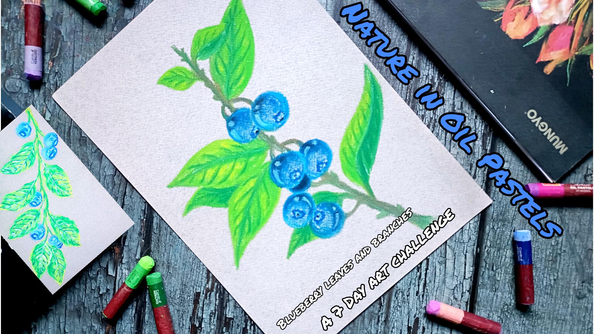
welcome to my new class. Nature in oil pastels, blueberry leaves and
branches a 70 art challenge. In this class, we
will be creating seven vibrant and beautiful
oil pastel illustrations, inspired by blueberries
and botanical elements. Throughout this
challenge, you will learn how to paint
blueberry clusters, branches, and
varieties of leave in different seems, sieges,
and compositions. We will start with the five main projects on colored paper, focusing on simple and Wigner
friendly illustrations. Then we will move on to
two additional projects on black paper where
we'll be creating more detailed and
striking compositions with stronger contrast
and richer colors. These are the two
projects in which we'll be using the
black colored paper. These are a little bit more
detail and bit more defined. We will begin with the basics where I'll guide
you through how to draw blue berries and leaves in different compositions
and perspective. Essential oil pastel
techniques like hatching, cross-hatching,
blending, color mixing, and presser control,
and the tools and the materials you will be
needing to get the best result. Hi, my name is Vishal. I'm an artist from India. This is my Skillshare profile, and I teach beginners for analy classes on oil
pastel ink illustration and watercolor here
on Skillshare. You can also check
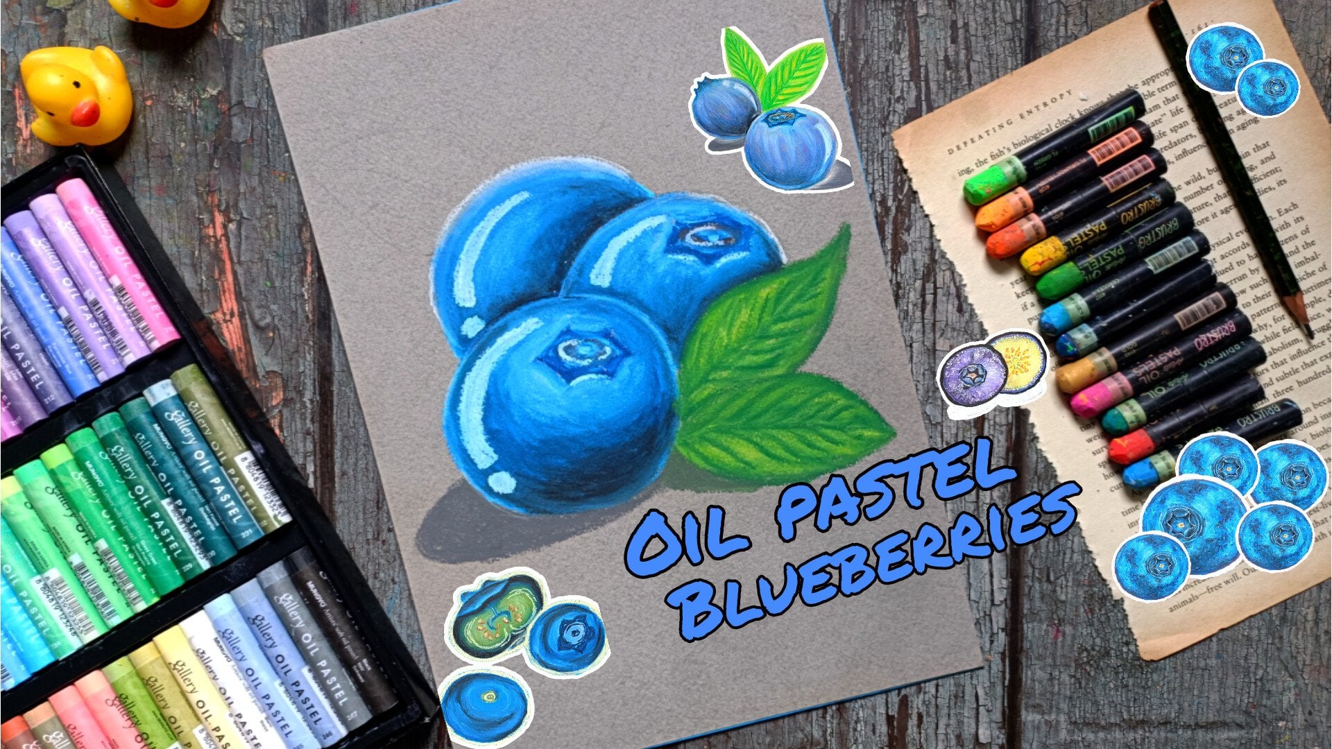
out my other class on oil pastel blueberries
for more practice, and you can find more of my work on my Instagram and YouTube. This class is suitable for Bgner as well as
intermediate artist, and anyone who enjoys
nature inspired art, all the lessons are
taught in real time, so you can easily follow along
with me at your own piece. So join me in the
seven day challenge, and let's create this beautiful, colorful blueberries
illustration together. I'll be uploading a
project each day, so I hope you will join me, and I'll be seeing
you in the class.
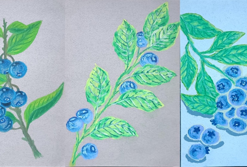
2. Class Project : For your class project, you will complete this seven
day oil pastel challenge by creating seven
blueberry illustration, featuring leaves and branches. We will begin with the five main project on colored paper, where you will practice drawing simple blueberry clusters,
leaves, and compositions. Then we will move on to two final projects on black paper, where we'll be creating more detailed and vibrant
illustration with a stronger contrast. Each day, you will follow
along with one project starting from basic saves
and gradually adding layers, blending and details using
oil pastel techniques. You can follow the
project exactly or add your own creative
variations in colors, leaf saves, and compositions. Once you are finished, upload at least one finished artwork or your full seven day collection
in the project gallery. Apart from that, you can also
see your practice seeds. I'd love to see your
progress and your unique takes on this
Blueberry illustration. Let's get started and let's create something
beautiful together.
3. List of Supplies : For this class, you
will need pencil and erase it to
do the pic pencil sketching and normal pencil and eraser will do the
work. Tissue paper. I will help in
avoiding smudging of the color as well
as color blending, masking team to
secure the paper. As for the blending tools, I'll be using QTIP
blending blending stump. Here, I'm using MogioGalries, 160 GSM oil pastel
paper, colored paper. I'll be using MongiosGaler
oil pistle as well as Brusto's artist oil
pastel to do the coloring. You don't have to use
the same oil pastel. You can use any oil pastel
that is available to you. You can use free pass, you can use Kripa Space List or any other oil pastel
that's available to you. You can also use
colored pencil to do the final detailings
and outlinings. It will come in handy.
That's all the supplies that you will need
for this class.
4. Pencil Sketch : Welcome to the first
section sketches. In here, I'll be showing you different ways in which we'll be creating the blueberries, the insides of the blueberries, different kinds of leave and simple thumbnail sketches for
five of the main projects. In here, I have
already started with a simple circular C
for our blueberry, and give it a little bit
of three dimensional see. We'll be adding the coloring, following the canton, the curve cheap of the blueberries
in this manner. You can consider it to
be the canton lines, and following that curve, we'll be adding the color using the oil pastel at the top, in here, we have got the calax. For all the seven
projects in here, mostly we'll be creating very simplified versions
of the blueberries, generally using oval or circular saves to
create the blueberries. And here's another example
of the blueberries. In here, the bottom
section will be visible. Once again, starting
with this oval save for the blueberries. This will be the bottom, very small circular see like the stem connected
to the blueberries. And for this too,
we'll be following the cantoon lines to
add the coloring. These are just hypothetical
lines that you can use as the guidelines to
do the coloring later on. With the help of this
kind of guidelines, you can make your
drawing process much more smoother and you will get a little bit more three dimensional look
to your paintings. So these are the two simple
examples of the blue berries. Next, we have two bisected
portions of the blueberries. One will be bisected vertically, the other will be
bisected horizontally. In that manner, we look
inside for the blue berry. Here's a simple coloring
of the bisected portion. This is from my earlier class. We'll be creating a
very simplified version of the inside like
this in this manner. We'll be creating seven or
eight seeds on both sides and simple circular lines
to divide it into different sections
in this manner. Very simple version
of the blueberry, that is bisected vertically. Mostly I won't be using it
for any of the project, but if you want to include
it, feel free to do that. Here we have got another bisected portion
above blueberries. This is bisected horizontally. So lots of seeds will be
visible for this one. This is from the same
Skillshare class of the blueberry that
I showed you earlier. Multiple seeds will
be visible in here. We'll have a very small
and thin flash at the top, then a little bit of purples and lights colored
region in between, and then the
remaining region will be a bit of lighter seeds. The seeds will be
yellow in color. I won't be including
this in our project, but if you want to include it, you can create it in a very simplified version
since the size of the blueberries will
be quite smaller and we won't be able to add
that much detailing for it. Here's a gloser
look for the cex. Mostly, I'll be
creating it like this, three or five star
like C for the inside, curved starl or you can see inverted starlight
C for the inside. And as for the top,
very small projection, rough projection like this
for the calx at the top. These are the simple ways in which I'll be creating the calx. Let's do the naming. We
have got the seeds in here. And very small and thin flesh for the blueberry at the top. If you want you can experiment
with few more examples of different section or different sections
of the blueberries. Instead of the bisectc poison, you can create one fourth or one third of the blueberries. So feel free to do
experimentation on your own. Now let me show you some of
the examples for the leaf. Here's a very simplified
version of the leaf. Adding the veins coming out from the midrms Here's another one, a bit larger and the normal one. Adding the veins coming
out from the mid ribs. The middle portion of the
leaf is called midrib, and the lines that comes out of the mid
ribs are called veins. You can create
varieties of the leaf. You don't have to
stick with only the two leaves that
I've shown you. Here's another
version of the leaf, another variation of the leaf. This leaf a little bit
folded in this manner. Let's create one more
example of folded leaf. This leaf is folded a
little bit from the top. I would recommend you to experiment on your
own and create more varieties of
the leaves with different sees sizes
and different foldings. We have got the midrib, the line that divides the leaf. And then the veins that
come out from the leaf. Next, we have got sadose
and the highlights. For this one, I'm
consideraing that the light is falling
from the top left sign. We have got a simple
blue berry in here. The highlight the highlight
will be on the top left sign. The sadose will be forming on the bottom right
sign in this manner. Now, here's second one. The light is falling
from the top. The highlights will
be at the top, a very small section for
the highlighted section, and the sados at
the base like this, just being the blue berry. Apart from the blueberries, we'll have lots of
leaves and the stem. The same thing can
be applied in here. The highlights for the leaf
will be on the top left side, and the sados will be
forming on the bottom, right side or at the
bottom section like this. The leaves at the top, only the highlights
will be visible. If you want to
include the shadows, you can add the sado at the
top of the blueberries. One more example
of the lights and the sadosT time the light is falling from the
top right sign, and in here, I decided to create a bit larger
blue bearing. Here we have got the
source of the light. Light is falling
from the top right. The highlights will be in
here, the top right sign. The darker region or
the sados will be in here on the bottom left sign. We'll be wearing the
seats of the color. This region will be
the most darker, and as we progress, we'll
be making it a bit lighter. In here, the darker
seed that I created, it won't be the
sado but it will be the darkest region
on the blueberry. The sados will be forming
on the bottom left corner. And in this manner, we'll be doing the
coloring, considering that the light is falling
from different perspective. You have got the rough idea. In the main projects, I'll be explaining it a
little bit better. Now let me show you some of the thumbnail sketches for
five of the main projects. I would recommend you to create more thumbnail sketches on
your own so that you can add more personal touches
to your paintings and the illustration. This
is the first one. In here, we have got
few leaves at the top. For the bees, we'll have
lots of blueberries. His simple sketching like this. I'd recommend you to practice some more thumbnail sketches so that you can create or add more present touches
to your projects. Just create a few
more variations or a few more example of this kind of blueberries
in different perspective. So this is how this
project will turn down. I'm going to create the thumbnil sketch for the second one. So this is how the
project will turn down. And here's a very
simplified version of that. Simple circular sees like this
for multiple blueberries. I'm just creating few
leaves at the sides. And as we progress, I'll increasing the number
of the leaves, but increasing the size of
the leaf in this manner. Very easy thumbnail sketch
like this in this manner. Now for the third
thumbnail sketch, this is the main
project, and in here, we have got fewer blueberries
and fewer leaves, but the leaves and
the blueberries are quite defined and detailed, but larger oval saves
for the blueberries. And larger leaves with the stems visible in here like this. For the smaller projects, we won't be able to create that much detailed or defined
leaves in the blueberries, but for larger ones like this, the leaves and the blueberries
will be quite detailed. And now, for the fourth
thumbnail sketch, this is the main project. This is one of my favorite
project from this class. And this took a lot of time, and this will be the first
project in this class. A very simplified verson
for the thumbnailket. Here we have got medium number of the leaves and
the blueberries. The seeds and the sizes
of the blueberries, as well as the
leaves varies a lot. We have got smaller
leaves at the top. And as we progress, we have got larger leave and same goes
for the blueberries cluster. At the top, we have got fewer blueberries
and for the middle, we have got more
and for the bottom, once again, fewer blueberries. This is one of my
favorite from this class. This is the last thumbnalskech
that I'm going to show you very simplified
and very easy even. Only three blueberries
and two leaves. A bit larger oval saves
for the blueberries. Main stem that is a little bit bent and grouped like this, two large leave and one more
blueberry at the bottom. So that's all for
the simple sketches. I hope you will practice on your own a little bit
of more examples, and I'll be seeing you
in the next video.
5. Oil Pastel Basics : Welcome to the oil
pastel basics. In here, I'll be
showing you some of the basic oil pastel techniques that we'll be using
in this class. Start with the simple
oil pastel strokes. Oil pastel allows
different kinds of strokes depending on
how you move your hand. We can create sot strokes, long strokes, circular
strokes, and layered strokes. Changing strok direction creates different texture
and visual effect. Now let's talk about a
little bit of freezer. Preser is one of the most essential aspect
of the oil pastel. In here, I've created
three small spherical see. The first one I
use light preacher or the second one,
medium presel. And for this third one,
I've used heavy preser. The fourth one is a combination of both medium and heavy preser. With the light braiser, we
get soft and green texture. With a medium preser we get more colored coverage
with slight texture, and in case of heavy
preser as you can see, it's rich bold color
with no coverage. Oil pastel is a very
revers tying medium. We can use the same kind
of technique that we generally use for the pen
and ink illustration. Here's an example of
hatching technique. So basically, hatching uses parallel lines to
create seeding. We have plain hatching lines, then a little bit of
angled hatching lines. Third example is
broken hatching lines. The fourth one is
curved hatching lines. With the hatching
lines. The closer the lines are the darker
the toe will appear. Further apart the lines,
the lighter tone, and it works well with the
light freezer and layering. It's great for building
structured seeding. Apart from the hatching, we can also use the cross-hatching, stippling, scribbling,
and a few other ink and pin illustration techniques. Next, we have cross-hatching. It builds upon hatching. So first example, we have
got angled cross-hatching. The second one is vertical and
horizontal cross-hatching. Third one is a combination
of curb cross-hatching. Basically, cross-hatching is layering lines in
multiple directions. It helps in adding depth as well as creating
darker shadows. It also create textured
and graphic look. Mostly, I'll be using it for strong contrast or
detailed seeding. Now let's put this into use. For this one, I'm using the hatching technique to
add the contour lines, starting with the ovals
for the blueberry. Following the hypothetical
curve chip of the blueberries and adding
the lines in this manner, a little bit of curb hatching to create or do the
coloring for this one. Now, hold the
second one in here. I'll be using cross-hatching. Starting with the ovals
for the blueberry. Now let's use hatching first and then we'll be converting
into cross-hatching, following the curve
contour lines for the seep of the blueberry, and now doing a little bit of cross-hatching in here
using the curve lines. So as you can see, it is a
little bit more darker and a bit more detailed as
compared to the first one. So depending upon
the requirement, we'll be using both
cross-hatching and hatching in our project. Next, we have got a
stippling technique from the pen and
ink illustration. It basically uses small
dots or taps of the pistil. In case of this stippling, sparser dots create
lighter areas and denser dots
create darker tones. It helps in creating
soft texture effect. We can do the coloring
for the small blueberries in this manner using stippling. It will take
comparatively more time, so I won't be using it, but if you want to do a little bit of stripping for some of the smaller section for the
leaf or the blue marries, especially for the calex or
the seed, you can use that. So doing the coloring for this blueberry using the stippling. As you can see, it's
comparatively more taxian and grainy as compared
to the hatching and cross-hatching blueberries. And lastly, in here, we
have got scribbling. Scribbling uses free lines to create any cap or structure. So just random lines
in this manner. You can also add a little bit of uniformity to the random lines. Feeling the insides
of this blueberry that we created with
the scribbling lines. For coloring, our project, I'll also be using lots of scribbling to do the coloring as it's free flowing and it's quite faster, comparatively
more faster. So these are some of the basic ink and paint
illustration techniques that I'll be using
in our main project, cross-hatching, hatching,
stippling, and scribbling. If you want to do a
little bit more practice on your own, feel
free to do that. You can also use some of the other techniques
from watercolors. Next, let's talk about a little
bit more freezer control. So we can start with a light
freezer, and as we move, we can just increase
the pixel and create a little bit of gradient in this manner from lighter
seed to the darker seen. In here, this is a
little bit textured one. In the next video, I'll
be sewing you with a little bit more smoother
variation for the gradient. Now let's talk about
oil pastel blending. Blending in oil pastel means mixing color
directly on paper to create smooth
transicent or neo sand or to create gradient, different kinds of gradient. For this example in here, I'll be using the
three primary colors yellow, blue, and red. And to keep it a
little bit simpler, I'll only be applying
low to medium pisel here's the third one,
the red colored one. So how it works, basically, I'll be starting
with the first color lightly, and then on top of it, I'll be adding second color, and the addition of the
first color on top of the second will do the
blending on its own. And to make it a little
bit more smoother, we can play with the spreezer. We can apply different kind of strokes using circular
stroke to blending it, or we can use blending
tools to blending it. For the first one, we'll be
blending yellows and the red. So starting with the yellow, now overlaying a little
bit of red on top of it. Middle region in here, it's
somewhat of orange color. You can get a little bit
of different seeds of the color depending upon how
you are doing the mixing. So in here, once again,
we use both the color. Here's another layer of the yellow on top of
the red. So two color. So two layers of the yellow, and the orange that we get
in here is more smoother. Here's third example in here, I'm doing the things
in opposite manner. I started with a red and
overlaid yellow on top of it. What I mean to say
that consequence of adding the colors
matters a lot. So depending upon what
set of the color we want, we'll be experimenting
in this manner. Now for the second one in here, we'll be using yellows
and the blues, we'll be getting somewhat
of greenish color. For the first one, we
started with the yellow. Now going with a
blue, overlaying a little bit of this blue on top of the yellow to get somewhat of greenish
color in the middle. In here, we are using blue as the primary layer and now
overlaying yellow on top of it. The green we get in here
is a little bit different. Overlaying a little
bit of blue on top of the yellow and going
back with the yellow to overlay it on top
of the blue to get somewhat of more smoother
consistency of the green. Here's the third example, we
are doing the same thing, overlaying a little bit of
yellow on top of the blue. And instead of using the yellow, I'm going back with a blue to get somewhat of
smoother consistency. Now let's take it a
step further instead of medium preser in here
and applying high preser. So a bit of smoother
consistency of the yellow now using the blue
and applying more preser. The green Vega art in here is smoother and more consistent. To make it more greenish, just add more layer of the yellow or the
green in this manner. So you have got
the rough idea how we can use the color
to do the blending. The layering of
the colors matter, the preserve we are
applying that matters, the strokes in which we are
adding the colors matter. Generally, in here, I use circular and straight
strokes to do the blending. But for our project,
we'll be wearing it. Here's one more example
of three colors together. You can also create
a larger scale of the color wheel
using the three colors. Now, the final example using reds in the blue to get
somewhat of purplish color, overlaying a little bit
of blue on top of it. Now for the second example, overlaying a little bit of
red on top of the blue. The purple for the two
overlapped region, as you can see, it's
quite different. So we'll be using
our common sense and depending upon
the requirement, we'll be blending the
colors in that manner. And that's all for the LP B six. I'll be seeing you
in the next video.
6. Blending and Gradients : Welcome to the oil
pastel basics two. In here, we'll be
exploring blending using different tools and a little
bit about gradient creation, color mixing and blending
for different purposes. Let's start with the blending. On the first one, we
haven't got Q tip, since the Q tips are
small and precise, making it great for
control blending. With the Q tips, we can create soft slightly texture blend, and it also helps in maintaining some grainier texture
for the oil pastel. It's based for small details or for the edges of the seam. It also helps in creating
controlled gradient. Next, we have got
blending stems. Lending stems are tightly ruled paper tools used for
smooth blending. With a blending stem, we can get smooth
and controlled fins slightly softer than the tips. And compared to the tips, it does not remove
too much pigment. It's based for fine seeding, soft gradient and detailed bur since the sizes of the blending
stems are quite smaller. Third, we have got tissue paper, which is soft and flexible. It's great for larger areas. With it, you can get smooth
and soft blending effect. It also creates slightly
diffused and eerie pins, as you can see in here. It's best for background or large surface or to create
soft colored transitions. Next, we have got cotton swab. This is somewhat similar
to the tissue paper. With it, we can create slightly stronger blending
than the Q tips. It also helps in spreading
the colors more widely. It's best for medium sized
areas or doing layer blending. It also helps in create
soft textured work. Then we have our finger. With the finger, you can control the freezer more precisely. With the fingers, we can create
smooth and rich blending. It can also help in creating
polished painter iloc. It's best for strong blending, color mixing, and
smooth gradient. One of the tip that you
should keep in mind, clean your fingers
when switching colors to avoid muddy tones. The last one in
here, we don't have to do the blending since
we used heavy freezer. So that's all for blending
with using the tools. Now let's dive into color
mixing and color blending. For the first example in here, I'll be using sats
of the purple. I started with mediums in
here. Do the partial blending. Once again, I'm
using medium prison. To make it a bit
more smoother for the grainier texture
of the blending, apply one more layer. To make it more smoother, you can use more presser like this, a little bit of medium preser. And to get more
smoother blending, you can just apply more
layers of the color, a little bit more dark purple, applying more layer of
the lighter purple. What I mean to say
that till you are satisfied with the
consistency of the color, you can just add layers
and layers of the color. Don't oversaturate
more layers won't be feasible that month since
the more layers you add it, the harder it gets
to add more layer. Now for the second
example in here, I'm using yellow
and orange to get somewhat more lighter
orange donnee, same kind of blending
of the colors, layers and layers of the
color to get somewhat of the orange color in
bitten, yellow and orange. This is somewhat of
greenier texture. Now for this one,
I decided to get a little bit more smoother transition in
between the colors. So starting with
a medium freezer. Now, let's make it a
little bit more smoother. So for this, I'm using the Q tip to do the
blending of the colors. Applying medium to
heavy presser with the Q tip to blend it smoothly. As you can see how smooth and the glossy the color
mixing turned out. Now for the third one in here, I've started with the
medium preser and I'll be using white to do
the blending of the color. Adding the orange just
beside the white. Us now one more layering
of the wipe on top of it. Then finally, going in with the lending tools to do the
blending using the Q tip. It's a little bit different from the blending that
we did earlier. It's a little bit more smoother. Now, let's use this for the spherical see
for the blueberries. In here, I'm starting
with the Prussian blue to create a circular see
for the blueberry. Now, this will be the darker
region of the blue berry. I'm concnring that the light
is falling from the top. So this will be the
darkest region. I applied medium
preserve for it. Now going with the purple color, overlaying a little
bit of this purple on top of the Prussian blue, adding it for the top and the
bottom sections like this. Now let's do the
blending of the colors. Once again, I'm using the
tip to do the blending, applying somewhat of medium to heavy preser to
do the blending, mixing these two
colors together, purple and the Prussian blue. Since the Prussian blue that we use has richer pigmentation, that's why it's overpowered
the light purple that we use. So to make it a little
bit more lighter, you can always use a little bit of white to do the blending. For this one, let's make it a
little bit of lighter tone. So in here I'm
starting with a blue. This will be the darker region. Adding the Calex in
here, simple circular s. Once again, I'm
using the purple. These two colors are somewhat
of same consistency. The pigmentations are of
somewhat of same consistency. This blue won't be overpowering the light
purple that much. Once again, I'm using the
Q tip to do the blending, applying medium to heavy preset
to mix these two colors. Here are two strokes in which you are mixing
the colors matter. For more smoother blending, you can use the circular strokes to get a little bit
of canton linens. You can do the blending,
following the cantu lines, the hypothetical canton lines. In here, I basically use circular strokes to
do the blending. The light purple that we use
is not that much visible. So another layer of
light purple like this, blending it a little
bit more with the blue that we used earlier. You can also use the Q tip
to redefine the scene. Giving it a little bit of more smoother outline like this. Such a simple examples
for our main project, we'll be using more
colors and making it a little bit more
detailed and defined. Now let's read color gradient using different
sets of the color. This will come in handy while doing the coloring
for the blueberries. Since for the blueberries,
we'll be trying to sew color gradient for the lighter and the darker
seats of the color, the highlights and the shadows. So I started with the darker
seed, the Rusin blue. Then use two lighter
sads of the blue. And here I'm using purple. Now, using a little bit of gray. The stickning I added a
little bit of olive on top. And finally, making
it a little bit more lighter using white. Going with the Qtip
to do the blending, here spreading the color from dark set to the light scene. You can also do the opposite, spreading the color
from the lighter tones to the darker tones. The result will be
somewhat different. So you can experiment
this on your own. You can create two rows of the same colors and
then for the one. And then for the
one of them, you can start with the darker set. For the other one,
you can start with the lighter set to
do the blending. So this is our very simple
gradient of the blue color. Let's create one more example. In here, I'm using green
colors to create the gradient. This will come in handy for
the coloring of the leaves. Now going in with another
darker tone of the green. To make the blending
more smoother, you can also add a little
bit of yellow in between the two colors. This
is the olive green. Now we are using the grass green overlaying a little bit of the
color on top of the olive. Let's make it a little
bit more lighter. I did not explain the
color gradient properly. A color gradient is basically a smooth transition from one color to another
or from light to dark or vice
versa from dark to light off the same color or
different color combinations. It has been creating depth,
providing smooth sading. It also provides
realistic lighting, and it's also helpful in
creating soft backgrounds. If you want to continue
and extend this gradients, you can use more seats of
the yellows and then white. But in here, I'm satisfied with this green color gradient. Now, in here, I'm going with
the QTIP to do the blending. Once again, I am starting from
the darker seeds and Alvin just spreading the
colours toward the lighter scene
to do the blending. You don't have to stick with
the QTIp to do the blending, feel free to use other tools. Applying medium to heavy preser and extending the
colors in this manner to get a smooth blending of the color for this
green colored gradient. As I mentioned earlier, we'll be using the color
gradient to do the coloring to
create the lights and the shadows for the blueberries
and for the leaves. We'll also be using
a little bit of color gradient for the
coloring of the stems. If you want to create the
background for the project, you can use the color gradients. Now here's one more
color gradient in here. Always starting
with a darker tone. For the middle region, we'll
have a bit lighter tone. And then once again
for the end region, we'll have the same darker tone. So I started with the maroon
in here, we have got orange. For the middle section,
we have got yellow. Now, once again,
using the orange, overlaying a little
bit of this orange on top of the yellow
that we just used. And finally, once again, using the maroon color. In here, we'll be
getting darker tone, lighter tone, and darker tone
a gradient in that manner. For this one, I'm
spreading the color from the lighter tone
towards the darker tone. So I'm extending
the yellow towards the orange and then orange
towards the maroon. Or you can do the opposite
extending the colors from maroon towards the orange and then towards the yellow, which I am doing right now. For this one, starting directly with the maroon to
do the blending, extending the
colored, overlaying it on top of the orange. Extending the color
combination of maroon and the orange on top of the yellow to get
a smooth blending like this for this gradient. That's all for this gradient. Now let's create
one more gradient. So in here, I'll be using
the seen color combination, but I'll be making
it from darker to lighter, starting
with the maroon. And for this one,
I'll also be using the white to make the transen
a little bit more smoother, overlaying a little bit of
orange on top of the white. Once again, using the white. And finally, going
in with the yellow. So we have got maroon, white, orange, white and yellow. Now going in with a Q tip to do the blending of the color, extending this maroon
and overlaying this on top of the white. Extending this orange and
overlaying this on top of the white with the use of the white in case of the
gradient or the blending, it makes the process
bit more smoother as it reduces the
intensity of the color. In here, it reduced
the intensity of the orange and the maroon and make it a little
bit more lighter, which makes the blending
process a bit more smoother. And with these, we are done with this gradient of the color. Now let's talk about some
of the preventive measure that you should use to avoid
smudging of the color. Use tissue paper underneath your palm to avoid smudging
of the color like this. So if you are not cautious, the color will
mismuge by your palm. So I try to use the
tissue paper or some clothe underneath my palm to avoid the smudging of
the color by mistake. By mistake, if you
have got some colors like this and if you
want to erase it, if it's of lighter tone, you can apply the
eraser to erase it. It will be somewhat removed, not done completely, but it will lose its
intensity quite a lot. I forgot to mention about
the blurring effect. With the finger,
you can get this kind of blurring effect. You can get this kind of
soft texture or you can see atmospheric effect by
using your finger. And yeah, that's all for
the oil pastel basics too. I'll be seeing you in
the first project. Mm.
7. Blueberry Cluster : Welcome to blueberry cluster. This is my favorite
project from this class. Let's start with a
simple pencil sketch, starting with this kind
of bit curved line for the stem of the blueberry. In here, we'll be
creating a total of seven blueberries
with lots of leave. This will be somewhat
semi realistic. You are free to make
changes in adjustment to the seep side as well as the placement of the
blueberries, leaves in the stem. Or you can just follow
along with me and create the same kind of painting
that I'm creating. So one of this blueberry will be lying behind the
other larger one. Adding one more
blueberry in here. Let's connect the blueberries
to the main branch. Let's connect the blueberries
to the main stem. We'll be adding multiple leaves. Lightly erasing the pencil mass. And now we'll be
creating multiple leaves a total of seven or
eight leaves in here. Before doing that,
I'm starting with the raw mer for the main branch. So as you can see, in here, I'm applying low to
medium pressure and we'll be doing two or three
different layer of the coloring for the branch. This project is divided into two sections. This is
the first section. But this section, we'll
only be doing the leaves, and in the next
section, we'll be doing the coloring for
the blueberries. Going over the outlines
of the stems that is connecting to the main
branch for the blueberries. Instead of this, if you want to make it a little
bit more greener, you can use seeds of green. Instead of this amber. I'll be overlaying greens
on top of it later on. In here, using this green to create the simple
outlines for the leaves. For one or two of the leaves, I'll be making them a little
bit folded like this. The first one that I did, a part of it is a little bit folded. I'll also be wearing the seeds in the
sides of the leaves, so feel free to experiment
with different kinds of leave as well as placement
and their sides. Instead of directly using the
color to do the outlines, you can start with
the pencil sketch. You can start with
the pencil sketch, and then later on, do the
coloring with the oil pastels. Adding one larger leaf in here. So this will be
the largest leaf. One more leaf in here behind
this two larger ones. Adding one more in here behind this two bluemrries
and for this side, Put the side, adding one
larger leaf in here. If you want, you can add
one or two mon leaves on the right side, and the sleep is a little
bit folded like this. Now, let's do the outlining
for the blueberries. So in here, I'm
using cobalt blue. Simply going over the outline a circular sep of
the blueberries. Making it a little
bit more and larger. Now for the three
blueberries in here. One of the blueberries
slice behind this two. So only a small section of
this is visible in here. One more blueberry in here. So with these, we are done with a total of seven blueberries. If you want to
increase the number, you can add a few
more blueberries. Now let's do the coloring. So in here, I'm using the
darker sad of the green. Adding it for the folded region for this leaf and one in here. Here, as you can see, I'm
lying medium to high presser. For these two
regions of the leaf will be a little bit darker. And also for the
leaves that are lying behind the leaves or
behind the blue berries, I'll be making it a
little bit darker to sew the sados adding it in here in between these two blueberries to make this region a little bit darker to sow the sadose cast it
minded two blueberries, adding it in here for the leaves to a little bit for the sados and here just beside
this smaller leaf. Avoid smudging the color, I'm using tissue paper now using this cadmium yellow to make some of the section of the
leave a bit lighter. This is going to be multi layered and multi colored leave. So I'll be doing the
coloring in layer, and it's going to
take a little bit of time since we
are trying to make the leaves look a little bit realistic and we'll have
to do lots of blending. For the regions
that I want to sew a little bit of light
color, for those regions, I'm adding this yellows, particularly in the
middle section and between the mid drips and
the outline sections. And now going in with
lighter side of the green. Overlaying this green
on top of the yellow. Here, as you can see, I'm
applying medium preser and we are almost covering the
yellows that I just added. But when we'll be
doing the blending, it will make the
whole leaves a bit more lighter since
we added the yellow. Yellow as the primary
layering for the leaf. I'm leaving a little bit of space in the middle
for the midrib. For the midribs and the veins, we'll be using dark seeds of
the green and then later on, do a little bit of blending
to reduce its intensity. Carefully overlaying
this green on top of the cadmium yellow in here
for the small leaves. Now for the larger
leaves in here, following the seep of the leaf and doing a little
bit of seeding, filling the entire
section with this. Adding it on the other side. Now moving on to this one. Another larger leaf, adding it carefully just
beside the blueberry. Overlaying it on the other side. Well, making this leaf
a little bit darker. So here I applied a little
bit of more presser. Now for the remaining
two leaves, adding it in here, and now
moving on to the last leaf. Here too, I applied a little
bit of more presel as compared to the other leaves to make it a bit more darker. And with these, we had done
with these two greens. Now let's just add with the
first layer of blending. So using QT to blend the colors. You will have to
apply a bit medium to high pressure to
do the blending. Primarily in here, I am blending this darker
side of the green. The bottle green that I use for the darker
regions of the leaf, particularly in here, the
folded parts of the leaf. Apply heavy pressure
and blending it to get a uniform and smooth
consistency of the color. Here I'll also be adding
a few more layers of the colours and add
veins later on. Moving on to this leaf,
the one that lies behind the other two leave and doing
a blending of the color, the greens and the yellows. Near the edges of
the leaf is a bit darker because of the
sados casted by it. Doing the same thing in here for this leaf in between
the two blueberries. To make the sees a little bit
more detailed and defined, later on, we'll be using
the blending stem. You can also use the
colored pencil to make the outlines a bit more sharper
and a bit more distinct, extending the greens
to the main branch. Now for the remaining leaves. Instead of blending colors
in circular manner, I'll be extending the colours like this to blending
these two colors, the yellow and the green slowly and gradually
filling the entire section. Gradually mixing these
two colours to get a smooth and uniform
blending of the color. For the regions where
we added more yellows. The regions, as you can see,
are comparatively lighter. And here, I'm extending the
colours from the mid rips towards the outline section
and doing the reverse, extending it from the
outside section towards the mid ribs to get a smooth blending following
the seep of the leaf. With these, we are done
with these two leaves, moving on to the smaller one. This is the smallest
leaf in here. And yeah, with these, we
are done with the blending. Now for the lighter leaves
that I have in here, this is the lightest
leaf of all. Let's do the blending
in the same manner. For this particular leaf, we applied lower prices. So this will be a
little bit more lighter as well as it will have
a little bit of texture. So this is our first layering and first blending
of the colors. We'll be adding a little
bit more coloring and adding and adding another
layer of blending later on. So this project is going to
take a little bit of time. That's why I divided it into
two different sections. The whole video is in real time, so you can always
join along with me and doing the blending on the other side of this leaf. For the blueberries, too, I'll be keeping it a
little bit text yet, so we'll be using mostly
low pressure and extending the colors to feel the
remaining section for the blueberries in the
second part of this video. Now moving on to the
last leaf in here and yeah applying heavy
presser to do the blending. And with this, we are done with the first layering of blending. Let's add a little bit more detailing for
some of the section. So using the screen to make the outline section a
little bit more darker, to make the shadows a bit more distinct and a bit more darker. Also, if you are
not satisfied with the save and the
sizes of the leaf, if you want, you can extend
it a little bit more. Here I extended this portion. Sending it to a little bit
more using this mortal green, the darker side of the green, blending it to the
remaining section. Apply heavy preset to blending. Here we are aiming
for smooth and uniform consistency
of the color. We have got one, two, three, and four leaves that
we want to make them a little bit more
darker to sew some of the sados casted when
the other leaves or the leaves themselves
are a little bit folded. If you want to make it
a little bit lighter, you can always use a little
bit of lighter side of the green or yellow
and overlay it on top of it and then
do a little bit of partial blending for the regions that you want to make
it a bit lighter. Now for the mid
ribs and the veins, simple straight line
for the mid ribs. And then we be creating
multiple veins coming out. Adding the mid ribs for all the leaves and then
we'll be adding the veins. Adding it in here. Put this one, only the veins will be visible on the sides. Making it a little bit more
bolder, a bit more darker. Increase the thickness
of the mid rips a little bit more
since after this, we'll be doing a little bit of blending to reduce
its intensity. So that's why I decided to make its thickness a
bit more broader. Applying a bit of
medium pressure and blending the colors
a little bit for the mid drips so that it will mix with the remaining
colours of the leaf. As you can see, I'm merging the outline section of this midrip to the remaining
color of the leaf. Let's do the same thing
for all the leaves. Always keep the tissue
paper under your palm. Otherwise, since
you are going to use multiple layers
and multiple colors, the colors will be
smirsed by the palm. Now for this smaller one, this project, I won't be adding any shadows
or background, but if you want, you
can create that. Extending the colors in here from the mid
drops a little bit, doing the same thing in here for this smaller section
of the leaf. Now for the section that
you are not satisfied with, just extend the colors or mix the color a little bit till
you are satisfied with it. Now adding the veins coming
out of the mid ribs. Fitting this kind of bit simple and bit curved
lines for the veins. Adding the veins coming out
from the mid drips like this, I am following the seep
of the leaf and creating the veins a little bit
curved, as you can see. To make it a bit more darker, you can use a bit more
darker side of the green. For this one, only this
part will be visible. Add more veins if you want, or you can also
make it a bit more distinct and add more
detailings to the veins. You can add smaller veins
coming out from the veins. Now, like we did earlier
with the mid ribs, just doing a little bit of partial blending for the
veins that we created. Instead of using the
Q tip in here I'm using the blending stem
since the sizes of the veins are quite
smaller as compared to the mid rib and we don't want to blend
the entire section. Only a partial blending
will do the work. So I decided to use the blending system since
it will make the process a bit more easier and I'll have more precision and
accuracy with this. Applying medium to
heavy prison with this to do a partial blending
of the veins in here, to subdue its intensity
a little bit, and to mix it with
the remaining colour, the background color of the
lean that we just created with the cadmium yellow and the light shades of the greens. We'll be doing the same thing for the remaining
leaves in here. As I mentioned for this
section of the video, we'll mostly be
doing the leaves, and in the next part, we'll be completing the blueberries, adding a little bit
of more coloring for some of the
sections of the leaves, doing the coloring
for the main branch and finishing this project. This is one of my favorite
project from this class. Let me know which one is yours. Blending partial blending
of the colors in here for the veins of this
last leaf in here, largest in the
last leaf in here. Oh. Now, doing more blending of the colors wherever
I think it's required. Also using it to
make the outlines a little bit more sharper. Blending the yellows and
the greens in here and making the outline a bit more sharper and a
bit more crisper. You can always use the
colour oil pastel color to make the outlines a bit
more detailed and defined. You can also use
the colored pencil, the green colored pencil. You can also use white. That will be interesting too. White oil pastel or
white colored pencil. Using this to make the
outlines a bit more sample. I'll be doing the same
thing for all the leaves, most of the part of the outline section of the leaves like this. I am also extending
a little bit of oil pastels to increase the size of the
leaf a little bit. In here, as you can see,
since we use darker shades of the greens and add it and applied a bit of heavy
presser with it, this leaf that lies behind
the other two larger leaves, it's quite darker, and it
portrays the cados quite well. Now for this one, for this
side to the darker side, I'll be using lighter seats of the green to add the veins, the veins underneath the
leaf that are visible. So I'll be using the lighter
seats of the green later on. Do the blending till you
are satisfied with it. So for the remaining
section of this video, I'll be doing lots of blending till I'm satisfied
with the result. Now, as I was mentioning using lighter side
of the green to add the beans in here on
the other side of the leaf. Now subduing its
intensity a little bit. So doing the same thing, using the blending stem, and blending it partially. Using it to define the seed
a little bit more clearly. In here, the midrs and the
veins were not that prominent, so using the green to create it. Doing a partial
blending of the color, subduing the intensity of the
darker greens a little bit. And I'll only be covering up to here for this section
of the video. And I'll be seeing in the next video where we'll
be completing this project.
8. Blending with Greens: Continuing on where we
left off a little bit more blending in here
with the tip here, I'm reducing the intensity of the mid ribs and the
veins a little bit, as well as also spreading
the dark colour to make this region a little bit more darker, comparatively
more darker. Continuing on with doing the
coloring for our main stem, applying a little bit more
raw armor on top of the stem, the smaller and the larger stem. To make it mold darker, you can also use other
sets of the brown. You can use raw siana. You can use dark brown, a little bit of more in here, just beside the
leaf and the stem. Connecting this blueberry to the stem tune using
simple curved lines, connecting this one too simple
curved lines like this. And with this, we are done
with the raw umber phone now. Now, give it a little
bit of greenish color, using a little bit of
green overlaying only a little bit of
this green on top of the raw mud that we used. You can use anised
from there bud green, bottle green with radiant
green, yellow, green. And here I decided to
use a bit darker bottle green extending the side a
little bit in this manner. We are going to do the
blending, once again, a bit of partial blending, the browns and the greens. We are not aiming for
a smooth blending. Since in here, we
have small stems, I decided to switch the Q
tips with a blending stem so that I can get
a little bit of more precision and
more control with it. In here, I'll also be trying to make the outline
section of the stems a little bit more defined using this blending stem
to do the blending. It was not working that well. The outline was looking
a little bit of blurry. So I switched it once
again with the QTip. I'll be using both
alternatively the Qtip and the blending stem
right now in here. Once again, I'm using
the blending stem for the smaller region. I'm applying heavy pressure
to do the blending, the greens and the blues, the green and the browns. To avoid smudging of the color, using the tissue paper
underneath my palm. Do the blending carefully
near the blueberries. Now for the upper
section of the stem, blending the smaller stems that are connected
to the blueberry. And now for the main stem, slowly and gradually applying freezer and blending the
colors in this manner. I'm also blending a little
bit of the stem that is connected to the limb so that we can achieve somewhat of smooth and clear transition in between the browns
and the greens. I do more blending wherever
you think it's required. Adding a little bit more texture in the form of this
kind of small thoughts on the side just by extending the color a little bit
using the blending stem. Smaller stem in here, connected to the blueberry, making it a bit thicker in here, doing the same for this one. Continue with the blending till you're satisfied
with the result. A little bit of more blending
in here for some sections. I'll be doing a little
bit of more blending. I'm just be moving the axis of the oil pastel that is
stuck to my blending stem, using this blending stem
to redo the blending of some sections of the
leaf and making the edges, the outlines a little
bit curve and soar. As you can clearly
see, a little bit of blending using
this blending stem, mainly focusing on connecting
it to the main stem, the browns and the greens. Applying a bit of heavy to medium pressure to
do the blending near the outline region so
that we can get a bit of smooth and consistent outlining. You can also use this to
extend the leaf a little bit, create a little bit more
pointed edge in here, increasing the
width a little bit by extending the
colors in this manner. Extending it a little
bit more to give it a little bit of blurry
effect at the base. Me blending in here just
beside the main stem. The stems that are connecting
to the blow berries. And with this, we are done
with the blending for now. Now let's do the coloring. In here, I'm starting with the Pusan blue for
our blueberries, starting with doing
the starting with creating this kind of
simple C for the galaxy, a little bit of star
s for the bees. For the blueberries, I'll be trying to achieve a little
bit of rougher texture. Instead of the Rufer
texture, if you want, you can always aim
for smooth texture by using lots of color and
applying heavy presser. So with these, we are done with the creation of cex for
all the blueberries. Continuing on with
the Prussian blue, adding it for the upper
part of the blueberries. Follow the curtep of the blueberries and
add the frutianbl in that manner so that
we can give it a little bit of more
three dimens snow hue. For the blueberry that lies in here behind the two blueberries, completely filling it
with the frution blue. For this one, since it's
facing in other direction, so I added the Prusien
blue at the base. Now for the remaining two
blueberries at the top, following the curve shape of
the blueberry and creating the contour line a little bit of more of this trustianblu. And with these, we are done with the Prussian blue for now. Let's do the
blending. As I said, I'll be aiming for
a rougher texture. So I'm just going to spread this Prussian blue towards
the Calex and I'm not going to use other color
for now extending the Prussian blue in this
manner blending stem. I'll be using the blending stump only with the tissue
paper or the Q tip. We cannot get this kind
of rougher texture. Also use this to redo the
outlining a little bit, giving it a little bit
of more defined scene. As you can clearly see, we have got darker
sand at the top. And as we move
away from the top, we have got lighter sand. And since we used only a little
bit of the producon blue, we have got rough texture
just beside the Calex. I'll be spreading the
color in this manner for all the blueberries
that I have eaten. Instead of this, if you
want to use other color, you can also include the
covet blue and light blue. So with that, you can make
it a little bit smoother. But as I mentioned,
I'll only sticking with the Prussian blue and
just extending it to do the partial blending and covering the remaining
section of the blueberries. Later on, I'll also be
using a little bit of white to create highlights
and reflection. For now, continuing on spreading the protein
blue in this manner. I'm not going to spread
the color from the calex, so avoid doing that and be careful while spreading
the color near the Calex. So once again, a lot of color has been
accumulated in here, so I'm going to remove it. I have got a zactine and
sandpaper to remove the color. Now continuing on
doing the same thing, spreading the color
in this manner, the protein blue to get a bit of rougher texture for
our blue berry. And I added the color in such a manner that it will
look three dimensional. I did not add the color
uniformly earlier, so you can see for
some of the section, particularly on both the
sides of the blueberry, we added more of
the Prussian blue, as well as for the
middle section. But for the remaining section,
a bit smaller amount. And while we added
the blueberries, we followed the curved lines of the blueberry or you can see the contours so that it will
look more three dimensonal. Continuing on doing the blending for the remaining
blueberry in here. This is the last
one, so carefully, start doing the blending
for the upper part first, and then we'll be
spreading the color. Spreading the colors in this
manner towards the cex. Don't blend the color near the calx spread it
towards the calx. Also use it to define the seed, giving it a little bit of more curvier and
more circular see. Now we are going to extend the color the Prussian
blue a little bit towards the stem so that we can mix or blending the colors a
little bit in this manner. Only a tiny amount of Prussian
low will do the work. So blending it to the browns
and the greens of the stem. You can always use
the colored pancil on the oil pastel once again to redefine the soup a
little bit to make it a bit more sulcular
and a bit more curvier. But for now, I'll only be
using the blending stick. Going in with the
black, a little bit of black to make some of the
section bit more darker. Only a tiny amount of
black in this manner. The regions where we
added more percian blue, I'm just adding black, a little bit of black
in here like this. Now we are going to
redo the blending. This is spreading the black
a little bit in this manner, and try to blend it a little bit with the prussian blue
from the earlier. Try to contain it within
the upper section. We are not going to spread
it towards the calx. We are not allowing
it to reach towards the calx only up
to the half point, keep that in mind and to the
blending in this manner, blending the prussian blue with the black and extending
it a little bit. Now for the remaining
two blueberries in here, the same thing, a little bit of blending of this Brucian
blue with the black. For this blueberry
in the background, completely filling the entire
section with this black. And with these, we are done
with the black for now. Now for the insides of the calex reading the Prussian
blue a little bit, only a little bit of
this prussian blue, try to aim for a rougher
texture for the insides of the calax Go back once again with the black
and creating tiny dots inside the calex for the middle portion of
the calx in this manner. Now going in with the white
to create highlights. I'll be creating this kind of simple exclamation mark for the highlights or you can see the reflection caused
by the blow berry. You'll have to apply a
bit of heavy pressure to overlay on top of the black
and the Prussian blue. If you want, you can do two or three layers of the
white to make it a bit more contrasting
and a bit more lighter. But in here, I'm satisfied
with this kind of shade of the white on top
of the black and the blues. Adding it in here
for the last one. If you want, you can also use a little bit of this to create
a little bit of highlights and reflexion for
some section of the stems and a little
bit for the leaves too. For the insides of the
calex and beside it, also adding a tiny
amount of white. And with this, we are done
with the white for now. Now I'm going back
once again with the blending stem
to do the blending a little bit near the cex. Also using it to
redefine the seep of the exclamation
mark a little bit. For some of the
section, the thickness of the white was a
little bit more, so I decided to use it to reduce the intensity and blending the white a little
bit in this manner. Just blending the outlines of the white that we just used. As I was saying, a little bit of white to do the outlining and a little bit of reflection for some sections of the
leaves and the stems. I won't be using it
for all the leaves, for some of the leaves only. A little bit for the
stems in this manner. Go over the mid rib. If you want to get a dark
streak of the white, you'll have to apply a bit of
heavy placer, but in here, I'm mostly using
medium low placer since I don't want to draw
more attention from the white. Now, going in with
the blending stem to subdue the intensity of
the white a little bit, blending it with the
greens in this manner, a little bit more blending of the whites that we
just use for the stem. More blending of the
white wherever you want, more blending of the whites for the regions where you added it just subdue its
intensity a little bit. If you want, you can
also cover it entirely, that region will become
a bit more lighter. Spreading the color a little
bit for the blueberries. Now, these are all
additional details. If you are satisfied
with your project, you don't have to do this, but I will be blending some
section of the blueberries, some section of the leaves
till I'm satisfied with it. I decided to use
a little bit more Prusin blue on the side to
make it a bit more darker. I'm blending the colors in
this manner a little bit to sow that cado casted by the
blueberry that lies above it. More blending still, I'm satisfied with the
consistency and the coloring of our blueberries and the leaves and the stems. As I mentioned, if you're
satisfied with your project, you don't have to overdo it. A bit of more white
for the reflection. A little bit more blending
on the stems in here, the greens and the browns. Spreading the blue a little bit towards the
brown for the stem, extending the side
of this main stem a little bit by
spreading the color. And with these, we are
done with our project. This is one of my
favorites from this class. I hope you enjoyed
painting this. It was a lot of fun
to do the coloring, and it took comparably more time since we did a lot of blending, a lot of coloring, and finally
removing the masking tape. I hope you enjoyed
it, and I'll be seeing you in the next
project, happy painting.
9. Delightful Berry Branch : Welcome to Delightful
Berry Branch Project. Apart from the one
we did earlier, this is also one of my favorite
projects from this class. Let's start with this kind
of slanted angled line. This will be the main
estem for our blueberry. In here, we'll be
creating a total of seven large leaves
and six blueberries. Creating this kind of
normal leaves like this. Some of the leaves
in here that we'll be creating will be
a little bit bent, and we are creating this kind of bit organic saves for the leaf. Instead of this, if you want, you can create very clean
and normal looking leaves. Or you can also create a
little bit of sharp leaves. Let's do the coloring directly. And here I'm starting
with the lemon yellow, using this lemon yellow to do the outlining for the leave. As for the coloring
of the leaves, I'll be using lemon yellow, dark green, olive yellow, grass green and yellow green. We'll be using lots of color, and the leaves that we'll
be creating will turn out very beautiful
and very vibrant. In here, I won't be using any
tools to do the blending. We'll be applying lots of preset to do the blending
of the colours. We'll be using multiple layers. This is going to
be a multi layered and multi colored project. I hope you will enjoy
painting this one, the whole video is in real time, so you can always
follow along with me. After creating the
outlines for the leaves, we'll be adding a little
bit for the insides. I decided to create
one more leaf that lies behind this one. Increasing the width of some of the section of the
stem like this. Now, feeling the
insides with it. Just using random scribbling
technique like this. We are not going to cover
the entire section. We are just going to make some of the section for the insides a little bit lighter when we'll be doing the blending later on. So the section in
which we are adding more lemon yellow will
become a little bit lighter. Just use random scribbling lines to add the color in this manner. Now, in here, we are going
with the olive yellow, overlaying a little bit
of this olive yellow on top of the lemon yellow, as well as adding it for the other regions
beside it like this. Once again, we are using a scribbling technique to feel the insides in this manner. And as you can see in here, I'm not covering
the entire section. I'm also leaving a little bit
of empty spaces in between. Adding it for the
last leave in here. And with these, we are done
with the olive yellow. Now let's make it a
little bit more greenish. In here, I'm using
the yellow green, Overlaying this yellow green on top of the other two colors, the lemon yellow and
the olive yellow. The intensity of this green is a little bit richer as compared
to the other two colors. Overlaying it on top of
the other two colors while leaving a little bit of
specs in midwin like this. This is our third
layer of the color. We have got two more leaves. Continue on with adding the yellow green for
the remaining leaf, adding it for the
last leaf in here. And with this, we are done
with the yellow green for now. Now let's make it more
greenish this time. I'm using the grass green. Add the grass green
for those region where we want to make it
look bit darker, I'll be mostly adding
it near the stems, as well as a little bit for
the upper region like this. As compared to the
other three colors that we have used earlier, I'm adding it
comparatively less. You can also use it to do the outlining for
some of the section. I would recommend you
to do the outlining for only one side or only a
small section using this. Continue on with creating scribble marks like this
using this grass screen. And now adding it
for the last leaf. Random strokes with grass green, overlaying it on top
of the other colors, the lemon yellow, the olive
yellow, and the yellow green. Adding a little bit more for
some of the other leaves. Now, moving on to
the blueberries. In here, I'm starting
with the purple. I have got mauve color in here, using it to create
the outlines for the blueberries P to increase
or decrease the numbers, seeps and the sizes
of the blueberries. I decided to create a total
of six blueberries in here. We have already created
four. Let's create two more. This one will lie behind
this larger leaf. So only a small section of it
will be visible like this. And one more at the bottom. Simple circule see like this. And with these, we are done
with our six blueberries, connecting it to the stems, using the lemon yellow color, overlaying it on top of
the purple like this. Increasing the bit of the
stems using this lemon yellow, overlaying more lines to make it more thicker bit more stronger. Connecting the stems to
the leaf in this manner. Also, we are using it to do
the blending of the color, all the layers of
the colors that we have accumulated so
far for the leaf, apply medium to high presser and blend all the colors together
using this lemon yellow. You have got the
option. Instead of using the colour to
do the blending, you can use the blending tools. You can use the tissue paper, tip or blending stems
to do the blending. But as I mentioned
earlier, for this project, I decided not to use
any blending tools. I'll only be using the
colors to do the blending. To continue on with using the lemon yellow
as blending agent, applying heavy plaster with it to blend it with
the lemon yellow, the grass green, and the
yellow green from the earlier. And as you can see, the regions where we added more
greens is a bit more darker and the regions
where we added lighter tones, the lemon yellow earlier
is quite lighter. Thus we have created a little
bit of subtle gradient, as well as giving
it a little bit of natural look to the leave This is our first layer
of the color blending. We'll be blending a
little bit more later on. For now, apply medium to heavy present and
do the blending of the color in this manner. Spreading the colors a little
bit towards the main stem. Now for the fourth leave,
do the same thing, blending the colors
together in this manner, applying medium to heavy
presser to do the blending. I'm not spreading the
color inward or outward. I'm just mixing it in this manner by overlaying
lemon yellow on top of it. Instead of this, if you want to create a gradient or if you want to read the contour for
the mid drips and the veins, you can spread the color from the outside
towards the inside, or you can just do their post. You can use the midrib
as the guideline and spread the color
towards the outside. This creating a little bit of small resemblance for the
veins that is coming out from the mid drips or
you can just follow along with me and do the
blending in this normal manner. You can also use it to
expand the side of the leaf a little bit if you're not satisfied with the
side of the leaf. Blending the color for this one. Blending the color in here for the leaf in the
stem like this, we have got two more leaf. Always use the tissue
paper underneath your palm to avoid smudging of the
color since in here, we are using lots of
color and lots of layers. There is a high probability that the colors will get
smuged by your palm. So use tissue paper or cloth or any paper underneath
your palm to avoid smudging of the colours. If a small amount of colour
is smuked by mistake, you can always use the
eraser to remove it. But if a large amount
of color is smoked, it will be quite
challenging to remove it. Blending the colors in here
for the last leaf, applying medium to heavy press the same kind of thing we
did for the earlier leaves. And look how beautiful and
vibrant it's coming out. After doing this, we'll also be using darker
sad of the green, dark green to create the midrobs and the veins and on top of it, I'll also be adding a
little bit of white to sew a little bit of reflections
and highlight for the leaves. And with these, we
are almost done with the coloring
for the leaves, not the coloring, the
blending for all the leaves. Do a little bit of more
blending wherever you think it's required or wherever
you are not satisfied with. I'm satisfied with it for now. Now, in here, I'm using the
darker side of the green, overlaying a little
bit on top of the yellow green to make some of the sections of the stem
a little bit darker. As you can see, I have not
covered the entire section. I only added a little bit of it since we'll be overlaying
more color on top of it, by doing it, it will
blend on its own. So using this color,
the olive yellow, overlaying it on
top of the greens, the lemon yellow, as well as the green that we
used just earlier. And yeah, just by adding it, we are doing a little
bit of partial blending. Going over the entire section of the stem with this
color, the olive yellow. Instead of the olive yellow, you can also use
the lemon yellow, but I decided to make it
a little bit different. Adding for the bottom
section of the stem with it, a little bit of
partial blending of the colors using it that is
connected to the blueberry. And with these, we are done with the olive yellow for the stem. Now, let's do the coloring
for the blueberry. We started with the
purple podra outlining. Now in here, I'm using the
Prussian blue to create the circular appearance
for the calix. Simple circular
seed like this at the upper part of the
blueberries for the calix. Instead of this colour,
if you want to use other variations of
the color of the blue, you can do that. You can also use other
variations of the purple. Now, in here, I'm going
with the sky blue, and we are going to
add it just below the Prussian blouw
that we just use, adding it below the
Prussian blue Calex. As you can see, I'm feeling almost the entire
region while leaving a little bit of
species in between. In here, right
now, I'm giving it a little bit of
grainier texture. Later on, I'll be
using more layers of the colors to
do the blending. We'll be aiming for a bit of rougher texture for
all the blueberries, adding it for the last
blueberry in here. Now, a little bit more for
the blueberries at the top, making it a little bit more
thicker, a bit more darker. A bit of color is accumulated
on top of the oil hale. So using the tissue
paper to remove it, now continuing on with making it a little
bit more grainier, adding another
layer of the color on top of the blue
berries like this. Early, we did not cover
the entire section, but now we are covering most
of the section using it. I'm also subduing the intensity of the Prussian blue
a little bit by overlaying a small section of this sky blue on top of
the Prusine blue galaxy. So we are adding a little bit of this sky blue on top of
the Prusine blue Calex. Going back once again
with the Prussian blue, adding it particularly on the one side to make that
side bit more darker. In here, I'm focusing
on the top left side, creating this kind of bit
rougher texture with this kind of smaller and rougher
strokes with a prussian blue. Adding it for the last
blueberry in here, small strokes with
a Prussian blue. Add a little bit of more wherever you think
it's required. Now going back once
again with the sky blue, we are doing a bit of partiil
blending of the two colors. Apply medium to heavy preset to do the pile blending
in this manner. Do not cover the entire
section of the Prussian blue, only cover some of
the sections like this and spread the colours
toward the other section. When you are
spreading it, try to give it a little bit
of contour like C, a bit under or you can see circular C for
the blueberries. Once again, going back
with the Prussian blue to make sum of the section a bit more detailed a
bit more outlined. Making the connection
between the stems and the blue berries bit more
prominent with the greens. Since we use lots of layer, a lot of oil pitel
dust has accumulated, removing it using the rs Now continuing on with
the lemon yellow, overlaying it on top of
the stems to make it a bit more lighter and increasing its thickness a little bit more. Make the connection between
the blueberries and the stems bit more prominent
and a bit more clear, a little bit more of this color. Spreading the color
in this manner, doing the same thing
for the last blueberry in here with the sky blue. Spreading the color a little
bit more the Prussian blue, using this sky blue. And with these, we
are done with the primary coloring for
our blueberries. I'll also be adding a
little bit of white, but I'll be doing it later on. Now in here, I'm using dark
green and creating this kind of broken lines to create the appearance for the mid drips and the veins for our leave. Instead of creating this
kind of broken lines, you can use plain
and normal lines to create the mid
rips and the veins. Once I create the mid rips
and the veins with this, I'll also be adding
another layer of the white colot to make it a little bit more highlighted or what do you mean
to say that I'll be adding another layer of white on top of it to sew a little bit of reflection
in the highlights. Create multiple veins on the
sides of the mers like this. Instead of creating
straight veins, I'm making the veins a little
bit curvier like this. So for all the leaves in here, we'll be doing the same thing,
creating multiple veins, using curvier lines, a
little bit of curvier and broken lines like
this in this manner. You can increase or decrease
the number of the veins. You can also make the
veins a little bit more complex by branching up the
veins into more sections. Adding the veins for
this fourth one. We have got three more
leaves doing the same thing, creating multiple
smaller veins like this, using bit broken and bit
curvier lines like this. More veins like this
in this manner, following the curtsy of the leaf and add the veins
in that manner. In here for this
leaf, we have got a little bit of bulged section. So following the
contour of the leaf and making the veins a little bit
more curvy for that region. And finally, moving
on to the last leaf, following the curve sap,
adding the mid ribs like this, and now creating the
veins coming out of it, a little bit curvier and
wet broken lines like this. Making some of the
section of the stem and the leaves a little bit more
darker with this dark green, particularly the section where the blueberries is connected. Now, going over the entire
section of the stem with it, and here I'm applying
medium presser with it to overlay on top of all the
layers of the colors like this. And with these, we are
done with the dark green. Initially, I decided
that I won't be using the blending tools
to do the blending, but in here I decided to use a little bit of
the blending stem. Instead of using the
blending stem, if you want, you can continue on with doing the blending using the lemon
yellow or the yellow green. And with these, we are
done with the blending. And now, as I said earlier, using a little bit of white to subdue the intensity
of the dark green to sew a little
bit of reflection and the highlights on top
of the leaf like this. This is optional if you're
satisfied with your midrips in the vein or how the leaves turn out, you
don't have to do this. So for all the leaves in here, I'll be adding the
white in this manner. I won't be overlaying this white on top of all the
midrips in the veins. I'll only be adding it
for the darker ones, the midrips and the veins
that are quite darker. I'll also be adding a little
bit of this on some of the sections of thetems
and after doing this, we'll also be adding it
for the blueberries. As you can see, I'm not covering the entire sections of the mains and the mid rips with the white. Only a small section is being covered by the
white like this. And with these, we are done with all the leaves
with the white. If you want, you can
add a little bit more white for some
of the sections. Now, adding the white for the highlights and the
reflection for the low varies. In here, I'm only adding the white on the top
left side like this, small strokes with the white
to add the highlights. I'm also adding a little bit of white for the insides
of the calex. You'll have to apply a
bit of heavy pressure to overlay the white
on top of the blues. And with these, we are
done with the blueberries. Going back in with the green, since some of the white that we used earlier has subdued
the greens a lot. So for some of those veins, I'm adding the green like
this in this manner. If you're satisfied
with your leaves, you don't have to do this. Remove the excess
oil pistil der. And with these, we are
done with this project. I hope you enjoyed
painting this. This was quite fun to paint, and this was quite smaller. And I enjoyed painting it a lot. I'll be seeing you in the
next project, happy painting.
10. Overflowing Blueberry Harvest : Welcome to overflowing
Blueberry Harvest. Let's start with a
simple pencilsk. Here, I won't be creating each individual
blueberry, but in here, I'm just simply sketching
out the please where we'll be adding blueberries, and in here for the upper part, we'll be adding multiple leaves, five or six leaves. For this place in here, we'll be adding multiple blueberries. I'll also be adding
a few blueberries on the bottom left side. In here, I'm directly starting
with the peel yellow. So using this peel, yellow to create multiple blueberries. Let's create multiple
smaller blueberries. In here, you can
increase and increase the number as well as
sizes of the blueberries. Here I'll be creating around
15 to 20 blueberries. Most of the blueberries in
front will be complete by complete diamond circular c and others that are
lying behind it. Only a small portion of it
will be visible like this. You can follow along with me and create the same kind of
blueberries that I'm creating in here or you can
create it on your own way. As for the colours, I'll
be using lemon yellow, lime green, and pale
yellow for the leaves. As for the blueberries,
we have got sky blue, light purple, and
sapphire bloom. I'll also be using a little
bit of green to create sados and a little bit
of black and white. Now let's create fume leave where simple
leaves like this. Here, too, if you want, you can change the seeps in
the sides of the leaf. For one or two of the
leaves among the sections will be hidden behind
the blueberries. Let's add one more leaf in here. And yeah, we are done with that. And as I was mentioning,
few blueberries in here on the bottom left side. If you want, you can also add few blueberries on
the right side too. Adding one more in
here, just beside it. Let's make it three. In here, we have got a little
bit more space, so let's create few more leaves. So this will be our simple
sketch for the blueberries. If you want to make changes in adjustment to the blueberries, if you want to add few
more, you can do that. But I'm satisfied with the number of the
blueberries and the leaves. Let's start with the coloring. Here I'm starting with a
sapphire blue to create the Calex simple star like seed. So for all the
blueberries in here, I'll be adding the
calx like this. Make a little bit of changes and adjustment to the
sips of the calex, try to make it a little
bit uneven and ununiform. So some of the cex
will be a bit smaller, others will be quite large, and some will have five petals, others will have
six or seven ones. So accordingly, make changes to the sieves and the
sizes of the calex. So in here, we have got
one, two, three, four, five, six, seven, eight, 19, 11, 12, 13, 14, 15, 16, 17, 18, 19, 20, 21, 22, 22, 24, 24, I have got somewhat
of 24 to 26 blbrries. Let me know how
many blbrries you have created in the
discussion section. Adding it in here for this one. As you can see, I did not add the calax in the middle portion
for all the blue berries. For some of them, I added it on their top or some of
them at the bottom. Now using this sapphire blue to do a little bit of seeding, adding it particularly
on one side. Just add it a little bit on
one side of the blueberries, the side that you want to
sew a little bit of sados. Adding it on the side that you want to make
it a little bit darker. Also, since this is a little bit complicated since we have
got lots of blueberry, so the shadows of
the blueberries casted by the other blueberries will be a little
bit different as the light is falling
from the top right side, so the sadoh be forming
on the left side, but because of the
sados created by other blueberries on
other blueberries, we'll have shadows on
both left and the right. So accordingly, add the shadows, considering that the light is
falling from the top right, and also consided
that the shadows casted by the other blueberries. Adding the sappirebue for the
three blueberries in here. And with these, we are done
with the sapphire blue for the darker sets
of the blueberry. Now in here, I'm
using the sky blue, and we'll be overlaying
this sky blue on top of the sapphire
blue that we just used and doing a little
bit of blending of the colors by applying
medium to heavy pressure. Just surround the
sapphire blouw with this sky blue and do a
little bit of blending. This process is going to
take a little bit of time. For all the blueberries in
here, I'll be using this. And and and and if you want to make it a
little bit more interesting, you can make some of the
blueberries a bit more darker, so you can use cobalt blue or
ultramarine blue for those. And for others, you can use
lighter shades like sky blue. And you can also
make some of them a bit more darker using
blacks and browns. So if you want to experiment, you can do that on your own. In here, I'll be keeping the colors of the blueberries
somewhat similar. So I'll only be
using this sky blue, sapphire blue, and light purple. So we'll be making
them blueberries a little bit of purple in color. But if you want to experiment with different seeds
of the blueberries, you can proceed with using
different shades of blue. Overlying is on top
of the si fire blue, applying medium to
heavy freezer and extending it a little
bit on the other side. Try to avoid overlaying
this on top of the Calex. We are almost with a
half of the blueberries. You have got few more in here. Try to avoid overlaying
this color on top of the pale yellow that we used to create the outlines
for the blueberries. Extending the colors
a little bit. Now we have got four
or five more in here. If you want, you can also create graphs in the same like this. Now moving on to the blueberries
in here at the bottom. Sapphire blue on this blueberry at towards the bottom left side, so adding sky blue
on those regions, overlaying this on top
of the sapphire blue, applying medium to
heavy freezer and extending it a little
bit on the other side. Now, add more Sky Blue whenever
you think it's required. Adding a little bit more
in here for this one. We are done with the sky Blue. If required, add a little bit more wherever you
think it's required. And with these, we are
done with the sky blue. So here I'm using
the light purple. As I mentioned, I'll be making
this blueberry purples. So using this lighter
side of the purple, to make it a little
bit darker purple, you can use mauve or lilac. We'll be basically filling the remaining section
with this light purple, overlaying it on top of
the sky blue and applying a little bit of medium preset to blending parceling
with both the color, the sky blue and
the Sapphire bloom. Try avoid adding it
on top of the calx. You can add it a little bit
for the inside of the calx, but avoid adding it on top
of the outline section. So you can see just by adding this little bit of light purple, our blue berries looks a bit more vibrant and a
bit more colorful. And we have got a little
bit of transition in between dark and the
lighted seats of the color. And since we are not adding
the colors on top of the pink yellow that we use
to create the outlines, let's make it a little
bit more interesting. Avoid smudging of the color. I'm using the tissue
paper under my palm. Carefully adding it for
the smaller regions. Applying medium to heavy pressure with it to
blending it with the sky blue and the
Safire blue from earlier. This is one of my favorite
project from this class. Let me know which project is your favorite
from this class. Make this a little
bit more interesting, you can use lilac or mouth for the blueberries that are lying underneath
these larger ones. So you can use the darker
sets of the lilac and the mouth to do the coloring
for those blueberries. We have got few more
blueberries in here, a little bit of color w must
using the sit to remove it. Now, let's continue with
the remaining blueberries. Adding this light purple
the remaining area, as well as overlaying it
on top of the sky blue and the sapphire blue and towing a little bit of partial
blending of the color. I'll also be using the gray
to create the sados later on. And as for the leaves,
we'll be keeping it mid simmer using
three or four colors, particularly pale
yellow, lemon yellow, and lime yellow, and lime green. So we'll be creating bit
lighter shades of the leaf. If you want to make
it a bit darker, you can do that using
darker sades of the green, radiant green, grass
greens and dark green. Adding it for this one,
just beside the leaves. This is going to take a little bit more time since we have got few more blueberries
to add the slight purple. Try not to overlay the
slight purple on top of the pale yellow that we used to create the outlines
for the blueberry. Also do a little bit
of blending where the intensity of
the sapphire blue is a little bit higher. So if you have got lots of sapphire blue for some
of the blueberries, overlay this light purple
and apply presser to blend it with it to reduce the intensity of the
sapphire blue a little bit. And with these, we are mostly done with all the
blueberries in here, moving on to the
three blueberries at the bottom, doing
the same thing, filling the remaining area
with this light purple, as well as overlaying
a little bit of it on top of the sky blue and the sapphire blue and doing a partial
blending of the color, adding it for the second one. And finally, moving
on to the third one, third and the final one in here. If you want, you can still add few more blueberries
for the bottom section. I won't be doing it,
but if you want to make it a little bit more
crowded, you can do that. Now add more light
purple wherever you think it's required
for some of the regions. Adding it in here for this one to make it a bit more lighter, overlaying it on top
of the sapphire blue. Making this one a little
bit more circular and safe. Making this one a
little bit more larger. I decided to use a little bit of this light purple for the
insides of the Calex. So just creating
tiny strokes for the insides of the Calex
with this light purple. Yeah, with these, we are
done with the light purple. If required, I'll be adding a little bit of
more light purple, but I think we are done with it.
11. Vibrant Leaves: Now, let's do the
coloring for the leaves. In here, I'm starting
with the lemon yellow, adding this lemon
yellow in this manner, creating this kind
of random strokes, a bit larger random stroke. Adding this kind of mid
larger random strokes of this lemon yellow for
the insides of the leaf. I'm not covering
the entire section, using a little bit of scribbling technique for some of the
sections of the leaf. Adding it for the
last leaf in here. So this will act as the
base and we'll make the leaf a little
bit lighter inside. Adding it a little bit more for the other leaves in here to
make it bit more lighter. Continuing on with this
side of the green. So overlaying this on
top of the lemon yellow, as well as adding it on top of the mid drift and just beside
the outlined sections. Here, too, I'm creating a bit
of random strokes with it. Overlaying it on
top of the stems, making the stems a
little bit more darker. This added beside
the outline section, as well as a little
bit for the mid ribs. For this one, adding
a little bit more near the blow berries
to sow the sados. For this one, too, I
added a little bit more for the sados Now, let's do the blending
of the colors. In here, to make
this bit lighter, I'm using this lime green and using this lime
green and applying somewhat of medium pressure, overlaying this on top of the
lemon yellow and the green that we just used to create this kind of coloring
for our leaves. Instead of this
green, if you want, you can use the yellow green or you can use other
states of the light green. You can also use pale yellow
to do the blending to create the background or the
coloring for the leaves. So using this lime green and extending the green that
we just used earlier, using this lime
green and extending the darker side of the
green towards the center, also overlaying on top of the mid ribs that
we just created. Extending it a little bit
more in here to make this a little bit more darker for the sados cast at
my the blueberries. In here as you can
see I'm applying a bit more presser to do
the blending of the color, a little bit of partial
blending of the color, making the outlines of the stem a little bit more pronounced. Now going with the lime green and do the final
blending of the colours, apply heavy pressure with it overlay on top
of all the colors, and yeah, we'll be blending it. Extending the colour, the darker seats of the green
towards the center, and for the center to extending
it a little bit outwards. Apply heavy presser with it. If you want to make it
a little bit darker, you can use other side of the green and use that
to do the blending. Or if you want to make it
a little bit more lighter, you can use pale yellow
to do the blending. Apart from it, if you want to keep the leaves a
little bit toxic, you don't need to
do the blending. In that case, you can use a little bit darker side
of the green to create the red drips and
the veins linter on so that you can preserve the
rough texture of the leaves. You can also use a
little bit of scribbling or stippling to
create textured leaf, defining the seep of the
leaf a little bit with this oh for the remaining three
leaves on this side, applying heavy presser with lemon yellow and blending
all the colors with it. So these two leaves will be a little bit darker because
of the sados casted by the other leaf and
a little bit sados by the blueberries. Adding it for the last one, apply a little bit of more
presser to do the blending. Carefully added
near the blueberry, we don't want the pale yellow
to mix with the greens. Now add more lemon yellow wherever you think
it's required. I'm also using it to make the seep of the leaves a
little bit more defined. Removing the oil pastel dust. Now using a bit darker
side of the green to create the mid drips
and the veins. If you want to keep it as it is, without any mid drips or veins, you can just leave it as it is, or you can just follow
along with me and create the mid drops and
the veins in this manner. Make it a bit more interesting. You can use two or three
seats of the green to create varieties of mid
drops in the veins. With these we are done
with the top three. Let's do the remaining three. Later on, I'll also subdue
its intensity a little bit. Adding it for this one, small
veins and large midrib. And for the last one, adding the veins coming out
of the mid ribs. And with these, we are then with the midribs and the veins, doing a little bit
of outlining for this leaf to make it
a bit more darker, overlaying it a little
bit on top of the stem. Extending it towards
the blueberries. Also using it to
make the seep of the leaves a little bit more detailed and bit more defined. Now to subdue it a little bit, this time I'm using
a little bit of pale yellow overlaying
this pale yellow on top of the green that we just used for the stems, mid
drips, and the veins. Instead of this, if you want, you can also use the blending
stemp for the Q tip. But for this project, I
decided that I won't be using any tools to do the blending of the color, so I
won't be doing it. But if you want, you
can proceed with that. Or if you want to keep the
textured leave as it is, you don't have to
do the blending in here using the pale yellow. Applying bit heavy pressure
with it to overlaid on top of the green that we used to
create the menus and the veins. Aim here is not to
cover the entire sexon but just subdue its
intensity a little bit. And with these, we are
done with the leaves. Now, I'll be creating simple
sados using this gray, adding a little bit of
sados in this manner. So for all the
blueberries in here, we'll be adding the
sados like this. To make the sados a little
bit more realistic, you can also use a little
bit of sapphire blue, add the sapphire blue just
beside the blueberries and then use the green
to overlaten top of it so that you can
in that manner, you will get a little bit of
blue sado And with these, we are done with the sadosG in with the pale yellow to make the outlines a little
bit more defined. For some of the sections, I mistakenly added the
blues and the purple. So for those section, adding
a little bit of pale yellow. This is abnal if
you're satisfied with your project, you
don't need to do this. Adding it for the
blue berries in here, this beside the leaves. You can also use
white instead of the pale yellow to
make the outlines a little bit more distinct. And we are almost done with it. Apart from it, if you want, you can also use a
little bit of white to create some highlights for some of the sections
of the blueberries, a little bit of highlights
for the leaves too. Adding it a little bit of more grief for some of the regions, using gray to add the cytos for the leaf that
I forgot to add. Adding a little bit more grief
for some of the regions. And with these, we are
done with this project. I hope you enjoyed
painting this one. And I'll be seeing
in the next project, happy painting. And
12. Berry Branch : Welcome to this
project Berry branch. Let's start with
a simple sketch. In here, we'll be
creating somewhat of texted blueberries
and the limes, a total of 15 to 20
blueberries of various signs. As we are progressing
from top to bottom, I'll be increasing the number of the site for the lower section, we'll be decreasing the
sizes of the blueberry. I'll be creating
multiple branches and adding multiple blueberries, 15 to 20 in total. You can vary the seeds sides, as well as the placements of the blueberries, as you see fit. You can also create
other kinds of leaf. In here, I'll be creating a bit simpler
versions of the leaf. And apart from the
larger branches, I'll also be creating
few smaller branches with few smaller leaves. As for the colors, I'll be using mint green and radiant
green for the leaves. For the plant, I'll
be using raw umber mixed with the two
variations of the green. I'll also be using a little
bit of yellow ochre. And apart from that, we'll
be using royal purple and Prussian blue and
a little bit of sky blue for our blueberries. Creating multiple
berries in here. I'm also wearing the
sides a little bit. If you want to vary with
more, you can do that, too. Adding a few more in
here for the lower part. I'll be creating
two main branches and then few stems
coming out of it. Let's add few more in here. So this is going to
be the main branch. And let's create leave in here. I'll be getting
this kind of very simple versions of the leaf. On the right side, too, I'll be adding two or three blueberries. This is our main branch, and now let's add few leaves. Some of the leaves will be
hidden by the blueberries. I won't be adding
that many leaves beside or behind
the blueberries, since that will make
the process a little bit complicated and
will take more time. So mostly I'll be arning the leaves on the sides
of the blueberries. A total of five to
eight larger naves, and then few smaller liens. Another branch in here. Extending it a little bit. On smaller branches or stem, I'll be adding smaller leaves. Adding a few more
blueberries at the top. Adding one leave behind
this blueberries cluster. One more smaller stems coming
out from the main branch. And with these, we are done
with our pencil sketches. If you want to make changes and adjustments, feel
free to do that. Lucky erasing the pencil sketch, and we will be
doing the coloring. This project is also divided into two parts. This
is the first part. In here, we'll be
doing the coloring for the blueberries and a little
bit for the branches. And then in the next
section of this project, we'll be completely coloring it. In here, I'm starting with the mint green to do the
coloring for our leave. This is going to be
the first layer. Right now, I'm using it to do the outlining for the leaves. Here I am gene Boss
artist oil pastel. Creating multiple small leaves for the smaller
branches in here. One of the larger leave that lies behind the blue berries. Larger leaf in here at the top. We have got two or
three more leaves. This will be the
largest leaf in here. Now, three or four
leaves in here. So one of the leave
is folded like this. If you want to create
other folded leaves, you can do that the
kind of leaves that we created in the first
or second projects. So basically, I
did the outlining for all the leaves in here. If required, I'll be adding
a few more small leaves. But for now, we are done
with the ment queen. Using the room to do the
outlining for the stems. Using this rum but to do the outlining for the mean
stems and the branches. I'm not adding any thickness
to the branches yet. I'll I'll be doing
that later on. For now, just roughly go
over the outline section with the branches and the
stems with this raw umber. Now moving on to
our blueberries. In here, I'm using
Prussian glue. And let's do the outlining
for all the blueberries. Still, if you want to vary the seeds in the sides
of the blueberries, as well as the placement of the blueberries,
you can do that. If you want to make it a
little bit less complicated, you can reduce the numbers of the blueberries or
if you want to make it more complicated or full of blueberries,
you can add more. You can add more
blueberries and you can also use raw
umber once again to extend some of the branches and add multiple
blueberries on them. Now in here for the
smaller branch, a small blueberry in here. And with these, we are done with a protein blue for
the blueberries. I decided to create one more smaller blueberries at the top. Here we have got a total
of 20 blueberries. A little bit of oil pastel was smudged in here, so erasing it. And to avoid further smudging of the color using the
tissue paper and my palm, Let's do the coloring for
the cex of our blueberries. In here, I decided to use
the ram, but to do that. Very small dot with a raw umber at the center of
our blue berries. Not particularly center, but mostly at the middle
of the blueberries. I'll also be nating a little
bit from the center to add smaller dots with this raw umber for the calax of
our blueberries. Let's add a little bit more detailing defining the seep of our blueberry encircling
the small dots that we have created
with this raw umber. In here, we'll be creating a little bit textured
blueberries. I won't be doing
any blending using the blending tools like QTI blending stemp
or tissue paper. But if you want
to get smooth and uniform consistency
of the color, you can also do the
smooth blending and get a uniform and
consistent sining blueberries. But I'll be making our
blueberries bit textured. Adding a little bit
of lucen blue for the insides of the calec Um, now filling a little bit more of this Prussian blue
phone the insides of the circular seep or
the elliptical seep that we created with
rhumber for the Calex. Add only a little bit
of this Prussian blue. Later on, we'll be
making the seep of the blueberries a little
bit more defined. And with this, we are done with the Prussian blue phone now. In here, I'm using royal purple. Applying medium pressure with the royal purple and
creating this kind of smallness strokes throughout the one side of our blueberries. So these sides will
be the darker. So depending upon where you
are considering the light is falling from at the royal
purple on the other side. So if you're considering that the light is falling
from the top right side, then you'll have to add it
on the bottom left side. And if you are considering that the light is falling
from the left side, then you'll have to
add the coloring this royal purple on
the bottom right side. And apart from that, you'll also have to do a little bit of variation depending
upon the shadows cast in by other blueberries. He now I decided to make it
a little bit more darker, so adding a little bit more of this royal purple to make
it a bit more darker. So I'll be doing
the same thing for all the remaining luebries here. Doing a little bit of
blending using this white, overlaying this white on top
of the Prussian blue as well as the royal purple
that we just added and doing a bit of
partial blending of the colors in here to get
somewhat of enough texture for our blue barries So I'll be doing the same thing for all the remaining
blueberries in here. This is going to
take a little bit of time since we have got
lots of blueberry, but just apply medium to
high presser with the white and do a partial
blending of the colours, the Prussian blue and the
royal purple using this white. Try not to blending the colors with a brown for the center that we used earlier for the
cex of our blueberries. If you want to add a little bit more variation in the color, you can also use a bit darker bit lighter
shades of the view. But for now, I'll be
using the white and doing a partial blending for all
the blueberries in here. In here, I'm creating
a bit smaller brush or strokes to do this
partial blending. Instead of creating this
kind of bit smaller stroke, if I would have created
a bit larger stroke, then the colours would
have been extended from the position where I added it. So I want to keep the purples and the Bruin blue
where they are. So mostly I'm creating this kind of smaller breath strokes and overlaying it on top of it and extending it a little
bit, not that much. Carefully creating this kind
of smaller strokes and yeah, doing a bit of partial blending. I'm not properly
able to convey it, but what I mean to say
that if you will apply heavy freezer with this wine
and extend the colors a lot, then the purple
will be extending for the whole blue berries, and I don't want to do that. I want the purple to
remain where I added it. I'll only be extending
the purple a little bit. That's why I'm creating smaller strokes with the oil pastel and extending it only a little bit from the production
where I added it. Okay. We are halfway through
these blueberries. We have got few
more blueberries. So continue on with creating this kind of smaller brush or strokes and doing
a partial blending of the color with this white. Still, if you want to give it a little bit of smooth texture, you can apply heavy
pressure or you can use blending tools to do the
blending for our colors. But in here for this project, I'll be keeping our
blueberries bit texted, so I won't be doing that. So continuing on with creating this kind of smaller brush or strokes and doing
a partial blending of the color with this white. So in here we are down to
last three blueberries, doing the partial
blending for this one. Now moving on to the
second last one and doing a partial blending of
the color with this white. Adding more white and extending
the purples a little bit. And finally, let's do the partial blending for the
last blueberries in here, creating small bros strokes, standing the purples
only a little bit. And with this, we are done with a partial blending of
all our blueberries. Now add more white wherever you think it's required
for the blueberries that you are not satisfied
with adding more white for some
of the blueberries and extending the
purples a little bit. You can also use this white to make the seep a
little bit more defined, overlay this white on top of the Prussian blue to make
the seep a bit more defined. Since we won't be
using any tools or colored pencil to do
the outlining in here. So I'm just directly using the colours to do the
outlining and making it a bit more risper and a bit more oval sap for
our blueberries. By doing it, we are
also making it a bit more smoother and extending
the side a little bit. So, mostly in this
part of the project, I'll only be covering
for the blueberries. And in the next part
of our project, we'll be adding the color for
our leave using mint green, viridian, and yellow ochre. We'll also be doing the coloring for all our branches
and the stems. Continue on with
using this white to do a little bit of better
blending of the color. Mostly, I'm subduing
the intensity of the prose blue a little bit, my overlaying this
white on top of it. Treating smaller strokes
with this white and overlaying on top of the royal purple and
the Prussian blue. If you're satisfied
with the coloring of your blue berries and the
texture that you have achieved, you don't have to overdo it. Making the Prussian blue a little bit more
lighter in here. Now for the last one in here, overlaying this white on
top of the Prussian blue. No. Add a little bit of
white for this region too. Now, going back once again with the Prusin blue to
make the central part, the calx a little
bit more darker. If you want to make the central a little
bit more defined, you can create the five petal like for the galaxy
of our blueberries. I won't be doing that in here, but in our next part
of the project, I'll be making a little
bit more adjustment. And with these we are
done with this part. I'll be seeing you in the
next part of this project.
13. Stems and Leaves: Welcome to the second
part of the berry branch. Let's do the coloring
for our leaves. In here, I'm starting
with the viridian. As I mentioned, mostly, we'll be creating a bit of
rough textured, coloring for our leaves and the plants and
the blue berries. So using this viridian green for the folded
part of our leave, I added a little bit
more green in here to make it a little bit
more darker and denser. Adding a little bit of
this yellow orchard to make some of the sections of our leave a little bit lighter, and then going to add it
for the entire section, mostly a little bit
beside our mid ribs. Applying medium presser with this yellow ocher and creating this kind of smaller
brass strokes for both the sides
of the midrum. Instead of this yellow ocher, if you want to make it
a bit more lighter, you can use other sides
of the yellow too. Using the mint green
that we used earlier, do the outlining and filling
the entire section with it. Start with applying low
presser and as you progress, apply a bit more presume. We'll be coving the entire
section and overlaying it on top of the yellow
ocher that we just used. Instead of this
color combination, if you want to use other
colors, you can do that, too. Now in here, I'm applying
a little bit of more preset to get a bit better
blending of the colours, the yellows and the mint green. We'll be doing the
same thing for the remaining leaves in here. Moving into the leaf in here, the first one that we started. Following the curved sweep of the leaf and
overlaying this mint green on top of the yellow ocher and peeling the rest of
the space with this. Moving on to this one. So yeah, we'll be basically doing the same thing for
the remaining leaves, starting with a bit
of low pressure. And as we progress, we'll
be applying a little bit of poor pressure and
overlaying this on top of the yellow ocher and trying to do a little bit of blending of the
colors for it. Since we are aiming for a
bit of rougher texture, I won't be applying
that much of braces. And for the leaves
that are lying beside or under
the blue berries, add the colors carefully. We don't want the blues
to mix with the greens, so adding it carefully in here. I'll also creating this
kind of smaller leaves. I'm wearing the size
of the smaller leaves. But if you don't
want to do that, you can keep it simple and only do the color on the leaves
that we have created. But if you want to
follow along with me and create multiple smaller
leaves, you can do that, too. Adding the color for the largest leaf that we have created, overlaying it on top
of the yellow ocher. Making the sizes of these
leaves a little bit larger. For this leaf in here that lies under all
these blueberries, only a small portion of
this leaf is visible. Now for the leaves in here, for the bottom part, extending the wind green and overlaying it on top of the yellow ocher. I'll also be using a little
bit of this color on top of the amber for the main
stems and the branches. For now, we are done with it. If you want to make some of the leaves a bit more lighter, you can add a little bit more
yellow ocher on top of it. Re using this viridian green to add the mid ribs
and the veins, as well as we'll be using it to refine the seep of the
leaf a little bit more. Basically, you can
consider it that we'll also be doing a little
bit of outlining with it. And later on to
subdue its intensity, the intensity of
this viridian green to make it a little
bit more muted. I'll be adding another layer
of greens on top of it. As you can see in here, we
are using mostly muted tones of the coloring to create our blue berries
and the branch. But if you want to give
it a little bit of more sharper look and a
bit more defined look, you can keep the
viridiant green as it is. You don't have to add
another layer of the green on top of this viridian
green later on. Adding the mid ribs and the
veins for the leaves in here. Use the tissue paper to avoid smudging of your
colon by your palm. Now, let's do the outlining for the remaining three
leaves at the top. For the smaller leaves, I would be adding the mid
rips or the veins. Only a small mid
rip if required. Otherwise, I'll be
leaving it as it is. Doing the outlining for some of the leaves which I forgot to do. Now for the small
leaves, as I mentioned, only doing a little
bit of outlining, I'm not adding the mid
rips or the veins, simple outlining with it. Now, let's subdue its
intensity a little bit. So adding another
layer of this mint green on top of the viridiant
green that we just used. So applying medium lobe reserve
with this mint green and overlaying it on top of the viridiant green
that we just used. Okay. Just overlaying
this mint green on top of the entire section of the leaf and thus reducing the intensity of the
ident green that we used. Instead of using
this, if you want, you can also use the white to make it a little
bit more lighter, or you can also use a bit of yellow to make it a little
bit yellowish in color. Apart from adding it on
top of the iden green, I'm also adding it in between the different sections
of the leaf, too. Also, as you can see, I'm adding this mint green following
the seep of the leaf, adding it in between the different veins that
we have created. You can also use it to redefine
the sizes of the leaf. Now, let's do the same thing
for the remaining leaves. I'll be adding a few more
leaves at the top later on. But for now, continuing
on with this mint green. I won't be creating
any background or adding bees or
creating shadows. If you want to do
that, you can do that. But in here, I'll
only be creating these multiple blueberries
and the branches. Overlaying this on top of the radiant green and
extending it a little bit to subdue its intensity and also making the seep a
little bit more crisper, a little bit more defined. Now, for this one,
the same thing. So this is going to take
a little bit of time. We have got two or
three more leaves, and then we'll also be creating few more leaves at the top. And then we have to subdue the intensity of the sum
of the smaller leaves. Carefully adding in between the separate section
that we created. We're laying it on top of
the gradient green and redefining a see and the sides
of the leaf a little bit. Adding it for this one, the
leaf that lies blow berries. Still, if you want to
add a few more leaves, you can do that. It will make the project a
little bit more vibrant. I won't be doing it,
but if you want, you can go ahead and
create few more leaves. You can add larger leaves at the upper part than a little bit of smaller leaves in here. I think you can add four
or five larger leaves and then six or seven
smaller leaves. You can also add
few more branches and do the coloring
in the same manner. After doing this, we'll
be doing the coloring for the stems and the
branches and using a little bit of white to
add highlights for some of the section for blueberries
or the leaves if required. Once again, using
the radiant green, Mike some of the section
a little bit more darker. Going back with the mint
green for the smaller leaves, overlaying this on top of the radiant green and
subduing its intensity, doing this kind of bit
partial blending for the leaves that we have
created the smaller leaves. Now, as I was mentioning, creating a few more
smaller leaves at the top, overlaying on top
of the mint green. And now, once again,
going back with the mint green and overlaying it on top of the rident green, also extending the size
of the leaf a little bit, making the leaves a
little bit larger. If you want to give it a
little bit more defined seep, you can do that, too, but I'll be keeping it like this a bit of a
texture for our leave. Now adding more mint green wherever I
think it's required. So mostly adding it on
top of the gradient green to subdue its
intensity a little bit more. And with these, we add
the leaves for now. If required, I'll be adding a little bit more
colors later on. In here, once again, I'm using raw armor for the main
stems and the branches, giving it a little
bit more thickness. Here to a sequencing, I'm applying a little bit
of medium freezer and just going over the outlines of the branches and the
stems that we did, carefully adding it in
between the leaves. Adding one in here. Now moving on to
the upper section. I'm also adding a few
more additional branches. If you don't want to do that, you can just follow
the outlines that we created earlier
and go over it, giving it a little bit of
thickness for the top, making it a little bit thinner. Now let's make it a little
bit of greenss in color. So a little bit
of this viridiant green on top of the amber. As you can see, I'm applying
very low pressure with it, and I'm not going to subdue the intensity of the
brown with the green. Just a little bit of this
viridant green to make the stems a little bit
greenish in color. Creating a little bit more
detailing for the stems. Creating these kind of small
projections for the stems. Now going in with
the mint green. Like we did earlier with the
viridian green overlaying a little bit of this mint
green on top of the rhumba. Here I'm applying a
little bit more moisture as compared to the Midian green. So you can see that we are doing a little bit of
partial blending using this since the intensity of
the Rumber is quite darker. The mint green, which is a bit of lighter consistency
of the color, it won't overpower the brown, so using it to do
a little bit of partial blending for the stems and making it a
little bit smoother. For the regions where the branch is connected to
the stems of the blueberries, for that region, I'll be adding a little bit more
of this mint green. For these leaves,
making the outline a little bit more darker
using this viridant green. Now, once again, continuing
on with the mint green, overlaying this on top of the Ramber and doing a little
bit of partial blending. If you don't want to do this,
you don't have to do this. You can just use aqua color and overlay it on
top of the amber and do a little bit of
partial blending to make the branches a little
bit more detail. Apart from that, if you want to make it a little bit lighter, you can add a bit lighter
shades of the yellows on top on top of the amber and to make
it a little bit darker, you can use burnt Siena or olive green to make it
a little bit darker. You can also use black to
make it a bit more darker, or you can just follow
along with me and do the same thing that I am
doing using this mint green. Adding it for the smaller
stems at the top. Also overlaying a little bit of this on top of the
leaves that we created, extending the sine of
the leaf a little bit. Now we are basically done with
the stems in the branches. If required, I'll be
adding a little bit more colouring using a little bit of this mint green
for the leave. Adding it for the smaller
stems at the top. Using a little bit of
the ment cream for the. And with these, we are done with the mint green fold down. Going back with the
viridian green to make some of the sexon a
little bit more darker, adding it particularly for
the smaller leaves in here. Let's subdue the green a little
bit with this mint green. This are just final details. If you're satisfied with how
your project turned out, you don't have to do
anymore coloring. For now, I'll only be doing
a little bit of coloring for some of
the section where I'm not satisfied where I'm not
satisfied with the coloring. Using this meant green
for some of the section, making some of the regions of the leaf a little bit lighter, redoing a little bit more blending for the stems
and the branches. Using a little bit more brown to create a little
bit more detailing, adding the stems to the
blue berries in here and, yeah, overlaying this
mint green on top of it. These are the final
details for the project. And as I mentioned, I won't be creating shadows or background. If you want to do that, you can use different seeds of the gray, one or two shades of
the gray to create the shadows for our
blueberries and the leaves. In here a little
bit of color was smirked using research
to remove it. And with this, we are done with our project blueberry branch. I hope you enjoyed
painting this. So this took a
little bit more time as compared to other project. But yeah, we are done with
the rough texted blueberries. A little bit more detailing
for some of the sections. And finally, this
time, I'm really satisfied with this and we
are done with this project. I'll be seeing you
in the next project. Happy painting. Okay.
14. Fresh Garden Blues : Welcome to the
phrase garden Blues. This is one of the easiest and simplest projects of this class. In here, I'm using
white to create a simple and smaller see
for the blueberries. In here, I'll be creating
three blueberries, a large stem, and two leaves. So this is going to
be quite simple one. This too is going to be multi
colored and multi layered. We'll be using eight or ten different colours
for the blueberry. And if you want to make
changes in adjustment, you can increase or decrease the number of the blueberries. You can also make changes to the seeds in the size of the
stems that we have created. As for the leaves, too, you can increase or decrease the
number of the leaves. So this will be our two simple
leaves for this project. And I'll also be adding one
more blueberry in here. This is our simple outline. And I'll be using olive greens, jade green and grass greens and moss green to do the
coloring for the leon. And for the blueberries,
we have got sapphire blue, pre winkle blue, ultramarine blue, light purple, and I'll also be
using a little bit of pale yellow for
some of the section. In here, I'm using
the light purple, using this light purple for the upper part of
the blueberries, applying medium
pressure with this and adding it a little bit
for the other side too. Now adding it for the blueberry in here, just
surrounding the circle, just surrounding the center
of the blueberries with it, adding a little bit of more. Now using this periwinkle blue, adding the prewwnkle blue
for the middle section in between the outline section that painted with
the light purple. Now using a bit darker color. So using ultramarine
blue in here, using this ultramarine utue add the outlining
on the other side, as well as overlaying
it a little bit on top of the other two colors. I forgot to do the
coloring in here. So using the pre
winkle blue and adding it just beside the light
purple that we used. Now using the ultramarine blue, making the outline a bit
more darker with it. Making the outline a
bit more darker for the other two blueberries
at the top two. Now you're using blending stem to do the blending
of this three color. Instead of this, if you want to use the QTIP, you
can do that, too. But with this blending stem, I'll get a little bit
more control with it, and I'll be doing the blending in different small section, following the curved sip of the blueberries and doing the blending for
the entire section. To avoid smudging of the color, I'm using the tissue
paper under my palm. Do the outlining from top to bottom so that upper part
will remain lighter. If you'll be doing the
outlining from bottom to top, darker colors from the bottom
will spread a little bit towards the top and make the whole blueberries
a bit more darker. But instead in here, we
are doing the opposite, spreading the lighter colour, spreading the lighter colour
towards the bottom and thus making the gradient
a bit more lighter. We are done with the
blending in here. Now, let's do the
blending in here for the third blue berry
in here following a circular seep of the blue bering and
doing the blending in that manner so that we can
preserve the curved sp. So to so that it's a little
bit three dimensional. And with this, we are done with the blending of the
primary layering. In here, I'm using darker
color so sapphire blue, adding a little bit of texture a little bit for the upper part. A little bit just beside the
outlines that we did with the other color with other color tram linu
adding it in here, going over the outline
for the center and a little bit beside it. Now let's redo the blending, applying heavy pressure with
this blending stem to reduce the intensity of
the sapphire blue and mixing it with the
other three colors, the pre winkle blue, the ultramarne blue,
and the light purple, doing the same thing in here, doing a partial
blending of color and reducing its intensity
a little bit. For the center, I'm not doing
the blending right now, but I'll be making a little
bit of changes later on. I'll be coming back
to it later on. Hold down, let's do the coloring for the stems and the leaves. In here, I'm starting here, I'm starting with the
moss green for the stem. So overlaying this
moss green on top of the white outline that we used earlier to do the sketching. Make the stem a little
bit more thicker. I'm not covering all the
white that we used earlier, so a little bit of this white or the pale yellow that I use. Sorry, I mistakenly said
white in the beginning. But in here I use pale
yellow for the outlining. Here I'm using Jent green, a little bit different
kind of green, overlaying this green, a
little bit on top of the Muse green to add a little bit of more characters
to the system. I'll be overlaying another
layer of moss green in here, so a little bit of overlaying
for the upper part of the stem with a moss
green to subdue the intensity of the
jet green a little bit. And we have created a beautiful
stem for the blueberries. If you want, you can
blend the color for the bottom part of the stem too. Now for the leaves, starting
with the jet green, creating this kind of
bit larger strokes to larger strokes in here. Now using this olive yellow, adding the olive yellow for the remaining section in here. Thank you. In here, I'm using
the grass green. Adding the grass green on
two sides of the leaves. So this is how we'll
be doing the coloring. If you want to add other
color or keep it simple, you can only use two
or three colors, doing the same thing in here, starting with this jet green. So the jet green and
the olive green will create the lighter section of the leaves and with
the grass green, we'll be creating the darker
regions for the leaf. Here too, we'll be doing
the blending and later on, using the lighter sets of the colour to add the bedrops and the veins using Q tip to
do the blending in here. If you want, you can also use the blending stem,
but with a tip, I can do the blending a
little bit more quicker, and I don't need that
much of precision and accuracy in here to preserve
the seep of the leaf. In case of the blueberry, we have to so that the
blueberry was bit rounder, so I use the blending
stem in there. So applying heavy presser with this tip to blend all
the three colors. You can see that we have
created a bit of gradient. The middle section is a
little bit lighter and a little bit of different color
because of the jet green. Let's do the same thing in here. For this leaf, I decided to make the bottom side a bit darker, so that's why I use the
grass green in there. This leaf is a little bit more lighter as
compared to the first one since we use
the grass screen on both the sides of the
leaf for the first one. But in here, we only
use it for one side. Using the jet green to add
the mid rips and the veins. Adding the veins coming
out of the mid rib. Apart from this,
I'll also be using a little bit of pale
yellow later on. But for now, grating the
mid rips and the veins, using this jet green. Overlaying a little bit of
this green for the stem too. Now, let's make it
a bit more lighter and add a little bit
more contrasting effect. So using pale green, and
you'll have to apply heavy presser with
it to overlay it on top of this many
layers of the green. Going over the outlines of
the mid drops in the veins. And as you can see,
I'm not covering the entire section of the mid
drops in the veins with it, but only a small portion. Also using this pale
yellow to create a little bit of highlight for some of the sections
of the stems, a little bit of
overlaying this on top of the jet green
and the moss green. Adding a little bit of
highlights and reflexion for the blue marries with small
dots with the pale yow. Here too, you'll have to
apply heavy presser with it, adding it for the
upper part too. And yeah, with this, we are done with the pin
yellow for now. Now, I decided to do a little bit of more blending
for the leaves in here. So try to make the outlines of the leaves a little
bit more crisper. So trying to make
the outlines of the leaves a bit more crisper, blending the colors a little bit better for the outline region. Let's do the same
thing in here for the stem that's connect
to the main branch. So this is optional, if
you are satisfied with the kind of leaf and the
stems that you have created, you don't have to do
the blending in here, but I decided to make the
outlines a bit more distinct, a bit more defined and to
create a little bit of blurry effect for the sides of the leaves and for
the stems, too. I'm going over all the secon and doing a bit of partial
blending for the colors. Blending the jet green, the moss green, and the
pale yellow that we used. And you can see the difference just by doing the
blending of the colors, we have made the
outlines a bit more distinct and a bit more sharp. Now, once again, going
back to the blueberries, a little bit of blending to subdue the intensity of
the blues a little bit and also blending it
with a little bit of the pale yellow that we use for reflection and
the highlight. I'm also blending the stems to the blueberries,
a little bit of it. And with these, we are almost
done with this project. I decided to make some of the
sex in a bit more darker. So using the sapphire
blue to make the outlines upper part and sides a little
bit more darker. Sub its intensity a
little bit by blending it with the remaining colors.
A little bit of blending. I'm I'm not going to do the complete
blending of the colors. Doing the blending on
the other side, too. And going back once again with the pale yellow to add a little bit of more
highlights for the upper part. Adding a little
bit of highlights for the outline section too. In here, too, I decided to add a little bit more highlights and do a little bit
of outlining with it. And with this, we are
done with the project. These are all additional
things that I am doing to make it a little bit more
clear a bit more risper. Using this cutip to blend color a little
bit for the stem, in here, I decided to extend
the stem a little bit. So blending it with the
remaining section of the stem. And with these, we are
done with this project. So this is quite
simple and quite easy, and I hope you enjoyed this. Let's unmask our painting, and I'll be seeing you in the next project.
Happy painting.
15. Midnight Blueberries : Welcome to this project,
Midnight blueberries. This is a little bit different. For the last two project, we'll be using black
colored paper. It has got a little bit
of smooth traction. Let's start with a
simple pencil sketching. In here, I'll be
creating a total of 11 blueberries and
lots and lots of ya. Starting with creating
the oval seed, a bit larger oval seed
for our blueberries. In here, I'll be creating a
total of four blueberries. Two of them will
be in the front, and other two will be
sling behind them, creating the outline
for the third one. And here's the fourth one
that lies behind this one. In here, we have got three more, one more oval seed in here
for the last blueberries. When I'll be
creating the leaves, I'll be overlaying some of the leaves on top
of the blueberries. A few more blueberries in here. And as for the
leaves, just create simple lines like this and
then and then we'll be giving it a little
bit of more seed as it's not visible
clearly in here, so that's why I've included
the finished image. Continuing on with creating
the simple outlining for our leaves, simple
leaves like this. You'll be creating lots and
lots of leaves for this, feel free to make
changes in adjustment. You can increase or decrease the number of the blueberries. You can do the same
thing with their side. You can make them a
bit more larger or more smaller. Same
goes for the lm. You can increase or
decrease the number. You can increase or
decrease the size. You can play with the placement of both the blue
berries and the leaps. So feel free to experiment on your own and add your
personal touches. One more leaf in here. For now, I'll be
creating leaves. I'll be overlaying some leaves
on top of the blueberries. I'll be creating few leaves
behind the blueberries. You've got the idea,
but I mean to say, add as many leaves as you want. Just don't oversaturate it. One more single
blueberry in here. This is going to our
simple pencil sketching, lightly raising the pencil mask, ensure that the small
section of the pencil sketch remains visible so that we can
use it to do the coloring. As for the coloring, we won't be needing that
much of color for this. I'll be using Bustos
artist oil pastel. For the leaves, I'll mostly using viridian green
and halo green. For the blue
berries, we have got royal purple, Prussian bloom. I'll also be using
black and white. Apart from that, I'll also be using lemon yellow
for the leave. Basically, what I'm
going to do is adding this lemon yellow on
both sides of the leave. This lemon yellow will act as the primary layering
for pan lean. You'll have to apply a bit of medium presil on both
sides of the leave. Here I decided to do the outline for the leaves first
and then we'll be continuing on with adding the lemon yellow
on both the sides. Go with the outlines
of all the leaves that you have pretend
with this lemon yellow. Applying mini pizzer
to go with the outline and just simple peachic seeds in the mid drips in the middle. And then we'll be
adding the lemon yellow on both the sides. Still, if you want
to increase or decrease the numbers of the
leave, you can do that. You can make them a little
bit larger, a bit smaller. You can also change
the placement. So feel free to experiment and add your personal
touches to it. Apart from this, as I mentioned, I'll be using viridian green
and halo green on top of it. I'll also be using a
little bit of whine to do the outlining later on and add a little
bit of highlights. For now, continue on
doing the outlining for the remaining leaves
that we have created in here. Here's another one. Simple leaves for the
leaves like this. Here's another set
of two leaves. After doing the outlining
for all the leaves, I'll be adding lemon
yellow for the inside. We have got smaller
leaf in here. Some portion of the leaves some portion of the leaves
lies behind the blueberries. One more leaf in here. Feel free to add
few more leaves. If you want. You can increase or decrease the saves or the sizes. I'm satisfied with the number
of the leaves in here now, adding the yellow for the insides of the
leave, lemon yellow. And here we apply medium
presser with this lemon yellow, adding it on both the sides. You can consider that I am doing a little bit of sting
or you can consider that we are using
hatching limes to add this kind of first
layering for our leaf. This lemon yellow will act as the first layering and it
will make this portion, the two sides of the leaf, the middle portion of
them a little bit lighter since we'll be overlaying to
more colors on top of it. Continuing on with
adding the lemon yellow for the remaining
leaves in here. Simple hatching line
like this to do the coloring for all the
leaves that we have created. If you want, you can add few
leaves in here at the top, extending the stems a
little bit like this. I forgot to add the coloring for the two leaves at the bottom. I'll be doing that later on. For now, going with
the white and yeah creating simple oval seeps like this, put the blueberries. We have got a total of
ten blueberries in here. Feel free to make changes to the seeds in the crus
of the blueberry. You can increase or decrease the number of the
blueberries still. Apart from that,
you can also change the placement of
the blueberries. You don't have to
stick with the pencil sketch that you have cleated. As I mentioned, feel free to
make changes in adjustment, add add your own
personal touches to it. Going over the outline of
some of the blue berries, making them quite thicker. And as I mentioned, I'll
be adding the calx. I'll be adding it, but in here, I decided to do the outlining
for the stems first, a little bit of
outlining for the stem, and then I'll be coming back
with the white to create the calex using this raw umber to create the outlining
for our stem. This is going to be
the main branch, and then we have got lots
of small stems that are connected to the leaves
and the blueberries. As we progress,
I'll be decreasing the width of the stem
and the main branch. For the upper side, we
have a bit thicker branch, and as we move away,
a bit thinner branch. I'll also be branching
the main stem into different section for the lower half On top of this, I'll be adding a little bit
of lemon yellow so that the color of the leaf and the system will be
somewhat similar. With these, we are done
with the Ramer for now. Going back with
the lemon yellow, a little bit of
this lemon yellow on top of the ramur
that we just used. I decided to create
one more leaf in here. Only a small section of
the leaf is visible. If you want, you can add few more leaves in here at the top. We have got lots
of empty spaces. Overlaying this yellow on top of the amber in this manner, adding it for this section, the thicker section
of the branch. And for the remaining
two leaves in here, adding this lemon
yellow on both side. Add more lemon yellow
wherever you think it's required for these
leaves in here, a little bit of lemon
yellow on both the side. Also increasing the length
of the leaf a little bit, adding more yellow on the sides. And with these, we are done with the lemon yellow phone now. And as I mentioned,
going back with the white to create the
calex for our blueberries. Simple elliptical seep
like this for the calix. On top of the calx liter
on lv using Prusin blue, create this kind of
small oval seep or elliptical see for the bottom of the blueberries in this
manner for the calax. And with these we are done
with the white for now. Now, we'll be doing the
coloring for our blueberries. I'll be using royal
purple and prosen blue, starting with the
royal pulper to do the coloring to give
it a little bit of three dimensional see at the royal purple
in this manner, following the curtsy
of the blueberries. We are not going to cover
the entire section. We'll be living a little
bit of empty spaces in between the royal purple
and the white in this manner. So just follow the curved shape, the contour of the blueberry, and add it in this manner. For the sides, we have
a bit larger lines. For the middle section, we
have a bit smaller lines. And here I'm applying a bit of medium preser to add this royal purple
for the blueberries. Continuing on with adding the royal purple for the
remaining blueberries. We have got three
more blueberries, following the curve strip of the blueberries and adding it in this manner so that it will
look more three dimensional. And with this, we are done
with the royal purple for now. Now going in with the ruchinbum mostly adding this Bluen blue
on top of the royal purple. Once again, follow
the curve stripe of the blueberry and add
it in that manner. The sides will be a
little bit larger, the middle portion bit smaller. Overlaying on top of all the blue berries
that we have created. Here, too, you'll have to
apply medium to high placed to overlay this on top
of the royal purple. Now we are going to
do the blending. We are going to extend
the royal purple towards the calex as well as to the blending of
this royal purple along with the crcine blue. And apart from that, we are
also doing a little bit of blending with these
two colors with the white of the
outline section. Here, too, you'll have to
follow the curd ship of the blueberry so that it
will look three dimensional. Instead of doing the
blending in circular manner, do this, follow the curds. For the region
near the calax you can do the blending
in circular manner, but for the remaining section, just follow the curd ship of the blueberry and do the
blending in this manner. This process is going to take a little bit of
time since we are following the curd sip
of the blueberry and not doing the blending
in any other manner. Since we are using
the blending step, it takes quite more time. The reason that I'm using
the blending stem instead of using the tissue paper
or Q tip or my finger. With this blending stem, I'll be getting a little
bit more precision and control over the blending. Apart from that, if I have used the tissue paper or
my finger or the tip, a little bit of the oil
pastel would have stuck to them on the tissue paper or
the tip or on my finger. But in here with
the blending stem, most of the color will be
remaining on the paper. So that's why I choose to use this blending stem to do the blending for the
blueberries in here. We are basically done with the three blueberries at the top, continuing in here for the
cluster of four blueberries. Extending the colour
to do the blending, first blending the Prussian
blue with a royal purple, then extending the royal pb towards the white cex
that we have created. Este, if you want to increase the number of the
blueberries, you can do that. You can add few more
blueberries using the white. You can start witholining them and then use the
same colored skin, the Prussian blue and
the royal purple. Continuing on doing
the blending for the remaining blueberries
that we have in here, a total of five
blueberries in my case. In this manner, I'm doing a little bit of
blending of the white, just following the curtsy of the blueberry and
a little bit of blending of this royal purple and the Prussian
blue with the white. After doing this, I'll
be going back with the Prusine mile to add a little bit of
detailing for the calex. Mostly, I'll be overlaying a little bit of
prusin milw on top of the white of the calex and
try to create a circular s, and then I'll be going
in with the black to make some section of
the calex a bit darker. We'll also be using a
little bit of black for the side of the
blueberry if required. And lastly, I'll be
using white to add the reflection or you can say highlight on one side
of the blueberry. For that, you'll have
to apply heavy present. The more layer you use, the
more present you have to apply so that the color will stick on top of
the other layers. Continuing on doing
the blending, we have got three
more blueberries. Mostly, for this
section of the project, I'll be doing the blending
for our blueberries and a little bit of blending or more coloring for the leaves. And then we'll be continuing on the coloring in the next
section of this project. Doing the blending
for the second glass. Doing the blending for this one, following the curve
shape of the blueberry, blending the Prussian
blue with a royal purple and then extending the royal
purple towards the galaxy. You have reached the last
blueberry, do the same thing. Follow the curve shape
of the blueberry, doing the blending
in that manner, extending the Prussian blue and extending this
royal purple towards the galax And with these, we are done with the
blending for our bluebries. And as I mentioned, going
back with the Prusin blue, applying heavy pressure with it to overlay it in
top of the white, the galax Apply heavy presser and try to create
a bit of ovals. It's quite difficult in here, but I'm just adding a little bit of Prusin
blue on top of the white. I'm not covering
the entire section, but mostly most
of the section of the calax is covered
by this Prussian mew. Now, going in the black, small.in here at the
middle of the Calex. Here, too, you'll have to
apply a bit of heavy preset to overlay this on top of all
the layers of the colours, the white, the Prussian blue, and a little bit of blending. And with these, we are done
with the black for the Calex. I'll be seeing you
in the next part of this project in which we'll be doing the
coloring for our leaf.
16. Colorful Blueberries : Welcome to the second part. Let's continue
where we left off. In here, I'm starting with the radiant green for the leaf. Overlaying this with
radiant green on top of the lemon yellow
that we used earlier. I'm not going to cover the entire lemon yellow
that I used earlier, but for most of the section, the simple overlaying in this manner where
this radiant green. Apart from this, we'll also
be using a little bit of halo green to create our mid
ribs and the veins, and I'll also be using lemon yellow and quite a
little bit of white. For now, continuing on doing the coloring for the remaining
leaves that we have, you don't have to
stick with the same color combinations
that I'm using. Feel free to use other seeds of the green and other
colored schemes to do the coloring for the leaf. Now for the remaining
three leaves in here, filling this in this manner, applying medium pressure
with this viridian green. Now for the last leaf in here, a little bit of ridian
green in this manner, overlaying it on top
of the lemon yellow. And finally, add
more riden green wherever you think
it's required. And the regions
where you have not added that much of ridian green. With this, you are done
with the idiant green. You're going to do a blending using the QTip to
do the blending, a bit of partial blending, apply medium to high
presser to do the blending, the lemon yellow with
the viridian green. And just beside the blueberries causes and carefully
do the blending. Here, if you want to use the blending stem,
you can use that. But in here, we don't need to
add that much of precision. Just be continuing on with doing the blending using this Q tip. This process is going to take a little bit of time
since we have got lots of leave blending and blending with the Q tip
takes a bit of time. So be patient and continue
on with doing the blending. Instead of doing the blending, you can just create
a smooth texture by overlaying more layers of the colors on top
of it and creating smooth texture by
overlaying of the colors. Apart from that, you can also opt out to create rough texture. So just layers and layers of the coloring to get
a little bit of rougher texture for the leave.
You have got the choice. Other you can follow
along with me and do the blending
for all the colors. Or you can just create
smooth blending by adding more layers on top of
it and apply heavy freezer, or you can create a
bit ruffo texture. But for now in here, I'll
be continuing on with doing the parcel blending for the
remaining leaves in here. Using the tissue
paper underneath my palm to avoid the
smudging of the color. We have got around one, two,
three, four, five, six, seven, eight, nine, nine or
eight or nine neels in here. Using the tissue
paper underneath my palm to avoid the smudging of the color and continuing on doing the blending
of these two colours, the lemon yellow, and
the viridiant green. Since we have got a
little bit of a piece at the top and the bottom on
the bottom right side, if you want, you can add
another stem in here, a bit smaller stem with
fewer small blueberries in. And instead of
that, if you want, you can also include
only the blueberries. You can also add more
resonant touches to the project by adding a little bit more additional
elements to it. In here, we have got
five more leaves. Continuing on with the Q tip to do the blending of the color. After doing this, we'll have to create the mid ribs
and the veins, then do the outlining for some of the
sections of the leaf. We'll also have to
do the coloring for the main branch
in the stems, and I have not added the
highlights for the blueberries, so I'll be using
white to do that. We have got five or
six more things to do, then we'll be completing
this project. We have got two more
leaves in here. It took me around
four to 6 minutes to do the blending for all
the leaves in here, and this is the
last one, a bit of parcel blending of these two colored lemon yellow,
and the viridian green. Would these done with the leaves a little bit of blending of the color for the stems in here. If you're not satisfied
with the blending, you can do a little
bit of more blending. But for now, I'll be
continuing doing a bit of parcel blending for the
stem that we have in here. The upper portion of the stem, a bit of partial blending of the color in this manner using the tip a little bit more blending in
here and this beside the blueberry to make
it a bit more thicker, since the stem beside the
blueberry was a bit thinner. You can also use the tip in this man to make
the outline of the leaves a little bit more defined or you can also make
them a little bit blurry. For some of the leaves, I'll be doing the blending
in this manner, near the outline intersections. Apply a bit of medium
to heavy presser and do the blending in
this manner for the leaf. And if you want to
create a bit of blurry effect, you
can do that, too. You just have to apply a
little bit more presser and change the angle of
the tip at an angle, you can create a bit of
blurrying effect using this tip. And after doing the coloring and adding the mid
drips in the veins, we'll be making some section of the leaves a little
bit more detail. So another layer of outlining at the later stages
of this project. Do the blending carefully
near the blueberries. We don't want the greens
and the blues to mix. Now, using the halo green to add the midrib and the veins. Right now, it's not
that much visible, but when we'll be
adding a little bit of more detail by using lighter seeds of the colour to go over the mid
drops and the veins, it will become a
bit more apparent. And since we'll be using
a bit lighter seed, it will create a bit
more contrasting effect. So that's why I decided
to use this holo green, a bit darker seat of
the green and which is also more similar to the
coloring of the leaf. And instead of using this
halo green, if you want, you can use other seeds of the green to create
the outlining. In that manner, you don't have to redo the outlining later on. You can use a bit lighter
seeds of the green. You can use lemon yellow, you can use white to create
the mid ribs in the veins, or you can also use
more darker sades of the green so that
the mid ribs in the veins will be more
clearly visible on top of the two layers of the greens that we use to create the leaf. Just simple plain mid dress with lots of veins
on both the sides. Simple and plain,
sometimes curved, sometimes intro mids for
all the leaves and beside the meats on both the side,
creating multiple veins. And yeah, with this, we are almost done
with the ho green. Add a little bit of mon halo green wherever you
think it's required. I mean, I mean. Money. Now in here, I'm going with a blending
stem to do a little bit of mon blending for some of
the section of the blueberry, particularly the white
outlines that we created, a little bit of blending of this white colour to the
remaining blues and the purples. If you are satisfied with your outlining, you
don't have to do this, but I decided to subdue the intensity of the
white a little bit, so just decreasing its
intensity a little bit by blending it with the remaining section
of the blueberry. In here, I'm applying medium to high press to do the blending. To blending it a little
bit more smoothly, you can just use a
little bit more of the royal purple and add it beside the white section and then do the blending of
the two colors together, the white and the royal purple. And with these, I'm
satisfied with it. Now. In here, once again, using white to create the small highlights
and reflection. Simple cove lines like this
to add the highlights, particularly on the left side. So for all the
blueberries in here, just creating this kind
of simple circular sap, simple, curved sap like
this, adding it for in here. As usual, you have to apply
heavy presser in here since we have got too many layers
of the colors in here. And as I was mentioning, to create a little bit of more contrasting effect
for the leaves in here, I'm using white and overlaying it on top
of the halo green. So we'll be redoing
some of the sections of the mid drops and the
veins using this white. Apart from the
white, if you want, you can also use the lemon
yellow to do the same thing. In here, I'm applying
medium presser and overlaying it on top of the
tho green for the leaf. Now going over the
outlines of the veins, I'm not going to go
all the outlines of the wins that
we have created. This is optional if you
don't want to do this, you can just keep it as it is. And as I mentioned, you can also use lemon
yellow to do this, or you can also use
lighter seed of the green like pastel green or grass green to do this thing to do the mid upps and the wins in this manner. We have got a few more leaves at the top around eight or ten. Continuing on with going over the outlines of the mid ribs
and the veins with this. After doing this,
we'll also be doing the outlining for
all the leaves. So I'll be making the outline a bit more crisper and
a bit more detail. But if you are satisfied with the outlines that you have,
you don't have to do this. Earlier, we used a QTIP to do the blending for the
outlines of the leaf. So if you want to keep it as it is, you don't
have to do this. Adding the mid drops
and the vein for the remaining two
leaves in here, and this is the
final leaf in here, multiple veins like this. And this is the optimal part. Just going over the outline for the leaves in this manner. If you don't want to do this, you can just leave it as it is only with the mid drops
and the veins with the wine, or you can just follow
along with me and do the outlining for all the
leaves in this manner. I'm making one side a
little bit more lighter. So, particularly
on the left side, I'm doing outlining and a little bit on the
right side, too. P down just continuing on
with doing the outlining, particularly for the left, a little bit of outlining for the one side of the
stem in this manner. I decided to make the
highlights a little bit more darker so a little
bit more white in this manner for some
of the blueberries. Now, add more white wherever you think it's required to do the outlining or add a little bit more midrift or the veins for
some of the leaves. A little bit of color
is must in here, using ser to remove it. I decided to do a little bit of more outlining for some of the leaves adding the outlining on the other side
of the leaf, too. Once again, this is optional. If you are satisfied
with your project, you don't have to do this. Carefully doing the
outline in here and this beside the
blueberry in the stem. Doing the same thing here, extending the lines
on the right side to do the outlining
for the leaf. You have got three or
four more leaves in here. Outlining the leaf in here, the leaf that lies
behind the blue berries. With this, we are done with the white for the outlining
and the highlights. If you want to add
a little bit more detailing or final touches,
feel free to do that. But in here, I'm satisfied
with it, how it turned out. A little bit of detailing for these leave and this is how
this project turned out. I hope you enjoyed
painting this one. It has lots of blueberries
and lots of green, so a vibrant project, indeed. I'll be seeing you in the
next project, happy painting.
17. Big Branch Berry : Welcome to Big Branch Project. Let's start with a
simple pencil sketching. In here, I am using smooth
light colored paper, and in order for the
lines to be visible, I'm using white colored
pencil to do the outlining a total of
three large blueberries. This is going to be
a first blueberry. Second one line behind this, another large circular
see for the blueberry. And this is going to be the
third and the final one. Apart from this, I won't be creating any more blueberries. But if you want to
include more blueberries, if you want to increase
or decrease the side or change the placement
of the blueberries, feel free to do that. Connecting this third
blueberry to the main stem. As for the leaf,
I'll be creating a total of four large leaf. This is going to
be the main stem. As we progress,
I'll be increasing the width of the
stem in this manner. Extending the
remaining portion of the stem in here at the top. A total of three
large leave in here, starting with
creating the outline for the midrib of the leaf, doing the outlining for
the remaining section. Simple seep like this
for the outlining. This is going to be
the second large one. Connecting it to the stem. Ones. And third one in
here, a bit smaller one. I'll be creating
one more in here, increasing the width a little
bit like this in here. With this, we are done
with a leaf at the top. Now for the leaf in here, starting with the
midrib on this side, I'll be adding the leaf
on the other side, so extending the midrib like
this on the other side. So this leaf in here
is a little bit band. So some portion
lies on this side, the remaining portion
on the other side. If you want to add few more
leave, feel free to do that. Now, rough outlining for
the calax of the blueberry. For this one, only a
small portion is visible. And for the remaining
two, we have got this kind of wet
polygonal star like seam. This is going to be our
simple pencil sketching. Let's do the coloring in here. I'm starting with
the darker side of the color, so sin blue. Primarily adding the crosin blue for the lower sections
of the blueberry, and add the coloring
following the curved sip of the blueberry so
that we can give it a little bit of more
three dimensional look, adding it for the second one. As you can see, I'm not
adding a lot of it. Only a small section of the blueberries are covered
by this Russian blue. The third and the
final one in here, following the curved trip of the blueberry and adding
this color in this manner. Applying medium presser and
creating small strokes. Particularly adding
a little bit more on one side of the
blueberry at the maze. With these, we are done with
the Prussian blue four now. Going with a lighter side. So in here, I'm using
fluorescent sapphire blue, overlaying a little bit of this fluorescent
sapphire blue on top of the prosen blue and creating another layer and creating
another layer in this manner. Adding it for the third one, creating small strokes with this while following the curve
sip of the blueberry, overlaying a little bit of this fluorescent sapphire
blue on top of the Prusian blue while following the curd
ip of the blueberry. And with this, we had with the fluorescent
sapphire blue for now. Now, going in with the white
to make it a bit lighter, adding for the remaining
section in here just beside the calex and besides the fluorescent sapphire
blue that we used earlier. We have got the darker
d as the Prussian blue, lighter side as the
fluorescent sapphire blue, and this is the lightest
one simple and plain white. Creating this kind of small random strokes with this white. So this will be the
three coloring for our blue baries going back
with the Prusine blue for the calec following the star like seep and adding the
Pusan blue in that manner. Apart from the proinblue, I'll also be adding a
little bit of black. For now continuing on with
the fluorescent aphire blue for the cex a little
bit in this manner. And now we are going to
do the blending. Sure. Using the Q tip to do
the blending in here, apply heavy places so that we can blending
both the color, the protein blue, the
sapphire blue, and the white. Do the blending by
following the curd sip of the blueberries so that we will get a little bit of more
three dimensional look. Continuing on doing
the blending for all the three
colors that we have in here while following
the court scene, mixing the white with
the fluorescent blue and the florescent blue and the flourescent blue
with the Prusan blue. With these, we are done
with the first one. We'll be doing the same thing for the second and
the third one. To make it a little bit lighter, you can just start the
blending from top to bottom. What I mean is that you can
extend the white towards the sapphire blue and then sapreblue towards
the Prusine blue. In that manner, you'll be
making it a little bit lighter. And if you do the
opposite thing, that is extending the
Prusine blue on top of the fluorescent sapphire blue and fluorescent saphre
blue on top of the white, then you can make
it a little bit darker using the tissue paper so as to avoid the smudging of the color paper palm
applying medium to heavy preset to do the
blending for the third and the final one while following the
curve sip of the blueberry. On top of it, I'll be
adding a little bit of white to add the reflection
and highlight later on, as well as doing the
outlining for some of the sections so that the blueberries will be
more clearly visible. Right now, it's not
looking that much clearly distinct from the
color of the paper, so I'll be doing that later on. A little bit of more
blending in here. Going back with the protein to make some of the
regions a bit more darker. So so the sado casted by the
blueberries in the front. First blueberry on
top of the second one and doing the same thing
for this third blueberry, a little bit of the
cado casted second one, applying a bit of heavy
preset to overlay this on top of all the
layer of the color. Also, making it a little
bit more lighter in here, a little bit of white
in this manner. You'll have to apply heavy press so that you can
easily overlay it on top of the blending of the
colors. Same thing in here. Just beside the Calex a little bit of white
in this manner. A little bit of white in here for the third and the final one. Now we are going to
redo the blending, starting with blending
this white near the calx to make the region near the
calx bit more lighter. Following the seep of the
calx and doing the blending, doing the same thing in
here for the second one, for the third and the
final one, the same thing, blending the white
while following the curve ship of the blueberry, extending the line
towards the base. With these, we are done with the blending of the white for the regions near the Calex Okay. A little bit more blending of this white for this
first blueberry. And with this, we are
done with the blending. As for the Prussian
blue that we added, I'll be doing the blending
later on, but for now, continuing on with the black to create a clear distinction in between the calax and the remaining coloring
of our blue berry. Redoing the outlining of
the calax in this manner, adding a little bit
for the inside too for the regions where we added more protein to make
this more darker, adding a little bit of
black in this manner, overlaying it on top
of the Prussian blue. Once again, going back with the QTIP to do the
blending in here, we are doing the
blending of the black, the Prussian blue and the first layer of the blending that we
did at the beginning, doing the same thing
for this first one, blending the black
and the Prussian blue with the remaining
coloring in here. Card in the final
one, same thing. Black, Prussian blue, and the remaining color of the blueberry that
we have in here. Make this a bit more
darker in here, extending the color a
little bit like this. Now for the insides of the calx, a little bit of
blending of the color, the black and the Prussian blue. We are not going to
completely turn this into a black colour Calex but a little bit of blending
in this manner. And with these we are
done with the blending, put the calx for now. I'll be making the calx a
little bit more lighter. So now going back with the
fluorescent sapphire blue to add it inside the cex in this manner to make
it a bit more lighter, redoing the blending
for the inside to make the regions near the center part of the calx bit more lighter. Simply blending it
in this manner. Add more colors and
do more blending till you are satisfied till you are satisfied with your calx and the remaining portion is
beside it for the blueberry. Is that there is a clear
distinction between the calex and the remaining
portion of the blueberry. We'll be doing the
coloring for the leaf, starting with the pistil green. So this is going to be our
first layering for the leaf. Using it to do the outlining
and now we are going to feel the entire section with
this pistle green. You don't have to use the
same color that I'm using. Feel free to use other colors. Apart from the pistil green, I'll also be using hallow green, a little bit of bottle
green and radiant green. As you can see, I'm applying medium pressure with
this pastel green. Making the outline a
bit more distinct. A small section of the
stem in here like this. And I'll be making this kind of rough outlining for our leaves. So using this pastel green to do the outlining
in this manner. If you want to keep the
leaf plain and simple, you don't have to add this. A little bit more of the
pastal green for the inside. Now, we'll be doing
the same thing for the second and the third leaf
that we have in here. For this project, I have
divided into two sections. This is going to
be the first part. In here, we'll be doing
the coloring for the leaf, the blueberries and a
little bit for the stem. And in the next
section, we'll be adding more detailing
for the leaves and full coloring for the
stem so that can complete it. A. The whole video in real time, so you can always
follow along with me. And with these we are
done with this leaf. Let's do the same thing
for the leaf at the top. Starting with a
straight line for the midrib of our leave now, removing the masking
tin so that I can create the outlining
for our leaf properly. Doing the outlining
with this pastel green for this leaf at the top. Now we are just
going to completely add this pastel green
for the inside, the outline section of the
leaf that we have created, extending it in this manner
towards the main stem. Now we are going to create the
rough edge in this manner. Simple seep like this to create
the rough edge like this. In here, since we'll be creating the rough edge for both
the leaves on this side, so there will be a little bit
of overlapping of the leaf. The smaller leaf we'll be
covering a small section of this larger leaf
or just deposit, the larger leaf
we'll be covering a small section of
the smaller leaf. We now continuing on with doing the outlining
for this side. And with this we had done with a large leaf for the
smaller leaf in here. As I was seeing, this leaf, a small portion of this leaf is overlaid on top
of the larger leaf, or you can just do the opposite. Now creating the outlining in this manner for the
other side like this. And with this we had done
with three leaves at the top, doing the same thing for
the large leave in here. We have did the outlining a little bit more outlining
for the region near the blueberries so that we don't mistakenly add this pastel
green on the blueberries. Now we are just going to feel the entire section like this, adding it carefully in
here on the other side. Do the outlining near the
blueberries and then feel the remaining section of the outlined region with
the pastel green. And lastly, creating the
outlining in this manner. For this section just
underneath the blueberries, I'll be making the leaf a
little bit more darker. So we'll be making some section of the
leaf a bit more darker, especially near the stem. And the remaining section,
the upper part of the one side will be
keeping it a bit lighter. With these, we are done
with all the three leaves in here with the pistle green. Now going with the second green. In here, we are using
the viridian green. Overlaying this dent green on top of the pistle
green in this manner. We are not going to cover
the entire section, adding it particularly beside the midrm doing the same thing for this smaller leaf in here, a little bit of this radiant green just beside the mid drum, extending the color a little
bit for this larger one, extending it towards
the main stem, now for the third and the final a little bit of the viridian
green in this manner. Now let's do the first layer of the blending for our leaf. Blending this viridian green with pristl green from earlier. This is our first layer of
the blending for the leaf, we'll be doing more layering. We'll be doing more layering,
two or three more layering. But for now continue
on doing a bit of partial blending
with pastel green and this viridian green. Do the blending carefully
near the outlined region. We don't want it to make
it smoother or bit blunt. Doing the blending carefully
near the blueberry. And with this, we are done
with the leaf at the base. Now for the three
leaves in here, the same kind of simple
blending of the color, the gradient green
with a pastel green. To make this process bit faster, you can use your finger tip
or you can use tissue paper. Continuing on doing
the blending for the remaining section
for this large leaf. Oh Now, let's do the blending for the remaining two leaves
that we have in here, starting with the smaller one, landing the pastel green
with a radiant green. If you want to add
few more leaves, you can do that at the base. And with these, we are almost
done with a smaller one, a little bit more blending
near the outlined region. Adding it carefully
near the blueberry. And finally, doing
the blending for the large leaf in here. Starting with doing the blending
near the outline region and extending the colours
towards the midrib, doing the same thing
on the other side, extending the colour towards
the mid drip to do a bit of partial blending of the pistal green with the viridian green. We are not aiming for a
smooth blending for now, just a bit of partial
blending like this, as we'll be adding
a few more colours on top of it and we'll be making it a bit more
detailed and bit more defined. That's all. I'll
only be covering up to here in this
section of the project. And I'll sing in the next part of this project. Happy painting.
18. Large Berry Blending : Welcome to the second parts. Let's continue
where we left off. A little bit of mound blending the colors we required
with the co tip. If you're satisfied
with your blending, you don't have to redo it. I'm just blending
a little bit of this color near
the outline region since the region just beside this outline region is a
little bit more lighter. So that's why I decided
to do a little bit of blending in this manner
near the outline region, a bit of blending
of the past ruin with a radiant green
to get somewhat of same consistency
of the color for the entire region of the leaf. For this stem, I'll be using raw an along with the red oxide. Here I'm going with
the bottle green, creating the mid rib like this. Adding the mid for
this one, too. And for the third and the
final one at the top. Also making the region near the stem a little
bit more darker. For the regions where you
want to sow the cados or a little bit of dark or a little bit of region
for the leaves, add a little bit of
this bottle green. As you can see, I'm
particularly adding it in one side of the leaf so that I can make it a bit more darker. In here, adding a
little bit more, so as to sow the cados cast why the blueberries had made this region a bit more darker. Making the midrib
a little bit more defined by adding more
lines in this manner. Extending this bottle green towards the upper
part like this. A little bit more near
the blueberry in here. In here, I'm going
with the halo green. You don't have to
use the thalo green, you can continue with
the bottle green. In here, I'm creating the veins coming out from the mid drops, numerous veins
following the seep of the leaf in this manner, doing the same thing
for the leaf in here. For the remaining two
leave the same thing, creating the numerous
veins coming out from the mid drops, using
this tho green. And with this, we're done
with the thalo green for now, I'll be using a
little bit of more. I'll be using a little bit
more of this bottle green. Overlaying a little bit
of bottle green on top of some of the veins that we
created with the halo green. Now let's do the coloring
for the main stem. So in here, I'm starting
with red oxide. Start with doing the
outlining for the mainstem, and then we'll be
filling the insides with this red oxide. We're not going to
completely fill the inside, only a small portion of it. Later on, I'll also be using
raw sienna for the inside, and to give it a little
bit of greenish color. We'll also be using a little
bit of green for now, connecting the blueberry
to the main stem, doing the same thing in here, connecting the leaf to the
mainstem with this red oxide. You don't have to use the
same colour that I'm using. You can use the other shades of the browns and the green
to create the stem. And with these, we are done
with the red oxide for now, now going in with this raw iana, filling the remaining
inside with this raw ana. Now for the upper part, too, a little bit of overlying
of this raw iana on top of the red oxide and then
filling the remaining section. Blending the two
colors a little bit, the rawhiana, the red oxide, and the greens in here. Adding a little bit
of green to make this stem a little bit
greenish in color. And here as you can
see, I'm applying very low pressure
with the oil pastel. In here, as you can
see, I'm applying very low pressure with
the pistil so that only a thin layer of the
green will be applied on top of the asiana
and the red oxide, doing the same thing
in here for the stem. For the stem that is
connecting to the blueberry, a little bit of more color, extending the green
from the leave towards the main
stem in this manner. Now, we are going
to do the blending. So once again using
the Q tip to do the blending for all
the three colors that we have in here, the red oxide, the asana, and the green, a little bit of partial bending of the color. We are aiming to
preserve a little bit of a rough texture for the stem. But if you want to do
a smooth blending, feel free to do that, too. Just extending the colors
to do the blending, a bit of partial blending Now for the colors
in here at the top, mixing the browns,
the greens for this upper part of
the blueberries, mixing the browns and the
greens in here at the top. Now going with the darker side of the green, the bottle green. A little bit more of this
bottle green on top of the tho green that we used
earlier to create the veins. It's overlaying this on top of the tho green
from the earlier, making the mid
rips and the veins a bit more distinct and
a bit more sharper. In here, as you can
see, the hogreen did not do the work properly. The veins in the mid rips
are not that quite visible. So that's why I decided to
redo some section of the wind drips and the veins
with this bottle green. And with this, we are done with this mottle green for now. Using a bit lighter so
does the green once again to make it a bit more lighter
for some of the sections, particularly in
here for this one. Also, the system
is looking quite dark so a little bit more of this raw sienna and mostly adding it near
the outlined region. Adding a disc below
the blueberry in here. If you want, you can also add a little bit for
the upper part too. Now going with the red oxide to reduce intensity a little bit. A little bit of more blending
of the color in here, the greens and the browns. Just do a partcel
blending by applying low to medium presser in
here in this manner. More greens near the blueberry. So for now, I'll
mostly be doing more coloring and more blending
wherever it's required. In here, I'm using white, removing the other
colored pistils stick to the pistle here in this manner. Using white to create
the reflection on the highlight for
the blueberries. Simple exclamation marks like see Adding the highlight for this one, too. And finally in
here for this one. Adding it just above the Calex. Also using it to
do a little bit of outlining for the lower side of the blueberry with the white, doing the same thing for
this one, the lower portion. We're using this white to create a clear distinction
between the blueberries. A little bit of more blending of the colors wherever you
think it's required, you can also blend a
little bit of white to the remaining color
of the blueberries. More of this prosin
blue in here, just beside the white
that we just used. As I mentioned, these are
just additional retailing. If you're satisfied
with your project, you don't have to you
don't have to do it. But I just decided to do a
little bit more detailing. In here, this time extending the colour to get a little bit of blurring effect
for the beads stem, a more blending of the
colors in here for the stem. Here, too, if you want
to use a bit of white to do the outlining for some
section, you can do that. You can also do the outlining
for some of the leaves. On this side, we can create the remaining
portion of the leaf. Extending the color in
this manner for the leaf, the pointed edge, creating the pointed edge in this manner. If you're not satisfied with the outlining for the leaves, you can do a little bit more outlining and make the
edges a bit more sharper. Blending the colors
a little bit more the color that we
just added right now. I decided to make
this bit more darker, so a little bit more
green for the leaf, particularly just
beside the stem and just below the blueberries. As I mentioned earlier,
if you are satisfied with your leaf and the project
and the blue berries, you don't have to
add more colors. I'm just adding a little bit of additional retailing for some of the section that I'm
not satisfied with it. And with these, we get
done with this project. I hope you enjoyed
painting this, and I'll be seeing
you in the next one.
19. Red Colored Paper: Hi and welcome to get
another bonus project. In here, we'll be creating
two colored blueberries, purple and blue ones, a little bit more detailed ones. In here, I've already started with a simple pencil sketch. There will be a single main
branch and few smaller stems with lots of blueberries and we'll also be
creating various leaves, a little bit different
kind of leave. So just follow along
with me and create this simple pencil sketching
for the blueberries. You don't have to stick
with the same pencil as sketch that I am making. Feel free to make changes in adjustment and add your
own personal touches. In here, I'm using the pencil very lightly to
do the sketching. I won't be erasing the
pencil mark since the paper is dark colored and I'm
applying light preacher. I'll directly be starting
with the coloring. As for the colors in here, I'll be using mauve, violet, cobalt blue, Prussian blue, light purple, lemon yellow, olive, olive brown,
lilac and yellow green, continuing on with creating more smaller and larger berries. Mostly, I'm keeping the sizes of the blue berries
somewhat uniform. I'm just wearing a little bit, making it a little bit
larger or a bit smaller. But overall, the sizes
are somewhat same. Adding few more
blueberries in here, simple circular see like this. You don't have to stick with the same colored paper
that I am using in here. You can use other colored
paper or you can just use plain and normal white colored
paper to do the project. And here with these, we are
done with a simple sketching. Earlier, I said that I won't
be raising the pencil marks, but I decided, why not? Let's erase it a little bit since we'll be using a little bit lighter
sades of the color. So that's why I decided to
remove the pencil marks a little bit. Let's
do the coloring. In here, I'm directly starting with a lighter sad of the color, light purple to do the outlining
for all the blueberries. I won't be adding the
colours for the inside. I'll only be doing the outlining going over the pencil marks for the oval seep or circular
saves of the blueberries. Just do the outlining
with the light purple. Instead of this light purple, you can use other seeds
of the lighter color. You can use the gray, you can use the white or
you can use sky blue. Some of the blueberries
that I'll be creating in here will be lying
behind the leaves. So only a small section or
portion of it will be visible. In here at the top, we
have got six blueberries. For the middle section in here, we have got six or seven
blueberries once again. And for the bottom, I'll be
only creating three or four. As usual, you don't
have to stick with the pencil outline
that you did earlier. Feel free to make
changes in adjustment. You can add more blueberries. You can reduce the number
of the blueberries. You can change your placement. You can play with the seeps
and sides of the blueberries, feel free to add your own
personal touches to it. At the bottom section,
I decided to make the size of the blueberries
a little bit larger. This is going to be the largest blueberry for this project. If you want, you
can add few more. I decided to create
one more in here. Only a small section
will be visible. The other section, the majority of the section will be
covered by the leaf. For this project, we mainly concentrated all the
blueberries in the middle. Now in here, I'm
using the brown. Using the brown to create
the outline for the stem, as well as for the leaves. It's not brown.
It's olive brown. So using this olive brown to create the outlining
for the leaves first, and then later on, if required, we'll be using it to
create the outlines for the stem and the branches. Otherwise, we'll be
using the green, yellow green or the
lemon yellow to create the outlines for our leave and the stems and the branches. So a little bit different
kind of leaf like this. Once again, you don't have to create the same kind of leaf. You can create other variations of the leaf or other varieties. You can play with the
seeps in the sies you can make it bit larger, smaller. You can also change
the placement. One more blueberry in here. Now continue on with creating more leaves as well
as a little bit of outlining for the main branch and the stems coming out of it. The whole video in real time, so you can always
follow along with me. Put more larger leaf in here. Mostly in here, I'll be
creating very simple leaf. My simple leaf, I mean, I won't be creating any
detail or folded leaves. But if you want to
create folded leaf or overlap leaf, feel
free to do that. So this leaf covers some of the sections of this
blueberry like this. This project is also
a little bit bigger, so I've divided
into two sections. This is the first
section in here. I'll only be doing the
coloring for the blueberries. And in the next section,
we'll be adding the final detailing as
well as coloring our leaf. Continuing on with
creating more leaves. For the blue colored
blue berries, I'll be using Prussian
blue and cobalt blue. For the purple
ones, I'll be using the lilac mauve and light
purple to do the coloring. I'll also be using a little bit of white to add the highlights. As for the leaf, we have got yellow green and lemon yellow, as well as olive brown. With these, we are mostly
done with the leaves. I'll be adding a few
more leaves as well as connecting some of the
blueberries to the main stem. To avoid confusing, we
have got a main branch, and from main branch, few
smaller stems is coming out. Add few more details wherever
you think it's required, you can add few
more smaller stems. You can add few more leaves. In here, I decided to
add one more leave just beside the blueberries covering small section of it like this. Another smaller leaf in here. And with these, we are done
with the leaves and the stem. Now, let's do the coloring. So I'll be starting
with the purple ones. In here, I'm starting with a
mouth, a sad of the purple. Adding a little bit of this mob. I'm using a little bit of low to medium freezer and creating this kind of
bit rougher texture for the upper sections
of the blueberries and particularly on the
top left side like this, a little bit mostly on the
top, left side like this. We'll be making this
region a little bit lighter and also we'll be
adding highlights in here, a little bit more
mauve like this. In here, I'm using
the Prussian blue. For the darker blueberries
or the bluest blueberries, we are going to add this prusin blue at the upper section. Once again, a little bit of
low to medium placer and creating this kind of bitrher texture with this prussian blue. Adding it for all the
remaining blueberries in here with this
Prussian bloom. Add it carefully near the leaves and stems
and the branches, adding it in here
just beside the leaf. Add a little bit of more wherever you think
it's required. And with these we are done with the mouth and the Prussian blue. Now in here, I'm going
with the light purple. Adding a little bit of light
purple just below the mouth. Instead of this light purple, you can also use the sky blue, the same color that
we used earlier to do the outlining
for the blueberries. You can use any of
these two colors, but mostly I'll only be
using this light purple, continuing on with
the light purple, overlaying a little bit of this light purple on
top of the mouth, as well as surrounding
it in this manner. We are not going to cover
the entire section. Leaving a little bit
of empty species, mostly for the lower
region like this. Yeah, continuing on with adding this light perform for the
remaining blueberries in here. Overlaying a little bit of it on top of the move as well as adding it just beside it on
top and below it like this. And with these, we are done
with the light purple. Now, I decided to make it a little bit more lighter
for the lower region. I'm adding a little bit of this sky blue at the
bottom like this. Earlier, I mentioned that you can use either of
the two colors. But then I decided
the combination of these two colors will create a little bit more beautiful
and subtle gradient in between the purples colors
from light to darker scene. That's why I decided to
use both the colors. Sky blue, the light
purple and the mouth in here to create somewhat
of gratin later on. Now for the other blueberries
in here, I'm using violet, overlaying a little
bit of violet on top of the Prusine blue, as well as adding
it just pillow it. So for all the
remaining blueberries, we are going to add this
violet in this manner, add it carefully beside the leave and beside the
stems and the branches. You don't have to use the
same colour combination and same colored schemes. You can use other
color combinations to create to create and do the coloring for
your blue berries. For now, continuing on with the remaining blue
berries with this violet, a little bit of overlaying
of this on top of the Prusine blue and
adding it just pillow it. And with these, we are
mostly done with the violet. Now, in here, I'm going
into the cobalt blue. So adding adding the cobalt
blue just below the violet, overlaying a little bit of
this cobelt blue on top of it, on top of the violet
that we used earlier. Continuing on with
the cobalt blue for the remaining blueberries, we have got four more. And the blueberries at the top, we have got stems and the leaves covering
some sections of it. So add it carefully in there. And when these we are
done with the covet view, now, going back once
again with the mouth, we are using this mouth to make the upper region a
little bit more darker, a little bit of mov for
the upper section as well as overlaying a little bit
on top of the light purple, as well as on top of the sky
blue that we used earlier, adding it for the
blueberries at the top, a little bit of this
mov in this manner. And yeah, with these, we
are done with the mouth. Now let's do a little
bit of blending. In here, we are aiming for a little bit of smoother blending. I'm using the blending
stem to do the blending. And since we are aiming
for a little bit of smoother blending and we
have small spaces in here, so I decided to use
the blending stem. It will give me a little
bit more pre season. Instead of it, you can also use instead of using
the blending stem, you can also use the Q tip. But blending it with that tissue paper or
the cotton swab will be a little bit trickier
since we have got very small sections
for the lberries. I'm spreading the colour from top to bottom and then doing a little bit of circular strokes to blend the colors
a little bit more. Apart from blending
it in this manner, I'm also blending a little bit from top to bottom
while following the canton lines to give it a little bit more three
dimens like this. We are going to do
the blending for all the remaining
blueberries in this manner. Only the purple is
blueberries right now. And after doing this, we'll be moving on to the blue ones. Spread the colour
from top to bottom. You can also do this opposite spreading the lighter
colors towards the top. We have got four more
blueberries in here. The same thing, apply
somewhat of medium to heavy preset to do the blending
of the colors in here. A little bit of circular
strokes to do the blending, using the blending stem. And yeah, final three
blueberries at the bottom. I'm also blending a little
bit of the outlines, the sky blue that
we used earlier. Only a small portion
of it is being blended with the colors inside. The largest blueberry in here. Using circular motion to get a little bit more
smoother and more uniform blending of
the colors like this. A little bit blending
of the outline color. And this is the last one. Circular mosen to
do the blending, spreading the colors
and mixing it, the mouth, the light purple, and the sky blue all
together like this. We have got a little bit of
darker region at the top. And for the middle, we have got a transient in between dark
and the lighter shades. And with these, we are done with all the purple blue
berries for now, we'll be adding a little bit of more detailing and
colors later on. Now, we are going to do the
blending for the blue ones, the same kind of thing, extending the colors
a little bit. We have got Prussian blue. We have got Prussian blue. We have got violet as
well as the cobalt blue. I'm also going to
do a little bit of blending of all these colors together with the outline sky
blue that we used earlier. For the regions
near the leaves and the purple colored blueberries, do the blending carefully. We don't want the
colours to mix. And since in here, we are
using darker sets of the color overlaying other colors on
top of it will become harder. So be cautious while adding the colors near the
blueberries and the leave Once again, I'm using circular moson to do the blending
of the colors. You have got a gradient in
between the Busan blue, the violet, as well
as the cobalt blue. So from dark to lighter
set of the color in here. We have got three
more blueberries. Continuing on with doing the blending in the same manner
for the remaining three. Mostly for this section
of the project, I'll only be
covering up to here, the blending of the colors. And in the next
part, we'll be doing the coloring for the
leaves and the stem, as well as add a little
bit more detailing, make the blueberries a
little bit more darker, as well as add a little bit of highlights for
some of the sections. Blending the coloring for
the last one like this. That's all for this
section of the project. I'll be seeing you
in the next section where we'll be
completing this project.
20. More Leaves and Stems: Continuing on where we left off. In here, let's start
with the lemon yellow to do the
coloring for our leave. This lemon yellow will act as the primary layer for our leave. I'm not going to cover
the entire section. I'm just creating this kind of plain normal strokes
or you can consider it to be somewhat of hatching lines on both sides of the leaf, just feel it like this while leaving a little bit
of space in between. Instead of using
this lemon yellow, if you want to make it a
little bit different or use other seeds of the
green, we free to do that. For all the leaves in
here, I'll be using lemon, yellow, and yellow green
as the primary layering. I'll also be using
a little bit of this lemon yellow
for the main branch as well as for the stents. And with these, we
are done with these, we are done with the leaves
with the lemon yellow color. Now we'll be switching
on to the other color. For the remaining
leaves in here, I decided to make it a little
bit of different colours, so I'm using yellow
green for those. Adding the yellow green in the same manner that we
use the lemon yellow, leaving a little bit
of space in between the strokes that we
are creating in here. Carefully in between
the blueberries. Remaining two leaves
at the bottom. Adding this yellow
green in here. If you want to create few
more leaves, you can do that. Still, if you want to
add few more leaves, you can do that. In here, I'm adding
a little bit more of lemon yellow for some of
the sections of the leaf. Now let's do a little bit
of blending of the colors. In here, for the blending of
the colours for the leave, I'll only be
spreading the color. I'm using Q tip to spread the colouring starting
with this yellow green, applying somewhat of medium to heavy preserve with
the tip to spread the colour to get somewhat of even and uniform
spreading of the color. Also try to preserve the rough texture of the
outline section of the leave. On top of this, we'll be adding another
layer of the colour to recreate the midribs and
the veins for our leave. So we are going to
do the same thing for all the leaves in here, both the yellow green leaves
and the lemon yellow leaves. In here, apart from this, if you want to depict
lights and shadows, you can use lighter and
darker shades of the greens, a little bit more
coloring to do that. In here, some of the sections became a little bit lighter, so I decided to add a
little bit more greens in here using the yellow
greens in this manner, overlaying it for some of the sections to make
it bit more lighter. This is optional. If
you are satisfied with your coloring, you
don't have to do this. Continue on with spreading the colour to get a
little bit of somewhat of uniform consistency for the
base layer for the leaves. We'll be doing the
same thing for the lemon yellow
leaves later on. For now, let's continue
on doing the same thing. Because while spreading the colours near
the blue berries. We don't want the blues
and greens to mix. Spreading the colors in here. As for the blueberries
that we have created in here and we'll be adding a
little bit of highlights, and for some of the blueberries, we'll be redefining it sees, making it a little
bit more circular. Continuing on
blending the leave. And this is the last one. So spreading the color in here. And with this, we are
done with the last leaf for the yellow green color. Now going back once again
with the lemon yellow, adding a little bit more of this lemon yellow for
some of the leaves. Filling the outlined section for the insides of the
leaf in this manner with this Once again, we are going to do
the same thing, spreading the color to
get a little bit of uniform consistency
for the base layer. Since we use a little bit
of low to medium preserve, when we are spreading the color, the intensity of the
color is decreasing. So for those region
or for those leaves, add a little bit more coloring. Instead of spreading the color,
you can do another thing. You can just apply a little bit more presser with the color, the lemon yellow in this case to get a little bit
more smoother and bit more richer color for the primary layer
for the leaves. Or you can just follow
along with me and spread the color for the
remaining leaves in here. We have got four
leaves in here at the top, spreading the color. While spreading the color, I'm also blending a
little bit of this to the olive that we used earlier to do the
outlining for the leaf. We did the same thing for the earlier leaves
with the yellow green, Londed a little bit of the
yellow green with the olive. Spreading the color in here for this leaf blending it a little
bit with the olive color. Now we have got two
more leaves at the top. In total, we have created one, two, three, four,
five, six, seven, eight, a total of eight leaves with this
lemon yellow colour. Let me know how many leaves
you have created with the lemon yellow colour and how many leaves with the other
colour the yellow green. You have got two more leaves
in here at the bottom. Same thing, spreading the
color in this manner. And we are done with this one, moving on to the final
one, spreading the color. I'm applying medium
to heavy presa to spread the color
in this manner. Also blending a little bit of this lemon yellow
with the olive color. As you can see in here
by spreading the color, we have reduced it richness. So the intensity has
decreased a little bit. In here, I'm going
back once again with the olive color to recreate
the midribs and the veins, as well as redefine the seeps
of the leave a little bit. So for all the two
colored leaves, the lemon yellow and the yellow green leaves will
be doing the same thing, using the same colours to recreate the midrib
and the veins for the leaf as well as using it to redefine the s for the leave. Instead of using the
same color, if you want, you can use other color
for the other color leaf. You can use dark green for
the lemon yellow leaves and you can use other sat of green for the yellow green leaf. I would suggest you to do a little bit of experimentation. Continuing on with creating
the mid drips and the veins, as well as redefining the seeds of some of the
leaves in this manner. As for the mean branch and
the stems coming out of it, we'll also be adding
a little bit of greens to make it a little
bit of greenish color. For now, let's continue
on with adding the mid drops and the veins for the remaining leave
that we have. I'm adding comparatively
more veins. If you want to
decrease the number of the ans, you can do that. And to make the seeds
of the leaf a little bit more crisp and
bit more detail, you can always use
the colored pencil to redo the seeds a
little bit later on. And adding it for the last
leaf in here and the middle. And yeah, with these we
had done with the olive Using a little bit
of more purple for some of the sections
to make some of the regions of the
blueberries a little bit darker and also
creating the calx, using it to create the
calx in this manner. A little bit somewhat
of this kind of circular see for the
calex for the blueberry. For some of the sections, I'm creating this kind
of pointed edges. Lowest blueberries, I'm using Prusine blue to create
the alex in this manner. So for all the
blueberries in here, add the calx in this manner. Instead of this darker seed, you can also use
lighter seed or you can also use black
colour to create the calex And with this, we are done with
the Calex creation. Now going in with
the olive once again and connecting it to
the blueberries in a little bit more
definite manner like this so that
it would become more clear that the
blueberries are connected to the
stems of the branch. Now going with the tip
to blending the colors, blending a little bit
of the colors from the blueberries to the colors
of the stems in this manner to get a little bit of
transitional effect in between the blues and the browns and the purple and the
browns in this manner. Also, I'm extending the
colors a little bit, not extending spreading
the colours to make the branch a little
bit more thicker. And as I was mentioning,
going in with the lemon yellow
and adding it on top of the olive colour to give the branch and the stems a
little bit of greenish color. Remove the oil pastel dust
if it's accumulating since we used lots of colour and applied layers and
layers of the colour. Now going with the
landing stem to do a little bit of blending
for the cex in here. I made a little bit of mistakes, so using the lighter
seed of the color to rectify it to make this
region a bit more lighter. And now subduing
the intensity of the lighter sends
using the Q tip. Just spreading the
color a little bit and blending it with
the remaining section. Do the same thing for all the
calec that we have created, spread the color a little bit to mix it with the
remaining section. Just make the outlines a
little bit more subtle. In here, as I was mentioning, I'm using the colored pencil to make the outlines of the leaves a little bit more defined. Here making the outlines
of the leaves a little bit more crisper and a bit more defined with a colored pencil. If you are satisfied
with your leaf, you don't have to use this. Or instead of using
this colored pencil, you can directly use
the oil pastel to make the leaves a little bit more crisper and
bit more detail. You'll have to bit causes and create bit smaller strokes with the oil pastel to create bit crisper and bit
more detailed outline. In here, I'm using the sad of the green for the greener
leaves that we created. I'm also spreading
a little bit of olive using this
green colored pencil. Now for the yellow leaves, I'm using this sad
of the colour. Give it a little bit more crisper outlines and make it
a little bit more detail. You are creating a little
bit of sharper edges, as well as we are also extending the colors a little bit
using this colored pencil. This is spreading the
color a little bit of this olive color using
this colored pencil. Once again, I would like to
remind you this is optimal. If you're satisfied
with your project, you don't have to do this. So far, we have not used the colored pencil for
any of the project. So if you want to avoid it,
you don't have to do this. Removing the oil pieces dust. A little bit of more
blending for some of the regions where you
are not satisfied with. Some of the blues and the
purples blue berries, I'm spreading the colors a little bit for some
of them particularly. I'm also subduing
the intensity of the sky blue that we used
earlier to create the outlines. You can also use the
colored pencil to do the outlining for the
blueberries in here. For the purple ones, you can use the purple colored pencil
and for the blue one, you can use blue colored pencil. Or you can also use white or black colour to
do the outlining. I'm making the Calex
a little bit more darker for some of the
blue berries like this, mixing it with the
remaining color like this, using the tip. Adding a little
bit more detailing for some of the calec
using this purple, darker side of the purple. Now using the tissue paper underneath my palm to avoid
smudging of the color. And I'm going to subdue the intensity of the
olive color for some of the leaves leaves
that are looking a little bit more darker. So just subduing it
intensity by mixing it or blending it with the
remaining the colors of the background like this. Since the intensity of the olives were
looking quite darker, it was quite bold, so that's why I
decided to do it. This was a mistake on my part. So if you are satisfied
with your project, you don't have to follow
along with me in here. Mostly, I'll be doing it for
the yellow green leaves. Blending the colors
in here for this one. We have got two more
leaves at the bottom. Doing the same thing, blending the two colors together
a little bit like this. I'm not doing the
complete blending, as you can clearly
see the little bit of visibility of the mid drops in the veins we created earlier. Now going back once again with lemon yellow and recreating the midrib in the
veins using it. Since the background has become a little bit of muddier tone, so that's why the lemon yellow
in here will become more clearly visible will become more apparent and more visible, creating a little
bit of lighter tone. We have created the mid
ribs for all the leaf. Now let's create multiple
veins coming out of it, as compared to the veins that we created with
the olive in here, I have decreased the
number of the veins. So we are creating
comparatively fewer veins for the leaf using
this lemon yellow. We have got three or
four more leaves. So let's continue
doing the same thing, creating fewer veins with lemon yellow for
the remaining leaf. Now we have got two more leaves, creating multiple veins like this for the leaf at the top. And finally, adding a
little bit more of this lemon yellow for some
of the sections of the branches and the stems. And finally, moving on to
the last leaf in here, adding fewer veins like this. Adding a little bit
of it for some of the section of the
branches and the stems. Remove the excess
oil pastel dust. If you want to do the same
thing for this kind of leaves, you can do it, but I
decided not to do it. I'm just spreading the colors
a little bit in here for the bottom section or the edges of the veins
that we have created, blending it with the greens, a little bit of
blending like this. Just blending the edges of
the veins with the greens. And, yeah, when these we are
done with all the leaves, the veins, and the branches, going in with the white
to add the highlights, creating this kind
of curve line for the highlights on
the upper side. I'm considering that the light is falling from
the top left side, so the upper left side of the blue baries will
be a bit lighter. Just create this kind of
simple curved lines so you can create exclamation mark line signs to create the highlight. So for all the
blueberries in here, we are going to create the
highlights in this manner. You'll have to apply a
little bit of heavy freezer with the oil pastel to overlay it on top of all the layers of the oil pastel that we have used to create the blueberries. If you want, you can also add a little bit of white to add a little bit of
reflection for some of the section of the
branches and the stems, and you can also add it for
some of the leaves too. A little bit of
color must in here, so using the erases
to remove it. If only a little bit
of color is present, you can easily erase
it with the eraser. And with these, we are
done with this project. This was a little
bit tricker when I made a little bit of
mistakes with this one. Let's remove the masking team. I hope you enjoyed
painting this. This was a lot of fun, and, yeah, I'll be seeing
you in the next video.
21. Rainbow blueberries : Welcome to Rainbow
blueberries project. This is yet another
bonus project. For this project,
we'll be creating most number of blueberries. Let's start with a
simple pencil sketching. In here, I've
created this kind of curve line for the
main branch now. In here, I'll be creating a few more branches that is coming out from
the main branch. You can create three to
five additional branch coming out from the main branch. And now let's create
multiple blueberries. Try to vary the sizes of the
blueberries a little bit. Simple circular seep or oval
see for the blueberries. For some of the sections, I'll be creating two or three blueberries
for other sections, I'll be creating cluster of the blueberries and for
some of the section, only a single blueberries. So depending upon the branch, I'll be wearing the number
of the blueberries. You don't have to stick
with the same number of the blueberries at the
same exact position. Feel free to make changes and adjustment and add your
own personal touches in here, we have
created numerous blow berries of various sizes. Now let's create simple. So somewhat of this kind of elliptical saves for the leaf. Sizes of the leaf in
here are quite medium. I'm creating very medium sized. If you want to make
it a little bit larger, feel free to do that. I decided to do the outlining of the sketches for
the leaf later on. For now, let's lightly
erase the pencil marks. And then later on, I'll be directly using
the colour to do the coloring for
the leaf or I'll be starting with the pencil
sketch and then proceed on. Removing the erasus dust. Now let's directly start
with the coloring. So in here, I'm starting
with a blue color. We have got cobalt blue. Mostly, I'll be using two
or three different seeds of the coloring to
create our blueberries. This is a little bit
of medium seed color. So we are going to
use cobalt blue and seuen blue for this
kind of blueberries. Simple circular seed, as
well as a little bit of circular seed for the inside for the calax of
the blueberries. I'm not outlining all the
blueberries in a cluster. I'm only outlining some
of the blueberries. If you want to make the cluster of same color, you can do that. But in here, I decided
to vary the colors for the blueberries in
different cluster in different or same clusters. And I'm satisfied with the number of the blueberries
with this column. Now, to make it a little
bit darker in here, I'm going with a Pusan blue, and we are going to
fill the insides with the Pusan blue a little
bit for the Calex too, applying somewhat of medium to heavy preset
to feel the sins. I'm not trying to cover the cobalt blue that I used earlier, so carefully adding
this in this manner. Going back once again with the cobalt blue to
redefine the sea, as well as doing the outlining, overlaying it on
top of the calx. To avoid smudging of
the colors in here, I'm using tissue paper
underneath my palm. So for all the blue baries
that we have created in here, we are going to
do the same thing carefully adding this
producing blue for the inside. And if required, we'll be
going back once again with the cobalt blue to redo the outline for some
of the sections. Apart from this, to make
it a little bit lighter, I'll be using a little bit of
lighter seeds of the color, white or sky blue or some other lighter seeds
of the blue colour. As for the blueberries,
mostly I'll be using two or three
shades of the colour to do the coloring and the colors that I'll be using
are Ovalic blue, cerulean blue, sky blue, royal purple, amethyst,
and Prussian blue. As for the leaves, I'll be
using bud green, mint green, pastel green, and
for the branch, I'll be using mendike brown. You don't have to
use the same color, feel free to use
any color you want. As I mentioned earlier,
instead of this, if you want, you can use other color combinations
for your blueberries, carefully filling it for the
larger blueberries in here. And with these, we are done
with all the blueberries. Now going back once again with the cobalt blue to redefine the outlining and
overlaying a little bit of this comte blue on
top of the Brucin blue. So basically, we are redefining the oval seafood
and blue berries, as well as a little bit of
more definition to the Calex by overlaying this cobalt blue
on top of the prucinblue. And with this, we are done with the first set of
the blue marries. Now, we are going to do a
little bit of partial blending. So the outlines that
we created with the cobalt blue and the
Prusine blue for the insides, a bit of partial blending
using this blending stem. Instead of the blending
stem, if you want, you can also use the Q
tip to do the blending. But with the blending
stem in here, I will get a little
bit more precision, it will be a little bit difficult
to do the blending with the tissue paper or the
cotton or the finger. So that's why I would
recommend you to either use the Q tip
or the blending stem, or if you want to
leave it as it does, you don't have to
do the blending. Carefully and
cautiously blending on the colors a little bit
of partial blending. I would like to remind you that the whole video g in real time. So if you want to join along with me, feel free to do that. Since we are going to create numerous blueberries and leave, this project is going
to take a lot of time around 35 to 40 minutes. I have divided this
project into two sections. This is the first section. In here, mostly we'll be
doing the blueberries. And in the next
section, we'll be adding the finer details as well as doing the coloring
for the stems and the leaf. To avoid smoothing of the color, always use the tissue paper
underneath your palm. If you're satisfied
with your blending, you don't need to overdo it. I'm satisfied with it,
how it turned out. Now we are going to choose another set of colour
for the blueberries, a bit lighter side of the color. So going in with the sky blue, creating oval see like this
for the Calac In here, I'm making it a
little bit different. So instead of using the sky
blue to create the outlining, I'm only creating the
calx, and later on, I'll be using the other seeds of the color to
do the outlining. Mostly, I'll be using
Cerulian blue to do that. For now, just create the
cex for the blueberries, circular oval sees for the calx. For the insides of the cex, we'll be overlaying a little bit of cerliant blue on top of it. Now going in the Cerlean blue. So we are going to create the rough outlining for the see of the
blueberries with it. And later on, once again, we'll be using the sky blue to create top outlining
for the blueberries. Carefully using this serle blue and creating a rough outlining
for the blueberries, surrounding the sky blue
with this ceruan blue. For all the lighter states
of the blueberries, I'll be doing the
same thing, using the cerulan blue and surrounding the sky blue that
we used earlier to give it a little bit of
s for the blueberries. And later on, once again, we'll be going back
with the sky blue to redefine and give a roper
seed to the blueberries, roper oval see, so
continuing on with using the Cerulean blue to do the same thing for
the remaining spots. But for this blueberry two, we'll be doing a little bit of partial blending of the colors. And with this, we are done with all the blue berries
with the cerulean blue. As I mentioned, going
back once again with the sky blue and using
it to redefine the seed, not redefine, but using
it to define the outline, the oval see put the
blueberries with it. I'm also overlaying a little bit of sky blue on top
of the cerulean blue so that we can do the blending partial blending a little
bit easier later on. We have got three
or four more blue baries and then once again, we'll be using the
blending stem. Doing the outtning for
the last blueberry. And with this, we are
done with the sky view. We are going to do a bit
of partial blending, the same kind of blending
that made it earlier. So applying a little
bit of medium to heavy blazer with
a blending stem to blend serelan blue with the sky e. We are also doing a little bit
of partial blending of this galax with the cerlblue Also, I forgot to mention it. Earlier when I was
using the cerlen blue, I also laid a little bit of this serlan blue on top of
the sky blue for the calx, a small tiny dots
on top of the calx. Adjusting the tissue paper to avoid smudging of the colour. Since we are using somewhat
of medium and heavy presser, there is a lot of chances. The colours will get
smrged try to be cautious and careful to
avoid smudging of the color. After this, we'll be using the purple colours to create
remaining blueberries. With the purple colours,
I'll be creating somewhat of larger seeds
for the blueberries. For now continuing on doing the partial blending for
the remaining blueberries. If you're satisfied
with your blending, you don't have to overdo it for some of the section where
I'm not satisfied with it. I'm doing a little
bit more blending. You can also use the blending
stem to redefine the seeds to give it a little bit more smoother fins to
the oval seep of the bluemrries That's
what I'm doing right now, applying somewhat of medium
to heavy creasin and giving it a little bit
of proper smoother seam. And with these, we are done with a lighter seed of
the blueberries. Now in here, we are going
to use the purples. So mostly, I'll be using
royal purple and amethyst. In here, I'm using
the royal purple to create the alex
for our blueberries. The blueberries that we'll be creating with the purple will be somewhat larger,
comparatively larger than. Do the same thing that
we did earlier with the sky blue, create
multiple ales. The sides of the calex in
here are accordingly a bit larger since the sides of the blueberries
will be quite larger. And, with these, we are
done with a royal purple. Now in here I'm using amethyst, surrounding the calex the
royal purple that we used earlier and using
this amethyst to give it a little bit
of rougher oval seed. Basically, I'm just
surrounding the calix that we created earlier with the royal purple using this amethyst, as well as giving
it a little bit of proper oval seem
for the Blumarin. Later on, once again, we'll be going back with the
royal purple and redefine and give
it a little bit of proper oval seem to
the blueberries, the same kind of thing
that we did with the lighter side of
the blueberries. So continuing on We have got three or four more blueberries here
fully surrounding the cex and giving it a little bit of ovals
with this amethyst. Apart from the three
different seeds of the colors that I used to
create the blueberries, if you want to use other
seeds of the colour to create more blueberries,
feel free to do that. You have got two
more blueberries, so continuing on
with the amethyst, surrounding the calix
with it as well as giving it a little bit of
proper ovals for the blueberry. Uh carefully surrounding
the royal purple and giving it a
little bit of ovals. And with this, we are
done with the amethyst. Once again, going back with the royal purple and giving
it a little bit of propers. As usal, I'm also
overlaying a little bit of this royal purple on top
of the amethyst so that the blending so that
the partial blending of the two colors will become a little bit more easier
and more smoother. In total, we have got one, two, three, four,
five, six, and seven. A total of seven
purple is blueberries. Surrounding the blueberry in
here just beside the darker one and the last two continuing
on with the royal purple. And as you can see, the sizes of these blueberries are
comparatively larger as compared to the darker seats of the blues and the
lighter seats of the blues. And with these, we are done
with the royal purple. Now, once again, using the blending stem to do a bit of partial
blending the amethyst, along with the royal purple. If you want to do a little
bit of more blending, you can just extend the colour from the outside to the inside. What I mean is that
you can extend the royal purple towards the
center of the blueberry. Extending the colour to
do the partial blending. Since the sizes of the
blueberries in here are quite large,
comparatively larger. This is taking a little
bit of more thyme. We have got four
more blueberries, so continuing on doing the partial blending
of the two colours, amethyst, and the royal purple. And as I mentioned earlier, to give it a little bit of
highlight and reflection, later on, I'll be using white or lighter seats of the blues. If you want to give it a
little bit more darker seeds, you can also use a little bit of black or more darker sets of the blue like Prussian blue and add it on the opposite sides of the highlighted sections and
do a bit of partial brding. Only a small amount of black or the darker seeds of the
blue will do the work. And with these, we are done
with the second last one. This is the final one, a bit of partial blending in between the amethyst
and the royal purple. And with these, we are done
with all the blueberries, all the purple blueberries. If you are not
satisfied with it, you can do a little
bit of more blending, but I'm satisfied
with the blending of the colors in here. Now. In here, I decided to
create a few more blueberries. For the blue berries, I decided to make it a
little bit different. So instead of using the
seeds of the blue in here and starting with
the pastel green. So using the pastel green
to create the calex for the blueberries.
One more in here. You can also create
few more blueberries. Let's add one more for the upper section,
one more in here. And with these, we are
done with the pistil green for the blueberries, the Calex of the blueberries. In here, I'm using
the cobalt blue. This is somewhat similar
to the Calen blue. Earlier, I was
getting confused with the cereal blue and the cobalt
blue, Croper cobalt blue. So we are doing the same thing using this co belt blue and surrounding the pistol green that we used earlier for the ax. In total, we have created one, two, three, four,
five, six, seven, total of seven blue berries with a combination of the pistle
green and the cobelt blue. To avoid smudging the colors, we causes and use
the tissue paper or something underneath your palm to avoid the colors smudging. Now for the remaining
three surrounding the calex and using this cobintblue to give it a
propers for the blueberries. And finally, moving
on to the last two. Adding it carefully in here and between the two
other blueberries. Finally, moving on to the last one surrounding the Calex
the pistle green with this cobalt bume And with these, we are done with the cobalt bum. Now, once again, going back with the pistle green to
give it a little bit of proper see surrounding the cobalt blue that
we used earlier. Also overlaying a little bit of this pastel green on
top of the cobalt blue. Using it to give it a proper see as well as a little
bit of overlying of the color so that the
blending will become a little bit more easier
and smoother later on. For this section of the project, I'll only be
covering up to here. And in the next section
of this project, we'll be creating the leaves and the branches and add
more final touches as well as highlights and do a little bit more
changes if required, and I'll be seeing
you in the next part.
22. Changing Colors : Continue on where we left off. We did the coloring with the pastel green and
the cobalt blue. Now, once again, I'm using the blending stem to do the blending in between
these two colors, the pastel green and
the cobalt blue. A bit of partial blending for the outline section and the same goes for the
middle section, the Calac we created
with the pastel green, along with the cobalt blue. After doing this, we'll
be moving on to adding the coloring for the branch
and the leaf. The coloring. I'll be using bird
green, mint green, perhaps a little bit of pastel green for the
stem or the branch, I'll be using Vandy brown. If you want to add more
blueberries, you can do that. I won't be doing it
since I have already created numerous
blueberries in here. Continuing on doing
the partial blending between these two colors. We have got three more
to do the blending, applying medium to
heavy presser with the blending stem to do the
blending in this manner. Subduing the intensity of the
pastel green a little bit. Now for the remaining two, partial blending for
the outlined region of this pastel green
with a cobalt plume. Doing the blending
carefully in here in between the
other blueberries. And with these, we are
done with the second last. Now moving on to the final one. As for the branch in the stems, there will be one main branch, and from that branch, I'll be adding four or five
stems coming out of it. And as for the leaves, we'll be wearing the seeds in the siges and creating
numerous leaves. And with this, we are done
with the coloring as well as blending of the colour
for all the blueberries. Now for the stems in the branch, this is going to be
the main branch. And in here, I'm
using wendige down. Just go over the pencil
outlines that you have created. Or you can just create the
branch in a free flow manner. A little bit of
curved organic seep like this for the main branch. Creating stems coming
out of it accordingly to the number of the blueberries we have created, like in here. I created two smaller
branches, like in here. Since we have got a
lot of blueberries, I grated two stems. For this region, only
one will do the work. So accordingly, create the stem. You can vary the
number of the stems, so feel free to add your
own personal touches. You can increase or decrease
the number of the stems. So this is a simple guideline
for the main branch. We'll be making it a
little bit more thicker, and the same goes for the stems. We'll be increasing its
width a little bit. Before doing it, let's create a rough
guideline for the leaf. So in here for the leaf, I'm starting with
the mint green. Simple elliptical
seep like this, or even consider it to be lame. As I mentioned, I'll be
wearing the sides of the leaf. So wearing the s and
the sizes a little bit. For the regions near
the main branch or the start of the stem, we'll be making it quite larger. And as we progress, we'll be decreasing the
sizes a little bit. Like in here for the top, we create in very small ones. For the lower section
or for the main branch, we are making the
sine of the leaf quite larger,
comparatively larger. You don't have to use the same color combinations for the leaf. Feel free to use other
colors as you see fit. A few more leaves in here. You can also add numerous leaves in between the blueberries, the leaves that lies
behind it, here too, creating smaller ones,
smaller leaves for the top. A few more leaves in here
at the bottom section, making it a little bit more leafier And you can add few
more leaves if you want, but I think we are done with it. A smaller leaf at the top. Yeah, I'm satisfied with
the number of the leaf. If required, I'll
be adding few more. Now, using this mindrem and applying medium brazil and
filling the insides with it. So this is going to be our primary layering for the color. So this is going to be our
primary layer for the leaf. Apply low to medium
pressure with the men ring to feel in sines. To avoid smudging of the
colours, once again, I'm placing this piece of
paper underneath my palm. So for all the leaves
that we have created, I'll be filling the insides
with this pastel green. After doing this,
I'll be going in with the bud green
or if required, peatel green to add
more detail for our leaf and also do a little bit of partial
blending if required. Adding it carefully in
the blueberries. Okay. Instead of using this mint green in this
manner, if you want, you can apply heavy
presser with it and completely feel
the inside with it. By doing that, you can make
it a little bit more smoother and give it a little bit
of glossier appearance. Adding the green for
this larger leaf just beside the
larger blueberry. And the final leaf in here, feeling the color inside
with this mint green. And with these, we are
done with a mint green. As I mentioned, if you want to add more leaf, you can do that. In here, I'm using bud green and creating mid
ribs and the veins. So Mid drips divide the leaves into two
section and the veins, the veins coming out
from the midrib. I'm not going to do any kind of partil blending or
blending of the color. But if you want, you can do a little bit of blending
of the colors too. You can use a little
bit of medium seed of the greens and overlay
a little bit of it for the top and
middle sections and do a bit of parcel blending. Overlaying this bud
green on top of this mint green to
do the coloring. For all the leaves,
I'll be creating a single midrib and a set of three or four
veins coming out of it. For the smaller
ones, I'll only be creating two or three
veins for the larger ones, a little bit more veins, a set of two or three veins. Later on, I'll be using a
little bit more green to subdue its intensity
a little bit and do a bit of
partial blending. Moving on to the upper sections. Adding the mid robes and the veins for our
remaining leaves. Gritting the leaf in this
manner is comparatively easier. You have got three more,
smaller leaves at the top. Turning the mid drops
and the veins for the smaller leaves
in here at the top, and the remaining
four leaves in here, the same thing,
midribs and the veins, adding it for the smaller one. And with these we are done
with a but green for the leaf. Now, as I was mentioning, they I'll be doing a bit
of partial blending. So just subduing
the intensity of this bad green that we used and doing a bit of
partial blending. So what I'm doing in here, I'm blending the
edges of the budgreen with the mint green
that we used earlier. Blending in this manner, not going to cover the entire
mid drops and the veins, but subduing in
intensity and mixing it with the background
color, the mint green. This process is going to take a little bit of
time since we have created lots of ins and the mid drops and we
have lots of leave. Instead of this, if you want,
you can do the same thing. Using the mid
green, you can just overlay a little bit of mint green on top of the bud green to do the partial blending
in that manner. Or you can just stick with me and do the blending
in this manner, bit of partial blending, using the blending stem. Let's count the number of the leaves that we have created. For my project in
here, I have one, two, three, four, five,
six, seven, eight, nine, ten, 11, 12, 13, 14, 15, 16, 17, 18, 19, 20, 21, 22, 23, 24, 25, 26, 27, 28, 29, 30, 31, 32, 33, 34, 35, 36, 37, total of 37 leaves. Let me know how many leaves you have created for your project. Doing the blending carefully
in here and between the blue and the purple less
blue berries we created. This is going to be a bit time consuming process continuing on with doing partial blending
for the remaining leaves. We have a bit of
partial blending of this bird green with the
mindreen of the background. And with this, we are done
with this set of two leaves. Adjusting the tissue paper to avoid smudging of the
color in this manner. This is our second last project. After this, I'll
also be plotting one more project,
a bonus project. Continuing on doing a
partial blending for the remaining leaves in
here. We are halfway there. Most of the leaves at the top are quite smaller,
comparatively smaller. After this, we'll be doing the
coloring for a mean branch and the stems coming out of
it using the n **** brown. I'll also be giving it a
little bit of greenish color. So I'll also be using a
little bit of greens on the sides and do a bit of
partial blending of the color. For this product,
as you can see, we mostly did partial
blending of the colors, continuing on with the remaining leaves for the upper section. Okay. For the smaller leaves in here, I only created a single mid rib and two or three veins coming out of it to keep it quite
easier and quite smaller. Doing the blending for
this leaf in here, just below the
darkest blue lumery. We don't have that
many leaves in here, so only seven or
eight more leaves to do the partial
blending coloring. No. Continue on doing the blending for the remaining. This is quite time consuming
process because of the smaller and finer
details as well as the large number of the
midrbs and the veins. In here, I use Brusts
artist oil pistel color. We know which oil
pastel colors you have used and the
color of your paper. And continuing on the remaining
leaves at the top. The same thing,
partial blending of this bud green with
the mint green, the mint green that
we used earlier for the mint cream that we used earlier as the primary
layering for the leave, the leaves at the top. And yeah, with this, we are mostly done with the
blending of the colors. If you are not
satisfied, you can do a little bit
of more blending. And as I was mentioning
that we'll be giving it a little bit
of greenness color so overlaying a little
bit of this bud green on top of the van ****
brown for the stem. Here I'm applying medium to low pressure to do the
blending, not blending. I'm just overlaying
a little bit of this butdcrem on top
of the wendy cream, Also creating a few more
additional systems to connect it to the few bluebries
that are not connected. Like in here, this blueberry
was not connected. Same goes for here, connecting the blueberries in this
manner with the main stem. Now, once again, continuing
on with the bad green, overlaying a little bit of this bad green on top
of the dye green. Be cautious and avoid smudging
of the color by your palm, use the tisu paper or any cloth or paper
underneath your palm. And with this, we are
done with the bud green and the pen **** brown. Once again, we are going to do the partial blending
of these two colors, the bud green and the red
dye green for the main stem. Or you can say the main branch and the stems that
are coming out of it. Using this to spread the
color a little bit and doing the blending of the
colors in a bit of rough or maton in a bit rough
manner so that we'll have a little bit of grainier texture for the main stem
and the main branch. So continue on doing
the blending for all the stems that we created
as well as the main branch. Blending stem to extend
the side a little bit. You can make the stems and the branch is
a little bit more thicker just by spreading
the color a little bit. You'll have to wit
cases while doing the blending of the
current, the blue berries. We don't want the blues and the browns to mix
with each other. For the thinner
sections of the stems, try to avoid extending it
or making it a bit broader. As for the sections
near the main branch and the near the
start of the stem, make it quite thicker,
comparatively thicker. Doing a partial blending
of the color in here, making it a little
bit thicker in here for this larger blueberry, doing the same thing for the
upper part of the branch. And finally, at the top,
doing the same thing, blending it partially, the Vandyke brown and the
butter green that we use. Now, do the blending
wherever you think it's required till
you're satisfied. And for now, I'm satisfied with the mean stem
and the leaves. So I'll be going with the white to add the highlights
for the blueberries. A little bit more
blending for this region. I was not satisfied with it, making it a bit more thicker and a little bit more organized. No more blending wherever
you think it's required for the leaf or the blueberries
or the stem or the branch, using a little bit
more of this mint green to extend the sizes
of the leaf a little bit. So these are all
the final touches. Add more color
wherever you think. It's more blending wherever
you think it's required. And finally, going with the Y to add a little
bit of highlight, I'm considering
that the light is falling from the
top left corner. So the highlights will
be on the top left side, small exclamation mark like see or you can just create
small curved seep like this on the
upper section of the blueberries on
the top left corner, not the cornet on the
top left side like this. You'll have to apply a
little bit of heavy place to overlay it on top
of the blues and the purple since we used two or three layerings of the colour to do the
coloring earlier. Add it for all the blueberries
that we have created. You can also use a little bit of white to add a little bit of highlight for some sections of the leaf and for some
sections of the branch. Adding it for the
blueberries at the top. If you want, you can also use a little bit of darker
sad of the blue or a little bit of
brown or black to add a little bit of
sados on the other side. I won't be doing it.
And yeah, with these, we are done with the highlights
for all the blueberries, a little bit more
finer touches or adjustment wherever you
think it's required. You can also use the
colored pencil to give it a little
bit more saper and a bit more detailed outlines for some of the sections or
for all the sections. And yeah, with these, we
are done with this project. This was quite longer project, but I hope you enjoyed
painting this, and I'll be seeing you
in the next project.
23. Thanks and Conclusion : Congratulations on
completing this class and finishing your
blueberry illustrations. I hope you enjoyed the seven day challenge and learned how to create beautiful lumery
branches using oil pistol. We covered a lot
from mesic sketching and shapes to technique
like blending, layering, color mixing,
and pressure control. If you have not already, don't forget to upload your projects in
the class gallery. I'd love to see your
work and how you added your own creative touches
to these illustrations, keep practicing,
keep experimenting with colors and texture, and most importantly,
enjoy the process of creating you can also check out my other classes
on oil pistols, watercolor and ink illustration for more projects and practice. Once again, thank you so much for joining me in this class, and I'll be seeing you in my
next class. Happy painting.
 Vishal Munshi