Transcripts
1. Intro: Hi, everyone.
Welcome to my class. If you love dreamy
landscape and you want to learn how to create
them using oil pastel, then you are in the right place. Hi, I'm Michelle Guy, an artist and content creator. I love creating soft
dreamy illustration that feel comforting
and carming. I have been sharing my art
journey online and helping others explore creativity in
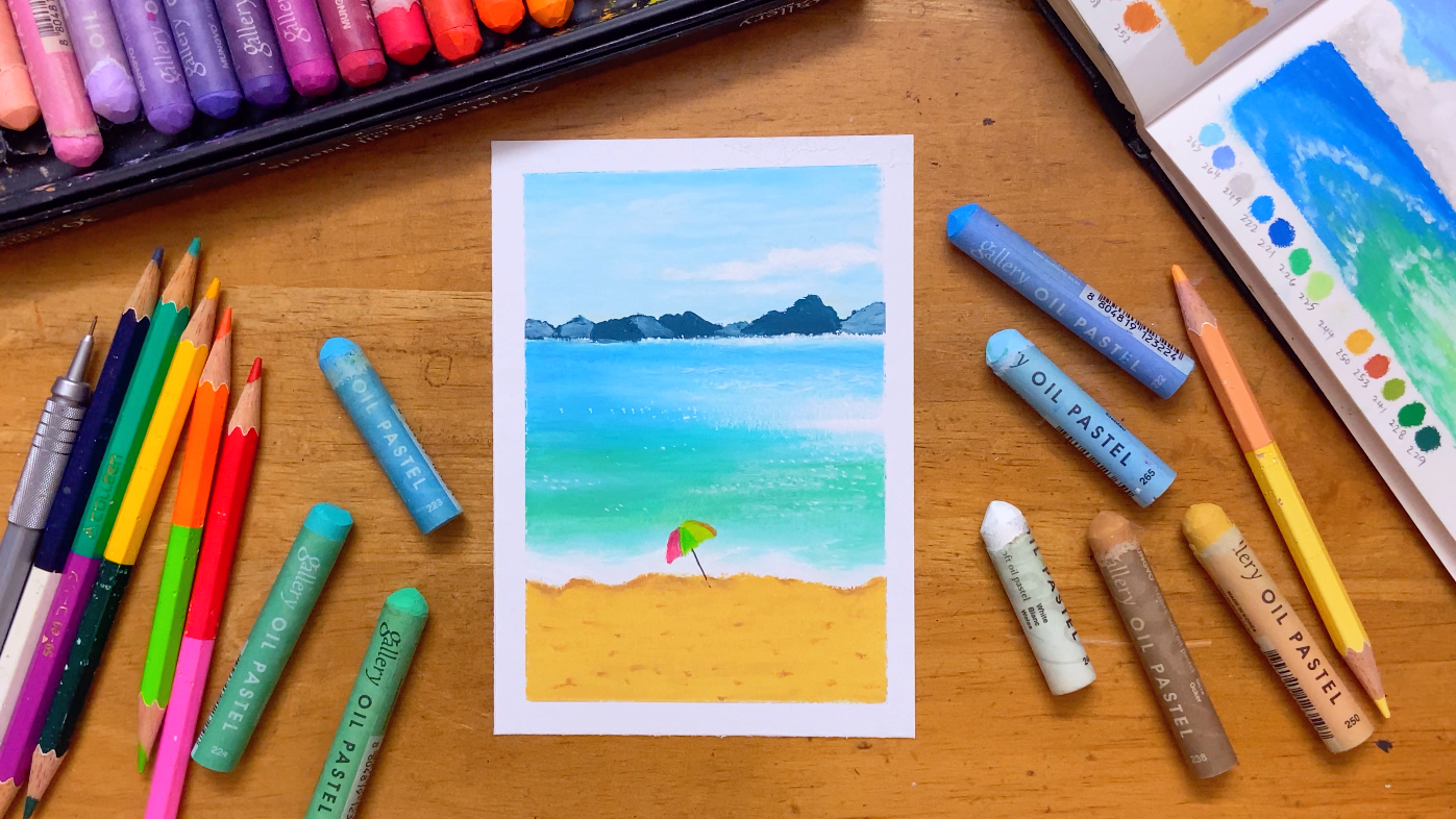
a simple and enjoyable way. In this class, we'll be drawing a beautiful sea scrap beach
with a soft blue sky. This class will be more focused on how to
paint the ocean. I'll show you how to
paint the sea with not only using blue colors
and also teach you how to create the
sparkle shining effect of the sea and how to blend different shapes of blue and green blend smoothly
together of the sea. You will also learn how to
create the distant looks of the mountain in our painting and how to create the
depth of the beach. I'll teach you how to do
all the blending with just your finger
and layers colors to bring your landscape to life. This class is perfect
for beginners, hobby artists, or anyone who just want to relax and
enjoy a creative moment. You don't need any
prior experience, come with an open mind and
have fun and I'll guide you step by step through
the process of building the landscape
using oil pastel. I'm really excited to
create this with you. Let's get started and I'll
see you in the first lesson.
2. Materials: In this class, there's only five things we
need. First is paper. I recommend paper in somewhere 100-20 grams to
200 grams is the best. But if you don't have
that, it's okay. You can use whatever
paper you have at the moment or any
sketchbook you have. Second is oil pastel. This is the Mono Gallery. Oil pastel 72 color set. If you have the budget, I recommend this brand
is a brand from Korea. You can find online on Amazon or any online
store in your country. If you never tried Pastel before or you're not sure you
like this medium or not, you can get the 36 color set. I bought it at around $70 USD. And if you already have tri Oil Pastel and you
like to get more color, but don't have much budget, you can get the 72 color set. I bought it at around USD $38. The full color set is 120 color, but I think 72 color is enough for you to
draw almost anything. These are just my
recommendation, but you're welcome to use any brand you like
in this class. The color I mentioned in this class is from
this Mono oil pastel, but you can find
the similar color of your oil pastel to use. Next is a pencil and an eraser. Eraser is to erase any smudging and pencil is to draw the
handle of the umbrella. And the last thing you
need is some color pencil. Prepare four to five
different colors of color pencils to
draw the umbrella. In this class, you
won't use any tool to blend unless you have the blending tool and
you feel free to use it. But I want to make
it as beginner friendly as much as possible. So all you need to blend
is just use your finger. Also, you can use washi
tape to stick in the paper, so the edges of the drawing
came out nice and clean. But this is optional. And
that's all for the materials, let's get start drawing.
3. How to draw the soft smooth blue sky: Welcome to the first
chapter of the class. Before we start, let's tape our paper around the
edges with washi tape. So the painting
will have a clean, beautiful line when
we finish drawing. Let's start paint the sky. I use ice blue and
white for the sky. We separate into three sections. First, upper part is the sky. The middle is the ocean
and the mountain, and the bottom
part is the beach. You can use beach or any light color pencil
to likely draw out the line and roughly sketch
the mountain location. I know it's not easy to see my beach color pencil
on the screen. Don't worry, when I draw the mountain with
oil pastel later, you can always watch first and then follow my step while
you watch it again. You can also sketch the
umbrella on the beach. We will use color pencil to draw the umbrella at the
end of the class. Now, let's start
with oil pastel. Use ice blue to lightly
color for the sky. Remember, just gently
apply your pleasure. Leave some space at the
left side for the cloud. Draw some uneven shape to
create the look of the cloud. I'm going to put more
oil pastel at the top, so it's easier to blend later. Next, use white to
apply the second layer. Also with light pressure, don't touch the cloud area. I put some more ice
blue to some areas around the cloud because I
think it looked too white, and I also want to
emphasize the cloud. Next, we start to do blending. If you don't want to
get your hand dirty, you can always use cotton
bad or blending tools. Here, I'm just going
to use my finger because it's the
most convenient way. The direction goes
in horizontal way. Try to push your oil pastel around the washi tape
while you blend. Be careful when you
blend around the cloud. Try to make it look as
natural as possible. If you think the cloud looks
not so visible or obvious, you can always add more
ice blue color around it. I'm adding more white colour around the outline of the cloud, so it's look more
natural and smooth. And your skin is done, easy and fast. Uh
4. How to draw distant mountain to create depth: In this chapter, we're
going to draw the mountain. The color we'll use are silver
gray and malachite green. It's a dark green that makes
a little bit of blueton. Clean your oil pastel if
it's got other color on it. First, we use Mache green to draw the mountain one by one. You no need to follow exactly to the reference or the
sketch we drew just now. You can draw whatever
you like as long as the shape is not all the
same height and size. Make sure the outline
is clear and neat. You can use the edge of your upper style to
draw the clear line. Next, we use the silver gray to apply the second
layer of the mountain. But we don't draw on
all the mountain, only apply on some of the mountain that
look more far away. When we draw the
distance in landscape, we can acggerate the
lighter values of the front object to get more depth to make it
look more obvious. For the object that at the back that look
more far away from us, we can try to blur
it up or lower the value I use the silver gray color to
create this distant look. And our mountain is done.
5. How to draw a sparkling blue ocean: In this chapter, we are
going to paint the ocean. The color we're going
to use are light blue, Toko blue, ice blue, TkoiGreen, jade green and white. First, use Toko blue paint from the left side and
slowly to the right. Remember to leave space for
the top at the right side. We will apply white
colour on that area. The direction of the light
is come from the right side. You can see there's some
reflection highlight on the sea mostly at the right. So we also need to leave
the areas blank for now. Then we use white to paint
the top of the ocean, draw in horizontal way, slowly move goes to the left. Be careful, try not to
touch the mountain. If you really accidentally
draw to the mountain, just use back the
color we painted the mountain just now
to paint it back. Then we continue use white to paint the part that the
light reflect on the sea, lightly paint a light
layer on top of the blue. Leave it for now first.
Use toque green, continue paint the sea, slowly move to the lower part, also paint from the
left to the right. Reduce your pressure when
you move to the right. Then use jade green, apply the second layer on top of the toqui green that
we painted just now, but not cover all
the tokai green, just half of it only because if you look
closely to the reference, the see is not only
have blue colour. I also have some
green colour in it. Usually, when we paint the sea, it will use blue
and green colour, but keep in mind that
the green we choose for the sea usually is not the
same we use for the grass. The green color I choose in this painting have
the blue colour tone. So keep in mind that understand what fine and atmosphere you want to bring out
in your painting. The color you choose will
effect the s of your painting. But don't worry or to overthinking
on the color decision, you can try test the color on the side on your sketchbook, then only decide which
color you want to use, and also don't be
afraid to make mistake. The more mistake you
make, the more you learn. When we draw the areas that where light
reflect on the sea, you can use the
most lightest blue, which is ice blue that I use. Also can use this color to
paint the bottom of the sea. Try to use the green
color that we use just now to overlap with
blue color together, so the gradient will
look more natural and smooth when we
do blending later. I also leaving some space for the umbrella were going to
draw at the end of the class. Then we can start
do the blending. Use your finger move
in horizontal way. We start blending
from the upper part, then slowly move
down to lower part. You will see the gradient really look natural and smooth if you have paint the color overlap to each other in the middle. Then I add ice blue at the left because here have
the light reflection. Next, I use white to likely apply on the areas that
have light reflection. Use your finger to blend at the same time while you
apply white colour. Keep in mind that
the direction of your finger blending also affect the look of your painting. Next, we're going to work
on the form of the wave. Make sure your all
pastel is clean. This time, don't
put light pressure, apply full pressure, try
to make an even wave. I apply some ice glue near
the wave because the color in that areas turning
more lighter color and your ocean is done, the most hardest part is over. You have done a great job
if you make this far. In next chapter, we're
going to draw the beach.
6. How to draw textured sandy beach: Before we move to the beach, let's add more depth
to the ocean first. Add light blue on the
upper part of the ocean. Although it is
called light blue, but actually it's
more darker blue. The light blue is
just a name from the uno Brand oil pastel. Then use your finger
to blend, too. Next, we start to
work on the beach. Use ochre or pale
ochre for the beach. Use the pale ochre
as the base colour, paint from the bottom. Don't draw too near the ocean. Leave space between the
ocean and the sand. Then we start to draw out
the edges of the sea foam. Try to make it uneven
as much as possible. Don't make it like
a straight line, or it will look very unnatural. Apply more oil pastel
for the beach, so it's easier to
do blending later. Then we start use
finger to blend. Remember, don't use the same
finger that we blended to see just now or you will
smark your painting. Next, use Occur to
build for the dap. Use your oil pastel to dot, dot, dot on the paper, then use your finger
to lightly blend it, but don't fully blend it. We just softer it a little bit. Then we want to highlight
the form, emphasize it, so we use the same colour to carefully draw
under the form, but don't draw at all the form. Just only at some of the part. Like a small shadow
under the form. If you think you put
too much colour, you can use the peer or
curl to lighten it up. So your painting now
is look very vivid. I'm adjusting some details here to make the shape
look more uneven, so it look more natural. And your painting
is almost done. We just need to add the
umbrella in next chapter.
7. Add sparkling water highlights and a colorful beach umbrella: Now we add the final touch out on the ocean. This is optional. If you're happy with
the of your ocean, you can stop now and skip
to the umbrella part. But if you have white marker, feel free to add more details. So we use white marker to create the sparkling shining effect that light reflects
on the ocean. Just use dot dot techniques, patiently add to the ocean. The highlight mostly focus on the right side of the ocean, so we're adding more to it at the site and also add
a few here and there. Next, we're going to
draw the umbrella, determine the location of
where you want to draw. I want to put the handle
of the umbrella here. So choose four color
of your color pencil, whatever color you like. You no need to follow
the reference. Just follow your heart.
We draw the canopy first. When you use color
pencil on oil pastel, fully press your
color pencil to draw, and the oil pastel will come
off on your color pencil. Just wipe it off, then apply multiple time again. Then lastly, just use
pencil to draw the handle. And that's it. Your
painting is done. I'm taking off the tape now, which is my most favorite
and satisfying moment. Look how clean and
neat the lines are. Thank you so much
for taking my class. Feel free to upload your
painting to the project section. I would love to see a result. If you'd like to try draw
more IPAs style painting, feel free to check out my
other I Pastle classes. See you in my next class. Oh.
 Michelle Gooi, Traditional Artist